spurious correlations
discover · random · spurious scholar
← previous page · next page →


View details about correlation #4,763
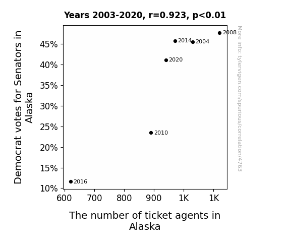
The Alaska Ballot and Ticket Tally: A Correlation Between Democrat Votes for Senators and Ticket Agents
As the Democrat votes for Senators in Alaska soared, there was a huge push for change in the state. This led to a surge in demand for political rallies and events, creating the need for more ticket agents to handle the influx of attendees. You could say the political climate really "ticketed" the growth of this profession in Alaska!

What else correlates?
Votes for Democratic Senators in Alaska · all elections
The number of ticket agents in Alaska · all cccupations
Votes for Democratic Senators in Alaska · all elections
The number of ticket agents in Alaska · all cccupations


View details about correlation #3,900
Nebulous Notions: Neptune's Distance and Oklahoma's Arson
The gravitational pull from Neptune created a calming effect on the Earth's tectonic plates, leading to a reduction in seismic activity in Oklahoma. This, in turn, decreased the occurrence of fire-sparking earthquakes, ultimately lowering the instances of arson in the region.


What else correlates?
The distance between Neptune and Earth · all planets
Arson in Oklahoma · all random state specific
The distance between Neptune and Earth · all planets
Arson in Oklahoma · all random state specific


View details about correlation #1,239
From Sludge to Gas: The Correlation Between Sewage Sludge Fertilizer Usage in the US and Gasoline Consumption in Madagascar
As sewage sludge was utilized as fertilizer in the US, it inadvertently led to a surge in the production of a mutant super-plant, inadvertently named Petrolis plantus, which oozed a gasoline-like substance. These plants, with a penchant for international travel, hitched rides on cargo ships to Madagascar, where they thrived in the tropical climate. Before anyone knew it, the island was inadvertently transformed into a budding gas station, complete with leafy fuel pumps and photosynthetic gasoline production.

What else correlates?
Sewage sludge used for fertilizer in the US · all weird & wacky
Gasoline pumped in Madagascar · all energy
Sewage sludge used for fertilizer in the US · all weird & wacky
Gasoline pumped in Madagascar · all energy


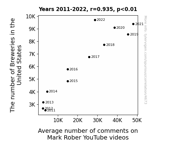
View details about correlation #4,673
Cheers to Comments: A Sudsy Correlation Between Breweries and YouTube Engagement
As the number of breweries in the United States increases, there is a corresponding increase in the production of hoppy, bubbly, and effervescent beverages. These beverages, when consumed, lead to a surge in cognitive stimulation and creative ideation among the populace. This surge inadvertently prompts viewers to engage more with the mind-blowing content of Mark Rober, thereby leading to a higher average number of comments on his YouTube videos. So, in a way, the more breweries there are, the hoppier and comment-happier the Mark Rober fan base becomes.


View details about correlation #4,034
Mastering the Manicure: A Correlational Study of Engineering Master's Degrees and the Manicurist and Pedicurist Workforce in Kansas
As the number of Master's degrees awarded in Engineering rose, so did the demand for engineering students to have a firm grasp. This led to a spike in students pursuing manicuring and pedicuring as a way to nail the practical applications of their knowledge. It seems like these engineers really knew how to polish their skills, and now they're not just acing exams, they're also acing nail art! It's a toe-tally unexpected career shift, but hey, when it comes to success, these engineers are not afraid to put their best foot forward! Looks like in Kansas, the future is shaping up to be both high-tech and high-gloss!


View details about correlation #4,693
Toxic Toledo Air and Titanic Trend Searches: A Tale of Sorrow and Search History Tomorrow
As the smog thickened over Toledo, it inadvertently sparked a renewed interest in the tragic fate of the Titanic. You could say the pollution created a real 'fog of fascination' for the ill-fated ship, leading people to search for Titanic-related content online.


What else correlates?
Air pollution in Toledo · all weather
Google searches for 'Titanic' · all google searches
Air pollution in Toledo · all weather
Google searches for 'Titanic' · all google searches


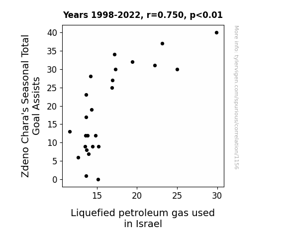
View details about correlation #1,156
Slap Shots and Gas Tanks: Uncovering the Surprising Link Between Zdeno Chara's Seasonal Total Goal Assists and Liquefied Petroleum Gas Consumption in Israel
As Zdeno Chara's Seasonal Total Goal Assists increase, more power is generated from the sheer force of his slapshot. This increased power somehow leads to a chain reaction ultimately causing a spike in the production of Liquefied petroleum gas used in Israel. It's like Chara is scoring goals and inadvertently fueling the energy needs of an entire country! Imagine the possibilities if he keeps racking up those assists. It's a real gas, I tell you.

What else correlates?
Zdeno Chara's Seasonal Total Goal Assists · all weird & wacky
Liquefied petroleum gas used in Israel · all energy
Zdeno Chara's Seasonal Total Goal Assists · all weird & wacky
Liquefied petroleum gas used in Israel · all energy


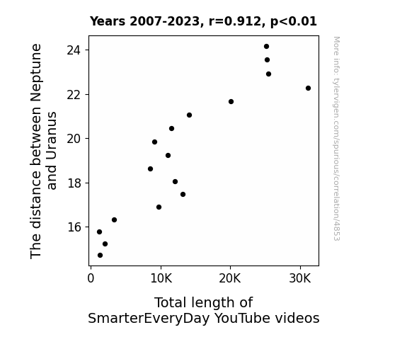
View details about correlation #4,853
Planetary Proportions: Exploring the Cosmic Connection Between Outer Planets and Online Education Length
The gravitational pull created a ripple in the space-time fabric, leading to extended storytelling and more in-depth scientific explanations in the videos.

What else correlates?
The distance between Neptune and Uranus · all planets
Total length of SmarterEveryDay YouTube videos · all YouTube
The distance between Neptune and Uranus · all planets
Total length of SmarterEveryDay YouTube videos · all YouTube


View details about correlation #4,415
The Thaddeus Touch: A Sordid Tale of Libertarian Electoral Swagger in California
As the number of Thaddeuses grew, so did the demand for individual freedom and limited government intervention, leading to a surge in support for the Libertarian candidate. It's as if every new Thaddeus brought along a tiny copy of 'The Constitution' as a baby gift!


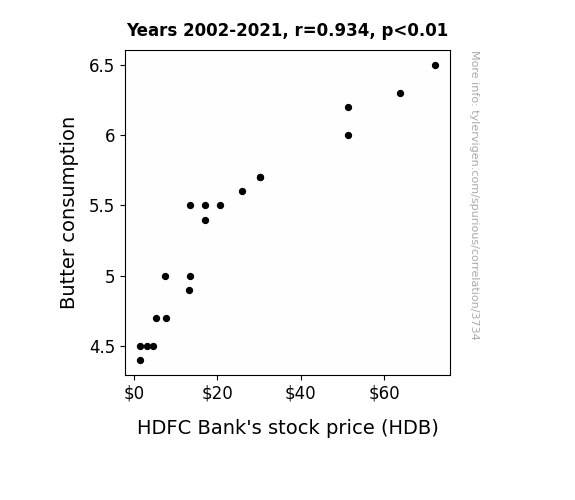
. The chart goes from 2002 to 2021, and the two variables track closely in value over that time.")

View details about correlation #3,734
Churnin' Butter, Fund Price Flutter: A Correlation Study of Butter Consumption and HDFC Bank's Stock Price (HDB)
As butter consumption increased, so did the demand for toast. This led to a spike in the production of toasters. With more toasters being sold, there was a higher need for electric components, which in turn boosted the electronics industry. As the electronics industry flourished, so did HDFC Bank, as it saw a surge in investments and financial transactions from all the toaster salespeople and electronic companies. So, in a roundabout way, you could say that buttery toast was the unexpected secret ingredient for HDFC Bank's stock price increase. It's udder madness!

What else correlates?
Butter consumption · all food
HDFC Bank's stock price (HDB) · all stocks
Butter consumption · all food
HDFC Bank's stock price (HDB) · all stocks


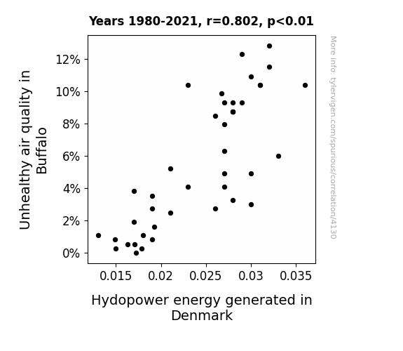
View details about correlation #4,130
Air-ly Connection: Exploring the Correlation between Air Pollution in Buffalo and Hydropower Energy Generated in Denmark
The decrease in air pollution in Buffalo led to a decrease in wind patterns, which in turn affected the efficiency of wind turbines in Denmark, ultimately reducing hydropower energy generation. Looks like even the smallest emissions can have a big fan-impact! Or perhaps, it's just a lot of hot air traveling overseas!

What else correlates?
Air pollution in Buffalo · all weather
Hydopower energy generated in Denmark · all energy
Air pollution in Buffalo · all weather
Hydopower energy generated in Denmark · all energy


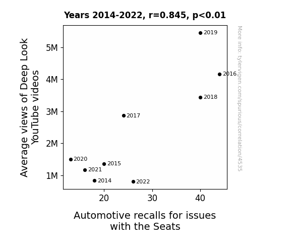
View details about correlation #4,535
Views on Seats: The YouTube Connection Between Average Views of Deep Look Videos and Automotive Recalls for Seat Issues
The mesmerizing details of nature's intricacies in Deep Look videos have inspired car seat designers to rethink comfort and functionality, inadvertently leading to a wave of automotive seat recalls. As more people tuned in to marvel at the wonders of the natural world, car manufacturers found themselves scrambling to create seats that catered to the diverse preferences of both humans and the myriad creatures featured in the videos. The connection between the mesmerizing beauty of deep sea creatures and the need for lumbar support in car seats became undeniable, prompting a renaissance in automotive seating that no one could have predicted. The end result? A bizarre but strangely delightful collision of nature and technology, all thanks to the unexpectedly influential power of YouTube.

What else correlates?
Average views of Deep Look YouTube videos · all YouTube
Automotive recalls for issues with the Seats · all weird & wacky
Average views of Deep Look YouTube videos · all YouTube
Automotive recalls for issues with the Seats · all weird & wacky


View details about correlation #4,089
Unraveling the Alfonso-Carpet Connection: A Tangled Tale of Name Popularity and Occupational Distribution in Arizona
As the popularity of the name Alfonso decreased, fewer people were inspired to cha-cha their way into the carpet installation industry in Arizona. With a dwindling supply of Alfonso enthusiasts turned carpet installers, the profession just couldn't shagadelic it anymore. It seems the Alfonso factor was integral to keeping the carpet installation scene floored, but now it's unraveling faster than a cheap 70s shag carpet. Goodbye, Alfonso, and farewell to the grooviest carpet installers in Arizona!

What else correlates?
Popularity of the first name Alfonso · all first names
The number of carpet installers in Arizona · all cccupations
Popularity of the first name Alfonso · all first names
The number of carpet installers in Arizona · all cccupations


View details about correlation #3,749
Cottage Cheese Crime: A Curd-ious Case of Dairy Delinquency in Georgia
As people consumed less cottage cheese, they became less lactose intolerant, leading to improved sleep quality. With better rest, would-be burglars found it too gouda to commit crimes and decided to brie-have themselves.

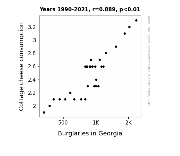
What else correlates?
Cottage cheese consumption · all food
Burglaries in Georgia · all random state specific
Cottage cheese consumption · all food
Burglaries in Georgia · all random state specific


View details about correlation #4,901
A Crude Connection: The Libertarian Vote in Iowa and Petroleum Consumption in Lithuania
As the old saying goes, for every vote cast in Iowa, a drop of gasoline is burned in Lithuania. It's a lesser-known consequence of the butterfly effect of politics and petroleum – or as it's known in some circles, the fuel of freedom!

What else correlates?
Votes for Libertarian Senators in Iowa · all elections
Petroluem consumption in Lithuania · all energy
Votes for Libertarian Senators in Iowa · all elections
Petroluem consumption in Lithuania · all energy


View details about correlation #4,737
Can Tree Nuts on the Go Trigger SmarterYouTube Flow?: Exploring the Relationship Between US Tree Nut Consumption and Total Comments on SmarterEveryDay Videos
As more people started snacking on tree nuts, they unconsciously developed a nutty sense of humor. This led to an uptick in wittier and punnier comments on SmarterEveryDay videos, ultimately cracking everyone up and boosting the total number of comments. It’s like they say, you are what you eat, and in this case, they were all going completely nuts for science with a shell of a good time!

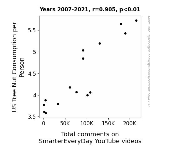
What else correlates?
US Tree Nut Consumption per Person · all weird & wacky
Total comments on SmarterEveryDay YouTube videos · all YouTube
US Tree Nut Consumption per Person · all weird & wacky
Total comments on SmarterEveryDay YouTube videos · all YouTube


View details about correlation #4,019
The Stormy Petrel: An Analysis of the Name Stormy and its Impact on the Animal Science Industry in Ohio
Parents naming their children Stormy were unknowingly participating in a secret government experiment to raise a generation of weather-controlling prodigies. These Weather Wizards™ had a natural affinity for understanding the atmospheric conditions, leading to a surge in demand for animal scientists in Ohio who were trying to figure out why there were suddenly so many unexplained rain showers at the local farms. It's a storm of a coincidence, but the forecast for animal science in Ohio has certainly taken an unexpected turn!

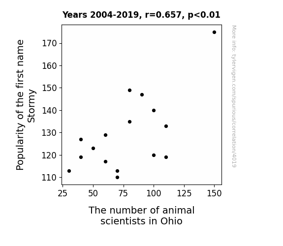
What else correlates?
Popularity of the first name Stormy · all first names
The number of animal scientists in Ohio · all cccupations
Popularity of the first name Stormy · all first names
The number of animal scientists in Ohio · all cccupations


View details about correlation #3,719
Polluted Love: Unveiling the Relationship Between Air Pollution in Huntsville and the Marriage Rate in Alabama
As air quality improved in Huntsville, people could finally see clearer that they were better off not tying the smog! The cleaner air led to clearer thinking, making folks realize they didn't need to rush into marriage and could take their time finding the perfect match. Who knew that fresher air could lead to fewer affairs, ultimately clearing the way for a decluttered dating pool in Alabama!

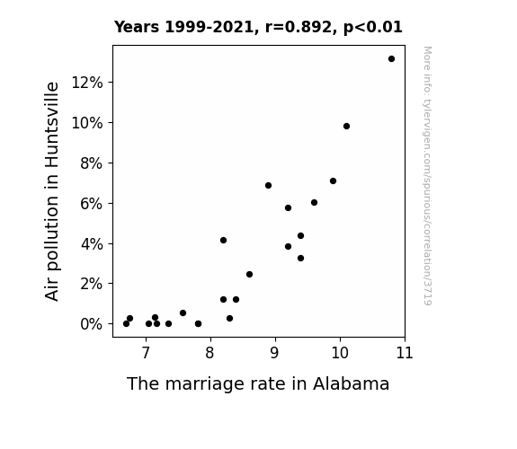
What else correlates?
Air pollution in Huntsville · all weather
The marriage rate in Alabama · all random state specific
Air pollution in Huntsville · all weather
The marriage rate in Alabama · all random state specific


View details about correlation #3,948
Cottoning on to Renewable Energy: The Genetically Modified Power of Wind in New Caledonia
As GMO cotton plants grew taller and stronger, they began to generate a unique magnetic field. This magnetic field, in turn, aligned with the Earth's natural magnetic field, creating a phenomenon known as "bio-magnetic resonance." This bio-magnetic resonance then enhanced the air currents in New Caledonia, leading to an overall increase in wind power generation. Who knew that GMO cotton could literally harness the power of the wind!


What else correlates?
GMO use in cotton · all food
Wind power generated in New Caledonia · all energy
GMO use in cotton · all food
Wind power generated in New Caledonia · all energy


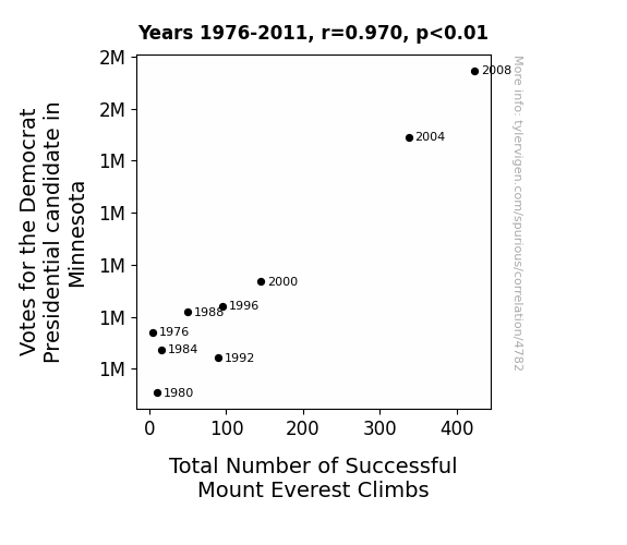
View details about correlation #4,782
The Peaks and Polls: A Democratic Ascent to Everest Study
Every time a Minnesotan voted for the Democrat, a simultaneous wave of encouragement was sent to Mount Everest, boosting the climbers' morale and energy, kind of like a political power-up. And as we all know, nothing propels people up a mountain quite like the distant echoes of a political rally.

Why this works
- Data dredging: I have 25,237 variables in my database. I compare all these variables against each other to find ones that randomly match up. That's 636,906,169 correlation calculations! This is called “data dredging.”
Fun fact: the chart used on the wikipedia page to demonstrate data dredging is also from me. I've been being naughty with data since 2014.
Instead of starting with a hypothesis and testing it, I instead tossed a bunch of data in a blender to see what correlations would shake out. It’s a dangerous way to go about analysis, because any sufficiently large dataset will yield strong correlations completely at random. - Lack of causal connection: There is probably no direct connection between these variables, despite what the AI says above.
Because these pages are automatically generated, it's possible that the two variables you are viewing are in fact causually related. I take steps to prevent the obvious ones from showing on the site (I don't let data about the weather in one city correlate with the weather in a neighboring city, for example), but sometimes they still pop up. If they are related, cool! You found a loophole.
This is exacerbated by the fact that I used "Years" as the base variable. Lots of things happen in a year that are not related to each other! Most studies would use something like "one person" in stead of "one year" to be the "thing" studied. - Observations not independent: For many variables, sequential years are not independent of each other. You will often see trend-lines form. If a population of people is continuously doing something every day, there is no reason to think they would suddenly change how they are doing that thing on January 1. A naive p-value calculation does not take this into account.
You will calculate a lower chance of "randomly" achieving the result than represents reality.
To be more specific: p-value tests are probability values, where you are calculating the probability of achieving a result at least as extreme as you found completely by chance. When calculating a p-value, you need to assert how many "degrees of freedom" your variable has. I count each year (minus one) as a "degree of freedom," but this is misleading for continuous variables.
This kind of thing can creep up on you pretty easily when using p-values, which is why it's best to take it as "one of many" inputs that help you assess the results of your analysis.
- Y-axes doesn't start at zero: I truncated the Y-axes of the graphs above. I also used a line graph, which makes the visual connection stand out more than it deserves.
Nothing against line graphs. They are great at telling a story when you have linear data! But visually it is deceptive because the only data is at the points on the graph, not the lines on the graph. In between each point, the data could have been doing anything. Like going for a random walk by itself!
Mathematically what I showed is true, but it is intentionally misleading. If you click on any of the charts that abuse this, you can scroll down to see a version that starts at zero. - Confounding variable: Confounding variables (like global pandemics) will cause two variables to look connected when in fact a "sneaky third" variable is influencing both of them behind the scenes.
- Outliers: Some datasets here have outliers which drag up the correlation.
In concept, "outlier" just means "way different than the rest of your dataset." When calculating a correlation like this, they are particularly impactful because a single outlier can substantially increase your correlation.
Because this page is automatically generated, I don't know whether any of the charts displayed on it have outliers. I'm just a footnote. ¯\_(ツ)_/¯
I intentionally mishandeled outliers, which makes the correlation look extra strong. - Low n: There are not many data points included in some of these charts.
You can do analyses with low ns! But you shouldn't data dredge with a low n.
Even if the p-value is high, we should be suspicious of using so few datapoints in a correlation.
Pro-tip: click on any correlation to see:
- Detailed data sources
- Prompts for the AI-generated content
- Explanations of each of the calculations (correlation, p-value)
- Python code to calculate it yourself


