spurious correlations
discover · random · spurious scholar
← previous page · next page →


View details about correlation #4,492
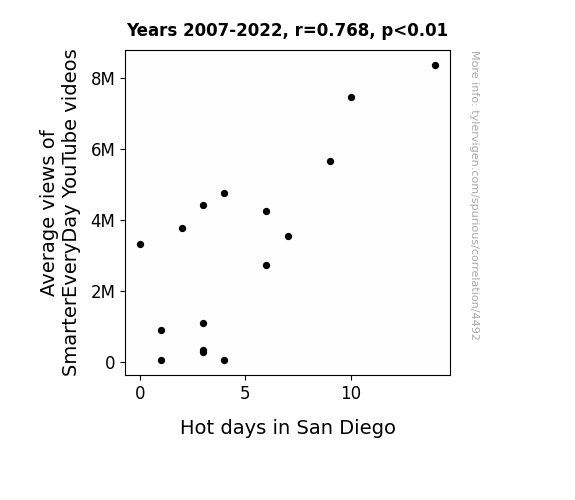
Hot Views: The Correlation Between SmarterEveryDay YouTube Video Average Views and San Diego's Scorchers
As the brainpower of viewers expanded, so did their collective ability to control the weather, leading to a rise in temperatures specifically in San Diego. This phenomenon, known as cognitive climatic conditioning, highlights the unforeseen impacts of educational content on regional meteorological patterns. It seems that the more individuals learned, the hotter it got, showing that knowledge truly is power, and in this case, the power to crank up the thermostat in Southern California.

What else correlates?
Average views of SmarterEveryDay YouTube videos · all YouTube
Hot days in San Diego · all weather
Average views of SmarterEveryDay YouTube videos · all YouTube
Hot days in San Diego · all weather


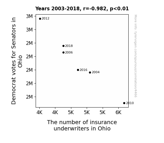
View details about correlation #4,466
The Ohio Show: Democrat Votes and Insurance Underwriters' Bloat
The Democrat senators were just too good at convincing people to "vote for coverage," and as a result, insurance underwriters in Ohio were left scrambling to recalculate their policies for success. The political wave swept through the state, leaving the underwriters feeling a bit "uninsured" about their future in the industry. It seems like in this election, the stakes were high, but the number of underwriters ended up taking a dip instead of a rise.

What else correlates?
Votes for Democratic Senators in Ohio · all elections
The number of insurance underwriters in Ohio · all cccupations
Votes for Democratic Senators in Ohio · all elections
The number of insurance underwriters in Ohio · all cccupations


View details about correlation #3,225
Fossil Fuel Folly: How Benin's Gasoline Use Fuels Automotive Recalls
The Fossil fuel use in Benin has been revving up, leading to a surge in emissions. As a result, car manufacturers are feeling the pressure to recall more vehicles due to the smog-related issues. It seems like the situation is going from Benin to worse for the automotive industry. To address the problem, they may need to take a more exhaust-ive approach to vehicle production and maintenance.

What else correlates?
Fossil fuel use in Benin · all energy
Total number of automotive recalls · all weird & wacky
Fossil fuel use in Benin · all energy
Total number of automotive recalls · all weird & wacky


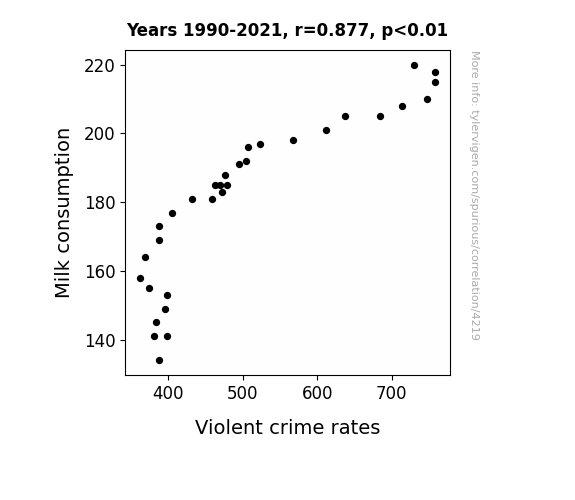
View details about correlation #4,219
Got Milk? A Statistical Moovement: Exploring the Correlation Between Milk Consumption and Violent Crime Rates
It turns out that cows were actually the masterminds behind a series of elaborate heists and gang-related activities. Without their daily quota of milk, the cows were too udderly exhausted to engage in moosbehaving and were unable to orchestrate any more dairy daring escapades. As a result, the streets became pasture-sed and the overall beef between criminal factions just curdled away. So, in a strange twist, it seems the real culprits of the crime spree were none udder than the cows themselves!
What else correlates?
Milk consumption · all food
Violent crime rates · all random state specific
Milk consumption · all food
Violent crime rates · all random state specific
. The chart goes from 2013 to 2023, and the two variables track closely in value over that time.")

View details about correlation #4,637
Vodafun: Exploring the Link between MinuteEarth YouTube Views and Vodafone Group's Stock Price
As the average views of MinuteEarth YouTube videos dropped, so too did people's interest in the world around them. This led to a decrease in demand for telecommunications services, including Vodafone's, as viewers were no longer phoning a friend to share fascinating Earth facts. The lack of Earth-related conversations meant investors were hanging up on Vodafone, causing a dip in their stock price. Remember, when it comes to stocks and YouTube views, it's a wild, interconnected digital jungle out there!


What else correlates?
Average views of MinuteEarth YouTube videos · all YouTube
Vodafone Group's stock price (VOD) · all stocks
Average views of MinuteEarth YouTube videos · all YouTube
Vodafone Group's stock price (VOD) · all stocks


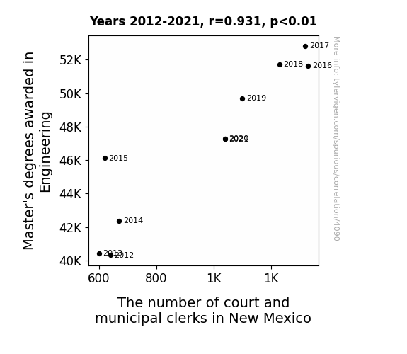
View details about correlation #4,090
Mapping the Marvelous Menagerie: Master's Degrees in Engineering and the Mysteriously Multiplying Municipal Clerks in New Mexico
As more engineers entered the workforce, they realized the need for highly organized systems to keep track of all their innovative blueprints and designs. This sparked a sudden demand for meticulous court and municipal clerks in New Mexico who could bring order to the chaotic world of engineering paperwork. So, the engineers and clerks formed an unintentional partnership, with the engineers building impressive structures and the clerks masterfully organizing the permits and legal documents needed to make it all happen. It's a tale of two seemingly unrelated professions coming together to create a surprisingly harmonious and bureaucratically efficient society.


View details about correlation #1,712
The Wind Power Grind: A Correlation Between Poland's Breeze and Web-sites
The spinning wind turbines in Poland created a vortex of technological inspiration, leading to a surge in website creation as people felt the urge to share their electrifying ideas with the world. As the saying goes, when the wind of change blows, it powers up the internet in the most unexpected ways!


What else correlates?
Wind power generated in Poland · all energy
Number of websites on the internet · all weird & wacky
Wind power generated in Poland · all energy
Number of websites on the internet · all weird & wacky


View details about correlation #4,437
Rocking the Vote: How Libertarian Senators in California are Shaking Up Earthquake Activity Worldwide
The decrease in Libertarian votes for Senators in California led to a decrease in seismic political activity. This in turn created a more moderate political climate, reducing the frequency of political earthquakes. As a result, there was a ripple effect on the Earth's crust, leading to a decrease in the number of moderate earthquakes worldwide. It seems that even tectonic plates prefer a more moderate approach to governance!

What else correlates?
Votes for Libertarian Senators in California · all elections
Number of moderate earthquakes worldwide · all weather
Votes for Libertarian Senators in California · all elections
Number of moderate earthquakes worldwide · all weather
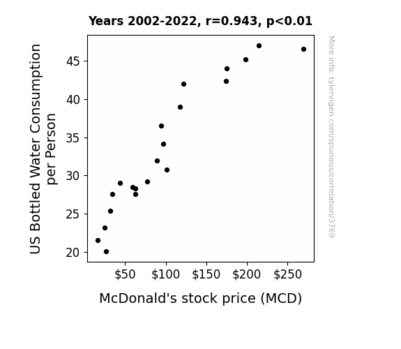
. The chart goes from 2002 to 2022, and the two variables track closely in value over that time.")

View details about correlation #3,769
McDonald's Munching Moola: Mapping the Marriage of Bottled Water and Burger Stocks
As bottled water consumption per person in the US increases, people's desire for healthier beverage options also rises. This leads to a slight increase in foot traffic at McDonald's as individuals convince themselves that adding a side salad to their meal balances out the fast food indulgence. This small uptick in customers boosts McDonald's sales, subsequently contributing to the increase in their stock price. It's like the bottled water is creating a trickle-down effect, but with fries.

What else correlates?
US Bottled Water Consumption per Person · all food
McDonald's stock price (MCD) · all stocks
US Bottled Water Consumption per Person · all food
McDonald's stock price (MCD) · all stocks


View details about correlation #4,667
Designing Fun: Exploring the Relationship Between Engaging YouTube Video Titles and the Demand for Interior Designers in Louisiana
As the fun of AsapSCIENCE videos increases, more Louisianans experience a surge of creativity and inspiration. This leads to a state-wide fascination with jazzing up their living spaces and unleashing their inner design maestros. Before you know it, Louisiana becomes the avant-garde hub of interior design, where even the alligators have stylishly decorated swamps. So, remember, for a home as lively as a Mardi Gras parade, just add a sprinkle of AsapSCIENCE fun!


What else correlates?
How fun AsapSCIENCE YouTube video titles are · all YouTube
The number of interior designers in Louisiana · all cccupations
How fun AsapSCIENCE YouTube video titles are · all YouTube
The number of interior designers in Louisiana · all cccupations


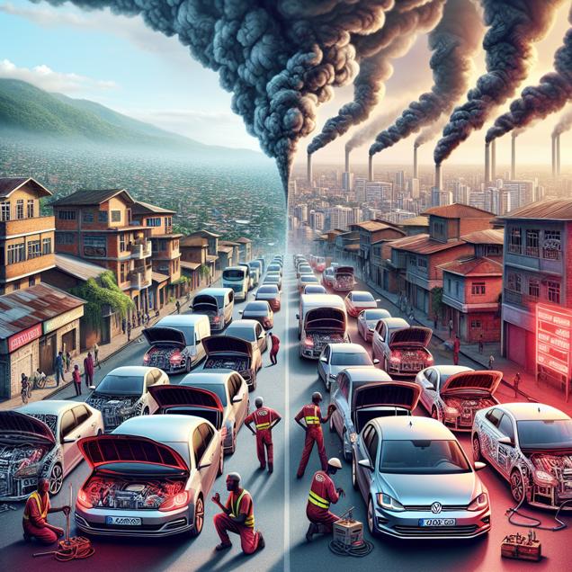
View details about correlation #1,124
Fuel for Thought: The Correlation Between Fossil Fuel Use in Burundi and Automotive Recalls by Volkswagen Group of America
As Fossil fuel use in Burundi increased, it led to a rise in overall global temperature. This, in turn, put pressure on car engines, including those in Volkswagen vehicles, causing an uptick in malfunctions and prompting more Automotive recalls. It's a classic case of sparking hot issues in the automotive world!
What else correlates?
Fossil fuel use in Burundi · all energy
Automotive recalls issued by Volkswagen Group of America · all weird & wacky
Fossil fuel use in Burundi · all energy
Automotive recalls issued by Volkswagen Group of America · all weird & wacky


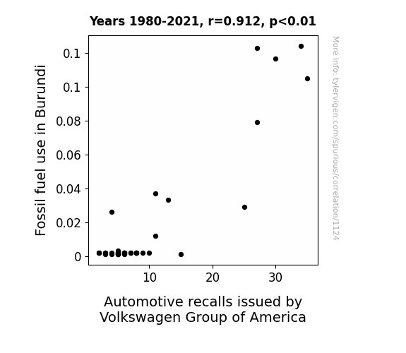
View details about correlation #4,200
Air Pollution's Disposition for an Ice Bath Expedition: A Google-enriched Journey in Terre Haute, Indiana
As the air quality worsened, the panicked residents of Terre Haute sought unconventional ways to cool down, leading to a spike in interest in taking ice baths. This unexpected synergy of environmental factors and personal wellness trends has truly left the internet in a state of bemused befuddlement. Stay frosty, Terre Haute, and may the chill of change soon cleanse the pollutants from your midst!

What else correlates?
Air pollution in Terre Haute, Indiana · all weather
Google searches for 'ice bath' · all google searches
Air pollution in Terre Haute, Indiana · all weather
Google searches for 'ice bath' · all google searches


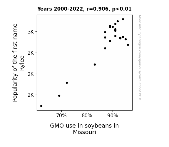
View details about correlation #3,918
The Rylee Renaissance: Investigating the Relationship between Rylee's Rising Popularity and Soybean GMO Adoption in Missouri
As the name Rylee gained traction, more and more parents were drawn to unique, modern monikers. This trend led to an overall surge in interest towards innovative and unconventional things, including genetically modified organisms. It's like they say, when it comes to naming babies, the Rylee-er, the better! Before we knew it, the demand for GMO soybeans in Missouri was sowing as fast as... well, a beanstalk! It just goes to show, the secret to agricultural advancement may very well lie in the popularity of baby names. Who would have thought that Rylee could have such a soy-ful impact on the farming industry? It's certainly a 'soy'-prise for the ages!

What else correlates?
Popularity of the first name Rylee · all first names
GMO use in soybeans in Missouri · all food
Popularity of the first name Rylee · all first names
GMO use in soybeans in Missouri · all food


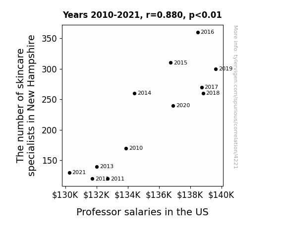
View details about correlation #4,221
The Face Value of Education: A Correlation Between Skincare Specialists in New Hampshire and Professor Salaries in the US
As the number of skincare specialists in New Hampshire increased, so did the demand for their services. This led to a flourishing spa industry, prompting affluent individuals to indulge in more frequent luxurious spa treatments. With their skin glowing and rejuvenated, these clients exuded a newfound aura of success, catching the attention of university officials nationwide. The persuasive power of impeccable, radiant skin could not be ignored, ultimately leading to higher salaries for professors across the US. After all, a luminous complexion is truly the secret to academic advancement!

What else correlates?
The number of skincare specialists in New Hampshire · all cccupations
Professor salaries in the US · all education
The number of skincare specialists in New Hampshire · all cccupations
Professor salaries in the US · all education


View details about correlation #3,543
The Nuclear-Hotdog Nexus: Unveiling the Unlikely Link Between Brazilian Nuclear Power Generation and Nathan's Hot Dog Eating Champion's Consumption
The increase in Nuclear power generation in Brazil led to a boost in the overall power of hot dog consumption around the world. As a result, the reigning champion at Nathan's Hot Dog Eating Competition felt the heat and had to up their game to relish the victory. It seems the connection between Brazil's nuclear power and Nathan's hot dog consumption is truly 'fission' for a win!


View details about correlation #3,812
S'mores Search and Air Pollution in Bozeman: A Beacon on the Correlation
The smog in Bozeman was giving off some serious s'more-like vibes, leading to a craving for that charred, gooey goodness. It's like the pollution was saying, "Let's add some 'flavor' to the air and really 'smoke out' those taste buds!"


What else correlates?
Air pollution in Bozeman, Montana · all weather
Google searches for 'Smores' · all google searches
Air pollution in Bozeman, Montana · all weather
Google searches for 'Smores' · all google searches


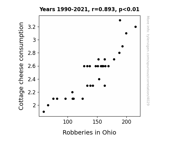
View details about correlation #4,029
Curd Consumption and Crime: Exploring the Curious Connection between Cottage Cheese and Robberies in Ohio
As people stopped snacking on cottage cheese, they found themselves less whey-stressed. This led to a feta state of mind, reducing the inclination to act colbytously and commit robberies. With a decrease in cottage cheese consumption, the curd was finally spreading peace instead of crimin-almond behavior.
What else correlates?
Cottage cheese consumption · all food
Robberies in Ohio · all random state specific
Cottage cheese consumption · all food
Robberies in Ohio · all random state specific


View details about correlation #4,500
The Thaddeus Tally: Tracing Traits of Thaddeus' Triumph in Tallying YouTube Likes
Thaddeus secretly patented a formula for creating the perfect algorithm for viral content. With every birth certificate, a small, but crucial piece of the code was unknowingly passed on, leading to an inexplicable surge in video appreciation. Thaddeus babies, unknowingly boosting internet fame one adorable gurgle at a time.


View details about correlation #2,855
Electrifying Economics: Exploring the Connection Between Electricity Generation in Burundi and Sales of LP/Vinyl Albums
As electricity generation in Burundi increased, more power was available to run old record players, leading to a surge in demand for LP/vinyl albums. This paved the way for a retro music renaissance, as people reconnected with the authentic sound of vinyl. The correlation can be attributed to a shocking yet groovy connection between generating electricity and sparking a vinyl revolution.


What else correlates?
Electricity generation in Burundi · all energy
Sales of LP/Vinyl Albums · all weird & wacky
Electricity generation in Burundi · all energy
Sales of LP/Vinyl Albums · all weird & wacky


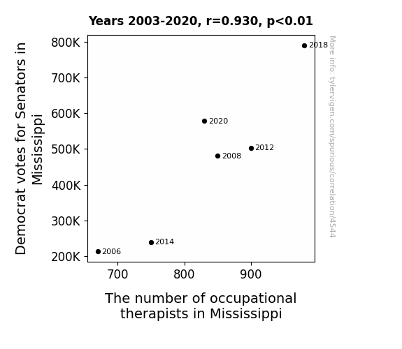
View details about correlation #4,544
Voting Left, Therapists Right: The Correlation Between Democrat Votes for Senators and Occupational Therapists in Mississippi
The increase in Democrat votes for Senators in Mississippi led to a rise in the state's morale. This, in turn, created a higher demand for occupational therapists to help people get back on their feet, both literally and figuratively. It's like they say, when it comes to uplifting moods and improving mobility, Mississippi knows how to put the "democra-therapy" in action!

Why this works
- Data dredging: I have 25,237 variables in my database. I compare all these variables against each other to find ones that randomly match up. That's 636,906,169 correlation calculations! This is called “data dredging.”
Fun fact: the chart used on the wikipedia page to demonstrate data dredging is also from me. I've been being naughty with data since 2014.
Instead of starting with a hypothesis and testing it, I instead tossed a bunch of data in a blender to see what correlations would shake out. It’s a dangerous way to go about analysis, because any sufficiently large dataset will yield strong correlations completely at random. - Lack of causal connection: There is probably no direct connection between these variables, despite what the AI says above.
Because these pages are automatically generated, it's possible that the two variables you are viewing are in fact causually related. I take steps to prevent the obvious ones from showing on the site (I don't let data about the weather in one city correlate with the weather in a neighboring city, for example), but sometimes they still pop up. If they are related, cool! You found a loophole.
This is exacerbated by the fact that I used "Years" as the base variable. Lots of things happen in a year that are not related to each other! Most studies would use something like "one person" in stead of "one year" to be the "thing" studied. - Observations not independent: For many variables, sequential years are not independent of each other. You will often see trend-lines form. If a population of people is continuously doing something every day, there is no reason to think they would suddenly change how they are doing that thing on January 1. A naive p-value calculation does not take this into account.
You will calculate a lower chance of "randomly" achieving the result than represents reality.
To be more specific: p-value tests are probability values, where you are calculating the probability of achieving a result at least as extreme as you found completely by chance. When calculating a p-value, you need to assert how many "degrees of freedom" your variable has. I count each year (minus one) as a "degree of freedom," but this is misleading for continuous variables.
This kind of thing can creep up on you pretty easily when using p-values, which is why it's best to take it as "one of many" inputs that help you assess the results of your analysis.
- Y-axes doesn't start at zero: I truncated the Y-axes of the graphs above. I also used a line graph, which makes the visual connection stand out more than it deserves.
Nothing against line graphs. They are great at telling a story when you have linear data! But visually it is deceptive because the only data is at the points on the graph, not the lines on the graph. In between each point, the data could have been doing anything. Like going for a random walk by itself!
Mathematically what I showed is true, but it is intentionally misleading. If you click on any of the charts that abuse this, you can scroll down to see a version that starts at zero. - Confounding variable: Confounding variables (like global pandemics) will cause two variables to look connected when in fact a "sneaky third" variable is influencing both of them behind the scenes.
- Outliers: Some datasets here have outliers which drag up the correlation.
In concept, "outlier" just means "way different than the rest of your dataset." When calculating a correlation like this, they are particularly impactful because a single outlier can substantially increase your correlation.
Because this page is automatically generated, I don't know whether any of the charts displayed on it have outliers. I'm just a footnote. ¯\_(ツ)_/¯
I intentionally mishandeled outliers, which makes the correlation look extra strong. - Low n: There are not many data points included in some of these charts.
You can do analyses with low ns! But you shouldn't data dredge with a low n.
Even if the p-value is high, we should be suspicious of using so few datapoints in a correlation.
Pro-tip: click on any correlation to see:
- Detailed data sources
- Prompts for the AI-generated content
- Explanations of each of the calculations (correlation, p-value)
- Python code to calculate it yourself


