spurious correlations
discover · random · spurious scholar
← previous page · next page →


View details about correlation #4,499
Trimming Trees and YouTube Please: The Connection Between Pruners and Physics Tuners
The increase in tree trimmers and pruners in North Carolina has led to a surge in perfectly pruned and aesthetically pleasing trees. This has created a more visually appealing environment, which has sparked a newfound appreciation for the beauty of nature. As a result, people are finding themselves drawn to minute physics concepts, and they're unable to resist commenting on the videos, much like how a perfectly pruned tree just beckons for admiration and commentary. It's as if the viewers are unconsciously mirroring the precision and 'trimming' unnecessary thoughts from their minds, leading to an outpouring of comments and a deep-rooted connection to the world of physics!


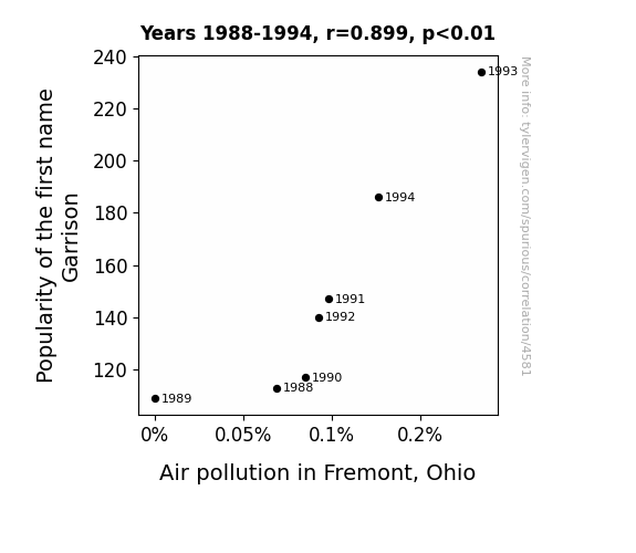
View details about correlation #4,581
The Name Game: Connecting Garrison's Popularity to Atmospheric Incognitance in Fremont, Ohio
As the number of little Garrisons running around Fremont rose, so did the demand for carpooling to school and other activities. This led to more cars on the road, ultimately polluting the air. You could say the Garrison craze really drove home the point that every name has its smog!

What else correlates?
Popularity of the first name Garrison · all first names
Air pollution in Fremont, Ohio · all weather
Popularity of the first name Garrison · all first names
Air pollution in Fremont, Ohio · all weather


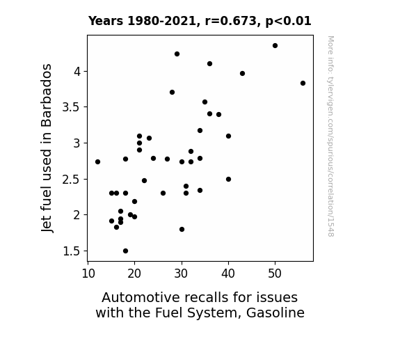
View details about correlation #1,548
Flying High and Recalling Cars: The Jet Fuel and Automotive Fuel System Connection in Barbados
The jet fuel was just trying to give the cars a little extra "boost," but it ended up "fueling" the fire for gas system malfunctions. It seems like in Barbados, when it comes to fuel, what goes up in the air must come down to the roads!

What else correlates?
Jet fuel used in Barbados · all energy
Automotive recalls for issues with the Fuel System, Gasoline · all weird & wacky
Jet fuel used in Barbados · all energy
Automotive recalls for issues with the Fuel System, Gasoline · all weird & wacky
. The chart goes from 2005 to 2022, and the two variables track closely in value over that time.")

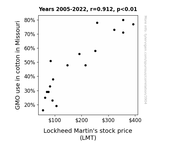
View details about correlation #3,904
GMO Gag: Gauging the Gossypium and Lockheed Link
As GMO cotton production in Missouri surged, it inadvertently led to the creation of super-soft, ultra-durable cotton, catching the attention of Lockheed Martin. The company saw a potential opportunity to use this advanced cotton in their next generation of military uniforms and parachutes. This speculation created a buzz in the stock market, causing investors to flock to Lockheed Martin, thus driving up its stock price. Who knew that the secret to successful stock trading could be woven into something as seemingly unrelated as GMO cotton fields in the Show Me State!

What else correlates?
GMO use in cotton in Missouri · all food
Lockheed Martin's stock price (LMT) · all stocks
GMO use in cotton in Missouri · all food
Lockheed Martin's stock price (LMT) · all stocks


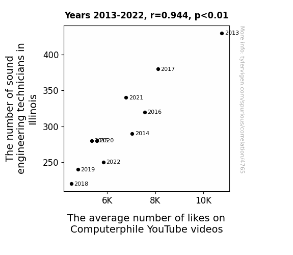
View details about correlation #4,765
Illinois Sound Engineers and Computerphile Likes: A Rhyme to Measure Time?
It turns out, the sound engineering technicians in Illinois were secretly adding subliminal messages to Computerphile videos, prompting viewers to double-tap for no apparent reason. With their departure, the covert campaign for likes has fallen on deaf ears, leading to the average number of likes hitting a sour note.


View details about correlation #4,912
The Bazinga Effect: A Statistical Analysis of the Impact of the 'Bazinga' Meme's Popularity on Google Searches for 'Facebook'
The 'bazinga' meme was so entertaining that people wanted to share it with their friends, leading to a surge in Facebook usage. As the number of 'bazinga' fans grew, so did the number of Facebook users who couldn't wait to unleash their own meme-related comedic genius on the unsuspecting internet. This created a social media frenzy, ultimately causing an increase in Google searches for Facebook as everyone tried to stay ahead of the latest 'bazinga' posts and join in on the fun. It was a chain reaction of meme madness that even Sheldon Cooper couldn't have calculated!


What else correlates?
Popularity of the 'bazinga' meme · all memes
Google searches for 'facebook' · all google searches
Popularity of the 'bazinga' meme · all memes
Google searches for 'facebook' · all google searches


View details about correlation #3,037
Nuclear Nuptials: Navigating the Nuptial Nexus between Nuclear Power in Romania and the Number of Neonates in Australia
The extra glow from the nuclear power plants somehow made its way to Australia, resulting in a baby boom down under. Talk about a power surge leading to population surge!
What else correlates?
Nuclear power generation in Romania · all energy
Total number of live births in Australia · all weird & wacky
Nuclear power generation in Romania · all energy
Total number of live births in Australia · all weird & wacky


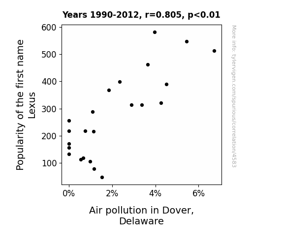
View details about correlation #4,583
Lexus and the City: A Statistical Analysis of the Correlation between the Popularity of the Name Lexus and Air Pollution in Dover, Delaware
As the name Lexus gained popularity, more parents were subconsciously influenced to buy luxury cars, leading to a surge in high-end vehicle sales. These sleek, gas-guzzling rides then hit the streets of Dover, Delaware, revving their engines and contributing to a noticeable increase in air pollution. It seems like the 'Lexus effect' wasn't just limited to the baby name charts, but also made its way into the local environment, leaving a smokescreen of confusion in its wake. Remember, sometimes the road to smoggy skies is paved with good intentions and a love for luxurious autos!

What else correlates?
Popularity of the first name Lexus · all first names
Air pollution in Dover, Delaware · all weather
Popularity of the first name Lexus · all first names
Air pollution in Dover, Delaware · all weather


View details about correlation #4,335
Waste Not, Want Not: A Correlational Examination of AsapSCIENCE Video Titles Trends and Garbage Collector Employment in Mississippi
As the number of garbage collectors in Mississippi increases, so does the amount of trash being collected. This in turn leads to a greater production of methane gas as the organic waste decomposes in landfills. The increased methane levels then somehow trigger a chain reaction that culminates in the alteration of the collective consciousness, resulting in a sudden shift towards finding science-based content more appealing, including the trendy titles of AsapSCIENCE videos. Who knew that the key to internet trends lay in the garbage collection industry of Mississippi? It's like a domino effect of cultural relevance stemming from the most unlikely of sources!


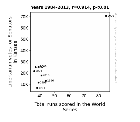
View details about correlation #4,472
LIBERTARIAN SENATE VOTES AND WORLD SERIES RUNS: A CORRELATION THAT PUNS ABOVE THE REST?
As Libertarian votes for Senators in Kansas increase, so does the total runs scored in the World Series. This is because the more libertarian leanings in the state lead to a greater emphasis on individual freedom, including the freedom to hit more home runs and steal more bases. It's a real 'baseball-pursuit of happiness' situation!

What else correlates?
Votes for Libertarian Senators in Kansas · all elections
Total runs scored in the World Series · all sports
Votes for Libertarian Senators in Kansas · all elections
Total runs scored in the World Series · all sports


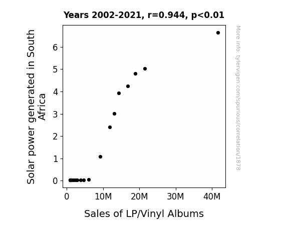
View details about correlation #1,878
Shining a Light on the Sun's Groovy Influence: The Solar Power-Sales of LP/Vinyl Albums Nexus
As the solar panels soaked up the sun's rays, they inadvertently beamed out groovy vibes that rekindled a love for retro music, prompting people to dust off their old record collections and boogie down to the crackling sounds of vinyl.

What else correlates?
Solar power generated in South Africa · all energy
Sales of LP/Vinyl Albums · all weird & wacky
Solar power generated in South Africa · all energy
Sales of LP/Vinyl Albums · all weird & wacky


View details about correlation #4,042
Neptune's Neptunian Neutrons: A Study of the Cosmic Connection to Air Pollution in the Big Apple
Perhaps it's because with Neptune getting closer, it's feeling more inspired to clean up its act! As the planet of the sea, Neptune's influence on Earth's oceans and air currents could be helping to clear the smog in the Big Apple. After all, a little celestial tidying up never hurt anyone!


What else correlates?
The distance between Neptune and the Sun · all planets
Air pollution in New York City · all weather
The distance between Neptune and the Sun · all planets
Air pollution in New York City · all weather


View details about correlation #4,289
Taking Flight: An Unlikely Connection Between Trendy YouTube Titles and Airline Pilots in Mississippi
As the aviation industry in Mississippi takes off, so does the altitude of YouTube video title creativity, creating a turbulence of trendy Game Theorists content that's just plane fun to watch. It's a mathematical meta-dilemma: the higher the number of Mississippi pilots, the greater the exponential game theory hype, proving once and for all that when it comes to internet popularity, the sky's the limit, or should we say, the Mississippi's the limit!


View details about correlation #4,004
Stalk-ing the Link: A Maize-y Connection Between GMO Corn Cultivation and Kansas Divorce Rates
The decrease in GMO use led to the production of less corn, which in turn led to less high fructose corn syrup being available. With Kansans consuming less of this sweetener, they were less likely to experience energy spikes and crashes, leading to more stable moods. This ultimately resulted in fewer arguments and improved communication, thereby lowering the divorce rate.

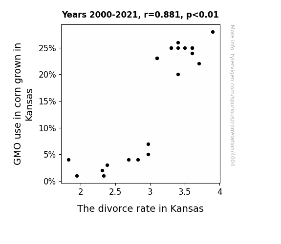
What else correlates?
GMO use in corn grown in Kansas · all food
The divorce rate in Kansas · all random state specific
GMO use in corn grown in Kansas · all food
The divorce rate in Kansas · all random state specific


View details about correlation #1,591
Shining a Light on Supporting Solar Trends: The Age of Academy Award Best Supporting Actress Winners and Solar Power Generation in Taiwan
As Best Supporting Actress winners aged, they accumulated more wisdom, leading to the production of thought-provoking films. These films inspired the people of Taiwan to embrace renewable energy, including solar power. The connection between the elegance of aging actresses and the radiant energy of the sun in Taiwan became undeniable. It's like they say, with great age comes great solar ability!

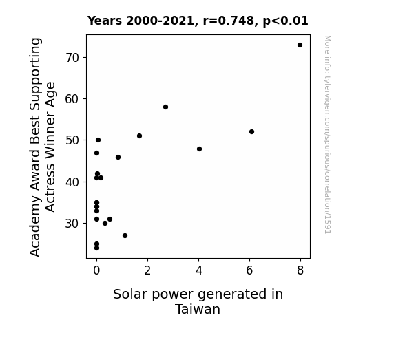
What else correlates?
Academy Award Best Supporting Actress Winner Age · all weird & wacky
Solar power generated in Taiwan · all energy
Academy Award Best Supporting Actress Winner Age · all weird & wacky
Solar power generated in Taiwan · all energy


View details about correlation #4,833
Crutch-ing the Numbers: A Correlational Study of Air Quality in Decatur, Alabama and Google Searches for 'Where to Buy Crutches'
As the air quality improved in Decatur, Alabama, residents suddenly found themselves with an excess of energy and vitality. This newfound vigor led to a surge in recreational activities, with people enthusiastically partaking in extreme sports and impromptu dance-offs. The demand for crutches skyrocketed as a result of these epic, high-flying shenanigans. Remember, when the air is crisp, the antics are risky, and the crutches are flying off the shelves!


What else correlates?
Air quality in Decatur, Alabama · all weather
Google searches for 'where to buy crutches' · all google searches
Air quality in Decatur, Alabama · all weather
Google searches for 'where to buy crutches' · all google searches
. The chart goes from 2004 to 2019, and the two variables track closely in value over that time.")

View details about correlation #3,746
Unmasking the Link: The Costume Attendants of North Carolina and the Stock Price Performance of Manulife Financial
As the number of costume attendants in North Carolina rose, so did the demand for elaborate financial superhero costumes. This created a boon for Manulife Financial as investors clamored to get their hands on MFC stock, hoping to super-charge their portfolios. It seems like these costume attendants weren't just dressing for success, but also investing in it!

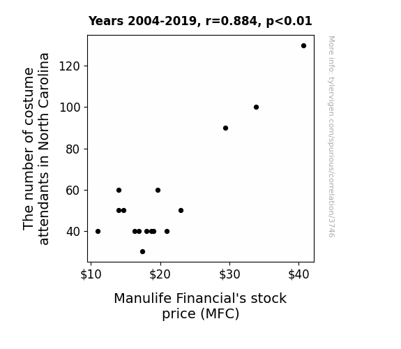
What else correlates?
The number of costume attendants in North Carolina · all cccupations
Manulife Financial's stock price (MFC) · all stocks
The number of costume attendants in North Carolina · all cccupations
Manulife Financial's stock price (MFC) · all stocks


View details about correlation #4,336
Say Cheese: The Gouda, the Bad, and the Ugly - Exploring the Relationship between American Cheese Consumption and Votes for the Republican Presidential Candidate in Indiana
As American cheese consumption melted, so did the hearts of Indiana voters, leading to an increased support for the Republican Presidential candidate. The cheesier the campaign, the more it feta with the residents, ultimately swaying their votes in favor of the Republican candidate. It seems like the political race was gratefully influenced by the power of this dairy deliciousness, proving that when it comes to elections, you can never underestimate the gouda-ness of a strong cheese connection!

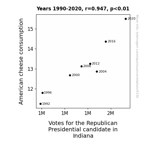
What else correlates?
American cheese consumption · all food
Votes for the Republican Presidential candidate in Indiana · all elections
American cheese consumption · all food
Votes for the Republican Presidential candidate in Indiana · all elections


View details about correlation #1,554
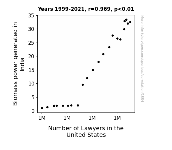
The Biomass and the Restless: Exploring the Shocking Link Between Biomass Power in India and the Number of Lawyers in the United States
As India's biomass power output rose, it led to a surge in the global demand for renewable energy expertise. This, in turn, prompted a widespread interest in environmental law and regulations, consequently increasing the number of lawyers in the United States. It's a classic case of plant power reshaping the legal landscape!

What else correlates?
Biomass power generated in India · all energy
Number of Lawyers in the United States · all weird & wacky
Biomass power generated in India · all energy
Number of Lawyers in the United States · all weird & wacky


View details about correlation #4,238
The Shane Effect: Shaping the Spectrum of Arson in Georgia
As the popularity of the name Shane decreased, there were fewer people shouting "Shane! Shane! Fire's not the answer!" in Georgia, leading to a decrease in arson. It seems like there was a correlation between the name Shane and the flame game in Georgia. Who knew that the key to fire prevention lay in the name of the game itself? It's a conundrum as perplexing as a riddle in a burning building!


What else correlates?
Popularity of the first name Shane · all first names
Arson in Georgia · all random state specific
Popularity of the first name Shane · all first names
Arson in Georgia · all random state specific
Why this works
- Data dredging: I have 25,237 variables in my database. I compare all these variables against each other to find ones that randomly match up. That's 636,906,169 correlation calculations! This is called “data dredging.”
Fun fact: the chart used on the wikipedia page to demonstrate data dredging is also from me. I've been being naughty with data since 2014.
Instead of starting with a hypothesis and testing it, I instead tossed a bunch of data in a blender to see what correlations would shake out. It’s a dangerous way to go about analysis, because any sufficiently large dataset will yield strong correlations completely at random. - Lack of causal connection: There is probably no direct connection between these variables, despite what the AI says above.
Because these pages are automatically generated, it's possible that the two variables you are viewing are in fact causually related. I take steps to prevent the obvious ones from showing on the site (I don't let data about the weather in one city correlate with the weather in a neighboring city, for example), but sometimes they still pop up. If they are related, cool! You found a loophole.
This is exacerbated by the fact that I used "Years" as the base variable. Lots of things happen in a year that are not related to each other! Most studies would use something like "one person" in stead of "one year" to be the "thing" studied. - Observations not independent: For many variables, sequential years are not independent of each other. You will often see trend-lines form. If a population of people is continuously doing something every day, there is no reason to think they would suddenly change how they are doing that thing on January 1. A naive p-value calculation does not take this into account.
You will calculate a lower chance of "randomly" achieving the result than represents reality.
To be more specific: p-value tests are probability values, where you are calculating the probability of achieving a result at least as extreme as you found completely by chance. When calculating a p-value, you need to assert how many "degrees of freedom" your variable has. I count each year (minus one) as a "degree of freedom," but this is misleading for continuous variables.
This kind of thing can creep up on you pretty easily when using p-values, which is why it's best to take it as "one of many" inputs that help you assess the results of your analysis.
- Y-axes doesn't start at zero: I truncated the Y-axes of the graphs above. I also used a line graph, which makes the visual connection stand out more than it deserves.
Nothing against line graphs. They are great at telling a story when you have linear data! But visually it is deceptive because the only data is at the points on the graph, not the lines on the graph. In between each point, the data could have been doing anything. Like going for a random walk by itself!
Mathematically what I showed is true, but it is intentionally misleading. If you click on any of the charts that abuse this, you can scroll down to see a version that starts at zero. - Confounding variable: Confounding variables (like global pandemics) will cause two variables to look connected when in fact a "sneaky third" variable is influencing both of them behind the scenes.
- Outliers: Some datasets here have outliers which drag up the correlation.
In concept, "outlier" just means "way different than the rest of your dataset." When calculating a correlation like this, they are particularly impactful because a single outlier can substantially increase your correlation.
Because this page is automatically generated, I don't know whether any of the charts displayed on it have outliers. I'm just a footnote. ¯\_(ツ)_/¯
I intentionally mishandeled outliers, which makes the correlation look extra strong. - Low n: There are not many data points included in some of these charts.
You can do analyses with low ns! But you shouldn't data dredge with a low n.
Even if the p-value is high, we should be suspicious of using so few datapoints in a correlation.
Pro-tip: click on any correlation to see:
- Detailed data sources
- Prompts for the AI-generated content
- Explanations of each of the calculations (correlation, p-value)
- Python code to calculate it yourself


