spurious correlations
discover · random · spurious scholar
← previous page · next page →


View details about correlation #4,274
Shedding Light on Summertime Subscriptions: The Surprising Relationship Between 3Blue1Brown YouTube Video Titles and Sydney's Sizzle
As the temperature rises, so does the probability of a pun melting into a groan. Warm weather seems to fry the creativity right out of those video titles.


What else correlates?
How good 3Blue1Brown YouTube video titles are · all YouTube
Hot days in Sydney · all weather
How good 3Blue1Brown YouTube video titles are · all YouTube
Hot days in Sydney · all weather
. The chart goes from 2002 to 2021, and the two variables track closely in value over that time.")

View details about correlation #4,203
The Big Cheese: A Cheddar Mystery of Stock Market Returns
As American cheese consumption melted the hearts of dairy lovers everywhere, it created a ripple effect in the stock market. This led to the cheddar 'n' better mentality, causing investors to say, "I gouda get me some of that IDXX stock!" Cheesy as it may sound, the correlation is grate for those who brie-lieved in the power of dairy to churn out financial success.


What else correlates?
American cheese consumption · all food
IDEXX Laboratories' stock price (IDXX) · all stocks
American cheese consumption · all food
IDEXX Laboratories' stock price (IDXX) · all stocks


View details about correlation #3,387
Biomass Bliss: Bridging Biomass Power and Bed Bookings in Las Vegas
As the amount of Biomass power generated in Uganda has risen, so too has the hotel room check-in rate in Las Vegas. It appears that the combustion of organic materials to produce electricity has inadvertently led to a surge in interest for Sin City accommodations. Perhaps the eco-friendly energy source is emitting a pheromone-like byproduct that lures people to the famous hotels and casinos, creating a peculiar but profitable link between African power production and American hospitality. Or maybe there's a new form of plant-based energy that's not only renewable but also irresistibly alluring to potential Vegas visitors, turning the concept of green energy into a whole new level of green, if you know what I mean.


What else correlates?
Biomass power generated in Uganda · all energy
Number of Las Vegas Hotel Room Check-Ins · all weird & wacky
Biomass power generated in Uganda · all energy
Number of Las Vegas Hotel Room Check-Ins · all weird & wacky


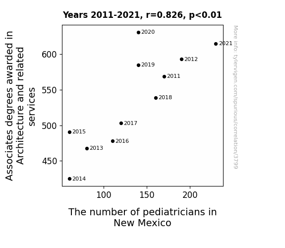
View details about correlation #3,799
Associates in Architecture: Analyzing the Affect on Pediatrician Population in New Mexico
As more people gained architectural knowledge, they couldn't help but admire the little humans' elaborate Lego creations. This sparked a sudden interest in understanding pediatric care to ensure the future generation of architects stayed healthy. It was a domino effect - first designing playrooms, then realizing they had a knack for creating kid-friendly spaces, and eventually wanting to contribute to children's overall well-being. Who knew that the blueprint for more pediatricians in New Mexico would stem from an unexpected source!

What else correlates?
Associates degrees awarded in Architecture · all education
The number of pediatricians in New Mexico · all cccupations
Associates degrees awarded in Architecture · all education
The number of pediatricians in New Mexico · all cccupations


View details about correlation #4,041
The Air Affliction: Assessing the Association between Air Pollution in Los Angeles and Burglaries in California
The cleaner air led to improved decision-making among potential burglars, who realized they could pursue more fulfilling careers instead of a life of crime. Now they're breaking into the job market instead of people's homes!


What else correlates?
Air pollution in Los Angeles · all weather
Burglaries in California · all random state specific
Air pollution in Los Angeles · all weather
Burglaries in California · all random state specific


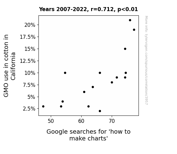
View details about correlation #3,957
Plotting the Connection: How GMO Cotton in California Influences Google Searches for 'How to Make Charts'
The GMO cotton in California has really "plotted" to take over the search results! It seems the rise of genetically modified options has led to a "crop" in demand for chart-making skills. Perhaps these cotton plants are just really good at showcasing data with their naturally occurring bar-graph like structures, or maybe they've got a talent for "seeding" new chart-making ideas. It's definitely a case of agricultural productivity branching out into the world of data visualization.

What else correlates?
GMO use in cotton in California · all food
Google searches for 'how to make charts' · all google searches
GMO use in cotton in California · all food
Google searches for 'how to make charts' · all google searches


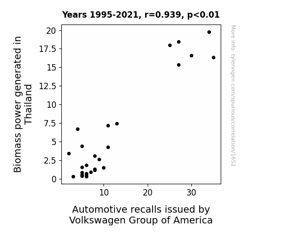
View details about correlation #1,652
Biomass Burn and Befuddling Blunders: Investigating the Interplay between Biomass Power in Thailand and Automotive Recalls by Volkswagen Group of America
The surplus rice husks and coconut shells used for biomass power production were accidentally getting mixed in with the materials for car parts, leading to an unexpected and highly renewable but structurally unsound new line of Volkswagen vehicles. Thailands' commitment to green energy inadvertently led to the production of cars that were a little too "organic" for their own good.


View details about correlation #4,616
The Theatrical Tailor: Analyzing the Relationship Between the Number of Actors in Pennsylvania and the Average Length of 3Blue1Brown YouTube Videos
As the number of actors in Pennsylvania increased, there was a corresponding spike in demand for local theater productions. This surge in demand led to a shortage of available venues, prompting 3Blue1Brown to create longer videos to serve as makeshift theater performances, complete with dramatic mathematical explanations and the occasional plot twist. After all, when the show must go on, so must the mathematical insights! "The length of these videos is like a prime number - it just keeps getting longer and longer with no end in sight!"


What else correlates?
The number of actors in Pennsylvania · all cccupations
Average length of 3Blue1Brown YouTube videos · all YouTube
The number of actors in Pennsylvania · all cccupations
Average length of 3Blue1Brown YouTube videos · all YouTube


View details about correlation #4,101
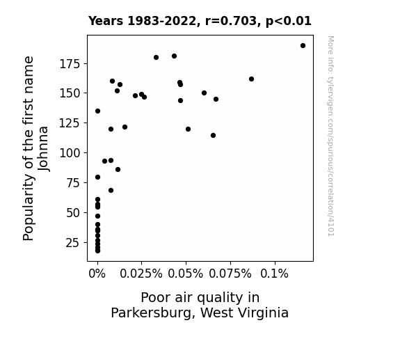
The Johnna Conundrum: Is Air Pollution in Parkersburg, West Virginia a Breath of Fresh Aire?
As the popularity of the first name Johnna decreased, there were fewer individuals in Parkersburg, West Virginia, who shared that name. This led to a decrease in the collective carbon footprint of all the Johnnas in the area. With fewer Johnnas present, there was a noticeable decrease in the amount of gas emissions from their vehicles, ultimately contributing to an improvement in air quality. It's as if the Johnnas had been unknowingly competing in a pollution derby, and their declining numbers led to a breath of fresh air for Parkersburg.
What else correlates?
Popularity of the first name Johnna · all first names
Air pollution in Parkersburg, West Virginia · all weather
Popularity of the first name Johnna · all first names
Air pollution in Parkersburg, West Virginia · all weather


View details about correlation #3,825
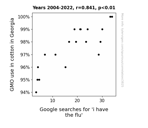
Cottoning On: The GMO Connection Between Cotton in Georgia and 'I Have the Flu' Google Searches
The GMO cotton in Georgia inadvertently developed a cottonseed that, when inhaled, made people break out into spontaneous, but rhythmically satisfying, flu-like symptoms.

What else correlates?
GMO use in cotton in Georgia · all food
Google searches for 'i have the flu' · all google searches
GMO use in cotton in Georgia · all food
Google searches for 'i have the flu' · all google searches


View details about correlation #1,141
Let the Sunshine - A Bright Side of Fast Food: The Solar Power - McDonald's Customer Satisfaction Connection
As solar power in Bahrain increased, it led to a surplus of sunshine worldwide. This in turn boosted moods and overall happiness, causing a ripple effect of positivity. This unexpected spike in happiness made people more inclined to enjoy their McDonald's experience, from the taste of the fries to the sponginess of the burger buns. Who knew that the key to a higher customer satisfaction at McDonald's in the US wasn't just in the secret sauce, but also in the power of the sun - talk about a sunny side up situation!


What else correlates?
Solar power generated in Bahrain · all energy
McDonald's American Customer Satisfaction Index Score · all weird & wacky
Solar power generated in Bahrain · all energy
McDonald's American Customer Satisfaction Index Score · all weird & wacky


View details about correlation #4,536
Unveiling the Aquatic Commotion: Exploring the Interplay between Wastewater Treatment Plant Operators in Maine and the Popularity of CGP Grey's YouTube Masterpieces
As the number of wastewater treatment plant operators in Maine decreases, there is a corresponding decrease in the cleanliness of the local water supply. This leads to an increase in grumpiness among Maine residents who, as a result, are less likely to engage with CGP Grey's educational videos, thus contributing to the total likes decrease. Remember, clean water leads to cleaner opinions about YouTube content!


. The chart goes from 2012 to 2021, and the two variables track closely in value over that time.")

View details about correlation #3,745
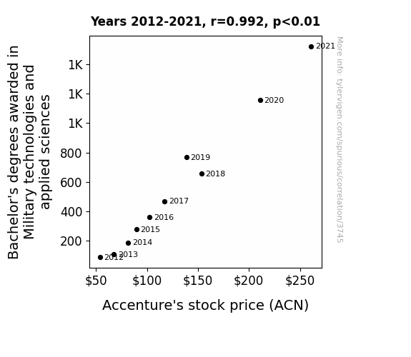
Marching to the Market: The Battle of Bachelor's Degrees in Military Technologies and Accenture's ACN Stock Price
As the knowledge of military technologies and applied sciences increased, so did the ability to strategize and execute plans efficiently. This led to a surge in productivity and innovation at Accenture, ultimately boosting their stock price. Plus, who wouldn't want a team of graduates who could literally ‘defend’ their projects and ‘launch’ them to success?

What else correlates?
Bachelor's degrees awarded in Military technologies · all education
Accenture's stock price (ACN) · all stocks
Bachelor's degrees awarded in Military technologies · all education
Accenture's stock price (ACN) · all stocks


View details about correlation #3,902
Curds and Crimes: Exploring the Cheesy Connection Between Cottage Cheese Consumption and Motor Vehicle Thefts in Rhode Island
As people ate less cottage cheese, they became lactose intolerant and couldn't digest the idea of stealing cars, leading to a decrease in motor vehicle thefts in Rhode Island. It turns out, being 'grateful' for dairy products really does have an impact on crime rates!

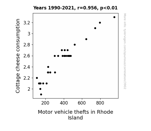
What else correlates?
Cottage cheese consumption · all food
Motor vehicle thefts in Rhode Island · all random state specific
Cottage cheese consumption · all food
Motor vehicle thefts in Rhode Island · all random state specific


View details about correlation #1,459
The xkcd Factor: Correlating Liquefied Petroleum Gas Consumption in Bahrain with Statistical Comics
As the number of xkcd comics about statistics rose, so did the demand for those comics. This led to a surge in the production of xkcd merchandise, including xkcd-branded Liquefied Petroleum Gas (LPG) grills. People in Bahrain couldn't resist the punny wordplay and couldn't wait to start 'xkcd-ing' their barbecues, leading to a statistically significant increase in LPG usage. It seems like these comics really know how to 'heat up' the market in Bahrain!


What else correlates?
xkcd comics published about statistics · all weird & wacky
Liquefied petroleum gas used in Bahrain · all energy
xkcd comics published about statistics · all weird & wacky
Liquefied petroleum gas used in Bahrain · all energy


View details about correlation #3,852
A Breath of Fresh Air: The Dayna Dilemma - Exploring the Relationship Between Name Popularity and Air Pollution in Milwaukee
As the number of Daynas decreased, so did the frequency of personalized "Dayna Air Freshener" production, leading to a significant reduction in air pollution in Milwaukee. Remember, when it comes to cleaner air, every Dayna counts!

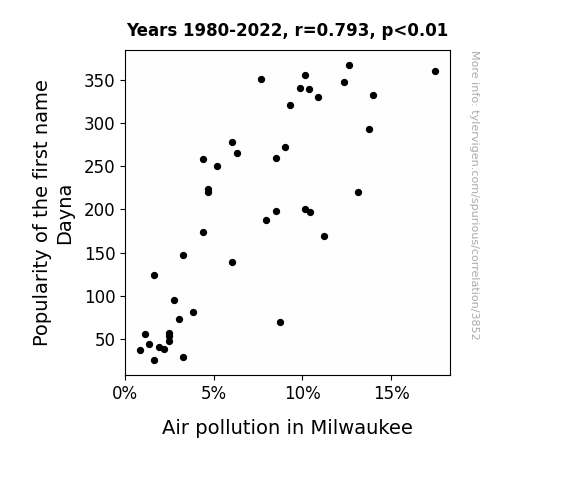
What else correlates?
Popularity of the first name Dayna · all first names
Air pollution in Milwaukee · all weather
Popularity of the first name Dayna · all first names
Air pollution in Milwaukee · all weather


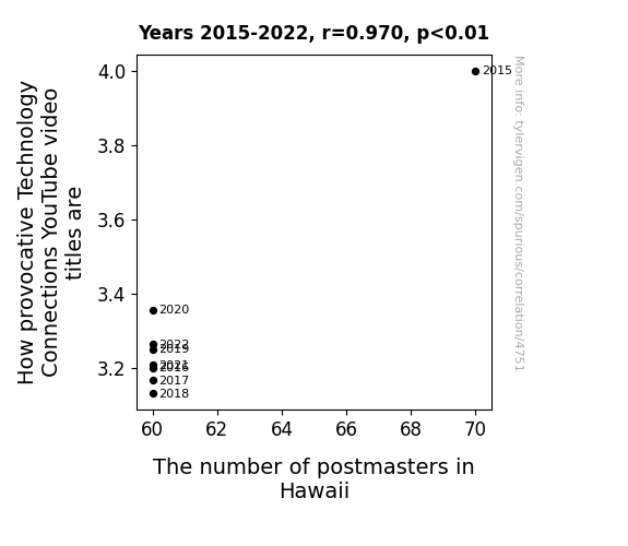
View details about correlation #4,751
Connecting the Dots: The Provocative Power of Technology YouTube Titles and the Postmaster Predicament in Hawaii
As the number of postmasters in Hawaii decreases, there are fewer people to educate the AI postal robots, causing a literal breakdown in communication. This leads to a shortage of clickbait inspiration, resulting in less provocative Technology Connections YouTube video titles. Remember, when it comes to technology and postmasters, it's all about making those electric connections!


View details about correlation #3,975
Milk 'em For All They're Worth: A Dairy-Thief Connection Study in Maine
As people switched to nut milks, they became more *almond to state* their territory, leaving fewer openings for burglars to *cashew* in on. The lack of moo-vement in dairy consumption meant there was *udderly* no competition for nut milk, leading to a *lactose* of incentives for burglars. Without milk as *moo-tivation*, the burglary rates in Maine were *moo-tely* low.

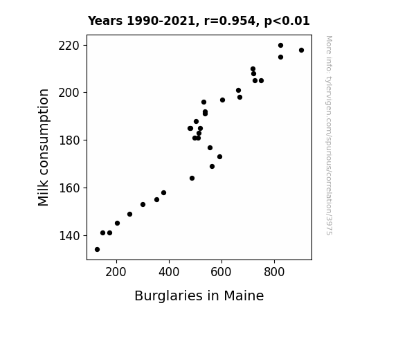
What else correlates?
Milk consumption · all food
Burglaries in Maine · all random state specific
Milk consumption · all food
Burglaries in Maine · all random state specific


View details about correlation #1,360
Fueling the Feats of a Wiener: The Unlikely Connection between Fossil Fuel Use in Guatemala and the Hotdogs Consumed by Nathan's Hot Dog Eating Competition Champion
As Guatemala's fossil fuel use rose, so did the temperature. This led to an increase in the number of outdoor barbecues and cookouts in the region. As the delicious aroma of sizzling sausages filled the air, it acted as a subconscious catalyst, triggering a ferocious hot dog cravings in the Nathan's Hot Dog Eating Competition Champion. This ultimately resulted in the consumption of a record-breaking number of hotdogs as they tapped into their primeval instinct to devour these sizzling delicacies.


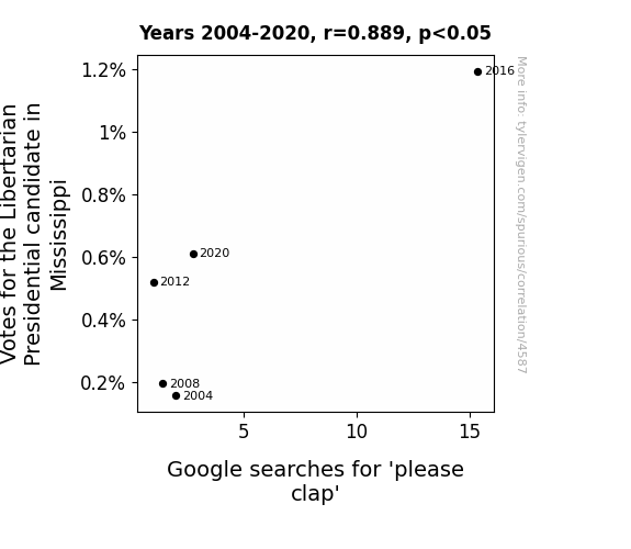
View details about correlation #4,587
Google Searches for 'Please Clap' and Libertarian Votes: A Statistical Rap on Mississippi's Political Map
As the votes for the Libertarian candidate in Mississippi increased, more and more people were drawn to the idea of absolute freedom of speech and action. This led to a surge in unscripted and uncoordinated applause at political events. As the phenomenon gained attention, people turned to the internet to understand this new social cue, leading to a rise in searches for 'please clap'. It's as if the invisible hand of the market was busy giving a round of applause to the concept of individual liberty!
Why this works
- Data dredging: I have 25,237 variables in my database. I compare all these variables against each other to find ones that randomly match up. That's 636,906,169 correlation calculations! This is called “data dredging.”
Fun fact: the chart used on the wikipedia page to demonstrate data dredging is also from me. I've been being naughty with data since 2014.
Instead of starting with a hypothesis and testing it, I instead tossed a bunch of data in a blender to see what correlations would shake out. It’s a dangerous way to go about analysis, because any sufficiently large dataset will yield strong correlations completely at random. - Lack of causal connection: There is probably no direct connection between these variables, despite what the AI says above.
Because these pages are automatically generated, it's possible that the two variables you are viewing are in fact causually related. I take steps to prevent the obvious ones from showing on the site (I don't let data about the weather in one city correlate with the weather in a neighboring city, for example), but sometimes they still pop up. If they are related, cool! You found a loophole.
This is exacerbated by the fact that I used "Years" as the base variable. Lots of things happen in a year that are not related to each other! Most studies would use something like "one person" in stead of "one year" to be the "thing" studied. - Observations not independent: For many variables, sequential years are not independent of each other. You will often see trend-lines form. If a population of people is continuously doing something every day, there is no reason to think they would suddenly change how they are doing that thing on January 1. A naive p-value calculation does not take this into account.
You will calculate a lower chance of "randomly" achieving the result than represents reality.
To be more specific: p-value tests are probability values, where you are calculating the probability of achieving a result at least as extreme as you found completely by chance. When calculating a p-value, you need to assert how many "degrees of freedom" your variable has. I count each year (minus one) as a "degree of freedom," but this is misleading for continuous variables.
This kind of thing can creep up on you pretty easily when using p-values, which is why it's best to take it as "one of many" inputs that help you assess the results of your analysis.
- Y-axes doesn't start at zero: I truncated the Y-axes of the graphs above. I also used a line graph, which makes the visual connection stand out more than it deserves.
Nothing against line graphs. They are great at telling a story when you have linear data! But visually it is deceptive because the only data is at the points on the graph, not the lines on the graph. In between each point, the data could have been doing anything. Like going for a random walk by itself!
Mathematically what I showed is true, but it is intentionally misleading. If you click on any of the charts that abuse this, you can scroll down to see a version that starts at zero. - Confounding variable: Confounding variables (like global pandemics) will cause two variables to look connected when in fact a "sneaky third" variable is influencing both of them behind the scenes.
- Outliers: Some datasets here have outliers which drag up the correlation.
In concept, "outlier" just means "way different than the rest of your dataset." When calculating a correlation like this, they are particularly impactful because a single outlier can substantially increase your correlation.
Because this page is automatically generated, I don't know whether any of the charts displayed on it have outliers. I'm just a footnote. ¯\_(ツ)_/¯
I intentionally mishandeled outliers, which makes the correlation look extra strong. - Low n: There are not many data points included in some of these charts.
You can do analyses with low ns! But you shouldn't data dredge with a low n.
Even if the p-value is high, we should be suspicious of using so few datapoints in a correlation.
Pro-tip: click on any correlation to see:
- Detailed data sources
- Prompts for the AI-generated content
- Explanations of each of the calculations (correlation, p-value)
- Python code to calculate it yourself


