spurious correlations
discover · random · spurious scholar
← previous page · next page →


View details about correlation #4,590
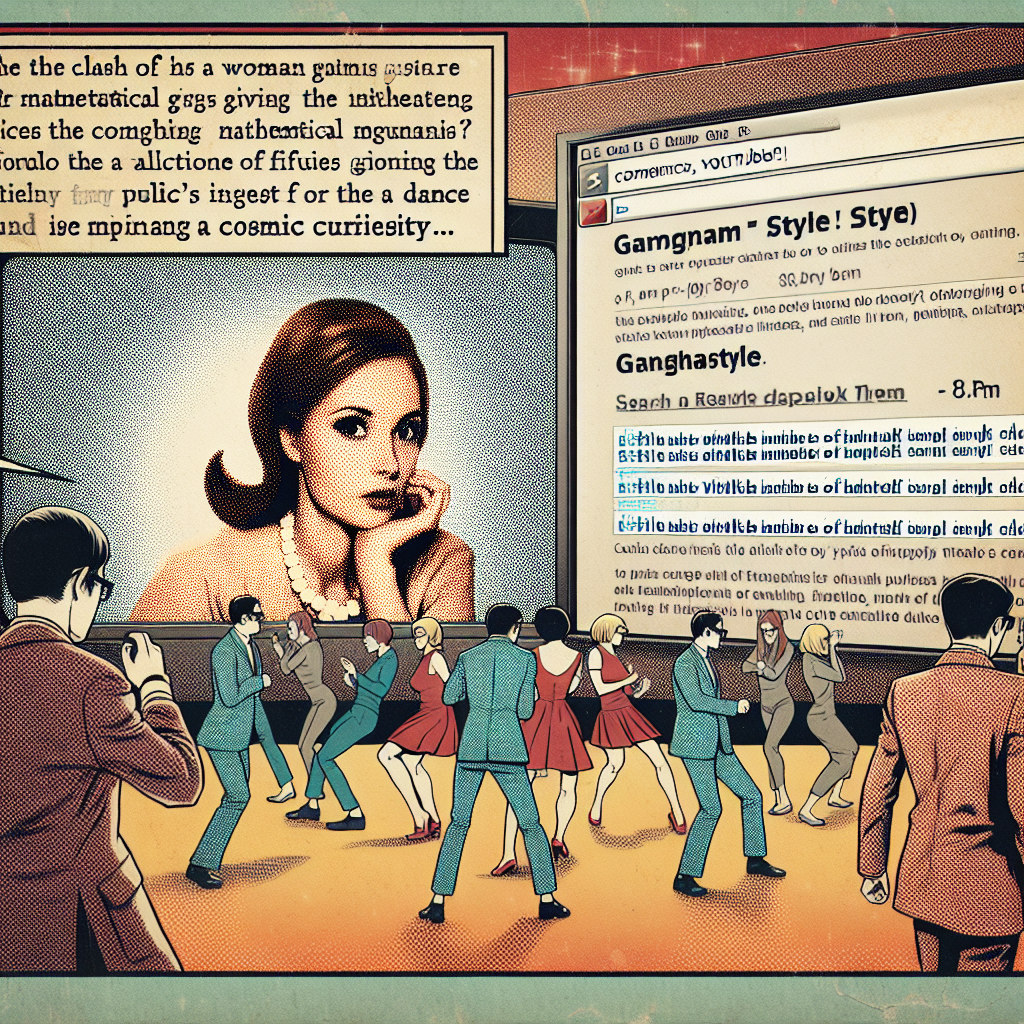
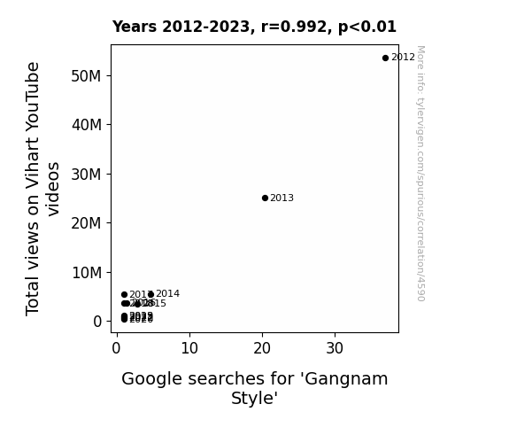
YouTube Views and Gangnam Style Cues: A Rhyme in Time
Vihart's mathematical musings inadvertently led to a formula for anti-Gangnam Style dance moves, creating a paradoxical YouTube black hole of uncoolness. Remember folks, math can be a dance destroyer!
What else correlates?
Total views on Vihart's YouTube videos · all YouTube
Google searches for 'Gangnam Style' · all google searches
Total views on Vihart's YouTube videos · all YouTube
Google searches for 'Gangnam Style' · all google searches


View details about correlation #4,145
Breaking Down the Numbers: The Burglar's Bounty - A Tale of Payroll and Timekeeping Clerks in Alabama
As burglaries in Alabama decreased, the demand for payroll and timekeeping clerks also decreased because there were fewer stolen hours for them to track. Looks like even the job market is affected by a lack of crime time!


What else correlates?
Burglaries in Alabama · all random state specific
The number of payroll and timekeeping clerks in Alabama · all cccupations
Burglaries in Alabama · all random state specific
The number of payroll and timekeeping clerks in Alabama · all cccupations


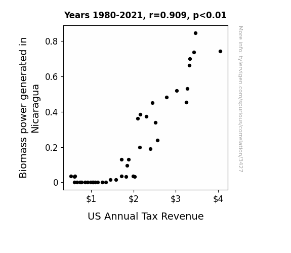
View details about correlation #3,427
Biodolla$: The Biomass Bridge Between Nicaragua and US Annual Tax Revenue
The influx of green energy from Nicaragua sparked a surge in economic activity in the US, leading to higher business profits and individual incomes. This caused a photosynthesis of wealth, and as we all know, where there's muck, there's brass! The tax revenue sprouted like weeds in a garden, fertilized by the unexpected growth in the economy. It seems the Nicaraguan biomass power was sowing the seeds of financial prosperity across borders, proving that when it comes to taxes, it's all about plant-ing the right energy sources!

What else correlates?
Biomass power generated in Nicaragua · all energy
US Annual Tax Revenue · all weird & wacky
Biomass power generated in Nicaragua · all energy
US Annual Tax Revenue · all weird & wacky
View details about correlation #4,066
Neptune and Uranus: A Cosmic Bond and Its Impact on CVX Frond
As the gap widened, it created a ripple effect on cosmic energy markets, leading to heightened demand for celestial fuel sources. Remember, in the stock market, even astronomical distances can't eclipse potential profits!
What else correlates?
The distance between Neptune and Uranus · all planets
Chevron's stock price (CVX) · all stocks
The distance between Neptune and Uranus · all planets
Chevron's stock price (CVX) · all stocks


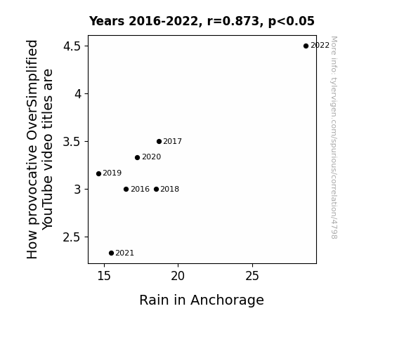
View details about correlation #4,798
Cloudy with a Chance of Clickbait: The Provocative Power of Oversimplified YouTube Video Titles and Their Surprising Influence on Rain in Anchorage
Every time it rains in Anchorage, it creates a cozy atmosphere that inspires the OverSimplified video title writers to get extra creative. Plus, the sound of raindrops somehow triggers an influx of puns and catchy phrases in their brains. It's like the precipitation in Alaska has a direct line to the provocative part of their content creation process. Who knew that inclement weather could be the secret sauce for click-worthy video titles?

What else correlates?
How provocative OverSimplified YouTube video titles are · all YouTube
Rain in Anchorage · all weather
How provocative OverSimplified YouTube video titles are · all YouTube
Rain in Anchorage · all weather


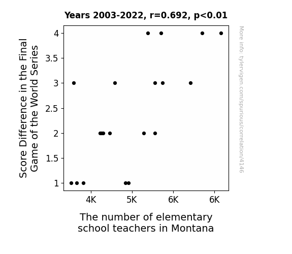
View details about correlation #4,146
The Curveball Connection: Exploring the Correlation Between Score Difference in the Final Game of the World Series and the Number of Elementary School Teachers in Montana
The higher the score difference, the more likely the winning team's fans are to celebrate by becoming teachers, causing an increase in the number of elementary school teachers in Montana. "Looks like the real victory is for the education system!"


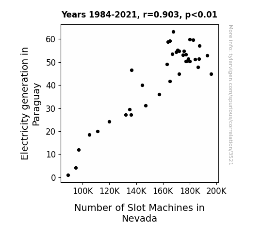
View details about correlation #3,521
Electricity Fortuna: An Electrifying Connection Between Paraguayan Power and Nevada's Slot Machine Surge
As power from Paraguay surged, so did the allure of slot machines in Nevada, creating a current trend in the gaming industry. It seems the spark of electricity from Paraguay lit up a new wave of slot machine enthusiasm, shocking both experts and casual observers alike. It's a true case of electric dreams leading to some high-voltage gaming action!

What else correlates?
Electricity generation in Paraguay · all energy
Number of Slot Machines in Nevada · all weird & wacky
Electricity generation in Paraguay · all energy
Number of Slot Machines in Nevada · all weird & wacky


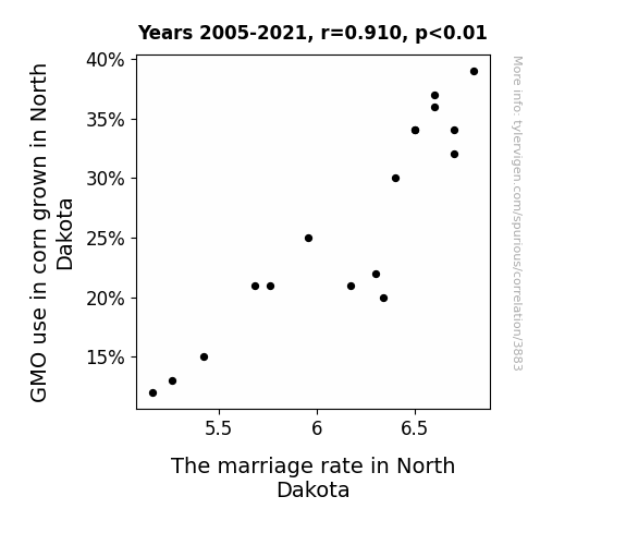
View details about correlation #3,883
The Marriage Muddle: Mapping the Marriage Market and Genetically Modified Corn Growth in North Dakota
As it turns out, genetically modified corn in North Dakota was inadvertently doubling as a potent aphrodisiac. With its reduced GMO use, the corn could no longer corn-vince the locals to put a ring on it, leading to a cob-siderable decrease in the marriage rate. Who would have thought that the secret to a fruitful love life in North Dakota was simply an ear-resistible ear of GMO corn!

What else correlates?
GMO use in corn grown in North Dakota · all food
The marriage rate in North Dakota · all random state specific
GMO use in corn grown in North Dakota · all food
The marriage rate in North Dakota · all random state specific
. The chart goes from 2002 to 2022, and the two variables track closely in value over that time.")

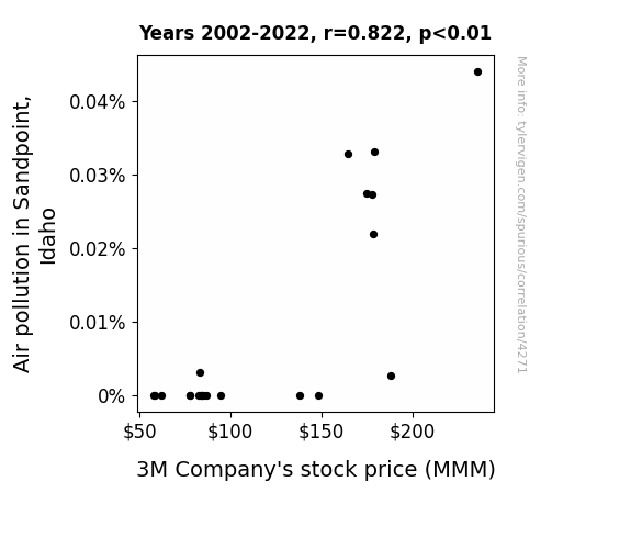
View details about correlation #4,271
Clearing the Air: The Gritty Connection Between Air Pollution in Sandpoint, Idaho, and 3M Company's Stock Price
The smog particles formed a protective layer around 3M's facilities, inadvertently optimizing their production processes and leading to higher efficiency and output. This ultimately impressed investors, driving up the stock price. Because when life gives 3M air pollution, they make money.

What else correlates?
Air pollution in Sandpoint, Idaho · all weather
3M Company's stock price (MMM) · all stocks
Air pollution in Sandpoint, Idaho · all weather
3M Company's stock price (MMM) · all stocks


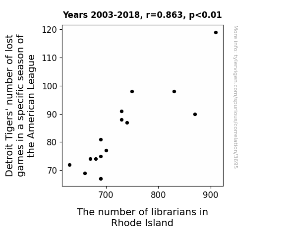
View details about correlation #3,695
The Link between Detroit Tigers’ Number of Lost Games and the Number of Librarians in Rhode Island: A Statistical Insight
Because every time the Tigers won a game, the excitement in Detroit was so contagious that it spread all the way to Rhode Island, prompting some librarians to ditch the quiet shushing for some impromptu celebratory dancing. The domino effect was real, my friend!


View details about correlation #1,284
Bun-believable Connections: Unveiling the Correlation Between Geothermal Power in Portugal and Hotdog Consumption by Nathan's Hot Dog Eating Competition Champion
As Portugal tapped into more geothermal energy, it sent a surge of heat underground, coincidentally cooking more hotdogs. This led to a bun-believable rise in the hotdog supply, ultimately fueling the champion's record-breaking consumption. It seems they couldn't resist riding the wave of wiener prosperity!


View details about correlation #4,458
Kodi's Libertarian Leverage: Longitudinal Links between New Hampshire Nom de Plume Popularity and Political Preferences
Perhaps every time someone named Kodi was born, a new law of nature, like gravity and the speed of light, was discovered. It's hard to resist voting for a Senator who promises to uphold the laws of Kodi-nature.

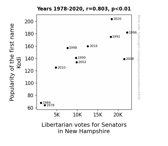
What else correlates?
Popularity of the first name Kodi · all first names
Votes for Libertarian Senators in New Hampshire · all elections
Popularity of the first name Kodi · all first names
Votes for Libertarian Senators in New Hampshire · all elections


View details about correlation #4,711
Breath of Fresh Heir: Examining the Relationship Between Air Quality in Tallahassee and Google Searches for 'How to Make Baby'
The higher oxygen levels led to an increase in energy and vitality, prompting more romantic activities and ultimately, more curiosity about the baby-making process. It's like Tallahassee became the love capital, where even the air was whispering, "Let's make some little Tallahasseans."

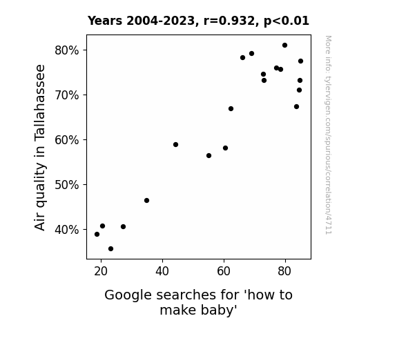
What else correlates?
Air quality in Tallahassee · all weather
Google searches for 'how to make baby' · all google searches
Air quality in Tallahassee · all weather
Google searches for 'how to make baby' · all google searches
. The chart goes from 2008 to 2020, and the two variables track closely in value over that time.")

View details about correlation #4,202
Branching Out: Linking the Growth of Forest and Conservation Workers in New Jersey to NatWest Group's Stock Price
As the forest and conservation workers dwindled in New Jersey, the state's greenery started to spiral out of control. Unkempt shrubbery and rogue vines seemed to take on a life of their own, creeping their way into unexpected places. One particularly aggressive patch of foliage made its way to the headquarters of NatWest Group, causing a comedic chaos as panicked employees tried to fend off the photosynthetic invaders. This unexpected greenery crisis led to a series of stock-dropping events, with the company's financial prospects getting entangled in a mess of branches and leaves. As the battle of man versus nature raged on, it became clear that the fate of NatWest Group was now inexorably linked to the botanical battleground in New Jersey. And thus, the dwindling army of forest and conservation workers inadvertently dealt a foliage-fueled blow to NWG stock, proving that in the wacky world of finance, even Wall Street can't escape the long reach of a wayward fern.


View details about correlation #3,301
Powering Up: The Hydro-Nuclear Nexus - A Witty Investigation
As the hydroelectric power in Fiji surged, it created a ripple effect, quite literally. The excessive energy output led to a sudden spike in the world's power grid activity. This unexpected surge in power demand caused a chain reaction, prompting countries to re-evaluate their energy needs and reignite their interest in nuclear power. It's as if Fiji's hydroelectric success sent shockwaves through the international energy community, ultimately sparking a revival of interest in nuclear power plant operations. Who would have thought that Fiji's hydropower could reignite the nuclear power scene worldwide? It just go to show, when it comes to energy, the tides can truly turn in unexpected ways!
What else correlates?
Hydopower energy generated in Fiji · all energy
Global count of operating nuclear power plants · all weird & wacky
Hydopower energy generated in Fiji · all energy
Global count of operating nuclear power plants · all weird & wacky


View details about correlation #4,387
More than Meets the 'Jovani': Exploring the Correlation Between Jovani's Popularity and the Trendiness of Extra History YouTube Video Titles
Fewer Jovani's meant fewer people were feeling jovial, leading to a decrease in demand for extra joyful history content. It's a real case of Jovani's joyfully jumbling just how jazzy those historical videos can be!

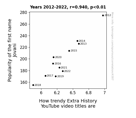
What else correlates?
Popularity of the first name Jovani · all first names
How trendy Extra History YouTube video titles are · all YouTube
Popularity of the first name Jovani · all first names
How trendy Extra History YouTube video titles are · all YouTube


View details about correlation #4,908
Spread it, Don't Shred it: Butter Consumption and Air Quality in York, Pennsylvania
As butter consumption increased, people's flatulence production also increased. The unique combination of fatty acids and dairy compounds in the butter-enhanced flatulence acted as a natural air purifier, effectively reducing air pollution in York, Pennsylvania.


What else correlates?
Butter consumption · all food
Air quality in York, Pennsylvania · all weather
Butter consumption · all food
Air quality in York, Pennsylvania · all weather
. The chart goes from 2008 to 2019, and the two variables track closely in value over that time.")

View details about correlation #4,177
Counting on Numbers: A Correlation Between the Count of Mathematicians in Texas and Discovering Financial Success
As the number of mathematicians in Texas grows, so does their love for crunching numbers. This creates a surge in demand for math-related items, including graphing calculators. This sudden calculator craze leads to a spike in purchases at Discover, as people use their DFS credit cards to buy the latest and greatest in mathematical technology. With all these mathematicians swiping away, Discover's stock price naturally experiences a positive multiplication effect.


What else correlates?
The number of mathematicians in Texas · all cccupations
Discover Financial Services' stock price (DFS) · all stocks
The number of mathematicians in Texas · all cccupations
Discover Financial Services' stock price (DFS) · all stocks


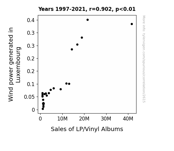
View details about correlation #2,615
The Spin of Sales: An LP/Vinyl Connection to Wind Power Generation in Luxembourg
The turbines actually emit a faint, nostalgic tune from a bygone era as they spin, inexplicably causing an uptick in demand for retro music formats. Some experts believe this could revolutionize the music industry, paving the way for a new genre: Turbine Tunes.

What else correlates?
Wind power generated in Luxembourg · all energy
Sales of LP/Vinyl Albums · all weird & wacky
Wind power generated in Luxembourg · all energy
Sales of LP/Vinyl Albums · all weird & wacky


View details about correlation #4,473
The Thaddeus Effect: A Statistical Analysis of the Correlation between Name Popularity and Libertarian Presidential Votes in Maine
The name Thaddeus has been tripling in popularity, leading to a Thaddeus surge in support for the Libertarian candidate. It seems that Mainers are saying, "Thaddeus be the best choice for a leader!"


Why this works
- Data dredging: I have 25,237 variables in my database. I compare all these variables against each other to find ones that randomly match up. That's 636,906,169 correlation calculations! This is called “data dredging.”
Fun fact: the chart used on the wikipedia page to demonstrate data dredging is also from me. I've been being naughty with data since 2014.
Instead of starting with a hypothesis and testing it, I instead tossed a bunch of data in a blender to see what correlations would shake out. It’s a dangerous way to go about analysis, because any sufficiently large dataset will yield strong correlations completely at random. - Lack of causal connection: There is probably no direct connection between these variables, despite what the AI says above.
Because these pages are automatically generated, it's possible that the two variables you are viewing are in fact causually related. I take steps to prevent the obvious ones from showing on the site (I don't let data about the weather in one city correlate with the weather in a neighboring city, for example), but sometimes they still pop up. If they are related, cool! You found a loophole.
This is exacerbated by the fact that I used "Years" as the base variable. Lots of things happen in a year that are not related to each other! Most studies would use something like "one person" in stead of "one year" to be the "thing" studied. - Observations not independent: For many variables, sequential years are not independent of each other. You will often see trend-lines form. If a population of people is continuously doing something every day, there is no reason to think they would suddenly change how they are doing that thing on January 1. A naive p-value calculation does not take this into account.
You will calculate a lower chance of "randomly" achieving the result than represents reality.
To be more specific: p-value tests are probability values, where you are calculating the probability of achieving a result at least as extreme as you found completely by chance. When calculating a p-value, you need to assert how many "degrees of freedom" your variable has. I count each year (minus one) as a "degree of freedom," but this is misleading for continuous variables.
This kind of thing can creep up on you pretty easily when using p-values, which is why it's best to take it as "one of many" inputs that help you assess the results of your analysis.
- Y-axes doesn't start at zero: I truncated the Y-axes of the graphs above. I also used a line graph, which makes the visual connection stand out more than it deserves.
Nothing against line graphs. They are great at telling a story when you have linear data! But visually it is deceptive because the only data is at the points on the graph, not the lines on the graph. In between each point, the data could have been doing anything. Like going for a random walk by itself!
Mathematically what I showed is true, but it is intentionally misleading. If you click on any of the charts that abuse this, you can scroll down to see a version that starts at zero. - Confounding variable: Confounding variables (like global pandemics) will cause two variables to look connected when in fact a "sneaky third" variable is influencing both of them behind the scenes.
- Outliers: Some datasets here have outliers which drag up the correlation.
In concept, "outlier" just means "way different than the rest of your dataset." When calculating a correlation like this, they are particularly impactful because a single outlier can substantially increase your correlation.
Because this page is automatically generated, I don't know whether any of the charts displayed on it have outliers. I'm just a footnote. ¯\_(ツ)_/¯
I intentionally mishandeled outliers, which makes the correlation look extra strong. - Low n: There are not many data points included in some of these charts.
You can do analyses with low ns! But you shouldn't data dredge with a low n.
Even if the p-value is high, we should be suspicious of using so few datapoints in a correlation.
Pro-tip: click on any correlation to see:
- Detailed data sources
- Prompts for the AI-generated content
- Explanations of each of the calculations (correlation, p-value)
- Python code to calculate it yourself


