spurious correlations
discover · random · spurious scholar
← previous page · next page →


View details about correlation #3,943
: Close Encounters of the Kenzie Kind: Investigating the Correlation Between Kenzie's Popularity and UFO Sightings in Ohio
As the name Kenzie gained popularity, more parents subconsciously yearned for their kids to stand out like a UFO in Ohio sky. It's as if the universe conspired to make them believe that little Kenzies were truly out of this world! Remember, with great Kenzie comes great UFO sightings!


What else correlates?
Popularity of the first name Kenzie · all first names
UFO sightings in Ohio · all random state specific
Popularity of the first name Kenzie · all first names
UFO sightings in Ohio · all random state specific


View details about correlation #4,921
Home Is Where the Votes Are: A Correlational Study of US Household Spending on Housing and Democratic Presidential Voting Behavior in Utah
As household spending on housing in the US increased, more people began investing in figurines of famous landmarks to decorate their homes. This inadvertently led to a surge in support for the Democratic candidate in Utah, as these figurines subliminally swayed voters with their tiny, liberal-leaning picket signs.


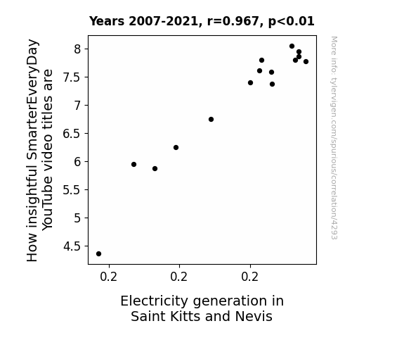
View details about correlation #4,293
Shocking Slogans: Unraveling the Relationship between SmarterEveryDay Video Titles and Electrical Output in Saint Kitts and Nevis
As Saint Kitts and Nevis generates more electricity, it creates a charged intellectual atmosphere, leading to a surge in insightful SmarterEveryDay video titles. It's like the electrons in the power lines are sparking brilliant ideas for the channel. Who would have thought that the secret to SmarterEveryDay's wit and wisdom lies in the Caribbean's energy output? It's shockingly funny how interconnected this all is!


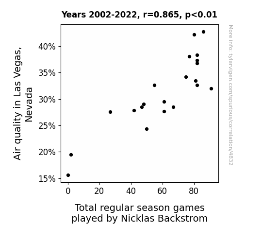
View details about correlation #4,832
Breathing in the Hockey Season: The Air Quality-Nicklas Backstrom Connection in Las Vegas, Nevada
The improved air quality in Las Vegas led to a higher concentration of oxygen in the atmosphere. This, in turn, enhanced the performance of the Vegas Golden Knights hockey team. As a result, they made it to the playoffs, leading to more total regular season games played by Nicklas Backstrom. This one is really out there!

What else correlates?
Air quality in Las Vegas, Nevada · all weather
Total regular season games played by Nicklas Backstrom · all sports
Air quality in Las Vegas, Nevada · all weather
Total regular season games played by Nicklas Backstrom · all sports


View details about correlation #4,188
The Divine Connection: Exploring the Correlation Between Theology Degrees and Brokerage Clerks in Utah
As fewer theology and religious vocation graduates entered the workforce, there was a divine shift in the job market. The decreased spiritual presence led to a decrease in the need for heavenly stock trades in Utah. It seems even the stock market is not immune to the effects of karma. Remember, when it comes to the economy, sometimes the most unexpected connections can bear the cross of causation. Always keep an eye on the fluctuating values, whether it's of stocks or souls.


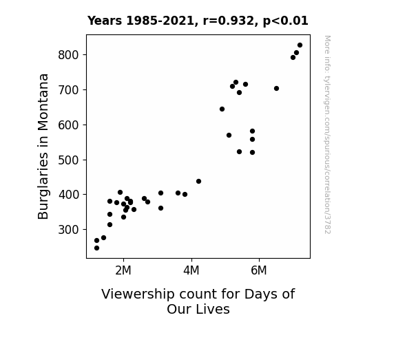
View details about correlation #3,782
Ludicrous Link: Larcenies in Montana and Linearity with Days of Our Lives' Loyalists
As it turns out, the burglars in Montana were just big fans of Days of Our Lives. They couldn't resist the drama and suspense of the show, so they would always plan their heists around not missing an episode. You could say the burglaries were the real life "Days of Our Lives" for the local community, but now that they've decreased, it seems the burglars have found a new way to fill their time - hopefully something a little less criminal and a lot more productive!

What else correlates?
Burglaries in Montana · all random state specific
Viewership count for Days of Our Lives · all weird & wacky
Burglaries in Montana · all random state specific
Viewership count for Days of Our Lives · all weird & wacky


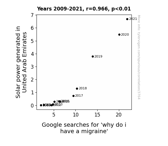
View details about correlation #3,764
Lighting Up the Search: A Sunny Connection Between Solar Power Generation and Google Searches for 'Why Do I Have a Migraine'
The increase in solar power generated in the United Arab Emirates is leading to a surge in ultra-bright sunlight being emitted. This intense light is being reflected off the shiny buildings and desert landscapes, creating blinding glares. People are squinting more, which is putting a strain on their eye muscles and triggering migraines. Furthermore, the rise in solar energy production has inadvertently stimulated the production of 'solar-photon-endorphins' in the atmosphere, which, when inhaled, are disrupting brain chemistry and leading to an increase in migraines. But on the bright side, at least the UAE is bringing a whole new meaning to the term 'power trip!'


View details about correlation #4,511
The Orion Correlation: Shedding Light on the Relationship Between the Popularity of the Name Orion and the Trendiness of Technology Connections YouTube Video Titles
Parents naming their kids after a constellation must be really into futuristic stuff, rubbing off on the Technology Connections video titles. It's like they're cosmically compelled to keep up with the latest tech trends! It's a stellar connection, if you ask me.

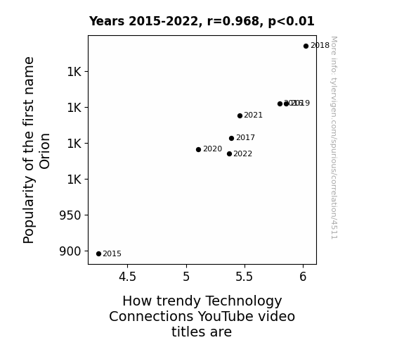
. The chart goes from 2003 to 2022, and the two variables track closely in value over that time.")

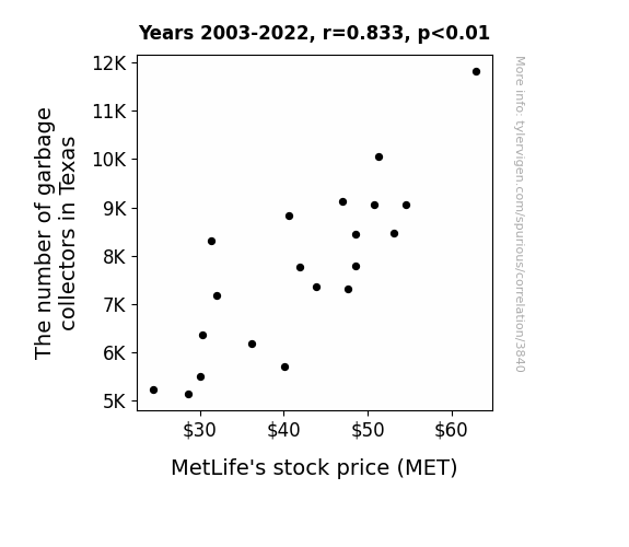
View details about correlation #3,840
Trash Dash: The Flash Clash with MetLife's Cash Stash
As the garbage collectors in Texas multiplied, so did their efficiency in picking up the trash. This inadvertently led to a significant reduction in MetLife's risk exposure, prompting investors to 'waste' no time in snatching up their stocks. After all, a cleaner state means a 'tidier' financial outlook for the insurance company, and the market simply couldn't 'bin' ignoring this correlation. So, as the saying goes, one person's trash is another person's ticket to a bullish market!

What else correlates?
The number of garbage collectors in Texas · all cccupations
MetLife's stock price (MET) · all stocks
The number of garbage collectors in Texas · all cccupations
MetLife's stock price (MET) · all stocks


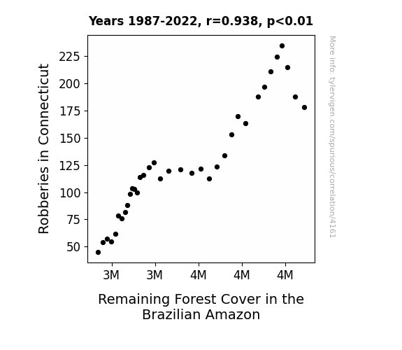
View details about correlation #4,161
Woodland Hoods: Exploring the Relationship Between Heists in the Nutmeg State and Greenery in the Amazon Basin
As robberies in Connecticut decreased, it led to a decline in the demand for wooden baseball bats, which are commonly used as weapons. This decrease in demand for wooden bats meant that fewer trees were being harvested in the US, leading to a surplus of baseball bat-grade wood. This surplus wood was then exported to Brazil at incredibly low prices, making it more affordable for deforestation efforts in the Amazon. In other words, the decrease in robberies in Connecticut had a knock-on effect on the Amazon's forest cover, creating a 'bat-tastic' connection between law enforcement and deforestation.

What else correlates?
Robberies in Connecticut · all random state specific
Remaining Forest Cover in the Brazilian Amazon · all weird & wacky
Robberies in Connecticut · all random state specific
Remaining Forest Cover in the Brazilian Amazon · all weird & wacky


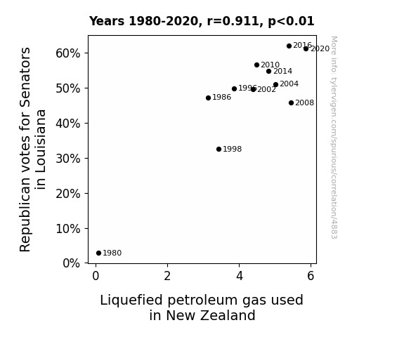
View details about correlation #4,883
The Republican Gas Pass: Assessing the Correlation between GOP Votes in Louisiana and LPG Usage in New Zealand
As the Republican votes ignited in Louisiana, it created a fiery passion for gas-related policies. This sparked a chain reaction, leading to increased demand for LPG in New Zealand. It seems like the political hot air from Louisiana traveled all the way to Kiwi land, fueling the LPG usage. It's a politi-gas phenomenon unlike any other!

What else correlates?
Votes for Republican Senators in Louisiana · all elections
Liquefied petroleum gas used in New Zealand · all energy
Votes for Republican Senators in Louisiana · all elections
Liquefied petroleum gas used in New Zealand · all energy


View details about correlation #4,097
Milwaukee Air Pollution's Influence on 'Titanic' Google Searches: A Statistical Seasaw
The air pollution in Milwaukee created a murky atmosphere, leading people to seek out the foggy romance of the Titanic. It's like they say, when the smog rises in Milwaukee, interest in the Titanic sets sail!


What else correlates?
Air pollution in Milwaukee · all weather
Google searches for 'Titanic' · all google searches
Air pollution in Milwaukee · all weather
Google searches for 'Titanic' · all google searches


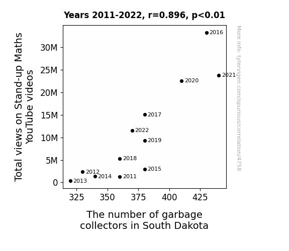
View details about correlation #4,758
Laughing Their Way to the Dump: Correlating Total Views on Stand-up Maths YouTube Videos with the Number of Garbage Collectors in South Dakota
As the laughter from the videos echoed across the Great Plains, it sparked a newfound appreciation for clean surroundings. The increased intellectual stimulation from learning about math in a funny way must have inspired many South Dakotans to pursue a noble career in garbage collection. After watching those videos, they were probably thinking, "I don't want these rubbish binomial distributions in my state - it's time to cosine on the dotted line and integrate myself into the sanitation workforce!" Who knew that a few more views could cosine such a trashy upheaval in South Dakota!
. The chart goes from 2002 to 2022, and the two variables track closely in value over that time.")

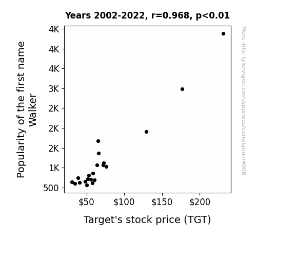
View details about correlation #4,008
Walkering through Stock Prices: The Surprising Link Between the Name 'Walker' and Target's TGT Stock
With the rise in popularity of the name Walker, more babies were given this name. As a result, there was a sudden spike in demand for baby walkers. This unexpected surge in sales boosted Target's revenue, leading to an overall increase in their stock price. So, you could say that the name Walker really helped Target take some baby steps towards success!

What else correlates?
Popularity of the first name Walker · all first names
Target's stock price (TGT) · all stocks
Popularity of the first name Walker · all first names
Target's stock price (TGT) · all stocks


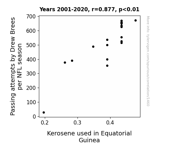
View details about correlation #1,460
A Flaming Connection: Drew Brees's Passing Attempts and the Kerosene Quandary in Equatorial Guinea
As Drew Brees attempts more passes, the sheer force of his arm talent creates tiny frictional heat energy, leading to a minuscule spike in global kerosene demand. It's like he's inadvertently fueling the world one pass at a time!

What else correlates?
Passing attempts by Drew Brees per NFL season · all weird & wacky
Kerosene used in Equatorial Guinea · all energy
Passing attempts by Drew Brees per NFL season · all weird & wacky
Kerosene used in Equatorial Guinea · all energy


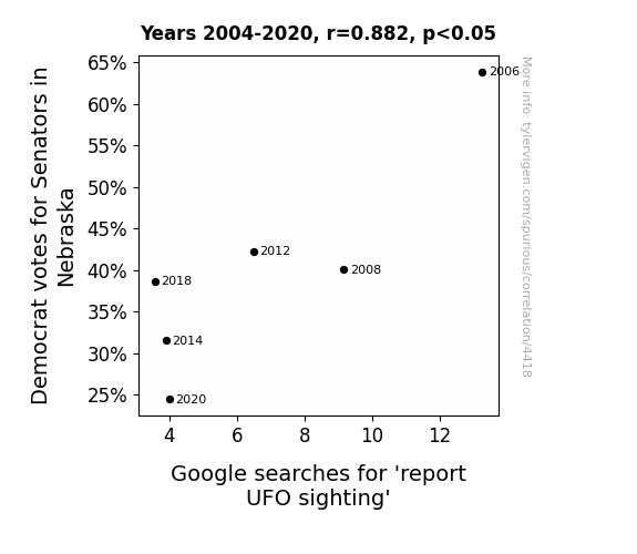
View details about correlation #4,418
Seeking Senators and Surprising Searches: The Strange Connection Between Democrat Votes in Nebraska and UFO Sightings
The decrease in Democrat votes for Senators in Nebraska has led to a decrease in political party tension. With less political polarization, Nebraskans are finding common ground in their quest for earthly harmony, reducing the need to seek otherworldly alliances. Or perhaps the UFOs have simply realized that there are some things even they can't fix!


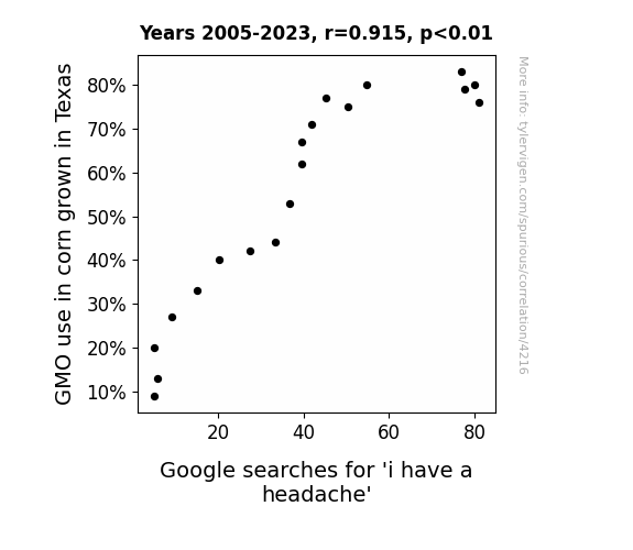
View details about correlation #4,216
Genetically Modified Corn: A Kernel of Truth in the Connection between Corn Production and Headache-Related Google Searches
The GMO corn in Texas started producing kernels in the shape of tiny aspirin pills, leading people to mistakenly believe they could relieve their headaches by snacking on corn straight from the cob.

What else correlates?
GMO use in corn grown in Texas · all food
Google searches for 'i have a headache' · all google searches
GMO use in corn grown in Texas · all food
Google searches for 'i have a headache' · all google searches
. The chart goes from 2010 to 2022, and the two variables track closely in value over that time.")

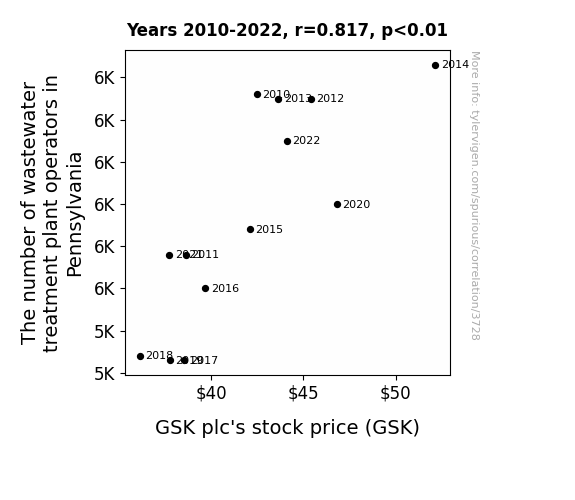
View details about correlation #3,728
The Poo-lar Connection: Examining the Relationship Between Wastewater Treatment Plant Operators in Pennsylvania and GSK plc's Stock Price
As the number of wastewater treatment plant operators in Pennsylvania increased, it led to cleaner waterways. This, in turn, meant that the secret formula for GSK's latest pharmaceutical breakthrough, accidentally flushed down the toilet by a clumsy lab assistant, was less likely to be diluted. The potential for accidental super-fish and highly medicated aquatic life caused a stir of excitement among investors, leading to a surge in GSK plc's stock price. Who knew that the key to a healthy portfolio was hidden in the water treatment plants of Pennsylvania all along?


View details about correlation #1,540
Let the Sun Shine In: Illuminating the Gender Pay Gap Through Solar Power Connection
As the solar power in Kenya shone brighter, it inadvertently sparked a new wave of energy in the US workforce. This led to heated debates about equal pay, creating a glaring disparity in how much men and women were earning. It's like the Sun was shining a light on the issue, but instead of closing the gap, it was just adding to the solar you-know-what divide.

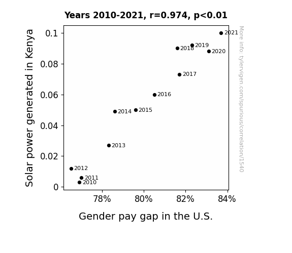
What else correlates?
Solar power generated in Kenya · all energy
Gender pay gap in the U.S. · all weird & wacky
Solar power generated in Kenya · all energy
Gender pay gap in the U.S. · all weird & wacky


View details about correlation #4,454
Libertarian Votica: A Correlative Study of the Danica Effect on Senatorial Elections in Connecticut
The theory of "Danica-ism" emerged, which promotes a platform of racing for personal freedom. As the name Danica gained popularity, more people embraced this ideology, leading to an unexpected surge in Libertarian votes for Senators in Connecticut. It seems that the connection between Danica and driving towards political independence was too strong to ignore! Remember, always buckle up for liberty!

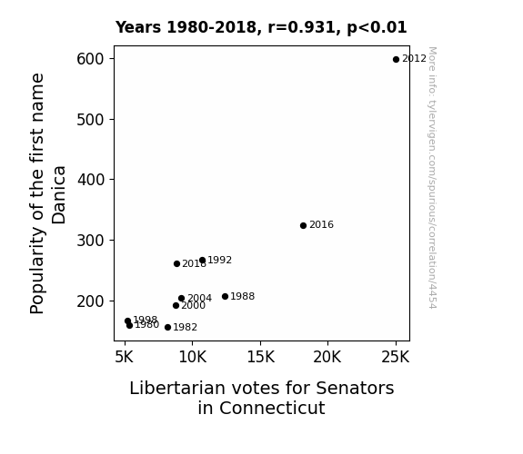
What else correlates?
Popularity of the first name Danica · all first names
Votes for Libertarian Senators in Connecticut · all elections
Popularity of the first name Danica · all first names
Votes for Libertarian Senators in Connecticut · all elections
Why this works
- Data dredging: I have 25,237 variables in my database. I compare all these variables against each other to find ones that randomly match up. That's 636,906,169 correlation calculations! This is called “data dredging.”
Fun fact: the chart used on the wikipedia page to demonstrate data dredging is also from me. I've been being naughty with data since 2014.
Instead of starting with a hypothesis and testing it, I instead tossed a bunch of data in a blender to see what correlations would shake out. It’s a dangerous way to go about analysis, because any sufficiently large dataset will yield strong correlations completely at random. - Lack of causal connection: There is probably no direct connection between these variables, despite what the AI says above.
Because these pages are automatically generated, it's possible that the two variables you are viewing are in fact causually related. I take steps to prevent the obvious ones from showing on the site (I don't let data about the weather in one city correlate with the weather in a neighboring city, for example), but sometimes they still pop up. If they are related, cool! You found a loophole.
This is exacerbated by the fact that I used "Years" as the base variable. Lots of things happen in a year that are not related to each other! Most studies would use something like "one person" in stead of "one year" to be the "thing" studied. - Observations not independent: For many variables, sequential years are not independent of each other. You will often see trend-lines form. If a population of people is continuously doing something every day, there is no reason to think they would suddenly change how they are doing that thing on January 1. A naive p-value calculation does not take this into account.
You will calculate a lower chance of "randomly" achieving the result than represents reality.
To be more specific: p-value tests are probability values, where you are calculating the probability of achieving a result at least as extreme as you found completely by chance. When calculating a p-value, you need to assert how many "degrees of freedom" your variable has. I count each year (minus one) as a "degree of freedom," but this is misleading for continuous variables.
This kind of thing can creep up on you pretty easily when using p-values, which is why it's best to take it as "one of many" inputs that help you assess the results of your analysis.
- Y-axes doesn't start at zero: I truncated the Y-axes of the graphs above. I also used a line graph, which makes the visual connection stand out more than it deserves.
Nothing against line graphs. They are great at telling a story when you have linear data! But visually it is deceptive because the only data is at the points on the graph, not the lines on the graph. In between each point, the data could have been doing anything. Like going for a random walk by itself!
Mathematically what I showed is true, but it is intentionally misleading. If you click on any of the charts that abuse this, you can scroll down to see a version that starts at zero. - Confounding variable: Confounding variables (like global pandemics) will cause two variables to look connected when in fact a "sneaky third" variable is influencing both of them behind the scenes.
- Outliers: Some datasets here have outliers which drag up the correlation.
In concept, "outlier" just means "way different than the rest of your dataset." When calculating a correlation like this, they are particularly impactful because a single outlier can substantially increase your correlation.
Because this page is automatically generated, I don't know whether any of the charts displayed on it have outliers. I'm just a footnote. ¯\_(ツ)_/¯
I intentionally mishandeled outliers, which makes the correlation look extra strong. - Low n: There are not many data points included in some of these charts.
You can do analyses with low ns! But you shouldn't data dredge with a low n.
Even if the p-value is high, we should be suspicious of using so few datapoints in a correlation.
Pro-tip: click on any correlation to see:
- Detailed data sources
- Prompts for the AI-generated content
- Explanations of each of the calculations (correlation, p-value)
- Python code to calculate it yourself


