spurious correlations
discover · random · spurious scholar
← previous page · next page →


View details about correlation #4,367
EntertainMint to Win It: The Correlation between US Household Spending on Entertainment and Republican Votes for Senators in Mississippi
As household spending on entertainment in the US increased, more families in Mississippi were able to afford TV and internet subscriptions. This led to a rise in exposure to Republican political advertising and messaging, ultimately swaying their votes towards Republican Senators.


What else correlates?
US household spending on entertainment · all weird & wacky
Votes for Republican Senators in Mississippi · all elections
US household spending on entertainment · all weird & wacky
Votes for Republican Senators in Mississippi · all elections


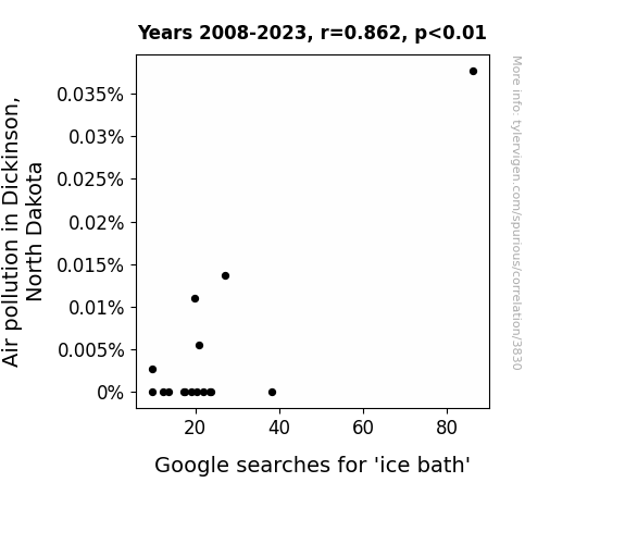
View details about correlation #3,830
Chilling Correlation: The Relationship between Air Pollution in Dickinson, North Dakota and Google Searches for 'Ice Bath'
As air pollution increased in Dickinson, North Dakota, the local population started to experience a collective rise in body temperature, prompting a sudden need to cool down. This led to a surge in interest in ice baths as a way to beat the newfound heat. Remember, sometimes the coolest solutions can be found in the most unexpected places!

What else correlates?
Air pollution in Dickinson, North Dakota · all weather
Google searches for 'ice bath' · all google searches
Air pollution in Dickinson, North Dakota · all weather
Google searches for 'ice bath' · all google searches


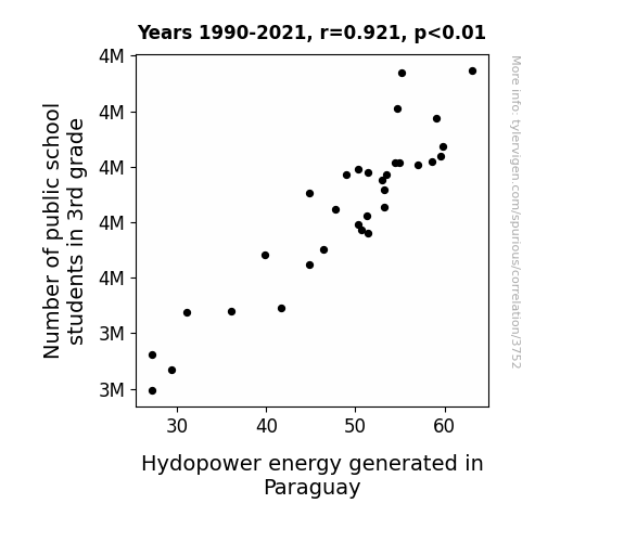
View details about correlation #3,752
Perplexing Parallels: Pupils and Power in Paraguay
The influx of 3rd graders brought an unexpected surge in enthusiasm for science, leading to a groundbreaking class project on renewable energy. As the students delved into hydropower, they inadvertently sparked a competition to design more efficient water wheels, creating a mini boom in hydro innovation. The Paraguayan government, astounded by the 8-year-old prodigies' achievements, implemented their designs in major hydroelectric plants, ultimately revolutionizing the hydro industry. The pint-sized pioneers not only elevated the nation's energy output but also left a lasting ripple in the world of green technology. Who knew that a few extra 3rd graders could power up Paraguay's hydroelectricity in such a shocking manner!

What else correlates?
Number of public school students in 3rd grade · all education
Hydopower energy generated in Paraguay · all energy
Number of public school students in 3rd grade · all education
Hydopower energy generated in Paraguay · all energy


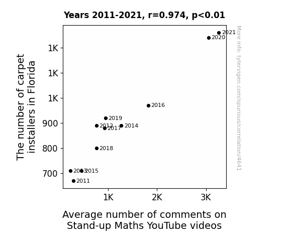
View details about correlation #4,641
Laying the Groundwork: The Link Between Carpet Installers in Florida and Average Number of Comments on Stand-up Maths YouTube Videos
As the carpet installers in Florida perfected the art of laying down those straight, seamless lines, viewers couldn't help but notice the correlation between their skills and the impeccable comedic timing in the Stand-up Maths videos. The uncanny connection between precision on the floor and precision in the punchlines had internet users rolling on the floor laughing, turning the comment section into a wall-to-wall carpet of clever remarks and witty banter. It seems that as these installers were nailing the flooring, they were also laying the groundwork for a surge in mathematical humor appreciation.


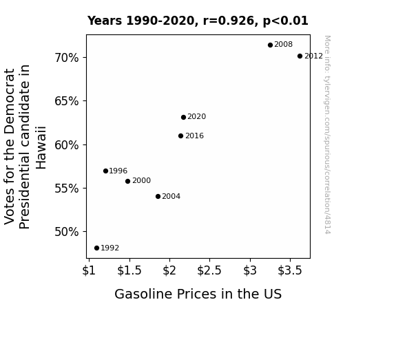
View details about correlation #4,814
Hawaiian Hilarity: How Hawaii's Hopes for the Democrat Presidential Candidate Hike US Gasoline Prices
As more people in Hawaii showed support for the Democratic candidate, the overall enthusiasm created a chain reaction of high-fives and fist bumps. This sudden surge in celebratory movements somehow disrupted the delicate balance of supply and demand in the gasoline market, leading to a nationwide increase in prices. Who knew that political excitement in a tropical paradise could fuel such a pump-tastic predicament for drivers across the country!

What else correlates?
Votes for the Democratic Presidential candidate in Hawaii · all elections
Gasoline Prices in the US · all weird & wacky
Votes for the Democratic Presidential candidate in Hawaii · all elections
Gasoline Prices in the US · all weird & wacky


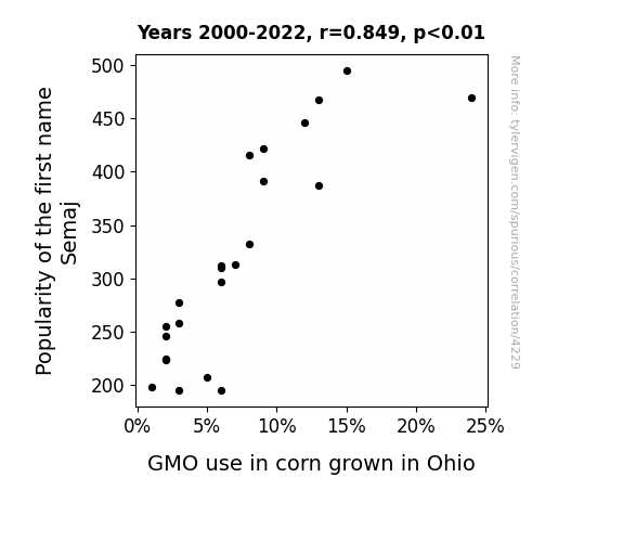
View details about correlation #4,229
Semaj's Popularity and Ohio's GMO Corn Flexibility: A Rhyming Tale of Surname Sorcery
As the name Semaj gained popularity, more and more parents were inspired to get creative with their kids' names. This led to a surge in unique and original names, ultimately sparking a similar trend in the agricultural sector. Farmers in Ohio, wanting to stand out in the world of corn cultivation, began experimenting with genetically modifying their crops to create one-of-a-kind corn varieties. It seems like the ripple effect of Semaj's rising prominence didn't stop at baby names – it inadvertently shaped the agricultural landscape, one ear of corn at a time.

What else correlates?
Popularity of the first name Semaj · all first names
GMO use in corn grown in Ohio · all food
Popularity of the first name Semaj · all first names
GMO use in corn grown in Ohio · all food


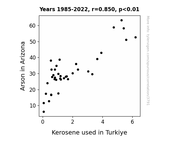
View details about correlation #3,791
Burnin' Love: A Fiery Connection Between Arson in Arizona and Kerosene Consumption in Turkiye
As the number of arson incidents in Arizona dropped, there was a subsequent decline in the demand for kerosene as a potential accelerant. This led to a surplus of kerosene, causing exports to countries like Turkiye to decrease as they found themselves with ample supply, and ultimately resulting in a nationwide shortage of kerosene in Turkiye. It seems like even the kerosene market couldn't handle the heat of the Arizona arsons fizzling out!

What else correlates?
Arson in Arizona · all random state specific
Kerosene used in Turkiye · all energy
Arson in Arizona · all random state specific
Kerosene used in Turkiye · all energy
. The chart goes from 2003 to 2021, and the two variables track closely in value over that time.")

View details about correlation #4,013
The Policing Professors and the Peculiar Performance of POSCO Holdings' PKX: An Alliterative Analysis
As the number of criminal justice and law enforcement teachers in Kentucky increased, there was a corresponding surge in the popularity of police-themed TV shows. This led to a higher demand for props like handcuffs, which just so happen to be made from steel - the primary product of POSCO Holdings. As the demand for these props increased, so did the stock price of POSCO Holdings, proving that even the steel industry isn't immune to the long arm of the law.


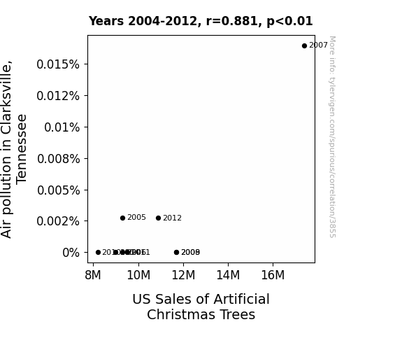
View details about correlation #3,855
The Firce Connection: Exploring the Correlation Between Air Pollution in Clarksville, Tennessee and US Sales of Artificial Christmas Trees
The higher levels of air pollution in Clarksville led to foliage on trees turning a festive shade of artificial green, sparking nationwide demand for pre-decorated Christmas trees, thus boosting US sales of artificial Christmas trees.
What else correlates?
Air pollution in Clarksville, Tennessee · all weather
US Sales of Artificial Christmas Trees · all weird & wacky
Air pollution in Clarksville, Tennessee · all weather
US Sales of Artificial Christmas Trees · all weird & wacky


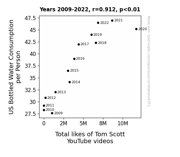
View details about correlation #4,351
The Thirst for Tom: Tracking the Tenuous Relationship between Total Likes of Tom Scott on YouTube and US Bottled Water Consumption per Capita
People were just trying to aqua-punch to improve their like-ability. And as their hydration levels rose, so did their appreciation for Tom Scott's content. It's like the water was conducting a like orchestra in their bodies, and Tom Scott's videos were the perfect symphony for their H2O-infused brains. Stay thirsty for knowledge, and keep those likes flowing!

What else correlates?
US Bottled Water Consumption per Person · all food
Total likes of Tom Scott's YouTube videos · all YouTube
US Bottled Water Consumption per Person · all food
Total likes of Tom Scott's YouTube videos · all YouTube
 Final Score Difference Between Winners and Runner-Up and the second variable is Petroluem consumption in Germany, West. The chart goes from 1982 to 1990, and the two variables track closely in value over that time.")

View details about correlation #3,939
Fueling the Fire: The Softball Score-Petrol Paradox in German and West Petroleum Consumption
The more dominant the winners, the more they fired up their players, leading to an increase in overall energy utilization. This created a ripple effect, eventually boosting the demand for petroleum in Germany, West. It's a classic case of high-scoring games igniting a fuel frenzy across the globe, all thanks to the powerful performances on the softball field!


View details about correlation #4,356
Birds of a Feather Vote Together? Exploring the Correlation Between Republican Votes for South Carolina Senators and Curiosity About Avian Rainy Day Hideouts
The Republican votes in South Carolina have sparked a new 'tweet-er in town' initiative, leading to the passing of legislation for bird-friendly shelters in the state. This has created a 'flock-ing' great environment, encouraging our feathered friends to seek cover and stay 'dry as a bone'. It seems like these political changes have truly 'ruffled some feathers' in the avian community, and now the birds have a whole new 'reign' of options when it pours.


View details about correlation #2,451
Ushers and Everest Thrust: A Statistical Bust or Just a Fuss?
As the number of ushers in South Dakota increased, so did the total number of successful Mount Everest climbs. It turns out, the ushers' superior skills in directing people to their seats translated seamlessly to efficiently guiding climbers along their treacherous routes. Their expertise in crowd control also reduced bottlenecks on the mountain, leading to smoother ascents. Plus, their knack for handling unexpected situations came in handy when dealing with the ever-changing mountain conditions. It just goes to show, when it comes to reaching new heights, having the right ushers can make all the difference!


What else correlates?
The number of ushers in South Dakota · all cccupations
Total Number of Successful Mount Everest Climbs · all weird & wacky
The number of ushers in South Dakota · all cccupations
Total Number of Successful Mount Everest Climbs · all weird & wacky


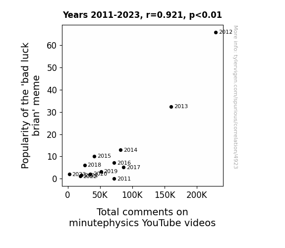
View details about correlation #4,923
Unlucky Linkage: Exploring the Correlation between 'Bad Luck Brian' Meme Popularity and Total Comments on MinutePhysics YouTube Videos
The 'bad luck brian' meme is so old and overused that it made people seek out new sources of entertainment, leading them to minutePhysics. It seems like bad luck for the meme, but it's actually a stroke of good luck for science enthusiasts. They just couldn't resist the attraction of learning about physics, and it all adds up to a positively charged surge in comments on the videos. It's like the meme was destined to create a 'commentum' of scientific discussions! Who knew that bad luck could bring about such a quantum leap in engagement with minutePhysics?

What else correlates?
Popularity of the 'bad luck brian' meme · all memes
Total comments on minutephysics YouTube videos · all YouTube
Popularity of the 'bad luck brian' meme · all memes
Total comments on minutephysics YouTube videos · all YouTube


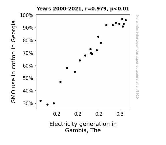
View details about correlation #3,910
GMOs in Georgia: Generating Gambia's Gigawatts
As cotton production in Georgia increased, there was a corresponding rise in the number of boll weevils migrating to Gambia. These boll weevils, attracted to the Gambian climate, inadvertently enhanced the local electricity production. It turns out, when life gives Gambia boll weevils from Georgia, they power up and generate a buzz in the electricity industry. #GMOpoweredElectricity

What else correlates?
GMO use in cotton in Georgia · all food
Electricity generation in Gambia · all energy
GMO use in cotton in Georgia · all food
Electricity generation in Gambia · all energy


View details about correlation #4,037
Uncovering the Rhythmic Connection: Air Pollution and Google Searches for 'Gangnam Style' in Wichita
As the air cleared, people could finally see clearly and realized they didn't actually want to do the horsey dance anymore. With each breath of fresh, clean air, their desire to gallop along to K-pop just dwindled away. It turns out, when you can breathe without wheezing, Gangnam Style just isn't as catchy. The smog had been the invisible force keeping those dance moves alive, but once it lifted, so did the urge to groove Gangnam-style.

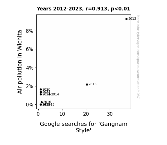
What else correlates?
Air pollution in Wichita · all weather
Google searches for 'Gangnam Style' · all google searches
Air pollution in Wichita · all weather
Google searches for 'Gangnam Style' · all google searches


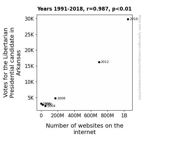
View details about correlation #4,361
The World Wide Web of Liberty: A Libertarian Perspective on the Correlation between Votes for the Libertarian Presidential Candidate in Arkansas and the Number of Websites on the Internet
As more people embraced libertarianism in Arkansas, there was a sudden surge in individuals advocating for internet freedom. This led to a frenzy of website creation, as everyone exercised their right to an online platform to express their views. It was a virtual gold rush, with web developers and tech-savvy libertarians banding together to expand the digital frontier. It just go to show, when it comes to web domination, the possibilities are endless when you let your libertarian spirit soar.


View details about correlation #4,389
Cartographically Nerdy: A Statistical Analysis of Simone Giertz's YouTube Video Titles and their Impact on the Number of Cartographers in Wisconsin
As the number of cartographers in Wisconsin rises, so does the demand for map-based humor. Simone Giertz, being a self-proclaimed "queen of sh*tty robots," realizes the potential for comedic gold in creating nerdy, map-related content. This leads to an exponential growth in her punny and cartoony video titles, as she navigates her way to the top of the nerdy YouTube kingdom.

What else correlates?
How nerdy Simone Giertz's YouTube video titles are · all YouTube
The number of cartographers in Wisconsin · all cccupations
How nerdy Simone Giertz's YouTube video titles are · all YouTube
The number of cartographers in Wisconsin · all cccupations


View details about correlation #1,957
Churning Wind: The Butter-Wind Power Connection in Latvia
As butter consumption increased, people's gaseous emissions became more potent, creating a higher demand for wind power in Latvia to disperse the increased flatulence, leading to a simultaneous rise in wind power generation.


What else correlates?
Butter consumption · all food
Wind power generated in Latvia · all energy
Butter consumption · all food
Wind power generated in Latvia · all energy


View details about correlation #4,432
Bozeman's Haze, Trump's Craze: The Surprising Link Between Air Pollution and Searching for Donald Trump
As air pollution in Bozeman increased, it led to a higher concentration of charged particles in the atmosphere. These charged particles somehow formed a unique pattern in the sky that resembled Donald Trump's hair, sparking curiosity and prompting people to search for the man behind the iconic hairstyle. It's like a smoggy, political Rorschach test in the sky!

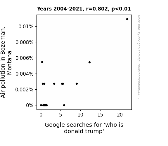
What else correlates?
Air pollution in Bozeman, Montana · all weather
Google searches for 'who is donald trump' · all google searches
Air pollution in Bozeman, Montana · all weather
Google searches for 'who is donald trump' · all google searches
Why this works
- Data dredging: I have 25,237 variables in my database. I compare all these variables against each other to find ones that randomly match up. That's 636,906,169 correlation calculations! This is called “data dredging.”
Fun fact: the chart used on the wikipedia page to demonstrate data dredging is also from me. I've been being naughty with data since 2014.
Instead of starting with a hypothesis and testing it, I instead tossed a bunch of data in a blender to see what correlations would shake out. It’s a dangerous way to go about analysis, because any sufficiently large dataset will yield strong correlations completely at random. - Lack of causal connection: There is probably no direct connection between these variables, despite what the AI says above.
Because these pages are automatically generated, it's possible that the two variables you are viewing are in fact causually related. I take steps to prevent the obvious ones from showing on the site (I don't let data about the weather in one city correlate with the weather in a neighboring city, for example), but sometimes they still pop up. If they are related, cool! You found a loophole.
This is exacerbated by the fact that I used "Years" as the base variable. Lots of things happen in a year that are not related to each other! Most studies would use something like "one person" in stead of "one year" to be the "thing" studied. - Observations not independent: For many variables, sequential years are not independent of each other. You will often see trend-lines form. If a population of people is continuously doing something every day, there is no reason to think they would suddenly change how they are doing that thing on January 1. A naive p-value calculation does not take this into account.
You will calculate a lower chance of "randomly" achieving the result than represents reality.
To be more specific: p-value tests are probability values, where you are calculating the probability of achieving a result at least as extreme as you found completely by chance. When calculating a p-value, you need to assert how many "degrees of freedom" your variable has. I count each year (minus one) as a "degree of freedom," but this is misleading for continuous variables.
This kind of thing can creep up on you pretty easily when using p-values, which is why it's best to take it as "one of many" inputs that help you assess the results of your analysis.
- Y-axes doesn't start at zero: I truncated the Y-axes of the graphs above. I also used a line graph, which makes the visual connection stand out more than it deserves.
Nothing against line graphs. They are great at telling a story when you have linear data! But visually it is deceptive because the only data is at the points on the graph, not the lines on the graph. In between each point, the data could have been doing anything. Like going for a random walk by itself!
Mathematically what I showed is true, but it is intentionally misleading. If you click on any of the charts that abuse this, you can scroll down to see a version that starts at zero. - Confounding variable: Confounding variables (like global pandemics) will cause two variables to look connected when in fact a "sneaky third" variable is influencing both of them behind the scenes.
- Outliers: Some datasets here have outliers which drag up the correlation.
In concept, "outlier" just means "way different than the rest of your dataset." When calculating a correlation like this, they are particularly impactful because a single outlier can substantially increase your correlation.
Because this page is automatically generated, I don't know whether any of the charts displayed on it have outliers. I'm just a footnote. ¯\_(ツ)_/¯
I intentionally mishandeled outliers, which makes the correlation look extra strong. - Low n: There are not many data points included in some of these charts.
You can do analyses with low ns! But you shouldn't data dredge with a low n.
Even if the p-value is high, we should be suspicious of using so few datapoints in a correlation.
Pro-tip: click on any correlation to see:
- Detailed data sources
- Prompts for the AI-generated content
- Explanations of each of the calculations (correlation, p-value)
- Python code to calculate it yourself


