spurious correlations
discover · random · spurious scholar
← previous page · next page →


View details about correlation #4,365
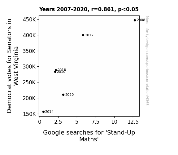
Stand-Up Maths and Stand-Up Votes: A Correlational Analysis of Democrat Votes for Senators in West Virginia and Google Searches for 'Stand-Up Maths'
As the Democrat votes for Senators in West Virginia decreased, it added to the state's overall apathy, causing a ripple effect that dampened the enthusiasm for stand-up comedy, math included. It seems the formula for political engagement is directly proportional to the laughter quotient, leading to a polynomial decrease in searches for Stand-Up Maths. It's a prime example of how even in the realm of entertainment, the power of politics can't be divided from the final outcome!
What else correlates?
Votes for Democratic Senators in West Virginia · all elections
Google searches for 'Stand-Up Maths' · all google searches
Votes for Democratic Senators in West Virginia · all elections
Google searches for 'Stand-Up Maths' · all google searches


View details about correlation #1,175
Fuelling the Engine: A Study on the Relationship Between Jet Fuel Usage in Senegal and Automotive Recalls for Engine and Engine Cooling Issues
Well, it's simple really. As the saying goes, "Senegal's jet-setters are revving up the automotive industry!" The more jet fuel Senegal uses, the greater the need for top-notch engine performance. It's like their car engines are saying, "Jet me to the mechanic, I need some high-octane lovin'!" Who knew that Senegal's skies were fueling a recall revolution on the roads? Looks like the connection between jet fuel and automotive recalls is just taking off!

What else correlates?
Jet fuel used in Senegal · all energy
Automotive recalls for issues with the Engine And Engine Cooling · all weird & wacky
Jet fuel used in Senegal · all energy
Automotive recalls for issues with the Engine And Engine Cooling · all weird & wacky


View details about correlation #4,566
Saturn's Stern Concern: The Yearn for Uranus and Tuscaloosa's Air Whirl
As the celestial bodies moved further apart, they inadvertently created a cosmic breeze that swept away pollution from Tuscaloosa, leaving behind air as fresh as a daisy chain on a spring morning.


What else correlates?
The distance between Uranus and Saturn · all planets
Air quality in Tuscaloosa, Alabama · all weather
The distance between Uranus and Saturn · all planets
Air quality in Tuscaloosa, Alabama · all weather
. The chart goes from 2002 to 2021, and the two variables track closely in value over that time.")

View details about correlation #4,007
Better Butter, Bountiful Bank: A Boisterous Bridge between Butter Consumption and Royal Bank of Canada's RY Stock Price
As butter consumption increased, so did the demand for baked goods. This led to a rise in profits for bakeries, causing them to invest more money in the stock market, including RY. It's like the saying goes, "Butter makes everything better, even stock prices!" Remember, this is just a funny made-up explanation and not based on real causation.


What else correlates?
Butter consumption · all food
Royal Bank of Canada's stock price (RY) · all stocks
Butter consumption · all food
Royal Bank of Canada's stock price (RY) · all stocks


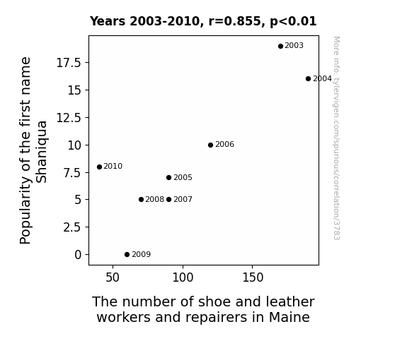
View details about correlation #3,783
Shoe-niqua and the Cobbler Connection: An Empirical Study of the Relationship between the Popularity of the Name Shaniqua and the Number of Shoe and Leather Workers and Repairers in Maine
As the name 'Shaniqua' fell out of favor, there was a nationwide shortage of shoe aficionados with a passion for the craft. Without a steady influx of Shaniqua's Shoe Services, Maine's leather workers and repairers found themselves cobbling together a plan for the future. The correlation was quite striking, leading experts to dub it the 'Shaniqua Shoe Shrinkage Effect,' as it seemed that the name held a soleful influence on the state's footwear industry.


View details about correlation #2,482
Sizzling Solar Success: Spain's Sun-Powered Solutions and US Gun-Galore Quandary
As solar panels in Spain soaked up the sun's rays, they inadvertently beamed a message into space that was misconstrued as a call for a Wild West revival. This led to a surge in demand for American-made firearms, as the solar-powered signal triggered a global fascination with frontier-style shootouts. The unexpected link between renewable energy and old-fashioned weaponry left everyone in a state of solar shock and awe.

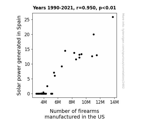
What else correlates?
Solar power generated in Spain · all energy
Number of firearms manufactured in the US · all weird & wacky
Solar power generated in Spain · all energy
Number of firearms manufactured in the US · all weird & wacky


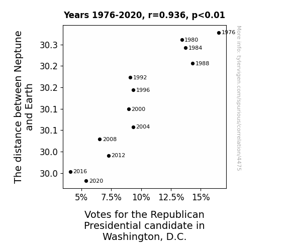
View details about correlation #4,475
Looking Beyond the Stars: The Neptune of Republican Votes in Washington, D.C.
As Neptune inched closer, it created a stronger gravitational pull on the political landscape. This led to a 'republi-cant' situation for the Republican candidate, as their votes got lost in the cosmic chaos. It seems even in the far reaches of space, the stars just didn't align for the GOP in D.C.


View details about correlation #4,268
Can Texas Secede from the Union? An Investigation into the Links Between Air Pollution in North Port, Florida and Search Queries on Google
As air pollution in North Port, Florida increased, it led to the proliferation of mutant super mosquitoes. These mosquitoes, with their newfound Texan accents, began inciting a rebellion in Texas, ultimately sparking renewed interest in Texas seceding from the union. One mosquito's buzz is another state's call for independence!


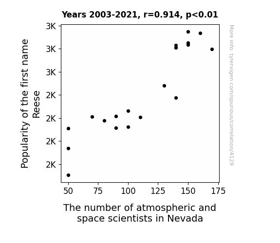
View details about correlation #4,129
Reese-ntful Skies: The Atmospheric Rise of the Name Reese in Nevada
As the name Reese gained popularity, more parents were inspired by the sweet success of Reese's Peanut Butter Cups and named their kids after the irresistible treat. This led to a generation of bright minds who were drawn to the heavenly realms of outer space, just like a magnet. The celestial connection was undeniable, as these budding scientists reached for the stars, all thanks to their celestial-chocolatey name inspiration. It's like they say, with great Reese-ponsibility comes great Reese-search in the field of space and atmospheric science!


View details about correlation #1,366
Flowing Words: Uncovering the Hydro-Powered Connection between the Dominican Republic and New York Times Fiction Best Sellers
The surge in hydropower from the Dominican Republic is sparking a new wave of creativity in the region. The increased flow of clean energy is electrifying Dominican writers and fueling their imaginations, leading to a flood of captivating fiction that's making a splash in the literary world. It's like they say, when it reigns, it pours captivating stories, and the current is certainly in favor of these electrifying Dominican authors! So, it's not just the rivers in the Dominican Republic that are flowing, but also the ink of creativity, cascading into the literary landscape and leaving readers all amped up for these new tales!

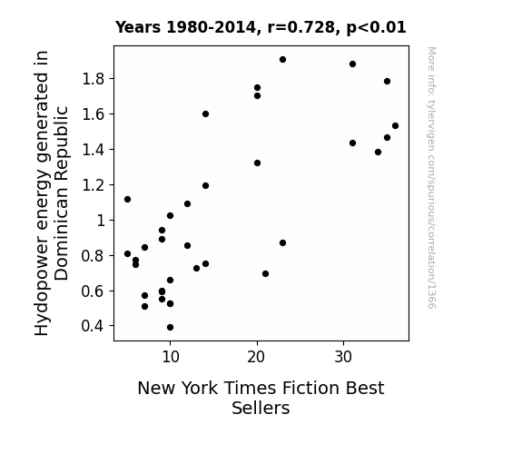
What else correlates?
Hydopower energy generated in Dominican Republic · all energy
New York Times Fiction Best Sellers · all weird & wacky
Hydopower energy generated in Dominican Republic · all energy
New York Times Fiction Best Sellers · all weird & wacky


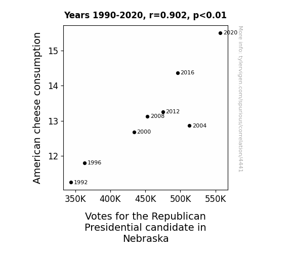
View details about correlation #4,441
Say Cheese: An Examination of the Gouda Connection Between American Cheese Consumption and Republican Votes in Nebraska
As American cheese consumption goes up, so does the cheesiness of political ads in Nebraska. This activates the latent fondness for dairy-based humor, leading voters to cast their ballots for the candidate who is gouda at cracking jokes. Remember, when in doubt, let Velveeta decide your vote!
What else correlates?
American cheese consumption · all food
Votes for the Republican Presidential candidate in Nebraska · all elections
American cheese consumption · all food
Votes for the Republican Presidential candidate in Nebraska · all elections


View details about correlation #3,815
The Hazy Link Between Air Pollution and Criminal Tendencies: A Case Study in St. Marys, Pennsylvania
As the smog lifted, so did the tendency to brawl. Turns out, cleaner air led to cleaner tempers. It's as if the reduced pollution created a 'peaceful protest' within the population, showing that when it comes to crime, the real 'killer' was actually the pollutants in the air. This just goes to show that when the atmosphere is less toxic, so are the interactions. Who would have thought that the key to a safer city was simply letting the residents breathe easy?


What else correlates?
Air pollution in St. Marys, Pennsylvania · all weather
Violent crime rates · all random state specific
Air pollution in St. Marys, Pennsylvania · all weather
Violent crime rates · all random state specific
. The chart goes from 2004 to 2021, and the two variables track closely in value over that time.")

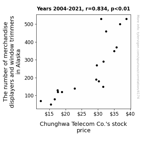
View details about correlation #4,174
Alaska Shop Displays and CHT Stock Parlays: An Eccentric Correlation Study
As more displayers and trimmers set up shop in Alaska, the demand for decorative ice sculptures skyrocketed. Catering to this icy trend, Chunghwa Telecom Co. pivoted to manufacturing uniquely carved, ice-embedded smartphones, leading to a surge in sales and a frosty coolness in the stock market. Remember, when it comes to stocks, it's all about staying chill!


View details about correlation #3,605
Solar Power in Suriname and Gender Disparity in the Land of the Dime
As Solar power output in Suriname increases, it inadvertently amplifies the energy of the Sun. This solar-powered surge somehow intensifies stereotypes, leading to a corresponding rise in the gender pay gap in the U.S. It's quite a shocker, as the Sun's influence ends up sparking a heated debate about equality in the workplace. Who would have thought that sunshine and salary disparities could be connected in such a bright and perplexing way!


What else correlates?
Solar power generated in Suriname · all energy
Gender pay gap in the U.S. · all weird & wacky
Solar power generated in Suriname · all energy
Gender pay gap in the U.S. · all weird & wacky


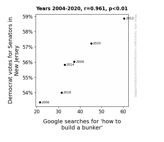
View details about correlation #4,884
Digging into Democrats' Digs: The Correlation Between New Jersey Democratic Senate Votes and Google Searches for 'How to Build a Bunker'
As more Democrats vote for Senators in New Jersey, there is a greater push for progressive policies, leading some individuals to humorously consider building bunkers as a metaphorical way of fortifying their beliefs. Remember, when it comes to politics, it's always best to dig deep for the puns!


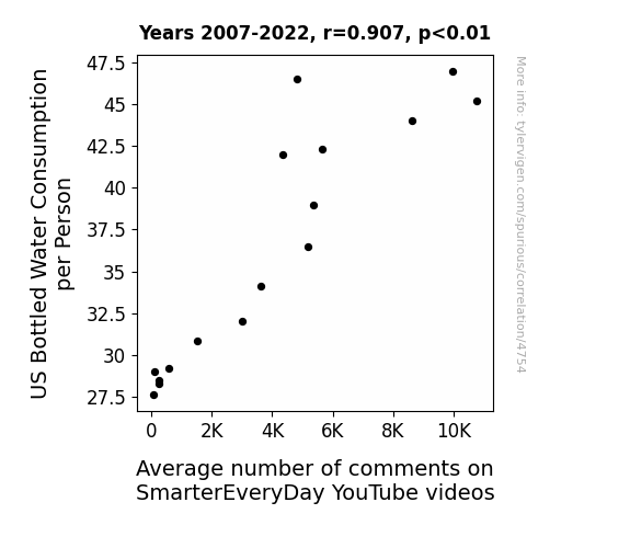
View details about correlation #4,754
H2O and Hilarity: Unearthing the Aquatic Quirk in Digital Discourse
As the nation drank their way to hydration, the collective thirst for knowledge also grew. This led to a spike in cerebral activity, as people became H2O-bsessed with learning and sharing their thoughts. It seems the more water Americans guzzle, the more they comment, quenching their intellectual thirst and creating a ripple effect of engagement. Truly, the comment section has become a well of wisdom, all thanks to the bottle-up trend of water consumption. Could it be that the secret to sparking discussions lies in a profound connection between water and w-comments? One thing’s clear - this correlation is making waves in the world of online learning, and audiences are simply soaking it all in!


View details about correlation #3,987
Joyriding Jose: Exploring the Enigmatic Link Between the Popularity of the Name Jose and Motor Vehicle Thefts in North Carolina
As the popularity of the name Jose waned, so did the number of car "hosays" in North Carolina, leading to a decrease in motor vehicle thefts. It seems there's just no "José" for stealing cars anymore!

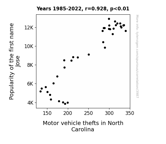
What else correlates?
Popularity of the first name Jose · all first names
Motor vehicle thefts in North Carolina · all random state specific
Popularity of the first name Jose · all first names
Motor vehicle thefts in North Carolina · all random state specific


View details about correlation #1,816
Burning the Midnight Oil: An Unlikely Relationship Between Food and Tobacco Roasting, Baking, and Drying Machine Operators and Tenders in Indiana and Jet Fuel Consumption in Kiribati
As the number of these operators and tenders in Indiana increased, so did the level of *hot air* produced. This led to a chain reaction of *smokin'* interference with the air currents, ultimately causing a disproportionate amount of jet fuel to be diverted towards Kiribati. It seems the Hoosier state's sizzling workforce inadvertently put the *heat* on Kiribati's aviation fuel supply!
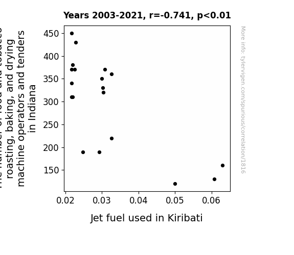
. The chart goes from 2008 to 2023, and the two variables track closely in value over that time.")

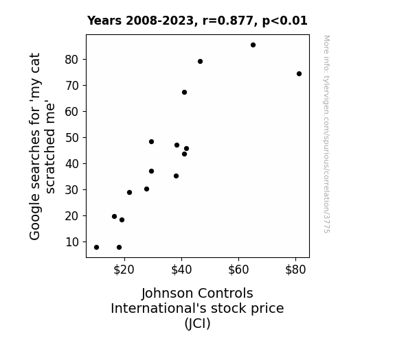
View details about correlation #3,775
Scratch That Stock: The Purr-fect Relationship Between Google Searches for 'My Cat Scratched Me' and Johnson Controls International's Stock Price
As more people Googled 'my cat scratched me', the demand for pet first aid supplies soared. This unexpected surge in demand led to a boost in sales of Johnson Controls' temperature and humidity control systems, as pet owners tried to create the purr-fect healing environment for their beloved feline friends. This increase in the company's products' popularity among pet owners ultimately drove up their stock price as investors realized the clawsome new market opportunity. Remember, a rising stock price can sometimes be the cat-alyst for a good pun!


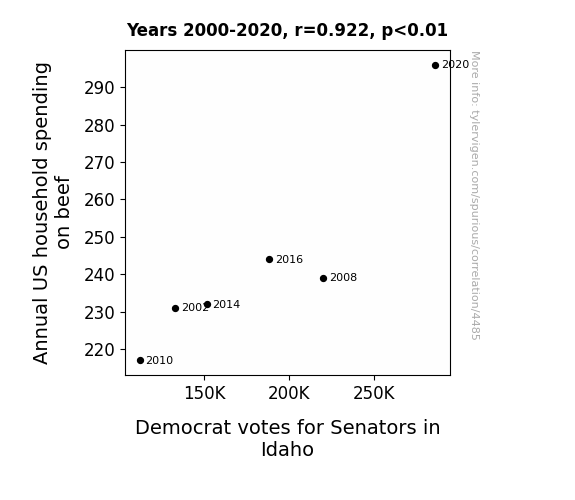
View details about correlation #4,485
Steak and Ballot: The Beef-Ballot Battle in Idaho Senate Elections
Perhaps there's a strong beefy bond that has formed between the electorate and the candidates. As households spent more on beef, they found themselves inexplicably drawn to the steaks...I mean, stakes of the election. It's as if the sizzle of their spending translated into a desire for sizzling policies, leading to a rare victory for the Democrats.

What else correlates?
Annual US household spending on beef · all weird & wacky
Votes for Democratic Senators in Idaho · all elections
Annual US household spending on beef · all weird & wacky
Votes for Democratic Senators in Idaho · all elections
Why this works
- Data dredging: I have 25,237 variables in my database. I compare all these variables against each other to find ones that randomly match up. That's 636,906,169 correlation calculations! This is called “data dredging.”
Fun fact: the chart used on the wikipedia page to demonstrate data dredging is also from me. I've been being naughty with data since 2014.
Instead of starting with a hypothesis and testing it, I instead tossed a bunch of data in a blender to see what correlations would shake out. It’s a dangerous way to go about analysis, because any sufficiently large dataset will yield strong correlations completely at random. - Lack of causal connection: There is probably no direct connection between these variables, despite what the AI says above.
Because these pages are automatically generated, it's possible that the two variables you are viewing are in fact causually related. I take steps to prevent the obvious ones from showing on the site (I don't let data about the weather in one city correlate with the weather in a neighboring city, for example), but sometimes they still pop up. If they are related, cool! You found a loophole.
This is exacerbated by the fact that I used "Years" as the base variable. Lots of things happen in a year that are not related to each other! Most studies would use something like "one person" in stead of "one year" to be the "thing" studied. - Observations not independent: For many variables, sequential years are not independent of each other. You will often see trend-lines form. If a population of people is continuously doing something every day, there is no reason to think they would suddenly change how they are doing that thing on January 1. A naive p-value calculation does not take this into account.
You will calculate a lower chance of "randomly" achieving the result than represents reality.
To be more specific: p-value tests are probability values, where you are calculating the probability of achieving a result at least as extreme as you found completely by chance. When calculating a p-value, you need to assert how many "degrees of freedom" your variable has. I count each year (minus one) as a "degree of freedom," but this is misleading for continuous variables.
This kind of thing can creep up on you pretty easily when using p-values, which is why it's best to take it as "one of many" inputs that help you assess the results of your analysis.
- Y-axes doesn't start at zero: I truncated the Y-axes of the graphs above. I also used a line graph, which makes the visual connection stand out more than it deserves.
Nothing against line graphs. They are great at telling a story when you have linear data! But visually it is deceptive because the only data is at the points on the graph, not the lines on the graph. In between each point, the data could have been doing anything. Like going for a random walk by itself!
Mathematically what I showed is true, but it is intentionally misleading. If you click on any of the charts that abuse this, you can scroll down to see a version that starts at zero. - Confounding variable: Confounding variables (like global pandemics) will cause two variables to look connected when in fact a "sneaky third" variable is influencing both of them behind the scenes.
- Outliers: Some datasets here have outliers which drag up the correlation.
In concept, "outlier" just means "way different than the rest of your dataset." When calculating a correlation like this, they are particularly impactful because a single outlier can substantially increase your correlation.
Because this page is automatically generated, I don't know whether any of the charts displayed on it have outliers. I'm just a footnote. ¯\_(ツ)_/¯
I intentionally mishandeled outliers, which makes the correlation look extra strong. - Low n: There are not many data points included in some of these charts.
You can do analyses with low ns! But you shouldn't data dredge with a low n.
Even if the p-value is high, we should be suspicious of using so few datapoints in a correlation.
Pro-tip: click on any correlation to see:
- Detailed data sources
- Prompts for the AI-generated content
- Explanations of each of the calculations (correlation, p-value)
- Python code to calculate it yourself


