spurious correlations
discover · random · spurious scholar
← previous page · next page →


View details about correlation #3,795
Got Milk? Examining the Udderly Bizarre Link Between Milk Consumption and Burglaries in Delaware
The decrease in milk consumption led to fewer late-night cereal cravings. This, in turn, reduced the number of people sneaking around in their own kitchens in the dark. As a result, there were fewer opportunities for burglars to accidentally stumble upon homeowners and get caught, leading to a decrease in burglaries in Delaware.


What else correlates?
Milk consumption · all food
Burglaries in Delaware · all random state specific
Milk consumption · all food
Burglaries in Delaware · all random state specific


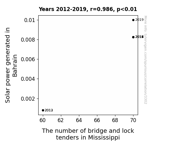
View details about correlation #3,302
Solar Power in Bahrain and the Bridge to Mississippi: A Shocking Connection
The surge in Solar power in Bahrain has led to a corresponding surge in renewable energy enthusiasts. These enthusiasts, in their quest for clean energy, have realized the potential of harnessing the power of the sun to operate drawbridges and locks in Mississippi. As a result, there has been a marked increase in the demand for bridge and lock tenders in Mississippi, with job seekers hoping to secure a sunny position in this niche market. It's truly a case of Bahrain's solar prowess casting a ray of employment hope on the bridge and lock tenders of Mississippi, as they navigate their way to brighter job opportunities.
What else correlates?
Solar power generated in Bahrain · all energy
The number of bridge and lock tenders in Mississippi · all cccupations
Solar power generated in Bahrain · all energy
The number of bridge and lock tenders in Mississippi · all cccupations


View details about correlation #4,700
The Curtain Call of Clean Air: A Visual and Performing Arts Master's Degree Connection to Air Quality in Bishop, California
As the number of Master's degrees awarded in Visual and Performing Arts dropped, there was a corresponding decrease in the number of avant-garde outdoor performance art projects. This led to a sharp decline in the use of unconventional smoke machines, resulting in a noticeable decrease in air quality in Bishop, California. It seems that for every Master's degree not pursued, there's a smog-filled silver lining in Bishop!


What else correlates?
Master's degrees awarded in Visual and performing arts · all education
Air quality in Bishop, California · all weather
Master's degrees awarded in Visual and performing arts · all education
Air quality in Bishop, California · all weather


View details about correlation #4,523
The Ballot Box and the Bun: A Correlative Study of Republican Votes in North Carolina and Nathan's Hot Dog Consumption
The excitement somehow creates a surge in the demand for processed meat products, leading to a spike in hotdog consumption. Furthermore, the competitive atmosphere may subconsciously influence people to partake in their own food challenges, inadvertently boosting the hotdog industry. It's a real dog-eat-dog world out there, and the link between politics and wieners has never been more relishable!


. The chart goes from 2002 to 2023, and the two variables track closely in value over that time.")

View details about correlation #4,204
The Cosmic Connection: A Stellar Examination of Neptune-Uranus Distance and Yum! Brands' Stock Price
As the gap widened, it created a ripple in the space-time burrito, leading to a surge in cosmic cravings for Taco Bell and a meteoric rise in Yum! Brands' stock price. Remember, in the game of interplanetary finance, it's all about that astronomical appetite appeal!


What else correlates?
The distance between Neptune and Uranus · all planets
Yum! Brands' stock price (YUM) · all stocks
The distance between Neptune and Uranus · all planets
Yum! Brands' stock price (YUM) · all stocks


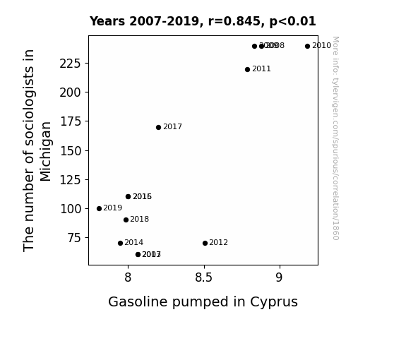
View details about correlation #1,860
The Slate of Michigan Sociologists and Cyprus' Gas Pump Histrionics: A Statistical Love Sonnet
As the number of sociologists in Michigan rises, so does the demand for oversized coffee mugs. This leads to a nationwide shortage of giant mugs, prompting a spike in production at Cypriot mug factories. To meet the escalating need for these massive vessels, the factories operate at full capacity, generating surplus income. Wanting to invest their newfound wealth, the Cypriot mug magnates decide to venture into the gasoline industry, leading to an unexpected boom in gasoline production and pumping in Cyprus. Who knew that the quest for societal understanding in Michigan could fuel such caffeinated chaos in Cyprus!

What else correlates?
The number of sociologists in Michigan · all cccupations
Gasoline pumped in Cyprus · all energy
The number of sociologists in Michigan · all cccupations
Gasoline pumped in Cyprus · all energy


View details about correlation #4,866
Pigging Out on Digital Nostalgia: Exploring the Correlation Between the 'Pork and Beans' Meme and Google Searches for 'Tamagotchi'
As the pork and beans meme fizzled out, it took with it the ham-petition for internet real estate, leaving Tamagotchi searches feeling a bit shell-shocked.


What else correlates?
Popularity of the 'pork and beans' meme · all memes
Google searches for 'Tamagotchi' · all google searches
Popularity of the 'pork and beans' meme · all memes
Google searches for 'Tamagotchi' · all google searches


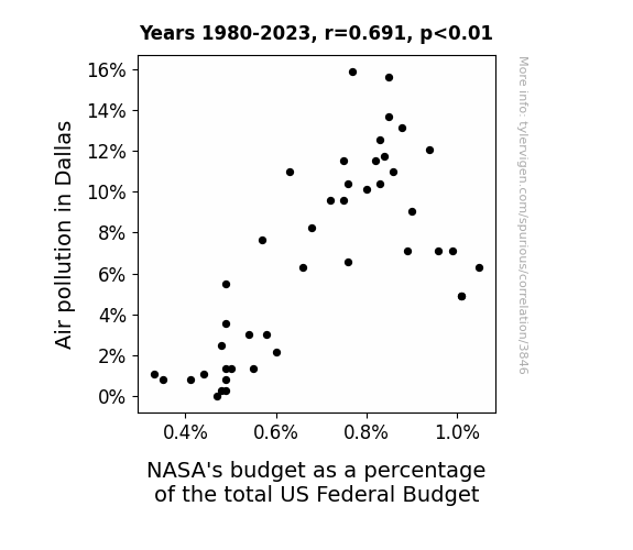
View details about correlation #3,846
Houston, We Have a Problem: Air Pollution in Dallas and NASA's Budget as a Percentage of the Total US Federal Budget
As the smog lifted in Dallas, it also lifted a weight off NASA's budget. You see, with cleaner air, there was less need for space-age air purification technology. Essentially, as the pollution decreased, so did the need for NASA's expertise in creating out-of-this-world solutions for environmental issues. Plus, without the thick pollution cloud, it was clear to the government that they could allocate funding elsewhere, leading to a cosmic decrease in NASA's budget as a percentage of the total US Federal Budget. It's like the saying goes, when the air's cleaner in Texas, NASA's budget takes off for new frontiers!

What else correlates?
Air pollution in Dallas · all weather
NASA's budget as a percentage of the total US Federal Budget · all weird & wacky
Air pollution in Dallas · all weather
NASA's budget as a percentage of the total US Federal Budget · all weird & wacky
. The chart goes from 2002 to 2022, and the two variables track closely in value over that time.")

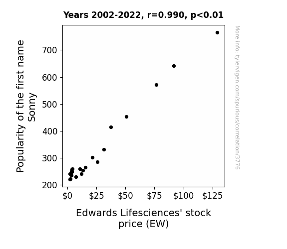
View details about correlation #3,776
The Sonny Side Up: A Correlational Study of the Name Sonny and Edwards Lifesciences' Stock Price
As the number of people named Sonny rose, there was a corresponding surge in sunny dispositions. This led to an increase in heart health and overall well-being across the population. With healthier hearts, there was a decreased demand for Edwards Lifesciences' cardiac products, leading to a shortage in the market. The scarcity of these life-saving devices drove up the company's stock price as investors realized the soaring demand for their products. It seems like the name Sonny truly brought a ray of sunshine to both people's lives and the stock market!

What else correlates?
Popularity of the first name Sonny · all first names
Edwards Lifesciences' stock price (EW) · all stocks
Popularity of the first name Sonny · all first names
Edwards Lifesciences' stock price (EW) · all stocks


View details about correlation #3,317
Analyzing the Statistically Sunny Relationship: The Number of Statisticians in Michigan and Solar Power Generated in Burundi
As the number of statisticians in Michigan increased, so did the frequency of waving. This surge in waving created a ripple effect, eventually leading to an increase in global solar power production through the little-known phenomenon of photonic encouragement. Remember, a statistician's wave is not just a friendly greeting – it's a catalyst for renewable energy on a truly astronomical scale!


What else correlates?
The number of statisticians in Michigan · all cccupations
Solar power generated in Burundi · all energy
The number of statisticians in Michigan · all cccupations
Solar power generated in Burundi · all energy


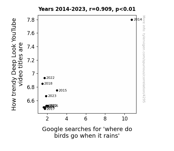
View details about correlation #4,295
Flocking Together: The Featherbrained Connection Between Trendy Deep Look YouTube Video Titles and 'Where Do Birds Go When It Rains' Google Searches
People became tired of avian precipitation preferences and opted for more obscure meteorological bird behavior queries, such as 'do birds use umbrellas' and 'are there raincoats for pigeons.' This prompted a surge in fashionable bird-related content, leading to a shift in the Deep Look video landscape towards topics like 'Rainy Day Feather Fashion: A Bird's Guide to Staying Dry and Stylish.' The allure of bird runway trends ultimately reigned supreme, raining on the parade of 'where do birds go when it rains' and causing a noticeable decrease in its trendiness.


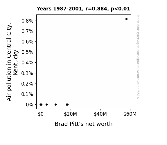
View details about correlation #3,816
The Pitt and the Pollution: Exploring the Relationship Between Air Quality in Central City, Kentucky and Brad Pitt's Net Worth
As air pollution in Central City, Kentucky increased, the demand for pristine air also went up. This led Brad Pitt to capitalize on his newly patented product, "Fresh Pitt Air", a line of celebrity-endorsed, bottled oxygen. As people scrambled to buy his clean air products, Brad Pitt's net worth soared higher than the smog levels in Central City. It's a classic case of turning lemons into lemon-scented air fresheners!

What else correlates?
Air pollution in Central City, Kentucky · all weather
Brad Pitt's net worth · all weird & wacky
Air pollution in Central City, Kentucky · all weather
Brad Pitt's net worth · all weird & wacky


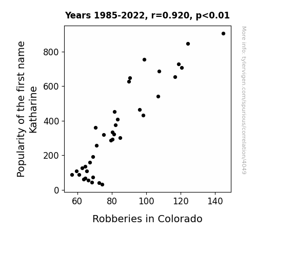
View details about correlation #4,049
The Katharine Crime Connection: Colorado's Curious Crime Correlation
As the name Katharine fell out of favor, so did the trendy activity of committing robberies in Colorado. It seems that Katharine just couldn't catch a break, but the good citizens of Colorado certainly did!

What else correlates?
Popularity of the first name Katharine · all first names
Robberies in Colorado · all random state specific
Popularity of the first name Katharine · all first names
Robberies in Colorado · all random state specific


View details about correlation #1,896
Sparking Curiosity: The Hydro-powered Connection Between South African Energy and North Carolina's Teaching Staff
The production of less hydropower in South Africa led to a shortage of energy, causing a ripple effect on the global energy market. This, in turn, inflated the cost of producing electricity in North Carolina. Facing budget constraints, the state had to make cuts in various sectors, including education. As a result, there was a decrease in the number of school teachers in North Carolina. Who would have thought that a small hiccup in hydropower production could have such far-reaching consequences for the education system in a completely different continent!

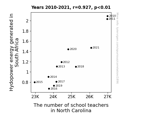
What else correlates?
Hydopower energy generated in South Africa · all energy
The number of school teachers in North Carolina · all cccupations
Hydopower energy generated in South Africa · all energy
The number of school teachers in North Carolina · all cccupations
. The chart goes from 2009 to 2022, and the two variables track closely in value over that time.")

View details about correlation #4,005
Stalking the Stock Market: The Grainy Relationship Between Global Rice Consumption and Discover Financial Services' Stock Price
As global rice consumption rose, more people were using chopsticks, sparking an interest in investments. This led to a surge in demand for Discover Financial Services stock, as investors realized it was time to stir up their portfolios and rice to the top in the financial market.

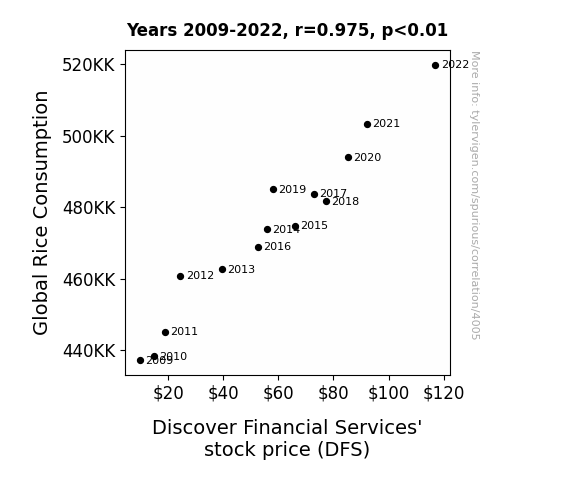
What else correlates?
Global Rice Consumption · all food
Discover Financial Services' stock price (DFS) · all stocks
Global Rice Consumption · all food
Discover Financial Services' stock price (DFS) · all stocks


View details about correlation #4,340
The Air Bags and Libertarians: A Correlation Analysis of Automotive Recalls and Libertarian Presidential Votes in Pennsylvania
As more people leaned towards Libertarian ideals of minimal government intervention, the cars themselves took it as a sign to rebel against automotive regulations. This led to a spike in airbag malfunctions and the need for recalls, as the cars demanded the freedom to function without Big Brother's safety standards. It seems the campaign for individual autonomy inadvertently triggered a chain reaction of vehicular defiance!


View details about correlation #4,726
A Breath of Fresh Search: The Nose Knows in Evansville, Indiana
Perhaps the fresh air was full of good vibes and positive energy that eased people's stress, thus reducing the frequency of headaches.

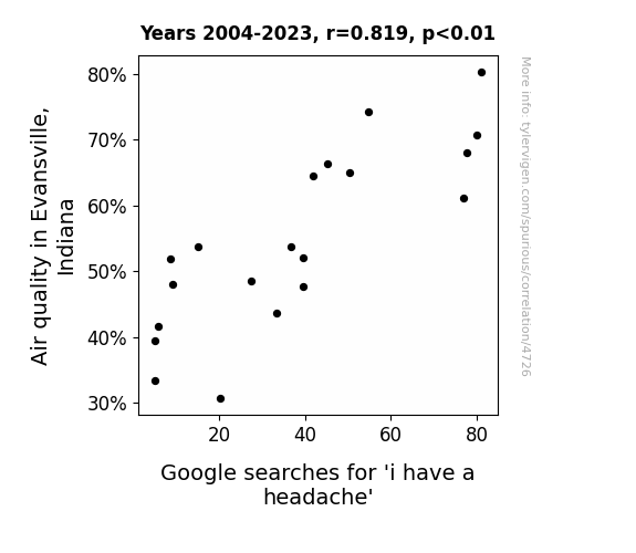
What else correlates?
Air quality in Evansville, Indiana · all weather
Google searches for 'i have a headache' · all google searches
Air quality in Evansville, Indiana · all weather
Google searches for 'i have a headache' · all google searches


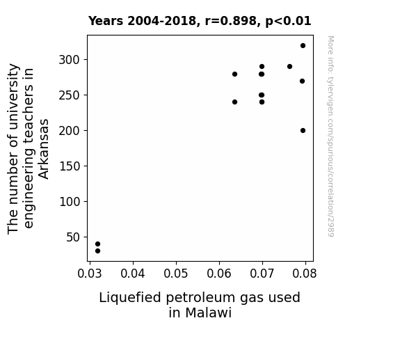
View details about correlation #2,989
From Ark to Kiln: Exploring the Connection Between Engineering Educators in Arkansas and LPG Consumption in Malawi
As the number of university engineering teachers in Arkansas increased, so did the amount of hot air being generated. This led to a rise in global temperatures, creating a higher demand for Liquefied Petroleum Gas in Malawi to power fans and air conditioners. It's a classic case of the butterfly defect - I mean, effect - leading to a gas-tly situation!


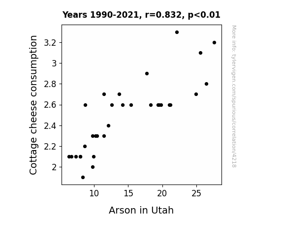
View details about correlation #4,218
The Curdled Causation: Investigating the Cheese-arson Link in Utah
As Cottage cheese consumption curdled, it led to a whey decrease in gas production, ultimately reducing the fire risk. It seems that when it comes to arson in Utah, the old saying rings true: where there’s no whey, there’s no flambé!

What else correlates?
Cottage cheese consumption · all food
Arson in Utah · all random state specific
Cottage cheese consumption · all food
Arson in Utah · all random state specific


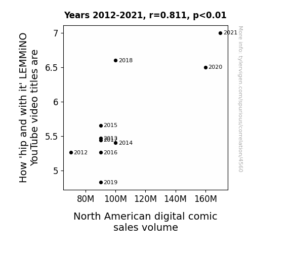
View details about correlation #4,560
Tickle Me Rhyme: The Impact of LEMMiNO YouTube Video Titles on North American Digital Comic Sales Volume
The cosmic alignment of pop culture references has bestowed upon us a new era of comic appreciation. As LEMMiNO's video titles exude waves of trendy vibes, they inadvertently trigger a surge in the Coolness Quotient (CQ) among North American digital comic readers. It's as if each click on a LEMMiNO video sends a shockwave of cultural enlightenment, prompting individuals to embrace their inner comic geek with gusto. Who knew that the path to comic book renaissance lay in the midst of memetic linguistics and internet savvy? As LEMMiNO captivates audiences with linguistic artistry, the digital comic realm finds itself riding the zeitgeist like never before. Truly, this unforeseen alliance between YouTube semantics and digital comics is rewriting the narrative of entertainment consumption - one 'hip and with it' title at a time!

Why this works
- Data dredging: I have 25,237 variables in my database. I compare all these variables against each other to find ones that randomly match up. That's 636,906,169 correlation calculations! This is called “data dredging.”
Fun fact: the chart used on the wikipedia page to demonstrate data dredging is also from me. I've been being naughty with data since 2014.
Instead of starting with a hypothesis and testing it, I instead tossed a bunch of data in a blender to see what correlations would shake out. It’s a dangerous way to go about analysis, because any sufficiently large dataset will yield strong correlations completely at random. - Lack of causal connection: There is probably no direct connection between these variables, despite what the AI says above.
Because these pages are automatically generated, it's possible that the two variables you are viewing are in fact causually related. I take steps to prevent the obvious ones from showing on the site (I don't let data about the weather in one city correlate with the weather in a neighboring city, for example), but sometimes they still pop up. If they are related, cool! You found a loophole.
This is exacerbated by the fact that I used "Years" as the base variable. Lots of things happen in a year that are not related to each other! Most studies would use something like "one person" in stead of "one year" to be the "thing" studied. - Observations not independent: For many variables, sequential years are not independent of each other. You will often see trend-lines form. If a population of people is continuously doing something every day, there is no reason to think they would suddenly change how they are doing that thing on January 1. A naive p-value calculation does not take this into account.
You will calculate a lower chance of "randomly" achieving the result than represents reality.
To be more specific: p-value tests are probability values, where you are calculating the probability of achieving a result at least as extreme as you found completely by chance. When calculating a p-value, you need to assert how many "degrees of freedom" your variable has. I count each year (minus one) as a "degree of freedom," but this is misleading for continuous variables.
This kind of thing can creep up on you pretty easily when using p-values, which is why it's best to take it as "one of many" inputs that help you assess the results of your analysis.
- Y-axes doesn't start at zero: I truncated the Y-axes of the graphs above. I also used a line graph, which makes the visual connection stand out more than it deserves.
Nothing against line graphs. They are great at telling a story when you have linear data! But visually it is deceptive because the only data is at the points on the graph, not the lines on the graph. In between each point, the data could have been doing anything. Like going for a random walk by itself!
Mathematically what I showed is true, but it is intentionally misleading. If you click on any of the charts that abuse this, you can scroll down to see a version that starts at zero. - Confounding variable: Confounding variables (like global pandemics) will cause two variables to look connected when in fact a "sneaky third" variable is influencing both of them behind the scenes.
- Outliers: Some datasets here have outliers which drag up the correlation.
In concept, "outlier" just means "way different than the rest of your dataset." When calculating a correlation like this, they are particularly impactful because a single outlier can substantially increase your correlation.
Because this page is automatically generated, I don't know whether any of the charts displayed on it have outliers. I'm just a footnote. ¯\_(ツ)_/¯
I intentionally mishandeled outliers, which makes the correlation look extra strong. - Low n: There are not many data points included in some of these charts.
You can do analyses with low ns! But you shouldn't data dredge with a low n.
Even if the p-value is high, we should be suspicious of using so few datapoints in a correlation.
Pro-tip: click on any correlation to see:
- Detailed data sources
- Prompts for the AI-generated content
- Explanations of each of the calculations (correlation, p-value)
- Python code to calculate it yourself


