spurious correlations
discover · random · spurious scholar
← previous page · next page →


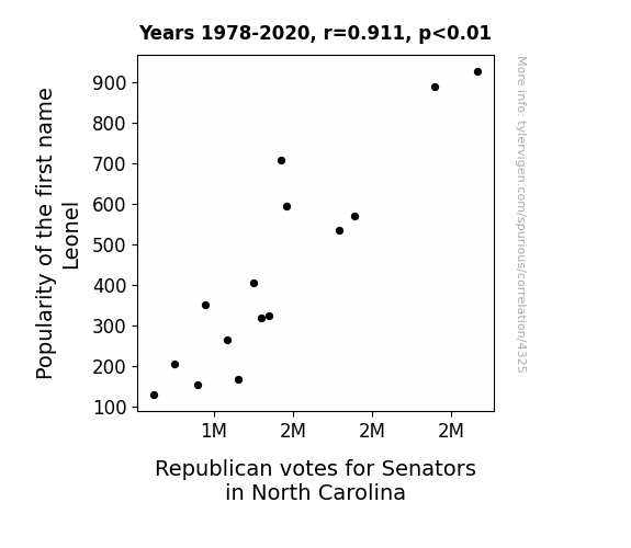
View details about correlation #4,325
Leonel, Lies, and Legislation: The Influence of Name Popularity on Political Preferences in North Carolina
Every time someone named Leonel is born, a secret message is transmitted via baby babble directly into the minds of North Carolina Republicans, compelling them to head to the polls. It's like a tiny, adorable, conservative rally cry that they just can't resist! Who knew that baby Leonels held the key to political influence in North Carolina? It's a 'Lion King' level of power, and it's no coincidence that it's shaping the mane-steam of elections in the Tar Heel State!

What else correlates?
Popularity of the first name Leonel · all first names
Votes for Republican Senators in North Carolina · all elections
Popularity of the first name Leonel · all first names
Votes for Republican Senators in North Carolina · all elections


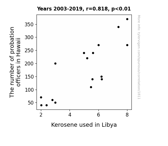
View details about correlation #1,811
Probation Puzzles and Kerosene Conundrums: Unraveling the Intercontinental Connection
It seems that as the number of probation officers in Hawaii decreased, there was a corresponding decrease in office-related tension. This led to a collective sense of calm and tranquility across the islands. Now, you might be wondering, what does this have to do with kerosene in Libya? Well, as the probation officers in Hawaii found themselves with more free time on their hands, they decided to take up gardening as a relaxing hobby. And what did they choose to plant? That's right, Hawaiian kerosene plants. With the perfect climate and soil conditions, they inadvertently sparked a kerosene farming craze. As a result, Hawaii's kerosene production skyrocketed, leading to a surplus of kerosene worldwide. This unexpected influx of kerosene caused prices to plummet, turning Libya's attention towards alternative energy sources. Who would have thought that a change in Hawaii's probation officer count could set off a chain of events that would fuel innovation in Libya!

What else correlates?
The number of probation officers in Hawaii · all cccupations
Kerosene used in Libya · all energy
The number of probation officers in Hawaii · all cccupations
Kerosene used in Libya · all energy


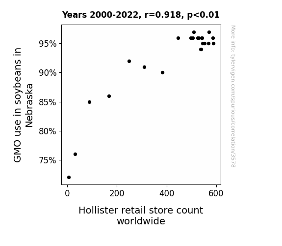
View details about correlation #3,578
GMO Soybean Grow, Hollister Show: Investigating the Rhyme of Time
As GMO use in soybeans in Nebraska increased, it led to a surplus of soy products. This surplus of soy products somehow sparked a sudden global fashion craze for denim overalls and plaid shirts, ultimately prompting the expansion of Hollister retail stores worldwide.

What else correlates?
GMO use in soybeans in Nebraska · all food
Hollister retail store count worldwide · all weird & wacky
GMO use in soybeans in Nebraska · all food
Hollister retail store count worldwide · all weird & wacky


View details about correlation #4,634
The Force is Strong with This One: A Correlational Study of Google Searches for 'How to Build a Lightsaber' and Air Pollution in Orlando
Fewer homemade lightsabers means fewer impromptu battles, resulting in a significant reduction in the need for air traffic control intervention.


What else correlates?
Google searches for 'how to build a lightsaber' · all google searches
Air pollution in Orlando · all weather
Google searches for 'how to build a lightsaber' · all google searches
Air pollution in Orlando · all weather
. The chart goes from 2002 to 2022, and the two variables track closely in value over that time.")

View details about correlation #4,110
Kai and TSCO: A Rolling Name and Stock Price Correlation Study
More babies named Kai meant more demand for baby overalls, leading to higher sales at Tractor Supply Company. You could say Kai's popularity really boosted TSCO's bottom line!


What else correlates?
Popularity of the first name Kai · all first names
Tractor Supply Company's stock price (TSCO) · all stocks
Popularity of the first name Kai · all first names
Tractor Supply Company's stock price (TSCO) · all stocks


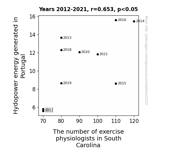
View details about correlation #2,522
A Hydro-hilarious Connection: Exploring the Correlation between Hydropower Energy in Portugal and the Number of Exercise Physiologists in South Carolina
The surge in hydroelectric power from Portugal somehow sparked a wave of enthusiasm for exercise physiology in South Carolina, leading to an unexpected influx of professionals in the field. It's as if the electrical currents carried a subliminal message to pump up and power through, creating a shocking connection between Portuguese energy and Southern wellness.


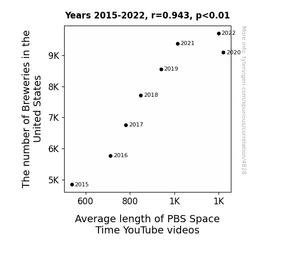
View details about correlation #4,828
Cheers to Time well Spent: Unveiling the Ale-Encompassing Relationship between Breweries in the United States and the Average Length of PBS Space Time YouTube Videos
As the number of breweries in the United States increased, so did the demand for hoppy, in-depth discussions. This led to longer PBS Space Time videos as they tried to tap into the expanding audience of beer-loving, space-curious viewers. It's a brew-tiful example of how a sudsy industry can have far-reaching effects on the length of scientific content!

What else correlates?
The number of Breweries in the United States · all food
Average length of PBS Space Time YouTube videos · all YouTube
The number of Breweries in the United States · all food
Average length of PBS Space Time YouTube videos · all YouTube


View details about correlation #4,584
Sniffles and Search Results: Exploring the Relationship Between Knoxville Air Quality and I Have the Flu Google Searches
The fresher air in Knoxville blew in some sneeze-inducing pollen, giving people the 'achoo' flu symptoms! It seems like these flu Google searches are just a result of some high-quality air infecting the residents with a case of the 'achoo'-r-binzies!


What else correlates?
Air quality in Knoxville, Tennessee · all weather
Google searches for 'i have the flu' · all google searches
Air quality in Knoxville, Tennessee · all weather
Google searches for 'i have the flu' · all google searches
. The chart goes from 2002 to 2022, and the two variables track closely in value over that time.")

View details about correlation #4,201
The Oil and Babies: A Crude Connection between London Name Popularity and Occidental Petroleum's Stock Study
As the name London gained popularity, more parents subconsciously steered their children towards careers in the petroleum industry, leading to a surge in qualified job applicants for Occidental Petroleum. This influx of talent boosted the company's productivity and innovation, ultimately driving up their stock price. It's like the butterfly effect, but with baby names and oil reserves!


What else correlates?
Popularity of the first name London · all first names
Occidental Petroleum's stock price (OXY) · all stocks
Popularity of the first name London · all first names
Occidental Petroleum's stock price (OXY) · all stocks


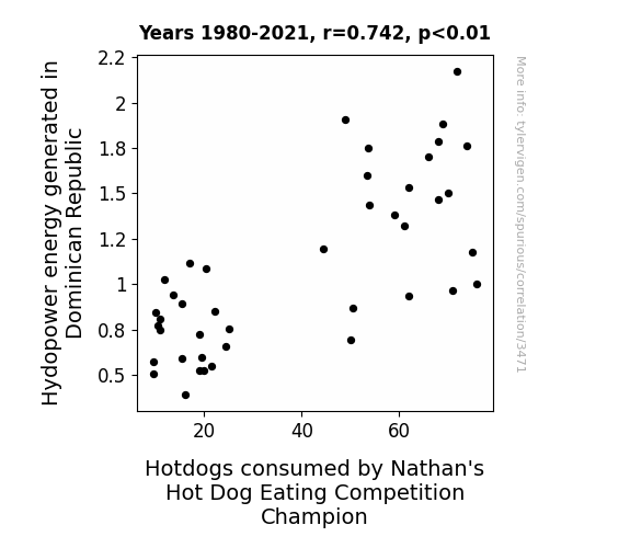
View details about correlation #3,471
From Hydropower to Hotdogs: A Statistical Connection Between Energy Generation and Competitive Eating Elation
The surge in hydropower energy in the Dominican Republic led to cooler temperatures overall. As a result, hot dog consumption increased globally, including by the reigning Nathan's Hot Dog Eating Competition champion, who found the weather to be perfect for consuming an impressive quantity of delicious hot dogs.


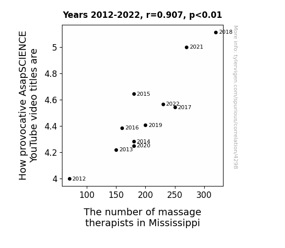
View details about correlation #4,298
The Knead for Attention: A Correlative Analysis of Provocative AsapSCIENCE YouTube Video Titles and the Number of Massage Therapists in Mississippi
As the soothing hands of Mississippi's massage therapists work their magic, the people are left in a state of relaxation and open-mindedness. This leads to the AsapSCIENCE creators feeling the need to spice up their video titles in order to captivate this newly zen audience. After all, who wouldn't want to watch a video titled "The Provocative Power of Physics" after a blissful massage session in Mississippi? The connection between a knead for relaxation and a need for clickbait is truly a rub-tastic phenomenon!


View details about correlation #4,598
Pawsitively Political: A Feline-Fueled Analysis of Google Searches for 'Cat Memes' and Democrat Votes for Senators in California
As the internet was flooded with hilarious cat memes, Californians couldn't help but feel a surge of positivity. This led to a statewide increase in dopamine levels, elevating moods across the board. With Californians in higher spirits, they found themselves more inclined to engage in political activities like voting. And lo and behold, when it came time to support their Democratic Senators, they were feline good and ready to cast their ballots! It seems that this time, the purrfect combination of humor and a-meow-zing political representation truly made a difference in the election results.


What else correlates?
Google searches for 'cat memes' · all google searches
Votes for Democratic Senators in California · all elections
Google searches for 'cat memes' · all google searches
Votes for Democratic Senators in California · all elections


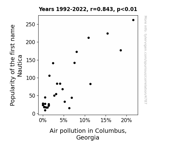
View details about correlation #4,787
Nautical Nomenclature: Exploring the Correlation between the Popularity of the Name Nautica and Air Pollution in Columbus, Georgia
More people were buying boat-themed air fresheners for their cars, leading to an unexpected surge in artificial ocean scents wafting through the city.

What else correlates?
Popularity of the first name Nautica · all first names
Air pollution in Columbus, Georgia · all weather
Popularity of the first name Nautica · all first names
Air pollution in Columbus, Georgia · all weather


View details about correlation #1,971
Blowing in the Wind: Unveiling the Link Between Czech Wind Power and US Patent Flourish
The strong gusts of creativity blown in by Czechia's wind power have sparked a whirlwind of innovation across the Atlantic, leading to a patent storm in the US. It seems like when it comes to new ideas, Czechia is really raising the bar!

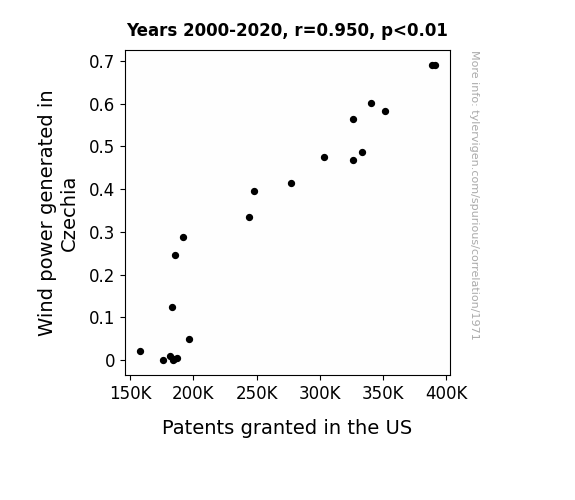
What else correlates?
Wind power generated in Czechia · all energy
Patents granted in the US · all weird & wacky
Wind power generated in Czechia · all energy
Patents granted in the US · all weird & wacky


View details about correlation #4,906
Dancing the Data: The Floss Dance Meme's Influence on the Comment Section of Simone Giertz's YouTube Channel
As the floss dance craze took over, more and more people were inspired to floss not only their dance moves but also their teeth. This led to an unexpected surge in positivity, prompting viewers to leave uplifting and often hilarious comments on Simone Giertz's videos. After all, a good dental hygiene routine can really brighten your day and make you smile - or floss your way into the comment section!

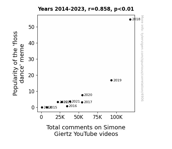
What else correlates?
Popularity of the 'floss dance' meme · all memes
Total comments on Simone Giertz's YouTube videos · all YouTube
Popularity of the 'floss dance' meme · all memes
Total comments on Simone Giertz's YouTube videos · all YouTube
. The chart goes from 2002 to 2020, and the two variables track closely in value over that time.")

View details about correlation #4,357
Democratic Dilemma: The Dance of Democrat Votes in Kentucky and the Dance of Carnival Corporation's Stock Price
Perhaps the thought of all those blue waves had people dreaming of cruises to escape the political turmoil. Plus, who wouldn't want to set sail and debate the best buffet options instead of actual politics?

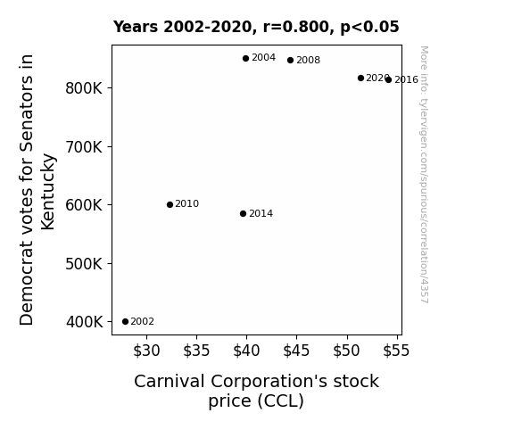
What else correlates?
Votes for Democratic Senators in Kentucky · all elections
Carnival Corporation's stock price (CCL) · all stocks
Votes for Democratic Senators in Kentucky · all elections
Carnival Corporation's stock price (CCL) · all stocks


View details about correlation #4,082
Growing Cotton and Popularity: The Correlation Between the Name India and GMO Adoption in Arkansas
As the name India became less popular, there was a corresponding decrease in the demand for Indian cotton. This led to a decrease in the production of cotton in Arkansas, causing a reduced need for GMO cotton. It's a case of as the India name faded, so did the GMO cotton trade! Who would have thought there'd be a connection between baby names and agricultural practices?

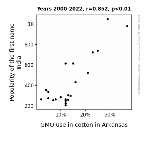
What else correlates?
Popularity of the first name India · all first names
GMO use in cotton in Arkansas · all food
Popularity of the first name India · all first names
GMO use in cotton in Arkansas · all food


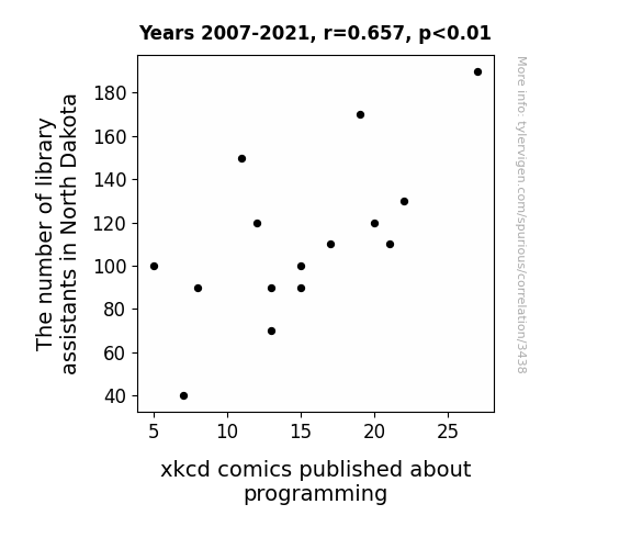
View details about correlation #3,438
Checking Out the Relationship Between Library Assistants in North Dakota and xkcd Comics on Programming: A Statistical Analysis
The decrease in library assistants led to fewer sticky notes with obscure programming jokes being strategically placed in programming books, ultimately stunting the inspiration for xkcd comics about programming. Remember, next time you check out a book, you may be holding the key to a future punchline!


View details about correlation #4,675
Pawsitively Linked: The Meow-nificent Correlation Between Google Searches for 'Adopt a Cat' and Tom Scott YouTube Video Likes
As more people adopted cats, the feline energy in the universe elevated, leading to a widespread sense of contentment and joy. This subtle but powerful shift in the cosmic meowtrix resulted in viewers being more inclined to appreciate and engage with Tom Scott's educational and entertaining content, ultimately boosting the average number of likes on his YouTube videos. Remember, a purrfectly balanced world is a happier world!


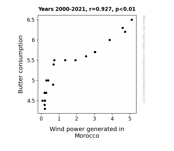
View details about correlation #3,103
Churning Winds and Margarine Mills: Unraveling the Relationship Between Butter Consumption and Wind Power Generation in Morocco
As butter consumption increased, people everywhere started to become more gassy. This led to an uptick in flatulence, which, when captured and harnessed, remarkably contributed to the overall increase in wind power generated in Morocco. It's a real gas-powered revolution!

What else correlates?
Butter consumption · all food
Wind power generated in Morocco · all energy
Butter consumption · all food
Wind power generated in Morocco · all energy
Why this works
- Data dredging: I have 25,237 variables in my database. I compare all these variables against each other to find ones that randomly match up. That's 636,906,169 correlation calculations! This is called “data dredging.”
Fun fact: the chart used on the wikipedia page to demonstrate data dredging is also from me. I've been being naughty with data since 2014.
Instead of starting with a hypothesis and testing it, I instead tossed a bunch of data in a blender to see what correlations would shake out. It’s a dangerous way to go about analysis, because any sufficiently large dataset will yield strong correlations completely at random. - Lack of causal connection: There is probably no direct connection between these variables, despite what the AI says above.
Because these pages are automatically generated, it's possible that the two variables you are viewing are in fact causually related. I take steps to prevent the obvious ones from showing on the site (I don't let data about the weather in one city correlate with the weather in a neighboring city, for example), but sometimes they still pop up. If they are related, cool! You found a loophole.
This is exacerbated by the fact that I used "Years" as the base variable. Lots of things happen in a year that are not related to each other! Most studies would use something like "one person" in stead of "one year" to be the "thing" studied. - Observations not independent: For many variables, sequential years are not independent of each other. You will often see trend-lines form. If a population of people is continuously doing something every day, there is no reason to think they would suddenly change how they are doing that thing on January 1. A naive p-value calculation does not take this into account.
You will calculate a lower chance of "randomly" achieving the result than represents reality.
To be more specific: p-value tests are probability values, where you are calculating the probability of achieving a result at least as extreme as you found completely by chance. When calculating a p-value, you need to assert how many "degrees of freedom" your variable has. I count each year (minus one) as a "degree of freedom," but this is misleading for continuous variables.
This kind of thing can creep up on you pretty easily when using p-values, which is why it's best to take it as "one of many" inputs that help you assess the results of your analysis.
- Y-axes doesn't start at zero: I truncated the Y-axes of the graphs above. I also used a line graph, which makes the visual connection stand out more than it deserves.
Nothing against line graphs. They are great at telling a story when you have linear data! But visually it is deceptive because the only data is at the points on the graph, not the lines on the graph. In between each point, the data could have been doing anything. Like going for a random walk by itself!
Mathematically what I showed is true, but it is intentionally misleading. If you click on any of the charts that abuse this, you can scroll down to see a version that starts at zero. - Confounding variable: Confounding variables (like global pandemics) will cause two variables to look connected when in fact a "sneaky third" variable is influencing both of them behind the scenes.
- Outliers: Some datasets here have outliers which drag up the correlation.
In concept, "outlier" just means "way different than the rest of your dataset." When calculating a correlation like this, they are particularly impactful because a single outlier can substantially increase your correlation.
Because this page is automatically generated, I don't know whether any of the charts displayed on it have outliers. I'm just a footnote. ¯\_(ツ)_/¯
I intentionally mishandeled outliers, which makes the correlation look extra strong. - Low n: There are not many data points included in some of these charts.
You can do analyses with low ns! But you shouldn't data dredge with a low n.
Even if the p-value is high, we should be suspicious of using so few datapoints in a correlation.
Pro-tip: click on any correlation to see:
- Detailed data sources
- Prompts for the AI-generated content
- Explanations of each of the calculations (correlation, p-value)
- Python code to calculate it yourself


