spurious correlations
discover · random · spurious scholar
← previous page · next page →
. The chart goes from 2002 to 2022, and the two variables track closely in value over that time.")

View details about correlation #3,710
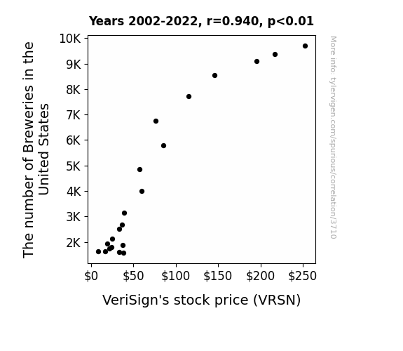
Brewing Up Stocks: An Examination of the Relationship between the Number of Breweries in the United States and VeriSign's Stock Price
As the number of breweries in the United States hops up, so does the demand for unique beer names. With craft breweries competing to come up with the wittiest and punniest names, there's a surge in requests for domain registrations. This unexpectedly benefits VeriSign, the company responsible for managing the .com and .net top-level domains, as beer enthusiasts and entrepreneurs flock to secure their hoppy endings and ale-iterations online. It seems like the Brewsiness expansion is ale-menting VeriSign's stock price to Lager levels, proving that in the world of finance, even a frothy connection can brew up success.

What else correlates?
The number of Breweries in the United States · all food
VeriSign's stock price (VRSN) · all stocks
The number of Breweries in the United States · all food
VeriSign's stock price (VRSN) · all stocks


View details about correlation #1,161
Timey Wimey Geothermal Power: The Tardis Effect on Total Minutes of Doctor Who Aired and Geothermal Power Generated in Russia
As the TARDIS traveled through time and space, it unknowingly triggered a chain reaction of wibbly wobbly geothermal energy production in Russia. The sheer awesomeness of Doctor Who episodes was just too much for the Earth to handle, leading to an eruption of geothermal power. Who knew that a Time Lord and a bunch of Daleks could have such a hot impact on Russian energy production?

What else correlates?
Total minutes of Doctor Who aired · all weird & wacky
Geothermal power generated in Russia · all energy
Total minutes of Doctor Who aired · all weird & wacky
Geothermal power generated in Russia · all energy


View details about correlation #4,075
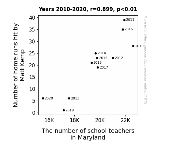
The Kemp-Knowledge Correlation: Connecting Matt Kemp's Home Runs with Maryland's Mentors
As Matt Kemp's home run count plummeted, it created a 'teaching moment' for the entire state of Maryland. With each ball failing to leave the park, there was a parallel decrease in the number of educators. It seems that as Kemp's power at the plate waned, so did the power of attraction for teaching in Maryland. It's a classic case of 'Kemp-ing' kids in school - when the homers don't soar, neither do the aspirations to educate.

What else correlates?
Number of home runs hit by Matt Kemp · all sports
The number of school teachers in Maryland · all cccupations
Number of home runs hit by Matt Kemp · all sports
The number of school teachers in Maryland · all cccupations


View details about correlation #4,320
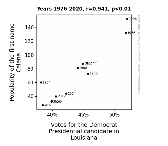
The Celena-Candidate Correlation in the Bayou State: A Two-Decade Tale
As the popularity of the name Celena waned, so did the enthusiasm for political candidates with a similar-sounding 'celebrity' status. It's possible that Louisiana locals subconsciously associated the name with a potential trend in political figures and decided to cast their votes elsewhere. After all, who would want their state to be governed by someone with a name that sounds like it belongs in a glitzy Hollywood movie? The name Celena might have inadvertently sparked a political identity crisis, leading voters to opt for candidates with more down-to-earth and 'serious' names. In the unpredictable world of politics, it seems that even the most unexpected factors can sway a voter's decision!


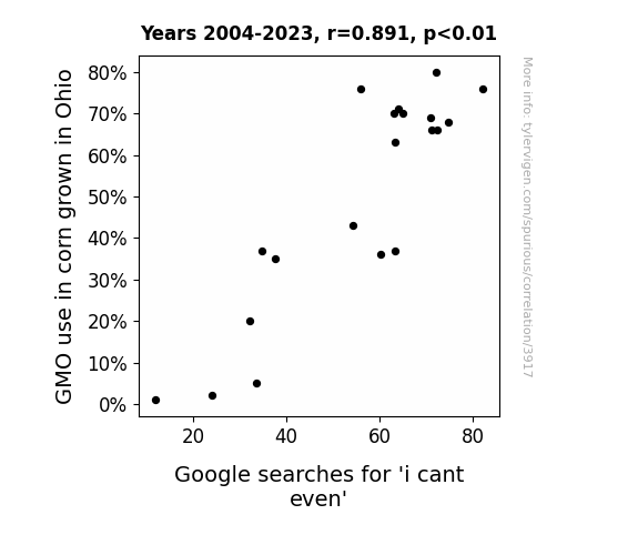
View details about correlation #3,917
Maizey Genetics: The GMO Connection to I Can't Even Search Queries in Ohio
The GMO corn in Ohio developed a protein that, when consumed by humans, inadvertently mimicked the linguistic centers of the brain, leading to an epidemic of people being unable to even. As a result, the state saw a surge in 'i cant even' Google searches as perplexed individuals tried to make sense of their newfound inability to odd. It seems that in this case, the corn was not just genetically modified, but also genetically moodified.

What else correlates?
GMO use in corn grown in Ohio · all food
Google searches for 'i cant even' · all google searches
GMO use in corn grown in Ohio · all food
Google searches for 'i cant even' · all google searches


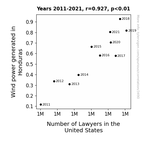
View details about correlation #3,490
Blowing in the Legal Winds: A Statistical Analysis of the Relationship Between Wind Power Generation in Honduras and the Number of Lawyers in the United States
The increased wind power in Honduras led to a rise in kite production. This in turn resulted in more kites getting stuck in trees in the US, leading to an uptick in demand for lawyers to settle property disputes over kite retrieval. After all, when it comes to tangled legal matters, they're the experts in navigating the 'air' of the law!

What else correlates?
Wind power generated in Honduras · all energy
Number of Lawyers in the United States · all weird & wacky
Wind power generated in Honduras · all energy
Number of Lawyers in the United States · all weird & wacky


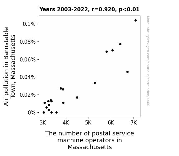
View details about correlation #4,400
Air Pollution and Postal Solution: A Rhyming Connection in Barnstable Town, Massachusetts
As the air quality improved, postal service machine operators found it easier to take deep breaths, leading to a state of zen-like relaxation. Unable to muster the necessary hustle and bustle, they made the peaceful career switch to meditation instructors, spreading postal peace and delivering tranquility one 'om' at a time.


View details about correlation #4,501
YouTube Views and Crime News: Do Computerphile Hits Affect US Heists?
As the number of people watching Computerphile videos decreased, there was a parallel decrease in the overall superiority complex of tech-savvy individuals. This led to a reduced incidence of smug hackers trying to outsmart security systems, ultimately lowering the success rate of robberies. It seems that when it comes to crime, a little less "Ctrl+Alt+Delete" mentality can actually be a good thing!


What else correlates?
Total views on Computerphile YouTube videos · all YouTube
Robberies in the US · all random state specific
Total views on Computerphile YouTube videos · all YouTube
Robberies in the US · all random state specific


View details about correlation #4,398
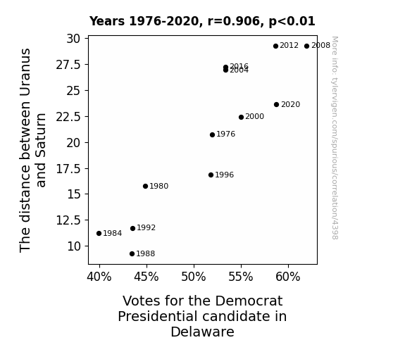
Astro-Politics: The Far-Out Connection Between Celestial Bodies and Political Leanings in Delaware
As the gravitational pull between Uranus and Saturn weakened, it created a ripple effect on the space-time continuum. This led to a surge in cosmic energy that somehow aligned with the political preferences of the residents in Delaware, ultimately swaying their votes in favor of the Democrat Presidential candidate.


View details about correlation #2,714
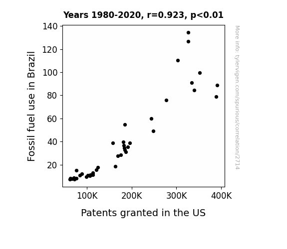
Fueling Invention: Uncovering the Gas-tronomical Connection Between Fossil Fuel Use in Brazil and Patents Granted in the US
As Brazil revved up the fossil fuel usage, the carbon emissions wafted all the way to the US, sparking unparalleled levels of creativity and innovation. It's like the fumes fueled the inventors' imaginations, leading to a patent frenzy. Or maybe there's a secret connection between the smell of gasoline and brilliant ideas - either way, it seems like Brazil was inadvertently pumping out inspiration along with the greenhouse gases!

What else correlates?
Fossil fuel use in Brazil · all energy
Patents granted in the US · all weird & wacky
Fossil fuel use in Brazil · all energy
Patents granted in the US · all weird & wacky


View details about correlation #4,685
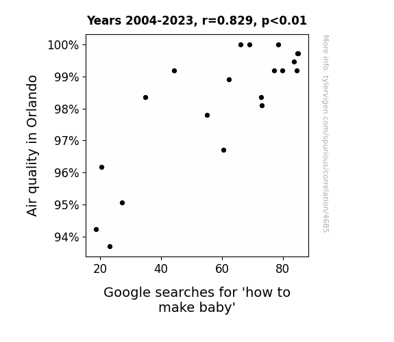
The Baby-Making Breeze: Uncovering the Link Between Air Quality in Orlando and Google Searches for 'How to Make Baby'
The fresher air must have put people in the mood for some clean conceptions. It's like they say, when the air's nice, it's twice as likely for a little one to be sprout-lando!

What else correlates?
Air quality in Orlando · all weather
Google searches for 'how to make baby' · all google searches
Air quality in Orlando · all weather
Google searches for 'how to make baby' · all google searches
. The chart goes from 2006 to 2021, and the two variables track closely in value over that time.")

View details about correlation #4,153
Cheddar Economics: Analyzing the Cheesy Relationship Between American Cheese Consumption and Ameriprise Financial Stock Price
As American cheese consumption melted, it created a positive ripple effect in the dairy industry. This led to an udderly remarkable surge in dairy company profits, including those of Ameriprise shareholders, who were undoubtedly feeling grate. Remember, the stock market is like a sandwich - it's all about the cheddar!


What else correlates?
American cheese consumption · all food
Ameriprise Financial's stock price (AMP) · all stocks
American cheese consumption · all food
Ameriprise Financial's stock price (AMP) · all stocks


View details about correlation #4,413
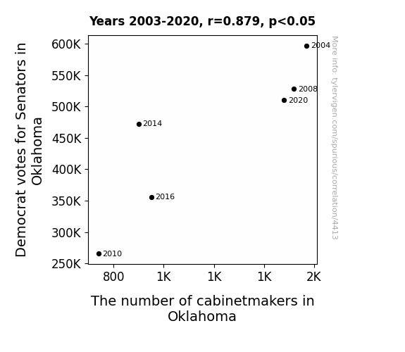
Cabinetmakers and the OK Correlation: A Panel Data Analysis of Democrat Votes for Senators in Oklahoma
As Democrat votes for Senators in Oklahoma decreased, there was a subsequent decline in political cabinet reshuffling. This led to less demand for new cabinets, ultimately impacting the number of cabinetmakers in the state. Politics and woodworking truly do have more in common than we think!
What else correlates?
Votes for Democratic Senators in Oklahoma · all elections
The number of cabinetmakers in Oklahoma · all cccupations
Votes for Democratic Senators in Oklahoma · all elections
The number of cabinetmakers in Oklahoma · all cccupations


View details about correlation #1,648
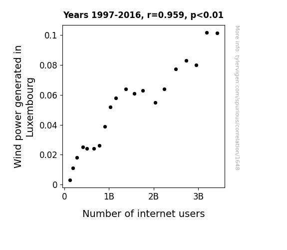
Blown Away: The Winds of Change in Luxembourg's Power and Connectivity Landscape
The spinning wind turbines created a unique electromagnetic field that somehow boosted Wi-Fi signals across the country, leading to more people hopping online. It's like they say, when it comes to internet access, the Luxembourgish are really blowing away the competition!

What else correlates?
Wind power generated in Luxembourg · all energy
Number of internet users · all weird & wacky
Wind power generated in Luxembourg · all energy
Number of internet users · all weird & wacky


View details about correlation #4,607
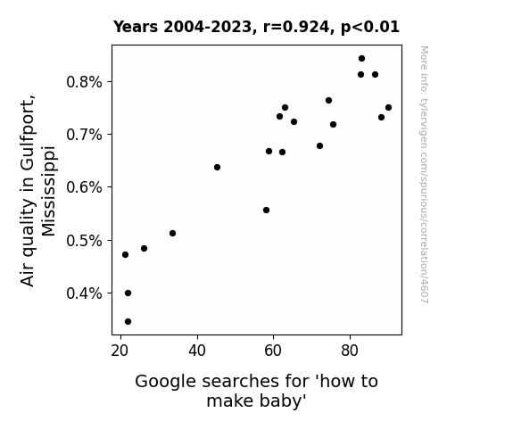
Breathless in Gulfport: The Air-Quality-Baby Conundrum
The cleaner air in Gulfport led to a baby boom as residents found themselves more energized and in the mood for romance. Perhaps the fresh Gulfport breeze carried a hint of fertility, inspiring amorous activities and sparking a rise in the population. It seems like Gulfport has found the secret recipe for both clean air and an abundance of storks!

What else correlates?
Air quality in Gulfport, Mississippi · all weather
Google searches for 'how to make baby' · all google searches
Air quality in Gulfport, Mississippi · all weather
Google searches for 'how to make baby' · all google searches


View details about correlation #4,909
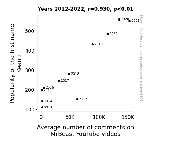
You're Breathtaking: The Keanu-nundrum of Popularity and Comments on MrBeast YouTube Videos
It's simple, really. More babies were named Keanu, which led to a higher demand for baby products. This increased the production of baby food, which in turn boosted the agricultural industry. With more people working in agriculture, there was a surplus of farmers with an inclination for charitable giving. And who is the epitome of philanthropy? None other than MrBeast himself. So, indirectly, the name Keanu sparked a chain reaction of kindness and internet stardom.

What else correlates?
Popularity of the first name Keanu · all first names
Average number of comments on MrBeast's YouTube videos · all YouTube
Popularity of the first name Keanu · all first names
Average number of comments on MrBeast's YouTube videos · all YouTube
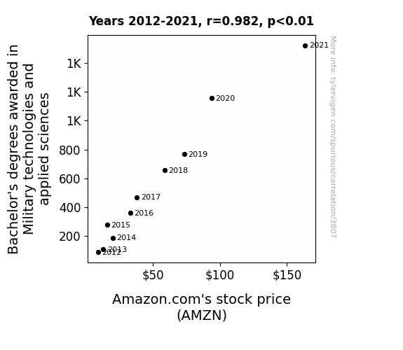
. The chart goes from 2012 to 2021, and the two variables track closely in value over that time.")

View details about correlation #3,807
The Tactical Tie: Tracing the Ties Between Bachelor's Degrees in Military Technologies and Amazon.com's AMZN Stock Price
As more students became experts in military technologies, they inadvertently perfected the art of efficient logistics and drone deliveries, thus boosting Amazon's operational capabilities and investor confidence in their futuristic approach to e-commerce.

What else correlates?
Bachelor's degrees awarded in Military technologies · all education
Amazon.com's stock price (AMZN) · all stocks
Bachelor's degrees awarded in Military technologies · all education
Amazon.com's stock price (AMZN) · all stocks


View details about correlation #3,628
Clowning Clerks: Correlating the Count of Loan Interviewers with the Capacity of Biomass Power
As more loan interviewers and clerks were hired in Utah, there was a surge in productivity. This productivity led to a surplus of paper, which was then sold to Australia at a great discount. The Australians, known for their resourcefulness, used this paper to create more efficient biomass power systems, ultimately leading to an increase in biomass power generated. So, in a strange and indirect way, Utah's focus on loans ended up fueling Australia's biomass power production!


What else correlates?
The number of loan interviewers and clerks in Utah · all cccupations
Biomass power generated in Australia · all energy
The number of loan interviewers and clerks in Utah · all cccupations
Biomass power generated in Australia · all energy


View details about correlation #1,332
Shocking Consequences: The Spread of Butter Consumption and its Impact on Automotive Recalls for Electrical System Malfunctions
As butter consumption increased, more people experienced butterfingers while trying to fix their cars, leading to a higher likelihood of electrical mishaps. Remember, slippery hands and car repairs don't mix!

What else correlates?
Butter consumption · all food
Automotive recalls for issues with the Electrical System · all weird & wacky
Butter consumption · all food
Automotive recalls for issues with the Electrical System · all weird & wacky


View details about correlation #4,193
Air Quality and Quality Wins: A Rhyme Time Analysis of Wichita's Clean Air and Golden State Warriors' Victories
There were fewer distractions from smog-blocking jump shots. Clean air meant better atmosphere for 3-pointers. It's as if the team was breathing in success with each fresh, pristine gulp of air. It was like their opponents were gasping for victory while the Warriors were just breezing through the season.


What else correlates?
Air quality in Wichita · all weather
Golden State Warriors' Seasonal Total Wins · all sports
Air quality in Wichita · all weather
Golden State Warriors' Seasonal Total Wins · all sports
Why this works
- Data dredging: I have 25,237 variables in my database. I compare all these variables against each other to find ones that randomly match up. That's 636,906,169 correlation calculations! This is called “data dredging.”
Fun fact: the chart used on the wikipedia page to demonstrate data dredging is also from me. I've been being naughty with data since 2014.
Instead of starting with a hypothesis and testing it, I instead tossed a bunch of data in a blender to see what correlations would shake out. It’s a dangerous way to go about analysis, because any sufficiently large dataset will yield strong correlations completely at random. - Lack of causal connection: There is probably no direct connection between these variables, despite what the AI says above.
Because these pages are automatically generated, it's possible that the two variables you are viewing are in fact causually related. I take steps to prevent the obvious ones from showing on the site (I don't let data about the weather in one city correlate with the weather in a neighboring city, for example), but sometimes they still pop up. If they are related, cool! You found a loophole.
This is exacerbated by the fact that I used "Years" as the base variable. Lots of things happen in a year that are not related to each other! Most studies would use something like "one person" in stead of "one year" to be the "thing" studied. - Observations not independent: For many variables, sequential years are not independent of each other. You will often see trend-lines form. If a population of people is continuously doing something every day, there is no reason to think they would suddenly change how they are doing that thing on January 1. A naive p-value calculation does not take this into account.
You will calculate a lower chance of "randomly" achieving the result than represents reality.
To be more specific: p-value tests are probability values, where you are calculating the probability of achieving a result at least as extreme as you found completely by chance. When calculating a p-value, you need to assert how many "degrees of freedom" your variable has. I count each year (minus one) as a "degree of freedom," but this is misleading for continuous variables.
This kind of thing can creep up on you pretty easily when using p-values, which is why it's best to take it as "one of many" inputs that help you assess the results of your analysis.
- Y-axes doesn't start at zero: I truncated the Y-axes of the graphs above. I also used a line graph, which makes the visual connection stand out more than it deserves.
Nothing against line graphs. They are great at telling a story when you have linear data! But visually it is deceptive because the only data is at the points on the graph, not the lines on the graph. In between each point, the data could have been doing anything. Like going for a random walk by itself!
Mathematically what I showed is true, but it is intentionally misleading. If you click on any of the charts that abuse this, you can scroll down to see a version that starts at zero. - Confounding variable: Confounding variables (like global pandemics) will cause two variables to look connected when in fact a "sneaky third" variable is influencing both of them behind the scenes.
- Outliers: Some datasets here have outliers which drag up the correlation.
In concept, "outlier" just means "way different than the rest of your dataset." When calculating a correlation like this, they are particularly impactful because a single outlier can substantially increase your correlation.
Because this page is automatically generated, I don't know whether any of the charts displayed on it have outliers. I'm just a footnote. ¯\_(ツ)_/¯
I intentionally mishandeled outliers, which makes the correlation look extra strong. - Low n: There are not many data points included in some of these charts.
You can do analyses with low ns! But you shouldn't data dredge with a low n.
Even if the p-value is high, we should be suspicious of using so few datapoints in a correlation.
Pro-tip: click on any correlation to see:
- Detailed data sources
- Prompts for the AI-generated content
- Explanations of each of the calculations (correlation, p-value)
- Python code to calculate it yourself


