spurious correlations
discover · random · spurious scholar
← previous page · next page →


View details about correlation #4,705
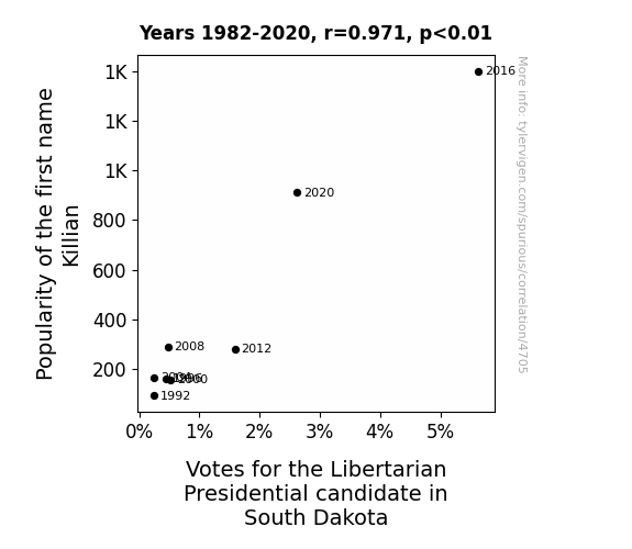
Killian's Popularity Yields Libertarian's Volatility: A Longitudinal Study in South Dakota from '82 to 2020
Perhaps every new baby named Killian was secretly registered as a libertarian voter, creating a tiny but dedicated army of politically active infants. As their numbers grew, so did the support for the Libertarian candidate, thanks to the unexpected influence of these baby politicos. Or perhaps there's a charismatic political figure named Killian who inadvertently sparked a wave of libertarian fervor, simply by being so charming that people couldn't help but embrace his political ideology. It's a name that not only demands attention, but also apparently sways political allegiance in the most unexpected of ways.


View details about correlation #3,761
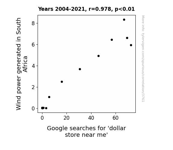
Whimsical Wind Warrants Wacky Wishes: Investigating the Interplay Between Wind Power in South Africa and Searches for the Nearest Nickel-and-Dime Nook
The gentle hum of the wind turbines created a soothing ambiance, lulling people into a bargain-hunting mood. As the turbines spun, they inadvertently sent out subliminal messages prompting folks to seek out the best deals, ultimately leading to a surge in Google searches for 'dollar store near me'. It's a case of aerodynamically-ignited consumerism, where the winds of change blew in a frenzy of frugal shopping tendencies. So, next time you're on the hunt for budget-friendly goods, just follow the breezy path to the nearest dollar store!

What else correlates?
Wind power generated in South Africa · all energy
Google searches for 'dollar store near me' · all google searches
Wind power generated in South Africa · all energy
Google searches for 'dollar store near me' · all google searches


View details about correlation #4,493
The Relationship Between Degrees in Helping Minds and Omaha's Air Grinds: A Rhyming Psuedo-Scientific Investigation
As more people became qualified to work in public administration and social services, they organized a city-wide initiative to reduce pollution. This led to the implementation of innovative programs like 'Pristine Parks, Happy Lungs' and 'Operation Fresh Air' which significantly improved air quality in Omaha. Additionally, the graduates excelled in creating a more efficient and environmentally friendly city management system, ultimately clearing the air and proving that when it comes to reducing pollution, a degree can make the difference!


What else correlates?
Bachelor's degrees awarded in social services · all education
Air quality in Omaha · all weather
Bachelor's degrees awarded in social services · all education
Air quality in Omaha · all weather


View details about correlation #1,131
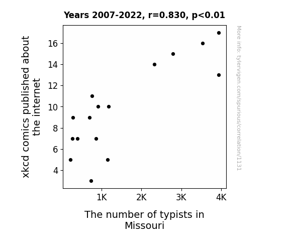
XKCD Rhymes and Typist Times: A Statistical Analysis of Internet Comics and Missouri's Typing Population
As the internet comics decreased, so did the demand for typists in Missouri, leading to a decrease in their numbers. It's a classic case of xkcd-xtinguishing the need for typists in the Show-Me State.

What else correlates?
xkcd comics published about the internet · all weird & wacky
The number of typists in Missouri · all cccupations
xkcd comics published about the internet · all weird & wacky
The number of typists in Missouri · all cccupations
. The chart goes from 2010 to 2022, and the two variables track closely in value over that time.")

View details about correlation #3,837
Walkin' the Stock: The Correlation Between the Popularity of the Name Walker and Fortinet's Fortunes
More babies were named Walker, creating a future generation of fast-moving, security-conscious individuals. As they grow up, they will naturally reinforce the demand for Fortinet's products and services, leading to an increase in stock price.

What else correlates?
Popularity of the first name Walker · all first names
Fortinet's stock price (FTNT) · all stocks
Popularity of the first name Walker · all first names
Fortinet's stock price (FTNT) · all stocks


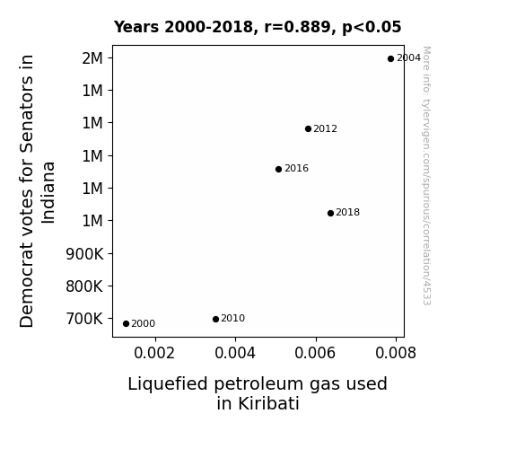
View details about correlation #4,533
Going with the Flo: An Unexpected Correlation Between Democrat Votes for Senators in Indiana and Liquefied Petroleum Gas Usage in Kiribati
The Democratic senators in Indiana brought some heat to the political arena, which sparked a wave of support. This surge in support created a gas-tronomical shift in the state's political landscape, leading to an increase in LPG usage. It seems like in the Hoosier State, when it comes to political choices, the voters have really turned up the gas!

What else correlates?
Votes for Democratic Senators in Indiana · all elections
Liquefied petroleum gas used in Kiribati · all energy
Votes for Democratic Senators in Indiana · all elections
Liquefied petroleum gas used in Kiribati · all energy


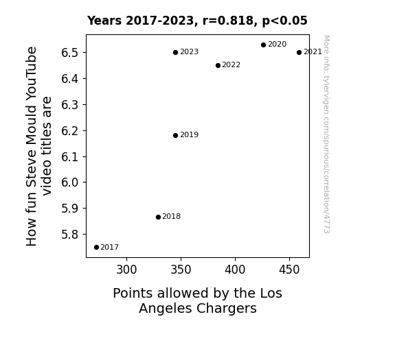
View details about correlation #4,773
Finding Fun in Football: Exploring the Correlation Between Steve Mould YouTube Video Titles and Points Allowed by the Los Angeles Chargers
As the Chargers' defense struggles, it creates a shocking lack of entertainment for Steve Mould, sparking a need for him to amp up the fun in his video titles to compensate for the Bolt's inability to stop anyone. After all, when the Chargers can't hold their opponents, Steve has to make sure his audience is positively charged with excitement.

What else correlates?
How fun Steve Mould's YouTube video titles are · all YouTube
Points allowed by the Los Angeles Chargers · all sports
How fun Steve Mould's YouTube video titles are · all YouTube
Points allowed by the Los Angeles Chargers · all sports


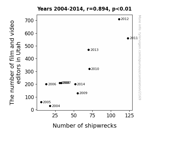
View details about correlation #2,169
Cutting and Crashing: The Correlation Between the Count of Film and Video Editors in Utah and Global Shipwrecks
As the demand for film and video content in Utah grew, more green screens were being utilized. This led to a shortage of availability for the color green worldwide. Consequently, ships were unable to properly camouflage themselves in certain sea routes, resulting in an uptick in global shipwrecks.

What else correlates?
The number of film and video editors in Utah · all cccupations
Global shipwrecks · all weird & wacky
The number of film and video editors in Utah · all cccupations
Global shipwrecks · all weird & wacky
. The chart goes from 2002 to 2023, and the two variables track closely in value over that time.")

View details about correlation #4,604
Air-pollution and Money in 'Charleston's Web': A Nitty-Gritty Analysis of Lloyds Banking Group's Stock Price and the Ambient Air Quality in Charleston, West Virginia
The decreased air pollution led to an unexpected increase in productivity among the local squirrel population. With their newfound energy, the squirrels embarked on a mission to bury acorns at an unprecedented rate. This surge in buried acorns ultimately led to a mysterious underground infrastructure of nutty financial institutions. As word of these unconventional banking services spread, investor confidence in traditional banking waned, causing Lloyds Banking Group's stock price to decrease. In essence, the cleaner air inadvertently paved the way for a competitive squirrel banking industry, leaving Lloyds scrambling to adapt to this unforeseen financial fur-mageddon.


What else correlates?
Air pollution in Charleston, West Virginia · all weather
Lloyds Banking Group's stock price (LYG) · all stocks
Air pollution in Charleston, West Virginia · all weather
Lloyds Banking Group's stock price (LYG) · all stocks


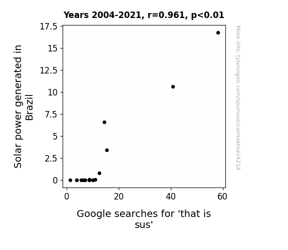
View details about correlation #4,214
Spotlight on Solar Sus-picion: Illuminating the Relationship Between Solar Power Generation in Brazil and Google Searches for 'That is Sus'
The solar panels were accidentally programmed to emit a signal that sounds like the phrase 'that is sus,' leading to a viral TikTok trend of people dancing in a shady manner whenever they visited a solar farm.

What else correlates?
Solar power generated in Brazil · all energy
Google searches for 'that is sus' · all google searches
Solar power generated in Brazil · all energy
Google searches for 'that is sus' · all google searches


View details about correlation #4,762
Penned to Pixels: Unveiling the Ink-credible Link between Journalism Graduates and 3Blue1Brown YouTube Likes
As the number of Communication and Journalism graduates rose, so did the nation's collective ability to effectively convey complex mathematical concepts. These skilled individuals subtly wove the beauty of calculus and linear algebra into their news articles and radio segments, unknowingly cultivating a growing appreciation for 3Blue1Brown's content. With each perfectly crafted sentence and impeccably timed broadcast, they were unknowingly nudging more and more people towards hitting that 'like' button on those mind-boggling math videos. It's almost as if the derivative of their communication skills with respect to 3Blue1Brown's content was always positive! Could the solution to engaging math education be as simple as hiring more journalism graduates? It's a story that adds up, no matter how you angle it.


What else correlates?
Bachelor's degrees awarded in journalism · all education
Total likes of 3Blue1Brown YouTube videos · all YouTube
Bachelor's degrees awarded in journalism · all education
Total likes of 3Blue1Brown YouTube videos · all YouTube


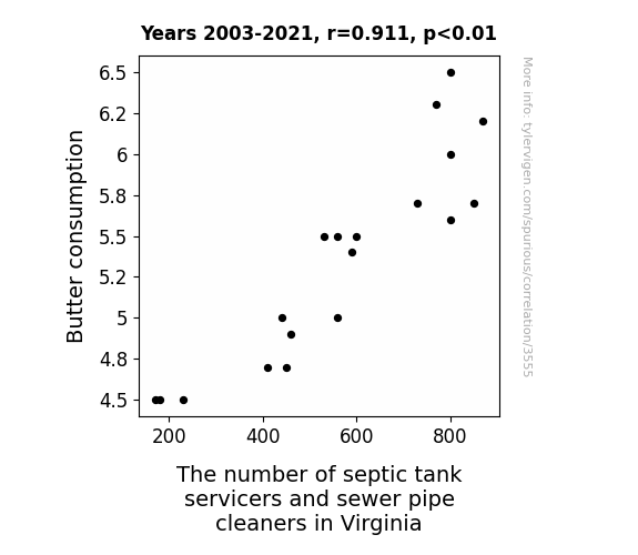
View details about correlation #3,555
Spreading Insights: The Butter-Sewer Connection in Virginia
As butter consumption soared, so did the frequency of 'butter emergencies.' This led to a slippery situation in Virginia's septic tanks and sewer pipes, creating a demand for more servicers and cleaners to tackle the 'butterly' mess.

What else correlates?
Butter consumption · all food
The number of septic tank servicers and sewer pipe cleaners in Virginia · all cccupations
Butter consumption · all food
The number of septic tank servicers and sewer pipe cleaners in Virginia · all cccupations


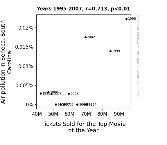
View details about correlation #3,814
Smog and the Silver Screen: A Statistical Analysis of Air Pollution in Seneca, South Carolina and Box Office Performance of the Top Movie of the Year
As air pollution levels rose in Seneca, South Carolina, so did the ticket sales for the top movie of the year. It turns out, the smoggy air created the perfect conditions for a unique form of outdoor 3D projection, enhancing the overall cinematic experience. As the pollution particles mingled with the evening mist, they unintentionally formed a giant, high-definition screen in the sky, captivating the residents and drawing them to open-air theaters like never before. Who knew that Seneca's pollution was the unexpected, silver lining for the local entertainment industry!

What else correlates?
Air pollution in Seneca, South Carolina · all weather
Tickets Sold for the Top Movie of the Year · all films & actors
Air pollution in Seneca, South Carolina · all weather
Tickets Sold for the Top Movie of the Year · all films & actors


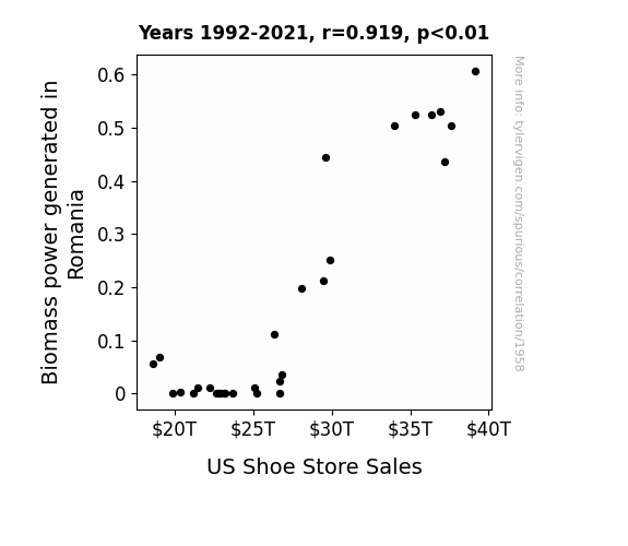
View details about correlation #1,958
Putting Their Best Foot Forward: The Sole-ful Connection Between Biomass Energy in Romania and US Shoe Store Sales
As Romania's biomass power output rose, so did the local wildlife population. This led to an unexpected surge in the demand for stylish and durable footwear in the US, as people wanted to step out in the latest 'wildlife chic' fashion trend. The connection between Romanian biomass and American shoe sales seems to be a classic case of 'energy in, shoe-trend out'!

What else correlates?
Biomass power generated in Romania · all energy
US Shoe Store Sales · all weird & wacky
Biomass power generated in Romania · all energy
US Shoe Store Sales · all weird & wacky


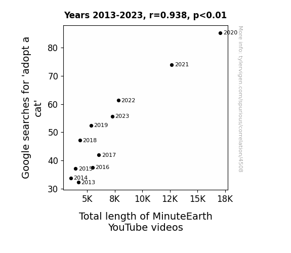
View details about correlation #4,508
Pawsitively Meowvelous: Exploring the Correlation Between Google Searches for 'Adopt a Cat' and Total Length of MinuteEarth YouTube Videos
The rise in 'adopt a cat' searches led to a surge in feline adoptions, creating a greater demand for heartwarming and educational content. As more cats found their forever homes, MinuteEarth had to cater to this new feline-loving audience, prompting them to extend their videos to accommodate the purrfect pet owners. It's a tail of adoption success, where the length of MinuteEarth videos truly became a meowtter of cat-astrophic proportions!

What else correlates?
Google searches for 'adopt a cat' · all google searches
Total length of MinuteEarth YouTube videos · all YouTube
Google searches for 'adopt a cat' · all google searches
Total length of MinuteEarth YouTube videos · all YouTube


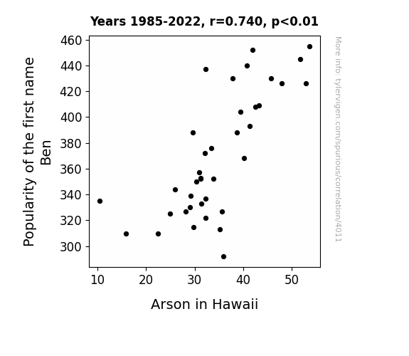
View details about correlation #4,011
Playing with Fire: The Incendiary Connection Between the Popularity of the Name Ben and Arson in Hawaii
As the popularity of the name Ben dwindled, so did the number of people pretending to be a firebender from the cartoon Avatar: The Last Airbender. With fewer amateur firebenders running around, Hawaii experienced a welcome decrease in accidental and intentional fire-related incidents. It seems the connection between the name Ben and fiery shenanigans was more than just a coincidence!

What else correlates?
Popularity of the first name Ben · all first names
Arson in Hawaii · all random state specific
Popularity of the first name Ben · all first names
Arson in Hawaii · all random state specific


View details about correlation #3,691
The Smoggy Path to Procurement: Unveiling the Relationship Between Air Pollution in Dayton and the Population of Purchasing Managers in Ohio
The cleaner air led to an increase in productivity and efficiency, meaning Ohio needed fewer purchasing managers to keep things running smoothly. With less smog to wade through, they could streamline their operations and trim the manager fat.


What else correlates?
Air pollution in Dayton · all weather
The number of purchasing managers in Ohio · all cccupations
Air pollution in Dayton · all weather
The number of purchasing managers in Ohio · all cccupations


View details about correlation #1,197
The Fuel for Thought: Analyzing the Correlation Between xkcd Comics on Technology and Gasoline Consumption in New Caledonia
The influx of tech-based xkcd comics has inadvertently led to a rise in demand for internet usage. This has caused an uptick in the production of electronic devices, subsequently creating a greater need for electricity. To meet this escalating energy consumption, more gasoline is being utilized to power the generators in New Caledonia, leading to an unexpected spike in gasoline pumped. It's a classic case of digital humor driving real-world fuel usage - a situation that can only be described as...comic-al.


What else correlates?
xkcd comics published about technology · all weird & wacky
Gasoline pumped in New Caledonia · all energy
xkcd comics published about technology · all weird & wacky
Gasoline pumped in New Caledonia · all energy


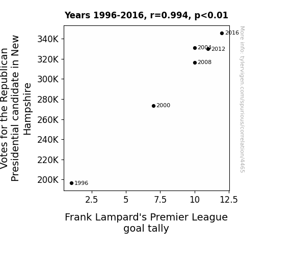
View details about correlation #4,465
Goal of the GOP: Exploring the Correlation Between Republican Votes in New Hampshire and Frank Lampard's Premier League Goal Tally
As Republican votes surged, so did the belief in the power of right-wing tactics, inspiring a new strategy in Premier League matches. The conservative approach to scoring goals kicked in, leading to a "net" gain for Frank Lampard's tally. It seems the presidential race wasn't the only thing experiencing a boost from the right!


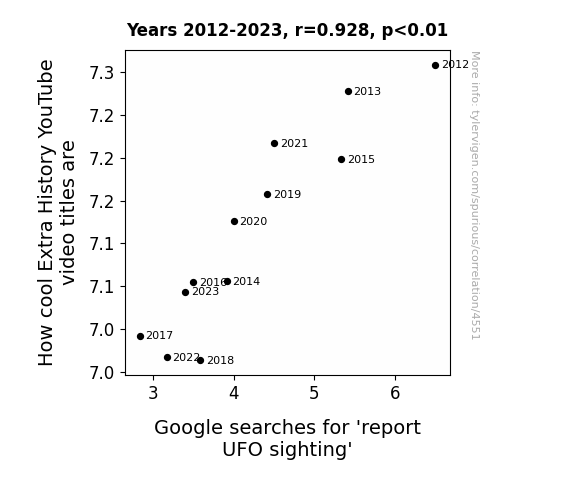
View details about correlation #4,551
Extraterrestrial Enticement: The UFO-nny Connection Between Extra History YouTube Video Titles and Google Searches
Because as the reports go up, the aliens get closer to invading, and nobody has time for history when you're fighting off an alien invasion!

Why this works
- Data dredging: I have 25,237 variables in my database. I compare all these variables against each other to find ones that randomly match up. That's 636,906,169 correlation calculations! This is called “data dredging.”
Fun fact: the chart used on the wikipedia page to demonstrate data dredging is also from me. I've been being naughty with data since 2014.
Instead of starting with a hypothesis and testing it, I instead tossed a bunch of data in a blender to see what correlations would shake out. It’s a dangerous way to go about analysis, because any sufficiently large dataset will yield strong correlations completely at random. - Lack of causal connection: There is probably no direct connection between these variables, despite what the AI says above.
Because these pages are automatically generated, it's possible that the two variables you are viewing are in fact causually related. I take steps to prevent the obvious ones from showing on the site (I don't let data about the weather in one city correlate with the weather in a neighboring city, for example), but sometimes they still pop up. If they are related, cool! You found a loophole.
This is exacerbated by the fact that I used "Years" as the base variable. Lots of things happen in a year that are not related to each other! Most studies would use something like "one person" in stead of "one year" to be the "thing" studied. - Observations not independent: For many variables, sequential years are not independent of each other. You will often see trend-lines form. If a population of people is continuously doing something every day, there is no reason to think they would suddenly change how they are doing that thing on January 1. A naive p-value calculation does not take this into account.
You will calculate a lower chance of "randomly" achieving the result than represents reality.
To be more specific: p-value tests are probability values, where you are calculating the probability of achieving a result at least as extreme as you found completely by chance. When calculating a p-value, you need to assert how many "degrees of freedom" your variable has. I count each year (minus one) as a "degree of freedom," but this is misleading for continuous variables.
This kind of thing can creep up on you pretty easily when using p-values, which is why it's best to take it as "one of many" inputs that help you assess the results of your analysis.
- Y-axes doesn't start at zero: I truncated the Y-axes of the graphs above. I also used a line graph, which makes the visual connection stand out more than it deserves.
Nothing against line graphs. They are great at telling a story when you have linear data! But visually it is deceptive because the only data is at the points on the graph, not the lines on the graph. In between each point, the data could have been doing anything. Like going for a random walk by itself!
Mathematically what I showed is true, but it is intentionally misleading. If you click on any of the charts that abuse this, you can scroll down to see a version that starts at zero. - Confounding variable: Confounding variables (like global pandemics) will cause two variables to look connected when in fact a "sneaky third" variable is influencing both of them behind the scenes.
- Outliers: Some datasets here have outliers which drag up the correlation.
In concept, "outlier" just means "way different than the rest of your dataset." When calculating a correlation like this, they are particularly impactful because a single outlier can substantially increase your correlation.
Because this page is automatically generated, I don't know whether any of the charts displayed on it have outliers. I'm just a footnote. ¯\_(ツ)_/¯
I intentionally mishandeled outliers, which makes the correlation look extra strong. - Low n: There are not many data points included in some of these charts.
You can do analyses with low ns! But you shouldn't data dredge with a low n.
Even if the p-value is high, we should be suspicious of using so few datapoints in a correlation.
Pro-tip: click on any correlation to see:
- Detailed data sources
- Prompts for the AI-generated content
- Explanations of each of the calculations (correlation, p-value)
- Python code to calculate it yourself


