spurious correlations
discover · random · spurious scholar
← previous page · next page →
. The chart goes from 2002 to 2023, and the two variables track closely in value over that time.")

View details about correlation #3,730
Neptune's Space and Uranus' Place: The Case of the Southern Copper's Stock Price
As the gap widened, gravitational fluctuations inadvertently boosted demand for copper, leading to a spike in Southern Copper's stock price. It seems even celestial bodies can't resist the allure of a good conductor!


What else correlates?
The distance between Neptune and Uranus · all planets
Southern Copper's stock price (SCCO) · all stocks
The distance between Neptune and Uranus · all planets
Southern Copper's stock price (SCCO) · all stocks


View details about correlation #3,117
Clearing the Air: A Burning Connection Between Air Pollution in Cincinnati and Kerosene Usage in the United States
As the air quality in Cincinnati improved, it led to a decrease in smog. This, in turn, meant that there were fewer impurities in the air to react with, ultimately reducing the demand for kerosene in the United States. It's a classic case of cleaner air not only being good for the environment, but also for diminishing the nation's reliance on kerosene. Who would have thought that Cincinnati's clearer skies could have such far-reaching effects on kerosene usage!

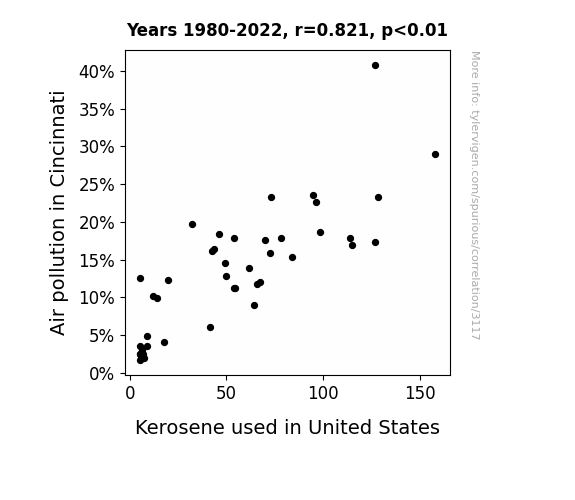
What else correlates?
Air pollution in Cincinnati · all weather
Kerosene used in United States · all energy
Air pollution in Cincinnati · all weather
Kerosene used in United States · all energy


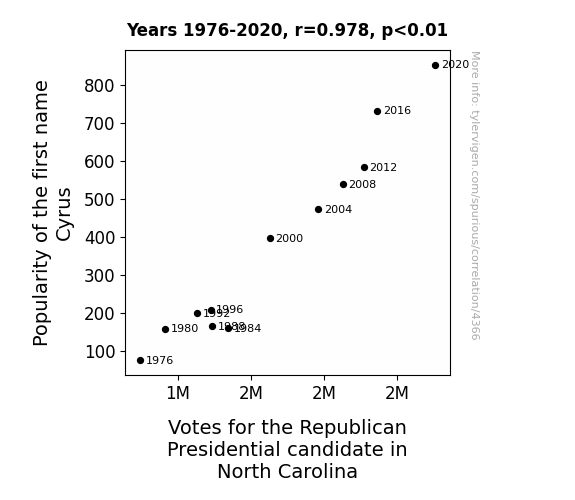
View details about correlation #4,366
The Cyrus Virus: A Study of the Connection Between Name Popularity and Political Propensity
As the popularity of the name Cyrus soared, more and more parents were subconsciously drawn to the idea of strong, leadership qualities for their children. This led to a ripple effect in North Carolina, where youngsters named Cyrus excelled in their school leadership roles, inadvertently inspiring their parents to lean towards the Republican candidate. It's a case of the name setting a 'cyrus' of events in motion, ultimately shaping the political landscape. Remember, behind every great leader is a trendy name!


View details about correlation #2,267
Shipwrecks and Shorelines: An Unexpected Correlation with the Number of University Biological Science Teachers in Arkansas
As the number of university biological science teachers in Arkansas increased, so did their enthusiasm for marine biology. This led to a surge in Arkansas-based research on aquatic life. However, their attempts to understand sea urchins somehow disrupted the global navigation systems, causing an uptick in catastrophic shipwrecks. Who knew that diving into the depths of biology in Arkansas could rock the boat for sailors worldwide?


What else correlates?
The number of university biological science teachers in Arkansas · all cccupations
Global shipwrecks · all weird & wacky
The number of university biological science teachers in Arkansas · all cccupations
Global shipwrecks · all weird & wacky
. The chart goes from 2002 to 2022, and the two variables track closely in value over that time.")

View details about correlation #3,990
Pour-fection Connection: US Bottled Water Consumption and ONEOK's Stock Roaring in Sync
As bottled water consumption per person in the US increases, people stay more hydrated leading to heightened cognitive abilities. This causes a spike in demand for natural gas, which is needed to power the plants that produce bottled water. ONEOK, being a major player in the natural gas industry, sees a surge in stock price as a result of this increased demand, quenching the thirst for profits.

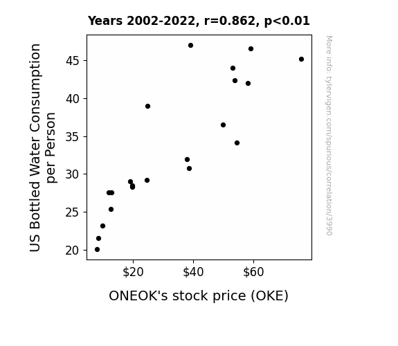
What else correlates?
US Bottled Water Consumption per Person · all food
ONEOK's stock price (OKE) · all stocks
US Bottled Water Consumption per Person · all food
ONEOK's stock price (OKE) · all stocks


View details about correlation #4,549
The Power of a Good Numberphile Title: A Correlative Examination of YouTube Videos and Biomass Power Generation in Burma
The more biomass power generated in Burma, the greater the positive energy flow in the universe, leading to an influx of number-related creativity. As the power output grows, so does the exponential titling prowess of Numberphile, creating a renewable cycle of electrifying math content. With each new video, the synergy between Burmese biomass and numerical knowledge becomes a prime factor in sparking excitement for both renewable energy and mathematics. It's a logarithmic match made in comedic and educational heaven, proving that when it comes to YouTube titles, Burma's biomass power is the real powerhouse behind Numberphile's magnetic math mania!


What else correlates?
How good Numberphile YouTube video titles are · all YouTube
Biomass power generated in Burma · all energy
How good Numberphile YouTube video titles are · all YouTube
Biomass power generated in Burma · all energy


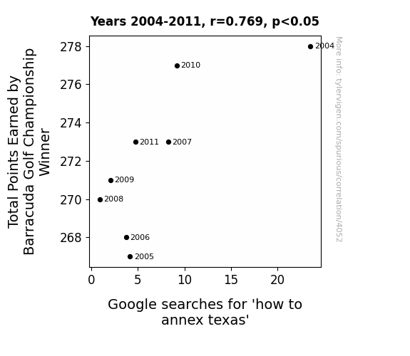
View details about correlation #4,052
Championship Victory and 'Annex Texas' Query Quantity: Is There a Link Sparking Debating Fluididity?
As golf points decreased, the overall morale of the nation also took a hit. This led to a collective lack of confidence and motivation, causing people to reconsider ambitious undertakings. With the top golfer earning fewer points, it sent a subtle message that even the best can struggle, prompting individuals to reassess the viability of their own lofty aspirations. This shift in attitude had a ripple effect, dampening the interest in annexing Texas as people decided to focus on more achievable endeavors. So, in an unexpected twist, a golf tournament outcome ended up influencing geopolitical contemplations. Remember, it's all fun and games until someone tries to annex Texas based on golf tournament results - then it's just Texas-sized absurdity!


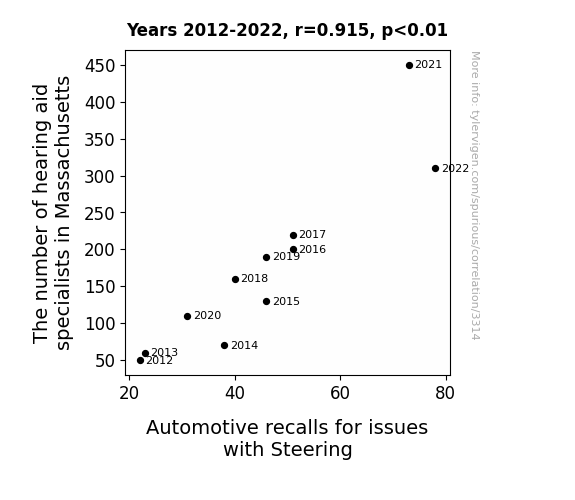
View details about correlation #3,314
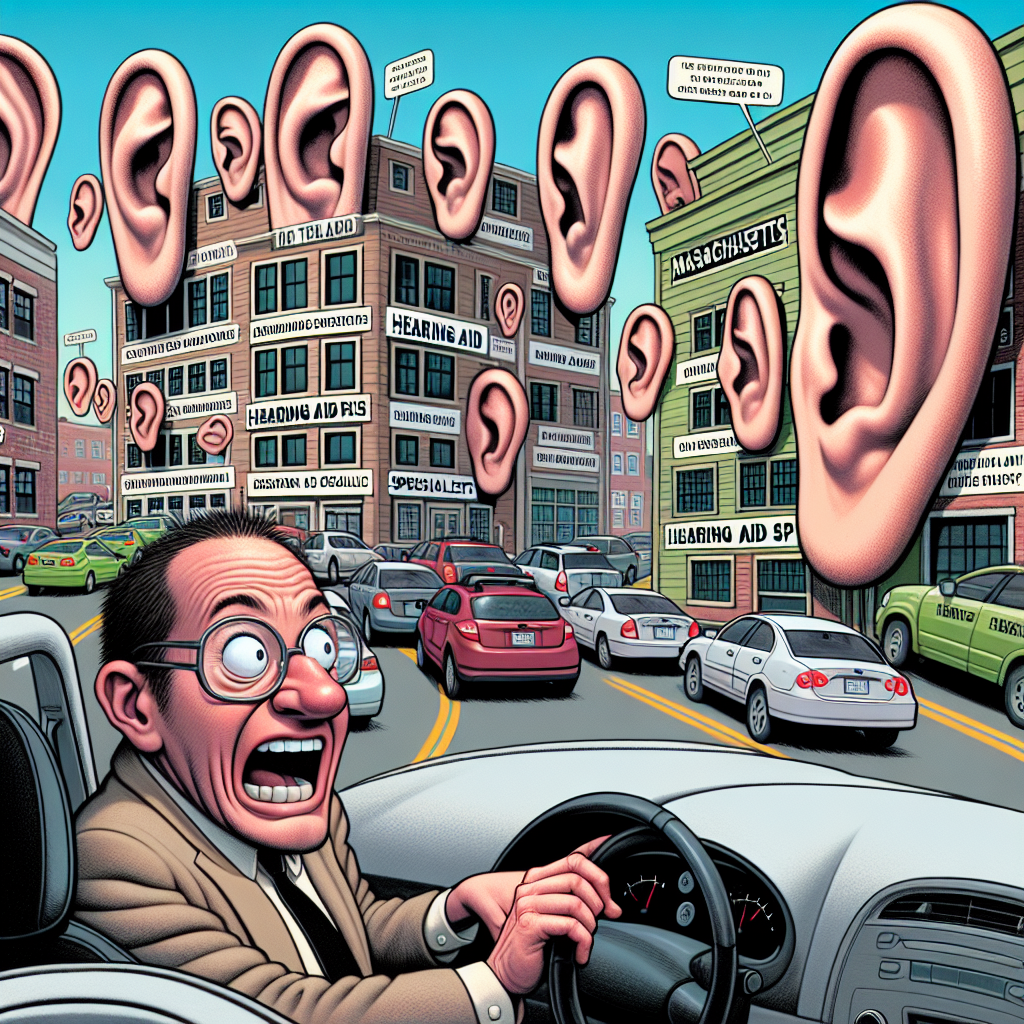
Hear Me Out: An Ear-resistible Link Between Hearing Aid Specialists and Automotive Recalls for Steering Issues
As hearing aid specialists multiplied, so did their ability to eavesdrop on car conversations. The steering wheels, feeling self-conscious about all the backseat driving, started overcorrecting and swerving, leading to an increase in automotive recalls for steering issues. It was a real case of "hear today, recalled tomorrow!"


View details about correlation #4,728
Callie-doscope: Examining the Correlation Between Callie's Popularity and Air Pollution in Mayfield, Kentucky
As the popularity of the name Callie increased, more and more people were inspired to call out to their friends and family who lived in Mayfield, Kentucky. This led to a surge in phone usage, and as we all know, excessive phone usage can generate a shocking amount of hot air. This rise in hot air production coincided with an unexpected spike in Mayfield's air pollution levels. Remember folks, with great Callie popularity comes great aerosol responsibility!

What else correlates?
Popularity of the first name Callie · all first names
Air pollution in Mayfield, Kentucky · all weather
Popularity of the first name Callie · all first names
Air pollution in Mayfield, Kentucky · all weather


View details about correlation #2,872
Butter Benefits: Biomass and Butter in Beautiful El Salvador
The additional butter consumption led to an increase in people power, which was then harnessed to generate more biomass power in El Salvador. Turns out, it really is a butter way to fuel the country's energy production. Who knew that spreading a little extra butter could churn out such shocking results in the power sector!


What else correlates?
Butter consumption · all food
Biomass power generated in El Salvador · all energy
Butter consumption · all food
Biomass power generated in El Salvador · all energy


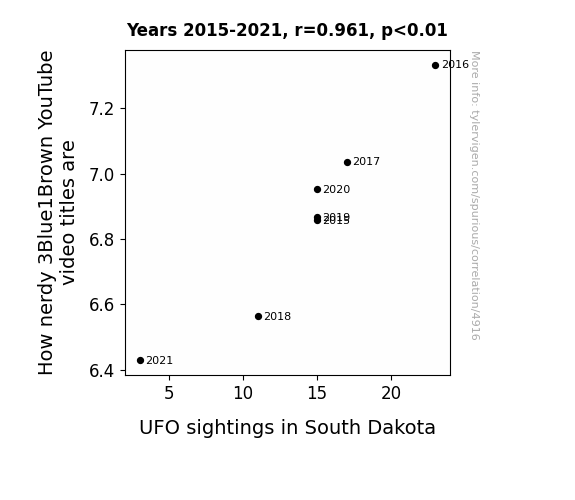
View details about correlation #4,916
It's All in the Title: A Witty Investigation into the Relationship Between 3Blue1Brown YouTube Video Titles and UFO Sightings in South Dakota
As the UFO sightings in South Dakota decrease, there is less demand for out-of-this-world content. This leads 3Blue1Brown to pivot to more down-to-earth video titles, resulting in a decrease in nerdy references. You could say the UFOs were the real extra-terrestrial influencers of video title trends!

What else correlates?
How nerdy 3Blue1Brown YouTube video titles are · all YouTube
UFO sightings in South Dakota · all random state specific
How nerdy 3Blue1Brown YouTube video titles are · all YouTube
UFO sightings in South Dakota · all random state specific


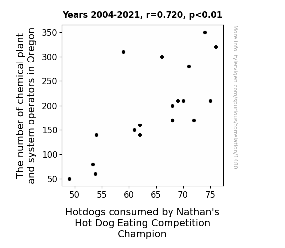
View details about correlation #1,480
Wiener-takes-all: Unveiling the Surprising Link Between Chemical Plant Operators in Oregon and Hotdog Consumption Among Nathan's Hot Dog Eating Champions
As the number of chemical plant and system operators in Oregon increases, so too does the production of condiments and preservatives. These secret sauce ingredients find their way into the competitive eating circuit, fueling record-breaking hot dog consumption. It's a wiener-take-all situation where more operators means more flavor innovation, ultimately leading to a dog-eat-dog competition for the top spot at Nathan's. Who knew that behind every champion, there's a relish-loving workforce in Oregon making it all possible!


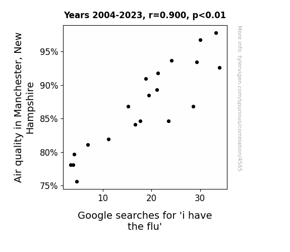
View details about correlation #4,565
A Breath of Fresh Search: Correlating Air Quality in Manchester, New Hampshire with Google Searches for 'I Have the Flu'
As the air quality improved, more people in Manchester, New Hampshire decided to venture outside. However, this merely served to spread the flu virus further, leading to an increase in flu cases. One could say that the flu was really "air-itated" by the sudden influx of healthier air and decided to make a strong comeback, much to the dismay of the residents.

What else correlates?
Air quality in Manchester, New Hampshire · all weather
Google searches for 'i have the flu' · all google searches
Air quality in Manchester, New Hampshire · all weather
Google searches for 'i have the flu' · all google searches


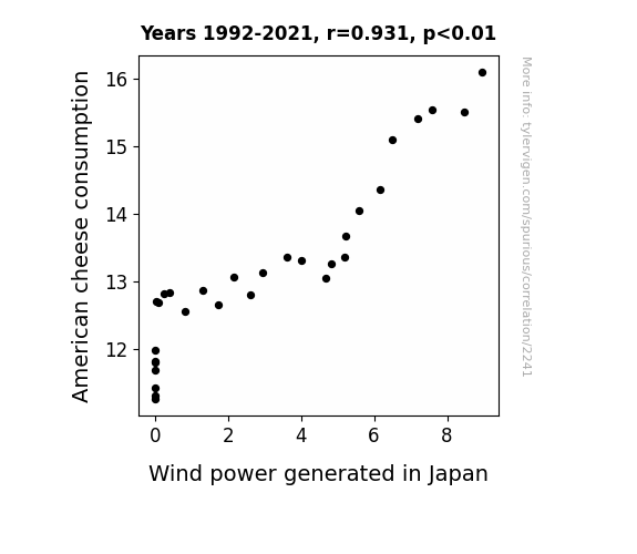
View details about correlation #2,241
The Big Cheese and the Windy Power: A Gouda Correlation Between American Cheese Consumption and Wind Power Generated in Japan
The holes in American cheese slices were actually miniature wind tunnels, inspiring the design for more efficient wind turbines in Japan. Looks like the secret to renewable energy was really just a cheesy solution!

What else correlates?
American cheese consumption · all food
Wind power generated in Japan · all energy
American cheese consumption · all food
Wind power generated in Japan · all energy
. The chart goes from 2012 to 2021, and the two variables track closely in value over that time.")

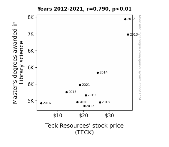
View details about correlation #3,724
The Dewey Decimal Effect: A Novel Investigation into the Link between Library Science Master's Degrees and Teck Resources' Stock Price
As the number of Master's degrees awarded in Library Science decreased, so did the demand for librarians. With fewer librarians around, the knowledge of how to properly index and categorize information also dwindled. This led to a massive mix-up in the filing system at Teck Resources. Important documents on sustainable mining practices ended up in the fiction section, while employees were using old mining manuals as bookmarks in the company's financial reports. As chaos ensued, investors lost confidence in the company's ability to stay organized, causing a drop in Teck Resources' stock price.

What else correlates?
Master's degrees awarded in Library science · all education
Teck Resources' stock price (TECK) · all stocks
Master's degrees awarded in Library science · all education
Teck Resources' stock price (TECK) · all stocks


View details about correlation #1,821
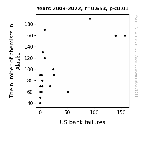
Reacting to the Situation: The Chemical Composition of Bank Failures
The decrease in chemists in Alaska led to a decreased demand for certain chemical elements, causing their prices to drop. This unexpected deflation of element prices somehow stabilized the volatile banking sector, preventing US bank failures from happening. Remember, when it comes to financial stability, it's all about that chemistry!

What else correlates?
The number of chemists in Alaska · all cccupations
US bank failures · all weird & wacky
The number of chemists in Alaska · all cccupations
US bank failures · all weird & wacky


View details about correlation #4,303
Samara-nity and the Elephant in the Room: An Examination of the Republican Presidential Vote in New Mexico and the Popularity of the Name 'Samara'
Perhaps voters were subconsciously swayed by the subtle association between the name Samara and the popular horror movie character from "The Ring." They may have felt a strange compulsion to support a candidate who they believed could "ring" in positive change for the state. And who knows, maybe they just really liked the idea of a candidate with a mysterious, well, 'ring' to their campaign!


View details about correlation #4,687
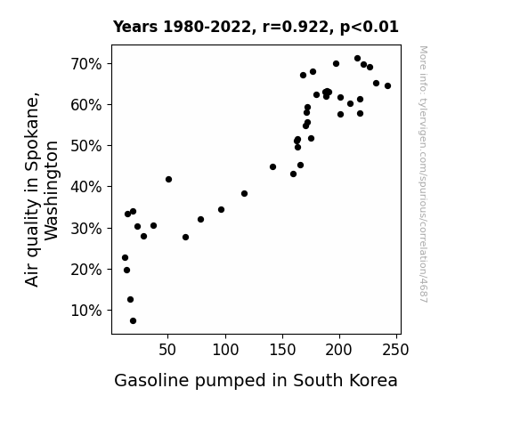
Air Fair: The Pairing of Spokane Air Quality and South Korean Gasoline
The improved air quality in Spokane, Washington led to an uptick in happiness levels. This inexplicably triggered a chain reaction, causing an increase in the production of upbeat commercials in the US. These strangely captivating commercials somehow made their way to South Korea, where they were so effective that they prompted a surge in gasoline consumption. It seems even gasoline can't resist a good mood! So, if you ever need a boost in gasoline production, just remember, it all starts with that fresh Spokane air!

What else correlates?
Air quality in Spokane, Washington · all weather
Gasoline pumped in South Korea · all energy
Air quality in Spokane, Washington · all weather
Gasoline pumped in South Korea · all energy


View details about correlation #4,236
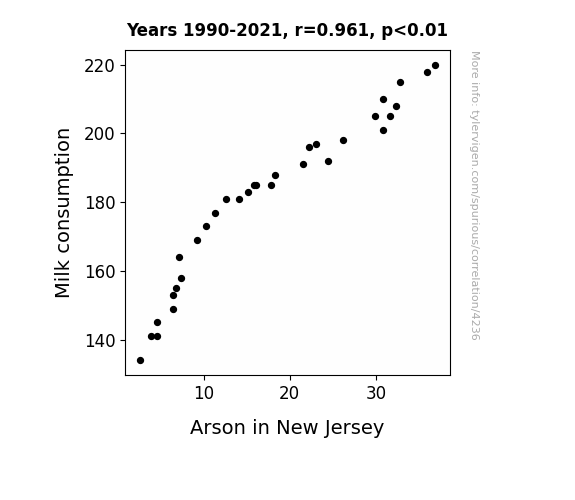
Milk Makes Miscreants? A Study on the Relationship between Milk Consumption and Arson in New Jersey
The fewer people were milking cows, the fewer opportunities there were for udder disaster, ultimately leading to a reduction in fiery incidents in New Jersey.

What else correlates?
Milk consumption · all food
Arson in New Jersey · all random state specific
Milk consumption · all food
Arson in New Jersey · all random state specific


View details about correlation #1,634
Aging Idols and Alaskan Artisans: Exploring the Curious Relationship Between American Idol Winners' Age and the Millwright Population in The Last Frontier
As the American Idol winners age, they develop a strong affinity for lumberjack culture, leading to a surge in demand for Alaskan millwrights to craft custom log cabin furniture and intricate wooden structures. It's a real testament to the ripple effects of aging pop stars on niche trades in the Last Frontier!


What else correlates?
Age of American Idol Winner · all weird & wacky
The number of millwrights in Alaska · all cccupations
Age of American Idol Winner · all weird & wacky
The number of millwrights in Alaska · all cccupations
Why this works
- Data dredging: I have 25,237 variables in my database. I compare all these variables against each other to find ones that randomly match up. That's 636,906,169 correlation calculations! This is called “data dredging.”
Fun fact: the chart used on the wikipedia page to demonstrate data dredging is also from me. I've been being naughty with data since 2014.
Instead of starting with a hypothesis and testing it, I instead tossed a bunch of data in a blender to see what correlations would shake out. It’s a dangerous way to go about analysis, because any sufficiently large dataset will yield strong correlations completely at random. - Lack of causal connection: There is probably no direct connection between these variables, despite what the AI says above.
Because these pages are automatically generated, it's possible that the two variables you are viewing are in fact causually related. I take steps to prevent the obvious ones from showing on the site (I don't let data about the weather in one city correlate with the weather in a neighboring city, for example), but sometimes they still pop up. If they are related, cool! You found a loophole.
This is exacerbated by the fact that I used "Years" as the base variable. Lots of things happen in a year that are not related to each other! Most studies would use something like "one person" in stead of "one year" to be the "thing" studied. - Observations not independent: For many variables, sequential years are not independent of each other. You will often see trend-lines form. If a population of people is continuously doing something every day, there is no reason to think they would suddenly change how they are doing that thing on January 1. A naive p-value calculation does not take this into account.
You will calculate a lower chance of "randomly" achieving the result than represents reality.
To be more specific: p-value tests are probability values, where you are calculating the probability of achieving a result at least as extreme as you found completely by chance. When calculating a p-value, you need to assert how many "degrees of freedom" your variable has. I count each year (minus one) as a "degree of freedom," but this is misleading for continuous variables.
This kind of thing can creep up on you pretty easily when using p-values, which is why it's best to take it as "one of many" inputs that help you assess the results of your analysis.
- Y-axes doesn't start at zero: I truncated the Y-axes of the graphs above. I also used a line graph, which makes the visual connection stand out more than it deserves.
Nothing against line graphs. They are great at telling a story when you have linear data! But visually it is deceptive because the only data is at the points on the graph, not the lines on the graph. In between each point, the data could have been doing anything. Like going for a random walk by itself!
Mathematically what I showed is true, but it is intentionally misleading. If you click on any of the charts that abuse this, you can scroll down to see a version that starts at zero. - Confounding variable: Confounding variables (like global pandemics) will cause two variables to look connected when in fact a "sneaky third" variable is influencing both of them behind the scenes.
- Outliers: Some datasets here have outliers which drag up the correlation.
In concept, "outlier" just means "way different than the rest of your dataset." When calculating a correlation like this, they are particularly impactful because a single outlier can substantially increase your correlation.
Because this page is automatically generated, I don't know whether any of the charts displayed on it have outliers. I'm just a footnote. ¯\_(ツ)_/¯
I intentionally mishandeled outliers, which makes the correlation look extra strong. - Low n: There are not many data points included in some of these charts.
You can do analyses with low ns! But you shouldn't data dredge with a low n.
Even if the p-value is high, we should be suspicious of using so few datapoints in a correlation.
Pro-tip: click on any correlation to see:
- Detailed data sources
- Prompts for the AI-generated content
- Explanations of each of the calculations (correlation, p-value)
- Python code to calculate it yourself


