spurious correlations
discover · random · spurious scholar
← previous page · next page →


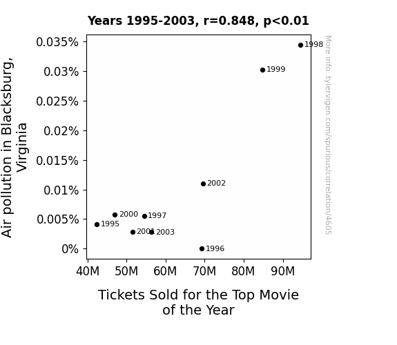
View details about correlation #4,605
Clear Skies, Full Theaters: Investigating the Relationship Between Air Quality and Box Office Success in Blacksburg, Virginia
As air pollution in Blacksburg, Virginia increased, more people experienced minor respiratory irritation, leading to an uptick in movie theater visits as they sought refuge in the dark, air-conditioned cinemas. The popularity of the top movie of the year soared as a result, proving that sometimes, even a haze-filled silver lining can lead to blockbuster success. Remember, this is just a tongue-in-cheek connection and should not be taken seriously!

What else correlates?
Air pollution in Blacksburg, Virginia · all weather
Tickets Sold for the Top Movie of the Year · all films & actors
Air pollution in Blacksburg, Virginia · all weather
Tickets Sold for the Top Movie of the Year · all films & actors


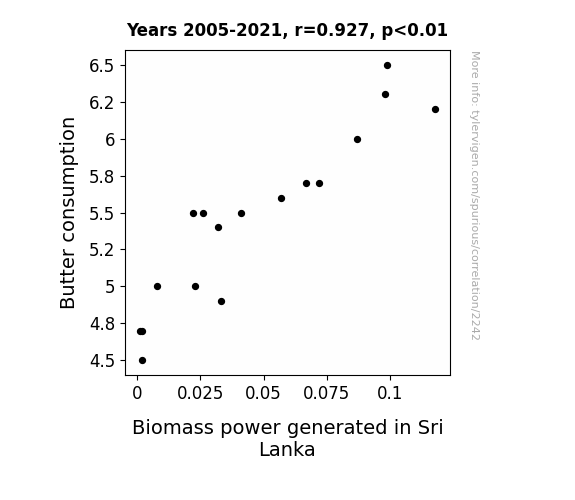
View details about correlation #2,242
Better Butter: Bridging Biomass in Sri Lanka
The extra greasy fingers led to more efficient turbine operation - it's like a natural, renewable lubricant! And the cows? Well, let's just say they were utter powerhouses when it came to producing methane for energy. It's a mooo-ving tale of dairy deliciousness leading to a buttery burst of sustainable power!

What else correlates?
Butter consumption · all food
Biomass power generated in Sri Lanka · all energy
Butter consumption · all food
Biomass power generated in Sri Lanka · all energy


View details about correlation #4,280
Gauging the Groovy Google Gander: Grasping the Gravitational Gist of Google Searches and LEMMiNO's Lengthy YouTube Labyrinth
Fewer google searches meant fewer ganders at LEMMiNO's videos, giving him less incentive to stretch them out. After all, when it comes to video length, it's all about that search for 'balance'!

What else correlates?
Google searches for 'google' · all google searches
Total length of LEMMiNO YouTube videos · all YouTube
Google searches for 'google' · all google searches
Total length of LEMMiNO YouTube videos · all YouTube


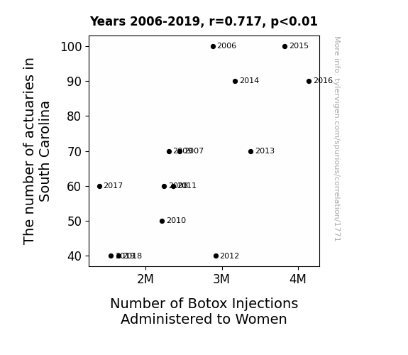
View details about correlation #1,771
Furrowed Brows in the Palmetto State: An Examination of the Relationship Between Actuarial Density and Botox Injections Administered to Women in South Carolina
As the population realized there were fewer actuaries around to calculate the risks, they naturally became more cautious about getting Botox injections, leading to a decrease in the number of injections administered to women. This ultimately resulted in a statewide shift towards embracing laughter lines as a new form of currency, devaluing the pursuit of a perpetually smooth and furrow-free facade. The unforeseen consequence? South Carolina's new state motto: "Smiles are priceless, unlike Botox."


View details about correlation #4,781
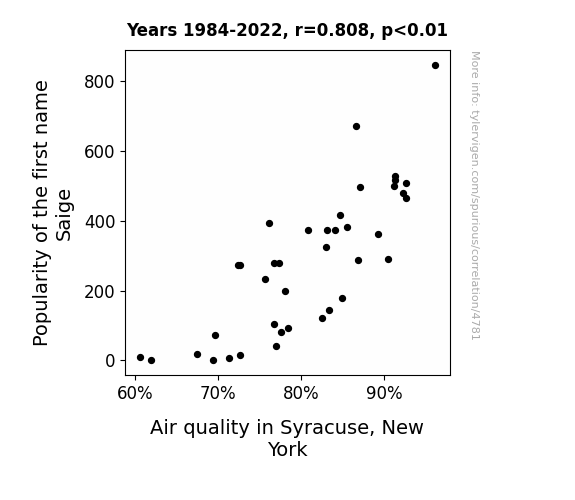
Saige and Syracuse: A Study on Airy Popularity and Air Quality Purity
More people started practicing yoga and meditation, leading to a collective decrease in stress levels and a corresponding drop in air pollution from all the Zen vibes. Remember, when in doubt, just Sai-ge no to air pollution!

What else correlates?
Popularity of the first name Saige · all first names
Air quality in Syracuse, New York · all weather
Popularity of the first name Saige · all first names
Air quality in Syracuse, New York · all weather


View details about correlation #2,805
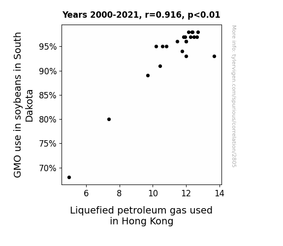
Sprouting Connections: Exploring the Relationship Between GMO Soybeans in South Dakota and LPG Consumption in Hong Kong
As the GMO soybeans in South Dakota grew bigger and stronger, they also developed a natural gas, which somehow found its way to Hong Kong, leading to an increase in liquefied petroleum gas usage. It seems these soybeans were really gassy, creating a connection from the fields all the way to the bustling city! It's a case of soy power leading to more gas power, ultimately beaning a gas-tacular situation for Hong Kong! The soybean gas export business is really taking off - talk about a major soy-cle in the market!

What else correlates?
GMO use in soybeans in South Dakota · all food
Liquefied petroleum gas used in Hong Kong · all energy
GMO use in soybeans in South Dakota · all food
Liquefied petroleum gas used in Hong Kong · all energy


View details about correlation #4,410
Navigating Ideological Tides: A Correlational Analysis of Republican Votes for Senators in Connecticut and Google Searches for 'How to Move to Europe'
As the old saying goes, "As Connecticut's red votes went up, so did the search for a new Europe move-ment! Maybe it's because as political tension rises, people just want to take a Brussels sprout and find some Greece and serenity. Or perhaps they're simply Hungary for a change and thinking, 'Czech, please!' But one thing's for Switzerland: There's Norway they're letting this decision Denmark their future plans! It's a veritable United Kingdom of motivations, all stemming from the ballot box. It's like they say, when the going gets tough politically, the tough book a flight to Paris. After all, if you can't beat 'em, join 'em... in a different hemisphere!"


View details about correlation #3,310
The Summit of Science: Exploring the Relationship Between University Biological Science Teachers in Alabama and Total Number of Successful Mount Everest Climbs
As the population of biology teachers grew, so did their expertise in plant and animal life. This knowledge inadvertently led to the discovery of a new, highly oxygenating breed of genetically modified, supercharged ferns. These ferns were strategically planted along the climbers' route, creating oxygenated "rest stops" and effectively turning Mount Everest into the world's highest natural oxygen bar, making the ascent easier and more efficient for adventurers. This unexpected green pathway to success has forever changed the landscape of mountain climbing and plant physiology.


View details about correlation #4,888
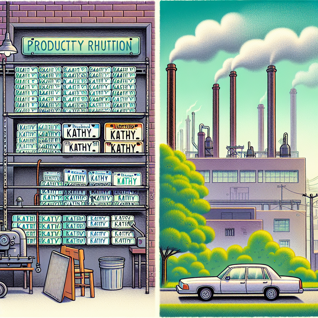
The Relationship Between the Popularity of the First Name Kathy and Air Quality in Hartford: A Statistical Odyssey
As the popularity of the name Kathy waned, so did the number of personalized "Kathy" novelty license plates. This led to a decrease in production at the local plate manufacturing plant, ultimately reducing the overall carbon emissions in Hartford. It turns out, when it comes to air quality, Kathy really does make a difference!

What else correlates?
Popularity of the first name Kathy · all first names
Air pollution in Hartford, Connecticut · all weather
Popularity of the first name Kathy · all first names
Air pollution in Hartford, Connecticut · all weather


View details about correlation #2,563
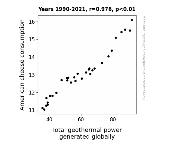
Melting Cheese, Sizzling Earth: Exploring the Bizarre Link between American Cheese Consumption and Global Geothermal Power Generation
As Americans consumed more cheese, the collective increase in dairy-induced flatulence contributed to a rise in geothermal activity, ultimately leading to an increase in total geothermal power generated globally. The cheese may have been gouda for the taste buds, but it was even better for sparking a gassy, yet grate, renewable energy source. Talk about an unexpected ripple effect of the nation's love for cheese! Remember, next time you're melting that cheddar on your burger, you're not just adding a savory kick – you're also fueling the Earth's underground cheese-fueled power plants.

What else correlates?
American cheese consumption · all food
Total geothermal power generated globally · all energy
American cheese consumption · all food
Total geothermal power generated globally · all energy


View details about correlation #3,688
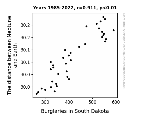
Stellar Thievery: Unveiling the Galactic Influence on Burglaries in South Dakota
As Neptune gets closer, its gravitational pull on South Dakota strengthens, creating a security force field. This deters burglars and keeps the state safe. Additionally, the cosmic rearrangement disrupts the space-time continuum for thieves, making it harder for them to operate.

What else correlates?
The distance between Neptune and Earth · all planets
Burglaries in South Dakota · all random state specific
The distance between Neptune and Earth · all planets
Burglaries in South Dakota · all random state specific


View details about correlation #1,194
Stuck on Growth: The Bond Between GDP Per Capita and Adhesive Bonding Machine Operators
As Canada's wealth grew, they developed a strong demand for Mississippi's finest adhesive bonding products. This led to a surge in production, creating a pressing need for more adhesive bonding machine operators in the state. It's a sticky situation, but hey, nothing brings people together like good old Canadian prosperity and Mississippi's bond with the adhesive industry!


View details about correlation #4,620
Correlation of the 'Florida Man' Phenomenon and the Cumulative Content of CGP Grey YouTube Yarns
As the 'florida man' meme gained traction, it sparked a renewed interest in absurd and inexplicable behavior. This led to an uptick in demand for longer, more in-depth explanations to understand the intricacies of the chaotic 'florida man' phenomena. As a result, CGP Grey responded to this cultural shift by creating longer videos to thoroughly dissect and analyze the baffling nature of the 'florida man' archetype, inadvertently contributing to the overall increase in the total length of his YouTube videos.


What else correlates?
Popularity of the 'florida man' meme · all memes
Total length of CGP Grey YouTube videos · all YouTube
Popularity of the 'florida man' meme · all memes
Total length of CGP Grey YouTube videos · all YouTube


View details about correlation #4,368
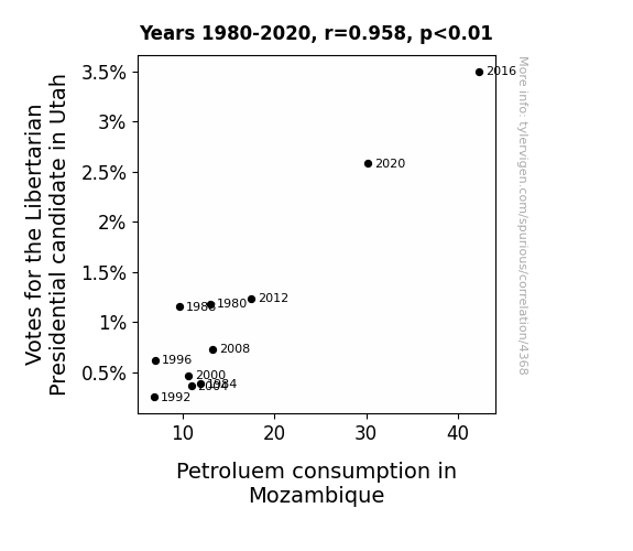
Fueling Libertarianism: A Crude Connection Between Votes for the Libertarian Presidential Candidate in Utah and Petroleum Consumption in Mozambique
The spike in demand for diesel trucks adorned with "Taxation is Theft" bumper stickers led to a domino effect of increased fuel imports in Mozambique. Who knew that the road to a small government ran right through a big oil boom in Southern Africa?

What else correlates?
Votes for the Libertarian Presidential candidate in Utah · all elections
Petroluem consumption in Mozambique · all energy
Votes for the Libertarian Presidential candidate in Utah · all elections
Petroluem consumption in Mozambique · all energy


View details about correlation #4,058
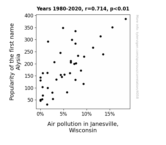
A Breath of Fresh Alysia: Exploring the Correlation Between Alysia's Popularity and Air Pollution in Janesville, Wisconsin
As the popularity of the name Alysia decreased, fewer people were named Alysia. With fewer people, there were fewer car trips being made, leading to a reduction in air pollution in Janesville, Wisconsin. It seems Alysia's weren't 'air'ing themselves out as much, ultimately clearing the way for fresher Janesville air!

What else correlates?
Popularity of the first name Alysia · all first names
Air pollution in Janesville, Wisconsin · all weather
Popularity of the first name Alysia · all first names
Air pollution in Janesville, Wisconsin · all weather


View details about correlation #1,623
Kicking Around the Numbers: Exploring the Correlation Between England Football Team's International Match Count and the Number of School Teachers in North Dakota
As the England Football Team's international match count increases, more and more people across the globe become enamored with the sport. This growing interest leads to a surge in demand for soccer merchandise, including those adorable mini jerseys for kids. As a result, the production of these mini jerseys skyrockets, leading to an unexpected boom in the North Dakota textile industry. With a sudden need for skilled workers to operate the mini jersey-making machinery, the state sees a corresponding rise in job opportunities. In response to this economic growth, individuals from all walks of life, including former professional ballerinas and retired rodeo clowns, decide to pursue textile-related careers, with many opting to become school teachers specializing in the art of mini jersey production. Before you know it, North Dakota is overflowing with a disproportionately high number of school teachers, all thanks to the England Football Team kicking their way to victory!

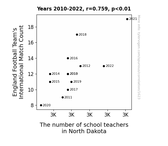
. The chart goes from 2002 to 2023, and the two variables track closely in value over that time.")

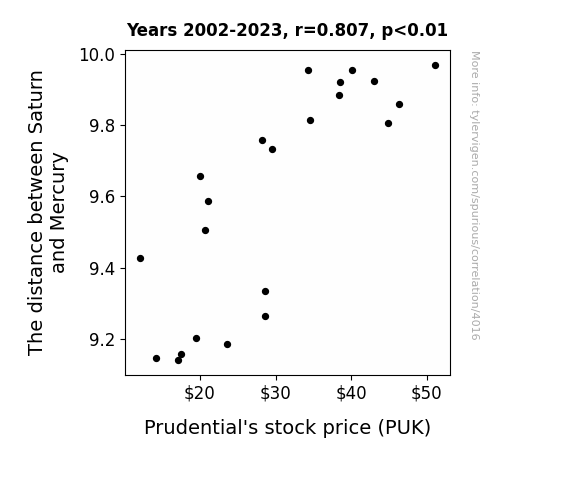
View details about correlation #4,016
Planetary Proximity and Prudential Prosperity: A Statistical Study of Saturn-Mercury Distance and PUK
As the distance between Saturn and Mercury increased, so did the gravitational pull on the stock market. This shift in gravitational forces led investors to adopt a more bullish stance, including those with a keen interest in Prudential. Ultimately, this celestial choreography culminated in a stellar performance for Prudential's stock, defying earthly market trends. So remember, the next time you're considering investment options, always keep an eye on the stars - the astrophysical economy may just hold the key to your financial success!

What else correlates?
The distance between Saturn and Mercury · all planets
Prudential's stock price (PUK) · all stocks
The distance between Saturn and Mercury · all planets
Prudential's stock price (PUK) · all stocks


View details about correlation #4,827
Aloha to Gasoline Galore: Exploring the Curious Correlation Between Libertarian Votes for Senators in Hawaii and Gasoline Pumped in Eritrea
As the saying goes, fewer libertarian votes in Hawaii led to a decrease in gas-ertarian beliefs worldwide. With less support for individual fuel choice, it's no wonder that even the gas situation in Eritrea felt the impact. After all, when it comes to pumping gas, it seems like political ideologies really can fuel the tank!

What else correlates?
Votes for Libertarian Senators in Hawaii · all elections
Gasoline pumped in Eritrea · all energy
Votes for Libertarian Senators in Hawaii · all elections
Gasoline pumped in Eritrea · all energy


View details about correlation #4,350
Counting Comments: The Celestial Connection Between Ingrid and SciShow Space
Ingrid, the name, has cosmic powers. As the popularity of the name wanes, so does the gravitational pull of intellect and curiosity. This leads to a relative shortage of space enthusiasts, resulting in fewer total comments on SciShow Space videos. It's an astronomical phenomenon of intergalactic proportions!


What else correlates?
Popularity of the first name Ingrid · all first names
Total comments on SciShow Space YouTube videos · all YouTube
Popularity of the first name Ingrid · all first names
Total comments on SciShow Space YouTube videos · all YouTube


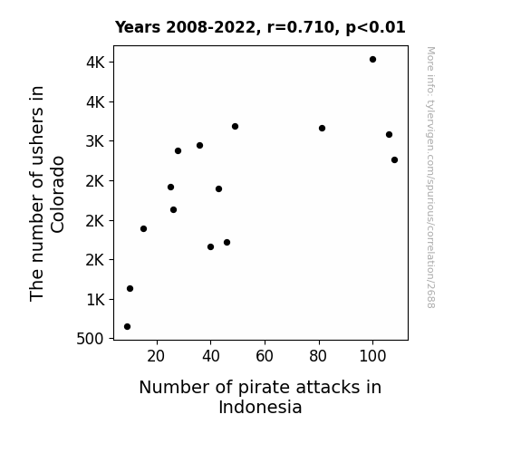
View details about correlation #2,688
Pirates and Parishes: Exploring the Relationship Between Ushers in Colorado and Pirate Attacks in Indonesia
Fewer ushers means fewer people to show others to their seats. As a result, there's less opportunity for them to accidentally direct pirates to the wrong location, like a movie theater instead of a ship. Remember, it's not just X marks the spot, it's also J10 for the best view of the screen!
What else correlates?
The number of ushers in Colorado · all cccupations
Number of pirate attacks in Indonesia · all weird & wacky
The number of ushers in Colorado · all cccupations
Number of pirate attacks in Indonesia · all weird & wacky
Why this works
- Data dredging: I have 25,237 variables in my database. I compare all these variables against each other to find ones that randomly match up. That's 636,906,169 correlation calculations! This is called “data dredging.”
Fun fact: the chart used on the wikipedia page to demonstrate data dredging is also from me. I've been being naughty with data since 2014.
Instead of starting with a hypothesis and testing it, I instead tossed a bunch of data in a blender to see what correlations would shake out. It’s a dangerous way to go about analysis, because any sufficiently large dataset will yield strong correlations completely at random. - Lack of causal connection: There is probably no direct connection between these variables, despite what the AI says above.
Because these pages are automatically generated, it's possible that the two variables you are viewing are in fact causually related. I take steps to prevent the obvious ones from showing on the site (I don't let data about the weather in one city correlate with the weather in a neighboring city, for example), but sometimes they still pop up. If they are related, cool! You found a loophole.
This is exacerbated by the fact that I used "Years" as the base variable. Lots of things happen in a year that are not related to each other! Most studies would use something like "one person" in stead of "one year" to be the "thing" studied. - Observations not independent: For many variables, sequential years are not independent of each other. You will often see trend-lines form. If a population of people is continuously doing something every day, there is no reason to think they would suddenly change how they are doing that thing on January 1. A naive p-value calculation does not take this into account.
You will calculate a lower chance of "randomly" achieving the result than represents reality.
To be more specific: p-value tests are probability values, where you are calculating the probability of achieving a result at least as extreme as you found completely by chance. When calculating a p-value, you need to assert how many "degrees of freedom" your variable has. I count each year (minus one) as a "degree of freedom," but this is misleading for continuous variables.
This kind of thing can creep up on you pretty easily when using p-values, which is why it's best to take it as "one of many" inputs that help you assess the results of your analysis.
- Y-axes doesn't start at zero: I truncated the Y-axes of the graphs above. I also used a line graph, which makes the visual connection stand out more than it deserves.
Nothing against line graphs. They are great at telling a story when you have linear data! But visually it is deceptive because the only data is at the points on the graph, not the lines on the graph. In between each point, the data could have been doing anything. Like going for a random walk by itself!
Mathematically what I showed is true, but it is intentionally misleading. If you click on any of the charts that abuse this, you can scroll down to see a version that starts at zero. - Confounding variable: Confounding variables (like global pandemics) will cause two variables to look connected when in fact a "sneaky third" variable is influencing both of them behind the scenes.
- Outliers: Some datasets here have outliers which drag up the correlation.
In concept, "outlier" just means "way different than the rest of your dataset." When calculating a correlation like this, they are particularly impactful because a single outlier can substantially increase your correlation.
Because this page is automatically generated, I don't know whether any of the charts displayed on it have outliers. I'm just a footnote. ¯\_(ツ)_/¯
I intentionally mishandeled outliers, which makes the correlation look extra strong. - Low n: There are not many data points included in some of these charts.
You can do analyses with low ns! But you shouldn't data dredge with a low n.
Even if the p-value is high, we should be suspicious of using so few datapoints in a correlation.
Pro-tip: click on any correlation to see:
- Detailed data sources
- Prompts for the AI-generated content
- Explanations of each of the calculations (correlation, p-value)
- Python code to calculate it yourself


