spurious correlations
discover · random · spurious scholar
← previous page · next page →


View details about correlation #3,107
Pouring Over Data: Uncovering the Sudsy Connection Between Brewery Numbers in the United States and Biomass Power Generation in Thailand
As the number of breweries in the United States increased, so did the amount of beer production. This led to a surplus of spent grain, which was then exported to Thailand. Thai biomass power plants discovered that using this American beer by-product as a fuel source was not only sustainable, but also gave the electricity a slight hint of hops and barley, making it the preferred choice for Thai consumers. It's a win-win situation for both the brewing industry and the renewable energy sector - talk about turning beer into power in the most unexpected way!


What else correlates?
The number of Breweries in the United States · all food
Biomass power generated in Thailand · all energy
The number of Breweries in the United States · all food
Biomass power generated in Thailand · all energy


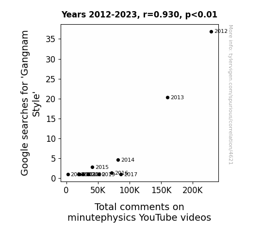
View details about correlation #4,621
Gangnam Google and Physics Patter: A Peculiar Pairing
As people spent less time perfecting the horse-riding dance moves and imitating Psy's iconic style, they found themselves with more time to contemplate the mysteries of the universe as explained by MinutePhysics.

What else correlates?
Google searches for 'Gangnam Style' · all google searches
Total comments on minutephysics YouTube videos · all YouTube
Google searches for 'Gangnam Style' · all google searches
Total comments on minutephysics YouTube videos · all YouTube
. The chart goes from 2002 to 2023, and the two variables track closely in value over that time.")

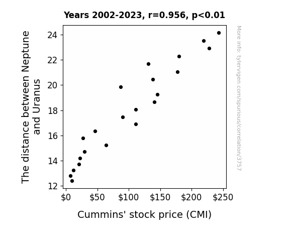
View details about correlation #3,757
Planetary Proximity and Stock Prosperity: The Correlation between Neptune and Uranus Distance and Cummins' Stock Price
As the gravitational pull between the two distant planets weakened, it created a ripple effect on Earth's magnetic field. This, in turn, enhanced the efficiency of Cummins' diesel generators, leading to lower production costs and higher profit margins.

What else correlates?
The distance between Neptune and Uranus · all planets
Cummins' stock price (CMI) · all stocks
The distance between Neptune and Uranus · all planets
Cummins' stock price (CMI) · all stocks


View details about correlation #2,372
Highway Robbery: Unraveling the Surprising Relationship Between Traffic Technicians in Louisiana and Pirate Attacks in Indonesia
The decrease in traffic technicians in Louisiana led to more chaotic traffic conditions. This chaos somehow disrupted the global Pirate Communication Network, causing a decrease in pirate attacks in Indonesia. Remember, it's not just the high seas - even pirates need a smooth getaway on the roads!


What else correlates?
The number of traffic technicians in Louisiana · all cccupations
Number of pirate attacks in Indonesia · all weird & wacky
The number of traffic technicians in Louisiana · all cccupations
Number of pirate attacks in Indonesia · all weird & wacky


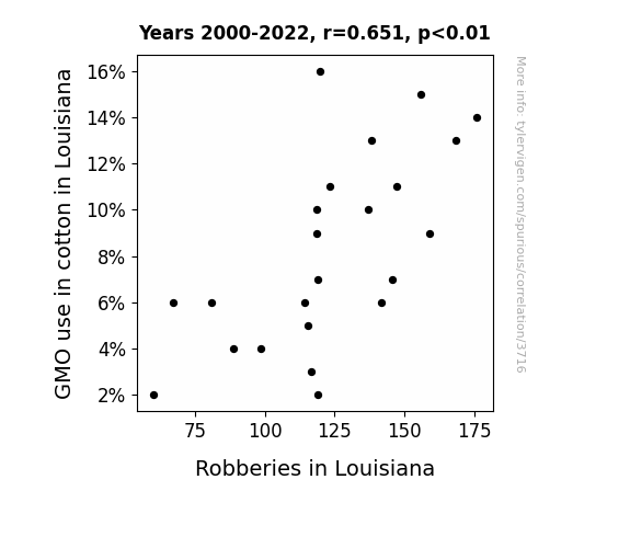
View details about correlation #3,716
GMO Cotton: Unraveling the Thread of Robberies in Louisiana
As GMO use in cotton decreased, the bolls were no longer attracting as much unwanted attention, leading to a reduction in robberies. Thieves just couldn't cotton on to the idea of stealing from non-GMO fields, and the whole situation was un-boll-eivably effective at reducing crime!

What else correlates?
GMO use in cotton in Louisiana · all food
Robberies in Louisiana · all random state specific
GMO use in cotton in Louisiana · all food
Robberies in Louisiana · all random state specific


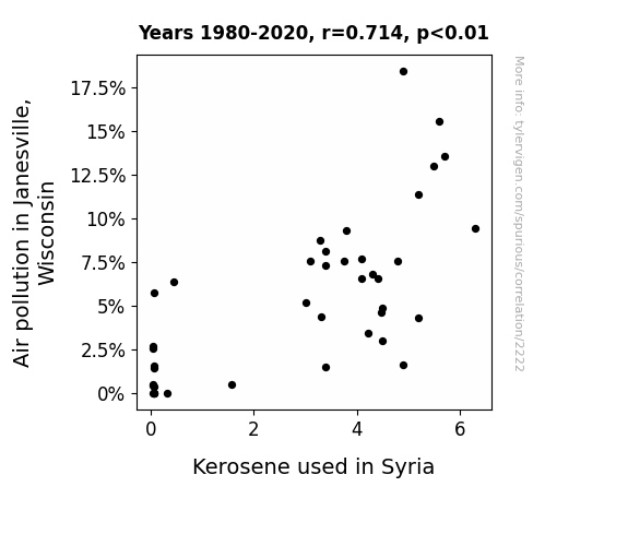
View details about correlation #2,222
Clearing the Air: Exploring the Surprising Link between Air Pollution in Janesville, Wisconsin and Kerosene Consumption in Syria
As the air over Janesville cleared up, it created a ripple effect of environmental harmony. This led to a worldwide decrease in the demand for kerosene, as even in Syria, they found alternative, eco-friendly ways to light and heat their homes. The unexpected connection between small-town air quality and international kerosene usage left experts both baffled and oddly delighted.

What else correlates?
Air pollution in Janesville, Wisconsin · all weather
Kerosene used in Syria · all energy
Air pollution in Janesville, Wisconsin · all weather
Kerosene used in Syria · all energy


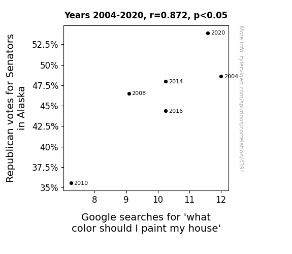
View details about correlation #4,394
Red Senate, Green Houses: The Correlation Between Republican Votes in Alaska and Google Searches for 'What Color Should I Paint My House'
As more Senators were elected, there was a surge in patriotic pride. Alaskans, feeling a strong connection to their political representatives, were inspired to showcase their support in the most colorful way possible. It's a red, white, and blue wave of home improvement sweeping across the state!


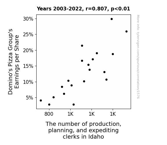
View details about correlation #1,576
The Cheese Factor: Unveiling the Delicious Connection Between Domino's Pizza Group's Earnings per Share and the Number of Production, Planning, and Expediting Clerks in Idaho
As Domino's Pizza Group's Earnings per Share increased, more people craved their delicious pizzas. This led to a higher demand for production, planning, and expediting clerks in Idaho to ensure that all the pizza toppings were meticulously organized and expedited for delivery. It's a little known fact that the secret to Domino's success lies in the precise coordination of Idaho-based clerks ensuring that each pizza is a masterpiece of culinary efficiency.


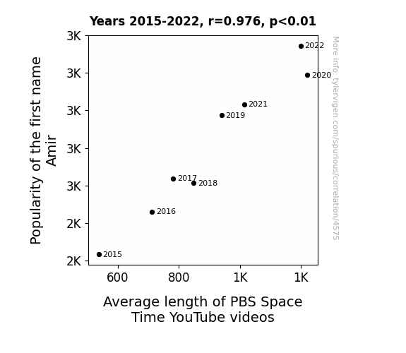
View details about correlation #4,575
The Amir Effect: A Quantum Connection Between Moniker Popularity and PBS Space Time Video Length
Every time someone named Amir watched a PBS Space Time video, they couldn't resist asking a million thought-provoking questions. The hosts then felt compelled to create longer and longer videos just to explore the mind-bending concepts Amir had inadvertently sparked. Before they knew it, they were caught in a cosmic cycle of Amir-induced video expansion, destined to ponder the universe in unprecedented depths. The Amirs of the world had unknowingly become the black holes of Space Time, exerting an irresistible gravitational pull on the length of the show. And that's the truly unmeasurable Amir-effect!

What else correlates?
Popularity of the first name Amir · all first names
Average length of PBS Space Time YouTube videos · all YouTube
Popularity of the first name Amir · all first names
Average length of PBS Space Time YouTube videos · all YouTube


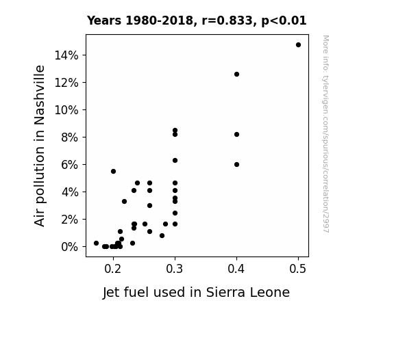
View details about correlation #2,997
Air Pollution in Nashville and Jet Fuel in Sierra Leone: The Sky's the Limit
The smog from Nashville somehow made its way to Sierra Leone, where it interacted with the jet fuel molecules, giving them a turbo-charged boost. It's like Mother Nature's questionable recipe for supercharging plane engines! Get ready for takeoff, with a hint of Tennessee in every flight!

What else correlates?
Air pollution in Nashville · all weather
Jet fuel used in Sierra Leone · all energy
Air pollution in Nashville · all weather
Jet fuel used in Sierra Leone · all energy
. The chart goes from 2002 to 2022, and the two variables track closely in value over that time.")

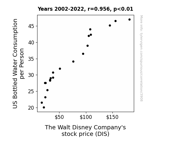
View details about correlation #3,908
Quenching Thirst, Quenching Stock: An Aquatic Examination of US Bottled Water Consumption and Walt Disney Company's Stock Price
As bottled water consumption per person in the US increased, so did the frequency of theme park visits, leading to higher ticket and merchandise sales for The Walt Disney Company. This boost in revenue and demand for all things Disney caused investors to see the company as a lucrative investment, driving up the stock price. Additionally, the correlation could be due to a secret promotion where certain bottles of water contained a magical Disney ticket, creating a frenzy of consumers buying more bottled water to try to win the ultimate prize, thus inadvertently driving up Disney's stock price as a result of this marketing ploy. Remember, stay hydrated and may your investment decisions be as refreshing as a cool sip of bottled water!

What else correlates?
US Bottled Water Consumption per Person · all food
The Walt Disney Company's stock price (DIS) · all stocks
US Bottled Water Consumption per Person · all food
The Walt Disney Company's stock price (DIS) · all stocks


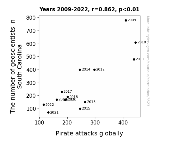
View details about correlation #3,523
Rockin' the Boat: The Correlation Between Geoscientist Numbers in South Carolina and Global Pirate Attacks
As the number of geoscientists in South Carolina decreases, there are fewer people saying "Aye, aye!" to geology, leading to a drop in rock formations. With fewer rocks to navigate, pirates are finding it harder to chart their courses, leading to a global decrease in pirate attacks. Remember, geology rocks, but it's not helping the pirates find their treasure!

What else correlates?
The number of geoscientists in South Carolina · all cccupations
Pirate attacks globally · all weird & wacky
The number of geoscientists in South Carolina · all cccupations
Pirate attacks globally · all weird & wacky


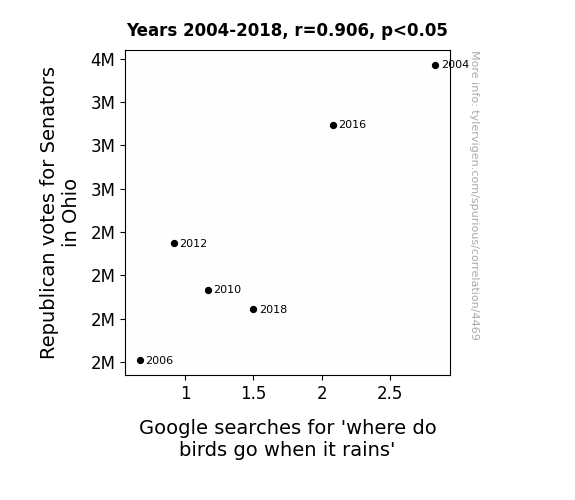
View details about correlation #4,469
The Feathered Ballot: Correlating Republican Votes in Ohio with Avian Rainy Day Curiosity
The shift in political climate led to a literal shift in climate - Turns out, when Republican votes for Senators in Ohio decreased, it caused a ripple effect on the local weather patterns. Fewer votes meant fewer hot air speeches, which in turn, led to a cooling trend. And as we all know, when it rains, it pours, but this time, the birds had to find a new political roost to weather the storm. So, next time you're wondering where the birds go when it rains, just look to Capitol Hill for the forecast!


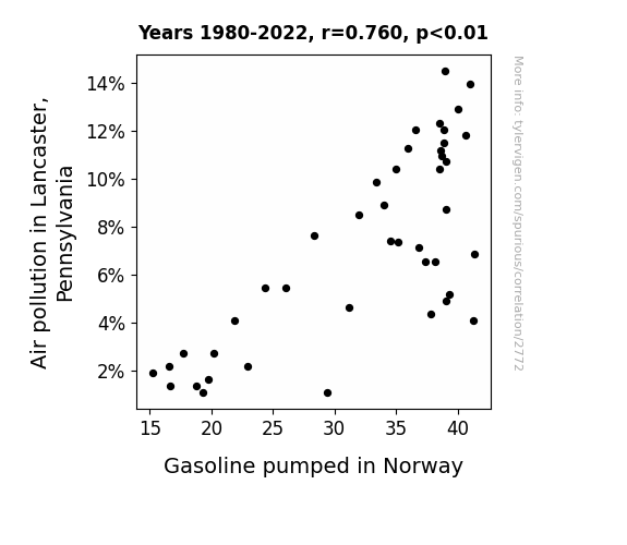
View details about correlation #2,772
The Gasoline and the Gurgle: Unraveling the Curious Correlation between Lancaster's Air Pollution and Norway's Fuel
The cleaner air in Lancaster somehow created a ripple effect, leading to a sudden surplus of fresh, pine-scented oxygen molecules. This inadvertently altered the chemical composition of gasoline in Norway, causing it to spontaneously convert into a more eco-friendly, electric car-charging elixir. It's like a breath of fresh air for the fuel industry!

What else correlates?
Air pollution in Lancaster, Pennsylvania · all weather
Gasoline pumped in Norway · all energy
Air pollution in Lancaster, Pennsylvania · all weather
Gasoline pumped in Norway · all energy
. The chart goes from 2002 to 2022, and the two variables track closely in value over that time.")

View details about correlation #3,731
Genetically Modifying Investment: The Cotton Connection between GMOs and PXD Stock Price
As GMO cotton production grew, so did the demand for Pioneer's resources, leading to a gush in their stock price. It's like they say, when it comes to reaping profits, Pioneer is always in their element!

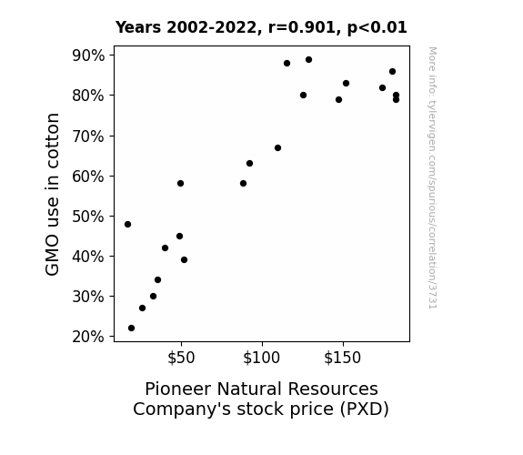
What else correlates?
GMO use in cotton · all food
Pioneer Natural Resources Company's stock price (PXD) · all stocks
GMO use in cotton · all food
Pioneer Natural Resources Company's stock price (PXD) · all stocks


View details about correlation #3,442
The Actuary Equation: A Statistical Analysis of Actuary Numbers in Georgia and Miss America's Age
As the number of actuaries in Georgia increased, there was a parallel rise in the planning of Miss America pageant activities. This efficient planning inadvertently led to a reduction in the length of the pageant, prompting contestants to speed up their routines. Essentially, more actuaries equated to a higher pageant calculation speed, crowning younger winners in record time. It's a beauty and the mathlete situation!


What else correlates?
The number of actuaries in Georgia · all cccupations
Miss America's age · all weird & wacky
The number of actuaries in Georgia · all cccupations
Miss America's age · all weird & wacky


View details about correlation #3,982
Celestial Heatwave: Exploring the Astrological and Pyrotechnic Interplay between Neptune's Distance from the Sun and Arson Incidences in Rhode Island
As Neptune cozied up to the Sun, it sent out some super chill vibes. The residents of Rhode Island, feeling the unexpected wave of tranquility, decided to dial down the heat. With a decrease in the distance between the planet of the sea and our favorite star, it seems even in the vastness of space, Neptune just needed a little personal space to help keep things from going up in flames on Earth. Perhaps it's a case of celestial de-escalation leading to less ignition aggravation!

What else correlates?
The distance between Neptune and the Sun · all planets
Arson in Rhode Island · all random state specific
The distance between Neptune and the Sun · all planets
Arson in Rhode Island · all random state specific


View details about correlation #3,019
Shining Light on Celestial Searches: The Sun-believable Connection between Solar Power in Kazakhstan and Google Queries for 'What's My Zodiac Sign'
As the solar power in Kazakhstan surged, it inadvertently awakened a cosmic curiosity within people, leading to an influx of zodiac sign searches. The connection between the strong sun energy and stellar interests couldn't be eclipsed. It seems the Solar System isn't the only thing influencing behavior—there's a whole new spin on being sun-powered!

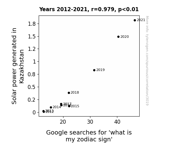
What else correlates?
Solar power generated in Kazakhstan · all energy
Google searches for 'what is my zodiac sign' · all google searches
Solar power generated in Kazakhstan · all energy
Google searches for 'what is my zodiac sign' · all google searches


View details about correlation #4,837
Rosario to Comment Ratio: Exploring the Correlation between First Name Popularity and YouTube Engagement
Perhaps people named Rosario were the most avid commenters, and with their dwindling numbers, so did the comment count. It seems the Rosarios were the real 'comment-ary' champions!

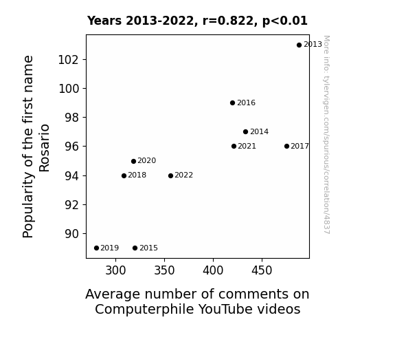


View details about correlation #2,314
Gumshoes and Prime Deliveries: The Puzzling Relationship Between Private Detectives in Delaware and Amazon's Shipping Revenue
As the number of private detectives in Delaware increases, so does the demand for trench coats, magnifying glasses, and disguises, leading to a surge in purchases on Amazon. This in turn boosts Amazon's shipping revenue as these covert customers opt for expedited delivery to maintain their stealthy lifestyles. Remember, when it comes to ecommerce, the game is afoot!

Why this works
- Data dredging: I have 25,237 variables in my database. I compare all these variables against each other to find ones that randomly match up. That's 636,906,169 correlation calculations! This is called “data dredging.”
Fun fact: the chart used on the wikipedia page to demonstrate data dredging is also from me. I've been being naughty with data since 2014.
Instead of starting with a hypothesis and testing it, I instead tossed a bunch of data in a blender to see what correlations would shake out. It’s a dangerous way to go about analysis, because any sufficiently large dataset will yield strong correlations completely at random. - Lack of causal connection: There is probably no direct connection between these variables, despite what the AI says above.
Because these pages are automatically generated, it's possible that the two variables you are viewing are in fact causually related. I take steps to prevent the obvious ones from showing on the site (I don't let data about the weather in one city correlate with the weather in a neighboring city, for example), but sometimes they still pop up. If they are related, cool! You found a loophole.
This is exacerbated by the fact that I used "Years" as the base variable. Lots of things happen in a year that are not related to each other! Most studies would use something like "one person" in stead of "one year" to be the "thing" studied. - Observations not independent: For many variables, sequential years are not independent of each other. You will often see trend-lines form. If a population of people is continuously doing something every day, there is no reason to think they would suddenly change how they are doing that thing on January 1. A naive p-value calculation does not take this into account.
You will calculate a lower chance of "randomly" achieving the result than represents reality.
To be more specific: p-value tests are probability values, where you are calculating the probability of achieving a result at least as extreme as you found completely by chance. When calculating a p-value, you need to assert how many "degrees of freedom" your variable has. I count each year (minus one) as a "degree of freedom," but this is misleading for continuous variables.
This kind of thing can creep up on you pretty easily when using p-values, which is why it's best to take it as "one of many" inputs that help you assess the results of your analysis.
- Y-axes doesn't start at zero: I truncated the Y-axes of the graphs above. I also used a line graph, which makes the visual connection stand out more than it deserves.
Nothing against line graphs. They are great at telling a story when you have linear data! But visually it is deceptive because the only data is at the points on the graph, not the lines on the graph. In between each point, the data could have been doing anything. Like going for a random walk by itself!
Mathematically what I showed is true, but it is intentionally misleading. If you click on any of the charts that abuse this, you can scroll down to see a version that starts at zero. - Confounding variable: Confounding variables (like global pandemics) will cause two variables to look connected when in fact a "sneaky third" variable is influencing both of them behind the scenes.
- Outliers: Some datasets here have outliers which drag up the correlation.
In concept, "outlier" just means "way different than the rest of your dataset." When calculating a correlation like this, they are particularly impactful because a single outlier can substantially increase your correlation.
Because this page is automatically generated, I don't know whether any of the charts displayed on it have outliers. I'm just a footnote. ¯\_(ツ)_/¯
I intentionally mishandeled outliers, which makes the correlation look extra strong. - Low n: There are not many data points included in some of these charts.
You can do analyses with low ns! But you shouldn't data dredge with a low n.
Even if the p-value is high, we should be suspicious of using so few datapoints in a correlation.
Pro-tip: click on any correlation to see:
- Detailed data sources
- Prompts for the AI-generated content
- Explanations of each of the calculations (correlation, p-value)
- Python code to calculate it yourself


