spurious correlations
discover · random · spurious scholar
← previous page · next page →


View details about correlation #4,468
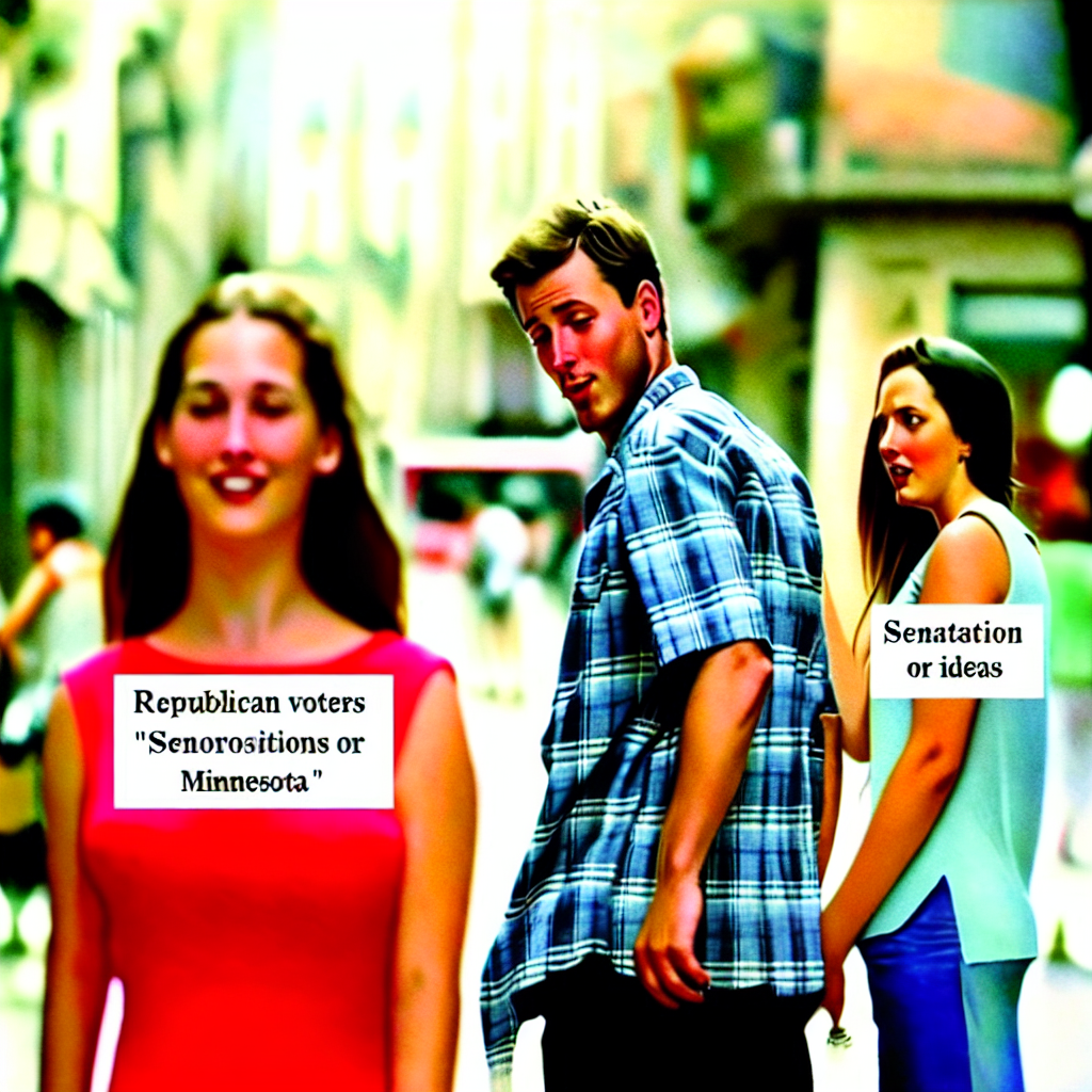
Votes and Voyeurs: The Distracted Boyfriend Meme and Republican Senators in Minnesota
As more Republican senators were voted in, they inadvertently boosted the meme economy. Their conservative policies led to an unexpected rise in meme production as people sought lighthearted distractions from political discourse. It turns out, the secret ingredient for meme success was... bipartisanship!

What else correlates?
Votes for Republican Senators in Minnesota · all elections
Popularity of the 'distracted boyfriend' meme · all memes
Votes for Republican Senators in Minnesota · all elections
Popularity of the 'distracted boyfriend' meme · all memes


View details about correlation #4,205
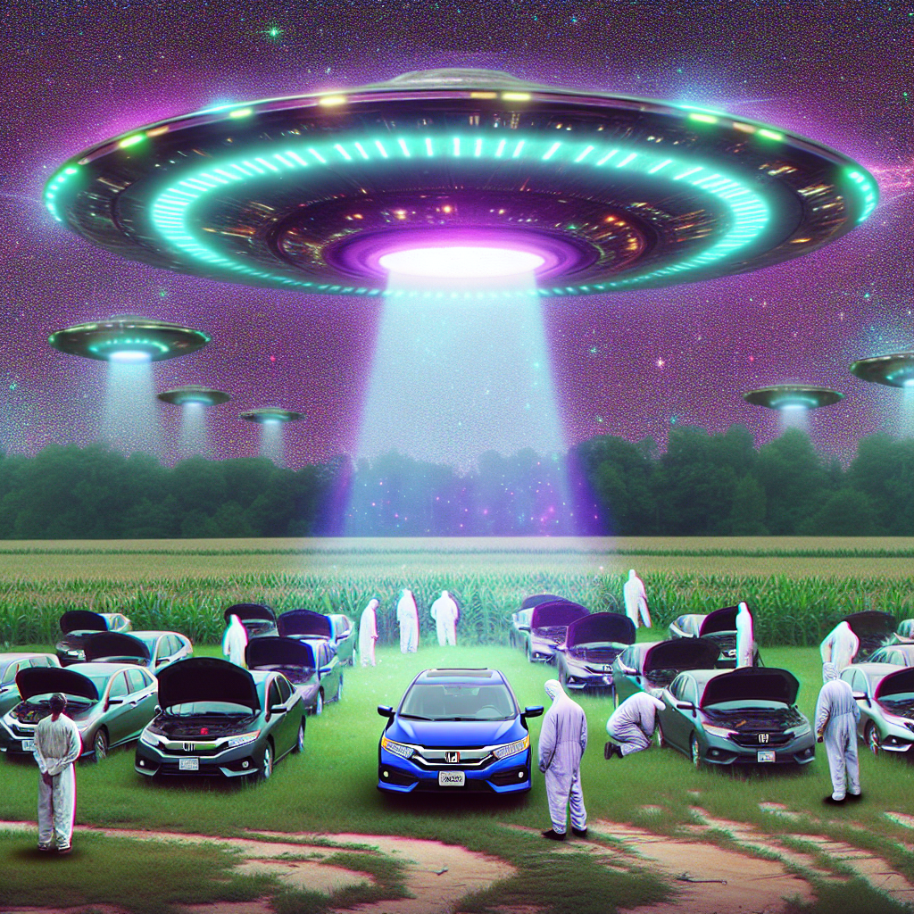
The UFO-Honda Connection: Exploring the Correlation Between UFO Sightings in Mississippi and Automotive Recalls by Honda
As UFOs buzzed around Mississippi, they accidentally activated some cosmic car-stalling ray, prompting a Honda recall. It seems even aliens can't resist a good old-fashioned joyride, leaving Honda no choice but to address this otherworldly problem. It's a classic case of UFO-OPS (Unidentifiable Flying Objects Prompting Service) putting the 'highway' in 'highway to the danger zone' for Honda drivers. The connection between these phenomena is truly out of this world!

What else correlates?
UFO sightings in Mississippi · all random state specific
Automotive recalls issued by Honda · all weird & wacky
UFO sightings in Mississippi · all random state specific
Automotive recalls issued by Honda · all weird & wacky
. The chart goes from 2002 to 2022, and the two variables track closely in value over that time.")

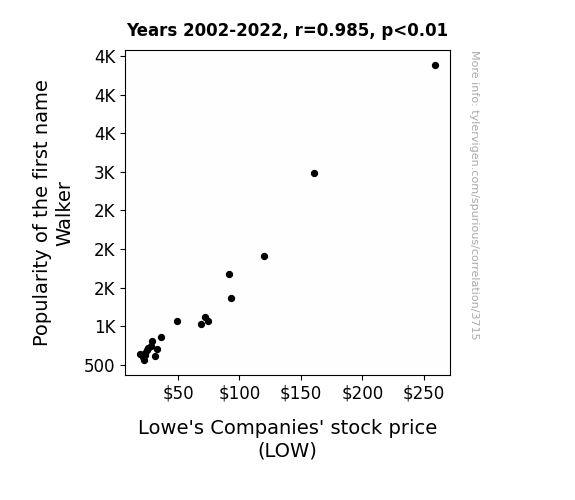
View details about correlation #3,715
Lowe and behold: The 'LOW'down on the Impact of the Name 'Walker' on Stock Prices
More people naming their kids after a common household item led to a subconscious increase in home improvement projects and purchases, boosting the company's stock value.

What else correlates?
Popularity of the first name Walker · all first names
Lowe's Companies' stock price (LOW) · all stocks
Popularity of the first name Walker · all first names
Lowe's Companies' stock price (LOW) · all stocks


View details about correlation #1,856
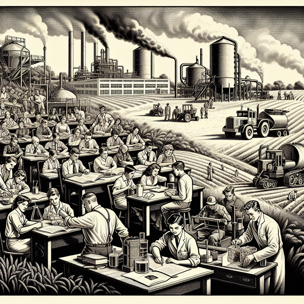
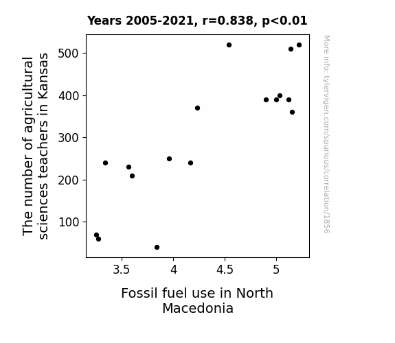
Tilling Fields, Fueling Fossils: Unearthing the Interplay Between Agricultural Sciences Educators in the Corn State and Fossil Fuel Consumption in the Land of Alexander the Great
As the knowledge cultivation in Kansas became scarce, it led to a crop in innovative farming practices. Without enough ag-science teachers to help them branch out, the farmers had to mulch over to more sustainable methods, reducing their reliance on fossil fuels. It seems the root of the issue in North Macedonia's fossil fuel use was actually sprouting all the way over in Kansas. This just goes to show, when it comes to global impact, every stalk and roll counts!
What else correlates?
The number of agricultural sciences teachers in Kansas · all cccupations
Fossil fuel use in North Macedonia · all energy
The number of agricultural sciences teachers in Kansas · all cccupations
Fossil fuel use in North Macedonia · all energy


View details about correlation #4,230
Gleaning GMOs: Great Guffaws about Google Searches for Gravitation towards the Great White North
The GMO cotton in Alabama grew so soft and luscious that it developed a friendly, welcoming personality. As word spread, people couldn't help but feel a strong connection to the charming cotton plants. Their irresistible allure led many to consider moving to Canada, known for its equally welcoming reputation. Plus, maybe they just wanted to be surrounded by more things that were ginning to make them happy.


What else correlates?
GMO use in cotton in Alabama · all food
Google searches for 'how to immigrate to canada' · all google searches
GMO use in cotton in Alabama · all food
Google searches for 'how to immigrate to canada' · all google searches


View details about correlation #4,644
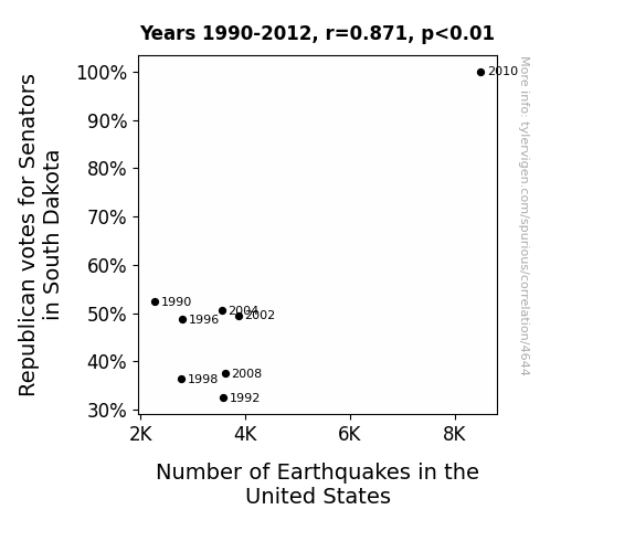
Shakin' Up the Ballot Box: The Correlation Between Republican Votes for Senators in South Dakota and Seismic Activity in the United States
As more Republicans voted for Senators in South Dakota, there was a surge in political rhetoric. This led to an increase in hot air production, creating a literal and figurative shift in the tectonic plates across the United States. Seismic activity couldn't help but rise as the political landscape became, quite literally, rockier.
What else correlates?
Votes for Republican Senators in South Dakota · all elections
Number of Earthquakes in the United States · all weather
Votes for Republican Senators in South Dakota · all elections
Number of Earthquakes in the United States · all weather


View details about correlation #3,890
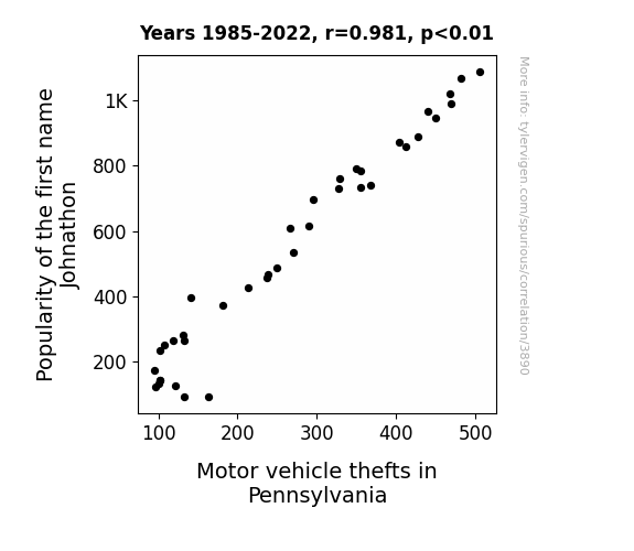
The Johnathon Job: An Examination of the Correlation between Popularity of the First Name Johnathon and Motor Vehicle Thefts in Pennsylvania
As the popularity of the name Johnathon waned, so did the enthusiasm for car-related activities. This lack of interest in anything with wheels led to a statewide decrease in motor vehicle thefts in Pennsylvania. It's as if the name Johnathon had been revving up a certain demographic to engage in automotive larceny, but now that influence has run out of gas.
What else correlates?
Popularity of the first name Johnathon · all first names
Motor vehicle thefts in Pennsylvania · all random state specific
Popularity of the first name Johnathon · all first names
Motor vehicle thefts in Pennsylvania · all random state specific


View details about correlation #1,450
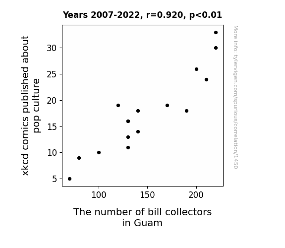
XKCD Affectin' the Collectin': A Rhyming Study on Pop Culture Comics and Bill Collectors in Guam
As xkcd comics about pop culture decreased, so did the number of references to outdated memes, leading to a decline in unpaid debts and a decreased demand for bill collectors in Guam. This is due to the little-known fact that internet humor has a direct impact on the economic ecosystem of remote Pacific islands. Who would've thought that a comic about Star Wars or Rickrolling could have such far-reaching consequences for the financial sector of a small U.S. territory? But hey, that's just the power of webcomics at play.

What else correlates?
xkcd comics published about pop culture · all weird & wacky
The number of bill collectors in Guam · all cccupations
xkcd comics published about pop culture · all weird & wacky
The number of bill collectors in Guam · all cccupations


View details about correlation #2,876
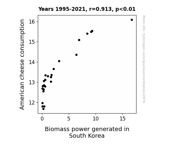
Fromage to Power: The Cheesy Connection between American Cheese Consumption and Biomass Power Generation in South Korea
As Americans enjoyed their cheesy indulgences, they unknowingly contributed to a surge in Biomass power production in South Korea. It turns out that the collective gas emissions from consuming all that American cheese somehow fueled the creation of more Biomass power. It's a gouda thing for both lactose lovers and renewable energy enthusiasts. Cheesy emissions leading to a power surge - talk about dairy air doing some real work!

What else correlates?
American cheese consumption · all food
Biomass power generated in South Korea · all energy
American cheese consumption · all food
Biomass power generated in South Korea · all energy


View details about correlation #4,588
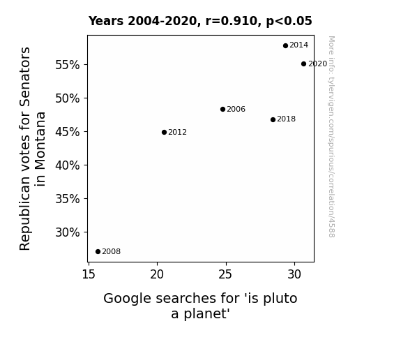
Planet Politics: The Pluto Paradox - A Correlational Study of Republican Senatorial Votes in Montana and Google Searches for 'Is Pluto a Planet?'
As the Republican votes for Senators in Montana increased, it created a gravitational pull towards reclassifying Pluto as a planet in the hearts and minds of the public. It seems the political atmosphere was just right for Pluto to reclaim its status among the stars.

What else correlates?
Votes for Republican Senators in Montana · all elections
Google searches for 'is pluto a planet' · all google searches
Votes for Republican Senators in Montana · all elections
Google searches for 'is pluto a planet' · all google searches
. The chart goes from 2012 to 2021, and the two variables track closely in value over that time.")

View details about correlation #3,726
Burgeoning Bachelor's: Booming Bachelor's Degrees in Battlefield Breakthroughs and Nasdaq's Nifty Numbers
As the number of military technology experts with Bachelor's degrees rises, so does their demand in the job market. This leads to an influx of highly specialized individuals entering the workforce. With their knack for strategic thinking and precision, these graduates inadvertently bring a new level of efficiency and innovation to various industries. This surge in productivity and forward-thinking approaches boosts the overall performance of companies listed on Nasdaq, sending their stock prices soaring. It's a case of the 'military precision' mindset infiltrating the stock market and propelling it to new heights!


What else correlates?
Bachelor's degrees awarded in Military technologies · all education
Nasdaq's stock price (NDAQ) · all stocks
Bachelor's degrees awarded in Military technologies · all education
Nasdaq's stock price (NDAQ) · all stocks


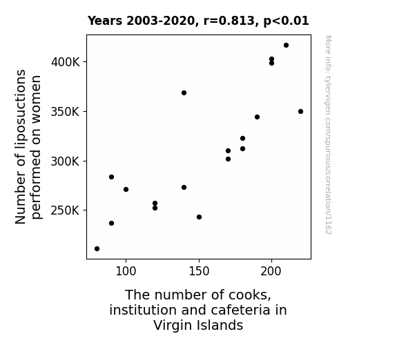
View details about correlation #1,162
Lipo and Lido: Exploring the Link Between Liposuctions and Chefs in the Virgin Islands
As the number of liposuctions on women decreased, there was a corresponding decrease in the availability of excess fat. This led to a shortage of ingredients for creating hearty, flavorful dishes. As a result, the demand for cooks in institutions and cafeterias in the Virgin Islands decreased, since there simply wasn't enough fat to fry and sauté their way to culinary success. It's a case of fat shortage leading to a thinning out of the cooking industry in the Virgin Islands!


View details about correlation #1,595
Spreading Thin: Uncovering the Butter-Fossil Fuel Link in Rwanda
As butter consumption in Rwanda increased, it led to a rise in the popularity of baking. With more people baking and indulging in delicious buttery treats, there was a greater demand for kitchen appliances like ovens. This surge in the purchase of ovens and electric mixers meant that there was a higher need for electricity, leading to an increase in the burning of fossil fuels to meet the newfound energy needs. In other words, it was a classic case of turning up the 'heata' in the kitchen leading to a 'butter' load on fossil fuel resources!

What else correlates?
Butter consumption · all food
Fossil fuel use in Rwanda · all energy
Butter consumption · all food
Fossil fuel use in Rwanda · all energy


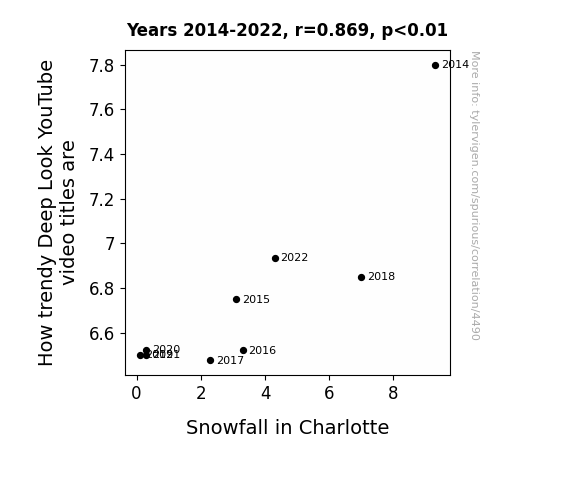
View details about correlation #4,490
Snow Joke: The Snowfall-Deep Look Connection - A Trendy Relationship
The decrease in trendy Deep Look YouTube video titles is causing a decrease in hot air, leading to a cooling effect that reduces snowfall in Charlotte. Remember, stay cool but not trendy!
What else correlates?
How trendy Deep Look YouTube video titles are · all YouTube
Snowfall in Charlotte · all weather
How trendy Deep Look YouTube video titles are · all YouTube
Snowfall in Charlotte · all weather
. The chart goes from 2002 to 2022, and the two variables track closely in value over that time.")

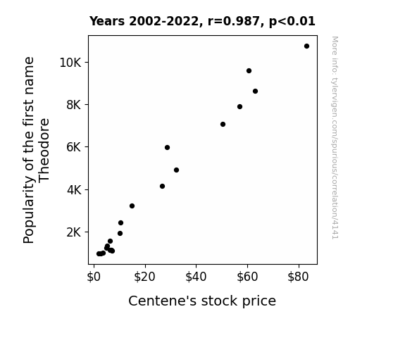
View details about correlation #4,141
The Theo-Retrical Impact: Unveiling the Correlation between Theodore's Trend and Centene's Stock
More people named Theodore means more people interested in teddy bears. This leads to a surge in demand for teddy bear health insurance, boosting Centene's stock price. "Looks like Centene's prognosis is beary good!"

What else correlates?
Popularity of the first name Theodore · all first names
Centene's stock price (CNC) · all stocks
Popularity of the first name Theodore · all first names
Centene's stock price (CNC) · all stocks


View details about correlation #2,978
Sticking Together: Exploring the Correlation Between US Household Spending on Postage and Stationery and the Number of Tapers in Texas
As household spending on postage and stationery decreased, people resorted to using electronic communication, leading to less need for traditional mail items. With fewer letters being sent, there was a decline in the demand for sealing wax, ultimately causing the number of tapers in Texas to decrease. The situation really waxed and waned for the tapers, leaving them in a sticky spot!


What else correlates?
US household spending on postage and stationery · all weird & wacky
The number of tapers in Texas · all cccupations
US household spending on postage and stationery · all weird & wacky
The number of tapers in Texas · all cccupations


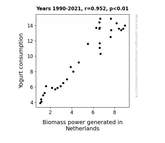
View details about correlation #1,774
Cultivating Energy: The Yogurt-Biomass Power Connection in the Netherlands
As yogurt consumption increased, so did the culture in the Netherlands. This led to a spike in biomass power because the bacteria were whey more productive at generating energy. It's a real powerhouse of a connection! Just goes to show, when it comes to dairy good correlations, this one takes the cake – or should I say, the yogurt!

What else correlates?
Yogurt consumption · all food
Biomass power generated in Netherlands · all energy
Yogurt consumption · all food
Biomass power generated in Netherlands · all energy


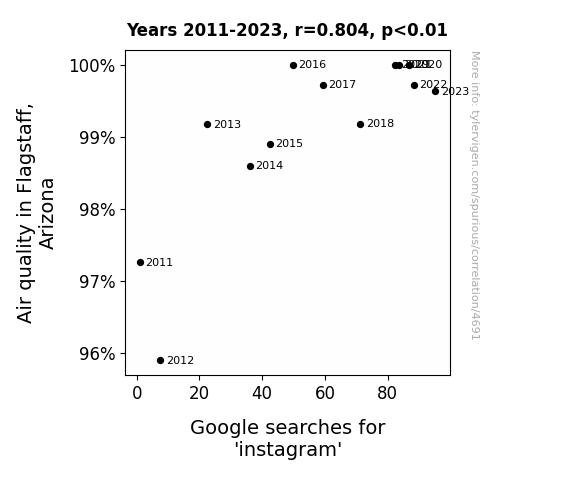
View details about correlation #4,691
Air Quality in Arizona: Assessing the Affinity between Ambient Atmosphere and Instagram Inquiries
As the air quality improved, people in Flagstaff had more energy and were feeling uplifted. This led to an increase in outdoor activities, where they couldn't resist taking beautiful pictures of the clear, picturesque landscapes. These stunning shots were then promptly uploaded to Instagram, causing a ripple effect of envy and wanderlust among users, ultimately driving up the searches for Instagram.

What else correlates?
Air quality in Flagstaff, Arizona · all weather
Google searches for 'instagram' · all google searches
Air quality in Flagstaff, Arizona · all weather
Google searches for 'instagram' · all google searches


View details about correlation #4,521
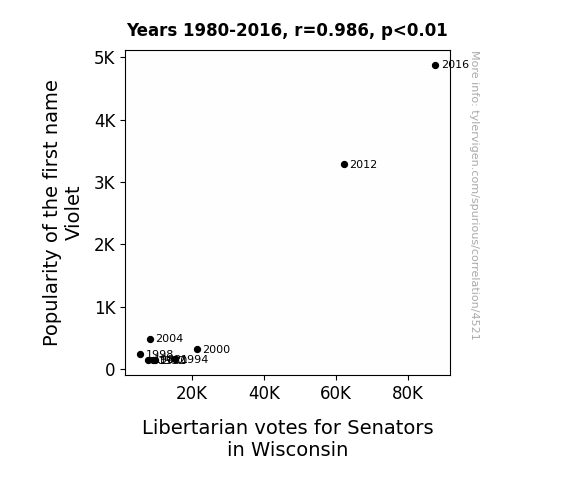
Violet's Veto: Exploring the Entangled Enigma of Name Popularity and Political Preferences in Wisconsin's Senators
It’s simple. As the popularity of the first name Violet increased, so did the sales of lavender-scented products. The aroma of lavender has a calming effect, leading to a decrease in political polarization. This, in turn, inclined more individuals in Wisconsin towards libertarian ideology, ultimately boosting the libertarian votes for Senators. Who would have thought that a fragrant flower could have such a blooming impact on the political landscape?

What else correlates?
Popularity of the first name Violet · all first names
Votes for Libertarian Senators in Wisconsin · all elections
Popularity of the first name Violet · all first names
Votes for Libertarian Senators in Wisconsin · all elections


View details about correlation #3,417
Trimmers and Trimmed: Tracing the Ties Between Tailors' Tools and Transnational Tots
The shortage of hand cutters and trimmers in Indiana led to a decrease in the supply of hand models, making it much harder for Americans to get a handle on the situation.


What else correlates?
The number of cutters and trimmers, hand in Indiana · all cccupations
U.S. intercountry adoptions · all weird & wacky
The number of cutters and trimmers, hand in Indiana · all cccupations
U.S. intercountry adoptions · all weird & wacky
Why this works
- Data dredging: I have 25,237 variables in my database. I compare all these variables against each other to find ones that randomly match up. That's 636,906,169 correlation calculations! This is called “data dredging.”
Fun fact: the chart used on the wikipedia page to demonstrate data dredging is also from me. I've been being naughty with data since 2014.
Instead of starting with a hypothesis and testing it, I instead tossed a bunch of data in a blender to see what correlations would shake out. It’s a dangerous way to go about analysis, because any sufficiently large dataset will yield strong correlations completely at random. - Lack of causal connection: There is probably no direct connection between these variables, despite what the AI says above.
Because these pages are automatically generated, it's possible that the two variables you are viewing are in fact causually related. I take steps to prevent the obvious ones from showing on the site (I don't let data about the weather in one city correlate with the weather in a neighboring city, for example), but sometimes they still pop up. If they are related, cool! You found a loophole.
This is exacerbated by the fact that I used "Years" as the base variable. Lots of things happen in a year that are not related to each other! Most studies would use something like "one person" in stead of "one year" to be the "thing" studied. - Observations not independent: For many variables, sequential years are not independent of each other. You will often see trend-lines form. If a population of people is continuously doing something every day, there is no reason to think they would suddenly change how they are doing that thing on January 1. A naive p-value calculation does not take this into account.
You will calculate a lower chance of "randomly" achieving the result than represents reality.
To be more specific: p-value tests are probability values, where you are calculating the probability of achieving a result at least as extreme as you found completely by chance. When calculating a p-value, you need to assert how many "degrees of freedom" your variable has. I count each year (minus one) as a "degree of freedom," but this is misleading for continuous variables.
This kind of thing can creep up on you pretty easily when using p-values, which is why it's best to take it as "one of many" inputs that help you assess the results of your analysis.
- Y-axes doesn't start at zero: I truncated the Y-axes of the graphs above. I also used a line graph, which makes the visual connection stand out more than it deserves.
Nothing against line graphs. They are great at telling a story when you have linear data! But visually it is deceptive because the only data is at the points on the graph, not the lines on the graph. In between each point, the data could have been doing anything. Like going for a random walk by itself!
Mathematically what I showed is true, but it is intentionally misleading. If you click on any of the charts that abuse this, you can scroll down to see a version that starts at zero. - Confounding variable: Confounding variables (like global pandemics) will cause two variables to look connected when in fact a "sneaky third" variable is influencing both of them behind the scenes.
- Outliers: Some datasets here have outliers which drag up the correlation.
In concept, "outlier" just means "way different than the rest of your dataset." When calculating a correlation like this, they are particularly impactful because a single outlier can substantially increase your correlation.
Because this page is automatically generated, I don't know whether any of the charts displayed on it have outliers. I'm just a footnote. ¯\_(ツ)_/¯
I intentionally mishandeled outliers, which makes the correlation look extra strong. - Low n: There are not many data points included in some of these charts.
You can do analyses with low ns! But you shouldn't data dredge with a low n.
Even if the p-value is high, we should be suspicious of using so few datapoints in a correlation.
Pro-tip: click on any correlation to see:
- Detailed data sources
- Prompts for the AI-generated content
- Explanations of each of the calculations (correlation, p-value)
- Python code to calculate it yourself


