spurious correlations
discover · random · spurious scholar
← previous page · next page →


View details about correlation #3,243
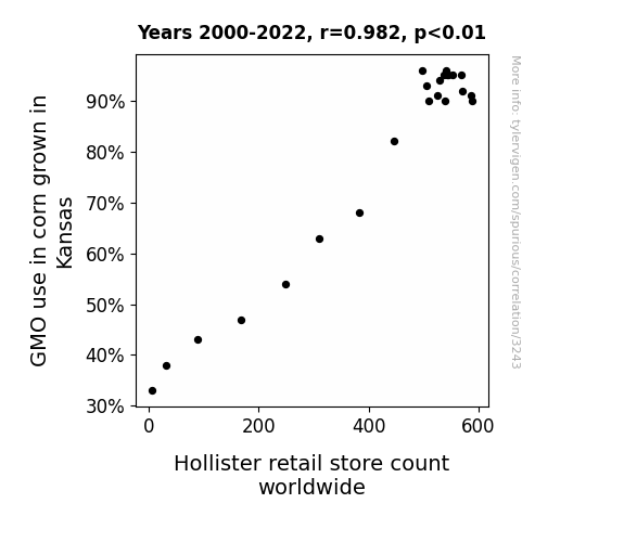
From Cornfields to Catwalks: The GMO-Cein Oui-dence of Corn and Couture
As the corn in Kansas grew taller thanks to GMOs, it created a higher demand for overalls, and Hollister was ready to overaller the market with their latest styles. They saw the opportunity and jumped in, just like corn in a popcorn machine!

What else correlates?
GMO use in corn grown in Kansas · all food
Hollister retail store count worldwide · all weird & wacky
GMO use in corn grown in Kansas · all food
Hollister retail store count worldwide · all weird & wacky


View details about correlation #4,459
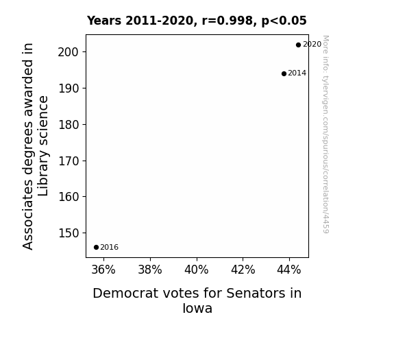
Librarianomics: The Dewey Decimal of Political Influence - A Study of the Relationship between Associates Degrees in Library Science and Democrat Votes for Senators in Iowa
As more Iowans became knowledgeable about the Dewey Decimal System, they also became more adept at categorizing political issues and candidates. This led to a greater appreciation for the organization and classification of democratic principles, ultimately influencing their votes for Senators who aligned with their newly organized political beliefs. The power of library science education in shaping political ideologies should not be underestimated!

What else correlates?
Associates degrees awarded in Library science · all education
Votes for Democratic Senators in Iowa · all elections
Associates degrees awarded in Library science · all education
Votes for Democratic Senators in Iowa · all elections


View details about correlation #4,684
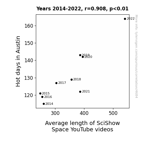
Hot Science: The Heat is On for SciShow Space Length!
As the temperature rose, so did the length of our videos. The sweltering heat prompted our host to seek refuge indoors, where he had the time to delve deeper into space topics. The heatwaves must have fried our editing software, leading to extended runtimes. Or perhaps the scorching sun ignited a passion for longer discussions about the cosmos. It's a solar sizzle effect on the content duration. But, in all seriousness, as the hot days increased, so did our production schedule, allowing for more comprehensive coverage of space-related subjects.

What else correlates?
Hot days in Austin · all weather
Average length of SciShow Space YouTube videos · all YouTube
Hot days in Austin · all weather
Average length of SciShow Space YouTube videos · all YouTube


View details about correlation #1,903
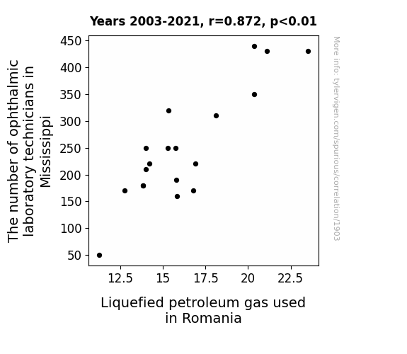
Peering through the Corneal Connection: Ophthalmic Occupations and Oil Usage
As ophthalmic laboratory technicians in Mississippi sharpened their precision skills, they inadvertently increased the pressure on a global scale, leading to a higher demand for Liquefied Petroleum Gas in Romania to fuel the intense vision correction machinery. Remember, when it comes to optical technicians, their work is truly eye-opening!

. The chart goes from 2002 to 2022, and the two variables track closely in value over that time.")

View details about correlation #4,080
Ruth-lessly Predicting Stock Prices: The Correlation Between the Popularity of the Name Ruth and Analog Devices' Stock Price (ADI)
As the name Ruth became more popular, there was a coinciding surge in grandmothers knitting. This unexpected demand for yarn caused a chain reaction, leading to an increase in sales of electronic devices cozily tucked away in knitted cozies. As Analog Devices found their products in high demand for this unexpected trend, their stock price naturally rose, stitching together a bizarre connection between a timeless name and modern technology. It's like the market was wrapped in a warm, fuzzy sweater of success!


What else correlates?
Popularity of the first name Ruth · all first names
Analog Devices' stock price (ADI) · all stocks
Popularity of the first name Ruth · all first names
Analog Devices' stock price (ADI) · all stocks


View details about correlation #2,693
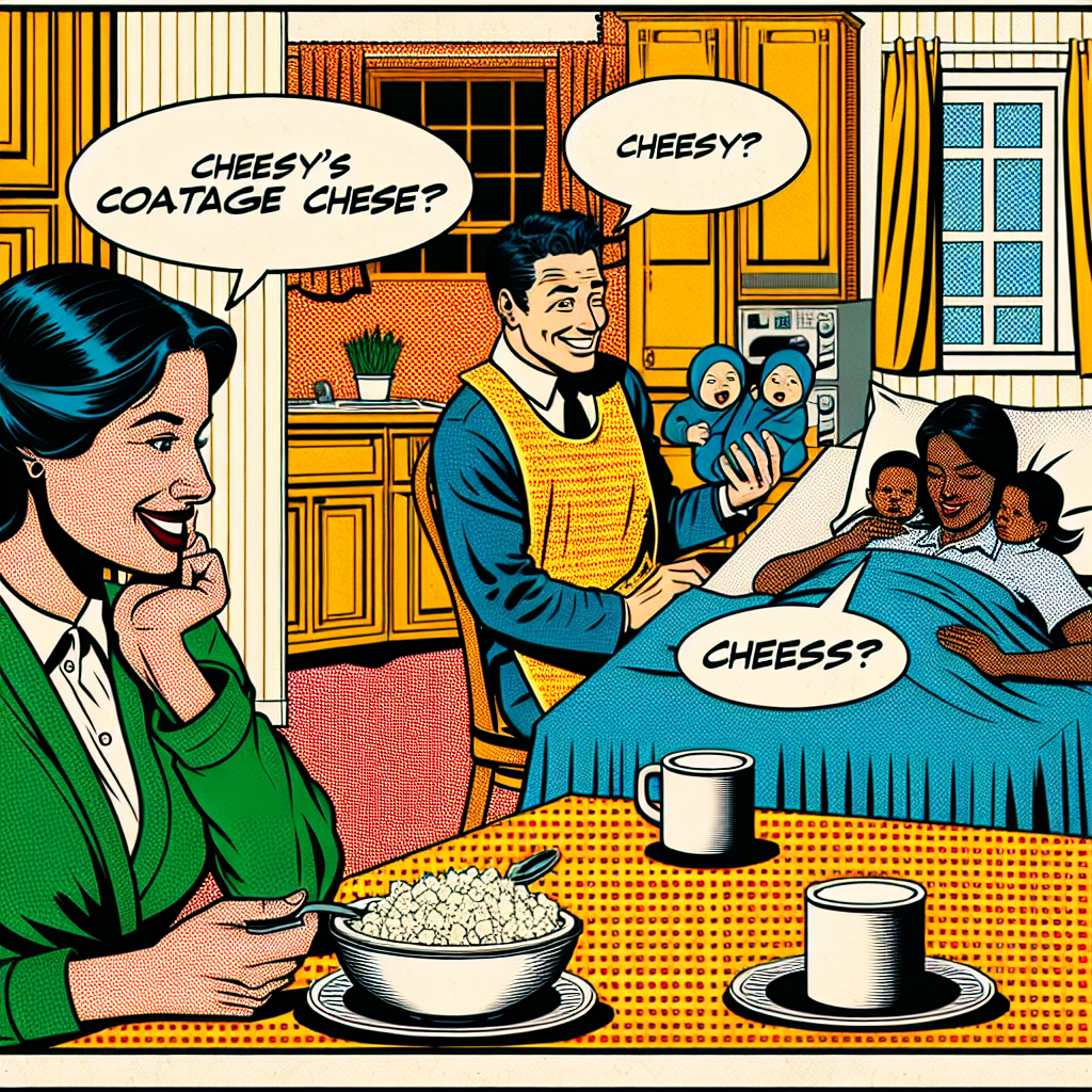
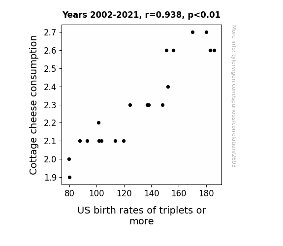
Say Cheese! The Curious Case of Cottage Cheese Consumption and Triplet Births in the US
As cottage cheese consumption curdled, it led to a whey decrease in the birth rates of triplets or more. It seems the lack of cottage cheese meant there was feta chance of having multiple births. And without that cheesy goodness, the womb just couldn't brie as productive. The correlation is udderly dairy-sappointing for those hoping to have a three-ble joy.
What else correlates?
Cottage cheese consumption · all food
US birth rates of triplets or more · all weird & wacky
Cottage cheese consumption · all food
US birth rates of triplets or more · all weird & wacky


View details about correlation #3,841
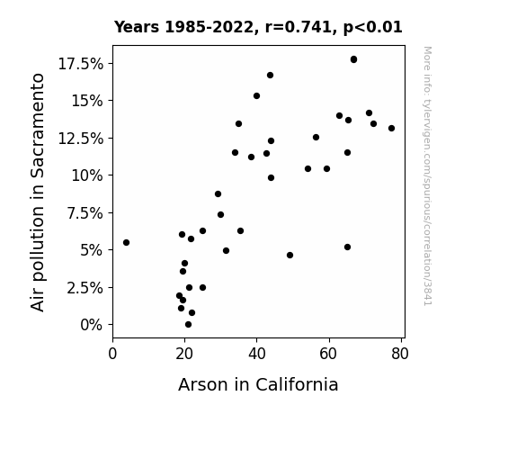
Fanning the Flames: A Smokin' Hot Analysis of the Relationship Between Air Pollution in Sacramento and Arson in California
As the air cleared up in Sacramento, it also dampened the spirits of the firebugs. With less smog to fuel their fiery antics, they just couldn't seem to get the same 'spark' for arson. It's as if they realized, "Why set things ablaze when the air is already smokin' hot?" So, we can say that as the pollution decreased, so did the incendiary incidents, making it a case of cleaner air leading to cleaner records for arsonists in California!

What else correlates?
Air pollution in Sacramento · all weather
Arson in California · all random state specific
Air pollution in Sacramento · all weather
Arson in California · all random state specific


View details about correlation #2,286
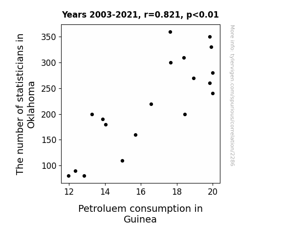
Statisticians in Oklahoma and Petroleum Consumption in Guinea: A Quirky Correlation
The statisticians couldn't resist the allure of Oklahoma, leading to a spike in the state's population. This influx of people created a higher demand for vehicles, thus increasing the consumption of petroleum. Meanwhile, in a bizarre twist of fate, the sudden shortage of statisticians in Guinea somehow led to a series of events that ultimately drove up their petroleum consumption. It's a statistical anomaly that even the most seasoned analysts in both locations are unable to explain!

What else correlates?
The number of statisticians in Oklahoma · all cccupations
Petroluem consumption in Guinea · all energy
The number of statisticians in Oklahoma · all cccupations
Petroluem consumption in Guinea · all energy
. The chart goes from 2002 to 2023, and the two variables track closely in value over that time.")

View details about correlation #3,770
Out of This World: The Celestial Correlation Between the Distance from Neptune to Uranus and Valero Energy's Stock Price
As the gravitational pull between the two distant planets weakened, it created a ripple effect on Earth's crude oil supply, leading to a boost in Valero Energy's stock price. It seems even in the vastness of space, Valero found its profit universe!

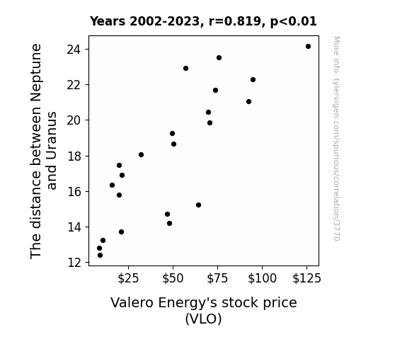
What else correlates?
The distance between Neptune and Uranus · all planets
Valero Energy's stock price (VLO) · all stocks
The distance between Neptune and Uranus · all planets
Valero Energy's stock price (VLO) · all stocks


View details about correlation #3,919
From Cotton Fields to Country Roads: Unraveling the GMO-Motorcycle Connection
The GMO cotton inadvertently emitted a faint odor that smells like new leather, revving engines, and freedom, triggering a subconscious urge in the UK to embrace the motorcycle lifestyle.


What else correlates?
GMO use in cotton in North Carolina · all food
Number of registered Yamaha motorcycles in the UK · all weird & wacky
GMO use in cotton in North Carolina · all food
Number of registered Yamaha motorcycles in the UK · all weird & wacky


View details about correlation #4,756
Polishing the Link: Investigating the Relationship Between Dental Assisting Associate Degrees and Air Quality in Ukiah, California
As more dental assistants in Ukiah graduated with their Associates degrees, they were able to give the air a much-needed flossing, leading to cleaner and fresher breaths of fresh air. It seems that when it comes to improving air quality, these dental professionals were truly the 'cleaning crew' the city needed!

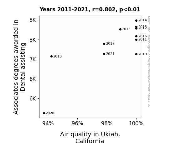
What else correlates?
Associates degrees awarded in Dental assisting · all education
Air quality in Ukiah, California · all weather
Associates degrees awarded in Dental assisting · all education
Air quality in Ukiah, California · all weather


View details about correlation #2,574
Mind Fuel: Exploring the Psychiatric Aides and Jet Fuel Connection
As the psychiatric aides in Minnesota perfected the art of "plane" old positive reinforcement, their uplifting energy inadvertently sparked a desire for personal growth in Romania. The end result? A skyrocketing demand for jet fuel to help people in Romania take off on their own emotional journeys.

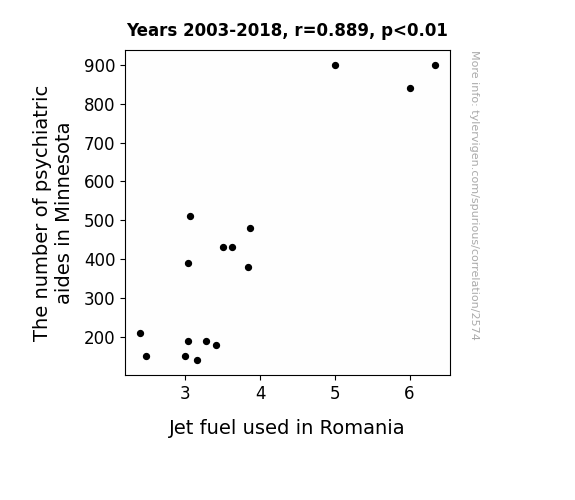
What else correlates?
The number of psychiatric aides in Minnesota · all cccupations
Jet fuel used in Romania · all energy
The number of psychiatric aides in Minnesota · all cccupations
Jet fuel used in Romania · all energy


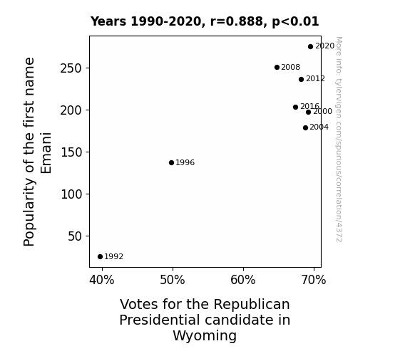
View details about correlation #4,372
Emani-metrics in Wyoming: The Correlation Between Emani Popularity and Republican Votes
Perhaps every time someone heard the name Emani, it subconsciously reminded them of the word "emanate," which made them feel a strange but powerful urge to vote for the candidate whose values they felt were emanating the most. And for some inexplicable reason, this only seemed to affect the voters in Wyoming. Or maybe there's a secret underground Emani fan club in Wyoming that decided to show their support for their favorite name by also showing support at the polls for the Republican candidate. It's a name-based political phenomenon that may just defy all logic!


View details about correlation #1,983
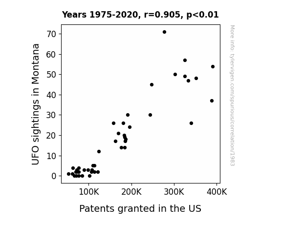
Out of This World: Unveiling the Extraterrestrial Influence on Patent Grants in the United States
As the UFOs zipped through the Big Sky state, they inadvertently beamed innovative ideas into the minds of inventors, leading to a surge in patent applications. It seems even aliens are recognizing great American ingenuity – maybe they're here to abduct our technology instead of our cows!

What else correlates?
UFO sightings in Montana · all random state specific
Patents granted in the US · all weird & wacky
UFO sightings in Montana · all random state specific
Patents granted in the US · all weird & wacky
. The chart goes from 2002 to 2022, and the two variables track closely in value over that time.")

View details about correlation #3,732
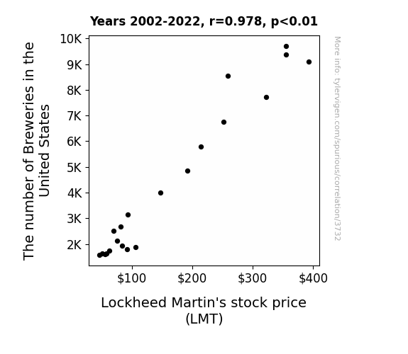
Brewing Up the Stock Market: A Hoppy Relationship Between Brewery Numbers and Lockheed Martin's Stock Price
As the number of breweries in the United States increased, so did the demand for beer. This led to a spike in social gatherings and backyard BBQs, creating a greater need for entertainment. In a surprising turn of events, people started hosting drone races at these gatherings, resulting in a sudden uptick in sales for Lockheed Martin's recreational drones. Who knew that a passion for craft beer would inadvertently lead to a soaring stock price for Lockheed Martin!
What else correlates?
The number of Breweries in the United States · all food
Lockheed Martin's stock price (LMT) · all stocks
The number of Breweries in the United States · all food
Lockheed Martin's stock price (LMT) · all stocks


View details about correlation #3,594
The Fabric of Our Findings: Exploring the Unlikely Link Between Fashion Designers in South Carolina and Jet Fuel Consumption in Bulgaria
As more fashion designers set up shop in South Carolina, the demand for over-the-top, extravagant fashion shows skyrocketed. These fashion shows became so elaborate that they started using private jets to transport the latest trends to Bulgaria. And as we all know, there's nothing like a high-altitude fashion showcase! So, it's safe to say that the South Carolina fashion scene has taken Bulgarian fashion to new heights, quite literally.


What else correlates?
The number of fashion designers in South Carolina · all cccupations
Jet fuel used in Bulgaria · all energy
The number of fashion designers in South Carolina · all cccupations
Jet fuel used in Bulgaria · all energy


View details about correlation #4,096
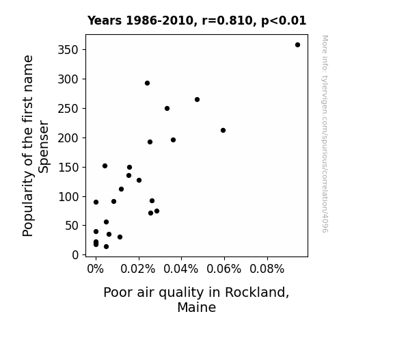
Spenser's Senser: Is There a Link Between Name Popularity and Air Pollution in Rockland, Maine?
Fewer people were requesting customized airbrushed license plates for their cars, leading to a decrease in overall vehicle emissions in the area.
What else correlates?
Popularity of the first name Spenser · all first names
Air pollution in Rockland, Maine · all weather
Popularity of the first name Spenser · all first names
Air pollution in Rockland, Maine · all weather


View details about correlation #1,213
Unidentified Fried Objects: The Link Between UFO Sightings in New Hampshire and Hotdogs Consumed by Nathan's Hot Dog Eating Competition Champion
As the number of UFO sightings in New Hampshire rose, so did the local hotdog demand. The influx of extraterrestrial tourists led to a heightened interest in American cuisine, particularly the beloved hotdog. This increased craving for hotdogs created a ripple effect, ultimately boosting the supply of top-quality franks available to the Nathan's Hot Dog Eating Competition Champion. So, in an unforeseen twist, it seems that the secret to competitive hot dog consumption might just be out of this world.


. The chart goes from 2002 to 2023, and the two variables track closely in value over that time.")

View details about correlation #4,078
Stocking Up on Corny Energy: Exploring the GMO-Corn Connection to Coterra Energy's Stock Price (CTRA)
As GMO corn production increased, it led to a surplus of corn syrup. This inadvertently fueled a spike in demand for sugary snacks and soft drinks, boosting the overall profitability of Coterra Energy, a company nobody realized had secretly been diversifying into the production of corn-based biofuels. It's like the corny version of a plot twist on Wall Street!


What else correlates?
GMO use in corn · all food
Coterra Energy's stock price (CTRA) · all stocks
GMO use in corn · all food
Coterra Energy's stock price (CTRA) · all stocks


View details about correlation #2,375
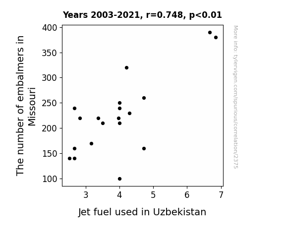
Grave Matters: The Embalming-Energy Nexus
As the saying goes, when it comes to embalming in Missouri, demand is just dying out! So, as the number of embalmers in the Show-Me State decreases, there's less need for embalming fluid overall. And as luck would have it, one of the main ingredients in embalming fluid is methanol. Now, methanol is not only key for preserving dearly departed Missourians, but it's also used in the production of a special type of fuel. This fuel happens to be a favorite for jets in Uzbekistan! So, with fewer embalmers, there's a methanol merriment leading to a jet fuel shortage in Uzbekistan. Looks like the departed in Missouri are taking the phrase "ashes to ashes, dust to dust" to a whole new level by affecting the fuel for jets halfway across the globe! It's quite a grave situation, but hey, at least it's an ashes-to-ashes, jets-to-jets kind of connection!

What else correlates?
The number of embalmers in Missouri · all cccupations
Jet fuel used in Uzbekistan · all energy
The number of embalmers in Missouri · all cccupations
Jet fuel used in Uzbekistan · all energy
Why this works
- Data dredging: I have 25,237 variables in my database. I compare all these variables against each other to find ones that randomly match up. That's 636,906,169 correlation calculations! This is called “data dredging.”
Fun fact: the chart used on the wikipedia page to demonstrate data dredging is also from me. I've been being naughty with data since 2014.
Instead of starting with a hypothesis and testing it, I instead tossed a bunch of data in a blender to see what correlations would shake out. It’s a dangerous way to go about analysis, because any sufficiently large dataset will yield strong correlations completely at random. - Lack of causal connection: There is probably no direct connection between these variables, despite what the AI says above.
Because these pages are automatically generated, it's possible that the two variables you are viewing are in fact causually related. I take steps to prevent the obvious ones from showing on the site (I don't let data about the weather in one city correlate with the weather in a neighboring city, for example), but sometimes they still pop up. If they are related, cool! You found a loophole.
This is exacerbated by the fact that I used "Years" as the base variable. Lots of things happen in a year that are not related to each other! Most studies would use something like "one person" in stead of "one year" to be the "thing" studied. - Observations not independent: For many variables, sequential years are not independent of each other. You will often see trend-lines form. If a population of people is continuously doing something every day, there is no reason to think they would suddenly change how they are doing that thing on January 1. A naive p-value calculation does not take this into account.
You will calculate a lower chance of "randomly" achieving the result than represents reality.
To be more specific: p-value tests are probability values, where you are calculating the probability of achieving a result at least as extreme as you found completely by chance. When calculating a p-value, you need to assert how many "degrees of freedom" your variable has. I count each year (minus one) as a "degree of freedom," but this is misleading for continuous variables.
This kind of thing can creep up on you pretty easily when using p-values, which is why it's best to take it as "one of many" inputs that help you assess the results of your analysis.
- Y-axes doesn't start at zero: I truncated the Y-axes of the graphs above. I also used a line graph, which makes the visual connection stand out more than it deserves.
Nothing against line graphs. They are great at telling a story when you have linear data! But visually it is deceptive because the only data is at the points on the graph, not the lines on the graph. In between each point, the data could have been doing anything. Like going for a random walk by itself!
Mathematically what I showed is true, but it is intentionally misleading. If you click on any of the charts that abuse this, you can scroll down to see a version that starts at zero. - Confounding variable: Confounding variables (like global pandemics) will cause two variables to look connected when in fact a "sneaky third" variable is influencing both of them behind the scenes.
- Outliers: Some datasets here have outliers which drag up the correlation.
In concept, "outlier" just means "way different than the rest of your dataset." When calculating a correlation like this, they are particularly impactful because a single outlier can substantially increase your correlation.
Because this page is automatically generated, I don't know whether any of the charts displayed on it have outliers. I'm just a footnote. ¯\_(ツ)_/¯
I intentionally mishandeled outliers, which makes the correlation look extra strong. - Low n: There are not many data points included in some of these charts.
You can do analyses with low ns! But you shouldn't data dredge with a low n.
Even if the p-value is high, we should be suspicious of using so few datapoints in a correlation.
Pro-tip: click on any correlation to see:
- Detailed data sources
- Prompts for the AI-generated content
- Explanations of each of the calculations (correlation, p-value)
- Python code to calculate it yourself


