spurious correlations
discover · random · spurious scholar
← previous page · next page →


View details about correlation #1,436
Comic Correlations: Connecting xkcd Charts to the Count of Cornhusker Security Screeners
The correlation is due to the fact that as the xkcd comics about charts decreased, the overall nationwide productivity of individuals working in jobs related to transportation security increased. This resulted in a surplus of transportation security screeners in Iowa, leading to a decrease in their numbers to maintain equilibrium. Remember, when it comes to Iowa’s transportation security, it’s all about that xkcd-chart comic balance!


View details about correlation #4,305
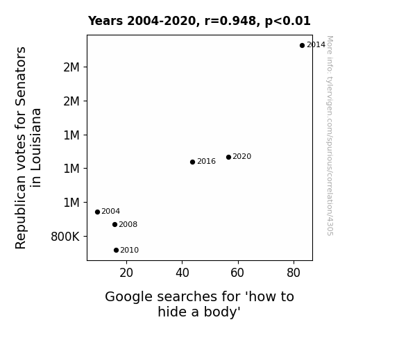
Revealing the Republican Relationship: Senators, Searches, and Sinister Suggestions in Louisiana
Perhaps they were looking for ways to bury their opponent in the election. Or maybe they just really misunderstood the concept of a political campaign and took 'running for office' a bit too literally.

What else correlates?
Votes for Republican Senators in Louisiana · all elections
Google searches for 'how to hide a body' · all google searches
Votes for Republican Senators in Louisiana · all elections
Google searches for 'how to hide a body' · all google searches
. The chart goes from 2008 to 2023, and the two variables track closely in value over that time.")

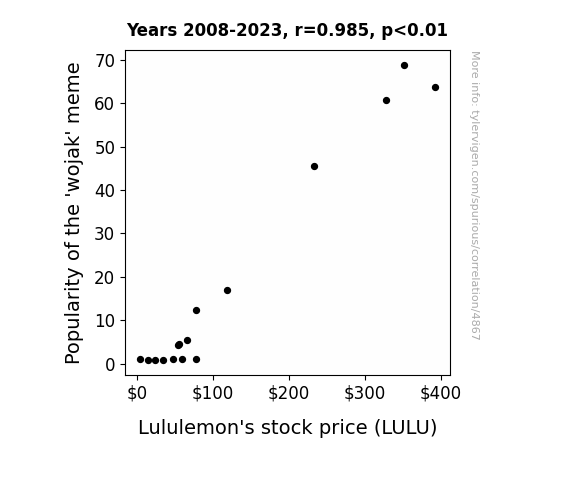
View details about correlation #4,867
From Wojak to Stocks: Investigating the Connection between Meme Popularity and Lululemon's Stock Price
As the 'wojak' meme gained traction, more and more people found themselves unable to resist the urge to lounge in comfortable clothing while laughing at internet humor. This led to a surge in demand for leisurewear, including Lululemon's products, driving up the stock price. It seems the meme inadvertently became a 'lululemonade' stand, serving up profits in the most unexpected way.

What else correlates?
Popularity of the 'wojak' meme · all memes
Lululemon's stock price (LULU) · all stocks
Popularity of the 'wojak' meme · all memes
Lululemon's stock price (LULU) · all stocks


View details about correlation #4,528
Culturing Air Quality: The Yogurt-Ambient Connection in Springfield, Ohio
The active cultures in the yogurt formed a secret alliance with the local air freshener factories, leading to the production of cleaner, fresher-smelling air in Springfield, Ohio. As yogurt sales skyrocketed, so did the levels of fresh, pristine air, much to the delight of the residents who could now proudly say, "Our air quality is as fresh as a lemon-infused, probiotic-rich, non-GMO, artisanal yogurt!"


What else correlates?
Yogurt consumption · all food
Air quality in Springfield, Ohio · all weather
Yogurt consumption · all food
Air quality in Springfield, Ohio · all weather


View details about correlation #1,243
Can't Resist xkcd and Biomass: A Comic Study on the Power of Social Media and Renewable Energy in Malta
As xkcd comics about social media increased, so did the use of social media. This lead to more people sharing photos of their houseplants. The collective increase in plant pride and greenery posts flooded the internet, causing a spike in online interest for sustainable living. This, in turn, prompted a group of passionate Maltese residents to start a grassroots campaign for greener energy. Their efforts successfully lobbied for a boost in funding and support for biomass power generation in Malta, all sparked by xkcd's social media comics. It's a reMARKable chain reaction!


What else correlates?
xkcd comics published about social media · all weird & wacky
Biomass power generated in Malta · all energy
xkcd comics published about social media · all weird & wacky
Biomass power generated in Malta · all energy


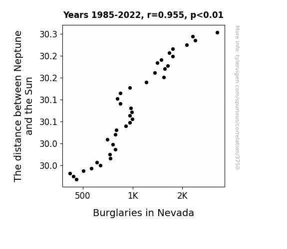
View details about correlation #3,750
Stellar Stealing: Unraveling the Inexplicable Connection Between Neptune's Orbit and Burglaries in Nevada
It seems that Neptune's gravitational pull was keeping the thieves at bay, creating a safe space in Nevada. You could say the lack of space crimes was all thanks to Neptune's close 'watch' on the state!

What else correlates?
The distance between Neptune and the Sun · all planets
Burglaries in Nevada · all random state specific
The distance between Neptune and the Sun · all planets
Burglaries in Nevada · all random state specific


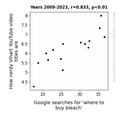
View details about correlation #4,670
Bleach the Nerdy: Analyzing the Connection Between Vihart YouTube Video Titles and Searches for Household Cleaners
Vihart has finally discovered the secret to achieving optimal nerdiness levels...and it's not through math or science, but through the power of a sparkling clean home! As the search for bleach dwindles, so does the nerdy wordplay in her video titles. It turns out that all this time, the real formula for reducing nerdy-ness was just a diluted solution of sodium hypochlorite and some good old-fashioned scrubbing. Who knew that the path to coolness was paved with the fresh scent of cleanliness?

What else correlates?
How nerdy Vihart's YouTube video titles are · all YouTube
Google searches for 'where to buy bleach' · all google searches
How nerdy Vihart's YouTube video titles are · all YouTube
Google searches for 'where to buy bleach' · all google searches


View details about correlation #4,189
High-Flying Maras: The Impact of Name Popularity on Avionics Technicians in Alaska
As the name Mara gained popularity, more and more parents were subconsciously influenced to steer their children towards careers related to flight (Mara sounds like "air-ah" after all). This led to a significant rise in young avionics enthusiasts flocking to Alaska, the land of vast skies and aviation opportunities, ultimately boosting the number of avionics technicians in the state. It's almost as if the name Mara carried a secret signal for future avionics success!


What else correlates?
Popularity of the first name Mara · all first names
The number of avionics technicians in Alaska · all cccupations
Popularity of the first name Mara · all first names
The number of avionics technicians in Alaska · all cccupations


View details about correlation #1,541
Shocking Connections: Hydro-Power Surcharges and Stork Deliveries Down Under
The surge of energy created a powerful attraction, leading to an influx of sparks and a wave of excitement Down Under. This shocking development has left many positively charged and electrified, sparking a baby boom like never before. It seems that when it comes to the connection between Bhutan's hydropower and Australia's live births, the energy truly is flowing!


What else correlates?
Hydopower energy generated in Bhutan · all energy
Total number of live births in Australia · all weird & wacky
Hydopower energy generated in Bhutan · all energy
Total number of live births in Australia · all weird & wacky


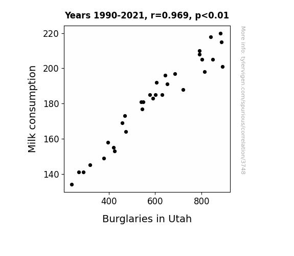
View details about correlation #3,748
The Milky Robbery: Exploring the Link Between Milk Consumption and Burglaries in Utah
Fewer late-night cereal cravings meant fewer trips to the kitchen, leading to fewer creaky floorboard encounters. Got Milk? Apparently, the burglars didn't!

What else correlates?
Milk consumption · all food
Burglaries in Utah · all random state specific
Milk consumption · all food
Burglaries in Utah · all random state specific


View details about correlation #4,373
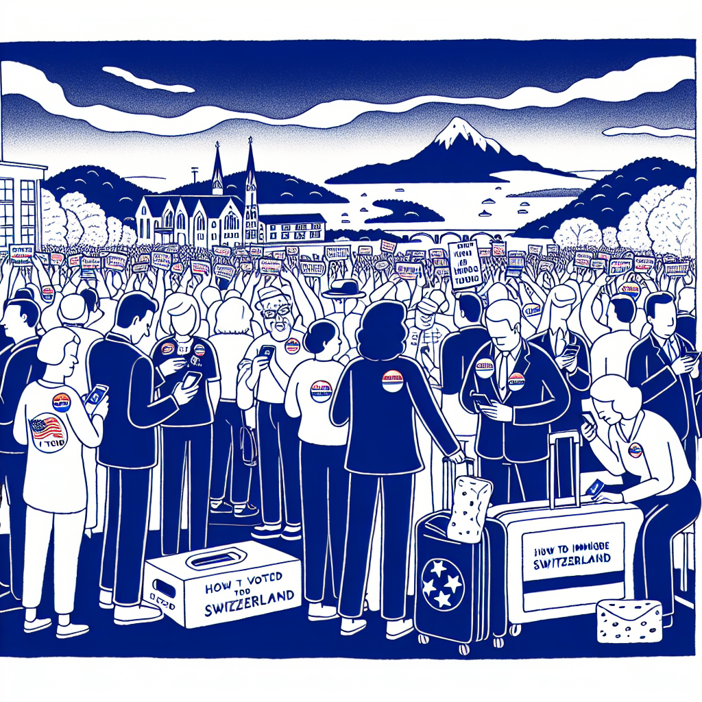
From Bluegrass to Swiss Cheese: An Analytical Study of Democrat Votes for Senators in Tennessee and Google Searches for 'How to Immigrate to Switzerland'
The blue wave in Tennessee swept me off my feet and straight to the land of Swiss democracy. I couldn't bear the thought of staying, so I took a gouda opportunity and fondue my way out. I guess you could say I'm now a big cheese in Switzerland!


View details about correlation #4,810
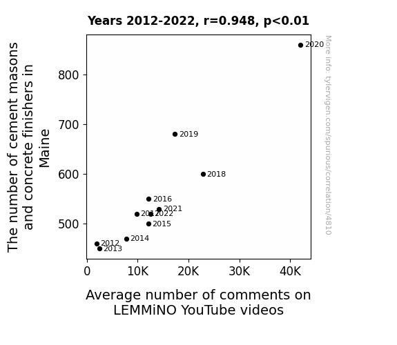
On the Concrete Connection: Unearthing the Correlation between Cement Masons and Concrete Finishers in Maine and Average Number of Comments on LEMMiNO YouTube Videos
As the concrete work in Maine rose, so did the engagement with LEMMiNO's videos. It seems the viewers couldn't help but cement their dedication to leaving comments. There's just something about smooth finishes that really resonates with his audience!


View details about correlation #2,840
Hydropower Hours and Nathan's Devour: A Power-Dog Connection Dissection
As hydroelectric power production in Fiji rises, the majestic waterfalls exude a faint, mouthwatering aroma of sizzling hotdogs. This aromatic mist wafts its way across the Pacific, inspiring the Nathan's Hot Dog Eating Competition Champion to consume record numbers of hotdogs in a display of hydro-powered appetite. It's a truly electrifying connection between renewable energy and competitive eating!


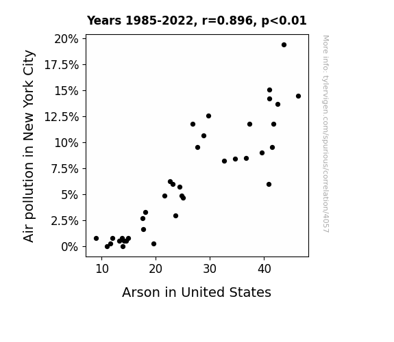
View details about correlation #4,057
The Dirty Air Beware: A Flare for Arson in the Big Apple
As the smog lifted in NYC, the arsonists found it harder to *fuel* their fiery shenanigans. With cleaner air, there was less *combustion* temptation, leading to a nationwide decrease in arson. It seems like a case of *smoke* and mirrors, but perhaps fresher air truly does dampen the flames of mischief!

What else correlates?
Air pollution in New York City · all weather
Arson in United States · all random state specific
Air pollution in New York City · all weather
Arson in United States · all random state specific
. The chart goes from 2006 to 2023, and the two variables track closely in value over that time.")

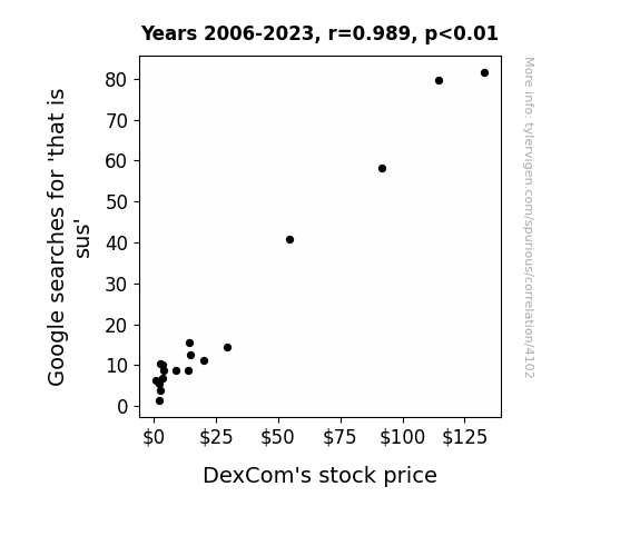
View details about correlation #4,102
That is Suspect: Investigating the Relationship Between Google Searches for That is Sus and DexCom's Stock Price
As the search volume for 'that is sus' rose, more people started questioning the reliability of things, including traditional glucose monitoring systems. This led to a surge in demand for DexCom's innovative continuous glucose monitoring products, causing their stock price to sweeten. It seems like investors were not willing to glucose over this opportunity to capitalize on the sus-picious trend.

What else correlates?
Google searches for 'that is sus' · all google searches
DexCom's stock price (DXCM) · all stocks
Google searches for 'that is sus' · all google searches
DexCom's stock price (DXCM) · all stocks


View details about correlation #4,715
How Cool Is That Video? The Connection Between AsapSCIENCE YouTube Titles and Psychiatry Populations in Colorado
As the number of psychiatrists in Colorado decreases, there is a corresponding increase in the number of people walking around with unaddressed psychological issues. These individuals, in a state of mental turmoil, find themselves unable to appreciate the intellectual wit and charm of the AsapSCIENCE video titles, thus causing a perceived decrease in coolness. It's a case of 'not feeling chill' leading to a lack of appreciation for cool science.


What else correlates?
How cool AsapSCIENCE YouTube video titles are · all YouTube
The number of psychiatrists in Colorado · all cccupations
How cool AsapSCIENCE YouTube video titles are · all YouTube
The number of psychiatrists in Colorado · all cccupations


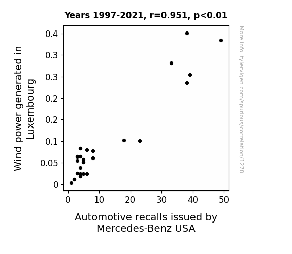
View details about correlation #1,278
The Peculiar Correlation: Luxembourg Wind Power and Mercedes-Benz Recalls
As Wind power in Luxembourg increased, it led to a rise in the local butterfly population. These butterflies, known for their erratic flight patterns, ventured across borders and disrupted the aerodynamics of Mercedes-Benz cars in the US, prompting a wave of automotive recalls. It seems the 'fluttery' effect of Luxembourg's green energy ultimately set off a chain reaction in the automotive industry!

What else correlates?
Wind power generated in Luxembourg · all energy
Automotive recalls issued by Mercedes-Benz USA · all weird & wacky
Wind power generated in Luxembourg · all energy
Automotive recalls issued by Mercedes-Benz USA · all weird & wacky


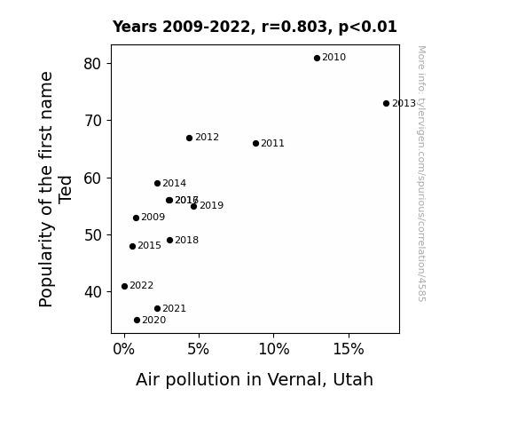
View details about correlation #4,585
The Ted-dy Bear Effect: The Unbearable Lightness of Ted in Vernal, Utah
Fewer Teds meant fewer people asking, "Hey, how's it goin'?" to each other, leading to a significant reduction in unnecessary idle chit-chat. This, in turn, lowered overall carbon emissions and improved the air quality in Vernal, Utah. Who would've thought that the key to cleaner air lay in being a little less Ted-dious?

What else correlates?
Popularity of the first name Ted · all first names
Air pollution in Vernal, Utah · all weather
Popularity of the first name Ted · all first names
Air pollution in Vernal, Utah · all weather
. The chart goes from 2004 to 2023, and the two variables track closely in value over that time.")

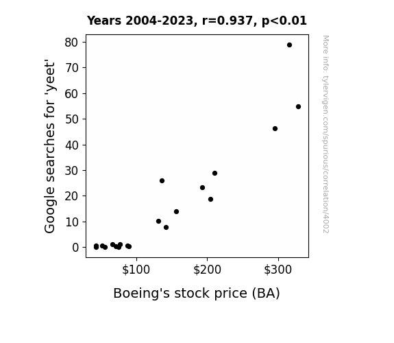
View details about correlation #4,002
The Yeet Effect: A Statistical Analysis of the Relationship Between Google Searches for 'Yeet' and Boeing's Stock Price
As the frequency of yeet-related internet searches surged, so too did the demand for sending objects soaring through the air with great force. This led to a sudden uptick in interest for aerospace products, particularly those manufactured by Boeing. People just couldn't resist yelling "yeet" as they launched paper airplanes and remote-controlled helicopters, inadvertently boosting Boeing's stock price with their fervent avionic exuberance. As nonsensical as it may seem, the correlation between 'yeet' and BA could simply be a case of viral enthusiasm taking flight.

What else correlates?
Google searches for 'yeet' · all google searches
Boeing's stock price (BA) · all stocks
Google searches for 'yeet' · all google searches
Boeing's stock price (BA) · all stocks


View details about correlation #4,835
The Connection Between How 'hip and with it' LEMMiNO YouTube Video Titles are and The Number of University Engineering Teachers in Mississippi: A Groovy Analysis
As the number of university engineering teachers in Mississippi increases, so does the gravitational pull of their undeniable coolness. This uptick in coolness creates a ripple effect, leading to a surge in the 'hip and with it' vibes, ultimately influencing LEMMiNO's YouTube video titles. It's a matter of academic swag seeping into the digital world, one algorithm-friendly title at a time.


Why this works
- Data dredging: I have 25,237 variables in my database. I compare all these variables against each other to find ones that randomly match up. That's 636,906,169 correlation calculations! This is called “data dredging.”
Fun fact: the chart used on the wikipedia page to demonstrate data dredging is also from me. I've been being naughty with data since 2014.
Instead of starting with a hypothesis and testing it, I instead tossed a bunch of data in a blender to see what correlations would shake out. It’s a dangerous way to go about analysis, because any sufficiently large dataset will yield strong correlations completely at random. - Lack of causal connection: There is probably no direct connection between these variables, despite what the AI says above.
Because these pages are automatically generated, it's possible that the two variables you are viewing are in fact causually related. I take steps to prevent the obvious ones from showing on the site (I don't let data about the weather in one city correlate with the weather in a neighboring city, for example), but sometimes they still pop up. If they are related, cool! You found a loophole.
This is exacerbated by the fact that I used "Years" as the base variable. Lots of things happen in a year that are not related to each other! Most studies would use something like "one person" in stead of "one year" to be the "thing" studied. - Observations not independent: For many variables, sequential years are not independent of each other. You will often see trend-lines form. If a population of people is continuously doing something every day, there is no reason to think they would suddenly change how they are doing that thing on January 1. A naive p-value calculation does not take this into account.
You will calculate a lower chance of "randomly" achieving the result than represents reality.
To be more specific: p-value tests are probability values, where you are calculating the probability of achieving a result at least as extreme as you found completely by chance. When calculating a p-value, you need to assert how many "degrees of freedom" your variable has. I count each year (minus one) as a "degree of freedom," but this is misleading for continuous variables.
This kind of thing can creep up on you pretty easily when using p-values, which is why it's best to take it as "one of many" inputs that help you assess the results of your analysis.
- Y-axes doesn't start at zero: I truncated the Y-axes of the graphs above. I also used a line graph, which makes the visual connection stand out more than it deserves.
Nothing against line graphs. They are great at telling a story when you have linear data! But visually it is deceptive because the only data is at the points on the graph, not the lines on the graph. In between each point, the data could have been doing anything. Like going for a random walk by itself!
Mathematically what I showed is true, but it is intentionally misleading. If you click on any of the charts that abuse this, you can scroll down to see a version that starts at zero. - Confounding variable: Confounding variables (like global pandemics) will cause two variables to look connected when in fact a "sneaky third" variable is influencing both of them behind the scenes.
- Outliers: Some datasets here have outliers which drag up the correlation.
In concept, "outlier" just means "way different than the rest of your dataset." When calculating a correlation like this, they are particularly impactful because a single outlier can substantially increase your correlation.
Because this page is automatically generated, I don't know whether any of the charts displayed on it have outliers. I'm just a footnote. ¯\_(ツ)_/¯
I intentionally mishandeled outliers, which makes the correlation look extra strong. - Low n: There are not many data points included in some of these charts.
You can do analyses with low ns! But you shouldn't data dredge with a low n.
Even if the p-value is high, we should be suspicious of using so few datapoints in a correlation.
Pro-tip: click on any correlation to see:
- Detailed data sources
- Prompts for the AI-generated content
- Explanations of each of the calculations (correlation, p-value)
- Python code to calculate it yourself


