spurious correlations
discover · random · spurious scholar
← previous page · next page →


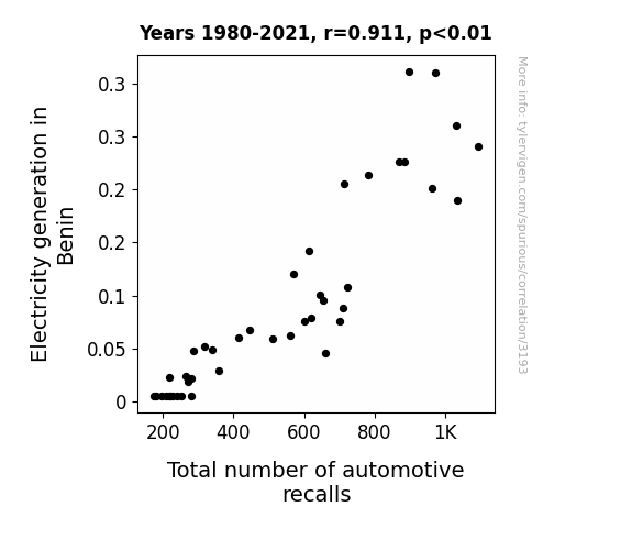
View details about correlation #3,193
Electrifying Explorations: Examining the Entanglement of Electricity generation in Benin and Total number of automotive recalls
As electricity generation in Benin increased, more power surged through the country, inadvertently zapping parked cars. This sudden influx of energy led to a shocking rise in automotive malfunctions, prompting a higher number of recalls to address the electrifying issues. It's a truly electrifying connection that has left both experts and car owners feeling a bit revved up.

What else correlates?
Electricity generation in Benin · all energy
Total number of automotive recalls · all weird & wacky
Electricity generation in Benin · all energy
Total number of automotive recalls · all weird & wacky


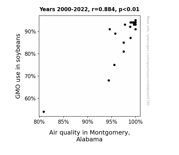
View details about correlation #4,780
Soybean Gene Tweaks and Air Quality Peaks: A Statistical Peek
The GMO soybeans inhaled less, leaving more fresh air for the people of Montgomery, Alabama. Remember, when it comes to air quality and soybeans, the stakes are high but the emissions are low!

What else correlates?
GMO use in soybeans · all food
Air quality in Montgomery, Alabama · all weather
GMO use in soybeans · all food
Air quality in Montgomery, Alabama · all weather
. The chart goes from 2002 to 2018, and the two variables track closely in value over that time.")

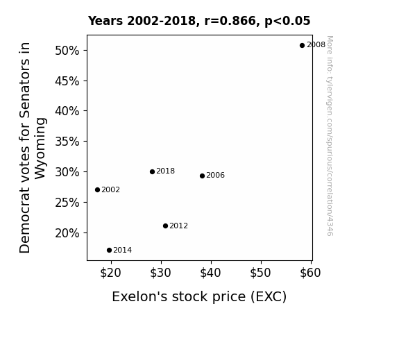
View details about correlation #4,346
Wacky Wyoming: Waltzing with Senatorial Selection and Stock Sway
As the demand for clean energy policies grows, so does the market for companies like Exelon, leading to a surge in their stock price. It's as if every Democratic vote in Wyoming is a little gust of wind propelling Exelon to new heights.

What else correlates?
Votes for Democratic Senators in Wyoming · all elections
Exelon's stock price (EXC) · all stocks
Votes for Democratic Senators in Wyoming · all elections
Exelon's stock price (EXC) · all stocks


View details about correlation #4,333
Regina-phobic Revelations: A Statistical Analysis of the Relationship Between the Popularity of the First Name Regina and the Entertainment Value of Casually Explained YouTube Video Titles
As more parents named their daughters Regina, the overall level of regal behavior in the population rose. This led to a spike in people insisting on a more proper and formal tone even in casual settings, inadvertently affecting the creativity and fun in the video titles. It seems the 'queenly' influence of the name didn't 'reign' it in!


What else correlates?
Popularity of the first name Regina · all first names
How fun Casually Explained YouTube video titles are · all YouTube
Popularity of the first name Regina · all first names
How fun Casually Explained YouTube video titles are · all YouTube


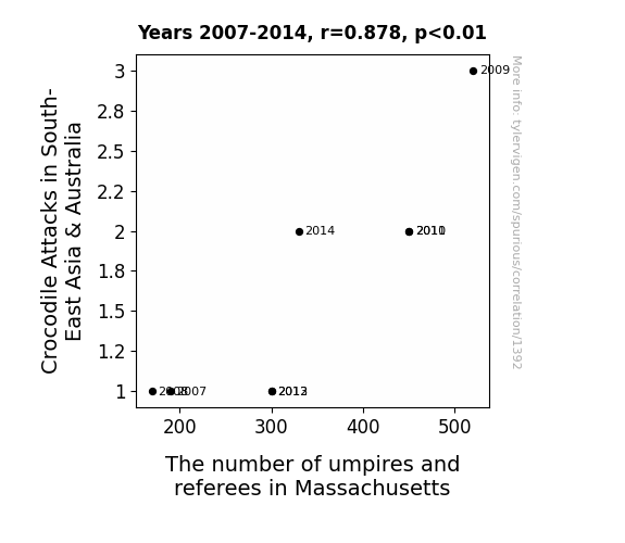
View details about correlation #1,392
Chomp Calls: An Examination of the Relationship Between Crocodile Attacks in South-East Asia & Australia and the Number of Umpires and Referees in Massachusetts
The surge in crocodile attacks led to a rise in demand for people with experience in maintaining order in dangerous situations. As a result, Massachusetts saw a sudden influx of individuals seeking refuge from reptilian confrontations by officiating sports. Remember, when life throws you a curveball, just make sure there's a referee to call it!


View details about correlation #3,257
Spreading the Truth: Uncovering the Butter-Wind Connection
As butter consumption increased, people's gaseous emissions became more potent, leading to an inadvertent but significant boost in wind power production. Remember, with great power comes great emissions!


What else correlates?
Butter consumption · all food
Total wind power generated globally · all energy
Butter consumption · all food
Total wind power generated globally · all energy


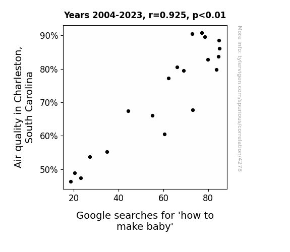
View details about correlation #4,278
Smog is in the Air: The Hazy Connection Between Air Quality in Charleston, South Carolina and Searches for 'How to Make Baby'
People were finally able to take their romantic strolls along the waterfront without coughing and wheezing, leading to a baby boom and a spike in Google searches for baby-making tips.

What else correlates?
Air quality in Charleston, South Carolina · all weather
Google searches for 'how to make baby' · all google searches
Air quality in Charleston, South Carolina · all weather
Google searches for 'how to make baby' · all google searches


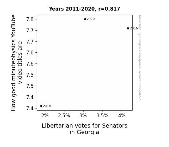
View details about correlation #4,657
As the clarity of minute physics video titles improved, a wave of enlightenment swept over viewers, propelling them to reevaluate their stance on government regulation and intervention. This ultimately resulted in a surge of support for Libertarian candidates in Georgia, as voters were captivated by the idea of a universe governed by its own natural laws, free from unnecessary external influence. After all, in a quantum world of political possibilities, perhaps the true path to power lies in maximizing individual freedom and minimizing the gravitational pull of traditional partisan politics.
What else correlates?
How good minutephysics YouTube video titles are · all YouTube
Votes for Libertarian Senators in Georgia · all elections
How good minutephysics YouTube video titles are · all YouTube
Votes for Libertarian Senators in Georgia · all elections


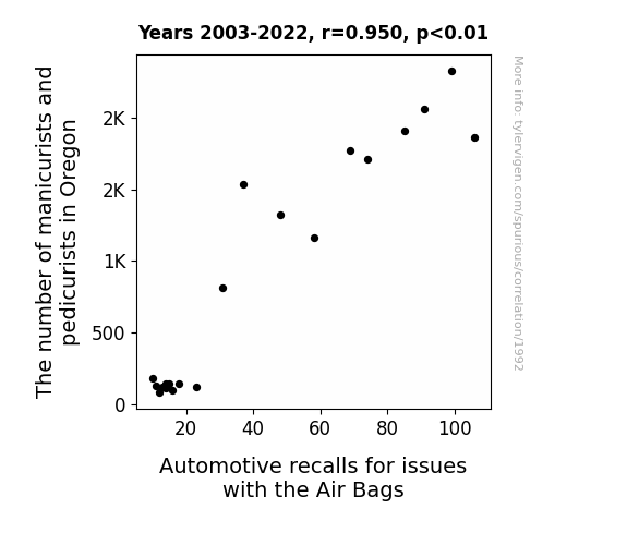
View details about correlation #1,992
Nailing Down the Relationship Between Manicurists, Pedicurists, and Air Bag Recalls in Oregon: A Hands-On Study
As the number of manicurists and pedicurists in Oregon increased, so did the chance of nail-related incidents. These incidents eventually led to an uptick in automotive recalls due to air bag issues. It seems the nail techs' colorful creations were more explosive than anyone anticipated, leading to a real nail-biter of a situation for car manufacturers. The state found itself in a slippery situation, with the demand for perfectly polished nails inadvertently leading to a sharp increase in air bag malfunctions. It's a real "who knew" moment, as these seemingly unrelated industries found themselves entangled in a truly bizarre cause-and-effect scenario.


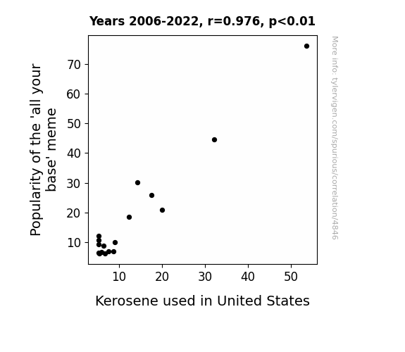
View details about correlation #4,846
Fueling the Fire: Exploring the Flammable Link Between 'All Your Base' Meme Popularity and Kerosene Consumption in the United States
As the 'all your base' meme faded into obscurity, the collective 'base' of internet users moved on to new obsessions, leading to a significant drop in the demand for kerosene lamps and heaters needed for meme-themed gatherings. This shift ultimately resulted in a nationwide decrease in kerosene consumption, much to the bewilderment of energy analysts who never realized the meme economy's unexpected influence on household fuel choices.

What else correlates?
Popularity of the 'all your base' meme · all memes
Kerosene used in United States · all energy
Popularity of the 'all your base' meme · all memes
Kerosene used in United States · all energy
. The chart goes from 2002 to 2022, and the two variables track closely in value over that time.")

View details about correlation #3,810
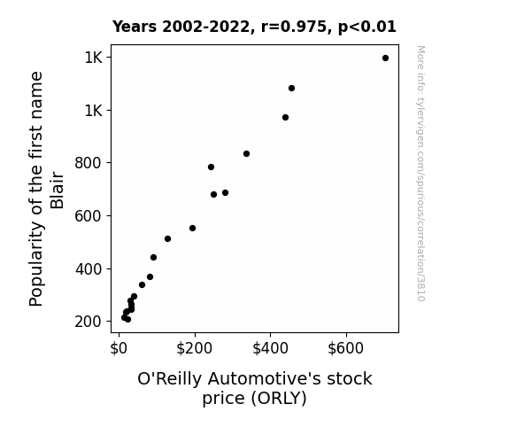
Blair-y Interesting: The Surprising Relationship Between the Popularity of the First Name Blair and O'Reilly Automotive's Stock Price (ORLY)
Because as the number of Blairs grew, so did the demand for car accessories, creating a nation-wide shortage of fuzzy dice and air fresheners, leading to O'Reilly's record-breaking sales. After all, more Blairs meant more flair for their automobiles!

What else correlates?
Popularity of the first name Blair · all first names
O'Reilly Automotive's stock price (ORLY) · all stocks
Popularity of the first name Blair · all first names
O'Reilly Automotive's stock price (ORLY) · all stocks


View details about correlation #4,426
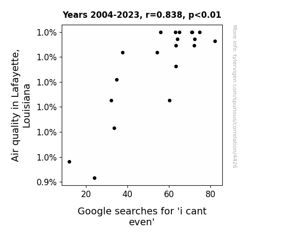
Gasping for Fresh Air: An Analysis of Air Quality in Lafayette, Louisiana and the Correlation with Google Searches for 'I Can't Even'
The cleaner air in Lafayette led to an uptick in productivity and overall zen vibes. With clearer lungs and sharper minds, people had the capacity to contemplate the incomprehensible, causing a surge in 'i cant even' moments. Breathe in that irony, Lafayette!

What else correlates?
Air quality in Lafayette, Louisiana · all weather
Google searches for 'i cant even' · all google searches
Air quality in Lafayette, Louisiana · all weather
Google searches for 'i cant even' · all google searches


View details about correlation #3,142
The Sky's the Limit: A Study on the Correlation Between Avionics Technicians in Alaska and xkcd Comics About Outer Space
As more avionics technicians populated Alaska, the local demand for aerospace-related reading material skyrocketed. This prompted the xkcd creator to tap into the niche market of Alaskan avionics enthusiasts, leading to a cosmic influx of outer space comics. It seems like the northern lights weren't the only things in Alaska sparking an electric connection to all things space! Or perhaps the technicians were simply inspiring some high-flying creativity from the comfort of their igloos. Who knew that the Last Frontier would play a pivotal role in the comic universe's expansion to infinity and beyond? It's like they say, the sky's the limit, especially when your state is as plane crazy as Alaska!


What else correlates?
The number of avionics technicians in Alaska · all cccupations
xkcd comics published about outer space · all weird & wacky
The number of avionics technicians in Alaska · all cccupations
xkcd comics published about outer space · all weird & wacky


View details about correlation #4,170
Shining a Light on Robberies: The Illuminating Link Between Kerosene Consumption in Australia and Robbery Rates in Oregon
The decrease in robberies in Oregon led to a decrease in the demand for getaway cars, causing a surplus of kerosene in Australia, which in turn led to a decrease in the price of kerosene, thereby reducing overall kerosene usage in the land down under. It's a crime-fighting, fuel-saving domino effect!
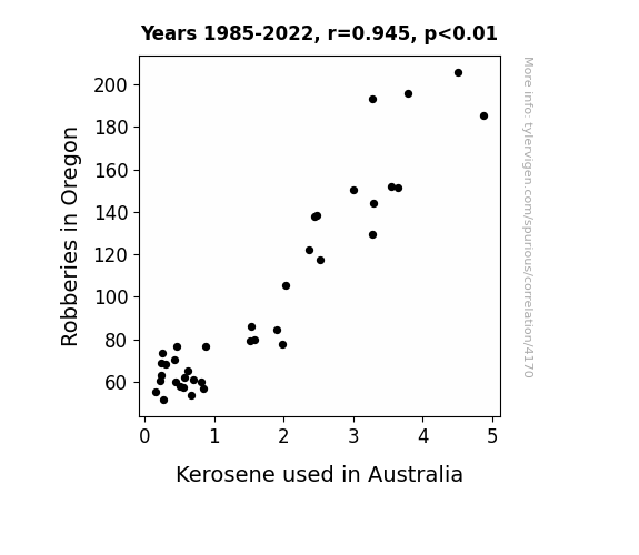
What else correlates?
Robberies in Oregon · all random state specific
Kerosene used in Australia · all energy
Robberies in Oregon · all random state specific
Kerosene used in Australia · all energy


View details about correlation #4,371
The Jovani Effect: A Statistical Analysis of Jovani's Impact on Democratic Votes in the Silver State
The name Jovani is a linguistic trigger for a secret clause in Nevadan brains that compels them to vote blue. This clause was inserted by a time-traveling, bipartisan group of Elvis impersonators in a bold yet sartorially impressive attempt to influence future election outcomes. The more individuals named Jovani there are, the stronger the subconscious urge to cast a democratic vote in the Silver State.


View details about correlation #4,699
Smoke Signals: Investigating the Relationship Between Air Quality in Lynchburg, Virginia and Google Searches for 'Tummy Ache'
People in Lynchburg, Virginia were feeling so refreshed by the clean air that they couldn't resist doing somersaults and cartwheels, leading to an unexpected upsurge in tummy aches. It's a classic case of too much oxygen leading to too much acrobatics!

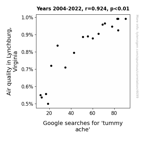
What else correlates?
Air quality in Lynchburg, Virginia · all weather
Google searches for 'tummy ache' · all google searches
Air quality in Lynchburg, Virginia · all weather
Google searches for 'tummy ache' · all google searches
. The chart goes from 2002 to 2022, and the two variables track closely in value over that time.")

View details about correlation #4,139
Peeling Back the Layers: A Fruitful Study of the Relationship Between US Household Spending on Fruits and Vegetables and McDonald's Stock Price
As households spent more on fruits and vegetables, they started to feel healthier and more conscious of their food choices. This led to a decrease in fast food consumption, making people less likely to visit McDonald's. With fewer customers, McDonald's had to innovate and improve their menu by offering healthier options and revamping their marketing. This ultimately boosted their sales and investor confidence, causing an increase in McDonald's stock price. Who would've thought that kale and a rising stock price could be related?

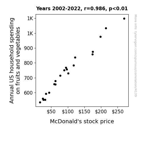
What else correlates?
Annual US household spending on fruits and vegetables · all weird & wacky
McDonald's stock price (MCD) · all stocks
Annual US household spending on fruits and vegetables · all weird & wacky
McDonald's stock price (MCD) · all stocks


View details about correlation #3,148
Polishing Connections: The Surprising Link Between Manicurists and Pedicurists in Kentucky and Liquefied Petroleum Gas Consumption in Belarus
As the number of manicurists and pedicurists in Kentucky dwindled, there was a noticeable dip in the demand for nail polish. This led to a surplus of Liquefied Petroleum Gas (LPG) in Belarus, as there were fewer colorful nails requiring drying. Turns out, it was a case of 'nail art' affecting global gas art!

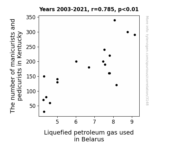


View details about correlation #4,167
Got Milked: Exploring the Udderly Intriguing Relationship Between Milk Consumption and Burglaries in Washington
Because there were fewer moo-ving targets for the burglars to milk from! When the dairy good supply dried up, the thieves realized they'd have to find udder ways to make a profit. It seems the lactose intolerant criminals just couldn't dairy to commit crimes without their calcium fix!


What else correlates?
Milk consumption · all food
Burglaries in Washington · all random state specific
Milk consumption · all food
Burglaries in Washington · all random state specific


View details about correlation #4,725
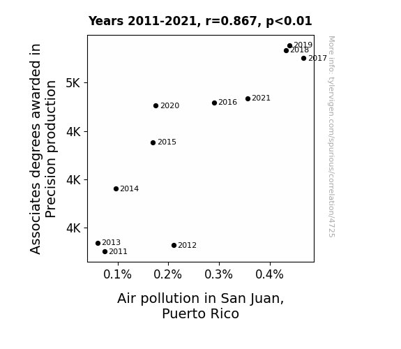
Degrees of Precision: A Closer Look at Air Pollution in San Juan, Puerto Rico
As more precision production machinery became available, there was a corresponding rise in production of tiny, intricately crafted metal parts. These parts, when inevitably misplaced, led to an unprecedented increase in the demand for air in San Juan. The resulting overconsumption of air led to air pollution reaching alarming levels. In reality, this is a spurious correlation with no direct causation.

What else correlates?
Associates degrees awarded in Precision production · all education
Air pollution in San Juan, Puerto Rico · all weather
Associates degrees awarded in Precision production · all education
Air pollution in San Juan, Puerto Rico · all weather
Why this works
- Data dredging: I have 25,237 variables in my database. I compare all these variables against each other to find ones that randomly match up. That's 636,906,169 correlation calculations! This is called “data dredging.”
Fun fact: the chart used on the wikipedia page to demonstrate data dredging is also from me. I've been being naughty with data since 2014.
Instead of starting with a hypothesis and testing it, I instead tossed a bunch of data in a blender to see what correlations would shake out. It’s a dangerous way to go about analysis, because any sufficiently large dataset will yield strong correlations completely at random. - Lack of causal connection: There is probably no direct connection between these variables, despite what the AI says above.
Because these pages are automatically generated, it's possible that the two variables you are viewing are in fact causually related. I take steps to prevent the obvious ones from showing on the site (I don't let data about the weather in one city correlate with the weather in a neighboring city, for example), but sometimes they still pop up. If they are related, cool! You found a loophole.
This is exacerbated by the fact that I used "Years" as the base variable. Lots of things happen in a year that are not related to each other! Most studies would use something like "one person" in stead of "one year" to be the "thing" studied. - Observations not independent: For many variables, sequential years are not independent of each other. You will often see trend-lines form. If a population of people is continuously doing something every day, there is no reason to think they would suddenly change how they are doing that thing on January 1. A naive p-value calculation does not take this into account.
You will calculate a lower chance of "randomly" achieving the result than represents reality.
To be more specific: p-value tests are probability values, where you are calculating the probability of achieving a result at least as extreme as you found completely by chance. When calculating a p-value, you need to assert how many "degrees of freedom" your variable has. I count each year (minus one) as a "degree of freedom," but this is misleading for continuous variables.
This kind of thing can creep up on you pretty easily when using p-values, which is why it's best to take it as "one of many" inputs that help you assess the results of your analysis.
- Y-axes doesn't start at zero: I truncated the Y-axes of the graphs above. I also used a line graph, which makes the visual connection stand out more than it deserves.
Nothing against line graphs. They are great at telling a story when you have linear data! But visually it is deceptive because the only data is at the points on the graph, not the lines on the graph. In between each point, the data could have been doing anything. Like going for a random walk by itself!
Mathematically what I showed is true, but it is intentionally misleading. If you click on any of the charts that abuse this, you can scroll down to see a version that starts at zero. - Confounding variable: Confounding variables (like global pandemics) will cause two variables to look connected when in fact a "sneaky third" variable is influencing both of them behind the scenes.
- Outliers: Some datasets here have outliers which drag up the correlation.
In concept, "outlier" just means "way different than the rest of your dataset." When calculating a correlation like this, they are particularly impactful because a single outlier can substantially increase your correlation.
Because this page is automatically generated, I don't know whether any of the charts displayed on it have outliers. I'm just a footnote. ¯\_(ツ)_/¯
I intentionally mishandeled outliers, which makes the correlation look extra strong. - Low n: There are not many data points included in some of these charts.
You can do analyses with low ns! But you shouldn't data dredge with a low n.
Even if the p-value is high, we should be suspicious of using so few datapoints in a correlation.
Pro-tip: click on any correlation to see:
- Detailed data sources
- Prompts for the AI-generated content
- Explanations of each of the calculations (correlation, p-value)
- Python code to calculate it yourself


