spurious correlations
discover · random · spurious scholar
← previous page · next page →


View details about correlation #1,532

What else correlates?
Bachelor's degrees awarded in law enforcement · all education
Google searches for 'sleepwalking' · all google searches
Bachelor's degrees awarded in law enforcement · all education
Google searches for 'sleepwalking' · all google searches


View details about correlation #1,205

What else correlates?
Divorce rates in the United Kingdom · all weird & wacky
Disney movies released · all films & actors
Divorce rates in the United Kingdom · all weird & wacky
Disney movies released · all films & actors


View details about correlation #4,953
What else correlates?
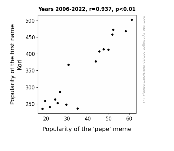
Popularity of the first name Kori · all first names
Popularity of the 'pepe' meme · all memes
Popularity of the first name Kori · all first names
Popularity of the 'pepe' meme · all memes


View details about correlation #2,996
What else correlates?
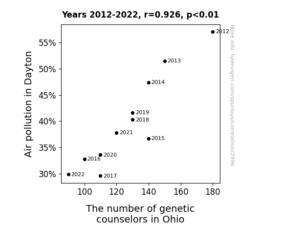
Air pollution in Dayton · all weather
The number of genetic counselors in Ohio · all cccupations
Air pollution in Dayton · all weather
The number of genetic counselors in Ohio · all cccupations


View details about correlation #1,598

What else correlates?
Solar power generated in Argentina · all energy
Google searches for 'do vaccines work' · all google searches
Solar power generated in Argentina · all energy
Google searches for 'do vaccines work' · all google searches


View details about correlation #5,818


View details about correlation #5,126
What else correlates?
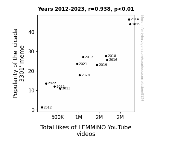
Popularity of the 'cicada 3301' meme · all memes
Total likes of LEMMiNO YouTube videos · all YouTube
Popularity of the 'cicada 3301' meme · all memes
Total likes of LEMMiNO YouTube videos · all YouTube


View details about correlation #1,830
What else correlates?
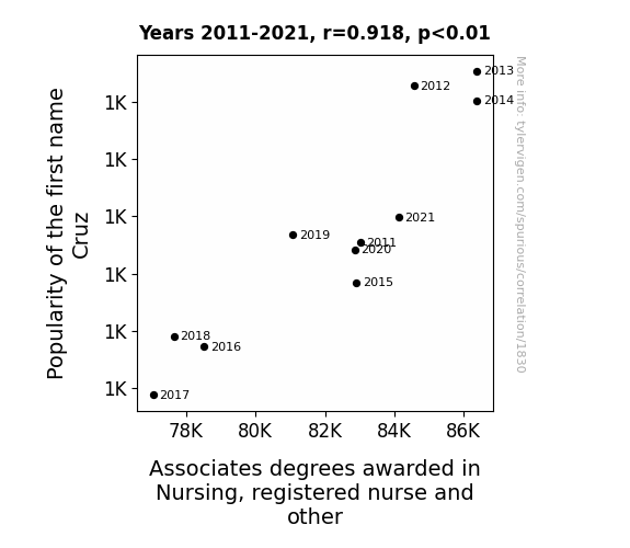
Popularity of the first name Cruz · all first names
Associates degrees awarded in Nursing · all education
Popularity of the first name Cruz · all first names
Associates degrees awarded in Nursing · all education


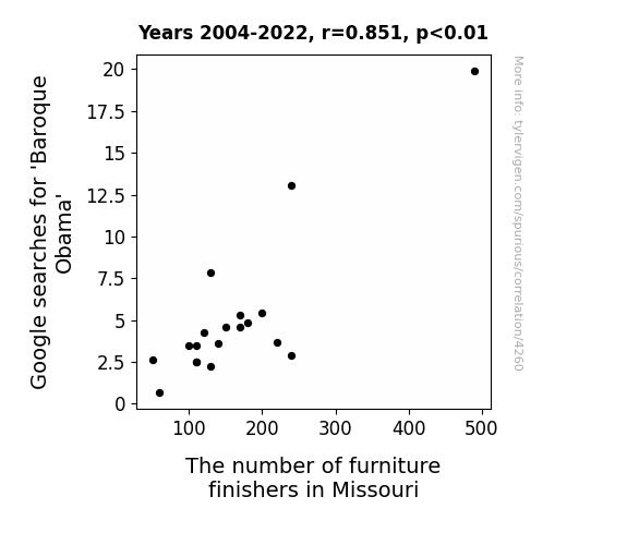
View details about correlation #4,260
What else correlates?
Google searches for 'Baroque Obama' · all google searches
The number of furniture finishers in Missouri · all cccupations
Google searches for 'Baroque Obama' · all google searches
The number of furniture finishers in Missouri · all cccupations


View details about correlation #5,845

What else correlates?
The number of movies Emma Watson appeared in · all films & actors
Votes for Democratic Senators in Michigan · all elections
The number of movies Emma Watson appeared in · all films & actors
Votes for Democratic Senators in Michigan · all elections


View details about correlation #1,133

What else correlates?
The distance between Saturn and the Sun · all planets
Customer satisfaction with HP · all weird & wacky
The distance between Saturn and the Sun · all planets
Customer satisfaction with HP · all weird & wacky


View details about correlation #1,887

What else correlates?
Popularity of the first name Rylee · all first names
GMO use in soybeans in Indiana · all food
Popularity of the first name Rylee · all first names
GMO use in soybeans in Indiana · all food


View details about correlation #4,876

What else correlates?
Popularity of the 'call me maybe' meme · all memes
Kerosene used in Panama · all energy
Popularity of the 'call me maybe' meme · all memes
Kerosene used in Panama · all energy
. The chart goes from 2008 to 2023, and the two variables track closely in value over that time.")

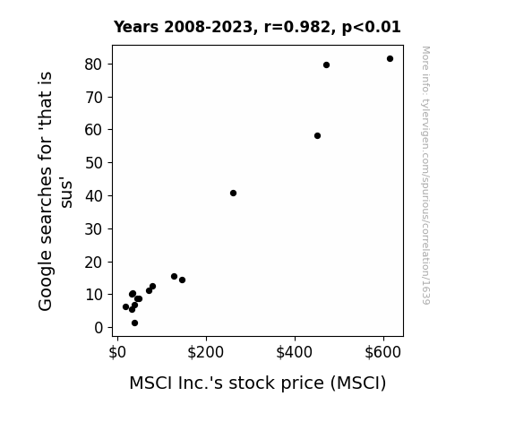
View details about correlation #1,639
What else correlates?
Google searches for 'that is sus' · all google searches
MSCI Inc.'s stock price (MSCI) · all stocks
Google searches for 'that is sus' · all google searches
MSCI Inc.'s stock price (MSCI) · all stocks


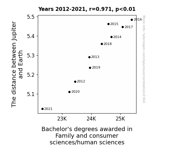
View details about correlation #2,364
What else correlates?
The distance between Jupiter and Earth · all planets
Bachelor's degrees awarded in consumer sciences · all education
The distance between Jupiter and Earth · all planets
Bachelor's degrees awarded in consumer sciences · all education


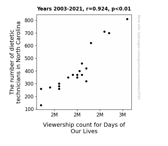
View details about correlation #2,550


View details about correlation #2,239
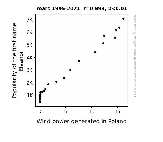
What else correlates?
Popularity of the first name Eleanor · all first names
Wind power generated in Poland · all energy
Popularity of the first name Eleanor · all first names
Wind power generated in Poland · all energy


View details about correlation #5,852
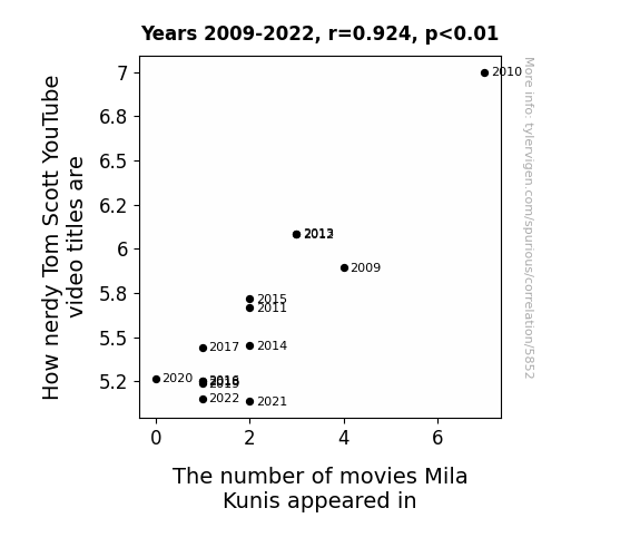
. The chart goes from 2007 to 2023, and the two variables track closely in value over that time.")

View details about correlation #2,819
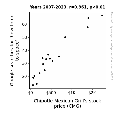
What else correlates?
Google searches for 'how to go to space' · all google searches
Chipotle Mexican Grill's stock price (CMG) · all stocks
Google searches for 'how to go to space' · all google searches
Chipotle Mexican Grill's stock price (CMG) · all stocks


View details about correlation #2,751
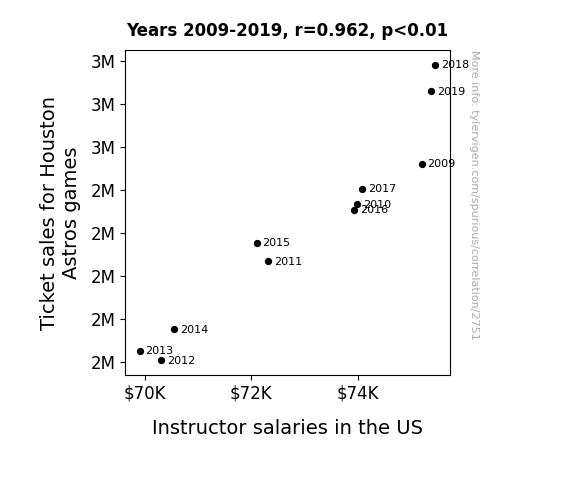
What else correlates?
Ticket sales for Houston Astros games · all sports
Instructor salaries in the US · all education
Ticket sales for Houston Astros games · all sports
Instructor salaries in the US · all education
Why this works
- Data dredging: I have 25,237 variables in my database. I compare all these variables against each other to find ones that randomly match up. That's 636,906,169 correlation calculations! This is called “data dredging.”
Fun fact: the chart used on the wikipedia page to demonstrate data dredging is also from me. I've been being naughty with data since 2014.
Instead of starting with a hypothesis and testing it, I instead tossed a bunch of data in a blender to see what correlations would shake out. It’s a dangerous way to go about analysis, because any sufficiently large dataset will yield strong correlations completely at random. - Lack of causal connection: There is probably no direct connection between these variables, despite what the AI says above.
Because these pages are automatically generated, it's possible that the two variables you are viewing are in fact causually related. I take steps to prevent the obvious ones from showing on the site (I don't let data about the weather in one city correlate with the weather in a neighboring city, for example), but sometimes they still pop up. If they are related, cool! You found a loophole.
This is exacerbated by the fact that I used "Years" as the base variable. Lots of things happen in a year that are not related to each other! Most studies would use something like "one person" in stead of "one year" to be the "thing" studied. - Observations not independent: For many variables, sequential years are not independent of each other. You will often see trend-lines form. If a population of people is continuously doing something every day, there is no reason to think they would suddenly change how they are doing that thing on January 1. A naive p-value calculation does not take this into account.
You will calculate a lower chance of "randomly" achieving the result than represents reality.
To be more specific: p-value tests are probability values, where you are calculating the probability of achieving a result at least as extreme as you found completely by chance. When calculating a p-value, you need to assert how many "degrees of freedom" your variable has. I count each year (minus one) as a "degree of freedom," but this is misleading for continuous variables.
This kind of thing can creep up on you pretty easily when using p-values, which is why it's best to take it as "one of many" inputs that help you assess the results of your analysis.
- Y-axes doesn't start at zero: I truncated the Y-axes of the graphs above. I also used a line graph, which makes the visual connection stand out more than it deserves.
Nothing against line graphs. They are great at telling a story when you have linear data! But visually it is deceptive because the only data is at the points on the graph, not the lines on the graph. In between each point, the data could have been doing anything. Like going for a random walk by itself!
Mathematically what I showed is true, but it is intentionally misleading. If you click on any of the charts that abuse this, you can scroll down to see a version that starts at zero. - Confounding variable: Confounding variables (like global pandemics) will cause two variables to look connected when in fact a "sneaky third" variable is influencing both of them behind the scenes.
- Outliers: Some datasets here have outliers which drag up the correlation.
In concept, "outlier" just means "way different than the rest of your dataset." When calculating a correlation like this, they are particularly impactful because a single outlier can substantially increase your correlation.
Because this page is automatically generated, I don't know whether any of the charts displayed on it have outliers. I'm just a footnote. ¯\_(ツ)_/¯
I intentionally mishandeled outliers, which makes the correlation look extra strong. - Low n: There are not many data points included in some of these charts.
You can do analyses with low ns! But you shouldn't data dredge with a low n.
Even if the p-value is high, we should be suspicious of using so few datapoints in a correlation.
Pro-tip: click on any correlation to see:
- Detailed data sources
- Prompts for the AI-generated content
- Explanations of each of the calculations (correlation, p-value)
- Python code to calculate it yourself


