spurious correlations
discover · random · spurious scholar
← previous page · next page →


View details about correlation #1,152
What else correlates?
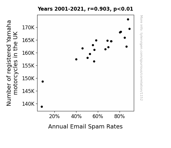
Number of registered Yamaha motorcycles in the UK · all weird & wacky
Annual Email Spam Rates · all weird & wacky
Number of registered Yamaha motorcycles in the UK · all weird & wacky
Annual Email Spam Rates · all weird & wacky
. The chart goes from 2006 to 2023, and the two variables track closely in value over that time.")

View details about correlation #1,943
What else correlates?
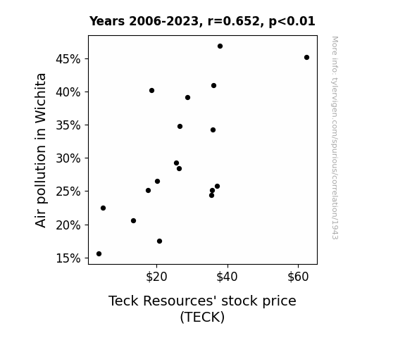
Air pollution in Wichita · all weather
Teck Resources' stock price (TECK) · all stocks
Air pollution in Wichita · all weather
Teck Resources' stock price (TECK) · all stocks


View details about correlation #5,958
What else correlates?
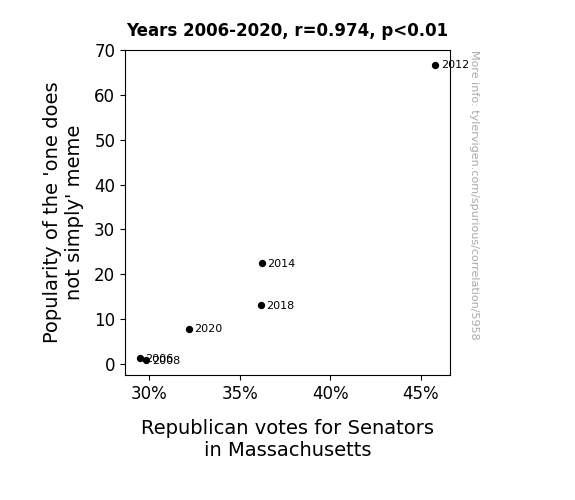
Popularity of the 'one does not simply' meme · all memes
Votes for Republican Senators in Massachusetts · all elections
Popularity of the 'one does not simply' meme · all memes
Votes for Republican Senators in Massachusetts · all elections


View details about correlation #2,455


View details about correlation #5,236
What else correlates?
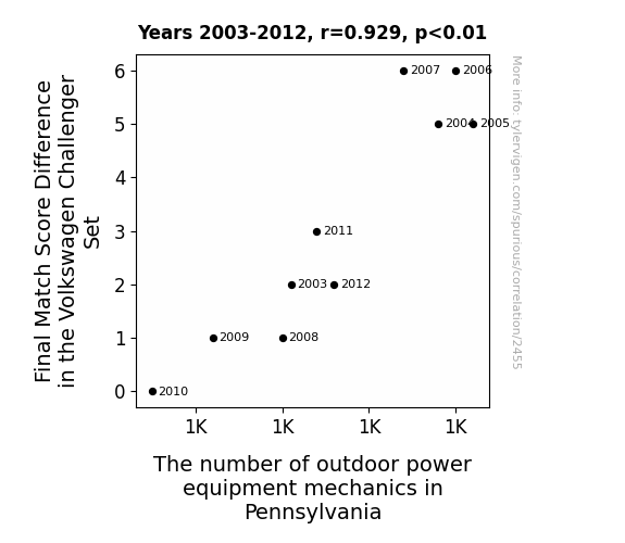
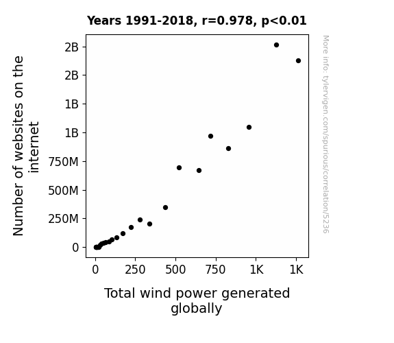
Number of websites on the internet · all weird & wacky
Total wind power generated globally · all energy
Number of websites on the internet · all weird & wacky
Total wind power generated globally · all energy


View details about correlation #2,183
What else correlates?
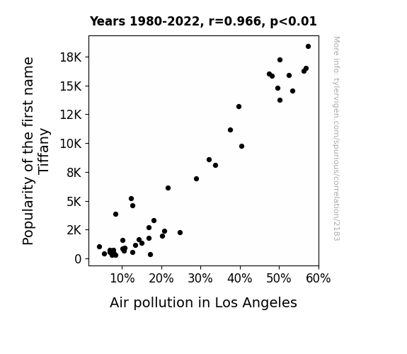
Popularity of the first name Tiffany · all first names
Air pollution in Los Angeles · all weather
Popularity of the first name Tiffany · all first names
Air pollution in Los Angeles · all weather
. The chart goes from 2008 to 2023, and the two variables track closely in value over that time.")

View details about correlation #5,960
What else correlates?
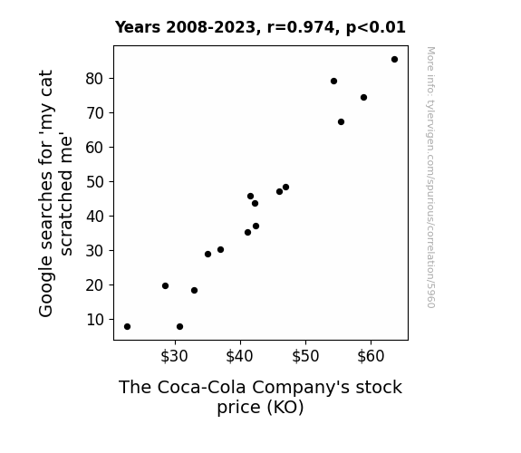
Google searches for 'my cat scratched me' · all google searches
The Coca-Cola Company's stock price (KO) · all stocks
Google searches for 'my cat scratched me' · all google searches
The Coca-Cola Company's stock price (KO) · all stocks


View details about correlation #2,723
What else correlates?
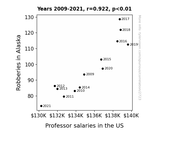
Robberies in Alaska · all random state specific
Professor salaries in the US · all education
Robberies in Alaska · all random state specific
Professor salaries in the US · all education


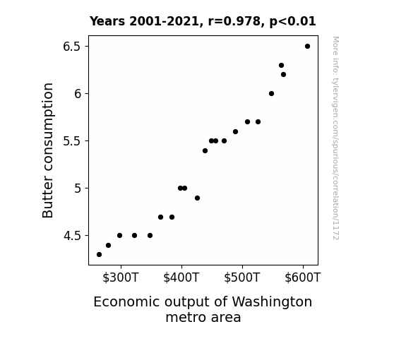
View details about correlation #1,172
What else correlates?
Butter consumption · all food
Economic output of Washington metro area · all weird & wacky
Butter consumption · all food
Economic output of Washington metro area · all weird & wacky


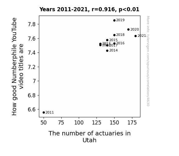
View details about correlation #4,630
What else correlates?
How good Numberphile YouTube video titles are · all YouTube
The number of actuaries in Utah · all cccupations
How good Numberphile YouTube video titles are · all YouTube
The number of actuaries in Utah · all cccupations


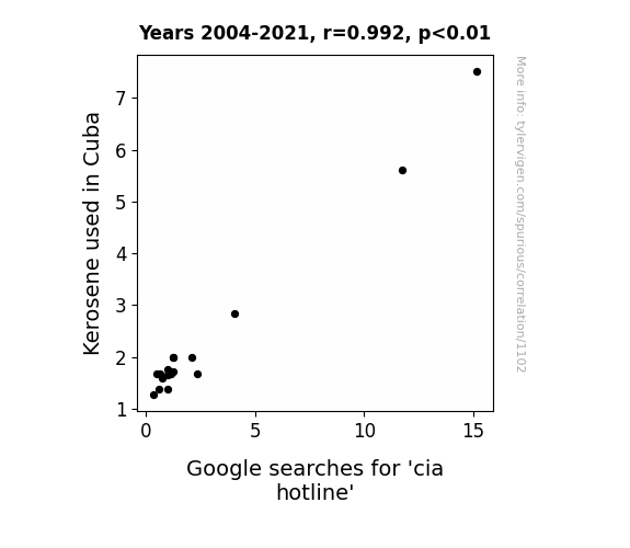
View details about correlation #1,102
What else correlates?
Kerosene used in Cuba · all energy
Google searches for 'cia hotline' · all google searches
Kerosene used in Cuba · all energy
Google searches for 'cia hotline' · all google searches


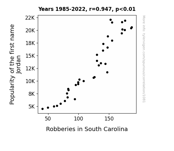
View details about correlation #1,081
What else correlates?
Popularity of the first name Jordan · all first names
Robberies in South Carolina · all random state specific
Popularity of the first name Jordan · all first names
Robberies in South Carolina · all random state specific


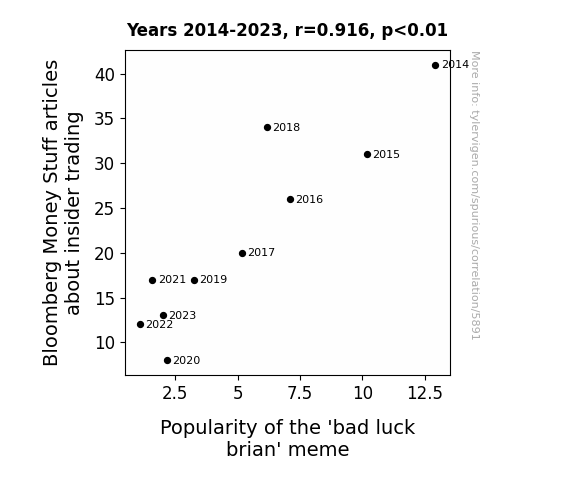
View details about correlation #5,891


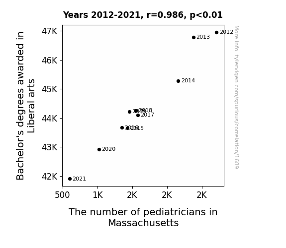
View details about correlation #1,689
What else correlates?
Bachelor's degrees awarded in Liberal arts · all education
The number of pediatricians in Massachusetts · all cccupations
Bachelor's degrees awarded in Liberal arts · all education
The number of pediatricians in Massachusetts · all cccupations


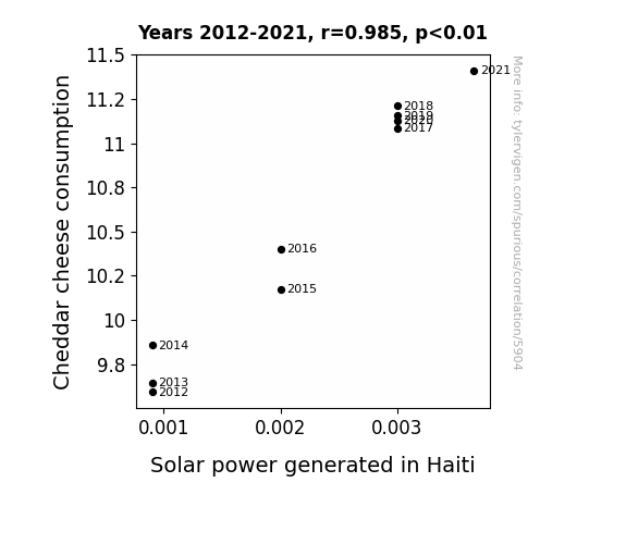
View details about correlation #5,904
What else correlates?
Cheddar cheese consumption · all food
Solar power generated in Haiti · all energy
Cheddar cheese consumption · all food
Solar power generated in Haiti · all energy
. The chart goes from 2002 to 2022, and the two variables track closely in value over that time.")

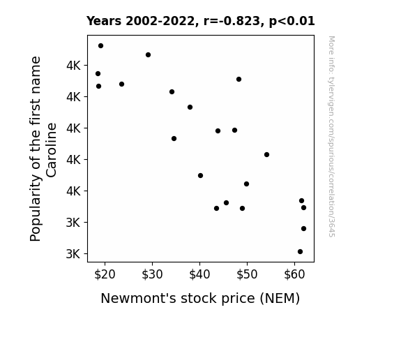
View details about correlation #3,645
What else correlates?
Popularity of the first name Caroline · all first names
Newmont's stock price (NEM) · all stocks
Popularity of the first name Caroline · all first names
Newmont's stock price (NEM) · all stocks


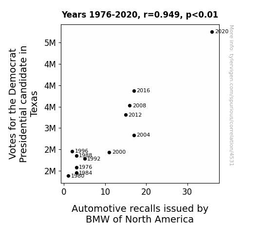
View details about correlation #4,531


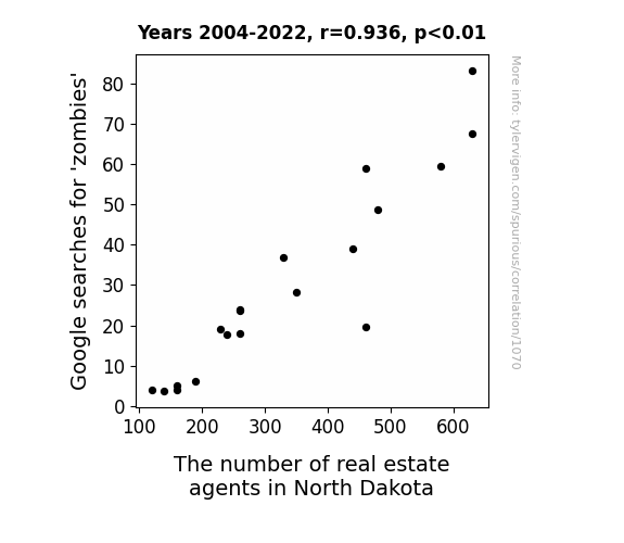
View details about correlation #1,070
What else correlates?
Google searches for 'zombies' · all google searches
The number of real estate agents in North Dakota · all cccupations
Google searches for 'zombies' · all google searches
The number of real estate agents in North Dakota · all cccupations


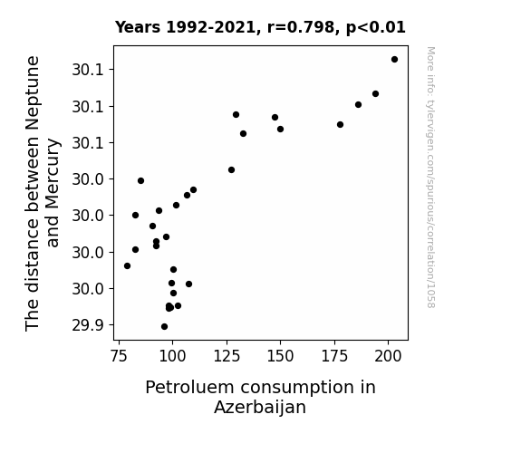
View details about correlation #1,058
What else correlates?
The distance between Neptune and Mercury · all planets
Petroluem consumption in Azerbaijan · all energy
The distance between Neptune and Mercury · all planets
Petroluem consumption in Azerbaijan · all energy
. The chart goes from 2006 to 2023, and the two variables track closely in value over that time.")

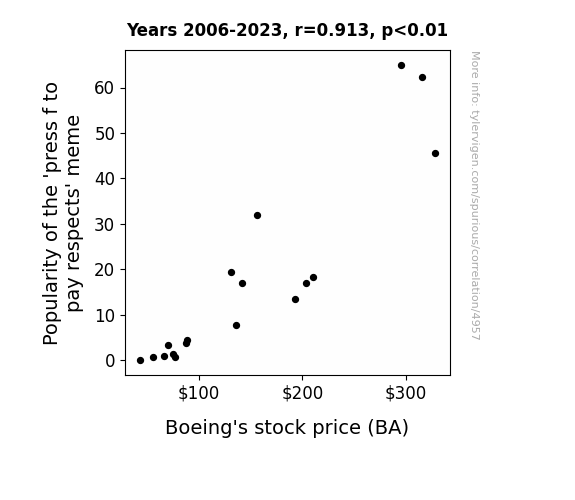
View details about correlation #4,957
What else correlates?
Popularity of the 'press f to pay respects' meme · all memes
Boeing's stock price (BA) · all stocks
Popularity of the 'press f to pay respects' meme · all memes
Boeing's stock price (BA) · all stocks
Why this works
- Data dredging: I have 25,237 variables in my database. I compare all these variables against each other to find ones that randomly match up. That's 636,906,169 correlation calculations! This is called “data dredging.”
Fun fact: the chart used on the wikipedia page to demonstrate data dredging is also from me. I've been being naughty with data since 2014.
Instead of starting with a hypothesis and testing it, I instead tossed a bunch of data in a blender to see what correlations would shake out. It’s a dangerous way to go about analysis, because any sufficiently large dataset will yield strong correlations completely at random. - Lack of causal connection: There is probably no direct connection between these variables, despite what the AI says above.
Because these pages are automatically generated, it's possible that the two variables you are viewing are in fact causually related. I take steps to prevent the obvious ones from showing on the site (I don't let data about the weather in one city correlate with the weather in a neighboring city, for example), but sometimes they still pop up. If they are related, cool! You found a loophole.
This is exacerbated by the fact that I used "Years" as the base variable. Lots of things happen in a year that are not related to each other! Most studies would use something like "one person" in stead of "one year" to be the "thing" studied. - Observations not independent: For many variables, sequential years are not independent of each other. You will often see trend-lines form. If a population of people is continuously doing something every day, there is no reason to think they would suddenly change how they are doing that thing on January 1. A naive p-value calculation does not take this into account.
You will calculate a lower chance of "randomly" achieving the result than represents reality.
To be more specific: p-value tests are probability values, where you are calculating the probability of achieving a result at least as extreme as you found completely by chance. When calculating a p-value, you need to assert how many "degrees of freedom" your variable has. I count each year (minus one) as a "degree of freedom," but this is misleading for continuous variables.
This kind of thing can creep up on you pretty easily when using p-values, which is why it's best to take it as "one of many" inputs that help you assess the results of your analysis.
- Y-axes doesn't start at zero: I truncated the Y-axes of the graphs above. I also used a line graph, which makes the visual connection stand out more than it deserves.
Nothing against line graphs. They are great at telling a story when you have linear data! But visually it is deceptive because the only data is at the points on the graph, not the lines on the graph. In between each point, the data could have been doing anything. Like going for a random walk by itself!
Mathematically what I showed is true, but it is intentionally misleading. If you click on any of the charts that abuse this, you can scroll down to see a version that starts at zero. - Confounding variable: Confounding variables (like global pandemics) will cause two variables to look connected when in fact a "sneaky third" variable is influencing both of them behind the scenes.
- Outliers: Some datasets here have outliers which drag up the correlation.
In concept, "outlier" just means "way different than the rest of your dataset." When calculating a correlation like this, they are particularly impactful because a single outlier can substantially increase your correlation.
Because this page is automatically generated, I don't know whether any of the charts displayed on it have outliers. I'm just a footnote. ¯\_(ツ)_/¯
I intentionally mishandeled outliers, which makes the correlation look extra strong. - Low n: There are not many data points included in some of these charts.
You can do analyses with low ns! But you shouldn't data dredge with a low n.
Even if the p-value is high, we should be suspicious of using so few datapoints in a correlation.
Pro-tip: click on any correlation to see:
- Detailed data sources
- Prompts for the AI-generated content
- Explanations of each of the calculations (correlation, p-value)
- Python code to calculate it yourself


