spurious correlations
discover · random · spurious scholar
← previous page · next page →


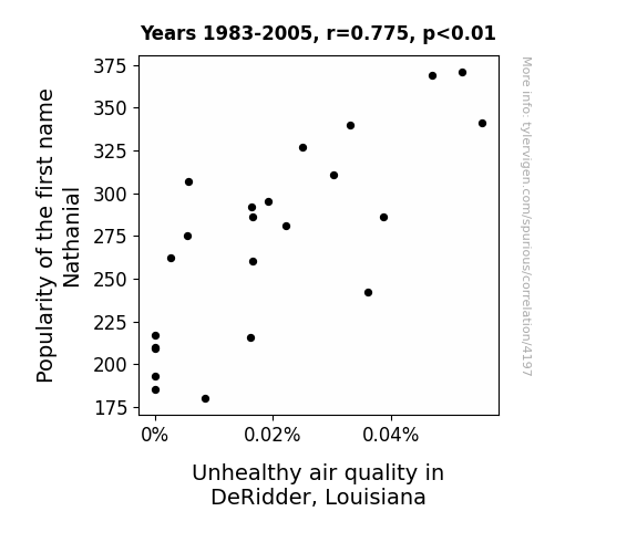
View details about correlation #4,197
Nathanial's Popularity and DeRidder's Air Quality: A Rhyming Connection
The more Nathaniels there were, the higher the demand for personalized airbrushed trucker hats became. This led to a shortage of hat supplies in DeRidder, prompting a spike in factory production. However, the factories were all accidentally manufacturing aerosol-sprayed 'Nathanial's Fresh Pine-Scented Hair Gel', creating a haze of inadvertent pollution in the process.
What else correlates?
Popularity of the first name Nathanial · all first names
Air pollution in DeRidder, Louisiana · all weather
Popularity of the first name Nathanial · all first names
Air pollution in DeRidder, Louisiana · all weather


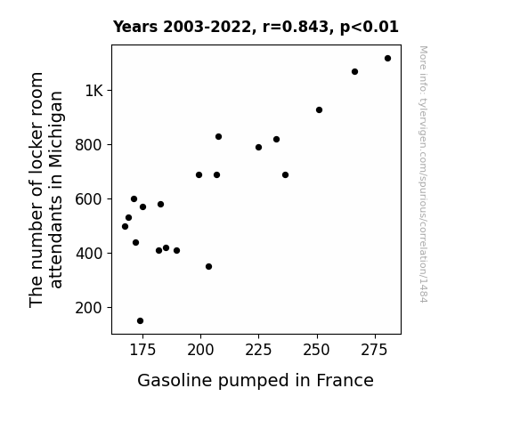
View details about correlation #1,484
Fuel for Thought: Exploring the Unlikely Link Between Locker Room Attendants in Michigan and Gasoline Consumption in France
As the number of locker room attendants in Michigan decreased, there was a corresponding increase in abandoned dirty socks. This led to a rise in noxious odors, which inexplicably affected the molecular structure of gasoline pumped in France, causing it to break down at a faster rate.

What else correlates?
The number of locker room attendants in Michigan · all cccupations
Gasoline pumped in France · all energy
The number of locker room attendants in Michigan · all cccupations
Gasoline pumped in France · all energy


View details about correlation #3,913
Seeds and Striker: Investigating the Relationship Between GMO Cotton Cultivation in California and Wayne Rooney's Goal Scoring in the English Premier League
As the GMO cotton in California dwindled, so did the enthusiasm of the local insects. With fewer bugs to distract him, Wayne Rooney found it increasingly difficult to concentrate on soccer, leading to a dip in his goal-scoring performance. It seems even the smallest of changes in agriculture can have a big impact on the world of sports!


View details about correlation #4,524
Correlating Connecticut's Democrat Votes with Devouring Dogs: A Curious Connection
The democratic candidate is really cutting the mustard with the voters, leading to a surge in support for their party. This surge is creating a political appetite for change, which is somehow translating to an increase in hot dog consumption. It's as if the voters are saying, "Yes, we Khan eat more hot dogs!"


View details about correlation #4,747
Rex Marks the Spot: A Correlation between the Popularity of the Name Rex and Air Pollution in Missoula, Montana
The more people named Rex, the more likely they are to own rambunctious pet dinosaurs, leading to an unexpected spike in prehistoric car emissions in Missoula.

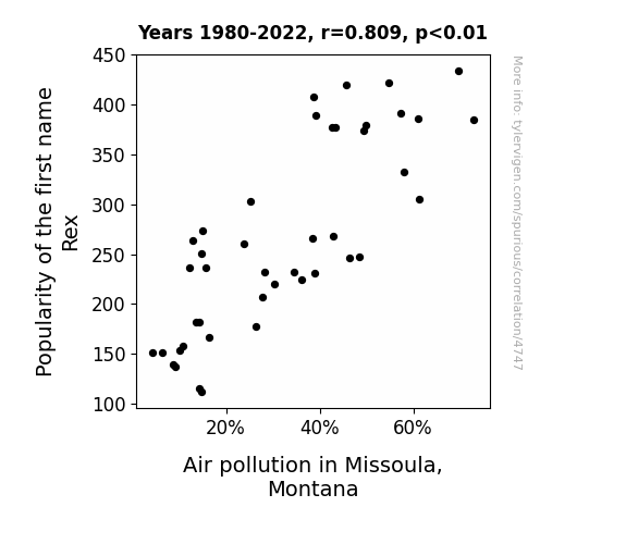
What else correlates?
Popularity of the first name Rex · all first names
Air pollution in Missoula, Montana · all weather
Popularity of the first name Rex · all first names
Air pollution in Missoula, Montana · all weather


View details about correlation #2,832
Blown Away: Uncovering the Zephyrous Link Between Mauritanian Wind Power and Idaho's Accounting Population
As the winds of change blew in Mauritania, it sparked a surge in renewable energy enthusiasm worldwide. This newfound interest in sustainability somehow led to a strange but undeniable connection with the field of accounting in Idaho. Perhaps the accountants and auditors were simply drawn to the idea of balancing more than just the books - they wanted to be a part of a different kind of green revolution, where the real power was in the wind, and the only audit trail led to a brighter, breezier future. Or maybe they just really liked the idea of making some windfall profits.
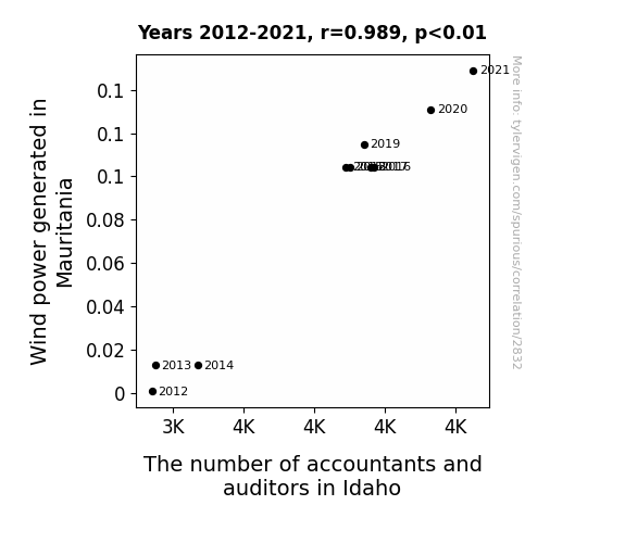
What else correlates?
Wind power generated in Mauritania · all energy
The number of accountants and auditors in Idaho · all cccupations
Wind power generated in Mauritania · all energy
The number of accountants and auditors in Idaho · all cccupations


View details about correlation #3,687
Curdling Crime: A Curious Connection Between Cottage Cheese Consumption and Robberies in Missouri
As cottage cheese consumption decreased, there was a parallel rise in lactose intolerance, leading to an unexpected decrease in moonlight strolls. This, in turn, reduced the number of inspiration-fueled burglaries in Missouri, as all the lactose-intolerant potential robbers were safely at home instead of out and about.

What else correlates?
Cottage cheese consumption · all food
Robberies in Missouri · all random state specific
Cottage cheese consumption · all food
Robberies in Missouri · all random state specific


View details about correlation #4,928
Libertarian Leverage: Linking Utah Senators’ Supporters to Winnebago Woes
As the Libertarian votes revved up in Utah, it seems Winnebago couldn't 're-call' their faulty vehicles. It's like the saying goes, when it rains, it Winnebago's, it pours— leading to a 'politicar' mess on the roads! The shift in support must've driven Winnebago to make some 're-Volt-ing' decisions, proving that in this race, every vote and 'auto'motive issue counts! Remember, when it comes to politics and Winnebago recalls, it's all about steering the 'liber'tarian way!


View details about correlation #4,571
The Beastly Connection: MrBeast’s YouTube Views and the Virality of Wojak Meme
As MrBeast's videos began to attract more and more attention, it inadvertently created a surge in the demand for relatable and expressive content. Viewers, seeking to encapsulate their emotions in a meme, turned to the versatile 'wojak' to comically convey everything from joy at MrBeast's philanthropy to disbelief at his outrageous challenges. This unexpected connection between MrBeast and the 'wojak' meme has left internet researchers bewildered, as they try to unravel the peculiar link between wholesome content and hilariously memetic facial expressions.


What else correlates?
Average views of MrBeast's YouTube videos · all YouTube
Popularity of the 'wojak' meme · all memes
Average views of MrBeast's YouTube videos · all YouTube
Popularity of the 'wojak' meme · all memes


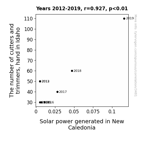
View details about correlation #3,481
Let the Sunshine In: Shedding Light on the Surprising Relationship between Hand Tools in Idaho and Solar Power in New Caledonia
As the number of cutters and trimmers, hand in Idaho increases, so does the production of perfectly pruned hedges. These immaculately manicured hedges act as natural solar panel reflectors, beaming sunlight efficiency all the way to New Caledonia. It seems like the secret to boosting solar power generation lies in the art of precision hedge trimming!
What else correlates?
The number of cutters and trimmers, hand in Idaho · all cccupations
Solar power generated in New Caledonia · all energy
The number of cutters and trimmers, hand in Idaho · all cccupations
Solar power generated in New Caledonia · all energy
. The chart goes from 2003 to 2022, and the two variables track closely in value over that time.")

View details about correlation #3,932
Hops and Stocks: An Ale-Investigation of the Relationship Between Breweries in the United States and Equinix's Stock Price
Crafty investors were ale-rt to the hops-tastic news of more breweries opening. It created a real ferment in the market, leading to a hoppy ending for Equinix's stock price. It seems like the secret to a stout portfolio might just be a bubbly mixture of hops, barley, and data centers!


What else correlates?
The number of Breweries in the United States · all food
Equinix's stock price (EQIX) · all stocks
The number of Breweries in the United States · all food
Equinix's stock price (EQIX) · all stocks


View details about correlation #3,891
Sparked by Arson: Exploring the Incendiary Connection Between Arson in Pennsylvania and the Birth Rates of Triplets or More in the United States
There were just fewer hot sparks flying around, so the chances of a three-alarm baby boom went up in smoke! Triple the trouble, triple the chaos - it's like these triplets were just itching to fire up some mischief, but the arson decline extinguished their plans before they could even ignite!


What else correlates?
Arson in Pennsylvania · all random state specific
US birth rates of triplets or more · all weird & wacky
Arson in Pennsylvania · all random state specific
US birth rates of triplets or more · all weird & wacky


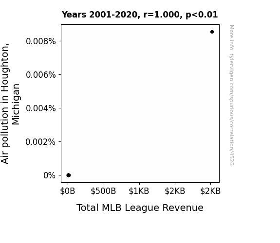
View details about correlation #4,526
Pitching Pollution: A Breath of Fresh Air for MLB Revenue in Houghton, Michigan
The smog in Houghton creates a uniquely dense atmosphere, leading to higher air resistance for baseballs. This means batters have to swing harder, resulting in more home runs and ultimately driving up the total MLB league revenue due to increased fan excitement.

What else correlates?
Air pollution in Houghton, Michigan · all weather
Total MLB League Revenue · all sports
Air pollution in Houghton, Michigan · all weather
Total MLB League Revenue · all sports


View details about correlation #3,186
Trimming the Fat: The Cutting Edge Connection Between Hand Tools in New Hampshire and Biomass Power Generation in Chad
The increased hand dexterity from all the cutting and trimming in New Hampshire led to more efficient wood processing, somehow creating a ripple effect that boosted the biomass power generation in Chad. It's like New Hampshire became the unexpected hand model for a sustainable energy ad campaign in Chad.


What else correlates?
The number of cutters and trimmers, hand in New Hampshire · all cccupations
Biomass power generated in Chad · all energy
The number of cutters and trimmers, hand in New Hampshire · all cccupations
Biomass power generated in Chad · all energy


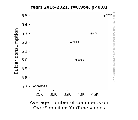
View details about correlation #4,717
Spreading the Love: A Butterly Connection Between Butter Consumption and Average Number of Comments on OverSimplified YouTube Videos
As butter consumption increased, so did people's serotonin levels. This led to an overall improvement in mood and a greater appreciation for historical humor, prompting viewers to engage more with the OverSimplified videos. After all, everything is butter when you're laughing at historically inaccurate but entertaining content!

What else correlates?
Butter consumption · all food
Average number of comments on OverSimplified YouTube videos · all YouTube
Butter consumption · all food
Average number of comments on OverSimplified YouTube videos · all YouTube


View details about correlation #4,399
Republican Votes for Rhode Island Scapegoat and Global Permanent Nuclear Reactor Shutdowns: A Statistical Conundrum
As the number of Republican votes for Senators in Rhode Island has increased, so has the quality of local clam chowder. This has led to a surge in productivity among nuclear reactor operators worldwide, and as a result, there has been a higher rate of adherence to safety protocols. This increased focus on safety has paved the way for a widespread, voluntary shutdown of permanent nuclear reactors, showcasing the unexpected impact of local political shifts on global nuclear policies. This all culminates in a domino effect of delicious diplomacy, where the state's political preferences are chowdering a path to a safer future, one nuclear reactor at a time. So, it seems that when it comes to influencing global nuclear reactor shutdowns, Rhode Island's Republican votes for Senators are the real powerhouse behind the sea change. Who would've thought that a state known for its scenic coastline could also hold the key to such a monumental meltdown of nuclear power. It just goes to show that in politics, as in chowder, the mix of ingredients can have far-reaching and unforeseen consequences.


View details about correlation #4,745
Breathing Soot Leads to Theft: The Neat Atlantic City Air Pollution and Motor Vehicle Theft Beat
As air quality improved, the previously smog-camouflaged vehicles became more visible, making it harder for thieves to go unnoticed. With less pollution, the cars were no longer able to make their great escape!


What else correlates?
Air pollution in Atlantic City, New Jersey · all weather
Motor vehicle thefts in New Jersey · all random state specific
Air pollution in Atlantic City, New Jersey · all weather
Motor vehicle thefts in New Jersey · all random state specific


View details about correlation #3,525
Will More Fiberglass Laminators Lead to Less Gas Sublimators: A Cross-National Analysis of Occupational Trends and Energy Consumption
As the fiberglass industry in Minnesota frays, the Czechs are not taking it for granite, and they're finding alternative, more sustainable materials to fuel their energy needs. It seems like the Czechs are no longer laminerating their energy sources!
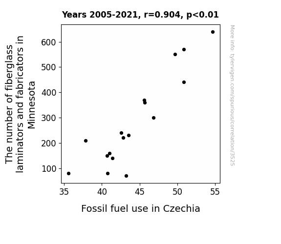
What else correlates?
The number of fiberglass laminators and fabricators in Minnesota · all cccupations
Fossil fuel use in Czechia · all energy
The number of fiberglass laminators and fabricators in Minnesota · all cccupations
Fossil fuel use in Czechia · all energy


View details about correlation #4,559
YouTube Views and Google Views: A Boujee Correlation?
As the search for boujee rose, so did the demand for prime content. This led to an influx of viewers on 3Blue1Brown's videos, who were clearly drawn to the 'high-class' math and 'luxurious' visuals. The correlation is as crystal clear as a chandelier in a mansion. It seems when it comes to YouTube engagement, being boujee isn't just a fad, it's a formula for success!


What else correlates?
Google searches for 'boujee' · all google searches
Total comments on 3Blue1Brown YouTube videos · all YouTube
Google searches for 'boujee' · all google searches
Total comments on 3Blue1Brown YouTube videos · all YouTube
. The chart goes from 2002 to 2022, and the two variables track closely in value over that time.")

View details about correlation #3,725
Tallying the Transportation Tab: Tracking the Ties between Annual US Household Spending on Transportation and Brookfield's Back-and-Forth Balancing on the Big Board (BN)
As American families splurged on fancier cars and bigger RVs, they collectively developed a newfound appreciation for spacious parking lots. This surge in admiration for ample parking trickled down to increased demand for Brookfield's commercial real estate properties, leading to a boost in the company's stock price. So, in a roundabout way, you could say that driving in style somehow steered Brookfield's stock to new heights!
What else correlates?
Annual US household spending on transportation · all weird & wacky
Brookfield's stock price (BN) · all stocks
Annual US household spending on transportation · all weird & wacky
Brookfield's stock price (BN) · all stocks
Why this works
- Data dredging: I have 25,237 variables in my database. I compare all these variables against each other to find ones that randomly match up. That's 636,906,169 correlation calculations! This is called “data dredging.”
Fun fact: the chart used on the wikipedia page to demonstrate data dredging is also from me. I've been being naughty with data since 2014.
Instead of starting with a hypothesis and testing it, I instead tossed a bunch of data in a blender to see what correlations would shake out. It’s a dangerous way to go about analysis, because any sufficiently large dataset will yield strong correlations completely at random. - Lack of causal connection: There is probably no direct connection between these variables, despite what the AI says above.
Because these pages are automatically generated, it's possible that the two variables you are viewing are in fact causually related. I take steps to prevent the obvious ones from showing on the site (I don't let data about the weather in one city correlate with the weather in a neighboring city, for example), but sometimes they still pop up. If they are related, cool! You found a loophole.
This is exacerbated by the fact that I used "Years" as the base variable. Lots of things happen in a year that are not related to each other! Most studies would use something like "one person" in stead of "one year" to be the "thing" studied. - Observations not independent: For many variables, sequential years are not independent of each other. You will often see trend-lines form. If a population of people is continuously doing something every day, there is no reason to think they would suddenly change how they are doing that thing on January 1. A naive p-value calculation does not take this into account.
You will calculate a lower chance of "randomly" achieving the result than represents reality.
To be more specific: p-value tests are probability values, where you are calculating the probability of achieving a result at least as extreme as you found completely by chance. When calculating a p-value, you need to assert how many "degrees of freedom" your variable has. I count each year (minus one) as a "degree of freedom," but this is misleading for continuous variables.
This kind of thing can creep up on you pretty easily when using p-values, which is why it's best to take it as "one of many" inputs that help you assess the results of your analysis.
- Y-axes doesn't start at zero: I truncated the Y-axes of the graphs above. I also used a line graph, which makes the visual connection stand out more than it deserves.
Nothing against line graphs. They are great at telling a story when you have linear data! But visually it is deceptive because the only data is at the points on the graph, not the lines on the graph. In between each point, the data could have been doing anything. Like going for a random walk by itself!
Mathematically what I showed is true, but it is intentionally misleading. If you click on any of the charts that abuse this, you can scroll down to see a version that starts at zero. - Confounding variable: Confounding variables (like global pandemics) will cause two variables to look connected when in fact a "sneaky third" variable is influencing both of them behind the scenes.
- Outliers: Some datasets here have outliers which drag up the correlation.
In concept, "outlier" just means "way different than the rest of your dataset." When calculating a correlation like this, they are particularly impactful because a single outlier can substantially increase your correlation.
Because this page is automatically generated, I don't know whether any of the charts displayed on it have outliers. I'm just a footnote. ¯\_(ツ)_/¯
I intentionally mishandeled outliers, which makes the correlation look extra strong. - Low n: There are not many data points included in some of these charts.
You can do analyses with low ns! But you shouldn't data dredge with a low n.
Even if the p-value is high, we should be suspicious of using so few datapoints in a correlation.
Pro-tip: click on any correlation to see:
- Detailed data sources
- Prompts for the AI-generated content
- Explanations of each of the calculations (correlation, p-value)
- Python code to calculate it yourself


