spurious correlations
discover · random · spurious scholar
← previous page · next page →


View details about correlation #4,315
Killian It with Popularity: The Curious Connection Between Name Popularity and Libertarian Voting Behavior in Illinois
Perhaps people just couldn't resist the "kill"-er combination of freedom and individual rights that the Libertarian candidate stood for. It's as if they were drawn to the idea of "Kill"-ian, you know, making a "kill"ing in the political arena with their beliefs in personal liberty and limited government. And hey, maybe there's a secret society of Killian-naires who are all about advocating for maximum autonomy and minimum state intervention! This correlation could be a real "free-will" mystery!


View details about correlation #1,287
Judging Solar Power: The Illuminating Connection Between Judicial Activity in New Mexico and Solar Energy Production in Honduras
As the number of judges in New Mexico increased, so did the frequency of their 'solar power' gavel bangs, inadvertently sending positive energy waves to Honduras, thus boosting solar power generation there. It seems the judiciary system has truly become a powerhouse for renewable energy - delivering justice and sunny dispositions in more ways than one!

What else correlates?
The number of judges in New Mexico · all cccupations
Solar power generated in Honduras · all energy
The number of judges in New Mexico · all cccupations
Solar power generated in Honduras · all energy


View details about correlation #4,428
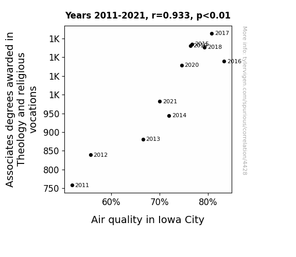
Theology Degrees and Air Quality: Corroborating the Ethereal Connection
As more theology and religious vocation students graduated, there was a ‘higher power’ at work. With their holy knowledge, they taught the trees to conduct photosynthesis with extra faith, leading to a ‘divine intervention’ in reducing air pollution. The theologians may have just unlocked the secret to creating a ‘sacred atmosphere’ for cleaner air in Iowa City. It seems like when it comes to improving air quality, these graduates were truly on a mission from ‘above’!

What else correlates?
Associates degrees awarded in Theology · all education
Air quality in Iowa City · all weather
Associates degrees awarded in Theology · all education
Air quality in Iowa City · all weather


View details about correlation #4,291
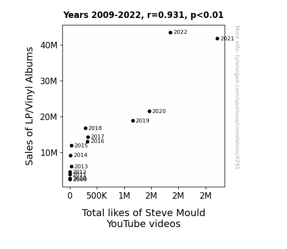
The Beat Goes On: An Acoustic Correlation Between Vinyl Album Sales and Steve Mould YouTube Likes
The groovy vibes from spinning those classic vinyl albums somehow emitted a signal that resonated with the viewers, amplifying their appreciation for science and prompting them to show Steve Mould some extra love on YouTube. It's as if the crackling sound of the needle on the record created a wave of support for educational content, leading to a vinyl-ful of likes on Steve's videos. Seems like when it comes to engaging with science enthusiasts, the correlation between LP/Vinyl album sales and Steve Mould's YouTube likes is not just a spin of fate, but a truly magnetic phenomenon!

What else correlates?
Sales of LP/Vinyl Albums · all weird & wacky
Total likes of Steve Mould's YouTube videos · all YouTube
Sales of LP/Vinyl Albums · all weird & wacky
Total likes of Steve Mould's YouTube videos · all YouTube
. The chart goes from 2002 to 2022, and the two variables track closely in value over that time.")

View details about correlation #4,105
Anabel's Fable: Vodafone Stock and Baby Name Enable
The decrease in Anabels led to a decrease in demand for personalized "Anabel" phone cases, resulting in a drop in revenue for phone case manufacturers. This ultimately impacted Vodafone Group's stock price as investors grew concerned about the overall decrease in consumer spending on phone accessories.


What else correlates?
Popularity of the first name Anabel · all first names
Vodafone Group's stock price (VOD) · all stocks
Popularity of the first name Anabel · all first names
Vodafone Group's stock price (VOD) · all stocks


View details about correlation #1,990
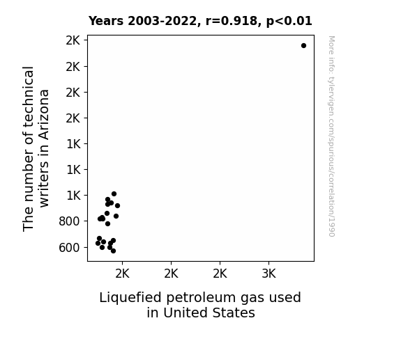
The Write Connection: A Correlation Study between Technical Writers in Arizona and Liquefied Petroleum Gas Consumption in the United States
As the number of technical writers in Arizona rose, so did the amount of hot air in the state. This led to an increased demand for Liquefied Petroleum Gas (LPG) as more and more people turned to grilling to enjoy the sunny weather. It seems the pen truly is mightier than the propane tank!

What else correlates?
The number of technical writers in Arizona · all cccupations
Liquefied petroleum gas used in United States · all energy
The number of technical writers in Arizona · all cccupations
Liquefied petroleum gas used in United States · all energy


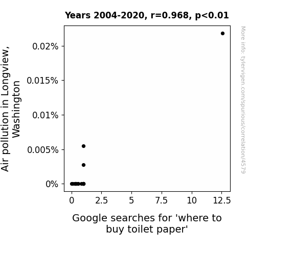
View details about correlation #4,579
The Air-a-Soft-on-Wipe: An Analysis of Air Pollution in Longview, Washington and the Correlation with Google Searches for 'Where to Buy Toilet Paper'
People were using toilet paper to filter the air, leading to a sudden shortage.

What else correlates?
Air pollution in Longview, Washington · all weather
Google searches for 'where to buy toilet paper' · all google searches
Air pollution in Longview, Washington · all weather
Google searches for 'where to buy toilet paper' · all google searches


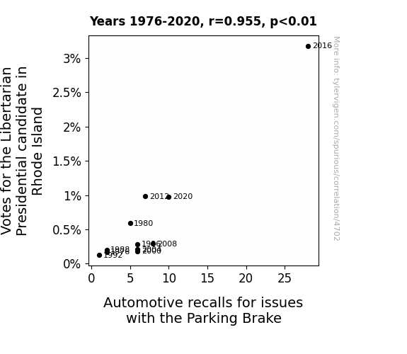
View details about correlation #4,702
Breaking News: The Brake for Libertarians - An Empirical Study on the Correlation between Votes for the Libertarian Presidential Candidate in Rhode Island and Automotive Recalls for Parking Brake Issues
As the number of votes for the Libertarian Presidential candidate in Rhode Island rose, so did the frequency of automotive recalls relating to parking brake issues. This may be attributed to the magnetic pull of individual freedom and limited government intervention, which inadvertently interfered with the proper functioning of parking brake systems in a display of vehicular nonconformity. It seems that as the quest for minimal state control revved up, it somehow applied a brake on parking brake effectiveness, leading to a need for heightened automotive safety measures. Perhaps there's a correlation between a political drive for liberty and a tendency for parking brakes to liberate themselves from vehicles. Or maybe it's just a case of electoral innovation sparking a strange campaign for parking brake independence.


View details about correlation #4,813
Lock, Stock, and Two Smoking Barrels: The Jocular Relationship Between LockPickingLawyer YouTube Video Titles and Burglaries in Vermont
LockPickingLawyer's videos cause burglars to pursue more fulfilling careers as locksmiths.


What else correlates?
How geeky LockPickingLawyer YouTube video titles are · all YouTube
Burglaries in Vermont · all random state specific
How geeky LockPickingLawyer YouTube video titles are · all YouTube
Burglaries in Vermont · all random state specific


View details about correlation #3,258
Sunny Side Up: Illuminating the Link between Solar Power in Bahrain and the Surprising Surge of Epidemiologists in Minnesota
The surplus solar power was beamed to Minnesota, inadvertently creating a booming job market for epidemiologists who were drawn to the state by the sudden abundance of sunny positions. Looks like the job market in Minnesota is infectious!


What else correlates?
Solar power generated in Bahrain · all energy
The number of epidemiologists in Minnesota · all cccupations
Solar power generated in Bahrain · all energy
The number of epidemiologists in Minnesota · all cccupations


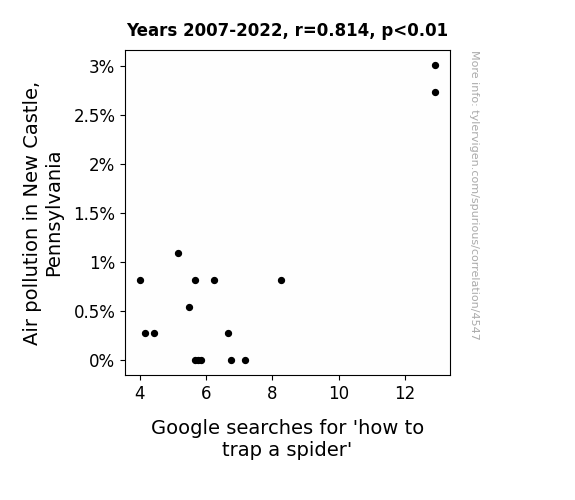
View details about correlation #4,547
Caught in a Web of Pollution: The Arachnophobic Effects of Air Quality in New Castle, Pennsylvania
As air quality improved, the spiders in New Castle, Pennsylvania started feeling more energized and active. Their usual sluggishness and laziness was replaced with increased alertness and agility. This newfound vitality allowed them to outsmart and evade any amateur attempts at trapping, leading to a decreased need for people to search for 'how to trap a spider' on Google. The spiders basically upgraded from laid-back, smoke-inhaling couch potatoes to nimble, clear-air athletes, leaving the good folks of New Castle scratching their heads and hoping that the spiders didn't pick up any martial arts skills along the way. The air may be cleaner, but the spider-catching game just got a whole lot trickier!

What else correlates?
Air pollution in New Castle, Pennsylvania · all weather
Google searches for 'how to trap a spider' · all google searches
Air pollution in New Castle, Pennsylvania · all weather
Google searches for 'how to trap a spider' · all google searches
. The chart goes from 2002 to 2022, and the two variables track closely in value over that time.")

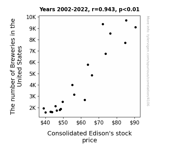
View details about correlation #4,106
Brewing Profits: A Sudsy Connection Between Breweries and Consolidated Edison's Stock Price
The increase in breweries led to a surge in beer production, creating a higher demand for electricity to power the brewing process. As a result, Consolidated Edison's stock price (ED) rose due to the increased need for their power services in brewery operations. "Looks like the stock market is tapping into the shocking connection between beer and electricity!"

What else correlates?
The number of Breweries in the United States · all food
Consolidated Edison's stock price (ED) · all stocks
The number of Breweries in the United States · all food
Consolidated Edison's stock price (ED) · all stocks


View details about correlation #4,808
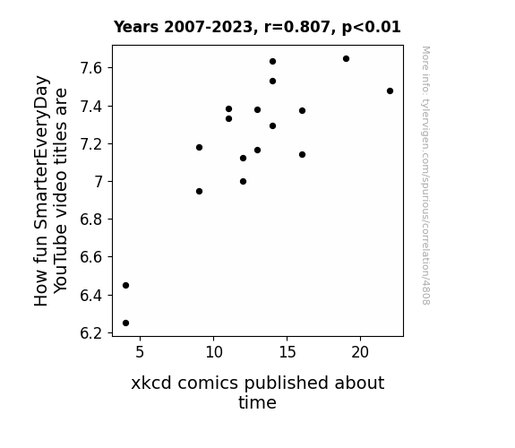
Tick-Tock Tunes: The Tantalizing Ties Between SmarterEveryDay and xkcd Time Titles
The more entertaining SmarterEveryDay video titles boost viewer engagement, causing an uptick in internet traffic. This surge in web activity somehow creates rifts in the space-time continuum, inspiring xkcd to produce more time-related comics. It's a wibbly wobbly, timey wimey YouTube phenomenon!
What else correlates?
How fun SmarterEveryDay YouTube video titles are · all YouTube
xkcd comics published about time · all weird & wacky
How fun SmarterEveryDay YouTube video titles are · all YouTube
xkcd comics published about time · all weird & wacky


View details about correlation #3,482
Economics Educators in Idaho and Fossil Fuel Follies in Bosnia and Herzegovina: A Rhyming Correlation
As the number of university economics teachers in Idaho increased, there was a corresponding surge in the discussion of supply and demand. This led to a bizarrely specific focus on the fossil fuel market in Bosnia and Herzegovina during lectures. Students, eager to impress their professors, began organizing random international fossil fuel purchasing events, leading to a peculiarly high demand. This unexpected spike in demand caught Bosnian and Herzegovinian suppliers off guard, prompting them to ramp up production and consumption, ultimately leading to increased fossil fuel use in the region.


View details about correlation #4,363
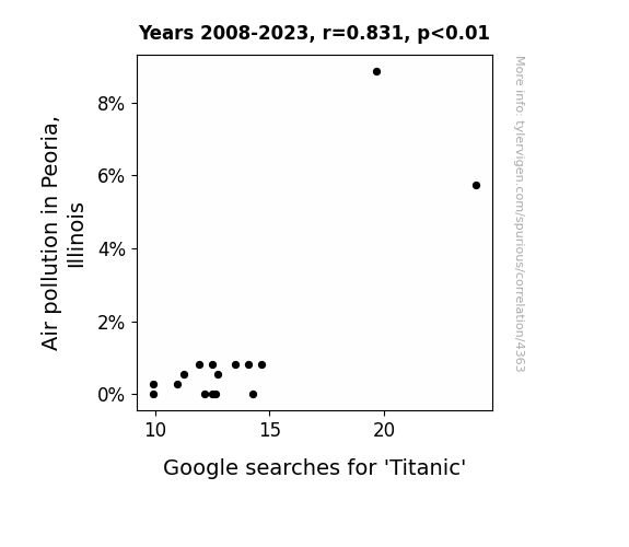
Fuming Love: An Examination of the Relationship Between Air Pollution in Peoria, Illinois, and Google Searches for 'Titanic'
The citizens of Peoria, in a quest for cleaner air, started watching the movie Titanic in droves, leading to a spike in online searches for anything Titanic-related. As they say, the smoggier, the merrier! Or perhaps a new form of pollution control involves releasing Kate Winslet's iconic "I'm flying, Jack!" scene into the air.

What else correlates?
Air pollution in Peoria, Illinois · all weather
Google searches for 'Titanic' · all google searches
Air pollution in Peoria, Illinois · all weather
Google searches for 'Titanic' · all google searches
. The chart goes from 2002 to 2022, and the two variables track closely in value over that time.")

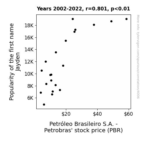
View details about correlation #4,006
Jayden-mic Effect: A Crude Connection Between Name Popularity and Petrobras Stock Price
As the popularity of the name Jayden soared, more and more babies were named after the character Jayden Smith played in the 'Karate Kid' movie. This led to a sudden surge in demand for tiny, fashionable headbands, reminiscent of the ones the character wore. As the headband craze took off, it sparked a boom in the fashion industry, causing an unexpected shortage of stretchy fabric, particularly in a vibrant shade of green. Unbeknownst to many, this specific shade of green was a trademark color for Petrobras, leading to a bizarre but undeniable increase in demand for their products. The company, baffled by this unforeseen link to baby fashion, enjoyed record-breaking sales, ultimately driving up their stock price. The power of Jayden-mania had inadvertently set off a chain reaction that even the savviest of investors couldn't have predicted!
What else correlates?
Popularity of the first name Jayden · all first names
Petróleo Brasileiro S.A. - Petrobras' stock price (PBR) · all stocks
Popularity of the first name Jayden · all first names
Petróleo Brasileiro S.A. - Petrobras' stock price (PBR) · all stocks


View details about correlation #4,522
Vote Libertarian, Surfin' the Web: A Correlation Study Between Votes for the Libertarian Presidential Candidate in Kansas and the Number of Websites on the Internet
As the support for the Libertarian candidate surged in Kansas, so did the desire for online freedom, leading to a wave of new internet creators. It seems like in this case, when it comes to internet expansion, it's all about the pursuit of happiness - and website development!


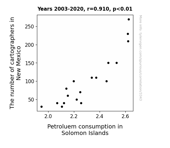
View details about correlation #3,343
Mapping the Way to Fuel: A Cart-astrophe of Cartographers and Petroleum Consumption
As the number of cartographers in New Mexico increased, so did the production of highly accurate maps. These maps, known for their exquisite detail, sparked a sudden interest in remote and exotic travel destinations. This led to a surge in tourism to the Solomon Islands, ultimately resulting in a higher demand for petroleum to power boats, planes, and other modes of transportation around the picturesque island nation. Who knew that cartography could put the Solomon Islands on the map in more ways than one!

What else correlates?
The number of cartographers in New Mexico · all cccupations
Petroluem consumption in Solomon Islands · all energy
The number of cartographers in New Mexico · all cccupations
Petroluem consumption in Solomon Islands · all energy


View details about correlation #4,151
Genetically Modified Corn's Gravitational Grip on Google Search Queries: A Correlative Conundrum
The GMO corn was inadvertently engineered to produce a compound that, when inhaled as people walked by cornfields, induced a state of constant bewilderment and an inability to even. This led to a surge in 'i cant even' Google searches as the perplexed population tried to articulate their inexplicable feelings of utter flabbergastation.


What else correlates?
GMO use in corn grown in Illinois · all food
Google searches for 'i cant even' · all google searches
GMO use in corn grown in Illinois · all food
Google searches for 'i cant even' · all google searches
. The chart goes from 2002 to 2018, and the two variables track closely in value over that time.")

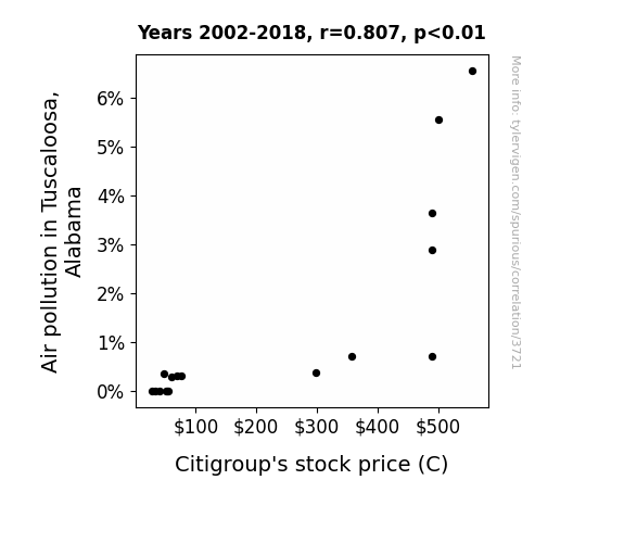
View details about correlation #3,721
Gasping for Air: The Relationship Between Air Pollution in Tuscaloosa, Alabama and Citigroup's Stock Price
People in Tuscaloosa were using pollution masks made by a Citigroup subsidiary, but once the air cleared, they no longer needed to purchase as many. This unexpected drop in demand for pollution masks led to a decrease in Citigroup's stock price.

What else correlates?
Air pollution in Tuscaloosa, Alabama · all weather
Citigroup's stock price (C) · all stocks
Air pollution in Tuscaloosa, Alabama · all weather
Citigroup's stock price (C) · all stocks
Why this works
- Data dredging: I have 25,237 variables in my database. I compare all these variables against each other to find ones that randomly match up. That's 636,906,169 correlation calculations! This is called “data dredging.”
Fun fact: the chart used on the wikipedia page to demonstrate data dredging is also from me. I've been being naughty with data since 2014.
Instead of starting with a hypothesis and testing it, I instead tossed a bunch of data in a blender to see what correlations would shake out. It’s a dangerous way to go about analysis, because any sufficiently large dataset will yield strong correlations completely at random. - Lack of causal connection: There is probably no direct connection between these variables, despite what the AI says above.
Because these pages are automatically generated, it's possible that the two variables you are viewing are in fact causually related. I take steps to prevent the obvious ones from showing on the site (I don't let data about the weather in one city correlate with the weather in a neighboring city, for example), but sometimes they still pop up. If they are related, cool! You found a loophole.
This is exacerbated by the fact that I used "Years" as the base variable. Lots of things happen in a year that are not related to each other! Most studies would use something like "one person" in stead of "one year" to be the "thing" studied. - Observations not independent: For many variables, sequential years are not independent of each other. You will often see trend-lines form. If a population of people is continuously doing something every day, there is no reason to think they would suddenly change how they are doing that thing on January 1. A naive p-value calculation does not take this into account.
You will calculate a lower chance of "randomly" achieving the result than represents reality.
To be more specific: p-value tests are probability values, where you are calculating the probability of achieving a result at least as extreme as you found completely by chance. When calculating a p-value, you need to assert how many "degrees of freedom" your variable has. I count each year (minus one) as a "degree of freedom," but this is misleading for continuous variables.
This kind of thing can creep up on you pretty easily when using p-values, which is why it's best to take it as "one of many" inputs that help you assess the results of your analysis.
- Y-axes doesn't start at zero: I truncated the Y-axes of the graphs above. I also used a line graph, which makes the visual connection stand out more than it deserves.
Nothing against line graphs. They are great at telling a story when you have linear data! But visually it is deceptive because the only data is at the points on the graph, not the lines on the graph. In between each point, the data could have been doing anything. Like going for a random walk by itself!
Mathematically what I showed is true, but it is intentionally misleading. If you click on any of the charts that abuse this, you can scroll down to see a version that starts at zero. - Confounding variable: Confounding variables (like global pandemics) will cause two variables to look connected when in fact a "sneaky third" variable is influencing both of them behind the scenes.
- Outliers: Some datasets here have outliers which drag up the correlation.
In concept, "outlier" just means "way different than the rest of your dataset." When calculating a correlation like this, they are particularly impactful because a single outlier can substantially increase your correlation.
Because this page is automatically generated, I don't know whether any of the charts displayed on it have outliers. I'm just a footnote. ¯\_(ツ)_/¯
I intentionally mishandeled outliers, which makes the correlation look extra strong. - Low n: There are not many data points included in some of these charts.
You can do analyses with low ns! But you shouldn't data dredge with a low n.
Even if the p-value is high, we should be suspicious of using so few datapoints in a correlation.
Pro-tip: click on any correlation to see:
- Detailed data sources
- Prompts for the AI-generated content
- Explanations of each of the calculations (correlation, p-value)
- Python code to calculate it yourself


