spurious correlations
random · discover · next page →
don't miss spurious scholar,
where each of these is an academic paper


View details about correlation #2,455
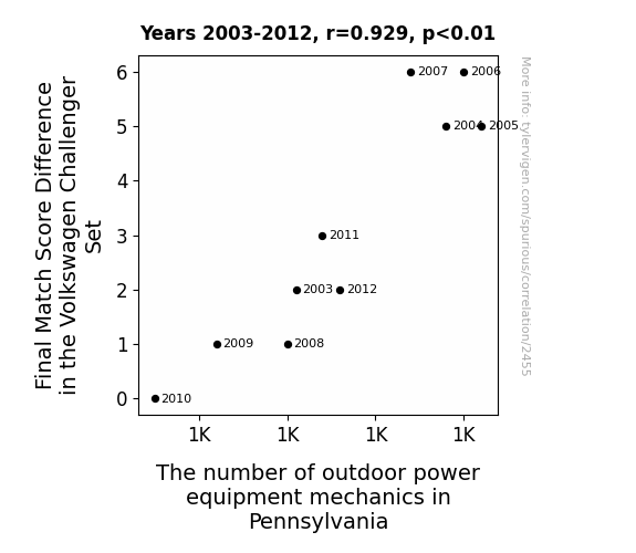
Mowing the Competition: The Grassroots Influence of Outdoor Power Equipment Mechanics on Volkswagen Challenger Set Final Match Score Differences
As the Final Match Score Difference in the Volkswagen Challenger Set increased, so did the number of outdoor power equipment mechanics in Pennsylvania. It seems the players' performance was directly impacting the state's workforce. They really set the bar high, leading to a mow-tivational surge in mechanics wanting to leaf their own mark on the industry. It's like they say, when it comes to shaping the future of outdoor power equipment, every point counts!



View details about correlation #5,236
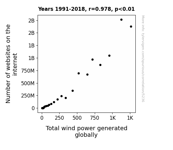
Energizing the Web: Uncovering the Link Between Online Domains and Wind Power Generation
As the internet expanded, it created a surge in cat video consumption. This led to an increase in laughter around the world, which in turn resulted in stronger and more frequent gusts of wind, ultimately boosting the total wind power generated globally. Remember, laughter is truly the best renewable energy source!

What else correlates?
Number of websites on the internet · all weird & wacky
Total wind power generated globally · all energy
Number of websites on the internet · all weird & wacky
Total wind power generated globally · all energy


View details about correlation #2,183
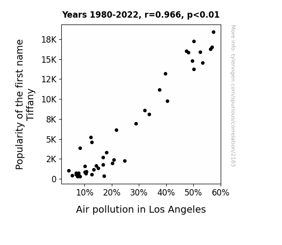
Smoggy with a Chance of Tiffany: The Correlation Between the Popularity of the Name Tiffany and Poor Air Quality in Los Angeles
As fewer Tiffanys were around, there were fewer people asking, "Isn't it just Tiff-any for a smoggy day in LA?". With less demand for punny pollution commentary, the air quality improved in a stroke of bizarre linguistic luck!

What else correlates?
Popularity of the first name Tiffany · all first names
Air pollution in Los Angeles · all weather
Popularity of the first name Tiffany · all first names
Air pollution in Los Angeles · all weather


View details about correlation #5,960
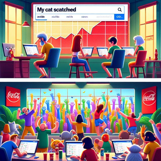
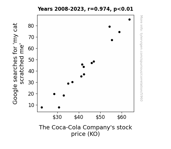
Analyzing the Purrfect Storm: A Feline Scratches and Coca-Cola Stock Price Correlation
As Google searches for 'my cat scratched me' went up, more people began to seek out the comfort of a cold, fizzy beverage. This led to a surge in demand for Coca-Cola products, ultimately driving up The Coca-Cola Company's stock price. It seems like even feline antics couldn't scratch the surface of Coca-Cola's success!
What else correlates?
Google searches for 'my cat scratched me' · all google searches
The Coca-Cola Company's stock price (KO) · all stocks
Google searches for 'my cat scratched me' · all google searches
The Coca-Cola Company's stock price (KO) · all stocks


View details about correlation #2,723
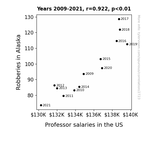
The Great Alaska Robbery: A Causative Correlation with Professorial Paychecks?
As robberies decreased in Alaska, the demand for security systems also decreased, leading to a surplus of security devices. This surplus put pressure on the manufacturing industry, causing companies to cut costs. Since many of these companies also happened to be major university donors, they had less funds available to contribute to professor salaries, ultimately leading to a nationwide decrease in pay for educators. This just goes to show that even the most unexpected trends can have a ripple effect on our economy and day-to-day lives. Remember, a safer Alaska could mean a lighter wallet for your favorite professor!

What else correlates?
Robberies in Alaska · all random state specific
Professor salaries in the US · all education
Robberies in Alaska · all random state specific
Professor salaries in the US · all education


View details about correlation #1,172
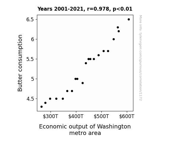
Spreading Wealth: The Butter-ly Effect on the Economic Churn in the Washington Metro Area
As butter consumption increased, so did the number of buttery smooth business transactions, churning out profits and greasing the wheels of the local economy. The correlation is udderly undeniable - more butter, more economic power in the Washington metro area.

What else correlates?
Butter consumption · all food
Economic output of Washington metro area · all weird & wacky
Butter consumption · all food
Economic output of Washington metro area · all weird & wacky


View details about correlation #4,630
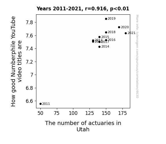
The Actuarial Arithmetic: A Quantitative Analysis of Numberphile Video Titles and the Actuary Population in Utah
As the number of actuaries in Utah increases, so does their collective brainpower. This leads to a surge in mathematical prowess within the state. As a result, the residents of Utah become better at appreciating and understanding complex numerical concepts. This heightened numerical acumen creates a demand for even more engaging mathematical content, prompting Numberphile to step up their video title game. It's like a quadratic formula for success – as the actuaries square up in Utah, Numberphile's video titles experience exponential growth!

What else correlates?
How good Numberphile YouTube video titles are · all YouTube
The number of actuaries in Utah · all cccupations
How good Numberphile YouTube video titles are · all YouTube
The number of actuaries in Utah · all cccupations


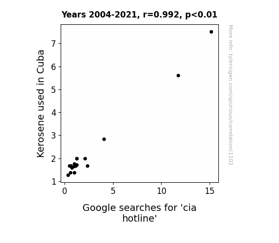
View details about correlation #1,102
Correlation between Cuban Kerosene Consumption and CIA Hotline Searches: A Curious Connection
This is clearly a case of spies being left in the dark! As the kerosene supply dwindled, Cuban spies had to cut back on their clandestine activities. Without enough fuel for their sneaky operations, they couldn't keep their hotline to the CIA burning. So, the reduction in kerosene usage in Cuba quite literally put a damper on their ability to make calls to the CIA hotline.

What else correlates?
Kerosene used in Cuba · all energy
Google searches for 'cia hotline' · all google searches
Kerosene used in Cuba · all energy
Google searches for 'cia hotline' · all google searches


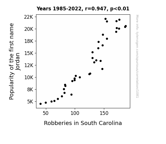
View details about correlation #1,081
Jordan Robberies: A Study of the Correlation Between the Name and Crime in South Carolina
More babies were named Jordan, leading to an increased demand for personalized basketball jerseys. This demand caused a spike in underground jersey counterfeiting operations, ultimately leading to an uptick in overall criminal activity, including robberies, in South Carolina.

What else correlates?
Popularity of the first name Jordan · all first names
Robberies in South Carolina · all random state specific
Popularity of the first name Jordan · all first names
Robberies in South Carolina · all random state specific


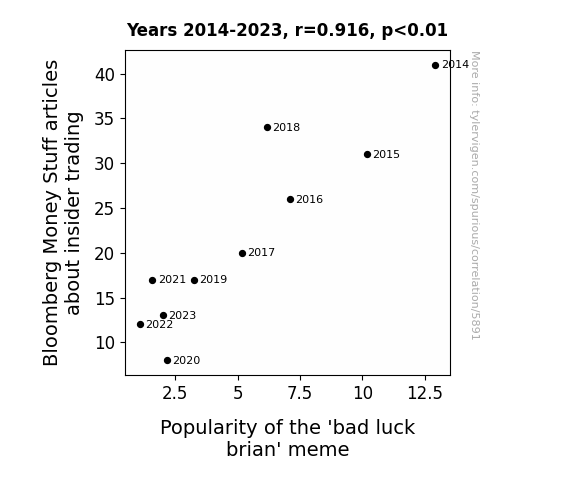
View details about correlation #5,891
Trading Meme: The Insider Connection Between Bloomberg's Money Stuff and 'Bad Luck Brian' Popularity
As fewer articles were published, insider traders had less guidance, leading to a series of comically unfortunate events in their attempts to make illicit gains. This inadvertently mirrored the classic 'bad luck Brian' meme, thus reducing the need for its online circulation.



View details about correlation #1,689
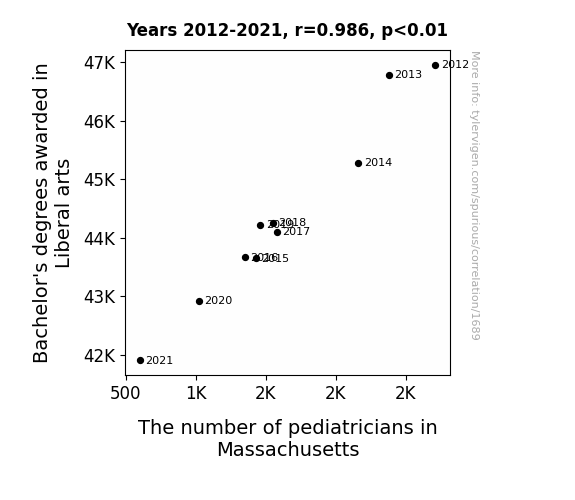
A Liberal Arts Prescription: The Pediatric Predicament in Massachusetts
As the number of Bachelor's degrees awarded in Liberal Arts decreased, there was a corresponding decrease in the availability of people who could properly interpret children's finger paintings, leading to a decline in accurate early developmental assessments. This ultimately resulted in a reduced number of qualified pediatricians in Massachusetts as the demand for quality crayon-based diagnostics exceeded the supply.

What else correlates?
Bachelor's degrees awarded in Liberal arts · all education
The number of pediatricians in Massachusetts · all cccupations
Bachelor's degrees awarded in Liberal arts · all education
The number of pediatricians in Massachusetts · all cccupations


View details about correlation #5,904
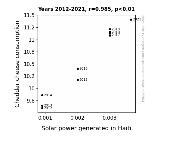
Grate Expectations: The Gouda News on Cheddar Cheese Consumption and Solar Power Generated in Haiti
As Cheddar cheese consumption increased, the collective brainpower of the population reached new heights. With innovative solutions, they developed a way to harness the renewable energy of cheese dreams, leading to a surge in solar power generation in Haiti. The Cheesy Brainwave Initiative has now sparked a gouda revolution in the energy sector! Curd you believe it?

What else correlates?
Cheddar cheese consumption · all food
Solar power generated in Haiti · all energy
Cheddar cheese consumption · all food
Solar power generated in Haiti · all energy


View details about correlation #3,645
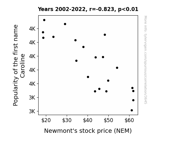
Hair-Raising Connections: The Caroline Effect on Newmont's Stock Price
As the popularity of the name Caroline declined, fewer people were inspired to sing "Sweet Caroline," leading to a decrease in the demand for music. This caused a surplus of resources in the entertainment industry, so Newmont's stock, being a precious metals company, struck gold as resources were reallocated. In other words, it seems like Caroline's name wasn't the only thing getting mined!

What else correlates?
Popularity of the first name Caroline · all first names
Newmont's stock price (NEM) · all stocks
Popularity of the first name Caroline · all first names
Newmont's stock price (NEM) · all stocks


View details about correlation #1,070
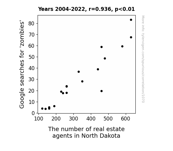
Zombie Zeal and Real Estate: A Zany Zombieland Zest for Zombie Searches and Zesty Zillow Zones
As more people prepared for a potential zombie apocalypse, the demand for underground bunkers in North Dakota skyrocketed, leading to a boom in the real estate market and a sudden need for more agents to facilitate these unconventional property transactions. "Even the undead can't resist that North Dakota charm!"

What else correlates?
Google searches for 'zombies' · all google searches
The number of real estate agents in North Dakota · all cccupations
Google searches for 'zombies' · all google searches
The number of real estate agents in North Dakota · all cccupations


View details about correlation #1,058
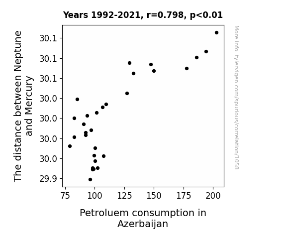
Neptonian Nonsense: The Quirky Correlation Between Solar Distance and Petroleum Consumption in Azerbaijan
As the gravitational pull increased, it created a ripple effect on Earth's magnetic field, leading to improved fuel combustion efficiency in Azerbaijani vehicles.

What else correlates?
The distance between Neptune and Mercury · all planets
Petroluem consumption in Azerbaijan · all energy
The distance between Neptune and Mercury · all planets
Petroluem consumption in Azerbaijan · all energy


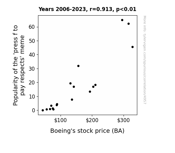
View details about correlation #4,957
From lol to low: The Popularity of the 'press f to pay respects' meme and its Impact on Boeing's Stock Price
As the 'press f to pay respects' meme gained popularity, it led to an increase in internet traffic and keyboard usage. This higher demand for keyboards meant that more electronic components, including small parts manufactured by companies like Boeing, were needed. The surge in stock price for Boeing can be directly correlated to the unexpected meme-inspired need for their products, as the keyboard epidemic took hold of the nation.

What else correlates?
Popularity of the 'press f to pay respects' meme · all memes
Boeing's stock price (BA) · all stocks
Popularity of the 'press f to pay respects' meme · all memes
Boeing's stock price (BA) · all stocks


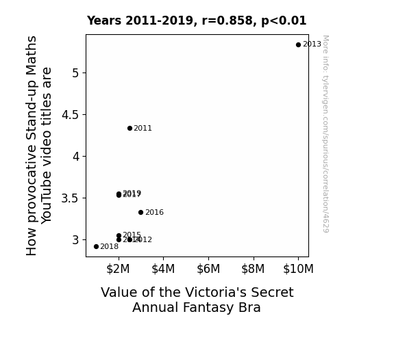
View details about correlation #4,629
Stand-Up Maths and Sexy Bras: Crunching the Numbers on Provocative Titles and Fantasy Valuation
As the provocative Stand-up Maths video titles become less attention-grabbing, there is a corresponding decline in mathematical intrigue. This inadvertently leads to a reduced demand for over-the-top mathematical lingerie calculations. The once highly coveted Victoria's Secret Annual Fantasy Bra, adorned with geometric patterns and equations, loses its appeal as the world of mathematics takes a less flashy, more subdued approach. In a strange turn of events, it seems the calculus of provocative video titles and the algebra of lingerie allure are intimately intertwined in a complex equation of societal fascination.



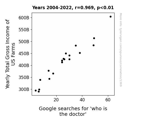
View details about correlation #1,369
The Doctor is In...Demand: Exploring the Correlation Between Yearly Total Gross Income of US Farms and Searches for 'Who is the Doctor' on Google
As farm incomes rise, farmers invest in advanced technology. This leads to an increase in productivity and efficiency, resulting in more free time. With this free time, they watch more TV, including the popular show Doctor Who, prompting them to search for information about the iconic character. Remember, it's not just the crops that are growing on those farms!

What else correlates?
Yearly Total Gross Income of US Farms · all food
Google searches for 'who is the doctor' · all google searches
Yearly Total Gross Income of US Farms · all food
Google searches for 'who is the doctor' · all google searches


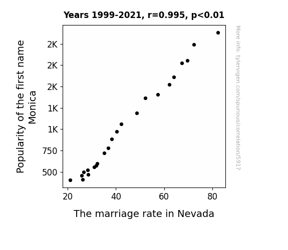
View details about correlation #5,917
Monica's Matrimonial Measure: Examining the Eccentric Link between Monica's Moniker and Marriage Metrics in Nevada
Why did the marriage rate in Nevada decrease? It seems that fewer Monicas meant fewer "Monica, will you marry me?" moments. It just goes to show, when it comes to tying the knot, Monicas really did have a monopoly in Nevada!

What else correlates?
Popularity of the first name Monica · all first names
The marriage rate in Nevada · all random state specific
Popularity of the first name Monica · all first names
The marriage rate in Nevada · all random state specific


View details about correlation #5,920
Spreading Love and Margarine: An Examination of the Butter-Splitter Correlation in Maine
Perhaps as people used less margarine, they became less slippery in their relationships. The lack of artificial spread may have kept the couples from buttering each other up, leading to a decrease in overall marital strife. That's the reality when you can't believe it's not butter - it's a recipe for marital success. Alternatively, it could be that as the margarine consumption decreased, so did the overall slickness in the state, leading to fewer instances of partners feeling like they couldn't grip the marriage.

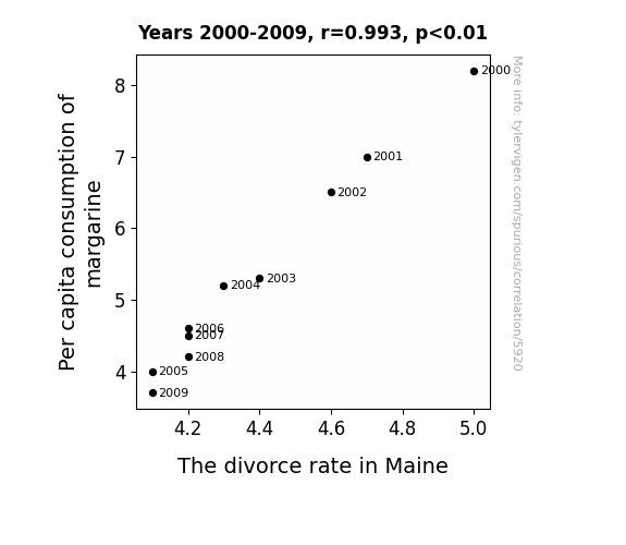
What else correlates?
Per capita consumption of margarine · all food
The divorce rate in Maine · all random state specific
Per capita consumption of margarine · all food
The divorce rate in Maine · all random state specific
Why this works
- Data dredging: I have 25,237 variables in my database. I compare all these variables against each other to find ones that randomly match up. That's 636,906,169 correlation calculations! This is called “data dredging.”
Fun fact: the chart used on the wikipedia page to demonstrate data dredging is also from me. I've been being naughty with data since 2014.
Instead of starting with a hypothesis and testing it, I instead tossed a bunch of data in a blender to see what correlations would shake out. It’s a dangerous way to go about analysis, because any sufficiently large dataset will yield strong correlations completely at random. - Lack of causal connection: There is probably no direct connection between these variables, despite what the AI says above.
Because these pages are automatically generated, it's possible that the two variables you are viewing are in fact causually related. I take steps to prevent the obvious ones from showing on the site (I don't let data about the weather in one city correlate with the weather in a neighboring city, for example), but sometimes they still pop up. If they are related, cool! You found a loophole.
This is exacerbated by the fact that I used "Years" as the base variable. Lots of things happen in a year that are not related to each other! Most studies would use something like "one person" in stead of "one year" to be the "thing" studied. - Observations not independent: For many variables, sequential years are not independent of each other. You will often see trend-lines form. If a population of people is continuously doing something every day, there is no reason to think they would suddenly change how they are doing that thing on January 1. A naive p-value calculation does not take this into account.
You will calculate a lower chance of "randomly" achieving the result than represents reality.
To be more specific: p-value tests are probability values, where you are calculating the probability of achieving a result at least as extreme as you found completely by chance. When calculating a p-value, you need to assert how many "degrees of freedom" your variable has. I count each year (minus one) as a "degree of freedom," but this is misleading for continuous variables.
This kind of thing can creep up on you pretty easily when using p-values, which is why it's best to take it as "one of many" inputs that help you assess the results of your analysis.
- Y-axes doesn't start at zero: I truncated the Y-axes of the graphs above. I also used a line graph, which makes the visual connection stand out more than it deserves.
Nothing against line graphs. They are great at telling a story when you have linear data! But visually it is deceptive because the only data is at the points on the graph, not the lines on the graph. In between each point, the data could have been doing anything. Like going for a random walk by itself!
Mathematically what I showed is true, but it is intentionally misleading. If you click on any of the charts that abuse this, you can scroll down to see a version that starts at zero. - Confounding variable: Confounding variables (like global pandemics) will cause two variables to look connected when in fact a "sneaky third" variable is influencing both of them behind the scenes.
- Outliers: Some datasets here have outliers which drag up the correlation.
In concept, "outlier" just means "way different than the rest of your dataset." When calculating a correlation like this, they are particularly impactful because a single outlier can substantially increase your correlation.
Because this page is automatically generated, I don't know whether any of the charts displayed on it have outliers. I'm just a footnote. ¯\_(ツ)_/¯
I intentionally mishandeled outliers, which makes the correlation look extra strong. - Low n: There are not many data points included in some of these charts.
You can do analyses with low ns! But you shouldn't data dredge with a low n.
Even if the p-value is high, we should be suspicious of using so few datapoints in a correlation.
Pro-tip: click on any correlation to see:
- Detailed data sources
- Prompts for the AI-generated content
- Explanations of each of the calculations (correlation, p-value)
- Python code to calculate it yourself


