spurious correlations
discover · random · spurious scholar
← previous page · next page →


View details about correlation #4,414
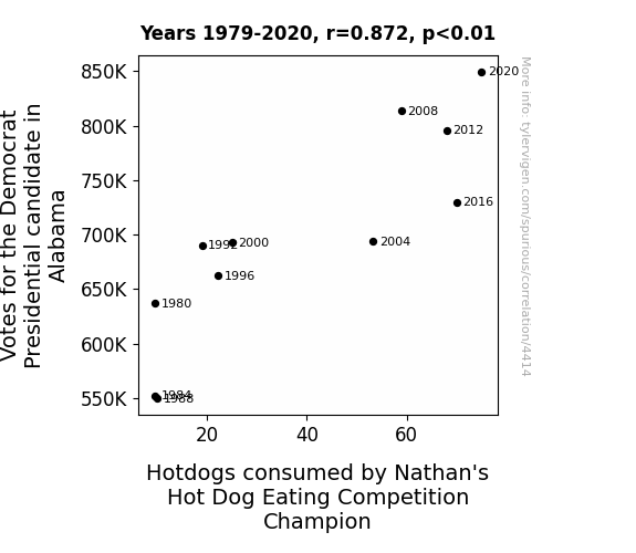
The Sausage Party: An Examination of the Correlation Between Democrat Presidential Votes in Alabama and Nathan's Hot Dog Consumption
As Democratic votes in Alabama rose, so did the competitive spirit in the political arena. This surge in competition ignited a hunger for success, mirroring the insatiable appetite of a hot dog eating champion. As the political race heated up, it created a veritable 'frank-furter' frenzy, leading to a 'bundling' of support for the Democratic candidate and a parallel surge in hot dog consumption. It seems that in the race for victory, both in politics and competitive eating, the stakes have truly become 'link-ed'!


View details about correlation #5,102
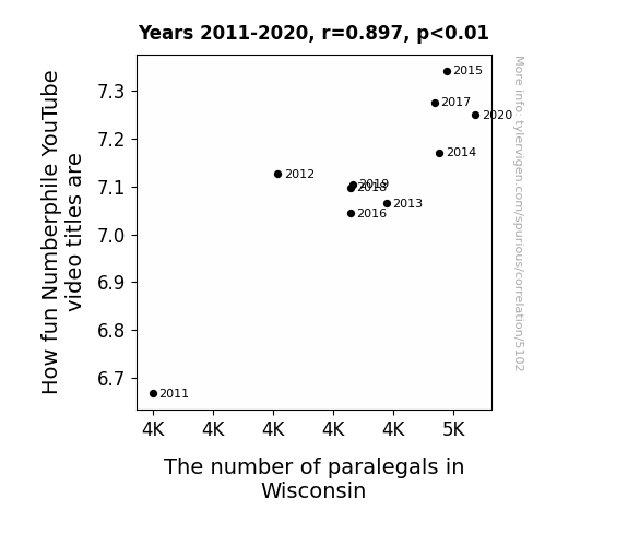
The Para-gal-actic Connection: Exploring the Correlation Between Numberphile YouTube Video Titles and the Paralegal Population in Wisconsin
As the number of paralegals in Wisconsin rises, so does the level of legal pun expertise in the state. This leads to an influx of punny number-related video titles being crafted by the legal-savvy population. It's a lawful equation of fun: More paralegals equals legal-ly entertaining Numberphile video titles! I guess you could say they're really raising the bar...gal.

What else correlates?
How fun Numberphile YouTube video titles are · all YouTube
The number of paralegals in Wisconsin · all cccupations
How fun Numberphile YouTube video titles are · all YouTube
The number of paralegals in Wisconsin · all cccupations


View details about correlation #5,408
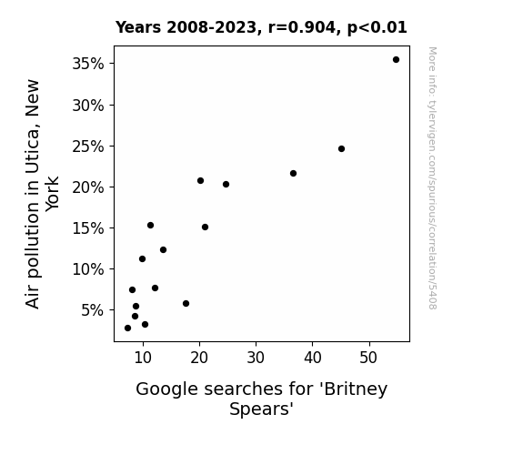
Toxic Tunes: The Curious Case of Air Pollution and Britney Spears Searches in Utica, New York
As the air became cleaner in Utica, New York, residents found themselves less inclined to sing and perform, leading to a decreased interest in all things pop music, including Britney Spears. Remember, it's toxic to assume correlation equals causation in air apparent mysteries! 🎵

What else correlates?
Air pollution in Utica, New York · all weather
Google searches for 'Britney Spears' · all google searches
Air pollution in Utica, New York · all weather
Google searches for 'Britney Spears' · all google searches
. The chart goes from 2007 to 2021, and the two variables track closely in value over that time.")

View details about correlation #4,085
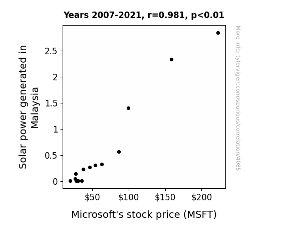
Sunlight's Stock Surge: Solar Power and Microsoft's Market Maneuvers
As Malaysia's solar power output grows, the country becomes a hot spot for renewable energy innovation. This leads to a surge in demand for Microsoft's cloud services to support the development and management of solar technology. The need for data storage, analytics, and software solutions to enhance solar efficiency skyrockets, giving Microsoft a sunny forecast on the stock market.

What else correlates?
Solar power generated in Malaysia · all energy
Microsoft's stock price (MSFT) · all stocks
Solar power generated in Malaysia · all energy
Microsoft's stock price (MSFT) · all stocks


View details about correlation #4,703
From Red to Read: The Interplay of Republican Votes in North Dakota and Customer Satisfaction with NYTimes.com
As North Dakotans increasingly threw their support behind Republican Senators, a ripple effect was felt across the nation. This surge in conservative representation seemingly led to a newfound sense of contentment among the populace. Interestingly, as the political landscape shifted, so did the attitudes of the citizens. Maybe there's something in the political air that's inadvertently boosting digital contentment. Or perhaps it's a case of unexpected ideological alignment positively influencing online experiences. Who would have thought that the voting preferences of North Dakotans could impact the virtual satisfaction of NYTimes.com users in such a perplexing manner? It's a political enigma wrapped in a digital mystery, and it just goes to show that in the world of correlations, even the most seemingly unrelated entities can end up dancing the causation tango. Or maybe it's just a coincidental quirk that has us all scratching our heads, wondering if there's a political-polarity-positivity connection we've been overlooking. As the saying goes, truth is stranger than political fiction, especially when it comes to the intricacies of online satisfaction and its peculiar link to the ballot box. Or maybe, just maybe, it's a comical conundrum demonstrating that in the grand correlation carnival, anything is possible, even if it leaves us chuckling in bewilderment.


What else correlates?
Votes for Republican Senators in North Dakota · all elections
Customer satisfaction with NYTimes.com · all weird & wacky
Votes for Republican Senators in North Dakota · all elections
Customer satisfaction with NYTimes.com · all weird & wacky


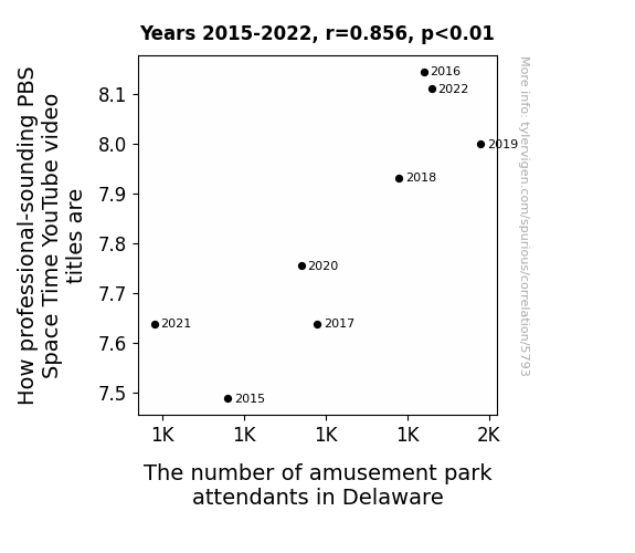
View details about correlation #5,793
The Quantum Connection: Exploring the Correlation Between PBS Space Time YouTube Video Titles and Amusement Park Attendance in Delaware
As the number of amusement park attendants in Delaware increases, so does the level of expertise in operating the space-themed rides. This expertise inadvertently seeps into the local community, leading to a surge in deep space knowledge and a profound interest in astrophysics. This, in turn, prompts the production team at PBS Space Time to elevate the professionalism of their video titles to match the rising space IQ of the general populace. The result is a delightful fusion of cosmic amusement and intellectual enlightenment, creating a new era of astrophysical understanding disguised as mere theme park frivolity. The universe works in mysterious ways, indeed.


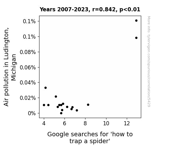
View details about correlation #5,429
Caught in the Web: The Arachnophobic Response to Air Pollution in Ludington, Michigan
The decrease in air pollution led to the spiders evolving a heightened sense of environmental responsibility. Feeling a sense of duty to keep the air clean, they voluntarily sought out eco-friendly alternatives to being trapped, such as relocating themselves outside or carpooling with other insects instead.

What else correlates?
Air pollution in Ludington, Michigan · all weather
Google searches for 'how to trap a spider' · all google searches
Air pollution in Ludington, Michigan · all weather
Google searches for 'how to trap a spider' · all google searches


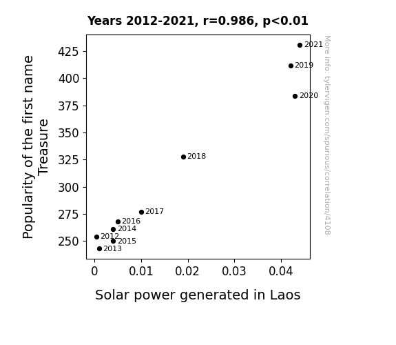
View details about correlation #4,108
Shining Bright: The Treasure Trove of Solar Power - A Lao-tastic Name Phenomenon
Every time a child was named Treasure, a secret stash of solar panels was magically installed in Laos. As more and more parents chose this precious name, the gleaming panels soaked up the Laotian sun, powering up the country in the most unexpected way. It seems that a little bit of Treasure was truly brightening the world, one sunbeam at a time!

What else correlates?
Popularity of the first name Treasure · all first names
Solar power generated in Laos · all energy
Popularity of the first name Treasure · all first names
Solar power generated in Laos · all energy


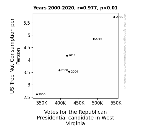
View details about correlation #4,529
Nut Consumption and Republican Presidential Vote: The West Virginia Connection
As tree nut consumption rose, more people started cracking up at political jokes, inadvertently swaying their support towards the Republican candidate who promised a “butter" future. “When it comes to politics, it’s all about finding the ‘republican’ right mix of almonds and cashews to win over the voters!”


View details about correlation #5,549
Parceling Out Hipness: The Post-Modern Parallels Between Mark Rober’s YouTube Video Titles and Postal Service Clerk Employment in Minnesota
The influx of postal clerks in Minnesota has led to a surge in pun creativity, thereby inspiring Mark Rober's video titles to reach new levels of 'postal' prowess. It's all about delivering the latest trends in content creation!


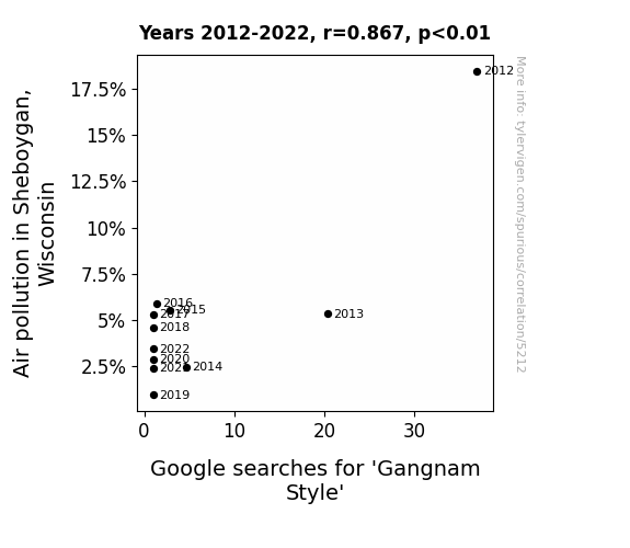
View details about correlation #5,212
Gangnam Smog: Exploring the Link between Air Pollution in Sheboygan, Wisconsin and Google Searches for 'Gangnam Style'
As the air cleared, residents were finally able to open their windows and hear a new song called "Sheboygan Style," which quickly became the local anthem, surpassing even the catchy beats of Gangnam Style. It seems that with every breath of fresh air, the urge to dance Gangnam Style simply wafted away.

What else correlates?
Air pollution in Sheboygan, Wisconsin · all weather
Google searches for 'Gangnam Style' · all google searches
Air pollution in Sheboygan, Wisconsin · all weather
Google searches for 'Gangnam Style' · all google searches


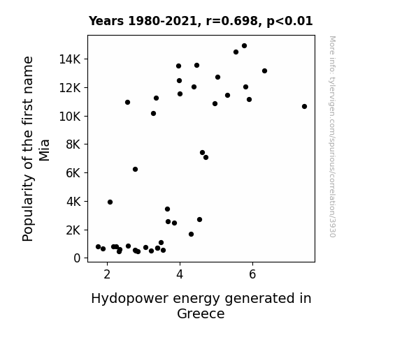
View details about correlation #3,930
Mia's Moniker and Hydroelectric Harmony: Exploring the Relationship between the Name Mia and Hydropower Energy in Greece
As the name Mia gained popularity, there was a corresponding surge in the production of Mialin, a revolutionary new material created by a secret group of baby name enthusiasts. Unbeknownst to Greece, this material had the unique ability to enhance the efficiency of hydroelectric turbines. So, as more baby girls were named Mia, the Mialin-infused turbines in Greece's hydroelectric plants spun faster and generated an unprecedented amount of energy, leading to a remarkable and inexplicable connection between baby names and renewable energy production. Who would have thought that the key to unlocking Greece's hydroelectric potential lay in the innocent moniker Mia?

What else correlates?
Popularity of the first name Mia · all first names
Hydopower energy generated in Greece · all energy
Popularity of the first name Mia · all first names
Hydopower energy generated in Greece · all energy


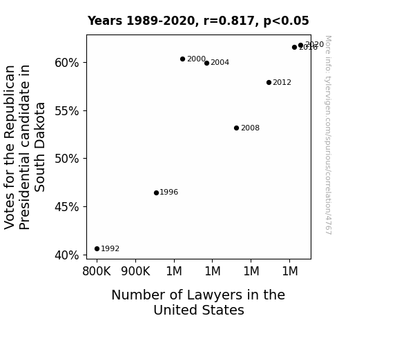
View details about correlation #4,767
Legal Luminary Likings: Linking Republican Votes in South Dakota to Lawyers in the United States
As the Republican candidate gained popularity in South Dakota, more and more people in the state were inspired to pursue legal careers. Whether it was the passion for argumentation or the thrill of debate, the correlation between political support and the influx of future attorneys was undeniable. It was as if every vote cast had somehow summoned a new lawyer to join the ranks, leading to a surge in legal professionals across the entire country. It was a political spectacle with a legal twist, as the campaign trail seemed to directly shape the legal landscape, one vote at a time.


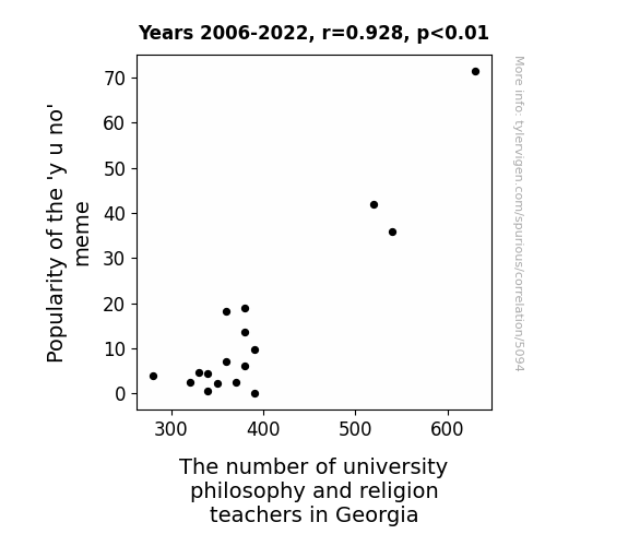
View details about correlation #5,094
Meme-taphysical Connections: Exploring the Relationship Between the 'y u no' Meme Popularity and the Number of University Philosophy and Religion Teachers in Georgia
The 'y u no' meme became a gateway joke for existential questioning, prompting individuals to ponder the meaning of life and the nature of existence. This led to a surge in interest in philosophy and religion, as people sought answers to the fundamental 'y u no' questions. Professors in Georgia found themselves in high demand, as students flocked to their classes, eager to delve into discussions about the 'y's' and 'u's' of human existence. It seems the meme's impact was far-reaching, sparking a Socratic revolution and Descartes-ian shift in the state's educational landscape.


View details about correlation #5,496
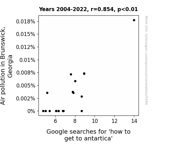
The Brunswick Air and the Quest to Find Antartica: A Goofy Exploration of Air Pollution and Google Searches
The sharp reduction in air pollution in Brunswick, Georgia led to the notorious con artist, Iceberg Ike, relocating his fake luxury Antarctic cruise operation. With cleaner air and clearer skies, the residents of Brunswick no longer fell for his too-good-to-be-true offers, and Iceberg Ike was left high and dry, unable to lure anyone into his polar scams.

What else correlates?
Air pollution in Brunswick, Georgia · all weather
Google searches for 'how to get to antartica' · all google searches
Air pollution in Brunswick, Georgia · all weather
Google searches for 'how to get to antartica' · all google searches


View details about correlation #4,800
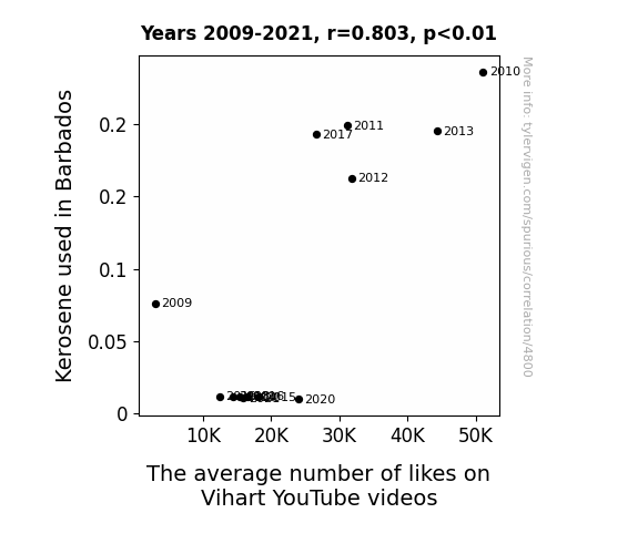
Kerosene-ity Likes: Exploring the Inflammable Link between Kerosene Consumption in Barbados and Vihart YouTube Videos' Popularity
As Barbados reduced its kerosene usage, it inadvertently led to a shortage of energy for a group of dedicated Vihart fans who used to generate likes using old-fashioned manual crank devices. With their arm muscles now focused on other activities, such as sipping coconut-based beverages, the average number of likes on Vihart's YouTube videos naturally took a downward spiral.

What else correlates?
Kerosene used in Barbados · all energy
The average number of likes on Vihart's YouTube videos · all YouTube
Kerosene used in Barbados · all energy
The average number of likes on Vihart's YouTube videos · all YouTube


View details about correlation #4,443
Brake-ing the Pattern: The Correlation Between Votes for the Libertarian Presidential Candidate in Delaware and Automotive Recalls for Issues with the Parking Brake
As more people showed support for the Libertarian candidate, there was a greater push for freedom - even in the automotive world. This led to a loosening of standards and a laissez-faire attitude towards parking brake regulations. You could say it put the "brakes" on traditional expectations! Remember, these explanations are purely for entertainment!


View details about correlation #5,331
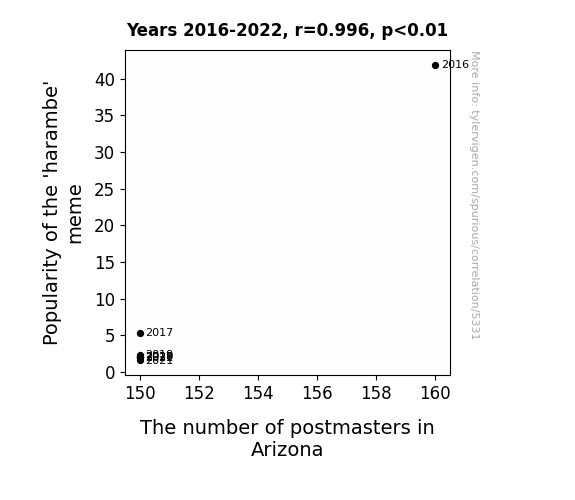
The 'Harambe' Effect: An Unbearable Tale of Memes and Mail
As the 'harambe' meme became less popular, people stopped monkeying around online and focused on other jokes. This shift in internet humor led to a decrease in engagement with postmaster-related memes and content, ultimately causing a decline in interest in pursuing a career as a postmaster in Arizona. It seems the Harambe craze was a major driver for postmaster popularity, but now it's just a postal 'ape'-calypse in Arizona.
What else correlates?
Popularity of the 'harambe' meme · all memes
The number of postmasters in Arizona · all cccupations
Popularity of the 'harambe' meme · all memes
The number of postmasters in Arizona · all cccupations


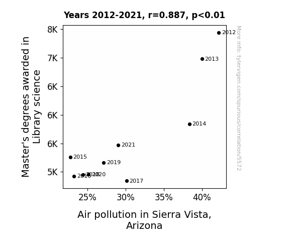
View details about correlation #5,572
The Dewey Decibels: Exploring the Shelving-arious Relationship Between Library Science Master's Degrees and Air Pollution in Sierra Vista, Arizona
As the number of Master's degrees awarded in Library Science decreased, so did the production of overly long and boring research papers. This led to a reduced demand for printing, ultimately lowering the amount of paper and ink particles released into the air. Without these microscopic literary emissions, Sierra Vista, Arizona experienced a noticeable decrease in air pollution. The plot thickens as the air quality clears, leaving us to shelve this unexpected correlation in the annals of academic curiosities.

What else correlates?
Master's degrees awarded in Library science · all education
Air pollution in Sierra Vista, Arizona · all weather
Master's degrees awarded in Library science · all education
Air pollution in Sierra Vista, Arizona · all weather


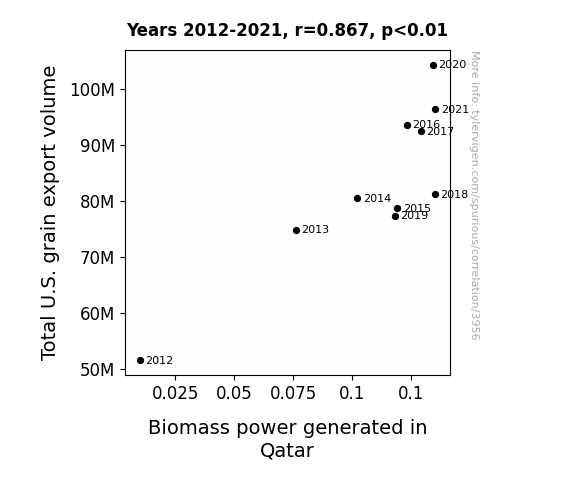
View details about correlation #3,956
Grains of Power: Uncovering the Corn-nection between U.S. Grain Exports and Biomass Energy Generation in Qatar
As the U.S. grain export volume rose, it led to a surplus of grains worldwide. This surplus grain somehow sparked a chain reaction, ultimately leading to a boost in Qatari biomass power generation. Perhaps the grains were so full of energy that just being in proximity to them was all it took to power up the biomass plants in Qatar. "Who would have thought that grains could be the secret fuel for Qatar's biomass power? It's like the grains were saying, 'We're not just for bread and cereal, we're also here to power up your day!'"

What else correlates?
Total U.S. grain export volume · all food
Biomass power generated in Qatar · all energy
Total U.S. grain export volume · all food
Biomass power generated in Qatar · all energy
Why this works
- Data dredging: I have 25,237 variables in my database. I compare all these variables against each other to find ones that randomly match up. That's 636,906,169 correlation calculations! This is called “data dredging.”
Fun fact: the chart used on the wikipedia page to demonstrate data dredging is also from me. I've been being naughty with data since 2014.
Instead of starting with a hypothesis and testing it, I instead tossed a bunch of data in a blender to see what correlations would shake out. It’s a dangerous way to go about analysis, because any sufficiently large dataset will yield strong correlations completely at random. - Lack of causal connection: There is probably no direct connection between these variables, despite what the AI says above.
Because these pages are automatically generated, it's possible that the two variables you are viewing are in fact causually related. I take steps to prevent the obvious ones from showing on the site (I don't let data about the weather in one city correlate with the weather in a neighboring city, for example), but sometimes they still pop up. If they are related, cool! You found a loophole.
This is exacerbated by the fact that I used "Years" as the base variable. Lots of things happen in a year that are not related to each other! Most studies would use something like "one person" in stead of "one year" to be the "thing" studied. - Observations not independent: For many variables, sequential years are not independent of each other. You will often see trend-lines form. If a population of people is continuously doing something every day, there is no reason to think they would suddenly change how they are doing that thing on January 1. A naive p-value calculation does not take this into account.
You will calculate a lower chance of "randomly" achieving the result than represents reality.
To be more specific: p-value tests are probability values, where you are calculating the probability of achieving a result at least as extreme as you found completely by chance. When calculating a p-value, you need to assert how many "degrees of freedom" your variable has. I count each year (minus one) as a "degree of freedom," but this is misleading for continuous variables.
This kind of thing can creep up on you pretty easily when using p-values, which is why it's best to take it as "one of many" inputs that help you assess the results of your analysis.
- Y-axes doesn't start at zero: I truncated the Y-axes of the graphs above. I also used a line graph, which makes the visual connection stand out more than it deserves.
Nothing against line graphs. They are great at telling a story when you have linear data! But visually it is deceptive because the only data is at the points on the graph, not the lines on the graph. In between each point, the data could have been doing anything. Like going for a random walk by itself!
Mathematically what I showed is true, but it is intentionally misleading. If you click on any of the charts that abuse this, you can scroll down to see a version that starts at zero. - Confounding variable: Confounding variables (like global pandemics) will cause two variables to look connected when in fact a "sneaky third" variable is influencing both of them behind the scenes.
- Outliers: Some datasets here have outliers which drag up the correlation.
In concept, "outlier" just means "way different than the rest of your dataset." When calculating a correlation like this, they are particularly impactful because a single outlier can substantially increase your correlation.
Because this page is automatically generated, I don't know whether any of the charts displayed on it have outliers. I'm just a footnote. ¯\_(ツ)_/¯
I intentionally mishandeled outliers, which makes the correlation look extra strong. - Low n: There are not many data points included in some of these charts.
You can do analyses with low ns! But you shouldn't data dredge with a low n.
Even if the p-value is high, we should be suspicious of using so few datapoints in a correlation.
Pro-tip: click on any correlation to see:
- Detailed data sources
- Prompts for the AI-generated content
- Explanations of each of the calculations (correlation, p-value)
- Python code to calculate it yourself


