spurious correlations
discover · random · spurious scholar
← previous page · next page →


View details about correlation #4,491
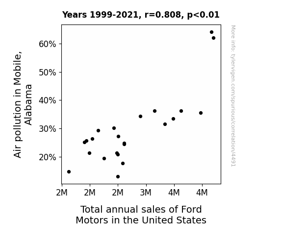
Correlation of Catastrophic Car Sales: Examining the Association Between Air Pollution in Mobile, Alabama and Ford Motors' Fluctuating Figures
As the air got cleaner in Mobile, people no longer felt the need to Ford away from the pollution, leading to a drop in total annual sales of Ford Motors in the United States. The correlation is clear - fresher air meant fewer people were revved up about buying Ford vehicles! It seems like in this case, a breath of fresh air led to a stall in Ford sales nationwide.

What else correlates?
Air pollution in Mobile, Alabama · all weather
Total annual sales of Ford Motors in the United States · all weird & wacky
Air pollution in Mobile, Alabama · all weather
Total annual sales of Ford Motors in the United States · all weird & wacky
. The chart goes from 2007 to 2023, and the two variables track closely in value over that time.")

View details about correlation #5,791
The View Counts Connection: A Reel Analysis of Total SmarterEveryDay YouTube Views and Warner Bros. Discovery Stock Price
As more people watched SmarterEveryDay, they became invested in learning and knowledge. This led to a surge in overall brainpower, triggering a spike in innovative thinking. The stock price for Warner Bros. Discovery, known for its creative content, soared as a result, riding the waves of intellect and imagination. The connection between Total views and WBD stock price turned out to be truly 'discovery' for the market!


What else correlates?
Total views on SmarterEveryDay YouTube videos · all YouTube
Warner Bros. Discovery's stock price (WBD) · all stocks
Total views on SmarterEveryDay YouTube videos · all YouTube
Warner Bros. Discovery's stock price (WBD) · all stocks


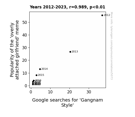
View details about correlation #5,073
A Meme-orable Affair: 'Overly Attached Girlfriend' Popularity Correlates with 'Gangnam Style' Searches
The collective internet consciousness simply couldn't handle both the clingy girlfriend and the catchy Korean dance sensation at the same time. It's like there was a limited amount of absurdity in meme form that the universe could handle, and the 'overly attached girlfriend' used up so much of it that there was just no room left for 'Gangnam Style'.

What else correlates?
Popularity of the 'overly attached girlfriend' meme · all memes
Google searches for 'Gangnam Style' · all google searches
Popularity of the 'overly attached girlfriend' meme · all memes
Google searches for 'Gangnam Style' · all google searches


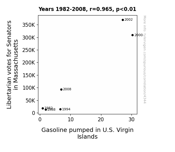
View details about correlation #4,344
The Gaslighting of Libertarian Votes: Uncovering the Link Between Massachusetts Senatorial Preferences and U.S. Virgin Islands Gasoline Consumption
As more Libertarians voted for Senators in Massachusetts, it sparked a widespread passion for freedom and independence. This surge in individual autonomy somehow led to a boom in the gasoline industry in the U.S. Virgin Islands, creating a real "fuel" for self-governing ideals. It's almost as if the Bay State voters inadvertently ignited a chain reaction, proving that when it comes to politics and petroleum, it's all about that "Mass-terious" connection!
What else correlates?
Votes for Libertarian Senators in Massachusetts · all elections
Gasoline pumped in U.S. Virgin Islands · all energy
Votes for Libertarian Senators in Massachusetts · all elections
Gasoline pumped in U.S. Virgin Islands · all energy


View details about correlation #4,546
Romantic Roanoke and xkcd: Revisiting Romance in Response to Pollution
As the air became cleaner, the city's lovebirds were finally able to focus on their own romantic lives instead of just trying to breathe. With clearer skies, they felt inspired to create their own swoon-worthy moments instead of relying on xkcd for their daily dose of romance!


What else correlates?
Air pollution in Roanoke, Virginia · all weather
xkcd comics published about romance · all weird & wacky
Air pollution in Roanoke, Virginia · all weather
xkcd comics published about romance · all weird & wacky


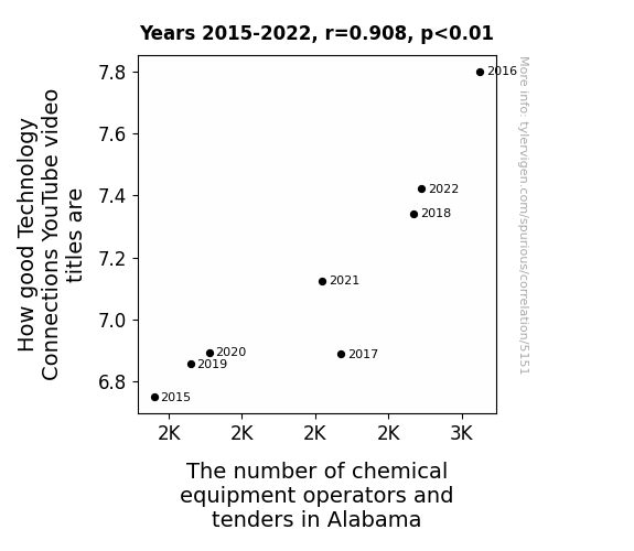
View details about correlation #5,151
Tech Connection Selection: A Rhyming Reflection on YouTube Video Titles and Chemical Equipment Operators and Tenders in Alabama
As the precision of technology-related puns and wordplay on YouTube improves, it inadvertently triggers a wave of inspiration among chemical equipment operators and tenders in Alabama. The enhanced linguistic reactions create a chain of ionic laughter, leading to a higher level of job satisfaction. This, in turn, sparks a chemical reaction in the workforce, causing a noticeable spike in the number of operators and tenders who just can't resist the attraction to work with such 'positively charged' equipment. In this case, the catalyst for career growth literally boils down to the power of well-connected tech humor, proving that when it comes to occupational influence, it all boils down to the punny business of chemistry!


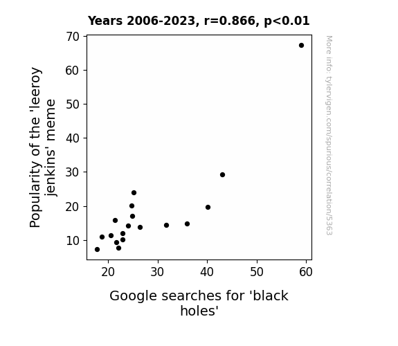
View details about correlation #5,363
Black Holes and Leeroy Jenkins: A Correlation Amongst Pop Culture Phenomena and Cryptic Cosmic Enigmas
The 'leeroy jenkins' meme was sucking up all the internet's attention, creating a gravitational pull on our collective consciousness. As it lost popularity, the meme's gravitational meme-ld (get it?) weakened, allowing people to focus on more celestial matters like black holes. It seems the meme's reign of 'terrorizing' our online spaces had a time limit, much like the event horizon of a black hole!

What else correlates?
Popularity of the 'leeroy jenkins' meme · all memes
Google searches for 'black holes' · all google searches
Popularity of the 'leeroy jenkins' meme · all memes
Google searches for 'black holes' · all google searches


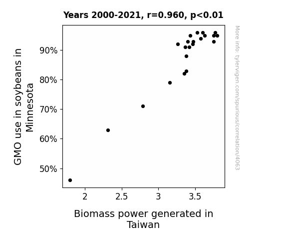
View details about correlation #4,063
Seeding Growth: The Genetically Modified Connection Between Soybeans in Minnesota and Biomass Power in Taiwan
As the GMO soybeans in Minnesota grew larger and more robust, their collective energy somehow resonated with the Biomass power stations in Taiwan, leading to a surge in power production. It's like the soybeans were broadcasting a power-boosting signal across the seas - a truly leguminous feat of electrical engineering!

What else correlates?
GMO use in soybeans in Minnesota · all food
Biomass power generated in Taiwan · all energy
GMO use in soybeans in Minnesota · all food
Biomass power generated in Taiwan · all energy


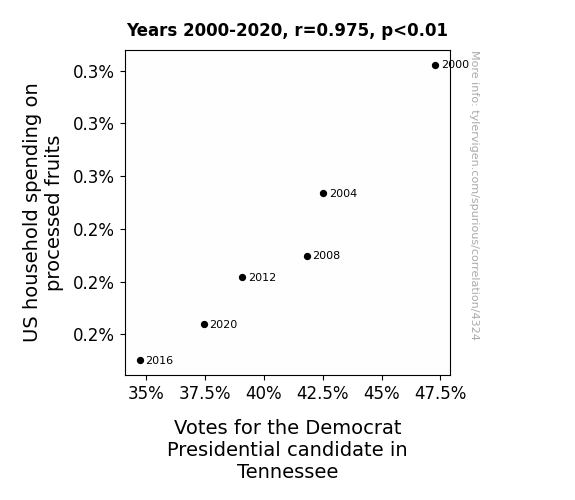
View details about correlation #4,324
Peeling Back the Layers: A Fruitful Investigation into Household Spending on Processed Fruits and Votes for the Democrat Presidential Candidate in Tennessee
As households cut back on processed fruits, their cognitive functions declined, leading to a decreased ability to engage in political discussions. This ultimately resulted in lower voter turnout for the Democrat candidate in Tennessee as people were too busy arguing about the importance of fruit in their diets instead of heading to the polls. Remember, a democracy runs on smoothie discussions and fruit-filled debates!


View details about correlation #5,687
The Thrilling Theoretical Ties: The Tantalizing Relationship Between The Game Theorists' YouTube Video Titles and The Trickle of Coaches and Scouts in Tacky New Hampshire
As the number of coaches and scouts in New Hampshire skyrockets, there's fierce competition to find the best talent. This leads to a clandestine society of game theory enthusiasts infiltrating the recruitment scene, analyzing player statistics and strategies using complex mathematical models. Suddenly, the key to discovering the next sports prodigy lies not in traditional scouting methods, but in understanding the intricate game theories proposed by a certain YouTube channel. As a result, The Game Theorists' video titles are forced to up their game, becoming more enticing and thought-provoking in a bid to attract this new wave of sports-minded viewers. It's a bizarre yet undeniable chain reaction - who knew that the future of athletics in New Hampshire would be shaped by the captivating allure of video titles?


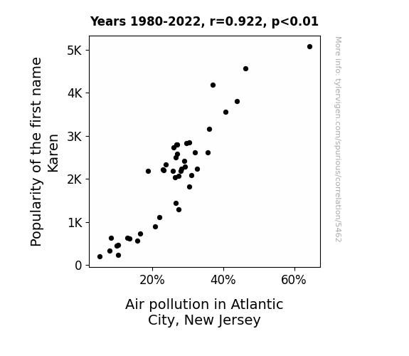
View details about correlation #5,462
Fair Karens Beware - The Air Pollution Affair: A Quirk in Atlantic City's Air Quality
As fewer babies were named Karen, there was a decrease in demand for personalized novelty license plates. This led to a reduction in the production and transportation of these plates, ultimately decreasing overall air pollution in Atlantic City, New Jersey. With fewer Karen-themed souvenirs being made and sold, the air quality in the bustling boardwalk area improved.

What else correlates?
Popularity of the first name Karen · all first names
Air pollution in Atlantic City, New Jersey · all weather
Popularity of the first name Karen · all first names
Air pollution in Atlantic City, New Jersey · all weather


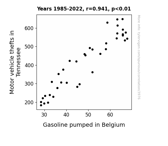
View details about correlation #3,976
Pump It Up: Exploring the Surprising Relationship Between Motor Vehicle Thefts in Tennessee and Gasoline Pumped in Belgium
As the number of car thefts in Tennessee dwindled, there was a corresponding decrease in the demand for gasoline in the state. This led to a surplus of gasoline, which, in a surprising turn of events, was exported to Belgium. The sudden influx of American gasoline in Belgium caused a shift in the local market, leading to a decrease in the amount of gasoline being pumped. It seems even gas can't escape the far-reaching impact of car theft trends!

What else correlates?
Motor vehicle thefts in Tennessee · all random state specific
Gasoline pumped in Belgium · all energy
Motor vehicle thefts in Tennessee · all random state specific
Gasoline pumped in Belgium · all energy


View details about correlation #4,445
Air Bags vs Ballots: An Unexpected Connection Between Libertarian Votes in Virginia and Automotive Recalls
As more people supported the idea of a hands-off government, it inadvertently led to a lack of oversight in the automotive industry. This created a deflating situation for air bag safety, ultimately inflating the number of recalls. It seems like the campaign slogan should have been "Libertarian candidate: Deflating government involvement, one airbag at a time."


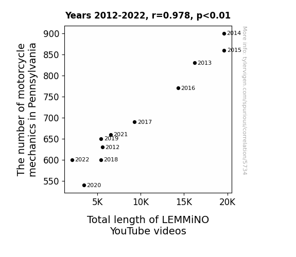
View details about correlation #5,734
Vrooming into YouTube: The High Correlation Between the Number of Motorcycle Mechanics in Pennsylvania and Total Length of LEMMiNO YouTube Videos
As the number of motorcycle mechanics in Pennsylvania surged, there was a corresponding spike in energy and efficiency in the state. This palpable buzz found its way to LEMMiNO, inspiring longer and more electrifying videos. One could say the mechanics were really fueling the content!

What else correlates?
The number of motorcycle mechanics in Pennsylvania · all cccupations
Total length of LEMMiNO YouTube videos · all YouTube
The number of motorcycle mechanics in Pennsylvania · all cccupations
Total length of LEMMiNO YouTube videos · all YouTube


View details about correlation #4,963
The 'Dumb Ways to Die' Meme: A Killer Connection to Google Searches for 'Google'
As the 'dumb ways to die' meme gained traction, more and more people sought it out on the internet. The constant mention of 'dumb ways to die' subconsciously reminded people of their mortality, prompting them to contemplate life's fleeting nature. This existential crisis led to a surge in Google searches as individuals frantically sought answers to life's big questions, inadvertently driving up the overall interest in googling, and ultimately, causing a spike in Google searches for 'google'. It's a classic case of internet shenanigans indirectly prompting a profound quest for meaning and knowledge!


What else correlates?
Popularity of the 'dumb ways to die' meme · all memes
Google searches for 'google' · all google searches
Popularity of the 'dumb ways to die' meme · all memes
Google searches for 'google' · all google searches


View details about correlation #3,813
In the Air Tonight: Unraveling the Link Between Ottawa's Air Pollution and Former Czechoslovakia's Jet Fuel Consumption
The cleaner air in Ottawa led to an influx of supercharged Canadian geese. These geese, known for their impeccable navigation skills, were hired by the Czechoslovakian government to provide eco-friendly aerial transportation, effectively reducing the need for traditional jet fuel. Remember, when it comes to fuel efficiency, never underestimate the power of a well-trained flock!

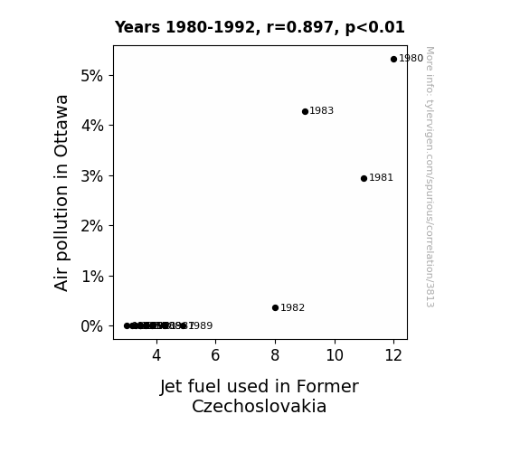
What else correlates?
Air pollution in Ottawa · all weather
Jet fuel used in Former Czechoslovakia · all energy
Air pollution in Ottawa · all weather
Jet fuel used in Former Czechoslovakia · all energy


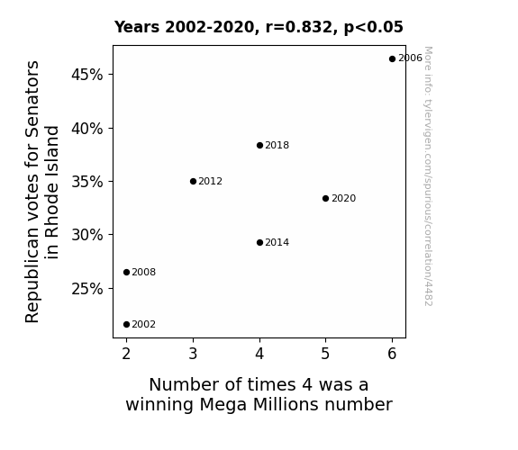
View details about correlation #4,482
Rolling the Dice: The Elec-Numbers Connection Between Republican Votes for Senators in Rhode Island and Winning Mega Millions Numbers
Every time a Republican Senator was elected, it added to the "re-districting" of luck in the state, increasing the odds of the number 4 coming out on top in the Mega Millions drawing. The political shift must have sparked a conservative estimate that 4 was the winning number, leading to a 'republican' of unexpected winners!


View details about correlation #5,678
The Titillating Ties: Tallying the Tremendous Traction of Computerphile's YouTube Titles and The Taskforce of Tidiers in Illinois
As the number of janitors and cleaners in Illinois increases, so does the quality of Computerphile YouTube video titles. This is because the fresh scent of clean floors and the sound of mops swishing somehow inspire the creators to come up with more captivating and click-worthy titles. It's like a cleaning-fueled creativity boost, sparking a connection between sanitation and sensational video headings. Who knew that the key to digital content success lay in the hands of custodial staff in the Land of Lincoln? It's a tidy lesson in the mysterious ways of video production inspiration!


View details about correlation #4,990
A Brew-Tiful Relationship: Exploring the Correlation Between Brewery Growth and the 'This is Fine' Meme
As the number of breweries in the United States increased, so did the production of beer. This led to a surplus of hops, which in turn sparked a resurgence in the agricultural industry. With more people working on farms, there was a greater demand for farming equipment. This, unsurprisingly, led to a boom in the manufacturing sector. As the manufacturing sector expanded, more and more individuals found employment in factories. With this rise in factory work, there was a newfound need for workplace safety regulations. This, ultimately, resulted in a nation-wide campaign promoting safety in all environments. And as the campaign for safety gained momentum, so did the 'this is fine' meme, which ironically depicts a dog calmly sipping coffee while everything around it is in flames. So, in a roundabout way, we have the increase in breweries to thank for the fiery popularity of the 'this is fine' meme.


What else correlates?
The number of Breweries in the United States · all food
Popularity of the 'this is fine' meme · all memes
The number of Breweries in the United States · all food
Popularity of the 'this is fine' meme · all memes


View details about correlation #3,763
Chasing Convictions: Exploring the Link Between Bachelor's Degrees in Law Enforcement and Hydropower Energy Generation in Uruguay
As more people pursued law enforcement degrees, they became experts at current flow and decided to dam up the rivers for hydroelectric power, leading to a shocking increase in Uruguay's hydropower energy production. It's a case of higher education making waves in renewable energy!

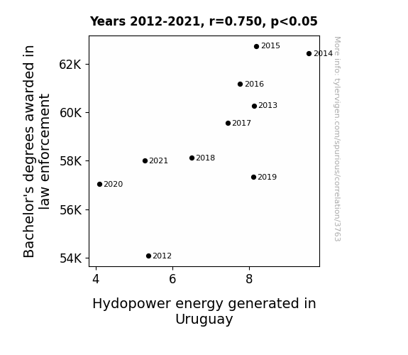
What else correlates?
Bachelor's degrees awarded in law enforcement · all education
Hydopower energy generated in Uruguay · all energy
Bachelor's degrees awarded in law enforcement · all education
Hydopower energy generated in Uruguay · all energy
Why this works
- Data dredging: I have 25,237 variables in my database. I compare all these variables against each other to find ones that randomly match up. That's 636,906,169 correlation calculations! This is called “data dredging.”
Fun fact: the chart used on the wikipedia page to demonstrate data dredging is also from me. I've been being naughty with data since 2014.
Instead of starting with a hypothesis and testing it, I instead tossed a bunch of data in a blender to see what correlations would shake out. It’s a dangerous way to go about analysis, because any sufficiently large dataset will yield strong correlations completely at random. - Lack of causal connection: There is probably no direct connection between these variables, despite what the AI says above.
Because these pages are automatically generated, it's possible that the two variables you are viewing are in fact causually related. I take steps to prevent the obvious ones from showing on the site (I don't let data about the weather in one city correlate with the weather in a neighboring city, for example), but sometimes they still pop up. If they are related, cool! You found a loophole.
This is exacerbated by the fact that I used "Years" as the base variable. Lots of things happen in a year that are not related to each other! Most studies would use something like "one person" in stead of "one year" to be the "thing" studied. - Observations not independent: For many variables, sequential years are not independent of each other. You will often see trend-lines form. If a population of people is continuously doing something every day, there is no reason to think they would suddenly change how they are doing that thing on January 1. A naive p-value calculation does not take this into account.
You will calculate a lower chance of "randomly" achieving the result than represents reality.
To be more specific: p-value tests are probability values, where you are calculating the probability of achieving a result at least as extreme as you found completely by chance. When calculating a p-value, you need to assert how many "degrees of freedom" your variable has. I count each year (minus one) as a "degree of freedom," but this is misleading for continuous variables.
This kind of thing can creep up on you pretty easily when using p-values, which is why it's best to take it as "one of many" inputs that help you assess the results of your analysis.
- Y-axes doesn't start at zero: I truncated the Y-axes of the graphs above. I also used a line graph, which makes the visual connection stand out more than it deserves.
Nothing against line graphs. They are great at telling a story when you have linear data! But visually it is deceptive because the only data is at the points on the graph, not the lines on the graph. In between each point, the data could have been doing anything. Like going for a random walk by itself!
Mathematically what I showed is true, but it is intentionally misleading. If you click on any of the charts that abuse this, you can scroll down to see a version that starts at zero. - Confounding variable: Confounding variables (like global pandemics) will cause two variables to look connected when in fact a "sneaky third" variable is influencing both of them behind the scenes.
- Outliers: Some datasets here have outliers which drag up the correlation.
In concept, "outlier" just means "way different than the rest of your dataset." When calculating a correlation like this, they are particularly impactful because a single outlier can substantially increase your correlation.
Because this page is automatically generated, I don't know whether any of the charts displayed on it have outliers. I'm just a footnote. ¯\_(ツ)_/¯
I intentionally mishandeled outliers, which makes the correlation look extra strong. - Low n: There are not many data points included in some of these charts.
You can do analyses with low ns! But you shouldn't data dredge with a low n.
Even if the p-value is high, we should be suspicious of using so few datapoints in a correlation.
Pro-tip: click on any correlation to see:
- Detailed data sources
- Prompts for the AI-generated content
- Explanations of each of the calculations (correlation, p-value)
- Python code to calculate it yourself


