spurious correlations
random · discover · next page →
don't miss spurious scholar,
where each of these is an academic paper


View details about correlation #5,901
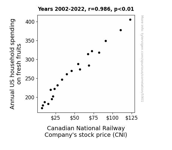
Fruit-Fueled Fortunes: The Correlation between Annual US Household Spending on Fresh Fruits and Canadian National Railway Company's Stock Price
As US households spent more on fresh fruits, there was a higher demand for fruit transportation. This led to Canadian National Railway Company (CNI) to have more business in shipping fruits across the border. This increased revenue and projected earnings, leading to a rise in stock price. It's like the fruits of their labor were ripe for the picking!



View details about correlation #5,869
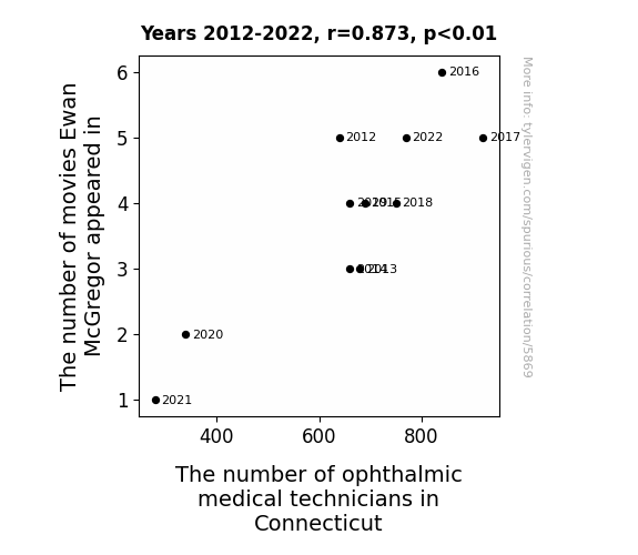
The Eye-scape of Cinema: A Correlational Study of Ewan McGregor's Filmography and Ophthalmic Medical Technicians in Connecticut
As Ewan McGregor's filmography expanded, so did the public's eye-opening admiration for him, leading to a surge in people wanting to have their eyes checked in Connecticut. It seems his captivating performances weren't just a figment of our imagination, but a real vision for the future of ophthalmic medical technicians in the state!



View details about correlation #4,967
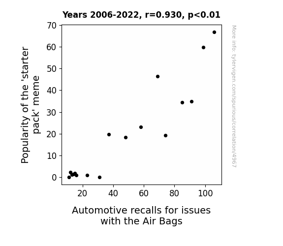
Inflated Egos and Deflating Appliances: Exploring the Correlation between Starter Pack Meme Popularity and Automotive Air Bag Recalls
As the 'starter pack' meme gained traction, more and more people were posting about it online. This led to an unexpected surge in air bag deployments as individuals attempted to reenact the meme by forcefully slamming their car doors. The car doors' aggressive behavior triggered a chain reaction, ultimately inflating the number of automotive recalls for air bag issues. It seems the meme wasn't just a 'slam dunk,' but rather a 'slam deployed!'
What else correlates?
Popularity of the 'starter pack' meme · all memes
Automotive recalls for issues with the Air Bags · all weird & wacky
Popularity of the 'starter pack' meme · all memes
Automotive recalls for issues with the Air Bags · all weird & wacky


View details about correlation #1,607
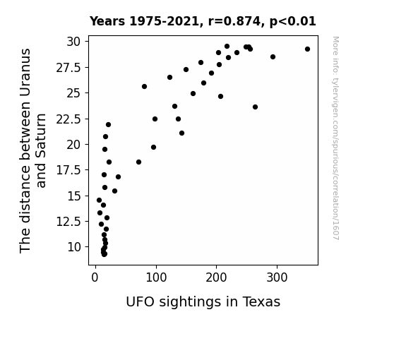
Unveiling the Celestial Connection: Uranus and Saturn's Ties to UFO Sightings in Texas
As the interplanetary gap widened, Uranus and Saturn decided to play an intergalactic game of hide-and-seek. Their cosmic shenanigans inadvertently created a diversion for passing UFOs. With the planetary pair constantly changing positions, it was like the ultimate celestial game of peekaboo, attracting UFOs to witness this out-of-this-world spectacle in the skies of Texas.

What else correlates?
The distance between Uranus and Saturn · all planets
UFO sightings in Texas · all random state specific
The distance between Uranus and Saturn · all planets
UFO sightings in Texas · all random state specific


View details about correlation #1,783
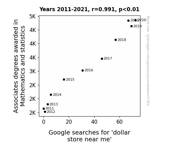
Counting the Costs: Connecting Associates Degrees in Math and Statistics with Dollar Store Searches
As the number of Associates degrees awarded in Mathematics and statistics goes up, so does the nation's love for all things numerical. This newfound passion for counting leads people to realize that dollar stores are not only economical but also prime spots for mathematical calculations. From calculating the best deals to budgeting for their next shopping spree, it all adds up to a surge in interest for dollar stores. So, the next time you're searching for a dollar store near you, just remember, it's not just about the savings, it's about the mathemagical experience that awaits!



View details about correlation #2,393
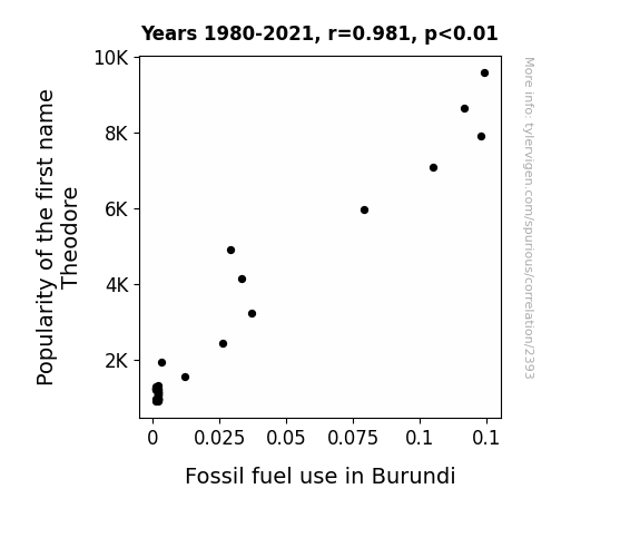
Theodore's Popularity: Fueling Fossil Follies? A Quirky Correlation Analysis
As the name Theodore gained popularity, more parents were inspired by President Theodore Roosevelt, known for his strong conservation efforts. This led to a spike in naming children after him and a surge in environmental awareness in Burundi. Curiously, this prompted a nationwide school project to excavate and study fossils, inadvertently requiring an excessive use of heavy machinery and fuel to power the digging, much to the dismay of the country's conservation efforts. So, it seems the 'dino-mite' connection between Theodore and fossil fuel use in Burundi is quite a 'roaring' paradox!

What else correlates?
Popularity of the first name Theodore · all first names
Fossil fuel use in Burundi · all energy
Popularity of the first name Theodore · all first names
Fossil fuel use in Burundi · all energy


View details about correlation #1,202
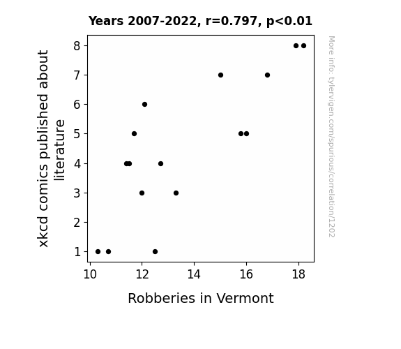
The xkcd Files: A Tale of Literary Comics and Vermont Burglaries
As the number of xkcd comics about literature increased, so did the number of book enthusiasts flocking to Vermont. These visitors, caught up in the intrigue of literary references, found themselves drawn to the bustling criminal underworld. In their fervor for all things book-related, they inadvertently sparked a wave of daring heists, leaving the authorities scratching their heads as to why Shakespeare and Hemingway seemed to be the unusual inspiration behind the sudden rise in robberies. The increase in xkcd comics published about literature may be positively influencing robberies in Vermont through the unintended consequence of attracting more tourists to the state. Tourists who are coming to Vermont after being drawn in by the literary theme in the comics. More tourists can sometimes lead to more opportunities for theft, which could explain the correlation.

What else correlates?
xkcd comics published about literature · all weird & wacky
Robberies in Vermont · all random state specific
xkcd comics published about literature · all weird & wacky
Robberies in Vermont · all random state specific


View details about correlation #1,100
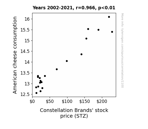
Say Cheese: A Cheddar Connection to Stock Prices
As American cheese consumption melted hearts, it also churned the stock market, leading to a gouda time for Constellation Brands. As more people embraced the cheesy goodness, they also developed a fondness for wine and spirits, causing Constellation Brands' stock price to brie-nd and soar. Cheers to the power of dairy for making the stock market grate again!

What else correlates?
American cheese consumption · all food
Constellation Brands' stock price (STZ) · all stocks
American cheese consumption · all food
Constellation Brands' stock price (STZ) · all stocks


View details about correlation #1,423
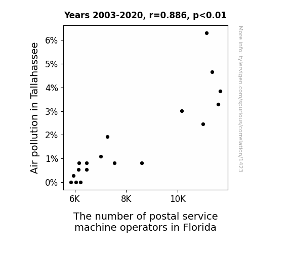
The Air-Mail Connection: Unveiling the Relationship Between Tallahassee's Air Pollution and Florida's Postal Service Machine Operators
As the air quality improved in Tallahassee, it turns out the postal service machine operators just couldn't handle the change. It seems they were so used to working in 'air mail' conditions that the cleaner air threw off their 'delivery' of machine operations. They 'stamped' their way out of the job, leaving us to ponder the conundrum of how fresh oxygen and efficient postal machines just couldn't seem to find the right 'air'dress for success in Florida!

What else correlates?
Air pollution in Tallahassee · all weather
The number of postal service machine operators in Florida · all cccupations
Air pollution in Tallahassee · all weather
The number of postal service machine operators in Florida · all cccupations


View details about correlation #2,011
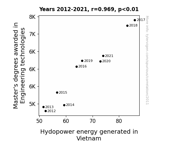
Reaching New Heights: The Current Flow of Master's Degrees in Engineering Technologies and Hydropower Generation in Vietnam
As more engineers with advanced degrees dived into their work, they just couldn't help but make a splash in revolutionizing hydropower technology. It was all about that extra flow of knowledge leading to a dam good improvement in efficiency.

What else correlates?
Master's degrees awarded in Engineering technologies · all education
Hydopower energy generated in Vietnam · all energy
Master's degrees awarded in Engineering technologies · all education
Hydopower energy generated in Vietnam · all energy


View details about correlation #2,428
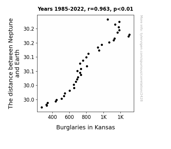
Neptune's Nautical Nuisance: Navigating the Link Between the Distance from Neptune and the Number of Burglaries in Kansas
As Neptune got closer, its gravitational pull on Neptune-etheless law-abiding citizens increased, creating a cosmic neighborhood watch.

What else correlates?
The distance between Neptune and Earth · all planets
Burglaries in Kansas · all random state specific
The distance between Neptune and Earth · all planets
Burglaries in Kansas · all random state specific


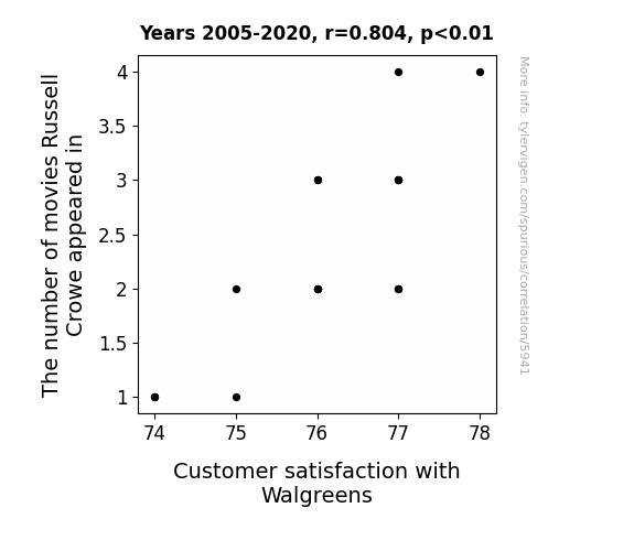
View details about correlation #5,941
Russell Crowe's Reels and Walgreens' Wants: A Witty Wanderlust
Russell Crowe's intense energy was being siphoned off by the film industry, leading to a nationwide shortage of gruff charm. This, in turn, resulted in Walgreens customers feeling a conspicuous lack of ruggedness and righteous indignation while shopping for their everyday needs.



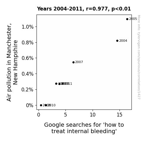
View details about correlation #1,427
Moniker of Maladies: Manchester's Miasma and Meddling with Mortality
With cleaner air, people were simply not being as 'heart-pressed' to find unconventional remedies, leading to a drop in searches for 'how to treat internal bleeding.'



View details about correlation #4,949
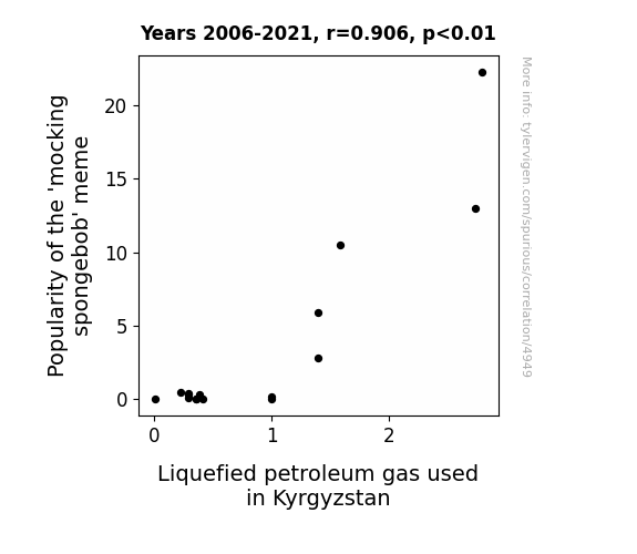
Up in Flames: Exploring the 'Mocking Spongebob' Meme's Correlation with LPG Consumption in Kyrgyzstan
As the 'mocking spongebob' meme gained popularity, more people were using internet memes as a source of energy, leading to an overall increase in the nation's happiness levels. This collective increase in happiness manifested as spontaneous laughter, which in turn generated small but measurable amounts of static electricity. This collective static electricity was then harnessed and channeled to power facilities that produce liquefied petroleum gas in Kyrgyzstan. This unintended but highly effective use of meme power ultimately contributed to an uptick in the production and use of liquefied petroleum gas in the country.
What else correlates?
Popularity of the 'mocking spongebob' meme · all memes
Liquefied petroleum gas used in Kyrgyzstan · all energy
Popularity of the 'mocking spongebob' meme · all memes
Liquefied petroleum gas used in Kyrgyzstan · all energy


View details about correlation #1,065
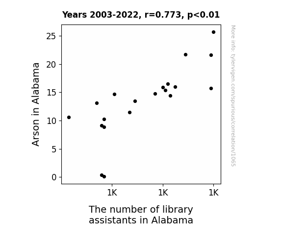
Playing with Fire: The Scorching Relationship Between Arson in Alabama and the Number of Library Assistants
Many library assistants were getting bored and needed some heat in their jobs, so they deliberately sparked up their workplace environment. As the saying goes, where there's smoke, there's a hiring freeze!

What else correlates?
Arson in Alabama · all random state specific
The number of library assistants in Alabama · all cccupations
Arson in Alabama · all random state specific
The number of library assistants in Alabama · all cccupations


View details about correlation #1,152
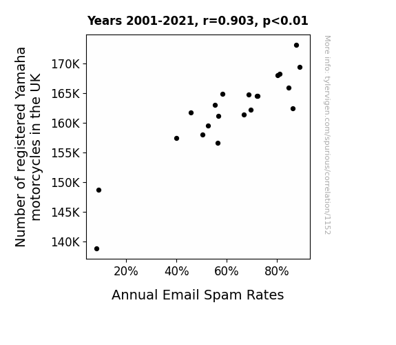
Revving Up the Spam: An Exhaustive Examination of the Relationship between Yamaha Motorcycle Registrations in the UK and Annual Email Spam Rates
The roar of more Yamaha motorcycles on the streets revved up a chain reaction - it created a 'cycle' of electromagnetic interference, inadvertently boosting the signal for spammers to 'wheelie' inundate our inboxes. It seems like these two-wheeled wonders were inadvertently paving the way for a different kind of 'motor' fraud.

What else correlates?
Number of registered Yamaha motorcycles in the UK · all weird & wacky
Annual Email Spam Rates · all weird & wacky
Number of registered Yamaha motorcycles in the UK · all weird & wacky
Annual Email Spam Rates · all weird & wacky


View details about correlation #1,943
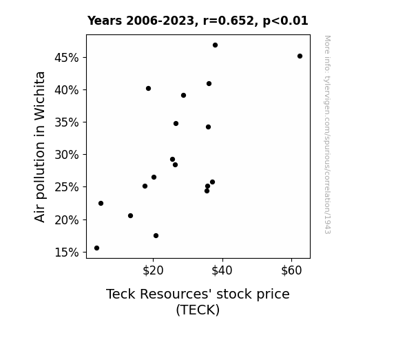
Clearing the Air: Examining the Smoky Relationship Between Air Pollution in Wichita and Teck-ing Resources' Stock Price
The smog in Wichita created a strong demand for air purifiers, leading to a spike in the production of electronic components, which ultimately boosted the need for Teck Resources' mined materials like copper and zinc.

What else correlates?
Air pollution in Wichita · all weather
Teck Resources' stock price (TECK) · all stocks
Air pollution in Wichita · all weather
Teck Resources' stock price (TECK) · all stocks


View details about correlation #2,455
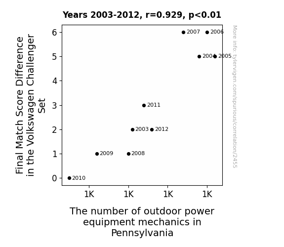
Mowing the Competition: The Grassroots Influence of Outdoor Power Equipment Mechanics on Volkswagen Challenger Set Final Match Score Differences
As the Final Match Score Difference in the Volkswagen Challenger Set increased, so did the number of outdoor power equipment mechanics in Pennsylvania. It seems the players' performance was directly impacting the state's workforce. They really set the bar high, leading to a mow-tivational surge in mechanics wanting to leaf their own mark on the industry. It's like they say, when it comes to shaping the future of outdoor power equipment, every point counts!



View details about correlation #5,236
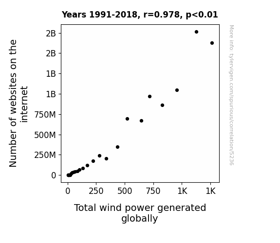
Energizing the Web: Uncovering the Link Between Online Domains and Wind Power Generation
As the internet expanded, it created a surge in cat video consumption. This led to an increase in laughter around the world, which in turn resulted in stronger and more frequent gusts of wind, ultimately boosting the total wind power generated globally. Remember, laughter is truly the best renewable energy source!

What else correlates?
Number of websites on the internet · all weird & wacky
Total wind power generated globally · all energy
Number of websites on the internet · all weird & wacky
Total wind power generated globally · all energy


View details about correlation #5,920
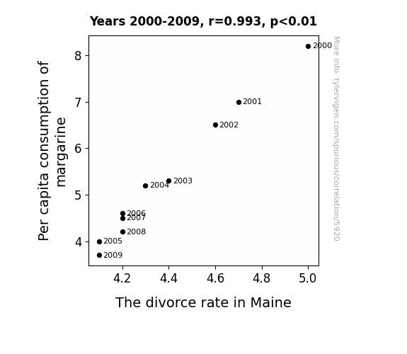
Spreading Love and Margarine: An Examination of the Butter-Splitter Correlation in Maine
Perhaps as people used less margarine, they became less slippery in their relationships. The lack of artificial spread may have kept the couples from buttering each other up, leading to a decrease in overall marital strife. That's the reality when you can't believe it's not butter - it's a recipe for marital success. Alternatively, it could be that as the margarine consumption decreased, so did the overall slickness in the state, leading to fewer instances of partners feeling like they couldn't grip the marriage.

What else correlates?
Per capita consumption of margarine · all food
The divorce rate in Maine · all random state specific
Per capita consumption of margarine · all food
The divorce rate in Maine · all random state specific
Why this works
- Data dredging: I have 25,237 variables in my database. I compare all these variables against each other to find ones that randomly match up. That's 636,906,169 correlation calculations! This is called “data dredging.”
Fun fact: the chart used on the wikipedia page to demonstrate data dredging is also from me. I've been being naughty with data since 2014.
Instead of starting with a hypothesis and testing it, I instead tossed a bunch of data in a blender to see what correlations would shake out. It’s a dangerous way to go about analysis, because any sufficiently large dataset will yield strong correlations completely at random. - Lack of causal connection: There is probably no direct connection between these variables, despite what the AI says above.
Because these pages are automatically generated, it's possible that the two variables you are viewing are in fact causually related. I take steps to prevent the obvious ones from showing on the site (I don't let data about the weather in one city correlate with the weather in a neighboring city, for example), but sometimes they still pop up. If they are related, cool! You found a loophole.
This is exacerbated by the fact that I used "Years" as the base variable. Lots of things happen in a year that are not related to each other! Most studies would use something like "one person" in stead of "one year" to be the "thing" studied. - Observations not independent: For many variables, sequential years are not independent of each other. You will often see trend-lines form. If a population of people is continuously doing something every day, there is no reason to think they would suddenly change how they are doing that thing on January 1. A naive p-value calculation does not take this into account.
You will calculate a lower chance of "randomly" achieving the result than represents reality.
To be more specific: p-value tests are probability values, where you are calculating the probability of achieving a result at least as extreme as you found completely by chance. When calculating a p-value, you need to assert how many "degrees of freedom" your variable has. I count each year (minus one) as a "degree of freedom," but this is misleading for continuous variables.
This kind of thing can creep up on you pretty easily when using p-values, which is why it's best to take it as "one of many" inputs that help you assess the results of your analysis.
- Y-axes doesn't start at zero: I truncated the Y-axes of the graphs above. I also used a line graph, which makes the visual connection stand out more than it deserves.
Nothing against line graphs. They are great at telling a story when you have linear data! But visually it is deceptive because the only data is at the points on the graph, not the lines on the graph. In between each point, the data could have been doing anything. Like going for a random walk by itself!
Mathematically what I showed is true, but it is intentionally misleading. If you click on any of the charts that abuse this, you can scroll down to see a version that starts at zero. - Confounding variable: Confounding variables (like global pandemics) will cause two variables to look connected when in fact a "sneaky third" variable is influencing both of them behind the scenes.
- Outliers: Some datasets here have outliers which drag up the correlation.
In concept, "outlier" just means "way different than the rest of your dataset." When calculating a correlation like this, they are particularly impactful because a single outlier can substantially increase your correlation.
Because this page is automatically generated, I don't know whether any of the charts displayed on it have outliers. I'm just a footnote. ¯\_(ツ)_/¯
I intentionally mishandeled outliers, which makes the correlation look extra strong. - Low n: There are not many data points included in some of these charts.
You can do analyses with low ns! But you shouldn't data dredge with a low n.
Even if the p-value is high, we should be suspicious of using so few datapoints in a correlation.
Pro-tip: click on any correlation to see:
- Detailed data sources
- Prompts for the AI-generated content
- Explanations of each of the calculations (correlation, p-value)
- Python code to calculate it yourself


