spurious correlations
discover · random · spurious scholar
← previous page · next page →


View details about correlation #1,224
What else correlates?
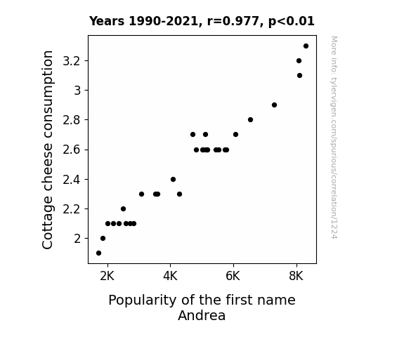
Cottage cheese consumption · all food
Popularity of the first name Andrea · all first names
Cottage cheese consumption · all food
Popularity of the first name Andrea · all first names


View details about correlation #4,998


View details about correlation #2,738
What else correlates?
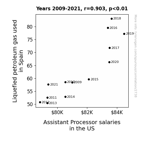
Liquefied petroleum gas used in Spain · all energy
Assistant Processor salaries in the US · all education
Liquefied petroleum gas used in Spain · all energy
Assistant Processor salaries in the US · all education


View details about correlation #3,078


View details about correlation #2,089

What else correlates?
Popularity of the first name William · all first names
Burglaries in South Carolina · all random state specific
Popularity of the first name William · all first names
Burglaries in South Carolina · all random state specific


View details about correlation #1,184

What else correlates?
The distance between Uranus and Earth · all planets
Number of Slot Machines in Nevada · all weird & wacky
The distance between Uranus and Earth · all planets
Number of Slot Machines in Nevada · all weird & wacky


View details about correlation #5,138
What else correlates?
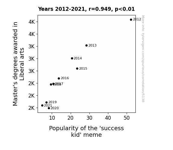
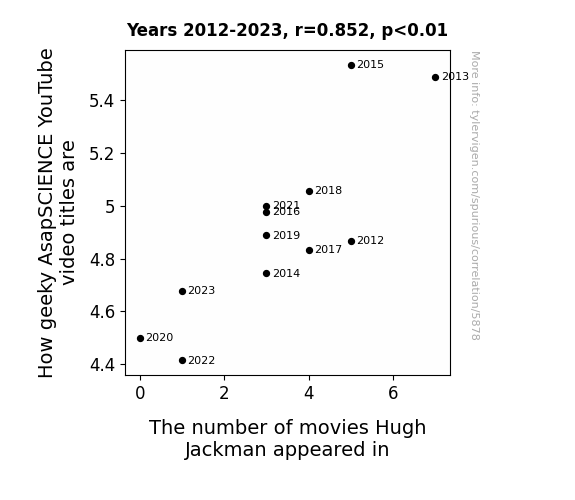
Master's degrees awarded in Liberal arts · all education
Popularity of the 'success kid' meme · all memes
Master's degrees awarded in Liberal arts · all education
Popularity of the 'success kid' meme · all memes


View details about correlation #4,640


View details about correlation #2,194
What else correlates?
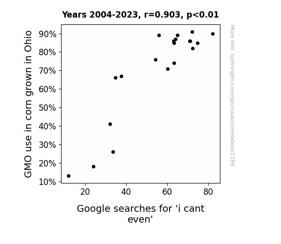
GMO use in corn grown in Ohio · all food
Google searches for 'i cant even' · all google searches
GMO use in corn grown in Ohio · all food
Google searches for 'i cant even' · all google searches


View details about correlation #1,082

What else correlates?
Google's Net Income · all stocks
Sales of LP/Vinyl Albums · all weird & wacky
Google's Net Income · all stocks
Sales of LP/Vinyl Albums · all weird & wacky


View details about correlation #5,024
What else correlates?
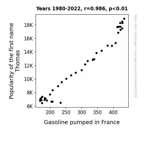
Popularity of the first name Thomas · all first names
Gasoline pumped in France · all energy
Popularity of the first name Thomas · all first names
Gasoline pumped in France · all energy


View details about correlation #5,878


View details about correlation #2,354
What else correlates?
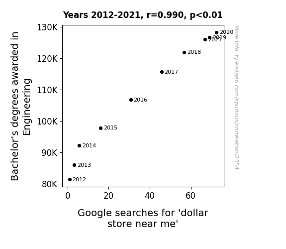
Bachelor's degrees awarded in Engineering · all education
Google searches for 'dollar store near me' · all google searches
Bachelor's degrees awarded in Engineering · all education
Google searches for 'dollar store near me' · all google searches


View details about correlation #5,943
What else correlates?
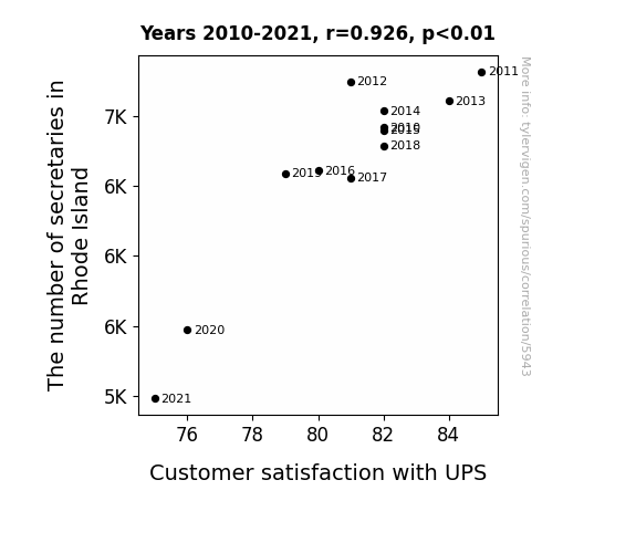
The number of secretaries in Rhode Island · all cccupations
Customer satisfaction with UPS · all weird & wacky
The number of secretaries in Rhode Island · all cccupations
Customer satisfaction with UPS · all weird & wacky


View details about correlation #1,739
What else correlates?
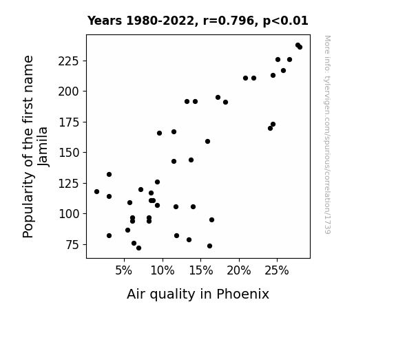
Popularity of the first name Jamila · all first names
Air quality in Phoenix · all weather
Popularity of the first name Jamila · all first names
Air quality in Phoenix · all weather
. The chart goes from 2007 to 2021, and the two variables track closely in value over that time.")

View details about correlation #4,113
What else correlates?
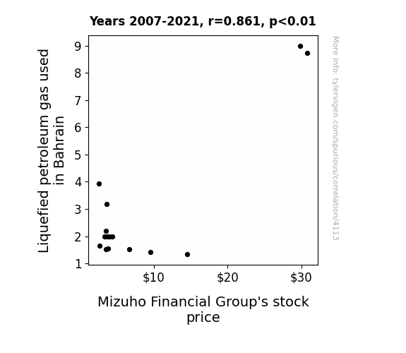
Liquefied petroleum gas used in Bahrain · all energy
Mizuho Financial Group's stock price (MFG) · all stocks
Liquefied petroleum gas used in Bahrain · all energy
Mizuho Financial Group's stock price (MFG) · all stocks


View details about correlation #1,199

What else correlates?
American cheese consumption · all food
Google's Annual Global Revenue · all weird & wacky
American cheese consumption · all food
Google's Annual Global Revenue · all weird & wacky


View details about correlation #5,949
What else correlates?
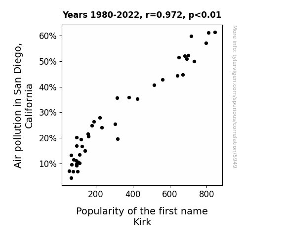
Air pollution in San Diego, California · all weather
Popularity of the first name Kirk · all first names
Air pollution in San Diego, California · all weather
Popularity of the first name Kirk · all first names


View details about correlation #1,059
What else correlates?
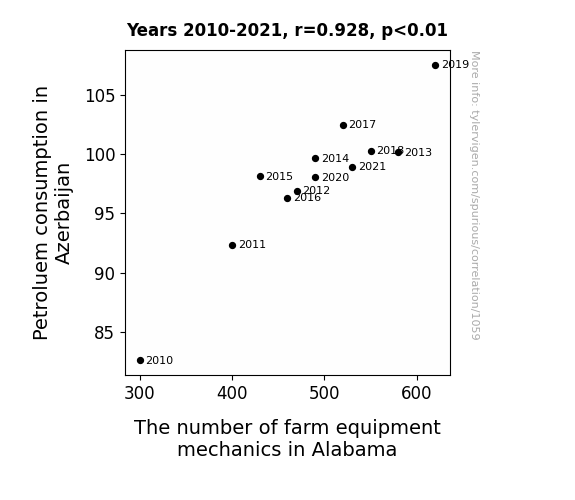
Petroluem consumption in Azerbaijan · all energy
The number of farm equipment mechanics in Alabama · all cccupations
Petroluem consumption in Azerbaijan · all energy
The number of farm equipment mechanics in Alabama · all cccupations
Why this works
- Data dredging: I have 25,237 variables in my database. I compare all these variables against each other to find ones that randomly match up. That's 636,906,169 correlation calculations! This is called “data dredging.”
Fun fact: the chart used on the wikipedia page to demonstrate data dredging is also from me. I've been being naughty with data since 2014.
Instead of starting with a hypothesis and testing it, I instead tossed a bunch of data in a blender to see what correlations would shake out. It’s a dangerous way to go about analysis, because any sufficiently large dataset will yield strong correlations completely at random. - Lack of causal connection: There is probably no direct connection between these variables, despite what the AI says above.
Because these pages are automatically generated, it's possible that the two variables you are viewing are in fact causually related. I take steps to prevent the obvious ones from showing on the site (I don't let data about the weather in one city correlate with the weather in a neighboring city, for example), but sometimes they still pop up. If they are related, cool! You found a loophole.
This is exacerbated by the fact that I used "Years" as the base variable. Lots of things happen in a year that are not related to each other! Most studies would use something like "one person" in stead of "one year" to be the "thing" studied. - Observations not independent: For many variables, sequential years are not independent of each other. You will often see trend-lines form. If a population of people is continuously doing something every day, there is no reason to think they would suddenly change how they are doing that thing on January 1. A naive p-value calculation does not take this into account.
You will calculate a lower chance of "randomly" achieving the result than represents reality.
To be more specific: p-value tests are probability values, where you are calculating the probability of achieving a result at least as extreme as you found completely by chance. When calculating a p-value, you need to assert how many "degrees of freedom" your variable has. I count each year (minus one) as a "degree of freedom," but this is misleading for continuous variables.
This kind of thing can creep up on you pretty easily when using p-values, which is why it's best to take it as "one of many" inputs that help you assess the results of your analysis.
- Y-axes doesn't start at zero: I truncated the Y-axes of the graphs above. I also used a line graph, which makes the visual connection stand out more than it deserves.
Nothing against line graphs. They are great at telling a story when you have linear data! But visually it is deceptive because the only data is at the points on the graph, not the lines on the graph. In between each point, the data could have been doing anything. Like going for a random walk by itself!
Mathematically what I showed is true, but it is intentionally misleading. If you click on any of the charts that abuse this, you can scroll down to see a version that starts at zero. - Confounding variable: Confounding variables (like global pandemics) will cause two variables to look connected when in fact a "sneaky third" variable is influencing both of them behind the scenes.
- Outliers: Some datasets here have outliers which drag up the correlation.
In concept, "outlier" just means "way different than the rest of your dataset." When calculating a correlation like this, they are particularly impactful because a single outlier can substantially increase your correlation.
Because this page is automatically generated, I don't know whether any of the charts displayed on it have outliers. I'm just a footnote. ¯\_(ツ)_/¯
I intentionally mishandeled outliers, which makes the correlation look extra strong. - Low n: There are not many data points included in some of these charts.
You can do analyses with low ns! But you shouldn't data dredge with a low n.
Even if the p-value is high, we should be suspicious of using so few datapoints in a correlation.
Pro-tip: click on any correlation to see:
- Detailed data sources
- Prompts for the AI-generated content
- Explanations of each of the calculations (correlation, p-value)
- Python code to calculate it yourself


