spurious correlations
discover · random · spurious scholar
← previous page · next page →


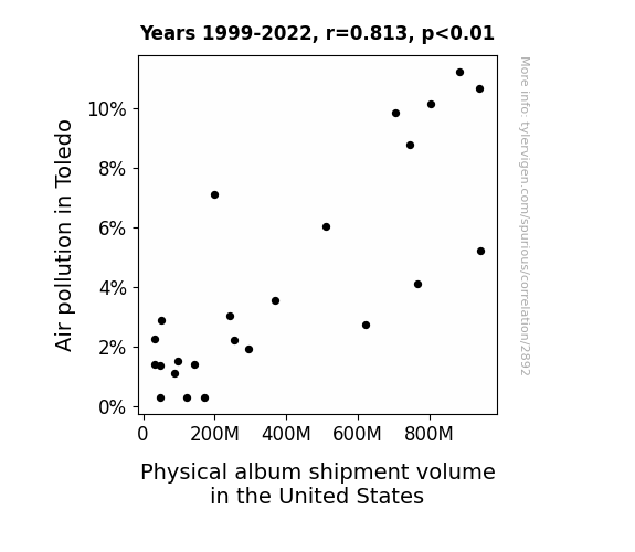
View details about correlation #2,892
The Airing of Dirty Discs: Exploring the Link Between Air Pollution in Toledo and Physical Album Shipment Volume in the United States
As the air cleared up in Toledo, it seems the music industry just couldn't 'breathe' without the added pollution particles. Perhaps those smoggy emissions were the real driving force behind physical album shipments, and now that the skies are cleaner, the demand for tangible tunes has vanished into thin air! It's like the pollution was the vinyl to the music industry's record player, and without it, they're just not spinning out the same success. Who knew that Toledo's air quality was the unexpected DJ of the physical album scene, mixing up a correlation that's straight out of left field!

What else correlates?
Air pollution in Toledo · all weather
Physical album shipment volume in the United States · all weird & wacky
Air pollution in Toledo · all weather
Physical album shipment volume in the United States · all weird & wacky


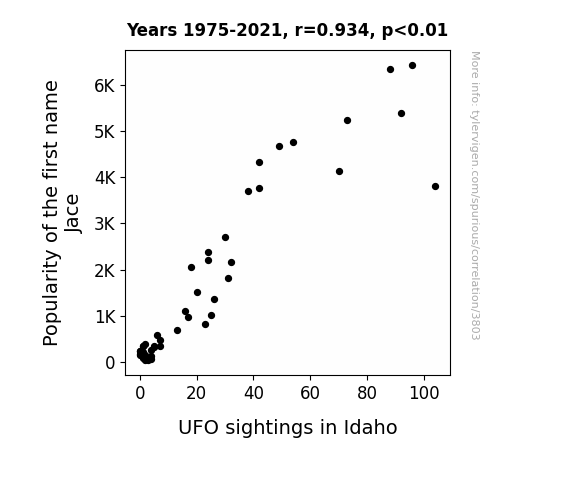
View details about correlation #3,803
Jace's Judicious Juxtaposition: Unraveling the UFO Connection in Idaho
As the name Jace gained popularity, more and more parents unknowingly invoked the ancient alien ritual of summoning. Little did they know, each time they called out "Jace, come here!" they were actually sending out a cosmic request for an otherworldly visit. This led to a sudden influx of confused UFOs in Idaho, all trying to figure out why they were being beckoned by a bunch of Earthlings. It seems the skies over Idaho were experiencing a Jace invasion, turning the state into a hotspot for both celestial confusion and close encounters of the Jace kind!
What else correlates?
Popularity of the first name Jace · all first names
UFO sightings in Idaho · all random state specific
Popularity of the first name Jace · all first names
UFO sightings in Idaho · all random state specific


View details about correlation #1,415
Spreading the Law: A Butterly Connection Between Butter Consumption and the Buoyancy of Lawyers in New Mexico
As butter intake rose, so did the demand for personal injury lawyers, leading to a migration of legal professionals to New Mexico in search of lucrative new cases related to butter-related accidents and health claims.


What else correlates?
Butter consumption · all food
The number of lawyers in New Mexico · all cccupations
Butter consumption · all food
The number of lawyers in New Mexico · all cccupations


View details about correlation #4,659
Up in Smoke: Uncovering the Libertarian Link between the Tar Heel State and LPG Consumption in Haiti
The increased hot air from the campaign trail and debates was inadvertently being captured and shipped to Haiti, where it was used to power the production of LPG. The fiery passion for political freedom was manifesting in the form of actual heat, leading to a surge in LPG production in Haiti. As the Libertarian candidate gained more support in North Carolina, the connection with Haiti strengthened, creating a bizarre yet undeniably gassy political alliance. It's a classic case of political gasbaggery leading to a real gas boom!


View details about correlation #2,670
Air Pollution: A Soap Opera for Days of Our Lives Viewership in Richmond, Virginia
As the air cleared, residents were suddenly able to step outside and find other forms of entertainment besides watching soap operas. Those clean, crisp air molecules must have carried away the urge to keep up with the dramatic lives of Salem's residents.


What else correlates?
Air pollution in Richmond, Virginia · all weather
Viewership count for Days of Our Lives · all weird & wacky
Air pollution in Richmond, Virginia · all weather
Viewership count for Days of Our Lives · all weird & wacky


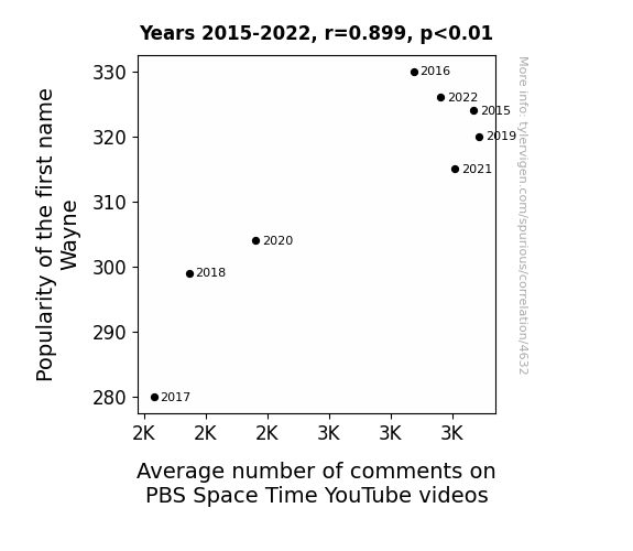
View details about correlation #4,632
Wayne's World: The Cosmic Connection Between Name Popularity and YouTube Engagement
Every time someone named Wayne watched a PBS Space Time video, they just had to comment, "Wayne-derful video!" It was an astronomical boost to the comment section. Before you knew it, the Wayne train had taken over, fueling discussions on everything from quantum mechanics to black holes with their Wayne-tastic insights. It's like the universe conspired to make Wayne and PBS Space Time a stellar combination!


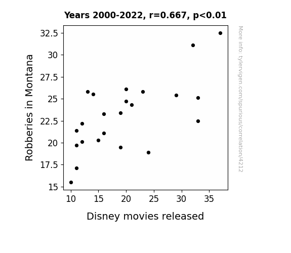
View details about correlation #4,212
The Magnificent Seven Dwarfs: Exploring the Snow White-collar Crime Connection in Montana
More robberies in Montana led to a surge in cowboy folklore interest, inspiring Disney to create more Wild West-themed movies like Toy Story and The Lone Ranger. As crime rates shot up, so did the demand for rootin' tootin' on-screen adventures, prompting Disney to ride off into the sunset with a string of box office hits. Yee-haw! Tumbleweeds and tiaras, it's the law of the outlaw!

What else correlates?
Robberies in Montana · all random state specific
Disney movies released · all films & actors
Robberies in Montana · all random state specific
Disney movies released · all films & actors


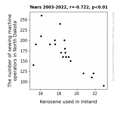
View details about correlation #1,738
Stitching Together the Thread of Correlation: The Curious Case of Sewing Machine Operators in North Dakota and Kerosene Consumption in Ireland
As the sewing machine operators in North Dakota stitched up a storm, they inadvertently created a global shift in the fabric of space-time, leading to a decrease in kerosene used in Ireland. The thread of productivity they unraveled somehow wove its way to Ireland, where it kerosene-ly impacted usage. It seems they really know how to seam-lessly connect with energy sources, leaving us to purl in amazement at this twisted correlation. Who knew that North Dakota's sew-surge would have such far-reaching and kerosene-ly repercussions?
What else correlates?
The number of sewing machine operators in North Dakota · all cccupations
Kerosene used in Ireland · all energy
The number of sewing machine operators in North Dakota · all cccupations
Kerosene used in Ireland · all energy


View details about correlation #3,235
GMO-ing the Distance: A Soy-ful Relationship Between Soybean GMO Usage and Costco Customer Satisfaction in Michigan
As GMO use in soybeans increased in Michigan, soy-based products became more abundant and affordable at Costco. This led to a "soy-tisfying" shopping experience, ultimately boosting customer satisfaction. With soy much to choose from, Costco shoppers were on cloud soy-ven. It's safe to say, the soy of customer satisfaction was definitely bean-efiting from the GMO use in Michigan!


What else correlates?
GMO use in soybeans in Michigan · all food
Customer satisfaction with Costco · all weird & wacky
GMO use in soybeans in Michigan · all food
Customer satisfaction with Costco · all weird & wacky


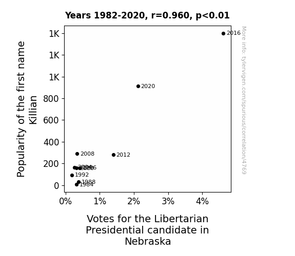
View details about correlation #4,769
Killian's Popularity and the Libertarian Vitality: A Statewide Proximity in Nebraska
As the name Killian gained popularity, more and more parents were subconsciously drawn to the idea of raising little free thinkers. This led to a surge in children growing up to embrace individualism and personal freedom, creating a future voting base for the Libertarian candidate. It seems like the name Killian was really making a "kill" ion the political beliefs of the next generation in Nebraska!


View details about correlation #4,797
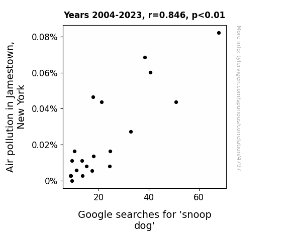
Unraveling the Smokescreen: A Correlative Study on Air Pollution in Jamestown, New York and Google Searches for 'Snoop Dog'
The air was too clean for Snoop Dogg's liking, it was no longer giving him the high that he needed. Without that smoggy inspiration, his fan base just couldn't keep barking up the right tree. It seems like Snoop Lion might have found a new source of environmental 'doggystyle' to rap about!

What else correlates?
Air pollution in Jamestown, New York · all weather
Google searches for 'snoop dog' · all google searches
Air pollution in Jamestown, New York · all weather
Google searches for 'snoop dog' · all google searches


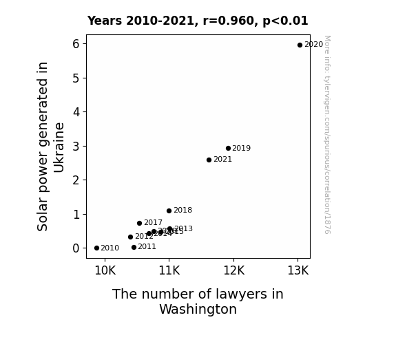
View details about correlation #1,876
Bright Light Delight: Solar Might and Legal Flight - A Correlational Delight
As Ukraine's solar power output surged, it inadvertently created a massive wave of energy that affected the Earth's electromagnetic field. This, in turn, led to a sudden spike in brain activity, specifically in individuals inclined towards legal professions. As the energy flowed across the globe, it acted as a catalyst for an inexplicable passion for law within the population of Washington, prompting a significant influx of aspiring lawyers. It seems Ukraine's solar success has inadvertently illuminated a new career path for many in the US capital!

What else correlates?
Solar power generated in Ukraine · all energy
The number of lawyers in Washington · all cccupations
Solar power generated in Ukraine · all energy
The number of lawyers in Washington · all cccupations


View details about correlation #2,968
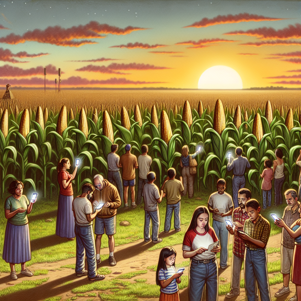
Corn GMOs in Nebraska and Global Pirates: A Corny Connection or Just a Kernel of Truth?
As corn in Nebraska switched to non-GMO, it inadvertently started producing corn that was less appealing to parrots. This led to a shortage of parrot recruits for the pirate industry, causing a decrease in pirate attacks globally. Corn in Nebraska went from being a-maize-ing to a-parr-ently not worth plundering for anymore! Corny, but true!
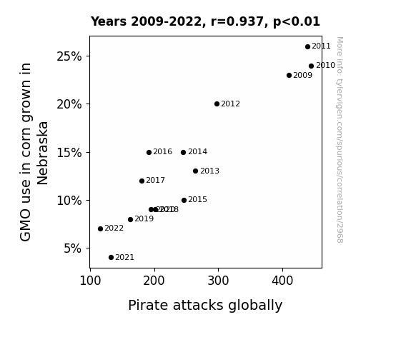
What else correlates?
GMO use in corn grown in Nebraska · all food
Pirate attacks globally · all weird & wacky
GMO use in corn grown in Nebraska · all food
Pirate attacks globally · all weird & wacky


View details about correlation #4,561
Gina-ray Correlation: A Cinematic Analysis of 3Blue1Brown Videos
Every time someone named Gina was born, a new mathematical prodigy was also born, destined to create mind-bending content for 3Blue1Brown. The universe just couldn't resist adding an extra dimension of genius to the videos. It's as if their brains were hardwired to unravel the mysteries of math in the most captivating way possible. Plus, with a name like Gina, they were always destined for 'geo'metric greatness!

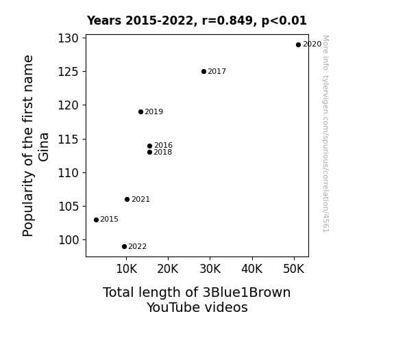
What else correlates?
Popularity of the first name Gina · all first names
Total length of 3Blue1Brown YouTube videos · all YouTube
Popularity of the first name Gina · all first names
Total length of 3Blue1Brown YouTube videos · all YouTube


View details about correlation #4,661
The Republican Ripple: Reflecting on the Relationship between Kentucky's Presidential Preferences and UFO Unveilings
Due to an obscure clause in the presidential candidate's platform, he unwittingly made it easier for alien spacecraft to qualify for agricultural tax exemptions in Kentucky, leading to a surge in UFO sightings as they attempted to blend in with the local farming activity. Who knew that intergalactic tax reform could have such down-to-earth consequences?
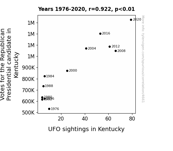


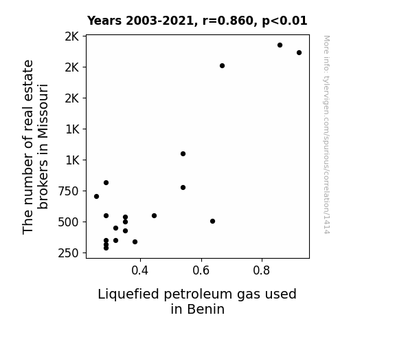
View details about correlation #1,414
Propane and Proprietary Properties: A Probing Probe into the Punning Paradox of Missouri Real Estate Brokers and Liquefied Petroleum Gas Consumption in Benin
As the number of real estate brokers in Missouri increases, there is a corresponding rise in the demand for stylish backyard fire pits. This trend leads to a surge in the import of liquefied petroleum gas used in Benin for a more 'lit' outdoor living experience. Remember, when it comes to real estate and LPG, it's all about keeping the market fired up!
What else correlates?
The number of real estate brokers in Missouri · all cccupations
Liquefied petroleum gas used in Benin · all energy
The number of real estate brokers in Missouri · all cccupations
Liquefied petroleum gas used in Benin · all energy
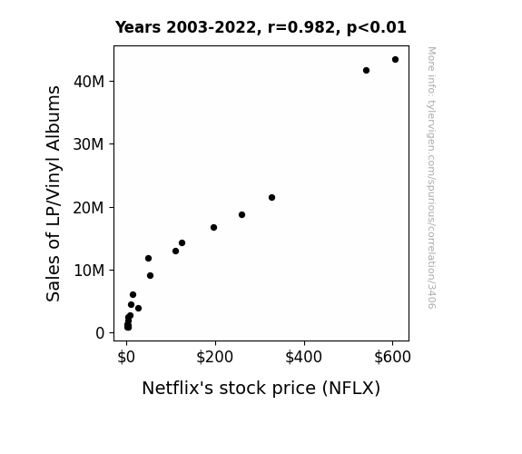
. The chart goes from 2003 to 2022, and the two variables track closely in value over that time.")

View details about correlation #3,406
Spinning Stocks: The Groovy Connection Between LP Sales and Netflix's Stock Price
As people dusted off their record players, the resulting increase in atmospheric nostalgia created a positive energy flux. This flux, in turn, was harvested by Netflix's hidden retro-entertainment receptors, leading to a surge in their stock price. It's like a cosmic boomerang effect, but for financial gains!

What else correlates?
Sales of LP/Vinyl Albums · all weird & wacky
Netflix's stock price (NFLX) · all stocks
Sales of LP/Vinyl Albums · all weird & wacky
Netflix's stock price (NFLX) · all stocks


View details about correlation #4,772
Yvettenama and Insightful Titles: A Popularity Correlation Analysis
As more and more babies were named Yvette, it created a surplus of brainy individuals. This led to a spike in the demand for more intellectually stimulating content, prompting the creators of OverSimplified videos to up their game and make their titles as insightful as possible to cater to the burgeoning population of Yvettes who had a knack for history and a penchant for witty, condensed explanations. It's like a name-based intellectual revolution leading to an Oversimplified enlightenment!


What else correlates?
Popularity of the first name Yvette · all first names
How insightful OverSimplified YouTube video titles are · all YouTube
Popularity of the first name Yvette · all first names
How insightful OverSimplified YouTube video titles are · all YouTube


View details about correlation #3,958
Sweet Corn and Canada's Bourne: The GMO-Google Correlation
As GMO use in Texas corn increased, so did the size of the corn. The taller corn stalks began whispering to the people, "Eh, maybe it's time to leaf this place and move to Canada, eh?" This led to a spike in Google searches for 'how to immigrate to Canada' as the corny persuasion proved to be ear-resistible. The phenomenon has been dubbed as the great corn migration, also known as cob-beration. This unexpected consequence has sparked a new agricultural movement, with farmers now focusing on creating bilingual corn to expand their market reach. It's a-maize-ing how a simple crop change can ear-itate such a monumental shift! Remember, when it comes to Texas corn, the stakes are always high.
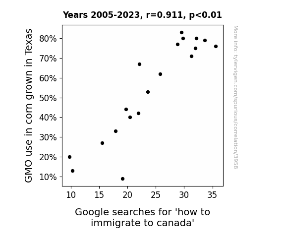
What else correlates?
GMO use in corn grown in Texas · all food
Google searches for 'how to immigrate to canada' · all google searches
GMO use in corn grown in Texas · all food
Google searches for 'how to immigrate to canada' · all google searches


View details about correlation #2,389
Hydropower High Jinks: Hilarity of Hydroelectricity and Haplology of Humble Handymen
The decrease in hydropower energy in Portugal led to a shortage of high-quality Portuguese water, which was essential for crafting precision lock components. As a result, the locksmiths and safe repairers in Oregon had to find alternative sources of water, but their attempts to use regular water backfired, causing their tools to rust and malfunction. This forced many locksmiths to switch careers, leading to a decrease in the number of locksmiths and safe repairers in Oregon.

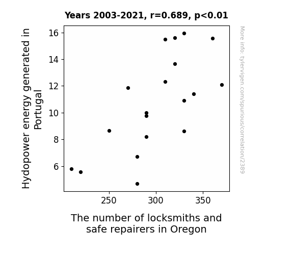
What else correlates?
Hydopower energy generated in Portugal · all energy
The number of locksmiths and safe repairers in Oregon · all cccupations
Hydopower energy generated in Portugal · all energy
The number of locksmiths and safe repairers in Oregon · all cccupations
Why this works
- Data dredging: I have 25,237 variables in my database. I compare all these variables against each other to find ones that randomly match up. That's 636,906,169 correlation calculations! This is called “data dredging.”
Fun fact: the chart used on the wikipedia page to demonstrate data dredging is also from me. I've been being naughty with data since 2014.
Instead of starting with a hypothesis and testing it, I instead tossed a bunch of data in a blender to see what correlations would shake out. It’s a dangerous way to go about analysis, because any sufficiently large dataset will yield strong correlations completely at random. - Lack of causal connection: There is probably no direct connection between these variables, despite what the AI says above.
Because these pages are automatically generated, it's possible that the two variables you are viewing are in fact causually related. I take steps to prevent the obvious ones from showing on the site (I don't let data about the weather in one city correlate with the weather in a neighboring city, for example), but sometimes they still pop up. If they are related, cool! You found a loophole.
This is exacerbated by the fact that I used "Years" as the base variable. Lots of things happen in a year that are not related to each other! Most studies would use something like "one person" in stead of "one year" to be the "thing" studied. - Observations not independent: For many variables, sequential years are not independent of each other. You will often see trend-lines form. If a population of people is continuously doing something every day, there is no reason to think they would suddenly change how they are doing that thing on January 1. A naive p-value calculation does not take this into account.
You will calculate a lower chance of "randomly" achieving the result than represents reality.
To be more specific: p-value tests are probability values, where you are calculating the probability of achieving a result at least as extreme as you found completely by chance. When calculating a p-value, you need to assert how many "degrees of freedom" your variable has. I count each year (minus one) as a "degree of freedom," but this is misleading for continuous variables.
This kind of thing can creep up on you pretty easily when using p-values, which is why it's best to take it as "one of many" inputs that help you assess the results of your analysis.
- Y-axes doesn't start at zero: I truncated the Y-axes of the graphs above. I also used a line graph, which makes the visual connection stand out more than it deserves.
Nothing against line graphs. They are great at telling a story when you have linear data! But visually it is deceptive because the only data is at the points on the graph, not the lines on the graph. In between each point, the data could have been doing anything. Like going for a random walk by itself!
Mathematically what I showed is true, but it is intentionally misleading. If you click on any of the charts that abuse this, you can scroll down to see a version that starts at zero. - Confounding variable: Confounding variables (like global pandemics) will cause two variables to look connected when in fact a "sneaky third" variable is influencing both of them behind the scenes.
- Outliers: Some datasets here have outliers which drag up the correlation.
In concept, "outlier" just means "way different than the rest of your dataset." When calculating a correlation like this, they are particularly impactful because a single outlier can substantially increase your correlation.
Because this page is automatically generated, I don't know whether any of the charts displayed on it have outliers. I'm just a footnote. ¯\_(ツ)_/¯
I intentionally mishandeled outliers, which makes the correlation look extra strong. - Low n: There are not many data points included in some of these charts.
You can do analyses with low ns! But you shouldn't data dredge with a low n.
Even if the p-value is high, we should be suspicious of using so few datapoints in a correlation.
Pro-tip: click on any correlation to see:
- Detailed data sources
- Prompts for the AI-generated content
- Explanations of each of the calculations (correlation, p-value)
- Python code to calculate it yourself


