spurious correlations
discover · random · spurious scholar
← previous page · next page →


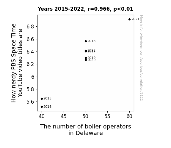
View details about correlation #5,122
Quantifying the Quirk: Querying the Quandary of Quantum Quotients in Quixotic YouTube Titles and Quaint Quantities of Quirky Quark Quests in Quirky Quarters of Quirky Quotidians
As the number of boiler operators in Delaware rises, so does the quantum enthusiasm permeating the state. This, in turn, creates a localized warp in the space-time nerdometer, causing a direct correlation to the level of nerdiness in PBS Space Time video titles. It's a complex interplay of quantum mechanics, Delaware's boiler charisma, and the gravitational pull of astrophysical puns.


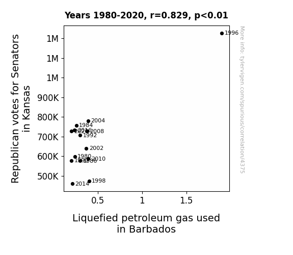
View details about correlation #4,375
Up in Smoke: The Flaming Hot Link Between Republican Votes in Kansas and LPG Usage in Barbados
As the Republican votes for Senators in Kansas went up, there was a surge in demand for BBQ equipment, leading to an increase in Liquefied petroleum gas used in Barbados! It seems like the political heat in the US was sparking some real flame-grilled enthusiasm for gas usage in the Caribbean. Who knew that a political race thousands of miles away could have such a *fiery* impact on Barbadian gas consumption!

What else correlates?
Votes for Republican Senators in Kansas · all elections
Liquefied petroleum gas used in Barbados · all energy
Votes for Republican Senators in Kansas · all elections
Liquefied petroleum gas used in Barbados · all energy


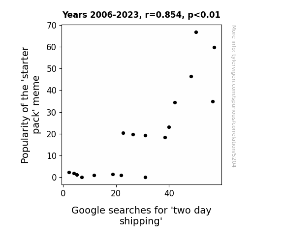
View details about correlation #5,204
What else correlates?
Popularity of the 'starter pack' meme · all memes
Google searches for 'two day shipping' · all google searches
Popularity of the 'starter pack' meme · all memes
Google searches for 'two day shipping' · all google searches


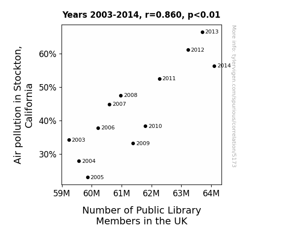
View details about correlation #5,173
The Dusty pages and Dirty Air: A Novel Connection Between Air Pollution in Stockton, California and Number of Public Library Members in the UK
The smog drifting across the globe inadvertently carried a love for reading, inspiring people in the UK to join their local libraries in search of fresh air... and fresh books! It's a novel case of pollution leading to a breath of literary fresh air across the pond!

What else correlates?
Air pollution in Stockton, California · all weather
Number of Public Library Members in the UK · all weird & wacky
Air pollution in Stockton, California · all weather
Number of Public Library Members in the UK · all weird & wacky


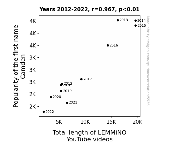
View details about correlation #5,536
Camden's LEMMiNO Linguistic Length: A Punnily Ponderous Pioneer
As fewer babies were named Camden, there was a subsequent decrease in the overall demand for cam-adorable content, leading LEMMiNO to shorten his videos to cater to a broader audience. After all, when it comes to captivating viewers, it's all about reel-ing them in with name-worthy content!
What else correlates?
Popularity of the first name Camden · all first names
Total length of LEMMiNO YouTube videos · all YouTube
Popularity of the first name Camden · all first names
Total length of LEMMiNO YouTube videos · all YouTube


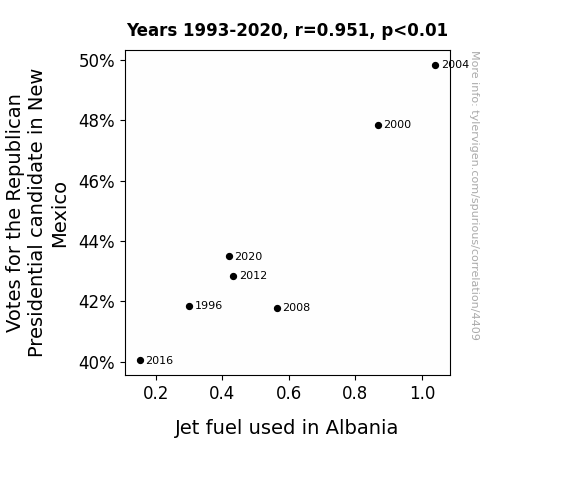
View details about correlation #4,409
Jetting to the Ballot Box: The Surprising Connection Between Republican Votes in New Mexico and Jet Fuel Consumption in Albania
As support for the Republican candidate soared in New Mexico, it created a 'political airwave' effect. This, in turn, led to an unexpected surge in enthusiasm for air travel in Albania, driving up the demand for jet fuel. It seems like even from that distance, the Republican candidate's campaign managed to really 'ignite' something in Albania's skies!

What else correlates?
Votes for the Republican Presidential candidate in New Mexico · all elections
Jet fuel used in Albania · all energy
Votes for the Republican Presidential candidate in New Mexico · all elections
Jet fuel used in Albania · all energy
Why this works
- Data dredging: I have 25,237 variables in my database. I compare all these variables against each other to find ones that randomly match up. That's 636,906,169 correlation calculations! This is called “data dredging.”
Fun fact: the chart used on the wikipedia page to demonstrate data dredging is also from me. I've been being naughty with data since 2014.
Instead of starting with a hypothesis and testing it, I instead tossed a bunch of data in a blender to see what correlations would shake out. It’s a dangerous way to go about analysis, because any sufficiently large dataset will yield strong correlations completely at random. - Lack of causal connection: There is probably no direct connection between these variables, despite what the AI says above.
Because these pages are automatically generated, it's possible that the two variables you are viewing are in fact causually related. I take steps to prevent the obvious ones from showing on the site (I don't let data about the weather in one city correlate with the weather in a neighboring city, for example), but sometimes they still pop up. If they are related, cool! You found a loophole.
This is exacerbated by the fact that I used "Years" as the base variable. Lots of things happen in a year that are not related to each other! Most studies would use something like "one person" in stead of "one year" to be the "thing" studied. - Observations not independent: For many variables, sequential years are not independent of each other. You will often see trend-lines form. If a population of people is continuously doing something every day, there is no reason to think they would suddenly change how they are doing that thing on January 1. A naive p-value calculation does not take this into account.
You will calculate a lower chance of "randomly" achieving the result than represents reality.
To be more specific: p-value tests are probability values, where you are calculating the probability of achieving a result at least as extreme as you found completely by chance. When calculating a p-value, you need to assert how many "degrees of freedom" your variable has. I count each year (minus one) as a "degree of freedom," but this is misleading for continuous variables.
This kind of thing can creep up on you pretty easily when using p-values, which is why it's best to take it as "one of many" inputs that help you assess the results of your analysis.
- Y-axes doesn't start at zero: I truncated the Y-axes of the graphs above. I also used a line graph, which makes the visual connection stand out more than it deserves.
Nothing against line graphs. They are great at telling a story when you have linear data! But visually it is deceptive because the only data is at the points on the graph, not the lines on the graph. In between each point, the data could have been doing anything. Like going for a random walk by itself!
Mathematically what I showed is true, but it is intentionally misleading. If you click on any of the charts that abuse this, you can scroll down to see a version that starts at zero. - Confounding variable: Confounding variables (like global pandemics) will cause two variables to look connected when in fact a "sneaky third" variable is influencing both of them behind the scenes.
- Outliers: Some datasets here have outliers which drag up the correlation.
In concept, "outlier" just means "way different than the rest of your dataset." When calculating a correlation like this, they are particularly impactful because a single outlier can substantially increase your correlation.
Because this page is automatically generated, I don't know whether any of the charts displayed on it have outliers. I'm just a footnote. ¯\_(ツ)_/¯
I intentionally mishandeled outliers, which makes the correlation look extra strong. - Low n: There are not many data points included in some of these charts.
You can do analyses with low ns! But you shouldn't data dredge with a low n.
Even if the p-value is high, we should be suspicious of using so few datapoints in a correlation.
Pro-tip: click on any correlation to see:
- Detailed data sources
- Prompts for the AI-generated content
- Explanations of each of the calculations (correlation, p-value)
- Python code to calculate it yourself


