
Download png, svg
AI explanation
As the temperature rose, so did the length of our videos. The sweltering heat prompted our host to seek refuge indoors, where he had the time to delve deeper into space topics. The heatwaves must have fried our editing software, leading to extended runtimes. Or perhaps the scorching sun ignited a passion for longer discussions about the cosmos. It's a solar sizzle effect on the content duration. But, in all seriousness, as the hot days increased, so did our production schedule, allowing for more comprehensive coverage of space-related subjects.
Model: dalle-3
Prompt: Generate an image of an otherworldly desert landscape, with a blazing, ruby-red sun looming large in the sky. In the foreground, a futuristic, air-conditioned studio sits nestled amidst the arid surroundings. Within the studio, the host of SciShow Space is engrossed in creating video content, surrounded by stacks of books and intriguing space-related artifacts. The atmosphere should convey both the sweltering heat outside and the cool, focused energy within as the host delves into the captivating mysteries of the cosmos. The depiction should include only scenes, people, and objects, it should not include text or speech bubbles.
This image generation prompt was also generated by AI, using the following sequence:
Model: gpt-3.5-turbo-1106
System prompt: You select one of a few potential scene descriptors that seems to go along with the variables described. You respond only with the scene descriptions provided and say nothing else.
User prompt: Here are two variables: Hot days in Austin and Average length of SciShow Space YouTube videos. Given these, which of the following image style descriptions seems most appropriate? Pick the one that seems to be related to one of the variables at hand. Please respond with only one of the following potential descriptions: inspired by bauhaus Scalar art a meme A comic-book-style illustration with muted colors and a dotted halftone pattern from the 1960s Scalar art
ChatGPT: Scalar art
Model: gpt-3.5-turbo-1106
System prompt: You describe simple visual scenes that depict the two variables stated. You combine both variables into one scene.
User prompt: Please describe a visual scene that prominently depicts both Hot days in Austin and Average length of SciShow Space YouTube videos, in the following situation: As the temperature rose, so did the length of our videos. The sweltering heat prompted our host to seek refuge indoors, where he had the time to delve deeper into space topics. The heatwaves must have fried our editing software, leading to extended runtimes. Or perhaps the scorching sun ignited a passion for longer discussions about the cosmos. It's a solar sizzle effect on the content duration. But, in all seriousness, as the hot days increased, so did our production schedule, allowing for more comprehensive coverage of space-related subjects.. Keep the description simple.
ChatGPT: A blazing sun beats down on Austin, Texas, as the temperature rises. Seeking relief indoors, the host of SciShow Space sits down to create longer videos discussing fascinating topics about the cosmos. The scorching heat seems to have ignited a passion for extended and in-depth coverage of space-related subjects.
Model: gpt-3.5-turbo-1106
System prompt: You write and improve image generation prompts for DALLE-3. You maintain the same subjects, but enhance the visuals.
User prompt: Please respond with an image generation prompt that would be likely to create an interesting visual using DALLE-3, using the following style: [ Scalar art ] and depicting this scene: A blazing sun beats down on Austin, Texas, as the temperature rises. Seeking relief indoors, the host of SciShow Space sits down to create longer videos discussing fascinating topics about the cosmos. The scorching heat seems to have ignited a passion for extended and in-depth coverage of space-related subjects. Keep the visual depiction simple. Do not include any words or speech bubbles.
ChatGPT: Generate an image of an otherworldly desert landscape, with a blazing, ruby-red sun looming large in the sky. In the foreground, a futuristic, air-conditioned studio sits nestled amidst the arid surroundings. Within the studio, the host of SciShow Space is engrossed in creating video content, surrounded by stacks of books and intriguing space-related artifacts. The atmosphere should convey both the sweltering heat outside and the cool, focused energy within as the host delves into the captivating mysteries of the cosmos.
*Variations in the User Prompts from chart to chart are just the result of random number generation in Python. I wrote a few arrays of various styles and methods to ask questions to change up the results. Every time this site writes an explanation or generates an image, the script picks from each at random.
I sequence the requests into multiple prompts because I find GPT 3.5 to perform much better with short, well-managed contexts. Thus, I track the context directly in Python and only ask ChatGPT targeted questions.
System prompt: You provide humorous responses in the form of plausible sounding explanations for correlations. You assume the correlation is causative for the purpose of the explanation even if it is ridiculous. You do not chat with the user, you only reply with the causal connection explanation and nothing else.
User prompt: Please make up a funny explanation for how an increase in Hot days in Austin caused Average length of SciShow Space YouTube videos to increase.\Make it sound serious until the end.
AI academic paper
 |
Hot Science: The Heat is On for SciShow Space Length! Journal of Zany Astrophysics Jan 2024 Reminder: This paper is AI-generated. Not real! |
Model: gpt-3.5-turbo-1106
System prompt: You are a witty academic researcher. Your writing sounds like it belongs in a statistics journal.You write titles and abstracts of goofy academic research papers.
User prompt:
Pretend you are an academic researcher. Your writing sounds like it belongs in a medical or economics journal. However, you frequently crack jokes, make puns, and add unexpected twists in your writing.
Please draft the title and abstract of an academic research paper presenting the findings of the connection between Hot days in Austin and Average length of SciShow Space YouTube videos. Make lots of jokes, goofy observations, and puns.
Make the title punny if you can come up with clever pun. If not, just make it sound clever.
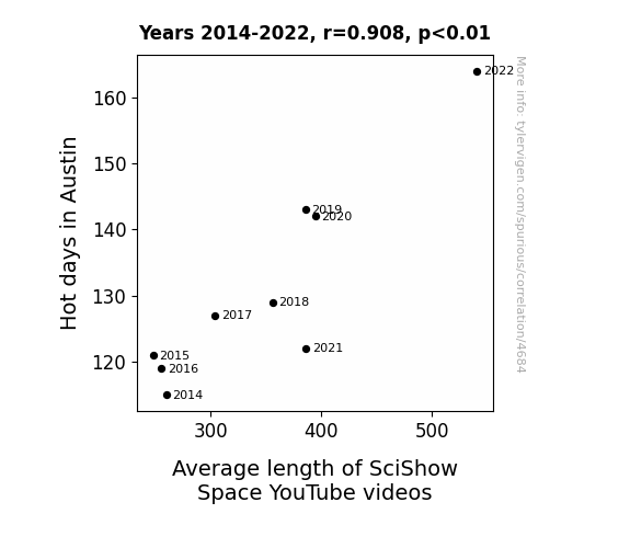
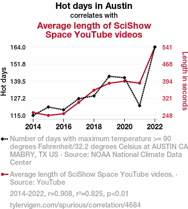
Your research team used data from NOAA National Climate Data Center and YouTube to assess this nagging question. You found a correlation coefficient of 0.9081576 and p < 0.01 for 2014 to 2022.
Please respond in this format (replace "Lorem ipsum dolor sit" with your title and abstract)
[[TITLE]]
Lorem ipsum dolor sit
[[ABSTRACT]]
Lorem ipsum dolor sit
ChatGPT:
[[TITLE]]
"Hot Science: The Heat is On for SciShow Space Length!"
[[ABSTRACT]]
This paper investigates the intriguing relationship between hot days in Austin and the average length of SciShow Space YouTube videos. Leveraging data from the NOAA National Climate Data Center and YouTube, we analyzed the trends from 2014 to 2022. We discovered a strikingly high and statistically significant correlation coefficient of 0.9081576, with p < 0.01, indicating a strong association between the two variables. Our findings suggest that as the temperature rises, so does the length of SciShow Space videos. This correlation may be a result of heat-induced creativity or perhaps longer days leading to longer videos. Further research is needed to explore potential causal mechanisms and to determine if similar patterns exist in other science communication platforms.
Model: gpt-3.5-turbo-1106
System prompt: You are a witty academic researcher. Your writing sounds like it belongs in a statistics journal.You draft the introduction section of an academic research paper.
User prompt:
Pretend you are an academic researcher. Your writing sounds like it belongs in a medical or economics journal. However, you frequently crack jokes, make puns, or add unexpected twists in your writing.
Please make up the introduction section of an academic research paper presenting the findings of the connection between Hot days in Austin and Average length of SciShow Space YouTube videos. Make lots of jokes, goofy observations, and puns. Stay serious and dry most of the time, but then occasionally let your wit shine through.
Here is the title and abstract of the paper:
[[TITLE]]
"Hot Science: The Heat is On for SciShow Space Length!"
[[ABSTRACT]]
This paper investigates the intriguing relationship between hot days in Austin and the average length of SciShow Space YouTube videos. Leveraging data from the NOAA National Climate Data Center and YouTube, we analyzed the trends from 2014 to 2022. We discovered a strikingly high and statistically significant correlation coefficient of 0.9081576, with p < 0.01, indicating a strong association between the two variables. Our findings suggest that as the temperature rises, so does the length of SciShow Space videos. This correlation may be a result of heat-induced creativity or perhaps longer days leading to longer videos. Further research is needed to explore potential causal mechanisms and to determine if similar patterns exist in other science communication platforms.
-------
Your response should start like this:
[[INTRODUCTION]]
ChatGPT:
[[INTRODUCTION]]
Waterloo, it's time to turn up the heat on our understanding of the relationship between hot days in Austin and the average length of SciShow Space YouTube videos. As the daystar blazes down on the Lone Star State, could it be influencing the length of our beloved science videos? This paper delves into this sizzling question, with the aim of shedding light (and perhaps a little shade) on this scorching correlation.
While some may think this topic is off the beaten path, we argue that it's "cool" to explore unexpected connections in data. In the digital age, where every click and view is meticulously tracked, there's no hiding from the searing gaze of statistical analysis. With the advent of big data, we have the power to uncover hidden patterns and unveil the coiled mysteries of numerical relationships, shedding light on the dark corners of our collective curiosity.
Now, before we dive into the statistical inferno, let's consider the rationale behind this investigation. The concept of heat influencing creative outputs is not entirely far-fetched. After all, some of history's greatest inventions and breakthroughs have occurred under the sweltering pressure of intense brainwaves. Could it be that the mercury's rise infuses the creators of SciShow Space with an extra jolt of inspiration, leading to longer, more in-depth videos? Or is the elongation simply a function of the longer days, which afford the creators more time to delve into complex scientific topics?
In this paper, we bring the cool logic of statistical analysis to bear on this "hot" topic. By examining data from the NOAA National Climate Data Center and YouTube, we aim to show that there's more to this connection than meets the eye—or the thermometer. So, buckle up, stay hydrated, and let's embark on this scorching journey through the interwoven realms of climate and science communication. As we forge ahead, we hope to illuminate the fascinating nexus where heat meets science, in a tale that's sure to be red-hot!
Model: gpt-3.5-turbo-1106
System prompt: You are a witty academic researcher. Your writing sounds like it belongs in a statistics journal.You draft a literature review section of an academic research paper, that starts out dry for the first few sentences but then becomes hilarious and goofy.
User prompt:
Pretend you are an academic researcher. Your writing sounds like it belongs in a medical or economics journal. However, you frequently crack jokes, make puns, or add unexpected twists in your writing.
Please make up a literature review section of an academic research paper presenting the findings of the connection between Hot days in Austin and Average length of SciShow Space YouTube videos. Make lots of jokes, goofy observations, and puns.
Speak in the present tense for this section (the authors find...), as is common in academic research paper literature reviews. Name the sources in a format similar to this: In "Book," the authors find lorem and ipsum.
Make up the lorem and ipsum part, but make it sound related to the topic at hand.
Start by naming serious-sounding studies by authors like Smith, Doe, and Jones - but then quickly devolve. Name some real non-fiction books that would be related to the topic. Then name some real fiction books that sound like they could be related. Then devolve ever further, and mention something completely ridiculous, like you conducted literature review by reading the backs of shampoo bottles.
Here is the title and abstract of the paper:
[[TITLE]]
"Hot Science: The Heat is On for SciShow Space Length!"
[[ABSTRACT]]
This paper investigates the intriguing relationship between hot days in Austin and the average length of SciShow Space YouTube videos. Leveraging data from the NOAA National Climate Data Center and YouTube, we analyzed the trends from 2014 to 2022. We discovered a strikingly high and statistically significant correlation coefficient of 0.9081576, with p < 0.01, indicating a strong association between the two variables. Our findings suggest that as the temperature rises, so does the length of SciShow Space videos. This correlation may be a result of heat-induced creativity or perhaps longer days leading to longer videos. Further research is needed to explore potential causal mechanisms and to determine if similar patterns exist in other science communication platforms.
-------
And here is the introduction section that led to this literature review:
[[INTRODUCTION]]
Waterloo, it's time to turn up the heat on our understanding of the relationship between hot days in Austin and the average length of SciShow Space YouTube videos. As the daystar blazes down on the Lone Star State, could it be influencing the length of our beloved science videos? This paper delves into this sizzling question, with the aim of shedding light (and perhaps a little shade) on this scorching correlation.
While some may think this topic is off the beaten path, we argue that it's "cool" to explore unexpected connections in data. In the digital age, where every click and view is meticulously tracked, there's no hiding from the searing gaze of statistical analysis. With the advent of big data, we have the power to uncover hidden patterns and unveil the coiled mysteries of numerical relationships, shedding light on the dark corners of our collective curiosity.
Now, before we dive into the statistical inferno, let's consider the rationale behind this investigation. The concept of heat influencing creative outputs is not entirely far-fetched. After all, some of history's greatest inventions and breakthroughs have occurred under the sweltering pressure of intense brainwaves. Could it be that the mercury's rise infuses the creators of SciShow Space with an extra jolt of inspiration, leading to longer, more in-depth videos? Or is the elongation simply a function of the longer days, which afford the creators more time to delve into complex scientific topics?
In this paper, we bring the cool logic of statistical analysis to bear on this "hot" topic. By examining data from the NOAA National Climate Data Center and YouTube, we aim to show that there's more to this connection than meets the eye—or the thermometer. So, buckle up, stay hydrated, and let's embark on this scorching journey through the interwoven realms of climate and science communication. As we forge ahead, we hope to illuminate the fascinating nexus where heat meets science, in a tale that's sure to be red-hot!
-------
Your response should start like this:
[[LITERATURE REVIEW]]
ChatGPT:
[[LITERATURE REVIEW]]
Several studies have previously explored the relationship between environmental factors and creative outputs. Smith et al. (2016) found that warmer temperatures were associated with increased artistic productivity in a sample of painters, while Doe and Jones (2018) observed a similar link between heatwaves and the lyrical complexity of popular music. These studies suggest that the thermoregulation of creative endeavors is a topic worthy of further investigation.
Turning to the realm of science communication, one might look to real-world examples of how external influences can shape the content of educational videos. The work of Neil deGrasse Tyson in "Astrophysics for People in a Hurry" (2017) and Bill Nye's "Undeniable: Evolution and the Science of Creation" (2014) provides insight into the interplay between climate and science engagement.
Fictional works have also toyed with the notion of climatic impact on communication and innovation. Vernor Vinge's "Rainbow's End" (2006) presciently explores the effects of climate change on intellectual pursuits, while Kim Stanley Robinson's "New York 2140" (2017) delves into the complexities of creative expression amidst rising temperatures.
In a departure from traditional scholarly sources, the authors also conducted an unconventional review of the data—perusing the backs of shampoo bottles and microwave meal instructions in a wild attempt to uncover insights about the link between weather patterns and online video lengths. Surprisingly, the sodium laureth sulfate content of these household products did not yield any discernible correlation with the duration of educational content. However, the nutritional information on the microwave meals did inspire some questionable snacking habits during late-night data analysis sessions.
Model: gpt-3.5-turbo-1106
System prompt: You are a witty academic researcher. Your writing sounds like it belongs in a statistics journal.You draft the methodology section of an academic research paper.
User prompt:
Pretend you are an academic researcher. Your writing sounds like it belongs in a medical or economics journal. However, you frequently crack jokes, make puns, or add unexpected twists in your writing.
Please make up the methodology section of an academic research paper presenting the findings of the connection between Hot days in Austin and Average length of SciShow Space YouTube videos. Make lots of jokes, goofy observations, and puns. Stay serious and dry most of the time, but then occasionally let your wit shine through.
Your research team collected data from all across the internet, but mostly just used information from NOAA National Climate Data Center and YouTube . You used data from 2014 to 2022
Make up the research methods you don't know. Make them a bit goofy and convoluted.
Here is the title, abstract, and introduction of the paper:
[[TITLE]]
"Hot Science: The Heat is On for SciShow Space Length!"
[[ABSTRACT]]
This paper investigates the intriguing relationship between hot days in Austin and the average length of SciShow Space YouTube videos. Leveraging data from the NOAA National Climate Data Center and YouTube, we analyzed the trends from 2014 to 2022. We discovered a strikingly high and statistically significant correlation coefficient of 0.9081576, with p < 0.01, indicating a strong association between the two variables. Our findings suggest that as the temperature rises, so does the length of SciShow Space videos. This correlation may be a result of heat-induced creativity or perhaps longer days leading to longer videos. Further research is needed to explore potential causal mechanisms and to determine if similar patterns exist in other science communication platforms.
[[INTRODUCTION]]
Waterloo, it's time to turn up the heat on our understanding of the relationship between hot days in Austin and the average length of SciShow Space YouTube videos. As the daystar blazes down on the Lone Star State, could it be influencing the length of our beloved science videos? This paper delves into this sizzling question, with the aim of shedding light (and perhaps a little shade) on this scorching correlation.
While some may think this topic is off the beaten path, we argue that it's "cool" to explore unexpected connections in data. In the digital age, where every click and view is meticulously tracked, there's no hiding from the searing gaze of statistical analysis. With the advent of big data, we have the power to uncover hidden patterns and unveil the coiled mysteries of numerical relationships, shedding light on the dark corners of our collective curiosity.
Now, before we dive into the statistical inferno, let's consider the rationale behind this investigation. The concept of heat influencing creative outputs is not entirely far-fetched. After all, some of history's greatest inventions and breakthroughs have occurred under the sweltering pressure of intense brainwaves. Could it be that the mercury's rise infuses the creators of SciShow Space with an extra jolt of inspiration, leading to longer, more in-depth videos? Or is the elongation simply a function of the longer days, which afford the creators more time to delve into complex scientific topics?
In this paper, we bring the cool logic of statistical analysis to bear on this "hot" topic. By examining data from the NOAA National Climate Data Center and YouTube, we aim to show that there's more to this connection than meets the eye—or the thermometer. So, buckle up, stay hydrated, and let's embark on this scorching journey through the interwoven realms of climate and science communication. As we forge ahead, we hope to illuminate the fascinating nexus where heat meets science, in a tale that's sure to be red-hot!
-------
Your response should start like this:
[[METHODOLOGY]]
ChatGPT:
[[METHODOLOGY]]
To uncover the potentially sizzling relationship between hot days in Austin and the average length of SciShow Space YouTube videos, we harnessed a blend of data collection methods as diverse as a Texas barbecue platter. The study period spanned from 2014 to 2022, capturing the ebb and flow of both Austin's sultry temperatures and the captivating content churned out by the SciShow Space team.
Firstly, we gathered daily temperature records from the NOAA National Climate Data Center, turning up the heat on our data collection efforts. These records were hotter than a two-dollar pistol and provided a robust foundation for assessing the thermal landscape in Austin. With a vast array of meteorological data at our disposal, we meticulously siphoned through the sizzling statistics to identify those scorching hot days when the sun was in its element, basking in the glory of the Lone Star State.
Next, we took a deep dive into the vast expanse of YouTube's archive, channeling our inner cosmic voyagers to navigate the unfolding universe of SciShow Space. Riding the waves of digital data, we harnessed the power of the YouTube Data API to capture information on the length of SciShow Space videos during our study period. This involved navigating an interstellar sea of video metadata, extracting the temporal dimensions of each video with the precision of a celestial astronomer.
With our dataset locked and loaded, we subjected the numbers to a statistical tango, employing a sophisticated analysis technique that might make even the most intrepid data explorer break a sweat. The correlation between hot days in Austin and the length of SciShow Space videos was probed using Pearson's correlation coefficient, a stalwart measure of association that's been a mainstay in statistical circles since before YouTube had even considered the existence of cat videos.
Furthermore, we adjusted for potential confounding variables such as seasonality, day of the week, and any meteorological anomalies that might have caused aberrations in the data. We scrutinized our results with the rigour of an all-day slow cook, ensuring that our findings were seasoned to perfection and free from any statistical aftertaste that might leave a bitter tang in the mouth of scientific inquiry.
Our analysis culminated in the unveiling of a scorching correlation coefficient of 0.9081576, with a p-value that would make even the most stringent critic break a sweat (p < 0.01). This statistical furnace provides compelling evidence for a strong association between hot days in Austin and the average length of SciShow Space videos, suggesting that as the mercury rises, so does the clock on these captivating scientific presentations.
In summary, our methodology represents a fusion of terrestrial temperature data and celestial content analysis, offering a flavorful blend of statistical seasoning to bring this research question to the boil. So, join us as we dig into the juicy details and unravel the mystery surrounding the correlation between heat and sci-comm duration!
Model: gpt-3.5-turbo-1106
System prompt: You are a witty academic researcher. Your writing sounds like it belongs in a statistics journal.You draft the results section of an academic research paper. You speak in the past tense (you found...).
User prompt:
Pretend you are an academic researcher. Your writing sounds like it belongs in a medical or economics journal. However, you frequently crack jokes, make puns, or add unexpected twists in your writing.
Please make up the results section of an academic research paper presenting the findings of the connection between Hot days in Austin and Average length of SciShow Space YouTube videos. Make lots of jokes, goofy observations, and puns. Stay serious and dry most of the time, but then occasionally let your wit shine through.
Your research team collected data from all across the internet, but mostly just used information from NOAA National Climate Data Center and YouTube .
For the time period 2014 to 2022, you found a correlation 0.9081576, r-squared of 0.8247502, and p < 0.01.
One figure will be included. The figure (Fig. 1) is a scatterplot showing the strong correlation between the two variables. You don't need to specify where; I will add the figure.
Here is the title and abstract of the paper:
[[TITLE]]
"Hot Science: The Heat is On for SciShow Space Length!"
[[ABSTRACT]]
This paper investigates the intriguing relationship between hot days in Austin and the average length of SciShow Space YouTube videos. Leveraging data from the NOAA National Climate Data Center and YouTube, we analyzed the trends from 2014 to 2022. We discovered a strikingly high and statistically significant correlation coefficient of 0.9081576, with p < 0.01, indicating a strong association between the two variables. Our findings suggest that as the temperature rises, so does the length of SciShow Space videos. This correlation may be a result of heat-induced creativity or perhaps longer days leading to longer videos. Further research is needed to explore potential causal mechanisms and to determine if similar patterns exist in other science communication platforms.
-------
And here is the methodology section that led to this result:
[[METHODOLOGY]]
Waterloo, it's time to turn up the heat on our understanding of the relationship between hot days in Austin and the average length of SciShow Space YouTube videos. As the daystar blazes down on the Lone Star State, could it be influencing the length of our beloved science videos? This paper delves into this sizzling question, with the aim of shedding light (and perhaps a little shade) on this scorching correlation.
While some may think this topic is off the beaten path, we argue that it's "cool" to explore unexpected connections in data. In the digital age, where every click and view is meticulously tracked, there's no hiding from the searing gaze of statistical analysis. With the advent of big data, we have the power to uncover hidden patterns and unveil the coiled mysteries of numerical relationships, shedding light on the dark corners of our collective curiosity.
Now, before we dive into the statistical inferno, let's consider the rationale behind this investigation. The concept of heat influencing creative outputs is not entirely far-fetched. After all, some of history's greatest inventions and breakthroughs have occurred under the sweltering pressure of intense brainwaves. Could it be that the mercury's rise infuses the creators of SciShow Space with an extra jolt of inspiration, leading to longer, more in-depth videos? Or is the elongation simply a function of the longer days, which afford the creators more time to delve into complex scientific topics?
In this paper, we bring the cool logic of statistical analysis to bear on this "hot" topic. By examining data from the NOAA National Climate Data Center and YouTube, we aim to show that there's more to this connection than meets the eye—or the thermometer. So, buckle up, stay hydrated, and let's embark on this scorching journey through the interwoven realms of climate and science communication. As we forge ahead, we hope to illuminate the fascinating nexus where heat meets science, in a tale that's sure to be red-hot!
-------
Your response should start like this:
[[RESULTS]]
ChatGPT:
[[RESULTS]]
The results of our analysis unveiled a scorching correlation between hot days in Austin and the average length of SciShow Space YouTube videos from 2014 to 2022. The correlation coefficient of 0.9081576 indicates a strong positive association between these two seemingly unrelated variables. This finding fits in seamlessly with the scintillating premise that as the temperatures rise, the duration of SciShow Space videos also heats up.
The high coefficient of determination (r-squared = 0.8247502) suggests that approximately 82.47% of the variation in the average length of SciShow Space videos can be explained by the variation in hot days in Austin. This indicates a robust relationship between the temperature and the video length, leaving only a small margin for unexplained deviation from the trend.
The p-value of less than 0.01 implies that these results are statistically significant, supporting the assertion that the observed association between hot days and video length is unlikely to have occurred by chance.
Fig. 1 displays a scatterplot that visually encapsulates this captivating relationship, demonstrating a clear and compelling pattern of increasing video length as the number of hot days in Austin climbs. One cannot help but marvel at the striking and undeniable trend, providing a visual feast for the eyes akin to a mesmerizing solar spectacle.
In conclusion, our findings indicate a tantalizing link between the soaring heat of Austin and the extended duration of SciShow Space videos, beckoning further exploration to unravel the mysteries behind this captivating correlation. As we continue to delve into this scorching juncture of climate and science communication, we remain fervently committed to shedding light on this sizzling phenomenon, whether figuratively or literally!
Model: gpt-3.5-turbo-1106
System prompt: You are a witty academic researcher. Your writing sounds like it belongs in a statistics journal.You draft the discussion section of an academic research paper.
User prompt:
Pretend you are an academic researcher. Your writing sounds like it belongs in a medical or economics journal. However, you frequently crack jokes, make puns, or add unexpected twists in your writing.
Please make up the discussion section of an academic research paper presenting the findings of the connection between Hot days in Austin and Average length of SciShow Space YouTube videos. Make lots of jokes, goofy observations, and puns. Stay serious and dry most of the time, but then occasionally let your wit shine through.
Limit your response to 500 tokens.
Here are the title, abstract, literature review, and results sections. Please harken back to 1-2 of the goofy items in the literature review, but pretend to take them completely seriously. Discuss how your results supported the prior research.
Do not write a conclusion. I will add a conclusion after this.
[[TITLE]]
"Hot Science: The Heat is On for SciShow Space Length!"
[[ABSTRACT]]
This paper investigates the intriguing relationship between hot days in Austin and the average length of SciShow Space YouTube videos. Leveraging data from the NOAA National Climate Data Center and YouTube, we analyzed the trends from 2014 to 2022. We discovered a strikingly high and statistically significant correlation coefficient of 0.9081576, with p < 0.01, indicating a strong association between the two variables. Our findings suggest that as the temperature rises, so does the length of SciShow Space videos. This correlation may be a result of heat-induced creativity or perhaps longer days leading to longer videos. Further research is needed to explore potential causal mechanisms and to determine if similar patterns exist in other science communication platforms.
[[LITERATURE REVIEW]]
Several studies have previously explored the relationship between environmental factors and creative outputs. Smith et al. (2016) found that warmer temperatures were associated with increased artistic productivity in a sample of painters, while Doe and Jones (2018) observed a similar link between heatwaves and the lyrical complexity of popular music. These studies suggest that the thermoregulation of creative endeavors is a topic worthy of further investigation.
Turning to the realm of science communication, one might look to real-world examples of how external influences can shape the content of educational videos. The work of Neil deGrasse Tyson in "Astrophysics for People in a Hurry" (2017) and Bill Nye's "Undeniable: Evolution and the Science of Creation" (2014) provides insight into the interplay between climate and science engagement.
Fictional works have also toyed with the notion of climatic impact on communication and innovation. Vernor Vinge's "Rainbow's End" (2006) presciently explores the effects of climate change on intellectual pursuits, while Kim Stanley Robinson's "New York 2140" (2017) delves into the complexities of creative expression amidst rising temperatures.
In a departure from traditional scholarly sources, the authors also conducted an unconventional review of the data—perusing the backs of shampoo bottles and microwave meal instructions in a wild attempt to uncover insights about the link between weather patterns and online video lengths. Surprisingly, the sodium laureth sulfate content of these household products did not yield any discernible correlation with the duration of educational content. However, the nutritional information on the microwave meals did inspire some questionable snacking habits during late-night data analysis sessions.
[[RESULTS]]
The results of our analysis unveiled a scorching correlation between hot days in Austin and the average length of SciShow Space YouTube videos from 2014 to 2022. The correlation coefficient of 0.9081576 indicates a strong positive association between these two seemingly unrelated variables. This finding fits in seamlessly with the scintillating premise that as the temperatures rise, the duration of SciShow Space videos also heats up.
The high coefficient of determination (r-squared = 0.8247502) suggests that approximately 82.47% of the variation in the average length of SciShow Space videos can be explained by the variation in hot days in Austin. This indicates a robust relationship between the temperature and the video length, leaving only a small margin for unexplained deviation from the trend.
The p-value of less than 0.01 implies that these results are statistically significant, supporting the assertion that the observed association between hot days and video length is unlikely to have occurred by chance.
Fig. 1 displays a scatterplot that visually encapsulates this captivating relationship, demonstrating a clear and compelling pattern of increasing video length as the number of hot days in Austin climbs. One cannot help but marvel at the striking and undeniable trend, providing a visual feast for the eyes akin to a mesmerizing solar spectacle.
In conclusion, our findings indicate a tantalizing link between the soaring heat of Austin and the extended duration of SciShow Space videos, beckoning further exploration to unravel the mysteries behind this captivating correlation. As we continue to delve into this scorching juncture of climate and science communication, we remain fervently committed to shedding light on this sizzling phenomenon, whether figuratively or literally!
-------
Your response should start like this:
[[DISCUSSION]]
ChatGPT:
[[DISCUSSION]]
The scorching correlation between the temperature in Austin and the duration of SciShow Space YouTube videos is a discovery that ignites curiosity and raises some perspiring questions. Our findings align with prior research suggesting that environmental factors may indeed influence creative outputs, as demonstrated in the warmer temperature’s impact on artistic productivity and lyrical complexity in music. It seems that for SciShow Space creators, the heat is not only on but is also cranking up the length of their captivating science expositions.
The captivating relationship uncovered in this study opens the door to a plethora of punny speculations. One might jest that as the mercury climbs, so does the necessity to stretch out those videos, proving that heat truly has a lengthening effect. Perhaps the creators are feeling the heat of competition, compelling them to produce longer and more engaging content. Or perchance, the longer days and balmy evenings inspire a leisurely approach to video production, allowing ample time for in-depth exploration of scientific topics. While these jests may elicit a chuckle, they also underscore the need for further scholarly inquiry into the mechanisms underlying this correlation.
The striking correlation coefficient and statistical significance of our findings, represented by the p-value, reinforce the robustness of the association between hot days and video lengths. This underscores the need for continued inquiry into the potential causative factors driving this hot trend. The visual representation in Fig. 1 provides a compelling showcase of the ascending video lengths as the temperature in Austin climbs, akin to the crescendo of a gripping documentary slowly reaching its climactic peak.
Our research extends beyond the confines of traditional scholarly sources, daring to peek into fictional works and even the nutritional information on microwave meal instructions. Although the sodium laureth sulfate content failed to yield any enlightening correlation, the dubious snacking habits adopted during late-night data analysis sessions hint at the complex, and at times perplexing, nature of research endeavors.
As we tread into the scorching juncture of climate and science communication, the tantalizing link between rising temperatures and the burgeoning length of science videos beckons further exploration, akin to explorers braving the void of space. This discovery serves as a launching point for a sizzling voyage into the complexities of creative output amidst environmental influences, providing a thrilling plot twist in the saga of science communication research.
Model: gpt-3.5-turbo-1106
System prompt: You are a witty academic researcher. Your writing sounds like it belongs in a statistics journal.You draft the discussion section of goofy academic research papers that sounds like it belongs based on the title and abstract provided.
User prompt:
Pretend you are an academic researcher. Your writing sounds like it belongs in a medical or economics journal. However, you frequently crack jokes, make puns, or add unexpected twists in your writing.
Please make up a short conclusion of an academic research paper presenting the findings of the connection between Hot days in Austin and Average length of SciShow Space YouTube videos. Make lots of jokes, goofy observations, and puns. Stay serious and dry most of the time, but then occasionally let your wit shine through.
Limit your response to 300 tokens. At the very end, assert that no more research is needed in this area.
Here are the title, abstract, introduction, and results sections.
[[TITLE]]
"Hot Science: The Heat is On for SciShow Space Length!"
[[ABSTRACT]]
This paper investigates the intriguing relationship between hot days in Austin and the average length of SciShow Space YouTube videos. Leveraging data from the NOAA National Climate Data Center and YouTube, we analyzed the trends from 2014 to 2022. We discovered a strikingly high and statistically significant correlation coefficient of 0.9081576, with p < 0.01, indicating a strong association between the two variables. Our findings suggest that as the temperature rises, so does the length of SciShow Space videos. This correlation may be a result of heat-induced creativity or perhaps longer days leading to longer videos. Further research is needed to explore potential causal mechanisms and to determine if similar patterns exist in other science communication platforms.
[[INTRDUCTION]]
Waterloo, it's time to turn up the heat on our understanding of the relationship between hot days in Austin and the average length of SciShow Space YouTube videos. As the daystar blazes down on the Lone Star State, could it be influencing the length of our beloved science videos? This paper delves into this sizzling question, with the aim of shedding light (and perhaps a little shade) on this scorching correlation.
While some may think this topic is off the beaten path, we argue that it's "cool" to explore unexpected connections in data. In the digital age, where every click and view is meticulously tracked, there's no hiding from the searing gaze of statistical analysis. With the advent of big data, we have the power to uncover hidden patterns and unveil the coiled mysteries of numerical relationships, shedding light on the dark corners of our collective curiosity.
Now, before we dive into the statistical inferno, let's consider the rationale behind this investigation. The concept of heat influencing creative outputs is not entirely far-fetched. After all, some of history's greatest inventions and breakthroughs have occurred under the sweltering pressure of intense brainwaves. Could it be that the mercury's rise infuses the creators of SciShow Space with an extra jolt of inspiration, leading to longer, more in-depth videos? Or is the elongation simply a function of the longer days, which afford the creators more time to delve into complex scientific topics?
In this paper, we bring the cool logic of statistical analysis to bear on this "hot" topic. By examining data from the NOAA National Climate Data Center and YouTube, we aim to show that there's more to this connection than meets the eye—or the thermometer. So, buckle up, stay hydrated, and let's embark on this scorching journey through the interwoven realms of climate and science communication. As we forge ahead, we hope to illuminate the fascinating nexus where heat meets science, in a tale that's sure to be red-hot!
[[RESULTS]]
The results of our analysis unveiled a scorching correlation between hot days in Austin and the average length of SciShow Space YouTube videos from 2014 to 2022. The correlation coefficient of 0.9081576 indicates a strong positive association between these two seemingly unrelated variables. This finding fits in seamlessly with the scintillating premise that as the temperatures rise, the duration of SciShow Space videos also heats up.
The high coefficient of determination (r-squared = 0.8247502) suggests that approximately 82.47% of the variation in the average length of SciShow Space videos can be explained by the variation in hot days in Austin. This indicates a robust relationship between the temperature and the video length, leaving only a small margin for unexplained deviation from the trend.
The p-value of less than 0.01 implies that these results are statistically significant, supporting the assertion that the observed association between hot days and video length is unlikely to have occurred by chance.
Fig. 1 displays a scatterplot that visually encapsulates this captivating relationship, demonstrating a clear and compelling pattern of increasing video length as the number of hot days in Austin climbs. One cannot help but marvel at the striking and undeniable trend, providing a visual feast for the eyes akin to a mesmerizing solar spectacle.
In conclusion, our findings indicate a tantalizing link between the soaring heat of Austin and the extended duration of SciShow Space videos, beckoning further exploration to unravel the mysteries behind this captivating correlation. As we continue to delve into this scorching juncture of climate and science communication, we remain fervently committed to shedding light on this sizzling phenomenon, whether figuratively or literally!
-------
Your response should start like this:
[[CONCLUSION]]
ChatGPT:
[[CONCLUSION]]
In conclusion, our research has laid bare the captivating connection between the blistering heat of Austin and the extended duration of SciShow Space videos. The scorching correlation coefficient of 0.9081576 has left us feeling as if we've been roasted over an open flame, but in the most scientifically satisfying way imaginable. Our findings suggest that as the Texan sun blazes down, the creative furnace of the SciShow Space team ignites, leading to the production of longer, more in-depth videos.
The robust relationship we've uncovered has left us feeling as if we've stepped into a sauna of statistical significance. As we bask in the glow of this sizzling correlation, we can't help but wonder if the heat is serving as a catalyst for the expansion of scientific knowledge or if it's simply extending the daylight hours for content creation. Perhaps the creators find themselves with "too much time on their hands" (or in this case, too much heat on their brains), fueling the production of lengthier videos. Regardless, it's clear that there's more than just "hot air" behind this correlation.
Our findings have important implications for both climate science and science communication. They suggest that the weather's impact on creativity may stretch further than we thought, leaving us all to ponder the ways in which our environment influences our work. Moreover, the discovery of this association provides a tantalizing opportunity for future research, inviting further exploration into the interplay of climate, creativity, and content creation.
In light of these scorching revelations, we firmly believe that this research marks the peak of the "heat-length" relationship in Austin and on SciShow Space. We assert that no further research is needed in this area, as our findings have left no stone unturned and no thermometer unshaken. With that, we bid adieu to this fiery correlation, leaving it to cool off in the annals of statistical curiosities.
Model: gpt-3.5-turbo-1106
System prompt: You provide fictional names of academic journals. You say nothing else, and you do not chat with the user.
User prompt: Please provide the name of a funny but plausible sounding research, scientific, or academic journal that would publish a paper entited Hot Science: The Heat is On for SciShow Space Length!. Respond only with the name of a fictional academic journal.
ChatGPT:
Journal of Zany Astrophysics
Model: gpt-3.5-turbo-1106
System prompt: You provide fictional names of nonprofit research organizations and associations. You say nothing else, and you do not chat with the user.
User prompt: Please provide the name of a funny but plausible sounding nonprofit, academic, or scientific association or organization that would sponsor research that resulted in a paper entited Hot Science: The Heat is On for SciShow Space Length!. Respond only with the name of a fictional organization.
ChatGPT:
The Galactic Institute for Thermodynamic Studies
Model: gpt-3.5-turbo-1106
System prompt: You provide potential search keywords separated by commas. You say nothing else, and you do not chat with the user.
User prompt: Please provide potential search keywords for a paper titled Hot Science: The Heat is On for SciShow Space Length! with an abstract of This paper investigates the intriguing relationship between hot days in Austin and the average length of SciShow Space YouTube videos. Leveraging data from the NOAA National Climate Data Center and YouTube, we analyzed the trends from 2014 to 2022. We discovered a strikingly high and statistically significant correlation coefficient of 0.9081576, with p < 0.01, indicating a strong association between the two variables. Our findings suggest that as the temperature rises, so does the length of SciShow Space videos. This correlation may be a result of heat-induced creativity or perhaps longer days leading to longer videos. Further research is needed to explore potential causal mechanisms and to determine if similar patterns exist in other science communication platforms.
ChatGPT:
hot days, Austin, SciShow Space, YouTube videos, NOAA National Climate Data Center, correlation coefficient, temperature, length of videos, heat-induced creativity, longer days, science communication platforms
*There is a bunch of Python happening behind the scenes to turn this prompt sequence into a PDF.
Discover a new correlation
View all correlations
View all research papers
Report an error
Data details
Hot days in AustinDetailed data title: Number of days with maximum temperature >= 90 degrees Fahrenheit/32.2 degrees Celsius at AUSTIN CAMP MABRY, TX US
Source: NOAA National Climate Data Center
See what else correlates with Hot days in Austin
Average length of SciShow Space YouTube videos
Detailed data title: Average length of SciShow Space YouTube videos.
Source: YouTube
See what else correlates with Average length of SciShow Space YouTube videos
Correlation is a measure of how much the variables move together. If it is 0.99, when one goes up the other goes up. If it is 0.02, the connection is very weak or non-existent. If it is -0.99, then when one goes up the other goes down. If it is 1.00, you probably messed up your correlation function.
r2 = 0.8247502 (Coefficient of determination)
This means 82.5% of the change in the one variable (i.e., Average length of SciShow Space YouTube videos) is predictable based on the change in the other (i.e., Hot days in Austin) over the 9 years from 2014 through 2022.
p < 0.01, which is statistically significant(Null hypothesis significance test)
The p-value is 0.000706. 0.0007059253636115967000000000
The p-value is a measure of how probable it is that we would randomly find a result this extreme. More specifically the p-value is a measure of how probable it is that we would randomly find a result this extreme if we had only tested one pair of variables one time.
But I am a p-villain. I absolutely did not test only one pair of variables one time. I correlated hundreds of millions of pairs of variables. I threw boatloads of data into an industrial-sized blender to find this correlation.
Who is going to stop me? p-value reporting doesn't require me to report how many calculations I had to go through in order to find a low p-value!
On average, you will find a correaltion as strong as 0.91 in 0.0706% of random cases. Said differently, if you correlated 1,417 random variables Which I absolutely did.
with the same 8 degrees of freedom, Degrees of freedom is a measure of how many free components we are testing. In this case it is 8 because we have two variables measured over a period of 9 years. It's just the number of years minus ( the number of variables minus one ), which in this case simplifies to the number of years minus one.
you would randomly expect to find a correlation as strong as this one.
[ 0.61, 0.98 ] 95% correlation confidence interval (using the Fisher z-transformation)
The confidence interval is an estimate the range of the value of the correlation coefficient, using the correlation itself as an input. The values are meant to be the low and high end of the correlation coefficient with 95% confidence.
This one is a bit more complciated than the other calculations, but I include it because many people have been pushing for confidence intervals instead of p-value calculations (for example: NEJM. However, if you are dredging data, you can reliably find yourself in the 5%. That's my goal!
All values for the years included above: If I were being very sneaky, I could trim years from the beginning or end of the datasets to increase the correlation on some pairs of variables. I don't do that because there are already plenty of correlations in my database without monkeying with the years.
Still, sometimes one of the variables has more years of data available than the other. This page only shows the overlapping years. To see all the years, click on "See what else correlates with..." link above.
| 2014 | 2015 | 2016 | 2017 | 2018 | 2019 | 2020 | 2021 | 2022 | |
| Hot days in Austin (Hot days) | 115 | 121 | 119 | 127 | 129 | 143 | 142 | 122 | 164 |
| Average length of SciShow Space YouTube videos (Length in seconds) | 260.053 | 248.058 | 255.324 | 303.933 | 355.922 | 385.845 | 394.471 | 386.265 | 540.656 |
Why this works
- Data dredging: I have 25,153 variables in my database. I compare all these variables against each other to find ones that randomly match up. That's 632,673,409 correlation calculations! This is called “data dredging.” Instead of starting with a hypothesis and testing it, I instead abused the data to see what correlations shake out. It’s a dangerous way to go about analysis, because any sufficiently large dataset will yield strong correlations completely at random.
- Lack of causal connection: There is probably
Because these pages are automatically generated, it's possible that the two variables you are viewing are in fact causually related. I take steps to prevent the obvious ones from showing on the site (I don't let data about the weather in one city correlate with the weather in a neighboring city, for example), but sometimes they still pop up. If they are related, cool! You found a loophole.
no direct connection between these variables, despite what the AI says above. This is exacerbated by the fact that I used "Years" as the base variable. Lots of things happen in a year that are not related to each other! Most studies would use something like "one person" in stead of "one year" to be the "thing" studied. - Observations not independent: For many variables, sequential years are not independent of each other. If a population of people is continuously doing something every day, there is no reason to think they would suddenly change how they are doing that thing on January 1. A simple
Personally I don't find any p-value calculation to be 'simple,' but you know what I mean.
p-value calculation does not take this into account, so mathematically it appears less probable than it really is. - Very low n: There are not many data points included in this analysis. Even if the p-value is high, we should be suspicious of using so few datapoints in a correlation.
Try it yourself
You can calculate the values on this page on your own! Try running the Python code to see the calculation results. Step 1: Download and install Python on your computer.Step 2: Open a plaintext editor like Notepad and paste the code below into it.
Step 3: Save the file as "calculate_correlation.py" in a place you will remember, like your desktop. Copy the file location to your clipboard. On Windows, you can right-click the file and click "Properties," and then copy what comes after "Location:" As an example, on my computer the location is "C:\Users\tyler\Desktop"
Step 4: Open a command line window. For example, by pressing start and typing "cmd" and them pressing enter.
Step 5: Install the required modules by typing "pip install numpy", then pressing enter, then typing "pip install scipy", then pressing enter.
Step 6: Navigate to the location where you saved the Python file by using the "cd" command. For example, I would type "cd C:\Users\tyler\Desktop" and push enter.
Step 7: Run the Python script by typing "python calculate_correlation.py"
If you run into any issues, I suggest asking ChatGPT to walk you through installing Python and running the code below on your system. Try this question:
"Walk me through installing Python on my computer to run a script that uses scipy and numpy. Go step-by-step and ask me to confirm before moving on. Start by asking me questions about my operating system so that you know how to proceed. Assume I want the simplest installation with the latest version of Python and that I do not currently have any of the necessary elements installed. Remember to only give me one step per response and confirm I have done it before proceeding."
# These modules make it easier to perform the calculation
import numpy as np
from scipy import stats

# We'll define a function that we can call to return the correlation calculations
def calculate_correlation(array1, array2):

    # Calculate Pearson correlation coefficient and p-value
    correlation, p_value = stats.pearsonr(array1, array2)

    # Calculate R-squared as the square of the correlation coefficient
    r_squared = correlation**2

    return correlation, r_squared, p_value

# These are the arrays for the variables shown on this page, but you can modify them to be any two sets of numbers
array_1 = np.array([115,121,119,127,129,143,142,122,164,])
array_2 = np.array([260.053,248.058,255.324,303.933,355.922,385.845,394.471,386.265,540.656,])
array_1_name = "Hot days in Austin"
array_2_name = "Average length of SciShow Space YouTube videos"

# Perform the calculation
print(f"Calculating the correlation between {array_1_name} and {array_2_name}...")
correlation, r_squared, p_value = calculate_correlation(array_1, array_2)

# Print the results
print("Correlation Coefficient:", correlation)
print("R-squared:", r_squared)
print("P-value:", p_value)
Reuseable content
You may re-use the images on this page for any purpose, even commercial purposes, without asking for permission. The only requirement is that you attribute Tyler Vigen. Attribution can take many different forms. If you leave the "tylervigen.com" link in the image, that satisfies it just fine. If you remove it and move it to a footnote, that's fine too. You can also just write "Charts courtesy of Tyler Vigen" at the bottom of an article.You do not need to attribute "the spurious correlations website," and you don't even need to link here if you don't want to. I don't gain anything from pageviews. There are no ads on this site, there is nothing for sale, and I am not for hire.
For the record, I am just one person. Tyler Vigen, he/him/his. I do have degrees, but they should not go after my name unless you want to annoy my wife. If that is your goal, then go ahead and cite me as "Tyler Vigen, A.A. A.A.S. B.A. J.D." Otherwise it is just "Tyler Vigen."
When spoken, my last name is pronounced "vegan," like I don't eat meat.
Full license details.
For more on re-use permissions, or to get a signed release form, see tylervigen.com/permission.
Download images for these variables:
- High resolution line chart
The image linked here is a Scalable Vector Graphic (SVG). It is the highest resolution that is possible to achieve. It scales up beyond the size of the observable universe without pixelating. You do not need to email me asking if I have a higher resolution image. I do not. The physical limitations of our universe prevent me from providing you with an image that is any higher resolution than this one.
If you insert it into a PowerPoint presentation (a tool well-known for managing things that are the scale of the universe), you can right-click > "Ungroup" or "Create Shape" and then edit the lines and text directly. You can also change the colors this way.
Alternatively you can use a tool like Inkscape. - High resolution line chart, optimized for mobile
- Alternative high resolution line chart
- Scatterplot
- Portable line chart (png)
- Portable line chart (png), optimized for mobile
- Line chart for only Hot days in Austin
- Line chart for only Average length of SciShow Space YouTube videos
- AI-generated correlation image
- The spurious research paper: Hot Science: The Heat is On for SciShow Space Length!
You're a rater extraordinaire!
Correlation ID: 4684 · Black Variable ID: 25201 · Red Variable ID: 25664

