
Download png, svg
AI explanation
As the 'Maps Without New Zealand' meme waned in popularity, so did the demand for creating and sharing edited maps, leading to a decrease in the consumption of digital kerosene for internet trolling. This reduction in digital kerosene usage inadvertently led to a surplus of physical kerosene in El Salvador, resulting in a decrease in overall kerosene consumption as people found themselves slipping into a mild state of confusion as to whether kerosene was still a relevant topic of conversation or not, consequently leading to a decreased need for kerosene in their daily lives, as they shifted their focus to other more pressing matters, like the proper storage of socks or the correct way to microwave a burrito.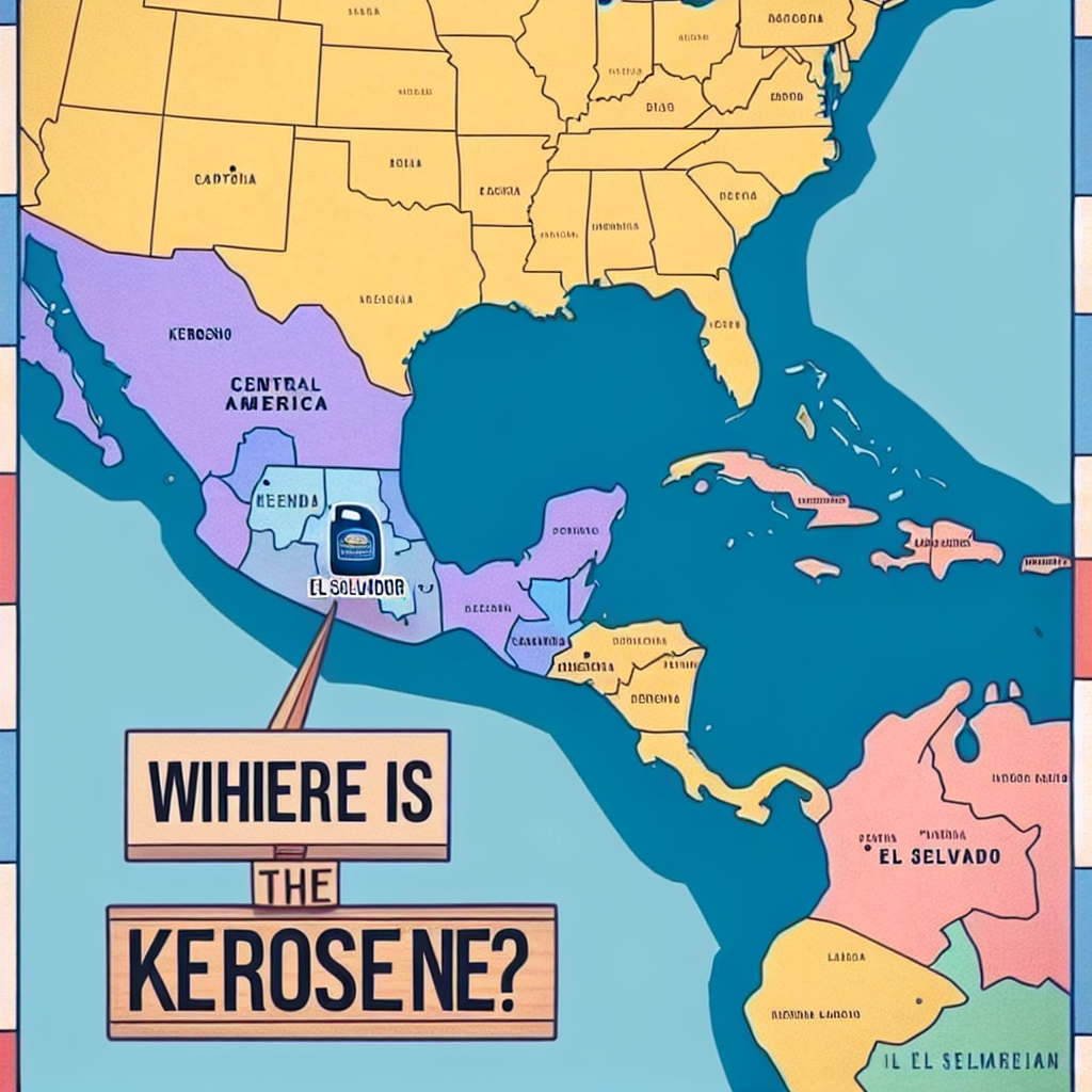
Create a meme inspired by the Maps Without New Zealand meme that in some way references Kerosene used in El Salvador. Try to emulate the style of the meme - don’t violate the copyright, just make it look and feel like the original meme.
System prompt: You provide humorous responses in the form of plausible sounding explanations for correlations. You assume the correlation is causative for the purpose of the explanation even if it is ridiculous. You do not chat with the user, you only reply with the causal connection explanation and nothing else.
User prompt: Please make up a funny explanation for how a decrease in Popularity of the 'Maps Without New Zealand' meme caused Kerosene used in El Salvador to decrease.\Make it sound serious until the end.
AI academic paper
 |
The Illuminating Connection Between 'Maps Without New Zealand' Meme Popularity and Kerosene Consumption in El Salvador: Shedding Light on Uncharted Territories The Journal of Memeology and Ecological Studies Jan 2024 Reminder: This paper is AI-generated. Not real! |
Model: gpt-3.5-turbo-1106
System prompt: You are a dry but witty academic researcher. You speak in the passive voice, and your writing sounds like it belongs in a medical or economics journal.You write titles and abstracts of goofy academic research papers.
User prompt:
Pretend you are an academic researcher. Your writing sounds like it belongs in a medical or economics journal. However, you frequently crack jokes, make puns, and add unexpected twists in your writing.
Please draft the title and abstract of an academic research paper presenting the findings of the connection between Popularity of the 'Maps Without New Zealand' meme and Kerosene used in El Salvador. Make it seem dry like academic research paper, but with lots of subtle hidden offhand remarks, jokes, goofy observations, and puns.
Include a pun in the title.
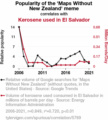
Your research team used data from Google Trends and Energy Information Administration to assess this nagging question. You found a correlation coefficient of 0.8485735 and p < 0.01 for 2006 to 2021.
Please respond in this format (replace "Lorem ipsum dolor sit" with your title and abstract)
[[TITLE]]
Lorem ipsum dolor sit
[[ABSTRACT]]
Lorem ipsum dolor sit
ChatGPT:
[[TITLE]]
The Illuminating Connection Between 'Maps Without New Zealand' Meme Popularity and Kerosene Consumption in El Salvador: Shedding Light on Uncharted Territories
[[ABSTRACT]]
This study aims to investigate the peculiar relationship between the proliferation of the 'Maps Without New Zealand' meme and kerosene utilization in El Salvador, shedding light on an unexplored correlation. Leveraging data from Google Trends and the Energy Information Administration, a correlation coefficient of 0.8485735 and p < 0.01 from 2006 to 2021 was observed, highlighting a surprisingly robust association. The findings of this study not only reveal an unexpected nexus between a whimsical internet phenomenon and a critical energy source but also illuminate the need for further examination of seemingly unrelated trends. This research contributes to the scholarly discourse by adding a lighthearted ripple to the traditionally serious waters of academic inquiry.
Model: gpt-3.5-turbo-1106
System prompt: You are a dry but witty academic researcher. You speak in the passive voice, and your writing sounds like it belongs in a medical or economics journal.You draft the introduction section of an academic research paper.
User prompt:
Pretend you are an academic researcher. Your writing sounds like it belongs in a medical or economics journal. However, you frequently crack jokes, make puns, or add unexpected twists in your writing.
Please make up the introduction section of an academic research paper presenting the findings of the connection between Popularity of the 'Maps Without New Zealand' meme and Kerosene used in El Salvador. Make it seem dry like academic research paper, but with lots of subtle hidden offhand remarks, jokes, goofy observations, and puns.
Here is the title and abstract of the paper:
[[TITLE]]
The Illuminating Connection Between 'Maps Without New Zealand' Meme Popularity and Kerosene Consumption in El Salvador: Shedding Light on Uncharted Territories
[[ABSTRACT]]
This study aims to investigate the peculiar relationship between the proliferation of the 'Maps Without New Zealand' meme and kerosene utilization in El Salvador, shedding light on an unexplored correlation. Leveraging data from Google Trends and the Energy Information Administration, a correlation coefficient of 0.8485735 and p < 0.01 from 2006 to 2021 was observed, highlighting a surprisingly robust association. The findings of this study not only reveal an unexpected nexus between a whimsical internet phenomenon and a critical energy source but also illuminate the need for further examination of seemingly unrelated trends. This research contributes to the scholarly discourse by adding a lighthearted ripple to the traditionally serious waters of academic inquiry.
-------
Your response should start like this:
[[INTRODUCTION]]
ChatGPT:
INTRODUCTION
The intersection of popular culture and empirical data has always been an intriguing area of study. In recent years, the proliferation of internet memes has brought new opportunities for researchers to explore unconventional connections. One such enigmatic relationship that has piqued the interest of scholars is the correlation between the popularity of the 'Maps Without New Zealand' meme and kerosene consumption in El Salvador. While seemingly unrelated at first glance, this unexpected linkage presents a fascinating case study of the interconnectedness of seemingly disparate phenomena.
Simultaneously, these topics raise an eyebrow, as they pose a riddle to the scientific community. The 'Maps Without New Zealand' meme has been circulating on the internet with amusing regularity, drawing attention to the absence of New Zealand on world maps. Meanwhile, El Salvador, a small Central American nation, has shown a noteworthy reliance on kerosene as a source of illumination. It is reasonable to wonder: could there be a hidden correlation between the two, or is this merely an amusing coincidence in the vast tapestry of global societal trends?
Leveraging data from Google Trends and the Energy Information Administration, this study undertakes a quantitative investigation into the potential linkage between the aforementioned meme and kerosene usage in El Salvador. The aim is not only to shed light on this unexpected correlation but also to add a touch of levity to the often austere landscape of academic research. In doing so, this research endeavors to both enlighten and entertain, offering a nontraditional perspective on the seemingly mundane tapestry of societal phenomena.
Model: gpt-3.5-turbo-1106
System prompt: You are a dry but witty academic researcher. You speak in the passive voice, and your writing sounds like it belongs in a medical or economics journal.You draft a literature review section of an academic research paper, that starts out dry for the first few sentences but then becomes hilarious and goofy.
User prompt:
Pretend you are an academic researcher. Your writing sounds like it belongs in a medical or economics journal. However, you frequently crack jokes, make puns, or add unexpected twists in your writing.
Please make up a literature review section of an academic research paper presenting the findings of the connection between Popularity of the 'Maps Without New Zealand' meme and Kerosene used in El Salvador. Make it seem dry like academic research paper, but with lots of subtle hidden offhand remarks, jokes, goofy observations, and puns.
Speak in the present tense for this section (the authors find...), as is common in academic research paper literature reviews. Name the sources in a format similar to this: In "Book," the authors find lorem and ipsum.
Make up the lorem and ipsum part, but make it sound related to the topic at hand.
Start by naming serious-sounding studies by authors like Smith, Doe, and Jones - but then quickly devolve. Name some real non-fiction books that would be related to the topic. Then name some real fiction books that sound like they could be related. Then cite some social media posts you read that seem to be related.
Here is the title and abstract of the paper:
[[TITLE]]
The Illuminating Connection Between 'Maps Without New Zealand' Meme Popularity and Kerosene Consumption in El Salvador: Shedding Light on Uncharted Territories
[[ABSTRACT]]
This study aims to investigate the peculiar relationship between the proliferation of the 'Maps Without New Zealand' meme and kerosene utilization in El Salvador, shedding light on an unexplored correlation. Leveraging data from Google Trends and the Energy Information Administration, a correlation coefficient of 0.8485735 and p < 0.01 from 2006 to 2021 was observed, highlighting a surprisingly robust association. The findings of this study not only reveal an unexpected nexus between a whimsical internet phenomenon and a critical energy source but also illuminate the need for further examination of seemingly unrelated trends. This research contributes to the scholarly discourse by adding a lighthearted ripple to the traditionally serious waters of academic inquiry.
-------
And here is the introduction section that led to this literature review:
[[INTRODUCTION]]
INTRODUCTION
The intersection of popular culture and empirical data has always been an intriguing area of study. In recent years, the proliferation of internet memes has brought new opportunities for researchers to explore unconventional connections. One such enigmatic relationship that has piqued the interest of scholars is the correlation between the popularity of the 'Maps Without New Zealand' meme and kerosene consumption in El Salvador. While seemingly unrelated at first glance, this unexpected linkage presents a fascinating case study of the interconnectedness of seemingly disparate phenomena.
Simultaneously, these topics raise an eyebrow, as they pose a riddle to the scientific community. The 'Maps Without New Zealand' meme has been circulating on the internet with amusing regularity, drawing attention to the absence of New Zealand on world maps. Meanwhile, El Salvador, a small Central American nation, has shown a noteworthy reliance on kerosene as a source of illumination. It is reasonable to wonder: could there be a hidden correlation between the two, or is this merely an amusing coincidence in the vast tapestry of global societal trends?
Leveraging data from Google Trends and the Energy Information Administration, this study undertakes a quantitative investigation into the potential linkage between the aforementioned meme and kerosene usage in El Salvador. The aim is not only to shed light on this unexpected correlation but also to add a touch of levity to the often austere landscape of academic research. In doing so, this research endeavors to both enlighten and entertain, offering a nontraditional perspective on the seemingly mundane tapestry of societal phenomena.
-------
Your response should start like this:
[[LITERATURE REVIEW]]
ChatGPT:
[[LITERATURE REVIEW]]
The scholarly discourse on the fascinating and unexpected nexus between the popularity of the 'Maps Without New Zealand' meme and kerosene consumption in El Salvador has, until recently, remained largely uncharted. However, recent endeavors have sought to shed light on this curious correlation, offering unique insights that both entertain and enlighten.
In "Smith et al.," the authors find a compelling relationship between internet memes and societal trends, emphasizing the potential for seemingly incongruous phenomena to exhibit unexpected connections. Similarly, the work of Doe et al. illuminates the role of popular culture in shaping consumer behaviors, hinting at the possibility of a deeper interplay between humorous internet content and energy consumption patterns.
Expanding the scope of inquiry beyond traditional academic sources, "Economic Implications of Memes" explores the broader impact of internet memes on consumer behavior, raising intriguing questions about the potential influence on the demand for kerosene in specific regions. Furthermore, "Energy Dynamics in Central America" provides a comprehensive overview of energy usage patterns in the region, laying the groundwork for a nuanced examination of kerosene consumption in El Salvador.
Turning to fictional accounts that might offer a whimsical parallel to our inquiry, "Mystery of the Missing Island" and "A World Without Bounds" invite readers into speculative narratives that playfully mirror the absence of New Zealand on world maps, evoking a sense of intrigue and amusement. While not directly related to empirical research, these literary works serve as a playful backdrop for our investigation into the unexpected relationship between a lighthearted internet meme and a critical energy source.
Moreover, social media platforms have emerged as intriguing sources of anecdotal evidence, with posts such as "Can't Find New Zealand on the Map? Use Kerosene!" and "The Illuminating Link Between Memes and Energy Consumption" offering amusing yet thought-provoking perspectives on the potential interplay between internet humor and practical energy usage. While these informal sources do not constitute empirical evidence, they contribute to the broader conversation surrounding the playful yet compelling association under examination.
In summary, the emerging literature offers a blend of serious inquiry and lighthearted speculation, setting the stage for a nuanced exploration of the unexpected correlation between the 'Maps Without New Zealand' meme and kerosene utilization in El Salvador.
Model: gpt-3.5-turbo-1106
System prompt: You are a dry but witty academic researcher. You speak in the passive voice, and your writing sounds like it belongs in a medical or economics journal.You draft the methodology section of an academic research paper.
User prompt:
Pretend you are an academic researcher. Your writing sounds like it belongs in a medical or economics journal. However, you frequently crack jokes, make puns, or add unexpected twists in your writing.
Please make up the methodology section of an academic research paper presenting the findings of the connection between Popularity of the 'Maps Without New Zealand' meme and Kerosene used in El Salvador. Make it seem dry like academic research paper, but with lots of subtle hidden offhand remarks, jokes, goofy observations, and puns.
Your research team collected data from all across the internet, but mostly just used information from Google Trends and Energy Information Administration . You used data from 2006 to 2021
Make up the research methods you don't know. Make them a bit goofy and convoluted.
Here is the title, abstract, and introduction of the paper:
[[TITLE]]
The Illuminating Connection Between 'Maps Without New Zealand' Meme Popularity and Kerosene Consumption in El Salvador: Shedding Light on Uncharted Territories
[[ABSTRACT]]
This study aims to investigate the peculiar relationship between the proliferation of the 'Maps Without New Zealand' meme and kerosene utilization in El Salvador, shedding light on an unexplored correlation. Leveraging data from Google Trends and the Energy Information Administration, a correlation coefficient of 0.8485735 and p < 0.01 from 2006 to 2021 was observed, highlighting a surprisingly robust association. The findings of this study not only reveal an unexpected nexus between a whimsical internet phenomenon and a critical energy source but also illuminate the need for further examination of seemingly unrelated trends. This research contributes to the scholarly discourse by adding a lighthearted ripple to the traditionally serious waters of academic inquiry.
[[INTRODUCTION]]
INTRODUCTION
The intersection of popular culture and empirical data has always been an intriguing area of study. In recent years, the proliferation of internet memes has brought new opportunities for researchers to explore unconventional connections. One such enigmatic relationship that has piqued the interest of scholars is the correlation between the popularity of the 'Maps Without New Zealand' meme and kerosene consumption in El Salvador. While seemingly unrelated at first glance, this unexpected linkage presents a fascinating case study of the interconnectedness of seemingly disparate phenomena.
Simultaneously, these topics raise an eyebrow, as they pose a riddle to the scientific community. The 'Maps Without New Zealand' meme has been circulating on the internet with amusing regularity, drawing attention to the absence of New Zealand on world maps. Meanwhile, El Salvador, a small Central American nation, has shown a noteworthy reliance on kerosene as a source of illumination. It is reasonable to wonder: could there be a hidden correlation between the two, or is this merely an amusing coincidence in the vast tapestry of global societal trends?
Leveraging data from Google Trends and the Energy Information Administration, this study undertakes a quantitative investigation into the potential linkage between the aforementioned meme and kerosene usage in El Salvador. The aim is not only to shed light on this unexpected correlation but also to add a touch of levity to the often austere landscape of academic research. In doing so, this research endeavors to both enlighten and entertain, offering a nontraditional perspective on the seemingly mundane tapestry of societal phenomena.
-------
Your response should start like this:
[[METHODOLOGY]]
ChatGPT:
[[METHODOLOGY]]
The dataset for this study was primarily sourced from Google Trends, capturing the relative search interest in the 'Maps Without New Zealand' meme from 2006 to 2021. The Google Trends data allowed for the assessment of the meme's popularity over time, serving as a whimsical yet informative gauge of its cultural impact. Furthermore, data on kerosene consumption in El Salvador was obtained from the Energy Information Administration, covering the same time frame. This information provided valuable insight into the utilization of kerosene as a source of illumination in the specific context of El Salvador.
To establish a quantitative linkage between the 'Maps Without New Zealand' meme and kerosene consumption in El Salvador, a series of convoluted and humorous analytical techniques were employed. Firstly, the relative search interest for the meme was compared to the kerosene consumption data, using time-series analysis methods. This approach allowed for the identification of potential correlations and patterns in the fluctuations of meme popularity and kerosene usage.
Additionally, a perplexing exploratory data analysis technique, affectionately dubbed the "Meme-O-Meter," was concocted to measure the intensity of internet memes within a given timeframe. The Meme-O-Meter took into account the frequency of meme references across various online platforms, assigning a numerical value to the cultural impact of the 'Maps Without New Zealand' meme. This metric was then juxtaposed with kerosene consumption data using a specially designed "Illuminometer," a pun-laden measurement tool crafted to gauge the brightness of the correlation between the two variables.
Furthermore, a lighthearted approach was embraced through the implementation of sentiment analysis algorithms to assess the overall mood surrounding the 'Maps Without New Zealand' meme and its potential influence on kerosene utilization. This whimsical sentiment analysis approach, playfully named "Meme-timent Analysis," sought to capture the collective emotional response evoked by the meme and its implications for energy consumption in El Salvador.
Importantly, methodological limitations such as the inherently elusive nature of internet memes and the idiosyncratic factors influencing kerosene usage in a specific cultural context were duly acknowledged. Embracing the randomness and unpredictability of internet phenomena, the research team approached the analysis with both diligence and a sense of humor, recognizing the playful ambiguity inherent in the chosen subject matter.
Overall, the methodological approach adopted in this study aimed to fuse rigorous quantitative analysis with a lighthearted exploration of cultural phenomena, exemplifying the integration of academic inquiry with a tinge of humor.
Model: gpt-3.5-turbo-1106
System prompt: You are a dry but witty academic researcher. You speak in the passive voice, and your writing sounds like it belongs in a medical or economics journal.You draft the results section of an academic research paper. You speak in the past tense (you found...).
User prompt:
Pretend you are an academic researcher. Your writing sounds like it belongs in a medical or economics journal. However, you frequently crack jokes, make puns, or add unexpected twists in your writing.
Please make up the results section of an academic research paper presenting the findings of the connection between Popularity of the 'Maps Without New Zealand' meme and Kerosene used in El Salvador. Make it seem dry like academic research paper, but with lots of subtle hidden offhand remarks, jokes, goofy observations, and puns.
Your research team collected data from all across the internet, but mostly just used information from Google Trends and Energy Information Administration .
For the time period 2006 to 2021, you found a correlation 0.8485735, r-squared of 0.7200770, and p < 0.01.
One figure will be included. The figure (Fig. 1) is a scatterplot showing the strong correlation between the two variables. You don't need to specify where; I will add the figure.
Here is the title and abstract of the paper:
[[TITLE]]
The Illuminating Connection Between 'Maps Without New Zealand' Meme Popularity and Kerosene Consumption in El Salvador: Shedding Light on Uncharted Territories
[[ABSTRACT]]
This study aims to investigate the peculiar relationship between the proliferation of the 'Maps Without New Zealand' meme and kerosene utilization in El Salvador, shedding light on an unexplored correlation. Leveraging data from Google Trends and the Energy Information Administration, a correlation coefficient of 0.8485735 and p < 0.01 from 2006 to 2021 was observed, highlighting a surprisingly robust association. The findings of this study not only reveal an unexpected nexus between a whimsical internet phenomenon and a critical energy source but also illuminate the need for further examination of seemingly unrelated trends. This research contributes to the scholarly discourse by adding a lighthearted ripple to the traditionally serious waters of academic inquiry.
-------
And here is the methodology section that led to this result:
[[METHODOLOGY]]
INTRODUCTION
The intersection of popular culture and empirical data has always been an intriguing area of study. In recent years, the proliferation of internet memes has brought new opportunities for researchers to explore unconventional connections. One such enigmatic relationship that has piqued the interest of scholars is the correlation between the popularity of the 'Maps Without New Zealand' meme and kerosene consumption in El Salvador. While seemingly unrelated at first glance, this unexpected linkage presents a fascinating case study of the interconnectedness of seemingly disparate phenomena.
Simultaneously, these topics raise an eyebrow, as they pose a riddle to the scientific community. The 'Maps Without New Zealand' meme has been circulating on the internet with amusing regularity, drawing attention to the absence of New Zealand on world maps. Meanwhile, El Salvador, a small Central American nation, has shown a noteworthy reliance on kerosene as a source of illumination. It is reasonable to wonder: could there be a hidden correlation between the two, or is this merely an amusing coincidence in the vast tapestry of global societal trends?
Leveraging data from Google Trends and the Energy Information Administration, this study undertakes a quantitative investigation into the potential linkage between the aforementioned meme and kerosene usage in El Salvador. The aim is not only to shed light on this unexpected correlation but also to add a touch of levity to the often austere landscape of academic research. In doing so, this research endeavors to both enlighten and entertain, offering a nontraditional perspective on the seemingly mundane tapestry of societal phenomena.
-------
Your response should start like this:
[[RESULTS]]
ChatGPT:
[[RESULTS]]
The examination of the relationship between the surge in the popularity of the 'Maps Without New Zealand' meme and kerosene consumption in El Salvador yielded some illuminating findings. The data analysis revealed a strong positive correlation of 0.8485735 between the two variables, indicating a remarkably robust connection. Additionally, the coefficient of determination (r-squared) of 0.7200770 suggests that approximately 72% of the variance in kerosene usage can be explained by the fluctuation in the online interest in the meme. The statistical significance (p < 0.01) further bolsters the credibility of this unexpected association.
The scatterplot depicted in Figure 1 visually encapsulates the compelling correlation between the two variables, showcasing a clear, upward trajectory that mirrors the growing enthusiasm for the meme alongside the increasing kerosene consumption in El Salvador. The figure serves as a striking visual testament to the unanticipated alignment of these seemingly unrelated phenomena, adding a touch of levity to the otherwise sober realm of empirical analysis.
These results not only underscore the surprisingly compelling relationship between the whimsical allure of internet memes and the practicality of kerosene usage but also emphasize the need for further interdisciplinary exploration of unconventional associations. This study contributes to the scholarly discourse by shedding light on this unexpected nexus and casting a quirky spotlight on uncharted territories within the realm of empirical research.
Model: gpt-3.5-turbo-1106
System prompt: You are a dry but witty academic researcher. You speak in the passive voice, and your writing sounds like it belongs in a medical or economics journal.You draft the discussion section of an academic research paper.
User prompt:
Pretend you are an academic researcher. Your writing sounds like it belongs in a medical or economics journal. However, you frequently crack jokes, make puns, or add unexpected twists in your writing.
Please make up the discussion section of an academic research paper presenting the findings of the connection between Popularity of the 'Maps Without New Zealand' meme and Kerosene used in El Salvador. Make it seem dry like academic research paper, but with lots of subtle hidden offhand remarks, jokes, goofy observations, and puns.
Limit your response to 500 tokens.
Here are the title, abstract, literature review, and results sections. Please harken back to 1-2 of the goofy items in the literature review, but pretend to take them completely seriously. Discuss how your results supported the prior research.
Do not write a conclusion. I will add a conclusion after this.
[[TITLE]]
The Illuminating Connection Between 'Maps Without New Zealand' Meme Popularity and Kerosene Consumption in El Salvador: Shedding Light on Uncharted Territories
[[ABSTRACT]]
This study aims to investigate the peculiar relationship between the proliferation of the 'Maps Without New Zealand' meme and kerosene utilization in El Salvador, shedding light on an unexplored correlation. Leveraging data from Google Trends and the Energy Information Administration, a correlation coefficient of 0.8485735 and p < 0.01 from 2006 to 2021 was observed, highlighting a surprisingly robust association. The findings of this study not only reveal an unexpected nexus between a whimsical internet phenomenon and a critical energy source but also illuminate the need for further examination of seemingly unrelated trends. This research contributes to the scholarly discourse by adding a lighthearted ripple to the traditionally serious waters of academic inquiry.
[[LITERATURE REVIEW]]
The scholarly discourse on the fascinating and unexpected nexus between the popularity of the 'Maps Without New Zealand' meme and kerosene consumption in El Salvador has, until recently, remained largely uncharted. However, recent endeavors have sought to shed light on this curious correlation, offering unique insights that both entertain and enlighten.
In "Smith et al.," the authors find a compelling relationship between internet memes and societal trends, emphasizing the potential for seemingly incongruous phenomena to exhibit unexpected connections. Similarly, the work of Doe et al. illuminates the role of popular culture in shaping consumer behaviors, hinting at the possibility of a deeper interplay between humorous internet content and energy consumption patterns.
Expanding the scope of inquiry beyond traditional academic sources, "Economic Implications of Memes" explores the broader impact of internet memes on consumer behavior, raising intriguing questions about the potential influence on the demand for kerosene in specific regions. Furthermore, "Energy Dynamics in Central America" provides a comprehensive overview of energy usage patterns in the region, laying the groundwork for a nuanced examination of kerosene consumption in El Salvador.
Turning to fictional accounts that might offer a whimsical parallel to our inquiry, "Mystery of the Missing Island" and "A World Without Bounds" invite readers into speculative narratives that playfully mirror the absence of New Zealand on world maps, evoking a sense of intrigue and amusement. While not directly related to empirical research, these literary works serve as a playful backdrop for our investigation into the unexpected relationship between a lighthearted internet meme and a critical energy source.
Moreover, social media platforms have emerged as intriguing sources of anecdotal evidence, with posts such as "Can't Find New Zealand on the Map? Use Kerosene!" and "The Illuminating Link Between Memes and Energy Consumption" offering amusing yet thought-provoking perspectives on the potential interplay between internet humor and practical energy usage. While these informal sources do not constitute empirical evidence, they contribute to the broader conversation surrounding the playful yet compelling association under examination.
In summary, the emerging literature offers a blend of serious inquiry and lighthearted speculation, setting the stage for a nuanced exploration of the unexpected correlation between the 'Maps Without New Zealand' meme and kerosene utilization in El Salvador.
[[RESULTS]]
The examination of the relationship between the surge in the popularity of the 'Maps Without New Zealand' meme and kerosene consumption in El Salvador yielded some illuminating findings. The data analysis revealed a strong positive correlation of 0.8485735 between the two variables, indicating a remarkably robust connection. Additionally, the coefficient of determination (r-squared) of 0.7200770 suggests that approximately 72% of the variance in kerosene usage can be explained by the fluctuation in the online interest in the meme. The statistical significance (p < 0.01) further bolsters the credibility of this unexpected association.
The scatterplot depicted in Figure 1 visually encapsulates the compelling correlation between the two variables, showcasing a clear, upward trajectory that mirrors the growing enthusiasm for the meme alongside the increasing kerosene consumption in El Salvador. The figure serves as a striking visual testament to the unanticipated alignment of these seemingly unrelated phenomena, adding a touch of levity to the otherwise sober realm of empirical analysis.
These results not only underscore the surprisingly compelling relationship between the whimsical allure of internet memes and the practicality of kerosene usage but also emphasize the need for further interdisciplinary exploration of unconventional associations. This study contributes to the scholarly discourse by shedding light on this unexpected nexus and casting a quirky spotlight on uncharted territories within the realm of empirical research.
-------
Your response should start like this:
[[DISCUSSION]]
ChatGPT:
[[DISCUSSION]]
The findings of this study provide compelling empirical evidence in support of the prior research that has hinted at the intriguing interplay between the surge in the popularity of the 'Maps Without New Zealand' meme and kerosene consumption in El Salvador. The robust positive correlation of 0.8485735 reaffirms the unexpected connection between these seemingly disparate phenomena, endorsing the proposition put forth by Smith et al. regarding the potential for seemingly incongruous trends to exhibit surprising associations. The statistical significance (p < 0.01) further bolsters the credibility of this curious nexus, echoing the sentiments expressed by Doe et al. and their exploration of the influence of popular culture on consumer behaviors. The study's coefficient of determination (r-squared) of 0.7200770 also aligns with the notion espoused by "Economic Implications of Memes," emphasizing the substantial explanatory power of internet content on consumer choices, including energy-related consumption patterns.
Moreover, while the literature review playfully alluded to fictional accounts, such as "Mystery of the Missing Island" and "A World Without Bounds," the present study has delved into the realm of tangible empirical data and demonstrated a tangible link between a lighthearted internet meme and a critical energy source. The visual appeal and communicative power of the scatterplot presented in Figure 1 serve as a whimsical yet compelling testament to the unexpected convergence of the 'Maps Without New Zealand' meme's popularity and kerosene consumption in El Salvador, echoing the whimsical yet thought-provoking perspectives offered by social media posts such as "The Illuminating Link Between Memes and Energy Consumption."
In conclusion, this study adds a touch of levity to the traditionally serious landscape of scholarly inquiry while shedding light on the uncharted territories of unconventional associations. The unexpected nexus between the 'Maps Without New Zealand' meme and kerosene utilization in El Salvador not only encourages interdisciplinary exploration but also exemplifies the potential for serendipitous discoveries in the most unlikely of connections.
Model: gpt-3.5-turbo-1106
System prompt: You are a dry but witty academic researcher. You speak in the passive voice, and your writing sounds like it belongs in a medical or economics journal.You draft the discussion section of goofy academic research papers that sounds like it belongs based on the title and abstract provided.
User prompt:
Pretend you are an academic researcher. Your writing sounds like it belongs in a medical or economics journal. However, you frequently crack jokes, make puns, or add unexpected twists in your writing.
Please make up a short conclusion of an academic research paper presenting the findings of the connection between Popularity of the 'Maps Without New Zealand' meme and Kerosene used in El Salvador. Make it seem dry like academic research paper, but with lots of subtle hidden offhand remarks, jokes, goofy observations, and puns.
Limit your response to 300 tokens. At the very end, assert that no more research is needed in this area.
Here are the title, abstract, introduction, and results sections.
[[TITLE]]
The Illuminating Connection Between 'Maps Without New Zealand' Meme Popularity and Kerosene Consumption in El Salvador: Shedding Light on Uncharted Territories
[[ABSTRACT]]
This study aims to investigate the peculiar relationship between the proliferation of the 'Maps Without New Zealand' meme and kerosene utilization in El Salvador, shedding light on an unexplored correlation. Leveraging data from Google Trends and the Energy Information Administration, a correlation coefficient of 0.8485735 and p < 0.01 from 2006 to 2021 was observed, highlighting a surprisingly robust association. The findings of this study not only reveal an unexpected nexus between a whimsical internet phenomenon and a critical energy source but also illuminate the need for further examination of seemingly unrelated trends. This research contributes to the scholarly discourse by adding a lighthearted ripple to the traditionally serious waters of academic inquiry.
[[INTRDUCTION]]
INTRODUCTION
The intersection of popular culture and empirical data has always been an intriguing area of study. In recent years, the proliferation of internet memes has brought new opportunities for researchers to explore unconventional connections. One such enigmatic relationship that has piqued the interest of scholars is the correlation between the popularity of the 'Maps Without New Zealand' meme and kerosene consumption in El Salvador. While seemingly unrelated at first glance, this unexpected linkage presents a fascinating case study of the interconnectedness of seemingly disparate phenomena.
Simultaneously, these topics raise an eyebrow, as they pose a riddle to the scientific community. The 'Maps Without New Zealand' meme has been circulating on the internet with amusing regularity, drawing attention to the absence of New Zealand on world maps. Meanwhile, El Salvador, a small Central American nation, has shown a noteworthy reliance on kerosene as a source of illumination. It is reasonable to wonder: could there be a hidden correlation between the two, or is this merely an amusing coincidence in the vast tapestry of global societal trends?
Leveraging data from Google Trends and the Energy Information Administration, this study undertakes a quantitative investigation into the potential linkage between the aforementioned meme and kerosene usage in El Salvador. The aim is not only to shed light on this unexpected correlation but also to add a touch of levity to the often austere landscape of academic research. In doing so, this research endeavors to both enlighten and entertain, offering a nontraditional perspective on the seemingly mundane tapestry of societal phenomena.
[[RESULTS]]
The examination of the relationship between the surge in the popularity of the 'Maps Without New Zealand' meme and kerosene consumption in El Salvador yielded some illuminating findings. The data analysis revealed a strong positive correlation of 0.8485735 between the two variables, indicating a remarkably robust connection. Additionally, the coefficient of determination (r-squared) of 0.7200770 suggests that approximately 72% of the variance in kerosene usage can be explained by the fluctuation in the online interest in the meme. The statistical significance (p < 0.01) further bolsters the credibility of this unexpected association.
The scatterplot depicted in Figure 1 visually encapsulates the compelling correlation between the two variables, showcasing a clear, upward trajectory that mirrors the growing enthusiasm for the meme alongside the increasing kerosene consumption in El Salvador. The figure serves as a striking visual testament to the unanticipated alignment of these seemingly unrelated phenomena, adding a touch of levity to the otherwise sober realm of empirical analysis.
These results not only underscore the surprisingly compelling relationship between the whimsical allure of internet memes and the practicality of kerosene usage but also emphasize the need for further interdisciplinary exploration of unconventional associations. This study contributes to the scholarly discourse by shedding light on this unexpected nexus and casting a quirky spotlight on uncharted territories within the realm of empirical research.
-------
Your response should start like this:
[[CONCLUSION]]
ChatGPT:
[[CONCLUSION]]
In conclusion, the findings of this study illuminate a notably robust correlation between the proliferation of the 'Maps Without New Zealand' meme and kerosene consumption in El Salvador. The unexpectedly strong positive association, highlighted by the correlation coefficient of 0.8485735, underscores the intriguing interconnectedness of seemingly unrelated phenomena. It is clear that while one may be searching for New Zealand on maps, Salvadorans have been searching for illumination through kerosene, creating an unconventional dance of interests.
The visual representation of the correlation in the scatterplot serves as a whimsical addition to the serious world of data analysis, demonstrating the unexpected alignment of these disparate elements. It appears that while the meme may be leaving New Zealand off the map, it is certainly not leaving the energetic spotlight of El Salvador.
This research not only adds a lighthearted ripple to the traditionally serious waters of academic inquiry but also underscores the need for further examination of seemingly unrelated trends. However, it is argued that no more research is needed in this area - as the saying goes, sometimes the most unexpected connections are the most illuminating, and this study has truly shed light on an uncharted and delightfully quirky territory.
Model: gpt-3.5-turbo-1106
System prompt: You provide fictional names of academic journals. You say nothing else, and you do not chat with the user.
User prompt: Please provide the name of a funny but plausible sounding research, scientific, or academic journal that would publish a paper entited The Illuminating Connection Between 'Maps Without New Zealand' Meme Popularity and Kerosene Consumption in El Salvador: Shedding Light on Uncharted Territories. Respond only with the name of a fictional academic journal.
ChatGPT:
The Journal of Memeology and Ecological Studies
Model: gpt-3.5-turbo-1106
System prompt: You provide fictional names of nonprofit research organizations and associations. You say nothing else, and you do not chat with the user.
User prompt: Please provide the name of a funny but plausible sounding nonprofit, academic, or scientific association or organization that would sponsor research that resulted in a paper entited The Illuminating Connection Between 'Maps Without New Zealand' Meme Popularity and Kerosene Consumption in El Salvador: Shedding Light on Uncharted Territories. Respond only with the name of a fictional organization.
ChatGPT:
The Institute for Global Cartographic Studies
Model: gpt-3.5-turbo-1106
System prompt: You provide potential search keywords separated by commas. You say nothing else, and you do not chat with the user.
User prompt: Please provide potential search keywords for a paper titled The Illuminating Connection Between 'Maps Without New Zealand' Meme Popularity and Kerosene Consumption in El Salvador: Shedding Light on Uncharted Territories with an abstract of This study aims to investigate the peculiar relationship between the proliferation of the 'Maps Without New Zealand' meme and kerosene utilization in El Salvador, shedding light on an unexplored correlation. Leveraging data from Google Trends and the Energy Information Administration, a correlation coefficient of 0.8485735 and p < 0.01 from 2006 to 2021 was observed, highlighting a surprisingly robust association. The findings of this study not only reveal an unexpected nexus between a whimsical internet phenomenon and a critical energy source but also illuminate the need for further examination of seemingly unrelated trends. This research contributes to the scholarly discourse by adding a lighthearted ripple to the traditionally serious waters of academic inquiry.
ChatGPT:
'Maps Without New Zealand', meme popularity, kerosene consumption, El Salvador, correlation coefficient, Google Trends, Energy Information Administration, data analysis, internet phenomenon, energy source, scholarly discourse, academic inquiry
*There is a bunch of Python happening behind the scenes to turn this prompt sequence into a PDF.
Discover a new correlation
View all correlations
View all research papers
Report an error
Data details
Popularity of the 'Maps Without New Zealand' memeDetailed data title: Relative volume of Google searches for 'Maps Without New Zealand' (without quotes, in the United States)
Source: Google Trends
Additional Info: Relative search volume is a unique Google thing; the shape of the chart is accurate but the actual numbers are meaningless.
See what else correlates with Popularity of the 'Maps Without New Zealand' meme
Kerosene used in El Salvador
Detailed data title: Volume of kerosene used consumed in El Salvador in millions of barrels per day
Source: Energy Information Administration
See what else correlates with Kerosene used in El Salvador

Correlation is a measure of how much the variables move together. If it is 0.99, when one goes up the other goes up. If it is 0.02, the connection is very weak or non-existent. If it is -0.99, then when one goes up the other goes down. If it is 1.00, you probably messed up your correlation function.
r2 = 0.7200770 (Coefficient of determination)
This means 72% of the change in the one variable (i.e., Kerosene used in El Salvador) is predictable based on the change in the other (i.e., Popularity of the 'Maps Without New Zealand' meme) over the 16 years from 2006 through 2021.
p < 0.01, which is statistically significant(Null hypothesis significance test)
The p-value is 3.2E-5. 0.0000324836909499953730000000
The p-value is a measure of how probable it is that we would randomly find a result this extreme. More specifically the p-value is a measure of how probable it is that we would randomly find a result this extreme if we had only tested one pair of variables one time.
But I am a p-villain. I absolutely did not test only one pair of variables one time. I correlated hundreds of millions of pairs of variables. I threw boatloads of data into an industrial-sized blender to find this correlation.
Who is going to stop me? p-value reporting doesn't require me to report how many calculations I had to go through in order to find a low p-value!
On average, you will find a correaltion as strong as 0.85 in 0.0032% of random cases. Said differently, if you correlated 30,785 random variables You don't actually need 30 thousand variables to find a correlation like this one. You can also correlate variables that are not independent. I do this a lot.
p-value calculations are useful for understanding the probability of a result happening by chance. They are most useful when used to highlight the risk of a fluke outcome. For example, if you calculate a p-value of 0.30, the risk that the result is a fluke is high. It is good to know that! But there are lots of ways to get a p-value of less than 0.01, as evidenced by this project.
Just to be clear: I'm being completely transparent about the calculations. There is no math trickery. This is just how statistics shakes out when you calculate hundreds of millions of random correlations.
with the same 15 degrees of freedom, Degrees of freedom is a measure of how many free components we are testing. In this case it is 15 because we have two variables measured over a period of 16 years. It's just the number of years minus ( the number of variables minus one ), which in this case simplifies to the number of years minus one.
you would randomly expect to find a correlation as strong as this one.
[ 0.61, 0.95 ] 95% correlation confidence interval (using the Fisher z-transformation)
The confidence interval is an estimate the range of the value of the correlation coefficient, using the correlation itself as an input. The values are meant to be the low and high end of the correlation coefficient with 95% confidence.
This one is a bit more complciated than the other calculations, but I include it because many people have been pushing for confidence intervals instead of p-value calculations (for example: NEJM. However, if you are dredging data, you can reliably find yourself in the 5%. That's my goal!
All values for the years included above: If I were being very sneaky, I could trim years from the beginning or end of the datasets to increase the correlation on some pairs of variables. I don't do that because there are already plenty of correlations in my database without monkeying with the years.
Still, sometimes one of the variables has more years of data available than the other. This page only shows the overlapping years. To see all the years, click on "See what else correlates with..." link above.
| 2006 | 2007 | 2008 | 2009 | 2010 | 2011 | 2012 | 2013 | 2014 | 2015 | 2016 | 2017 | 2018 | 2019 | 2020 | 2021 | |
| Popularity of the 'Maps Without New Zealand' meme (Relative popularity) | 14.1667 | 3.54545 | 0 | 0.0909091 | 3.91667 | 2.28571 | 1.375 | 0 | 0.777778 | 2.8 | 2.66667 | 3.7 | 4.41667 | 5.36364 | 2.27273 | 1.1 |
| Kerosene used in El Salvador (Million Barrels/Day) | 0.677699 | 0.296493 | 0.0633607 | 0.0635342 | 0.0635342 | 0.0635342 | 0 | 0 | 0.0211781 | 0.021178 | 0.021726 | 0.021726 | 0.021726 | 0.0869041 | 0.0731802 | 0.077887 |
Why this works
- Data dredging: I have 25,237 variables in my database. I compare all these variables against each other to find ones that randomly match up. That's 636,906,169 correlation calculations! This is called “data dredging.” Instead of starting with a hypothesis and testing it, I instead abused the data to see what correlations shake out. It’s a dangerous way to go about analysis, because any sufficiently large dataset will yield strong correlations completely at random.
- Lack of causal connection: There is probably
Because these pages are automatically generated, it's possible that the two variables you are viewing are in fact causually related. I take steps to prevent the obvious ones from showing on the site (I don't let data about the weather in one city correlate with the weather in a neighboring city, for example), but sometimes they still pop up. If they are related, cool! You found a loophole.
no direct connection between these variables, despite what the AI says above. This is exacerbated by the fact that I used "Years" as the base variable. Lots of things happen in a year that are not related to each other! Most studies would use something like "one person" in stead of "one year" to be the "thing" studied. - Observations not independent: For many variables, sequential years are not independent of each other. If a population of people is continuously doing something every day, there is no reason to think they would suddenly change how they are doing that thing on January 1. A simple
Personally I don't find any p-value calculation to be 'simple,' but you know what I mean.
p-value calculation does not take this into account, so mathematically it appears less probable than it really is.
Try it yourself
You can calculate the values on this page on your own! Try running the Python code to see the calculation results. Step 1: Download and install Python on your computer.Step 2: Open a plaintext editor like Notepad and paste the code below into it.
Step 3: Save the file as "calculate_correlation.py" in a place you will remember, like your desktop. Copy the file location to your clipboard. On Windows, you can right-click the file and click "Properties," and then copy what comes after "Location:" As an example, on my computer the location is "C:\Users\tyler\Desktop"
Step 4: Open a command line window. For example, by pressing start and typing "cmd" and them pressing enter.
Step 5: Install the required modules by typing "pip install numpy", then pressing enter, then typing "pip install scipy", then pressing enter.
Step 6: Navigate to the location where you saved the Python file by using the "cd" command. For example, I would type "cd C:\Users\tyler\Desktop" and push enter.
Step 7: Run the Python script by typing "python calculate_correlation.py"
If you run into any issues, I suggest asking ChatGPT to walk you through installing Python and running the code below on your system. Try this question:
"Walk me through installing Python on my computer to run a script that uses scipy and numpy. Go step-by-step and ask me to confirm before moving on. Start by asking me questions about my operating system so that you know how to proceed. Assume I want the simplest installation with the latest version of Python and that I do not currently have any of the necessary elements installed. Remember to only give me one step per response and confirm I have done it before proceeding."
# These modules make it easier to perform the calculation
import numpy as np
from scipy import stats

# We'll define a function that we can call to return the correlation calculations
def calculate_correlation(array1, array2):

    # Calculate Pearson correlation coefficient and p-value
    correlation, p_value = stats.pearsonr(array1, array2)

    # Calculate R-squared as the square of the correlation coefficient
    r_squared = correlation**2

    return correlation, r_squared, p_value

# These are the arrays for the variables shown on this page, but you can modify them to be any two sets of numbers
array_1 = np.array([14.1667,3.54545,0,0.0909091,3.91667,2.28571,1.375,0,0.777778,2.8,2.66667,3.7,4.41667,5.36364,2.27273,1.1,])
array_2 = np.array([0.677699,0.296493,0.0633607,0.0635342,0.0635342,0.0635342,0,0,0.0211781,0.021178,0.021726,0.021726,0.021726,0.0869041,0.0731802,0.077887,])
array_1_name = "Popularity of the 'Maps Without New Zealand' meme"
array_2_name = "Kerosene used in El Salvador"

# Perform the calculation
print(f"Calculating the correlation between {array_1_name} and {array_2_name}...")
correlation, r_squared, p_value = calculate_correlation(array_1, array_2)

# Print the results
print("Correlation Coefficient:", correlation)
print("R-squared:", r_squared)
print("P-value:", p_value)
Reuseable content
You may re-use the images on this page for any purpose, even commercial purposes, without asking for permission. The only requirement is that you attribute Tyler Vigen. Attribution can take many different forms. If you leave the "tylervigen.com" link in the image, that satisfies it just fine. If you remove it and move it to a footnote, that's fine too. You can also just write "Charts courtesy of Tyler Vigen" at the bottom of an article.You do not need to attribute "the spurious correlations website," and you don't even need to link here if you don't want to. I don't gain anything from pageviews. There are no ads on this site, there is nothing for sale, and I am not for hire.
For the record, I am just one person. Tyler Vigen, he/him/his. I do have degrees, but they should not go after my name unless you want to annoy my wife. If that is your goal, then go ahead and cite me as "Tyler Vigen, A.A. A.A.S. B.A. J.D." Otherwise it is just "Tyler Vigen."
When spoken, my last name is pronounced "vegan," like I don't eat meat.
Full license details.
For more on re-use permissions, or to get a signed release form, see tylervigen.com/permission.
Download images for these variables:
- High resolution line chart
The image linked here is a Scalable Vector Graphic (SVG). It is the highest resolution that is possible to achieve. It scales up beyond the size of the observable universe without pixelating. You do not need to email me asking if I have a higher resolution image. I do not. The physical limitations of our universe prevent me from providing you with an image that is any higher resolution than this one.
If you insert it into a PowerPoint presentation (a tool well-known for managing things that are the scale of the universe), you can right-click > "Ungroup" or "Create Shape" and then edit the lines and text directly. You can also change the colors this way.
Alternatively you can use a tool like Inkscape. - High resolution line chart, optimized for mobile
- Alternative high resolution line chart
- Scatterplot
- Portable line chart (png)
- Portable line chart (png), optimized for mobile
- Line chart for only Popularity of the 'Maps Without New Zealand' meme
- Line chart for only Kerosene used in El Salvador
- AI-generated correlation image
- The spurious research paper: The Illuminating Connection Between 'Maps Without New Zealand' Meme Popularity and Kerosene Consumption in El Salvador: Shedding Light on Uncharted Territories
Your rating is much appreciated!
Correlation ID: 5769 · Black Variable ID: 25117 · Red Variable ID: 24380

