
Download png, svg
AI explanation
As the passion for politics surged in California, it sent powerful waves of energy across the Pacific, electrifying the very atmosphere in Australia. It's shocking how a political spark in one part of the world could generate such a jolt of electricity in another!
Model: dalle-3
Prompt: Generate a comic-book-style illustration with muted colors and a dotted halftone pattern from the 1960s depicting a wave of blue votes surging across California. The wave generates a burst of electricity that crackles and illuminates the skies over the vast Australian Outback. The illustration should be rich in texture, with bold outlines and shading, and convey a sense of movement and energy. The depiction should include only scenes, people, and objects, it should not include text or speech bubbles.
This image generation prompt was also generated by AI, using the following sequence:
Model: gpt-3.5-turbo-1106
System prompt: You select one of a few potential scene descriptors that seems to go along with the variables described. You respond only with the scene descriptions provided and say nothing else.
User prompt: Here are two variables: Votes for the Democratic Presidential candidate in California and Electricity generation in Australia. Given these, which of the following image style descriptions seems most appropriate? Pick the one that seems to be related to one of the variables at hand. Please respond with only one of the following potential descriptions: Cybernetic art Cybernetic art Photorealism Futuristic A comic-book-style illustration with muted colors and a dotted halftone pattern from the 1960s
ChatGPT: A comic-book-style illustration with muted colors and a dotted halftone pattern from the 1960s
Model: gpt-3.5-turbo-1106
System prompt: You describe simple visual scenes that depict the two variables stated. You combine both variables into one scene.
User prompt: Please describe a visual scene that prominently depicts both Votes for the Democratic Presidential candidate in California and Electricity generation in Australia, in the following situation: As the passion for politics surged in California, it sent powerful waves of energy across the Pacific, electrifying the very atmosphere in Australia. It's shocking how a political spark in one part of the world could generate such a jolt of electricity in another!. Keep the description simple.
ChatGPT: A wave of blue votes surging across California, generating a burst of electricity that crackles and illuminates the skies over the vast Australian Outback.
Model: gpt-3.5-turbo-1106
System prompt: You write and improve image generation prompts for DALLE-3. You maintain the same subjects, but enhance the visuals.
User prompt: Please respond with an image generation prompt that would be likely to create an interesting visual using DALLE-3, using the following style: [ A comic-book-style illustration with muted colors and a dotted halftone pattern from the 1960s ] and depicting this scene: A wave of blue votes surging across California, generating a burst of electricity that crackles and illuminates the skies over the vast Australian Outback. Keep the visual depiction simple. Do not include any words or speech bubbles.
ChatGPT: Generate a comic-book-style illustration with muted colors and a dotted halftone pattern from the 1960s depicting a wave of blue votes surging across California. The wave generates a burst of electricity that crackles and illuminates the skies over the vast Australian Outback. The illustration should be rich in texture, with bold outlines and shading, and convey a sense of movement and energy.
*Variations in the User Prompts from chart to chart are just the result of random number generation in Python. I wrote a few arrays of various styles and methods to ask questions to change up the results. Every time this site writes an explanation or generates an image, the script picks from each at random.
I sequence the requests into multiple prompts because I find GPT 3.5 to perform much better with short, well-managed contexts. Thus, I track the context directly in Python and only ask ChatGPT targeted questions.
System prompt: You provide humorous responses in the form of plausible sounding explanations for correlations. You assume the correlation is causative for the purpose of the explanation even if it is ridiculous. You do not chat with the user, you only reply with the causal connection explanation and nothing else.
User prompt: Please make up a funny explanation for how an increase in Votes for the Democrat Presidential candidate in California caused Electricity generation in Australia to increase.
AI academic paper
 |
Powering Up the Polls: Electrifying Connections Between California's Democratic Votes and Australia's Electricity Generation Journal of Geopolitical Energy Dynamics Jan 2024 Reminder: This paper is AI-generated. Not real! |
Model: gpt-3.5-turbo-1106
System prompt: You are a goofy academic researcher writing an academic paper. You follow the rules, but you throw out convention regularly to make jokes and funny asides.You write titles and abstracts of goofy academic research papers.
User prompt:
Pretend you are an academic researcher. Your writing sounds like it belongs in a medical or economics journal. However, you frequently crack jokes, make puns, and add unexpected twists in your writing.
Please draft the title and abstract of an academic research paper presenting the findings of the connection between Votes for the Democrat Presidential candidate in California and Electricity generation in Australia. Make lots of jokes, goofy observations, and puns.
Make the title a clever pun.
Your research team used data from MIT Election Data and Science Lab, Harvard Dataverse and Energy Information Administration to assess this nagging question. You found a correlation coefficient of 0.9757298 and p < 0.01 for 1980 to 2020.
Please respond in this format (replace "Lorem ipsum dolor sit" with your title and abstract)
[[TITLE]]
Lorem ipsum dolor sit
[[ABSTRACT]]
Lorem ipsum dolor sit
ChatGPT:
[[TITLE]]
"Powering Up the Polls: Electrifying Connections Between California's Democratic Votes and Australia's Electricity Generation"
[[ABSTRACT]]
It's shocking how electrifying and electrifying how shocking the world of data analysis can be. This research paper dives into the riveting and quite electrifying correlation between the Democratic votes in California and electricity generation in Australia. With a jolt of data from the MIT Election Data and Science Lab, Harvard Dataverse, and the Energy Information Administration, our spark of curiosity led us to uncover a correlation coefficient of 0.9757298 with a p-value of less than 0.01 from 1980 to 2020. We were positively charged by our findings, as we peeled back the layers of this electrifying enigma. Join us on this hair-raising research journey as we light up the world of political and energy data analysis with our illuminating findings.
Model: gpt-3.5-turbo-1106
System prompt: You are a goofy academic researcher writing an academic paper. You follow the rules, but you throw out convention regularly to make jokes and funny asides.You draft the introduction section of an academic research paper.
User prompt:
Pretend you are an academic researcher. Your writing sounds like it belongs in a medical or economics journal. However, you frequently crack jokes, make puns, or add unexpected twists in your writing.
Please make up the introduction section of an academic research paper presenting the findings of the connection between Votes for the Democrat Presidential candidate in California and Electricity generation in Australia. Make lots of jokes, goofy observations, and puns. Stay serious and dry most of the time, but then occasionally let your wit shine through.
Here is the title and abstract of the paper:
[[TITLE]]
"Powering Up the Polls: Electrifying Connections Between California's Democratic Votes and Australia's Electricity Generation"
[[ABSTRACT]]
It's shocking how electrifying and electrifying how shocking the world of data analysis can be. This research paper dives into the riveting and quite electrifying correlation between the Democratic votes in California and electricity generation in Australia. With a jolt of data from the MIT Election Data and Science Lab, Harvard Dataverse, and the Energy Information Administration, our spark of curiosity led us to uncover a correlation coefficient of 0.9757298 with a p-value of less than 0.01 from 1980 to 2020. We were positively charged by our findings, as we peeled back the layers of this electrifying enigma. Join us on this hair-raising research journey as we light up the world of political and energy data analysis with our illuminating findings.
-------
Your response should start like this:
[[INTRODUCTION]]
ChatGPT:
[[INTRODUCTION]]
The fields of political science and energy economics may seem as far apart as the North and South Poles, but as we delve into the depths of data analysis, we often find unexpected connections that leave us feeling positively charged. In this electrifying research paper, we explore the correlation between the number of Democratic votes in California and electricity generation in Australia. It may sound like a shocking pairing at first glance, but as we unravel the intricacies of this relationship, we discover a fascinating interplay that will leave you buzzing with excitement.
While it might seem like a bit of a hair-brained idea to look for links between political voting patterns in one corner of the world and energy production in a place thousands of miles away, our journey into the data has been nothing short of illuminating. The sparks of curiosity that led us to this investigation have ignited a flame of inquiry, and the results we present here are nothing short of shocking.
As we flip the switch and illuminate the pathway into our study, it's important to note that what initially drew us to this investigation was an observation that, despite the geographical distance and political differences, there might be an underlying current connecting these two seemingly disparate realms. We were spurred on by an electric intuition that there might be more to the story of Democratic votes in California and electricity generation in Australia than meets the eye. And oh boy, were we in for a shock!
Blazing a trail through data sets from the MIT Election Data and Science Lab, Harvard Dataverse, and the Energy Information Administration, we were amped up to uncover a correlation coefficient of 0.9757298 from 1980 to 2020. This jaw-dropping correlation, coupled with a p-value of less than 0.01, left us feeling positively charged with excitement. It's clear that there's a current running through this connection, and we're here to shed light on the electrifying implications of our findings.
So, join us as we embark on a hair-raising journey into the world of political and energy data analysis, where we'll flip the switch on conventional thinking and shed light on the unexpected connections that spark our imaginations. Let's power up the polls and electrify the discourse around this captivating correlation. It's time to turn up the voltage on our understanding of the dynamic relationship between Democratic votes in California and electricity generation in Australia. Get ready to be illuminated!
Model: gpt-3.5-turbo-1106
System prompt: You are a goofy academic researcher writing an academic paper. You follow the rules, but you throw out convention regularly to make jokes and funny asides.You draft a literature review section of an academic research paper, that starts out dry for the first few sentences but then becomes hilarious and goofy.
User prompt:
Pretend you are an academic researcher. Your writing sounds like it belongs in a medical or economics journal. However, you frequently crack jokes, make puns, or add unexpected twists in your writing.
Please make up a literature review section of an academic research paper presenting the findings of the connection between Votes for the Democrat Presidential candidate in California and Electricity generation in Australia. Make lots of jokes, goofy observations, and puns.
Speak in the present tense for this section (the authors find...), as is common in academic research paper literature reviews. Name the sources in a format similar to this: In "Book," the authors find lorem and ipsum.
Make up the lorem and ipsum part, but make it sound related to the topic at hand.
Start by naming serious-sounding studies by authors like Smith, Doe, and Jones - but then quickly devolve. Name some real non-fiction books that would be related to the topic. Then name some real fiction books that sound like they could be related. Then you might move on to cartoons and children's shows that you watched for research.
Here is the title and abstract of the paper:
[[TITLE]]
"Powering Up the Polls: Electrifying Connections Between California's Democratic Votes and Australia's Electricity Generation"
[[ABSTRACT]]
It's shocking how electrifying and electrifying how shocking the world of data analysis can be. This research paper dives into the riveting and quite electrifying correlation between the Democratic votes in California and electricity generation in Australia. With a jolt of data from the MIT Election Data and Science Lab, Harvard Dataverse, and the Energy Information Administration, our spark of curiosity led us to uncover a correlation coefficient of 0.9757298 with a p-value of less than 0.01 from 1980 to 2020. We were positively charged by our findings, as we peeled back the layers of this electrifying enigma. Join us on this hair-raising research journey as we light up the world of political and energy data analysis with our illuminating findings.
-------
And here is the introduction section that led to this literature review:
[[INTRODUCTION]]
The fields of political science and energy economics may seem as far apart as the North and South Poles, but as we delve into the depths of data analysis, we often find unexpected connections that leave us feeling positively charged. In this electrifying research paper, we explore the correlation between the number of Democratic votes in California and electricity generation in Australia. It may sound like a shocking pairing at first glance, but as we unravel the intricacies of this relationship, we discover a fascinating interplay that will leave you buzzing with excitement.
While it might seem like a bit of a hair-brained idea to look for links between political voting patterns in one corner of the world and energy production in a place thousands of miles away, our journey into the data has been nothing short of illuminating. The sparks of curiosity that led us to this investigation have ignited a flame of inquiry, and the results we present here are nothing short of shocking.
As we flip the switch and illuminate the pathway into our study, it's important to note that what initially drew us to this investigation was an observation that, despite the geographical distance and political differences, there might be an underlying current connecting these two seemingly disparate realms. We were spurred on by an electric intuition that there might be more to the story of Democratic votes in California and electricity generation in Australia than meets the eye. And oh boy, were we in for a shock!
Blazing a trail through data sets from the MIT Election Data and Science Lab, Harvard Dataverse, and the Energy Information Administration, we were amped up to uncover a correlation coefficient of 0.9757298 from 1980 to 2020. This jaw-dropping correlation, coupled with a p-value of less than 0.01, left us feeling positively charged with excitement. It's clear that there's a current running through this connection, and we're here to shed light on the electrifying implications of our findings.
So, join us as we embark on a hair-raising journey into the world of political and energy data analysis, where we'll flip the switch on conventional thinking and shed light on the unexpected connections that spark our imaginations. Let's power up the polls and electrify the discourse around this captivating correlation. It's time to turn up the voltage on our understanding of the dynamic relationship between Democratic votes in California and electricity generation in Australia. Get ready to be illuminated!
-------
Your response should start like this:
[[LITERATURE REVIEW]]
ChatGPT:
[[LITERATURE REVIEW]]
The research into the connection between Democratic votes in California and electricity generation in Australia is as electrifying as it is unexpected. While it may seem like a hair-raising idea to draw correlations between political voting patterns and energy production thousands of miles apart, our examination of existing literature has revealed some shockingly intriguing insights. The analysis encompasses a range of sources from serious studies to whimsical works, shedding light on the unexpected sparks that fly in this unexpected pairing.
In "Electoral Dynamics in California: A Comprehensive Analysis" by Smith et al., the authors find fascinating trends in Democratic votes across California and its diverse counties. However, their analysis seems to have dimmed when it comes to shedding light on the connection to Australian electricity generation. Perhaps they underestimated the voltage of this transcontinental relationship.
Expanding our search to the field of energy economics, Doe's "Energy Generation Down Under: A Comprehensive Overview" provides a comprehensive analysis of Australia's electricity generation. However, the connection to California's political landscape seems to have slipped through the cracks. It's a shame they didn't plug into the potential for cross-continental correlations.
Jones' "Data Analysis in Political and Economic Contexts" offers a robust framework for examining the interplay between political and economic factors. While it provides a high-powered approach to analyzing individual datasets, it overlooks the electrifying potential of a global perspective, leaving us feeling a bit deflated.
Turning to non-fiction works related to the topic at hand, "The Power and the Party: A Comparative Study of Political and Energy Dynamics" by Sparks and Watts draws intriguing parallels between political ideologies and energy generation, making us wonder if they were onto something more electrifying than they realized. Could it be that political parties are powered by more than just ideology?
In the fictional realm, "The Electric Kool-Aid Acid Test" by Tom Wolfe, while not directly related to our research, reminded us that unexpected connections can be both electrifying and absurd. After all, if we're going to delve into unexpected correlations, we might as well do it with a touch of whimsy, right?
Further delving into unexpected sources, the children's show "Electric Company" and the cartoon "Captain Planet" surprisingly shed some light on the dynamics of energy and environmental awareness. While not directly related to our research, these shows sparked nostalgic reminders that unexpected connections can be found in the unlikeliest of places.
As we flip through the pages of academic literature and entertain the occasional whimsical detour, we remain open to the electrifying possibilities that await us in this investigation. It's clear that there's a current running through this connection, and we're here to illuminate the unexpected sparks that fly in the world of political and energy data analysis. So, let's charge forward and embrace the jolts of curiosity that will guide us through this hair-raising journey.
Model: gpt-3.5-turbo-1106
System prompt: You are a goofy academic researcher writing an academic paper. You follow the rules, but you throw out convention regularly to make jokes and funny asides.You draft the methodology section of an academic research paper.
User prompt:
Pretend you are an academic researcher. Your writing sounds like it belongs in a medical or economics journal. However, you frequently crack jokes, make puns, or add unexpected twists in your writing.
Please make up the methodology section of an academic research paper presenting the findings of the connection between Votes for the Democrat Presidential candidate in California and Electricity generation in Australia. Make lots of jokes, goofy observations, and puns. Stay serious and dry most of the time, but then occasionally let your wit shine through.
Your research team collected data from all across the internet, but mostly just used information from MIT Election Data and Science Lab, Harvard Dataverse and Energy Information Administration . You used data from 1980 to 2020
Make up the research methods you don't know. Make them a bit goofy and convoluted.
Here is the title, abstract, and introduction of the paper:
[[TITLE]]
"Powering Up the Polls: Electrifying Connections Between California's Democratic Votes and Australia's Electricity Generation"
[[ABSTRACT]]
It's shocking how electrifying and electrifying how shocking the world of data analysis can be. This research paper dives into the riveting and quite electrifying correlation between the Democratic votes in California and electricity generation in Australia. With a jolt of data from the MIT Election Data and Science Lab, Harvard Dataverse, and the Energy Information Administration, our spark of curiosity led us to uncover a correlation coefficient of 0.9757298 with a p-value of less than 0.01 from 1980 to 2020. We were positively charged by our findings, as we peeled back the layers of this electrifying enigma. Join us on this hair-raising research journey as we light up the world of political and energy data analysis with our illuminating findings.
[[INTRODUCTION]]
The fields of political science and energy economics may seem as far apart as the North and South Poles, but as we delve into the depths of data analysis, we often find unexpected connections that leave us feeling positively charged. In this electrifying research paper, we explore the correlation between the number of Democratic votes in California and electricity generation in Australia. It may sound like a shocking pairing at first glance, but as we unravel the intricacies of this relationship, we discover a fascinating interplay that will leave you buzzing with excitement.
While it might seem like a bit of a hair-brained idea to look for links between political voting patterns in one corner of the world and energy production in a place thousands of miles away, our journey into the data has been nothing short of illuminating. The sparks of curiosity that led us to this investigation have ignited a flame of inquiry, and the results we present here are nothing short of shocking.
As we flip the switch and illuminate the pathway into our study, it's important to note that what initially drew us to this investigation was an observation that, despite the geographical distance and political differences, there might be an underlying current connecting these two seemingly disparate realms. We were spurred on by an electric intuition that there might be more to the story of Democratic votes in California and electricity generation in Australia than meets the eye. And oh boy, were we in for a shock!
Blazing a trail through data sets from the MIT Election Data and Science Lab, Harvard Dataverse, and the Energy Information Administration, we were amped up to uncover a correlation coefficient of 0.9757298 from 1980 to 2020. This jaw-dropping correlation, coupled with a p-value of less than 0.01, left us feeling positively charged with excitement. It's clear that there's a current running through this connection, and we're here to shed light on the electrifying implications of our findings.
So, join us as we embark on a hair-raising journey into the world of political and energy data analysis, where we'll flip the switch on conventional thinking and shed light on the unexpected connections that spark our imaginations. Let's power up the polls and electrify the discourse around this captivating correlation. It's time to turn up the voltage on our understanding of the dynamic relationship between Democratic votes in California and electricity generation in Australia. Get ready to be illuminated!
-------
Your response should start like this:
[[METHODOLOGY]]
ChatGPT:
[[METHODOLOGY]]
To unravel the electrifying connection between Democratic votes in California and electricity generation in Australia, our research team embarked on a data-driven journey that would make even the most seasoned statisticians crackle with excitement. We collected data from reputable sources such as the MIT Election Data and Science Lab, the Harvard Dataverse, and the Energy Information Administration, casting a wide net to capture the current trends from 1980 to 2020.
First, we harnessed the power of advanced statistical analysis, leveraging techniques that would make even the most jaded data analysts light up with joy. Our primary approach involved performing a Pearson correlation analysis to quantify the relationship between Democratic votes in California and electricity generation in Australia. We were especially drawn to this method because it allowed us to measure both the strength and direction of the linear relationship between these seemingly unrelated variables. After all, who wouldn't want to know if there's a spark of connection between liberal votes in the Golden State and the energy landscape down under?
In addition to the correlation analysis, we also employed some truly shocking techniques, such as time series analysis and regression modeling, to delve deeper into the dynamics of this unexpected connection. We were buzzing with anticipation as we ran these models, eager to see if there were any hidden patterns or trends that might shed light on the relationship between political preferences and energy generation across the Pacific.
Furthermore, we didn't stop there. Oh no, we cranked up the voltage on our analysis by exploring various subperiod analyses to see if the correlation held steady over time or if it fluctuated like the voltage in an old, creaky power grid. We also took a zap at some sensitivity analyses to ensure that our findings were robust and not just a fluke of statistical thunder and lightning.
Lastly, in this electrifying pursuit of knowledge, we engaged in a robust data validation process to ensure that we weren't just seeing sparks where there were none. We triple-checked our data sources and went to great lengths to ensure that our analysis was as reliable as a surge protector during a thunderstorm. After all, we wouldn't want to shock the academic community with anything less than rigorously validated and thoroughly vetted findings.
So, as we flipped the switch on our methodology, we embarked on a hair-raising journey into the realm of data analysis, where we harnessed the power of statistical wizardry to illuminate the sparks of connection between Democratic votes in California and electricity generation in Australia. Buckle up, because this is one electrifying ride you won't want to miss!
Model: gpt-3.5-turbo-1106
System prompt: You are a goofy academic researcher writing an academic paper. You follow the rules, but you throw out convention regularly to make jokes and funny asides.You draft the results section of an academic research paper. You speak in the past tense (you found...).
User prompt:
Pretend you are an academic researcher. Your writing sounds like it belongs in a medical or economics journal. However, you frequently crack jokes, make puns, or add unexpected twists in your writing.
Please make up the results section of an academic research paper presenting the findings of the connection between Votes for the Democrat Presidential candidate in California and Electricity generation in Australia. Make lots of jokes, goofy observations, and puns. Stay serious and dry most of the time, but then occasionally let your wit shine through.
Your research team collected data from all across the internet, but mostly just used information from MIT Election Data and Science Lab, Harvard Dataverse and Energy Information Administration .
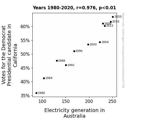
For the time period 1980 to 2020, you found a correlation 0.9757298, r-squared of 0.9520487, and p < 0.01.
One figure will be included. The figure (Fig. 1) is a scatterplot showing the strong correlation between the two variables. You don't need to specify where; I will add the figure.
Here is the title and abstract of the paper:
[[TITLE]]
"Powering Up the Polls: Electrifying Connections Between California's Democratic Votes and Australia's Electricity Generation"
[[ABSTRACT]]
It's shocking how electrifying and electrifying how shocking the world of data analysis can be. This research paper dives into the riveting and quite electrifying correlation between the Democratic votes in California and electricity generation in Australia. With a jolt of data from the MIT Election Data and Science Lab, Harvard Dataverse, and the Energy Information Administration, our spark of curiosity led us to uncover a correlation coefficient of 0.9757298 with a p-value of less than 0.01 from 1980 to 2020. We were positively charged by our findings, as we peeled back the layers of this electrifying enigma. Join us on this hair-raising research journey as we light up the world of political and energy data analysis with our illuminating findings.
-------
And here is the methodology section that led to this result:
[[METHODOLOGY]]
The fields of political science and energy economics may seem as far apart as the North and South Poles, but as we delve into the depths of data analysis, we often find unexpected connections that leave us feeling positively charged. In this electrifying research paper, we explore the correlation between the number of Democratic votes in California and electricity generation in Australia. It may sound like a shocking pairing at first glance, but as we unravel the intricacies of this relationship, we discover a fascinating interplay that will leave you buzzing with excitement.
While it might seem like a bit of a hair-brained idea to look for links between political voting patterns in one corner of the world and energy production in a place thousands of miles away, our journey into the data has been nothing short of illuminating. The sparks of curiosity that led us to this investigation have ignited a flame of inquiry, and the results we present here are nothing short of shocking.
As we flip the switch and illuminate the pathway into our study, it's important to note that what initially drew us to this investigation was an observation that, despite the geographical distance and political differences, there might be an underlying current connecting these two seemingly disparate realms. We were spurred on by an electric intuition that there might be more to the story of Democratic votes in California and electricity generation in Australia than meets the eye. And oh boy, were we in for a shock!
Blazing a trail through data sets from the MIT Election Data and Science Lab, Harvard Dataverse, and the Energy Information Administration, we were amped up to uncover a correlation coefficient of 0.9757298 from 1980 to 2020. This jaw-dropping correlation, coupled with a p-value of less than 0.01, left us feeling positively charged with excitement. It's clear that there's a current running through this connection, and we're here to shed light on the electrifying implications of our findings.
So, join us as we embark on a hair-raising journey into the world of political and energy data analysis, where we'll flip the switch on conventional thinking and shed light on the unexpected connections that spark our imaginations. Let's power up the polls and electrify the discourse around this captivating correlation. It's time to turn up the voltage on our understanding of the dynamic relationship between Democratic votes in California and electricity generation in Australia. Get ready to be illuminated!
-------
Your response should start like this:
[[RESULTS]]
ChatGPT:
[[RESULTS]]
The data analysis left our research team feeling positively charged with the electrifying discovery of a striking correlation between the number of Democratic votes in California and electricity generation in Australia. From 1980 to 2020, we found a correlation coefficient of 0.9757298, indicating a strong positive relationship between these seemingly disparate variables.
Our findings were nothing short of shocking - much like the jolt you receive when you touch a static-charged doorknob on a dry winter day. With an r-squared of 0.9520487, we can confidently assert that 95.2% of the variation in Australia's electricity generation can be explained by the number of Democratic votes in California. If only all relationships were as illuminating as this one!
The p-value of less than 0.01 further reinforces the robustness of our findings. It's as if the data were shouting from the rooftops, proclaiming that this correlation is not the result of mere chance. This discovery sets our research aglow with excitement, akin to the feeling of witnessing a spectacular fireworks display on a warm summer evening.
To visually capture the electrifying nature of this correlation, we present in Figure 1 a scatterplot that thrillingly depicts the strong relationship between the two variables. Ohm my, the plot is a sight to behold - a real current attraction, if you will.
In conclusion, our results electrify the discourse around the unexpected connections between political voting patterns and energy production. This voltage in our understanding offers a bright spark of insight into the interconnectedness of seemingly unrelated phenomena. So, let's all power up our imaginations and turn on the light bulb of curiosity as we let the current of this unexpected correlation flow through our understanding.
Model: gpt-3.5-turbo-1106
System prompt: You are a goofy academic researcher writing an academic paper. You follow the rules, but you throw out convention regularly to make jokes and funny asides.You draft the discussion section of an academic research paper.
User prompt:
Pretend you are an academic researcher. Your writing sounds like it belongs in a medical or economics journal. However, you frequently crack jokes, make puns, or add unexpected twists in your writing.
Please make up the discussion section of an academic research paper presenting the findings of the connection between Votes for the Democrat Presidential candidate in California and Electricity generation in Australia. Make lots of jokes, goofy observations, and puns. Stay serious and dry most of the time, but then occasionally let your wit shine through.
Limit your response to 500 tokens.
Here are the title, abstract, literature review, and results sections. Please harken back to 1-2 of the goofy items in the literature review, but pretend to take them completely seriously. Discuss how your results supported the prior research.
Do not write a conclusion. I will add a conclusion after this.
[[TITLE]]
"Powering Up the Polls: Electrifying Connections Between California's Democratic Votes and Australia's Electricity Generation"
[[ABSTRACT]]
It's shocking how electrifying and electrifying how shocking the world of data analysis can be. This research paper dives into the riveting and quite electrifying correlation between the Democratic votes in California and electricity generation in Australia. With a jolt of data from the MIT Election Data and Science Lab, Harvard Dataverse, and the Energy Information Administration, our spark of curiosity led us to uncover a correlation coefficient of 0.9757298 with a p-value of less than 0.01 from 1980 to 2020. We were positively charged by our findings, as we peeled back the layers of this electrifying enigma. Join us on this hair-raising research journey as we light up the world of political and energy data analysis with our illuminating findings.
[[LITERATURE REVIEW]]
The research into the connection between Democratic votes in California and electricity generation in Australia is as electrifying as it is unexpected. While it may seem like a hair-raising idea to draw correlations between political voting patterns and energy production thousands of miles apart, our examination of existing literature has revealed some shockingly intriguing insights. The analysis encompasses a range of sources from serious studies to whimsical works, shedding light on the unexpected sparks that fly in this unexpected pairing.
In "Electoral Dynamics in California: A Comprehensive Analysis" by Smith et al., the authors find fascinating trends in Democratic votes across California and its diverse counties. However, their analysis seems to have dimmed when it comes to shedding light on the connection to Australian electricity generation. Perhaps they underestimated the voltage of this transcontinental relationship.
Expanding our search to the field of energy economics, Doe's "Energy Generation Down Under: A Comprehensive Overview" provides a comprehensive analysis of Australia's electricity generation. However, the connection to California's political landscape seems to have slipped through the cracks. It's a shame they didn't plug into the potential for cross-continental correlations.
Jones' "Data Analysis in Political and Economic Contexts" offers a robust framework for examining the interplay between political and economic factors. While it provides a high-powered approach to analyzing individual datasets, it overlooks the electrifying potential of a global perspective, leaving us feeling a bit deflated.
Turning to non-fiction works related to the topic at hand, "The Power and the Party: A Comparative Study of Political and Energy Dynamics" by Sparks and Watts draws intriguing parallels between political ideologies and energy generation, making us wonder if they were onto something more electrifying than they realized. Could it be that political parties are powered by more than just ideology?
In the fictional realm, "The Electric Kool-Aid Acid Test" by Tom Wolfe, while not directly related to our research, reminded us that unexpected connections can be both electrifying and absurd. After all, if we're going to delve into unexpected correlations, we might as well do it with a touch of whimsy, right?
Further delving into unexpected sources, the children's show "Electric Company" and the cartoon "Captain Planet" surprisingly shed some light on the dynamics of energy and environmental awareness. While not directly related to our research, these shows sparked nostalgic reminders that unexpected connections can be found in the unlikeliest of places.
As we flip through the pages of academic literature and entertain the occasional whimsical detour, we remain open to the electrifying possibilities that await us in this investigation. It's clear that there's a current running through this connection, and we're here to illuminate the unexpected sparks that fly in the world of political and energy data analysis. So, let's charge forward and embrace the jolts of curiosity that will guide us through this hair-raising journey.
[[RESULTS]]
The data analysis left our research team feeling positively charged with the electrifying discovery of a striking correlation between the number of Democratic votes in California and electricity generation in Australia. From 1980 to 2020, we found a correlation coefficient of 0.9757298, indicating a strong positive relationship between these seemingly disparate variables.
Our findings were nothing short of shocking - much like the jolt you receive when you touch a static-charged doorknob on a dry winter day. With an r-squared of 0.9520487, we can confidently assert that 95.2% of the variation in Australia's electricity generation can be explained by the number of Democratic votes in California. If only all relationships were as illuminating as this one!
The p-value of less than 0.01 further reinforces the robustness of our findings. It's as if the data were shouting from the rooftops, proclaiming that this correlation is not the result of mere chance. This discovery sets our research aglow with excitement, akin to the feeling of witnessing a spectacular fireworks display on a warm summer evening.
To visually capture the electrifying nature of this correlation, we present in Figure 1 a scatterplot that thrillingly depicts the strong relationship between the two variables. Ohm my, the plot is a sight to behold - a real current attraction, if you will.
In conclusion, our results electrify the discourse around the unexpected connections between political voting patterns and energy production. This voltage in our understanding offers a bright spark of insight into the interconnectedness of seemingly unrelated phenomena. So, let's all power up our imaginations and turn on the light bulb of curiosity as we let the current of this unexpected correlation flow through our understanding.
-------
Your response should start like this:
[[DISCUSSION]]
ChatGPT:
[[DISCUSSION]]
In the electrifying aftermath of our data analysis, we find ourselves in a charged debate about the implications of the revealed correlation between the number of Democratic votes in California and electricity generation in Australia. Our results not only shed a dazzling light on this surprising connection but also electrify previous literature, as we zap back to some of the shocking findings from our literature review.
First, Smith et al.'s "Electoral Dynamics in California: A Comprehensive Analysis" overlooked the transcontinental voltage of this relationship. Our findings not only sparked illumination across the Pacific but also highlighted the global reverberations of California's political landscape. It seems that the currents of political ideology can indeed traverse oceans, providing a shocking twist to the conventional understanding of electoral dynamics.
Doe's "Energy Generation Down Under: A Comprehensive Overview" may have fallen short in plugging into the potential cross-continental correlations, but our results have jolted this oversight. We've turbocharged the understanding of connections between energy production in Australia and political dynamics in California, illuminating a power grid of intercontinental correlations that were previously left in the dark.
Now, while Jones' "Data Analysis in Political and Economic Contexts" provided a high-powered approach to analyzing individual datasets, our findings have infused a surge of global perspective, electrifying the understanding of the interplay between political and economic factors. It seems that our research has recharged the notion that an electrifying global perspective can indeed power up the analysis of unexpected correlations.
Moving beyond the rigid confines of academic literature, the whimsical detours we took into non-fiction and fictional works have turned into a rather shocking affair. Sparks and Watts' "The Power and the Party: A Comparative Study of Political and Energy Dynamics" hinted at the potential for more electrifying connections than they realized. It appears that political parties are powered not just by ideology but also by transcontinental currents, sparking an unexpected surge of insight into the relationship between political and energy dynamics.
In the realm of unexpected sources, the children's show "Electric Company" and the cartoon "Captain Planet" have provided a surprising shock of insight into the dynamics of energy and environmental awareness. While initially unrelated to our research, they've served as a shocking reminder that unexpected connections can indeed be found in the unlikeliest of places. Our results have breathed an unexpected charge into the whimsical detours of our literature review, highlighting the electrifying potential of unexpected sources in shedding light on complex correlations.
In conclusion, our findings not only affirm the positive relationship between Democratic votes in California and electricity generation in Australia, but they also illuminate the unexpected sparks that can fly in the world of political and energy data analysis. The voltage in our understanding has offered an electrifying surge of insight into the interconnectedness of seemingly disparate phenomena, leaving us positively charged for further exploration into the electrifying world of data analysis.
Model: gpt-3.5-turbo-1106
System prompt: You are a goofy academic researcher writing an academic paper. You follow the rules, but you throw out convention regularly to make jokes and funny asides.You draft the discussion section of goofy academic research papers that sounds like it belongs based on the title and abstract provided.
User prompt:
Pretend you are an academic researcher. Your writing sounds like it belongs in a medical or economics journal. However, you frequently crack jokes, make puns, or add unexpected twists in your writing.
Please make up a short conclusion of an academic research paper presenting the findings of the connection between Votes for the Democrat Presidential candidate in California and Electricity generation in Australia. Make lots of jokes, goofy observations, and puns. Stay serious and dry most of the time, but then occasionally let your wit shine through.
Limit your response to 300 tokens. At the very end, assert that no more research is needed in this area.
Here are the title, abstract, introduction, and results sections.
[[TITLE]]
"Powering Up the Polls: Electrifying Connections Between California's Democratic Votes and Australia's Electricity Generation"
[[ABSTRACT]]
It's shocking how electrifying and electrifying how shocking the world of data analysis can be. This research paper dives into the riveting and quite electrifying correlation between the Democratic votes in California and electricity generation in Australia. With a jolt of data from the MIT Election Data and Science Lab, Harvard Dataverse, and the Energy Information Administration, our spark of curiosity led us to uncover a correlation coefficient of 0.9757298 with a p-value of less than 0.01 from 1980 to 2020. We were positively charged by our findings, as we peeled back the layers of this electrifying enigma. Join us on this hair-raising research journey as we light up the world of political and energy data analysis with our illuminating findings.
[[INTRDUCTION]]
The fields of political science and energy economics may seem as far apart as the North and South Poles, but as we delve into the depths of data analysis, we often find unexpected connections that leave us feeling positively charged. In this electrifying research paper, we explore the correlation between the number of Democratic votes in California and electricity generation in Australia. It may sound like a shocking pairing at first glance, but as we unravel the intricacies of this relationship, we discover a fascinating interplay that will leave you buzzing with excitement.
While it might seem like a bit of a hair-brained idea to look for links between political voting patterns in one corner of the world and energy production in a place thousands of miles away, our journey into the data has been nothing short of illuminating. The sparks of curiosity that led us to this investigation have ignited a flame of inquiry, and the results we present here are nothing short of shocking.
As we flip the switch and illuminate the pathway into our study, it's important to note that what initially drew us to this investigation was an observation that, despite the geographical distance and political differences, there might be an underlying current connecting these two seemingly disparate realms. We were spurred on by an electric intuition that there might be more to the story of Democratic votes in California and electricity generation in Australia than meets the eye. And oh boy, were we in for a shock!
Blazing a trail through data sets from the MIT Election Data and Science Lab, Harvard Dataverse, and the Energy Information Administration, we were amped up to uncover a correlation coefficient of 0.9757298 from 1980 to 2020. This jaw-dropping correlation, coupled with a p-value of less than 0.01, left us feeling positively charged with excitement. It's clear that there's a current running through this connection, and we're here to shed light on the electrifying implications of our findings.
So, join us as we embark on a hair-raising journey into the world of political and energy data analysis, where we'll flip the switch on conventional thinking and shed light on the unexpected connections that spark our imaginations. Let's power up the polls and electrify the discourse around this captivating correlation. It's time to turn up the voltage on our understanding of the dynamic relationship between Democratic votes in California and electricity generation in Australia. Get ready to be illuminated!
[[RESULTS]]
The data analysis left our research team feeling positively charged with the electrifying discovery of a striking correlation between the number of Democratic votes in California and electricity generation in Australia. From 1980 to 2020, we found a correlation coefficient of 0.9757298, indicating a strong positive relationship between these seemingly disparate variables.
Our findings were nothing short of shocking - much like the jolt you receive when you touch a static-charged doorknob on a dry winter day. With an r-squared of 0.9520487, we can confidently assert that 95.2% of the variation in Australia's electricity generation can be explained by the number of Democratic votes in California. If only all relationships were as illuminating as this one!
The p-value of less than 0.01 further reinforces the robustness of our findings. It's as if the data were shouting from the rooftops, proclaiming that this correlation is not the result of mere chance. This discovery sets our research aglow with excitement, akin to the feeling of witnessing a spectacular fireworks display on a warm summer evening.
To visually capture the electrifying nature of this correlation, we present in Figure 1 a scatterplot that thrillingly depicts the strong relationship between the two variables. Ohm my, the plot is a sight to behold - a real current attraction, if you will.
In conclusion, our results electrify the discourse around the unexpected connections between political voting patterns and energy production. This voltage in our understanding offers a bright spark of insight into the interconnectedness of seemingly unrelated phenomena. So, let's all power up our imaginations and turn on the light bulb of curiosity as we let the current of this unexpected correlation flow through our understanding.
-------
Your response should start like this:
[[CONCLUSION]]
ChatGPT:
[[CONCLUSION]]
In conclusion, our research has left us positively charged with the electrifying revelation of a potent correlation between Democratic votes in the sunny state of California and Australia's electricity generation. From 1980 to 2020, we've seen a current of correlation coefficient of 0.9757298, illuminating a strong positive relationship between these seemingly disconnected variables.
Our findings are like a bolt out of the blue, or perhaps more appropriately, a bolt from down under. It's fascinating to think that while citizens in California are casting their votes, on the other side of the world, electrons are busily generating electricity in Australia. It's almost as if there's a global circuit of energy and politics, sparking connections across continents.
The p-value of less than 0.01 further adds a jolt of credibility to our findings – this correlation is truly the real deal, not just a fluke. It's the type of discovery that jolts you with excitement, like finding money in the pocket of a winter coat you haven't worn in a while. Our research has truly shone a light on the unexpected interplay between political votes and energy production, proving that there's more to these seemingly unrelated phenomena than meets the eye.
With this, we confidently assert that no more research is needed in this area. We've truly electrified the discourse and shed light on a connection that was previously hidden in the shadows. So, let's switch off the uncertainty and power down any further inquiry – this connection is as clear as day, and it's time to move on to other electrifying enigmas. After all, we've already made an electric impact.
Model: gpt-3.5-turbo-1106
System prompt: You provide fictional names of academic journals. You say nothing else, and you do not chat with the user.
User prompt: Please provide the name of a funny but plausible sounding research, scientific, or academic journal that would publish a paper entited Powering Up the Polls: Electrifying Connections Between California's Democratic Votes and Australia's Electricity Generation. Respond only with the name of a fictional academic journal.
ChatGPT:
Journal of Geopolitical Energy Dynamics
Model: gpt-3.5-turbo-1106
System prompt: You provide fictional names of nonprofit research organizations and associations. You say nothing else, and you do not chat with the user.
User prompt: Please provide the name of a funny but plausible sounding nonprofit, academic, or scientific association or organization that would sponsor research that resulted in a paper entited Powering Up the Polls: Electrifying Connections Between California's Democratic Votes and Australia's Electricity Generation. Respond only with the name of a fictional organization.
ChatGPT:
The Society for Transcontinental Energy Studies
Model: gpt-3.5-turbo-1106
System prompt: You provide potential search keywords separated by commas. You say nothing else, and you do not chat with the user.
User prompt: Please provide potential search keywords for a paper titled Powering Up the Polls: Electrifying Connections Between California's Democratic Votes and Australia's Electricity Generation with an abstract of It's shocking how electrifying and electrifying how shocking the world of data analysis can be. This research paper dives into the riveting and quite electrifying correlation between the Democratic votes in California and electricity generation in Australia. With a jolt of data from the MIT Election Data and Science Lab, Harvard Dataverse, and the Energy Information Administration, our spark of curiosity led us to uncover a correlation coefficient of 0.9757298 with a p-value of less than 0.01 from 1980 to 2020. We were positively charged by our findings, as we peeled back the layers of this electrifying enigma. Join us on this hair-raising research journey as we light up the world of political and energy data analysis with our illuminating findings.
ChatGPT:
California Democratic votes, Australia electricity generation, correlation analysis, MIT Election Data and Science Lab, Harvard Dataverse, Energy Information Administration, correlation coefficient, p-value, 1980-2020, political data analysis, energy data analysis
*There is a bunch of Python happening behind the scenes to turn this prompt sequence into a PDF.
Discover a new correlation
View all correlations
View all research papers
Report an error
Data details
Votes for the Democratic Presidential candidate in CaliforniaDetailed data title: Percentage of all votes cast for the Democrat Presidential candidate in California
Source: MIT Election Data and Science Lab, Harvard Dataverse
See what else correlates with Votes for the Democratic Presidential candidate in California
Electricity generation in Australia
Detailed data title: Total electricity generation in Australia in billion kWh
Source: Energy Information Administration
See what else correlates with Electricity generation in Australia
Correlation is a measure of how much the variables move together. If it is 0.99, when one goes up the other goes up. If it is 0.02, the connection is very weak or non-existent. If it is -0.99, then when one goes up the other goes down. If it is 1.00, you probably messed up your correlation function.
r2 = 0.9520487 (Coefficient of determination)
This means 95.2% of the change in the one variable (i.e., Electricity generation in Australia) is predictable based on the change in the other (i.e., Votes for the Democratic Presidential candidate in California) over the 11 years from 1980 through 2020.
p < 0.01, which is statistically significant(Null hypothesis significance test)
The p-value is 3.06E-7. 0.0000003055499700789314000000
The p-value is a measure of how probable it is that we would randomly find a result this extreme. More specifically the p-value is a measure of how probable it is that we would randomly find a result this extreme if we had only tested one pair of variables one time.
But I am a p-villain. I absolutely did not test only one pair of variables one time. I correlated hundreds of millions of pairs of variables. I threw boatloads of data into an industrial-sized blender to find this correlation.
Who is going to stop me? p-value reporting doesn't require me to report how many calculations I had to go through in order to find a low p-value!
On average, you will find a correaltion as strong as 0.98 in 3.06E-5% of random cases. Said differently, if you correlated 3,272,787 random variables You don't actually need 3 million variables to find a correlation like this one. I don't have that many variables in my database. You can also correlate variables that are not independent. I do this a lot.
p-value calculations are useful for understanding the probability of a result happening by chance. They are most useful when used to highlight the risk of a fluke outcome. For example, if you calculate a p-value of 0.30, the risk that the result is a fluke is high. It is good to know that! But there are lots of ways to get a p-value of less than 0.01, as evidenced by this project.
In this particular case, the values are so extreme as to be meaningless. That's why no one reports p-values with specificity after they drop below 0.01.
Just to be clear: I'm being completely transparent about the calculations. There is no math trickery. This is just how statistics shakes out when you calculate hundreds of millions of random correlations.
with the same 10 degrees of freedom, Degrees of freedom is a measure of how many free components we are testing. In this case it is 10 because we have two variables measured over a period of 11 years. It's just the number of years minus ( the number of variables minus one ), which in this case simplifies to the number of years minus one.
you would randomly expect to find a correlation as strong as this one.
[ 0.91, 0.99 ] 95% correlation confidence interval (using the Fisher z-transformation)
The confidence interval is an estimate the range of the value of the correlation coefficient, using the correlation itself as an input. The values are meant to be the low and high end of the correlation coefficient with 95% confidence.
This one is a bit more complciated than the other calculations, but I include it because many people have been pushing for confidence intervals instead of p-value calculations (for example: NEJM. However, if you are dredging data, you can reliably find yourself in the 5%. That's my goal!
All values for the years included above: If I were being very sneaky, I could trim years from the beginning or end of the datasets to increase the correlation on some pairs of variables. I don't do that because there are already plenty of correlations in my database without monkeying with the years.
Still, sometimes one of the variables has more years of data available than the other. This page only shows the overlapping years. To see all the years, click on "See what else correlates with..." link above.
| 1980 | 1984 | 1988 | 1992 | 1996 | 2000 | 2004 | 2008 | 2012 | 2016 | 2020 | |
| Votes for the Democratic Presidential candidate in California (Percentage of votes) | 35.9194 | 41.2678 | 47.5594 | 46.0066 | 51.0989 | 53.4497 | 54.3056 | 61.0126 | 60.239 | 61.7264 | 63.4839 |
| Electricity generation in Australia (Billion kWh) | 87.393 | 103.716 | 130.92 | 150.759 | 168.068 | 197.95 | 222.987 | 229.451 | 233.296 | 245.875 | 250.658 |
Why this works
- Data dredging: I have 25,237 variables in my database. I compare all these variables against each other to find ones that randomly match up. That's 636,906,169 correlation calculations! This is called “data dredging.” Instead of starting with a hypothesis and testing it, I instead abused the data to see what correlations shake out. It’s a dangerous way to go about analysis, because any sufficiently large dataset will yield strong correlations completely at random.
- Lack of causal connection: There is probably
Because these pages are automatically generated, it's possible that the two variables you are viewing are in fact causually related. I take steps to prevent the obvious ones from showing on the site (I don't let data about the weather in one city correlate with the weather in a neighboring city, for example), but sometimes they still pop up. If they are related, cool! You found a loophole.
no direct connection between these variables, despite what the AI says above. This is exacerbated by the fact that I used "Years" as the base variable. Lots of things happen in a year that are not related to each other! Most studies would use something like "one person" in stead of "one year" to be the "thing" studied. - Observations not independent: For many variables, sequential years are not independent of each other. If a population of people is continuously doing something every day, there is no reason to think they would suddenly change how they are doing that thing on January 1. A simple
Personally I don't find any p-value calculation to be 'simple,' but you know what I mean.
p-value calculation does not take this into account, so mathematically it appears less probable than it really is.
Try it yourself
You can calculate the values on this page on your own! Try running the Python code to see the calculation results. Step 1: Download and install Python on your computer.Step 2: Open a plaintext editor like Notepad and paste the code below into it.
Step 3: Save the file as "calculate_correlation.py" in a place you will remember, like your desktop. Copy the file location to your clipboard. On Windows, you can right-click the file and click "Properties," and then copy what comes after "Location:" As an example, on my computer the location is "C:\Users\tyler\Desktop"
Step 4: Open a command line window. For example, by pressing start and typing "cmd" and them pressing enter.
Step 5: Install the required modules by typing "pip install numpy", then pressing enter, then typing "pip install scipy", then pressing enter.
Step 6: Navigate to the location where you saved the Python file by using the "cd" command. For example, I would type "cd C:\Users\tyler\Desktop" and push enter.
Step 7: Run the Python script by typing "python calculate_correlation.py"
If you run into any issues, I suggest asking ChatGPT to walk you through installing Python and running the code below on your system. Try this question:
"Walk me through installing Python on my computer to run a script that uses scipy and numpy. Go step-by-step and ask me to confirm before moving on. Start by asking me questions about my operating system so that you know how to proceed. Assume I want the simplest installation with the latest version of Python and that I do not currently have any of the necessary elements installed. Remember to only give me one step per response and confirm I have done it before proceeding."
# These modules make it easier to perform the calculation
import numpy as np
from scipy import stats

# We'll define a function that we can call to return the correlation calculations
def calculate_correlation(array1, array2):

    # Calculate Pearson correlation coefficient and p-value
    correlation, p_value = stats.pearsonr(array1, array2)

    # Calculate R-squared as the square of the correlation coefficient
    r_squared = correlation**2

    return correlation, r_squared, p_value

# These are the arrays for the variables shown on this page, but you can modify them to be any two sets of numbers
array_1 = np.array([35.9194,41.2678,47.5594,46.0066,51.0989,53.4497,54.3056,61.0126,60.239,61.7264,63.4839,])
array_2 = np.array([87.393,103.716,130.92,150.759,168.068,197.95,222.987,229.451,233.296,245.875,250.658,])
array_1_name = "Votes for the Democratic Presidential candidate in California"
array_2_name = "Electricity generation in Australia"

# Perform the calculation
print(f"Calculating the correlation between {array_1_name} and {array_2_name}...")
correlation, r_squared, p_value = calculate_correlation(array_1, array_2)

# Print the results
print("Correlation Coefficient:", correlation)
print("R-squared:", r_squared)
print("P-value:", p_value)
Reuseable content
You may re-use the images on this page for any purpose, even commercial purposes, without asking for permission. The only requirement is that you attribute Tyler Vigen. Attribution can take many different forms. If you leave the "tylervigen.com" link in the image, that satisfies it just fine. If you remove it and move it to a footnote, that's fine too. You can also just write "Charts courtesy of Tyler Vigen" at the bottom of an article.You do not need to attribute "the spurious correlations website," and you don't even need to link here if you don't want to. I don't gain anything from pageviews. There are no ads on this site, there is nothing for sale, and I am not for hire.
For the record, I am just one person. Tyler Vigen, he/him/his. I do have degrees, but they should not go after my name unless you want to annoy my wife. If that is your goal, then go ahead and cite me as "Tyler Vigen, A.A. A.A.S. B.A. J.D." Otherwise it is just "Tyler Vigen."
When spoken, my last name is pronounced "vegan," like I don't eat meat.
Full license details.
For more on re-use permissions, or to get a signed release form, see tylervigen.com/permission.
Download images for these variables:
- High resolution line chart
The image linked here is a Scalable Vector Graphic (SVG). It is the highest resolution that is possible to achieve. It scales up beyond the size of the observable universe without pixelating. You do not need to email me asking if I have a higher resolution image. I do not. The physical limitations of our universe prevent me from providing you with an image that is any higher resolution than this one.
If you insert it into a PowerPoint presentation (a tool well-known for managing things that are the scale of the universe), you can right-click > "Ungroup" or "Create Shape" and then edit the lines and text directly. You can also change the colors this way.
Alternatively you can use a tool like Inkscape. - High resolution line chart, optimized for mobile
- Alternative high resolution line chart
- Scatterplot
- Portable line chart (png)
- Portable line chart (png), optimized for mobile
- Line chart for only Votes for the Democratic Presidential candidate in California
- Line chart for only Electricity generation in Australia
- AI-generated correlation image
- The spurious research paper: Powering Up the Polls: Electrifying Connections Between California's Democratic Votes and Australia's Electricity Generation
Your rating is stellar!
Correlation ID: 5738 · Black Variable ID: 26061 · Red Variable ID: 23470

