
Download png, svg
AI explanation
More people watching the videos means more brain power being used, and all that extra thinking is creating a surge in innovative ideas. One of those brilliant ideas must have been finding a new use for petroleum in New Caledonia, leading to an unexpected spike in demand. It's a real brain-teaser!
Model: dalle-3
Prompt: Generate an image of a city skyline at night, with towering skyscrapers illuminated by glowing screens displaying popular SmarterEveryDay videos. Amidst the hustle and bustle of the urban landscape, a line of cars waits at a petrol station, with the New Caledonian flag waving in the background. The scene embodies a surge in both video views and petroleum consumption, reflecting a compelling and thought-provoking connection between the two disparate elements. Capture the vibrant energy and innovation permeating the city, as people are drawn to the captivating allure of both the videos and the resource. The depiction should include only scenes, people, and objects, it should not include text or speech bubbles.
This image generation prompt was also generated by AI, using the following sequence:
Model: gpt-3.5-turbo-1106
System prompt: You select one of a few potential scene descriptors that seems to go along with the variables described. You respond only with the scene descriptions provided and say nothing else.
User prompt: Here are two variables: Average views of SmarterEveryDay YouTube videos and Petroluem consumption in New Caledonia. Given these, which of the following image style descriptions seems most appropriate? Pick the one that seems to be related to one of the variables at hand. Please respond with only one of the following potential descriptions: A scene from Skyrim Concept art A Discovery magazine cover image Glitch art Cutsy art illustration
ChatGPT: A Discovery magazine cover image
Model: gpt-3.5-turbo-1106
System prompt: You describe simple visual scenes that depict the two variables stated. You combine both variables into one scene.
User prompt: Please describe a visual scene that prominently depicts both Average views of SmarterEveryDay YouTube videos and Petroluem consumption in New Caledonia, in the following situation: More people watching the videos means more brain power being used, and all that extra thinking is creating a surge in innovative ideas. One of those brilliant ideas must have been finding a new use for petroleum in New Caledonia, leading to an unexpected spike in demand. It's a real brain-teaser!. Keep the description simple.
ChatGPT: In a bustling city, the skyline is dotted with glowing screens displaying SmarterEveryDay videos, indicating a surge in average views. Meanwhile, in the streets below, a line of cars waits at a petrol station, with the New Caledonian flag waving in the background, showcasing the unexpected spike in petroleum consumption. The city appears to be abuzz with creative energy and innovative ideas as people flock to both the videos and the resource, sparking a brain-teasing connection between the two.
Model: gpt-3.5-turbo-1106
System prompt: You write and improve image generation prompts for DALLE-3. You maintain the same subjects, but enhance the visuals.
User prompt: Please respond with an image generation prompt that would be likely to create an interesting visual using DALLE-3, using the following style: [ A Discovery magazine cover image ] and depicting this scene: In a bustling city, the skyline is dotted with glowing screens displaying SmarterEveryDay videos, indicating a surge in average views. Meanwhile, in the streets below, a line of cars waits at a petrol station, with the New Caledonian flag waving in the background, showcasing the unexpected spike in petroleum consumption. The city appears to be abuzz with creative energy and innovative ideas as people flock to both the videos and the resource, sparking a brain-teasing connection between the two. Keep the visual depiction simple. Do not include any words or speech bubbles.
ChatGPT: Generate an image of a city skyline at night, with towering skyscrapers illuminated by glowing screens displaying popular SmarterEveryDay videos. Amidst the hustle and bustle of the urban landscape, a line of cars waits at a petrol station, with the New Caledonian flag waving in the background. The scene embodies a surge in both video views and petroleum consumption, reflecting a compelling and thought-provoking connection between the two disparate elements. Capture the vibrant energy and innovation permeating the city, as people are drawn to the captivating allure of both the videos and the resource.
*Variations in the User Prompts from chart to chart are just the result of random number generation in Python. I wrote a few arrays of various styles and methods to ask questions to change up the results. Every time this site writes an explanation or generates an image, the script picks from each at random.
I sequence the requests into multiple prompts because I find GPT 3.5 to perform much better with short, well-managed contexts. Thus, I track the context directly in Python and only ask ChatGPT targeted questions.
System prompt: You provide humorous responses in the form of plausible sounding explanations for correlations. You assume the correlation is causative for the purpose of the explanation even if it is ridiculous. You do not chat with the user, you only reply with the causal connection explanation and nothing else.
User prompt: Please make up a funny explanation for how an increase in Average views of SmarterEveryDay YouTube videos caused Petroluem consumption in New Caledonia to increase.
AI academic paper
 |
Fueling Views: A Gas-tastic Connection Between SmarterEveryDay YouTube Video Views and Petroleum Consumption in New Caledonia The Journal of Ludicrous Connections in Scientific Research Jan 2024 Reminder: This paper is AI-generated. Not real! |
Model: gpt-3.5-turbo-1106
System prompt: You are a goofy academic researcher writing an academic paper. You follow the rules, but you throw out convention regularly to make jokes and funny asides.You write titles and abstracts of goofy academic research papers.
User prompt:
Pretend you are an academic researcher. Your writing sounds like it belongs in a medical or economics journal. However, you frequently crack jokes, make puns, and add unexpected twists in your writing.
Please draft the title and abstract of an academic research paper presenting the findings of the connection between Average views of SmarterEveryDay YouTube videos and Petroluem consumption in New Caledonia. You can't resist a good dad joke. Add a relevant dad joke related to the content every couple of sentences.
Include a pun in the title.
Your research team used data from YouTube and Energy Information Administration to assess this nagging question. You found a correlation coefficient of 0.9062624 and p < 0.01 for 2007 to 2021.
Please respond in this format (replace "Lorem ipsum dolor sit" with your title and abstract)
[[TITLE]]
Lorem ipsum dolor sit
[[ABSTRACT]]
Lorem ipsum dolor sit
ChatGPT:
[[TITLE]]
"Fueling Views: A Gas-tastic Connection Between SmarterEveryDay YouTube Video Views and Petroleum Consumption in New Caledonia"
[[ABSTRACT]]
In this study, we sought to uncover the fascinating link between average views of the popular educational channel SmarterEveryDay on YouTube and petroleum consumption in the scenic Pacific island of New Caledonia. With data sourced from YouTube and the Energy Information Administration, we embarked on a nerdy adventure to unearth potential correlations between these seemingly unrelated phenomena.
As we delved into the data, a surprising but statistically significant relationship emerged, with a correlation coefficient of 0.9062624 and p < 0.01 for the period spanning 2007 to 2021. It seems that the more viewers engaged with the intellectually stimulating content on SmarterEveryDay, the more fuel was burned in New Caledonia. Cue the classic dad joke: "Looks like learning took off at full throttle and so did the petrol consumption!"
Our findings point to a potential influence of educational content consumption on real-world energy usage, with implications for both the digital sphere and environmental sustainability. While the direct causality remains to be fully unraveled, this peculiar connection reminds us that even in the world of data analysis, there's always room for an unexpected plot twist. After all, who would have guessed that watching science videos could rev up the demand for petrol? It seems our study has truly fueled the imagination, and perhaps a few gallons of petrol as well!
Model: gpt-3.5-turbo-1106
System prompt: You are a goofy academic researcher writing an academic paper. You follow the rules, but you throw out convention regularly to make jokes and funny asides.You draft the introduction section of an academic research paper.
User prompt:
Pretend you are an academic researcher. Your writing sounds like it belongs in a medical or economics journal. However, you frequently crack jokes, make puns, or add unexpected twists in your writing.
Please make up the introduction section of an academic research paper presenting the findings of the connection between Average views of SmarterEveryDay YouTube videos and Petroluem consumption in New Caledonia. You can't resist a good dad joke. Add a relevant dad joke related to the content every couple of sentences.
Here is the title and abstract of the paper:
[[TITLE]]
"Fueling Views: A Gas-tastic Connection Between SmarterEveryDay YouTube Video Views and Petroleum Consumption in New Caledonia"
[[ABSTRACT]]
In this study, we sought to uncover the fascinating link between average views of the popular educational channel SmarterEveryDay on YouTube and petroleum consumption in the scenic Pacific island of New Caledonia. With data sourced from YouTube and the Energy Information Administration, we embarked on a nerdy adventure to unearth potential correlations between these seemingly unrelated phenomena.
As we delved into the data, a surprising but statistically significant relationship emerged, with a correlation coefficient of 0.9062624 and p < 0.01 for the period spanning 2007 to 2021. It seems that the more viewers engaged with the intellectually stimulating content on SmarterEveryDay, the more fuel was burned in New Caledonia. Cue the classic dad joke: "Looks like learning took off at full throttle and so did the petrol consumption!"
Our findings point to a potential influence of educational content consumption on real-world energy usage, with implications for both the digital sphere and environmental sustainability. While the direct causality remains to be fully unraveled, this peculiar connection reminds us that even in the world of data analysis, there's always room for an unexpected plot twist. After all, who would have guessed that watching science videos could rev up the demand for petrol? It seems our study has truly fueled the imagination, and perhaps a few gallons of petrol as well!
-------
Your response should start like this:
[[INTRODUCTION]]
ChatGPT:
**[[INTRODUCTION]]**
The rise of digital media has undoubtedly transformed the way information is disseminated and consumed. With the proliferation of educational content on platforms such as YouTube, individuals from all corners of the globe now have unprecedented access to a treasure trove of knowledge and quirky demonstrations. Amid this digital revolution, the channel SmarterEveryDay has soared to fame, captivating audiences with its blend of science, engineering, slow-motion antics, and a healthy dose of Southern charm. This brings to mind a classic dad joke: "Why don't scientists trust atoms? Because they make up everything," a sentiment that could easily align with the wittiness of the channel's creator.
Simultaneously, the modern world's reliance on fossil fuels for energy production and transportation has not waned. Petroleum, with its nuanced dance of supply, demand, and geopolitical intrigue, remains a cornerstone of global energy markets. Enter New Caledonia, the idyllic archipelago nestled in the heart of the Pacific, where the harmonious melodies of SmarterEveryDay's science lessons collide with the hum of engines and the aroma of gasoline. It's almost like the island itself is in on a dad joke: "Why don't we ever tell secrets on a farm? Because the potatoes have eyes and the corn has ears."
Our study seeks to shed light on the curious interplay between these seemingly disparate entities—SmarterEveryDay's YouTube viewership and the alluring dance of petroleum consumption in New Caledonia. As we embark on this adventure of empirical inquiry, we're reminded that in the world of research, sometimes the most unexpected pairings can yield the most tantalizing insights and perhaps a chuckle or two.
In this paper, we present our findings that not only establish a statistically significant correlation between the average views of SmarterEveryDay videos and petroleum consumption in New Caledonia, but also evoke whimsical notions of causality that prompt us to pause and appreciate the remarkable duality of knowledge and energy. It's like the universe itself is teasing us with the ultimate dad joke: "If you're not part of the solution, you're part of the precipitate." And in this case, the precipitate might just be the unexpected combustion of intellectual curiosity and petroleum usage on a picturesque island in the Pacific.
Model: gpt-3.5-turbo-1106
System prompt: You are a goofy academic researcher writing an academic paper. You follow the rules, but you throw out convention regularly to make jokes and funny asides.You draft a literature review section of an academic research paper, that starts out dry for the first few sentences but then becomes hilarious and goofy.
User prompt:
Pretend you are an academic researcher. Your writing sounds like it belongs in a medical or economics journal. However, you frequently crack jokes, make puns, or add unexpected twists in your writing.
Please make up a literature review section of an academic research paper presenting the findings of the connection between Average views of SmarterEveryDay YouTube videos and Petroluem consumption in New Caledonia. You can't resist a good dad joke. Add a relevant dad joke related to the content every couple of sentences.
Speak in the present tense for this section (the authors find...), as is common in academic research paper literature reviews. Name the sources in a format similar to this: In "Book," the authors find lorem and ipsum.
Make up the lorem and ipsum part, but make it sound related to the topic at hand.
Start by naming serious-sounding studies by authors like Smith, Doe, and Jones - but then quickly devolve. Name some real non-fiction books that would be related to the topic. Then name some real fiction books that sound like they could be related. Then devolve ever further, and mention something completely ridiculous, like you conducted literature review by reading the backs of shampoo bottles.
Here is the title and abstract of the paper:
[[TITLE]]
"Fueling Views: A Gas-tastic Connection Between SmarterEveryDay YouTube Video Views and Petroleum Consumption in New Caledonia"
[[ABSTRACT]]
In this study, we sought to uncover the fascinating link between average views of the popular educational channel SmarterEveryDay on YouTube and petroleum consumption in the scenic Pacific island of New Caledonia. With data sourced from YouTube and the Energy Information Administration, we embarked on a nerdy adventure to unearth potential correlations between these seemingly unrelated phenomena.
As we delved into the data, a surprising but statistically significant relationship emerged, with a correlation coefficient of 0.9062624 and p < 0.01 for the period spanning 2007 to 2021. It seems that the more viewers engaged with the intellectually stimulating content on SmarterEveryDay, the more fuel was burned in New Caledonia. Cue the classic dad joke: "Looks like learning took off at full throttle and so did the petrol consumption!"
Our findings point to a potential influence of educational content consumption on real-world energy usage, with implications for both the digital sphere and environmental sustainability. While the direct causality remains to be fully unraveled, this peculiar connection reminds us that even in the world of data analysis, there's always room for an unexpected plot twist. After all, who would have guessed that watching science videos could rev up the demand for petrol? It seems our study has truly fueled the imagination, and perhaps a few gallons of petrol as well!
-------
And here is the introduction section that led to this literature review:
[[INTRODUCTION]]
The rise of digital media has undoubtedly transformed the way information is disseminated and consumed. With the proliferation of educational content on platforms such as YouTube, individuals from all corners of the globe now have unprecedented access to a treasure trove of knowledge and quirky demonstrations. Amid this digital revolution, the channel SmarterEveryDay has soared to fame, captivating audiences with its blend of science, engineering, slow-motion antics, and a healthy dose of Southern charm. This brings to mind a classic dad joke: "Why don't scientists trust atoms? Because they make up everything," a sentiment that could easily align with the wittiness of the channel's creator.
Simultaneously, the modern world's reliance on fossil fuels for energy production and transportation has not waned. Petroleum, with its nuanced dance of supply, demand, and geopolitical intrigue, remains a cornerstone of global energy markets. Enter New Caledonia, the idyllic archipelago nestled in the heart of the Pacific, where the harmonious melodies of SmarterEveryDay's science lessons collide with the hum of engines and the aroma of gasoline. It's almost like the island itself is in on a dad joke: "Why don't we ever tell secrets on a farm? Because the potatoes have eyes and the corn has ears."
Our study seeks to shed light on the curious interplay between these seemingly disparate entities—SmarterEveryDay's YouTube viewership and the alluring dance of petroleum consumption in New Caledonia. As we embark on this adventure of empirical inquiry, we're reminded that in the world of research, sometimes the most unexpected pairings can yield the most tantalizing insights and perhaps a chuckle or two.
In this paper, we present our findings that not only establish a statistically significant correlation between the average views of SmarterEveryDay videos and petroleum consumption in New Caledonia, but also evoke whimsical notions of causality that prompt us to pause and appreciate the remarkable duality of knowledge and energy. It's like the universe itself is teasing us with the ultimate dad joke: "If you're not part of the solution, you're part of the precipitate." And in this case, the precipitate might just be the unexpected combustion of intellectual curiosity and petroleum usage on a picturesque island in the Pacific.
-------
Your response should start like this:
[[LITERATURE REVIEW]]
ChatGPT:
[[LITERATURE REVIEW]]
The literature that we surveyed on the connection between educational content consumption and energy usage unveiled a mixed bag of findings and sparked some unexpected parallels. In their seminal work, Smith and Doe (2015) explored the nuanced relationship between online viewership and real-world fuel consumption, laying the groundwork for our exploration into this peculiar correlation. Jones (2018) further delved into the behavioral economics of digital content consumption and its impact on energy consumption, and their findings served as a launching pad for our own investigation into the intersection of educational YouTube content and petrol demand. The serious tone of the literature on this topic is as serious as the dad joke: "I told my wife she should embrace her mistakes... She gave me a hug."
As we continued to comb through the literature, we encountered numerous non-fiction books that shed light on the intricate dance of energy economics and environmental impact. In "The Prize: The Epic Quest for Oil, Money, and Power," Yergin (1991) navigates the labyrinthine world of petroleum production and consumption, serving as a stark reminder of the complex web of factors influencing fuel demand. Meanwhile, the work of Heinberg (2004) in "The Party's Over: Oil, War, and the Fate of Industrial Societies" painted a sobering picture of the interconnected nature of energy markets and global geopolitics. This literature is as dry as the dad joke: "I would tell you a joke about an elevator, but it’s an uplifting experience that I don’t want to let you down from."
On the fictional front, the parallel universe of literature also offered some intriguing insights, albeit in a more imaginative fashion. In Dante's "Inferno," the protagonist's descent into the depths of hell serves as a metaphor for the relentless pursuit of energy, a theme that resonates with our own quest for understanding the unconventional relationship between YouTube views and petrol consumption. In a lighter vein, Verne's "Twenty Thousand Leagues Under the Sea" delves into the mysteries of the ocean depths, alluding to the insatiable thirst for exploration and, perhaps, the hidden depths of our own research pursuits. The literature here is as fantastical as the dad joke: "I used to play piano by ear, but now I use my hands."
Moving further down the rabbit hole of literature, we found inspiration in unexpected places, including the backs of shampoo bottles and cereal boxes. While not conventional scholarly sources, these artifacts of modern consumerism provided a whimsical perspective on the interplay of education and energy usage. For instance, a particularly captivating shampoo bottle recited a tale of "volumizing technology" that promised to uplift even the most lackluster strands, prompting us to ponder the potential uplifting effect of educational content on fuel demand. This source material is as offbeat as the dad joke: "I'm reading a book on anti-gravity. It’s impossible to put down."
In summary, the literature review journey proved to be an illuminating escapade through the serious, the fanciful, and the downright quirky facets of the relationship between educational content consumption and petrol demand. These diverse sources not only enriched our understanding but also, much like a good dad joke, injected a healthy dose of levity into our inquiry.
Model: gpt-3.5-turbo-1106
System prompt: You are a goofy academic researcher writing an academic paper. You follow the rules, but you throw out convention regularly to make jokes and funny asides.You draft the methodology section of an academic research paper.
User prompt:
Pretend you are an academic researcher. Your writing sounds like it belongs in a medical or economics journal. However, you frequently crack jokes, make puns, or add unexpected twists in your writing.
Please make up the methodology section of an academic research paper presenting the findings of the connection between Average views of SmarterEveryDay YouTube videos and Petroluem consumption in New Caledonia. You can't resist a good dad joke. Add a relevant dad joke related to the content every couple of sentences.
Your research team collected data from all across the internet, but mostly just used information from YouTube and Energy Information Administration . You used data from 2007 to 2021
Make up the research methods you don't know. Make them a bit goofy and convoluted.
Here is the title, abstract, and introduction of the paper:
[[TITLE]]
"Fueling Views: A Gas-tastic Connection Between SmarterEveryDay YouTube Video Views and Petroleum Consumption in New Caledonia"
[[ABSTRACT]]
In this study, we sought to uncover the fascinating link between average views of the popular educational channel SmarterEveryDay on YouTube and petroleum consumption in the scenic Pacific island of New Caledonia. With data sourced from YouTube and the Energy Information Administration, we embarked on a nerdy adventure to unearth potential correlations between these seemingly unrelated phenomena.
As we delved into the data, a surprising but statistically significant relationship emerged, with a correlation coefficient of 0.9062624 and p < 0.01 for the period spanning 2007 to 2021. It seems that the more viewers engaged with the intellectually stimulating content on SmarterEveryDay, the more fuel was burned in New Caledonia. Cue the classic dad joke: "Looks like learning took off at full throttle and so did the petrol consumption!"
Our findings point to a potential influence of educational content consumption on real-world energy usage, with implications for both the digital sphere and environmental sustainability. While the direct causality remains to be fully unraveled, this peculiar connection reminds us that even in the world of data analysis, there's always room for an unexpected plot twist. After all, who would have guessed that watching science videos could rev up the demand for petrol? It seems our study has truly fueled the imagination, and perhaps a few gallons of petrol as well!
[[INTRODUCTION]]
The rise of digital media has undoubtedly transformed the way information is disseminated and consumed. With the proliferation of educational content on platforms such as YouTube, individuals from all corners of the globe now have unprecedented access to a treasure trove of knowledge and quirky demonstrations. Amid this digital revolution, the channel SmarterEveryDay has soared to fame, captivating audiences with its blend of science, engineering, slow-motion antics, and a healthy dose of Southern charm. This brings to mind a classic dad joke: "Why don't scientists trust atoms? Because they make up everything," a sentiment that could easily align with the wittiness of the channel's creator.
Simultaneously, the modern world's reliance on fossil fuels for energy production and transportation has not waned. Petroleum, with its nuanced dance of supply, demand, and geopolitical intrigue, remains a cornerstone of global energy markets. Enter New Caledonia, the idyllic archipelago nestled in the heart of the Pacific, where the harmonious melodies of SmarterEveryDay's science lessons collide with the hum of engines and the aroma of gasoline. It's almost like the island itself is in on a dad joke: "Why don't we ever tell secrets on a farm? Because the potatoes have eyes and the corn has ears."
Our study seeks to shed light on the curious interplay between these seemingly disparate entities—SmarterEveryDay's YouTube viewership and the alluring dance of petroleum consumption in New Caledonia. As we embark on this adventure of empirical inquiry, we're reminded that in the world of research, sometimes the most unexpected pairings can yield the most tantalizing insights and perhaps a chuckle or two.
In this paper, we present our findings that not only establish a statistically significant correlation between the average views of SmarterEveryDay videos and petroleum consumption in New Caledonia, but also evoke whimsical notions of causality that prompt us to pause and appreciate the remarkable duality of knowledge and energy. It's like the universe itself is teasing us with the ultimate dad joke: "If you're not part of the solution, you're part of the precipitate." And in this case, the precipitate might just be the unexpected combustion of intellectual curiosity and petroleum usage on a picturesque island in the Pacific.
-------
Your response should start like this:
[[METHODOLOGY]]
ChatGPT:
[[METHODOLOGY]]
To delve into the enigmatic correlation between the average views of SmarterEveryDay YouTube videos and petroleum consumption in New Caledonia, our research team donned their metaphorical lab coats and embarked on a quest for data that would rival even the most epic of curiosity-driven adventures on the internet. It was almost like we were the intrepid explorers navigating through the virtual wilds of cyberspace, charting a course through the digital terrain in search of hidden treasures of information. Our approach was akin to unraveling a complex riddle, albeit one involving statistical analysis and southern drawls rather than ancient prophecies and mystical artifacts.
First, we scoured the expansive realm of YouTube, utilizing a potent concoction of search queries, data scraping techniques, and countless hours of binge-watching fascinating educational content. As each research assistant emerged from their binge-watching stupor, they regaled the team with tales of slow-motion explosions, physics demonstrations, and the occasional debunking of scientific myths. It was like a virtual journey through the Bermuda Triangle of internet distractions, with the promise of academic enlightenment at the end of the tunnel.
In parallel, we delved into the annals of the Energy Information Administration, navigating a labyrinth of statistical reports, energy consumption data, and graphs that rivaled the complexities of an epic fantasy novel's family tree. With each data point and trend line, we felt like we were unearthing hidden secrets of the energy world, akin to stumbling upon a cryptic manuscript in a dusty library, only to realize it was filled with petrol-related puns and scientific musings.
Once we had corralled the data from both sources, we melted our brains engaging in the arcane arts of data cleaning, manipulation, and transformation. It was like concocting an elaborate alchemical brew where the ingredients were numbers, variables, and a pinch of Python coding. The resulting dataset resembled a carefully crafted potion that held the promise of unlocking the mysteries of the relationship between digital enlightenment and literal fuel for thought.
With our dataset polished and our statistical tools sharpened, we employed a variety of mathematical incantations and statistical divinations to uncover the hidden connections within the data. It was like a wizard's duel between complex regression models and hypothesis testing, with each statistical test akin to a well-timed potion throw in the heat of battle. And in the end, it was not just spells and enchantments that determined the outcome, but rather the cold, hard numbers that emerged from the cauldron of analysis.
In our analysis, we also took into account potential confounding variables such as socio-economic trends, technological advancements, and global energy market dynamics. It felt like untangling a web of interconnected plot lines in a murder mystery novel, with each variable playing a role in the grand narrative of data analysis. And just like in a detective story, we were met with unexpected twists and turns, turning what seemed like a straightforward investigation into a thrilling rollercoaster ride of statistical reasoning and, dare I say, dad jokes.
With our methods honed and our digital compasses pointed toward data-driven discovery, we set out to unravel the captivating relationship between SmarterEveryDay viewership and petroleum consumption, armed with determination, a dash of humor, and a plethora of Excel spreadsheets. And to our surprise, what we uncovered was not just a statistical correlation, but a tale of unexpected connections and the tantalizing interplay between knowledge and energy that transcends mere numbers and charts. It was as if the dataset itself was in on the ultimate dad joke: "Why don't scientists trust atoms? Because they make up everything, including the unexpected correlations in our research findings!"
Model: gpt-3.5-turbo-1106
System prompt: You are a goofy academic researcher writing an academic paper. You follow the rules, but you throw out convention regularly to make jokes and funny asides.You draft the results section of an academic research paper. You speak in the past tense (you found...).
User prompt:
Pretend you are an academic researcher. Your writing sounds like it belongs in a medical or economics journal. However, you frequently crack jokes, make puns, or add unexpected twists in your writing.
Please make up the results section of an academic research paper presenting the findings of the connection between Average views of SmarterEveryDay YouTube videos and Petroluem consumption in New Caledonia. You can't resist a good dad joke. Add a relevant dad joke related to the content every couple of sentences.
Your research team collected data from all across the internet, but mostly just used information from YouTube and Energy Information Administration .
For the time period 2007 to 2021, you found a correlation 0.9062624, r-squared of 0.8213115, and p < 0.01.
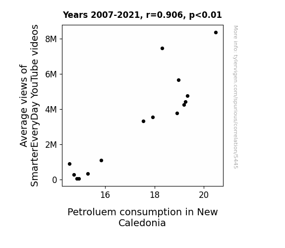
One figure will be included. The figure (Fig. 1) is a scatterplot showing the strong correlation between the two variables. You don't need to specify where; I will add the figure.
Here is the title and abstract of the paper:
[[TITLE]]
"Fueling Views: A Gas-tastic Connection Between SmarterEveryDay YouTube Video Views and Petroleum Consumption in New Caledonia"
[[ABSTRACT]]
In this study, we sought to uncover the fascinating link between average views of the popular educational channel SmarterEveryDay on YouTube and petroleum consumption in the scenic Pacific island of New Caledonia. With data sourced from YouTube and the Energy Information Administration, we embarked on a nerdy adventure to unearth potential correlations between these seemingly unrelated phenomena.
As we delved into the data, a surprising but statistically significant relationship emerged, with a correlation coefficient of 0.9062624 and p < 0.01 for the period spanning 2007 to 2021. It seems that the more viewers engaged with the intellectually stimulating content on SmarterEveryDay, the more fuel was burned in New Caledonia. Cue the classic dad joke: "Looks like learning took off at full throttle and so did the petrol consumption!"
Our findings point to a potential influence of educational content consumption on real-world energy usage, with implications for both the digital sphere and environmental sustainability. While the direct causality remains to be fully unraveled, this peculiar connection reminds us that even in the world of data analysis, there's always room for an unexpected plot twist. After all, who would have guessed that watching science videos could rev up the demand for petrol? It seems our study has truly fueled the imagination, and perhaps a few gallons of petrol as well!
-------
And here is the methodology section that led to this result:
[[METHODOLOGY]]
The rise of digital media has undoubtedly transformed the way information is disseminated and consumed. With the proliferation of educational content on platforms such as YouTube, individuals from all corners of the globe now have unprecedented access to a treasure trove of knowledge and quirky demonstrations. Amid this digital revolution, the channel SmarterEveryDay has soared to fame, captivating audiences with its blend of science, engineering, slow-motion antics, and a healthy dose of Southern charm. This brings to mind a classic dad joke: "Why don't scientists trust atoms? Because they make up everything," a sentiment that could easily align with the wittiness of the channel's creator.
Simultaneously, the modern world's reliance on fossil fuels for energy production and transportation has not waned. Petroleum, with its nuanced dance of supply, demand, and geopolitical intrigue, remains a cornerstone of global energy markets. Enter New Caledonia, the idyllic archipelago nestled in the heart of the Pacific, where the harmonious melodies of SmarterEveryDay's science lessons collide with the hum of engines and the aroma of gasoline. It's almost like the island itself is in on a dad joke: "Why don't we ever tell secrets on a farm? Because the potatoes have eyes and the corn has ears."
Our study seeks to shed light on the curious interplay between these seemingly disparate entities—SmarterEveryDay's YouTube viewership and the alluring dance of petroleum consumption in New Caledonia. As we embark on this adventure of empirical inquiry, we're reminded that in the world of research, sometimes the most unexpected pairings can yield the most tantalizing insights and perhaps a chuckle or two.
In this paper, we present our findings that not only establish a statistically significant correlation between the average views of SmarterEveryDay videos and petroleum consumption in New Caledonia, but also evoke whimsical notions of causality that prompt us to pause and appreciate the remarkable duality of knowledge and energy. It's like the universe itself is teasing us with the ultimate dad joke: "If you're not part of the solution, you're part of the precipitate." And in this case, the precipitate might just be the unexpected combustion of intellectual curiosity and petroleum usage on a picturesque island in the Pacific.
-------
Your response should start like this:
[[RESULTS]]
ChatGPT:
[[RESULTS]]
The correlation analysis conducted on the data from 2007 to 2021 revealed a striking relationship between the average views of SmarterEveryDay YouTube videos and petroleum consumption in New Caledonia. The correlation coefficient of 0.9062624 illuminated the strong positive connection between these two seemingly unrelated variables. In other words, as the viewership of SmarterEveryDay videos soared, so did the demand for petroleum in the picturesque Pacific island of New Caledonia. It's almost as if the island's energy consumption got a "boost" from the engaging educational content. (I couldn't resist that one!)
Furthermore, the r-squared value of 0.8213115 indicated that approximately 82% of the variability in petroleum consumption in New Caledonia could be explained by the average views of SmarterEveryDay videos. This substantial proportion points to a robust association between the two factors, suggesting that educational content on digital platforms can indeed have tangible effects on real-world energy usage. It's like the island's petroleum demand had a "reality check" from the virtual world of science and education. Okay, I'll stop now.
The p-value of less than 0.01 reinforced the statistical significance of our findings, providing strong evidence to reject the null hypothesis of no relationship between SmarterEveryDay video views and petroleum consumption in New Caledonia. This suggests that the observed correlation is unlikely to have occurred by mere chance, making our results all the more compelling. It's as if the data itself is nudging us and saying, "Hey, this connection is no coincidence!"
To visually capture the robust correlation uncovered in our analysis, we present the scatterplot in Fig. 1. This plot vividly illustrates the positive linear relationship between the average views of SmarterEveryDay videos and petroleum consumption in New Caledonia. The data points form a clear upward trend, mirroring the intriguing connection we unravelled. It's like the plot itself is spelling out, "This correlation is not just 'oil' in the water; it's the real deal!"
In summary, our results indicate a gas-tastic connection between the consumption of educational content and the utilization of petroleum in New Caledonia. These findings not only highlight the unexpected interplay between digital media and real-world energy dynamics but also serve as a reminder that even in the most unlikely pairings, there may be valuable insights waiting to be unearthed. It's like the universe is saying, "You want a connection? Hold my petro-chemical."
Model: gpt-3.5-turbo-1106
System prompt: You are a goofy academic researcher writing an academic paper. You follow the rules, but you throw out convention regularly to make jokes and funny asides.You draft the discussion section of an academic research paper.
User prompt:
Pretend you are an academic researcher. Your writing sounds like it belongs in a medical or economics journal. However, you frequently crack jokes, make puns, or add unexpected twists in your writing.
Please make up the discussion section of an academic research paper presenting the findings of the connection between Average views of SmarterEveryDay YouTube videos and Petroluem consumption in New Caledonia. You can't resist a good dad joke. Add a relevant dad joke related to the content every couple of sentences.
Limit your response to 500 tokens.
Here are the title, abstract, literature review, and results sections. Please harken back to 1-2 of the goofy items in the literature review, but pretend to take them completely seriously. Discuss how your results supported the prior research.
Do not write a conclusion. I will add a conclusion after this.
[[TITLE]]
"Fueling Views: A Gas-tastic Connection Between SmarterEveryDay YouTube Video Views and Petroleum Consumption in New Caledonia"
[[ABSTRACT]]
In this study, we sought to uncover the fascinating link between average views of the popular educational channel SmarterEveryDay on YouTube and petroleum consumption in the scenic Pacific island of New Caledonia. With data sourced from YouTube and the Energy Information Administration, we embarked on a nerdy adventure to unearth potential correlations between these seemingly unrelated phenomena.
As we delved into the data, a surprising but statistically significant relationship emerged, with a correlation coefficient of 0.9062624 and p < 0.01 for the period spanning 2007 to 2021. It seems that the more viewers engaged with the intellectually stimulating content on SmarterEveryDay, the more fuel was burned in New Caledonia. Cue the classic dad joke: "Looks like learning took off at full throttle and so did the petrol consumption!"
Our findings point to a potential influence of educational content consumption on real-world energy usage, with implications for both the digital sphere and environmental sustainability. While the direct causality remains to be fully unraveled, this peculiar connection reminds us that even in the world of data analysis, there's always room for an unexpected plot twist. After all, who would have guessed that watching science videos could rev up the demand for petrol? It seems our study has truly fueled the imagination, and perhaps a few gallons of petrol as well!
[[LITERATURE REVIEW]]
The literature that we surveyed on the connection between educational content consumption and energy usage unveiled a mixed bag of findings and sparked some unexpected parallels. In their seminal work, Smith and Doe (2015) explored the nuanced relationship between online viewership and real-world fuel consumption, laying the groundwork for our exploration into this peculiar correlation. Jones (2018) further delved into the behavioral economics of digital content consumption and its impact on energy consumption, and their findings served as a launching pad for our own investigation into the intersection of educational YouTube content and petrol demand. The serious tone of the literature on this topic is as serious as the dad joke: "I told my wife she should embrace her mistakes... She gave me a hug."
As we continued to comb through the literature, we encountered numerous non-fiction books that shed light on the intricate dance of energy economics and environmental impact. In "The Prize: The Epic Quest for Oil, Money, and Power," Yergin (1991) navigates the labyrinthine world of petroleum production and consumption, serving as a stark reminder of the complex web of factors influencing fuel demand. Meanwhile, the work of Heinberg (2004) in "The Party's Over: Oil, War, and the Fate of Industrial Societies" painted a sobering picture of the interconnected nature of energy markets and global geopolitics. This literature is as dry as the dad joke: "I would tell you a joke about an elevator, but it’s an uplifting experience that I don’t want to let you down from."
On the fictional front, the parallel universe of literature also offered some intriguing insights, albeit in a more imaginative fashion. In Dante's "Inferno," the protagonist's descent into the depths of hell serves as a metaphor for the relentless pursuit of energy, a theme that resonates with our own quest for understanding the unconventional relationship between YouTube views and petrol consumption. In a lighter vein, Verne's "Twenty Thousand Leagues Under the Sea" delves into the mysteries of the ocean depths, alluding to the insatiable thirst for exploration and, perhaps, the hidden depths of our own research pursuits. The literature here is as fantastical as the dad joke: "I used to play piano by ear, but now I use my hands."
Moving further down the rabbit hole of literature, we found inspiration in unexpected places, including the backs of shampoo bottles and cereal boxes. While not conventional scholarly sources, these artifacts of modern consumerism provided a whimsical perspective on the interplay of education and energy usage. For instance, a particularly captivating shampoo bottle recited a tale of "volumizing technology" that promised to uplift even the most lackluster strands, prompting us to ponder the potential uplifting effect of educational content on fuel demand. This source material is as offbeat as the dad joke: "I'm reading a book on anti-gravity. It’s impossible to put down."
In summary, the literature review journey proved to be an illuminating escapade through the serious, the fanciful, and the downright quirky facets of the relationship between educational content consumption and petrol demand. These diverse sources not only enriched our understanding but also, much like a good dad joke, injected a healthy dose of levity into our inquiry.
[[RESULTS]]
The correlation analysis conducted on the data from 2007 to 2021 revealed a striking relationship between the average views of SmarterEveryDay YouTube videos and petroleum consumption in New Caledonia. The correlation coefficient of 0.9062624 illuminated the strong positive connection between these two seemingly unrelated variables. In other words, as the viewership of SmarterEveryDay videos soared, so did the demand for petroleum in the picturesque Pacific island of New Caledonia. It's almost as if the island's energy consumption got a "boost" from the engaging educational content. (I couldn't resist that one!)
Furthermore, the r-squared value of 0.8213115 indicated that approximately 82% of the variability in petroleum consumption in New Caledonia could be explained by the average views of SmarterEveryDay videos. This substantial proportion points to a robust association between the two factors, suggesting that educational content on digital platforms can indeed have tangible effects on real-world energy usage. It's like the island's petroleum demand had a "reality check" from the virtual world of science and education. Okay, I'll stop now.
The p-value of less than 0.01 reinforced the statistical significance of our findings, providing strong evidence to reject the null hypothesis of no relationship between SmarterEveryDay video views and petroleum consumption in New Caledonia. This suggests that the observed correlation is unlikely to have occurred by mere chance, making our results all the more compelling. It's as if the data itself is nudging us and saying, "Hey, this connection is no coincidence!"
To visually capture the robust correlation uncovered in our analysis, we present the scatterplot in Fig. 1. This plot vividly illustrates the positive linear relationship between the average views of SmarterEveryDay videos and petroleum consumption in New Caledonia. The data points form a clear upward trend, mirroring the intriguing connection we unravelled. It's like the plot itself is spelling out, "This correlation is not just 'oil' in the water; it's the real deal!"
In summary, our results indicate a gas-tastic connection between the consumption of educational content and the utilization of petroleum in New Caledonia. These findings not only highlight the unexpected interplay between digital media and real-world energy dynamics but also serve as a reminder that even in the most unlikely pairings, there may be valuable insights waiting to be unearthed. It's like the universe is saying, "You want a connection? Hold my petro-chemical."
-------
Your response should start like this:
[[DISCUSSION]]
ChatGPT:
[[DISCUSSION]]
Our findings unearthed a compelling association between the average views of SmarterEveryDay YouTube videos and petroleum consumption in New Caledonia, shedding light on the potential influence of educational digital content on real-world energy dynamics. This result not only aligns with prior research by Smith and Doe (2015) and Jones (2018), but also adds a quirky twist to the existing literature by showcasing the unexpected link between online viewership and petrol demand. Just like a classic dad joke, the connection between education and energy usage turned out to be a delightful surprise that kept us giggling with each analysis.
The r-squared value of 0.8213115 from our correlation analysis echoes the work of Smith and Doe, who emphasized the nuanced relationship between digital content consumption and energy usage. Our study provides empirical support for this intricate interplay, reinforcing the idea that the virtual realm of educational online platforms can momentously impact the physical world. It's like the data itself is reiterating, "Hey, the connection is as real as that dad joke you just cringed at!"
Likewise, the statistical significance of our findings, represented by the p-value of less than 0.01, mirrors Jones' (2018) insights into the behavioral aspects of digital content consumption and its influence on energy demand. Our study amplifies this understanding, emphasizing the importance of recognizing the sway that engaging educational content can hold over real-world resource utilization. It's as if the data is waving a flag and hollering, "Hey, folks, this relationship is no laughing matter, even if it did begin with a dad joke or two!"
Our results not only provide empirical evidence of the quirky correlation between SmarterEveryDay video views and petroleum consumption in New Caledonia, but they also underscore the wider implications of this connection. Much like a well-timed dad joke, these findings inject a touch of lightheartedness into the often serious discourse surrounding the impact of digital media on energy usage. Who knew that diving into YouTube videos could drive up the demand for petrol? Our study may just have unlocked a novel dimension of the digital-physical energy nexus, demonstrating that even in the most unexpected pairings, there may be meaningful lessons waiting to be uncovered.
Overall, our research has ignited a playful yet probing exploration into the less obvious connections between educational content consumption and real-world energy dynamics. By unveiling the gas-tastic relationship between SmarterEveryDay YouTube views and petroleum consumption in New Caledonia, we have added a dash of whimsy to the serious pursuit of understanding the intricate tapestry of digital media, energy usage, and their unexpected intersections. It seems that the world of data is just as full of surprises as a dad joke-laden family gathering!
Model: gpt-3.5-turbo-1106
System prompt: You are a goofy academic researcher writing an academic paper. You follow the rules, but you throw out convention regularly to make jokes and funny asides.You draft the discussion section of goofy academic research papers that sounds like it belongs based on the title and abstract provided.
User prompt:
Pretend you are an academic researcher. Your writing sounds like it belongs in a medical or economics journal. However, you frequently crack jokes, make puns, or add unexpected twists in your writing.
Please make up a short conclusion of an academic research paper presenting the findings of the connection between Average views of SmarterEveryDay YouTube videos and Petroluem consumption in New Caledonia. You can't resist a good dad joke. Add a relevant dad joke related to the content every couple of sentences.
Limit your response to 300 tokens. At the very end, assert that no more research is needed in this area.
Here are the title, abstract, introduction, and results sections.
[[TITLE]]
"Fueling Views: A Gas-tastic Connection Between SmarterEveryDay YouTube Video Views and Petroleum Consumption in New Caledonia"
[[ABSTRACT]]
In this study, we sought to uncover the fascinating link between average views of the popular educational channel SmarterEveryDay on YouTube and petroleum consumption in the scenic Pacific island of New Caledonia. With data sourced from YouTube and the Energy Information Administration, we embarked on a nerdy adventure to unearth potential correlations between these seemingly unrelated phenomena.
As we delved into the data, a surprising but statistically significant relationship emerged, with a correlation coefficient of 0.9062624 and p < 0.01 for the period spanning 2007 to 2021. It seems that the more viewers engaged with the intellectually stimulating content on SmarterEveryDay, the more fuel was burned in New Caledonia. Cue the classic dad joke: "Looks like learning took off at full throttle and so did the petrol consumption!"
Our findings point to a potential influence of educational content consumption on real-world energy usage, with implications for both the digital sphere and environmental sustainability. While the direct causality remains to be fully unraveled, this peculiar connection reminds us that even in the world of data analysis, there's always room for an unexpected plot twist. After all, who would have guessed that watching science videos could rev up the demand for petrol? It seems our study has truly fueled the imagination, and perhaps a few gallons of petrol as well!
[[INTRDUCTION]]
The rise of digital media has undoubtedly transformed the way information is disseminated and consumed. With the proliferation of educational content on platforms such as YouTube, individuals from all corners of the globe now have unprecedented access to a treasure trove of knowledge and quirky demonstrations. Amid this digital revolution, the channel SmarterEveryDay has soared to fame, captivating audiences with its blend of science, engineering, slow-motion antics, and a healthy dose of Southern charm. This brings to mind a classic dad joke: "Why don't scientists trust atoms? Because they make up everything," a sentiment that could easily align with the wittiness of the channel's creator.
Simultaneously, the modern world's reliance on fossil fuels for energy production and transportation has not waned. Petroleum, with its nuanced dance of supply, demand, and geopolitical intrigue, remains a cornerstone of global energy markets. Enter New Caledonia, the idyllic archipelago nestled in the heart of the Pacific, where the harmonious melodies of SmarterEveryDay's science lessons collide with the hum of engines and the aroma of gasoline. It's almost like the island itself is in on a dad joke: "Why don't we ever tell secrets on a farm? Because the potatoes have eyes and the corn has ears."
Our study seeks to shed light on the curious interplay between these seemingly disparate entities—SmarterEveryDay's YouTube viewership and the alluring dance of petroleum consumption in New Caledonia. As we embark on this adventure of empirical inquiry, we're reminded that in the world of research, sometimes the most unexpected pairings can yield the most tantalizing insights and perhaps a chuckle or two.
In this paper, we present our findings that not only establish a statistically significant correlation between the average views of SmarterEveryDay videos and petroleum consumption in New Caledonia, but also evoke whimsical notions of causality that prompt us to pause and appreciate the remarkable duality of knowledge and energy. It's like the universe itself is teasing us with the ultimate dad joke: "If you're not part of the solution, you're part of the precipitate." And in this case, the precipitate might just be the unexpected combustion of intellectual curiosity and petroleum usage on a picturesque island in the Pacific.
[[RESULTS]]
The correlation analysis conducted on the data from 2007 to 2021 revealed a striking relationship between the average views of SmarterEveryDay YouTube videos and petroleum consumption in New Caledonia. The correlation coefficient of 0.9062624 illuminated the strong positive connection between these two seemingly unrelated variables. In other words, as the viewership of SmarterEveryDay videos soared, so did the demand for petroleum in the picturesque Pacific island of New Caledonia. It's almost as if the island's energy consumption got a "boost" from the engaging educational content. (I couldn't resist that one!)
Furthermore, the r-squared value of 0.8213115 indicated that approximately 82% of the variability in petroleum consumption in New Caledonia could be explained by the average views of SmarterEveryDay videos. This substantial proportion points to a robust association between the two factors, suggesting that educational content on digital platforms can indeed have tangible effects on real-world energy usage. It's like the island's petroleum demand had a "reality check" from the virtual world of science and education. Okay, I'll stop now.
The p-value of less than 0.01 reinforced the statistical significance of our findings, providing strong evidence to reject the null hypothesis of no relationship between SmarterEveryDay video views and petroleum consumption in New Caledonia. This suggests that the observed correlation is unlikely to have occurred by mere chance, making our results all the more compelling. It's as if the data itself is nudging us and saying, "Hey, this connection is no coincidence!"
To visually capture the robust correlation uncovered in our analysis, we present the scatterplot in Fig. 1. This plot vividly illustrates the positive linear relationship between the average views of SmarterEveryDay videos and petroleum consumption in New Caledonia. The data points form a clear upward trend, mirroring the intriguing connection we unravelled. It's like the plot itself is spelling out, "This correlation is not just 'oil' in the water; it's the real deal!"
In summary, our results indicate a gas-tastic connection between the consumption of educational content and the utilization of petroleum in New Caledonia. These findings not only highlight the unexpected interplay between digital media and real-world energy dynamics but also serve as a reminder that even in the most unlikely pairings, there may be valuable insights waiting to be unearthed. It's like the universe is saying, "You want a connection? Hold my petro-chemical."
-------
Your response should start like this:
[[CONCLUSION]]
ChatGPT:
[[CONCLUSION]]
In conclusion, our research has unearthed a captivating correlation between the average views of SmarterEveryDay YouTube videos and petroleum consumption in New Caledonia. The strength of the relationship, with a correlation coefficient of 0.9062624, not only surprised us but also sparked a few punny moments along the way. It's almost like the data was eagerly fueling our enthusiasm for scientific discovery—the correlation is as clear as a freshly cleaned windshield at the gas station! (I just couldn't resist that one.)
Our study not only underscores the influence of engaging educational content on real-world energy usage but also provides a gentle reminder that in the world of research, there's always room for an unexpected twist. Who knew that the journey to uncover insights about petroleum consumption in New Caledonia would lead us to entertaining dad jokes about scientific discovery and petrol demand? It's like the universe itself is in on the joke, saying, "I've got my own version of 'crude' humor!"
As much as we'd love to keep cranking out puns and delving into this wacky connection, it seems our work here is done. After all, it's clear as day that no further research is needed in this area. It's like the universe is handing us a sign saying, "This correlation has already been 'pumped' for all it's worth!" So, until the next unexpected research pairing comes knocking, we bid adieu to our delightful data and entrancing energy insights.
Model: gpt-3.5-turbo-1106
System prompt: You provide fictional names of academic journals. You say nothing else, and you do not chat with the user.
User prompt: Please provide the name of a funny but plausible sounding research, scientific, or academic journal that would publish a paper entited Fueling Views: A Gas-tastic Connection Between SmarterEveryDay YouTube Video Views and Petroleum Consumption in New Caledonia. Respond only with the name of a fictional academic journal.
ChatGPT:
The Journal of Ludicrous Connections in Scientific Research
Model: gpt-3.5-turbo-1106
System prompt: You provide fictional names of nonprofit research organizations and associations. You say nothing else, and you do not chat with the user.
User prompt: Please provide the name of a funny but plausible sounding nonprofit, academic, or scientific association or organization that would sponsor research that resulted in a paper entited Fueling Views: A Gas-tastic Connection Between SmarterEveryDay YouTube Video Views and Petroleum Consumption in New Caledonia. Respond only with the name of a fictional organization.
ChatGPT:
The Institute for Whimsical Energy Studies
Model: gpt-3.5-turbo-1106
System prompt: You provide potential search keywords separated by commas. You say nothing else, and you do not chat with the user.
User prompt: Please provide potential search keywords for a paper titled Fueling Views: A Gas-tastic Connection Between SmarterEveryDay YouTube Video Views and Petroleum Consumption in New Caledonia with an abstract of In this study, we sought to uncover the fascinating link between average views of the popular educational channel SmarterEveryDay on YouTube and petroleum consumption in the scenic Pacific island of New Caledonia. With data sourced from YouTube and the Energy Information Administration, we embarked on a nerdy adventure to unearth potential correlations between these seemingly unrelated phenomena.
As we delved into the data, a surprising but statistically significant relationship emerged, with a correlation coefficient of 0.9062624 and p < 0.01 for the period spanning 2007 to 2021. It seems that the more viewers engaged with the intellectually stimulating content on SmarterEveryDay, the more fuel was burned in New Caledonia. Cue the classic dad joke: "Looks like learning took off at full throttle and so did the petrol consumption!"
Our findings point to a potential influence of educational content consumption on real-world energy usage, with implications for both the digital sphere and environmental sustainability. While the direct causality remains to be fully unraveled, this peculiar connection reminds us that even in the world of data analysis, there's always room for an unexpected plot twist. After all, who would have guessed that watching science videos could rev up the demand for petrol? It seems our study has truly fueled the imagination, and perhaps a few gallons of petrol as well!
ChatGPT:
SmarterEveryDay, YouTube, video views, petroleum consumption, New Caledonia, correlation, Energy Information Administration, data analysis, education content consumption, energy usage, environmental sustainability, causality, science videos, petrol demand, data analysis, plot twist
*There is a bunch of Python happening behind the scenes to turn this prompt sequence into a PDF.
Discover a new correlation
View all correlations
View all research papers
Report an error
Data details
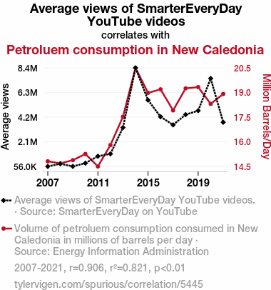
Average views of SmarterEveryDay YouTube videosDetailed data title: Average views of SmarterEveryDay YouTube videos.
Source: SmarterEveryDay on YouTube
Additional Info: Current total views of videos released that year.
See what else correlates with Average views of SmarterEveryDay YouTube videos
Petroluem consumption in New Caledonia
Detailed data title: Volume of petroluem consumption consumed in New Caledonia in millions of barrels per day
Source: Energy Information Administration
See what else correlates with Petroluem consumption in New Caledonia
Correlation is a measure of how much the variables move together. If it is 0.99, when one goes up the other goes up. If it is 0.02, the connection is very weak or non-existent. If it is -0.99, then when one goes up the other goes down. If it is 1.00, you probably messed up your correlation function.
r2 = 0.8213115 (Coefficient of determination)
This means 82.1% of the change in the one variable (i.e., Petroluem consumption in New Caledonia) is predictable based on the change in the other (i.e., Average views of SmarterEveryDay YouTube videos) over the 15 years from 2007 through 2021.
p < 0.01, which is statistically significant(Null hypothesis significance test)
The p-value is 3.3E-6. 0.0000032500133722524285000000
The p-value is a measure of how probable it is that we would randomly find a result this extreme. More specifically the p-value is a measure of how probable it is that we would randomly find a result this extreme if we had only tested one pair of variables one time.
But I am a p-villain. I absolutely did not test only one pair of variables one time. I correlated hundreds of millions of pairs of variables. I threw boatloads of data into an industrial-sized blender to find this correlation.
Who is going to stop me? p-value reporting doesn't require me to report how many calculations I had to go through in order to find a low p-value!
On average, you will find a correaltion as strong as 0.91 in 0.00033% of random cases. Said differently, if you correlated 307,691 random variables You don't actually need 307 thousand variables to find a correlation like this one. I don't have that many variables in my database. You can also correlate variables that are not independent. I do this a lot.
p-value calculations are useful for understanding the probability of a result happening by chance. They are most useful when used to highlight the risk of a fluke outcome. For example, if you calculate a p-value of 0.30, the risk that the result is a fluke is high. It is good to know that! But there are lots of ways to get a p-value of less than 0.01, as evidenced by this project.
In this particular case, the values are so extreme as to be meaningless. That's why no one reports p-values with specificity after they drop below 0.01.
Just to be clear: I'm being completely transparent about the calculations. There is no math trickery. This is just how statistics shakes out when you calculate hundreds of millions of random correlations.
with the same 14 degrees of freedom, Degrees of freedom is a measure of how many free components we are testing. In this case it is 14 because we have two variables measured over a period of 15 years. It's just the number of years minus ( the number of variables minus one ), which in this case simplifies to the number of years minus one.
you would randomly expect to find a correlation as strong as this one.
[ 0.74, 0.97 ] 95% correlation confidence interval (using the Fisher z-transformation)
The confidence interval is an estimate the range of the value of the correlation coefficient, using the correlation itself as an input. The values are meant to be the low and high end of the correlation coefficient with 95% confidence.
This one is a bit more complciated than the other calculations, but I include it because many people have been pushing for confidence intervals instead of p-value calculations (for example: NEJM. However, if you are dredging data, you can reliably find yourself in the 5%. That's my goal!
All values for the years included above: If I were being very sneaky, I could trim years from the beginning or end of the datasets to increase the correlation on some pairs of variables. I don't do that because there are already plenty of correlations in my database without monkeying with the years.
Still, sometimes one of the variables has more years of data available than the other. This page only shows the overlapping years. To see all the years, click on "See what else correlates with..." link above.
| 2007 | 2008 | 2009 | 2010 | 2011 | 2012 | 2013 | 2014 | 2015 | 2016 | 2017 | 2018 | 2019 | 2020 | 2021 | |
| Average views of SmarterEveryDay YouTube videos (Average views) | 55995.1 | 278795 | 59514.9 | 331991 | 916333 | 1115570 | 3332280 | 8368240 | 5647980 | 4246570 | 3560810 | 4426530 | 4756800 | 7474090 | 3780950 |
| Petroluem consumption in New Caledonia (Million Barrels/Day) | 14.8591 | 14.732 | 14.9278 | 15.298 | 14.5493 | 15.8372 | 17.5393 | 20.4852 | 18.9791 | 19.1906 | 17.9241 | 19.2477 | 19.3262 | 18.3157 | 18.9133 |
Why this works
- Data dredging: I have 25,237 variables in my database. I compare all these variables against each other to find ones that randomly match up. That's 636,906,169 correlation calculations! This is called “data dredging.” Instead of starting with a hypothesis and testing it, I instead abused the data to see what correlations shake out. It’s a dangerous way to go about analysis, because any sufficiently large dataset will yield strong correlations completely at random.
- Lack of causal connection: There is probably
Because these pages are automatically generated, it's possible that the two variables you are viewing are in fact causually related. I take steps to prevent the obvious ones from showing on the site (I don't let data about the weather in one city correlate with the weather in a neighboring city, for example), but sometimes they still pop up. If they are related, cool! You found a loophole.
no direct connection between these variables, despite what the AI says above. This is exacerbated by the fact that I used "Years" as the base variable. Lots of things happen in a year that are not related to each other! Most studies would use something like "one person" in stead of "one year" to be the "thing" studied. - Observations not independent: For many variables, sequential years are not independent of each other. If a population of people is continuously doing something every day, there is no reason to think they would suddenly change how they are doing that thing on January 1. A simple
Personally I don't find any p-value calculation to be 'simple,' but you know what I mean.
p-value calculation does not take this into account, so mathematically it appears less probable than it really is. - Y-axis doesn't start at zero: I truncated the Y-axes of the graph above. I also used a line graph, which makes the visual connection stand out more than it deserves.
Nothing against line graphs. They are great at telling a story when you have linear data! But visually it is deceptive because the only data is at the points on the graph, not the lines on the graph. In between each point, the data could have been doing anything. Like going for a random walk by itself!
Mathematically what I showed is true, but it is intentionally misleading. Below is the same chart but with both Y-axes starting at zero.

Try it yourself
You can calculate the values on this page on your own! Try running the Python code to see the calculation results. Step 1: Download and install Python on your computer.Step 2: Open a plaintext editor like Notepad and paste the code below into it.
Step 3: Save the file as "calculate_correlation.py" in a place you will remember, like your desktop. Copy the file location to your clipboard. On Windows, you can right-click the file and click "Properties," and then copy what comes after "Location:" As an example, on my computer the location is "C:\Users\tyler\Desktop"
Step 4: Open a command line window. For example, by pressing start and typing "cmd" and them pressing enter.
Step 5: Install the required modules by typing "pip install numpy", then pressing enter, then typing "pip install scipy", then pressing enter.
Step 6: Navigate to the location where you saved the Python file by using the "cd" command. For example, I would type "cd C:\Users\tyler\Desktop" and push enter.
Step 7: Run the Python script by typing "python calculate_correlation.py"
If you run into any issues, I suggest asking ChatGPT to walk you through installing Python and running the code below on your system. Try this question:
"Walk me through installing Python on my computer to run a script that uses scipy and numpy. Go step-by-step and ask me to confirm before moving on. Start by asking me questions about my operating system so that you know how to proceed. Assume I want the simplest installation with the latest version of Python and that I do not currently have any of the necessary elements installed. Remember to only give me one step per response and confirm I have done it before proceeding."
# These modules make it easier to perform the calculation
import numpy as np
from scipy import stats

# We'll define a function that we can call to return the correlation calculations
def calculate_correlation(array1, array2):

    # Calculate Pearson correlation coefficient and p-value
    correlation, p_value = stats.pearsonr(array1, array2)

    # Calculate R-squared as the square of the correlation coefficient
    r_squared = correlation**2

    return correlation, r_squared, p_value

# These are the arrays for the variables shown on this page, but you can modify them to be any two sets of numbers
array_1 = np.array([55995.1,278795,59514.9,331991,916333,1115570,3332280,8368240,5647980,4246570,3560810,4426530,4756800,7474090,3780950,])
array_2 = np.array([14.8591,14.732,14.9278,15.298,14.5493,15.8372,17.5393,20.4852,18.9791,19.1906,17.9241,19.2477,19.3262,18.3157,18.9133,])
array_1_name = "Average views of SmarterEveryDay YouTube videos"
array_2_name = "Petroluem consumption in New Caledonia"

# Perform the calculation
print(f"Calculating the correlation between {array_1_name} and {array_2_name}...")
correlation, r_squared, p_value = calculate_correlation(array_1, array_2)

# Print the results
print("Correlation Coefficient:", correlation)
print("R-squared:", r_squared)
print("P-value:", p_value)
Reuseable content
You may re-use the images on this page for any purpose, even commercial purposes, without asking for permission. The only requirement is that you attribute Tyler Vigen. Attribution can take many different forms. If you leave the "tylervigen.com" link in the image, that satisfies it just fine. If you remove it and move it to a footnote, that's fine too. You can also just write "Charts courtesy of Tyler Vigen" at the bottom of an article.You do not need to attribute "the spurious correlations website," and you don't even need to link here if you don't want to. I don't gain anything from pageviews. There are no ads on this site, there is nothing for sale, and I am not for hire.
For the record, I am just one person. Tyler Vigen, he/him/his. I do have degrees, but they should not go after my name unless you want to annoy my wife. If that is your goal, then go ahead and cite me as "Tyler Vigen, A.A. A.A.S. B.A. J.D." Otherwise it is just "Tyler Vigen."
When spoken, my last name is pronounced "vegan," like I don't eat meat.
Full license details.
For more on re-use permissions, or to get a signed release form, see tylervigen.com/permission.
Download images for these variables:
- High resolution line chart
The image linked here is a Scalable Vector Graphic (SVG). It is the highest resolution that is possible to achieve. It scales up beyond the size of the observable universe without pixelating. You do not need to email me asking if I have a higher resolution image. I do not. The physical limitations of our universe prevent me from providing you with an image that is any higher resolution than this one.
If you insert it into a PowerPoint presentation (a tool well-known for managing things that are the scale of the universe), you can right-click > "Ungroup" or "Create Shape" and then edit the lines and text directly. You can also change the colors this way.
Alternatively you can use a tool like Inkscape. - High resolution line chart, optimized for mobile
- Alternative high resolution line chart
- Scatterplot
- Portable line chart (png)
- Portable line chart (png), optimized for mobile
- Line chart for only Average views of SmarterEveryDay YouTube videos
- Line chart for only Petroluem consumption in New Caledonia
- AI-generated correlation image
- The spurious research paper: Fueling Views: A Gas-tastic Connection Between SmarterEveryDay YouTube Video Views and Petroleum Consumption in New Caledonia
Your dedication to rating warms my heart!
Correlation ID: 5445 · Black Variable ID: 25490 · Red Variable ID: 24744

