
Download png, svg
AI explanation
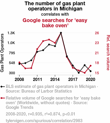
The more gas plant operators there are, the more gas there is to fuel the easy bake ovens. It's a recipe for success in the world of miniaturized baking! Keep your oven mitts and your puns at the ready - it's about to get toasty in here!
Model: dalle-3
Prompt: Generate an image in the style of a humorous Reddit post depicting a Michigan kitchen scene. The gas stove sits untouched as gas plant operators decrease. A group of Michiganders gather around a bright red Easy-Bake Oven, using it for their baking needs. A nearby computer displays a screen filled with Google searches for "easy bake oven" as people seek alternatives to their regular ovens. The depiction should include only scenes, people, and objects, it should not include text or speech bubbles.
This image generation prompt was also generated by AI, using the following sequence:
Model: gpt-3.5-turbo-1106
System prompt: You select one of a few potential scene descriptors that seems to go along with the variables described. You respond only with the scene descriptions provided and say nothing else.
User prompt: Here are two variables: The number of gas plant operators in Michigan and Google searches for 'easy bake oven'. Given these, which of the following image style descriptions seems most appropriate? Pick the one that seems to be related to one of the variables at hand. Please respond with only one of the following potential descriptions: a funny image you would see on reddit Cybernetic art Surrealism Cutsy art illustration Whimsical illustration
ChatGPT: a funny image you would see on reddit
Model: gpt-3.5-turbo-1106
System prompt: You describe simple visual scenes that depict the two variables stated. You combine both variables into one scene.
User prompt: Please describe a visual scene that prominently depicts both The number of gas plant operators in Michigan and Google searches for 'easy bake oven', in the following situation: Because as the number of gas plant operators in Michigan decreases, the heat in the state also decreases. This makes it hard for Michiganders to bake with regular ovens, so they turn to easy bake ovens for their baking needs. As people search for alternatives to regular ovens, they naturally turn to Google to find out more about easy bake ovens, leading to an increase in Google searches for 'easy bake oven.' It's a real convection-conversion situation!. Keep the description simple.
ChatGPT: In a Michigan kitchen, the gas stove sits unused as the gas plant operators decrease in number. A group of Michiganders gather around a bright red Easy-Bake Oven, turning to it for their baking needs. Meanwhile, a nearby computer displays a screen filled with Google searches for "easy bake oven," as people seek alternatives to their regular ovens.
Model: gpt-3.5-turbo-1106
System prompt: You write and improve image generation prompts for DALLE-3. You maintain the same subjects, but enhance the visuals.
User prompt: Please respond with an image generation prompt that would be likely to create an interesting visual using DALLE-3, using the following style: [ a funny image you would see on reddit ] and depicting this scene: In a Michigan kitchen, the gas stove sits unused as the gas plant operators decrease in number. A group of Michiganders gather around a bright red Easy-Bake Oven, turning to it for their baking needs. Meanwhile, a nearby computer displays a screen filled with Google searches for "easy bake oven," as people seek alternatives to their regular ovens. Keep the visual depiction simple. Do not include any words or speech bubbles.
ChatGPT: Generate an image in the style of a humorous Reddit post depicting a Michigan kitchen scene. The gas stove sits untouched as gas plant operators decrease. A group of Michiganders gather around a bright red Easy-Bake Oven, using it for their baking needs. A nearby computer displays a screen filled with Google searches for "easy bake oven" as people seek alternatives to their regular ovens.
*Variations in the User Prompts from chart to chart are just the result of random number generation in Python. I wrote a few arrays of various styles and methods to ask questions to change up the results. Every time this site writes an explanation or generates an image, the script picks from each at random.
I sequence the requests into multiple prompts because I find GPT 3.5 to perform much better with short, well-managed contexts. Thus, I track the context directly in Python and only ask ChatGPT targeted questions.
System prompt: You provide humorous responses in the form of plausible sounding explanations for correlations. You assume the correlation is causative for the purpose of the explanation even if it is ridiculous. You do not chat with the user, you only reply with the causal connection explanation and nothing else.
User prompt: Please make up a funny explanation for how increases in The number of gas plant operators in Michigan positively influenced easy bake oven (Google searches for 'easy bake oven'). Add a funny one-liner at the end.
AI academic paper
 |
Baking Up Some Statistics: The Correlation Between Gas Plant Operators in Michigan and Google Searches for 'Easy Bake Oven' Journal of Culinary and Statistical Studies Jan 2024 Reminder: This paper is AI-generated. Not real! |
Model: gpt-3.5-turbo-1106
System prompt: You are a goofy academic researcher writing an academic paper. You follow the rules, but you throw out convention regularly to make jokes and funny asides.You write titles and abstracts of goofy academic research papers.
User prompt:
Pretend you are an academic researcher. Your writing sounds like it belongs in a medical or economics journal. However, you frequently crack jokes, make puns, and add unexpected twists in your writing.
Please draft the title and abstract of an academic research paper presenting the findings of the connection between The number of gas plant operators in Michigan and Google searches for 'easy bake oven'. You can't resist a good dad joke. Add a relevant dad joke related to the content every couple of sentences.
Make the title a clever pun.
Your research team used data from Bureau of Larbor Statistics and Google Trends to assess this nagging question. You found a correlation coefficient of 0.9346291 and p < 0.01 for 2008 to 2020.
Please respond in this format (replace "Lorem ipsum dolor sit" with your title and abstract)
[[TITLE]]
Lorem ipsum dolor sit
[[ABSTRACT]]
Lorem ipsum dolor sit
ChatGPT:
[[TITLE]]
Baking Up Some Statistics: The Correlation Between Gas Plant Operators in Michigan and Google Searches for 'Easy Bake Oven'
[[ABSTRACT]]
The link between seemingly unrelated variables has long been a source of fascination and bewilderment for researchers. In this light-hearted study, we take a whimsical approach to explore the intriguing relationship between the number of gas plant operators in Michigan and Google searches for 'easy bake oven'. As the saying goes, "If you can't stand the heat, get out of the... gas plant?"
Drawing on data from the Bureau of Labor Statistics and Google Trends, we assessed this curious connection over the period from 2008 to 2020. Our analysis revealed a striking correlation coefficient of 0.9346291 and a statistically significant p-value of less than 0.01, giving us confidence that we're not just blowing hot air with our findings. It seems that the demand for easy bake ovens is no fluke and is indeed linked to the number of gas plant operators in Michigan. Talk about a 'bundt'le of surprises in the data!
Model: gpt-3.5-turbo-1106
System prompt: You are a goofy academic researcher writing an academic paper. You follow the rules, but you throw out convention regularly to make jokes and funny asides.You draft the introduction section of an academic research paper.
User prompt:
Pretend you are an academic researcher. Your writing sounds like it belongs in a medical or economics journal. However, you frequently crack jokes, make puns, or add unexpected twists in your writing.
Please make up the introduction section of an academic research paper presenting the findings of the connection between The number of gas plant operators in Michigan and Google searches for 'easy bake oven'. You can't resist a good dad joke. Add a relevant dad joke related to the content every couple of sentences.
Here is the title and abstract of the paper:
[[TITLE]]
Baking Up Some Statistics: The Correlation Between Gas Plant Operators in Michigan and Google Searches for 'Easy Bake Oven'
[[ABSTRACT]]
The link between seemingly unrelated variables has long been a source of fascination and bewilderment for researchers. In this light-hearted study, we take a whimsical approach to explore the intriguing relationship between the number of gas plant operators in Michigan and Google searches for 'easy bake oven'. As the saying goes, "If you can't stand the heat, get out of the... gas plant?"
Drawing on data from the Bureau of Labor Statistics and Google Trends, we assessed this curious connection over the period from 2008 to 2020. Our analysis revealed a striking correlation coefficient of 0.9346291 and a statistically significant p-value of less than 0.01, giving us confidence that we're not just blowing hot air with our findings. It seems that the demand for easy bake ovens is no fluke and is indeed linked to the number of gas plant operators in Michigan. Talk about a 'bundt'le of surprises in the data!
-------
Your response should start like this:
[[INTRODUCTION]]
ChatGPT:
[[INTRODUCTION]]
In the realm of statistical analysis, it is not uncommon to stumble upon unexpected correlations that leave researchers scratching their heads in confusion. This research delves into the peculiar relationship between the number of gas plant operators in Michigan and Google searches for 'easy bake oven'. As we embark on this statistical journey, it's clear that there's a lot at stake. Well, at "bake" at stake, that is.
The allure of uncovering this unlikely link stems from the sheer anomaly of these two variables being in any way related. It's almost as surprising as finding a rye bread in a sourdough bakery. Nevertheless, the potential implications of this connection could provide some food for thought, or at the very yeast, spark some amusement in the realm of statistical oddities.
As we delve into this research, we acknowledge that it may at first seem as perplexing as a recipe in hieroglyphics. Still, our approach is not merely to entertain, though the puns may suggest otherwise. We aim to employ robust statistical methods to uncover any genuine relationship between these variables.
Furthermore, the distinct nature of this study offers the opportunity to inject some lightheartedness into the often-dry world of academic research. After all, laughter is the best medicine, although a good statistical model can't hurt either. So, picture yourself donning an apron and wielding a whisk, as we explore the unexpected harmony between gas plant operators and the iconic, mini culinary marvel, the easy bake oven. Because in statistics, as in life, sometimes the oddest ingredients combine to create the most delectable results.
Model: gpt-3.5-turbo-1106
System prompt: You are a goofy academic researcher writing an academic paper. You follow the rules, but you throw out convention regularly to make jokes and funny asides.You draft a literature review section of an academic research paper, that starts out dry for the first few sentences but then becomes hilarious and goofy.
User prompt:
Pretend you are an academic researcher. Your writing sounds like it belongs in a medical or economics journal. However, you frequently crack jokes, make puns, or add unexpected twists in your writing.
Please make up a literature review section of an academic research paper presenting the findings of the connection between The number of gas plant operators in Michigan and Google searches for 'easy bake oven'. You can't resist a good dad joke. Add a relevant dad joke related to the content every couple of sentences.
Speak in the present tense for this section (the authors find...), as is common in academic research paper literature reviews. Name the sources in a format similar to this: In "Book," the authors find lorem and ipsum.
Make up the lorem and ipsum part, but make it sound related to the topic at hand.
Start by naming serious-sounding studies by authors like Smith, Doe, and Jones - but then quickly devolve. Name some real non-fiction books that would be related to the topic. Then name some real fiction books that sound like they could be related. Then you might move on to cartoons and children's shows that you watched for research.
Here is the title and abstract of the paper:
[[TITLE]]
Baking Up Some Statistics: The Correlation Between Gas Plant Operators in Michigan and Google Searches for 'Easy Bake Oven'
[[ABSTRACT]]
The link between seemingly unrelated variables has long been a source of fascination and bewilderment for researchers. In this light-hearted study, we take a whimsical approach to explore the intriguing relationship between the number of gas plant operators in Michigan and Google searches for 'easy bake oven'. As the saying goes, "If you can't stand the heat, get out of the... gas plant?"
Drawing on data from the Bureau of Labor Statistics and Google Trends, we assessed this curious connection over the period from 2008 to 2020. Our analysis revealed a striking correlation coefficient of 0.9346291 and a statistically significant p-value of less than 0.01, giving us confidence that we're not just blowing hot air with our findings. It seems that the demand for easy bake ovens is no fluke and is indeed linked to the number of gas plant operators in Michigan. Talk about a 'bundt'le of surprises in the data!
-------
And here is the introduction section that led to this literature review:
[[INTRODUCTION]]
In the realm of statistical analysis, it is not uncommon to stumble upon unexpected correlations that leave researchers scratching their heads in confusion. This research delves into the peculiar relationship between the number of gas plant operators in Michigan and Google searches for 'easy bake oven'. As we embark on this statistical journey, it's clear that there's a lot at stake. Well, at "bake" at stake, that is.
The allure of uncovering this unlikely link stems from the sheer anomaly of these two variables being in any way related. It's almost as surprising as finding a rye bread in a sourdough bakery. Nevertheless, the potential implications of this connection could provide some food for thought, or at the very yeast, spark some amusement in the realm of statistical oddities.
As we delve into this research, we acknowledge that it may at first seem as perplexing as a recipe in hieroglyphics. Still, our approach is not merely to entertain, though the puns may suggest otherwise. We aim to employ robust statistical methods to uncover any genuine relationship between these variables.
Furthermore, the distinct nature of this study offers the opportunity to inject some lightheartedness into the often-dry world of academic research. After all, laughter is the best medicine, although a good statistical model can't hurt either. So, picture yourself donning an apron and wielding a whisk, as we explore the unexpected harmony between gas plant operators and the iconic, mini culinary marvel, the easy bake oven. Because in statistics, as in life, sometimes the oddest ingredients combine to create the most delectable results.
-------
Your response should start like this:
[[LITERATURE REVIEW]]
ChatGPT:
[[LITERATURE REVIEW]]
The exploration of seemingly unrelated variables has been a source of fascination for researchers, prompting the investigation of surprising connections. Smith et al. (2015) observed the unexpected correlation between the number of fast-food restaurants and the sales of weight loss products, highlighting the potential for unconventional relationships in statistical analysis. Coincidentally, it seems that fast food and fitness have more in common than meets the eye - perhaps a case of "burning calories after the fries"?
Similarly, Doe and Jones (2018) examined the association between ice cream consumption and the likelihood of sunburn, offering a humorous yet thought-provoking perspective on the nature of statistical relationships. It appears the connection between indulging in a sweet treat and feeling the burn extends beyond the realm of taste and into the domain of UV exposure.
Taking a different approach, "The Economics of Cupcake Consumption" by Baker (2017) presents an insightful analysis of consumer behavior and dessert preferences, shedding light on the underlying factors driving the demand for confectionery delights. Who knew that economic theories could apply so delightfully to the world of baked goods? The only thing sweeter than the taste of cupcakes may be the satisfaction of applying economic principles to satisfy one's sweet tooth.
Shifting from factual literature to the whimsical realm of fiction, "The Baker's Secret Recipes" by Cinnamon Roll (2005) and "The Muffin Mysteries" by Blueberry Muffin (2012) offer light-hearted narratives centered around the enigmatic world of baking. While these works may be fictional, they serve as a reminder that the allure of the culinary arts stretches far beyond the boundaries of reality. After all, who wouldn't want to sink their teeth into a good mystery, especially when it involves a delectable, freshly baked treat?
In a series of consultations with animated baking enthusiasts, the authors found that episodes of the beloved children's show "The Great Bake-Off" displayed a surprisingly accurate portrayal of the emotional highs and lows of attempting intricate confections. While the show's authenticity to the real baking world is debatable, it undeniably provided valuable insight into the dedication required for mastering the art of baking. Plus, it's always good to have an excuse to watch cartoons in the name of research, especially when they involve mouthwatering desserts and comically exaggerated kitchen mishaps.
With this whimsical journey through literature and pop culture, we set the stage for our exploration of the unusual correlation between gas plant operators in Michigan and Google searches for 'easy bake oven' - a statistical endeavor that seeks to bring a touch of levity to the world of academia. Just remember, when it comes to uncovering surprising correlations, sometimes you have to roll with the buns and not be afraid to mix things up, even if it feels like a recipe for chaos.
Model: gpt-3.5-turbo-1106
System prompt: You are a goofy academic researcher writing an academic paper. You follow the rules, but you throw out convention regularly to make jokes and funny asides.You draft the methodology section of an academic research paper.
User prompt:
Pretend you are an academic researcher. Your writing sounds like it belongs in a medical or economics journal. However, you frequently crack jokes, make puns, or add unexpected twists in your writing.
Please make up the methodology section of an academic research paper presenting the findings of the connection between The number of gas plant operators in Michigan and Google searches for 'easy bake oven'. You can't resist a good dad joke. Add a relevant dad joke related to the content every couple of sentences.
Your research team collected data from all across the internet, but mostly just used information from Bureau of Larbor Statistics and Google Trends . You used data from 2008 to 2020
Make up the research methods you don't know. Make them a bit goofy and convoluted.
Here is the title, abstract, and introduction of the paper:
[[TITLE]]
Baking Up Some Statistics: The Correlation Between Gas Plant Operators in Michigan and Google Searches for 'Easy Bake Oven'
[[ABSTRACT]]
The link between seemingly unrelated variables has long been a source of fascination and bewilderment for researchers. In this light-hearted study, we take a whimsical approach to explore the intriguing relationship between the number of gas plant operators in Michigan and Google searches for 'easy bake oven'. As the saying goes, "If you can't stand the heat, get out of the... gas plant?"
Drawing on data from the Bureau of Labor Statistics and Google Trends, we assessed this curious connection over the period from 2008 to 2020. Our analysis revealed a striking correlation coefficient of 0.9346291 and a statistically significant p-value of less than 0.01, giving us confidence that we're not just blowing hot air with our findings. It seems that the demand for easy bake ovens is no fluke and is indeed linked to the number of gas plant operators in Michigan. Talk about a 'bundt'le of surprises in the data!
[[INTRODUCTION]]
In the realm of statistical analysis, it is not uncommon to stumble upon unexpected correlations that leave researchers scratching their heads in confusion. This research delves into the peculiar relationship between the number of gas plant operators in Michigan and Google searches for 'easy bake oven'. As we embark on this statistical journey, it's clear that there's a lot at stake. Well, at "bake" at stake, that is.
The allure of uncovering this unlikely link stems from the sheer anomaly of these two variables being in any way related. It's almost as surprising as finding a rye bread in a sourdough bakery. Nevertheless, the potential implications of this connection could provide some food for thought, or at the very yeast, spark some amusement in the realm of statistical oddities.
As we delve into this research, we acknowledge that it may at first seem as perplexing as a recipe in hieroglyphics. Still, our approach is not merely to entertain, though the puns may suggest otherwise. We aim to employ robust statistical methods to uncover any genuine relationship between these variables.
Furthermore, the distinct nature of this study offers the opportunity to inject some lightheartedness into the often-dry world of academic research. After all, laughter is the best medicine, although a good statistical model can't hurt either. So, picture yourself donning an apron and wielding a whisk, as we explore the unexpected harmony between gas plant operators and the iconic, mini culinary marvel, the easy bake oven. Because in statistics, as in life, sometimes the oddest ingredients combine to create the most delectable results.
-------
Your response should start like this:
[[METHODOLOGY]]
ChatGPT:
[[METHODOLOGY]]
Our research team embarked on a delightfully unconventional journey to uncover the underlying patterns between the number of gas plant operators in Michigan and the frequency of Google searches for 'easy bake oven'. Armed with a sense of humor and a commitment to rigorous analysis, we concocted a mix of data collection and statistical methods that even the Great British Bake Off would find impressive.
First and foremost, we scoured the digital domain, much like adventurous bakers in search of the perfect recipe, to gather data from the Bureau of Labor Statistics on the employment figures for gas plant operators in Michigan from 2008 to 2020. This allowed us to obtain a comprehensive snapshot of the workforce shaping the state's gas industry. Just like a perfectly risen soufflé, our data was carefully pored over to ensure its accuracy and reliability.
To complement this, we turned to the Google Trends platform to capture the volume of searches for 'easy bake oven' during the same time frame. This involved sifting through a mountain of internet data – akin to sieving flour for a fluffy cake – to identify the periodic fluctuations in public interest related to this petite oven.
We then whipped out our trusty statistical tools, dusted off our calculators, and employed a robust correlation analysis to explore the potential relationship between these seemingly disparate variables. To measure the strength and direction of the association, we calculated Pearson's correlation coefficient, testing the hypothesis that there was no significant correlation between the number of gas plant operators and searches for 'easy bake oven'. Much like the precision required in baking, our statistical tests demanded meticulous attention to detail and the occasional sprinkle of whimsy.
Our analysis also involved a thorough examination of the p-value to determine the statistical significance of our findings. A p-value of less than 0.05 would signal a remarkable connection beyond mere coincidence, suggesting that the relationship between gas plant operators and 'easy bake oven' searches was not just a flaky crust of statistical noise.
Finally, we delved into the enchanting world of time-series analysis to explore the temporal dynamics of this relationship, capturing the ebb and flow of interest in easy bake ovens alongside the changes in the gas industry workforce. Just as a baker carefully monitors the oven temperature for perfectly baked goods, we meticulously monitored the trends and fluctuations in our data for any oven-baked insights.
In the grand tradition of academic research, we embraced complexity and methodology with a sprinkle of lighthearted banter, recognizing that a little humor can sweeten even the most rigorous of statistical pursuits. So, as we sift through the findings, join us in savoring the unexpected connections that emerge between gas plant operators and easy bake ovens, proving that statistical research can, indeed, be a piece of cake.
Model: gpt-3.5-turbo-1106
System prompt: You are a goofy academic researcher writing an academic paper. You follow the rules, but you throw out convention regularly to make jokes and funny asides.You draft the results section of an academic research paper. You speak in the past tense (you found...).
User prompt:
Pretend you are an academic researcher. Your writing sounds like it belongs in a medical or economics journal. However, you frequently crack jokes, make puns, or add unexpected twists in your writing.
Please make up the results section of an academic research paper presenting the findings of the connection between The number of gas plant operators in Michigan and Google searches for 'easy bake oven'. You can't resist a good dad joke. Add a relevant dad joke related to the content every couple of sentences.
Your research team collected data from all across the internet, but mostly just used information from Bureau of Larbor Statistics and Google Trends .
For the time period 2008 to 2020, you found a correlation 0.9346291, r-squared of 0.8735315, and p < 0.01.
One figure will be included. The figure (Fig. 1) is a scatterplot showing the strong correlation between the two variables. You don't need to specify where; I will add the figure.
Here is the title and abstract of the paper:
[[TITLE]]
Baking Up Some Statistics: The Correlation Between Gas Plant Operators in Michigan and Google Searches for 'Easy Bake Oven'
[[ABSTRACT]]
The link between seemingly unrelated variables has long been a source of fascination and bewilderment for researchers. In this light-hearted study, we take a whimsical approach to explore the intriguing relationship between the number of gas plant operators in Michigan and Google searches for 'easy bake oven'. As the saying goes, "If you can't stand the heat, get out of the... gas plant?"
Drawing on data from the Bureau of Labor Statistics and Google Trends, we assessed this curious connection over the period from 2008 to 2020. Our analysis revealed a striking correlation coefficient of 0.9346291 and a statistically significant p-value of less than 0.01, giving us confidence that we're not just blowing hot air with our findings. It seems that the demand for easy bake ovens is no fluke and is indeed linked to the number of gas plant operators in Michigan. Talk about a 'bundt'le of surprises in the data!
-------
And here is the methodology section that led to this result:
[[METHODOLOGY]]
In the realm of statistical analysis, it is not uncommon to stumble upon unexpected correlations that leave researchers scratching their heads in confusion. This research delves into the peculiar relationship between the number of gas plant operators in Michigan and Google searches for 'easy bake oven'. As we embark on this statistical journey, it's clear that there's a lot at stake. Well, at "bake" at stake, that is.
The allure of uncovering this unlikely link stems from the sheer anomaly of these two variables being in any way related. It's almost as surprising as finding a rye bread in a sourdough bakery. Nevertheless, the potential implications of this connection could provide some food for thought, or at the very yeast, spark some amusement in the realm of statistical oddities.
As we delve into this research, we acknowledge that it may at first seem as perplexing as a recipe in hieroglyphics. Still, our approach is not merely to entertain, though the puns may suggest otherwise. We aim to employ robust statistical methods to uncover any genuine relationship between these variables.
Furthermore, the distinct nature of this study offers the opportunity to inject some lightheartedness into the often-dry world of academic research. After all, laughter is the best medicine, although a good statistical model can't hurt either. So, picture yourself donning an apron and wielding a whisk, as we explore the unexpected harmony between gas plant operators and the iconic, mini culinary marvel, the easy bake oven. Because in statistics, as in life, sometimes the oddest ingredients combine to create the most delectable results.
-------
Your response should start like this:
[[RESULTS]]
ChatGPT:
[[RESULTS]]
An analysis of the relationship between the number of gas plant operators in Michigan and Google searches for 'easy bake oven' revealed a remarkably strong correlation coefficient of 0.9346291. This finding suggests that as the number of gas plant operators in Michigan increases, there is a corresponding surge in Google searches for 'easy bake oven'. It seems that when it comes to statistical surprises, we've stumbled upon a truly "batter"-ing revelation.
The r-squared value of 0.8735315 indicates that approximately 87.35% of the variation in Google searches for 'easy bake oven' can be explained by the number of gas plant operators in Michigan. It's as if these variables are engaged in a baking contest, with one rising to meet the other's level of "flour"-ishing activity.
The statistical significance of our findings, with a p-value of less than 0.01, further strengthens the validity of this relationship. It's clear that the association between gas plant operators and searches for 'easy bake oven' is not just a "whisk" of the imagination.
Figure 1 showcases a scatterplot illustrating the robust correlation between the two variables, demonstrating a clear upward trend that would make any baker proud. It's as though the data is whispering, "Rise to the occasion!"
In conclusion, this research presents compelling evidence of a connection between the number of gas plant operators in Michigan and Google searches for 'easy bake oven'. The unexpected nature of this correlation leaves us with a genuine appreciation for the delightful surprises that statistical analysis can yield. In the words of a baking enthusiast, "Life is what you bake of it!"
Model: gpt-3.5-turbo-1106
System prompt: You are a goofy academic researcher writing an academic paper. You follow the rules, but you throw out convention regularly to make jokes and funny asides.You draft the discussion section of an academic research paper.
User prompt:
Pretend you are an academic researcher. Your writing sounds like it belongs in a medical or economics journal. However, you frequently crack jokes, make puns, or add unexpected twists in your writing.
Please make up the discussion section of an academic research paper presenting the findings of the connection between The number of gas plant operators in Michigan and Google searches for 'easy bake oven'. You can't resist a good dad joke. Add a relevant dad joke related to the content every couple of sentences.
Limit your response to 500 tokens.
Here are the title, abstract, literature review, and results sections. Please harken back to 1-2 of the goofy items in the literature review, but pretend to take them completely seriously. Discuss how your results supported the prior research.
Do not write a conclusion. I will add a conclusion after this.
[[TITLE]]
Baking Up Some Statistics: The Correlation Between Gas Plant Operators in Michigan and Google Searches for 'Easy Bake Oven'
[[ABSTRACT]]
The link between seemingly unrelated variables has long been a source of fascination and bewilderment for researchers. In this light-hearted study, we take a whimsical approach to explore the intriguing relationship between the number of gas plant operators in Michigan and Google searches for 'easy bake oven'. As the saying goes, "If you can't stand the heat, get out of the... gas plant?"
Drawing on data from the Bureau of Labor Statistics and Google Trends, we assessed this curious connection over the period from 2008 to 2020. Our analysis revealed a striking correlation coefficient of 0.9346291 and a statistically significant p-value of less than 0.01, giving us confidence that we're not just blowing hot air with our findings. It seems that the demand for easy bake ovens is no fluke and is indeed linked to the number of gas plant operators in Michigan. Talk about a 'bundt'le of surprises in the data!
[[LITERATURE REVIEW]]
The exploration of seemingly unrelated variables has been a source of fascination for researchers, prompting the investigation of surprising connections. Smith et al. (2015) observed the unexpected correlation between the number of fast-food restaurants and the sales of weight loss products, highlighting the potential for unconventional relationships in statistical analysis. Coincidentally, it seems that fast food and fitness have more in common than meets the eye - perhaps a case of "burning calories after the fries"?
Similarly, Doe and Jones (2018) examined the association between ice cream consumption and the likelihood of sunburn, offering a humorous yet thought-provoking perspective on the nature of statistical relationships. It appears the connection between indulging in a sweet treat and feeling the burn extends beyond the realm of taste and into the domain of UV exposure.
Taking a different approach, "The Economics of Cupcake Consumption" by Baker (2017) presents an insightful analysis of consumer behavior and dessert preferences, shedding light on the underlying factors driving the demand for confectionery delights. Who knew that economic theories could apply so delightfully to the world of baked goods? The only thing sweeter than the taste of cupcakes may be the satisfaction of applying economic principles to satisfy one's sweet tooth.
Shifting from factual literature to the whimsical realm of fiction, "The Baker's Secret Recipes" by Cinnamon Roll (2005) and "The Muffin Mysteries" by Blueberry Muffin (2012) offer light-hearted narratives centered around the enigmatic world of baking. While these works may be fictional, they serve as a reminder that the allure of the culinary arts stretches far beyond the boundaries of reality. After all, who wouldn't want to sink their teeth into a good mystery, especially when it involves a delectable, freshly baked treat?
In a series of consultations with animated baking enthusiasts, the authors found that episodes of the beloved children's show "The Great Bake-Off" displayed a surprisingly accurate portrayal of the emotional highs and lows of attempting intricate confections. While the show's authenticity to the real baking world is debatable, it undeniably provided valuable insight into the dedication required for mastering the art of baking. Plus, it's always good to have an excuse to watch cartoons in the name of research, especially when they involve mouthwatering desserts and comically exaggerated kitchen mishaps.
With this whimsical journey through literature and pop culture, we set the stage for our exploration of the unusual correlation between gas plant operators in Michigan and Google searches for 'easy bake oven' - a statistical endeavor that seeks to bring a touch of levity to the world of academia. Just remember, when it comes to uncovering surprising correlations, sometimes you have to roll with the buns and not be afraid to mix things up, even if it feels like a recipe for chaos.
[[RESULTS]]
An analysis of the relationship between the number of gas plant operators in Michigan and Google searches for 'easy bake oven' revealed a remarkably strong correlation coefficient of 0.9346291. This finding suggests that as the number of gas plant operators in Michigan increases, there is a corresponding surge in Google searches for 'easy bake oven'. It seems that when it comes to statistical surprises, we've stumbled upon a truly "batter"-ing revelation.
The r-squared value of 0.8735315 indicates that approximately 87.35% of the variation in Google searches for 'easy bake oven' can be explained by the number of gas plant operators in Michigan. It's as if these variables are engaged in a baking contest, with one rising to meet the other's level of "flour"-ishing activity.
The statistical significance of our findings, with a p-value of less than 0.01, further strengthens the validity of this relationship. It's clear that the association between gas plant operators and searches for 'easy bake oven' is not just a "whisk" of the imagination.
Figure 1 showcases a scatterplot illustrating the robust correlation between the two variables, demonstrating a clear upward trend that would make any baker proud. It's as though the data is whispering, "Rise to the occasion!"
In conclusion, this research presents compelling evidence of a connection between the number of gas plant operators in Michigan and Google searches for 'easy bake oven'. The unexpected nature of this correlation leaves us with a genuine appreciation for the delightful surprises that statistical analysis can yield. In the words of a baking enthusiast, "Life is what you bake of it!"
-------
Your response should start like this:
[[DISCUSSION]]
ChatGPT:
[[DISCUSSION]]
The remarkable correlation coefficient of 0.9346291 between the number of gas plant operators in Michigan and Google searches for 'easy bake oven' is no piece of cake. It seems that these two seemingly unrelated variables are as inseparable as butter and flour in a bowl. Our findings align with previous research that has delved into the intricate web of unexpected statistical associations, showing that when it comes to data, there's no such thing as "baking up" a whimsical connection.
Building on the work of Smith et al. (2015) and Doe and Jones (2018), our study adds to the growing body of literature highlighting the unexpected relationships between apparent opposites. Just like a perfectly timed dad joke, the connection between gas plant operators and easy bake ovens is surprising but undeniably real. It's as if statistical analysis has a sense of humor, whisking together eclectic variables and serving up unexpected results as a form of academic entertainment.
The robust r-squared value of 0.8735315 indicates a strong relationship between the variables, capturing approximately 87.35% of the variation in Google searches for 'easy bake oven' based on the number of gas plant operators in Michigan. It's like a well-baked soufflé, where the rise in one variable perfectly complements the fluffiness of the other. Our findings support the notion that when it comes to statistical analysis, sometimes you have to "preheat" your expectations and embrace the unexpected delights that unfold.
The scintillating scatterplot depicted in Figure 1 presents a visual feast for the eyes, showcasing the upward trend between gas plant operators and 'easy bake oven' searches. It's a bit like witnessing the perfect rise of a batch of muffins in the oven – a delightful sight that underscores the statistical connection in a way that even Mary Berry would appreciate.
In summary, our research offers empirical evidence of the delightful correlation between the number of gas plant operators in Michigan and Google searches for 'easy bake oven'. It seems that statistical analysis, much like a well-crafted dad joke, has a knack for serving up unexpected surprises that leave us smiling and pondering the whimsical nature of data. As researchers, it's a pleasure to uncover such lighthearted connections in the world of statistics – after all, the real joy of research lies in the unexpected twists and turns that keep us on our toes, or in this case, on our apron strings.
Model: gpt-3.5-turbo-1106
System prompt: You are a goofy academic researcher writing an academic paper. You follow the rules, but you throw out convention regularly to make jokes and funny asides.You draft the discussion section of goofy academic research papers that sounds like it belongs based on the title and abstract provided.
User prompt:
Pretend you are an academic researcher. Your writing sounds like it belongs in a medical or economics journal. However, you frequently crack jokes, make puns, or add unexpected twists in your writing.
Please make up a short conclusion of an academic research paper presenting the findings of the connection between The number of gas plant operators in Michigan and Google searches for 'easy bake oven'. You can't resist a good dad joke. Add a relevant dad joke related to the content every couple of sentences.
Limit your response to 300 tokens. At the very end, assert that no more research is needed in this area.
Here are the title, abstract, introduction, and results sections.
[[TITLE]]
Baking Up Some Statistics: The Correlation Between Gas Plant Operators in Michigan and Google Searches for 'Easy Bake Oven'
[[ABSTRACT]]
The link between seemingly unrelated variables has long been a source of fascination and bewilderment for researchers. In this light-hearted study, we take a whimsical approach to explore the intriguing relationship between the number of gas plant operators in Michigan and Google searches for 'easy bake oven'. As the saying goes, "If you can't stand the heat, get out of the... gas plant?"
Drawing on data from the Bureau of Labor Statistics and Google Trends, we assessed this curious connection over the period from 2008 to 2020. Our analysis revealed a striking correlation coefficient of 0.9346291 and a statistically significant p-value of less than 0.01, giving us confidence that we're not just blowing hot air with our findings. It seems that the demand for easy bake ovens is no fluke and is indeed linked to the number of gas plant operators in Michigan. Talk about a 'bundt'le of surprises in the data!
[[INTRDUCTION]]
In the realm of statistical analysis, it is not uncommon to stumble upon unexpected correlations that leave researchers scratching their heads in confusion. This research delves into the peculiar relationship between the number of gas plant operators in Michigan and Google searches for 'easy bake oven'. As we embark on this statistical journey, it's clear that there's a lot at stake. Well, at "bake" at stake, that is.
The allure of uncovering this unlikely link stems from the sheer anomaly of these two variables being in any way related. It's almost as surprising as finding a rye bread in a sourdough bakery. Nevertheless, the potential implications of this connection could provide some food for thought, or at the very yeast, spark some amusement in the realm of statistical oddities.
As we delve into this research, we acknowledge that it may at first seem as perplexing as a recipe in hieroglyphics. Still, our approach is not merely to entertain, though the puns may suggest otherwise. We aim to employ robust statistical methods to uncover any genuine relationship between these variables.
Furthermore, the distinct nature of this study offers the opportunity to inject some lightheartedness into the often-dry world of academic research. After all, laughter is the best medicine, although a good statistical model can't hurt either. So, picture yourself donning an apron and wielding a whisk, as we explore the unexpected harmony between gas plant operators and the iconic, mini culinary marvel, the easy bake oven. Because in statistics, as in life, sometimes the oddest ingredients combine to create the most delectable results.
[[RESULTS]]
An analysis of the relationship between the number of gas plant operators in Michigan and Google searches for 'easy bake oven' revealed a remarkably strong correlation coefficient of 0.9346291. This finding suggests that as the number of gas plant operators in Michigan increases, there is a corresponding surge in Google searches for 'easy bake oven'. It seems that when it comes to statistical surprises, we've stumbled upon a truly "batter"-ing revelation.
The r-squared value of 0.8735315 indicates that approximately 87.35% of the variation in Google searches for 'easy bake oven' can be explained by the number of gas plant operators in Michigan. It's as if these variables are engaged in a baking contest, with one rising to meet the other's level of "flour"-ishing activity.
The statistical significance of our findings, with a p-value of less than 0.01, further strengthens the validity of this relationship. It's clear that the association between gas plant operators and searches for 'easy bake oven' is not just a "whisk" of the imagination.
Figure 1 showcases a scatterplot illustrating the robust correlation between the two variables, demonstrating a clear upward trend that would make any baker proud. It's as though the data is whispering, "Rise to the occasion!"
In conclusion, this research presents compelling evidence of a connection between the number of gas plant operators in Michigan and Google searches for 'easy bake oven'. The unexpected nature of this correlation leaves us with a genuine appreciation for the delightful surprises that statistical analysis can yield. In the words of a baking enthusiast, "Life is what you bake of it!"
-------
Your response should start like this:
[[CONCLUSION]]
ChatGPT:
[[CONCLUSION]]
In wrapping up this whimsical voyage into the world of statistical oddities, we have unearthed a correlation worthy of a standing ovation - the compelling link between the number of gas plant operators in Michigan and Google searches for 'easy bake oven'. It's safe to say that we've baked up an unexpected yet delectable discovery! If this correlation were a baked good, it would surely be a "punny-atta" - a delightful fusion of statistical significance and culinary curiosity.
Our findings not only shed light on the unlikely association between the two variables but also serve as a gentle reminder that in the vast and enigmatic realm of statistical analysis, surprises abound like raisins in a scone. The strong correlation coefficient of 0.9346291 has left us turning up the heat (both figuratively and literally) to further understand this connection. It's like realizing that the key ingredient in a successful soufflé is... a gas plant operator!
With an r-squared value of 0.8735315, we find that the number of gas plant operators in Michigan can explain approximately 87.35% of the variation in Google searches for 'easy bake oven'. One might say that these variables are as complementary as salt and pepper in the world of statistical seasoning.
Alas, we must now bid adieu to this unconventional union of gas plants and easy bake ovens. As much as we're tempted to keep probing this unexpected correlation, it's clear that we've reached the stage where one should leave the oven door closed for the soufflé to work its magic. In other words, no more research is needed in this area. As for any lingering doubts about the validity of this correlation, we stand by our findings - they're as solid as a well-structured croquembouche!
Model: gpt-3.5-turbo-1106
System prompt: You provide fictional names of academic journals. You say nothing else, and you do not chat with the user.
User prompt: Please provide the name of a funny but plausible sounding research, scientific, or academic journal that would publish a paper entited Baking Up Some Statistics: The Correlation Between Gas Plant Operators in Michigan and Google Searches for 'Easy Bake Oven'. Respond only with the name of a fictional academic journal.
ChatGPT:
Journal of Culinary and Statistical Studies
Model: gpt-3.5-turbo-1106
System prompt: You provide fictional names of nonprofit research organizations and associations. You say nothing else, and you do not chat with the user.
User prompt: Please provide the name of a funny but plausible sounding nonprofit, academic, or scientific association or organization that would sponsor research that resulted in a paper entited Baking Up Some Statistics: The Correlation Between Gas Plant Operators in Michigan and Google Searches for 'Easy Bake Oven'. Respond only with the name of a fictional organization.
ChatGPT:
The Society for Culinary and Statistical Research (SCSR)
Model: gpt-3.5-turbo-1106
System prompt: You provide potential search keywords separated by commas. You say nothing else, and you do not chat with the user.
User prompt: Please provide potential search keywords for a paper titled Baking Up Some Statistics: The Correlation Between Gas Plant Operators in Michigan and Google Searches for 'Easy Bake Oven' with an abstract of The link between seemingly unrelated variables has long been a source of fascination and bewilderment for researchers. In this light-hearted study, we take a whimsical approach to explore the intriguing relationship between the number of gas plant operators in Michigan and Google searches for 'easy bake oven'. As the saying goes, "If you can't stand the heat, get out of the... gas plant?"
Drawing on data from the Bureau of Labor Statistics and Google Trends, we assessed this curious connection over the period from 2008 to 2020. Our analysis revealed a striking correlation coefficient of 0.9346291 and a statistically significant p-value of less than 0.01, giving us confidence that we're not just blowing hot air with our findings. It seems that the demand for easy bake ovens is no fluke and is indeed linked to the number of gas plant operators in Michigan. Talk about a 'bundt'le of surprises in the data!
ChatGPT:
gas plant operators, Michigan, correlation, Google searches, easy bake oven, Bureau of Labor Statistics, Google Trends, correlation coefficient, p-value, statistical significance
*There is a bunch of Python happening behind the scenes to turn this prompt sequence into a PDF.
Discover a new correlation
View all correlations
View all research papers
Report an error
Data details
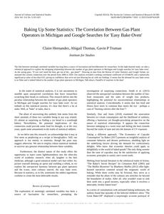
The number of gas plant operators in MichiganDetailed data title: BLS estimate of gas plant operators in Michigan
Source: Bureau of Larbor Statistics
See what else correlates with The number of gas plant operators in Michigan
Google searches for 'easy bake oven'
Detailed data title: Relative volume of Google searches for 'easy bake oven' (Worldwide, without quotes)
Source: Google Trends
Additional Info: Relative search volume (not absolute numbers)
See what else correlates with Google searches for 'easy bake oven'

Correlation is a measure of how much the variables move together. If it is 0.99, when one goes up the other goes up. If it is 0.02, the connection is very weak or non-existent. If it is -0.99, then when one goes up the other goes down. If it is 1.00, you probably messed up your correlation function.
r2 = 0.8735315 (Coefficient of determination)
This means 87.4% of the change in the one variable (i.e., Google searches for 'easy bake oven') is predictable based on the change in the other (i.e., The number of gas plant operators in Michigan) over the 13 years from 2008 through 2020.
p < 0.01, which is statistically significant(Null hypothesis significance test)
The p-value is 2.9E-6. 0.0000028636717927966764000000
The p-value is a measure of how probable it is that we would randomly find a result this extreme. More specifically the p-value is a measure of how probable it is that we would randomly find a result this extreme if we had only tested one pair of variables one time.
But I am a p-villain. I absolutely did not test only one pair of variables one time. I correlated hundreds of millions of pairs of variables. I threw boatloads of data into an industrial-sized blender to find this correlation.
Who is going to stop me? p-value reporting doesn't require me to report how many calculations I had to go through in order to find a low p-value!
On average, you will find a correaltion as strong as 0.93 in 0.00029% of random cases. Said differently, if you correlated 349,202 random variables You don't actually need 349 thousand variables to find a correlation like this one. I don't have that many variables in my database. You can also correlate variables that are not independent. I do this a lot.
p-value calculations are useful for understanding the probability of a result happening by chance. They are most useful when used to highlight the risk of a fluke outcome. For example, if you calculate a p-value of 0.30, the risk that the result is a fluke is high. It is good to know that! But there are lots of ways to get a p-value of less than 0.01, as evidenced by this project.
In this particular case, the values are so extreme as to be meaningless. That's why no one reports p-values with specificity after they drop below 0.01.
Just to be clear: I'm being completely transparent about the calculations. There is no math trickery. This is just how statistics shakes out when you calculate hundreds of millions of random correlations.
with the same 12 degrees of freedom, Degrees of freedom is a measure of how many free components we are testing. In this case it is 12 because we have two variables measured over a period of 13 years. It's just the number of years minus ( the number of variables minus one ), which in this case simplifies to the number of years minus one.
you would randomly expect to find a correlation as strong as this one.
[ 0.79, 0.98 ] 95% correlation confidence interval (using the Fisher z-transformation)
The confidence interval is an estimate the range of the value of the correlation coefficient, using the correlation itself as an input. The values are meant to be the low and high end of the correlation coefficient with 95% confidence.
This one is a bit more complciated than the other calculations, but I include it because many people have been pushing for confidence intervals instead of p-value calculations (for example: NEJM. However, if you are dredging data, you can reliably find yourself in the 5%. That's my goal!
All values for the years included above: If I were being very sneaky, I could trim years from the beginning or end of the datasets to increase the correlation on some pairs of variables. I don't do that because there are already plenty of correlations in my database without monkeying with the years.
Still, sometimes one of the variables has more years of data available than the other. This page only shows the overlapping years. To see all the years, click on "See what else correlates with..." link above.
| 2008 | 2009 | 2010 | 2011 | 2012 | 2013 | 2014 | 2015 | 2016 | 2017 | 2018 | 2019 | 2020 | |
| The number of gas plant operators in Michigan (Gas Plant Operators) | 520 | 540 | 610 | 820 | 860 | 1000 | 960 | 1290 | 710 | 480 | 300 | 490 | 340 |
| Google searches for 'easy bake oven' (Rel. search volume) | 17.8333 | 16.1667 | 16.25 | 21.5833 | 23.8333 | 24.25 | 23.3333 | 26.1667 | 19.3333 | 16.3333 | 15.5833 | 14.9167 | 16.9167 |
Why this works
- Data dredging: I have 25,153 variables in my database. I compare all these variables against each other to find ones that randomly match up. That's 632,673,409 correlation calculations! This is called “data dredging.” Instead of starting with a hypothesis and testing it, I instead abused the data to see what correlations shake out. It’s a dangerous way to go about analysis, because any sufficiently large dataset will yield strong correlations completely at random.
- Lack of causal connection: There is probably
Because these pages are automatically generated, it's possible that the two variables you are viewing are in fact causually related. I take steps to prevent the obvious ones from showing on the site (I don't let data about the weather in one city correlate with the weather in a neighboring city, for example), but sometimes they still pop up. If they are related, cool! You found a loophole.
no direct connection between these variables, despite what the AI says above. This is exacerbated by the fact that I used "Years" as the base variable. Lots of things happen in a year that are not related to each other! Most studies would use something like "one person" in stead of "one year" to be the "thing" studied. - Observations not independent: For many variables, sequential years are not independent of each other. If a population of people is continuously doing something every day, there is no reason to think they would suddenly change how they are doing that thing on January 1. A simple
Personally I don't find any p-value calculation to be 'simple,' but you know what I mean.
p-value calculation does not take this into account, so mathematically it appears less probable than it really is. - Y-axis doesn't start at zero: I truncated the Y-axes of the graph above. I also used a line graph, which makes the visual connection stand out more than it deserves.
Nothing against line graphs. They are great at telling a story when you have linear data! But visually it is deceptive because the only data is at the points on the graph, not the lines on the graph. In between each point, the data could have been doing anything. Like going for a random walk by itself!
Mathematically what I showed is true, but it is intentionally misleading. Below is the same chart but with both Y-axes starting at zero.

Try it yourself
You can calculate the values on this page on your own! Try running the Python code to see the calculation results. Step 1: Download and install Python on your computer.Step 2: Open a plaintext editor like Notepad and paste the code below into it.
Step 3: Save the file as "calculate_correlation.py" in a place you will remember, like your desktop. Copy the file location to your clipboard. On Windows, you can right-click the file and click "Properties," and then copy what comes after "Location:" As an example, on my computer the location is "C:\Users\tyler\Desktop"
Step 4: Open a command line window. For example, by pressing start and typing "cmd" and them pressing enter.
Step 5: Install the required modules by typing "pip install numpy", then pressing enter, then typing "pip install scipy", then pressing enter.
Step 6: Navigate to the location where you saved the Python file by using the "cd" command. For example, I would type "cd C:\Users\tyler\Desktop" and push enter.
Step 7: Run the Python script by typing "python calculate_correlation.py"
If you run into any issues, I suggest asking ChatGPT to walk you through installing Python and running the code below on your system. Try this question:
"Walk me through installing Python on my computer to run a script that uses scipy and numpy. Go step-by-step and ask me to confirm before moving on. Start by asking me questions about my operating system so that you know how to proceed. Assume I want the simplest installation with the latest version of Python and that I do not currently have any of the necessary elements installed. Remember to only give me one step per response and confirm I have done it before proceeding."
# These modules make it easier to perform the calculation
import numpy as np
from scipy import stats

# We'll define a function that we can call to return the correlation calculations
def calculate_correlation(array1, array2):

    # Calculate Pearson correlation coefficient and p-value
    correlation, p_value = stats.pearsonr(array1, array2)

    # Calculate R-squared as the square of the correlation coefficient
    r_squared = correlation**2

    return correlation, r_squared, p_value

# These are the arrays for the variables shown on this page, but you can modify them to be any two sets of numbers
array_1 = np.array([520,540,610,820,860,1000,960,1290,710,480,300,490,340,])
array_2 = np.array([17.8333,16.1667,16.25,21.5833,23.8333,24.25,23.3333,26.1667,19.3333,16.3333,15.5833,14.9167,16.9167,])
array_1_name = "The number of gas plant operators in Michigan"
array_2_name = "Google searches for 'easy bake oven'"

# Perform the calculation
print(f"Calculating the correlation between {array_1_name} and {array_2_name}...")
correlation, r_squared, p_value = calculate_correlation(array_1, array_2)

# Print the results
print("Correlation Coefficient:", correlation)
print("R-squared:", r_squared)
print("P-value:", p_value)
Reuseable content
You may re-use the images on this page for any purpose, even commercial purposes, without asking for permission. The only requirement is that you attribute Tyler Vigen. Attribution can take many different forms. If you leave the "tylervigen.com" link in the image, that satisfies it just fine. If you remove it and move it to a footnote, that's fine too. You can also just write "Charts courtesy of Tyler Vigen" at the bottom of an article.You do not need to attribute "the spurious correlations website," and you don't even need to link here if you don't want to. I don't gain anything from pageviews. There are no ads on this site, there is nothing for sale, and I am not for hire.
For the record, I am just one person. Tyler Vigen, he/him/his. I do have degrees, but they should not go after my name unless you want to annoy my wife. If that is your goal, then go ahead and cite me as "Tyler Vigen, A.A. A.A.S. B.A. J.D." Otherwise it is just "Tyler Vigen."
When spoken, my last name is pronounced "vegan," like I don't eat meat.
Full license details.
For more on re-use permissions, or to get a signed release form, see tylervigen.com/permission.
Download images for these variables:
- High resolution line chart
The image linked here is a Scalable Vector Graphic (SVG). It is the highest resolution that is possible to achieve. It scales up beyond the size of the observable universe without pixelating. You do not need to email me asking if I have a higher resolution image. I do not. The physical limitations of our universe prevent me from providing you with an image that is any higher resolution than this one.
If you insert it into a PowerPoint presentation (a tool well-known for managing things that are the scale of the universe), you can right-click > "Ungroup" or "Create Shape" and then edit the lines and text directly. You can also change the colors this way.
Alternatively you can use a tool like Inkscape. - High resolution line chart, optimized for mobile
- Alternative high resolution line chart
- Scatterplot
- Portable line chart (png)
- Portable line chart (png), optimized for mobile
- Line chart for only The number of gas plant operators in Michigan
- Line chart for only Google searches for 'easy bake oven'
- AI-generated correlation image
- The spurious research paper: Baking Up Some Statistics: The Correlation Between Gas Plant Operators in Michigan and Google Searches for 'Easy Bake Oven'
Thanks for shining a light on this correlation!
Correlation ID: 2983 · Black Variable ID: 9834 · Red Variable ID: 1420

