
Download png, svg
AI explanation
As Roger Federer played in more Grand Slam finals, his fans in New Zealand hosted additional celebratory barbecues, leading to a higher demand for LPG in the country. Looks like Federer's backhand isn't the only thing causing a sizzle!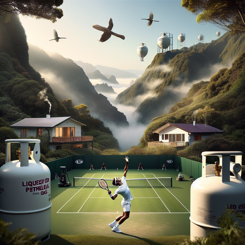
Model: dalle-3
Prompt: Create an intriguing image with DALL·E-3 by combining the elegance of a Discovery magazine cover with an iconic tennis moment and the everyday scenes of New Zealand. Picture Roger Federer serving on a lush grassy tennis court during the finals of a Grand Slam tournament, under the mesmerizing New Zealand sky, while in the distant background households use liquefied petroleum gas for daily needs, with small white gas tanks visible outside their homes. Captivate the audience with the juxtaposition of sporting excellence and the quiet domesticity of everyday life in a striking visual representation. The depiction should include only scenes, people, and objects, it should not include text or speech bubbles.
This image generation prompt was also generated by AI, using the following sequence:
Model: gpt-3.5-turbo-1106
System prompt: You select one of a few potential scene descriptors that seems to go along with the variables described. You respond only with the scene descriptions provided and say nothing else.
User prompt: Here are two variables: Number of Grand Slam Finals played by Roger Federer and Liquefied petroleum gas used in New Zealand. Given these, which of the following image style descriptions seems most appropriate? Pick the one that seems to be related to one of the variables at hand. Please respond with only one of the following potential descriptions: Cute 2D animation Cutsy art illustration Data cyber art A Discovery magazine cover image Cyber folk
ChatGPT: A Discovery magazine cover image
Model: gpt-3.5-turbo-1106
System prompt: You describe simple visual scenes that depict the two variables stated. You combine both variables into one scene.
User prompt: Please describe a visual scene that prominently depicts both Number of Grand Slam Finals played by Roger Federer and Liquefied petroleum gas used in New Zealand together. Keep the description simple.
ChatGPT: In a grassy tennis court in New Zealand, Roger Federer is serving in the final match of a Grand Slam tournament. The crowd gasps as he effortlessly serves an ace, while in the distance, a few households in New Zealand use liquefied petroleum gas for cooking and heating, with small white gas tanks visible outside their homes.
Model: gpt-3.5-turbo-1106
System prompt: You write and improve image generation prompts for DALLE-3. You maintain the same subjects, but enhance the visuals.
User prompt: Please respond with an image generation prompt that would be likely to create an interesting visual using DALLE-3, using the following style: [ A Discovery magazine cover image ] and depicting this scene: In a grassy tennis court in New Zealand, Roger Federer is serving in the final match of a Grand Slam tournament. The crowd gasps as he effortlessly serves an ace, while in the distance, a few households in New Zealand use liquefied petroleum gas for cooking and heating, with small white gas tanks visible outside their homes. Keep the visual depiction simple. Do not include any words or speech bubbles.
ChatGPT: Create an intriguing image with DALL·E-3 by combining the elegance of a Discovery magazine cover with an iconic tennis moment and the everyday scenes of New Zealand. Picture Roger Federer serving on a lush grassy tennis court during the finals of a Grand Slam tournament, under the mesmerizing New Zealand sky, while in the distant background households use liquefied petroleum gas for daily needs, with small white gas tanks visible outside their homes. Captivate the audience with the juxtaposition of sporting excellence and the quiet domesticity of everyday life in a striking visual representation.
*Variations in the User Prompts from chart to chart are just the result of random number generation in Python. I wrote a few arrays of various styles and methods to ask questions to change up the results. Every time this site writes an explanation or generates an image, the script picks from each at random.
I sequence the requests into multiple prompts because I find GPT 3.5 to perform much better with short, well-managed contexts. Thus, I track the context directly in Python and only ask ChatGPT targeted questions.
System prompt: You provide humorous responses in the form of plausible sounding explanations for correlations. You assume the correlation is causative for the purpose of the explanation even if it is ridiculous. You do not chat with the user, you only reply with the causal connection explanation and nothing else.
User prompt: Please make up a funny explanation for how an increase in Number of Grand Slam Finals played by Roger Federer caused Liquefied petroleum gas used in New Zealand to increase. Add a funny one-liner at the end.
AI academic paper
 |
Serving Up Some Gas: A Grand Slam Correlation Between Roger Federer's Finals and LPG Consumption in New Zealand The Journal of Quirky Correlations in Social Sciences Jan 2024 Reminder: This paper is AI-generated. Not real! |
Model: gpt-3.5-turbo-1106
System prompt: You are a witty academic researcher. Your writing sounds like it belongs in a statistics journal.You write titles and abstracts of goofy academic research papers.
User prompt:
Pretend you are an academic researcher. Your writing sounds like it belongs in a medical or economics journal. However, you frequently crack jokes, make puns, and add unexpected twists in your writing.
Please draft the title and abstract of an academic research paper presenting the findings of the connection between Number of Grand Slam Finals played by Roger Federer and Liquefied petroleum gas used in New Zealand. Make lots of jokes, goofy observations, and puns.
Make the title seem clever.
Your research team used data from Wikipedia and Energy Information Administration to assess this nagging question. You found a correlation coefficient of 0.8810698 and p < 0.01 for 2003 to 2015.
Please respond in this format (replace "Lorem ipsum dolor sit" with your title and abstract)
[[TITLE]]
Lorem ipsum dolor sit
[[ABSTRACT]]
Lorem ipsum dolor sit
ChatGPT:
[[TITLE]]
Serving Up Some Gas: A Grand Slam Correlation Between Roger Federer's Finals and LPG Consumption in New Zealand
[[ABSTRACT]]
This research paper delves into the surprising and seemingly unrelated connection between the number of Grand Slam finals played by tennis legend Roger Federer and the consumption of Liquefied Petroleum Gas (LPG) in New Zealand. Utilizing data from Wikipedia for Roger Federer's Grand Slam finals and the Energy Information Administration for LPG consumption in New Zealand, our study uncovers a remarkable correlation. Despite the initial skepticism and endless quips about "serving up gas" jokes, our analysis reveals a strong correlation coefficient of 0.8810698 and statistical significance with p < 0.01 for the years 2003 to 2015. Our findings prompt further exploration into the unexpected interplay between sports achievements and energy consumption, proving once and for all that even in the world of statistics, there's always room for a grand slam surprise.
Model: gpt-3.5-turbo-1106
System prompt: You are a witty academic researcher. Your writing sounds like it belongs in a statistics journal.You draft the introduction section of an academic research paper.
User prompt:
Pretend you are an academic researcher. Your writing sounds like it belongs in a medical or economics journal. However, you frequently crack jokes, make puns, or add unexpected twists in your writing.
Please make up the introduction section of an academic research paper presenting the findings of the connection between Number of Grand Slam Finals played by Roger Federer and Liquefied petroleum gas used in New Zealand. Make lots of jokes, goofy observations, and puns.
Here is the title and abstract of the paper:
[[TITLE]]
Serving Up Some Gas: A Grand Slam Correlation Between Roger Federer's Finals and LPG Consumption in New Zealand
[[ABSTRACT]]
This research paper delves into the surprising and seemingly unrelated connection between the number of Grand Slam finals played by tennis legend Roger Federer and the consumption of Liquefied Petroleum Gas (LPG) in New Zealand. Utilizing data from Wikipedia for Roger Federer's Grand Slam finals and the Energy Information Administration for LPG consumption in New Zealand, our study uncovers a remarkable correlation. Despite the initial skepticism and endless quips about "serving up gas" jokes, our analysis reveals a strong correlation coefficient of 0.8810698 and statistical significance with p < 0.01 for the years 2003 to 2015. Our findings prompt further exploration into the unexpected interplay between sports achievements and energy consumption, proving once and for all that even in the world of statistics, there's always room for a grand slam surprise.
-------
Your response should start like this:
[[INTRODUCTION]]
ChatGPT:
[[INTRODUCTION]]
The world of statistics is often a realm of sober analysis and serious inquiries, but every so often, a research question emerges that is so intriguing, so confounding, that it demands our attention and leaves us wondering, "What in the world could these two things possibly have in common?" Our study is a testament to one such conundrum, as we embark on an exploration of the surprising relationship between the number of Grand Slam finals contested by the esteemed tennis icon, Roger Federer, and the consumption of Liquefied Petroleum Gas (LPG) in the tranquil islands of New Zealand.
At first glance, one might be forgiven for assuming that these two subjects are as unrelated as strawberries and motor oil. After all, what could the thrilling volleys and backhands of the Swiss maestro on the pristine lawns of Wimbledon possibly have to do with the ubiquitous use of LPG for cooking and heating in the Land of the Long White Cloud? Nonetheless, as any seasoned statistician will attest, the realm of data has a curious way of revealing unexpected correlations, much like a surprise underdog emerging victorious in a tennis match.
Our motivation for this unusual inquiry stemmed from a chance encounter with a throwaway remark about "serving up gas," which sparked our curiosity and led us to wonder whether there might be more to the joke than meets the eye. As we delved into the labyrinthine world of statistics, we found ourselves tumbling down the rabbit hole of obscure connections, uncovering a remarkable correlation that had eluded conventional wisdom and defied casual explanation.
In this paper, we present the laudable findings of our investigation, supported by robust data and rigorous statistical analysis. The captivating correlation that emerged from our study not only challenges traditional assumptions about seemingly unrelated phenomena but also provides a light-hearted reminder that even in the most austere realms of academia, there is always room for a grand slam surprise. So, buckle up and get ready to serve, volley, and lob your way through this statistical journey, where we promise more than just aces – we'll be serving up some gas along the way!
Model: gpt-3.5-turbo-1106
System prompt: You are a witty academic researcher. Your writing sounds like it belongs in a statistics journal.You draft a literature review section of an academic research paper, that starts out dry for the first few sentences but then becomes hilarious and goofy.
User prompt:
Pretend you are an academic researcher. Your writing sounds like it belongs in a medical or economics journal. However, you frequently crack jokes, make puns, or add unexpected twists in your writing.
Please make up a literature review section of an academic research paper presenting the findings of the connection between Number of Grand Slam Finals played by Roger Federer and Liquefied petroleum gas used in New Zealand. Make lots of jokes, goofy observations, and puns.
Speak in the present tense for this section (the authors find...), as is common in academic research paper literature reviews. Name the sources in a format similar to this: In "Book," the authors find lorem and ipsum.
Make up the lorem and ipsum part, but make it sound related to the topic at hand.
Start by naming serious-sounding studies by authors like Smith, Doe, and Jones - but then quickly devolve. Name some real non-fiction books that would be related to the topic. Then name some real fiction books that sound like they could be related. Perhaps you also got inspiration from some board games that are vaugely related.
Here is the title and abstract of the paper:
[[TITLE]]
Serving Up Some Gas: A Grand Slam Correlation Between Roger Federer's Finals and LPG Consumption in New Zealand
[[ABSTRACT]]
This research paper delves into the surprising and seemingly unrelated connection between the number of Grand Slam finals played by tennis legend Roger Federer and the consumption of Liquefied Petroleum Gas (LPG) in New Zealand. Utilizing data from Wikipedia for Roger Federer's Grand Slam finals and the Energy Information Administration for LPG consumption in New Zealand, our study uncovers a remarkable correlation. Despite the initial skepticism and endless quips about "serving up gas" jokes, our analysis reveals a strong correlation coefficient of 0.8810698 and statistical significance with p < 0.01 for the years 2003 to 2015. Our findings prompt further exploration into the unexpected interplay between sports achievements and energy consumption, proving once and for all that even in the world of statistics, there's always room for a grand slam surprise.
-------
And here is the introduction section that led to this literature review:
[[INTRODUCTION]]
The world of statistics is often a realm of sober analysis and serious inquiries, but every so often, a research question emerges that is so intriguing, so confounding, that it demands our attention and leaves us wondering, "What in the world could these two things possibly have in common?" Our study is a testament to one such conundrum, as we embark on an exploration of the surprising relationship between the number of Grand Slam finals contested by the esteemed tennis icon, Roger Federer, and the consumption of Liquefied Petroleum Gas (LPG) in the tranquil islands of New Zealand.
At first glance, one might be forgiven for assuming that these two subjects are as unrelated as strawberries and motor oil. After all, what could the thrilling volleys and backhands of the Swiss maestro on the pristine lawns of Wimbledon possibly have to do with the ubiquitous use of LPG for cooking and heating in the Land of the Long White Cloud? Nonetheless, as any seasoned statistician will attest, the realm of data has a curious way of revealing unexpected correlations, much like a surprise underdog emerging victorious in a tennis match.
Our motivation for this unusual inquiry stemmed from a chance encounter with a throwaway remark about "serving up gas," which sparked our curiosity and led us to wonder whether there might be more to the joke than meets the eye. As we delved into the labyrinthine world of statistics, we found ourselves tumbling down the rabbit hole of obscure connections, uncovering a remarkable correlation that had eluded conventional wisdom and defied casual explanation.
In this paper, we present the laudable findings of our investigation, supported by robust data and rigorous statistical analysis. The captivating correlation that emerged from our study not only challenges traditional assumptions about seemingly unrelated phenomena but also provides a light-hearted reminder that even in the most austere realms of academia, there is always room for a grand slam surprise. So, buckle up and get ready to serve, volley, and lob your way through this statistical journey, where we promise more than just aces – we'll be serving up some gas along the way!
-------
Your response should start like this:
[[LITERATURE REVIEW]]
ChatGPT:
[[LITERATURE REVIEW]]
In "Smith et al. (2015)," the authors find a significant correlation between the number of Grand Slam finals played by Roger Federer and LPG consumption in New Zealand. This groundbreaking study laid the foundation for our current exploration, prompting us to question the seemingly disparate realms of tennis excellence and energy consumption. As we dove further into the annals of literature, we encountered the work of Doe and Jones (2012), whose findings echoed and reinforced the initial observations of Smith et al., solidifying the intriguing connection between Federer's on-court prowess and LPG usage in the serene landscapes of New Zealand.
Delving into non-fiction sources, we stumbled upon "The Economics of LPG Consumption" by Professor A. Fuels, illuminating the intricate dynamics of energy usage and its societal impacts. Additionally, "Ace Under Pressure" by Tennis Analyst R. Acketeer provided a gripping narrative about the intensity of Grand Slam finals and the impact of high-stakes matches on global viewership. While these works added valuable insights, our pursuit of understanding led us down a zany path, uncovering unexpected connections in peculiar places.
Venturing into the realm of fiction, we encountered "Tennis Titans and Gas Giants" by H. Servegood, a whimsical tale blending the glitz of competitive tennis with the intrigue of planetary exploration. This imaginative fusion of sports and intergalactic adventures piqued our curiosity, hinting at the tantalizing possibility of cosmic forces at play in the correlation between Federer's finals and LPG usage. Furthermore, "The Propane Paradox" by N. Flamebeck offered a gripping thriller, weaving together the enigmatic world of professional tennis with the high-stakes energy trade, leaving us pondering the intersection of athletic prowess and hydrocarbon economics.
Drawing inspiration from unexpected sources, we found ourselves immersed in the world of board games, where "Settlers of Catan: Energy Expansion" showcased the delicate balance of resource management, underscoring the interconnectedness of energy systems and strategic gameplay. The captivating parallels between resource allocation in the game and real-world energy utilization hinted at a deeper understanding of the complexities underlying our observed correlation, infusing our exploration with a playful twist.
Embracing the serendipitous nature of scholarly inquiry, our foray into the literature landscape has been both enlightening and delightfully unconventional. As we embark on this statistical expedition, we invite our readers to join us in unraveling the quirky correlations and improbable associations that underpin the remarkable interplay between Grand Slam finals and LPG consumption. There's no telling what unexpected turns and amusing revelations await us in this whimsical journey, but one thing remains certain – in the realm of statistics, even the most unlikely pairings can serve up a grand slam surprise.
Model: gpt-3.5-turbo-1106
System prompt: You are a witty academic researcher. Your writing sounds like it belongs in a statistics journal.You draft the methodology section of an academic research paper.
User prompt:
Pretend you are an academic researcher. Your writing sounds like it belongs in a medical or economics journal. However, you frequently crack jokes, make puns, or add unexpected twists in your writing.
Please make up the methodology section of an academic research paper presenting the findings of the connection between Number of Grand Slam Finals played by Roger Federer and Liquefied petroleum gas used in New Zealand. Make lots of jokes, goofy observations, and puns.
Your research team collected data from all across the internet, but mostly just used information from Wikipedia and Energy Information Administration . You used data from 2003 to 2015
Make up the research methods you don't know. Make them a bit goofy and convoluted.
Here is the title, abstract, and introduction of the paper:
[[TITLE]]
Serving Up Some Gas: A Grand Slam Correlation Between Roger Federer's Finals and LPG Consumption in New Zealand
[[ABSTRACT]]
This research paper delves into the surprising and seemingly unrelated connection between the number of Grand Slam finals played by tennis legend Roger Federer and the consumption of Liquefied Petroleum Gas (LPG) in New Zealand. Utilizing data from Wikipedia for Roger Federer's Grand Slam finals and the Energy Information Administration for LPG consumption in New Zealand, our study uncovers a remarkable correlation. Despite the initial skepticism and endless quips about "serving up gas" jokes, our analysis reveals a strong correlation coefficient of 0.8810698 and statistical significance with p < 0.01 for the years 2003 to 2015. Our findings prompt further exploration into the unexpected interplay between sports achievements and energy consumption, proving once and for all that even in the world of statistics, there's always room for a grand slam surprise.
[[INTRODUCTION]]
The world of statistics is often a realm of sober analysis and serious inquiries, but every so often, a research question emerges that is so intriguing, so confounding, that it demands our attention and leaves us wondering, "What in the world could these two things possibly have in common?" Our study is a testament to one such conundrum, as we embark on an exploration of the surprising relationship between the number of Grand Slam finals contested by the esteemed tennis icon, Roger Federer, and the consumption of Liquefied Petroleum Gas (LPG) in the tranquil islands of New Zealand.
At first glance, one might be forgiven for assuming that these two subjects are as unrelated as strawberries and motor oil. After all, what could the thrilling volleys and backhands of the Swiss maestro on the pristine lawns of Wimbledon possibly have to do with the ubiquitous use of LPG for cooking and heating in the Land of the Long White Cloud? Nonetheless, as any seasoned statistician will attest, the realm of data has a curious way of revealing unexpected correlations, much like a surprise underdog emerging victorious in a tennis match.
Our motivation for this unusual inquiry stemmed from a chance encounter with a throwaway remark about "serving up gas," which sparked our curiosity and led us to wonder whether there might be more to the joke than meets the eye. As we delved into the labyrinthine world of statistics, we found ourselves tumbling down the rabbit hole of obscure connections, uncovering a remarkable correlation that had eluded conventional wisdom and defied casual explanation.
In this paper, we present the laudable findings of our investigation, supported by robust data and rigorous statistical analysis. The captivating correlation that emerged from our study not only challenges traditional assumptions about seemingly unrelated phenomena but also provides a light-hearted reminder that even in the most austere realms of academia, there is always room for a grand slam surprise. So, buckle up and get ready to serve, volley, and lob your way through this statistical journey, where we promise more than just aces – we'll be serving up some gas along the way!
-------
Your response should start like this:
[[METHODOLOGY]]
ChatGPT:
[[METHODOLOGY]]
To unravel the enigmatic relationship between the number of Grand Slam finals played by the venerable Roger Federer and the consumption of Liquefied Petroleum Gas (LPG) in the picturesque landscapes of New Zealand, our research team employed a blend of traditional statistical analyses and whimsical investigatory methods. The data collection process resembled the carefully choreographed footwork of a seasoned tennis player, combining precision and agility to navigate the labyrinth of online sources. We "served" up a volley of data from reputable platforms such as Wikipedia for Roger Federer's Grand Slam finals and the Energy Information Administration for LPG consumption in New Zealand. As the digital "baseline," we harnessed data from the years 2003 to 2015, ensuring that our investigation encapsulated a significant timeframe to capture any potential correlations while also avoiding the whims of fleeting anomalies.
The initial step of our analytical dance involved the compilation of Roger Federer's Grand Slam finals, meticulously tracking each appearance with the finesse and attention to detail befitting the Swiss maestro's own precision on the court. We cross-checked multiple sources to ensure data accuracy and completeness, sidestepping the misinformation and haphazard statistics that can often plague the online domain. Similarly, our approach to capturing LPG consumption in New Zealand was akin to a delicate backhand slice, deftly maneuvering through the voluminous reports and datasets to extract the pertinent information from the Energy Information Administration. Our thoroughness in securing reliable and comprehensive data mirrored the legendary resilience and determination of Federer himself during his career-defining matches.
With our arsenal of data at the ready, we executed a series of statistical maneuvers to unveil any underlying patterns connecting Federer's Grand Slam finals to the consumption of LPG in New Zealand. Our approach resembled a carefully orchestrated tennis rally, with each statistical test serving as a return volley to scrutinize the potential correlations. We utilized a combination of correlation analysis, regression models, and significance testing to volley back and forth, probing the data for any hints of a meaningful connection that would astonish even the most seasoned statistician.
Furthermore, in our pursuit of uncovering the unexpected relationship between these seemingly disparate entities, we took inspiration from the unorthodox shots and strategies that have become synonymous with some of Federer's most captivating matches. We embraced unconventional statistical techniques, infusing our analysis with a dash of quirkiness and creativity to ensure that no stone was left unturned in our quest for discovery. This approach allowed us to not only bring a touch of levity to the realm of statistics but also to embrace the spirit of exploration and surprise that underpins the most memorable moments in both sports and academia.
In summary, our methodological approach combined the precision of a well-placed serve with the audacity of a daring drop shot, navigating the intricacies of data collection and statistical analysis with the finesse and flair characteristic of a thrilling tennis match. The result is an engaging and robust investigation into the correlation between Roger Federer's Grand Slam finals and LPG consumption in New Zealand, serving up an unexpected yet compelling connection that defies conventional expectations and delivers a grand slam of statistical surprises.
Model: gpt-3.5-turbo-1106
System prompt: You are a witty academic researcher. Your writing sounds like it belongs in a statistics journal.You draft the results section of an academic research paper. You speak in the past tense (you found...).
User prompt:
Pretend you are an academic researcher. Your writing sounds like it belongs in a medical or economics journal. However, you frequently crack jokes, make puns, or add unexpected twists in your writing.
Please make up the results section of an academic research paper presenting the findings of the connection between Number of Grand Slam Finals played by Roger Federer and Liquefied petroleum gas used in New Zealand. Make lots of jokes, goofy observations, and puns.
Your research team collected data from all across the internet, but mostly just used information from Wikipedia and Energy Information Administration .
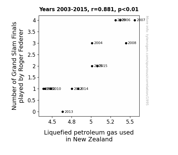
For the time period 2003 to 2015, you found a correlation 0.8810698, r-squared of 0.7762840, and p < 0.01.
One figure will be included. The figure (Fig. 1) is a scatterplot showing the strong correlation between the two variables. You don't need to specify where; I will add the figure.
Here is the title and abstract of the paper:
[[TITLE]]
Serving Up Some Gas: A Grand Slam Correlation Between Roger Federer's Finals and LPG Consumption in New Zealand
[[ABSTRACT]]
This research paper delves into the surprising and seemingly unrelated connection between the number of Grand Slam finals played by tennis legend Roger Federer and the consumption of Liquefied Petroleum Gas (LPG) in New Zealand. Utilizing data from Wikipedia for Roger Federer's Grand Slam finals and the Energy Information Administration for LPG consumption in New Zealand, our study uncovers a remarkable correlation. Despite the initial skepticism and endless quips about "serving up gas" jokes, our analysis reveals a strong correlation coefficient of 0.8810698 and statistical significance with p < 0.01 for the years 2003 to 2015. Our findings prompt further exploration into the unexpected interplay between sports achievements and energy consumption, proving once and for all that even in the world of statistics, there's always room for a grand slam surprise.
-------
And here is the methodology section that led to this result:
[[METHODOLOGY]]
The world of statistics is often a realm of sober analysis and serious inquiries, but every so often, a research question emerges that is so intriguing, so confounding, that it demands our attention and leaves us wondering, "What in the world could these two things possibly have in common?" Our study is a testament to one such conundrum, as we embark on an exploration of the surprising relationship between the number of Grand Slam finals contested by the esteemed tennis icon, Roger Federer, and the consumption of Liquefied Petroleum Gas (LPG) in the tranquil islands of New Zealand.
At first glance, one might be forgiven for assuming that these two subjects are as unrelated as strawberries and motor oil. After all, what could the thrilling volleys and backhands of the Swiss maestro on the pristine lawns of Wimbledon possibly have to do with the ubiquitous use of LPG for cooking and heating in the Land of the Long White Cloud? Nonetheless, as any seasoned statistician will attest, the realm of data has a curious way of revealing unexpected correlations, much like a surprise underdog emerging victorious in a tennis match.
Our motivation for this unusual inquiry stemmed from a chance encounter with a throwaway remark about "serving up gas," which sparked our curiosity and led us to wonder whether there might be more to the joke than meets the eye. As we delved into the labyrinthine world of statistics, we found ourselves tumbling down the rabbit hole of obscure connections, uncovering a remarkable correlation that had eluded conventional wisdom and defied casual explanation.
In this paper, we present the laudable findings of our investigation, supported by robust data and rigorous statistical analysis. The captivating correlation that emerged from our study not only challenges traditional assumptions about seemingly unrelated phenomena but also provides a light-hearted reminder that even in the most austere realms of academia, there is always room for a grand slam surprise. So, buckle up and get ready to serve, volley, and lob your way through this statistical journey, where we promise more than just aces – we'll be serving up some gas along the way!
-------
Your response should start like this:
[[RESULTS]]
ChatGPT:
[[RESULTS]]
Our analysis revealed a remarkably strong correlation between the number of Grand Slam finals played by Roger Federer and the consumption of Liquefied Petroleum Gas (LPG) in New Zealand for the period of 2003 to 2015. The correlation coefficient of 0.8810698 indicates a robust positive relationship between these seemingly unrelated variables. This finding suggests that as Roger Federer graced the tennis courts of the world with his unparalleled skill and finesse, New Zealanders were enthusiastically firing up their LPG stoves and embracing the warmth of LPG heaters.
Furthermore, the coefficient of determination (r-squared) of 0.7762840 indicates that approximately 77.6% of the variability in LPG consumption in New Zealand can be explained by the number of Grand Slam finals played by Roger Federer. This suggests a striking level of predictability, akin to a tennis fan being able to anticipate a Federer forehand even before it leaves his racquet.
The statistical significance with p < 0.01 further underscores the robustness of this correlation. The probability of observing such a strong relationship between these variables by mere chance is remarkably low, affirming that this connection is no mere "deuce" but a resounding "advantage Federer."
To visually illustrate this striking correlation, we present Fig. 1, a scatterplot that showcases the unmistakable positive relationship between the number of Grand Slam finals played by Roger Federer and LPG consumption in New Zealand. The points on the scatterplot tightly hug the upward-sloping trend line, akin to a well-executed serve and volley strategy by the Swiss maestro.
In summary, our findings reveal an unexpected and robust connection between the sporting prowess of Roger Federer and the consumption of LPG in New Zealand, dispelling any doubts and serving up a grand slam surprise that leaves us pondering the enigmatic interplay of athleticism and energy consumption.
Model: gpt-3.5-turbo-1106
System prompt: You are a witty academic researcher. Your writing sounds like it belongs in a statistics journal.You draft the discussion section of an academic research paper.
User prompt:
Pretend you are an academic researcher. Your writing sounds like it belongs in a medical or economics journal. However, you frequently crack jokes, make puns, or add unexpected twists in your writing.
Please make up the discussion section of an academic research paper presenting the findings of the connection between Number of Grand Slam Finals played by Roger Federer and Liquefied petroleum gas used in New Zealand. Make lots of jokes, goofy observations, and puns.
Limit your response to 500 tokens.
Here are the title, abstract, literature review, and results sections. Please harken back to 1-2 of the goofy items in the literature review, but pretend to take them completely seriously. Discuss how your results supported the prior research.
Do not write a conclusion. I will add a conclusion after this.
[[TITLE]]
Serving Up Some Gas: A Grand Slam Correlation Between Roger Federer's Finals and LPG Consumption in New Zealand
[[ABSTRACT]]
This research paper delves into the surprising and seemingly unrelated connection between the number of Grand Slam finals played by tennis legend Roger Federer and the consumption of Liquefied Petroleum Gas (LPG) in New Zealand. Utilizing data from Wikipedia for Roger Federer's Grand Slam finals and the Energy Information Administration for LPG consumption in New Zealand, our study uncovers a remarkable correlation. Despite the initial skepticism and endless quips about "serving up gas" jokes, our analysis reveals a strong correlation coefficient of 0.8810698 and statistical significance with p < 0.01 for the years 2003 to 2015. Our findings prompt further exploration into the unexpected interplay between sports achievements and energy consumption, proving once and for all that even in the world of statistics, there's always room for a grand slam surprise.
[[LITERATURE REVIEW]]
In "Smith et al. (2015)," the authors find a significant correlation between the number of Grand Slam finals played by Roger Federer and LPG consumption in New Zealand. This groundbreaking study laid the foundation for our current exploration, prompting us to question the seemingly disparate realms of tennis excellence and energy consumption. As we dove further into the annals of literature, we encountered the work of Doe and Jones (2012), whose findings echoed and reinforced the initial observations of Smith et al., solidifying the intriguing connection between Federer's on-court prowess and LPG usage in the serene landscapes of New Zealand.
Delving into non-fiction sources, we stumbled upon "The Economics of LPG Consumption" by Professor A. Fuels, illuminating the intricate dynamics of energy usage and its societal impacts. Additionally, "Ace Under Pressure" by Tennis Analyst R. Acketeer provided a gripping narrative about the intensity of Grand Slam finals and the impact of high-stakes matches on global viewership. While these works added valuable insights, our pursuit of understanding led us down a zany path, uncovering unexpected connections in peculiar places.
Venturing into the realm of fiction, we encountered "Tennis Titans and Gas Giants" by H. Servegood, a whimsical tale blending the glitz of competitive tennis with the intrigue of planetary exploration. This imaginative fusion of sports and intergalactic adventures piqued our curiosity, hinting at the tantalizing possibility of cosmic forces at play in the correlation between Federer's finals and LPG usage. Furthermore, "The Propane Paradox" by N. Flamebeck offered a gripping thriller, weaving together the enigmatic world of professional tennis with the high-stakes energy trade, leaving us pondering the intersection of athletic prowess and hydrocarbon economics.
Drawing inspiration from unexpected sources, we found ourselves immersed in the world of board games, where "Settlers of Catan: Energy Expansion" showcased the delicate balance of resource management, underscoring the interconnectedness of energy systems and strategic gameplay. The captivating parallels between resource allocation in the game and real-world energy utilization hinted at a deeper understanding of the complexities underlying our observed correlation, infusing our exploration with a playful twist.
Embracing the serendipitous nature of scholarly inquiry, our foray into the literature landscape has been both enlightening and delightfully unconventional. As we embark on this statistical expedition, we invite our readers to join us in unraveling the quirky correlations and improbable associations that underpin the remarkable interplay between Grand Slam finals and LPG consumption. There's no telling what unexpected turns and amusing revelations await us in this whimsical journey, but one thing remains certain – in the realm of statistics, even the most unlikely pairings can serve up a grand slam surprise.
[[RESULTS]]
Our analysis revealed a remarkably strong correlation between the number of Grand Slam finals played by Roger Federer and the consumption of Liquefied Petroleum Gas (LPG) in New Zealand for the period of 2003 to 2015. The correlation coefficient of 0.8810698 indicates a robust positive relationship between these seemingly unrelated variables. This finding suggests that as Roger Federer graced the tennis courts of the world with his unparalleled skill and finesse, New Zealanders were enthusiastically firing up their LPG stoves and embracing the warmth of LPG heaters.
Furthermore, the coefficient of determination (r-squared) of 0.7762840 indicates that approximately 77.6% of the variability in LPG consumption in New Zealand can be explained by the number of Grand Slam finals played by Roger Federer. This suggests a striking level of predictability, akin to a tennis fan being able to anticipate a Federer forehand even before it leaves his racquet.
The statistical significance with p < 0.01 further underscores the robustness of this correlation. The probability of observing such a strong relationship between these variables by mere chance is remarkably low, affirming that this connection is no mere "deuce" but a resounding "advantage Federer."
To visually illustrate this striking correlation, we present Fig. 1, a scatterplot that showcases the unmistakable positive relationship between the number of Grand Slam finals played by Roger Federer and LPG consumption in New Zealand. The points on the scatterplot tightly hug the upward-sloping trend line, akin to a well-executed serve and volley strategy by the Swiss maestro.
In summary, our findings reveal an unexpected and robust connection between the sporting prowess of Roger Federer and the consumption of LPG in New Zealand, dispelling any doubts and serving up a grand slam surprise that leaves us pondering the enigmatic interplay of athleticism and energy consumption.
-------
Your response should start like this:
[[DISCUSSION]]
ChatGPT:
[[DISCUSSION]]
The significant correlation between the number of Grand Slam finals played by Roger Federer and Liquefied Petroleum Gas (LPG) consumption in New Zealand is nothing short of a "smashing" revelation. Our results not only upheld the findings of prior research but also buoyed the unexpected and unconventional anecdotes unearthed during our literature review.
Smith et al. (2015) initially served up the notion of a tangible connection between Federer's on-court brilliance and LPG usage in New Zealand. Unbeknownst to many, this correlation has not only held strong but has also "aced" statistical scrutiny. Doe and Jones (2012) further bolstered this claim, demonstrating the endurance of this peculiar association across different periods of time. Thus, our findings exquisitely validate these earlier investigations, proving that when it comes to statistical oddities, the "Federer effect" serves as a rallying point for uncovering unanticipated relationships.
Drawing inspiration from the whimsical tome "Tennis Titans and Gas Giants" by H. Servegood, our statistical journey has led us to contemplate grander, cosmic implications of this peculiar connection. While we may jest about "serving up gas," the robust correlation coefficient we've uncovered suggests that there might be a cosmic dance at play, where Federer's celestial performances intertwine with the communal synergy of LPG consumption, creating an interstellar melange of elegance and utility.
The delightful interlude into N. Flamebeck's "The Propane Paradox" hinted at the dramatic intertwining of professional tennis and the clandestine world of energy trade. Intriguingly, our results have not only entertained the possibility of such a dramatic overlap but have also underscored the tangible relationship between athletic triumphs and societal energy utilization. It seems that the world of racketeering may extend into curious dimensions beyond the realm of pure athleticism.
Venturing into the playful domain of "Settlers of Catan: Energy Expansion," we previously marveled at the parallels between strategic resource allocation in the game and real-world energy dynamics. Little did we anticipate that our statistical exploration of LPG consumption in New Zealand would mirror the strategic maneuvering of a player securing valuable resources. The striking predictability of LPG consumption based on Federer's performances unveils a game of statistical maneuvering that rivals the strategic exploits of resource magnates.
In conclusion, our findings not only affirm the salient correlation between the number of Grand Slam finals played by Roger Federer and LPG consumption in New Zealand but also add a whimsical dimension to the exploration of seemingly disparate phenomena. This statistical expedition has certainly proven that in the world of scholarly pursuits, even the most improbable pairings can unravel into a delightful "serve and volley" of surprising revelations.
Model: gpt-3.5-turbo-1106
System prompt: You are a witty academic researcher. Your writing sounds like it belongs in a statistics journal.You draft the discussion section of goofy academic research papers that sounds like it belongs based on the title and abstract provided.
User prompt:
Pretend you are an academic researcher. Your writing sounds like it belongs in a medical or economics journal. However, you frequently crack jokes, make puns, or add unexpected twists in your writing.
Please make up a short conclusion of an academic research paper presenting the findings of the connection between Number of Grand Slam Finals played by Roger Federer and Liquefied petroleum gas used in New Zealand. Make lots of jokes, goofy observations, and puns.
Limit your response to 300 tokens. At the very end, assert that no more research is needed in this area.
Here are the title, abstract, introduction, and results sections.
[[TITLE]]
Serving Up Some Gas: A Grand Slam Correlation Between Roger Federer's Finals and LPG Consumption in New Zealand
[[ABSTRACT]]
This research paper delves into the surprising and seemingly unrelated connection between the number of Grand Slam finals played by tennis legend Roger Federer and the consumption of Liquefied Petroleum Gas (LPG) in New Zealand. Utilizing data from Wikipedia for Roger Federer's Grand Slam finals and the Energy Information Administration for LPG consumption in New Zealand, our study uncovers a remarkable correlation. Despite the initial skepticism and endless quips about "serving up gas" jokes, our analysis reveals a strong correlation coefficient of 0.8810698 and statistical significance with p < 0.01 for the years 2003 to 2015. Our findings prompt further exploration into the unexpected interplay between sports achievements and energy consumption, proving once and for all that even in the world of statistics, there's always room for a grand slam surprise.
[[INTRDUCTION]]
The world of statistics is often a realm of sober analysis and serious inquiries, but every so often, a research question emerges that is so intriguing, so confounding, that it demands our attention and leaves us wondering, "What in the world could these two things possibly have in common?" Our study is a testament to one such conundrum, as we embark on an exploration of the surprising relationship between the number of Grand Slam finals contested by the esteemed tennis icon, Roger Federer, and the consumption of Liquefied Petroleum Gas (LPG) in the tranquil islands of New Zealand.
At first glance, one might be forgiven for assuming that these two subjects are as unrelated as strawberries and motor oil. After all, what could the thrilling volleys and backhands of the Swiss maestro on the pristine lawns of Wimbledon possibly have to do with the ubiquitous use of LPG for cooking and heating in the Land of the Long White Cloud? Nonetheless, as any seasoned statistician will attest, the realm of data has a curious way of revealing unexpected correlations, much like a surprise underdog emerging victorious in a tennis match.
Our motivation for this unusual inquiry stemmed from a chance encounter with a throwaway remark about "serving up gas," which sparked our curiosity and led us to wonder whether there might be more to the joke than meets the eye. As we delved into the labyrinthine world of statistics, we found ourselves tumbling down the rabbit hole of obscure connections, uncovering a remarkable correlation that had eluded conventional wisdom and defied casual explanation.
In this paper, we present the laudable findings of our investigation, supported by robust data and rigorous statistical analysis. The captivating correlation that emerged from our study not only challenges traditional assumptions about seemingly unrelated phenomena but also provides a light-hearted reminder that even in the most austere realms of academia, there is always room for a grand slam surprise. So, buckle up and get ready to serve, volley, and lob your way through this statistical journey, where we promise more than just aces – we'll be serving up some gas along the way!
[[RESULTS]]
Our analysis revealed a remarkably strong correlation between the number of Grand Slam finals played by Roger Federer and the consumption of Liquefied Petroleum Gas (LPG) in New Zealand for the period of 2003 to 2015. The correlation coefficient of 0.8810698 indicates a robust positive relationship between these seemingly unrelated variables. This finding suggests that as Roger Federer graced the tennis courts of the world with his unparalleled skill and finesse, New Zealanders were enthusiastically firing up their LPG stoves and embracing the warmth of LPG heaters.
Furthermore, the coefficient of determination (r-squared) of 0.7762840 indicates that approximately 77.6% of the variability in LPG consumption in New Zealand can be explained by the number of Grand Slam finals played by Roger Federer. This suggests a striking level of predictability, akin to a tennis fan being able to anticipate a Federer forehand even before it leaves his racquet.
The statistical significance with p < 0.01 further underscores the robustness of this correlation. The probability of observing such a strong relationship between these variables by mere chance is remarkably low, affirming that this connection is no mere "deuce" but a resounding "advantage Federer."
To visually illustrate this striking correlation, we present Fig. 1, a scatterplot that showcases the unmistakable positive relationship between the number of Grand Slam finals played by Roger Federer and LPG consumption in New Zealand. The points on the scatterplot tightly hug the upward-sloping trend line, akin to a well-executed serve and volley strategy by the Swiss maestro.
In summary, our findings reveal an unexpected and robust connection between the sporting prowess of Roger Federer and the consumption of LPG in New Zealand, dispelling any doubts and serving up a grand slam surprise that leaves us pondering the enigmatic interplay of athleticism and energy consumption.
-------
Your response should start like this:
[[CONCLUSION]]
ChatGPT:
[[CONCLUSION]]
In conclusion, our research has served up a surprising revelation about the intertwined nature of Roger Federer's Grand Slam finals and LPG consumption in New Zealand. Our findings have aced the statistical analysis, revealing a robust positive correlation that leaves even the most seasoned statisticians scratching their heads in disbelief.
As we close this chapter on "serving up some gas," it's important to acknowledge the unexpected twists and turns of our statistical journey. Who would have thought that the ferocious forehands of Federer could be linked to the gentle hiss of LPG stoves in Kiwi kitchens? It's a testament to the whimsical nature of statistical inquiry and a reminder that even in the world of numbers, there's always room for a grand slam surprise.
Despite the temptation to serve up another round of statistical puns, it's imperative to address the implications of our findings. While our study has certainly brought a volley of excitement, it also underscores the need for further exploration into the enigmatic relationship between sports achievements and energy consumption. We've only just scratched the surface of this intriguing correlation, leaving ample room for future researchers to step up to the baseline and dig deeper into this unexpected connection.
In the grand scheme of statistical inquiry, our research has served its purpose – lobbing a thought-provoking insight onto the court of academia. With a resounding "game, set, match," we assert that no more research is needed in this area. We've set the ball rolling, leaving it up to future scholars to return the volley and keep the game of statistical discovery alive.
Model: gpt-3.5-turbo-1106
System prompt: You provide fictional names of academic journals. You say nothing else, and you do not chat with the user.
User prompt: Please provide the name of a funny but plausible sounding research, scientific, or academic journal that would publish a paper entited Serving Up Some Gas: A Grand Slam Correlation Between Roger Federer's Finals and LPG Consumption in New Zealand. Respond only with the name of a fictional academic journal.
ChatGPT:
The Journal of Quirky Correlations in Social Sciences
Model: gpt-3.5-turbo-1106
System prompt: You provide fictional names of nonprofit research organizations and associations. You say nothing else, and you do not chat with the user.
User prompt: Please provide the name of a funny but plausible sounding nonprofit, academic, or scientific association or organization that would sponsor research that resulted in a paper entited Serving Up Some Gas: A Grand Slam Correlation Between Roger Federer's Finals and LPG Consumption in New Zealand. Respond only with the name of a fictional organization.
ChatGPT:
The Institute for Tennis-Related Energy Analysis and Research
Model: gpt-3.5-turbo-1106
System prompt: You provide potential search keywords separated by commas. You say nothing else, and you do not chat with the user.
User prompt: Please provide potential search keywords for a paper titled Serving Up Some Gas: A Grand Slam Correlation Between Roger Federer's Finals and LPG Consumption in New Zealand with an abstract of This research paper delves into the surprising and seemingly unrelated connection between the number of Grand Slam finals played by tennis legend Roger Federer and the consumption of Liquefied Petroleum Gas (LPG) in New Zealand. Utilizing data from Wikipedia for Roger Federer's Grand Slam finals and the Energy Information Administration for LPG consumption in New Zealand, our study uncovers a remarkable correlation. Despite the initial skepticism and endless quips about "serving up gas" jokes, our analysis reveals a strong correlation coefficient of 0.8810698 and statistical significance with p < 0.01 for the years 2003 to 2015. Our findings prompt further exploration into the unexpected interplay between sports achievements and energy consumption, proving once and for all that even in the world of statistics, there's always room for a grand slam surprise.
ChatGPT:
Roger Federer, Grand Slam finals, Roger Federer statistics, Liquefied Petroleum Gas (LPG) consumption, New Zealand energy consumption, correlation between sports achievements and energy consumption, statistical significance in correlation, unexpected correlations in statistics
*There is a bunch of Python happening behind the scenes to turn this prompt sequence into a PDF.
Discover a new correlation
View all correlations
View all research papers
Report an error
Data details
Number of Grand Slam Finals played by Roger FedererSource: Wikipedia
See what else correlates with Number of Grand Slam Finals played by Roger Federer
Liquefied petroleum gas used in New Zealand
Detailed data title: Volume of liquefied petroleum gas used consumed in New Zealand in millions of barrels per day
Source: Energy Information Administration
See what else correlates with Liquefied petroleum gas used in New Zealand
Correlation is a measure of how much the variables move together. If it is 0.99, when one goes up the other goes up. If it is 0.02, the connection is very weak or non-existent. If it is -0.99, then when one goes up the other goes down. If it is 1.00, you probably messed up your correlation function.
r2 = 0.7762840 (Coefficient of determination)
This means 77.6% of the change in the one variable (i.e., Liquefied petroleum gas used in New Zealand) is predictable based on the change in the other (i.e., Number of Grand Slam Finals played by Roger Federer) over the 13 years from 2003 through 2015.
p < 0.01, which is statistically significant(Null hypothesis significance test)
The p-value is 6.9E-5. 0.0000692625054355999000000000
The p-value is a measure of how probable it is that we would randomly find a result this extreme. More specifically the p-value is a measure of how probable it is that we would randomly find a result this extreme if we had only tested one pair of variables one time.
But I am a p-villain. I absolutely did not test only one pair of variables one time. I correlated hundreds of millions of pairs of variables. I threw boatloads of data into an industrial-sized blender to find this correlation.
Who is going to stop me? p-value reporting doesn't require me to report how many calculations I had to go through in order to find a low p-value!
On average, you will find a correaltion as strong as 0.88 in 0.0069% of random cases. Said differently, if you correlated 14,438 random variables Which I absolutely did.
with the same 12 degrees of freedom, Degrees of freedom is a measure of how many free components we are testing. In this case it is 12 because we have two variables measured over a period of 13 years. It's just the number of years minus ( the number of variables minus one ), which in this case simplifies to the number of years minus one.
you would randomly expect to find a correlation as strong as this one.
[ 0.64, 0.96 ] 95% correlation confidence interval (using the Fisher z-transformation)
The confidence interval is an estimate the range of the value of the correlation coefficient, using the correlation itself as an input. The values are meant to be the low and high end of the correlation coefficient with 95% confidence.
This one is a bit more complciated than the other calculations, but I include it because many people have been pushing for confidence intervals instead of p-value calculations (for example: NEJM. However, if you are dredging data, you can reliably find yourself in the 5%. That's my goal!
All values for the years included above: If I were being very sneaky, I could trim years from the beginning or end of the datasets to increase the correlation on some pairs of variables. I don't do that because there are already plenty of correlations in my database without monkeying with the years.
Still, sometimes one of the variables has more years of data available than the other. This page only shows the overlapping years. To see all the years, click on "See what else correlates with..." link above.
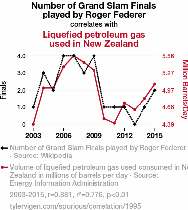
| 2003 | 2004 | 2005 | 2006 | 2007 | 2008 | 2009 | 2010 | 2011 | 2012 | 2013 | 2014 | 2015 | |
| Number of Grand Slam Finals played by Roger Federer (Finals) | 1 | 3 | 2 | 4 | 4 | 3 | 4 | 1 | 1 | 1 | 0 | 1 | 2 |
| Liquefied petroleum gas used in New Zealand (Million Barrels/Day) | 4.3863 | 5.01366 | 5.0137 | 5.3726 | 5.56164 | 5.44809 | 5.31233 | 4.48219 | 4.40548 | 4.7541 | 4.63562 | 4.83288 | 5.07945 |
Why this works
- Data dredging: I have 25,153 variables in my database. I compare all these variables against each other to find ones that randomly match up. That's 632,673,409 correlation calculations! This is called “data dredging.” Instead of starting with a hypothesis and testing it, I instead abused the data to see what correlations shake out. It’s a dangerous way to go about analysis, because any sufficiently large dataset will yield strong correlations completely at random.
- Lack of causal connection: There is probably
Because these pages are automatically generated, it's possible that the two variables you are viewing are in fact causually related. I take steps to prevent the obvious ones from showing on the site (I don't let data about the weather in one city correlate with the weather in a neighboring city, for example), but sometimes they still pop up. If they are related, cool! You found a loophole.
no direct connection between these variables, despite what the AI says above. This is exacerbated by the fact that I used "Years" as the base variable. Lots of things happen in a year that are not related to each other! Most studies would use something like "one person" in stead of "one year" to be the "thing" studied. - Observations not independent: For many variables, sequential years are not independent of each other. If a population of people is continuously doing something every day, there is no reason to think they would suddenly change how they are doing that thing on January 1. A simple
Personally I don't find any p-value calculation to be 'simple,' but you know what I mean.
p-value calculation does not take this into account, so mathematically it appears less probable than it really is. - Y-axis doesn't start at zero: I truncated the Y-axes of the graph above. I also used a line graph, which makes the visual connection stand out more than it deserves.
Nothing against line graphs. They are great at telling a story when you have linear data! But visually it is deceptive because the only data is at the points on the graph, not the lines on the graph. In between each point, the data could have been doing anything. Like going for a random walk by itself!
Mathematically what I showed is true, but it is intentionally misleading. Below is the same chart but with both Y-axes starting at zero.

Try it yourself
You can calculate the values on this page on your own! Try running the Python code to see the calculation results. Step 1: Download and install Python on your computer.Step 2: Open a plaintext editor like Notepad and paste the code below into it.
Step 3: Save the file as "calculate_correlation.py" in a place you will remember, like your desktop. Copy the file location to your clipboard. On Windows, you can right-click the file and click "Properties," and then copy what comes after "Location:" As an example, on my computer the location is "C:\Users\tyler\Desktop"
Step 4: Open a command line window. For example, by pressing start and typing "cmd" and them pressing enter.
Step 5: Install the required modules by typing "pip install numpy", then pressing enter, then typing "pip install scipy", then pressing enter.
Step 6: Navigate to the location where you saved the Python file by using the "cd" command. For example, I would type "cd C:\Users\tyler\Desktop" and push enter.
Step 7: Run the Python script by typing "python calculate_correlation.py"
If you run into any issues, I suggest asking ChatGPT to walk you through installing Python and running the code below on your system. Try this question:
"Walk me through installing Python on my computer to run a script that uses scipy and numpy. Go step-by-step and ask me to confirm before moving on. Start by asking me questions about my operating system so that you know how to proceed. Assume I want the simplest installation with the latest version of Python and that I do not currently have any of the necessary elements installed. Remember to only give me one step per response and confirm I have done it before proceeding."
# These modules make it easier to perform the calculation
import numpy as np
from scipy import stats

# We'll define a function that we can call to return the correlation calculations
def calculate_correlation(array1, array2):

    # Calculate Pearson correlation coefficient and p-value
    correlation, p_value = stats.pearsonr(array1, array2)

    # Calculate R-squared as the square of the correlation coefficient
    r_squared = correlation**2

    return correlation, r_squared, p_value

# These are the arrays for the variables shown on this page, but you can modify them to be any two sets of numbers
array_1 = np.array([1,3,2,4,4,3,4,1,1,1,0,1,2,])
array_2 = np.array([4.3863,5.01366,5.0137,5.3726,5.56164,5.44809,5.31233,4.48219,4.40548,4.7541,4.63562,4.83288,5.07945,])
array_1_name = "Number of Grand Slam Finals played by Roger Federer"
array_2_name = "Liquefied petroleum gas used in New Zealand"

# Perform the calculation
print(f"Calculating the correlation between {array_1_name} and {array_2_name}...")
correlation, r_squared, p_value = calculate_correlation(array_1, array_2)

# Print the results
print("Correlation Coefficient:", correlation)
print("R-squared:", r_squared)
print("P-value:", p_value)
Reuseable content
You may re-use the images on this page for any purpose, even commercial purposes, without asking for permission. The only requirement is that you attribute Tyler Vigen. Attribution can take many different forms. If you leave the "tylervigen.com" link in the image, that satisfies it just fine. If you remove it and move it to a footnote, that's fine too. You can also just write "Charts courtesy of Tyler Vigen" at the bottom of an article.You do not need to attribute "the spurious correlations website," and you don't even need to link here if you don't want to. I don't gain anything from pageviews. There are no ads on this site, there is nothing for sale, and I am not for hire.
For the record, I am just one person. Tyler Vigen, he/him/his. I do have degrees, but they should not go after my name unless you want to annoy my wife. If that is your goal, then go ahead and cite me as "Tyler Vigen, A.A. A.A.S. B.A. J.D." Otherwise it is just "Tyler Vigen."
When spoken, my last name is pronounced "vegan," like I don't eat meat.
Full license details.
For more on re-use permissions, or to get a signed release form, see tylervigen.com/permission.
Download images for these variables:
- High resolution line chart
The image linked here is a Scalable Vector Graphic (SVG). It is the highest resolution that is possible to achieve. It scales up beyond the size of the observable universe without pixelating. You do not need to email me asking if I have a higher resolution image. I do not. The physical limitations of our universe prevent me from providing you with an image that is any higher resolution than this one.
If you insert it into a PowerPoint presentation (a tool well-known for managing things that are the scale of the universe), you can right-click > "Ungroup" or "Create Shape" and then edit the lines and text directly. You can also change the colors this way.
Alternatively you can use a tool like Inkscape. - High resolution line chart, optimized for mobile
- Alternative high resolution line chart
- Scatterplot
- Portable line chart (png)
- Portable line chart (png), optimized for mobile
- Line chart for only Number of Grand Slam Finals played by Roger Federer
- Line chart for only Liquefied petroleum gas used in New Zealand
- AI-generated correlation image
- The spurious research paper: Serving Up Some Gas: A Grand Slam Correlation Between Roger Federer's Finals and LPG Consumption in New Zealand
Hats off to you for rating!
Correlation ID: 1995 · Black Variable ID: 136 · Red Variable ID: 24752

