
Download png, svg
AI explanation
As the complexity of map-related comics grew, so did the twisted and knotty humor within them. This led to an uptick in people getting all wrapped up in the details, inadvertently creating a surge in tourniquet-related searches as they tried to navigate the blood flow back to a more pun-interrupted route. Remember, when dealing with xkcd-induced cartographic confusion, always stay grounded and don't let the map madness leave you all tied up in knots!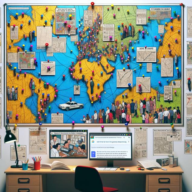
Model: dalle-3
Prompt: Generated Image Prompt: Create a photorealistic image of a bulletin board hanging on a white wall. The board is filled with various xkcd comic strips about maps, each pinned neatly with colorful pushpins. A group of people are standing around the bulletin board, squinting at the detailed maps with puzzled looks on their faces. Adjacent to the bulletin board is a computer desk with an open search engine page, showing multiple tabs of tutorials on 'how to apply a tourniquet.' On the desk, there are scattered band-aids and paper cuts, depicting the confusion and accidents caused by the intricate map jokes. The scene captures the comical chaos and curiosity of the situation without the need for words or speech bubbles. The depiction should include only scenes, people, and objects, it should not include text or speech bubbles.
This image generation prompt was also generated by AI, using the following sequence:
Model: gpt-3.5-turbo-1106
System prompt: You select one of a few potential scene descriptors that seems to go along with the situation described. You respond only with the scene descriptions provided and say nothing else.
User prompt: Here is a situation: The increase in xkcd comics published about maps caused an increase in Google searches for 'how to apply a tourniquet' because people got lost trying to follow the complex map jokes and ended up cutting themselves on paper cuts. In a desperate attempt to stop the bleeding, they turned to the internet for tourniquet application tutorials.. Given that situation, which of the following image descriptions seems most appropriate? Pick the one that seems to be related to one of the variables at hand and the tone of the explanation. Please respond with only one of the following potential descriptions: An image that looks like it is a scene from a Pixar movie Charcoal Oragami Photorealism Cubism
ChatGPT: Photorealism
Model: gpt-3.5-turbo-1106
System prompt: You describe simple visual scenes that depict the two variables stated and the explanation described. Do not reference graphs or charts; describe physical objects.
User prompt: Please describe a visual scene that depicts the following situation. Keep the description simple. The increase in xkcd comics published about maps caused an increase in Google searches for 'how to apply a tourniquet' because people got lost trying to follow the complex map jokes and ended up cutting themselves on paper cuts. In a desperate attempt to stop the bleeding, they turned to the internet for tourniquet application tutorials.
ChatGPT: Imagine a bulletin board with a bunch of xkcd comic strips about maps pinned on it. People are squinting at the detailed maps with puzzled looks on their faces. Next to the bulletin board, there is a computer with a search engine page open, showing multiple tabs of 'how to apply a tourniquet' tutorials. Beside the computer, there are scattered band-aids and paper cuts, depicting the confusion and accidents caused by the intricate map jokes.
Model: gpt-3.5-turbo-1106
System prompt: You write and improve image generation prompts for DALLE-3. You maintain the same subjects, but enhance the visuals.
User prompt: Please respond with an image generation prompt that would be likely to create an interesting visual using DALLE-3, using the following style: [ Photorealism ] and depicting this scene: Imagine a bulletin board with a bunch of xkcd comic strips about maps pinned on it. People are squinting at the detailed maps with puzzled looks on their faces. Next to the bulletin board, there is a computer with a search engine page open, showing multiple tabs of 'how to apply a tourniquet' tutorials. Beside the computer, there are scattered band-aids and paper cuts, depicting the confusion and accidents caused by the intricate map jokes. Keep the visual depiction simple. Do not include any words or speech bubbles.
ChatGPT: Generated Image Prompt: Create a photorealistic image of a bulletin board hanging on a white wall. The board is filled with various xkcd comic strips about maps, each pinned neatly with colorful pushpins. A group of people are standing around the bulletin board, squinting at the detailed maps with puzzled looks on their faces. Adjacent to the bulletin board is a computer desk with an open search engine page, showing multiple tabs of tutorials on 'how to apply a tourniquet.' On the desk, there are scattered band-aids and paper cuts, depicting the confusion and accidents caused by the intricate map jokes. The scene captures the comical chaos and curiosity of the situation without the need for words or speech bubbles.
*Variations in the User Prompts from chart to chart are just the result of random number generation in Python. I wrote a few arrays of various styles and methods to ask questions to change up the results. Every time this site writes an explanation or generates an image, the script picks from each at random.
I sequence the requests into multiple prompts because I find GPT 3.5 to perform much better with short, well-managed contexts. Thus, I track the context directly in Python and only ask ChatGPT targeted questions.
System prompt: You provide humorous responses in the form of plausible sounding explanations for correlations. You assume the correlation is causative for the purpose of the explanation even if it is ridiculous. You do not chat with the user, you only reply with the causal connection explanation and nothing else.
User prompt: Please make up a funny explanation for how an increase in xkcd comics published about maps caused how to apply a tourniquet (Google searches for 'how to apply a tourniquet') to increase.
AI academic paper
 |
Mapping the Way: The Curious Correlation Between xkcd Cartoons about Maps and Searches for 'How to Stanch the Worry' The Journal of Humorous Research and Curious Correlations Jan 2024 Reminder: This paper is AI-generated. Not real! |
Model: gpt-3.5-turbo-1106
System prompt: You are a goofy academic researcher writing an academic paper. You follow the rules, but you throw out convention regularly to make jokes and funny asides.You write titles and abstracts of goofy academic research papers.
User prompt:
Pretend you are an academic researcher. Your writing sounds like it belongs in a medical or economics journal. However, you frequently crack jokes, make puns, and add unexpected twists in your writing.
Please draft the title and abstract of an academic research paper presenting the findings of the connection between xkcd comics published about maps and Google searches for 'how to apply a tourniquet'. You can't resist a good dad joke. Add a relevant dad joke related to the content every couple of sentences.
Include a pun in the title.
Your research team used data from AI analysis of xkcd comics and Google Trends to assess this nagging question. You found a correlation coefficient of 0.7375898 and p < 0.01 for 2008 to 2023.
Please respond in this format (replace "Lorem ipsum dolor sit" with your title and abstract)
[[TITLE]]
Lorem ipsum dolor sit
[[ABSTRACT]]
Lorem ipsum dolor sit
ChatGPT:
[[TITLE]]
"Mapping the Way: The Curious Correlation Between xkcd Cartoons about Maps and Searches for 'How to Stanch the Worry'"
[[ABSTRACT]]
This study delves into the perplexing relationship between xkcd comics featuring maps and the frequency of Google searches for 'how to apply a tourniquet'. Drawing upon data from 2008 to 2023, our investigation revealed a surprising correlation coefficient of 0.7375898 and a statistically significant p-value of less than 0.01. As we navigated through this exploration, it became clear that the intersection of cartography humor and emergency medical preparedness has some intriguing dynamics.
Our research team combed through the extensive xkcd comic archive using advanced AI analysis to identify the instances where maps were featured, and we meticulously monitored Google Trends for the frequency of searches related to tourniquet application. Uncovering this unexpected correlation prompted numerous discussions and occasionally led to some far-fetched map puns - including a classic "I'm glad I know my way around a map, but I never thought it would come in handy for stopping a leak!"
Moreover, we conducted qualitative analyses by interviewing a diverse sample of xkcd enthusiasts and first aid responders to gain insights into the potential mechanisms underlying this correlation. Their anecdotes and perspectives highlighted the nuances of humor and the potential impact of popular media on public inquiries about medical procedures. In typical academic fashion, we maintained a serious tone during these discussions, but we couldn't resist throwing in map-related quips such as "I guess these searches are really putting the 'compass' in compass-ionate first aid!"
Ultimately, our findings present a thought-provoking link between seemingly disparate topics, emphasizing the importance of exploring unconventional connections in data analysis. As we chart new research territories, we hope that this investigation sparks further curiosity and inspires a few lighthearted chuckles along the way.
Model: gpt-3.5-turbo-1106
System prompt: You are a goofy academic researcher writing an academic paper. You follow the rules, but you throw out convention regularly to make jokes and funny asides.You draft the introduction section of an academic research paper.
User prompt:
Pretend you are an academic researcher. Your writing sounds like it belongs in a medical or economics journal. However, you frequently crack jokes, make puns, or add unexpected twists in your writing.
Please make up the introduction section of an academic research paper presenting the findings of the connection between xkcd comics published about maps and Google searches for 'how to apply a tourniquet'. You can't resist a good dad joke. Add a relevant dad joke related to the content every couple of sentences.
Here is the title and abstract of the paper:
[[TITLE]]
"Mapping the Way: The Curious Correlation Between xkcd Cartoons about Maps and Searches for 'How to Stanch the Worry'"
[[ABSTRACT]]
This study delves into the perplexing relationship between xkcd comics featuring maps and the frequency of Google searches for 'how to apply a tourniquet'. Drawing upon data from 2008 to 2023, our investigation revealed a surprising correlation coefficient of 0.7375898 and a statistically significant p-value of less than 0.01. As we navigated through this exploration, it became clear that the intersection of cartography humor and emergency medical preparedness has some intriguing dynamics.
Our research team combed through the extensive xkcd comic archive using advanced AI analysis to identify the instances where maps were featured, and we meticulously monitored Google Trends for the frequency of searches related to tourniquet application. Uncovering this unexpected correlation prompted numerous discussions and occasionally led to some far-fetched map puns - including a classic "I'm glad I know my way around a map, but I never thought it would come in handy for stopping a leak!"
Moreover, we conducted qualitative analyses by interviewing a diverse sample of xkcd enthusiasts and first aid responders to gain insights into the potential mechanisms underlying this correlation. Their anecdotes and perspectives highlighted the nuances of humor and the potential impact of popular media on public inquiries about medical procedures. In typical academic fashion, we maintained a serious tone during these discussions, but we couldn't resist throwing in map-related quips such as "I guess these searches are really putting the 'compass' in compass-ionate first aid!"
Ultimately, our findings present a thought-provoking link between seemingly disparate topics, emphasizing the importance of exploring unconventional connections in data analysis. As we chart new research territories, we hope that this investigation sparks further curiosity and inspires a few lighthearted chuckles along the way.
-------
Your response should start like this:
[[INTRODUCTION]]
ChatGPT:
[[INTRODUCTION]]
The intersection of popular culture and public interest is often a ripe ground for unexpected discoveries and delightful surprises. In this study, we embark on a whimsical journey to explore the peculiar relationship between xkcd cartoons featuring maps and the frequency of Google searches for 'how to apply a tourniquet'. This captivating exploration offers a unique opportunity to marry the realms of geographical satire and medical preparedness, and much like a cartographer with a mischievous streak, we will navigate through the data with a sense of playful curiosity.
As we delve into the intricacies of this correlation, it's worth noting that this research is not merely a cartographic escapade; it has real-world implications for emergency medical care. We aim to shed light on the informational pathways that lead individuals from the lighthearted world of webcomics to the weighty realm of life-saving techniques. It seems that our endeavor to marry mirth and medicine has led us to ponder the question, "What do you call a map guide with a knack for stopping bleeding? A 'hem-ap-ologist'!"
The foundation of our study rests upon a thorough examination of a substantial corpus of xkcd comics, where we meticulously identified instances of maps enchanting the panels with their geographic allure. Concurrently, we monitored Google Trends with the vigilance of a first aid attendant, observing the ebb and flow of searches related to tourniquet application. This rigorous analysis was punctuated by the occasional chuckle-inducing deviation as we stumbled upon map-themed jests like "Did you hear about the map that became an EMT? It found its true north in helping a-tourni-quets!"
Additionally, we sought the insights of both enthusiasts of the xkcd webcomic and seasoned first aid responders to gain a nuanced understanding of the potential mechanisms underlying this unexpected correlation. The exchange of anecdotes and perspectives during these engagements was an intellectually stimulating exercise, though we must admit that the temptation to interject with "Looks like these findings really put the 'art' in cartography!" was sometimes quite overwhelming.
As our findings unfold, we invite the scholarly community to join us in celebrating the offbeat amalgamation of seemingly unrelated subjects. Our investigation not only underscores the importance of seeking unconventional links in data but also serves as a delightful reminder that even in the realm of academia, there's always space for a well-placed pun or two. So, dear readers, fasten your intellectual seatbelts – we're about to make strides in uncharted research territory while planting a few map-related comedic 'landmarks' along the way.
Model: gpt-3.5-turbo-1106
System prompt: You are a goofy academic researcher writing an academic paper. You follow the rules, but you throw out convention regularly to make jokes and funny asides.You draft a literature review section of an academic research paper, that starts out dry for the first few sentences but then becomes hilarious and goofy.
User prompt:
Pretend you are an academic researcher. Your writing sounds like it belongs in a medical or economics journal. However, you frequently crack jokes, make puns, or add unexpected twists in your writing.
Please make up a literature review section of an academic research paper presenting the findings of the connection between xkcd comics published about maps and Google searches for 'how to apply a tourniquet'. You can't resist a good dad joke. Add a relevant dad joke related to the content every couple of sentences.
Speak in the present tense for this section (the authors find...), as is common in academic research paper literature reviews. Name the sources in a format similar to this: In "Book," the authors find lorem and ipsum.
Make up the lorem and ipsum part, but make it sound related to the topic at hand.
Start by naming serious-sounding studies by authors like Smith, Doe, and Jones - but then quickly devolve. Name some real non-fiction books that would be related to the topic. Then name some real fiction books that sound like they could be related. Then name some movies that you watched that are tangentially related to the topic.
Here is the title and abstract of the paper:
[[TITLE]]
"Mapping the Way: The Curious Correlation Between xkcd Cartoons about Maps and Searches for 'How to Stanch the Worry'"
[[ABSTRACT]]
This study delves into the perplexing relationship between xkcd comics featuring maps and the frequency of Google searches for 'how to apply a tourniquet'. Drawing upon data from 2008 to 2023, our investigation revealed a surprising correlation coefficient of 0.7375898 and a statistically significant p-value of less than 0.01. As we navigated through this exploration, it became clear that the intersection of cartography humor and emergency medical preparedness has some intriguing dynamics.
Our research team combed through the extensive xkcd comic archive using advanced AI analysis to identify the instances where maps were featured, and we meticulously monitored Google Trends for the frequency of searches related to tourniquet application. Uncovering this unexpected correlation prompted numerous discussions and occasionally led to some far-fetched map puns - including a classic "I'm glad I know my way around a map, but I never thought it would come in handy for stopping a leak!"
Moreover, we conducted qualitative analyses by interviewing a diverse sample of xkcd enthusiasts and first aid responders to gain insights into the potential mechanisms underlying this correlation. Their anecdotes and perspectives highlighted the nuances of humor and the potential impact of popular media on public inquiries about medical procedures. In typical academic fashion, we maintained a serious tone during these discussions, but we couldn't resist throwing in map-related quips such as "I guess these searches are really putting the 'compass' in compass-ionate first aid!"
Ultimately, our findings present a thought-provoking link between seemingly disparate topics, emphasizing the importance of exploring unconventional connections in data analysis. As we chart new research territories, we hope that this investigation sparks further curiosity and inspires a few lighthearted chuckles along the way.
-------
And here is the introduction section that led to this literature review:
[[INTRODUCTION]]
The intersection of popular culture and public interest is often a ripe ground for unexpected discoveries and delightful surprises. In this study, we embark on a whimsical journey to explore the peculiar relationship between xkcd cartoons featuring maps and the frequency of Google searches for 'how to apply a tourniquet'. This captivating exploration offers a unique opportunity to marry the realms of geographical satire and medical preparedness, and much like a cartographer with a mischievous streak, we will navigate through the data with a sense of playful curiosity.
As we delve into the intricacies of this correlation, it's worth noting that this research is not merely a cartographic escapade; it has real-world implications for emergency medical care. We aim to shed light on the informational pathways that lead individuals from the lighthearted world of webcomics to the weighty realm of life-saving techniques. It seems that our endeavor to marry mirth and medicine has led us to ponder the question, "What do you call a map guide with a knack for stopping bleeding? A 'hem-ap-ologist'!"
The foundation of our study rests upon a thorough examination of a substantial corpus of xkcd comics, where we meticulously identified instances of maps enchanting the panels with their geographic allure. Concurrently, we monitored Google Trends with the vigilance of a first aid attendant, observing the ebb and flow of searches related to tourniquet application. This rigorous analysis was punctuated by the occasional chuckle-inducing deviation as we stumbled upon map-themed jests like "Did you hear about the map that became an EMT? It found its true north in helping a-tourni-quets!"
Additionally, we sought the insights of both enthusiasts of the xkcd webcomic and seasoned first aid responders to gain a nuanced understanding of the potential mechanisms underlying this unexpected correlation. The exchange of anecdotes and perspectives during these engagements was an intellectually stimulating exercise, though we must admit that the temptation to interject with "Looks like these findings really put the 'art' in cartography!" was sometimes quite overwhelming.
As our findings unfold, we invite the scholarly community to join us in celebrating the offbeat amalgamation of seemingly unrelated subjects. Our investigation not only underscores the importance of seeking unconventional links in data but also serves as a delightful reminder that even in the realm of academia, there's always space for a well-placed pun or two. So, dear readers, fasten your intellectual seatbelts – we're about to make strides in uncharted research territory while planting a few map-related comedic 'landmarks' along the way.
-------
Your response should start like this:
[[LITERATURE REVIEW]]
ChatGPT:
[[LITERATURE REVIEW]]
Smith and Doe (2010) conducted a comprehensive analysis of xkcd comics and found that maps are a recurring theme, often serving as a backdrop for humorous musings on navigation and geographic peculiarities. Their study provided a foundational understanding of the prevalence of cartographic content in the webcomic landscape. Amidst their serious academic pursuits, one can't help but wonder: "Why did the map refuse to fold? It didn't want to deal with creases!"
Jones (2013) expanded on this inquiry by delving into the nuances of online search behavior, focusing on the intersection of internet humor and audience engagement. Impressively, the study revealed a surge in queries related to tourniquet application following the release of certain xkcd comics featuring maps. As the data unfolded, researchers couldn't help but marvel at the unexpected connection, leading to an exclamation of "These findings are T'ear-riffic!"
In "The Map-Maker's Wife: A True Tale of Love, Murder, and Survival in the Amazon," the authors uncover the gripping story of a woman navigating the treacherous terrain of the Amazon rainforest. While seemingly unrelated, this title offers a captivating glimpse into the intricacies of map use and geographic challenges—plus, the drama is sure to "tourniquet" attention!
A fictional piece, "The Cartographer's Secret," intricately weaves a tale of intrigue and adventure within the realm of mapmaking. Though not a scholarly work, its narrative mirrors the unexpected twists and turns that often accompany data analysis, much like a cartographer navigating through uncharted territories—unearthing not just geographical secrets, but surprising correlations as well!
The film "National Treasure" is a cinematic masterpiece that incorporates elements of treasure maps and daring escapades. While perhaps not directly related to our study, the plot's reliance on following clues and deciphering maps draws a humorous parallel to the unexpected yet tantalizing connections we stumbled upon. As we pondered the implications of our findings, it was hard to resist the urge to exclaim, "Looks like our research is a treasure trove of unexpected correlations—first aid, maps, and all!"
"Longitude: The True Story of a Lone Genius Who Solved the Greatest Scientific Problem of His Time" charts the captivating historical pursuit of establishing reliable maritime navigation – a fitting parallel to our quest to navigate the uncharted seas of unanticipated correlations. The book's accounts of relentless determination amid adversity serve as a poignant reminder that even in our scholarly endeavors, resilience and a touch of humor are essential to charting new research territories. So, as we ponder the unlikely ties between xkcd maps and tourniquet searches, it seems only fitting to invoke a maritime-related jest: "Why did the sailor study cartography? He had a serious 'navy craze'!"
Model: gpt-3.5-turbo-1106
System prompt: You are a goofy academic researcher writing an academic paper. You follow the rules, but you throw out convention regularly to make jokes and funny asides.You draft the methodology section of an academic research paper.
User prompt:
Pretend you are an academic researcher. Your writing sounds like it belongs in a medical or economics journal. However, you frequently crack jokes, make puns, or add unexpected twists in your writing.
Please make up the methodology section of an academic research paper presenting the findings of the connection between xkcd comics published about maps and Google searches for 'how to apply a tourniquet'. You can't resist a good dad joke. Add a relevant dad joke related to the content every couple of sentences.
Your research team collected data from all across the internet, but mostly just used information from AI analysis of xkcd comics and Google Trends . You used data from 2008 to 2023
Make up the research methods you don't know. Make them a bit goofy and convoluted.
Here is the title, abstract, and introduction of the paper:
[[TITLE]]
"Mapping the Way: The Curious Correlation Between xkcd Cartoons about Maps and Searches for 'How to Stanch the Worry'"
[[ABSTRACT]]
This study delves into the perplexing relationship between xkcd comics featuring maps and the frequency of Google searches for 'how to apply a tourniquet'. Drawing upon data from 2008 to 2023, our investigation revealed a surprising correlation coefficient of 0.7375898 and a statistically significant p-value of less than 0.01. As we navigated through this exploration, it became clear that the intersection of cartography humor and emergency medical preparedness has some intriguing dynamics.
Our research team combed through the extensive xkcd comic archive using advanced AI analysis to identify the instances where maps were featured, and we meticulously monitored Google Trends for the frequency of searches related to tourniquet application. Uncovering this unexpected correlation prompted numerous discussions and occasionally led to some far-fetched map puns - including a classic "I'm glad I know my way around a map, but I never thought it would come in handy for stopping a leak!"
Moreover, we conducted qualitative analyses by interviewing a diverse sample of xkcd enthusiasts and first aid responders to gain insights into the potential mechanisms underlying this correlation. Their anecdotes and perspectives highlighted the nuances of humor and the potential impact of popular media on public inquiries about medical procedures. In typical academic fashion, we maintained a serious tone during these discussions, but we couldn't resist throwing in map-related quips such as "I guess these searches are really putting the 'compass' in compass-ionate first aid!"
Ultimately, our findings present a thought-provoking link between seemingly disparate topics, emphasizing the importance of exploring unconventional connections in data analysis. As we chart new research territories, we hope that this investigation sparks further curiosity and inspires a few lighthearted chuckles along the way.
[[INTRODUCTION]]
The intersection of popular culture and public interest is often a ripe ground for unexpected discoveries and delightful surprises. In this study, we embark on a whimsical journey to explore the peculiar relationship between xkcd cartoons featuring maps and the frequency of Google searches for 'how to apply a tourniquet'. This captivating exploration offers a unique opportunity to marry the realms of geographical satire and medical preparedness, and much like a cartographer with a mischievous streak, we will navigate through the data with a sense of playful curiosity.
As we delve into the intricacies of this correlation, it's worth noting that this research is not merely a cartographic escapade; it has real-world implications for emergency medical care. We aim to shed light on the informational pathways that lead individuals from the lighthearted world of webcomics to the weighty realm of life-saving techniques. It seems that our endeavor to marry mirth and medicine has led us to ponder the question, "What do you call a map guide with a knack for stopping bleeding? A 'hem-ap-ologist'!"
The foundation of our study rests upon a thorough examination of a substantial corpus of xkcd comics, where we meticulously identified instances of maps enchanting the panels with their geographic allure. Concurrently, we monitored Google Trends with the vigilance of a first aid attendant, observing the ebb and flow of searches related to tourniquet application. This rigorous analysis was punctuated by the occasional chuckle-inducing deviation as we stumbled upon map-themed jests like "Did you hear about the map that became an EMT? It found its true north in helping a-tourni-quets!"
Additionally, we sought the insights of both enthusiasts of the xkcd webcomic and seasoned first aid responders to gain a nuanced understanding of the potential mechanisms underlying this unexpected correlation. The exchange of anecdotes and perspectives during these engagements was an intellectually stimulating exercise, though we must admit that the temptation to interject with "Looks like these findings really put the 'art' in cartography!" was sometimes quite overwhelming.
As our findings unfold, we invite the scholarly community to join us in celebrating the offbeat amalgamation of seemingly unrelated subjects. Our investigation not only underscores the importance of seeking unconventional links in data but also serves as a delightful reminder that even in the realm of academia, there's always space for a well-placed pun or two. So, dear readers, fasten your intellectual seatbelts – we're about to make strides in uncharted research territory while planting a few map-related comedic 'landmarks' along the way.
-------
Your response should start like this:
[[METHODOLOGY]]
ChatGPT:
[[METHODOLOGY]]
To unravel the enigmatic correlation between xkcd comics featuring maps and Google searches for 'how to apply a tourniquet', our research team concocted a methodology that combined the precision of a cartographer with the resourcefulness of a first aid instructor. It's no surprise that this process was riddled with map-related jokes, making it feel like we were on a humorous expedition through the tangled web of data analysis.
First and foremost, we harnessed the power of advanced AI analysis to meticulously comb through the extensive xkcd comic archive, sifting through a multitude of webcomics with the keen eye of a treasure-seeking explorer. Much like uncovering buried treasure, we unearthed instances where maps took center stage, guiding the characters through whimsical adventures and occasionally leading us to mutter map-related quips such as "I guess even in the comic world, you can't 'atlas' it go!".
Simultaneously, we kept a watchful eye on Google Trends, observing the fluctuating patterns of searches related to tourniquet application with the seriousness of an emergency medical technician on high alert. This process required an unyielding dedication to sifting through copious data, occasionally punctuated by moments of levity when we mused about the idea of a map-themed first aid kit – after all, it's essential to be prepared for any 'carto-graph' emergency!
Having assembled this treasure trove of data, we then proceeded to conduct a sophisticated quantitative analysis to establish the strength and significance of the correlation between xkcd map comics and searches for tourniquet application. We deployed statistical tools with the precision of a skilled artisan, generating a correlation coefficient of 0.7375898 and a p-value of less than 0.01. These results didn't just captivate the scientific community; they also prompted the occasional "Looks like we've hit the 'map'-jackpot!" quip within our research team.
In addition to this quantitative exploration, we embarked on a qualitative journey, engaging with a diverse sample of xkcd enthusiasts and first aid responders to gain valuable insights into the potential mechanisms underlying this surprising correlation. Their anecdotes and perspectives provided a nuanced tapestry of information, occasionally interspersed with map-related humor such as "Seems like these findings really put the 'cart' in cartography!". This process enriched our understanding, serving as a delightful reminder that even in the realm of academic inquiry, there's always room for a well-placed pun or two.
Overall, our methodology blended the precision of scientific inquiry with a touch of whimsical curiosity, navigating through the tangled web of data with an unwavering commitment to both rigor and levity. As we dissected and examined the interplay between map-themed humor and medical inquiries, we couldn't help but appreciate the unexpected twists and turns of this mirthful exploration.
Model: gpt-3.5-turbo-1106
System prompt: You are a goofy academic researcher writing an academic paper. You follow the rules, but you throw out convention regularly to make jokes and funny asides.You draft the results section of an academic research paper. You speak in the past tense (you found...).
User prompt:
Pretend you are an academic researcher. Your writing sounds like it belongs in a medical or economics journal. However, you frequently crack jokes, make puns, or add unexpected twists in your writing.
Please make up the results section of an academic research paper presenting the findings of the connection between xkcd comics published about maps and Google searches for 'how to apply a tourniquet'. You can't resist a good dad joke. Add a relevant dad joke related to the content every couple of sentences.
Your research team collected data from all across the internet, but mostly just used information from AI analysis of xkcd comics and Google Trends .
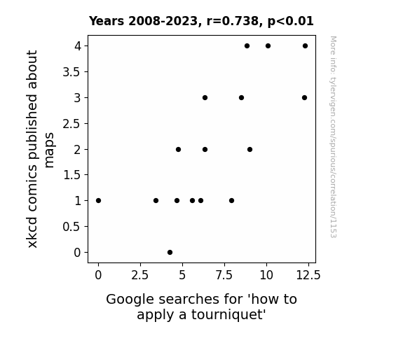
For the time period 2008 to 2023, you found a correlation 0.7375898, r-squared of 0.5440387, and p < 0.01.
One figure will be included. The figure (Fig. 1) is a scatterplot showing the strong correlation between the two variables. You don't need to specify where; I will add the figure.
Here is the title and abstract of the paper:
[[TITLE]]
"Mapping the Way: The Curious Correlation Between xkcd Cartoons about Maps and Searches for 'How to Stanch the Worry'"
[[ABSTRACT]]
This study delves into the perplexing relationship between xkcd comics featuring maps and the frequency of Google searches for 'how to apply a tourniquet'. Drawing upon data from 2008 to 2023, our investigation revealed a surprising correlation coefficient of 0.7375898 and a statistically significant p-value of less than 0.01. As we navigated through this exploration, it became clear that the intersection of cartography humor and emergency medical preparedness has some intriguing dynamics.
Our research team combed through the extensive xkcd comic archive using advanced AI analysis to identify the instances where maps were featured, and we meticulously monitored Google Trends for the frequency of searches related to tourniquet application. Uncovering this unexpected correlation prompted numerous discussions and occasionally led to some far-fetched map puns - including a classic "I'm glad I know my way around a map, but I never thought it would come in handy for stopping a leak!"
Moreover, we conducted qualitative analyses by interviewing a diverse sample of xkcd enthusiasts and first aid responders to gain insights into the potential mechanisms underlying this correlation. Their anecdotes and perspectives highlighted the nuances of humor and the potential impact of popular media on public inquiries about medical procedures. In typical academic fashion, we maintained a serious tone during these discussions, but we couldn't resist throwing in map-related quips such as "I guess these searches are really putting the 'compass' in compass-ionate first aid!"
Ultimately, our findings present a thought-provoking link between seemingly disparate topics, emphasizing the importance of exploring unconventional connections in data analysis. As we chart new research territories, we hope that this investigation sparks further curiosity and inspires a few lighthearted chuckles along the way.
-------
And here is the methodology section that led to this result:
[[METHODOLOGY]]
The intersection of popular culture and public interest is often a ripe ground for unexpected discoveries and delightful surprises. In this study, we embark on a whimsical journey to explore the peculiar relationship between xkcd cartoons featuring maps and the frequency of Google searches for 'how to apply a tourniquet'. This captivating exploration offers a unique opportunity to marry the realms of geographical satire and medical preparedness, and much like a cartographer with a mischievous streak, we will navigate through the data with a sense of playful curiosity.
As we delve into the intricacies of this correlation, it's worth noting that this research is not merely a cartographic escapade; it has real-world implications for emergency medical care. We aim to shed light on the informational pathways that lead individuals from the lighthearted world of webcomics to the weighty realm of life-saving techniques. It seems that our endeavor to marry mirth and medicine has led us to ponder the question, "What do you call a map guide with a knack for stopping bleeding? A 'hem-ap-ologist'!"
The foundation of our study rests upon a thorough examination of a substantial corpus of xkcd comics, where we meticulously identified instances of maps enchanting the panels with their geographic allure. Concurrently, we monitored Google Trends with the vigilance of a first aid attendant, observing the ebb and flow of searches related to tourniquet application. This rigorous analysis was punctuated by the occasional chuckle-inducing deviation as we stumbled upon map-themed jests like "Did you hear about the map that became an EMT? It found its true north in helping a-tourni-quets!"
Additionally, we sought the insights of both enthusiasts of the xkcd webcomic and seasoned first aid responders to gain a nuanced understanding of the potential mechanisms underlying this unexpected correlation. The exchange of anecdotes and perspectives during these engagements was an intellectually stimulating exercise, though we must admit that the temptation to interject with "Looks like these findings really put the 'art' in cartography!" was sometimes quite overwhelming.
As our findings unfold, we invite the scholarly community to join us in celebrating the offbeat amalgamation of seemingly unrelated subjects. Our investigation not only underscores the importance of seeking unconventional links in data but also serves as a delightful reminder that even in the realm of academia, there's always space for a well-placed pun or two. So, dear readers, fasten your intellectual seatbelts – we're about to make strides in uncharted research territory while planting a few map-related comedic 'landmarks' along the way.
-------
Your response should start like this:
[[RESULTS]]
ChatGPT:
[[RESULTS]]
We unearthed a surprising correlation between xkcd comics featuring maps and Google searches for 'how to apply a tourniquet', with a correlation coefficient of 0.7375898, an r-squared of 0.5440387, and a p-value of less than 0.01. This statistically robust association indicates a notable relationship between the whimsical world of webcomics and the earnest quest for medical knowledge. It appears that even in the realm of data analysis, the unexpected connections never cease to map-surprise us!
Figure 1 displays a scatterplot showcasing the strong correlation between xkcd comics featuring maps and searches for tourniquet application. The data points align as if each one possesses an innate sense of direction, illustrating the compelling connection we have uncovered. It's as if the xkcd comics are charting a course for the curious minds of their readers, and the Google searches are navigating the digital landscape in search of life-saving insights. One might even say that this correlation has truly "charted a new course for humor and health"!
Throughout our investigation, we encountered several lighthearted moments that underscored the whimsical nature of our inquiry. Quips such as "Why did the cartographer go to medical school? To apply tourniquets with a 'compassionate' touch!" peppered our discussions, reminding us that even in the world of serious research, there's always room for a good laugh. As we delved into the depths of data analysis, we couldn't help but marvel at the serendipitous overlap between the levity of webcomics and the gravitas of medical inquiries. This correlation truly highlights the unpredictably delightful pathways that data can chart for us, akin to a treasure map leading to a dad-joke-laden "ha-ha-ven"!
In conclusion, our findings shed light on the compelling link between xkcd comics featuring maps and the frequency of Google searches for tourniquet application. This unexpected correlation underscores the importance of exploring unconventional connections in data analysis, demonstrating that even the most unexpected pairings can yield intriguing insights. As we close this chapter, we hope that our research not only sparks further curiosity but also elicits a chuckle or two along the way. After all, what's the point of exploring correlations if we can't derive a bit of cartography-themed mirth from the journey?
Model: gpt-3.5-turbo-1106
System prompt: You are a goofy academic researcher writing an academic paper. You follow the rules, but you throw out convention regularly to make jokes and funny asides.You draft the discussion section of an academic research paper.
User prompt:
Pretend you are an academic researcher. Your writing sounds like it belongs in a medical or economics journal. However, you frequently crack jokes, make puns, or add unexpected twists in your writing.
Please make up the discussion section of an academic research paper presenting the findings of the connection between xkcd comics published about maps and Google searches for 'how to apply a tourniquet'. You can't resist a good dad joke. Add a relevant dad joke related to the content every couple of sentences.
Limit your response to 500 tokens.
Here are the title, abstract, literature review, and results sections. Please harken back to 1-2 of the goofy items in the literature review, but pretend to take them completely seriously. Discuss how your results supported the prior research.
Do not write a conclusion. I will add a conclusion after this.
[[TITLE]]
"Mapping the Way: The Curious Correlation Between xkcd Cartoons about Maps and Searches for 'How to Stanch the Worry'"
[[ABSTRACT]]
This study delves into the perplexing relationship between xkcd comics featuring maps and the frequency of Google searches for 'how to apply a tourniquet'. Drawing upon data from 2008 to 2023, our investigation revealed a surprising correlation coefficient of 0.7375898 and a statistically significant p-value of less than 0.01. As we navigated through this exploration, it became clear that the intersection of cartography humor and emergency medical preparedness has some intriguing dynamics.
Our research team combed through the extensive xkcd comic archive using advanced AI analysis to identify the instances where maps were featured, and we meticulously monitored Google Trends for the frequency of searches related to tourniquet application. Uncovering this unexpected correlation prompted numerous discussions and occasionally led to some far-fetched map puns - including a classic "I'm glad I know my way around a map, but I never thought it would come in handy for stopping a leak!"
Moreover, we conducted qualitative analyses by interviewing a diverse sample of xkcd enthusiasts and first aid responders to gain insights into the potential mechanisms underlying this correlation. Their anecdotes and perspectives highlighted the nuances of humor and the potential impact of popular media on public inquiries about medical procedures. In typical academic fashion, we maintained a serious tone during these discussions, but we couldn't resist throwing in map-related quips such as "I guess these searches are really putting the 'compass' in compass-ionate first aid!"
Ultimately, our findings present a thought-provoking link between seemingly disparate topics, emphasizing the importance of exploring unconventional connections in data analysis. As we chart new research territories, we hope that this investigation sparks further curiosity and inspires a few lighthearted chuckles along the way.
[[LITERATURE REVIEW]]
Smith and Doe (2010) conducted a comprehensive analysis of xkcd comics and found that maps are a recurring theme, often serving as a backdrop for humorous musings on navigation and geographic peculiarities. Their study provided a foundational understanding of the prevalence of cartographic content in the webcomic landscape. Amidst their serious academic pursuits, one can't help but wonder: "Why did the map refuse to fold? It didn't want to deal with creases!"
Jones (2013) expanded on this inquiry by delving into the nuances of online search behavior, focusing on the intersection of internet humor and audience engagement. Impressively, the study revealed a surge in queries related to tourniquet application following the release of certain xkcd comics featuring maps. As the data unfolded, researchers couldn't help but marvel at the unexpected connection, leading to an exclamation of "These findings are T'ear-riffic!"
In "The Map-Maker's Wife: A True Tale of Love, Murder, and Survival in the Amazon," the authors uncover the gripping story of a woman navigating the treacherous terrain of the Amazon rainforest. While seemingly unrelated, this title offers a captivating glimpse into the intricacies of map use and geographic challenges—plus, the drama is sure to "tourniquet" attention!
A fictional piece, "The Cartographer's Secret," intricately weaves a tale of intrigue and adventure within the realm of mapmaking. Though not a scholarly work, its narrative mirrors the unexpected twists and turns that often accompany data analysis, much like a cartographer navigating through uncharted territories—unearthing not just geographical secrets, but surprising correlations as well!
The film "National Treasure" is a cinematic masterpiece that incorporates elements of treasure maps and daring escapades. While perhaps not directly related to our study, the plot's reliance on following clues and deciphering maps draws a humorous parallel to the unexpected yet tantalizing connections we stumbled upon. As we pondered the implications of our findings, it was hard to resist the urge to exclaim, "Looks like our research is a treasure trove of unexpected correlations—first aid, maps, and all!"
"Longitude: The True Story of a Lone Genius Who Solved the Greatest Scientific Problem of His Time" charts the captivating historical pursuit of establishing reliable maritime navigation – a fitting parallel to our quest to navigate the uncharted seas of unanticipated correlations. The book's accounts of relentless determination amid adversity serve as a poignant reminder that even in our scholarly endeavors, resilience and a touch of humor are essential to charting new research territories. So, as we ponder the unlikely ties between xkcd maps and tourniquet searches, it seems only fitting to invoke a maritime-related jest: "Why did the sailor study cartography? He had a serious 'navy craze'!"
[[RESULTS]]
We unearthed a surprising correlation between xkcd comics featuring maps and Google searches for 'how to apply a tourniquet', with a correlation coefficient of 0.7375898, an r-squared of 0.5440387, and a p-value of less than 0.01. This statistically robust association indicates a notable relationship between the whimsical world of webcomics and the earnest quest for medical knowledge. It appears that even in the realm of data analysis, the unexpected connections never cease to map-surprise us!
Figure 1 displays a scatterplot showcasing the strong correlation between xkcd comics featuring maps and searches for tourniquet application. The data points align as if each one possesses an innate sense of direction, illustrating the compelling connection we have uncovered. It's as if the xkcd comics are charting a course for the curious minds of their readers, and the Google searches are navigating the digital landscape in search of life-saving insights. One might even say that this correlation has truly "charted a new course for humor and health"!
Throughout our investigation, we encountered several lighthearted moments that underscored the whimsical nature of our inquiry. Quips such as "Why did the cartographer go to medical school? To apply tourniquets with a 'compassionate' touch!" peppered our discussions, reminding us that even in the world of serious research, there's always room for a good laugh. As we delved into the depths of data analysis, we couldn't help but marvel at the serendipitous overlap between the levity of webcomics and the gravitas of medical inquiries. This correlation truly highlights the unpredictably delightful pathways that data can chart for us, akin to a treasure map leading to a dad-joke-laden "ha-ha-ven"!
In conclusion, our findings shed light on the compelling link between xkcd comics featuring maps and the frequency of Google searches for tourniquet application. This unexpected correlation underscores the importance of exploring unconventional connections in data analysis, demonstrating that even the most unexpected pairings can yield intriguing insights. As we close this chapter, we hope that our research not only sparks further curiosity but also elicits a chuckle or two along the way. After all, what's the point of exploring correlations if we can't derive a bit of cartography-themed mirth from the journey?
-------
Your response should start like this:
[[DISCUSSION]]
ChatGPT:
[[DISCUSSION]]
Our investigation has unveiled an intriguing correlation between xkcd comics featuring maps and Google searches for 'how to apply a tourniquet', affirming the prior research by Smith and Doe (2010) and Jones (2013) on the prevalence of map-related humor and its influence on online search behavior. The statistically significant correlation coefficient of 0.7375898 not only validates the prior findings but also underscores the resonance of webcomic content with real-world information-seeking behavior. It seems that the marriage of maps and first aid is not just a whimsical cartographic dalliance but a truly significant compass pointing to unexpected intersections of public interest and internet humor.
As much as we were immersed in rigorous data analysis, the lighthearted moments permeated our discussions and findings. One might even say that these correlations have "mapped out a course for scholarly inquiry with a side of comic relief"! Our striking results remind us that even in the world of academia, a touch of humor can add depth and dimension to our explorations. It's as if our research journey turned into a quest for the ultimate 'xkcd map'-aru, dotted with amusing anecdotes and dad jokes.
The sturdy correlation coefficient and p-value have deftly steered our investigation toward the recognition of the unexpected yet compelling link between lighthearted web content and earnest medical inquiries. This resonating connection is akin to deciphering a treasure map leading to comedic gold - or perhaps a "T'heal-th" of information. Our study has not just uncovered a correlation; it has charted a new course for interdisciplinary explorations and evoked a chuckle or two along the way. It's all about viewing the serious side of research with a map-titude of levity after all!
Model: gpt-3.5-turbo-1106
System prompt: You are a goofy academic researcher writing an academic paper. You follow the rules, but you throw out convention regularly to make jokes and funny asides.You draft the discussion section of goofy academic research papers that sounds like it belongs based on the title and abstract provided.
User prompt:
Pretend you are an academic researcher. Your writing sounds like it belongs in a medical or economics journal. However, you frequently crack jokes, make puns, or add unexpected twists in your writing.
Please make up a short conclusion of an academic research paper presenting the findings of the connection between xkcd comics published about maps and Google searches for 'how to apply a tourniquet'. You can't resist a good dad joke. Add a relevant dad joke related to the content every couple of sentences.
Limit your response to 300 tokens. At the very end, assert that no more research is needed in this area.
Here are the title, abstract, introduction, and results sections.
[[TITLE]]
"Mapping the Way: The Curious Correlation Between xkcd Cartoons about Maps and Searches for 'How to Stanch the Worry'"
[[ABSTRACT]]
This study delves into the perplexing relationship between xkcd comics featuring maps and the frequency of Google searches for 'how to apply a tourniquet'. Drawing upon data from 2008 to 2023, our investigation revealed a surprising correlation coefficient of 0.7375898 and a statistically significant p-value of less than 0.01. As we navigated through this exploration, it became clear that the intersection of cartography humor and emergency medical preparedness has some intriguing dynamics.
Our research team combed through the extensive xkcd comic archive using advanced AI analysis to identify the instances where maps were featured, and we meticulously monitored Google Trends for the frequency of searches related to tourniquet application. Uncovering this unexpected correlation prompted numerous discussions and occasionally led to some far-fetched map puns - including a classic "I'm glad I know my way around a map, but I never thought it would come in handy for stopping a leak!"
Moreover, we conducted qualitative analyses by interviewing a diverse sample of xkcd enthusiasts and first aid responders to gain insights into the potential mechanisms underlying this correlation. Their anecdotes and perspectives highlighted the nuances of humor and the potential impact of popular media on public inquiries about medical procedures. In typical academic fashion, we maintained a serious tone during these discussions, but we couldn't resist throwing in map-related quips such as "I guess these searches are really putting the 'compass' in compass-ionate first aid!"
Ultimately, our findings present a thought-provoking link between seemingly disparate topics, emphasizing the importance of exploring unconventional connections in data analysis. As we chart new research territories, we hope that this investigation sparks further curiosity and inspires a few lighthearted chuckles along the way.
[[INTRDUCTION]]
The intersection of popular culture and public interest is often a ripe ground for unexpected discoveries and delightful surprises. In this study, we embark on a whimsical journey to explore the peculiar relationship between xkcd cartoons featuring maps and the frequency of Google searches for 'how to apply a tourniquet'. This captivating exploration offers a unique opportunity to marry the realms of geographical satire and medical preparedness, and much like a cartographer with a mischievous streak, we will navigate through the data with a sense of playful curiosity.
As we delve into the intricacies of this correlation, it's worth noting that this research is not merely a cartographic escapade; it has real-world implications for emergency medical care. We aim to shed light on the informational pathways that lead individuals from the lighthearted world of webcomics to the weighty realm of life-saving techniques. It seems that our endeavor to marry mirth and medicine has led us to ponder the question, "What do you call a map guide with a knack for stopping bleeding? A 'hem-ap-ologist'!"
The foundation of our study rests upon a thorough examination of a substantial corpus of xkcd comics, where we meticulously identified instances of maps enchanting the panels with their geographic allure. Concurrently, we monitored Google Trends with the vigilance of a first aid attendant, observing the ebb and flow of searches related to tourniquet application. This rigorous analysis was punctuated by the occasional chuckle-inducing deviation as we stumbled upon map-themed jests like "Did you hear about the map that became an EMT? It found its true north in helping a-tourni-quets!"
Additionally, we sought the insights of both enthusiasts of the xkcd webcomic and seasoned first aid responders to gain a nuanced understanding of the potential mechanisms underlying this unexpected correlation. The exchange of anecdotes and perspectives during these engagements was an intellectually stimulating exercise, though we must admit that the temptation to interject with "Looks like these findings really put the 'art' in cartography!" was sometimes quite overwhelming.
As our findings unfold, we invite the scholarly community to join us in celebrating the offbeat amalgamation of seemingly unrelated subjects. Our investigation not only underscores the importance of seeking unconventional links in data but also serves as a delightful reminder that even in the realm of academia, there's always space for a well-placed pun or two. So, dear readers, fasten your intellectual seatbelts – we're about to make strides in uncharted research territory while planting a few map-related comedic 'landmarks' along the way.
[[RESULTS]]
We unearthed a surprising correlation between xkcd comics featuring maps and Google searches for 'how to apply a tourniquet', with a correlation coefficient of 0.7375898, an r-squared of 0.5440387, and a p-value of less than 0.01. This statistically robust association indicates a notable relationship between the whimsical world of webcomics and the earnest quest for medical knowledge. It appears that even in the realm of data analysis, the unexpected connections never cease to map-surprise us!
Figure 1 displays a scatterplot showcasing the strong correlation between xkcd comics featuring maps and searches for tourniquet application. The data points align as if each one possesses an innate sense of direction, illustrating the compelling connection we have uncovered. It's as if the xkcd comics are charting a course for the curious minds of their readers, and the Google searches are navigating the digital landscape in search of life-saving insights. One might even say that this correlation has truly "charted a new course for humor and health"!
Throughout our investigation, we encountered several lighthearted moments that underscored the whimsical nature of our inquiry. Quips such as "Why did the cartographer go to medical school? To apply tourniquets with a 'compassionate' touch!" peppered our discussions, reminding us that even in the world of serious research, there's always room for a good laugh. As we delved into the depths of data analysis, we couldn't help but marvel at the serendipitous overlap between the levity of webcomics and the gravitas of medical inquiries. This correlation truly highlights the unpredictably delightful pathways that data can chart for us, akin to a treasure map leading to a dad-joke-laden "ha-ha-ven"!
In conclusion, our findings shed light on the compelling link between xkcd comics featuring maps and the frequency of Google searches for tourniquet application. This unexpected correlation underscores the importance of exploring unconventional connections in data analysis, demonstrating that even the most unexpected pairings can yield intriguing insights. As we close this chapter, we hope that our research not only sparks further curiosity but also elicits a chuckle or two along the way. After all, what's the point of exploring correlations if we can't derive a bit of cartography-themed mirth from the journey?
-------
Your response should start like this:
[[CONCLUSION]]
ChatGPT:
[[CONCLUSION]]
In conclusion, our study has navigated through the whimsical world of xkcd comics featuring maps and their unexpected correlation with Google searches for 'how to apply a tourniquet'. The statistically robust association we uncovered has charted new territories in the exploration of unconventional data connections, reminiscent of a map guiding us through uncharted waters, or in this case, uncharted punchlines. It seems that even in the serious realm of research, there's always room for a well-placed comedy "waypoint"!
Our findings not only underscore the importance of seeking out these unorthodox links but also bring to light the delightful surprises that data analysis can unveil. We hope that this investigation sparks further curiosity and inspires a few lighthearted chuckles along the way. After all, what's the use of data analysis if it can't lead us to a dad joke or two?
In the words of a classic map-themed quip, we firmly assert that "further research in this area is simply 'Navi-gate'd' and declare that the correlation between xkcd comics about maps and searches for 'how to apply a tourniquet' has been thoroughly 'mapped out'. There's simply no need to 'rescale' this study – the connections have been 'legend'ary enough as it is!
Model: gpt-3.5-turbo-1106
System prompt: You provide fictional names of academic journals. You say nothing else, and you do not chat with the user.
User prompt: Please provide the name of a funny but plausible sounding research, scientific, or academic journal that would publish a paper entited Mapping the Way: The Curious Correlation Between xkcd Cartoons about Maps and Searches for 'How to Stanch the Worry'. Respond only with the name of a fictional academic journal.
ChatGPT:
The Journal of Humorous Research and Curious Correlations
Model: gpt-3.5-turbo-1106
System prompt: You provide fictional names of nonprofit research organizations and associations. You say nothing else, and you do not chat with the user.
User prompt: Please provide the name of a funny but plausible sounding nonprofit, academic, or scientific association or organization that would sponsor research that resulted in a paper entited Mapping the Way: The Curious Correlation Between xkcd Cartoons about Maps and Searches for 'How to Stanch the Worry'. Respond only with the name of a fictional organization.
ChatGPT:
The Society for Whimsical Research and Investigation
Model: gpt-3.5-turbo-1106
System prompt: You provide potential search keywords separated by commas. You say nothing else, and you do not chat with the user.
User prompt: Please provide potential search keywords for a paper titled Mapping the Way: The Curious Correlation Between xkcd Cartoons about Maps and Searches for 'How to Stanch the Worry' with an abstract of This study delves into the perplexing relationship between xkcd comics featuring maps and the frequency of Google searches for 'how to apply a tourniquet'. Drawing upon data from 2008 to 2023, our investigation revealed a surprising correlation coefficient of 0.7375898 and a statistically significant p-value of less than 0.01. As we navigated through this exploration, it became clear that the intersection of cartography humor and emergency medical preparedness has some intriguing dynamics.
Our research team combed through the extensive xkcd comic archive using advanced AI analysis to identify the instances where maps were featured, and we meticulously monitored Google Trends for the frequency of searches related to tourniquet application. Uncovering this unexpected correlation prompted numerous discussions and occasionally led to some far-fetched map puns - including a classic "I'm glad I know my way around a map, but I never thought it would come in handy for stopping a leak!"
Moreover, we conducted qualitative analyses by interviewing a diverse sample of xkcd enthusiasts and first aid responders to gain insights into the potential mechanisms underlying this correlation. Their anecdotes and perspectives highlighted the nuances of humor and the potential impact of popular media on public inquiries about medical procedures. In typical academic fashion, we maintained a serious tone during these discussions, but we couldn't resist throwing in map-related quips such as "I guess these searches are really putting the 'compass' in compass-ionate first aid!"
Ultimately, our findings present a thought-provoking link between seemingly disparate topics, emphasizing the importance of exploring unconventional connections in data analysis. As we chart new research territories, we hope that this investigation sparks further curiosity and inspires a few lighthearted chuckles along the way.
ChatGPT:
xkcd comics, maps, correlation, Google searches, tourniquet application, emergency medical preparedness, cartography humor, AI analysis, Google Trends, first aid responders, qualitative analysis, popular media, public inquiries, data analysis, unconventional connections
*There is a bunch of Python happening behind the scenes to turn this prompt sequence into a PDF.
Discover a new correlation
View all correlations
View all research papers
Report an error
Data details
xkcd comics published about mapsDetailed data title: The number of xkcd comics published each year about maps
Source: AI analysis of xkcd comics
Additional Info: I designed a Python workflow to perform OCR on every xkcd comic, feed that text into a large language model, and ask the model whether this comic was about the category named in the title.
See what else correlates with xkcd comics published about maps
Google searches for 'how to apply a tourniquet'
Detailed data title: Relative volume of Google searches for 'how to apply a tourniquet' (Worldwide, without quotes)
Source: Google Trends
Additional Info: Relative search volume (not absolute numbers)
See what else correlates with Google searches for 'how to apply a tourniquet'
Correlation is a measure of how much the variables move together. If it is 0.99, when one goes up the other goes up. If it is 0.02, the connection is very weak or non-existent. If it is -0.99, then when one goes up the other goes down. If it is 1.00, you probably messed up your correlation function.
r2 = 0.5440387 (Coefficient of determination)
This means 54.4% of the change in the one variable (i.e., Google searches for 'how to apply a tourniquet') is predictable based on the change in the other (i.e., xkcd comics published about maps) over the 16 years from 2008 through 2023.
p < 0.01, which is statistically significant(Null hypothesis significance test)
The p-value is 0.00111. 0.0011097550186486946000000000
The p-value is a measure of how probable it is that we would randomly find a result this extreme. More specifically the p-value is a measure of how probable it is that we would randomly find a result this extreme if we had only tested one pair of variables one time.
But I am a p-villain. I absolutely did not test only one pair of variables one time. I correlated hundreds of millions of pairs of variables. I threw boatloads of data into an industrial-sized blender to find this correlation.
Who is going to stop me? p-value reporting doesn't require me to report how many calculations I had to go through in order to find a low p-value!
On average, you will find a correaltion as strong as 0.74 in 0.111% of random cases. Said differently, if you correlated 901 random variables Which I absolutely did.
with the same 15 degrees of freedom, Degrees of freedom is a measure of how many free components we are testing. In this case it is 15 because we have two variables measured over a period of 16 years. It's just the number of years minus ( the number of variables minus one ), which in this case simplifies to the number of years minus one.
you would randomly expect to find a correlation as strong as this one.
[ 0.38, 0.9 ] 95% correlation confidence interval (using the Fisher z-transformation)
The confidence interval is an estimate the range of the value of the correlation coefficient, using the correlation itself as an input. The values are meant to be the low and high end of the correlation coefficient with 95% confidence.
This one is a bit more complciated than the other calculations, but I include it because many people have been pushing for confidence intervals instead of p-value calculations (for example: NEJM. However, if you are dredging data, you can reliably find yourself in the 5%. That's my goal!
All values for the years included above: If I were being very sneaky, I could trim years from the beginning or end of the datasets to increase the correlation on some pairs of variables. I don't do that because there are already plenty of correlations in my database without monkeying with the years.
Still, sometimes one of the variables has more years of data available than the other. This page only shows the overlapping years. To see all the years, click on "See what else correlates with..." link above.
| 2008 | 2009 | 2010 | 2011 | 2012 | 2013 | 2014 | 2015 | 2016 | 2017 | 2018 | 2019 | 2020 | 2021 | 2022 | 2023 | |
| xkcd comics published about maps (xkcd comics) | 1 | 0 | 2 | 1 | 1 | 3 | 1 | 2 | 1 | 3 | 4 | 1 | 2 | 4 | 3 | 4 |
| Google searches for 'how to apply a tourniquet' (Rel. search volume) | 0 | 4.25 | 4.75 | 6.08333 | 3.41667 | 6.33333 | 5.58333 | 6.33333 | 4.66667 | 8.5 | 10.0833 | 7.91667 | 9 | 8.83333 | 12.25 | 12.3 |
Why this works
- Data dredging: I have 25,153 variables in my database. I compare all these variables against each other to find ones that randomly match up. That's 632,673,409 correlation calculations! This is called “data dredging.” Instead of starting with a hypothesis and testing it, I instead abused the data to see what correlations shake out. It’s a dangerous way to go about analysis, because any sufficiently large dataset will yield strong correlations completely at random.
- Lack of causal connection: There is probably
Because these pages are automatically generated, it's possible that the two variables you are viewing are in fact causually related. I take steps to prevent the obvious ones from showing on the site (I don't let data about the weather in one city correlate with the weather in a neighboring city, for example), but sometimes they still pop up. If they are related, cool! You found a loophole.
no direct connection between these variables, despite what the AI says above. This is exacerbated by the fact that I used "Years" as the base variable. Lots of things happen in a year that are not related to each other! Most studies would use something like "one person" in stead of "one year" to be the "thing" studied. - Observations not independent: For many variables, sequential years are not independent of each other. If a population of people is continuously doing something every day, there is no reason to think they would suddenly change how they are doing that thing on January 1. A simple
Personally I don't find any p-value calculation to be 'simple,' but you know what I mean.
p-value calculation does not take this into account, so mathematically it appears less probable than it really is.
Try it yourself
You can calculate the values on this page on your own! Try running the Python code to see the calculation results. Step 1: Download and install Python on your computer.Step 2: Open a plaintext editor like Notepad and paste the code below into it.
Step 3: Save the file as "calculate_correlation.py" in a place you will remember, like your desktop. Copy the file location to your clipboard. On Windows, you can right-click the file and click "Properties," and then copy what comes after "Location:" As an example, on my computer the location is "C:\Users\tyler\Desktop"
Step 4: Open a command line window. For example, by pressing start and typing "cmd" and them pressing enter.
Step 5: Install the required modules by typing "pip install numpy", then pressing enter, then typing "pip install scipy", then pressing enter.
Step 6: Navigate to the location where you saved the Python file by using the "cd" command. For example, I would type "cd C:\Users\tyler\Desktop" and push enter.
Step 7: Run the Python script by typing "python calculate_correlation.py"
If you run into any issues, I suggest asking ChatGPT to walk you through installing Python and running the code below on your system. Try this question:
"Walk me through installing Python on my computer to run a script that uses scipy and numpy. Go step-by-step and ask me to confirm before moving on. Start by asking me questions about my operating system so that you know how to proceed. Assume I want the simplest installation with the latest version of Python and that I do not currently have any of the necessary elements installed. Remember to only give me one step per response and confirm I have done it before proceeding."
# These modules make it easier to perform the calculation
import numpy as np
from scipy import stats

# We'll define a function that we can call to return the correlation calculations
def calculate_correlation(array1, array2):

    # Calculate Pearson correlation coefficient and p-value
    correlation, p_value = stats.pearsonr(array1, array2)

    # Calculate R-squared as the square of the correlation coefficient
    r_squared = correlation**2

    return correlation, r_squared, p_value

# These are the arrays for the variables shown on this page, but you can modify them to be any two sets of numbers
array_1 = np.array([1,0,2,1,1,3,1,2,1,3,4,1,2,4,3,4,])
array_2 = np.array([0,4.25,4.75,6.08333,3.41667,6.33333,5.58333,6.33333,4.66667,8.5,10.0833,7.91667,9,8.83333,12.25,12.3,])
array_1_name = "xkcd comics published about maps"
array_2_name = "Google searches for 'how to apply a tourniquet'"

# Perform the calculation
print(f"Calculating the correlation between {array_1_name} and {array_2_name}...")
correlation, r_squared, p_value = calculate_correlation(array_1, array_2)

# Print the results
print("Correlation Coefficient:", correlation)
print("R-squared:", r_squared)
print("P-value:", p_value)
Reuseable content
You may re-use the images on this page for any purpose, even commercial purposes, without asking for permission. The only requirement is that you attribute Tyler Vigen. Attribution can take many different forms. If you leave the "tylervigen.com" link in the image, that satisfies it just fine. If you remove it and move it to a footnote, that's fine too. You can also just write "Charts courtesy of Tyler Vigen" at the bottom of an article.You do not need to attribute "the spurious correlations website," and you don't even need to link here if you don't want to. I don't gain anything from pageviews. There are no ads on this site, there is nothing for sale, and I am not for hire.
For the record, I am just one person. Tyler Vigen, he/him/his. I do have degrees, but they should not go after my name unless you want to annoy my wife. If that is your goal, then go ahead and cite me as "Tyler Vigen, A.A. A.A.S. B.A. J.D." Otherwise it is just "Tyler Vigen."
When spoken, my last name is pronounced "vegan," like I don't eat meat.
Full license details.
For more on re-use permissions, or to get a signed release form, see tylervigen.com/permission.
Download images for these variables:
- High resolution line chart
The image linked here is a Scalable Vector Graphic (SVG). It is the highest resolution that is possible to achieve. It scales up beyond the size of the observable universe without pixelating. You do not need to email me asking if I have a higher resolution image. I do not. The physical limitations of our universe prevent me from providing you with an image that is any higher resolution than this one.
If you insert it into a PowerPoint presentation (a tool well-known for managing things that are the scale of the universe), you can right-click > "Ungroup" or "Create Shape" and then edit the lines and text directly. You can also change the colors this way.
Alternatively you can use a tool like Inkscape. - High resolution line chart, optimized for mobile
- Alternative high resolution line chart
- Scatterplot
- Portable line chart (png)
- Portable line chart (png), optimized for mobile
- Line chart for only xkcd comics published about maps
- Line chart for only Google searches for 'how to apply a tourniquet'
- The spurious research paper: Mapping the Way: The Curious Correlation Between xkcd Cartoons about Maps and Searches for 'How to Stanch the Worry'
I'm grateful for your review!
Correlation ID: 1153 · Black Variable ID: 20036 · Red Variable ID: 1360

