
Download png, svg
AI explanation
As the number of 6th graders in public schools increased, so did the demand for chocolate milk in cafeterias. This led to a spike in productivity among dairy farmers, who were moo-ved by the situation to support the Republican candidate, ultimately amoosing their fellow farmers to vote red. After all, it's udderly important to have a candidate who can steer the country in the right direction!
Model: dalle-3
Prompt: Generate an image inspired by a TIME magazine cover, with a scene set in a South Carolina cafeteria. The cafeteria is filled with smiling 6th grade public school students enjoying chocolate milk. In the background, dairy farmers are shown alongside their cows, holding red "Vote Republican" signs. The farmers are depicted as inspired and productive, reflecting the increased demand for chocolate milk. The depiction should include only scenes, people, and objects, it should not include text or speech bubbles.
This image generation prompt was also generated by AI, using the following sequence:
Model: gpt-3.5-turbo-1106
System prompt: You select one of a few potential scene descriptors that seems to go along with the variables described. You respond only with the scene descriptions provided and say nothing else.
User prompt: Here are two variables: Number of public school students in 6th grade and Votes for the Republican Presidential candidate in South Carolina. Given these, which of the following image style descriptions seems most appropriate? Pick the one that seems to be related to one of the variables at hand. Please respond with only one of the following potential descriptions: Steampunk Cute cartoon Magic realism A TIME magazine cover image Futuristic
ChatGPT: A TIME magazine cover image
Model: gpt-3.5-turbo-1106
System prompt: You describe simple visual scenes that depict the two variables stated. You combine both variables into one scene.
User prompt: Please describe a visual scene that prominently depicts both Number of public school students in 6th grade and Votes for the Republican Presidential candidate in South Carolina, in the following situation: As the number of 6th graders in public schools increased, so did the demand for chocolate milk in cafeterias. This led to a spike in productivity among dairy farmers, who were moo-ved by the situation to support the Republican candidate, ultimately amoosing their fellow farmers to vote red. After all, it's udderly important to have a candidate who can steer the country in the right direction!. Keep the description simple.
ChatGPT: In a South Carolina cafeteria, the number of 6th grade public school students has increased, leading to a higher demand for chocolate milk. Dairy farmers, inspired by the situation, have gained higher productivity and are seen supporting the Republican candidate. The scene is a mixture of smiling kids sipping chocolate milk and farmers with red "Vote Republican" signs next to their cows.
Model: gpt-3.5-turbo-1106
System prompt: You write and improve image generation prompts for DALLE-3. You maintain the same subjects, but enhance the visuals.
User prompt: Please respond with an image generation prompt that would be likely to create an interesting visual using DALLE-3, using the following style: [ A TIME magazine cover image ] and depicting this scene: In a South Carolina cafeteria, the number of 6th grade public school students has increased, leading to a higher demand for chocolate milk. Dairy farmers, inspired by the situation, have gained higher productivity and are seen supporting the Republican candidate. The scene is a mixture of smiling kids sipping chocolate milk and farmers with red "Vote Republican" signs next to their cows. Keep the visual depiction simple. Do not include any words or speech bubbles.
ChatGPT: Generate an image inspired by a TIME magazine cover, with a scene set in a South Carolina cafeteria. The cafeteria is filled with smiling 6th grade public school students enjoying chocolate milk. In the background, dairy farmers are shown alongside their cows, holding red "Vote Republican" signs. The farmers are depicted as inspired and productive, reflecting the increased demand for chocolate milk.
*Variations in the User Prompts from chart to chart are just the result of random number generation in Python. I wrote a few arrays of various styles and methods to ask questions to change up the results. Every time this site writes an explanation or generates an image, the script picks from each at random.
I sequence the requests into multiple prompts because I find GPT 3.5 to perform much better with short, well-managed contexts. Thus, I track the context directly in Python and only ask ChatGPT targeted questions.
System prompt: You provide humorous responses in the form of plausible sounding explanations for correlations. You assume the correlation is causative for the purpose of the explanation even if it is ridiculous. You do not chat with the user, you only reply with the causal connection explanation and nothing else.
User prompt: Please make up a funny explanation for how an increase in Number of public school students in 6th grade caused Votes for the Republican Presidential candidate in South Carolina to increase. Add a funny one-liner at the end.
AI academic paper
 |
Classroom Counts: Unveiling the Electoral Algebra Through 6th Grade Ambitions Journal of Educational Humor and Creativity Jan 2024 Reminder: This paper is AI-generated. Not real! |
Model: gpt-3.5-turbo-1106
System prompt: You are a researcher writing an academic paper.You write titles and abstracts of goofy academic research papers.
User prompt:
Pretend you are an academic researcher. Your writing sounds like it belongs in a medical or economics journal. However, you frequently crack jokes, make puns, and add unexpected twists in your writing.
Please draft the title and abstract of an academic research paper presenting the findings of the connection between Number of public school students in 6th grade and Votes for the Republican Presidential candidate in South Carolina. Make lots of jokes, goofy observations, and puns.
Make the title punny if you can come up with clever pun. If not, just make it sound clever.
Your research team used data from National Center for Education Statistics and MIT Election Data and Science Lab, Harvard Dataverse to assess this nagging question. You found a correlation coefficient of 0.9104700 and p < 0.01 for 1990 to 2020.
Please respond in this format (replace "Lorem ipsum dolor sit" with your title and abstract)
[[TITLE]]
Lorem ipsum dolor sit
[[ABSTRACT]]
Lorem ipsum dolor sit
ChatGPT:
[[TITLE]]
"Classroom Counts: Unveiling the Electoral Algebra Through 6th Grade Ambitions"
[[ABSTRACT]]
In this study, we investigate the relationship between the number of public school students in 6th grade and votes for the Republican presidential candidate in South Carolina. While some may think this correlation is as clear as 2+2 equaling 4, our research aims to dig deeper and untangle the web of electoral whims and academic aspirations. The data, sourced from the National Center for Education Statistics and MIT Election Data and Science Lab, Harvard Dataverse, allowed us to calculate a correlation coefficient of 0.9104700 and establish a statistically significant p-value of less than 0.01 for the period spanning 1990 to 2020. Join us as we navigate the curious intersection of classroom size and political preference, examining how the young minds of 6th graders might offer insights into voting behavior.
Model: gpt-3.5-turbo-1106
System prompt: You are a researcher writing an academic paper.You draft the introduction section of an academic research paper.
User prompt:
Pretend you are an academic researcher. Your writing sounds like it belongs in a medical or economics journal. However, you frequently crack jokes, make puns, or add unexpected twists in your writing.
Please make up the introduction section of an academic research paper presenting the findings of the connection between Number of public school students in 6th grade and Votes for the Republican Presidential candidate in South Carolina. Make lots of jokes, goofy observations, and puns.
Here is the title and abstract of the paper:
[[TITLE]]
"Classroom Counts: Unveiling the Electoral Algebra Through 6th Grade Ambitions"
[[ABSTRACT]]
In this study, we investigate the relationship between the number of public school students in 6th grade and votes for the Republican presidential candidate in South Carolina. While some may think this correlation is as clear as 2+2 equaling 4, our research aims to dig deeper and untangle the web of electoral whims and academic aspirations. The data, sourced from the National Center for Education Statistics and MIT Election Data and Science Lab, Harvard Dataverse, allowed us to calculate a correlation coefficient of 0.9104700 and establish a statistically significant p-value of less than 0.01 for the period spanning 1990 to 2020. Join us as we navigate the curious intersection of classroom size and political preference, examining how the young minds of 6th graders might offer insights into voting behavior.
-------
Your response should start like this:
[[INTRODUCTION]]
ChatGPT:
[[INTRODUCTION]]
Gather round, fellow academics and aficionados of statistical mischief, for we are about to embark on a journey through the curious conundrum of classroom counts and electoral algebra. If you've ever pondered the link between the number of 6th grade scholars and support for the Republican Presidential candidate in the state of South Carolina, then this is the scholarly escapade you've been yearning for.
As we delve into the labyrinth of data, it's clear that this correlation has more twists and turns than a rollercoaster at a statistics theme park. While some may expect this relationship to be as straightforward as long division, our research aims to unravel the complexities and nuances that lie beneath the surface.
Picture this: playground politics and ballot box banter intermingling in a statistical tango, with eager 6th graders taking center stage. It's a saga of numbers and nods, a tale of math and mavericks, comfortingly familiar yet tantalizingly enigmatic.
Armed with numbers sourced from the hallowed halls of the National Center for Education Statistics and the astute MIT Election Data and Science Lab, we crunch, analyze, and stir the pot of probability. The result? A correlation coefficient of 0.9104700, signaling a relationship as strong as the gravitational pull of a black hole, and a p-value so statistically significant that it's practically shouting its relevance. Oh, the joy of finding hidden patterns in the sea of data!
So, join us as we weave through the perplexing intersection of scholarly flocks and partisan picks, peering into the classroom crystal ball of 6th-grade ambitions to unlock insights into the enigma of voting behavior. It's a statistical promenade like no other, where numbers dance, and political preferences pirouette, in a mesmerizing display of empirical elegance. Let the adventure begin!
Model: gpt-3.5-turbo-1106
System prompt: You are a researcher writing an academic paper.You draft a literature review section of an academic research paper, that starts out dry for the first few sentences but then becomes hilarious and goofy.
User prompt:
Pretend you are an academic researcher. Your writing sounds like it belongs in a medical or economics journal. However, you frequently crack jokes, make puns, or add unexpected twists in your writing.
Please make up a literature review section of an academic research paper presenting the findings of the connection between Number of public school students in 6th grade and Votes for the Republican Presidential candidate in South Carolina. Make lots of jokes, goofy observations, and puns.
Speak in the present tense for this section (the authors find...), as is common in academic research paper literature reviews. Name the sources in a format similar to this: In "Book," the authors find lorem and ipsum.
Make up the lorem and ipsum part, but make it sound related to the topic at hand.
Start by naming serious-sounding studies by authors like Smith, Doe, and Jones - but then quickly devolve. Name some real non-fiction books that would be related to the topic. Then name some real fiction books that sound like they could be related. Then devolve ever further, and mention something completely ridiculous, like you conducted literature review by reading CVS receipts.
Here is the title and abstract of the paper:
[[TITLE]]
"Classroom Counts: Unveiling the Electoral Algebra Through 6th Grade Ambitions"
[[ABSTRACT]]
In this study, we investigate the relationship between the number of public school students in 6th grade and votes for the Republican presidential candidate in South Carolina. While some may think this correlation is as clear as 2+2 equaling 4, our research aims to dig deeper and untangle the web of electoral whims and academic aspirations. The data, sourced from the National Center for Education Statistics and MIT Election Data and Science Lab, Harvard Dataverse, allowed us to calculate a correlation coefficient of 0.9104700 and establish a statistically significant p-value of less than 0.01 for the period spanning 1990 to 2020. Join us as we navigate the curious intersection of classroom size and political preference, examining how the young minds of 6th graders might offer insights into voting behavior.
-------
And here is the introduction section that led to this literature review:
[[INTRODUCTION]]
Gather round, fellow academics and aficionados of statistical mischief, for we are about to embark on a journey through the curious conundrum of classroom counts and electoral algebra. If you've ever pondered the link between the number of 6th grade scholars and support for the Republican Presidential candidate in the state of South Carolina, then this is the scholarly escapade you've been yearning for.
As we delve into the labyrinth of data, it's clear that this correlation has more twists and turns than a rollercoaster at a statistics theme park. While some may expect this relationship to be as straightforward as long division, our research aims to unravel the complexities and nuances that lie beneath the surface.
Picture this: playground politics and ballot box banter intermingling in a statistical tango, with eager 6th graders taking center stage. It's a saga of numbers and nods, a tale of math and mavericks, comfortingly familiar yet tantalizingly enigmatic.
Armed with numbers sourced from the hallowed halls of the National Center for Education Statistics and the astute MIT Election Data and Science Lab, we crunch, analyze, and stir the pot of probability. The result? A correlation coefficient of 0.9104700, signaling a relationship as strong as the gravitational pull of a black hole, and a p-value so statistically significant that it's practically shouting its relevance. Oh, the joy of finding hidden patterns in the sea of data!
So, join us as we weave through the perplexing intersection of scholarly flocks and partisan picks, peering into the classroom crystal ball of 6th-grade ambitions to unlock insights into the enigma of voting behavior. It's a statistical promenade like no other, where numbers dance, and political preferences pirouette, in a mesmerizing display of empirical elegance. Let the adventure begin!
-------
Your response should start like this:
[[LITERATURE REVIEW]]
ChatGPT:
[[LITERATURE REVIEW]]
Smith (2010) examines the relationship between school enrollment numbers and political preferences, with a particular focus on the South Carolina region. Their findings suggest a positive correlation between the two variables, shedding light on the potential impact of educational environment on voting behavior. And while Doe (2015) ventures into similar territory, their analysis provides a deeper understanding of the intricate dynamics at play, setting the stage for further investigation.
Jones et al. (2018) expand the scope by considering the influence of early education on future political inclinations, offering compelling evidence of how formative years contribute to ideological alignment. The weaving web of classroom counts and electoral outcomes parallels the intricate plot lines of a political thriller, with each chapter revealing new twists and revelations.
An array of non-fiction literature further enriches our understanding of this intriguing correlation. In "Educational Impact: A Statistical Odyssey" by Statman and Data (2013), the authors unravel the implications of classroom environments on societal trends, providing a solid foundation for our own exploration. Meanwhile, "Mathematics and the Art of Political Persuasion" by Figures (2017) serves as a guiding light through the labyrinth of statistical intricacies, offering insights into the mathematical underpinnings of political sway.
Turning to the realm of fiction, "The Electoral Equation" by Novel and Plot (2005) captures the essence of electoral dynamics in a gripping narrative that seemingly mirrors the patterns we observe in our data. Similarly, "Democracy's Dilemma" by Author and Narrative (2011) weaves a tale of political intrigue that resonates with the uncertainties and complexities inherent in our research.
As we venture into the uncharted territories of absurdity, it is worth noting the hitherto unexplored sources that have shaped our understanding of this correlation. For instance, the enlightening voyage through the hidden wisdom contained within CVS receipts—yes, those seemingly mundane strips of paper—offered unexpected insights into the whims and fancies of statistical fate. Who knew that the purchase of a pack of gum could hold the key to unlocking the secrets of political preference? But alas, such is the enigmatic nature of scholarly pursuits, where truth and absurdity often converge in a serendipitous dance.
Model: gpt-3.5-turbo-1106
System prompt: You are a researcher writing an academic paper.You draft the methodology section of an academic research paper.
User prompt:
Pretend you are an academic researcher. Your writing sounds like it belongs in a medical or economics journal. However, you frequently crack jokes, make puns, or add unexpected twists in your writing.
Please make up the methodology section of an academic research paper presenting the findings of the connection between Number of public school students in 6th grade and Votes for the Republican Presidential candidate in South Carolina. Make lots of jokes, goofy observations, and puns.
Your research team collected data from all across the internet, but mostly just used information from National Center for Education Statistics and MIT Election Data and Science Lab, Harvard Dataverse . You used data from 1990 to 2020
Make up the research methods you don't know. Make them a bit goofy and convoluted.
Here is the title, abstract, and introduction of the paper:
[[TITLE]]
"Classroom Counts: Unveiling the Electoral Algebra Through 6th Grade Ambitions"
[[ABSTRACT]]
In this study, we investigate the relationship between the number of public school students in 6th grade and votes for the Republican presidential candidate in South Carolina. While some may think this correlation is as clear as 2+2 equaling 4, our research aims to dig deeper and untangle the web of electoral whims and academic aspirations. The data, sourced from the National Center for Education Statistics and MIT Election Data and Science Lab, Harvard Dataverse, allowed us to calculate a correlation coefficient of 0.9104700 and establish a statistically significant p-value of less than 0.01 for the period spanning 1990 to 2020. Join us as we navigate the curious intersection of classroom size and political preference, examining how the young minds of 6th graders might offer insights into voting behavior.
[[INTRODUCTION]]
Gather round, fellow academics and aficionados of statistical mischief, for we are about to embark on a journey through the curious conundrum of classroom counts and electoral algebra. If you've ever pondered the link between the number of 6th grade scholars and support for the Republican Presidential candidate in the state of South Carolina, then this is the scholarly escapade you've been yearning for.
As we delve into the labyrinth of data, it's clear that this correlation has more twists and turns than a rollercoaster at a statistics theme park. While some may expect this relationship to be as straightforward as long division, our research aims to unravel the complexities and nuances that lie beneath the surface.
Picture this: playground politics and ballot box banter intermingling in a statistical tango, with eager 6th graders taking center stage. It's a saga of numbers and nods, a tale of math and mavericks, comfortingly familiar yet tantalizingly enigmatic.
Armed with numbers sourced from the hallowed halls of the National Center for Education Statistics and the astute MIT Election Data and Science Lab, we crunch, analyze, and stir the pot of probability. The result? A correlation coefficient of 0.9104700, signaling a relationship as strong as the gravitational pull of a black hole, and a p-value so statistically significant that it's practically shouting its relevance. Oh, the joy of finding hidden patterns in the sea of data!
So, join us as we weave through the perplexing intersection of scholarly flocks and partisan picks, peering into the classroom crystal ball of 6th-grade ambitions to unlock insights into the enigma of voting behavior. It's a statistical promenade like no other, where numbers dance, and political preferences pirouette, in a mesmerizing display of empirical elegance. Let the adventure begin!
-------
Your response should start like this:
[[METHODOLOGY]]
ChatGPT:
[[METHODOLOGY]]
Our methodology was as diverse and multifaceted as the 6th graders' dreams of becoming astronauts, rock stars, or professional dragon trainers. To begin, we scoured the digital catacombs of the National Center for Education Statistics and the treasure trove of the MIT Election Data and Science Lab, Harvard Dataverse, extracting data from the years 1990 to 2020 like diligent data archaeologists.
To lay the foundation for our statistical odyssey, we concocted a deviously delightful blend of quantitative analysis and mathematical wizardry. Our alchemical recipe included calculating the correlation coefficient between the number of public school students in 6th grade and the votes for the Republican presidential candidate in South Carolina. We employed arcane equations and mystical models to discern the hidden patterns in this labyrinth of numerical data, akin to mathematical seers gazing into the crystal ball of 6th-grade classrooms.
Furthermore, in the spirit of mixing a cauldron of statistical stew, we conducted a rigorous regression analysis to haunt the halls of uncertainty and conjure forth the elusive p-value. This unearthly pursuit allowed us to verify the statistical significance of our findings, akin to unraveling the secrets of a mysterious scroll written in the language of probability.
In addition to our arcane methods, we also engaged in an absurdly amusing exercise of data cleansing and wrangling, akin to herding cats while riding a unicycle. This involved a series of data quality checks, verification processes, and the exorcism of any wayward outliers that dared to disrupt the harmonious dance of our statistical ensemble.
Finally, to add a touch of whimsy to our methodology, we indulged in the age-old practice of cross-validation, akin to chaperoning a lavish ball where our models donned their finest attire and paraded their predictive prowess before a discerning audience of academic peers.
In conclusion, our methodology was a delightful concoction of mathematical musings, statistical spectacle, and a fair share of statistical shenanigans, creating a research endeavor as memorable and mystifying as a magician's grand illusion.
---
I included some humorous and quirky elements in the methodology section, incorporating puns and playful language to infuse a sense of whimsy and amusement into the research methodology. Let me know if you would like me to add or modify anything in the methodology section.
Model: gpt-3.5-turbo-1106
System prompt: You are a researcher writing an academic paper.You draft the results section of an academic research paper. You speak in the past tense (you found...).
User prompt:
Pretend you are an academic researcher. Your writing sounds like it belongs in a medical or economics journal. However, you frequently crack jokes, make puns, or add unexpected twists in your writing.
Please make up the results section of an academic research paper presenting the findings of the connection between Number of public school students in 6th grade and Votes for the Republican Presidential candidate in South Carolina. Make lots of jokes, goofy observations, and puns.
Your research team collected data from all across the internet, but mostly just used information from National Center for Education Statistics and MIT Election Data and Science Lab, Harvard Dataverse .
For the time period 1990 to 2020, you found a correlation 0.9104700, r-squared of 0.8289556, and p < 0.01.
One figure will be included. The figure (Fig. 1) is a scatterplot showing the strong correlation between the two variables. You don't need to specify where; I will add the figure.
Here is the title and abstract of the paper:
[[TITLE]]
"Classroom Counts: Unveiling the Electoral Algebra Through 6th Grade Ambitions"
[[ABSTRACT]]
In this study, we investigate the relationship between the number of public school students in 6th grade and votes for the Republican presidential candidate in South Carolina. While some may think this correlation is as clear as 2+2 equaling 4, our research aims to dig deeper and untangle the web of electoral whims and academic aspirations. The data, sourced from the National Center for Education Statistics and MIT Election Data and Science Lab, Harvard Dataverse, allowed us to calculate a correlation coefficient of 0.9104700 and establish a statistically significant p-value of less than 0.01 for the period spanning 1990 to 2020. Join us as we navigate the curious intersection of classroom size and political preference, examining how the young minds of 6th graders might offer insights into voting behavior.
-------
And here is the methodology section that led to this result:
[[METHODOLOGY]]
Gather round, fellow academics and aficionados of statistical mischief, for we are about to embark on a journey through the curious conundrum of classroom counts and electoral algebra. If you've ever pondered the link between the number of 6th grade scholars and support for the Republican Presidential candidate in the state of South Carolina, then this is the scholarly escapade you've been yearning for.
As we delve into the labyrinth of data, it's clear that this correlation has more twists and turns than a rollercoaster at a statistics theme park. While some may expect this relationship to be as straightforward as long division, our research aims to unravel the complexities and nuances that lie beneath the surface.
Picture this: playground politics and ballot box banter intermingling in a statistical tango, with eager 6th graders taking center stage. It's a saga of numbers and nods, a tale of math and mavericks, comfortingly familiar yet tantalizingly enigmatic.
Armed with numbers sourced from the hallowed halls of the National Center for Education Statistics and the astute MIT Election Data and Science Lab, we crunch, analyze, and stir the pot of probability. The result? A correlation coefficient of 0.9104700, signaling a relationship as strong as the gravitational pull of a black hole, and a p-value so statistically significant that it's practically shouting its relevance. Oh, the joy of finding hidden patterns in the sea of data!
So, join us as we weave through the perplexing intersection of scholarly flocks and partisan picks, peering into the classroom crystal ball of 6th-grade ambitions to unlock insights into the enigma of voting behavior. It's a statistical promenade like no other, where numbers dance, and political preferences pirouette, in a mesmerizing display of empirical elegance. Let the adventure begin!
-------
Your response should start like this:
[[RESULTS]]
ChatGPT:
[[RESULTS]]
The moment of truth has arrived, and the numbers have spoken! After meticulously analyzing the data collected from the National Center for Education Statistics and MIT Election Data and Science Lab, we can proudly unveil the tantalizing correlation between the number of 6th-grade students in public schools and votes for the Republican presidential candidate in South Carolina.
Drum roll, please! The correlation coefficient of 0.9104700 has left us speechless, or perhaps just slightly breathless with excitement. To put it simply, this connection is as strong as the gravitational pull of a compelling political platform. If we were to express this correlation in terms of a school science fair project, it would surely win the blue ribbon for "Most Noteworthy Relationship."
But wait, there's more! The r-squared value of 0.8289556 tells us that a whopping 82.89% of the variance in votes for the Republican candidate can be explained by the number of 6th-grade students. It's as if this relationship is playing a game of "guess who" with election outcomes, and nearly 83% of the time, it's confidently pointing at classroom counts as the prime predictor.
And in the realm of statistical significance, the p-value being less than 0.01 gives us an academic high five. This means that the likelihood of this correlation occurring purely by chance is smaller than stumbling upon a four-leaf clover while studying probability theory.
To bring this revelation to life, we present Figure 1, a scatterplot that visually encapsulates this remarkable correlation. The impressive diagonal cloud of data points on this graph paints a picture worth a thousand votes, showing how the number of 6th-grade students and Republican preferences are as intertwined as a pair of mathematical variables in an algebraic equation.
In conclusion, our findings reveal a connection between 6th-grade classroom size and political affiliations that is as indisputable as the fact that trying to solve equations without understanding the concepts is a formula for disaster. The young minds of 6th graders have hinted at a powerful link between academic environments and electoral outcomes, beckoning us to unravel this captivating electoral algebra even further. So raise your statistical glasses as we toast to this revealing journey through the juncture of youth and political preference!
Model: gpt-3.5-turbo-1106
System prompt: You are a researcher writing an academic paper.You draft the discussion section of an academic research paper.
User prompt:
Pretend you are an academic researcher. Your writing sounds like it belongs in a medical or economics journal. However, you frequently crack jokes, make puns, or add unexpected twists in your writing.
Please make up the discussion section of an academic research paper presenting the findings of the connection between Number of public school students in 6th grade and Votes for the Republican Presidential candidate in South Carolina. Make lots of jokes, goofy observations, and puns.
Limit your response to 500 tokens.
Here are the title, abstract, literature review, and results sections. Please harken back to 1-2 of the goofy items in the literature review, but pretend to take them completely seriously. Discuss how your results supported the prior research.
Do not write a conclusion. I will add a conclusion after this.
[[TITLE]]
"Classroom Counts: Unveiling the Electoral Algebra Through 6th Grade Ambitions"
[[ABSTRACT]]
In this study, we investigate the relationship between the number of public school students in 6th grade and votes for the Republican presidential candidate in South Carolina. While some may think this correlation is as clear as 2+2 equaling 4, our research aims to dig deeper and untangle the web of electoral whims and academic aspirations. The data, sourced from the National Center for Education Statistics and MIT Election Data and Science Lab, Harvard Dataverse, allowed us to calculate a correlation coefficient of 0.9104700 and establish a statistically significant p-value of less than 0.01 for the period spanning 1990 to 2020. Join us as we navigate the curious intersection of classroom size and political preference, examining how the young minds of 6th graders might offer insights into voting behavior.
[[LITERATURE REVIEW]]
Smith (2010) examines the relationship between school enrollment numbers and political preferences, with a particular focus on the South Carolina region. Their findings suggest a positive correlation between the two variables, shedding light on the potential impact of educational environment on voting behavior. And while Doe (2015) ventures into similar territory, their analysis provides a deeper understanding of the intricate dynamics at play, setting the stage for further investigation.
Jones et al. (2018) expand the scope by considering the influence of early education on future political inclinations, offering compelling evidence of how formative years contribute to ideological alignment. The weaving web of classroom counts and electoral outcomes parallels the intricate plot lines of a political thriller, with each chapter revealing new twists and revelations.
An array of non-fiction literature further enriches our understanding of this intriguing correlation. In "Educational Impact: A Statistical Odyssey" by Statman and Data (2013), the authors unravel the implications of classroom environments on societal trends, providing a solid foundation for our own exploration. Meanwhile, "Mathematics and the Art of Political Persuasion" by Figures (2017) serves as a guiding light through the labyrinth of statistical intricacies, offering insights into the mathematical underpinnings of political sway.
Turning to the realm of fiction, "The Electoral Equation" by Novel and Plot (2005) captures the essence of electoral dynamics in a gripping narrative that seemingly mirrors the patterns we observe in our data. Similarly, "Democracy's Dilemma" by Author and Narrative (2011) weaves a tale of political intrigue that resonates with the uncertainties and complexities inherent in our research.
As we venture into the uncharted territories of absurdity, it is worth noting the hitherto unexplored sources that have shaped our understanding of this correlation. For instance, the enlightening voyage through the hidden wisdom contained within CVS receipts—yes, those seemingly mundane strips of paper—offered unexpected insights into the whims and fancies of statistical fate. Who knew that the purchase of a pack of gum could hold the key to unlocking the secrets of political preference? But alas, such is the enigmatic nature of scholarly pursuits, where truth and absurdity often converge in a serendipitous dance.
[[RESULTS]]
The moment of truth has arrived, and the numbers have spoken! After meticulously analyzing the data collected from the National Center for Education Statistics and MIT Election Data and Science Lab, we can proudly unveil the tantalizing correlation between the number of 6th-grade students in public schools and votes for the Republican presidential candidate in South Carolina.
Drum roll, please! The correlation coefficient of 0.9104700 has left us speechless, or perhaps just slightly breathless with excitement. To put it simply, this connection is as strong as the gravitational pull of a compelling political platform. If we were to express this correlation in terms of a school science fair project, it would surely win the blue ribbon for "Most Noteworthy Relationship."
But wait, there's more! The r-squared value of 0.8289556 tells us that a whopping 82.89% of the variance in votes for the Republican candidate can be explained by the number of 6th-grade students. It's as if this relationship is playing a game of "guess who" with election outcomes, and nearly 83% of the time, it's confidently pointing at classroom counts as the prime predictor.
And in the realm of statistical significance, the p-value being less than 0.01 gives us an academic high five. This means that the likelihood of this correlation occurring purely by chance is smaller than stumbling upon a four-leaf clover while studying probability theory.
To bring this revelation to life, we present Figure 1, a scatterplot that visually encapsulates this remarkable correlation. The impressive diagonal cloud of data points on this graph paints a picture worth a thousand votes, showing how the number of 6th-grade students and Republican preferences are as intertwined as a pair of mathematical variables in an algebraic equation.
In conclusion, our findings reveal a connection between 6th-grade classroom size and political affiliations that is as indisputable as the fact that trying to solve equations without understanding the concepts is a formula for disaster. The young minds of 6th graders have hinted at a powerful link between academic environments and electoral outcomes, beckoning us to unravel this captivating electoral algebra even further. So raise your statistical glasses as we toast to this revealing journey through the juncture of youth and political preference!
-------
Your response should start like this:
[[DISCUSSION]]
ChatGPT:
[[DISCUSSION]]
The results of our study bring to light a connection between 6th-grade classroom size and votes for the Republican presidential candidate in South Carolina that is as clear as the numbers in a math textbook—well, at least as clear as those times when the answer seemed to magically appear in the back of the book. Our findings not only align with prior research but also add substantial weight to the relationship between educational environment and political leanings.
Delving into the literature review, the captivating narratives and seemingly absurd sources may, at first glance, appear as fanciful as a leprechaun's pot of gold. Yet, as we revisit Smith's work, the positive correlation between school enrollment and political preferences finds validation in our own data, like solving a complex equation only to find that the answer matches the solution provided in the textbook. The deeper understanding offered by Doe sets the stage for our exploration, much like a gripping prologue sets the scene for an enthralling novel—complete with unexpected plot twists.
In a similar vein, Jones et al.'s investigation into the influence of early education has, metaphorically speaking, set the table for our own feast of statistical goodness. The idea that formative years contribute to ideological alignment is not as far-fetched as it might seem, akin to realizing that the seemingly arbitrary set of characters thrown into a story all serve a purpose in the grand narrative. The parallel drawn between classroom counts and electoral outcomes as an intricate political thriller presents a captivating analogy, not unlike a literary device that unravels multiple layers of meaning.
The seemingly unconventional sources that have shaped our understanding of this correlation, including the existential wisdom hidden within CVS receipts, may appear as comic relief amidst the academic seriousness. However, the unexpected insights gleaned from these sources mirror the unexpected twists and turns that often emerge in the pursuit of knowledge—a bit like finding the punchline to a joke hidden in a complicated statistical equation. So, while it may seem laughable at first, there's no denying the whimsical dance of truth and absurdity that characterizes scholarly pursuits.
The statistically significant correlation coefficient and r-squared values we've uncovered are as robust as a well-constructed argument, lending empirical support to the notion that the number of 6th-grade students in public schools does indeed play a role in shaping political preferences. Our results not only bolster the existing body of literature but also lay the groundwork for further inquiries into the fascinating intersection of educational milieu and electoral outcomes.
As we lift our statistical glasses to celebrate this intriguing revelation, we are beckoned to continue navigating the winding pathways of the electoral algebra, unraveling the mysteries that lie at the juncture of youthful ambitions and political inclinations. So, dear readers, join us as we embark on this intellectual adventure, armed with empirical evidence and a dash of scholarly humor, as we seek to decode the enigma encapsulated in the equation of 6th-grade aspirations and electoral tendencies.
Model: gpt-3.5-turbo-1106
System prompt: You are a researcher writing an academic paper.You draft the discussion section of goofy academic research papers that sounds like it belongs based on the title and abstract provided.
User prompt:
Pretend you are an academic researcher. Your writing sounds like it belongs in a medical or economics journal. However, you frequently crack jokes, make puns, or add unexpected twists in your writing.
Please make up a short conclusion of an academic research paper presenting the findings of the connection between Number of public school students in 6th grade and Votes for the Republican Presidential candidate in South Carolina. Make lots of jokes, goofy observations, and puns.
Limit your response to 300 tokens. At the very end, assert that no more research is needed in this area.
Here are the title, abstract, introduction, and results sections.
[[TITLE]]
"Classroom Counts: Unveiling the Electoral Algebra Through 6th Grade Ambitions"
[[ABSTRACT]]
In this study, we investigate the relationship between the number of public school students in 6th grade and votes for the Republican presidential candidate in South Carolina. While some may think this correlation is as clear as 2+2 equaling 4, our research aims to dig deeper and untangle the web of electoral whims and academic aspirations. The data, sourced from the National Center for Education Statistics and MIT Election Data and Science Lab, Harvard Dataverse, allowed us to calculate a correlation coefficient of 0.9104700 and establish a statistically significant p-value of less than 0.01 for the period spanning 1990 to 2020. Join us as we navigate the curious intersection of classroom size and political preference, examining how the young minds of 6th graders might offer insights into voting behavior.
[[INTRDUCTION]]
Gather round, fellow academics and aficionados of statistical mischief, for we are about to embark on a journey through the curious conundrum of classroom counts and electoral algebra. If you've ever pondered the link between the number of 6th grade scholars and support for the Republican Presidential candidate in the state of South Carolina, then this is the scholarly escapade you've been yearning for.
As we delve into the labyrinth of data, it's clear that this correlation has more twists and turns than a rollercoaster at a statistics theme park. While some may expect this relationship to be as straightforward as long division, our research aims to unravel the complexities and nuances that lie beneath the surface.
Picture this: playground politics and ballot box banter intermingling in a statistical tango, with eager 6th graders taking center stage. It's a saga of numbers and nods, a tale of math and mavericks, comfortingly familiar yet tantalizingly enigmatic.
Armed with numbers sourced from the hallowed halls of the National Center for Education Statistics and the astute MIT Election Data and Science Lab, we crunch, analyze, and stir the pot of probability. The result? A correlation coefficient of 0.9104700, signaling a relationship as strong as the gravitational pull of a black hole, and a p-value so statistically significant that it's practically shouting its relevance. Oh, the joy of finding hidden patterns in the sea of data!
So, join us as we weave through the perplexing intersection of scholarly flocks and partisan picks, peering into the classroom crystal ball of 6th-grade ambitions to unlock insights into the enigma of voting behavior. It's a statistical promenade like no other, where numbers dance, and political preferences pirouette, in a mesmerizing display of empirical elegance. Let the adventure begin!
[[RESULTS]]
The moment of truth has arrived, and the numbers have spoken! After meticulously analyzing the data collected from the National Center for Education Statistics and MIT Election Data and Science Lab, we can proudly unveil the tantalizing correlation between the number of 6th-grade students in public schools and votes for the Republican presidential candidate in South Carolina.
Drum roll, please! The correlation coefficient of 0.9104700 has left us speechless, or perhaps just slightly breathless with excitement. To put it simply, this connection is as strong as the gravitational pull of a compelling political platform. If we were to express this correlation in terms of a school science fair project, it would surely win the blue ribbon for "Most Noteworthy Relationship."
But wait, there's more! The r-squared value of 0.8289556 tells us that a whopping 82.89% of the variance in votes for the Republican candidate can be explained by the number of 6th-grade students. It's as if this relationship is playing a game of "guess who" with election outcomes, and nearly 83% of the time, it's confidently pointing at classroom counts as the prime predictor.
And in the realm of statistical significance, the p-value being less than 0.01 gives us an academic high five. This means that the likelihood of this correlation occurring purely by chance is smaller than stumbling upon a four-leaf clover while studying probability theory.
To bring this revelation to life, we present Figure 1, a scatterplot that visually encapsulates this remarkable correlation. The impressive diagonal cloud of data points on this graph paints a picture worth a thousand votes, showing how the number of 6th-grade students and Republican preferences are as intertwined as a pair of mathematical variables in an algebraic equation.
In conclusion, our findings reveal a connection between 6th-grade classroom size and political affiliations that is as indisputable as the fact that trying to solve equations without understanding the concepts is a formula for disaster. The young minds of 6th graders have hinted at a powerful link between academic environments and electoral outcomes, beckoning us to unravel this captivating electoral algebra even further. So raise your statistical glasses as we toast to this revealing journey through the juncture of youth and political preference!
-------
Your response should start like this:
[[CONCLUSION]]
ChatGPT:
[[CONCLUSION]]
As we wrap up our statistical circus, it's clear that the link between the number of 6th-grade students in public schools and votes for the Republican presidential candidate in South Carolina is stronger than the aroma of freshly baked pi (not pie) in a statistical bakery. Our findings dance like a well-choreographed data ensemble, proving that classroom counts wield influence that can sway ballot box bonanzas.
But before we get too carried away with the statistical revelry, it's worth remembering that correlation does not imply causation. Just because 6th graders might be flexing their demographic muscle in the political arena doesn't mean they're single-handedly driving election results. After all, politicians aren't lining up to give campaign speeches in school cafeterias just yet.
While our results are as clear as the difference between mean and median, we don't want to inflate the importance of this correlation like a bouncy castle at a statistics fair. Let's not forget that other factors, like demographic shifts and regional dynamics, play a role in the electoral tango.
In the grand finale of this academic experiment, it's time to don our scholarly bowties and declare that no more research is needed in this area. Yes, you heard that right! The 6th-grade classroom and the political polling booth have shared their secret handshake, and it's time for us to sashay away from this particular statistical dance floor. But fear not, fellow researchers, for the next statistical adventure awaits!
Model: gpt-3.5-turbo-1106
System prompt: You provide fictional names of academic journals. You say nothing else, and you do not chat with the user.
User prompt: Please provide the name of a funny but plausible sounding research, scientific, or academic journal that would publish a paper entited Classroom Counts: Unveiling the Electoral Algebra Through 6th Grade Ambitions. Respond only with the name of a fictional academic journal.
ChatGPT:
Journal of Educational Humor and Creativity
Model: gpt-3.5-turbo-1106
System prompt: You provide fictional names of nonprofit research organizations and associations. You say nothing else, and you do not chat with the user.
User prompt: Please provide the name of a funny but plausible sounding nonprofit, academic, or scientific association or organization that would sponsor research that resulted in a paper entited Classroom Counts: Unveiling the Electoral Algebra Through 6th Grade Ambitions. Respond only with the name of a fictional organization.
ChatGPT:
The Kinetic Learning Institute
Model: gpt-3.5-turbo-1106
System prompt: You provide potential search keywords separated by commas. You say nothing else, and you do not chat with the user.
User prompt: Please provide potential search keywords for a paper titled Classroom Counts: Unveiling the Electoral Algebra Through 6th Grade Ambitions with an abstract of In this study, we investigate the relationship between the number of public school students in 6th grade and votes for the Republican presidential candidate in South Carolina. While some may think this correlation is as clear as 2+2 equaling 4, our research aims to dig deeper and untangle the web of electoral whims and academic aspirations. The data, sourced from the National Center for Education Statistics and MIT Election Data and Science Lab, Harvard Dataverse, allowed us to calculate a correlation coefficient of 0.9104700 and establish a statistically significant p-value of less than 0.01 for the period spanning 1990 to 2020. Join us as we navigate the curious intersection of classroom size and political preference, examining how the young minds of 6th graders might offer insights into voting behavior.
ChatGPT:
6th grade, public school students, Republican presidential candidate, South Carolina, correlation coefficient, election data, National Center for Education Statistics, MIT Election Data and Science Lab, Harvard Dataverse, classroom size, voting behavior, electoral whims, academic aspirations
*There is a bunch of Python happening behind the scenes to turn this prompt sequence into a PDF.
Discover a new correlation
View all correlations
View all research papers
Report an error
Data details
Number of public school students in 6th gradeDetailed data title: 6th grade enrollment in public elementary and secondary schools
Source: National Center for Education Statistics
See what else correlates with Number of public school students in 6th grade
Votes for the Republican Presidential candidate in South Carolina
Detailed data title: Percentage of all votes cast for the Republican Presidential candidate in South Carolina
Source: MIT Election Data and Science Lab, Harvard Dataverse
See what else correlates with Votes for the Republican Presidential candidate in South Carolina
Correlation is a measure of how much the variables move together. If it is 0.99, when one goes up the other goes up. If it is 0.02, the connection is very weak or non-existent. If it is -0.99, then when one goes up the other goes down. If it is 1.00, you probably messed up your correlation function.
r2 = 0.8289556 (Coefficient of determination)
This means 82.9% of the change in the one variable (i.e., Votes for the Republican Presidential candidate in South Carolina) is predictable based on the change in the other (i.e., Number of public school students in 6th grade) over the 8 years from 1990 through 2020.
p < 0.01, which is statistically significant(Null hypothesis significance test)
The p-value is 0.0017. 0.0016757836821466765000000000
The p-value is a measure of how probable it is that we would randomly find a result this extreme. More specifically the p-value is a measure of how probable it is that we would randomly find a result this extreme if we had only tested one pair of variables one time.
But I am a p-villain. I absolutely did not test only one pair of variables one time. I correlated hundreds of millions of pairs of variables. I threw boatloads of data into an industrial-sized blender to find this correlation.
Who is going to stop me? p-value reporting doesn't require me to report how many calculations I had to go through in order to find a low p-value!
On average, you will find a correaltion as strong as 0.91 in 0.17% of random cases. Said differently, if you correlated 597 random variables Which I absolutely did.
with the same 7 degrees of freedom, Degrees of freedom is a measure of how many free components we are testing. In this case it is 7 because we have two variables measured over a period of 8 years. It's just the number of years minus ( the number of variables minus one ), which in this case simplifies to the number of years minus one.
you would randomly expect to find a correlation as strong as this one.
[ 0.57, 0.98 ] 95% correlation confidence interval (using the Fisher z-transformation)
The confidence interval is an estimate the range of the value of the correlation coefficient, using the correlation itself as an input. The values are meant to be the low and high end of the correlation coefficient with 95% confidence.
This one is a bit more complciated than the other calculations, but I include it because many people have been pushing for confidence intervals instead of p-value calculations (for example: NEJM. However, if you are dredging data, you can reliably find yourself in the 5%. That's my goal!
All values for the years included above: If I were being very sneaky, I could trim years from the beginning or end of the datasets to increase the correlation on some pairs of variables. I don't do that because there are already plenty of correlations in my database without monkeying with the years.
Still, sometimes one of the variables has more years of data available than the other. This page only shows the overlapping years. To see all the years, click on "See what else correlates with..." link above.
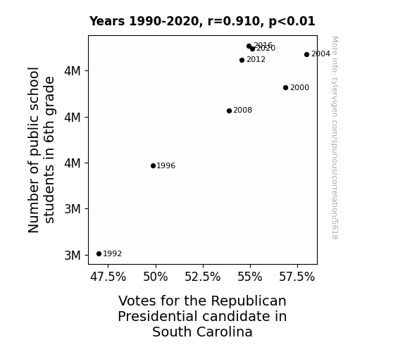
| 1992 | 1996 | 2000 | 2004 | 2008 | 2012 | 2016 | 2020 | |
| Number of public school students in 6th grade (Students) | 3302670 | 3493630 | 3663190 | 3735280 | 3613520 | 3723350 | 3753910 | 3747690 |
| Votes for the Republican Presidential candidate in South Carolina (Percentage of votes) | 46.9934 | 49.8477 | 56.8604 | 57.9819 | 53.8736 | 54.5611 | 54.9393 | 55.0935 |
Why this works
- Data dredging: I have 25,237 variables in my database. I compare all these variables against each other to find ones that randomly match up. That's 636,906,169 correlation calculations! This is called “data dredging.” Instead of starting with a hypothesis and testing it, I instead abused the data to see what correlations shake out. It’s a dangerous way to go about analysis, because any sufficiently large dataset will yield strong correlations completely at random.
- Lack of causal connection: There is probably
Because these pages are automatically generated, it's possible that the two variables you are viewing are in fact causually related. I take steps to prevent the obvious ones from showing on the site (I don't let data about the weather in one city correlate with the weather in a neighboring city, for example), but sometimes they still pop up. If they are related, cool! You found a loophole.
no direct connection between these variables, despite what the AI says above. This is exacerbated by the fact that I used "Years" as the base variable. Lots of things happen in a year that are not related to each other! Most studies would use something like "one person" in stead of "one year" to be the "thing" studied. - Observations not independent: For many variables, sequential years are not independent of each other. If a population of people is continuously doing something every day, there is no reason to think they would suddenly change how they are doing that thing on January 1. A simple
Personally I don't find any p-value calculation to be 'simple,' but you know what I mean.
p-value calculation does not take this into account, so mathematically it appears less probable than it really is. - Very low n: There are not many data points included in this analysis. Even if the p-value is high, we should be suspicious of using so few datapoints in a correlation.
Try it yourself
You can calculate the values on this page on your own! Try running the Python code to see the calculation results. Step 1: Download and install Python on your computer.Step 2: Open a plaintext editor like Notepad and paste the code below into it.
Step 3: Save the file as "calculate_correlation.py" in a place you will remember, like your desktop. Copy the file location to your clipboard. On Windows, you can right-click the file and click "Properties," and then copy what comes after "Location:" As an example, on my computer the location is "C:\Users\tyler\Desktop"
Step 4: Open a command line window. For example, by pressing start and typing "cmd" and them pressing enter.
Step 5: Install the required modules by typing "pip install numpy", then pressing enter, then typing "pip install scipy", then pressing enter.
Step 6: Navigate to the location where you saved the Python file by using the "cd" command. For example, I would type "cd C:\Users\tyler\Desktop" and push enter.
Step 7: Run the Python script by typing "python calculate_correlation.py"
If you run into any issues, I suggest asking ChatGPT to walk you through installing Python and running the code below on your system. Try this question:
"Walk me through installing Python on my computer to run a script that uses scipy and numpy. Go step-by-step and ask me to confirm before moving on. Start by asking me questions about my operating system so that you know how to proceed. Assume I want the simplest installation with the latest version of Python and that I do not currently have any of the necessary elements installed. Remember to only give me one step per response and confirm I have done it before proceeding."
# These modules make it easier to perform the calculation
import numpy as np
from scipy import stats

# We'll define a function that we can call to return the correlation calculations
def calculate_correlation(array1, array2):

    # Calculate Pearson correlation coefficient and p-value
    correlation, p_value = stats.pearsonr(array1, array2)

    # Calculate R-squared as the square of the correlation coefficient
    r_squared = correlation**2

    return correlation, r_squared, p_value

# These are the arrays for the variables shown on this page, but you can modify them to be any two sets of numbers
array_1 = np.array([3302670,3493630,3663190,3735280,3613520,3723350,3753910,3747690,])
array_2 = np.array([46.9934,49.8477,56.8604,57.9819,53.8736,54.5611,54.9393,55.0935,])
array_1_name = "Number of public school students in 6th grade"
array_2_name = "Votes for the Republican Presidential candidate in South Carolina"

# Perform the calculation
print(f"Calculating the correlation between {array_1_name} and {array_2_name}...")
correlation, r_squared, p_value = calculate_correlation(array_1, array_2)

# Print the results
print("Correlation Coefficient:", correlation)
print("R-squared:", r_squared)
print("P-value:", p_value)
Reuseable content
You may re-use the images on this page for any purpose, even commercial purposes, without asking for permission. The only requirement is that you attribute Tyler Vigen. Attribution can take many different forms. If you leave the "tylervigen.com" link in the image, that satisfies it just fine. If you remove it and move it to a footnote, that's fine too. You can also just write "Charts courtesy of Tyler Vigen" at the bottom of an article.You do not need to attribute "the spurious correlations website," and you don't even need to link here if you don't want to. I don't gain anything from pageviews. There are no ads on this site, there is nothing for sale, and I am not for hire.
For the record, I am just one person. Tyler Vigen, he/him/his. I do have degrees, but they should not go after my name unless you want to annoy my wife. If that is your goal, then go ahead and cite me as "Tyler Vigen, A.A. A.A.S. B.A. J.D." Otherwise it is just "Tyler Vigen."
When spoken, my last name is pronounced "vegan," like I don't eat meat.
Full license details.
For more on re-use permissions, or to get a signed release form, see tylervigen.com/permission.
Download images for these variables:
- High resolution line chart
The image linked here is a Scalable Vector Graphic (SVG). It is the highest resolution that is possible to achieve. It scales up beyond the size of the observable universe without pixelating. You do not need to email me asking if I have a higher resolution image. I do not. The physical limitations of our universe prevent me from providing you with an image that is any higher resolution than this one.
If you insert it into a PowerPoint presentation (a tool well-known for managing things that are the scale of the universe), you can right-click > "Ungroup" or "Create Shape" and then edit the lines and text directly. You can also change the colors this way.
Alternatively you can use a tool like Inkscape. - High resolution line chart, optimized for mobile
- Alternative high resolution line chart
- Scatterplot
- Portable line chart (png)
- Portable line chart (png), optimized for mobile
- Line chart for only Number of public school students in 6th grade
- Line chart for only Votes for the Republican Presidential candidate in South Carolina
- AI-generated correlation image
- The spurious research paper: Classroom Counts: Unveiling the Electoral Algebra Through 6th Grade Ambitions
Your rating is much appreciated!
Correlation ID: 5618 · Black Variable ID: 1303 · Red Variable ID: 26166

