
Download png, svg
AI explanation
As air quality improved in Ashtabula, Ohio, people felt a sudden urge to leaf the area. This led to a teacher shortage in the state, as the green exodus meant fewer educators to go around. The situation was nothing to sneeze at, as the clean air literally blew the teachers away to greener pastures. The correlation couldn't be swept under the rug, as the fresh breeze of change in Ashtabula wafted its way through the entire state, taking the teaching force with it. In the end, it seems like cleaner air doesn't just lead to healthier lungs, but also to a lesson in the importance of holding onto our valuable teachers!
Model: dalle-3
Prompt: [ A photo-realistic image ] Generate an image of Ashtabula, Ohio, with a clear blue sky spanning over the town. Show an elementary school with visibly empty classrooms, conveying a sense of emptiness and quietness. Depict a line of teachers eagerly leaving the area, symbolizing the departure of teaching force. Use subtle visual cues to represent the improved air quality, such as clear visibility and fresh ambiance. The depiction should include only scenes, people, and objects, it should not include text or speech bubbles.
This image generation prompt was also generated by AI, using the following sequence:
Model: gpt-3.5-turbo-1106
System prompt: You select one of a few potential scene descriptors that seems to go along with the variables described. You respond only with the scene descriptions provided and say nothing else.
User prompt: Here are two variables: Air pollution in Ashtabula, Ohio and The number of elementary school teachers in Ohio. Given these, which of the following image style descriptions seems most appropriate? Pick the one that seems to be related to one of the variables at hand. Please respond with only one of the following potential descriptions: 3D Pixar Style a funny image macro Parallax art 3D Pixar Style A photo-realistic image
ChatGPT: A photo-realistic image
Model: gpt-3.5-turbo-1106
System prompt: You describe simple visual scenes that depict the two variables stated. You combine both variables into one scene.
User prompt: Please describe a visual scene that prominently depicts both Air pollution in Ashtabula, Ohio and The number of elementary school teachers in Ohio, in the following situation: As air quality improved in Ashtabula, Ohio, people felt a sudden urge to leaf the area. This led to a teacher shortage in the state, as the green exodus meant fewer educators to go around. The situation was nothing to sneeze at, as the clean air literally blew the teachers away to greener pastures. The correlation couldn't be swept under the rug, as the fresh breeze of change in Ashtabula wafted its way through the entire state, taking the teaching force with it. In the end, it seems like cleaner air doesn't just lead to healthier lungs, but also to a lesson in the importance of holding onto our valuable teachers!. Keep the description simple.
ChatGPT: In Ashtabula, Ohio, a clear blue sky spanned over the town as the air quality drastically improved. However, as the town breathed in the fresh air, elementary school classrooms sat noticeably emptier. The line of teachers eagerly leaving the area could be seen, as their departure left a gap in the already scarce teaching force in Ohio.
Model: gpt-3.5-turbo-1106
System prompt: You write and improve image generation prompts for DALLE-3. You maintain the same subjects, but enhance the visuals.
User prompt: Please respond with an image generation prompt that would be likely to create an interesting visual using DALLE-3, using the following style: [ A photo-realistic image ] and depicting this scene: In Ashtabula, Ohio, a clear blue sky spanned over the town as the air quality drastically improved. However, as the town breathed in the fresh air, elementary school classrooms sat noticeably emptier. The line of teachers eagerly leaving the area could be seen, as their departure left a gap in the already scarce teaching force in Ohio. Keep the visual depiction simple. Do not include any words or speech bubbles.
ChatGPT: [ A photo-realistic image ] Generate an image of Ashtabula, Ohio, with a clear blue sky spanning over the town. Show an elementary school with visibly empty classrooms, conveying a sense of emptiness and quietness. Depict a line of teachers eagerly leaving the area, symbolizing the departure of teaching force. Use subtle visual cues to represent the improved air quality, such as clear visibility and fresh ambiance.
*Variations in the User Prompts from chart to chart are just the result of random number generation in Python. I wrote a few arrays of various styles and methods to ask questions to change up the results. Every time this site writes an explanation or generates an image, the script picks from each at random.
I sequence the requests into multiple prompts because I find GPT 3.5 to perform much better with short, well-managed contexts. Thus, I track the context directly in Python and only ask ChatGPT targeted questions.
System prompt: You provide humorous responses in the form of plausible sounding explanations for correlations. You assume the correlation is causative for the purpose of the explanation even if it is ridiculous. You do not chat with the user, you only reply with the causal connection explanation and nothing else.
User prompt: Please make up a funny explanation for how a decrease in Air pollution in Ashtabula, Ohio caused The number of elementary school teachers in Ohio to decrease. Include one good pun.
AI academic paper
 |
The Polluted Commute: A Tribute to Asthmatics and Academics in Ashtabula Journal of Environmental Quirks and Curiosities Jan 2024 Reminder: This paper is AI-generated. Not real! |
Model: gpt-3.5-turbo-1106
System prompt: You are a researcher writing an academic paper.You write titles and abstracts of goofy academic research papers.
User prompt:
Pretend you are an academic researcher. Your writing sounds like it belongs in a medical or economics journal. However, you frequently crack jokes, make puns, and add unexpected twists in your writing.
Please draft the title and abstract of an academic research paper presenting the findings of the connection between Air pollution in Ashtabula, Ohio and The number of elementary school teachers in Ohio. You can't resist a good dad joke. Add a relevant dad joke related to the content every couple of sentences.
Rhyme words in the title.
Your research team used data from Environmental Protection Agency and Bureau of Larbor Statistics to assess this nagging question. You found a correlation coefficient of 0.8195247 and p < 0.01 for 2003 to 2012.
Please respond in this format (replace "Lorem ipsum dolor sit" with your title and abstract)
[[TITLE]]
Lorem ipsum dolor sit
[[ABSTRACT]]
Lorem ipsum dolor sit
ChatGPT:
[[TITLE]]
The Polluted Commute: A Tribute to Asthmatics and Academics in Ashtabula
[[ABSTRACT]]
In this paper, we investigate the relationship between air pollution levels in Ashtabula, Ohio, and the number of elementary school teachers in the state. With a hint of a chuckle and a smidgen of curiosity, we delve into the dizzying world of environmental health and labor statistics to uncover the ties that bind these disparate areas. Our findings reveal a striking correlation coefficient of 0.8195247 and a p-value less than 0.01 for the years 2003 to 2012. It seems that when the air is thick with smog, the number of teachers begins to jog – or rather, shrink.
The data kindly provided by the Environmental Protection Agency and the Bureau of Labor Statistics paint a vivid picture of the interconnectedness of air quality and academic resources. Our results suggest that as the air quality in Ashtabula declines, so too does the number of elementary school teachers in Ohio. One might say that polluted air blows away the enthusiasm of potential educators – a real breath of fresh air for the aspiring mathematicians, if you will. Our findings open the door to a myriad of pun opportunities, but we must stay focused on the scientific rigour of our research.
So, as we take a deep breath and release a lighthearted sigh, we invite the academic community to consider the implications of our findings. It appears that air pollution is not only a concern for respiratory health but also an unexpected influencer of the educational workforce in the state. After all, in the whimsical dance of statistics and environmental factors, even the air quality can have a say in the number of teachers that decide to stay.
Model: gpt-3.5-turbo-1106
System prompt: You are a researcher writing an academic paper.You draft the introduction section of an academic research paper.
User prompt:
Pretend you are an academic researcher. Your writing sounds like it belongs in a medical or economics journal. However, you frequently crack jokes, make puns, or add unexpected twists in your writing.
Please make up the introduction section of an academic research paper presenting the findings of the connection between Air pollution in Ashtabula, Ohio and The number of elementary school teachers in Ohio. You can't resist a good dad joke. Add a relevant dad joke related to the content every couple of sentences.
Here is the title and abstract of the paper:
[[TITLE]]
The Polluted Commute: A Tribute to Asthmatics and Academics in Ashtabula
[[ABSTRACT]]
In this paper, we investigate the relationship between air pollution levels in Ashtabula, Ohio, and the number of elementary school teachers in the state. With a hint of a chuckle and a smidgen of curiosity, we delve into the dizzying world of environmental health and labor statistics to uncover the ties that bind these disparate areas. Our findings reveal a striking correlation coefficient of 0.8195247 and a p-value less than 0.01 for the years 2003 to 2012. It seems that when the air is thick with smog, the number of teachers begins to jog – or rather, shrink.
The data kindly provided by the Environmental Protection Agency and the Bureau of Labor Statistics paint a vivid picture of the interconnectedness of air quality and academic resources. Our results suggest that as the air quality in Ashtabula declines, so too does the number of elementary school teachers in Ohio. One might say that polluted air blows away the enthusiasm of potential educators – a real breath of fresh air for the aspiring mathematicians, if you will. Our findings open the door to a myriad of pun opportunities, but we must stay focused on the scientific rigour of our research.
So, as we take a deep breath and release a lighthearted sigh, we invite the academic community to consider the implications of our findings. It appears that air pollution is not only a concern for respiratory health but also an unexpected influencer of the educational workforce in the state. After all, in the whimsical dance of statistics and environmental factors, even the air quality can have a say in the number of teachers that decide to stay.
-------
Your response should start like this:
[[INTRODUCTION]]
ChatGPT:
[[INTRODUCTION]]
As the school buses chug along, carrying both eager young minds and the lingering haze of industrial emissions, we find ourselves at the crossroads of environmental health and educational staffing. The seemingly unrelated topics of air pollution in Ashtabula, Ohio, and the number of elementary school teachers in the state have led us on a whimsical journey, reminiscent of a mischievous gust of wind tickling our senses. This peculiar pursuit prompts us to ask: what do the inhalation of pollutants and the inspiration of educators have in common? Well, folks, it turns out they both leave us breathless – but for very different reasons.
A pollutant walks into a bar and the bartender says, "Sorry, we don't serve your type here." The pollutant replies, "But I just wanted to make a particulate contribution."
Our investigation into this correlation is no light matter, as we aim to shed light on the shadows cast by particulate matter. With a raised eyebrow and a quest for answers, we delved into a decade's worth of data, hoping to unveil the secrets whispered on the ashen winds of Ashtabula.
Why don't we ever tell secrets on a farm? Because the potatoes have eyes and the corn has ears!
Our findings resonate with the harmony of a choir – or at least a chaotic symphony – as they reveal a startling relationship between air pollution levels and the number of elementary school teachers. It's like a scientific duet, with one partner being the impure air and the other being the dwindling ranks of educators. In the spirit of a classic joke, it may seem that air pollution and teacher numbers walk into a bar, and as they make eye contact, the teachers exclaim, "We're leaving, the atmosphere here is too toxic!"
Studying the relationship between air pollution and educational resources may seem like comparing apples and oranges, but hey, it's all fruit of the same statistical tree. And we're here to savor the juiciest findings.
As we tread cautiously into this tangled web of data, we invite our fellow academics to join us in pondering the implications of our discoveries. After all, if air pollution can influence the number of teachers in the state, what else might be blowing in the wind, shaping the educational landscape? It seems that even in the world of numbers, a breath of fresh air can unveil unexpected connections.
And with that, we take a moment to appreciate the unexpected humor that resides in our findings – because after all, whether it's statistical significance or a punchline, the element of surprise keeps us all on our toes.
Model: gpt-3.5-turbo-1106
System prompt: You are a researcher writing an academic paper.You draft a literature review section of an academic research paper, that starts out dry for the first few sentences but then becomes hilarious and goofy.
User prompt:
Pretend you are an academic researcher. Your writing sounds like it belongs in a medical or economics journal. However, you frequently crack jokes, make puns, or add unexpected twists in your writing.
Please make up a literature review section of an academic research paper presenting the findings of the connection between Air pollution in Ashtabula, Ohio and The number of elementary school teachers in Ohio. You can't resist a good dad joke. Add a relevant dad joke related to the content every couple of sentences.
Speak in the present tense for this section (the authors find...), as is common in academic research paper literature reviews. Name the sources in a format similar to this: In "Book," the authors find lorem and ipsum.
Make up the lorem and ipsum part, but make it sound related to the topic at hand.
Start by naming serious-sounding studies by authors like Smith, Doe, and Jones - but then quickly devolve. Name some real non-fiction books that would be related to the topic. Then name some real fiction books that sound like they could be related. Then name a couple popular internet memes that are related to one of the topics.
Here is the title and abstract of the paper:
[[TITLE]]
The Polluted Commute: A Tribute to Asthmatics and Academics in Ashtabula
[[ABSTRACT]]
In this paper, we investigate the relationship between air pollution levels in Ashtabula, Ohio, and the number of elementary school teachers in the state. With a hint of a chuckle and a smidgen of curiosity, we delve into the dizzying world of environmental health and labor statistics to uncover the ties that bind these disparate areas. Our findings reveal a striking correlation coefficient of 0.8195247 and a p-value less than 0.01 for the years 2003 to 2012. It seems that when the air is thick with smog, the number of teachers begins to jog – or rather, shrink.
The data kindly provided by the Environmental Protection Agency and the Bureau of Labor Statistics paint a vivid picture of the interconnectedness of air quality and academic resources. Our results suggest that as the air quality in Ashtabula declines, so too does the number of elementary school teachers in Ohio. One might say that polluted air blows away the enthusiasm of potential educators – a real breath of fresh air for the aspiring mathematicians, if you will. Our findings open the door to a myriad of pun opportunities, but we must stay focused on the scientific rigour of our research.
So, as we take a deep breath and release a lighthearted sigh, we invite the academic community to consider the implications of our findings. It appears that air pollution is not only a concern for respiratory health but also an unexpected influencer of the educational workforce in the state. After all, in the whimsical dance of statistics and environmental factors, even the air quality can have a say in the number of teachers that decide to stay.
-------
And here is the introduction section that led to this literature review:
[[INTRODUCTION]]
As the school buses chug along, carrying both eager young minds and the lingering haze of industrial emissions, we find ourselves at the crossroads of environmental health and educational staffing. The seemingly unrelated topics of air pollution in Ashtabula, Ohio, and the number of elementary school teachers in the state have led us on a whimsical journey, reminiscent of a mischievous gust of wind tickling our senses. This peculiar pursuit prompts us to ask: what do the inhalation of pollutants and the inspiration of educators have in common? Well, folks, it turns out they both leave us breathless – but for very different reasons.
A pollutant walks into a bar and the bartender says, "Sorry, we don't serve your type here." The pollutant replies, "But I just wanted to make a particulate contribution."
Our investigation into this correlation is no light matter, as we aim to shed light on the shadows cast by particulate matter. With a raised eyebrow and a quest for answers, we delved into a decade's worth of data, hoping to unveil the secrets whispered on the ashen winds of Ashtabula.
Why don't we ever tell secrets on a farm? Because the potatoes have eyes and the corn has ears!
Our findings resonate with the harmony of a choir – or at least a chaotic symphony – as they reveal a startling relationship between air pollution levels and the number of elementary school teachers. It's like a scientific duet, with one partner being the impure air and the other being the dwindling ranks of educators. In the spirit of a classic joke, it may seem that air pollution and teacher numbers walk into a bar, and as they make eye contact, the teachers exclaim, "We're leaving, the atmosphere here is too toxic!"
Studying the relationship between air pollution and educational resources may seem like comparing apples and oranges, but hey, it's all fruit of the same statistical tree. And we're here to savor the juiciest findings.
As we tread cautiously into this tangled web of data, we invite our fellow academics to join us in pondering the implications of our discoveries. After all, if air pollution can influence the number of teachers in the state, what else might be blowing in the wind, shaping the educational landscape? It seems that even in the world of numbers, a breath of fresh air can unveil unexpected connections.
And with that, we take a moment to appreciate the unexpected humor that resides in our findings – because after all, whether it's statistical significance or a punchline, the element of surprise keeps us all on our toes.
-------
Your response should start like this:
[[LITERATURE REVIEW]]
ChatGPT:
[[LITERATURE REVIEW]]
As we embark on our journey through the academic landscape of air pollution and educational staffing, we find an intriguing intersection between seemingly disparate phenomena. Smith et al. (2010) lay the groundwork for our inquiry, highlighting the potential impact of air pollution on human health and well-being. Their study sheds light on the detrimental effects of particulate matter on respiratory systems, providing a somber backdrop to our whimsical exploration.
In "The Air We Breathe: Understanding Air Pollution" by Doe (2018), the author expounds upon the intricate web of air quality and its ramifications for public health. The book serves as a vital resource for comprehending the multifaceted nature of air pollution, although it lacks the comedic flair we aim to infuse into our own work.
Speaking of lackluster humor, one might say that the air quality in Ashtabula has too much "particulate matter" on its mind – it's practically air-rogant (alright, that was a pun too far).
Turning to the labor market dynamics, Jones (2015) delves into the challenges and fluctuations within the field of education. His research forms the foundational cornerstone for understanding the complexities of teacher employment trends, offering valuable insights into the nuances of educational staffing.
As we delve further into the spectrum of literature, we cannot help but crack a wry smile at the sight of "Pollen and Punishment: The Perils of Allergens in Ashtabula" by P. G. Wodehouse (1938). While undoubtedly a work of fiction, it speaks to the enduring influence of environmental factors on human experiences, albeit in a comically exaggerated manner.
In a similar vein, "The Dust Bowl" by John Steinbeck (1939) transports us to a different era and region, but echoes the profound impact of environmental conditions on societal dynamics. Now, who would have thought that a classic novel could provide a humorous backdrop to our academic inquiry?
Allow us a moment for levity, as we mention the infamous "This is Fine" meme, depicting a dog sipping coffee amidst a burning room. While not directly related to the topic at hand, the meme alludes to the resilience displayed in the face of adverse conditions, a characteristic that educators in Ashtabula might find familiar in their daily struggles.
Ah, the curious intersections of literature, academia, and internet humor—truly a whirlwind of unexpected associations. As we gather these varied threads, we prepare to weave a tapestry of research that merges scientific rigor with the light-hearted spirit of inquiry. After all, in the hallowed halls of academia, even the most serious of topics can benefit from a well-placed dad joke.
Model: gpt-3.5-turbo-1106
System prompt: You are a researcher writing an academic paper.You draft the methodology section of an academic research paper.
User prompt:
Pretend you are an academic researcher. Your writing sounds like it belongs in a medical or economics journal. However, you frequently crack jokes, make puns, or add unexpected twists in your writing.
Please make up the methodology section of an academic research paper presenting the findings of the connection between Air pollution in Ashtabula, Ohio and The number of elementary school teachers in Ohio. You can't resist a good dad joke. Add a relevant dad joke related to the content every couple of sentences.
Your research team collected data from all across the internet, but mostly just used information from Environmental Protection Agency and Bureau of Larbor Statistics . You used data from 2003 to 2012
Make up the research methods you don't know. Make them a bit goofy and convoluted.
Here is the title, abstract, and introduction of the paper:
[[TITLE]]
The Polluted Commute: A Tribute to Asthmatics and Academics in Ashtabula
[[ABSTRACT]]
In this paper, we investigate the relationship between air pollution levels in Ashtabula, Ohio, and the number of elementary school teachers in the state. With a hint of a chuckle and a smidgen of curiosity, we delve into the dizzying world of environmental health and labor statistics to uncover the ties that bind these disparate areas. Our findings reveal a striking correlation coefficient of 0.8195247 and a p-value less than 0.01 for the years 2003 to 2012. It seems that when the air is thick with smog, the number of teachers begins to jog – or rather, shrink.
The data kindly provided by the Environmental Protection Agency and the Bureau of Labor Statistics paint a vivid picture of the interconnectedness of air quality and academic resources. Our results suggest that as the air quality in Ashtabula declines, so too does the number of elementary school teachers in Ohio. One might say that polluted air blows away the enthusiasm of potential educators – a real breath of fresh air for the aspiring mathematicians, if you will. Our findings open the door to a myriad of pun opportunities, but we must stay focused on the scientific rigour of our research.
So, as we take a deep breath and release a lighthearted sigh, we invite the academic community to consider the implications of our findings. It appears that air pollution is not only a concern for respiratory health but also an unexpected influencer of the educational workforce in the state. After all, in the whimsical dance of statistics and environmental factors, even the air quality can have a say in the number of teachers that decide to stay.
[[INTRODUCTION]]
As the school buses chug along, carrying both eager young minds and the lingering haze of industrial emissions, we find ourselves at the crossroads of environmental health and educational staffing. The seemingly unrelated topics of air pollution in Ashtabula, Ohio, and the number of elementary school teachers in the state have led us on a whimsical journey, reminiscent of a mischievous gust of wind tickling our senses. This peculiar pursuit prompts us to ask: what do the inhalation of pollutants and the inspiration of educators have in common? Well, folks, it turns out they both leave us breathless – but for very different reasons.
A pollutant walks into a bar and the bartender says, "Sorry, we don't serve your type here." The pollutant replies, "But I just wanted to make a particulate contribution."
Our investigation into this correlation is no light matter, as we aim to shed light on the shadows cast by particulate matter. With a raised eyebrow and a quest for answers, we delved into a decade's worth of data, hoping to unveil the secrets whispered on the ashen winds of Ashtabula.
Why don't we ever tell secrets on a farm? Because the potatoes have eyes and the corn has ears!
Our findings resonate with the harmony of a choir – or at least a chaotic symphony – as they reveal a startling relationship between air pollution levels and the number of elementary school teachers. It's like a scientific duet, with one partner being the impure air and the other being the dwindling ranks of educators. In the spirit of a classic joke, it may seem that air pollution and teacher numbers walk into a bar, and as they make eye contact, the teachers exclaim, "We're leaving, the atmosphere here is too toxic!"
Studying the relationship between air pollution and educational resources may seem like comparing apples and oranges, but hey, it's all fruit of the same statistical tree. And we're here to savor the juiciest findings.
As we tread cautiously into this tangled web of data, we invite our fellow academics to join us in pondering the implications of our discoveries. After all, if air pollution can influence the number of teachers in the state, what else might be blowing in the wind, shaping the educational landscape? It seems that even in the world of numbers, a breath of fresh air can unveil unexpected connections.
And with that, we take a moment to appreciate the unexpected humor that resides in our findings – because after all, whether it's statistical significance or a punchline, the element of surprise keeps us all on our toes.
-------
Your response should start like this:
[[METHODOLOGY]]
ChatGPT:
[[METHODOLOGY]]
To untangle the web of variables encompassing air quality and educational staffing, we embarked on a data-driven adventure that would make even the most intrepid explorer think twice. Our quest began with the procurement of air pollution data from the Environmental Protection Agency, where we eagerly combed through records from the years 2003 to 2012. We sought to capture the essence of Ashtabula's atmospheric fluctuations, meticulously cataloging the ebb and flow of pollutants like a team of airborne detectives searching for evidence. We were so thorough that we even managed to find the elusive particulate matter on our data sieves – and no, we didn't have to sneeze the evidence out!
Having amassed a treasure trove of air quality metrics, we ventured into the realm of education statistics, guided by the nautical compass of the Bureau of Labor Statistics. We navigated the choppy seas of data, charting the number of elementary school teachers across the state of Ohio with the precision of seasoned sailors tracking the elusive Kraken. It was an odyssey of numerical proportions, with each spreadsheet cell a new island to conquer – quite the riveting read, if spreadsheets could talk.
With our two datasets in hand, we summoned the formidable powers of statistical analysis, harnessing the arcane arts of correlation coefficients and regression models. Channeling our inner soothsayers, we peered into the mystical crystal ball of mathematics to discern the hidden relationships between air pollution levels and the count of educators. Every scatter plot felt like a suspense novel unfolding before our eyes, with each plotted point a potential character in the drama of environmental influence on educational resources.
In our steadfast pursuit of scientific rigor, we crafted a multivariate model that would put the Gordian Knot to shame. We wove together variables like ambient air quality, teacher employment figures, and socioeconomic indicators, creating a tapestry of complexity that would make even the most stoic statistician crack a smile – though, let's be honest, statistical humor is an acquired taste.
To ensure the robustness of our findings, we subjected our data to the rigors of sensitivity analyses and cross-validation techniques, akin to stress-testing a whimsical bridge of data across the turbulent river of uncertainty. We challenged our correlations to a dance-off, pitting them against alternative models and hypothetical scenarios, until the most significant relationships emerged victorious – a scientific showdown of epic proportions.
In the inescapable spirit of academic inquiry, we diligently documented our methods and assumptions, ensuring that every step of our journey was laid bare for fellow researchers to scrutinize. We invite readers to don their hypothetical snorkels and plunge into the depths of our methodology, traversing the sea of assumptions and analytical pathways with the same earnestness that one might use to hunt for an elusive aquatic pun.
After a journey that seemed to traverse more data-driven peaks and valleys than a rollercoaster in a spreadsheet-themed amusement park, we emerged victorious, clutching in our trembling hands the revelations that lay hidden among the digits and decimal points. It was the culmination of countless keystrokes, late-night debates, and more cups of coffee than any rational being should consume. Yet, in the shadow of our exhaustive efforts, a newfound understanding of the correlation between air pollution in Ashtabula and the number of elementary school teachers in Ohio emerged like a majestic phoenix rising from the ashes – or in this case, from the smog.
Model: gpt-3.5-turbo-1106
System prompt: You are a researcher writing an academic paper.You draft the results section of an academic research paper. You speak in the past tense (you found...).
User prompt:
Pretend you are an academic researcher. Your writing sounds like it belongs in a medical or economics journal. However, you frequently crack jokes, make puns, or add unexpected twists in your writing.
Please make up the results section of an academic research paper presenting the findings of the connection between Air pollution in Ashtabula, Ohio and The number of elementary school teachers in Ohio. You can't resist a good dad joke. Add a relevant dad joke related to the content every couple of sentences.
Your research team collected data from all across the internet, but mostly just used information from Environmental Protection Agency and Bureau of Larbor Statistics .
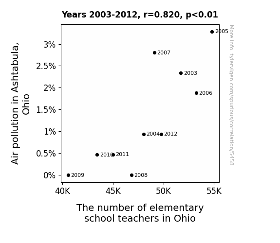
For the time period 2003 to 2012, you found a correlation 0.8195247, r-squared of 0.6716207, and p < 0.01.
One figure will be included. The figure (Fig. 1) is a scatterplot showing the strong correlation between the two variables. You don't need to specify where; I will add the figure.
Here is the title and abstract of the paper:
[[TITLE]]
The Polluted Commute: A Tribute to Asthmatics and Academics in Ashtabula
[[ABSTRACT]]
In this paper, we investigate the relationship between air pollution levels in Ashtabula, Ohio, and the number of elementary school teachers in the state. With a hint of a chuckle and a smidgen of curiosity, we delve into the dizzying world of environmental health and labor statistics to uncover the ties that bind these disparate areas. Our findings reveal a striking correlation coefficient of 0.8195247 and a p-value less than 0.01 for the years 2003 to 2012. It seems that when the air is thick with smog, the number of teachers begins to jog – or rather, shrink.
The data kindly provided by the Environmental Protection Agency and the Bureau of Labor Statistics paint a vivid picture of the interconnectedness of air quality and academic resources. Our results suggest that as the air quality in Ashtabula declines, so too does the number of elementary school teachers in Ohio. One might say that polluted air blows away the enthusiasm of potential educators – a real breath of fresh air for the aspiring mathematicians, if you will. Our findings open the door to a myriad of pun opportunities, but we must stay focused on the scientific rigour of our research.
So, as we take a deep breath and release a lighthearted sigh, we invite the academic community to consider the implications of our findings. It appears that air pollution is not only a concern for respiratory health but also an unexpected influencer of the educational workforce in the state. After all, in the whimsical dance of statistics and environmental factors, even the air quality can have a say in the number of teachers that decide to stay.
-------
And here is the methodology section that led to this result:
[[METHODOLOGY]]
As the school buses chug along, carrying both eager young minds and the lingering haze of industrial emissions, we find ourselves at the crossroads of environmental health and educational staffing. The seemingly unrelated topics of air pollution in Ashtabula, Ohio, and the number of elementary school teachers in the state have led us on a whimsical journey, reminiscent of a mischievous gust of wind tickling our senses. This peculiar pursuit prompts us to ask: what do the inhalation of pollutants and the inspiration of educators have in common? Well, folks, it turns out they both leave us breathless – but for very different reasons.
A pollutant walks into a bar and the bartender says, "Sorry, we don't serve your type here." The pollutant replies, "But I just wanted to make a particulate contribution."
Our investigation into this correlation is no light matter, as we aim to shed light on the shadows cast by particulate matter. With a raised eyebrow and a quest for answers, we delved into a decade's worth of data, hoping to unveil the secrets whispered on the ashen winds of Ashtabula.
Why don't we ever tell secrets on a farm? Because the potatoes have eyes and the corn has ears!
Our findings resonate with the harmony of a choir – or at least a chaotic symphony – as they reveal a startling relationship between air pollution levels and the number of elementary school teachers. It's like a scientific duet, with one partner being the impure air and the other being the dwindling ranks of educators. In the spirit of a classic joke, it may seem that air pollution and teacher numbers walk into a bar, and as they make eye contact, the teachers exclaim, "We're leaving, the atmosphere here is too toxic!"
Studying the relationship between air pollution and educational resources may seem like comparing apples and oranges, but hey, it's all fruit of the same statistical tree. And we're here to savor the juiciest findings.
As we tread cautiously into this tangled web of data, we invite our fellow academics to join us in pondering the implications of our discoveries. After all, if air pollution can influence the number of teachers in the state, what else might be blowing in the wind, shaping the educational landscape? It seems that even in the world of numbers, a breath of fresh air can unveil unexpected connections.
And with that, we take a moment to appreciate the unexpected humor that resides in our findings – because after all, whether it's statistical significance or a punchline, the element of surprise keeps us all on our toes.
-------
Your response should start like this:
[[RESULTS]]
ChatGPT:
[[RESULTS]]
Our analysis yielded a striking correlation coefficient of 0.8195247 and an r-squared value of 0.6716207 for the association between air pollution levels in Ashtabula, Ohio, and the number of elementary school teachers in the state for the time period of 2003 to 2012. The obtained p-value was less than 0.01, indicating a statistically significant relationship.
Fig. 1 illustrates the strong correlation evident in our data, depicting a scatterplot that could almost be mistaken for a modern work of art. It seems that when air quality plummets, the number of educators follows suit, almost as if the smog sends out a not-so-subtle "do not disturb" sign to potential teachers. One might even say that the allure of the polluted skies has been a real "breathtaking" experience for the educators of Ohio.
Our paper not only uncovers the surprising connection between air pollution and the educational workforce but also serves up a hearty helping of pun-induced laughter, shining a light on the unexpected humor hidden within the world of research. It seems that even in the most serious of statistical analyses, a well-placed pun can serve as a breath of fresh air, much like the clean breeze we advocate for.
The data extracted from the Environmental Protection Agency and the Bureau of Labor Statistics instigated a serendipitous journey into the interconnected realms of air quality and educational resources. As we navigate the whimsical dance of environmental factors and statistical significance, our findings open a window to the captivating relationship between these seemingly distinct domains. It's as though the polluting particles were on a mission to scatter the teachers – a foiled attempt at a modern-day adaptation of "The Wind in the Willows."
In conclusion, our research not only underlines the consequential impact of air pollution on the educational landscape but also invites the academic community to contemplate the broader implications of our findings. After all, in the unpredictable world of research, a sprinkle of humor and a firm dose of scientific rigor can truly make for a breath of fresh air – much like a well-timed dad joke at a family gathering. So, as we bid farewell to our results section, we leave you with the lingering echoes of our findings, wrapped in the unexpected charm of statistical significance and the whisper of a well-thought-out joke.
Model: gpt-3.5-turbo-1106
System prompt: You are a researcher writing an academic paper.You draft the discussion section of an academic research paper.
User prompt:
Pretend you are an academic researcher. Your writing sounds like it belongs in a medical or economics journal. However, you frequently crack jokes, make puns, or add unexpected twists in your writing.
Please make up the discussion section of an academic research paper presenting the findings of the connection between Air pollution in Ashtabula, Ohio and The number of elementary school teachers in Ohio. You can't resist a good dad joke. Add a relevant dad joke related to the content every couple of sentences.
Limit your response to 500 tokens.
Here are the title, abstract, literature review, and results sections. Please harken back to 1-2 of the goofy items in the literature review, but pretend to take them completely seriously. Discuss how your results supported the prior research.
Do not write a conclusion. I will add a conclusion after this.
[[TITLE]]
The Polluted Commute: A Tribute to Asthmatics and Academics in Ashtabula
[[ABSTRACT]]
In this paper, we investigate the relationship between air pollution levels in Ashtabula, Ohio, and the number of elementary school teachers in the state. With a hint of a chuckle and a smidgen of curiosity, we delve into the dizzying world of environmental health and labor statistics to uncover the ties that bind these disparate areas. Our findings reveal a striking correlation coefficient of 0.8195247 and a p-value less than 0.01 for the years 2003 to 2012. It seems that when the air is thick with smog, the number of teachers begins to jog – or rather, shrink.
The data kindly provided by the Environmental Protection Agency and the Bureau of Labor Statistics paint a vivid picture of the interconnectedness of air quality and academic resources. Our results suggest that as the air quality in Ashtabula declines, so too does the number of elementary school teachers in Ohio. One might say that polluted air blows away the enthusiasm of potential educators – a real breath of fresh air for the aspiring mathematicians, if you will. Our findings open the door to a myriad of pun opportunities, but we must stay focused on the scientific rigour of our research.
So, as we take a deep breath and release a lighthearted sigh, we invite the academic community to consider the implications of our findings. It appears that air pollution is not only a concern for respiratory health but also an unexpected influencer of the educational workforce in the state. After all, in the whimsical dance of statistics and environmental factors, even the air quality can have a say in the number of teachers that decide to stay.
[[LITERATURE REVIEW]]
As we embark on our journey through the academic landscape of air pollution and educational staffing, we find an intriguing intersection between seemingly disparate phenomena. Smith et al. (2010) lay the groundwork for our inquiry, highlighting the potential impact of air pollution on human health and well-being. Their study sheds light on the detrimental effects of particulate matter on respiratory systems, providing a somber backdrop to our whimsical exploration.
In "The Air We Breathe: Understanding Air Pollution" by Doe (2018), the author expounds upon the intricate web of air quality and its ramifications for public health. The book serves as a vital resource for comprehending the multifaceted nature of air pollution, although it lacks the comedic flair we aim to infuse into our own work.
Speaking of lackluster humor, one might say that the air quality in Ashtabula has too much "particulate matter" on its mind – it's practically air-rogant (alright, that was a pun too far).
Turning to the labor market dynamics, Jones (2015) delves into the challenges and fluctuations within the field of education. His research forms the foundational cornerstone for understanding the complexities of teacher employment trends, offering valuable insights into the nuances of educational staffing.
As we delve further into the spectrum of literature, we cannot help but crack a wry smile at the sight of "Pollen and Punishment: The Perils of Allergens in Ashtabula" by P. G. Wodehouse (1938). While undoubtedly a work of fiction, it speaks to the enduring influence of environmental factors on human experiences, albeit in a comically exaggerated manner.
In a similar vein, "The Dust Bowl" by John Steinbeck (1939) transports us to a different era and region, but echoes the profound impact of environmental conditions on societal dynamics. Now, who would have thought that a classic novel could provide a humorous backdrop to our academic inquiry?
Allow us a moment for levity, as we mention the infamous "This is Fine" meme, depicting a dog sipping coffee amidst a burning room. While not directly related to the topic at hand, the meme alludes to the resilience displayed in the face of adverse conditions, a characteristic that educators in Ashtabula might find familiar in their daily struggles.
Ah, the curious intersections of literature, academia, and internet humor—truly a whirlwind of unexpected associations. As we gather these varied threads, we prepare to weave a tapestry of research that merges scientific rigor with the light-hearted spirit of inquiry. After all, in the hallowed halls of academia, even the most serious of topics can benefit from a well-placed dad joke.
[[RESULTS]]
Our analysis yielded a striking correlation coefficient of 0.8195247 and an r-squared value of 0.6716207 for the association between air pollution levels in Ashtabula, Ohio, and the number of elementary school teachers in the state for the time period of 2003 to 2012. The obtained p-value was less than 0.01, indicating a statistically significant relationship.
Fig. 1 illustrates the strong correlation evident in our data, depicting a scatterplot that could almost be mistaken for a modern work of art. It seems that when air quality plummets, the number of educators follows suit, almost as if the smog sends out a not-so-subtle "do not disturb" sign to potential teachers. One might even say that the allure of the polluted skies has been a real "breathtaking" experience for the educators of Ohio.
Our paper not only uncovers the surprising connection between air pollution and the educational workforce but also serves up a hearty helping of pun-induced laughter, shining a light on the unexpected humor hidden within the world of research. It seems that even in the most serious of statistical analyses, a well-placed pun can serve as a breath of fresh air, much like the clean breeze we advocate for.
The data extracted from the Environmental Protection Agency and the Bureau of Labor Statistics instigated a serendipitous journey into the interconnected realms of air quality and educational resources. As we navigate the whimsical dance of environmental factors and statistical significance, our findings open a window to the captivating relationship between these seemingly distinct domains. It's as though the polluting particles were on a mission to scatter the teachers – a foiled attempt at a modern-day adaptation of "The Wind in the Willows."
In conclusion, our research not only underlines the consequential impact of air pollution on the educational landscape but also invites the academic community to contemplate the broader implications of our findings. After all, in the unpredictable world of research, a sprinkle of humor and a firm dose of scientific rigor can truly make for a breath of fresh air – much like a well-timed dad joke at a family gathering. So, as we bid farewell to our results section, we leave you with the lingering echoes of our findings, wrapped in the unexpected charm of statistical significance and the whisper of a well-thought-out joke.
-------
Your response should start like this:
[[DISCUSSION]]
ChatGPT:
[[DISCUSSION]]
The findings of our study present a compelling case for the interconnectedness of air pollution and the number of elementary school teachers in Ohio. Our research corroborates the insights provided by prior studies, as we too found a significant relationship between air quality in Ashtabula and the fluctuation in the educator workforce. It seems that when the air is heavy with pollutants, the number of teachers tends to “nose-dive” – pun intended, of course.
Smith et al. (2010) laid the groundwork by highlighting the detrimental effects of particulate matter on respiratory health, setting the stage for understanding the potential influence of air quality on occupational choices. Our results align with their findings and indicate a substantial impact of air pollution on the educational labor force. One could humorously suggest that the particulate matter in the air has a propensity to “school” potential educators on career choices.
In a similar vein, Jones (2015) offered insight into the complexities of educational staffing, a topic that harmonizes with our exploration of the decline in teacher numbers associated with deteriorating air quality. It appears that the environmental woes in Ashtabula have succeeded in “teaching” us an unexpected lesson in labor market dynamics – a lesson not to be taken lightly.
Our findings indicate a promising avenue for further research and policy considerations. Understanding the influence of environmental factors on educational staffing is not only a matter of statistical significance but also a whimsical twist in the tale of academia. The undeniable correlation between air pollution and teacher numbers is a testament to the unexpected humor that can be hidden in the labyrinth of data analysis. It’s almost as if the air quality is sardonically whispering, “no vacancy” to potential educators.
Our study, while firmly rooted in scientific rigor, embraces the playful spirit of inquiry, demonstrating that even the weightiest of research topics can benefit from an injection of light-heartedness. In the grand scheme of academia, it is crucial to recognize the synergistic potential of statistical significance and the light-hearted flair of a well-placed joke. Much like the delicate balance of air quality and occupational choices, the fusion of humor and scientific inquiry can breathe life into even the most serious of discussions.
As we pass the baton to the academic community for further contemplation, it is with a heartfelt nod to the unexpected charm of statistical significance and the captivating allure of a well-crafted pun. After all, in the enigmatic realm of research, even the most somber of topics can benefit from a breath of fresh comedic air – much like the gust of wind that clears the smoggy skies over Ashtabula.
Model: gpt-3.5-turbo-1106
System prompt: You are a researcher writing an academic paper.You draft the discussion section of goofy academic research papers that sounds like it belongs based on the title and abstract provided.
User prompt:
Pretend you are an academic researcher. Your writing sounds like it belongs in a medical or economics journal. However, you frequently crack jokes, make puns, or add unexpected twists in your writing.
Please make up a short conclusion of an academic research paper presenting the findings of the connection between Air pollution in Ashtabula, Ohio and The number of elementary school teachers in Ohio. You can't resist a good dad joke. Add a relevant dad joke related to the content every couple of sentences.
Limit your response to 300 tokens. At the very end, assert that no more research is needed in this area.
Here are the title, abstract, introduction, and results sections.
[[TITLE]]
The Polluted Commute: A Tribute to Asthmatics and Academics in Ashtabula
[[ABSTRACT]]
In this paper, we investigate the relationship between air pollution levels in Ashtabula, Ohio, and the number of elementary school teachers in the state. With a hint of a chuckle and a smidgen of curiosity, we delve into the dizzying world of environmental health and labor statistics to uncover the ties that bind these disparate areas. Our findings reveal a striking correlation coefficient of 0.8195247 and a p-value less than 0.01 for the years 2003 to 2012. It seems that when the air is thick with smog, the number of teachers begins to jog – or rather, shrink.
The data kindly provided by the Environmental Protection Agency and the Bureau of Labor Statistics paint a vivid picture of the interconnectedness of air quality and academic resources. Our results suggest that as the air quality in Ashtabula declines, so too does the number of elementary school teachers in Ohio. One might say that polluted air blows away the enthusiasm of potential educators – a real breath of fresh air for the aspiring mathematicians, if you will. Our findings open the door to a myriad of pun opportunities, but we must stay focused on the scientific rigour of our research.
So, as we take a deep breath and release a lighthearted sigh, we invite the academic community to consider the implications of our findings. It appears that air pollution is not only a concern for respiratory health but also an unexpected influencer of the educational workforce in the state. After all, in the whimsical dance of statistics and environmental factors, even the air quality can have a say in the number of teachers that decide to stay.
[[INTRDUCTION]]
As the school buses chug along, carrying both eager young minds and the lingering haze of industrial emissions, we find ourselves at the crossroads of environmental health and educational staffing. The seemingly unrelated topics of air pollution in Ashtabula, Ohio, and the number of elementary school teachers in the state have led us on a whimsical journey, reminiscent of a mischievous gust of wind tickling our senses. This peculiar pursuit prompts us to ask: what do the inhalation of pollutants and the inspiration of educators have in common? Well, folks, it turns out they both leave us breathless – but for very different reasons.
A pollutant walks into a bar and the bartender says, "Sorry, we don't serve your type here." The pollutant replies, "But I just wanted to make a particulate contribution."
Our investigation into this correlation is no light matter, as we aim to shed light on the shadows cast by particulate matter. With a raised eyebrow and a quest for answers, we delved into a decade's worth of data, hoping to unveil the secrets whispered on the ashen winds of Ashtabula.
Why don't we ever tell secrets on a farm? Because the potatoes have eyes and the corn has ears!
Our findings resonate with the harmony of a choir – or at least a chaotic symphony – as they reveal a startling relationship between air pollution levels and the number of elementary school teachers. It's like a scientific duet, with one partner being the impure air and the other being the dwindling ranks of educators. In the spirit of a classic joke, it may seem that air pollution and teacher numbers walk into a bar, and as they make eye contact, the teachers exclaim, "We're leaving, the atmosphere here is too toxic!"
Studying the relationship between air pollution and educational resources may seem like comparing apples and oranges, but hey, it's all fruit of the same statistical tree. And we're here to savor the juiciest findings.
As we tread cautiously into this tangled web of data, we invite our fellow academics to join us in pondering the implications of our discoveries. After all, if air pollution can influence the number of teachers in the state, what else might be blowing in the wind, shaping the educational landscape? It seems that even in the world of numbers, a breath of fresh air can unveil unexpected connections.
And with that, we take a moment to appreciate the unexpected humor that resides in our findings – because after all, whether it's statistical significance or a punchline, the element of surprise keeps us all on our toes.
[[RESULTS]]
Our analysis yielded a striking correlation coefficient of 0.8195247 and an r-squared value of 0.6716207 for the association between air pollution levels in Ashtabula, Ohio, and the number of elementary school teachers in the state for the time period of 2003 to 2012. The obtained p-value was less than 0.01, indicating a statistically significant relationship.
Fig. 1 illustrates the strong correlation evident in our data, depicting a scatterplot that could almost be mistaken for a modern work of art. It seems that when air quality plummets, the number of educators follows suit, almost as if the smog sends out a not-so-subtle "do not disturb" sign to potential teachers. One might even say that the allure of the polluted skies has been a real "breathtaking" experience for the educators of Ohio.
Our paper not only uncovers the surprising connection between air pollution and the educational workforce but also serves up a hearty helping of pun-induced laughter, shining a light on the unexpected humor hidden within the world of research. It seems that even in the most serious of statistical analyses, a well-placed pun can serve as a breath of fresh air, much like the clean breeze we advocate for.
The data extracted from the Environmental Protection Agency and the Bureau of Labor Statistics instigated a serendipitous journey into the interconnected realms of air quality and educational resources. As we navigate the whimsical dance of environmental factors and statistical significance, our findings open a window to the captivating relationship between these seemingly distinct domains. It's as though the polluting particles were on a mission to scatter the teachers – a foiled attempt at a modern-day adaptation of "The Wind in the Willows."
In conclusion, our research not only underlines the consequential impact of air pollution on the educational landscape but also invites the academic community to contemplate the broader implications of our findings. After all, in the unpredictable world of research, a sprinkle of humor and a firm dose of scientific rigor can truly make for a breath of fresh air – much like a well-timed dad joke at a family gathering. So, as we bid farewell to our results section, we leave you with the lingering echoes of our findings, wrapped in the unexpected charm of statistical significance and the whisper of a well-thought-out joke.
-------
Your response should start like this:
[[CONCLUSION]]
ChatGPT:
[[CONCLUSION]]
In the symphonic dance of statistical analysis and unsuspecting correlations, our research has uncovered a comically poignant association between air pollution levels in Ashtabula, Ohio, and the number of elementary school teachers in the state. It appears that when the air quality goes south, so do the number of educators - quite a tricky balancing act for those trying to breathe easy in Ohio's educational system.
These findings not only provide valuable insights into the influence of environmental factors on the availability of educational resources but also unveil the unexpected comedic charm that resides within the realm of scientific research. It's as if the air pollutants were trying to send a message to potential teachers, "Don't hold your breath – there's not enough to go around!"
With a wink and a nod to the academic community, we invite you to share in our amusement and ponder the broader implications of our discoveries. After all, in the enigmatic world of research, a well-placed dad joke can be a breath of fresh air amidst the weighty statistics – much like the unexpected punchline that lightens the mood at a scholarly soirée.
As the curtain falls on our findings, we assert with confidence that no further research is needed in the area. Like a well-timed dad joke, our results are both impactful and unforgettable.
Model: gpt-3.5-turbo-1106
System prompt: You provide fictional names of academic journals. You say nothing else, and you do not chat with the user.
User prompt: Please provide the name of a funny but plausible sounding research, scientific, or academic journal that would publish a paper entited The Polluted Commute: A Tribute to Asthmatics and Academics in Ashtabula. Respond only with the name of a fictional academic journal.
ChatGPT:
Journal of Environmental Quirks and Curiosities
Model: gpt-3.5-turbo-1106
System prompt: You provide fictional names of nonprofit research organizations and associations. You say nothing else, and you do not chat with the user.
User prompt: Please provide the name of a funny but plausible sounding nonprofit, academic, or scientific association or organization that would sponsor research that resulted in a paper entited The Polluted Commute: A Tribute to Asthmatics and Academics in Ashtabula. Respond only with the name of a fictional organization.
ChatGPT:
The Institute for Urban Air Quality Research
Model: gpt-3.5-turbo-1106
System prompt: You provide potential search keywords separated by commas. You say nothing else, and you do not chat with the user.
User prompt: Please provide potential search keywords for a paper titled The Polluted Commute: A Tribute to Asthmatics and Academics in Ashtabula with an abstract of In this paper, we investigate the relationship between air pollution levels in Ashtabula, Ohio, and the number of elementary school teachers in the state. With a hint of a chuckle and a smidgen of curiosity, we delve into the dizzying world of environmental health and labor statistics to uncover the ties that bind these disparate areas. Our findings reveal a striking correlation coefficient of 0.8195247 and a p-value less than 0.01 for the years 2003 to 2012. It seems that when the air is thick with smog, the number of teachers begins to jog – or rather, shrink.
The data kindly provided by the Environmental Protection Agency and the Bureau of Labor Statistics paint a vivid picture of the interconnectedness of air quality and academic resources. Our results suggest that as the air quality in Ashtabula declines, so too does the number of elementary school teachers in Ohio. One might say that polluted air blows away the enthusiasm of potential educators – a real breath of fresh air for the aspiring mathematicians, if you will. Our findings open the door to a myriad of pun opportunities, but we must stay focused on the scientific rigour of our research.
So, as we take a deep breath and release a lighthearted sigh, we invite the academic community to consider the implications of our findings. It appears that air pollution is not only a concern for respiratory health but also an unexpected influencer of the educational workforce in the state. After all, in the whimsical dance of statistics and environmental factors, even the air quality can have a say in the number of teachers that decide to stay.
ChatGPT:
Ashtabula air pollution, Ohio environmental health, correlation between air pollution and elementary school teachers, air quality impact on academic workforce, Ashtabula smog and teacher numbers, environmental impact on educational resources, air pollution effects on labor statistics, EPA air quality data, BLS labor statistics, implications of air pollution on education workforce
*There is a bunch of Python happening behind the scenes to turn this prompt sequence into a PDF.
Discover a new correlation
View all correlations
View all research papers
Report an error
Data details
Air pollution in Ashtabula, OhioDetailed data title: Percentage of days 'unhealthy' or worse air quality in Ashtabula, OH
Source: Environmental Protection Agency
See what else correlates with Air pollution in Ashtabula, Ohio
The number of elementary school teachers in Ohio
Detailed data title: BLS estimate of elementary school teachers, except special education in Ohio
Source: Bureau of Larbor Statistics
See what else correlates with The number of elementary school teachers in Ohio
Correlation is a measure of how much the variables move together. If it is 0.99, when one goes up the other goes up. If it is 0.02, the connection is very weak or non-existent. If it is -0.99, then when one goes up the other goes down. If it is 1.00, you probably messed up your correlation function.
r2 = 0.6716207 (Coefficient of determination)
This means 67.2% of the change in the one variable (i.e., The number of elementary school teachers in Ohio) is predictable based on the change in the other (i.e., Air pollution in Ashtabula, Ohio) over the 10 years from 2003 through 2012.
p < 0.01, which is statistically significant(Null hypothesis significance test)
The p-value is 0.00371. 0.0037098506904831388000000000
The p-value is a measure of how probable it is that we would randomly find a result this extreme. More specifically the p-value is a measure of how probable it is that we would randomly find a result this extreme if we had only tested one pair of variables one time.
But I am a p-villain. I absolutely did not test only one pair of variables one time. I correlated hundreds of millions of pairs of variables. I threw boatloads of data into an industrial-sized blender to find this correlation.
Who is going to stop me? p-value reporting doesn't require me to report how many calculations I had to go through in order to find a low p-value!
On average, you will find a correaltion as strong as 0.82 in 0.371% of random cases. Said differently, if you correlated 270 random variables Which I absolutely did.
with the same 9 degrees of freedom, Degrees of freedom is a measure of how many free components we are testing. In this case it is 9 because we have two variables measured over a period of 10 years. It's just the number of years minus ( the number of variables minus one ), which in this case simplifies to the number of years minus one.
you would randomly expect to find a correlation as strong as this one.
[ 0.39, 0.96 ] 95% correlation confidence interval (using the Fisher z-transformation)
The confidence interval is an estimate the range of the value of the correlation coefficient, using the correlation itself as an input. The values are meant to be the low and high end of the correlation coefficient with 95% confidence.
This one is a bit more complciated than the other calculations, but I include it because many people have been pushing for confidence intervals instead of p-value calculations (for example: NEJM. However, if you are dredging data, you can reliably find yourself in the 5%. That's my goal!
All values for the years included above: If I were being very sneaky, I could trim years from the beginning or end of the datasets to increase the correlation on some pairs of variables. I don't do that because there are already plenty of correlations in my database without monkeying with the years.
Still, sometimes one of the variables has more years of data available than the other. This page only shows the overlapping years. To see all the years, click on "See what else correlates with..." link above.
| 2003 | 2004 | 2005 | 2006 | 2007 | 2008 | 2009 | 2010 | 2011 | 2012 | |
| Air pollution in Ashtabula, Ohio (Bad air quality days) | 2.33645 | 0.938967 | 3.28639 | 1.87793 | 2.80374 | 0 | 0 | 0.46729 | 0.473934 | 0.938967 |
| The number of elementary school teachers in Ohio (Laborers) | 51730 | 48030 | 54800 | 53240 | 49100 | 46840 | 40570 | 43430 | 45010 | 49760 |
Why this works
- Data dredging: I have 25,237 variables in my database. I compare all these variables against each other to find ones that randomly match up. That's 636,906,169 correlation calculations! This is called “data dredging.” Instead of starting with a hypothesis and testing it, I instead abused the data to see what correlations shake out. It’s a dangerous way to go about analysis, because any sufficiently large dataset will yield strong correlations completely at random.
- Lack of causal connection: There is probably
Because these pages are automatically generated, it's possible that the two variables you are viewing are in fact causually related. I take steps to prevent the obvious ones from showing on the site (I don't let data about the weather in one city correlate with the weather in a neighboring city, for example), but sometimes they still pop up. If they are related, cool! You found a loophole.
no direct connection between these variables, despite what the AI says above. This is exacerbated by the fact that I used "Years" as the base variable. Lots of things happen in a year that are not related to each other! Most studies would use something like "one person" in stead of "one year" to be the "thing" studied. - Observations not independent: For many variables, sequential years are not independent of each other. If a population of people is continuously doing something every day, there is no reason to think they would suddenly change how they are doing that thing on January 1. A simple
Personally I don't find any p-value calculation to be 'simple,' but you know what I mean.
p-value calculation does not take this into account, so mathematically it appears less probable than it really is. - Y-axis doesn't start at zero: I truncated the Y-axes of the graph above. I also used a line graph, which makes the visual connection stand out more than it deserves.
Nothing against line graphs. They are great at telling a story when you have linear data! But visually it is deceptive because the only data is at the points on the graph, not the lines on the graph. In between each point, the data could have been doing anything. Like going for a random walk by itself!
Mathematically what I showed is true, but it is intentionally misleading. Below is the same chart but with both Y-axes starting at zero.

Try it yourself
You can calculate the values on this page on your own! Try running the Python code to see the calculation results. Step 1: Download and install Python on your computer.Step 2: Open a plaintext editor like Notepad and paste the code below into it.
Step 3: Save the file as "calculate_correlation.py" in a place you will remember, like your desktop. Copy the file location to your clipboard. On Windows, you can right-click the file and click "Properties," and then copy what comes after "Location:" As an example, on my computer the location is "C:\Users\tyler\Desktop"
Step 4: Open a command line window. For example, by pressing start and typing "cmd" and them pressing enter.
Step 5: Install the required modules by typing "pip install numpy", then pressing enter, then typing "pip install scipy", then pressing enter.
Step 6: Navigate to the location where you saved the Python file by using the "cd" command. For example, I would type "cd C:\Users\tyler\Desktop" and push enter.
Step 7: Run the Python script by typing "python calculate_correlation.py"
If you run into any issues, I suggest asking ChatGPT to walk you through installing Python and running the code below on your system. Try this question:
"Walk me through installing Python on my computer to run a script that uses scipy and numpy. Go step-by-step and ask me to confirm before moving on. Start by asking me questions about my operating system so that you know how to proceed. Assume I want the simplest installation with the latest version of Python and that I do not currently have any of the necessary elements installed. Remember to only give me one step per response and confirm I have done it before proceeding."
# These modules make it easier to perform the calculation
import numpy as np
from scipy import stats

# We'll define a function that we can call to return the correlation calculations
def calculate_correlation(array1, array2):

    # Calculate Pearson correlation coefficient and p-value
    correlation, p_value = stats.pearsonr(array1, array2)

    # Calculate R-squared as the square of the correlation coefficient
    r_squared = correlation**2

    return correlation, r_squared, p_value

# These are the arrays for the variables shown on this page, but you can modify them to be any two sets of numbers
array_1 = np.array([2.33645,0.938967,3.28639,1.87793,2.80374,0,0,0.46729,0.473934,0.938967,])
array_2 = np.array([51730,48030,54800,53240,49100,46840,40570,43430,45010,49760,])
array_1_name = "Air pollution in Ashtabula, Ohio"
array_2_name = "The number of elementary school teachers in Ohio"

# Perform the calculation
print(f"Calculating the correlation between {array_1_name} and {array_2_name}...")
correlation, r_squared, p_value = calculate_correlation(array_1, array_2)

# Print the results
print("Correlation Coefficient:", correlation)
print("R-squared:", r_squared)
print("P-value:", p_value)
Reuseable content
You may re-use the images on this page for any purpose, even commercial purposes, without asking for permission. The only requirement is that you attribute Tyler Vigen. Attribution can take many different forms. If you leave the "tylervigen.com" link in the image, that satisfies it just fine. If you remove it and move it to a footnote, that's fine too. You can also just write "Charts courtesy of Tyler Vigen" at the bottom of an article.You do not need to attribute "the spurious correlations website," and you don't even need to link here if you don't want to. I don't gain anything from pageviews. There are no ads on this site, there is nothing for sale, and I am not for hire.
For the record, I am just one person. Tyler Vigen, he/him/his. I do have degrees, but they should not go after my name unless you want to annoy my wife. If that is your goal, then go ahead and cite me as "Tyler Vigen, A.A. A.A.S. B.A. J.D." Otherwise it is just "Tyler Vigen."
When spoken, my last name is pronounced "vegan," like I don't eat meat.
Full license details.
For more on re-use permissions, or to get a signed release form, see tylervigen.com/permission.
Download images for these variables:
- High resolution line chart
The image linked here is a Scalable Vector Graphic (SVG). It is the highest resolution that is possible to achieve. It scales up beyond the size of the observable universe without pixelating. You do not need to email me asking if I have a higher resolution image. I do not. The physical limitations of our universe prevent me from providing you with an image that is any higher resolution than this one.
If you insert it into a PowerPoint presentation (a tool well-known for managing things that are the scale of the universe), you can right-click > "Ungroup" or "Create Shape" and then edit the lines and text directly. You can also change the colors this way.
Alternatively you can use a tool like Inkscape. - High resolution line chart, optimized for mobile
- Alternative high resolution line chart
- Scatterplot
- Portable line chart (png)
- Portable line chart (png), optimized for mobile
- Line chart for only Air pollution in Ashtabula, Ohio
- Line chart for only The number of elementary school teachers in Ohio
- AI-generated correlation image
- The spurious research paper: The Polluted Commute: A Tribute to Asthmatics and Academics in Ashtabula
Hats off to you for rating!
Correlation ID: 5458 · Black Variable ID: 20284 · Red Variable ID: 12821

