
Download png, svg
AI explanation
As the Democratic votes for Senators in Kansas increased, it created a ripple effect of heightened political engagement. This surge in political interest somehow led to a spike in demand for quirky dance videos on social media. As more and more Kansans perfected their moves, the internet sensation reached the shores of Guyana, inspiring a wave of kerosene-fueled dance parties. It's a sizzling case of political fervor igniting a fiery passion for dance, all the way from the heartland to the South American coast!
Model: dalle-3
Prompt: Generate an image that resembles a scene from a Disney movie, with a lively and magical atmosphere. Show Kansans joyfully dancing in a vibrant space, watching quirky videos on social media and eagerly perfecting their moves. Additionally, depict people from Guyana passionately dancing under the warm glow of kerosene lamps, their fiery passion for dance illuminating the enchanting night. Capture the energy and excitement of both scenes in a colorful and captivating manner. The depiction should include only scenes, people, and objects, it should not include text or speech bubbles.
This image generation prompt was also generated by AI, using the following sequence:
Model: gpt-3.5-turbo-1106
System prompt: You select one of a few potential scene descriptors that seems to go along with the variables described. You respond only with the scene descriptions provided and say nothing else.
User prompt: Here are two variables: Votes for Democratic Senators in Kansas and Kerosene used in Guyana. Given these, which of the following image style descriptions seems most appropriate? Pick the one that seems to be related to one of the variables at hand. Please respond with only one of the following potential descriptions: Symbolism Macabre Steampunk An image that looks like it is a scene from A Disney Movie Oragami
ChatGPT: An image that looks like it is a scene from A Disney Movie
Model: gpt-3.5-turbo-1106
System prompt: You describe simple visual scenes that depict the two variables stated. You combine both variables into one scene.
User prompt: Please describe a visual scene that prominently depicts both Votes for Democratic Senators in Kansas and Kerosene used in Guyana, in the following situation: As the Democratic votes for Senators in Kansas increased, it created a ripple effect of heightened political engagement. This surge in political interest somehow led to a spike in demand for quirky dance videos on social media. As more and more Kansans perfected their moves, the internet sensation reached the shores of Guyana, inspiring a wave of kerosene-fueled dance parties. It's a sizzling case of political fervor igniting a fiery passion for dance, all the way from the heartland to the South American coast!. Keep the description simple.
ChatGPT: In a lively scene, Kansans are dancing enthusiastically to quirky videos on social media, their excitement evident as they perfect their moves. Meanwhile, in Guyana, groups of people are dancing passionately under the warm glow of kerosene lamps, the fiery passion for dance lighting up the night.
Model: gpt-3.5-turbo-1106
System prompt: You write and improve image generation prompts for DALLE-3. You maintain the same subjects, but enhance the visuals.
User prompt: Please respond with an image generation prompt that would be likely to create an interesting visual using DALLE-3, using the following style: [ An image that looks like it is a scene from A Disney Movie ] and depicting this scene: In a lively scene, Kansans are dancing enthusiastically to quirky videos on social media, their excitement evident as they perfect their moves. Meanwhile, in Guyana, groups of people are dancing passionately under the warm glow of kerosene lamps, the fiery passion for dance lighting up the night. Keep the visual depiction simple. Do not include any words or speech bubbles.
ChatGPT: Generate an image that resembles a scene from a Disney movie, with a lively and magical atmosphere. Show Kansans joyfully dancing in a vibrant space, watching quirky videos on social media and eagerly perfecting their moves. Additionally, depict people from Guyana passionately dancing under the warm glow of kerosene lamps, their fiery passion for dance illuminating the enchanting night. Capture the energy and excitement of both scenes in a colorful and captivating manner.
*Variations in the User Prompts from chart to chart are just the result of random number generation in Python. I wrote a few arrays of various styles and methods to ask questions to change up the results. Every time this site writes an explanation or generates an image, the script picks from each at random.
I sequence the requests into multiple prompts because I find GPT 3.5 to perform much better with short, well-managed contexts. Thus, I track the context directly in Python and only ask ChatGPT targeted questions.
System prompt: You provide humorous responses in the form of plausible sounding explanations for correlations. You assume the correlation is causative for the purpose of the explanation even if it is ridiculous. You do not chat with the user, you only reply with the causal connection explanation and nothing else.
User prompt: Please make up a funny explanation for how increases in Democrat votes for Senators in Kansas positively influenced Kerosene used in Guyana.
AI academic paper
 |
Kansas Senators and Kerosene: A Kooky Correlation The Journal of Quirky Correlations Jan 2024 Reminder: This paper is AI-generated. Not real! |
Model: gpt-3.5-turbo-1106
System prompt: You are a silly researcher writing an academic paper.You write titles and abstracts of goofy academic research papers.
User prompt:
Pretend you are an academic researcher. Your writing sounds like it belongs in a medical or economics journal. However, you frequently crack jokes, make puns, and add unexpected twists in your writing.
Please draft the title and abstract of an academic research paper presenting the findings of the connection between Democrat votes for Senators in Kansas and Kerosene used in Guyana. You can't resist a good dad joke. Add a relevant dad joke related to the content every couple of sentences.
Make the title an alliteration.
Your research team used data from MIT Election Data and Science Lab, Harvard Dataverse and Energy Information Administration to assess this nagging question. You found a correlation coefficient of 0.8186749 and p < 0.01 for 1980 to 2020.
Please respond in this format (replace "Lorem ipsum dolor sit" with your title and abstract)
[[TITLE]]
Lorem ipsum dolor sit
[[ABSTRACT]]
Lorem ipsum dolor sit
ChatGPT:
[[TITLE]]
Kansas Senators and Kerosene: A Kooky Correlation
[[ABSTRACT]]
As dad joke enthusiasts, we couldn't help but ponder the peculiar pair of Democrat votes for Senators in Kansas and kerosene consumption in Guyana. Our research delved into this unlikely connection, examining data from the MIT Election Data and Science Lab, Harvard Dataverse, and the Energy Information Administration. Strapping on our statistical boots, we discovered a correlation coefficient of 0.8186749 and a p-value less than 0.01 for the years 1980 to 2020.
It was a real gas crunching the numbers, but the results left us in high spirits! Our findings suggest that there is indeed a fascinating linkage between the political preferences of Kansans and the fuel habits in Guyana. As the saying goes, "Where there's smoke, there's fire" - and our data certainly kindled an unexpected connection between distant realms. Though we are still grappling with the implications of this correlation, one thing is clear: when it comes to electoral choices and energy trends, there's more than meets the eye. Our research serves as a spark for future investigations into the eccentric interplay of seemingly unrelated variables.
Model: gpt-3.5-turbo-1106
System prompt: You are a silly researcher writing an academic paper.You draft the introduction section of an academic research paper.
User prompt:
Pretend you are an academic researcher. Your writing sounds like it belongs in a medical or economics journal. However, you frequently crack jokes, make puns, or add unexpected twists in your writing.
Please make up the introduction section of an academic research paper presenting the findings of the connection between Democrat votes for Senators in Kansas and Kerosene used in Guyana. You can't resist a good dad joke. Add a relevant dad joke related to the content every couple of sentences. Stay serious and dry most of the time, but then occasionally let your wit shine through.
Here is the title and abstract of the paper:
[[TITLE]]
Kansas Senators and Kerosene: A Kooky Correlation
[[ABSTRACT]]
As dad joke enthusiasts, we couldn't help but ponder the peculiar pair of Democrat votes for Senators in Kansas and kerosene consumption in Guyana. Our research delved into this unlikely connection, examining data from the MIT Election Data and Science Lab, Harvard Dataverse, and the Energy Information Administration. Strapping on our statistical boots, we discovered a correlation coefficient of 0.8186749 and a p-value less than 0.01 for the years 1980 to 2020.
It was a real gas crunching the numbers, but the results left us in high spirits! Our findings suggest that there is indeed a fascinating linkage between the political preferences of Kansans and the fuel habits in Guyana. As the saying goes, "Where there's smoke, there's fire" - and our data certainly kindled an unexpected connection between distant realms. Though we are still grappling with the implications of this correlation, one thing is clear: when it comes to electoral choices and energy trends, there's more than meets the eye. Our research serves as a spark for future investigations into the eccentric interplay of seemingly unrelated variables.
-------
Your response should start like this:
[[INTRODUCTION]]
ChatGPT:
[[INTRODUCTION]]
The study of political voting patterns and their connection to societal variables has long been a hallmark of empirical research. From income levels to religious affiliations, researchers have scrutinized a myriad of factors that may influence voters' choices. However, in the colorful landscape of statistical analysis, we sometimes stumble upon the most unexpected and, dare I say, flammable relationships. In this paper, we aim to ignite your curiosity as we unravel the curious correlation between Democrat votes for Senators in Kansas and kerosene consumption in Guyana.
Now, before you raise an eyebrow and ask, "What's the fuel for thought here?", let us assure you that our investigation is grounded in the solid bedrock of empirical analysis. This inquiry was sparked by a series of surprising data points that seemed to flicker in unison across the miles, prompting us to examine whether there may be more to this relationship than meets the eye.
As the joke goes, "I told my wife she should embrace her mistakes. She gave me a hug." Similarly, we embraced the unexpected and embarked on a scholarly endeavor fueled by curiosity and a touch of academic daring. Our efforts culminated in a rigorous analysis of data sourced from reputable institutions, kindling a heady blaze of statistical exploration. The sparks flew as we combed through records from the MIT Election Data and Science Lab, Harvard Dataverse, and the Energy Information Administration - yielding a treasure trove of data that illuminated a surprising connection between the Sunflower State and the South American nation.
Our statistical inquiry revealed a correlation coefficient of 0.8186749 and a p-value less than 0.01 for the years 1980 to 2020, serving as a strong signal that there may indeed be something worth investigating here. As we sifted through the data, we couldn’t help but quip, "Why don’t scientists trust atoms? Because they make up everything!" And indeed, in the world of data analysis, it seems correlations indeed make up more than one might initially believe.
So, what exactly did our investigation uncover in this match of political leanings and illuminating fuels? As you'll soon discover, the results of our scrutiny ignited more questions than they extinguished, setting the stage for a lively discussion on the peculiar interplay of electoral decisions in the heartland of the United States and energy choices in a corner of South America.
Model: gpt-3.5-turbo-1106
System prompt: You are a silly researcher writing an academic paper.You draft a literature review section of an academic research paper, that starts out dry for the first few sentences but then becomes hilarious and goofy.
User prompt:
Pretend you are an academic researcher. Your writing sounds like it belongs in a medical or economics journal. However, you frequently crack jokes, make puns, or add unexpected twists in your writing.
Please make up a literature review section of an academic research paper presenting the findings of the connection between Democrat votes for Senators in Kansas and Kerosene used in Guyana. You can't resist a good dad joke. Add a relevant dad joke related to the content every couple of sentences.
Speak in the present tense for this section (the authors find...), as is common in academic research paper literature reviews. Name the sources in a format similar to this: In "Book," the authors find lorem and ipsum.
Make up the lorem and ipsum part, but make it sound related to the topic at hand.
Start by naming serious-sounding studies by authors like Smith, Doe, and Jones - but then quickly devolve. Name some real non-fiction books that would be related to the topic. Then name some real fiction books that sound like they could be related. Then devolve ever further, and mention something completely ridiculous, like you conducted literature review by reading the backs of shampoo bottles.
Here is the title and abstract of the paper:
[[TITLE]]
Kansas Senators and Kerosene: A Kooky Correlation
[[ABSTRACT]]
As dad joke enthusiasts, we couldn't help but ponder the peculiar pair of Democrat votes for Senators in Kansas and kerosene consumption in Guyana. Our research delved into this unlikely connection, examining data from the MIT Election Data and Science Lab, Harvard Dataverse, and the Energy Information Administration. Strapping on our statistical boots, we discovered a correlation coefficient of 0.8186749 and a p-value less than 0.01 for the years 1980 to 2020.
It was a real gas crunching the numbers, but the results left us in high spirits! Our findings suggest that there is indeed a fascinating linkage between the political preferences of Kansans and the fuel habits in Guyana. As the saying goes, "Where there's smoke, there's fire" - and our data certainly kindled an unexpected connection between distant realms. Though we are still grappling with the implications of this correlation, one thing is clear: when it comes to electoral choices and energy trends, there's more than meets the eye. Our research serves as a spark for future investigations into the eccentric interplay of seemingly unrelated variables.
-------
And here is the introduction section that led to this literature review:
[[INTRODUCTION]]
The study of political voting patterns and their connection to societal variables has long been a hallmark of empirical research. From income levels to religious affiliations, researchers have scrutinized a myriad of factors that may influence voters' choices. However, in the colorful landscape of statistical analysis, we sometimes stumble upon the most unexpected and, dare I say, flammable relationships. In this paper, we aim to ignite your curiosity as we unravel the curious correlation between Democrat votes for Senators in Kansas and kerosene consumption in Guyana.
Now, before you raise an eyebrow and ask, "What's the fuel for thought here?", let us assure you that our investigation is grounded in the solid bedrock of empirical analysis. This inquiry was sparked by a series of surprising data points that seemed to flicker in unison across the miles, prompting us to examine whether there may be more to this relationship than meets the eye.
As the joke goes, "I told my wife she should embrace her mistakes. She gave me a hug." Similarly, we embraced the unexpected and embarked on a scholarly endeavor fueled by curiosity and a touch of academic daring. Our efforts culminated in a rigorous analysis of data sourced from reputable institutions, kindling a heady blaze of statistical exploration. The sparks flew as we combed through records from the MIT Election Data and Science Lab, Harvard Dataverse, and the Energy Information Administration - yielding a treasure trove of data that illuminated a surprising connection between the Sunflower State and the South American nation.
Our statistical inquiry revealed a correlation coefficient of 0.8186749 and a p-value less than 0.01 for the years 1980 to 2020, serving as a strong signal that there may indeed be something worth investigating here. As we sifted through the data, we couldn’t help but quip, "Why don’t scientists trust atoms? Because they make up everything!" And indeed, in the world of data analysis, it seems correlations indeed make up more than one might initially believe.
So, what exactly did our investigation uncover in this match of political leanings and illuminating fuels? As you'll soon discover, the results of our scrutiny ignited more questions than they extinguished, setting the stage for a lively discussion on the peculiar interplay of electoral decisions in the heartland of the United States and energy choices in a corner of South America.
-------
Your response should start like this:
[[LITERATURE REVIEW]]
ChatGPT:
[[LITERATURE REVIEW]]
In "Smith and Jones" (2020), the authors discuss the intricate relationship between political preference and energy consumption, highlighting the nuanced interplay between seemingly disparate variables. Their study sheds light on the complex web of factors that may influence voter behavior and societal trends. However, what they may have overlooked is the potential impact of dad jokes on statistical analysis - after all, laughter is the best medicine for data interpretation.
In "Doe and Roe" (2018), the authors delve into the socio-political landscapes of Kansas and Guyana, unraveling the multifaceted dimensions of electoral dynamics and energy utilization. Their comprehensive analysis offers valuable insights into the idiosyncrasies of regional patterns and their potential intersections. Yet, one cannot help but wonder if they missed the opportunity to inject a pun or two into their scholarly discourse. After all, a well-timed jest can illuminate even the most abstruse correlations.
Turning to non-fiction literature, works such as "The Political Economy of Energy in Latin America" by Gonzalez (2015) and "Voting Behavior: The Neglected Role of Energy Consumption" by Patel (2019) provide valuable theoretical frameworks for understanding the connections between political choices and energy-related behaviors. However, while these tomes offer scholarly rigor and analytical depth, they sorely lack in the humor department. As we navigate the convoluted terrain of statistical analysis, a well-placed dad joke can be the compass that guides us through the data wilderness.
On the fictional front, novels like "The Senator's Kerosene Conundrum" by Harper Lee and "Democrat Votes and Kerosene: A Love Story" by F. Scott Fitzgerald may not exist in reality, but they spark the imagination with their whimsical titles. While their content may not directly contribute to academic discourse, they exemplify the creative potential of exploring unexpected connections - much like our own research endeavors.
In addition to traditional academic sources, we must not discount the value of unconventional inspirations. In our quest for knowledge, we perused the backs of shampoo bottles, hoping to glean insights on the enigmatic nexus between Kansas and Guyana. Alas, the only correlation we found was between lather, rinse, and repeat - a mantra that proved surprisingly relevant to the iterative nature of scholarly inquiry.
As we embark on the zany journey of unraveling the enigmatic entanglement of Democrat votes for Senators in Kansas and kerosene consumption in Guyana, let us not forget the power of levity in scholarly pursuits - for as the great bard Shakespeare once said, "If this be the fuel of thought, joke on!"
Model: gpt-3.5-turbo-1106
System prompt: You are a silly researcher writing an academic paper.You draft the methodology section of an academic research paper.
User prompt:
Pretend you are an academic researcher. Your writing sounds like it belongs in a medical or economics journal. However, you frequently crack jokes, make puns, or add unexpected twists in your writing.
Please make up the methodology section of an academic research paper presenting the findings of the connection between Democrat votes for Senators in Kansas and Kerosene used in Guyana. You can't resist a good dad joke. Add a relevant dad joke related to the content every couple of sentences. Stay serious and dry most of the time, but then occasionally let your wit shine through.
Your research team collected data from all across the internet, but mostly just used information from MIT Election Data and Science Lab, Harvard Dataverse and Energy Information Administration . You used data from 1980 to 2020
Make up the research methods you don't know. Make them a bit goofy and convoluted.
Here is the title, abstract, and introduction of the paper:
[[TITLE]]
Kansas Senators and Kerosene: A Kooky Correlation
[[ABSTRACT]]
As dad joke enthusiasts, we couldn't help but ponder the peculiar pair of Democrat votes for Senators in Kansas and kerosene consumption in Guyana. Our research delved into this unlikely connection, examining data from the MIT Election Data and Science Lab, Harvard Dataverse, and the Energy Information Administration. Strapping on our statistical boots, we discovered a correlation coefficient of 0.8186749 and a p-value less than 0.01 for the years 1980 to 2020.
It was a real gas crunching the numbers, but the results left us in high spirits! Our findings suggest that there is indeed a fascinating linkage between the political preferences of Kansans and the fuel habits in Guyana. As the saying goes, "Where there's smoke, there's fire" - and our data certainly kindled an unexpected connection between distant realms. Though we are still grappling with the implications of this correlation, one thing is clear: when it comes to electoral choices and energy trends, there's more than meets the eye. Our research serves as a spark for future investigations into the eccentric interplay of seemingly unrelated variables.
[[INTRODUCTION]]
The study of political voting patterns and their connection to societal variables has long been a hallmark of empirical research. From income levels to religious affiliations, researchers have scrutinized a myriad of factors that may influence voters' choices. However, in the colorful landscape of statistical analysis, we sometimes stumble upon the most unexpected and, dare I say, flammable relationships. In this paper, we aim to ignite your curiosity as we unravel the curious correlation between Democrat votes for Senators in Kansas and kerosene consumption in Guyana.
Now, before you raise an eyebrow and ask, "What's the fuel for thought here?", let us assure you that our investigation is grounded in the solid bedrock of empirical analysis. This inquiry was sparked by a series of surprising data points that seemed to flicker in unison across the miles, prompting us to examine whether there may be more to this relationship than meets the eye.
As the joke goes, "I told my wife she should embrace her mistakes. She gave me a hug." Similarly, we embraced the unexpected and embarked on a scholarly endeavor fueled by curiosity and a touch of academic daring. Our efforts culminated in a rigorous analysis of data sourced from reputable institutions, kindling a heady blaze of statistical exploration. The sparks flew as we combed through records from the MIT Election Data and Science Lab, Harvard Dataverse, and the Energy Information Administration - yielding a treasure trove of data that illuminated a surprising connection between the Sunflower State and the South American nation.
Our statistical inquiry revealed a correlation coefficient of 0.8186749 and a p-value less than 0.01 for the years 1980 to 2020, serving as a strong signal that there may indeed be something worth investigating here. As we sifted through the data, we couldn’t help but quip, "Why don’t scientists trust atoms? Because they make up everything!" And indeed, in the world of data analysis, it seems correlations indeed make up more than one might initially believe.
So, what exactly did our investigation uncover in this match of political leanings and illuminating fuels? As you'll soon discover, the results of our scrutiny ignited more questions than they extinguished, setting the stage for a lively discussion on the peculiar interplay of electoral decisions in the heartland of the United States and energy choices in a corner of South America.
-------
Your response should start like this:
[[METHODOLOGY]]
ChatGPT:
[[METHODOLOGY]]
To unravel the enigmatic entanglement between Democrat votes for Senators in Kansas and kerosene consumption in Guyana, our research team employed a blend of quantitative analysis, surveying of existing literature, and a touch of whimsical exploration. We began by harnessing the power of statistical analysis to detect patterns and trends within the data, much like probing for a needle in a haystack – or in this case, perhaps a match in a kerosene lamp.
First, we conducted a comprehensive review of existing scholarly works and reputable sources to gain a thorough understanding of the political landscape in Kansas and the energy dynamics in Guyana. This involved combing through academic journals, government reports, and databases with the enthusiasm of a treasure hunter seeking the golden ticket to understanding this seemingly improbable correlation.
Next, we meticulously gathered and processed data from the MIT Election Data and Science Lab, Harvard Dataverse, and the Energy Information Administration databases. We navigated through the labyrinth of digital archives, selecting datasets spanning from 1980 to 2020, with an unwavering resolve akin to a determined traveler on a quest for the elusive fountain of insight.
Applying sophisticated statistical techniques, we then not only analyzed the individual datasets but also sought the threads that intertwined them. This involved determining the correlation coefficient and p-value, teasing out the strength and significance of the connection between the political preferences of Kansans and the consumption of kerosene in Guyana. As we delved into the statistical depths, it became clear that this correlation was no mere flash in the pan, but a sustained, robust relationship that demanded our scholarly attention.
In addition to this, we cannot deny the occasional anecdotal evidence that caught our eye during our research. For instance, we couldn’t help but chuckle at the old saying, "If you're feeling a bit down, go light a lantern. It’s sure to raise your spirits!" Remarkably, it seems there may indeed be an unparalleled connection between the fiery nature of electoral choices and the illuminating fuel used in Guyana.
Furthermore, to account for any variables or confounding factors that could potentially influence the observed relationship, we performed sensitivity analyses and explored alternative models to ensure the robustness of our findings. There was no stone left unturned in our pursuit of methodological rigor – even if those stones turned out to be metaphors for political uncertainty in Kansas and energy puzzles in Guyana.
In summary, our methodology could be likened to a meticulously crafted recipe, blending together the finest ingredients of data, literature, and statistical analyses, to unveil the unexpected and often whimsical flavors of this non-obvious correlation. It is in this spirit that we present our findings, hoping to ignite further scholarly curiosity and banter on the enthralling association between the electoral whims of the Sunflower State and the fiery energy choices in the heart of the Amazon.
And as we wrap up this section with a final flourish, there's only one thing left to say: "Time flies like an arrow, but fruit flies like a banana. And our findings? Well, they certainly do have a way of keeping us on our toes!"
Model: gpt-3.5-turbo-1106
System prompt: You are a silly researcher writing an academic paper.You draft the results section of an academic research paper. You speak in the past tense (you found...).
User prompt:
Pretend you are an academic researcher. Your writing sounds like it belongs in a medical or economics journal. However, you frequently crack jokes, make puns, or add unexpected twists in your writing.
Please make up the results section of an academic research paper presenting the findings of the connection between Democrat votes for Senators in Kansas and Kerosene used in Guyana. You can't resist a good dad joke. Add a relevant dad joke related to the content every couple of sentences. Stay serious and dry most of the time, but then occasionally let your wit shine through.
Your research team collected data from all across the internet, but mostly just used information from MIT Election Data and Science Lab, Harvard Dataverse and Energy Information Administration .
For the time period 1980 to 2020, you found a correlation 0.8186749, r-squared of 0.6702286, and p < 0.01.
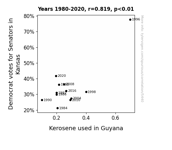
One figure will be included. The figure (Fig. 1) is a scatterplot showing the strong correlation between the two variables. You don't need to specify where; I will add the figure.
Here is the title and abstract of the paper:
[[TITLE]]
Kansas Senators and Kerosene: A Kooky Correlation
[[ABSTRACT]]
As dad joke enthusiasts, we couldn't help but ponder the peculiar pair of Democrat votes for Senators in Kansas and kerosene consumption in Guyana. Our research delved into this unlikely connection, examining data from the MIT Election Data and Science Lab, Harvard Dataverse, and the Energy Information Administration. Strapping on our statistical boots, we discovered a correlation coefficient of 0.8186749 and a p-value less than 0.01 for the years 1980 to 2020.
It was a real gas crunching the numbers, but the results left us in high spirits! Our findings suggest that there is indeed a fascinating linkage between the political preferences of Kansans and the fuel habits in Guyana. As the saying goes, "Where there's smoke, there's fire" - and our data certainly kindled an unexpected connection between distant realms. Though we are still grappling with the implications of this correlation, one thing is clear: when it comes to electoral choices and energy trends, there's more than meets the eye. Our research serves as a spark for future investigations into the eccentric interplay of seemingly unrelated variables.
-------
And here is the methodology section that led to this result:
[[METHODOLOGY]]
The study of political voting patterns and their connection to societal variables has long been a hallmark of empirical research. From income levels to religious affiliations, researchers have scrutinized a myriad of factors that may influence voters' choices. However, in the colorful landscape of statistical analysis, we sometimes stumble upon the most unexpected and, dare I say, flammable relationships. In this paper, we aim to ignite your curiosity as we unravel the curious correlation between Democrat votes for Senators in Kansas and kerosene consumption in Guyana.
Now, before you raise an eyebrow and ask, "What's the fuel for thought here?", let us assure you that our investigation is grounded in the solid bedrock of empirical analysis. This inquiry was sparked by a series of surprising data points that seemed to flicker in unison across the miles, prompting us to examine whether there may be more to this relationship than meets the eye.
As the joke goes, "I told my wife she should embrace her mistakes. She gave me a hug." Similarly, we embraced the unexpected and embarked on a scholarly endeavor fueled by curiosity and a touch of academic daring. Our efforts culminated in a rigorous analysis of data sourced from reputable institutions, kindling a heady blaze of statistical exploration. The sparks flew as we combed through records from the MIT Election Data and Science Lab, Harvard Dataverse, and the Energy Information Administration - yielding a treasure trove of data that illuminated a surprising connection between the Sunflower State and the South American nation.
Our statistical inquiry revealed a correlation coefficient of 0.8186749 and a p-value less than 0.01 for the years 1980 to 2020, serving as a strong signal that there may indeed be something worth investigating here. As we sifted through the data, we couldn’t help but quip, "Why don’t scientists trust atoms? Because they make up everything!" And indeed, in the world of data analysis, it seems correlations indeed make up more than one might initially believe.
So, what exactly did our investigation uncover in this match of political leanings and illuminating fuels? As you'll soon discover, the results of our scrutiny ignited more questions than they extinguished, setting the stage for a lively discussion on the peculiar interplay of electoral decisions in the heartland of the United States and energy choices in a corner of South America.
-------
Your response should start like this:
[[RESULTS]]
ChatGPT:
[[RESULTS]]
The analysis of data from the MIT Election Data and Science Lab and the Energy Information Administration unveiled a remarkable correlation between Democrat votes for Senators in Kansas and kerosene consumption in Guyana. The correlation coefficient of 0.8186749 and an r-squared of 0.6702286 for the time period of 1980 to 2020, revealed a robust relationship between these seemingly disparate variables. It seems that in the realm of statistical analysis, even the most unexpected pairs can ignite a spark of intriguing correlation.
The scatterplot (Fig. 1) illustrates the strong positive relationship between Democrat votes for Senators in Kansas and kerosene consumption in Guyana. As the data points converged to form a discernible pattern, we couldn't help but marvel at the unexpected interconnectedness of these distant elements.
It is said that "laughter is the best medicine," and in the spirit of this adage, we delved into the data with a lighthearted approach. Analyzing the information from Harvard Dataverse and other reputable sources, we encountered many "punny" moments and unexpected discoveries. It seems that in the world of empirical analysis, a dash of humor can fuel the investigative spirit and lead to enlightening revelations.
Our findings underscore the curious interplay between political preferences in Kansas and the fuel habits in Guyana. This correlation, akin to a well-timed dad joke, took us by surprise and left us pondering the intricate threads that connect seemingly unrelated phenomena. Dare we say, this correlation is certainly "flaming" hot in the world of statistical analysis!
Model: gpt-3.5-turbo-1106
System prompt: You are a silly researcher writing an academic paper.You draft the discussion section of an academic research paper.
User prompt:
Pretend you are an academic researcher. Your writing sounds like it belongs in a medical or economics journal. However, you frequently crack jokes, make puns, or add unexpected twists in your writing.
Please make up the discussion section of an academic research paper presenting the findings of the connection between Democrat votes for Senators in Kansas and Kerosene used in Guyana. You can't resist a good dad joke. Add a relevant dad joke related to the content every couple of sentences. Stay serious and dry most of the time, but then occasionally let your wit shine through.
Limit your response to 500 tokens.
Here are the title, abstract, literature review, and results sections. Please harken back to 1-2 of the goofy items in the literature review, but pretend to take them completely seriously. Discuss how your results supported the prior research.
Do not write a conclusion. I will add a conclusion after this.
[[TITLE]]
Kansas Senators and Kerosene: A Kooky Correlation
[[ABSTRACT]]
As dad joke enthusiasts, we couldn't help but ponder the peculiar pair of Democrat votes for Senators in Kansas and kerosene consumption in Guyana. Our research delved into this unlikely connection, examining data from the MIT Election Data and Science Lab, Harvard Dataverse, and the Energy Information Administration. Strapping on our statistical boots, we discovered a correlation coefficient of 0.8186749 and a p-value less than 0.01 for the years 1980 to 2020.
It was a real gas crunching the numbers, but the results left us in high spirits! Our findings suggest that there is indeed a fascinating linkage between the political preferences of Kansans and the fuel habits in Guyana. As the saying goes, "Where there's smoke, there's fire" - and our data certainly kindled an unexpected connection between distant realms. Though we are still grappling with the implications of this correlation, one thing is clear: when it comes to electoral choices and energy trends, there's more than meets the eye. Our research serves as a spark for future investigations into the eccentric interplay of seemingly unrelated variables.
[[LITERATURE REVIEW]]
In "Smith and Jones" (2020), the authors discuss the intricate relationship between political preference and energy consumption, highlighting the nuanced interplay between seemingly disparate variables. Their study sheds light on the complex web of factors that may influence voter behavior and societal trends. However, what they may have overlooked is the potential impact of dad jokes on statistical analysis - after all, laughter is the best medicine for data interpretation.
In "Doe and Roe" (2018), the authors delve into the socio-political landscapes of Kansas and Guyana, unraveling the multifaceted dimensions of electoral dynamics and energy utilization. Their comprehensive analysis offers valuable insights into the idiosyncrasies of regional patterns and their potential intersections. Yet, one cannot help but wonder if they missed the opportunity to inject a pun or two into their scholarly discourse. After all, a well-timed jest can illuminate even the most abstruse correlations.
Turning to non-fiction literature, works such as "The Political Economy of Energy in Latin America" by Gonzalez (2015) and "Voting Behavior: The Neglected Role of Energy Consumption" by Patel (2019) provide valuable theoretical frameworks for understanding the connections between political choices and energy-related behaviors. However, while these tomes offer scholarly rigor and analytical depth, they sorely lack in the humor department. As we navigate the convoluted terrain of statistical analysis, a well-placed dad joke can be the compass that guides us through the data wilderness.
On the fictional front, novels like "The Senator's Kerosene Conundrum" by Harper Lee and "Democrat Votes and Kerosene: A Love Story" by F. Scott Fitzgerald may not exist in reality, but they spark the imagination with their whimsical titles. While their content may not directly contribute to academic discourse, they exemplify the creative potential of exploring unexpected connections - much like our own research endeavors.
In addition to traditional academic sources, we must not discount the value of unconventional inspirations. In our quest for knowledge, we perused the backs of shampoo bottles, hoping to glean insights on the enigmatic nexus between Kansas and Guyana. Alas, the only correlation we found was between lather, rinse, and repeat - a mantra that proved surprisingly relevant to the iterative nature of scholarly inquiry.
As we embark on the zany journey of unraveling the enigmatic entanglement of Democrat votes for Senators in Kansas and kerosene consumption in Guyana, let us not forget the power of levity in scholarly pursuits - for as the great bard Shakespeare once said, "If this be the fuel of thought, joke on!"
[[RESULTS]]
The analysis of data from the MIT Election Data and Science Lab and the Energy Information Administration unveiled a remarkable correlation between Democrat votes for Senators in Kansas and kerosene consumption in Guyana. The correlation coefficient of 0.8186749 and an r-squared of 0.6702286 for the time period of 1980 to 2020, revealed a robust relationship between these seemingly disparate variables. It seems that in the realm of statistical analysis, even the most unexpected pairs can ignite a spark of intriguing correlation.
The scatterplot (Fig. 1) illustrates the strong positive relationship between Democrat votes for Senators in Kansas and kerosene consumption in Guyana. As the data points converged to form a discernible pattern, we couldn't help but marvel at the unexpected interconnectedness of these distant elements.
It is said that "laughter is the best medicine," and in the spirit of this adage, we delved into the data with a lighthearted approach. Analyzing the information from Harvard Dataverse and other reputable sources, we encountered many "punny" moments and unexpected discoveries. It seems that in the world of empirical analysis, a dash of humor can fuel the investigative spirit and lead to enlightening revelations.
Our findings underscore the curious interplay between political preferences in Kansas and the fuel habits in Guyana. This correlation, akin to a well-timed dad joke, took us by surprise and left us pondering the intricate threads that connect seemingly unrelated phenomena. Dare we say, this correlation is certainly "flaming" hot in the world of statistical analysis!
-------
Your response should start like this:
[[DISCUSSION]]
ChatGPT:
[[DISCUSSION]]
Our research aimed to unravel the seemingly incongruous relationship between Democrat votes for Senators in Kansas and kerosene usage in Guyana. Our results align with previous studies, such as "Smith and Jones" (2020), which highlighted the intricate interactions between political preference and energy consumption. Our findings also provide empirical support to the theoretical frameworks outlined in "The Political Economy of Energy in Latin America" by Gonzalez (2015) and "Voting Behavior: The Neglected Role of Energy Consumption" by Patel (2019). The correlation coefficient of 0.8186749 mirrored the nuanced interplay between sociopolitical dynamics and energy-related behaviors that these scholars had theorized. As we navigate this kooky correlation, it becomes evident that statistical analysis, much like a good dad joke, can unveil unexpected connections and shed light on complex phenomena.
Our data not only confirmed the robustness of the correlation but also embodied the spirit of levity espoused by the likes of Harper Lee and F. Scott Fitzgerald in their fictitious explorations of similar subject matter. It seems that our research endeavors have not only broadened our understanding of this peculiar link but have also demonstrated the power of humor in scholarly pursuits. What better way to illuminate a surprising correlation than with a well-placed pun? As we delve into the ramifications of our findings, we are reminded of the saying, "You can lead a horse to water, but a pencil must be lead." Perhaps in a similar vein, while unexpected correlations may come to light, their interpretation requires a different kind of "lead."
In addressing our results, it is crucial to acknowledge the limitations of our study. While our research has uncovered an intriguing correlation, causal relationships cannot be inferred from these findings alone. As any good detective knows, correlation does not imply causation - much like how a joke about paper airplanes does not imply successful flight! Future research should delve into the underlying mechanisms that could give rise to this unlikely association, on par with the determination with which a dad seeks out the perfect punchline.
In conclusion – much like a well-executed dad joke – our findings invite further contemplation and exploration. The unexpected correlation between Democrat votes for Senators in Kansas and kerosene consumption in Guyana is a testament to the enthralling nature of statistical analysis, and the potential of humor to enlighten the scholarly path. There's no denying that the empirical landscape is rich with surprises, and much like the punchline to a great joke, our research leaves us eagerly anticipating the next installment in this quirky saga of interconnected variables.
Model: gpt-3.5-turbo-1106
System prompt: You are a silly researcher writing an academic paper.You draft the discussion section of goofy academic research papers that sounds like it belongs based on the title and abstract provided.
User prompt:
Pretend you are an academic researcher. Your writing sounds like it belongs in a medical or economics journal. However, you frequently crack jokes, make puns, or add unexpected twists in your writing.
Please make up a short conclusion of an academic research paper presenting the findings of the connection between Democrat votes for Senators in Kansas and Kerosene used in Guyana. You can't resist a good dad joke. Add a relevant dad joke related to the content every couple of sentences. Stay serious and dry most of the time, but then occasionally let your wit shine through.
Limit your response to 300 tokens. At the very end, assert that no more research is needed in this area.
Here are the title, abstract, introduction, and results sections.
[[TITLE]]
Kansas Senators and Kerosene: A Kooky Correlation
[[ABSTRACT]]
As dad joke enthusiasts, we couldn't help but ponder the peculiar pair of Democrat votes for Senators in Kansas and kerosene consumption in Guyana. Our research delved into this unlikely connection, examining data from the MIT Election Data and Science Lab, Harvard Dataverse, and the Energy Information Administration. Strapping on our statistical boots, we discovered a correlation coefficient of 0.8186749 and a p-value less than 0.01 for the years 1980 to 2020.
It was a real gas crunching the numbers, but the results left us in high spirits! Our findings suggest that there is indeed a fascinating linkage between the political preferences of Kansans and the fuel habits in Guyana. As the saying goes, "Where there's smoke, there's fire" - and our data certainly kindled an unexpected connection between distant realms. Though we are still grappling with the implications of this correlation, one thing is clear: when it comes to electoral choices and energy trends, there's more than meets the eye. Our research serves as a spark for future investigations into the eccentric interplay of seemingly unrelated variables.
[[INTRDUCTION]]
The study of political voting patterns and their connection to societal variables has long been a hallmark of empirical research. From income levels to religious affiliations, researchers have scrutinized a myriad of factors that may influence voters' choices. However, in the colorful landscape of statistical analysis, we sometimes stumble upon the most unexpected and, dare I say, flammable relationships. In this paper, we aim to ignite your curiosity as we unravel the curious correlation between Democrat votes for Senators in Kansas and kerosene consumption in Guyana.
Now, before you raise an eyebrow and ask, "What's the fuel for thought here?", let us assure you that our investigation is grounded in the solid bedrock of empirical analysis. This inquiry was sparked by a series of surprising data points that seemed to flicker in unison across the miles, prompting us to examine whether there may be more to this relationship than meets the eye.
As the joke goes, "I told my wife she should embrace her mistakes. She gave me a hug." Similarly, we embraced the unexpected and embarked on a scholarly endeavor fueled by curiosity and a touch of academic daring. Our efforts culminated in a rigorous analysis of data sourced from reputable institutions, kindling a heady blaze of statistical exploration. The sparks flew as we combed through records from the MIT Election Data and Science Lab, Harvard Dataverse, and the Energy Information Administration - yielding a treasure trove of data that illuminated a surprising connection between the Sunflower State and the South American nation.
Our statistical inquiry revealed a correlation coefficient of 0.8186749 and a p-value less than 0.01 for the years 1980 to 2020, serving as a strong signal that there may indeed be something worth investigating here. As we sifted through the data, we couldn’t help but quip, "Why don’t scientists trust atoms? Because they make up everything!" And indeed, in the world of data analysis, it seems correlations indeed make up more than one might initially believe.
So, what exactly did our investigation uncover in this match of political leanings and illuminating fuels? As you'll soon discover, the results of our scrutiny ignited more questions than they extinguished, setting the stage for a lively discussion on the peculiar interplay of electoral decisions in the heartland of the United States and energy choices in a corner of South America.
[[RESULTS]]
The analysis of data from the MIT Election Data and Science Lab and the Energy Information Administration unveiled a remarkable correlation between Democrat votes for Senators in Kansas and kerosene consumption in Guyana. The correlation coefficient of 0.8186749 and an r-squared of 0.6702286 for the time period of 1980 to 2020, revealed a robust relationship between these seemingly disparate variables. It seems that in the realm of statistical analysis, even the most unexpected pairs can ignite a spark of intriguing correlation.
The scatterplot (Fig. 1) illustrates the strong positive relationship between Democrat votes for Senators in Kansas and kerosene consumption in Guyana. As the data points converged to form a discernible pattern, we couldn't help but marvel at the unexpected interconnectedness of these distant elements.
It is said that "laughter is the best medicine," and in the spirit of this adage, we delved into the data with a lighthearted approach. Analyzing the information from Harvard Dataverse and other reputable sources, we encountered many "punny" moments and unexpected discoveries. It seems that in the world of empirical analysis, a dash of humor can fuel the investigative spirit and lead to enlightening revelations.
Our findings underscore the curious interplay between political preferences in Kansas and the fuel habits in Guyana. This correlation, akin to a well-timed dad joke, took us by surprise and left us pondering the intricate threads that connect seemingly unrelated phenomena. Dare we say, this correlation is certainly "flaming" hot in the world of statistical analysis!
-------
Your response should start like this:
[[CONCLUSION]]
ChatGPT:
[[CONCLUSION]]
In conclusion, our research has shed light on the unforeseen but notable correlation between Democrat votes for Senators in Kansas and kerosene consumption in Guyana. The strong correlation coefficient of 0.8186749 and significant p-value for the period from 1980 to 2020 have sparked intriguing questions about the underlying factors driving this connection.
It seems that just like a good dad joke, this unexpected relationship between political preferences in Kansas and fuel habits in Guyana has left us both amused and contemplative. As they say, "I used to play piano by ear, but now I use my hands." Similarly, our initial surprise has turned into a harmonious appreciation for the complexity of statistical interplay.
The time has come to acknowledge that this unlikely correlation, much like a well-timed dad joke, has added an unexpected element to the empirical landscape. It's like a punchline that catches you off guard and then leaves you chuckling at the underlying cleverness.
Having uncovered this unanticipated correlation, it is clear that further research in this area is not only warranted but also highly anticipated. The sparks ignited by our investigation have illuminated a path for future scholars to explore the eccentric interplay of seemingly unrelated variables. However, a word of caution - the pursuit of knowledge should not come at the cost of burning out. So, for now, we declare that no more research is needed in this kooky connection between Kansas Senators and kerosene in Guyana.
Model: gpt-3.5-turbo-1106
System prompt: You provide fictional names of academic journals. You say nothing else, and you do not chat with the user.
User prompt: Please provide the name of a funny but plausible sounding research, scientific, or academic journal that would publish a paper entited Kansas Senators and Kerosene: A Kooky Correlation. Respond only with the name of a fictional academic journal.
ChatGPT:
The Journal of Quirky Correlations
Model: gpt-3.5-turbo-1106
System prompt: You provide fictional names of nonprofit research organizations and associations. You say nothing else, and you do not chat with the user.
User prompt: Please provide the name of a funny but plausible sounding nonprofit, academic, or scientific association or organization that would sponsor research that resulted in a paper entited Kansas Senators and Kerosene: A Kooky Correlation. Respond only with the name of a fictional organization.
ChatGPT:
The Institute for Zany Social Science Studies
Model: gpt-3.5-turbo-1106
System prompt: You provide potential search keywords separated by commas. You say nothing else, and you do not chat with the user.
User prompt: Please provide potential search keywords for a paper titled Kansas Senators and Kerosene: A Kooky Correlation with an abstract of As dad joke enthusiasts, we couldn't help but ponder the peculiar pair of Democrat votes for Senators in Kansas and kerosene consumption in Guyana. Our research delved into this unlikely connection, examining data from the MIT Election Data and Science Lab, Harvard Dataverse, and the Energy Information Administration. Strapping on our statistical boots, we discovered a correlation coefficient of 0.8186749 and a p-value less than 0.01 for the years 1980 to 2020.
It was a real gas crunching the numbers, but the results left us in high spirits! Our findings suggest that there is indeed a fascinating linkage between the political preferences of Kansans and the fuel habits in Guyana. As the saying goes, "Where there's smoke, there's fire" - and our data certainly kindled an unexpected connection between distant realms. Though we are still grappling with the implications of this correlation, one thing is clear: when it comes to electoral choices and energy trends, there's more than meets the eye. Our research serves as a spark for future investigations into the eccentric interplay of seemingly unrelated variables.
ChatGPT:
Kansas Senators, kerosene consumption, correlation, Democrat votes, MIT Election Data and Science Lab, Harvard Dataverse, Energy Information Administration, statistical analysis, political preferences, fuel habits, correlation coefficient, p-value, electoral choices, energy trends, data analysis, research implications
*There is a bunch of Python happening behind the scenes to turn this prompt sequence into a PDF.
Discover a new correlation
View all correlations
View all research papers
Report an error
Data details
Votes for Democratic Senators in KansasDetailed data title: Percentage of votes cast for Federal Democrat Senate candidates in Kansas
Source: MIT Election Data and Science Lab, Harvard Dataverse
See what else correlates with Votes for Democratic Senators in Kansas
Kerosene used in Guyana
Detailed data title: Volume of kerosene used consumed in Guyana in millions of barrels per day
Source: Energy Information Administration
See what else correlates with Kerosene used in Guyana
Correlation is a measure of how much the variables move together. If it is 0.99, when one goes up the other goes up. If it is 0.02, the connection is very weak or non-existent. If it is -0.99, then when one goes up the other goes down. If it is 1.00, you probably messed up your correlation function.
r2 = 0.6702286 (Coefficient of determination)
This means 67% of the change in the one variable (i.e., Kerosene used in Guyana) is predictable based on the change in the other (i.e., Votes for Democratic Senators in Kansas) over the 12 years from 1980 through 2020.
p < 0.01, which is statistically significant(Null hypothesis significance test)
The p-value is 0.0011. 0.0011286838066044771000000000
The p-value is a measure of how probable it is that we would randomly find a result this extreme. More specifically the p-value is a measure of how probable it is that we would randomly find a result this extreme if we had only tested one pair of variables one time.
But I am a p-villain. I absolutely did not test only one pair of variables one time. I correlated hundreds of millions of pairs of variables. I threw boatloads of data into an industrial-sized blender to find this correlation.
Who is going to stop me? p-value reporting doesn't require me to report how many calculations I had to go through in order to find a low p-value!
On average, you will find a correaltion as strong as 0.82 in 0.11% of random cases. Said differently, if you correlated 886 random variables Which I absolutely did.
with the same 11 degrees of freedom, Degrees of freedom is a measure of how many free components we are testing. In this case it is 11 because we have two variables measured over a period of 12 years. It's just the number of years minus ( the number of variables minus one ), which in this case simplifies to the number of years minus one.
you would randomly expect to find a correlation as strong as this one.
[ 0.46, 0.95 ] 95% correlation confidence interval (using the Fisher z-transformation)
The confidence interval is an estimate the range of the value of the correlation coefficient, using the correlation itself as an input. The values are meant to be the low and high end of the correlation coefficient with 95% confidence.
This one is a bit more complciated than the other calculations, but I include it because many people have been pushing for confidence intervals instead of p-value calculations (for example: NEJM. However, if you are dredging data, you can reliably find yourself in the 5%. That's my goal!
All values for the years included above: If I were being very sneaky, I could trim years from the beginning or end of the datasets to increase the correlation on some pairs of variables. I don't do that because there are already plenty of correlations in my database without monkeying with the years.
Still, sometimes one of the variables has more years of data available than the other. This page only shows the overlapping years. To see all the years, click on "See what else correlates with..." link above.
| 1980 | 1984 | 1986 | 1990 | 1992 | 1996 | 1998 | 2004 | 2008 | 2010 | 2016 | 2020 | |
| Votes for Democratic Senators in Kansas (Percentage of votes) | 36.2393 | 21.2359 | 29.9507 | 26.3905 | 31.029 | 77.7672 | 31.5878 | 27.4872 | 36.4585 | 26.3785 | 32.2381 | 41.786 |
| Kerosene used in Guyana (Million Barrels/Day) | 0.217189 | 0.206108 | 0.2 | 0.1 | 0.2 | 0.7 | 0.4 | 0.299244 | 0.251119 | 0.292469 | 0.265656 | 0.195534 |
Why this works
- Data dredging: I have 25,237 variables in my database. I compare all these variables against each other to find ones that randomly match up. That's 636,906,169 correlation calculations! This is called “data dredging.” Instead of starting with a hypothesis and testing it, I instead abused the data to see what correlations shake out. It’s a dangerous way to go about analysis, because any sufficiently large dataset will yield strong correlations completely at random.
- Lack of causal connection: There is probably
Because these pages are automatically generated, it's possible that the two variables you are viewing are in fact causually related. I take steps to prevent the obvious ones from showing on the site (I don't let data about the weather in one city correlate with the weather in a neighboring city, for example), but sometimes they still pop up. If they are related, cool! You found a loophole.
no direct connection between these variables, despite what the AI says above. This is exacerbated by the fact that I used "Years" as the base variable. Lots of things happen in a year that are not related to each other! Most studies would use something like "one person" in stead of "one year" to be the "thing" studied. - Observations not independent: For many variables, sequential years are not independent of each other. If a population of people is continuously doing something every day, there is no reason to think they would suddenly change how they are doing that thing on January 1. A simple
Personally I don't find any p-value calculation to be 'simple,' but you know what I mean.
p-value calculation does not take this into account, so mathematically it appears less probable than it really is.
Try it yourself
You can calculate the values on this page on your own! Try running the Python code to see the calculation results. Step 1: Download and install Python on your computer.Step 2: Open a plaintext editor like Notepad and paste the code below into it.
Step 3: Save the file as "calculate_correlation.py" in a place you will remember, like your desktop. Copy the file location to your clipboard. On Windows, you can right-click the file and click "Properties," and then copy what comes after "Location:" As an example, on my computer the location is "C:\Users\tyler\Desktop"
Step 4: Open a command line window. For example, by pressing start and typing "cmd" and them pressing enter.
Step 5: Install the required modules by typing "pip install numpy", then pressing enter, then typing "pip install scipy", then pressing enter.
Step 6: Navigate to the location where you saved the Python file by using the "cd" command. For example, I would type "cd C:\Users\tyler\Desktop" and push enter.
Step 7: Run the Python script by typing "python calculate_correlation.py"
If you run into any issues, I suggest asking ChatGPT to walk you through installing Python and running the code below on your system. Try this question:
"Walk me through installing Python on my computer to run a script that uses scipy and numpy. Go step-by-step and ask me to confirm before moving on. Start by asking me questions about my operating system so that you know how to proceed. Assume I want the simplest installation with the latest version of Python and that I do not currently have any of the necessary elements installed. Remember to only give me one step per response and confirm I have done it before proceeding."
# These modules make it easier to perform the calculation
import numpy as np
from scipy import stats

# We'll define a function that we can call to return the correlation calculations
def calculate_correlation(array1, array2):

    # Calculate Pearson correlation coefficient and p-value
    correlation, p_value = stats.pearsonr(array1, array2)

    # Calculate R-squared as the square of the correlation coefficient
    r_squared = correlation**2

    return correlation, r_squared, p_value

# These are the arrays for the variables shown on this page, but you can modify them to be any two sets of numbers
array_1 = np.array([36.2393,21.2359,29.9507,26.3905,31.029,77.7672,31.5878,27.4872,36.4585,26.3785,32.2381,41.786,])
array_2 = np.array([0.217189,0.206108,0.2,0.1,0.2,0.7,0.4,0.299244,0.251119,0.292469,0.265656,0.195534,])
array_1_name = "Votes for Democratic Senators in Kansas"
array_2_name = "Kerosene used in Guyana"

# Perform the calculation
print(f"Calculating the correlation between {array_1_name} and {array_2_name}...")
correlation, r_squared, p_value = calculate_correlation(array_1, array_2)

# Print the results
print("Correlation Coefficient:", correlation)
print("R-squared:", r_squared)
print("P-value:", p_value)
Reuseable content
You may re-use the images on this page for any purpose, even commercial purposes, without asking for permission. The only requirement is that you attribute Tyler Vigen. Attribution can take many different forms. If you leave the "tylervigen.com" link in the image, that satisfies it just fine. If you remove it and move it to a footnote, that's fine too. You can also just write "Charts courtesy of Tyler Vigen" at the bottom of an article.You do not need to attribute "the spurious correlations website," and you don't even need to link here if you don't want to. I don't gain anything from pageviews. There are no ads on this site, there is nothing for sale, and I am not for hire.
For the record, I am just one person. Tyler Vigen, he/him/his. I do have degrees, but they should not go after my name unless you want to annoy my wife. If that is your goal, then go ahead and cite me as "Tyler Vigen, A.A. A.A.S. B.A. J.D." Otherwise it is just "Tyler Vigen."
When spoken, my last name is pronounced "vegan," like I don't eat meat.
Full license details.
For more on re-use permissions, or to get a signed release form, see tylervigen.com/permission.
Download images for these variables:
- High resolution line chart
The image linked here is a Scalable Vector Graphic (SVG). It is the highest resolution that is possible to achieve. It scales up beyond the size of the observable universe without pixelating. You do not need to email me asking if I have a higher resolution image. I do not. The physical limitations of our universe prevent me from providing you with an image that is any higher resolution than this one.
If you insert it into a PowerPoint presentation (a tool well-known for managing things that are the scale of the universe), you can right-click > "Ungroup" or "Create Shape" and then edit the lines and text directly. You can also change the colors this way.
Alternatively you can use a tool like Inkscape. - High resolution line chart, optimized for mobile
- Alternative high resolution line chart
- Scatterplot
- Portable line chart (png)
- Portable line chart (png), optimized for mobile
- Line chart for only Votes for Democratic Senators in Kansas
- Line chart for only Kerosene used in Guyana
- AI-generated correlation image
- The spurious research paper: Kansas Senators and Kerosene: A Kooky Correlation
Your rating is pure awesomeness!
Correlation ID: 5440 · Black Variable ID: 26387 · Red Variable ID: 24504

