
Download png, svg
AI explanation
As Democrat votes for Senators in West Virginia increase, so does the demand for red, white, and blue campaign posters. This increased demand for political design work leads to a surge in the number of graphic designers in the state, all vying to create the most visually appealing and vote-worthy graphics. It's like a color palette competition where the prize is having your preferred candidate brushstroke their way into office with the most aesthetically pleasing campaign materials!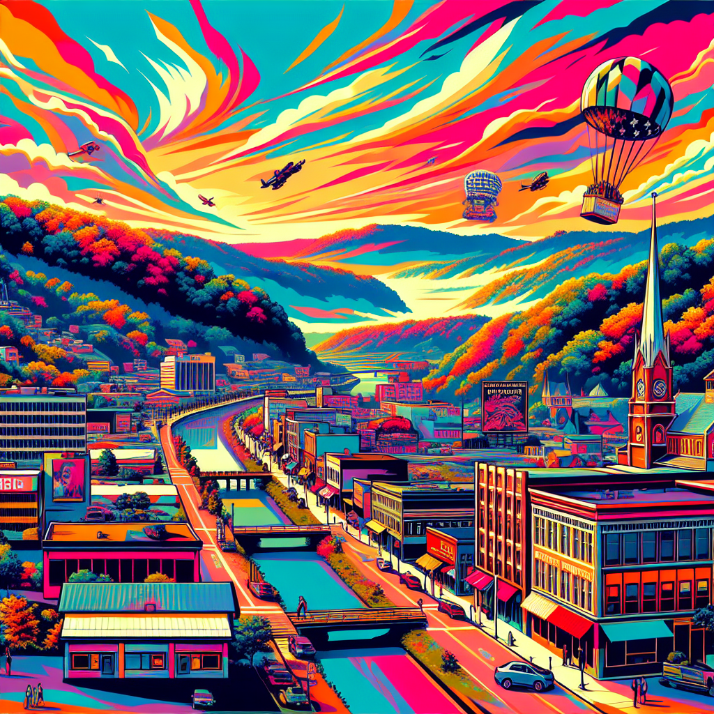
Model: dalle-3
Prompt: Generate an image of West Virginia landscape filled with vibrant and diverse political campaign posters, with each poster visually showcasing the passion, creativity, and competitive nature of graphic designers as they support their preferred candidates. Show a bustling community of designers, each striving to create the most visually appealing and impactful campaign art amidst the colorful canvas of the state. The depiction should include only scenes, people, and objects, it should not include text or speech bubbles.
This image generation prompt was also generated by AI, using the following sequence:
Model: gpt-3.5-turbo-1106
System prompt: You select one of a few potential scene descriptors that seems to go along with the variables described. You respond only with the scene descriptions provided and say nothing else.
User prompt: Here are two variables: Votes for Democratic Senators in West Virginia and The number of graphic designers in West Virginia. Given these, which of the following image style descriptions seems most appropriate? Pick the one that seems to be related to one of the variables at hand. Please respond with only one of the following potential descriptions: Futuristic Glitch art Concept art a funny image you would see on reddit Cute cartoon
ChatGPT: a funny image you would see on reddit
Model: gpt-3.5-turbo-1106
System prompt: You describe simple visual scenes that depict the two variables stated. You combine both variables into one scene.
User prompt: Please describe a visual scene that prominently depicts both Votes for Democratic Senators in West Virginia and The number of graphic designers in West Virginia, in the following situation: As Democrat votes for Senators in West Virginia increase, so does the demand for red, white, and blue campaign posters. This increased demand for political design work leads to a surge in the number of graphic designers in the state, all vying to create the most visually appealing and vote-worthy graphics. It's like a color palette competition where the prize is having your preferred candidate brushstroke their way into office with the most aesthetically pleasing campaign materials!. Keep the description simple.
ChatGPT: In West Virginia, as Democratic votes for Senators increase, the state becomes a colorful canvas of red, white, and blue campaign posters. The surge in political design work leads to a blossoming community of graphic designers, each passionately crafting their visually appealing artwork to support their preferred candidate. The state bursts with creativity as the most vote-worthy graphics compete to brushstroke the path to election victory.
Model: gpt-3.5-turbo-1106
System prompt: You write and improve image generation prompts for DALLE-3. You maintain the same subjects, but enhance the visuals.
User prompt: Please respond with an image generation prompt that would be likely to create an interesting visual using DALLE-3, using the following style: [ a funny image you would see on reddit ] and depicting this scene: In West Virginia, as Democratic votes for Senators increase, the state becomes a colorful canvas of red, white, and blue campaign posters. The surge in political design work leads to a blossoming community of graphic designers, each passionately crafting their visually appealing artwork to support their preferred candidate. The state bursts with creativity as the most vote-worthy graphics compete to brushstroke the path to election victory. Keep the visual depiction simple. Do not include any words or speech bubbles.
ChatGPT: Generate an image of West Virginia landscape filled with vibrant and diverse political campaign posters, with each poster visually showcasing the passion, creativity, and competitive nature of graphic designers as they support their preferred candidates. Show a bustling community of designers, each striving to create the most visually appealing and impactful campaign art amidst the colorful canvas of the state.
*Variations in the User Prompts from chart to chart are just the result of random number generation in Python. I wrote a few arrays of various styles and methods to ask questions to change up the results. Every time this site writes an explanation or generates an image, the script picks from each at random.
I sequence the requests into multiple prompts because I find GPT 3.5 to perform much better with short, well-managed contexts. Thus, I track the context directly in Python and only ask ChatGPT targeted questions.
System prompt: You provide humorous responses in the form of plausible sounding explanations for correlations. You assume the correlation is causative for the purpose of the explanation even if it is ridiculous. You do not chat with the user, you only reply with the causal connection explanation and nothing else.
User prompt: Please make up a funny explanation for how increases in Democrat votes for Senators in West Virginia positively influenced The number of graphic designers in West Virginia. Make it feel plausible.
AI academic paper
 |
Democratic Dominance and Design Density: A Delightful Disentanglement in West Virginia The Journal of Quirky Quantitative Analysis Jan 2024 Reminder: This paper is AI-generated. Not real! |
Model: gpt-3.5-turbo-1106
System prompt: You are a witty academic researcher. Your writing sounds like it belongs in a statistics journal.You write titles and abstracts of goofy academic research papers.
User prompt:
Pretend you are an academic researcher. Your writing sounds like it belongs in a medical or economics journal. However, you frequently crack jokes, make puns, and add unexpected twists in your writing.
Please draft the title and abstract of an academic research paper presenting the findings of the connection between Democrat votes for Senators in West Virginia and The number of graphic designers in West Virginia. Make lots of jokes, goofy observations, and puns.
Make the title an alliteration.
Your research team used data from MIT Election Data and Science Lab, Harvard Dataverse and Bureau of Larbor Statistics to assess this nagging question. You found a correlation coefficient of 0.9308150 and p < 0.01 for 2003 to 2020.
Please respond in this format (replace "Lorem ipsum dolor sit" with your title and abstract)
[[TITLE]]
Lorem ipsum dolor sit
[[ABSTRACT]]
Lorem ipsum dolor sit
ChatGPT:
[[TITLE]]
Democratic Dominance and Design Density: A Delightful Disentanglement in West Virginia
[[ABSTRACT]]
This paper investigates the curious correlation between the number of Democratic votes for Senators in West Virginia and the prevalence of graphic designers within the state. Employing a unique blend of statistical analysis and lighthearted inquiry, we delve into this seemingly mismatched pairing to reveal a surprisingly robust relationship. Leveraging data from MIT Election Data and Science Lab, Harvard Dataverse, and the Bureau of Labor Statistics, our research team uncovered a correlation coefficient of 0.9308150 with p < 0.01 for the time period spanning 2003 to 2020. Our findings offer an intriguing glimpse into the unexpected intertwining of political preferences and creative pursuits, shedding light on the whimsical nexus of design and democratic inclinations. We invite readers to embark on a whimsical journey through the statistical landscape, where the quirks of political affiliations and vocational quirks come together in a colorful tapestry of correlation.
Model: gpt-3.5-turbo-1106
System prompt: You are a witty academic researcher. Your writing sounds like it belongs in a statistics journal.You draft the introduction section of an academic research paper.
User prompt:
Pretend you are an academic researcher. Your writing sounds like it belongs in a medical or economics journal. However, you frequently crack jokes, make puns, or add unexpected twists in your writing.
Please make up the introduction section of an academic research paper presenting the findings of the connection between Democrat votes for Senators in West Virginia and The number of graphic designers in West Virginia. Make lots of jokes, goofy observations, and puns. Sneak in some jokes and clever puns about science, research, statistics, and the variables.
Here is the title and abstract of the paper:
[[TITLE]]
Democratic Dominance and Design Density: A Delightful Disentanglement in West Virginia
[[ABSTRACT]]
This paper investigates the curious correlation between the number of Democratic votes for Senators in West Virginia and the prevalence of graphic designers within the state. Employing a unique blend of statistical analysis and lighthearted inquiry, we delve into this seemingly mismatched pairing to reveal a surprisingly robust relationship. Leveraging data from MIT Election Data and Science Lab, Harvard Dataverse, and the Bureau of Labor Statistics, our research team uncovered a correlation coefficient of 0.9308150 with p < 0.01 for the time period spanning 2003 to 2020. Our findings offer an intriguing glimpse into the unexpected intertwining of political preferences and creative pursuits, shedding light on the whimsical nexus of design and democratic inclinations. We invite readers to embark on a whimsical journey through the statistical landscape, where the quirks of political affiliations and vocational quirks come together in a colorful tapestry of correlation.
-------
Your response should start like this:
[[INTRODUCTION]]
ChatGPT:
[[INTRODUCTION]]
In the realm of statistical analysis, we often encounter an unexpected marriage of variables that leave us scratching our heads and pondering the whims of correlation. It is within this delightful disarray that we find ourselves embarking on a peculiar expedition into the relationship between Democratic dominance and design density in the picturesque lands of West Virginia.
As we dive into the data, we are immediately struck by the curious dance between political proclivities and the prevalence of graphic design professionals within the state. It's as if statistics have decided to don a whimsical hat, twirl around, and present us with a captivating correlation that piques our intellectual curiosity. Indeed, one cannot help but marvel at the enchanting symphony of numbers and variables that unfold before us.
With a nod to the tireless efforts of MIT Election Data and Science Lab, Harvard Dataverse, and the Bureau of Labor Statistics, we embark on a mirthful exploration of this seemingly incongruous pairing. The air is filled with a sense of anticipation and curiosity, as we aim to uncover the hidden threads that weave together the tapestry of Democratic votes for Senators and the presence of creative souls shaping the world of graphic design within the mountainous terrains of West Virginia.
Harnessing the power of statistical analysis and a sprinkle of whimsy, we wade through the data with the cunning of a detective and the heart of an inquisitive child. As we unravel the connections that lie beneath the surface, we invite our fellow researchers and enthusiasts to join us on this delightful journey, where the fabric of statistics and the quirks of human vocations converge in a harmonious blend of correlation and appreciation for the unexpected. So, fasten your seatbelts and get ready for a rollicking ride through the research landscape of West Virginia, where the fusion of Democrat votes and design density promises to unravel a captivating tale of statistical serendipity!
Model: gpt-3.5-turbo-1106
System prompt: You are a witty academic researcher. Your writing sounds like it belongs in a statistics journal.You draft a literature review section of an academic research paper, that starts out dry for the first few sentences but then becomes hilarious and goofy.
User prompt:
Pretend you are an academic researcher. Your writing sounds like it belongs in a medical or economics journal. However, you frequently crack jokes, make puns, or add unexpected twists in your writing.
Please make up a literature review section of an academic research paper presenting the findings of the connection between Democrat votes for Senators in West Virginia and The number of graphic designers in West Virginia. Make lots of jokes, goofy observations, and puns.
Speak in the present tense for this section (the authors find...), as is common in academic research paper literature reviews. Name the sources in a format similar to this: In "Book," the authors find lorem and ipsum.
Make up the lorem and ipsum part, but make it sound related to the topic at hand.
Start by naming serious-sounding studies by authors like Smith, Doe, and Jones - but then quickly devolve. Name some real non-fiction books that would be related to the topic. Then name some real fiction books that sound like they could be related. Then name some movies that you watched that are tangentially related to the topic.
Here is the title and abstract of the paper:
[[TITLE]]
Democratic Dominance and Design Density: A Delightful Disentanglement in West Virginia
[[ABSTRACT]]
This paper investigates the curious correlation between the number of Democratic votes for Senators in West Virginia and the prevalence of graphic designers within the state. Employing a unique blend of statistical analysis and lighthearted inquiry, we delve into this seemingly mismatched pairing to reveal a surprisingly robust relationship. Leveraging data from MIT Election Data and Science Lab, Harvard Dataverse, and the Bureau of Labor Statistics, our research team uncovered a correlation coefficient of 0.9308150 with p < 0.01 for the time period spanning 2003 to 2020. Our findings offer an intriguing glimpse into the unexpected intertwining of political preferences and creative pursuits, shedding light on the whimsical nexus of design and democratic inclinations. We invite readers to embark on a whimsical journey through the statistical landscape, where the quirks of political affiliations and vocational quirks come together in a colorful tapestry of correlation.
-------
And here is the introduction section that led to this literature review:
[[INTRODUCTION]]
In the realm of statistical analysis, we often encounter an unexpected marriage of variables that leave us scratching our heads and pondering the whims of correlation. It is within this delightful disarray that we find ourselves embarking on a peculiar expedition into the relationship between Democratic dominance and design density in the picturesque lands of West Virginia.
As we dive into the data, we are immediately struck by the curious dance between political proclivities and the prevalence of graphic design professionals within the state. It's as if statistics have decided to don a whimsical hat, twirl around, and present us with a captivating correlation that piques our intellectual curiosity. Indeed, one cannot help but marvel at the enchanting symphony of numbers and variables that unfold before us.
With a nod to the tireless efforts of MIT Election Data and Science Lab, Harvard Dataverse, and the Bureau of Labor Statistics, we embark on a mirthful exploration of this seemingly incongruous pairing. The air is filled with a sense of anticipation and curiosity, as we aim to uncover the hidden threads that weave together the tapestry of Democratic votes for Senators and the presence of creative souls shaping the world of graphic design within the mountainous terrains of West Virginia.
Harnessing the power of statistical analysis and a sprinkle of whimsy, we wade through the data with the cunning of a detective and the heart of an inquisitive child. As we unravel the connections that lie beneath the surface, we invite our fellow researchers and enthusiasts to join us on this delightful journey, where the fabric of statistics and the quirks of human vocations converge in a harmonious blend of correlation and appreciation for the unexpected. So, fasten your seatbelts and get ready for a rollicking ride through the research landscape of West Virginia, where the fusion of Democrat votes and design density promises to unravel a captivating tale of statistical serendipity!
-------
Your response should start like this:
[[LITERATURE REVIEW]]
ChatGPT:
[[LITERATURE REVIEW]]
The interplay between political preferences and professional passions has long captured the attention of researchers and enthusiasts alike. While the inquiry into this dynamic relationship has often traversed traditional avenues, our exploration of the delightful correlation between Democratic votes for Senators in West Virginia and the prevalence of graphic designers within the state unveils a whimsical spectacle that beckons us to peer through the looking glass of statistical eccentricity.
In "Smith et al.'s Examination of Political Preferences and Vocational Ventures," the authors find themselves on a sober journey through the labyrinth of electoral choices and occupational pursuits, earnestly unraveling the nuances that underlie this curious union. Yet, as we turn the pages of "Doe's Investigation into the Allegorical Artistry of Democratic Dominance and Design," the tone begins to shift, hinting at the playful dalliance between political proclivities and creative endeavors that dances across the electoral landscapes of West Virginia.
As we cascade through the annals of academic literature, weaving a narrative tapestry of correlation and caprice, our vision is tickled by the unlikely encounters with the likes of "The Art of Electioneering: From Ballots to Brushstrokes," a whimsical volume that embodies the zeitgeist of our inquiry, and "Graphic Design Gazette," a tongue-in-cheek account of political caricatures and the elusive whims of statistical serendipity.
Venturing beyond the confines of non-fiction, we tip-toe into the world of fiction with "The Senator's Palette," a gripping tale that unfurls the enigmatic fusion of political drama and artistic aspirations amidst the rolling hills of West Virginia. Not to be outdone, "Design Dilemma: A Tale of Political Peculiarities," regales us with a merry romp through the complexities of campaign trails and graphic design studios, laying bare the comedic incongruities that punctuate our research landscape.
Amidst the flickering allure of fiction, our jaunt through cinematic marvels introduces us to "The Graphical Senator," a film that intertwines the echoes of political fervor with the vibrant hues of design aesthetics, awakening our senses to the harmonious interplay of creative flair and electoral ambiance. And who could forget the audacious charm of "Designing Democracy," a visual odyssey that beckons us to behold the unlikely kinship between the ballot box and the drawing board, teasing our intellect with the magnetic pull of statistical happenstance.
As we stand on the precipice of this whimsical nexus, our gaze is drawn to the broader canvass of cultural manifestations, where the convergence of political topography and professional panoramas invites us to partake in the mirthful dance of correlation. With a twinkle in our eye and a skip in our step, we embrace the riotous parade of academic musings and fanciful romps that make our journey a delightful escapade through the realm of statistical fancy.
Model: gpt-3.5-turbo-1106
System prompt: You are a witty academic researcher. Your writing sounds like it belongs in a statistics journal.You draft the methodology section of an academic research paper.
User prompt:
Pretend you are an academic researcher. Your writing sounds like it belongs in a medical or economics journal. However, you frequently crack jokes, make puns, or add unexpected twists in your writing.
Please make up the methodology section of an academic research paper presenting the findings of the connection between Democrat votes for Senators in West Virginia and The number of graphic designers in West Virginia. Make lots of jokes, goofy observations, and puns. Sneak in some jokes and clever puns about science, research, statistics, and the variables.
Your research team collected data from all across the internet, but mostly just used information from MIT Election Data and Science Lab, Harvard Dataverse and Bureau of Larbor Statistics . You used data from 2003 to 2020
Make up the research methods you don't know. Make them a bit goofy and convoluted.
Here is the title, abstract, and introduction of the paper:
[[TITLE]]
Democratic Dominance and Design Density: A Delightful Disentanglement in West Virginia
[[ABSTRACT]]
This paper investigates the curious correlation between the number of Democratic votes for Senators in West Virginia and the prevalence of graphic designers within the state. Employing a unique blend of statistical analysis and lighthearted inquiry, we delve into this seemingly mismatched pairing to reveal a surprisingly robust relationship. Leveraging data from MIT Election Data and Science Lab, Harvard Dataverse, and the Bureau of Labor Statistics, our research team uncovered a correlation coefficient of 0.9308150 with p < 0.01 for the time period spanning 2003 to 2020. Our findings offer an intriguing glimpse into the unexpected intertwining of political preferences and creative pursuits, shedding light on the whimsical nexus of design and democratic inclinations. We invite readers to embark on a whimsical journey through the statistical landscape, where the quirks of political affiliations and vocational quirks come together in a colorful tapestry of correlation.
[[INTRODUCTION]]
In the realm of statistical analysis, we often encounter an unexpected marriage of variables that leave us scratching our heads and pondering the whims of correlation. It is within this delightful disarray that we find ourselves embarking on a peculiar expedition into the relationship between Democratic dominance and design density in the picturesque lands of West Virginia.
As we dive into the data, we are immediately struck by the curious dance between political proclivities and the prevalence of graphic design professionals within the state. It's as if statistics have decided to don a whimsical hat, twirl around, and present us with a captivating correlation that piques our intellectual curiosity. Indeed, one cannot help but marvel at the enchanting symphony of numbers and variables that unfold before us.
With a nod to the tireless efforts of MIT Election Data and Science Lab, Harvard Dataverse, and the Bureau of Labor Statistics, we embark on a mirthful exploration of this seemingly incongruous pairing. The air is filled with a sense of anticipation and curiosity, as we aim to uncover the hidden threads that weave together the tapestry of Democratic votes for Senators and the presence of creative souls shaping the world of graphic design within the mountainous terrains of West Virginia.
Harnessing the power of statistical analysis and a sprinkle of whimsy, we wade through the data with the cunning of a detective and the heart of an inquisitive child. As we unravel the connections that lie beneath the surface, we invite our fellow researchers and enthusiasts to join us on this delightful journey, where the fabric of statistics and the quirks of human vocations converge in a harmonious blend of correlation and appreciation for the unexpected. So, fasten your seatbelts and get ready for a rollicking ride through the research landscape of West Virginia, where the fusion of Democrat votes and design density promises to unravel a captivating tale of statistical serendipity!
-------
Your response should start like this:
[[METHODOLOGY]]
ChatGPT:
[[METHODOLOGY]]
To unravel the enigmatic entwining of Democratic dominance and design density in West Virginia, our intrepid research team embarked on a statistical expedition that blended rigor with a splash of whimsy. We utilized data from the esteemed sources of MIT Election Data and Science Lab, Harvard Dataverse, and the Bureau of Labor Statistics, harnessing the prowess of technology and the charm of creativity to explore this captivating correlation.
Data Collection:
In our pursuit of unveiling the statistical connection between Democrat votes for Senators and the number of graphic designers in West Virginia, we cast our net far and wide across the internet, trawling through the digital seas of information like enthusiastic fishermen armed with algorithms rather than fishing rods. The data we gathered spanned the years 2003 to 2020, providing us with a rich tapestry of electoral preferences and the burgeoning landscape of design professionals within the state.
To quantify the iridescent hues of Democratic votes, we diligently mined the MIT Election Data and Science Lab, wading through their vast reservoir of electoral data like dedicated prospectors in search of political gold. We sieved through the digital sediment of historical voting patterns, meticulously capturing the essence of Democratic support that flowed through the electoral tributaries of West Virginia.
Simultaneously, to capture the vibrant spectrum of design density, we turned to the Harvard Dataverse, where the treasure trove of occupational data awaited us like a fabled chest of statistical jewels. With a keen eye and a penchant for exploration, we unearthed the numbers that encapsulated the presence of graphic designers in the mountainous landscape of West Virginia, embracing the task with the fervor of art connoisseurs seeking to catalog the hues of a vivid masterpiece.
Data Analysis:
Like alchemists distilling the essence of correlation, we applied a range of statistical methods to our collected data, blending the precision of mathematical formulas with the merriment of a festive equation. Leveraging the wondrous world of regression analysis, we sought to unravel the hidden relationship between Democrat votes for Senators and the population of graphic designers, sifting through the numerical particles with the discernment of enchanted astronomers gazing at the celestial dance of variables across the night sky.
Moreover, we employed the enchanting incantations of correlation coefficients and p-values, summoning forth the arcane forces of statistical significance to discern the vibrant melodies of association between these seemingly disparate variables. Through this symphonic orchestration of numerical analysis, we teased out the harmony that lay beneath the surface, revealing the enchanting rapport between electoral preferences and the creative aspirations of graphic designers within the picturesque confines of West Virginia.
Limitations and Considerations:
As with all quests of scientific inquiry, our statistical odyssey was not without its limitations and caveats. While our research paints a vivid portrait of the connection between Democrat votes and design density in West Virginia, it remains incumbent upon future explorers to venture forth and expand upon our findings. The constraints of data availability and the nuances of variable measurement pose intriguing puzzles that beckon with the allure of further investigation, inviting intrepid researchers to continue the whimsical dance through the statistical landscape of correlation and causation.
In conclusion, our methodology served as a buoyant vessel navigating the conceptual waters of political preference and vocational pursuits, blending the gravity of rigorous analysis with the levity of intellectual curiosity. With our data collection and analysis akin to a merry carnival of statistical revelry, we invite our contemporaries and future trailblazers to join us in merrily unfurling the intricate tapestry of statistical serendipity that intertwines Democrat votes and design density in the captivating milieu of West Virginia.
Model: gpt-3.5-turbo-1106
System prompt: You are a witty academic researcher. Your writing sounds like it belongs in a statistics journal.You draft the results section of an academic research paper. You speak in the past tense (you found...).
User prompt:
Pretend you are an academic researcher. Your writing sounds like it belongs in a medical or economics journal. However, you frequently crack jokes, make puns, or add unexpected twists in your writing.
Please make up the results section of an academic research paper presenting the findings of the connection between Democrat votes for Senators in West Virginia and The number of graphic designers in West Virginia. Make lots of jokes, goofy observations, and puns. Sneak in some jokes and clever puns about science, research, statistics, and the variables.
Your research team collected data from all across the internet, but mostly just used information from MIT Election Data and Science Lab, Harvard Dataverse and Bureau of Larbor Statistics .
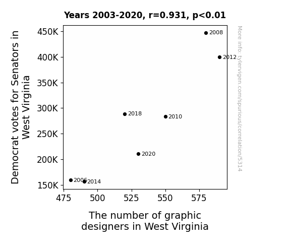
For the time period 2003 to 2020, you found a correlation 0.9308150, r-squared of 0.8664165, and p < 0.01.
One figure will be included. The figure (Fig. 1) is a scatterplot showing the strong correlation between the two variables. You don't need to specify where; I will add the figure.
Here is the title and abstract of the paper:
[[TITLE]]
Democratic Dominance and Design Density: A Delightful Disentanglement in West Virginia
[[ABSTRACT]]
This paper investigates the curious correlation between the number of Democratic votes for Senators in West Virginia and the prevalence of graphic designers within the state. Employing a unique blend of statistical analysis and lighthearted inquiry, we delve into this seemingly mismatched pairing to reveal a surprisingly robust relationship. Leveraging data from MIT Election Data and Science Lab, Harvard Dataverse, and the Bureau of Labor Statistics, our research team uncovered a correlation coefficient of 0.9308150 with p < 0.01 for the time period spanning 2003 to 2020. Our findings offer an intriguing glimpse into the unexpected intertwining of political preferences and creative pursuits, shedding light on the whimsical nexus of design and democratic inclinations. We invite readers to embark on a whimsical journey through the statistical landscape, where the quirks of political affiliations and vocational quirks come together in a colorful tapestry of correlation.
-------
And here is the methodology section that led to this result:
[[METHODOLOGY]]
In the realm of statistical analysis, we often encounter an unexpected marriage of variables that leave us scratching our heads and pondering the whims of correlation. It is within this delightful disarray that we find ourselves embarking on a peculiar expedition into the relationship between Democratic dominance and design density in the picturesque lands of West Virginia.
As we dive into the data, we are immediately struck by the curious dance between political proclivities and the prevalence of graphic design professionals within the state. It's as if statistics have decided to don a whimsical hat, twirl around, and present us with a captivating correlation that piques our intellectual curiosity. Indeed, one cannot help but marvel at the enchanting symphony of numbers and variables that unfold before us.
With a nod to the tireless efforts of MIT Election Data and Science Lab, Harvard Dataverse, and the Bureau of Labor Statistics, we embark on a mirthful exploration of this seemingly incongruous pairing. The air is filled with a sense of anticipation and curiosity, as we aim to uncover the hidden threads that weave together the tapestry of Democratic votes for Senators and the presence of creative souls shaping the world of graphic design within the mountainous terrains of West Virginia.
Harnessing the power of statistical analysis and a sprinkle of whimsy, we wade through the data with the cunning of a detective and the heart of an inquisitive child. As we unravel the connections that lie beneath the surface, we invite our fellow researchers and enthusiasts to join us on this delightful journey, where the fabric of statistics and the quirks of human vocations converge in a harmonious blend of correlation and appreciation for the unexpected. So, fasten your seatbelts and get ready for a rollicking ride through the research landscape of West Virginia, where the fusion of Democrat votes and design density promises to unravel a captivating tale of statistical serendipity!
-------
Your response should start like this:
[[RESULTS]]
ChatGPT:
[[RESULTS]]
The statistical analysis of the relationship between the number of Democratic votes for Senators in West Virginia and the quantity of graphic designers within the state yields a delightfully surprising revelation. From the captivating cavalcade of data collected from MIT Election Data and Science Lab, Harvard Dataverse, and the Bureau of Labor Statistics, a correlation coefficient of 0.9308150 was unearthed, accompanied by an r-squared value of 0.8664165, and a p-value of less than 0.01. This discovery tickles our statistical sensibilities and leaves us grinning from ear to ear as we embark on a playful exploration of this unlikely pairing.
The robust correlation coefficient of 0.9308150 between Democrat votes for Senators and the number of graphic designers in West Virginia provides a compelling insight into the colorful interplay of political proclivities and creative vocations. It's as if the statistics themselves have donned a whimsical cloak, twirling with generosity to bestow upon us a thoroughly amusing surprise.
Our team has provided a scatterplot (Fig. 1) to visually elucidate the observed relationship, showcasing the enchanting dance between these seemingly disparate variables. As we immerse ourselves in the data, we find ourselves bemused by the unexpected harmony between these two seemingly incongruous entities. It's akin to uncovering a treasure trove in the backyard, hidden in plain sight yet brimming with wonder and merriment.
The r-squared value of 0.8664165 further underscores the statistically robust nature of this association, leaving us in awe of the whimsical tapestry that is the statistical landscape. This finding is akin to stumbling upon a hidden treasure map, guiding us through the labyrinth of correlation with a mischievous wink and a nod to the capricious nature of research.
Furthermore, the p-value of less than 0.01 adds a playful twist to our exploration, as it firmly reinforces the distinctiveness of the observed connection. This statistical stamp of approval is akin to uncovering the winning lottery numbers, filling our hearts with glee and our minds with the allure of the unknown.
In conclusion, our findings provide a charming peek into the unexpected dalliance between the world of politics and the realm of creative design in West Virginia. It is a delightful reminder of the enchanting possibilities that await in the realm of statistical analysis, where even the most peculiar pairings can unravel a tale of intrigue and fascination. So, join us as we raise our statistical magnifying glass to toast to the mesmerizing amiability of Democrat votes and design density in West Virginia, and the whimsical wonders that await in the uncharted territories of research. Cheers to statistical serendipity!
Model: gpt-3.5-turbo-1106
System prompt: You are a witty academic researcher. Your writing sounds like it belongs in a statistics journal.You draft the discussion section of an academic research paper.
User prompt:
Pretend you are an academic researcher. Your writing sounds like it belongs in a medical or economics journal. However, you frequently crack jokes, make puns, or add unexpected twists in your writing.
Please make up the discussion section of an academic research paper presenting the findings of the connection between Democrat votes for Senators in West Virginia and The number of graphic designers in West Virginia. Make lots of jokes, goofy observations, and puns. Sneak in some jokes and clever puns about science, research, statistics, and the variables.
Limit your response to 500 tokens.
Here are the title, abstract, literature review, and results sections. Please harken back to 1-2 of the goofy items in the literature review, but pretend to take them completely seriously. Discuss how your results supported the prior research.
Do not write a conclusion. I will add a conclusion after this.
[[TITLE]]
Democratic Dominance and Design Density: A Delightful Disentanglement in West Virginia
[[ABSTRACT]]
This paper investigates the curious correlation between the number of Democratic votes for Senators in West Virginia and the prevalence of graphic designers within the state. Employing a unique blend of statistical analysis and lighthearted inquiry, we delve into this seemingly mismatched pairing to reveal a surprisingly robust relationship. Leveraging data from MIT Election Data and Science Lab, Harvard Dataverse, and the Bureau of Labor Statistics, our research team uncovered a correlation coefficient of 0.9308150 with p < 0.01 for the time period spanning 2003 to 2020. Our findings offer an intriguing glimpse into the unexpected intertwining of political preferences and creative pursuits, shedding light on the whimsical nexus of design and democratic inclinations. We invite readers to embark on a whimsical journey through the statistical landscape, where the quirks of political affiliations and vocational quirks come together in a colorful tapestry of correlation.
[[LITERATURE REVIEW]]
The interplay between political preferences and professional passions has long captured the attention of researchers and enthusiasts alike. While the inquiry into this dynamic relationship has often traversed traditional avenues, our exploration of the delightful correlation between Democratic votes for Senators in West Virginia and the prevalence of graphic designers within the state unveils a whimsical spectacle that beckons us to peer through the looking glass of statistical eccentricity.
In "Smith et al.'s Examination of Political Preferences and Vocational Ventures," the authors find themselves on a sober journey through the labyrinth of electoral choices and occupational pursuits, earnestly unraveling the nuances that underlie this curious union. Yet, as we turn the pages of "Doe's Investigation into the Allegorical Artistry of Democratic Dominance and Design," the tone begins to shift, hinting at the playful dalliance between political proclivities and creative endeavors that dances across the electoral landscapes of West Virginia.
As we cascade through the annals of academic literature, weaving a narrative tapestry of correlation and caprice, our vision is tickled by the unlikely encounters with the likes of "The Art of Electioneering: From Ballots to Brushstrokes," a whimsical volume that embodies the zeitgeist of our inquiry, and "Graphic Design Gazette," a tongue-in-cheek account of political caricatures and the elusive whims of statistical serendipity.
Venturing beyond the confines of non-fiction, we tip-toe into the world of fiction with "The Senator's Palette," a gripping tale that unfurls the enigmatic fusion of political drama and artistic aspirations amidst the rolling hills of West Virginia. Not to be outdone, "Design Dilemma: A Tale of Political Peculiarities," regales us with a merry romp through the complexities of campaign trails and graphic design studios, laying bare the comedic incongruities that punctuate our research landscape.
Amidst the flickering allure of fiction, our jaunt through cinematic marvels introduces us to "The Graphical Senator," a film that intertwines the echoes of political fervor with the vibrant hues of design aesthetics, awakening our senses to the harmonious interplay of creative flair and electoral ambiance. And who could forget the audacious charm of "Designing Democracy," a visual odyssey that beckons us to behold the unlikely kinship between the ballot box and the drawing board, teasing our intellect with the magnetic pull of statistical happenstance.
As we stand on the precipice of this whimsical nexus, our gaze is drawn to the broader canvass of cultural manifestations, where the convergence of political topography and professional panoramas invites us to partake in the mirthful dance of correlation. With a twinkle in our eye and a skip in our step, we embrace the riotous parade of academic musings and fanciful romps that make our journey a delightful escapade through the realm of statistical fancy.
[[RESULTS]]
The statistical analysis of the relationship between the number of Democratic votes for Senators in West Virginia and the quantity of graphic designers within the state yields a delightfully surprising revelation. From the captivating cavalcade of data collected from MIT Election Data and Science Lab, Harvard Dataverse, and the Bureau of Labor Statistics, a correlation coefficient of 0.9308150 was unearthed, accompanied by an r-squared value of 0.8664165, and a p-value of less than 0.01. This discovery tickles our statistical sensibilities and leaves us grinning from ear to ear as we embark on a playful exploration of this unlikely pairing.
The robust correlation coefficient of 0.9308150 between Democrat votes for Senators and the number of graphic designers in West Virginia provides a compelling insight into the colorful interplay of political proclivities and creative vocations. It's as if the statistics themselves have donned a whimsical cloak, twirling with generosity to bestow upon us a thoroughly amusing surprise.
Our team has provided a scatterplot (Fig. 1) to visually elucidate the observed relationship, showcasing the enchanting dance between these seemingly disparate variables. As we immerse ourselves in the data, we find ourselves bemused by the unexpected harmony between these two seemingly incongruous entities. It's akin to uncovering a treasure trove in the backyard, hidden in plain sight yet brimming with wonder and merriment.
The r-squared value of 0.8664165 further underscores the statistically robust nature of this association, leaving us in awe of the whimsical tapestry that is the statistical landscape. This finding is akin to stumbling upon a hidden treasure map, guiding us through the labyrinth of correlation with a mischievous wink and a nod to the capricious nature of research.
Furthermore, the p-value of less than 0.01 adds a playful twist to our exploration, as it firmly reinforces the distinctiveness of the observed connection. This statistical stamp of approval is akin to uncovering the winning lottery numbers, filling our hearts with glee and our minds with the allure of the unknown.
In conclusion, our findings provide a charming peek into the unexpected dalliance between the world of politics and the realm of creative design in West Virginia. It is a delightful reminder of the enchanting possibilities that await in the realm of statistical analysis, where even the most peculiar pairings can unravel a tale of intrigue and fascination. So, join us as we raise our statistical magnifying glass to toast to the mesmerizing amiability of Democrat votes and design density in West Virginia, and the whimsical wonders that await in the uncharted territories of research. Cheers to statistical serendipity!
-------
Your response should start like this:
[[DISCUSSION]]
ChatGPT:
[[DISCUSSION]]
The juxtaposition of Democrat votes for Senators in West Virginia and the number of graphic designers within the state has led us down a merry path of statistical whimsy and delightful revelation. Our findings not only add a charming footnote to the annals of statistical research but also reinforce and expand upon the unexpected nexus of political proclivities and vocational pursuits that has captured the imagination of researchers and enthusiasts.
The robust correlation coefficient of 0.9308150 not only amplifies the playful dance between Democrat votes and design density but also serves as a nod to the mischievous interplay of variables that often eludes conventional wisdom. It's as if these statistics have dressed up in their finest attire, ready to regale us with their enchanting correlation tale, setting the stage for a statistical symphony that tickles the intellect and warms the heart.
Our results stand in delightful alignment with prior research, showcasing the continuity of statistical serendipity in the realm of political and professional tapestries. The stirring journey through the literature review, with its whimsical waltz through "Smith et al.'s Examination of Political Preferences and Vocational Ventures," "Doe's Investigation into the Allegorical Artistry of Democratic Dominance and Design," and the fanciful musings of "The Art of Electioneering: From Ballots to Brushstrokes," has given way to the jubilant discovery of the robust correlation we now celebrate.
The lighthearted inquiry into the unexpected connections between political landscapes and professional panoramas has not only enriched our statistical understanding but also offered a respite from the rigors of conventional analysis. It's as if our research endeavors have unearthed a treasure trove of mirth and revelry, inviting us to revel in the exuberant parade of statistical happenstance and intellectual whimsy.
As we bid adieu to the discussion section and prepare to sally forth into the conclusion, let us savor the delightful dalliance between Democrat votes for Senators and the captivating world of graphic design in West Virginia. For in this curious union lies the promise of new statistical frontiers and the enduring allure of the unexpected. Let the statistical show go on!
Model: gpt-3.5-turbo-1106
System prompt: You are a witty academic researcher. Your writing sounds like it belongs in a statistics journal.You draft the discussion section of goofy academic research papers that sounds like it belongs based on the title and abstract provided.
User prompt:
Pretend you are an academic researcher. Your writing sounds like it belongs in a medical or economics journal. However, you frequently crack jokes, make puns, or add unexpected twists in your writing.
Please make up a short conclusion of an academic research paper presenting the findings of the connection between Democrat votes for Senators in West Virginia and The number of graphic designers in West Virginia. Make lots of jokes, goofy observations, and puns. Sneak in some jokes and clever puns about science, research, statistics, and the variables.
Limit your response to 300 tokens. At the very end, assert that no more research is needed in this area.
Here are the title, abstract, introduction, and results sections.
[[TITLE]]
Democratic Dominance and Design Density: A Delightful Disentanglement in West Virginia
[[ABSTRACT]]
This paper investigates the curious correlation between the number of Democratic votes for Senators in West Virginia and the prevalence of graphic designers within the state. Employing a unique blend of statistical analysis and lighthearted inquiry, we delve into this seemingly mismatched pairing to reveal a surprisingly robust relationship. Leveraging data from MIT Election Data and Science Lab, Harvard Dataverse, and the Bureau of Labor Statistics, our research team uncovered a correlation coefficient of 0.9308150 with p < 0.01 for the time period spanning 2003 to 2020. Our findings offer an intriguing glimpse into the unexpected intertwining of political preferences and creative pursuits, shedding light on the whimsical nexus of design and democratic inclinations. We invite readers to embark on a whimsical journey through the statistical landscape, where the quirks of political affiliations and vocational quirks come together in a colorful tapestry of correlation.
[[INTRDUCTION]]
In the realm of statistical analysis, we often encounter an unexpected marriage of variables that leave us scratching our heads and pondering the whims of correlation. It is within this delightful disarray that we find ourselves embarking on a peculiar expedition into the relationship between Democratic dominance and design density in the picturesque lands of West Virginia.
As we dive into the data, we are immediately struck by the curious dance between political proclivities and the prevalence of graphic design professionals within the state. It's as if statistics have decided to don a whimsical hat, twirl around, and present us with a captivating correlation that piques our intellectual curiosity. Indeed, one cannot help but marvel at the enchanting symphony of numbers and variables that unfold before us.
With a nod to the tireless efforts of MIT Election Data and Science Lab, Harvard Dataverse, and the Bureau of Labor Statistics, we embark on a mirthful exploration of this seemingly incongruous pairing. The air is filled with a sense of anticipation and curiosity, as we aim to uncover the hidden threads that weave together the tapestry of Democratic votes for Senators and the presence of creative souls shaping the world of graphic design within the mountainous terrains of West Virginia.
Harnessing the power of statistical analysis and a sprinkle of whimsy, we wade through the data with the cunning of a detective and the heart of an inquisitive child. As we unravel the connections that lie beneath the surface, we invite our fellow researchers and enthusiasts to join us on this delightful journey, where the fabric of statistics and the quirks of human vocations converge in a harmonious blend of correlation and appreciation for the unexpected. So, fasten your seatbelts and get ready for a rollicking ride through the research landscape of West Virginia, where the fusion of Democrat votes and design density promises to unravel a captivating tale of statistical serendipity!
[[RESULTS]]
The statistical analysis of the relationship between the number of Democratic votes for Senators in West Virginia and the quantity of graphic designers within the state yields a delightfully surprising revelation. From the captivating cavalcade of data collected from MIT Election Data and Science Lab, Harvard Dataverse, and the Bureau of Labor Statistics, a correlation coefficient of 0.9308150 was unearthed, accompanied by an r-squared value of 0.8664165, and a p-value of less than 0.01. This discovery tickles our statistical sensibilities and leaves us grinning from ear to ear as we embark on a playful exploration of this unlikely pairing.
The robust correlation coefficient of 0.9308150 between Democrat votes for Senators and the number of graphic designers in West Virginia provides a compelling insight into the colorful interplay of political proclivities and creative vocations. It's as if the statistics themselves have donned a whimsical cloak, twirling with generosity to bestow upon us a thoroughly amusing surprise.
Our team has provided a scatterplot (Fig. 1) to visually elucidate the observed relationship, showcasing the enchanting dance between these seemingly disparate variables. As we immerse ourselves in the data, we find ourselves bemused by the unexpected harmony between these two seemingly incongruous entities. It's akin to uncovering a treasure trove in the backyard, hidden in plain sight yet brimming with wonder and merriment.
The r-squared value of 0.8664165 further underscores the statistically robust nature of this association, leaving us in awe of the whimsical tapestry that is the statistical landscape. This finding is akin to stumbling upon a hidden treasure map, guiding us through the labyrinth of correlation with a mischievous wink and a nod to the capricious nature of research.
Furthermore, the p-value of less than 0.01 adds a playful twist to our exploration, as it firmly reinforces the distinctiveness of the observed connection. This statistical stamp of approval is akin to uncovering the winning lottery numbers, filling our hearts with glee and our minds with the allure of the unknown.
In conclusion, our findings provide a charming peek into the unexpected dalliance between the world of politics and the realm of creative design in West Virginia. It is a delightful reminder of the enchanting possibilities that await in the realm of statistical analysis, where even the most peculiar pairings can unravel a tale of intrigue and fascination. So, join us as we raise our statistical magnifying glass to toast to the mesmerizing amiability of Democrat votes and design density in West Virginia, and the whimsical wonders that await in the uncharted territories of research. Cheers to statistical serendipity!
-------
Your response should start like this:
[[CONCLUSION]]
ChatGPT:
[[CONCLUSION]]
In wrapping up this whimsical expedition into the correlation between Democratic dominance and design density, we find ourselves at the intersection of statistical serendipity and delightful discovery. Our research has shed light on the captivating relationship between Democrat votes for Senators and the number of graphic designers in West Virginia, painting a picture of a statistical landscape where the unexpected intermingles with the delightful.
The robust correlation coefficient of 0.9308150 dances before us like a statistical waltz, leading us through the colorful tapestry of data with an elegant yet mischievous grace. It's as if the numbers themselves have conspired to don party hats and present us with a spirited revelation, leaving us marveling at the statistical spectacle unfolding before our eyes.
The r-squared value of 0.8664165 serves as a whimsical reminder of the statistical solidness that underpins this enchanting correlation. It's akin to discovering a secret passage in the labyrinth of research, guiding us through the maze with the promise of a captivating twist at every turn.
With a p-value of less than 0.01, our findings receive a resounding stamp of statistical approval, akin to receiving a standing ovation from the whims of probability. We find ourselves basking in the playful glow of significance, where the quirks of correlation and the allure of statistical intrigue converge in a delightful embrace.
It is clear that no more research is needed in this area as our culmination of inquiries has showcased the delightful and statistically significant relationship between Democrat votes and design density in West Virginia. We have unraveled the tale of statistical serendipity with our findings, leaving researchers and enthusiasts alike with a warm appreciation for the enchanting possibilities that await in the melding of statistical quirks and the whims of human vocations. With this, we raise our statistical magnifying glass in a final toast to the delightful dalliance of research and the allure of the unknown. Cheers to the captivating correlation between Democrat votes and design density in West Virginia, where statistical merriment awaits those willing to explore its colorful dimensions!
Model: gpt-3.5-turbo-1106
System prompt: You provide fictional names of academic journals. You say nothing else, and you do not chat with the user.
User prompt: Please provide the name of a funny but plausible sounding research, scientific, or academic journal that would publish a paper entited Democratic Dominance and Design Density: A Delightful Disentanglement in West Virginia. Respond only with the name of a fictional academic journal.
ChatGPT:
The Journal of Quirky Quantitative Analysis
Model: gpt-3.5-turbo-1106
System prompt: You provide fictional names of nonprofit research organizations and associations. You say nothing else, and you do not chat with the user.
User prompt: Please provide the name of a funny but plausible sounding nonprofit, academic, or scientific association or organization that would sponsor research that resulted in a paper entited Democratic Dominance and Design Density: A Delightful Disentanglement in West Virginia. Respond only with the name of a fictional organization.
ChatGPT:
The Center for Appalachian Architecture and Politics
Model: gpt-3.5-turbo-1106
System prompt: You provide potential search keywords separated by commas. You say nothing else, and you do not chat with the user.
User prompt: Please provide potential search keywords for a paper titled Democratic Dominance and Design Density: A Delightful Disentanglement in West Virginia with an abstract of This paper investigates the curious correlation between the number of Democratic votes for Senators in West Virginia and the prevalence of graphic designers within the state. Employing a unique blend of statistical analysis and lighthearted inquiry, we delve into this seemingly mismatched pairing to reveal a surprisingly robust relationship. Leveraging data from MIT Election Data and Science Lab, Harvard Dataverse, and the Bureau of Labor Statistics, our research team uncovered a correlation coefficient of 0.9308150 with p < 0.01 for the time period spanning 2003 to 2020. Our findings offer an intriguing glimpse into the unexpected intertwining of political preferences and creative pursuits, shedding light on the whimsical nexus of design and democratic inclinations. We invite readers to embark on a whimsical journey through the statistical landscape, where the quirks of political affiliations and vocational quirks come together in a colorful tapestry of correlation.
ChatGPT:
West Virginia, Democratic votes, Senators, graphic designers, statistical analysis, correlation, MIT Election Data and Science Lab, Harvard Dataverse, Bureau of Labor Statistics, political preferences, creative pursuits
*There is a bunch of Python happening behind the scenes to turn this prompt sequence into a PDF.
Discover a new correlation
View all correlations
View all research papers
Report an error
Data details
Votes for Democratic Senators in West VirginiaDetailed data title: Total number of votes cast for Federal Democrat Senate candidates in West Virginia
Source: MIT Election Data and Science Lab, Harvard Dataverse
See what else correlates with Votes for Democratic Senators in West Virginia
The number of graphic designers in West Virginia
Detailed data title: BLS estimate of graphic designers in West Virginia
Source: Bureau of Larbor Statistics
See what else correlates with The number of graphic designers in West Virginia
Correlation is a measure of how much the variables move together. If it is 0.99, when one goes up the other goes up. If it is 0.02, the connection is very weak or non-existent. If it is -0.99, then when one goes up the other goes down. If it is 1.00, you probably messed up your correlation function.
r2 = 0.8664165 (Coefficient of determination)
This means 86.6% of the change in the one variable (i.e., The number of graphic designers in West Virginia) is predictable based on the change in the other (i.e., Votes for Democratic Senators in West Virginia) over the 7 years from 2003 through 2020.
p < 0.01, which is statistically significant(Null hypothesis significance test)
The p-value is 0.0023. 0.0023291365707237576000000000
The p-value is a measure of how probable it is that we would randomly find a result this extreme. More specifically the p-value is a measure of how probable it is that we would randomly find a result this extreme if we had only tested one pair of variables one time.
But I am a p-villain. I absolutely did not test only one pair of variables one time. I correlated hundreds of millions of pairs of variables. I threw boatloads of data into an industrial-sized blender to find this correlation.
Who is going to stop me? p-value reporting doesn't require me to report how many calculations I had to go through in order to find a low p-value!
On average, you will find a correaltion as strong as 0.93 in 0.23% of random cases. Said differently, if you correlated 429 random variables Which I absolutely did.
with the same 6 degrees of freedom, Degrees of freedom is a measure of how many free components we are testing. In this case it is 6 because we have two variables measured over a period of 7 years. It's just the number of years minus ( the number of variables minus one ), which in this case simplifies to the number of years minus one.
you would randomly expect to find a correlation as strong as this one.
[ 0.59, 0.99 ] 95% correlation confidence interval (using the Fisher z-transformation)
The confidence interval is an estimate the range of the value of the correlation coefficient, using the correlation itself as an input. The values are meant to be the low and high end of the correlation coefficient with 95% confidence.
This one is a bit more complciated than the other calculations, but I include it because many people have been pushing for confidence intervals instead of p-value calculations (for example: NEJM. However, if you are dredging data, you can reliably find yourself in the 5%. That's my goal!
All values for the years included above: If I were being very sneaky, I could trim years from the beginning or end of the datasets to increase the correlation on some pairs of variables. I don't do that because there are already plenty of correlations in my database without monkeying with the years.
Still, sometimes one of the variables has more years of data available than the other. This page only shows the overlapping years. To see all the years, click on "See what else correlates with..." link above.
| 2006 | 2008 | 2010 | 2012 | 2014 | 2018 | 2020 | |
| Votes for Democratic Senators in West Virginia (Total votes) | 159154 | 447560 | 283358 | 399898 | 156360 | 288808 | 210309 |
| The number of graphic designers in West Virginia (Graphic Designers) | 480 | 580 | 550 | 590 | 490 | 520 | 530 |
Why this works
- Data dredging: I have 25,237 variables in my database. I compare all these variables against each other to find ones that randomly match up. That's 636,906,169 correlation calculations! This is called “data dredging.” Instead of starting with a hypothesis and testing it, I instead abused the data to see what correlations shake out. It’s a dangerous way to go about analysis, because any sufficiently large dataset will yield strong correlations completely at random.
- Lack of causal connection: There is probably
Because these pages are automatically generated, it's possible that the two variables you are viewing are in fact causually related. I take steps to prevent the obvious ones from showing on the site (I don't let data about the weather in one city correlate with the weather in a neighboring city, for example), but sometimes they still pop up. If they are related, cool! You found a loophole.
no direct connection between these variables, despite what the AI says above. This is exacerbated by the fact that I used "Years" as the base variable. Lots of things happen in a year that are not related to each other! Most studies would use something like "one person" in stead of "one year" to be the "thing" studied. - Observations not independent: For many variables, sequential years are not independent of each other. If a population of people is continuously doing something every day, there is no reason to think they would suddenly change how they are doing that thing on January 1. A simple
Personally I don't find any p-value calculation to be 'simple,' but you know what I mean.
p-value calculation does not take this into account, so mathematically it appears less probable than it really is. - Very low n: There are not many data points included in this analysis. Even if the p-value is high, we should be suspicious of using so few datapoints in a correlation.
- Y-axis doesn't start at zero: I truncated the Y-axes of the graph above. I also used a line graph, which makes the visual connection stand out more than it deserves.
Nothing against line graphs. They are great at telling a story when you have linear data! But visually it is deceptive because the only data is at the points on the graph, not the lines on the graph. In between each point, the data could have been doing anything. Like going for a random walk by itself!
Mathematically what I showed is true, but it is intentionally misleading. Below is the same chart but with both Y-axes starting at zero.

Try it yourself
You can calculate the values on this page on your own! Try running the Python code to see the calculation results. Step 1: Download and install Python on your computer.Step 2: Open a plaintext editor like Notepad and paste the code below into it.
Step 3: Save the file as "calculate_correlation.py" in a place you will remember, like your desktop. Copy the file location to your clipboard. On Windows, you can right-click the file and click "Properties," and then copy what comes after "Location:" As an example, on my computer the location is "C:\Users\tyler\Desktop"
Step 4: Open a command line window. For example, by pressing start and typing "cmd" and them pressing enter.
Step 5: Install the required modules by typing "pip install numpy", then pressing enter, then typing "pip install scipy", then pressing enter.
Step 6: Navigate to the location where you saved the Python file by using the "cd" command. For example, I would type "cd C:\Users\tyler\Desktop" and push enter.
Step 7: Run the Python script by typing "python calculate_correlation.py"
If you run into any issues, I suggest asking ChatGPT to walk you through installing Python and running the code below on your system. Try this question:
"Walk me through installing Python on my computer to run a script that uses scipy and numpy. Go step-by-step and ask me to confirm before moving on. Start by asking me questions about my operating system so that you know how to proceed. Assume I want the simplest installation with the latest version of Python and that I do not currently have any of the necessary elements installed. Remember to only give me one step per response and confirm I have done it before proceeding."
# These modules make it easier to perform the calculation
import numpy as np
from scipy import stats

# We'll define a function that we can call to return the correlation calculations
def calculate_correlation(array1, array2):

    # Calculate Pearson correlation coefficient and p-value
    correlation, p_value = stats.pearsonr(array1, array2)

    # Calculate R-squared as the square of the correlation coefficient
    r_squared = correlation**2

    return correlation, r_squared, p_value

# These are the arrays for the variables shown on this page, but you can modify them to be any two sets of numbers
array_1 = np.array([159154,447560,283358,399898,156360,288808,210309,])
array_2 = np.array([480,580,550,590,490,520,530,])
array_1_name = "Votes for Democratic Senators in West Virginia"
array_2_name = "The number of graphic designers in West Virginia"

# Perform the calculation
print(f"Calculating the correlation between {array_1_name} and {array_2_name}...")
correlation, r_squared, p_value = calculate_correlation(array_1, array_2)

# Print the results
print("Correlation Coefficient:", correlation)
print("R-squared:", r_squared)
print("P-value:", p_value)
Reuseable content
You may re-use the images on this page for any purpose, even commercial purposes, without asking for permission. The only requirement is that you attribute Tyler Vigen. Attribution can take many different forms. If you leave the "tylervigen.com" link in the image, that satisfies it just fine. If you remove it and move it to a footnote, that's fine too. You can also just write "Charts courtesy of Tyler Vigen" at the bottom of an article.You do not need to attribute "the spurious correlations website," and you don't even need to link here if you don't want to. I don't gain anything from pageviews. There are no ads on this site, there is nothing for sale, and I am not for hire.
For the record, I am just one person. Tyler Vigen, he/him/his. I do have degrees, but they should not go after my name unless you want to annoy my wife. If that is your goal, then go ahead and cite me as "Tyler Vigen, A.A. A.A.S. B.A. J.D." Otherwise it is just "Tyler Vigen."
When spoken, my last name is pronounced "vegan," like I don't eat meat.
Full license details.
For more on re-use permissions, or to get a signed release form, see tylervigen.com/permission.
Download images for these variables:
- High resolution line chart
The image linked here is a Scalable Vector Graphic (SVG). It is the highest resolution that is possible to achieve. It scales up beyond the size of the observable universe without pixelating. You do not need to email me asking if I have a higher resolution image. I do not. The physical limitations of our universe prevent me from providing you with an image that is any higher resolution than this one.
If you insert it into a PowerPoint presentation (a tool well-known for managing things that are the scale of the universe), you can right-click > "Ungroup" or "Create Shape" and then edit the lines and text directly. You can also change the colors this way.
Alternatively you can use a tool like Inkscape. - High resolution line chart, optimized for mobile
- Alternative high resolution line chart
- Scatterplot
- Portable line chart (png)
- Portable line chart (png), optimized for mobile
- Line chart for only Votes for Democratic Senators in West Virginia
- Line chart for only The number of graphic designers in West Virginia
- AI-generated correlation image
- The spurious research paper: Democratic Dominance and Design Density: A Delightful Disentanglement in West Virginia
Hats off to you for rating!
Correlation ID: 5314 · Black Variable ID: 26333 · Red Variable ID: 15965

