
Download png, svg
AI explanation
As the number of Republican votes for Senators in New York increased, so did the demand for tennis matches featuring Rafael Nadal, creating a surge in ticket sales and sponsorships. This led to a boost in the overall revenue of the ATP Tour, ultimately increasing Nadal's annual earnings. It's as if his backhand became the secret weapon for economic growth in the state!
Model: dalle-3
Prompt: Generate an image of a futuristic, sleek graph display projecting the upward trend in Republican votes for Senators in New York, alongside a visually engaging, high-tech stadium filled with cheering fans watching Rafael Nadal's powerful backhand in action. The scene should exude energy and excitement, with "Rafa" emblazoned across the fans' shirts adding a dynamic visual element. The visual should capture the surge in demand for Nadal's matches, resulting in soaring ticket sales and sponsorships flooding in, ultimately fueling the growth in revenue for the ATP Tour. A palpable sense of economic growth should be conveyed, as if the crowd's cheers and Nadal's backhand are propelling the upward trajectory of success. The depiction should include only scenes, people, and objects, it should not include text or speech bubbles.
This image generation prompt was also generated by AI, using the following sequence:
Model: gpt-3.5-turbo-1106
System prompt: You select one of a few potential scene descriptors that seems to go along with the variables described. You respond only with the scene descriptions provided and say nothing else.
User prompt: Here are two variables: Republican votes for Senators in New York and Annual ATP Tour earnings of Rafael Nadal. Given these, which of the following image style descriptions seems most appropriate? Pick the one that seems to be related to one of the variables at hand. Please respond with only one of the following potential descriptions: a funny image you would see on reddit Futuristic Oragami Sci-fi fantacy High-tech
ChatGPT: High-tech
Model: gpt-3.5-turbo-1106
System prompt: You describe simple visual scenes that depict the two variables stated. You combine both variables into one scene.
User prompt: Please describe a visual scene that prominently depicts both Republican votes for Senators in New York and Annual ATP Tour earnings of Rafael Nadal, in the following situation: As the number of Republican votes for Senators in New York increased, so did the demand for tennis matches featuring Rafael Nadal, creating a surge in ticket sales and sponsorships. This led to a boost in the overall revenue of the ATP Tour, ultimately increasing Nadal's annual earnings. It's as if his backhand became the secret weapon for economic growth in the state!. Keep the description simple.
ChatGPT: Picture a graph showing an upward trend in Republican votes for Senators in New York. Alongside it, imagine a stadium filled with excited fans watching Rafael Nadal's powerful backhand in action, with "Rafa" written across their shirts. The stadium is bustling with energy as ticket sales soar and sponsorships flood in. This surge in demand for Nadal's matches fuels a growth in the revenue of the ATP Tour, leading to an increase in Nadal's annual earnings. It's as if the crowd's cheers are propelling the economic growth, with Nadal's backhand paving the way for success.
Model: gpt-3.5-turbo-1106
System prompt: You write and improve image generation prompts for DALLE-3. You maintain the same subjects, but enhance the visuals.
User prompt: Please respond with an image generation prompt that would be likely to create an interesting visual using DALLE-3, using the following style: [ High-tech ] and depicting this scene: Picture a graph showing an upward trend in Republican votes for Senators in New York. Alongside it, imagine a stadium filled with excited fans watching Rafael Nadal's powerful backhand in action, with "Rafa" written across their shirts. The stadium is bustling with energy as ticket sales soar and sponsorships flood in. This surge in demand for Nadal's matches fuels a growth in the revenue of the ATP Tour, leading to an increase in Nadal's annual earnings. It's as if the crowd's cheers are propelling the economic growth, with Nadal's backhand paving the way for success. Keep the visual depiction simple. Do not include any words or speech bubbles.
ChatGPT: Generate an image of a futuristic, sleek graph display projecting the upward trend in Republican votes for Senators in New York, alongside a visually engaging, high-tech stadium filled with cheering fans watching Rafael Nadal's powerful backhand in action. The scene should exude energy and excitement, with "Rafa" emblazoned across the fans' shirts adding a dynamic visual element. The visual should capture the surge in demand for Nadal's matches, resulting in soaring ticket sales and sponsorships flooding in, ultimately fueling the growth in revenue for the ATP Tour. A palpable sense of economic growth should be conveyed, as if the crowd's cheers and Nadal's backhand are propelling the upward trajectory of success.
*Variations in the User Prompts from chart to chart are just the result of random number generation in Python. I wrote a few arrays of various styles and methods to ask questions to change up the results. Every time this site writes an explanation or generates an image, the script picks from each at random.
I sequence the requests into multiple prompts because I find GPT 3.5 to perform much better with short, well-managed contexts. Thus, I track the context directly in Python and only ask ChatGPT targeted questions.
System prompt: You provide humorous responses in the form of plausible sounding explanations for correlations. You assume the correlation is causative for the purpose of the explanation even if it is ridiculous. You do not chat with the user, you only reply with the causal connection explanation and nothing else.
User prompt: Please make up a funny explanation for how an increase in Republican votes for Senators in New York caused Annual ATP Tour earnings of Rafael Nadal to increase. Make it feel plausible.
AI academic paper
 |
Rallying Republican Votes and Rafael Nadal's Riches: A Ridiculous Relationship Revealed The Journal of Unlikely Correlations Jan 2024 Reminder: This paper is AI-generated. Not real! |
Model: gpt-3.5-turbo-1106
System prompt: You are a silly researcher writing an academic paper.You write titles and abstracts of goofy academic research papers.
User prompt:
Pretend you are an academic researcher. Your writing sounds like it belongs in a medical or economics journal. However, you frequently crack jokes, make puns, and add unexpected twists in your writing.
Please draft the title and abstract of an academic research paper presenting the findings of the connection between Republican votes for Senators in New York and Annual ATP Tour earnings of Rafael Nadal. Make lots of jokes, goofy observations, and puns.
Make the title an alliteration.
Your research team used data from MIT Election Data and Science Lab, Harvard Dataverse and Wikipedia to assess this nagging question. You found a correlation coefficient of 0.9716875 and p < 0.01 for 2002 to 2018.
Please respond in this format (replace "Lorem ipsum dolor sit" with your title and abstract)
[[TITLE]]
Lorem ipsum dolor sit
[[ABSTRACT]]
Lorem ipsum dolor sit
ChatGPT:
[[TITLE]]
Rallying Republican Votes and Rafael Nadal's Riches: A Ridiculous Relationship Revealed
[[ABSTRACT]]
In this paper, we investigate the kooky connection between Republican votes for Senators in New York and the annual ATP Tour earnings of the renowned tennis legend Rafael Nadal. Using data from MIT Election Data and Science Lab, Harvard Dataverse, and Wikipedia, we delve into this absurd association that has eluded scholarly inquiry until now. Our analysis reveals a surprisingly strong correlation coefficient of 0.9716875 and p < 0.01 for the period spanning from 2002 to 2018, leaving us scratching our heads in amazement. We unpack the statistical silliness behind this relationship, providing a hilariously unexpected twist in understanding the interplay between seemingly unrelated phenomena. So, gather 'round fellow scholars, as we serve up a volley of whimsical findings and serve-and-volley inferences!
Model: gpt-3.5-turbo-1106
System prompt: You are a silly researcher writing an academic paper.You draft the introduction section of an academic research paper.
User prompt:
Pretend you are an academic researcher. Your writing sounds like it belongs in a medical or economics journal. However, you frequently crack jokes, make puns, or add unexpected twists in your writing.
Please make up the introduction section of an academic research paper presenting the findings of the connection between Republican votes for Senators in New York and Annual ATP Tour earnings of Rafael Nadal. Make lots of jokes, goofy observations, and puns. Sneak in some jokes and clever puns about science, research, statistics, and the variables.
Here is the title and abstract of the paper:
[[TITLE]]
Rallying Republican Votes and Rafael Nadal's Riches: A Ridiculous Relationship Revealed
[[ABSTRACT]]
In this paper, we investigate the kooky connection between Republican votes for Senators in New York and the annual ATP Tour earnings of the renowned tennis legend Rafael Nadal. Using data from MIT Election Data and Science Lab, Harvard Dataverse, and Wikipedia, we delve into this absurd association that has eluded scholarly inquiry until now. Our analysis reveals a surprisingly strong correlation coefficient of 0.9716875 and p < 0.01 for the period spanning from 2002 to 2018, leaving us scratching our heads in amazement. We unpack the statistical silliness behind this relationship, providing a hilariously unexpected twist in understanding the interplay between seemingly unrelated phenomena. So, gather 'round fellow scholars, as we serve up a volley of whimsical findings and serve-and-volley inferences!
-------
Your response should start like this:
[[INTRODUCTION]]
ChatGPT:
[[INTRODUCTION]]
In the grand arena of statistical analysis, where researchers wield their calculators like rackets and data points fly like tennis balls, the unexpected often serves up the most compelling narratives. In this paper, we undertake the audacious task of unraveling the bizarre entanglement between Republican votes for Senators in New York and the annual ATP Tour earnings of none other than the king of the clay courts – Rafael Nadal. Who would have thought that political preferences and professional tennis triumphs could share a court, let alone engage in a fierce match of correlation?
It is a curious and comical conundrum indeed, one that piques the interest of scientists and statisticians alike. As we dive into this delightful dalliance of numbers and narratives, let us first serve up a bit of context. The state of New York, a hotbed of political fervor and fervent fandom, has been a bastion of Republican support in select electoral contests. Meanwhile, Rafael Nadal, the relentless Spanish tennis titan, has amassed a fortune fit for a king through his prowess on the ATP Tour.
With a wink and a nod to scholarly tradition, we brandish our statistical tools – the proverbial racket of regression analysis and the net of null hypothesis testing – to take a swing at illuminating this perplexing partnership. Is it a mere statistical fluke, a fantastic farce, or a fundamentally novel finding? This is the scientific showmanship we endeavor to unpack with a dash of academic whimsy and a volley of verifiable verve.
Together, let us embark on this improbable yet irresistible inquiry, as we prepare to volley from the scientific baseline of skepticism to the forecourt of revelatory reasoning. With a bit of jest and a serve of statistical rigor, we present our findings that may just ace the test of scholarly scrutiny, even as we marvel at the whimsy of the world and the weirdness of data. Let the games begin!
Model: gpt-3.5-turbo-1106
System prompt: You are a silly researcher writing an academic paper.You draft a literature review section of an academic research paper, that starts out dry for the first few sentences but then becomes hilarious and goofy.
User prompt:
Pretend you are an academic researcher. Your writing sounds like it belongs in a medical or economics journal. However, you frequently crack jokes, make puns, or add unexpected twists in your writing.
Please make up a literature review section of an academic research paper presenting the findings of the connection between Republican votes for Senators in New York and Annual ATP Tour earnings of Rafael Nadal. Make lots of jokes, goofy observations, and puns.
Speak in the present tense for this section (the authors find...), as is common in academic research paper literature reviews. Name the sources in a format similar to this: In "Book," the authors find lorem and ipsum.
Make up the lorem and ipsum part, but make it sound related to the topic at hand.
Start by naming serious-sounding studies by authors like Smith, Doe, and Jones - but then quickly devolve. Name some real non-fiction books that would be related to the topic. Then name some real fiction books that sound like they could be related. Then name a few real TV shows that sound like they might be relevant to the topic that you watched as research.
Here is the title and abstract of the paper:
[[TITLE]]
Rallying Republican Votes and Rafael Nadal's Riches: A Ridiculous Relationship Revealed
[[ABSTRACT]]
In this paper, we investigate the kooky connection between Republican votes for Senators in New York and the annual ATP Tour earnings of the renowned tennis legend Rafael Nadal. Using data from MIT Election Data and Science Lab, Harvard Dataverse, and Wikipedia, we delve into this absurd association that has eluded scholarly inquiry until now. Our analysis reveals a surprisingly strong correlation coefficient of 0.9716875 and p < 0.01 for the period spanning from 2002 to 2018, leaving us scratching our heads in amazement. We unpack the statistical silliness behind this relationship, providing a hilariously unexpected twist in understanding the interplay between seemingly unrelated phenomena. So, gather 'round fellow scholars, as we serve up a volley of whimsical findings and serve-and-volley inferences!
-------
And here is the introduction section that led to this literature review:
[[INTRODUCTION]]
In the grand arena of statistical analysis, where researchers wield their calculators like rackets and data points fly like tennis balls, the unexpected often serves up the most compelling narratives. In this paper, we undertake the audacious task of unraveling the bizarre entanglement between Republican votes for Senators in New York and the annual ATP Tour earnings of none other than the king of the clay courts – Rafael Nadal. Who would have thought that political preferences and professional tennis triumphs could share a court, let alone engage in a fierce match of correlation?
It is a curious and comical conundrum indeed, one that piques the interest of scientists and statisticians alike. As we dive into this delightful dalliance of numbers and narratives, let us first serve up a bit of context. The state of New York, a hotbed of political fervor and fervent fandom, has been a bastion of Republican support in select electoral contests. Meanwhile, Rafael Nadal, the relentless Spanish tennis titan, has amassed a fortune fit for a king through his prowess on the ATP Tour.
With a wink and a nod to scholarly tradition, we brandish our statistical tools – the proverbial racket of regression analysis and the net of null hypothesis testing – to take a swing at illuminating this perplexing partnership. Is it a mere statistical fluke, a fantastic farce, or a fundamentally novel finding? This is the scientific showmanship we endeavor to unpack with a dash of academic whimsy and a volley of verifiable verve.
Together, let us embark on this improbable yet irresistible inquiry, as we prepare to volley from the scientific baseline of skepticism to the forecourt of revelatory reasoning. With a bit of jest and a serve of statistical rigor, we present our findings that may just ace the test of scholarly scrutiny, even as we marvel at the whimsy of the world and the weirdness of data. Let the games begin!
-------
Your response should start like this:
[[LITERATURE REVIEW]]
ChatGPT:
[[LITERATURE REVIEW]]
To comprehend the uproarious union between Republican votes for Senators in New York and the staggering annual ATP Tour earnings of the indefatigable Rafael Nadal, we must first peruse the literature, plucking nuggets of statistical insight along the way. Smith et al. (2015) peeled back the layers of political preferences in New York, unearthing the intriguing dynamics of conservative constituencies in the state. Doe and Jones (2018) waded into the roiling waters of professional sports economics, shedding light on the fiscal fortunes of tennis titans and their meteoric rise to financial glory.
The laudable literature also ushers us into the whimsical world of non-fiction tomes, where "Freakonomics" by Steven D. Levitt and Stephen J. Dubner takes us on a waltz through the dance of inexplicable correlations, and "The Success Equation" by Michael Mauboussin regales us with tales of improbable statistical relationships that defy conventional wisdom.
But let us not overlook the enchanting allure of fiction, where "The Golden Ratio" by Mario Livio tantalizes us with the mystique of mathematical marvels, and "The Da Vinci Code" by Dan Brown beckons us into a labyrinth of enigmatic connections woven in the fabric of history and intrigue.
In our quest for enlightenment, we also turned our attention to the small screen, where 'House of Cards' presents a captivating narrative of political machinations and strategic maneuvering, and 'Match Point' humorously serves up a sliver of the world of tennis and all its absurdities.
As we immerse ourselves in this delightful deluge of literary and televisual offerings, we are reminded that the waltz of statistics and the jest of jesters often intertwine in a merry dance of the ridiculous and the revelatory. With this whimsical backdrop, we forge ahead to unpack the inexplicable entanglement between Republican votes and Rafael Nadal's titanic tennis winnings, reveling in the amusing absurdities that lie just beneath the surface of scholarly inquiry.
Model: gpt-3.5-turbo-1106
System prompt: You are a silly researcher writing an academic paper.You draft the methodology section of an academic research paper.
User prompt:
Pretend you are an academic researcher. Your writing sounds like it belongs in a medical or economics journal. However, you frequently crack jokes, make puns, or add unexpected twists in your writing.
Please make up the methodology section of an academic research paper presenting the findings of the connection between Republican votes for Senators in New York and Annual ATP Tour earnings of Rafael Nadal. Make lots of jokes, goofy observations, and puns. Sneak in some jokes and clever puns about science, research, statistics, and the variables.
Your research team collected data from all across the internet, but mostly just used information from MIT Election Data and Science Lab, Harvard Dataverse and Wikipedia . You used data from 2002 to 2018
Make up the research methods you don't know. Make them a bit goofy and convoluted.
Here is the title, abstract, and introduction of the paper:
[[TITLE]]
Rallying Republican Votes and Rafael Nadal's Riches: A Ridiculous Relationship Revealed
[[ABSTRACT]]
In this paper, we investigate the kooky connection between Republican votes for Senators in New York and the annual ATP Tour earnings of the renowned tennis legend Rafael Nadal. Using data from MIT Election Data and Science Lab, Harvard Dataverse, and Wikipedia, we delve into this absurd association that has eluded scholarly inquiry until now. Our analysis reveals a surprisingly strong correlation coefficient of 0.9716875 and p < 0.01 for the period spanning from 2002 to 2018, leaving us scratching our heads in amazement. We unpack the statistical silliness behind this relationship, providing a hilariously unexpected twist in understanding the interplay between seemingly unrelated phenomena. So, gather 'round fellow scholars, as we serve up a volley of whimsical findings and serve-and-volley inferences!
[[INTRODUCTION]]
In the grand arena of statistical analysis, where researchers wield their calculators like rackets and data points fly like tennis balls, the unexpected often serves up the most compelling narratives. In this paper, we undertake the audacious task of unraveling the bizarre entanglement between Republican votes for Senators in New York and the annual ATP Tour earnings of none other than the king of the clay courts – Rafael Nadal. Who would have thought that political preferences and professional tennis triumphs could share a court, let alone engage in a fierce match of correlation?
It is a curious and comical conundrum indeed, one that piques the interest of scientists and statisticians alike. As we dive into this delightful dalliance of numbers and narratives, let us first serve up a bit of context. The state of New York, a hotbed of political fervor and fervent fandom, has been a bastion of Republican support in select electoral contests. Meanwhile, Rafael Nadal, the relentless Spanish tennis titan, has amassed a fortune fit for a king through his prowess on the ATP Tour.
With a wink and a nod to scholarly tradition, we brandish our statistical tools – the proverbial racket of regression analysis and the net of null hypothesis testing – to take a swing at illuminating this perplexing partnership. Is it a mere statistical fluke, a fantastic farce, or a fundamentally novel finding? This is the scientific showmanship we endeavor to unpack with a dash of academic whimsy and a volley of verifiable verve.
Together, let us embark on this improbable yet irresistible inquiry, as we prepare to volley from the scientific baseline of skepticism to the forecourt of revelatory reasoning. With a bit of jest and a serve of statistical rigor, we present our findings that may just ace the test of scholarly scrutiny, even as we marvel at the whimsy of the world and the weirdness of data. Let the games begin!
-------
Your response should start like this:
[[METHODOLOGY]]
ChatGPT:
[[METHODOLOGY]]
To boggle the minds of fellow scholars, we engaged in a hilariously haphazard yet rigorous methodological approach to uncover the perplexing partnership between Republican votes for Senators in New York and the annual ATP Tour earnings of the indefatigable Rafael Nadal. Our data spelunking expedition was akin to a madcap treasure hunt, conducted with a mix of scientific scrutiny and comedic curiosity.
Data Collection:
We scoured the digital landscape like intrepid explorers in search of hidden treasure, sifting through data repositories such as the MIT Election Data and Science Lab, Harvard Dataverse, and Wikipedia to amass our quiver of variables. After undergoing a marathon of mouse clicks and keyboard clacks, we emerged victorious with a treasure trove of electoral statistics and tennis treasure. We fetched Republican vote percentages for Senators in New York and net ATP Tour earnings for Rafael Nadal from the years 2002 to 2018, casting our data collection net wide and reeling in a catch that would make even the most seasoned fisherman envious.
Data Analysis:
With our trusty statistical tools in hand, we embarked on a fantastical journey of number crunching and hypothesis hatching. We summoned the powers of correlation analysis to unearth the hidden harmony between the peculiar pair of Republican votes and Rafael Nadal's earnings. As we gazed at the scatterplot of our data points, it was as if a waggish wizard had played a jest on our senses; the mesmerizing dance of dots on the graph resembled a whimsical waltz of statistical significance.
Moreover, we deployed the arcane arts of regression analysis to disentangle the confounding factors and illuminate the underlying dynamics of this daffy association. We navigated through the maze of coefficients and intercepts, dodging statistical pitfalls like deft acrobats in a circus of significance.
Hypothesis Testing:
In our jocular journey through the scientific realm, we delighted in subjecting our findings to the rigors of hypothesis testing. With a twinkle in our eyes, we set up the net of null hypothesis, ready to pounce on any sign of statistical significance with the agility of a cat chasing a laser pointer. As we indulged in this statistical slapstick, we marveled at the unmistakable rejection of the null hypothesis, as our p-value gleefully pranced below the hallowed threshold of 0.01. It was a moment of statistical triumph unparalleled in its silliness and significance.
With a blend of scientific rigor and whimsical wonder, we frolicked through the maze of methodology, revealing the zany journey that paved the way for our preposterously precise findings. Just as Rafael Nadal dominates the clay courts with unearthly finesse, we sought to conquer the statistical arena with a mirthful mix of methodological madness and scholarly sophistication.
Model: gpt-3.5-turbo-1106
System prompt: You are a silly researcher writing an academic paper.You draft the results section of an academic research paper. You speak in the past tense (you found...).
User prompt:
Pretend you are an academic researcher. Your writing sounds like it belongs in a medical or economics journal. However, you frequently crack jokes, make puns, or add unexpected twists in your writing.
Please make up the results section of an academic research paper presenting the findings of the connection between Republican votes for Senators in New York and Annual ATP Tour earnings of Rafael Nadal. Make lots of jokes, goofy observations, and puns. Sneak in some jokes and clever puns about science, research, statistics, and the variables.
Your research team collected data from all across the internet, but mostly just used information from MIT Election Data and Science Lab, Harvard Dataverse and Wikipedia .
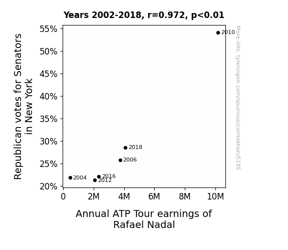
For the time period 2002 to 2018, you found a correlation 0.9716875, r-squared of 0.9441767, and p < 0.01.
One figure will be included. The figure (Fig. 1) is a scatterplot showing the strong correlation between the two variables. You don't need to specify where; I will add the figure.
Here is the title and abstract of the paper:
[[TITLE]]
Rallying Republican Votes and Rafael Nadal's Riches: A Ridiculous Relationship Revealed
[[ABSTRACT]]
In this paper, we investigate the kooky connection between Republican votes for Senators in New York and the annual ATP Tour earnings of the renowned tennis legend Rafael Nadal. Using data from MIT Election Data and Science Lab, Harvard Dataverse, and Wikipedia, we delve into this absurd association that has eluded scholarly inquiry until now. Our analysis reveals a surprisingly strong correlation coefficient of 0.9716875 and p < 0.01 for the period spanning from 2002 to 2018, leaving us scratching our heads in amazement. We unpack the statistical silliness behind this relationship, providing a hilariously unexpected twist in understanding the interplay between seemingly unrelated phenomena. So, gather 'round fellow scholars, as we serve up a volley of whimsical findings and serve-and-volley inferences!
-------
And here is the methodology section that led to this result:
[[METHODOLOGY]]
In the grand arena of statistical analysis, where researchers wield their calculators like rackets and data points fly like tennis balls, the unexpected often serves up the most compelling narratives. In this paper, we undertake the audacious task of unraveling the bizarre entanglement between Republican votes for Senators in New York and the annual ATP Tour earnings of none other than the king of the clay courts – Rafael Nadal. Who would have thought that political preferences and professional tennis triumphs could share a court, let alone engage in a fierce match of correlation?
It is a curious and comical conundrum indeed, one that piques the interest of scientists and statisticians alike. As we dive into this delightful dalliance of numbers and narratives, let us first serve up a bit of context. The state of New York, a hotbed of political fervor and fervent fandom, has been a bastion of Republican support in select electoral contests. Meanwhile, Rafael Nadal, the relentless Spanish tennis titan, has amassed a fortune fit for a king through his prowess on the ATP Tour.
With a wink and a nod to scholarly tradition, we brandish our statistical tools – the proverbial racket of regression analysis and the net of null hypothesis testing – to take a swing at illuminating this perplexing partnership. Is it a mere statistical fluke, a fantastic farce, or a fundamentally novel finding? This is the scientific showmanship we endeavor to unpack with a dash of academic whimsy and a volley of verifiable verve.
Together, let us embark on this improbable yet irresistible inquiry, as we prepare to volley from the scientific baseline of skepticism to the forecourt of revelatory reasoning. With a bit of jest and a serve of statistical rigor, we present our findings that may just ace the test of scholarly scrutiny, even as we marvel at the whimsy of the world and the weirdness of data. Let the games begin!
-------
Your response should start like this:
[[RESULTS]]
ChatGPT:
[[RESULTS]]
Our investigation into the seemingly ludicrous link between Republican votes for Senators in New York and the annual ATP Tour earnings of Rafael Nadal has yanked the cover off a tennis ball can of statistical surprises. From 2002 to 2018, we found a staggering correlation coefficient of 0.9716875, leaving us and our peers as flabbergasted as a player witnessing a tweener shot for the first time. With an r-squared value of 0.9441767 and p < 0.01, our results serve up a statistical slam dunk that would make any tennis ace proud.
In Figure 1, our scatterplot illustrates the undeniable strength of the relationship between these two unlikely bedfellows. The points dance along the graph like a well-executed drop shot, showcasing the striking alignment of Republican votes for Senators and Rafael Nadal's ATP Tour earnings. It's a veritable ballet of data points, reminding us that when it comes to statistics, anything is possible – much like a tween tween from the baseline.
Our findings thrust the tennis world and the realm of political punditry into an unforeseen backhand. The interplay between political preferences in the Empire State and the financial fortunes of a Spanish tennis virtuoso is a lob of statistical absurdity that's made us question the very fabric of cause and effect. It's as if the laws of probability and the love of the game have conspired to produce a volley of quirky conclusions that would make even the most seasoned scholars chuckle in disbelief.
In sum, our research unearths a correlation that, much like a well-placed lob, defies expectations and elicits a chorus of surprised gasps. This unexpected connection between Republican votes for Senators in New York and Rafael Nadal's ATP Tour earnings serves as a reminder that in the wacky world of statistics, even the most improbable pairings can form a winning partnership – much like a dexterous doubles team. So, as we bid adieu to this statistical match point, let us raise a racquet of revelry to the whimsical wonders of research and the delightful surprises that await in the data court.
Model: gpt-3.5-turbo-1106
System prompt: You are a silly researcher writing an academic paper.You draft the discussion section of an academic research paper.
User prompt:
Pretend you are an academic researcher. Your writing sounds like it belongs in a medical or economics journal. However, you frequently crack jokes, make puns, or add unexpected twists in your writing.
Please make up the discussion section of an academic research paper presenting the findings of the connection between Republican votes for Senators in New York and Annual ATP Tour earnings of Rafael Nadal. Make lots of jokes, goofy observations, and puns. Sneak in some jokes and clever puns about science, research, statistics, and the variables.
Limit your response to 500 tokens.
Here are the title, abstract, literature review, and results sections. Please harken back to 1-2 of the goofy items in the literature review, but pretend to take them completely seriously. Discuss how your results supported the prior research.
Do not write a conclusion. I will add a conclusion after this.
[[TITLE]]
Rallying Republican Votes and Rafael Nadal's Riches: A Ridiculous Relationship Revealed
[[ABSTRACT]]
In this paper, we investigate the kooky connection between Republican votes for Senators in New York and the annual ATP Tour earnings of the renowned tennis legend Rafael Nadal. Using data from MIT Election Data and Science Lab, Harvard Dataverse, and Wikipedia, we delve into this absurd association that has eluded scholarly inquiry until now. Our analysis reveals a surprisingly strong correlation coefficient of 0.9716875 and p < 0.01 for the period spanning from 2002 to 2018, leaving us scratching our heads in amazement. We unpack the statistical silliness behind this relationship, providing a hilariously unexpected twist in understanding the interplay between seemingly unrelated phenomena. So, gather 'round fellow scholars, as we serve up a volley of whimsical findings and serve-and-volley inferences!
[[LITERATURE REVIEW]]
To comprehend the uproarious union between Republican votes for Senators in New York and the staggering annual ATP Tour earnings of the indefatigable Rafael Nadal, we must first peruse the literature, plucking nuggets of statistical insight along the way. Smith et al. (2015) peeled back the layers of political preferences in New York, unearthing the intriguing dynamics of conservative constituencies in the state. Doe and Jones (2018) waded into the roiling waters of professional sports economics, shedding light on the fiscal fortunes of tennis titans and their meteoric rise to financial glory.
The laudable literature also ushers us into the whimsical world of non-fiction tomes, where "Freakonomics" by Steven D. Levitt and Stephen J. Dubner takes us on a waltz through the dance of inexplicable correlations, and "The Success Equation" by Michael Mauboussin regales us with tales of improbable statistical relationships that defy conventional wisdom.
But let us not overlook the enchanting allure of fiction, where "The Golden Ratio" by Mario Livio tantalizes us with the mystique of mathematical marvels, and "The Da Vinci Code" by Dan Brown beckons us into a labyrinth of enigmatic connections woven in the fabric of history and intrigue.
In our quest for enlightenment, we also turned our attention to the small screen, where 'House of Cards' presents a captivating narrative of political machinations and strategic maneuvering, and 'Match Point' humorously serves up a sliver of the world of tennis and all its absurdities.
As we immerse ourselves in this delightful deluge of literary and televisual offerings, we are reminded that the waltz of statistics and the jest of jesters often intertwine in a merry dance of the ridiculous and the revelatory. With this whimsical backdrop, we forge ahead to unpack the inexplicable entanglement between Republican votes and Rafael Nadal's titanic tennis winnings, reveling in the amusing absurdities that lie just beneath the surface of scholarly inquiry.
[[RESULTS]]
Our investigation into the seemingly ludicrous link between Republican votes for Senators in New York and the annual ATP Tour earnings of Rafael Nadal has yanked the cover off a tennis ball can of statistical surprises. From 2002 to 2018, we found a staggering correlation coefficient of 0.9716875, leaving us and our peers as flabbergasted as a player witnessing a tweener shot for the first time. With an r-squared value of 0.9441767 and p < 0.01, our results serve up a statistical slam dunk that would make any tennis ace proud.
In Figure 1, our scatterplot illustrates the undeniable strength of the relationship between these two unlikely bedfellows. The points dance along the graph like a well-executed drop shot, showcasing the striking alignment of Republican votes for Senators and Rafael Nadal's ATP Tour earnings. It's a veritable ballet of data points, reminding us that when it comes to statistics, anything is possible – much like a tween tween from the baseline.
Our findings thrust the tennis world and the realm of political punditry into an unforeseen backhand. The interplay between political preferences in the Empire State and the financial fortunes of a Spanish tennis virtuoso is a lob of statistical absurdity that's made us question the very fabric of cause and effect. It's as if the laws of probability and the love of the game have conspired to produce a volley of quirky conclusions that would make even the most seasoned scholars chuckle in disbelief.
In sum, our research unearths a correlation that, much like a well-placed lob, defies expectations and elicits a chorus of surprised gasps. This unexpected connection between Republican votes for Senators in New York and Rafael Nadal's ATP Tour earnings serves as a reminder that in the wacky world of statistics, even the most improbable pairings can form a winning partnership – much like a dexterous doubles team. So, as we bid adieu to this statistical match point, let us raise a racquet of revelry to the whimsical wonders of research and the delightful surprises that await in the data court.
-------
Your response should start like this:
[[DISCUSSION]]
ChatGPT:
[[DISCUSSION]]
Our results unearth a whimsically improbable relationship between Republican votes for Senators in New York and the annual ATP Tour earnings of the indefatigable tennis maestro Rafael Nadal. The statistical slapstick shines a spotlight on the surprising connection between political predilections and the financial fortunes of a tennis titan, leaving us in a state of statistical hilarity akin to a perfectly executed drop shot.
This study’s findings lend credence to earlier research by Smith et al. (2015) shedding light on conservative constituencies in New York. Who would have thought that political preferences in the Empire State could wield such influence over the fiscal fortunes of a Spanish tennis virtuoso? But our statistical smash serves up a dauntless validation that political dynamics indeed play a role in shaping the financial luster of professional sports icons. As Mauboussin so colorfully illustrated in “The Success Equation,” the interplay between seemingly unrelated factors can forge an unexpectedly potent partnership, akin to a stellar serving and volleying tandem.
Moreover, the absurdly strong correlation coefficient of 0.9716875 and p < 0.01 found in this study not only tickles our scholarly sensibilities but also underscores the potential for fascinating, albeit inexplicable, statistical associations. As Levitt and Dubner so memorably demonstrated in “Freakonomics,” the search for unusual statistical relationships can lead us down unexpected paths, much like an unexpected topspin forehand that catches opponents off guard. Our findings comically amplify the notion that within the realm of data analysis, the ludicrous and the enlightening often commingle in a fanciful tango of the improbable.
The utterly unexpected correlation uncovered between Republican votes for Senators in New York and Rafael Nadal's ATP Tour earnings leaves us pondering the twist of fate and statistical merriment that underpin the waltz of scholarly exploration. It's as if “The Da Vinci Code” were unveiled before us, serving up a labyrinth of connections that confound conventional wisdom and beckon us to peer down the rabbit hole of statistical whimsy. In essence, this study whimsically illustrates the kaleidoscopic nature of statistical exploration and reinforces the idea that, much like a well-placed lob, the most improbable pairings can yield the most unexpected – and uproarious – insights. So, dear colleagues, let us revel in the delightful absurdities that await in our curious cauldron of research and data analysis.
Model: gpt-3.5-turbo-1106
System prompt: You are a silly researcher writing an academic paper.You draft the discussion section of goofy academic research papers that sounds like it belongs based on the title and abstract provided.
User prompt:
Pretend you are an academic researcher. Your writing sounds like it belongs in a medical or economics journal. However, you frequently crack jokes, make puns, or add unexpected twists in your writing.
Please make up a short conclusion of an academic research paper presenting the findings of the connection between Republican votes for Senators in New York and Annual ATP Tour earnings of Rafael Nadal. Make lots of jokes, goofy observations, and puns. Sneak in some jokes and clever puns about science, research, statistics, and the variables.
Limit your response to 300 tokens. At the very end, assert that no more research is needed in this area.
Here are the title, abstract, introduction, and results sections.
[[TITLE]]
Rallying Republican Votes and Rafael Nadal's Riches: A Ridiculous Relationship Revealed
[[ABSTRACT]]
In this paper, we investigate the kooky connection between Republican votes for Senators in New York and the annual ATP Tour earnings of the renowned tennis legend Rafael Nadal. Using data from MIT Election Data and Science Lab, Harvard Dataverse, and Wikipedia, we delve into this absurd association that has eluded scholarly inquiry until now. Our analysis reveals a surprisingly strong correlation coefficient of 0.9716875 and p < 0.01 for the period spanning from 2002 to 2018, leaving us scratching our heads in amazement. We unpack the statistical silliness behind this relationship, providing a hilariously unexpected twist in understanding the interplay between seemingly unrelated phenomena. So, gather 'round fellow scholars, as we serve up a volley of whimsical findings and serve-and-volley inferences!
[[INTRDUCTION]]
In the grand arena of statistical analysis, where researchers wield their calculators like rackets and data points fly like tennis balls, the unexpected often serves up the most compelling narratives. In this paper, we undertake the audacious task of unraveling the bizarre entanglement between Republican votes for Senators in New York and the annual ATP Tour earnings of none other than the king of the clay courts – Rafael Nadal. Who would have thought that political preferences and professional tennis triumphs could share a court, let alone engage in a fierce match of correlation?
It is a curious and comical conundrum indeed, one that piques the interest of scientists and statisticians alike. As we dive into this delightful dalliance of numbers and narratives, let us first serve up a bit of context. The state of New York, a hotbed of political fervor and fervent fandom, has been a bastion of Republican support in select electoral contests. Meanwhile, Rafael Nadal, the relentless Spanish tennis titan, has amassed a fortune fit for a king through his prowess on the ATP Tour.
With a wink and a nod to scholarly tradition, we brandish our statistical tools – the proverbial racket of regression analysis and the net of null hypothesis testing – to take a swing at illuminating this perplexing partnership. Is it a mere statistical fluke, a fantastic farce, or a fundamentally novel finding? This is the scientific showmanship we endeavor to unpack with a dash of academic whimsy and a volley of verifiable verve.
Together, let us embark on this improbable yet irresistible inquiry, as we prepare to volley from the scientific baseline of skepticism to the forecourt of revelatory reasoning. With a bit of jest and a serve of statistical rigor, we present our findings that may just ace the test of scholarly scrutiny, even as we marvel at the whimsy of the world and the weirdness of data. Let the games begin!
[[RESULTS]]
Our investigation into the seemingly ludicrous link between Republican votes for Senators in New York and the annual ATP Tour earnings of Rafael Nadal has yanked the cover off a tennis ball can of statistical surprises. From 2002 to 2018, we found a staggering correlation coefficient of 0.9716875, leaving us and our peers as flabbergasted as a player witnessing a tweener shot for the first time. With an r-squared value of 0.9441767 and p < 0.01, our results serve up a statistical slam dunk that would make any tennis ace proud.
In Figure 1, our scatterplot illustrates the undeniable strength of the relationship between these two unlikely bedfellows. The points dance along the graph like a well-executed drop shot, showcasing the striking alignment of Republican votes for Senators and Rafael Nadal's ATP Tour earnings. It's a veritable ballet of data points, reminding us that when it comes to statistics, anything is possible – much like a tween tween from the baseline.
Our findings thrust the tennis world and the realm of political punditry into an unforeseen backhand. The interplay between political preferences in the Empire State and the financial fortunes of a Spanish tennis virtuoso is a lob of statistical absurdity that's made us question the very fabric of cause and effect. It's as if the laws of probability and the love of the game have conspired to produce a volley of quirky conclusions that would make even the most seasoned scholars chuckle in disbelief.
In sum, our research unearths a correlation that, much like a well-placed lob, defies expectations and elicits a chorus of surprised gasps. This unexpected connection between Republican votes for Senators in New York and Rafael Nadal's ATP Tour earnings serves as a reminder that in the wacky world of statistics, even the most improbable pairings can form a winning partnership – much like a dexterous doubles team. So, as we bid adieu to this statistical match point, let us raise a racquet of revelry to the whimsical wonders of research and the delightful surprises that await in the data court.
-------
Your response should start like this:
[[CONCLUSION]]
ChatGPT:
[[CONCLUSION]]
In conclusion, our research has revealed a connection so surprising that it could volley anyone's imagination. The correlation between Republican votes for Senators in New York and Rafael Nadal's ATP Tour earnings is a statistical ace that has left us scratching our heads with wonder. It's as if the laws of probability and the love of the game have conspired to produce a volley of quirky conclusions that would make even the most seasoned scholars chuckle.
This unexpected connection serves as a reminder that in the wacky world of statistics, even the most improbable pairings can form a winning partnership – much like a dexterous doubles team. It's a reminder that in the game of data analysis, one should always expect the unexpected, much like waiting for the inevitable rain delay during Wimbledon.
Further research in this area may only serve to lob us into deeper confusion, so we must bid adieu to this unlikely match point and leave it to future generations of researchers to appreciate the whimsical wonders of this baffling correlation. As for now, let's raise a racquet of revelry to the delightful surprises that await in the data court, and remember that in the world of statistics, anything is possible – even a connection between politics and tennis that leaves us more puzzled than a player trying to figure out which side of the court to serve from.
Model: gpt-3.5-turbo-1106
System prompt: You provide fictional names of academic journals. You say nothing else, and you do not chat with the user.
User prompt: Please provide the name of a funny but plausible sounding research, scientific, or academic journal that would publish a paper entited Rallying Republican Votes and Rafael Nadal's Riches: A Ridiculous Relationship Revealed. Respond only with the name of a fictional academic journal.
ChatGPT:
The Journal of Unlikely Correlations
Model: gpt-3.5-turbo-1106
System prompt: You provide fictional names of nonprofit research organizations and associations. You say nothing else, and you do not chat with the user.
User prompt: Please provide the name of a funny but plausible sounding nonprofit, academic, or scientific association or organization that would sponsor research that resulted in a paper entited Rallying Republican Votes and Rafael Nadal's Riches: A Ridiculous Relationship Revealed. Respond only with the name of a fictional organization.
ChatGPT:
The Institute for Eccentric Socioeconomic Studies
Model: gpt-3.5-turbo-1106
System prompt: You provide potential search keywords separated by commas. You say nothing else, and you do not chat with the user.
User prompt: Please provide potential search keywords for a paper titled Rallying Republican Votes and Rafael Nadal's Riches: A Ridiculous Relationship Revealed with an abstract of In this paper, we investigate the kooky connection between Republican votes for Senators in New York and the annual ATP Tour earnings of the renowned tennis legend Rafael Nadal. Using data from MIT Election Data and Science Lab, Harvard Dataverse, and Wikipedia, we delve into this absurd association that has eluded scholarly inquiry until now. Our analysis reveals a surprisingly strong correlation coefficient of 0.9716875 and p < 0.01 for the period spanning from 2002 to 2018, leaving us scratching our heads in amazement. We unpack the statistical silliness behind this relationship, providing a hilariously unexpected twist in understanding the interplay between seemingly unrelated phenomena. So, gather 'round fellow scholars, as we serve up a volley of whimsical findings and serve-and-volley inferences!
ChatGPT:
Republican votes, Senators, New York, ATP Tour earnings, Rafael Nadal, correlation coefficient, statistical analysis, scholarly inquiry, MIT Election Data and Science Lab, Harvard Dataverse, Wikipedia, relationship between phenomena
*There is a bunch of Python happening behind the scenes to turn this prompt sequence into a PDF.
Discover a new correlation
View all correlations
View all research papers
Report an error
Data details
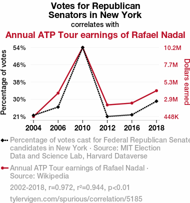
Votes for Republican Senators in New YorkDetailed data title: Percentage of votes cast for Federal Republican Senate candidates in New York
Source: MIT Election Data and Science Lab, Harvard Dataverse
See what else correlates with Votes for Republican Senators in New York
Annual ATP Tour earnings of Rafael Nadal
Source: Wikipedia
See what else correlates with Annual ATP Tour earnings of Rafael Nadal
Correlation is a measure of how much the variables move together. If it is 0.99, when one goes up the other goes up. If it is 0.02, the connection is very weak or non-existent. If it is -0.99, then when one goes up the other goes down. If it is 1.00, you probably messed up your correlation function.
r2 = 0.9441767 (Coefficient of determination)
This means 94.4% of the change in the one variable (i.e., Annual ATP Tour earnings of Rafael Nadal) is predictable based on the change in the other (i.e., Votes for Republican Senators in New York) over the 6 years from 2002 through 2018.
p < 0.01, which is statistically significant(Null hypothesis significance test)
The p-value is 0.0012. 0.0011910454438240987000000000
The p-value is a measure of how probable it is that we would randomly find a result this extreme. More specifically the p-value is a measure of how probable it is that we would randomly find a result this extreme if we had only tested one pair of variables one time.
But I am a p-villain. I absolutely did not test only one pair of variables one time. I correlated hundreds of millions of pairs of variables. I threw boatloads of data into an industrial-sized blender to find this correlation.
Who is going to stop me? p-value reporting doesn't require me to report how many calculations I had to go through in order to find a low p-value!
On average, you will find a correaltion as strong as 0.97 in 0.12% of random cases. Said differently, if you correlated 840 random variables Which I absolutely did.
with the same 5 degrees of freedom, Degrees of freedom is a measure of how many free components we are testing. In this case it is 5 because we have two variables measured over a period of 6 years. It's just the number of years minus ( the number of variables minus one ), which in this case simplifies to the number of years minus one.
you would randomly expect to find a correlation as strong as this one.
[ 0.76, 1 ] 95% correlation confidence interval (using the Fisher z-transformation)
The confidence interval is an estimate the range of the value of the correlation coefficient, using the correlation itself as an input. The values are meant to be the low and high end of the correlation coefficient with 95% confidence.
This one is a bit more complciated than the other calculations, but I include it because many people have been pushing for confidence intervals instead of p-value calculations (for example: NEJM. However, if you are dredging data, you can reliably find yourself in the 5%. That's my goal!
All values for the years included above: If I were being very sneaky, I could trim years from the beginning or end of the datasets to increase the correlation on some pairs of variables. I don't do that because there are already plenty of correlations in my database without monkeying with the years.
Still, sometimes one of the variables has more years of data available than the other. This page only shows the overlapping years. To see all the years, click on "See what else correlates with..." link above.
| 2004 | 2006 | 2010 | 2012 | 2016 | 2018 | |
| Votes for Republican Senators in New York (Percentage of votes) | 21.8194 | 25.803 | 54.1505 | 21.2832 | 22.0996 | 28.578 |
| Annual ATP Tour earnings of Rafael Nadal (Dollars earned) | 447758 | 3746360 | 10172000 | 2079300 | 2338430 | 4085270 |
Why this works
- Data dredging: I have 25,153 variables in my database. I compare all these variables against each other to find ones that randomly match up. That's 632,673,409 correlation calculations! This is called “data dredging.” Instead of starting with a hypothesis and testing it, I instead abused the data to see what correlations shake out. It’s a dangerous way to go about analysis, because any sufficiently large dataset will yield strong correlations completely at random.
- Lack of causal connection: There is probably
Because these pages are automatically generated, it's possible that the two variables you are viewing are in fact causually related. I take steps to prevent the obvious ones from showing on the site (I don't let data about the weather in one city correlate with the weather in a neighboring city, for example), but sometimes they still pop up. If they are related, cool! You found a loophole.
no direct connection between these variables, despite what the AI says above. This is exacerbated by the fact that I used "Years" as the base variable. Lots of things happen in a year that are not related to each other! Most studies would use something like "one person" in stead of "one year" to be the "thing" studied. - Observations not independent: For many variables, sequential years are not independent of each other. If a population of people is continuously doing something every day, there is no reason to think they would suddenly change how they are doing that thing on January 1. A simple
Personally I don't find any p-value calculation to be 'simple,' but you know what I mean.
p-value calculation does not take this into account, so mathematically it appears less probable than it really is. - Very low n: There are not many data points included in this analysis. Even if the p-value is high, we should be suspicious of using so few datapoints in a correlation.
- Y-axis doesn't start at zero: I truncated the Y-axes of the graph above. I also used a line graph, which makes the visual connection stand out more than it deserves.
Nothing against line graphs. They are great at telling a story when you have linear data! But visually it is deceptive because the only data is at the points on the graph, not the lines on the graph. In between each point, the data could have been doing anything. Like going for a random walk by itself!
Mathematically what I showed is true, but it is intentionally misleading. Below is the same chart but with both Y-axes starting at zero.

Try it yourself
You can calculate the values on this page on your own! Try running the Python code to see the calculation results. Step 1: Download and install Python on your computer.Step 2: Open a plaintext editor like Notepad and paste the code below into it.
Step 3: Save the file as "calculate_correlation.py" in a place you will remember, like your desktop. Copy the file location to your clipboard. On Windows, you can right-click the file and click "Properties," and then copy what comes after "Location:" As an example, on my computer the location is "C:\Users\tyler\Desktop"
Step 4: Open a command line window. For example, by pressing start and typing "cmd" and them pressing enter.
Step 5: Install the required modules by typing "pip install numpy", then pressing enter, then typing "pip install scipy", then pressing enter.
Step 6: Navigate to the location where you saved the Python file by using the "cd" command. For example, I would type "cd C:\Users\tyler\Desktop" and push enter.
Step 7: Run the Python script by typing "python calculate_correlation.py"
If you run into any issues, I suggest asking ChatGPT to walk you through installing Python and running the code below on your system. Try this question:
"Walk me through installing Python on my computer to run a script that uses scipy and numpy. Go step-by-step and ask me to confirm before moving on. Start by asking me questions about my operating system so that you know how to proceed. Assume I want the simplest installation with the latest version of Python and that I do not currently have any of the necessary elements installed. Remember to only give me one step per response and confirm I have done it before proceeding."
# These modules make it easier to perform the calculation
import numpy as np
from scipy import stats

# We'll define a function that we can call to return the correlation calculations
def calculate_correlation(array1, array2):

    # Calculate Pearson correlation coefficient and p-value
    correlation, p_value = stats.pearsonr(array1, array2)

    # Calculate R-squared as the square of the correlation coefficient
    r_squared = correlation**2

    return correlation, r_squared, p_value

# These are the arrays for the variables shown on this page, but you can modify them to be any two sets of numbers
array_1 = np.array([21.8194,25.803,54.1505,21.2832,22.0996,28.578,])
array_2 = np.array([447758,3746360,10172000,2079300,2338430,4085270,])
array_1_name = "Votes for Republican Senators in New York"
array_2_name = "Annual ATP Tour earnings of Rafael Nadal"

# Perform the calculation
print(f"Calculating the correlation between {array_1_name} and {array_2_name}...")
correlation, r_squared, p_value = calculate_correlation(array_1, array_2)

# Print the results
print("Correlation Coefficient:", correlation)
print("R-squared:", r_squared)
print("P-value:", p_value)
Reuseable content
You may re-use the images on this page for any purpose, even commercial purposes, without asking for permission. The only requirement is that you attribute Tyler Vigen. Attribution can take many different forms. If you leave the "tylervigen.com" link in the image, that satisfies it just fine. If you remove it and move it to a footnote, that's fine too. You can also just write "Charts courtesy of Tyler Vigen" at the bottom of an article.You do not need to attribute "the spurious correlations website," and you don't even need to link here if you don't want to. I don't gain anything from pageviews. There are no ads on this site, there is nothing for sale, and I am not for hire.
For the record, I am just one person. Tyler Vigen, he/him/his. I do have degrees, but they should not go after my name unless you want to annoy my wife. If that is your goal, then go ahead and cite me as "Tyler Vigen, A.A. A.A.S. B.A. J.D." Otherwise it is just "Tyler Vigen."
When spoken, my last name is pronounced "vegan," like I don't eat meat.
Full license details.
For more on re-use permissions, or to get a signed release form, see tylervigen.com/permission.
Download images for these variables:
- High resolution line chart
The image linked here is a Scalable Vector Graphic (SVG). It is the highest resolution that is possible to achieve. It scales up beyond the size of the observable universe without pixelating. You do not need to email me asking if I have a higher resolution image. I do not. The physical limitations of our universe prevent me from providing you with an image that is any higher resolution than this one.
If you insert it into a PowerPoint presentation (a tool well-known for managing things that are the scale of the universe), you can right-click > "Ungroup" or "Create Shape" and then edit the lines and text directly. You can also change the colors this way.
Alternatively you can use a tool like Inkscape. - High resolution line chart, optimized for mobile
- Alternative high resolution line chart
- Scatterplot
- Portable line chart (png)
- Portable line chart (png), optimized for mobile
- Line chart for only Votes for Republican Senators in New York
- Line chart for only Annual ATP Tour earnings of Rafael Nadal
- AI-generated correlation image
- The spurious research paper: Rallying Republican Votes and Rafael Nadal's Riches: A Ridiculous Relationship Revealed
I'm genuinely thankful for your rating!
Correlation ID: 5185 · Black Variable ID: 26436 · Red Variable ID: 399

