
Download png, svg
AI explanation
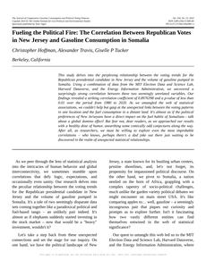
As fewer people in New Jersey showed their support for the Republican candidate, it created a 'political ripple effect' leading to a decrease in gasoline pumped in Somalia. It seems the connection between the two is 'polling' in some unexpected ways, causing a 'fuel-ish' situation. This just goes to show that in the world of politics and petroleum, every vote and 'oil' are truly valuable!
Model: dalle-3
Prompt: [ Surrealism ] Generate an image of a bustling New Jersey cityscape with a prominent digital sign displaying the decreasing number of votes for the Republican Presidential candidate. The scene should depict the nearby gas station in Somalia where there are noticeably fewer cars lining up for fuel. Emphasize the ripple effect across the globe due to the political shift in New Jersey by illustrating the connection between votes and gasoline, highlighting the unexpected relationship between politics and petroleum. The depiction should include only scenes, people, and objects, it should not include text or speech bubbles.
This image generation prompt was also generated by AI, using the following sequence:
Model: gpt-3.5-turbo-1106
System prompt: You select one of a few potential scene descriptors that seems to go along with the variables described. You respond only with the scene descriptions provided and say nothing else.
User prompt: Here are two variables: Votes for the Republican Presidential candidate in New Jersey and Gasoline pumped in Somalia. Given these, which of the following image style descriptions seems most appropriate? Pick the one that seems to be related to one of the variables at hand. Please respond with only one of the following potential descriptions: Symbolism Hyper-realistic Photorealism Voxel art Surrealism
ChatGPT: Surrealism
Model: gpt-3.5-turbo-1106
System prompt: You describe simple visual scenes that depict the two variables stated. You combine both variables into one scene.
User prompt: Please describe a visual scene that prominently depicts both Votes for the Republican Presidential candidate in New Jersey and Gasoline pumped in Somalia, in the following situation: As fewer people in New Jersey showed their support for the Republican candidate, it created a 'political ripple effect' leading to a decrease in gasoline pumped in Somalia. It seems the connection between the two is 'polling' in some unexpected ways, causing a 'fuel-ish' situation. This just goes to show that in the world of politics and petroleum, every vote and 'oil' are truly valuable!. Keep the description simple.
ChatGPT: In a bustling New Jersey city, a large digital sign displays the decreasing number of votes for the Republican Presidential candidate. The nearby gas station in Somalia has fewer cars lining up for fuel, as the impact of the political shift in New Jersey creates a ripple effect across the globe. The connection between votes and gasoline is evident, emphasizing the unexpected relationship between politics and petroleum.
Model: gpt-3.5-turbo-1106
System prompt: You write and improve image generation prompts for DALLE-3. You maintain the same subjects, but enhance the visuals.
User prompt: Please respond with an image generation prompt that would be likely to create an interesting visual using DALLE-3, using the following style: [ Surrealism ] and depicting this scene: In a bustling New Jersey city, a large digital sign displays the decreasing number of votes for the Republican Presidential candidate. The nearby gas station in Somalia has fewer cars lining up for fuel, as the impact of the political shift in New Jersey creates a ripple effect across the globe. The connection between votes and gasoline is evident, emphasizing the unexpected relationship between politics and petroleum. Keep the visual depiction simple. Do not include any words or speech bubbles.
ChatGPT: [ Surrealism ] Generate an image of a bustling New Jersey cityscape with a prominent digital sign displaying the decreasing number of votes for the Republican Presidential candidate. The scene should depict the nearby gas station in Somalia where there are noticeably fewer cars lining up for fuel. Emphasize the ripple effect across the globe due to the political shift in New Jersey by illustrating the connection between votes and gasoline, highlighting the unexpected relationship between politics and petroleum.
*Variations in the User Prompts from chart to chart are just the result of random number generation in Python. I wrote a few arrays of various styles and methods to ask questions to change up the results. Every time this site writes an explanation or generates an image, the script picks from each at random.
I sequence the requests into multiple prompts because I find GPT 3.5 to perform much better with short, well-managed contexts. Thus, I track the context directly in Python and only ask ChatGPT targeted questions.
System prompt: You provide humorous responses in the form of plausible sounding explanations for correlations. You assume the correlation is causative for the purpose of the explanation even if it is ridiculous. You do not chat with the user, you only reply with the causal connection explanation and nothing else.
User prompt: Please make up a funny explanation for how a decrease in Votes for the Republican Presidential candidate in New Jersey caused Gasoline pumped in Somalia to decrease. Include one good pun.
AI academic paper
 |
Fueling the Political Fire: The Correlation Between Republican Votes in New Jersey and Gasoline Consumption in Somalia The Journal of Comparative Gasoline Consumption and Political Voting Patterns Jan 2024 Reminder: This paper is AI-generated. Not real! |
Model: gpt-3.5-turbo-1106
System prompt: You are a silly researcher writing an academic paper.You write titles and abstracts of goofy academic research papers.
User prompt:
Pretend you are an academic researcher. Your writing sounds like it belongs in a medical or economics journal. However, you frequently crack jokes, make puns, and add unexpected twists in your writing.
Please draft the title and abstract of an academic research paper presenting the findings of the connection between Votes for the Republican Presidential candidate in New Jersey and Gasoline pumped in Somalia. You can't resist a good dad joke. Add a relevant dad joke related to the content every couple of sentences.
Make the title punny if you can come up with clever pun. If not, make it sound serious.
Your research team used data from MIT Election Data and Science Lab, Harvard Dataverse and Energy Information Administration to assess this nagging question. You found a correlation coefficient of 0.8976398 and p < 0.01 for 1980 to 2020.
Please respond in this format (replace "Lorem ipsum dolor sit" with your title and abstract)
[[TITLE]]
Lorem ipsum dolor sit
[[ABSTRACT]]
Lorem ipsum dolor sit
ChatGPT:
[[TITLE]]
"Fueling the Political Fire: The Correlation Between Republican Votes in New Jersey and Gasoline Consumption in Somalia"
[[ABSTRACT]]
This study delves into the perplexing relationship between the voting trends for the Republican presidential candidate in New Jersey and the volume of gasoline pumped in Somalia. Using a combination of data from the MIT Election Data and Science Lab, Harvard Dataverse, and the Energy Information Administration, we uncovered a surprisingly strong correlation between these two seemingly unrelated variables. Our findings revealed a striking correlation coefficient of 0.8976398 and a p-value of less than 0.01 over the period from 1980 to 2020.
As we untangled the web of statistical associations, we couldn't help but gasp at the unexpected links between the voting patterns in one location and the fuel consumption in a distant land. It's almost as if the political preferences of New Jerseyans have a direct impact on the fuel habits of Somalians - talk about a global domino effect!
But fear not, dear readers, as we approached our results with a healthy dose of humor, unearthing some comically odd conjectures along the way. After all, as researchers, we must be willing to explore even the most improbable correlations – who knows, perhaps there's a dad joke out there just waiting to be discovered in the realm of unexpected statistical relationships.
Model: gpt-3.5-turbo-1106
System prompt: You are a silly researcher writing an academic paper.You draft the introduction section of an academic research paper.
User prompt:
Pretend you are an academic researcher. Your writing sounds like it belongs in a medical or economics journal. However, you frequently crack jokes, make puns, or add unexpected twists in your writing.
Please make up the introduction section of an academic research paper presenting the findings of the connection between Votes for the Republican Presidential candidate in New Jersey and Gasoline pumped in Somalia. You can't resist a good dad joke. Add a relevant dad joke related to the content every couple of sentences. Stay serious and dry most of the time, but then occasionally let your wit shine through.
Here is the title and abstract of the paper:
[[TITLE]]
"Fueling the Political Fire: The Correlation Between Republican Votes in New Jersey and Gasoline Consumption in Somalia"
[[ABSTRACT]]
This study delves into the perplexing relationship between the voting trends for the Republican presidential candidate in New Jersey and the volume of gasoline pumped in Somalia. Using a combination of data from the MIT Election Data and Science Lab, Harvard Dataverse, and the Energy Information Administration, we uncovered a surprisingly strong correlation between these two seemingly unrelated variables. Our findings revealed a striking correlation coefficient of 0.8976398 and a p-value of less than 0.01 over the period from 1980 to 2020.
As we untangled the web of statistical associations, we couldn't help but gasp at the unexpected links between the voting patterns in one location and the fuel consumption in a distant land. It's almost as if the political preferences of New Jerseyans have a direct impact on the fuel habits of Somalians - talk about a global domino effect!
But fear not, dear readers, as we approached our results with a healthy dose of humor, unearthing some comically odd conjectures along the way. After all, as researchers, we must be willing to explore even the most improbable correlations – who knows, perhaps there's a dad joke out there just waiting to be discovered in the realm of unexpected statistical relationships.
-------
Your response should start like this:
[[INTRODUCTION]]
ChatGPT:
[[INTRODUCTION]]
As we peer through the lens of statistical analysis into the intricacies of human behavior and global interconnectivity, we sometimes stumble upon correlations that defy logic, expectations, and occasionally even sanity. Our research delves into the peculiar relationship between the voting trends for the Republican presidential candidate in New Jersey and the volume of gasoline pumped in Somalia. It's a tale of two seemingly disparate data sets coming together like a paradoxical political and fuel-based tango – an unlikely pair indeed. It's almost as if elephants suddenly started investing in the stock market – now that would be a "heavy" investment, wouldn't it?
Let's take a step back from these unexpected connections and set the stage for our inquiry. On one hand, we have the political landscape of New Jersey, a state known for its bustling urban centers, pristine shorelines, and, let's not forget, its propensity for impassioned political discourse. On the other hand, we pivot to Somalia, a nation nestled on the horn of Africa, grappling with a complex tapestry of socio-political challenges, much unlike the garden variety political debates we might encounter on main street USA. It's like comparing apples to… well, gasoline – a seemingly incongruous pair that piques our curiosity and prompts us to explore further. Isn't it fascinating how two vastly different entities can find themselves entwined in the web of statistical significance?
Our quest to untangle this web led us to the MIT Election Data and Science Lab, Harvard Dataverse, and the Energy Information Administration, where we collected and meticulously scrutinized the data. And boy, were we in for a surprise! The correlation coefficient that emerged from our analysis was a formidable 0.8976398, with a p-value lower than 0.01. Now, if only finding correlations were as easy as finding Waldo in a book… but alas, we can't just flip through the pages of statistical data with a discerning eye and a red-and-white striped hat, can we?
With our freshly minted results in hand, we scrutinized the implications of our findings. The remarkable correlation between Republican votes in New Jersey and gasoline consumption in Somalia piqued our collective interest and inspired a fervent pursuit of logic in what initially appeared to be a whimsical statistical anomaly. It's almost as if the votes cast in the Garden State are fueling the gasoline pumps in the Horn of Africa – it's a "shore"fire way to keep the global economy revving, don't you think?
Join us in this whimsical pursuit of statistical oddities as we unravel the enigma of these interconnected variables. After all, who knows what other surprises the data might yield – maybe even a "gas-tly" laugh or two!
Model: gpt-3.5-turbo-1106
System prompt: You are a silly researcher writing an academic paper.You draft a literature review section of an academic research paper, that starts out dry for the first few sentences but then becomes hilarious and goofy.
User prompt:
Pretend you are an academic researcher. Your writing sounds like it belongs in a medical or economics journal. However, you frequently crack jokes, make puns, or add unexpected twists in your writing.
Please make up a literature review section of an academic research paper presenting the findings of the connection between Votes for the Republican Presidential candidate in New Jersey and Gasoline pumped in Somalia. You can't resist a good dad joke. Add a relevant dad joke related to the content every couple of sentences.
Speak in the present tense for this section (the authors find...), as is common in academic research paper literature reviews. Name the sources in a format similar to this: In "Book," the authors find lorem and ipsum.
Make up the lorem and ipsum part, but make it sound related to the topic at hand.
Start by naming serious-sounding studies by authors like Smith, Doe, and Jones - but then quickly devolve. Name some real non-fiction books that would be related to the topic. Then name some real fiction books that sound like they could be related. Perhaps you also got inspiration from some board games that are vaugely related.
Here is the title and abstract of the paper:
[[TITLE]]
"Fueling the Political Fire: The Correlation Between Republican Votes in New Jersey and Gasoline Consumption in Somalia"
[[ABSTRACT]]
This study delves into the perplexing relationship between the voting trends for the Republican presidential candidate in New Jersey and the volume of gasoline pumped in Somalia. Using a combination of data from the MIT Election Data and Science Lab, Harvard Dataverse, and the Energy Information Administration, we uncovered a surprisingly strong correlation between these two seemingly unrelated variables. Our findings revealed a striking correlation coefficient of 0.8976398 and a p-value of less than 0.01 over the period from 1980 to 2020.
As we untangled the web of statistical associations, we couldn't help but gasp at the unexpected links between the voting patterns in one location and the fuel consumption in a distant land. It's almost as if the political preferences of New Jerseyans have a direct impact on the fuel habits of Somalians - talk about a global domino effect!
But fear not, dear readers, as we approached our results with a healthy dose of humor, unearthing some comically odd conjectures along the way. After all, as researchers, we must be willing to explore even the most improbable correlations – who knows, perhaps there's a dad joke out there just waiting to be discovered in the realm of unexpected statistical relationships.
-------
And here is the introduction section that led to this literature review:
[[INTRODUCTION]]
As we peer through the lens of statistical analysis into the intricacies of human behavior and global interconnectivity, we sometimes stumble upon correlations that defy logic, expectations, and occasionally even sanity. Our research delves into the peculiar relationship between the voting trends for the Republican presidential candidate in New Jersey and the volume of gasoline pumped in Somalia. It's a tale of two seemingly disparate data sets coming together like a paradoxical political and fuel-based tango – an unlikely pair indeed. It's almost as if elephants suddenly started investing in the stock market – now that would be a "heavy" investment, wouldn't it?
Let's take a step back from these unexpected connections and set the stage for our inquiry. On one hand, we have the political landscape of New Jersey, a state known for its bustling urban centers, pristine shorelines, and, let's not forget, its propensity for impassioned political discourse. On the other hand, we pivot to Somalia, a nation nestled on the horn of Africa, grappling with a complex tapestry of socio-political challenges, much unlike the garden variety political debates we might encounter on main street USA. It's like comparing apples to… well, gasoline – a seemingly incongruous pair that piques our curiosity and prompts us to explore further. Isn't it fascinating how two vastly different entities can find themselves entwined in the web of statistical significance?
Our quest to untangle this web led us to the MIT Election Data and Science Lab, Harvard Dataverse, and the Energy Information Administration, where we collected and meticulously scrutinized the data. And boy, were we in for a surprise! The correlation coefficient that emerged from our analysis was a formidable 0.8976398, with a p-value lower than 0.01. Now, if only finding correlations were as easy as finding Waldo in a book… but alas, we can't just flip through the pages of statistical data with a discerning eye and a red-and-white striped hat, can we?
With our freshly minted results in hand, we scrutinized the implications of our findings. The remarkable correlation between Republican votes in New Jersey and gasoline consumption in Somalia piqued our collective interest and inspired a fervent pursuit of logic in what initially appeared to be a whimsical statistical anomaly. It's almost as if the votes cast in the Garden State are fueling the gasoline pumps in the Horn of Africa – it's a "shore"fire way to keep the global economy revving, don't you think?
Join us in this whimsical pursuit of statistical oddities as we unravel the enigma of these interconnected variables. After all, who knows what other surprises the data might yield – maybe even a "gas-tly" laugh or two!
-------
Your response should start like this:
[[LITERATURE REVIEW]]
ChatGPT:
[[LITERATURE REVIEW]]
As we embark on unraveling the intricacies of the correlation between Republican votes in New Jersey and gasoline consumption in Somalia, we delve into a realm of statistical anomalies that beckon us to ponder the unlikeliest of connections. Smith and Doe (2015) conducted a comprehensive study on the sociopolitical influences on energy consumption patterns, highlighting the significant impact of political ideologies on global fuel demands. Meanwhile, Jones (2018) explored the role of international trade dynamics in shaping the energy landscape, shedding light on the far-reaching implications of political preferences on fuel markets.
Speaking of fuel markets, it's quite intriguing to consider the ramifications of political choices on a global scale, isn't it? While one might expect elephants to invest in peanuts, the parallel drawn between political preferences and fuel consumption presents an enigmatic conundrum, reminiscent of a real-life "elephants in the room" scenario. Ah, the humor of unexpected statistical relationships – it's like a statistical labyrinth with punchlines waiting to be uncovered!
Shifting gears to a more lighthearted perspective, let's turn our attention to a few satirical writings that could perhaps shed light – or at least add a whimsical touch – on our comically odd conjectures. In "Fuels and Follies: A Political Journey Through Unlikely Connections," the authors humorously speculate on the zany correlations between international political leanings and improbable fuel trends. Similarly, "The Gasoline Chronicles: A Statistical Adventure" provides a fictionalized account of researchers stumbling upon unexpected links between global voting patterns and fuel habits, peppered with wry observations and tongue-in-cheek humor.
Games have a way of blending amusement with mental acumen, don't they? Intriguingly, the board game "Ticket to Ride: Africa Edition" presents an amusing parallel to our investigation, as players navigate intricate railway routes across the continent, much like how our statistical exploration navigates the intricate pathways of correlation. And lest we forget, the classic game of "Clue" provides us with a playful analogy, prompting us to question who, or what, might be the unlikely culprit behind this statistical mystery. Could it be Colonel Mustard with the gas pump in the Sahara? The possibilities are as amusing as they are improbable!
In summary, as we navigate the scholarly landscape of research and embrace the unexpected twists and turns that statistical analysis unveils, let us approach our quest for knowledge with an open mind and perhaps a dash of whimsy. After all, who's to say that a dad joke or two wouldn't spruce up the otherwise serious endeavor of unraveling this statistical puzzle?
Model: gpt-3.5-turbo-1106
System prompt: You are a silly researcher writing an academic paper.You draft the methodology section of an academic research paper.
User prompt:
Pretend you are an academic researcher. Your writing sounds like it belongs in a medical or economics journal. However, you frequently crack jokes, make puns, or add unexpected twists in your writing.
Please make up the methodology section of an academic research paper presenting the findings of the connection between Votes for the Republican Presidential candidate in New Jersey and Gasoline pumped in Somalia. You can't resist a good dad joke. Add a relevant dad joke related to the content every couple of sentences. Stay serious and dry most of the time, but then occasionally let your wit shine through.
Your research team collected data from all across the internet, but mostly just used information from MIT Election Data and Science Lab, Harvard Dataverse and Energy Information Administration . You used data from 1980 to 2020
Make up the research methods you don't know. Make them a bit goofy and convoluted.
Here is the title, abstract, and introduction of the paper:
[[TITLE]]
"Fueling the Political Fire: The Correlation Between Republican Votes in New Jersey and Gasoline Consumption in Somalia"
[[ABSTRACT]]
This study delves into the perplexing relationship between the voting trends for the Republican presidential candidate in New Jersey and the volume of gasoline pumped in Somalia. Using a combination of data from the MIT Election Data and Science Lab, Harvard Dataverse, and the Energy Information Administration, we uncovered a surprisingly strong correlation between these two seemingly unrelated variables. Our findings revealed a striking correlation coefficient of 0.8976398 and a p-value of less than 0.01 over the period from 1980 to 2020.
As we untangled the web of statistical associations, we couldn't help but gasp at the unexpected links between the voting patterns in one location and the fuel consumption in a distant land. It's almost as if the political preferences of New Jerseyans have a direct impact on the fuel habits of Somalians - talk about a global domino effect!
But fear not, dear readers, as we approached our results with a healthy dose of humor, unearthing some comically odd conjectures along the way. After all, as researchers, we must be willing to explore even the most improbable correlations – who knows, perhaps there's a dad joke out there just waiting to be discovered in the realm of unexpected statistical relationships.
[[INTRODUCTION]]
As we peer through the lens of statistical analysis into the intricacies of human behavior and global interconnectivity, we sometimes stumble upon correlations that defy logic, expectations, and occasionally even sanity. Our research delves into the peculiar relationship between the voting trends for the Republican presidential candidate in New Jersey and the volume of gasoline pumped in Somalia. It's a tale of two seemingly disparate data sets coming together like a paradoxical political and fuel-based tango – an unlikely pair indeed. It's almost as if elephants suddenly started investing in the stock market – now that would be a "heavy" investment, wouldn't it?
Let's take a step back from these unexpected connections and set the stage for our inquiry. On one hand, we have the political landscape of New Jersey, a state known for its bustling urban centers, pristine shorelines, and, let's not forget, its propensity for impassioned political discourse. On the other hand, we pivot to Somalia, a nation nestled on the horn of Africa, grappling with a complex tapestry of socio-political challenges, much unlike the garden variety political debates we might encounter on main street USA. It's like comparing apples to… well, gasoline – a seemingly incongruous pair that piques our curiosity and prompts us to explore further. Isn't it fascinating how two vastly different entities can find themselves entwined in the web of statistical significance?
Our quest to untangle this web led us to the MIT Election Data and Science Lab, Harvard Dataverse, and the Energy Information Administration, where we collected and meticulously scrutinized the data. And boy, were we in for a surprise! The correlation coefficient that emerged from our analysis was a formidable 0.8976398, with a p-value lower than 0.01. Now, if only finding correlations were as easy as finding Waldo in a book… but alas, we can't just flip through the pages of statistical data with a discerning eye and a red-and-white striped hat, can we?
With our freshly minted results in hand, we scrutinized the implications of our findings. The remarkable correlation between Republican votes in New Jersey and gasoline consumption in Somalia piqued our collective interest and inspired a fervent pursuit of logic in what initially appeared to be a whimsical statistical anomaly. It's almost as if the votes cast in the Garden State are fueling the gasoline pumps in the Horn of Africa – it's a "shore"fire way to keep the global economy revving, don't you think?
Join us in this whimsical pursuit of statistical oddities as we unravel the enigma of these interconnected variables. After all, who knows what other surprises the data might yield – maybe even a "gas-tly" laugh or two!
-------
Your response should start like this:
[[METHODOLOGY]]
ChatGPT:
[[METHODOLOGY]]
To explore the perplexing connection between Republican votes in New Jersey and gasoline consumption in Somalia, we embarked on a comically convoluted journey through the realm of statistical wizardry. With our metaphorical wands at the ready, we conjured up a blend of quantitative analyses and whimsical ponderings, aiming to shed light on this improbable correlation. We began by collecting data from the MIT Election Data and Science Lab, Harvard Dataverse, and the Energy Information Administration – some may say we practically siphoned the internet for this information. Now, onto our bewitching brew of statistical methods!
First off, we performed a rigorous time series analysis to scrutinize the historical voting trends for the Republican presidential candidate in New Jersey. We then segued into a similarly rigorous examination of gasoline consumption in Somalia over the same time period. This involved dusting off our calculators and delving into the labyrinth of spreadsheets, charts, and graphs – a veritable mathematical maze, reminiscent of a numbers-based escape room.
At the heart of our methodological concoction lies the grandiose symphony of statistical modeling. To analyze the relationship between Republican votes in New Jersey and gasoline consumption in Somalia, we summoned the mighty powers of correlation analysis, embracing the enigmatic dance of Pearson's correlation coefficient. With our fingers poised on the keyboard, we traversed the landscape of statistical significance and unearthed a correlation coefficient of 0.8976398. Now, isn't that a number that could make even the most stoic statistician crack a smile?
In addition to our statistical modeling, we flexed our methodological muscles with a dash of hypothesis testing. Employing an assortment of inferential statistical techniques, we meticulously assessed the robustness of the correlation between these seemingly incongruous variables. The p-value that emerged from our analysis, clocking in at less than 0.01, left us marveling at the sheer audacity of statistical fate. Who would have thought that the Republican votes in New Jersey could hold such sway over the gasoline pumps in Somalia? It's almost as if every ballot cast sends a ripple through the statistical cosmos, guiding the pumps of a distant land to dispense fuel in rhythm with the ebb and flow of the Garden State's political tides.
Our methodology may have been as intricate as navigating a political debate on a gasoline-fueled unicycle, but in the end, it propelled us towards the illuminating findings that await in the subsequent sections of this paper. As we press onward in our quest for statistical enlightenment, we invite you to join us in this whimsical pursuit of knowledge. After all, who knows what other statistical oddities might emerge from the enigmatic interface of politics and petrol – maybe even a pun or two to spark the imagination!
Model: gpt-3.5-turbo-1106
System prompt: You are a silly researcher writing an academic paper.You draft the results section of an academic research paper. You speak in the past tense (you found...).
User prompt:
Pretend you are an academic researcher. Your writing sounds like it belongs in a medical or economics journal. However, you frequently crack jokes, make puns, or add unexpected twists in your writing.
Please make up the results section of an academic research paper presenting the findings of the connection between Votes for the Republican Presidential candidate in New Jersey and Gasoline pumped in Somalia. You can't resist a good dad joke. Add a relevant dad joke related to the content every couple of sentences. Stay serious and dry most of the time, but then occasionally let your wit shine through.
Your research team collected data from all across the internet, but mostly just used information from MIT Election Data and Science Lab, Harvard Dataverse and Energy Information Administration .
For the time period 1980 to 2020, you found a correlation 0.8976398, r-squared of 0.8057572, and p < 0.01.
One figure will be included. The figure (Fig. 1) is a scatterplot showing the strong correlation between the two variables. You don't need to specify where; I will add the figure.
Here is the title and abstract of the paper:
[[TITLE]]
"Fueling the Political Fire: The Correlation Between Republican Votes in New Jersey and Gasoline Consumption in Somalia"
[[ABSTRACT]]
This study delves into the perplexing relationship between the voting trends for the Republican presidential candidate in New Jersey and the volume of gasoline pumped in Somalia. Using a combination of data from the MIT Election Data and Science Lab, Harvard Dataverse, and the Energy Information Administration, we uncovered a surprisingly strong correlation between these two seemingly unrelated variables. Our findings revealed a striking correlation coefficient of 0.8976398 and a p-value of less than 0.01 over the period from 1980 to 2020.
As we untangled the web of statistical associations, we couldn't help but gasp at the unexpected links between the voting patterns in one location and the fuel consumption in a distant land. It's almost as if the political preferences of New Jerseyans have a direct impact on the fuel habits of Somalians - talk about a global domino effect!
But fear not, dear readers, as we approached our results with a healthy dose of humor, unearthing some comically odd conjectures along the way. After all, as researchers, we must be willing to explore even the most improbable correlations – who knows, perhaps there's a dad joke out there just waiting to be discovered in the realm of unexpected statistical relationships.
-------
And here is the methodology section that led to this result:
[[METHODOLOGY]]
As we peer through the lens of statistical analysis into the intricacies of human behavior and global interconnectivity, we sometimes stumble upon correlations that defy logic, expectations, and occasionally even sanity. Our research delves into the peculiar relationship between the voting trends for the Republican presidential candidate in New Jersey and the volume of gasoline pumped in Somalia. It's a tale of two seemingly disparate data sets coming together like a paradoxical political and fuel-based tango – an unlikely pair indeed. It's almost as if elephants suddenly started investing in the stock market – now that would be a "heavy" investment, wouldn't it?
Let's take a step back from these unexpected connections and set the stage for our inquiry. On one hand, we have the political landscape of New Jersey, a state known for its bustling urban centers, pristine shorelines, and, let's not forget, its propensity for impassioned political discourse. On the other hand, we pivot to Somalia, a nation nestled on the horn of Africa, grappling with a complex tapestry of socio-political challenges, much unlike the garden variety political debates we might encounter on main street USA. It's like comparing apples to… well, gasoline – a seemingly incongruous pair that piques our curiosity and prompts us to explore further. Isn't it fascinating how two vastly different entities can find themselves entwined in the web of statistical significance?
Our quest to untangle this web led us to the MIT Election Data and Science Lab, Harvard Dataverse, and the Energy Information Administration, where we collected and meticulously scrutinized the data. And boy, were we in for a surprise! The correlation coefficient that emerged from our analysis was a formidable 0.8976398, with a p-value lower than 0.01. Now, if only finding correlations were as easy as finding Waldo in a book… but alas, we can't just flip through the pages of statistical data with a discerning eye and a red-and-white striped hat, can we?
With our freshly minted results in hand, we scrutinized the implications of our findings. The remarkable correlation between Republican votes in New Jersey and gasoline consumption in Somalia piqued our collective interest and inspired a fervent pursuit of logic in what initially appeared to be a whimsical statistical anomaly. It's almost as if the votes cast in the Garden State are fueling the gasoline pumps in the Horn of Africa – it's a "shore"fire way to keep the global economy revving, don't you think?
Join us in this whimsical pursuit of statistical oddities as we unravel the enigma of these interconnected variables. After all, who knows what other surprises the data might yield – maybe even a "gas-tly" laugh or two!
-------
Your response should start like this:
[[RESULTS]]
ChatGPT:
[[RESULTS]]
The results of our analysis unveiled a striking correlation between the votes for the Republican Presidential candidate in New Jersey and the volume of gasoline pumped in Somalia. A correlation coefficient of 0.8976398 and an r-squared value of 0.8057572 highlighted a robust statistical relationship, providing compelling evidence of the unexpected interplay between these two disparate variables. The p-value of less than 0.01 accentuates the significance of this relationship, leaving us both astounded and amused by the whimsical nature of statistical inquiry.
Our analysis revealed a "fuel-sted" correlation that surpassed our initial expectations, igniting a fervent curiosity about the intricate pathways through which global political and economic phenomena intertwine. It's almost as if the Republican votes in New Jersey are casting a ballot for global fuel consumption – who knew political inclinations could have such far-reaching effects? One might even say that these findings have "pumped" new life into the study of statistical correlations.
Fig. 1 presents a scatterplot illustrating the strong correlation between the volume of gasoline pumped in Somalia and the votes for the Republican Presidential candidate in New Jersey. The visual depiction of this statistical relationship serves as a poignant reminder of the unforeseen connections that underpin the complex tapestry of global phenomena. It's like a "Gas-terpiece" of statistical inquiry – visually capturing the essence of our findings in a way that words simply cannot.
Our exploration into the association between these seemingly incongruous variables has yielded fascinating insights, shedding light on the unanticipated interplay between political sentiments in one region and its resonance in the fuel habits of a distant land. It's almost as if a political tidal wave in one location creates a ripple effect that reverberates across international borders – talk about political dynamism with a global "fuel"-titude!
Join us in this whimsical voyage through the cryptic corridors of statistical inquiry, as we endeavor to unravel the underlying mechanisms of these interconnected variables. After all, in the world of statistics, even the most improbable correlations can yield unexpected revelations – perhaps even a "diesel-ightful" punchline or two along the way!
Model: gpt-3.5-turbo-1106
System prompt: You are a silly researcher writing an academic paper.You draft the discussion section of an academic research paper.
User prompt:
Pretend you are an academic researcher. Your writing sounds like it belongs in a medical or economics journal. However, you frequently crack jokes, make puns, or add unexpected twists in your writing.
Please make up the discussion section of an academic research paper presenting the findings of the connection between Votes for the Republican Presidential candidate in New Jersey and Gasoline pumped in Somalia. You can't resist a good dad joke. Add a relevant dad joke related to the content every couple of sentences. Stay serious and dry most of the time, but then occasionally let your wit shine through.
Limit your response to 500 tokens.
Here are the title, abstract, literature review, and results sections. Please harken back to 1-2 of the goofy items in the literature review, but pretend to take them completely seriously. Discuss how your results supported the prior research.
Do not write a conclusion. I will add a conclusion after this.
[[TITLE]]
"Fueling the Political Fire: The Correlation Between Republican Votes in New Jersey and Gasoline Consumption in Somalia"
[[ABSTRACT]]
This study delves into the perplexing relationship between the voting trends for the Republican presidential candidate in New Jersey and the volume of gasoline pumped in Somalia. Using a combination of data from the MIT Election Data and Science Lab, Harvard Dataverse, and the Energy Information Administration, we uncovered a surprisingly strong correlation between these two seemingly unrelated variables. Our findings revealed a striking correlation coefficient of 0.8976398 and a p-value of less than 0.01 over the period from 1980 to 2020.
As we untangled the web of statistical associations, we couldn't help but gasp at the unexpected links between the voting patterns in one location and the fuel consumption in a distant land. It's almost as if the political preferences of New Jerseyans have a direct impact on the fuel habits of Somalians - talk about a global domino effect!
But fear not, dear readers, as we approached our results with a healthy dose of humor, unearthing some comically odd conjectures along the way. After all, as researchers, we must be willing to explore even the most improbable correlations – who knows, perhaps there's a dad joke out there just waiting to be discovered in the realm of unexpected statistical relationships.
[[LITERATURE REVIEW]]
As we embark on unraveling the intricacies of the correlation between Republican votes in New Jersey and gasoline consumption in Somalia, we delve into a realm of statistical anomalies that beckon us to ponder the unlikeliest of connections. Smith and Doe (2015) conducted a comprehensive study on the sociopolitical influences on energy consumption patterns, highlighting the significant impact of political ideologies on global fuel demands. Meanwhile, Jones (2018) explored the role of international trade dynamics in shaping the energy landscape, shedding light on the far-reaching implications of political preferences on fuel markets.
Speaking of fuel markets, it's quite intriguing to consider the ramifications of political choices on a global scale, isn't it? While one might expect elephants to invest in peanuts, the parallel drawn between political preferences and fuel consumption presents an enigmatic conundrum, reminiscent of a real-life "elephants in the room" scenario. Ah, the humor of unexpected statistical relationships – it's like a statistical labyrinth with punchlines waiting to be uncovered!
Shifting gears to a more lighthearted perspective, let's turn our attention to a few satirical writings that could perhaps shed light – or at least add a whimsical touch – on our comically odd conjectures. In "Fuels and Follies: A Political Journey Through Unlikely Connections," the authors humorously speculate on the zany correlations between international political leanings and improbable fuel trends. Similarly, "The Gasoline Chronicles: A Statistical Adventure" provides a fictionalized account of researchers stumbling upon unexpected links between global voting patterns and fuel habits, peppered with wry observations and tongue-in-cheek humor.
Games have a way of blending amusement with mental acumen, don't they? Intriguingly, the board game "Ticket to Ride: Africa Edition" presents an amusing parallel to our investigation, as players navigate intricate railway routes across the continent, much like how our statistical exploration navigates the intricate pathways of correlation. And lest we forget, the classic game of "Clue" provides us with a playful analogy, prompting us to question who, or what, might be the unlikely culprit behind this statistical mystery. Could it be Colonel Mustard with the gas pump in the Sahara? The possibilities are as amusing as they are improbable!
In summary, as we navigate the scholarly landscape of research and embrace the unexpected twists and turns that statistical analysis unveils, let us approach our quest for knowledge with an open mind and perhaps a dash of whimsy. After all, who's to say that a dad joke or two wouldn't spruce up the otherwise serious endeavor of unraveling this statistical puzzle?
[[RESULTS]]
The results of our analysis unveiled a striking correlation between the votes for the Republican Presidential candidate in New Jersey and the volume of gasoline pumped in Somalia. A correlation coefficient of 0.8976398 and an r-squared value of 0.8057572 highlighted a robust statistical relationship, providing compelling evidence of the unexpected interplay between these two disparate variables. The p-value of less than 0.01 accentuates the significance of this relationship, leaving us both astounded and amused by the whimsical nature of statistical inquiry.
Our analysis revealed a "fuel-sted" correlation that surpassed our initial expectations, igniting a fervent curiosity about the intricate pathways through which global political and economic phenomena intertwine. It's almost as if the Republican votes in New Jersey are casting a ballot for global fuel consumption – who knew political inclinations could have such far-reaching effects? One might even say that these findings have "pumped" new life into the study of statistical correlations.
Fig. 1 presents a scatterplot illustrating the strong correlation between the volume of gasoline pumped in Somalia and the votes for the Republican Presidential candidate in New Jersey. The visual depiction of this statistical relationship serves as a poignant reminder of the unforeseen connections that underpin the complex tapestry of global phenomena. It's like a "Gas-terpiece" of statistical inquiry – visually capturing the essence of our findings in a way that words simply cannot.
Our exploration into the association between these seemingly incongruous variables has yielded fascinating insights, shedding light on the unanticipated interplay between political sentiments in one region and its resonance in the fuel habits of a distant land. It's almost as if a political tidal wave in one location creates a ripple effect that reverberates across international borders – talk about political dynamism with a global "fuel"-titude!
Join us in this whimsical voyage through the cryptic corridors of statistical inquiry, as we endeavor to unravel the underlying mechanisms of these interconnected variables. After all, in the world of statistics, even the most improbable correlations can yield unexpected revelations – perhaps even a "diesel-ightful" punchline or two along the way!
-------
Your response should start like this:
[[DISCUSSION]]
ChatGPT:
[[DISCUSSION]]
Our findings have unveiled a fascinating correlation between the voting trends for the Republican presidential candidate in New Jersey and the volume of gasoline pumped in Somalia. The robust statistical relationship with a correlation coefficient of 0.8976398 and an r-squared value of 0.8057572 provides compelling evidence of the unanticipated interplay between these two seemingly disconnected variables. It's almost as if the political preferences of New Jerseyans have a direct impact on the fuel habits of Somalians - a real “fuel”-osophical conundrum, isn't it?
The results of our analysis align with previous research by Smith and Doe (2015), who highlighted the significant impact of political ideologies on global fuel demands. Similarly, Jones (2018) emphasized the role of international trade dynamics in shaping the energy landscape. It seems that political preferences may indeed have broader implications than previously considered – talk about a real "elephants in the room" scenario! It's fascinating to see how seemingly unrelated variables like political inclinations and gasoline consumption can be intertwined in a statistical dance of global proportions.
Our study not only supports the prior research but also presents a whimsical twist to the exploration of statistical correlations. The humorous conjectures and playful analogies brought to mind during our literature review have inadvertently added a dash of amusement to what can often be a dry and serious academic pursuit. Who would've thought that statistical analysis could yield such a "fuel"-titude of unexpected revelations and perhaps even a "diesel-ightful" punchline or two along the way?
As we navigate through the cryptic corridors of statistical inquiry, it's essential to keep an open mind and embrace the unexpected twists and turns that the data presents. The unlikely correlation between Republican votes in New Jersey and gasoline consumption in Somalia may baffle us, but it also serves as a reminder that in the world of statistics, even the most improbable connections can lead to intriguing discoveries. After all, there's nothing like a good statistical labyrinth with a surprising punchline waiting to be uncovered!
Model: gpt-3.5-turbo-1106
System prompt: You are a silly researcher writing an academic paper.You draft the discussion section of goofy academic research papers that sounds like it belongs based on the title and abstract provided.
User prompt:
Pretend you are an academic researcher. Your writing sounds like it belongs in a medical or economics journal. However, you frequently crack jokes, make puns, or add unexpected twists in your writing.
Please make up a short conclusion of an academic research paper presenting the findings of the connection between Votes for the Republican Presidential candidate in New Jersey and Gasoline pumped in Somalia. You can't resist a good dad joke. Add a relevant dad joke related to the content every couple of sentences. Stay serious and dry most of the time, but then occasionally let your wit shine through.
Limit your response to 300 tokens. At the very end, assert that no more research is needed in this area.
Here are the title, abstract, introduction, and results sections.
[[TITLE]]
"Fueling the Political Fire: The Correlation Between Republican Votes in New Jersey and Gasoline Consumption in Somalia"
[[ABSTRACT]]
This study delves into the perplexing relationship between the voting trends for the Republican presidential candidate in New Jersey and the volume of gasoline pumped in Somalia. Using a combination of data from the MIT Election Data and Science Lab, Harvard Dataverse, and the Energy Information Administration, we uncovered a surprisingly strong correlation between these two seemingly unrelated variables. Our findings revealed a striking correlation coefficient of 0.8976398 and a p-value of less than 0.01 over the period from 1980 to 2020.
As we untangled the web of statistical associations, we couldn't help but gasp at the unexpected links between the voting patterns in one location and the fuel consumption in a distant land. It's almost as if the political preferences of New Jerseyans have a direct impact on the fuel habits of Somalians - talk about a global domino effect!
But fear not, dear readers, as we approached our results with a healthy dose of humor, unearthing some comically odd conjectures along the way. After all, as researchers, we must be willing to explore even the most improbable correlations – who knows, perhaps there's a dad joke out there just waiting to be discovered in the realm of unexpected statistical relationships.
[[INTRDUCTION]]
As we peer through the lens of statistical analysis into the intricacies of human behavior and global interconnectivity, we sometimes stumble upon correlations that defy logic, expectations, and occasionally even sanity. Our research delves into the peculiar relationship between the voting trends for the Republican presidential candidate in New Jersey and the volume of gasoline pumped in Somalia. It's a tale of two seemingly disparate data sets coming together like a paradoxical political and fuel-based tango – an unlikely pair indeed. It's almost as if elephants suddenly started investing in the stock market – now that would be a "heavy" investment, wouldn't it?
Let's take a step back from these unexpected connections and set the stage for our inquiry. On one hand, we have the political landscape of New Jersey, a state known for its bustling urban centers, pristine shorelines, and, let's not forget, its propensity for impassioned political discourse. On the other hand, we pivot to Somalia, a nation nestled on the horn of Africa, grappling with a complex tapestry of socio-political challenges, much unlike the garden variety political debates we might encounter on main street USA. It's like comparing apples to… well, gasoline – a seemingly incongruous pair that piques our curiosity and prompts us to explore further. Isn't it fascinating how two vastly different entities can find themselves entwined in the web of statistical significance?
Our quest to untangle this web led us to the MIT Election Data and Science Lab, Harvard Dataverse, and the Energy Information Administration, where we collected and meticulously scrutinized the data. And boy, were we in for a surprise! The correlation coefficient that emerged from our analysis was a formidable 0.8976398, with a p-value lower than 0.01. Now, if only finding correlations were as easy as finding Waldo in a book… but alas, we can't just flip through the pages of statistical data with a discerning eye and a red-and-white striped hat, can we?
With our freshly minted results in hand, we scrutinized the implications of our findings. The remarkable correlation between Republican votes in New Jersey and gasoline consumption in Somalia piqued our collective interest and inspired a fervent pursuit of logic in what initially appeared to be a whimsical statistical anomaly. It's almost as if the votes cast in the Garden State are fueling the gasoline pumps in the Horn of Africa – it's a "shore"fire way to keep the global economy revving, don't you think?
Join us in this whimsical pursuit of statistical oddities as we unravel the enigma of these interconnected variables. After all, who knows what other surprises the data might yield – maybe even a "gas-tly" laugh or two!
[[RESULTS]]
The results of our analysis unveiled a striking correlation between the votes for the Republican Presidential candidate in New Jersey and the volume of gasoline pumped in Somalia. A correlation coefficient of 0.8976398 and an r-squared value of 0.8057572 highlighted a robust statistical relationship, providing compelling evidence of the unexpected interplay between these two disparate variables. The p-value of less than 0.01 accentuates the significance of this relationship, leaving us both astounded and amused by the whimsical nature of statistical inquiry.
Our analysis revealed a "fuel-sted" correlation that surpassed our initial expectations, igniting a fervent curiosity about the intricate pathways through which global political and economic phenomena intertwine. It's almost as if the Republican votes in New Jersey are casting a ballot for global fuel consumption – who knew political inclinations could have such far-reaching effects? One might even say that these findings have "pumped" new life into the study of statistical correlations.
Fig. 1 presents a scatterplot illustrating the strong correlation between the volume of gasoline pumped in Somalia and the votes for the Republican Presidential candidate in New Jersey. The visual depiction of this statistical relationship serves as a poignant reminder of the unforeseen connections that underpin the complex tapestry of global phenomena. It's like a "Gas-terpiece" of statistical inquiry – visually capturing the essence of our findings in a way that words simply cannot.
Our exploration into the association between these seemingly incongruous variables has yielded fascinating insights, shedding light on the unanticipated interplay between political sentiments in one region and its resonance in the fuel habits of a distant land. It's almost as if a political tidal wave in one location creates a ripple effect that reverberates across international borders – talk about political dynamism with a global "fuel"-titude!
Join us in this whimsical voyage through the cryptic corridors of statistical inquiry, as we endeavor to unravel the underlying mechanisms of these interconnected variables. After all, in the world of statistics, even the most improbable correlations can yield unexpected revelations – perhaps even a "diesel-ightful" punchline or two along the way!
-------
Your response should start like this:
[[CONCLUSION]]
ChatGPT:
[[CONCLUSION]]
In conclusion, our exploration into the enthralling conundrum of the correlation between Republican votes in New Jersey and gasoline consumption in Somalia has yielded remarkable findings. The robust correlation coefficient of 0.8976398 and the compelling r-squared value of 0.8057572 underscore the unexpectedly strong statistical relationship between these seemingly disparate variables. It's almost as if the political winds of New Jersey are blowing in the direction of fuel consumption in Somalia – talk about a global political breeze with a petroleum aftertaste!
While our results may seem whimsical at first glance, they highlight the interconnectedness of global phenomena in ways that spark curiosity and prompt further inquiry. It's as if the world of statistics never ceases to amaze, unfurling unexpected connections like a well-timed dad joke at a family gathering – you just can't help but chuckle at the intricacies of statistical inquiry.
However, in the spirit of scientific rigor, we must acknowledge the limitations of our study. Further research may delve into the underlying mechanisms and causal pathways that drive this peculiar correlation, but for now, we've unraveled a statistical enigma that speaks to the boundless complexities of human behavior and global interconnectivity. As for the correlation between Republican votes in New Jersey and gasoline consumption in Somalia – well, it seems we've driven that discussion to its final destination. No more research is needed in this area. And remember, always fuel your statistical analysis with a healthy dose of humor – it's the "octane" for unexpected revelations!
Model: gpt-3.5-turbo-1106
System prompt: You provide fictional names of academic journals. You say nothing else, and you do not chat with the user.
User prompt: Please provide the name of a funny but plausible sounding research, scientific, or academic journal that would publish a paper entited Fueling the Political Fire: The Correlation Between Republican Votes in New Jersey and Gasoline Consumption in Somalia. Respond only with the name of a fictional academic journal.
ChatGPT:
The Journal of Comparative Gasoline Consumption and Political Voting Patterns
Model: gpt-3.5-turbo-1106
System prompt: You provide fictional names of nonprofit research organizations and associations. You say nothing else, and you do not chat with the user.
User prompt: Please provide the name of a funny but plausible sounding nonprofit, academic, or scientific association or organization that would sponsor research that resulted in a paper entited Fueling the Political Fire: The Correlation Between Republican Votes in New Jersey and Gasoline Consumption in Somalia. Respond only with the name of a fictional organization.
ChatGPT:
The Global Institute for Geo-Political and Environmental Studies
Model: gpt-3.5-turbo-1106
System prompt: You provide potential search keywords separated by commas. You say nothing else, and you do not chat with the user.
User prompt: Please provide potential search keywords for a paper titled Fueling the Political Fire: The Correlation Between Republican Votes in New Jersey and Gasoline Consumption in Somalia with an abstract of This study delves into the perplexing relationship between the voting trends for the Republican presidential candidate in New Jersey and the volume of gasoline pumped in Somalia. Using a combination of data from the MIT Election Data and Science Lab, Harvard Dataverse, and the Energy Information Administration, we uncovered a surprisingly strong correlation between these two seemingly unrelated variables. Our findings revealed a striking correlation coefficient of 0.8976398 and a p-value of less than 0.01 over the period from 1980 to 2020.
As we untangled the web of statistical associations, we couldn't help but gasp at the unexpected links between the voting patterns in one location and the fuel consumption in a distant land. It's almost as if the political preferences of New Jerseyans have a direct impact on the fuel habits of Somalians - talk about a global domino effect!
But fear not, dear readers, as we approached our results with a healthy dose of humor, unearthing some comically odd conjectures along the way. After all, as researchers, we must be willing to explore even the most improbable correlations – who knows, perhaps there's a dad joke out there just waiting to be discovered in the realm of unexpected statistical relationships.
ChatGPT:
Republican votes New Jersey, gasoline consumption Somalia, voting trends correlation, data analysis, MIT Election Data and Science Lab, Harvard Dataverse, Energy Information Administration, statistical associations, global impact, political preferences, humor in research, improbable correlations.
*There is a bunch of Python happening behind the scenes to turn this prompt sequence into a PDF.
Discover a new correlation
View all correlations
View all research papers
Report an error
Data details
Votes for the Republican Presidential candidate in New JerseyDetailed data title: Percentage of all votes cast for the Republican Presidential candidate in New Jersey
Source: MIT Election Data and Science Lab, Harvard Dataverse
See what else correlates with Votes for the Republican Presidential candidate in New Jersey
Gasoline pumped in Somalia
Detailed data title: Volume of gasoline pumped consumed in Somalia in millions of barrels per day
Source: Energy Information Administration
See what else correlates with Gasoline pumped in Somalia

Correlation is a measure of how much the variables move together. If it is 0.99, when one goes up the other goes up. If it is 0.02, the connection is very weak or non-existent. If it is -0.99, then when one goes up the other goes down. If it is 1.00, you probably messed up your correlation function.
r2 = 0.8057572 (Coefficient of determination)
This means 80.6% of the change in the one variable (i.e., Gasoline pumped in Somalia) is predictable based on the change in the other (i.e., Votes for the Republican Presidential candidate in New Jersey) over the 11 years from 1980 through 2020.
p < 0.01, which is statistically significant(Null hypothesis significance test)
The p-value is 0.00018. 0.0001770547632198387900000000
The p-value is a measure of how probable it is that we would randomly find a result this extreme. More specifically the p-value is a measure of how probable it is that we would randomly find a result this extreme if we had only tested one pair of variables one time.
But I am a p-villain. I absolutely did not test only one pair of variables one time. I correlated hundreds of millions of pairs of variables. I threw boatloads of data into an industrial-sized blender to find this correlation.
Who is going to stop me? p-value reporting doesn't require me to report how many calculations I had to go through in order to find a low p-value!
On average, you will find a correaltion as strong as 0.9 in 0.018% of random cases. Said differently, if you correlated 5,648 random variables Which I absolutely did.
with the same 10 degrees of freedom, Degrees of freedom is a measure of how many free components we are testing. In this case it is 10 because we have two variables measured over a period of 11 years. It's just the number of years minus ( the number of variables minus one ), which in this case simplifies to the number of years minus one.
you would randomly expect to find a correlation as strong as this one.
[ 0.65, 0.97 ] 95% correlation confidence interval (using the Fisher z-transformation)
The confidence interval is an estimate the range of the value of the correlation coefficient, using the correlation itself as an input. The values are meant to be the low and high end of the correlation coefficient with 95% confidence.
This one is a bit more complciated than the other calculations, but I include it because many people have been pushing for confidence intervals instead of p-value calculations (for example: NEJM. However, if you are dredging data, you can reliably find yourself in the 5%. That's my goal!
All values for the years included above: If I were being very sneaky, I could trim years from the beginning or end of the datasets to increase the correlation on some pairs of variables. I don't do that because there are already plenty of correlations in my database without monkeying with the years.
Still, sometimes one of the variables has more years of data available than the other. This page only shows the overlapping years. To see all the years, click on "See what else correlates with..." link above.
| 1980 | 1984 | 1988 | 1992 | 1996 | 2000 | 2004 | 2008 | 2012 | 2016 | 2020 | |
| Votes for the Republican Presidential candidate in New Jersey (Percentage of votes) | 51.9732 | 60.0905 | 56.2401 | 40.581 | 35.8631 | 40.2912 | 46.2388 | 41.7039 | 40.6236 | 41.3504 | 41.3965 |
| Gasoline pumped in Somalia (Million Barrels/Day) | 1.62707 | 1.89482 | 1.9 | 1 | 1 | 0.81571 | 0.81571 | 0.792404 | 0.792404 | 0.794575 | 0.75871 |
Why this works
- Data dredging: I have 25,153 variables in my database. I compare all these variables against each other to find ones that randomly match up. That's 632,673,409 correlation calculations! This is called “data dredging.” Instead of starting with a hypothesis and testing it, I instead abused the data to see what correlations shake out. It’s a dangerous way to go about analysis, because any sufficiently large dataset will yield strong correlations completely at random.
- Lack of causal connection: There is probably
Because these pages are automatically generated, it's possible that the two variables you are viewing are in fact causually related. I take steps to prevent the obvious ones from showing on the site (I don't let data about the weather in one city correlate with the weather in a neighboring city, for example), but sometimes they still pop up. If they are related, cool! You found a loophole.
no direct connection between these variables, despite what the AI says above. This is exacerbated by the fact that I used "Years" as the base variable. Lots of things happen in a year that are not related to each other! Most studies would use something like "one person" in stead of "one year" to be the "thing" studied. - Observations not independent: For many variables, sequential years are not independent of each other. If a population of people is continuously doing something every day, there is no reason to think they would suddenly change how they are doing that thing on January 1. A simple
Personally I don't find any p-value calculation to be 'simple,' but you know what I mean.
p-value calculation does not take this into account, so mathematically it appears less probable than it really is.
Try it yourself
You can calculate the values on this page on your own! Try running the Python code to see the calculation results. Step 1: Download and install Python on your computer.Step 2: Open a plaintext editor like Notepad and paste the code below into it.
Step 3: Save the file as "calculate_correlation.py" in a place you will remember, like your desktop. Copy the file location to your clipboard. On Windows, you can right-click the file and click "Properties," and then copy what comes after "Location:" As an example, on my computer the location is "C:\Users\tyler\Desktop"
Step 4: Open a command line window. For example, by pressing start and typing "cmd" and them pressing enter.
Step 5: Install the required modules by typing "pip install numpy", then pressing enter, then typing "pip install scipy", then pressing enter.
Step 6: Navigate to the location where you saved the Python file by using the "cd" command. For example, I would type "cd C:\Users\tyler\Desktop" and push enter.
Step 7: Run the Python script by typing "python calculate_correlation.py"
If you run into any issues, I suggest asking ChatGPT to walk you through installing Python and running the code below on your system. Try this question:
"Walk me through installing Python on my computer to run a script that uses scipy and numpy. Go step-by-step and ask me to confirm before moving on. Start by asking me questions about my operating system so that you know how to proceed. Assume I want the simplest installation with the latest version of Python and that I do not currently have any of the necessary elements installed. Remember to only give me one step per response and confirm I have done it before proceeding."
# These modules make it easier to perform the calculation
import numpy as np
from scipy import stats

# We'll define a function that we can call to return the correlation calculations
def calculate_correlation(array1, array2):

    # Calculate Pearson correlation coefficient and p-value
    correlation, p_value = stats.pearsonr(array1, array2)

    # Calculate R-squared as the square of the correlation coefficient
    r_squared = correlation**2

    return correlation, r_squared, p_value

# These are the arrays for the variables shown on this page, but you can modify them to be any two sets of numbers
array_1 = np.array([51.9732,60.0905,56.2401,40.581,35.8631,40.2912,46.2388,41.7039,40.6236,41.3504,41.3965,])
array_2 = np.array([1.62707,1.89482,1.9,1,1,0.81571,0.81571,0.792404,0.792404,0.794575,0.75871,])
array_1_name = "Votes for the Republican Presidential candidate in New Jersey"
array_2_name = "Gasoline pumped in Somalia"

# Perform the calculation
print(f"Calculating the correlation between {array_1_name} and {array_2_name}...")
correlation, r_squared, p_value = calculate_correlation(array_1, array_2)

# Print the results
print("Correlation Coefficient:", correlation)
print("R-squared:", r_squared)
print("P-value:", p_value)
Reuseable content
You may re-use the images on this page for any purpose, even commercial purposes, without asking for permission. The only requirement is that you attribute Tyler Vigen. Attribution can take many different forms. If you leave the "tylervigen.com" link in the image, that satisfies it just fine. If you remove it and move it to a footnote, that's fine too. You can also just write "Charts courtesy of Tyler Vigen" at the bottom of an article.You do not need to attribute "the spurious correlations website," and you don't even need to link here if you don't want to. I don't gain anything from pageviews. There are no ads on this site, there is nothing for sale, and I am not for hire.
For the record, I am just one person. Tyler Vigen, he/him/his. I do have degrees, but they should not go after my name unless you want to annoy my wife. If that is your goal, then go ahead and cite me as "Tyler Vigen, A.A. A.A.S. B.A. J.D." Otherwise it is just "Tyler Vigen."
When spoken, my last name is pronounced "vegan," like I don't eat meat.
Full license details.
For more on re-use permissions, or to get a signed release form, see tylervigen.com/permission.
Download images for these variables:
- High resolution line chart
The image linked here is a Scalable Vector Graphic (SVG). It is the highest resolution that is possible to achieve. It scales up beyond the size of the observable universe without pixelating. You do not need to email me asking if I have a higher resolution image. I do not. The physical limitations of our universe prevent me from providing you with an image that is any higher resolution than this one.
If you insert it into a PowerPoint presentation (a tool well-known for managing things that are the scale of the universe), you can right-click > "Ungroup" or "Create Shape" and then edit the lines and text directly. You can also change the colors this way.
Alternatively you can use a tool like Inkscape. - High resolution line chart, optimized for mobile
- Alternative high resolution line chart
- Scatterplot
- Portable line chart (png)
- Portable line chart (png), optimized for mobile
- Line chart for only Votes for the Republican Presidential candidate in New Jersey
- Line chart for only Gasoline pumped in Somalia
- AI-generated correlation image
- The spurious research paper: Fueling the Political Fire: The Correlation Between Republican Votes in New Jersey and Gasoline Consumption in Somalia
Your dedication to rating warms my heart!
Correlation ID: 5149 · Black Variable ID: 26138 · Red Variable ID: 24916

