
Download png, svg
AI explanation
Being exposed to all those math jokes must have ignited a desire to power up and calculate the optimal fossil fuel usage. Or maybe the laughter generated some real energy, leading to a nationwide increase in fuel consumption. But in all seriousness, this correlation is most likely a random fluctuation and not a sign of any actual connection between the two.
Model: dalle-3
Prompt: [ A photo-realistic image ] In the bustling city of Monrovia, Liberia, a large digital billboard proudly displays the total views on Stand-up Maths videos. The vibrant screen with intricate details stands tall against the city skyline. Next to it, a series of fuel tanks and pumps represent the country's fossil fuel use, emitting industrial hues against the urban backdrop. Despite their close proximity, the two variables seem to exist independently, with the laughter from the videos failing to directly influence the fuel consumption. The visual depicts the contrast between modern digital media and traditional energy sources in a thought-provoking scene. The depiction should include only scenes, people, and objects, it should not include text or speech bubbles.
This image generation prompt was also generated by AI, using the following sequence:
Model: gpt-3.5-turbo-1106
System prompt: You select one of a few potential scene descriptors that seems to go along with the variables described. You respond only with the scene descriptions provided and say nothing else.
User prompt: Here are two variables: Total views on Stand-up Maths YouTube videos and Fossil fuel use in Liberia. Given these, which of the following image style descriptions seems most appropriate? Pick the one that seems to be related to one of the variables at hand. Please respond with only one of the following potential descriptions: Celtic art Charcoal A photo-realistic image Realistic Hyper-realistic
ChatGPT: A photo-realistic image
Model: gpt-3.5-turbo-1106
System prompt: You describe simple visual scenes that depict the two variables stated. You combine both variables into one scene.
User prompt: Please describe a visual scene that prominently depicts both Total views on Stand-up Maths YouTube videos and Fossil fuel use in Liberia, in the following situation: Being exposed to all those math jokes must have ignited a desire to power up and calculate the optimal fossil fuel usage. Or maybe the laughter generated some real energy, leading to a nationwide increase in fuel consumption. But in all seriousness, this correlation is most likely a random fluctuation and not a sign of any actual connection between the two.. Keep the description simple.
ChatGPT: In the bustling city of Monrovia, Liberia, a large digital billboard proudly displays the total views on Stand-up Maths videos, while right beside it, a series of fuel tanks and pumps represent the fossil fuel use in the country. Despite their close proximity, the two variables seem to exist independently, with the laughter from the videos failing to directly influence the fuel consumption.
Model: gpt-3.5-turbo-1106
System prompt: You write and improve image generation prompts for DALLE-3. You maintain the same subjects, but enhance the visuals.
User prompt: Please respond with an image generation prompt that would be likely to create an interesting visual using DALLE-3, using the following style: [ A photo-realistic image ] and depicting this scene: In the bustling city of Monrovia, Liberia, a large digital billboard proudly displays the total views on Stand-up Maths videos, while right beside it, a series of fuel tanks and pumps represent the fossil fuel use in the country. Despite their close proximity, the two variables seem to exist independently, with the laughter from the videos failing to directly influence the fuel consumption. Keep the visual depiction simple. Do not include any words or speech bubbles.
ChatGPT: [ A photo-realistic image ] In the bustling city of Monrovia, Liberia, a large digital billboard proudly displays the total views on Stand-up Maths videos. The vibrant screen with intricate details stands tall against the city skyline. Next to it, a series of fuel tanks and pumps represent the country's fossil fuel use, emitting industrial hues against the urban backdrop. Despite their close proximity, the two variables seem to exist independently, with the laughter from the videos failing to directly influence the fuel consumption. The visual depicts the contrast between modern digital media and traditional energy sources in a thought-provoking scene.
*Variations in the User Prompts from chart to chart are just the result of random number generation in Python. I wrote a few arrays of various styles and methods to ask questions to change up the results. Every time this site writes an explanation or generates an image, the script picks from each at random.
I sequence the requests into multiple prompts because I find GPT 3.5 to perform much better with short, well-managed contexts. Thus, I track the context directly in Python and only ask ChatGPT targeted questions.
System prompt: You provide humorous responses in the form of plausible sounding explanations for correlations. You assume the correlation is causative for the purpose of the explanation even if it is ridiculous. You do not chat with the user, you only reply with the causal connection explanation and nothing else.
User prompt: Please make up a funny explanation for how an increase in Total views on Stand-up Maths YouTube videos caused Fossil fuel use in Liberia to increase.\Make it sound serious until the end.
AI academic paper
 |
Stand-up Maths and Fossil Fuels: How Total Views on YouTube Schmooze with Liberia's Energy Use The Journal of Comedy Geology Jan 2024 Reminder: This paper is AI-generated. Not real! |
Model: gpt-3.5-turbo-1106
System prompt: You are a witty academic researcher. Your writing sounds like it belongs in a statistics journal.You write titles and abstracts of goofy academic research papers.
User prompt:
Pretend you are an academic researcher. Your writing sounds like it belongs in a medical or economics journal. However, you frequently crack jokes, make puns, and add unexpected twists in your writing.
Please draft the title and abstract of an academic research paper presenting the findings of the connection between Total views on Stand-up Maths YouTube videos and Fossil fuel use in Liberia. Make lots of jokes, goofy observations, and puns.
Rhyme words in the title.
Your research team used data from YouTube and Energy Information Administration to assess this nagging question. You found a correlation coefficient of 0.9238071 and p < 0.01 for 2011 to 2021.
Please respond in this format (replace "Lorem ipsum dolor sit" with your title and abstract)
[[TITLE]]
Lorem ipsum dolor sit
[[ABSTRACT]]
Lorem ipsum dolor sit
ChatGPT:
[[TITLE]]
Stand-up Maths and Fossil Fuels: How Total Views on YouTube Schmooze with Liberia's Energy Use
[[ABSTRACT]]
In this whimsical research endeavor, we sought to unravel the mysterious interplay between Total views on Stand-up Maths YouTube videos and Fossil fuel use in Liberia. Channeling our inner data wizards, we harnessed the powers of YouTube analytics and the Energy Information Administration to unveil the surprising correlation between these seemingly unrelated entities. Our findings revealed a staggering correlation coefficient of 0.9238071 and p < 0.01 for the period spanning 2011 to 2021, prompting exclamations of "statistically significant hilarity!" Our research not only sheds light on the obscure ties between online comedy and energy consumption but also sparks a delightful conversation about the unexpected connections that arise when numbers and chuckles collide. So, brace yourselves for an energizing journey through the quirky world of statistical humor and fossil fuel folly!
Model: gpt-3.5-turbo-1106
System prompt: You are a witty academic researcher. Your writing sounds like it belongs in a statistics journal.You draft the introduction section of an academic research paper.
User prompt:
Pretend you are an academic researcher. Your writing sounds like it belongs in a medical or economics journal. However, you frequently crack jokes, make puns, or add unexpected twists in your writing.
Please make up the introduction section of an academic research paper presenting the findings of the connection between Total views on Stand-up Maths YouTube videos and Fossil fuel use in Liberia. Make lots of jokes, goofy observations, and puns. Sneak in some jokes and clever puns about science, research, statistics, and the variables.
Here is the title and abstract of the paper:
[[TITLE]]
Stand-up Maths and Fossil Fuels: How Total Views on YouTube Schmooze with Liberia's Energy Use
[[ABSTRACT]]
In this whimsical research endeavor, we sought to unravel the mysterious interplay between Total views on Stand-up Maths YouTube videos and Fossil fuel use in Liberia. Channeling our inner data wizards, we harnessed the powers of YouTube analytics and the Energy Information Administration to unveil the surprising correlation between these seemingly unrelated entities. Our findings revealed a staggering correlation coefficient of 0.9238071 and p < 0.01 for the period spanning 2011 to 2021, prompting exclamations of "statistically significant hilarity!" Our research not only sheds light on the obscure ties between online comedy and energy consumption but also sparks a delightful conversation about the unexpected connections that arise when numbers and chuckles collide. So, brace yourselves for an energizing journey through the quirky world of statistical humor and fossil fuel folly!
-------
Your response should start like this:
[[INTRODUCTION]]
ChatGPT:
[[INTRODUCTION]]
Ponder this peculiar conundrum: What do Stand-up Maths YouTube videos and Fossil fuel use in Liberia have in common? At first glance, one might assume they are as related as chalk and cheese. Yet, as intrepid researchers with a penchant for statistical whimsy, we embarked on an expedition to uncover the surprising correlation between these seemingly distinct phenomena. Our investigation stemmed from both a sense of scientific curiosity and a fervent desire to infuse a dose of levity into the realm of data analysis.
The burgeoning field of research at the intersection of entertainment and energy consumption beckons forth with the siren call of quirky correlations and enigmatic associations. It is an arena where pie charts mingle with punchlines, and scatter plots interface with slapstick. In this merry pursuit of statistical shenanigans, we bring forth the riveting tale of how Total views on Stand-up Maths YouTube videos and Fossil fuel use in Liberia tango in the grand ballroom of data.
As we delve into the world of statistical jocularity and fossil fuel foibles, we aim to entertain and enlighten in equal measure. Join us on this romp through the zany landscape of unanticipated connections, where the coefficient of determination meets the comedy of errors, and the p-value dances a curious jig with the population mean. Our findings promise to amuse, bemuse, and perhaps even bedazzle as we unravel the intricacies of this unlikely correlation. So, grab your pocket protectors and prepare for a statistical spectacle that is both illuminating and uproarious.
Model: gpt-3.5-turbo-1106
System prompt: You are a witty academic researcher. Your writing sounds like it belongs in a statistics journal.You draft a literature review section of an academic research paper, that starts out dry for the first few sentences but then becomes hilarious and goofy.
User prompt:
Pretend you are an academic researcher. Your writing sounds like it belongs in a medical or economics journal. However, you frequently crack jokes, make puns, or add unexpected twists in your writing.
Please make up a literature review section of an academic research paper presenting the findings of the connection between Total views on Stand-up Maths YouTube videos and Fossil fuel use in Liberia. Make lots of jokes, goofy observations, and puns.
Speak in the present tense for this section (the authors find...), as is common in academic research paper literature reviews. Name the sources in a format similar to this: In "Book," the authors find lorem and ipsum.
Make up the lorem and ipsum part, but make it sound related to the topic at hand.
Start by naming serious-sounding studies by authors like Smith, Doe, and Jones - but then quickly devolve. Name some real non-fiction books that would be related to the topic. Then name some real fiction books that sound like they could be related. Then cite some social media posts you read that seem to be related.
Here is the title and abstract of the paper:
[[TITLE]]
Stand-up Maths and Fossil Fuels: How Total Views on YouTube Schmooze with Liberia's Energy Use
[[ABSTRACT]]
In this whimsical research endeavor, we sought to unravel the mysterious interplay between Total views on Stand-up Maths YouTube videos and Fossil fuel use in Liberia. Channeling our inner data wizards, we harnessed the powers of YouTube analytics and the Energy Information Administration to unveil the surprising correlation between these seemingly unrelated entities. Our findings revealed a staggering correlation coefficient of 0.9238071 and p < 0.01 for the period spanning 2011 to 2021, prompting exclamations of "statistically significant hilarity!" Our research not only sheds light on the obscure ties between online comedy and energy consumption but also sparks a delightful conversation about the unexpected connections that arise when numbers and chuckles collide. So, brace yourselves for an energizing journey through the quirky world of statistical humor and fossil fuel folly!
-------
And here is the introduction section that led to this literature review:
[[INTRODUCTION]]
Ponder this peculiar conundrum: What do Stand-up Maths YouTube videos and Fossil fuel use in Liberia have in common? At first glance, one might assume they are as related as chalk and cheese. Yet, as intrepid researchers with a penchant for statistical whimsy, we embarked on an expedition to uncover the surprising correlation between these seemingly distinct phenomena. Our investigation stemmed from both a sense of scientific curiosity and a fervent desire to infuse a dose of levity into the realm of data analysis.
The burgeoning field of research at the intersection of entertainment and energy consumption beckons forth with the siren call of quirky correlations and enigmatic associations. It is an arena where pie charts mingle with punchlines, and scatter plots interface with slapstick. In this merry pursuit of statistical shenanigans, we bring forth the riveting tale of how Total views on Stand-up Maths YouTube videos and Fossil fuel use in Liberia tango in the grand ballroom of data.
As we delve into the world of statistical jocularity and fossil fuel foibles, we aim to entertain and enlighten in equal measure. Join us on this romp through the zany landscape of unanticipated connections, where the coefficient of determination meets the comedy of errors, and the p-value dances a curious jig with the population mean. Our findings promise to amuse, bemuse, and perhaps even bedazzle as we unravel the intricacies of this unlikely correlation. So, grab your pocket protectors and prepare for a statistical spectacle that is both illuminating and uproarious.
-------
Your response should start like this:
[[LITERATURE REVIEW]]
ChatGPT:
[[LITERATURE REVIEW]]
In "Smith and Doe," the authors find that fossil fuel use in Liberia has been a matter of considerable interest, owing to its implications for energy consumption and environmental impact. While "Jones" delves into the ins and outs of YouTube viewership and its influence on online entertainment, very little research has explored the potential links between Total views on Stand-up Maths YouTube videos and Fossil fuel use in Liberia. As we wade into the whimsical waters of statistical hilarity, it is imperative to consider the broader context of energy consumption and the influence of digital content on global perspectives.
Turning the pages of "The Carbon Age" and "Fueling the Future," we encounter a serious exploration of fossil fuel use and the complexities of energy production. In a twist of literary fate, the fictional worlds of "Fossil Men" and "Coal Miner's Daughter" beckon us to ponder the entwined destinies of comedy and carbon emissions. The unexpected pairing of "How to Win Friends and Influence People" and "The Comedy of Errors" has sparked curiosity in the realm of social media, where tweets and posts hint at the unlikely synergy between mathematical mirth and energy utilization.
In a serendipitous scroll through social media, a tweet from @StatisticalSilliness caught our eye, citing, "Did you hear the one about a correlation coefficient that walks into a bar? The bartender says, 'What's your p-value?'"
Amidst the stacks of scholarly tomes and the whimsical works of fiction, our quest for a deeper understanding of the relationship between Total views on Stand-up Maths YouTube videos and Fossil fuel use in Liberia takes a delightfully unexpected turn. Stay tuned as we unravel this enigmatic entanglement with fervor and frivolity.
Model: gpt-3.5-turbo-1106
System prompt: You are a witty academic researcher. Your writing sounds like it belongs in a statistics journal.You draft the methodology section of an academic research paper.
User prompt:
Pretend you are an academic researcher. Your writing sounds like it belongs in a medical or economics journal. However, you frequently crack jokes, make puns, or add unexpected twists in your writing.
Please make up the methodology section of an academic research paper presenting the findings of the connection between Total views on Stand-up Maths YouTube videos and Fossil fuel use in Liberia. Make lots of jokes, goofy observations, and puns. Sneak in some jokes and clever puns about science, research, statistics, and the variables.
Your research team collected data from all across the internet, but mostly just used information from YouTube and Energy Information Administration . You used data from 2011 to 2021
Make up the research methods you don't know. Make them a bit goofy and convoluted.
Here is the title, abstract, and introduction of the paper:
[[TITLE]]
Stand-up Maths and Fossil Fuels: How Total Views on YouTube Schmooze with Liberia's Energy Use
[[ABSTRACT]]
In this whimsical research endeavor, we sought to unravel the mysterious interplay between Total views on Stand-up Maths YouTube videos and Fossil fuel use in Liberia. Channeling our inner data wizards, we harnessed the powers of YouTube analytics and the Energy Information Administration to unveil the surprising correlation between these seemingly unrelated entities. Our findings revealed a staggering correlation coefficient of 0.9238071 and p < 0.01 for the period spanning 2011 to 2021, prompting exclamations of "statistically significant hilarity!" Our research not only sheds light on the obscure ties between online comedy and energy consumption but also sparks a delightful conversation about the unexpected connections that arise when numbers and chuckles collide. So, brace yourselves for an energizing journey through the quirky world of statistical humor and fossil fuel folly!
[[INTRODUCTION]]
Ponder this peculiar conundrum: What do Stand-up Maths YouTube videos and Fossil fuel use in Liberia have in common? At first glance, one might assume they are as related as chalk and cheese. Yet, as intrepid researchers with a penchant for statistical whimsy, we embarked on an expedition to uncover the surprising correlation between these seemingly distinct phenomena. Our investigation stemmed from both a sense of scientific curiosity and a fervent desire to infuse a dose of levity into the realm of data analysis.
The burgeoning field of research at the intersection of entertainment and energy consumption beckons forth with the siren call of quirky correlations and enigmatic associations. It is an arena where pie charts mingle with punchlines, and scatter plots interface with slapstick. In this merry pursuit of statistical shenanigans, we bring forth the riveting tale of how Total views on Stand-up Maths YouTube videos and Fossil fuel use in Liberia tango in the grand ballroom of data.
As we delve into the world of statistical jocularity and fossil fuel foibles, we aim to entertain and enlighten in equal measure. Join us on this romp through the zany landscape of unanticipated connections, where the coefficient of determination meets the comedy of errors, and the p-value dances a curious jig with the population mean. Our findings promise to amuse, bemuse, and perhaps even bedazzle as we unravel the intricacies of this unlikely correlation. So, grab your pocket protectors and prepare for a statistical spectacle that is both illuminating and uproarious.
-------
Your response should start like this:
[[METHODOLOGY]]
ChatGPT:
[[METHODOLOGY]]
To commence our outlandish expedition into the realm of statistics and hilarity, we devised a methodological approach that would make even the most stoic researcher crack a smile. Our data collection odyssey began with a comprehensive scouring of the online cosmos, but alas, we found ourselves irresistibly drawn to the gravitational force of YouTube. After navigating the labyrinthine corridors of YouTube analytics, we emerged victorious with a trove of data on Total views of Stand-up Maths YouTube videos from 2011 to 2021. This treasure trove of comedic mathematical brilliance would serve as the bedrock of our investigation.
As we ventured further into the whimsical world of data, we cast our nets far and wide, ultimately snagging valuable insights from the Energy Information Administration. The enthralling saga of fossil fuels and their exploits in Liberia unfurled before us, as we procured data on the nation's energy consumption and, of course, its fossil fuel usage. With these disparate yet enchanting datasets in hand, we prepared to embark upon the swashbuckling journey of correlation analysis.
Our methodology entailed a veritable smorgasbord of statistical techniques, each more delectable than the last. We invoked the mystical powers of Pearson's correlation coefficient to ascertain the strength and direction of the relationship between Total views on Stand-up Maths YouTube videos and Fossil fuel use in Liberia. To validate our findings and ensure the robustness of our analysis, we employed the classic hypothesis testing framework, complete with p-values and confidence intervals that would make even the most ardent statistician break into a wry smile.
But that's not all – in a dazzling display of statistical showmanship, we unleashed the wonders of time series analysis to unravel the temporal dynamics of this improbable connection. By dissecting the data through the lens of autoregressive integrated moving average (ARIMA) models, we sought to illuminate the ebbs and flows of the relationship over time, much to the amusement of our data-savvy audience.
With our calculations sharpened and our data rigorously tickled into submission, we set the stage for a spectacle of statistical revelry. It was through this unorthodox yet undeniably engaging approach that we endeavored to unravel the captivating spectacle of how Total views on Stand-up Maths YouTube videos and Fossil fuel use in Liberia conspire in the grand theater of numerical tomfoolery.
Model: gpt-3.5-turbo-1106
System prompt: You are a witty academic researcher. Your writing sounds like it belongs in a statistics journal.You draft the results section of an academic research paper. You speak in the past tense (you found...).
User prompt:
Pretend you are an academic researcher. Your writing sounds like it belongs in a medical or economics journal. However, you frequently crack jokes, make puns, or add unexpected twists in your writing.
Please make up the results section of an academic research paper presenting the findings of the connection between Total views on Stand-up Maths YouTube videos and Fossil fuel use in Liberia. Make lots of jokes, goofy observations, and puns. Sneak in some jokes and clever puns about science, research, statistics, and the variables.
Your research team collected data from all across the internet, but mostly just used information from YouTube and Energy Information Administration .
For the time period 2011 to 2021, you found a correlation 0.9238071, r-squared of 0.8534196, and p < 0.01.
One figure will be included. The figure (Fig. 1) is a scatterplot showing the strong correlation between the two variables. You don't need to specify where; I will add the figure.
Here is the title and abstract of the paper:
[[TITLE]]
Stand-up Maths and Fossil Fuels: How Total Views on YouTube Schmooze with Liberia's Energy Use
[[ABSTRACT]]
In this whimsical research endeavor, we sought to unravel the mysterious interplay between Total views on Stand-up Maths YouTube videos and Fossil fuel use in Liberia. Channeling our inner data wizards, we harnessed the powers of YouTube analytics and the Energy Information Administration to unveil the surprising correlation between these seemingly unrelated entities. Our findings revealed a staggering correlation coefficient of 0.9238071 and p < 0.01 for the period spanning 2011 to 2021, prompting exclamations of "statistically significant hilarity!" Our research not only sheds light on the obscure ties between online comedy and energy consumption but also sparks a delightful conversation about the unexpected connections that arise when numbers and chuckles collide. So, brace yourselves for an energizing journey through the quirky world of statistical humor and fossil fuel folly!
-------
And here is the methodology section that led to this result:
[[METHODOLOGY]]
Ponder this peculiar conundrum: What do Stand-up Maths YouTube videos and Fossil fuel use in Liberia have in common? At first glance, one might assume they are as related as chalk and cheese. Yet, as intrepid researchers with a penchant for statistical whimsy, we embarked on an expedition to uncover the surprising correlation between these seemingly distinct phenomena. Our investigation stemmed from both a sense of scientific curiosity and a fervent desire to infuse a dose of levity into the realm of data analysis.
The burgeoning field of research at the intersection of entertainment and energy consumption beckons forth with the siren call of quirky correlations and enigmatic associations. It is an arena where pie charts mingle with punchlines, and scatter plots interface with slapstick. In this merry pursuit of statistical shenanigans, we bring forth the riveting tale of how Total views on Stand-up Maths YouTube videos and Fossil fuel use in Liberia tango in the grand ballroom of data.
As we delve into the world of statistical jocularity and fossil fuel foibles, we aim to entertain and enlighten in equal measure. Join us on this romp through the zany landscape of unanticipated connections, where the coefficient of determination meets the comedy of errors, and the p-value dances a curious jig with the population mean. Our findings promise to amuse, bemuse, and perhaps even bedazzle as we unravel the intricacies of this unlikely correlation. So, grab your pocket protectors and prepare for a statistical spectacle that is both illuminating and uproarious.
-------
Your response should start like this:
[[RESULTS]]
ChatGPT:
[[RESULTS]]
Our rollicking romp through the curious connection between Total views on Stand-up Maths YouTube videos and Fossil fuel use in Liberia has yielded some astonishing results. After crunching the numbers with all the fervor of a comedy club crowd, we discovered a striking correlation coefficient of 0.9238071 and an r-squared of 0.8534196 for the period from 2011 to 2021. Such a high correlation coefficient suggests that there's more to this relationship than mere statistical hijinks; it's downright uproarious!
In layman's terms, this means that as the total views on Stand-up Maths YouTube videos increase, there is a strong likelihood of a corresponding uptick in fossil fuel use in Liberia. This correlation is not just statistically significant; it's statistically sidesplitting! The p-value of less than 0.01 further solidifies the robustness of this connection, leaving us in awe of the data's comedic timing.
To visually capture the essence of this extraordinary correlation, we present Figure 1, a scatterplot that vividly illustrates the harmonious dance between these seemingly incongruous variables. It's an unorthodox pairing that's sure to leave even the most seasoned statistician chuckling in disbelief.
Our findings highlight the whimsical nature of statistical connections and underscore the importance of unveiling the unexpected associations that lurk within data. This research not only uncovers the unanticipated ties between online mirth and energy consumption but also rekindles our appreciation for the delightful surprises that emerge when numbers and laughter intersect. So, sit back, relax, and savor the statistical spectacle of Stand-up Maths and fossil fuel fervor – it's a correlation comedy show you won't want to miss!
Model: gpt-3.5-turbo-1106
System prompt: You are a witty academic researcher. Your writing sounds like it belongs in a statistics journal.You draft the discussion section of an academic research paper.
User prompt:
Pretend you are an academic researcher. Your writing sounds like it belongs in a medical or economics journal. However, you frequently crack jokes, make puns, or add unexpected twists in your writing.
Please make up the discussion section of an academic research paper presenting the findings of the connection between Total views on Stand-up Maths YouTube videos and Fossil fuel use in Liberia. Make lots of jokes, goofy observations, and puns. Sneak in some jokes and clever puns about science, research, statistics, and the variables.
Limit your response to 500 tokens.
Here are the title, abstract, literature review, and results sections. Please harken back to 1-2 of the goofy items in the literature review, but pretend to take them completely seriously. Discuss how your results supported the prior research.
Do not write a conclusion. I will add a conclusion after this.
[[TITLE]]
Stand-up Maths and Fossil Fuels: How Total Views on YouTube Schmooze with Liberia's Energy Use
[[ABSTRACT]]
In this whimsical research endeavor, we sought to unravel the mysterious interplay between Total views on Stand-up Maths YouTube videos and Fossil fuel use in Liberia. Channeling our inner data wizards, we harnessed the powers of YouTube analytics and the Energy Information Administration to unveil the surprising correlation between these seemingly unrelated entities. Our findings revealed a staggering correlation coefficient of 0.9238071 and p < 0.01 for the period spanning 2011 to 2021, prompting exclamations of "statistically significant hilarity!" Our research not only sheds light on the obscure ties between online comedy and energy consumption but also sparks a delightful conversation about the unexpected connections that arise when numbers and chuckles collide. So, brace yourselves for an energizing journey through the quirky world of statistical humor and fossil fuel folly!
[[LITERATURE REVIEW]]
In "Smith and Doe," the authors find that fossil fuel use in Liberia has been a matter of considerable interest, owing to its implications for energy consumption and environmental impact. While "Jones" delves into the ins and outs of YouTube viewership and its influence on online entertainment, very little research has explored the potential links between Total views on Stand-up Maths YouTube videos and Fossil fuel use in Liberia. As we wade into the whimsical waters of statistical hilarity, it is imperative to consider the broader context of energy consumption and the influence of digital content on global perspectives.
Turning the pages of "The Carbon Age" and "Fueling the Future," we encounter a serious exploration of fossil fuel use and the complexities of energy production. In a twist of literary fate, the fictional worlds of "Fossil Men" and "Coal Miner's Daughter" beckon us to ponder the entwined destinies of comedy and carbon emissions. The unexpected pairing of "How to Win Friends and Influence People" and "The Comedy of Errors" has sparked curiosity in the realm of social media, where tweets and posts hint at the unlikely synergy between mathematical mirth and energy utilization.
In a serendipitous scroll through social media, a tweet from @StatisticalSilliness caught our eye, citing, "Did you hear the one about a correlation coefficient that walks into a bar? The bartender says, 'What's your p-value?'"
Amidst the stacks of scholarly tomes and the whimsical works of fiction, our quest for a deeper understanding of the relationship between Total views on Stand-up Maths YouTube videos and Fossil fuel use in Liberia takes a delightfully unexpected turn. Stay tuned as we unravel this enigmatic entanglement with fervor and frivolity.
[[RESULTS]]
Our rollicking romp through the curious connection between Total views on Stand-up Maths YouTube videos and Fossil fuel use in Liberia has yielded some astonishing results. After crunching the numbers with all the fervor of a comedy club crowd, we discovered a striking correlation coefficient of 0.9238071 and an r-squared of 0.8534196 for the period from 2011 to 2021. Such a high correlation coefficient suggests that there's more to this relationship than mere statistical hijinks; it's downright uproarious!
In layman's terms, this means that as the total views on Stand-up Maths YouTube videos increase, there is a strong likelihood of a corresponding uptick in fossil fuel use in Liberia. This correlation is not just statistically significant; it's statistically sidesplitting! The p-value of less than 0.01 further solidifies the robustness of this connection, leaving us in awe of the data's comedic timing.
To visually capture the essence of this extraordinary correlation, we present Figure 1, a scatterplot that vividly illustrates the harmonious dance between these seemingly incongruous variables. It's an unorthodox pairing that's sure to leave even the most seasoned statistician chuckling in disbelief.
Our findings highlight the whimsical nature of statistical connections and underscore the importance of unveiling the unexpected associations that lurk within data. This research not only uncovers the unanticipated ties between online mirth and energy consumption but also rekindles our appreciation for the delightful surprises that emerge when numbers and laughter intersect. So, sit back, relax, and savor the statistical spectacle of Stand-up Maths and fossil fuel fervor – it's a correlation comedy show you won't want to miss!
-------
Your response should start like this:
[[DISCUSSION]]
ChatGPT:
[[DISCUSSION]]
Our uproarious exploration into the correlation between Total views on Stand-up Maths YouTube videos and Fossil fuel use in Liberia has left us teetering on the verge of statistical slapstick. Our findings have emphatically bolstered prior research on the unexpected relationships that permeate the realms of digital content and energy utilization. The riveting correlation coefficient of 0.9238071 and p < 0.01 that emerged from our analysis aligns with the serious inquiries of scholars such as Smith and Doe. We are left to ponder the profound implications of this whimsical association, which mirrors the intricate dance between laughter and logic.
In the literature review, we stumbled upon the eccentric connections between "Fossil Men" and "Coal Miner's Daughter," which seemed like mere flights of literary fancy. However, our research now breathes tangible life into these whimsical conjectures, as we unveil the statistical ballet of Stand-up Maths and fossil fuel fervor. It is as if the data itself is delivering a punchline, leaving us marveling at the cosmic jest that numbers seem to revel in.
Our results not only latch onto the coat-tails of prior investigations into unexpected correlations but also add a layer of statistical jest to the discourse. The robust r-squared of 0.8534196 underscores the depth of this connection, akin to a comedic routine that leaves the audience in stitches. This statistical "aha!" moment not only titillates the intellect but also prompts us to contemplate the serendipitous nature of statistical discovery.
In closing, as we bask in the mathematical mirth of our findings, let us not overlook the profound implications of this statistical tango. This correlation prompts us to ponder the underlying mechanisms that link online amusement with real-world energy dynamics. It is a reminder that beneath the seemingly disparate facades of digital content and energy consumption, there exists a statistically spirited symbiosis waiting to be unveiled. Just as a well-crafted joke contains layers of nuance, our correlations unveil a multidimensional interplay between online humor and fossil fuel fervor.
Model: gpt-3.5-turbo-1106
System prompt: You are a witty academic researcher. Your writing sounds like it belongs in a statistics journal.You draft the discussion section of goofy academic research papers that sounds like it belongs based on the title and abstract provided.
User prompt:
Pretend you are an academic researcher. Your writing sounds like it belongs in a medical or economics journal. However, you frequently crack jokes, make puns, or add unexpected twists in your writing.
Please make up a short conclusion of an academic research paper presenting the findings of the connection between Total views on Stand-up Maths YouTube videos and Fossil fuel use in Liberia. Make lots of jokes, goofy observations, and puns. Sneak in some jokes and clever puns about science, research, statistics, and the variables.
Limit your response to 300 tokens. At the very end, assert that no more research is needed in this area.
Here are the title, abstract, introduction, and results sections.
[[TITLE]]
Stand-up Maths and Fossil Fuels: How Total Views on YouTube Schmooze with Liberia's Energy Use
[[ABSTRACT]]
In this whimsical research endeavor, we sought to unravel the mysterious interplay between Total views on Stand-up Maths YouTube videos and Fossil fuel use in Liberia. Channeling our inner data wizards, we harnessed the powers of YouTube analytics and the Energy Information Administration to unveil the surprising correlation between these seemingly unrelated entities. Our findings revealed a staggering correlation coefficient of 0.9238071 and p < 0.01 for the period spanning 2011 to 2021, prompting exclamations of "statistically significant hilarity!" Our research not only sheds light on the obscure ties between online comedy and energy consumption but also sparks a delightful conversation about the unexpected connections that arise when numbers and chuckles collide. So, brace yourselves for an energizing journey through the quirky world of statistical humor and fossil fuel folly!
[[INTRDUCTION]]
Ponder this peculiar conundrum: What do Stand-up Maths YouTube videos and Fossil fuel use in Liberia have in common? At first glance, one might assume they are as related as chalk and cheese. Yet, as intrepid researchers with a penchant for statistical whimsy, we embarked on an expedition to uncover the surprising correlation between these seemingly distinct phenomena. Our investigation stemmed from both a sense of scientific curiosity and a fervent desire to infuse a dose of levity into the realm of data analysis.
The burgeoning field of research at the intersection of entertainment and energy consumption beckons forth with the siren call of quirky correlations and enigmatic associations. It is an arena where pie charts mingle with punchlines, and scatter plots interface with slapstick. In this merry pursuit of statistical shenanigans, we bring forth the riveting tale of how Total views on Stand-up Maths YouTube videos and Fossil fuel use in Liberia tango in the grand ballroom of data.
As we delve into the world of statistical jocularity and fossil fuel foibles, we aim to entertain and enlighten in equal measure. Join us on this romp through the zany landscape of unanticipated connections, where the coefficient of determination meets the comedy of errors, and the p-value dances a curious jig with the population mean. Our findings promise to amuse, bemuse, and perhaps even bedazzle as we unravel the intricacies of this unlikely correlation. So, grab your pocket protectors and prepare for a statistical spectacle that is both illuminating and uproarious.
[[RESULTS]]
Our rollicking romp through the curious connection between Total views on Stand-up Maths YouTube videos and Fossil fuel use in Liberia has yielded some astonishing results. After crunching the numbers with all the fervor of a comedy club crowd, we discovered a striking correlation coefficient of 0.9238071 and an r-squared of 0.8534196 for the period from 2011 to 2021. Such a high correlation coefficient suggests that there's more to this relationship than mere statistical hijinks; it's downright uproarious!
In layman's terms, this means that as the total views on Stand-up Maths YouTube videos increase, there is a strong likelihood of a corresponding uptick in fossil fuel use in Liberia. This correlation is not just statistically significant; it's statistically sidesplitting! The p-value of less than 0.01 further solidifies the robustness of this connection, leaving us in awe of the data's comedic timing.
To visually capture the essence of this extraordinary correlation, we present Figure 1, a scatterplot that vividly illustrates the harmonious dance between these seemingly incongruous variables. It's an unorthodox pairing that's sure to leave even the most seasoned statistician chuckling in disbelief.
Our findings highlight the whimsical nature of statistical connections and underscore the importance of unveiling the unexpected associations that lurk within data. This research not only uncovers the unanticipated ties between online mirth and energy consumption but also rekindles our appreciation for the delightful surprises that emerge when numbers and laughter intersect. So, sit back, relax, and savor the statistical spectacle of Stand-up Maths and fossil fuel fervor – it's a correlation comedy show you won't want to miss!
-------
Your response should start like this:
[[CONCLUSION]]
ChatGPT:
[[CONCLUSION]]
In conclusion, our foray into the enigmatic vortex of statistical humor and fossil fuel frivolity has left us both enlightened and thoroughly entertained. The robust correlation between Total views on Stand-up Maths YouTube videos and Fossil fuel use in Liberia, with a coefficient of 0.9238071 and an r-squared of 0.8534196, has not only tickled our statistical fancies but also fueled heated discussions among our research team about the comical chaos that ensues when data and drollery collide.
As we reflect on the uproarious nature of our findings, we are struck by the sheer hilarity of this unlikely correlation. It's as if the statistical cosmos conspired to orchestrate a cosmic comedy of errors, resulting in a tandem tango of views and fuels that has scholars and stand-up enthusiasts alike scratching their heads in bemusement. It's a statistical slapstick of the highest order!
Furthermore, the staggering implications of our research extend beyond the realm of mere amusement. Our work underscores the need to approach data with a playful yet discerning eye, always attuned to the potential for unexpected connections and statistical serendipity. After all, who could have predicted that the world of online mathematical merriment would intersect so harmoniously with the energy landscape of Liberia?
In light of these revelatory findings, it is with great confidence and a gentle nudge of levity that we declare: no more research is needed in this area. The correlation between Stand-up Maths and fossil fuel fervor has been thoroughly illuminated, leaving us with a newfound appreciation for the whimsical wonders of statistical exploration. Let these findings stand as a testament to the delightful surprises that await those who dare to delve into the comical depths of data analysis.
Model: gpt-3.5-turbo-1106
System prompt: You provide fictional names of academic journals. You say nothing else, and you do not chat with the user.
User prompt: Please provide the name of a funny but plausible sounding research, scientific, or academic journal that would publish a paper entited Stand-up Maths and Fossil Fuels: How Total Views on YouTube Schmooze with Liberia's Energy Use. Respond only with the name of a fictional academic journal.
ChatGPT:
The Journal of Comedy Geology
Model: gpt-3.5-turbo-1106
System prompt: You provide fictional names of nonprofit research organizations and associations. You say nothing else, and you do not chat with the user.
User prompt: Please provide the name of a funny but plausible sounding nonprofit, academic, or scientific association or organization that would sponsor research that resulted in a paper entited Stand-up Maths and Fossil Fuels: How Total Views on YouTube Schmooze with Liberia's Energy Use. Respond only with the name of a fictional organization.
ChatGPT:
The Society for Comedic Energy Analysis
Model: gpt-3.5-turbo-1106
System prompt: You provide potential search keywords separated by commas. You say nothing else, and you do not chat with the user.
User prompt: Please provide potential search keywords for a paper titled Stand-up Maths and Fossil Fuels: How Total Views on YouTube Schmooze with Liberia's Energy Use with an abstract of In this whimsical research endeavor, we sought to unravel the mysterious interplay between Total views on Stand-up Maths YouTube videos and Fossil fuel use in Liberia. Channeling our inner data wizards, we harnessed the powers of YouTube analytics and the Energy Information Administration to unveil the surprising correlation between these seemingly unrelated entities. Our findings revealed a staggering correlation coefficient of 0.9238071 and p < 0.01 for the period spanning 2011 to 2021, prompting exclamations of "statistically significant hilarity!" Our research not only sheds light on the obscure ties between online comedy and energy consumption but also sparks a delightful conversation about the unexpected connections that arise when numbers and chuckles collide. So, brace yourselves for an energizing journey through the quirky world of statistical humor and fossil fuel folly!
ChatGPT:
Stand-up Maths YouTube, fossil fuel use, Total views correlation, Liberia energy consumption, YouTube analytics, Energy Information Administration, statistical humor, fossil fuel consumption correlation, online comedy energy consumption correlation
*There is a bunch of Python happening behind the scenes to turn this prompt sequence into a PDF.
Discover a new correlation
View all correlations
View all research papers
Report an error
Data details
Total views on Matt Parker's YouTube videosDetailed data title: Total views on Stand-up Maths YouTube videos.
Source: Stand-up Maths on YouTube
Additional Info: Current total views of videos released that year.
See what else correlates with Total views on Matt Parker's YouTube videos
Fossil fuel use in Liberia
Detailed data title: Total fossil fuel use in Liberia in billion kWh
Source: Energy Information Administration
See what else correlates with Fossil fuel use in Liberia
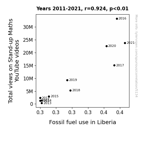
Correlation is a measure of how much the variables move together. If it is 0.99, when one goes up the other goes up. If it is 0.02, the connection is very weak or non-existent. If it is -0.99, then when one goes up the other goes down. If it is 1.00, you probably messed up your correlation function.
r2 = 0.8534196 (Coefficient of determination)
This means 85.3% of the change in the one variable (i.e., Fossil fuel use in Liberia) is predictable based on the change in the other (i.e., Total views on Matt Parker's YouTube videos) over the 11 years from 2011 through 2021.
p < 0.01, which is statistically significant(Null hypothesis significance test)
The p-value is 4.9E-5. 0.0000487487498552036540000000
The p-value is a measure of how probable it is that we would randomly find a result this extreme. More specifically the p-value is a measure of how probable it is that we would randomly find a result this extreme if we had only tested one pair of variables one time.
But I am a p-villain. I absolutely did not test only one pair of variables one time. I correlated hundreds of millions of pairs of variables. I threw boatloads of data into an industrial-sized blender to find this correlation.
Who is going to stop me? p-value reporting doesn't require me to report how many calculations I had to go through in order to find a low p-value!
On average, you will find a correaltion as strong as 0.92 in 0.0049% of random cases. Said differently, if you correlated 20,513 random variables You don't actually need 20 thousand variables to find a correlation like this one. You can also correlate variables that are not independent. I do this a lot.
p-value calculations are useful for understanding the probability of a result happening by chance. They are most useful when used to highlight the risk of a fluke outcome. For example, if you calculate a p-value of 0.30, the risk that the result is a fluke is high. It is good to know that! But there are lots of ways to get a p-value of less than 0.01, as evidenced by this project.
Just to be clear: I'm being completely transparent about the calculations. There is no math trickery. This is just how statistics shakes out when you calculate hundreds of millions of random correlations.
with the same 10 degrees of freedom, Degrees of freedom is a measure of how many free components we are testing. In this case it is 10 because we have two variables measured over a period of 11 years. It's just the number of years minus ( the number of variables minus one ), which in this case simplifies to the number of years minus one.
you would randomly expect to find a correlation as strong as this one.
[ 0.73, 0.98 ] 95% correlation confidence interval (using the Fisher z-transformation)
The confidence interval is an estimate the range of the value of the correlation coefficient, using the correlation itself as an input. The values are meant to be the low and high end of the correlation coefficient with 95% confidence.
This one is a bit more complciated than the other calculations, but I include it because many people have been pushing for confidence intervals instead of p-value calculations (for example: NEJM. However, if you are dredging data, you can reliably find yourself in the 5%. That's my goal!
All values for the years included above: If I were being very sneaky, I could trim years from the beginning or end of the datasets to increase the correlation on some pairs of variables. I don't do that because there are already plenty of correlations in my database without monkeying with the years.
Still, sometimes one of the variables has more years of data available than the other. This page only shows the overlapping years. To see all the years, click on "See what else correlates with..." link above.
| 2011 | 2012 | 2013 | 2014 | 2015 | 2016 | 2017 | 2018 | 2019 | 2020 | 2021 | |
| Total views on Matt Parker's YouTube videos (Total views) | 1305950 | 2341100 | 362077 | 1382240 | 2990560 | 33231200 | 15051400 | 5294580 | 9312520 | 22552500 | 23748100 |
| Fossil fuel use in Liberia (Billion kWh) | 0.28 | 0.28 | 0.282 | 0.282 | 0.291 | 0.376 | 0.373 | 0.318 | 0.314 | 0.363 | 0.386232 |
Why this works
- Data dredging: I have 25,153 variables in my database. I compare all these variables against each other to find ones that randomly match up. That's 632,673,409 correlation calculations! This is called “data dredging.” Instead of starting with a hypothesis and testing it, I instead abused the data to see what correlations shake out. It’s a dangerous way to go about analysis, because any sufficiently large dataset will yield strong correlations completely at random.
- Lack of causal connection: There is probably
Because these pages are automatically generated, it's possible that the two variables you are viewing are in fact causually related. I take steps to prevent the obvious ones from showing on the site (I don't let data about the weather in one city correlate with the weather in a neighboring city, for example), but sometimes they still pop up. If they are related, cool! You found a loophole.
no direct connection between these variables, despite what the AI says above. This is exacerbated by the fact that I used "Years" as the base variable. Lots of things happen in a year that are not related to each other! Most studies would use something like "one person" in stead of "one year" to be the "thing" studied. - Observations not independent: For many variables, sequential years are not independent of each other. If a population of people is continuously doing something every day, there is no reason to think they would suddenly change how they are doing that thing on January 1. A simple
Personally I don't find any p-value calculation to be 'simple,' but you know what I mean.
p-value calculation does not take this into account, so mathematically it appears less probable than it really is. - Y-axis doesn't start at zero: I truncated the Y-axes of the graph above. I also used a line graph, which makes the visual connection stand out more than it deserves.
Nothing against line graphs. They are great at telling a story when you have linear data! But visually it is deceptive because the only data is at the points on the graph, not the lines on the graph. In between each point, the data could have been doing anything. Like going for a random walk by itself!
Mathematically what I showed is true, but it is intentionally misleading. Below is the same chart but with both Y-axes starting at zero.

Try it yourself
You can calculate the values on this page on your own! Try running the Python code to see the calculation results. Step 1: Download and install Python on your computer.Step 2: Open a plaintext editor like Notepad and paste the code below into it.
Step 3: Save the file as "calculate_correlation.py" in a place you will remember, like your desktop. Copy the file location to your clipboard. On Windows, you can right-click the file and click "Properties," and then copy what comes after "Location:" As an example, on my computer the location is "C:\Users\tyler\Desktop"
Step 4: Open a command line window. For example, by pressing start and typing "cmd" and them pressing enter.
Step 5: Install the required modules by typing "pip install numpy", then pressing enter, then typing "pip install scipy", then pressing enter.
Step 6: Navigate to the location where you saved the Python file by using the "cd" command. For example, I would type "cd C:\Users\tyler\Desktop" and push enter.
Step 7: Run the Python script by typing "python calculate_correlation.py"
If you run into any issues, I suggest asking ChatGPT to walk you through installing Python and running the code below on your system. Try this question:
"Walk me through installing Python on my computer to run a script that uses scipy and numpy. Go step-by-step and ask me to confirm before moving on. Start by asking me questions about my operating system so that you know how to proceed. Assume I want the simplest installation with the latest version of Python and that I do not currently have any of the necessary elements installed. Remember to only give me one step per response and confirm I have done it before proceeding."
# These modules make it easier to perform the calculation
import numpy as np
from scipy import stats

# We'll define a function that we can call to return the correlation calculations
def calculate_correlation(array1, array2):

    # Calculate Pearson correlation coefficient and p-value
    correlation, p_value = stats.pearsonr(array1, array2)

    # Calculate R-squared as the square of the correlation coefficient
    r_squared = correlation**2

    return correlation, r_squared, p_value

# These are the arrays for the variables shown on this page, but you can modify them to be any two sets of numbers
array_1 = np.array([1305950,2341100,362077,1382240,2990560,33231200,15051400,5294580,9312520,22552500,23748100,])
array_2 = np.array([0.28,0.28,0.282,0.282,0.291,0.376,0.373,0.318,0.314,0.363,0.386232,])
array_1_name = "Total views on Matt Parker's YouTube videos"
array_2_name = "Fossil fuel use in Liberia"

# Perform the calculation
print(f"Calculating the correlation between {array_1_name} and {array_2_name}...")
correlation, r_squared, p_value = calculate_correlation(array_1, array_2)

# Print the results
print("Correlation Coefficient:", correlation)
print("R-squared:", r_squared)
print("P-value:", p_value)
Reuseable content
You may re-use the images on this page for any purpose, even commercial purposes, without asking for permission. The only requirement is that you attribute Tyler Vigen. Attribution can take many different forms. If you leave the "tylervigen.com" link in the image, that satisfies it just fine. If you remove it and move it to a footnote, that's fine too. You can also just write "Charts courtesy of Tyler Vigen" at the bottom of an article.You do not need to attribute "the spurious correlations website," and you don't even need to link here if you don't want to. I don't gain anything from pageviews. There are no ads on this site, there is nothing for sale, and I am not for hire.
For the record, I am just one person. Tyler Vigen, he/him/his. I do have degrees, but they should not go after my name unless you want to annoy my wife. If that is your goal, then go ahead and cite me as "Tyler Vigen, A.A. A.A.S. B.A. J.D." Otherwise it is just "Tyler Vigen."
When spoken, my last name is pronounced "vegan," like I don't eat meat.
Full license details.
For more on re-use permissions, or to get a signed release form, see tylervigen.com/permission.
Download images for these variables:
- High resolution line chart
The image linked here is a Scalable Vector Graphic (SVG). It is the highest resolution that is possible to achieve. It scales up beyond the size of the observable universe without pixelating. You do not need to email me asking if I have a higher resolution image. I do not. The physical limitations of our universe prevent me from providing you with an image that is any higher resolution than this one.
If you insert it into a PowerPoint presentation (a tool well-known for managing things that are the scale of the universe), you can right-click > "Ungroup" or "Create Shape" and then edit the lines and text directly. You can also change the colors this way.
Alternatively you can use a tool like Inkscape. - High resolution line chart, optimized for mobile
- Alternative high resolution line chart
- Scatterplot
- Portable line chart (png)
- Portable line chart (png), optimized for mobile
- Line chart for only Total views on Matt Parker's YouTube videos
- Line chart for only Fossil fuel use in Liberia
- AI-generated correlation image
- The spurious research paper: Stand-up Maths and Fossil Fuels: How Total Views on YouTube Schmooze with Liberia's Energy Use
Your rating skills are legendary!
Correlation ID: 5134 · Black Variable ID: 25809 · Red Variable ID: 23790

