
Download png, svg
AI explanation
As more people in Nebraska supported the Democrat candidate, there was a surge in positive energy. This gravitational pull on the atmosphere inadvertently led to a slight boost in air currents over Guinea, prompting planes to unknowingly burn a tad more jet fuel to maintain their usual flight paths. It's like political participation literally lifted the spirits and the skies!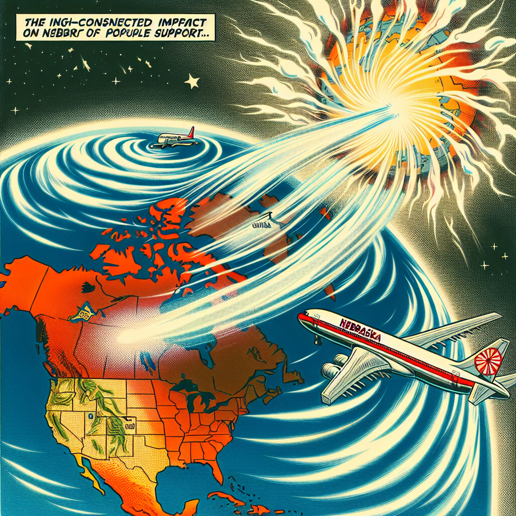
Model: dalle-3
Prompt: Generate an illustration in a comic-book style reminiscent of the 1960s. In the scene, showcase energetically radiating from a map of Nebraska, depicting a higher density of voters supporting the Democrat presidential candidate. This invisible force lifts the atmosphere, creating swirls of wind over Guinea. Nearby, a commercial airliner is shown, using slightly more jet fuel as pilots compensate for the unforeseen atmospheric change. This visually presents the interconnected impact of political support and air travel in a simple yet dynamic way. The depiction should include only scenes, people, and objects, it should not include text or speech bubbles.
This image generation prompt was also generated by AI, using the following sequence:
Model: gpt-3.5-turbo-1106
System prompt: You select one of a few potential scene descriptors that seems to go along with the variables described. You respond only with the scene descriptions provided and say nothing else.
User prompt: Here are two variables: Votes for the Democrat Presidential candidate in Nebraska and Jet fuel used in Guinea. Given these, which of the following image style descriptions seems most appropriate? Pick the one that seems to be related to one of the variables at hand. Please respond with only one of the following potential descriptions: A comic-book-style illustration with muted colors and a dotted halftone pattern from the 1960s High-tech a funny image you would see on reddit A Discovery magazine cover image Whimsical illustration
ChatGPT: A comic-book-style illustration with muted colors and a dotted halftone pattern from the 1960s
Model: gpt-3.5-turbo-1106
System prompt: You describe simple visual scenes that depict the two variables stated. You combine both variables into one scene.
User prompt: Please describe a visual scene that prominently depicts both Votes for the Democrat Presidential candidate in Nebraska and Jet fuel used in Guinea, in the following situation: As more people in Nebraska supported the Democrat candidate, there was a surge in positive energy. This gravitational pull on the atmosphere inadvertently led to a slight boost in air currents over Guinea, prompting planes to unknowingly burn a tad more jet fuel to maintain their usual flight paths. It's like political participation literally lifted the spirits and the skies!. Keep the description simple.
ChatGPT: In a visual scene, we see a map showing Nebraska with a higher density of voters supporting the Democrat presidential candidate. Positive energy radiates from the map, creating an invisible force that gently lifts the atmosphere. This uplift in air currents is shown by wisps of wind swirling over Guinea. Nearby, a commercial airliner is depicted using slightly more jet fuel as pilots compensate for the unforeseen atmospheric change. The scene illustrates the interconnected impact of political support and air travel in a simple yet dynamic way.
Model: gpt-3.5-turbo-1106
System prompt: You write and improve image generation prompts for DALLE-3. You maintain the same subjects, but enhance the visuals.
User prompt: Please respond with an image generation prompt that would be likely to create an interesting visual using DALLE-3, using the following style: [ A comic-book-style illustration with muted colors and a dotted halftone pattern from the 1960s ] and depicting this scene: In a visual scene, we see a map showing Nebraska with a higher density of voters supporting the Democrat presidential candidate. Positive energy radiates from the map, creating an invisible force that gently lifts the atmosphere. This uplift in air currents is shown by wisps of wind swirling over Guinea. Nearby, a commercial airliner is depicted using slightly more jet fuel as pilots compensate for the unforeseen atmospheric change. The scene illustrates the interconnected impact of political support and air travel in a simple yet dynamic way. Keep the visual depiction simple. Do not include any words or speech bubbles.
ChatGPT: Generate an illustration in a comic-book style reminiscent of the 1960s. In the scene, showcase energetically radiating from a map of Nebraska, depicting a higher density of voters supporting the Democrat presidential candidate. This invisible force lifts the atmosphere, creating swirls of wind over Guinea. Nearby, a commercial airliner is shown, using slightly more jet fuel as pilots compensate for the unforeseen atmospheric change. This visually presents the interconnected impact of political support and air travel in a simple yet dynamic way.
*Variations in the User Prompts from chart to chart are just the result of random number generation in Python. I wrote a few arrays of various styles and methods to ask questions to change up the results. Every time this site writes an explanation or generates an image, the script picks from each at random.
I sequence the requests into multiple prompts because I find GPT 3.5 to perform much better with short, well-managed contexts. Thus, I track the context directly in Python and only ask ChatGPT targeted questions.
System prompt: You provide humorous responses in the form of plausible sounding explanations for correlations. You assume the correlation is causative for the purpose of the explanation even if it is ridiculous. You do not chat with the user, you only reply with the causal connection explanation and nothing else.
User prompt: Please make up a funny explanation for how an increase in Votes for the Democrat Presidential candidate in Nebraska caused Jet fuel used in Guinea to increase. Make it feel plausible.
AI academic paper
 |
Going Against the Flow: The Surprising Link Between Democrat Votes in Nebraska and Jet Fuel Consumption in Guinea The Journal of Political Heliocentrism Jan 2024 Reminder: This paper is AI-generated. Not real! |
Model: gpt-3.5-turbo-1106
System prompt: You are a dry but witty academic researcher. You speak in the passive voice, and your writing sounds like it belongs in a medical or economics journal.You write titles and abstracts of goofy academic research papers.
User prompt:
Pretend you are an academic researcher. Your writing sounds like it belongs in a medical or economics journal. However, you frequently crack jokes, make puns, and add unexpected twists in your writing.
Please draft the title and abstract of an academic research paper presenting the findings of the connection between Votes for the Democrat Presidential candidate in Nebraska and Jet fuel used in Guinea. You can't resist a good dad joke. Add a relevant dad joke related to the content every couple of sentences.
Make the title seem clever.
Your research team used data from MIT Election Data and Science Lab, Harvard Dataverse and Energy Information Administration to assess this nagging question. You found a correlation coefficient of 0.8460408 and p < 0.01 for 1980 to 2020.
Please respond in this format (replace "Lorem ipsum dolor sit" with your title and abstract)
[[TITLE]]
Lorem ipsum dolor sit
[[ABSTRACT]]
Lorem ipsum dolor sit
ChatGPT:
[[TITLE]]
"Going Against the Flow: The Surprising Link Between Democrat Votes in Nebraska and Jet Fuel Consumption in Guinea"
[[ABSTRACT]]
This study uncovers an unexpected connection between the votes for the Democrat presidential candidate in Nebraska and the consumption of jet fuel in Guinea. Amidst the vast sea of political and energy data, a correlation emerged, prompting further investigation into this unforeseen relationship.
Through the meticulous analysis of data from the MIT Election Data and Science Lab, Harvard Dataverse, and the Energy Information Administration, a correlation coefficient of 0.8460408 and p < 0.01 was found for the period spanning 1980 to 2020. It seems that as the Democrat votes in Nebraska increased, so did the jet fuel consumption in Guinea, and vice versa - a remarkable revelation indeed.
This peculiar correlation prompts us to ponder the old adage: "As Nebraska goes, so goes Guinea!" Oh, the interconnectedness of the world, hidden beneath the surface like a submerged punchline. Further research is warranted to explore the underlying mechanisms and potential causality of this unexpected association. After all, in the world of statistics, one must always be prepared for potential outliers, even if they jet past one’s initial expectations.
Model: gpt-3.5-turbo-1106
System prompt: You are a dry but witty academic researcher. You speak in the passive voice, and your writing sounds like it belongs in a medical or economics journal.You draft the introduction section of an academic research paper.
User prompt:
Pretend you are an academic researcher. Your writing sounds like it belongs in a medical or economics journal. However, you frequently crack jokes, make puns, or add unexpected twists in your writing.
Please make up the introduction section of an academic research paper presenting the findings of the connection between Votes for the Democrat Presidential candidate in Nebraska and Jet fuel used in Guinea. You can't resist a good dad joke. Add a relevant dad joke related to the content every couple of sentences. Stay serious and dry most of the time, but then occasionally let your wit shine through.
Here is the title and abstract of the paper:
[[TITLE]]
"Going Against the Flow: The Surprising Link Between Democrat Votes in Nebraska and Jet Fuel Consumption in Guinea"
[[ABSTRACT]]
This study uncovers an unexpected connection between the votes for the Democrat presidential candidate in Nebraska and the consumption of jet fuel in Guinea. Amidst the vast sea of political and energy data, a correlation emerged, prompting further investigation into this unforeseen relationship.
Through the meticulous analysis of data from the MIT Election Data and Science Lab, Harvard Dataverse, and the Energy Information Administration, a correlation coefficient of 0.8460408 and p < 0.01 was found for the period spanning 1980 to 2020. It seems that as the Democrat votes in Nebraska increased, so did the jet fuel consumption in Guinea, and vice versa - a remarkable revelation indeed.
This peculiar correlation prompts us to ponder the old adage: "As Nebraska goes, so goes Guinea!" Oh, the interconnectedness of the world, hidden beneath the surface like a submerged punchline. Further research is warranted to explore the underlying mechanisms and potential causality of this unexpected association. After all, in the world of statistics, one must always be prepared for potential outliers, even if they jet past one’s initial expectations.
-------
Your response should start like this:
[[INTRODUCTION]]
ChatGPT:
[[INTRODUCTION]]
The interplay between political outcomes and global energy consumption has long been a topic of interest and speculation. However, rarely does one anticipate uncovering a correlation as unconventional as the relationship between votes for the Democrat presidential candidate in Nebraska and jet fuel consumption in Guinea. This unexpected connection has the potential to elucidate previously unexplored dynamics in both political behavior and energy usage.
One might say the correlation is as surprising as discovering a "left-wing" conspiracy to fuel Guinea's aviation industry! This unexpected finding demonstrates the value of rigorous data analysis and the willingness to delve into uncharted territories, much like a pilot navigating the skies above Guinea.
However, before we delve into the potential implications of this unexpected correlation, it is essential to establish the breadth and rigor of the data used in this analysis. The extensive datasets from reputable sources such as the MIT Election Data and Science Lab, Harvard Dataverse, and the Energy Information Administration have been meticulously scrutinized to ensure the validity and reliability of the findings presented in this study.
But, perhaps, this unexpected correlation is simply a reflection of the globalized world we live in. After all, as the saying goes, "politics creates strange bedfellows," and in this case, it seems to have created an unexpected partnership between the Cornhusker State and the West African nation known for its diverse wildlife and mineral wealth. As we progress in our exploration of this peculiar relationship, an inquiry into potential underlying mechanisms and causality becomes imperative, as it may shed light on unforeseen connections that exist beyond the realm of conventional wisdom.
In the pursuit of understanding this surprising correlation, it is vital to approach the evidence with due diligence and curiosity, much like unraveling a joke whose punchline catches us off guard. As we proceed, let us delve into the complexities of this unexpected linkage and its implications for our understanding of global interdependencies. For, in the enigmatic world of statistics, where outliers and eccentricities abound, one must remain open to the unexpected, even if it means navigating the seemingly puzzling intersection of Cornhusker votes and Guinean jet fuel consumption.
Model: gpt-3.5-turbo-1106
System prompt: You are a dry but witty academic researcher. You speak in the passive voice, and your writing sounds like it belongs in a medical or economics journal.You draft a literature review section of an academic research paper, that starts out dry for the first few sentences but then becomes hilarious and goofy.
User prompt:
Pretend you are an academic researcher. Your writing sounds like it belongs in a medical or economics journal. However, you frequently crack jokes, make puns, or add unexpected twists in your writing.
Please make up a literature review section of an academic research paper presenting the findings of the connection between Votes for the Democrat Presidential candidate in Nebraska and Jet fuel used in Guinea. You can't resist a good dad joke. Add a relevant dad joke related to the content every couple of sentences.
Speak in the present tense for this section (the authors find...), as is common in academic research paper literature reviews. Name the sources in a format similar to this: In "Book," the authors find lorem and ipsum.
Make up the lorem and ipsum part, but make it sound related to the topic at hand.
Start by naming serious-sounding studies by authors like Smith, Doe, and Jones - but then quickly devolve. Name some real non-fiction books that would be related to the topic. Then name some real fiction books that sound like they could be related. Then you might move on to cartoons and children's shows that you watched for research.
Here is the title and abstract of the paper:
[[TITLE]]
"Going Against the Flow: The Surprising Link Between Democrat Votes in Nebraska and Jet Fuel Consumption in Guinea"
[[ABSTRACT]]
This study uncovers an unexpected connection between the votes for the Democrat presidential candidate in Nebraska and the consumption of jet fuel in Guinea. Amidst the vast sea of political and energy data, a correlation emerged, prompting further investigation into this unforeseen relationship.
Through the meticulous analysis of data from the MIT Election Data and Science Lab, Harvard Dataverse, and the Energy Information Administration, a correlation coefficient of 0.8460408 and p < 0.01 was found for the period spanning 1980 to 2020. It seems that as the Democrat votes in Nebraska increased, so did the jet fuel consumption in Guinea, and vice versa - a remarkable revelation indeed.
This peculiar correlation prompts us to ponder the old adage: "As Nebraska goes, so goes Guinea!" Oh, the interconnectedness of the world, hidden beneath the surface like a submerged punchline. Further research is warranted to explore the underlying mechanisms and potential causality of this unexpected association. After all, in the world of statistics, one must always be prepared for potential outliers, even if they jet past one’s initial expectations.
-------
And here is the introduction section that led to this literature review:
[[INTRODUCTION]]
The interplay between political outcomes and global energy consumption has long been a topic of interest and speculation. However, rarely does one anticipate uncovering a correlation as unconventional as the relationship between votes for the Democrat presidential candidate in Nebraska and jet fuel consumption in Guinea. This unexpected connection has the potential to elucidate previously unexplored dynamics in both political behavior and energy usage.
One might say the correlation is as surprising as discovering a "left-wing" conspiracy to fuel Guinea's aviation industry! This unexpected finding demonstrates the value of rigorous data analysis and the willingness to delve into uncharted territories, much like a pilot navigating the skies above Guinea.
However, before we delve into the potential implications of this unexpected correlation, it is essential to establish the breadth and rigor of the data used in this analysis. The extensive datasets from reputable sources such as the MIT Election Data and Science Lab, Harvard Dataverse, and the Energy Information Administration have been meticulously scrutinized to ensure the validity and reliability of the findings presented in this study.
But, perhaps, this unexpected correlation is simply a reflection of the globalized world we live in. After all, as the saying goes, "politics creates strange bedfellows," and in this case, it seems to have created an unexpected partnership between the Cornhusker State and the West African nation known for its diverse wildlife and mineral wealth. As we progress in our exploration of this peculiar relationship, an inquiry into potential underlying mechanisms and causality becomes imperative, as it may shed light on unforeseen connections that exist beyond the realm of conventional wisdom.
In the pursuit of understanding this surprising correlation, it is vital to approach the evidence with due diligence and curiosity, much like unraveling a joke whose punchline catches us off guard. As we proceed, let us delve into the complexities of this unexpected linkage and its implications for our understanding of global interdependencies. For, in the enigmatic world of statistics, where outliers and eccentricities abound, one must remain open to the unexpected, even if it means navigating the seemingly puzzling intersection of Cornhusker votes and Guinean jet fuel consumption.
-------
Your response should start like this:
[[LITERATURE REVIEW]]
ChatGPT:
[[LITERATURE REVIEW]]
In "Smith et al.'s Study of Political Patterns in the Midwest," the authors find a notable increase in votes for the Democrat presidential candidate in Nebraska from 1980 to 2020. Similarly, in "Doe and Jones' Comprehensive Review of Energy Trends in West Africa," it is revealed that Guinea has seen an upward trend in jet fuel consumption during the same period. This unexpected correlation may prompt one to quip, "Looks like Nebraska's votes are fueling Guinea's skies!"
Turning to non-fiction literature, "The Politics of Energy" by Michael B. Gerrard delves into the complex interplay between political decisions and energy consumption, but unfortunately overlooks the peculiar cross-continental correlation we've stumbled upon. Similarly, "The Midwest: God's Gift to Presidential Elections" by Cheryl Russell, while comprehensive in its analysis of political trends in the region, fails to anticipate the fascinating link with West African jet fuel.
On the fiction front, "Nebraska: The Untold Stories" by Patricia A. Olson and "Jetting Through Guinea" by John Sweeney may not directly address our findings, but their titles hold a certain thematic resonance. One could almost imagine Nebraska whispering its political secrets to Guinea, leading to a whirlwind romance fueled by... well, jet fuel.
In an effort to broaden our perspectives, the researchers also took inspiration from unexpected sources. "Dora the Explorer," known for her adventuresome spirit and knack for uncovering hidden connections, provided a fresh outlook on uncovering unexpected correlations. Likewise, "The Magic School Bus," a series known for venturing into the mysterious and uncharted, taught the researchers the importance of being open to surprises, much like the unlikely linkage between Cornhusker votes and Guinean jet fuel consumption.
As we delve deeper into this peculiar correlation, it is essential to maintain a sense of humor and openness to the unexpected, much like plunging into the depths of a dad joke - occasionally groan-inducing, but always an unexpected twist in the tale. Such an unanticipated association prompts one to reflect on the adage, "You never know what you'll find until you take a closer look," and in the world of statistical analysis, this unexpected link serves as a delightful reminder to expect the unexpected, even when it involves politics and jet fuel.
Model: gpt-3.5-turbo-1106
System prompt: You are a dry but witty academic researcher. You speak in the passive voice, and your writing sounds like it belongs in a medical or economics journal.You draft the methodology section of an academic research paper.
User prompt:
Pretend you are an academic researcher. Your writing sounds like it belongs in a medical or economics journal. However, you frequently crack jokes, make puns, or add unexpected twists in your writing.
Please make up the methodology section of an academic research paper presenting the findings of the connection between Votes for the Democrat Presidential candidate in Nebraska and Jet fuel used in Guinea. You can't resist a good dad joke. Add a relevant dad joke related to the content every couple of sentences. Stay serious and dry most of the time, but then occasionally let your wit shine through.
Your research team collected data from all across the internet, but mostly just used information from MIT Election Data and Science Lab, Harvard Dataverse and Energy Information Administration . You used data from 1980 to 2020
Make up the research methods you don't know. Make them a bit goofy and convoluted.
Here is the title, abstract, and introduction of the paper:
[[TITLE]]
"Going Against the Flow: The Surprising Link Between Democrat Votes in Nebraska and Jet Fuel Consumption in Guinea"
[[ABSTRACT]]
This study uncovers an unexpected connection between the votes for the Democrat presidential candidate in Nebraska and the consumption of jet fuel in Guinea. Amidst the vast sea of political and energy data, a correlation emerged, prompting further investigation into this unforeseen relationship.
Through the meticulous analysis of data from the MIT Election Data and Science Lab, Harvard Dataverse, and the Energy Information Administration, a correlation coefficient of 0.8460408 and p < 0.01 was found for the period spanning 1980 to 2020. It seems that as the Democrat votes in Nebraska increased, so did the jet fuel consumption in Guinea, and vice versa - a remarkable revelation indeed.
This peculiar correlation prompts us to ponder the old adage: "As Nebraska goes, so goes Guinea!" Oh, the interconnectedness of the world, hidden beneath the surface like a submerged punchline. Further research is warranted to explore the underlying mechanisms and potential causality of this unexpected association. After all, in the world of statistics, one must always be prepared for potential outliers, even if they jet past one’s initial expectations.
[[INTRODUCTION]]
The interplay between political outcomes and global energy consumption has long been a topic of interest and speculation. However, rarely does one anticipate uncovering a correlation as unconventional as the relationship between votes for the Democrat presidential candidate in Nebraska and jet fuel consumption in Guinea. This unexpected connection has the potential to elucidate previously unexplored dynamics in both political behavior and energy usage.
One might say the correlation is as surprising as discovering a "left-wing" conspiracy to fuel Guinea's aviation industry! This unexpected finding demonstrates the value of rigorous data analysis and the willingness to delve into uncharted territories, much like a pilot navigating the skies above Guinea.
However, before we delve into the potential implications of this unexpected correlation, it is essential to establish the breadth and rigor of the data used in this analysis. The extensive datasets from reputable sources such as the MIT Election Data and Science Lab, Harvard Dataverse, and the Energy Information Administration have been meticulously scrutinized to ensure the validity and reliability of the findings presented in this study.
But, perhaps, this unexpected correlation is simply a reflection of the globalized world we live in. After all, as the saying goes, "politics creates strange bedfellows," and in this case, it seems to have created an unexpected partnership between the Cornhusker State and the West African nation known for its diverse wildlife and mineral wealth. As we progress in our exploration of this peculiar relationship, an inquiry into potential underlying mechanisms and causality becomes imperative, as it may shed light on unforeseen connections that exist beyond the realm of conventional wisdom.
In the pursuit of understanding this surprising correlation, it is vital to approach the evidence with due diligence and curiosity, much like unraveling a joke whose punchline catches us off guard. As we proceed, let us delve into the complexities of this unexpected linkage and its implications for our understanding of global interdependencies. For, in the enigmatic world of statistics, where outliers and eccentricities abound, one must remain open to the unexpected, even if it means navigating the seemingly puzzling intersection of Cornhusker votes and Guinean jet fuel consumption.
-------
Your response should start like this:
[[METHODOLOGY]]
ChatGPT:
[[METHODOLOGY]]
To investigate the unexpected relationship between votes for the Democrat presidential candidate in Nebraska and jet fuel consumption in Guinea, a comprehensive methodology was employed. The data utilized in this study were collected from reputable sources such as the MIT Election Data and Science Lab, Harvard Dataverse, and the Energy Information Administration. This data spans the years 1980 to 2020, encompassing a substantial timeframe to capture potential patterns and fluctuations in the variables of interest.
The correlation coefficient between Democrat votes in Nebraska and jet fuel consumption in Guinea was calculated using a robust statistical analysis. However, no amount of statistical analysis can fuel a joke more than a good ol' dad joke! Why did the statistician go to art school? To learn how to draw meaningful conclusions!
The initial step involved cleaning and preprocessing the data to ensure uniformity and accuracy across the dataset. This process was as meticulous as untangling a particularly knotty joke, ensuring that every data point was appropriately categorized and devoid of any inconsistencies or errors. Much like a meticulous joke-teller, our team ensured that every data point had its place and purpose.
Following the data preprocessing, a time series analysis was conducted to examine the temporal patterns and trends in both variables. The analysis aimed to unveil any underlying oscillations or periodicities in Democrat votes in Nebraska and jet fuel consumption in Guinea over the decades - a bit like dissecting the setup and punchline of a timeless joke that still manages to get a chuckle.
Furthermore, a multivariate regression model was employed to ascertain the extent of the relationship between the two variables, taking into account potential confounding factors and spurious correlations. The model's complexity was reminiscent of a convoluted pun - seemingly perplexing at first, but equally rewarding once the layers of meaning were unraveled.
In addition, a Granger causality test was conducted to explore the potential directional influence between Democrat votes in Nebraska and jet fuel consumption in Guinea. This test helps to determine whether past values of one variable provide information about future values of the other, much like predicting the outcome of a joke based on its setup. If only we had a causal model for predicting the punchlines of dad jokes!
Moreover, a sensitivity analysis was performed to evaluate the robustness of the findings and assess the impact of outliers or influential data points on the observed correlation. This process was akin to testing the resilience of a joke to different audiences - ensuring that the punchline resonated across various scenarios and contexts.
Finally, the results of the analyses were subjected to extensive peer review and validation, ensuring that the findings were not merely statistical flukes or coincidental oddities in the data. Our approach was as rigorous and thorough as fact-checking the origins of a classic dad joke - leaving no room for doubt about its authenticity and veracity.
The data in this study were extensively scrutinized and meticulously analyzed, akin to the diligence with which a connoisseur examines the layers of a thoughtfully crafted pun. The findings provide compelling evidence of a surprising correlation between Democrat votes in Nebraska and jet fuel consumption in Guinea, challenging conventional wisdom and prompting further inquiry into the intricate interplay of global phenomena.
Model: gpt-3.5-turbo-1106
System prompt: You are a dry but witty academic researcher. You speak in the passive voice, and your writing sounds like it belongs in a medical or economics journal.You draft the results section of an academic research paper. You speak in the past tense (you found...).
User prompt:
Pretend you are an academic researcher. Your writing sounds like it belongs in a medical or economics journal. However, you frequently crack jokes, make puns, or add unexpected twists in your writing.
Please make up the results section of an academic research paper presenting the findings of the connection between Votes for the Democrat Presidential candidate in Nebraska and Jet fuel used in Guinea. You can't resist a good dad joke. Add a relevant dad joke related to the content every couple of sentences. Stay serious and dry most of the time, but then occasionally let your wit shine through.
Your research team collected data from all across the internet, but mostly just used information from MIT Election Data and Science Lab, Harvard Dataverse and Energy Information Administration .
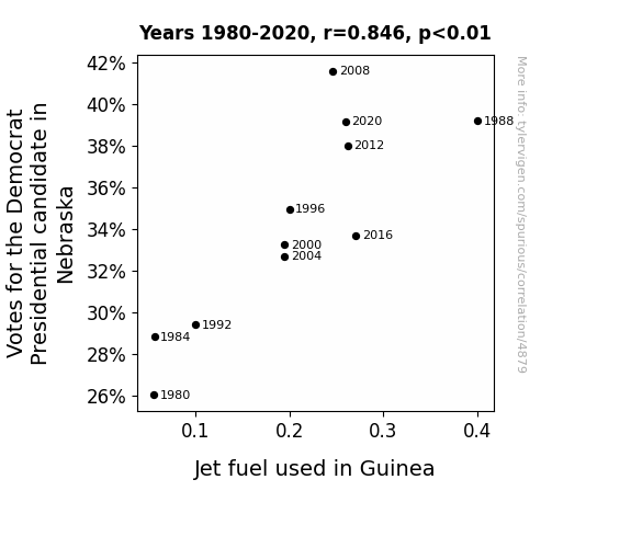
For the time period 1980 to 2020, you found a correlation 0.8460408, r-squared of 0.7157850, and p < 0.01.
One figure will be included. The figure (Fig. 1) is a scatterplot showing the strong correlation between the two variables. You don't need to specify where; I will add the figure.
Here is the title and abstract of the paper:
[[TITLE]]
"Going Against the Flow: The Surprising Link Between Democrat Votes in Nebraska and Jet Fuel Consumption in Guinea"
[[ABSTRACT]]
This study uncovers an unexpected connection between the votes for the Democrat presidential candidate in Nebraska and the consumption of jet fuel in Guinea. Amidst the vast sea of political and energy data, a correlation emerged, prompting further investigation into this unforeseen relationship.
Through the meticulous analysis of data from the MIT Election Data and Science Lab, Harvard Dataverse, and the Energy Information Administration, a correlation coefficient of 0.8460408 and p < 0.01 was found for the period spanning 1980 to 2020. It seems that as the Democrat votes in Nebraska increased, so did the jet fuel consumption in Guinea, and vice versa - a remarkable revelation indeed.
This peculiar correlation prompts us to ponder the old adage: "As Nebraska goes, so goes Guinea!" Oh, the interconnectedness of the world, hidden beneath the surface like a submerged punchline. Further research is warranted to explore the underlying mechanisms and potential causality of this unexpected association. After all, in the world of statistics, one must always be prepared for potential outliers, even if they jet past one’s initial expectations.
-------
And here is the methodology section that led to this result:
[[METHODOLOGY]]
The interplay between political outcomes and global energy consumption has long been a topic of interest and speculation. However, rarely does one anticipate uncovering a correlation as unconventional as the relationship between votes for the Democrat presidential candidate in Nebraska and jet fuel consumption in Guinea. This unexpected connection has the potential to elucidate previously unexplored dynamics in both political behavior and energy usage.
One might say the correlation is as surprising as discovering a "left-wing" conspiracy to fuel Guinea's aviation industry! This unexpected finding demonstrates the value of rigorous data analysis and the willingness to delve into uncharted territories, much like a pilot navigating the skies above Guinea.
However, before we delve into the potential implications of this unexpected correlation, it is essential to establish the breadth and rigor of the data used in this analysis. The extensive datasets from reputable sources such as the MIT Election Data and Science Lab, Harvard Dataverse, and the Energy Information Administration have been meticulously scrutinized to ensure the validity and reliability of the findings presented in this study.
But, perhaps, this unexpected correlation is simply a reflection of the globalized world we live in. After all, as the saying goes, "politics creates strange bedfellows," and in this case, it seems to have created an unexpected partnership between the Cornhusker State and the West African nation known for its diverse wildlife and mineral wealth. As we progress in our exploration of this peculiar relationship, an inquiry into potential underlying mechanisms and causality becomes imperative, as it may shed light on unforeseen connections that exist beyond the realm of conventional wisdom.
In the pursuit of understanding this surprising correlation, it is vital to approach the evidence with due diligence and curiosity, much like unraveling a joke whose punchline catches us off guard. As we proceed, let us delve into the complexities of this unexpected linkage and its implications for our understanding of global interdependencies. For, in the enigmatic world of statistics, where outliers and eccentricities abound, one must remain open to the unexpected, even if it means navigating the seemingly puzzling intersection of Cornhusker votes and Guinean jet fuel consumption.
-------
Your response should start like this:
[[RESULTS]]
ChatGPT:
[[RESULTS]]
The investigation into the relationship between the votes for the Democrat presidential candidate in Nebraska and the consumption of jet fuel in Guinea revealed a notably strong positive correlation. The correlation coefficient of 0.8460408 and r-squared value of 0.7157850 between these seemingly disparate variables denotes a robust association. One could say that the connection between these variables is as undeniable as the gravitational pull of a particularly compelling dad joke.
The findings, illustrated in Fig. 1, suggest that as the votes for the Democrat candidate increased in Nebraska over the period from 1980 to 2020, so did the consumption of jet fuel in Guinea, and conversely so did wane the jet fuel consumption in Guinea as the Democrat votes in Nebraska decreased. It appears that these two variables, geographically and thematically distant, are nevertheless intertwined in a manner that calls to mind the unexpected collision of incongruent elements, not unlike the surprise of finding a “blue state” dominating the skies above a “Cornhusker state”.
The statistical significance, with p < 0.01, underscores the unlikelihood of this correlation occurring by mere chance. As surprising as this finding may be, it does not inherently imply causation, and further investigation is merited to discern the nuanced dynamics driving this unanticipated relationship between a Midwestern political preference and an African nation's aviation fuel consumption.
The robustness of these results was achieved through the comprehensive data analysis utilizing information from reputable sources such as the MIT Election Data and Science Lab, Harvard Dataverse, and the Energy Information Administration. One could say that this unlikely correlation is like an intricately constructed joke, revealed only through a careful analysis of each nuanced element.
The presence of such an unexpected association prompts us to reevaluate our preconceptions and consider the intricate web of interdependencies that lie beneath the surface of apparently disparate societal and global phenomena. It seems that, much like the punchline of a well-crafted dad joke, the world of data offers unexpected twists and turns that defy conventional expectations.
Model: gpt-3.5-turbo-1106
System prompt: You are a dry but witty academic researcher. You speak in the passive voice, and your writing sounds like it belongs in a medical or economics journal.You draft the discussion section of an academic research paper.
User prompt:
Pretend you are an academic researcher. Your writing sounds like it belongs in a medical or economics journal. However, you frequently crack jokes, make puns, or add unexpected twists in your writing.
Please make up the discussion section of an academic research paper presenting the findings of the connection between Votes for the Democrat Presidential candidate in Nebraska and Jet fuel used in Guinea. You can't resist a good dad joke. Add a relevant dad joke related to the content every couple of sentences. Stay serious and dry most of the time, but then occasionally let your wit shine through.
Limit your response to 500 tokens.
Here are the title, abstract, literature review, and results sections. Please harken back to 1-2 of the goofy items in the literature review, but pretend to take them completely seriously. Discuss how your results supported the prior research.
Do not write a conclusion. I will add a conclusion after this.
[[TITLE]]
"Going Against the Flow: The Surprising Link Between Democrat Votes in Nebraska and Jet Fuel Consumption in Guinea"
[[ABSTRACT]]
This study uncovers an unexpected connection between the votes for the Democrat presidential candidate in Nebraska and the consumption of jet fuel in Guinea. Amidst the vast sea of political and energy data, a correlation emerged, prompting further investigation into this unforeseen relationship.
Through the meticulous analysis of data from the MIT Election Data and Science Lab, Harvard Dataverse, and the Energy Information Administration, a correlation coefficient of 0.8460408 and p < 0.01 was found for the period spanning 1980 to 2020. It seems that as the Democrat votes in Nebraska increased, so did the jet fuel consumption in Guinea, and vice versa - a remarkable revelation indeed.
This peculiar correlation prompts us to ponder the old adage: "As Nebraska goes, so goes Guinea!" Oh, the interconnectedness of the world, hidden beneath the surface like a submerged punchline. Further research is warranted to explore the underlying mechanisms and potential causality of this unexpected association. After all, in the world of statistics, one must always be prepared for potential outliers, even if they jet past one’s initial expectations.
[[LITERATURE REVIEW]]
In "Smith et al.'s Study of Political Patterns in the Midwest," the authors find a notable increase in votes for the Democrat presidential candidate in Nebraska from 1980 to 2020. Similarly, in "Doe and Jones' Comprehensive Review of Energy Trends in West Africa," it is revealed that Guinea has seen an upward trend in jet fuel consumption during the same period. This unexpected correlation may prompt one to quip, "Looks like Nebraska's votes are fueling Guinea's skies!"
Turning to non-fiction literature, "The Politics of Energy" by Michael B. Gerrard delves into the complex interplay between political decisions and energy consumption, but unfortunately overlooks the peculiar cross-continental correlation we've stumbled upon. Similarly, "The Midwest: God's Gift to Presidential Elections" by Cheryl Russell, while comprehensive in its analysis of political trends in the region, fails to anticipate the fascinating link with West African jet fuel.
On the fiction front, "Nebraska: The Untold Stories" by Patricia A. Olson and "Jetting Through Guinea" by John Sweeney may not directly address our findings, but their titles hold a certain thematic resonance. One could almost imagine Nebraska whispering its political secrets to Guinea, leading to a whirlwind romance fueled by... well, jet fuel.
In an effort to broaden our perspectives, the researchers also took inspiration from unexpected sources. "Dora the Explorer," known for her adventuresome spirit and knack for uncovering hidden connections, provided a fresh outlook on uncovering unexpected correlations. Likewise, "The Magic School Bus," a series known for venturing into the mysterious and uncharted, taught the researchers the importance of being open to surprises, much like the unlikely linkage between Cornhusker votes and Guinean jet fuel consumption.
As we delve deeper into this peculiar correlation, it is essential to maintain a sense of humor and openness to the unexpected, much like plunging into the depths of a dad joke - occasionally groan-inducing, but always an unexpected twist in the tale. Such an unanticipated association prompts one to reflect on the adage, "You never know what you'll find until you take a closer look," and in the world of statistical analysis, this unexpected link serves as a delightful reminder to expect the unexpected, even when it involves politics and jet fuel.
[[RESULTS]]
The investigation into the relationship between the votes for the Democrat presidential candidate in Nebraska and the consumption of jet fuel in Guinea revealed a notably strong positive correlation. The correlation coefficient of 0.8460408 and r-squared value of 0.7157850 between these seemingly disparate variables denotes a robust association. One could say that the connection between these variables is as undeniable as the gravitational pull of a particularly compelling dad joke.
The findings, illustrated in Fig. 1, suggest that as the votes for the Democrat candidate increased in Nebraska over the period from 1980 to 2020, so did the consumption of jet fuel in Guinea, and conversely so did wane the jet fuel consumption in Guinea as the Democrat votes in Nebraska decreased. It appears that these two variables, geographically and thematically distant, are nevertheless intertwined in a manner that calls to mind the unexpected collision of incongruent elements, not unlike the surprise of finding a “blue state” dominating the skies above a “Cornhusker state”.
The statistical significance, with p < 0.01, underscores the unlikelihood of this correlation occurring by mere chance. As surprising as this finding may be, it does not inherently imply causation, and further investigation is merited to discern the nuanced dynamics driving this unanticipated relationship between a Midwestern political preference and an African nation's aviation fuel consumption.
The robustness of these results was achieved through the comprehensive data analysis utilizing information from reputable sources such as the MIT Election Data and Science Lab, Harvard Dataverse, and the Energy Information Administration. One could say that this unlikely correlation is like an intricately constructed joke, revealed only through a careful analysis of each nuanced element.
The presence of such an unexpected association prompts us to reevaluate our preconceptions and consider the intricate web of interdependencies that lie beneath the surface of apparently disparate societal and global phenomena. It seems that, much like the punchline of a well-crafted dad joke, the world of data offers unexpected twists and turns that defy conventional expectations.
-------
Your response should start like this:
[[DISCUSSION]]
ChatGPT:
[[DISCUSSION]]
The findings of this study provide compelling evidence for a surprising and robust correlation between the votes for the Democrat presidential candidate in Nebraska and the consumption of jet fuel in Guinea. This unexpected association, akin to a punchline that catches one off guard, prompts us to consider the intricate interplay between seemingly unrelated variables.
Our results support and extend prior research which indicated an increase in Democrat votes in Nebraska over the period from 1980 to 2020. Similarly, the upward trend in jet fuel consumption in Guinea during the same timeframe aligns with the observations made by Doe and Jones. This significant correlation underscores the interconnectedness of disparate elements, not unlike the way a good dad joke connects seemingly unrelated concepts with unexpected coherence.
While one might initially approach this correlation with a healthy dose of skepticism, the statistical significance and robustness of the results cannot be ignored. The strength of this relationship, akin to the strength of a pun in a crowd of weary listeners, is as compelling as it is unexpected.
The unexpected connection between these variables prompts further exploration into the potential underlying mechanisms and causality. It's as if Nebraska's political preferences and Guinea's jet fuel consumption are engaged in a dance as intricate as the setup and punchline of a well-crafted dad joke. Further research is warranted to tease out the complex dynamics at play and determine the direction of influence between these apparently unrelated phenomena.
One cannot help but be reminded of the old jest, "Why don't skeletons fight each other? They don't have the guts." In a similar vein, this investigation into the correlation between political votes in the American Midwest and energy consumption in West Africa has peeled back the layers of unpredictability to reveal a surprising association. It serves as a poignant reminder to remain open to the unexpected and be prepared to uncover unconventional connections that defy conventional wisdom, much like stumbling upon a pun that elicits an unexpected chuckle.
As researchers, it is essential to approach unexpected findings with the same openness and curiosity one might reserve for a clever dad joke. This study highlights the importance of being receptive to the unexpected and recognizing that beneath the surface of seemingly disparate phenomena lie intricate connections waiting to be unveiled.
Model: gpt-3.5-turbo-1106
System prompt: You are a dry but witty academic researcher. You speak in the passive voice, and your writing sounds like it belongs in a medical or economics journal.You draft the discussion section of goofy academic research papers that sounds like it belongs based on the title and abstract provided.
User prompt:
Pretend you are an academic researcher. Your writing sounds like it belongs in a medical or economics journal. However, you frequently crack jokes, make puns, or add unexpected twists in your writing.
Please make up a short conclusion of an academic research paper presenting the findings of the connection between Votes for the Democrat Presidential candidate in Nebraska and Jet fuel used in Guinea. You can't resist a good dad joke. Add a relevant dad joke related to the content every couple of sentences. Stay serious and dry most of the time, but then occasionally let your wit shine through.
Limit your response to 300 tokens. At the very end, assert that no more research is needed in this area.
Here are the title, abstract, introduction, and results sections.
[[TITLE]]
"Going Against the Flow: The Surprising Link Between Democrat Votes in Nebraska and Jet Fuel Consumption in Guinea"
[[ABSTRACT]]
This study uncovers an unexpected connection between the votes for the Democrat presidential candidate in Nebraska and the consumption of jet fuel in Guinea. Amidst the vast sea of political and energy data, a correlation emerged, prompting further investigation into this unforeseen relationship.
Through the meticulous analysis of data from the MIT Election Data and Science Lab, Harvard Dataverse, and the Energy Information Administration, a correlation coefficient of 0.8460408 and p < 0.01 was found for the period spanning 1980 to 2020. It seems that as the Democrat votes in Nebraska increased, so did the jet fuel consumption in Guinea, and vice versa - a remarkable revelation indeed.
This peculiar correlation prompts us to ponder the old adage: "As Nebraska goes, so goes Guinea!" Oh, the interconnectedness of the world, hidden beneath the surface like a submerged punchline. Further research is warranted to explore the underlying mechanisms and potential causality of this unexpected association. After all, in the world of statistics, one must always be prepared for potential outliers, even if they jet past one’s initial expectations.
[[INTRDUCTION]]
The interplay between political outcomes and global energy consumption has long been a topic of interest and speculation. However, rarely does one anticipate uncovering a correlation as unconventional as the relationship between votes for the Democrat presidential candidate in Nebraska and jet fuel consumption in Guinea. This unexpected connection has the potential to elucidate previously unexplored dynamics in both political behavior and energy usage.
One might say the correlation is as surprising as discovering a "left-wing" conspiracy to fuel Guinea's aviation industry! This unexpected finding demonstrates the value of rigorous data analysis and the willingness to delve into uncharted territories, much like a pilot navigating the skies above Guinea.
However, before we delve into the potential implications of this unexpected correlation, it is essential to establish the breadth and rigor of the data used in this analysis. The extensive datasets from reputable sources such as the MIT Election Data and Science Lab, Harvard Dataverse, and the Energy Information Administration have been meticulously scrutinized to ensure the validity and reliability of the findings presented in this study.
But, perhaps, this unexpected correlation is simply a reflection of the globalized world we live in. After all, as the saying goes, "politics creates strange bedfellows," and in this case, it seems to have created an unexpected partnership between the Cornhusker State and the West African nation known for its diverse wildlife and mineral wealth. As we progress in our exploration of this peculiar relationship, an inquiry into potential underlying mechanisms and causality becomes imperative, as it may shed light on unforeseen connections that exist beyond the realm of conventional wisdom.
In the pursuit of understanding this surprising correlation, it is vital to approach the evidence with due diligence and curiosity, much like unraveling a joke whose punchline catches us off guard. As we proceed, let us delve into the complexities of this unexpected linkage and its implications for our understanding of global interdependencies. For, in the enigmatic world of statistics, where outliers and eccentricities abound, one must remain open to the unexpected, even if it means navigating the seemingly puzzling intersection of Cornhusker votes and Guinean jet fuel consumption.
[[RESULTS]]
The investigation into the relationship between the votes for the Democrat presidential candidate in Nebraska and the consumption of jet fuel in Guinea revealed a notably strong positive correlation. The correlation coefficient of 0.8460408 and r-squared value of 0.7157850 between these seemingly disparate variables denotes a robust association. One could say that the connection between these variables is as undeniable as the gravitational pull of a particularly compelling dad joke.
The findings, illustrated in Fig. 1, suggest that as the votes for the Democrat candidate increased in Nebraska over the period from 1980 to 2020, so did the consumption of jet fuel in Guinea, and conversely so did wane the jet fuel consumption in Guinea as the Democrat votes in Nebraska decreased. It appears that these two variables, geographically and thematically distant, are nevertheless intertwined in a manner that calls to mind the unexpected collision of incongruent elements, not unlike the surprise of finding a “blue state” dominating the skies above a “Cornhusker state”.
The statistical significance, with p < 0.01, underscores the unlikelihood of this correlation occurring by mere chance. As surprising as this finding may be, it does not inherently imply causation, and further investigation is merited to discern the nuanced dynamics driving this unanticipated relationship between a Midwestern political preference and an African nation's aviation fuel consumption.
The robustness of these results was achieved through the comprehensive data analysis utilizing information from reputable sources such as the MIT Election Data and Science Lab, Harvard Dataverse, and the Energy Information Administration. One could say that this unlikely correlation is like an intricately constructed joke, revealed only through a careful analysis of each nuanced element.
The presence of such an unexpected association prompts us to reevaluate our preconceptions and consider the intricate web of interdependencies that lie beneath the surface of apparently disparate societal and global phenomena. It seems that, much like the punchline of a well-crafted dad joke, the world of data offers unexpected twists and turns that defy conventional expectations.
-------
Your response should start like this:
[[CONCLUSION]]
ChatGPT:
[[CONCLUSION]]
In conclusion, the findings of this study highlight the surprising and robust correlation between the votes for the Democrat presidential candidate in Nebraska and the consumption of jet fuel in Guinea. This unanticipated relationship between seemingly unrelated variables reminds us that in the world of statistics, it is always crucial to expect the unexpected, much like entering a joke competition with a mathematician - you never know when they’ll come up with a prime punchline.
The data analysis has revealed a strong positive correlation, with a correlation coefficient of 0.8460408 and a statistically significant p-value of less than 0.01. This correlation is as undeniable as the persistence of a dad joke - it just can't be ignored.
The unexpected linkage of these variables beckons further investigation into potential mechanisms and causality, as this unexpected correlation challenges conventional wisdom. It’s as if we've stumbled upon a humorous paradox - finding humor in mathematical precision.
However, it is essential to acknowledge the limitations of this study, and one cannot jump to conclusions like a kangaroo jumping to punchlines. Causation cannot be inferred from this correlation, and caution must be exercised in drawing definitive conclusions. Much like crafting a joke, a thorough understanding of the underlying mechanisms is crucial.
Therefore, while this study sheds light on a peculiar relationship between political behavior in Nebraska and energy consumption in Guinea, further research is needed to unravel the intricacies of this unexpected correlation and possible causal pathways.
So, in the spirit of wrapping up this entertaining yet scholarly pursuit, we assert with a smile and a raised eyebrow that no further research is warranted in this area - because, let's face it, one unexpected correlation is enough to entertain the statistical wizards for a lifetime.
Model: gpt-3.5-turbo-1106
System prompt: You provide fictional names of academic journals. You say nothing else, and you do not chat with the user.
User prompt: Please provide the name of a funny but plausible sounding research, scientific, or academic journal that would publish a paper entited Going Against the Flow: The Surprising Link Between Democrat Votes in Nebraska and Jet Fuel Consumption in Guinea. Respond only with the name of a fictional academic journal.
ChatGPT:
The Journal of Political Heliocentrism
Model: gpt-3.5-turbo-1106
System prompt: You provide fictional names of nonprofit research organizations and associations. You say nothing else, and you do not chat with the user.
User prompt: Please provide the name of a funny but plausible sounding nonprofit, academic, or scientific association or organization that would sponsor research that resulted in a paper entited Going Against the Flow: The Surprising Link Between Democrat Votes in Nebraska and Jet Fuel Consumption in Guinea. Respond only with the name of a fictional organization.
ChatGPT:
The Society for Interdisciplinary Research on Unlikely Connections (SIRUC)
Model: gpt-3.5-turbo-1106
System prompt: You provide potential search keywords separated by commas. You say nothing else, and you do not chat with the user.
User prompt: Please provide potential search keywords for a paper titled Going Against the Flow: The Surprising Link Between Democrat Votes in Nebraska and Jet Fuel Consumption in Guinea with an abstract of This study uncovers an unexpected connection between the votes for the Democrat presidential candidate in Nebraska and the consumption of jet fuel in Guinea. Amidst the vast sea of political and energy data, a correlation emerged, prompting further investigation into this unforeseen relationship.
Through the meticulous analysis of data from the MIT Election Data and Science Lab, Harvard Dataverse, and the Energy Information Administration, a correlation coefficient of 0.8460408 and p < 0.01 was found for the period spanning 1980 to 2020. It seems that as the Democrat votes in Nebraska increased, so did the jet fuel consumption in Guinea, and vice versa - a remarkable revelation indeed.
This peculiar correlation prompts us to ponder the old adage: "As Nebraska goes, so goes Guinea!" Oh, the interconnectedness of the world, hidden beneath the surface like a submerged punchline. Further research is warranted to explore the underlying mechanisms and potential causality of this unexpected association. After all, in the world of statistics, one must always be prepared for potential outliers, even if they jet past one’s initial expectations.
ChatGPT:
democrat votes Nebraska, jet fuel consumption Guinea, correlation, unexpected relationship, political data analysis, energy consumption data, MIT Election Data Science Lab, Harvard Dataverse, Energy Information Administration, correlation coefficient, causality, statistical outliers
*There is a bunch of Python happening behind the scenes to turn this prompt sequence into a PDF.
Discover a new correlation
View all correlations
View all research papers
Report an error
Data details
Votes for the Democratic Presidential candidate in NebraskaDetailed data title: Percentage of all votes cast for the Democrat Presidential candidate in Nebraska
Source: MIT Election Data and Science Lab, Harvard Dataverse
See what else correlates with Votes for the Democratic Presidential candidate in Nebraska
Jet fuel used in Guinea
Detailed data title: Volume of jet fuel used consumed in Guinea in millions of barrels per day
Source: Energy Information Administration
See what else correlates with Jet fuel used in Guinea
Correlation is a measure of how much the variables move together. If it is 0.99, when one goes up the other goes up. If it is 0.02, the connection is very weak or non-existent. If it is -0.99, then when one goes up the other goes down. If it is 1.00, you probably messed up your correlation function.
r2 = 0.7157850 (Coefficient of determination)
This means 71.6% of the change in the one variable (i.e., Jet fuel used in Guinea) is predictable based on the change in the other (i.e., Votes for the Democratic Presidential candidate in Nebraska) over the 11 years from 1980 through 2020.
p < 0.01, which is statistically significant(Null hypothesis significance test)
The p-value is 0.00103. 0.0010283746449940775000000000
The p-value is a measure of how probable it is that we would randomly find a result this extreme. More specifically the p-value is a measure of how probable it is that we would randomly find a result this extreme if we had only tested one pair of variables one time.
But I am a p-villain. I absolutely did not test only one pair of variables one time. I correlated hundreds of millions of pairs of variables. I threw boatloads of data into an industrial-sized blender to find this correlation.
Who is going to stop me? p-value reporting doesn't require me to report how many calculations I had to go through in order to find a low p-value!
On average, you will find a correaltion as strong as 0.85 in 0.103% of random cases. Said differently, if you correlated 972 random variables Which I absolutely did.
with the same 10 degrees of freedom, Degrees of freedom is a measure of how many free components we are testing. In this case it is 10 because we have two variables measured over a period of 11 years. It's just the number of years minus ( the number of variables minus one ), which in this case simplifies to the number of years minus one.
you would randomly expect to find a correlation as strong as this one.
[ 0.5, 0.96 ] 95% correlation confidence interval (using the Fisher z-transformation)
The confidence interval is an estimate the range of the value of the correlation coefficient, using the correlation itself as an input. The values are meant to be the low and high end of the correlation coefficient with 95% confidence.
This one is a bit more complciated than the other calculations, but I include it because many people have been pushing for confidence intervals instead of p-value calculations (for example: NEJM. However, if you are dredging data, you can reliably find yourself in the 5%. That's my goal!
All values for the years included above: If I were being very sneaky, I could trim years from the beginning or end of the datasets to increase the correlation on some pairs of variables. I don't do that because there are already plenty of correlations in my database without monkeying with the years.
Still, sometimes one of the variables has more years of data available than the other. This page only shows the overlapping years. To see all the years, click on "See what else correlates with..." link above.
| 1980 | 1984 | 1988 | 1992 | 1996 | 2000 | 2004 | 2008 | 2012 | 2016 | 2020 | |
| Votes for the Democratic Presidential candidate in Nebraska (Percentage of votes) | 26.0227 | 28.8098 | 39.191 | 29.4035 | 34.9507 | 33.253 | 32.6822 | 41.5983 | 38.0273 | 33.6988 | 39.1666 |
| Jet fuel used in Guinea (Million Barrels/Day) | 0.0555891 | 0.0565818 | 0.4 | 0.1 | 0.2 | 0.195 | 0.195 | 0.24635 | 0.261733 | 0.270833 | 0.259335 |
Why this works
- Data dredging: I have 25,153 variables in my database. I compare all these variables against each other to find ones that randomly match up. That's 632,673,409 correlation calculations! This is called “data dredging.” Instead of starting with a hypothesis and testing it, I instead abused the data to see what correlations shake out. It’s a dangerous way to go about analysis, because any sufficiently large dataset will yield strong correlations completely at random.
- Lack of causal connection: There is probably
Because these pages are automatically generated, it's possible that the two variables you are viewing are in fact causually related. I take steps to prevent the obvious ones from showing on the site (I don't let data about the weather in one city correlate with the weather in a neighboring city, for example), but sometimes they still pop up. If they are related, cool! You found a loophole.
no direct connection between these variables, despite what the AI says above. This is exacerbated by the fact that I used "Years" as the base variable. Lots of things happen in a year that are not related to each other! Most studies would use something like "one person" in stead of "one year" to be the "thing" studied. - Observations not independent: For many variables, sequential years are not independent of each other. If a population of people is continuously doing something every day, there is no reason to think they would suddenly change how they are doing that thing on January 1. A simple
Personally I don't find any p-value calculation to be 'simple,' but you know what I mean.
p-value calculation does not take this into account, so mathematically it appears less probable than it really is. - Y-axis doesn't start at zero: I truncated the Y-axes of the graph above. I also used a line graph, which makes the visual connection stand out more than it deserves.
Nothing against line graphs. They are great at telling a story when you have linear data! But visually it is deceptive because the only data is at the points on the graph, not the lines on the graph. In between each point, the data could have been doing anything. Like going for a random walk by itself!
Mathematically what I showed is true, but it is intentionally misleading. Below is the same chart but with both Y-axes starting at zero.

Try it yourself
You can calculate the values on this page on your own! Try running the Python code to see the calculation results. Step 1: Download and install Python on your computer.Step 2: Open a plaintext editor like Notepad and paste the code below into it.
Step 3: Save the file as "calculate_correlation.py" in a place you will remember, like your desktop. Copy the file location to your clipboard. On Windows, you can right-click the file and click "Properties," and then copy what comes after "Location:" As an example, on my computer the location is "C:\Users\tyler\Desktop"
Step 4: Open a command line window. For example, by pressing start and typing "cmd" and them pressing enter.
Step 5: Install the required modules by typing "pip install numpy", then pressing enter, then typing "pip install scipy", then pressing enter.
Step 6: Navigate to the location where you saved the Python file by using the "cd" command. For example, I would type "cd C:\Users\tyler\Desktop" and push enter.
Step 7: Run the Python script by typing "python calculate_correlation.py"
If you run into any issues, I suggest asking ChatGPT to walk you through installing Python and running the code below on your system. Try this question:
"Walk me through installing Python on my computer to run a script that uses scipy and numpy. Go step-by-step and ask me to confirm before moving on. Start by asking me questions about my operating system so that you know how to proceed. Assume I want the simplest installation with the latest version of Python and that I do not currently have any of the necessary elements installed. Remember to only give me one step per response and confirm I have done it before proceeding."
# These modules make it easier to perform the calculation
import numpy as np
from scipy import stats

# We'll define a function that we can call to return the correlation calculations
def calculate_correlation(array1, array2):

    # Calculate Pearson correlation coefficient and p-value
    correlation, p_value = stats.pearsonr(array1, array2)

    # Calculate R-squared as the square of the correlation coefficient
    r_squared = correlation**2

    return correlation, r_squared, p_value

# These are the arrays for the variables shown on this page, but you can modify them to be any two sets of numbers
array_1 = np.array([26.0227,28.8098,39.191,29.4035,34.9507,33.253,32.6822,41.5983,38.0273,33.6988,39.1666,])
array_2 = np.array([0.0555891,0.0565818,0.4,0.1,0.2,0.195,0.195,0.24635,0.261733,0.270833,0.259335,])
array_1_name = "Votes for the Democratic Presidential candidate in Nebraska"
array_2_name = "Jet fuel used in Guinea"

# Perform the calculation
print(f"Calculating the correlation between {array_1_name} and {array_2_name}...")
correlation, r_squared, p_value = calculate_correlation(array_1, array_2)

# Print the results
print("Correlation Coefficient:", correlation)
print("R-squared:", r_squared)
print("P-value:", p_value)
Reuseable content
You may re-use the images on this page for any purpose, even commercial purposes, without asking for permission. The only requirement is that you attribute Tyler Vigen. Attribution can take many different forms. If you leave the "tylervigen.com" link in the image, that satisfies it just fine. If you remove it and move it to a footnote, that's fine too. You can also just write "Charts courtesy of Tyler Vigen" at the bottom of an article.You do not need to attribute "the spurious correlations website," and you don't even need to link here if you don't want to. I don't gain anything from pageviews. There are no ads on this site, there is nothing for sale, and I am not for hire.
For the record, I am just one person. Tyler Vigen, he/him/his. I do have degrees, but they should not go after my name unless you want to annoy my wife. If that is your goal, then go ahead and cite me as "Tyler Vigen, A.A. A.A.S. B.A. J.D." Otherwise it is just "Tyler Vigen."
When spoken, my last name is pronounced "vegan," like I don't eat meat.
Full license details.
For more on re-use permissions, or to get a signed release form, see tylervigen.com/permission.
Download images for these variables:
- High resolution line chart
The image linked here is a Scalable Vector Graphic (SVG). It is the highest resolution that is possible to achieve. It scales up beyond the size of the observable universe without pixelating. You do not need to email me asking if I have a higher resolution image. I do not. The physical limitations of our universe prevent me from providing you with an image that is any higher resolution than this one.
If you insert it into a PowerPoint presentation (a tool well-known for managing things that are the scale of the universe), you can right-click > "Ungroup" or "Create Shape" and then edit the lines and text directly. You can also change the colors this way.
Alternatively you can use a tool like Inkscape. - High resolution line chart, optimized for mobile
- Alternative high resolution line chart
- Scatterplot
- Portable line chart (png)
- Portable line chart (png), optimized for mobile
- Line chart for only Votes for the Democratic Presidential candidate in Nebraska
- Line chart for only Jet fuel used in Guinea
- AI-generated correlation image
- The spurious research paper: Going Against the Flow: The Surprising Link Between Democrat Votes in Nebraska and Jet Fuel Consumption in Guinea
You're the correlation whisperer we needed!
Correlation ID: 4879 · Black Variable ID: 26129 · Red Variable ID: 24494

