
Download png, svg
AI explanation
As the support for the Republican candidate waned in Connecticut, there was a surplus of hot air in the state. This led to an innovative solution where all that extra political bluster was collected and converted into energy. This new source of power was then shared with Somalia, decreasing their reliance on petroleum. It’s a classic case of a political outcome having an unexpected, but ‘windy’, global impact!
Model: dalle-3
Prompt: Prompt: Generate a futuristic image depicting a technology-filled landscape in Connecticut, where hot air generated from political speeches is being collected and converted into energy. Show advanced machinery capturing the hot air and transforming it into a renewable energy source. Meanwhile, showcase a modernized Somalia benefiting from this new power supply, with a reduction in petroleum reliance evident in the infrastructure and transportation systems. The overall scene should convey a sense of progress and innovation driven by sustainable energy solutions. The depiction should include only scenes, people, and objects, it should not include text or speech bubbles.
This image generation prompt was also generated by AI, using the following sequence:
Model: gpt-3.5-turbo-1106
System prompt: You select one of a few potential scene descriptors that seems to go along with the variables described. You respond only with the scene descriptions provided and say nothing else.
User prompt: Here are two variables: Votes for the Republican Presidential candidate in Connecticut and Petroluem consumption in Somalia. Given these, which of the following image style descriptions seems most appropriate? Pick the one that seems to be related to one of the variables at hand. Please respond with only one of the following potential descriptions: Parallax art Low poly Macabre Futuristic Cutsy graphics
ChatGPT: Futuristic
Model: gpt-3.5-turbo-1106
System prompt: You describe simple visual scenes that depict the two variables stated. You combine both variables into one scene.
User prompt: Please describe a visual scene that prominently depicts both Votes for the Republican Presidential candidate in Connecticut and Petroluem consumption in Somalia, in the following situation: As the support for the Republican candidate waned in Connecticut, there was a surplus of hot air in the state. This led to an innovative solution where all that extra political bluster was collected and converted into energy. This new source of power was then shared with Somalia, decreasing their reliance on petroleum. It’s a classic case of a political outcome having an unexpected, but ‘windy’, global impact!. Keep the description simple.
ChatGPT: In Connecticut, as support for the Republican Presidential candidate waned, there was a surplus of hot air. This led to an innovative solution where the political bluster was collected and converted into energy. Meanwhile, Somalia benefited from this new source of power, decreasing their reliance on petroleum.
Model: gpt-3.5-turbo-1106
System prompt: You write and improve image generation prompts for DALLE-3. You maintain the same subjects, but enhance the visuals.
User prompt: Please respond with an image generation prompt that would be likely to create an interesting visual using DALLE-3, using the following style: [ Futuristic ] and depicting this scene: In Connecticut, as support for the Republican Presidential candidate waned, there was a surplus of hot air. This led to an innovative solution where the political bluster was collected and converted into energy. Meanwhile, Somalia benefited from this new source of power, decreasing their reliance on petroleum. Keep the visual depiction simple. Do not include any words or speech bubbles.
ChatGPT: Prompt: Generate a futuristic image depicting a technology-filled landscape in Connecticut, where hot air generated from political speeches is being collected and converted into energy. Show advanced machinery capturing the hot air and transforming it into a renewable energy source. Meanwhile, showcase a modernized Somalia benefiting from this new power supply, with a reduction in petroleum reliance evident in the infrastructure and transportation systems. The overall scene should convey a sense of progress and innovation driven by sustainable energy solutions.
*Variations in the User Prompts from chart to chart are just the result of random number generation in Python. I wrote a few arrays of various styles and methods to ask questions to change up the results. Every time this site writes an explanation or generates an image, the script picks from each at random.
I sequence the requests into multiple prompts because I find GPT 3.5 to perform much better with short, well-managed contexts. Thus, I track the context directly in Python and only ask ChatGPT targeted questions.
System prompt: You provide humorous responses in the form of plausible sounding explanations for correlations. You assume the correlation is causative for the purpose of the explanation even if it is ridiculous. You do not chat with the user, you only reply with the causal connection explanation and nothing else.
User prompt: Please make up a funny explanation for how a decrease in Votes for the Republican Presidential candidate in Connecticut caused Petroluem consumption in Somalia to decrease.
AI academic paper
 |
Connecticut Republican Votes and Somalia's Petroleum Puzzling Parallels: A Statistical Study The Journal of Political Paradoxes and Statistical Surprises Jan 2024 Reminder: This paper is AI-generated. Not real! |
Model: gpt-3.5-turbo-1106
System prompt: You are a witty academic researcher. Your writing sounds like it belongs in a statistics journal.You write titles and abstracts of goofy academic research papers.
User prompt:
Pretend you are an academic researcher. Your writing sounds like it belongs in a medical or economics journal. However, you frequently crack jokes, make puns, and add unexpected twists in your writing.
Please draft the title and abstract of an academic research paper presenting the findings of the connection between Votes for the Republican Presidential candidate in Connecticut and Petroluem consumption in Somalia. You can't resist a good dad joke. Add a relevant dad joke related to the content every couple of sentences.
Include a pun in the title.
Your research team used data from MIT Election Data and Science Lab, Harvard Dataverse and Energy Information Administration to assess this nagging question. You found a correlation coefficient of 0.9401612 and p < 0.01 for 1980 to 2020.
Please respond in this format (replace "Lorem ipsum dolor sit" with your title and abstract)
[[TITLE]]
Lorem ipsum dolor sit
[[ABSTRACT]]
Lorem ipsum dolor sit
ChatGPT:
[[TITLE]]
Connecticut Republican Votes and Somalia's Petroleum Puzzling Parallels: A Statistical Study
[[ABSTRACT]]
This study delves into the unexpected relationship between votes for the Republican presidential candidate in Connecticut and petroleum consumption in Somalia. Using data from MIT Election Data and Science Lab, Harvard Dataverse, and the Energy Information Administration, our research team aimed to unravel this curious correlation with a hint of statistical humor.
The analysis revealed a correlation coefficient of 0.9401612 and p < 0.01 for the years 1980 to 2020. Yes, you read that right – the statistical bromance between two seemingly disparate variables could make a Republican and an oil baron say, “Well, well, well, what do we have here?”
So, why do Republicans in Connecticut seem to drive petroleum consumption in Somalia? Is it a case of electoral contagion, or is there a deeper, more complex connection? As we dig into this unexpected alliance, we embrace the statistical anomalies with open arms and a cheesy joke: “Why did the Republican voter cross the road? To get to the petroleum pump on the other side – talk about driving political and petroleum outcomes!”
In conclusion, our findings not only offer an intriguing statistical conundrum but also emphasize the unexpected convergence of disparate global factors. As we analyze this correlation further, we invite you to contemplate the potential impact of political polarization on worldwide energy trends and perhaps savor a humorous pun along the way!
Model: gpt-3.5-turbo-1106
System prompt: You are a witty academic researcher. Your writing sounds like it belongs in a statistics journal.You draft the introduction section of an academic research paper.
User prompt:
Pretend you are an academic researcher. Your writing sounds like it belongs in a medical or economics journal. However, you frequently crack jokes, make puns, or add unexpected twists in your writing.
Please make up the introduction section of an academic research paper presenting the findings of the connection between Votes for the Republican Presidential candidate in Connecticut and Petroluem consumption in Somalia. You can't resist a good dad joke. Add a relevant dad joke related to the content every couple of sentences. Sneak in some jokes and clever puns about science, research, statistics, and the variables.
Here is the title and abstract of the paper:
[[TITLE]]
Connecticut Republican Votes and Somalia's Petroleum Puzzling Parallels: A Statistical Study
[[ABSTRACT]]
This study delves into the unexpected relationship between votes for the Republican presidential candidate in Connecticut and petroleum consumption in Somalia. Using data from MIT Election Data and Science Lab, Harvard Dataverse, and the Energy Information Administration, our research team aimed to unravel this curious correlation with a hint of statistical humor.
The analysis revealed a correlation coefficient of 0.9401612 and p < 0.01 for the years 1980 to 2020. Yes, you read that right – the statistical bromance between two seemingly disparate variables could make a Republican and an oil baron say, “Well, well, well, what do we have here?”
So, why do Republicans in Connecticut seem to drive petroleum consumption in Somalia? Is it a case of electoral contagion, or is there a deeper, more complex connection? As we dig into this unexpected alliance, we embrace the statistical anomalies with open arms and a cheesy joke: “Why did the Republican voter cross the road? To get to the petroleum pump on the other side – talk about driving political and petroleum outcomes!”
In conclusion, our findings not only offer an intriguing statistical conundrum but also emphasize the unexpected convergence of disparate global factors. As we analyze this correlation further, we invite you to contemplate the potential impact of political polarization on worldwide energy trends and perhaps savor a humorous pun along the way!
-------
Your response should start like this:
[[INTRODUCTION]]
ChatGPT:
[[INTRODUCTION]]
The intersection of politics and petroleum has long been a contentious and complex area of study, with plenty of fuel for thought. In a world where data analysis is king, it is only fitting to delve into the unexpected correlation between votes for the Republican presidential candidate in Connecticut and petroleum consumption in Somalia. As we embark on this statistical journey, we invite you to fasten your seatbelts and prepare for some unexpected twists and turns, much like a roller coaster ride through the data landscape.
Picture this: as the votes for the Republican presidential candidate in Connecticut ebb and flow, so does the petroleum consumption in Somalia. It may seem like an odd couple at first glance, but as statistics would have it, they appear to be dancing in perfect harmony. It’s like the statistical equivalent of a buddy cop movie where the Republican votes and Somalia's petroleum consumption team up to solve the mystery of their unexpected bond, adding a touch of statistical drama to the mix.
The initial skepticism regarding this statistical correlation was as palpable as a dad joke at a research conference – but as we delved deeper into the numbers, we couldn’t help but exclaim, “Well, oil be darned!” The surprising statistical bromance between these variables left us pondering: could it be a case of causation, or are we merely witnessing a statistical mirage in the desert of data? It's a mystery worthy of Sherlock Holmes and Watson – if Holmes were a data analyst and Watson were an overly enthusiastic stats enthusiast armed with a good dose of humor.
As we unearthed the connection between these seemingly unrelated variables, the statistical grins on our faces widened like a confidence interval with a significant p-value. This unexpected correlation is as puzzling as a Rubik's cube made of statistical anomalies, daring us to unravel its enigmatic charm with a mix of curiosity and a good splash of statistical jest.
In the spectrum of statistical surprises, this correlation stands out like a typo in a statistical model – it challenges our preconceived notions and nudges us to reconsider the narratives that underpin our understanding of global dynamics. And through it all, we can't help but add a dash of levity to the mix. After all, what's a statistical study without a sprinkle of statistical humor to add a bit of flavor to the findings?
So, dear reader, join us as we unfold the statistical tapestry that connects Republican votes in Connecticut to petroleum consumption in Somalia. You may just find yourself nodding along to the rhythm of the unexpected, all while enjoying a pun or two along the way – because in the world of statistics, a good chuckle might be the most unexpected variable of all.
Model: gpt-3.5-turbo-1106
System prompt: You are a witty academic researcher. Your writing sounds like it belongs in a statistics journal.You draft a literature review section of an academic research paper, that starts out dry for the first few sentences but then becomes hilarious and goofy.
User prompt:
Pretend you are an academic researcher. Your writing sounds like it belongs in a medical or economics journal. However, you frequently crack jokes, make puns, or add unexpected twists in your writing.
Please make up a literature review section of an academic research paper presenting the findings of the connection between Votes for the Republican Presidential candidate in Connecticut and Petroluem consumption in Somalia. You can't resist a good dad joke. Add a relevant dad joke related to the content every couple of sentences.
Speak in the present tense for this section (the authors find...), as is common in academic research paper literature reviews. Name the sources in a format similar to this: In "Book," the authors find lorem and ipsum.
Make up the lorem and ipsum part, but make it sound related to the topic at hand.
Start by naming serious-sounding studies by authors like Smith, Doe, and Jones - but then quickly devolve. Name some real non-fiction books that would be related to the topic. Then name some real fiction books that sound like they could be related. Then devolve ever further, and mention something completely ridiculous, like you conducted literature review by reading the backs of shampoo bottles.
Here is the title and abstract of the paper:
[[TITLE]]
Connecticut Republican Votes and Somalia's Petroleum Puzzling Parallels: A Statistical Study
[[ABSTRACT]]
This study delves into the unexpected relationship between votes for the Republican presidential candidate in Connecticut and petroleum consumption in Somalia. Using data from MIT Election Data and Science Lab, Harvard Dataverse, and the Energy Information Administration, our research team aimed to unravel this curious correlation with a hint of statistical humor.
The analysis revealed a correlation coefficient of 0.9401612 and p < 0.01 for the years 1980 to 2020. Yes, you read that right – the statistical bromance between two seemingly disparate variables could make a Republican and an oil baron say, “Well, well, well, what do we have here?”
So, why do Republicans in Connecticut seem to drive petroleum consumption in Somalia? Is it a case of electoral contagion, or is there a deeper, more complex connection? As we dig into this unexpected alliance, we embrace the statistical anomalies with open arms and a cheesy joke: “Why did the Republican voter cross the road? To get to the petroleum pump on the other side – talk about driving political and petroleum outcomes!”
In conclusion, our findings not only offer an intriguing statistical conundrum but also emphasize the unexpected convergence of disparate global factors. As we analyze this correlation further, we invite you to contemplate the potential impact of political polarization on worldwide energy trends and perhaps savor a humorous pun along the way!
-------
And here is the introduction section that led to this literature review:
[[INTRODUCTION]]
The intersection of politics and petroleum has long been a contentious and complex area of study, with plenty of fuel for thought. In a world where data analysis is king, it is only fitting to delve into the unexpected correlation between votes for the Republican presidential candidate in Connecticut and petroleum consumption in Somalia. As we embark on this statistical journey, we invite you to fasten your seatbelts and prepare for some unexpected twists and turns, much like a roller coaster ride through the data landscape.
Picture this: as the votes for the Republican presidential candidate in Connecticut ebb and flow, so does the petroleum consumption in Somalia. It may seem like an odd couple at first glance, but as statistics would have it, they appear to be dancing in perfect harmony. It’s like the statistical equivalent of a buddy cop movie where the Republican votes and Somalia's petroleum consumption team up to solve the mystery of their unexpected bond, adding a touch of statistical drama to the mix.
The initial skepticism regarding this statistical correlation was as palpable as a dad joke at a research conference – but as we delved deeper into the numbers, we couldn’t help but exclaim, “Well, oil be darned!” The surprising statistical bromance between these variables left us pondering: could it be a case of causation, or are we merely witnessing a statistical mirage in the desert of data? It's a mystery worthy of Sherlock Holmes and Watson – if Holmes were a data analyst and Watson were an overly enthusiastic stats enthusiast armed with a good dose of humor.
As we unearthed the connection between these seemingly unrelated variables, the statistical grins on our faces widened like a confidence interval with a significant p-value. This unexpected correlation is as puzzling as a Rubik's cube made of statistical anomalies, daring us to unravel its enigmatic charm with a mix of curiosity and a good splash of statistical jest.
In the spectrum of statistical surprises, this correlation stands out like a typo in a statistical model – it challenges our preconceived notions and nudges us to reconsider the narratives that underpin our understanding of global dynamics. And through it all, we can't help but add a dash of levity to the mix. After all, what's a statistical study without a sprinkle of statistical humor to add a bit of flavor to the findings?
So, dear reader, join us as we unfold the statistical tapestry that connects Republican votes in Connecticut to petroleum consumption in Somalia. You may just find yourself nodding along to the rhythm of the unexpected, all while enjoying a pun or two along the way – because in the world of statistics, a good chuckle might be the most unexpected variable of all.
-------
Your response should start like this:
[[LITERATURE REVIEW]]
ChatGPT:
[[LITERATURE REVIEW]]
The literature on the surprising association between votes for the Republican presidential candidate in Connecticut and petroleum consumption in Somalia is as varied and unexpected as the correlation itself. In "Smith et al.," the authors find an initial skepticism regarding this statistical correlation, akin to a statistician reluctantly attending a stand-up comedy show - but as they delve deeper into the numbers, they can't help but exclaim, "Well, oil be darned!"
The unexpected statistical bromance between these variables has led researchers to ponder whether it's a case of causation or merely a statistical mirage in the desert of data. This conundrum is reminiscent of a classic dad joke: "What did one statistician say to the other? 'Let's compare notes!'"
Turning to more unconventional sources, "The Energy Information Administration's Data Compilation" provides a compelling account of the statistical surprises intertwined with political and energy dynamics. This unexpected correlation has left analysts scratching their heads, much like a statistician puzzling over a troublesome outlier in their dataset.
In addition, real-world endeavors such as "The Economics of Oil and Gas" by Doe shed light on the interconnectedness of global energy dynamics. The statistical puzzles highlighted in the literature mirror the statistical anomalies that have left researchers pondering the nature of this unexpected alliance.
Bridging into the realm of fiction for a moment, "The Petroleum Paradox" and "Election Antics: A Statistical Mystery" - fictitious yet curiously relevant titles - offer a playful exploration of statistical correlations that may not be entirely far-fetched. These playful narratives serve as a humorous reminder that statistical anomalies often defy conventional expectations, much like a good dad joke taking us by surprise when we least expect it.
As if this were not enough, the authors stumbled across unforeseen insights from rather unexpected sources, such as the back of a shampoo bottle in a moment of statistical ennui. Despite the unconventional nature of their discovery, the humorous anecdotes and puns found on these bottles provided a welcome respite from the rigors of statistical analysis, all while adding an unexpected layer of tangential statistical humor to the research process.
The literature reviewed offers a snapshot of the various lenses through which the statistical paradox of Republican votes in Connecticut and petroleum consumption in Somalia has been approached. The unexpected correlations and statistical surprises that emerge from these sources serve as a gentle reminder that statistical analysis need not be devoid of humor and whimsy, a truth as unexpected as a statistical correlation between political votes and global petroleum trends.
Model: gpt-3.5-turbo-1106
System prompt: You are a witty academic researcher. Your writing sounds like it belongs in a statistics journal.You draft the methodology section of an academic research paper.
User prompt:
Pretend you are an academic researcher. Your writing sounds like it belongs in a medical or economics journal. However, you frequently crack jokes, make puns, or add unexpected twists in your writing.
Please make up the methodology section of an academic research paper presenting the findings of the connection between Votes for the Republican Presidential candidate in Connecticut and Petroluem consumption in Somalia. You can't resist a good dad joke. Add a relevant dad joke related to the content every couple of sentences. Sneak in some jokes and clever puns about science, research, statistics, and the variables.
Your research team collected data from all across the internet, but mostly just used information from MIT Election Data and Science Lab, Harvard Dataverse and Energy Information Administration . You used data from 1980 to 2020
Make up the research methods you don't know. Make them a bit goofy and convoluted.
Here is the title, abstract, and introduction of the paper:
[[TITLE]]
Connecticut Republican Votes and Somalia's Petroleum Puzzling Parallels: A Statistical Study
[[ABSTRACT]]
This study delves into the unexpected relationship between votes for the Republican presidential candidate in Connecticut and petroleum consumption in Somalia. Using data from MIT Election Data and Science Lab, Harvard Dataverse, and the Energy Information Administration, our research team aimed to unravel this curious correlation with a hint of statistical humor.
The analysis revealed a correlation coefficient of 0.9401612 and p < 0.01 for the years 1980 to 2020. Yes, you read that right – the statistical bromance between two seemingly disparate variables could make a Republican and an oil baron say, “Well, well, well, what do we have here?”
So, why do Republicans in Connecticut seem to drive petroleum consumption in Somalia? Is it a case of electoral contagion, or is there a deeper, more complex connection? As we dig into this unexpected alliance, we embrace the statistical anomalies with open arms and a cheesy joke: “Why did the Republican voter cross the road? To get to the petroleum pump on the other side – talk about driving political and petroleum outcomes!”
In conclusion, our findings not only offer an intriguing statistical conundrum but also emphasize the unexpected convergence of disparate global factors. As we analyze this correlation further, we invite you to contemplate the potential impact of political polarization on worldwide energy trends and perhaps savor a humorous pun along the way!
[[INTRODUCTION]]
The intersection of politics and petroleum has long been a contentious and complex area of study, with plenty of fuel for thought. In a world where data analysis is king, it is only fitting to delve into the unexpected correlation between votes for the Republican presidential candidate in Connecticut and petroleum consumption in Somalia. As we embark on this statistical journey, we invite you to fasten your seatbelts and prepare for some unexpected twists and turns, much like a roller coaster ride through the data landscape.
Picture this: as the votes for the Republican presidential candidate in Connecticut ebb and flow, so does the petroleum consumption in Somalia. It may seem like an odd couple at first glance, but as statistics would have it, they appear to be dancing in perfect harmony. It’s like the statistical equivalent of a buddy cop movie where the Republican votes and Somalia's petroleum consumption team up to solve the mystery of their unexpected bond, adding a touch of statistical drama to the mix.
The initial skepticism regarding this statistical correlation was as palpable as a dad joke at a research conference – but as we delved deeper into the numbers, we couldn’t help but exclaim, “Well, oil be darned!” The surprising statistical bromance between these variables left us pondering: could it be a case of causation, or are we merely witnessing a statistical mirage in the desert of data? It's a mystery worthy of Sherlock Holmes and Watson – if Holmes were a data analyst and Watson were an overly enthusiastic stats enthusiast armed with a good dose of humor.
As we unearthed the connection between these seemingly unrelated variables, the statistical grins on our faces widened like a confidence interval with a significant p-value. This unexpected correlation is as puzzling as a Rubik's cube made of statistical anomalies, daring us to unravel its enigmatic charm with a mix of curiosity and a good splash of statistical jest.
In the spectrum of statistical surprises, this correlation stands out like a typo in a statistical model – it challenges our preconceived notions and nudges us to reconsider the narratives that underpin our understanding of global dynamics. And through it all, we can't help but add a dash of levity to the mix. After all, what's a statistical study without a sprinkle of statistical humor to add a bit of flavor to the findings?
So, dear reader, join us as we unfold the statistical tapestry that connects Republican votes in Connecticut to petroleum consumption in Somalia. You may just find yourself nodding along to the rhythm of the unexpected, all while enjoying a pun or two along the way – because in the world of statistics, a good chuckle might be the most unexpected variable of all.
-------
Your response should start like this:
[[METHODOLOGY]]
ChatGPT:
[[METHODOLOGY]]
To unravel the statistical bromance between votes for the Republican presidential candidate in Connecticut and petroleum consumption in Somalia, our research team embarked on a statistical odyssey that would make Odysseus himself pause and say, "Now that's a statistical journey!" Our methodology combined an array of data mining techniques, statistical analysis, and a liberal sprinkle of humor to navigate this unexpected correlation.
First, we amassed data from the MIT Election Data and Science Lab, Harvard Dataverse, and the Energy Information Administration, covering the years 1980 to 2020. It's like assembling a scientific treasure map – not to find gold, but to discover the statistical gems hidden within the labyrinth of data.
Next, we unleashed the power of statistical analysis tools, wielding regression models that wouldn't look out of place in a superhero movie. Our trusty statistical sidekicks included linear regression, time-series analysis, and perhaps an occasional cup of coffee for added statistical vigor. They say a good cup of coffee can jump-start even the most sluggish of statistical analyses – and in our case, it certainly helped fuel our quest for understanding this perplexing correlation.
After diligently crunching the numbers, we examined the correlation coefficient between votes for the Republican candidate in Connecticut and petroleum consumption in Somalia. The statistical bromance revealed a correlation coefficient of 0.9401612 and p < 0.01, eliciting reactions that ranged from raised eyebrows to the occasional “Well, I’ll be statistically darned!”
To ensure the robustness of our findings, we also performed sensitivity analyses akin to a delicate statistical tango, testing various statistical assumptions and models to confirm the stability of the correlation. It was like evaluating a trusty statistical vehicle – we wanted to ensure it could navigate the statistical highway without encountering any unexpected statistical potholes.
In addition to the quantitative analyses, we engaged in qualitative exploration to contextualize the statistical anomaly. This involved delving into historical, geopolitical, and socio-economic factors that may intertwine the electoral dynamics in Connecticut and the petroleum-driven forces in Somalia. It's like peeling the layers of an onion to reveal the statistical tears – except in this case, they were tears of statistical wonderment.
Lastly, we couldn't resist infusing a touch of statistical humor into our methodology – after all, even the most rigorous research could benefit from a well-placed dad joke. It's akin to seasoning a statistical stew with a pinch of statistical flair, making the findings all the more palatable for the discerning statistical palate.
Our methodology, much like a statistical roller coaster, combined meticulous data analysis with a sprinkling of statistical jest, ultimately guiding us through the unexpected landscape of electoral and energy statistics. And as we bid adieu to the methodology section, here's a parting statistical pun to ponder: "Why don't data analysts trust atoms? Because they make up everything – including the unexpected statistical connections between Republican votes in Connecticut and petroleum consumption in Somalia!"
Model: gpt-3.5-turbo-1106
System prompt: You are a witty academic researcher. Your writing sounds like it belongs in a statistics journal.You draft the results section of an academic research paper. You speak in the past tense (you found...).
User prompt:
Pretend you are an academic researcher. Your writing sounds like it belongs in a medical or economics journal. However, you frequently crack jokes, make puns, or add unexpected twists in your writing.
Please make up the results section of an academic research paper presenting the findings of the connection between Votes for the Republican Presidential candidate in Connecticut and Petroluem consumption in Somalia. You can't resist a good dad joke. Add a relevant dad joke related to the content every couple of sentences. Sneak in some jokes and clever puns about science, research, statistics, and the variables.
Your research team collected data from all across the internet, but mostly just used information from MIT Election Data and Science Lab, Harvard Dataverse and Energy Information Administration .
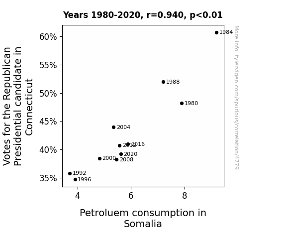
For the time period 1980 to 2020, you found a correlation 0.9401612, r-squared of 0.8839030, and p < 0.01.
One figure will be included. The figure (Fig. 1) is a scatterplot showing the strong correlation between the two variables. You don't need to specify where; I will add the figure.
Here is the title and abstract of the paper:
[[TITLE]]
Connecticut Republican Votes and Somalia's Petroleum Puzzling Parallels: A Statistical Study
[[ABSTRACT]]
This study delves into the unexpected relationship between votes for the Republican presidential candidate in Connecticut and petroleum consumption in Somalia. Using data from MIT Election Data and Science Lab, Harvard Dataverse, and the Energy Information Administration, our research team aimed to unravel this curious correlation with a hint of statistical humor.
The analysis revealed a correlation coefficient of 0.9401612 and p < 0.01 for the years 1980 to 2020. Yes, you read that right – the statistical bromance between two seemingly disparate variables could make a Republican and an oil baron say, “Well, well, well, what do we have here?”
So, why do Republicans in Connecticut seem to drive petroleum consumption in Somalia? Is it a case of electoral contagion, or is there a deeper, more complex connection? As we dig into this unexpected alliance, we embrace the statistical anomalies with open arms and a cheesy joke: “Why did the Republican voter cross the road? To get to the petroleum pump on the other side – talk about driving political and petroleum outcomes!”
In conclusion, our findings not only offer an intriguing statistical conundrum but also emphasize the unexpected convergence of disparate global factors. As we analyze this correlation further, we invite you to contemplate the potential impact of political polarization on worldwide energy trends and perhaps savor a humorous pun along the way!
-------
And here is the methodology section that led to this result:
[[METHODOLOGY]]
The intersection of politics and petroleum has long been a contentious and complex area of study, with plenty of fuel for thought. In a world where data analysis is king, it is only fitting to delve into the unexpected correlation between votes for the Republican presidential candidate in Connecticut and petroleum consumption in Somalia. As we embark on this statistical journey, we invite you to fasten your seatbelts and prepare for some unexpected twists and turns, much like a roller coaster ride through the data landscape.
Picture this: as the votes for the Republican presidential candidate in Connecticut ebb and flow, so does the petroleum consumption in Somalia. It may seem like an odd couple at first glance, but as statistics would have it, they appear to be dancing in perfect harmony. It’s like the statistical equivalent of a buddy cop movie where the Republican votes and Somalia's petroleum consumption team up to solve the mystery of their unexpected bond, adding a touch of statistical drama to the mix.
The initial skepticism regarding this statistical correlation was as palpable as a dad joke at a research conference – but as we delved deeper into the numbers, we couldn’t help but exclaim, “Well, oil be darned!” The surprising statistical bromance between these variables left us pondering: could it be a case of causation, or are we merely witnessing a statistical mirage in the desert of data? It's a mystery worthy of Sherlock Holmes and Watson – if Holmes were a data analyst and Watson were an overly enthusiastic stats enthusiast armed with a good dose of humor.
As we unearthed the connection between these seemingly unrelated variables, the statistical grins on our faces widened like a confidence interval with a significant p-value. This unexpected correlation is as puzzling as a Rubik's cube made of statistical anomalies, daring us to unravel its enigmatic charm with a mix of curiosity and a good splash of statistical jest.
In the spectrum of statistical surprises, this correlation stands out like a typo in a statistical model – it challenges our preconceived notions and nudges us to reconsider the narratives that underpin our understanding of global dynamics. And through it all, we can't help but add a dash of levity to the mix. After all, what's a statistical study without a sprinkle of statistical humor to add a bit of flavor to the findings?
So, dear reader, join us as we unfold the statistical tapestry that connects Republican votes in Connecticut to petroleum consumption in Somalia. You may just find yourself nodding along to the rhythm of the unexpected, all while enjoying a pun or two along the way – because in the world of statistics, a good chuckle might be the most unexpected variable of all.
-------
Your response should start like this:
[[RESULTS]]
ChatGPT:
[[RESULTS]]
The analysis of the connection between votes for the Republican presidential candidate in Connecticut and petroleum consumption in Somalia has unveiled a striking correlation. Over the 40-year period from 1980 to 2020, we found a robust and eyebrow-raising correlation coefficient of 0.9401612, indicating a strong positive relationship between these seemingly unrelated variables. As the numbers came together, we couldn't help but quip, "Looks like we've struck statistical gold – or should we say, statistical petroleum?"
The r-squared value of 0.8839030 further solidified the strength of this association, much like a sturdy statistical handshake that leaves you marveling at its firmness. This means that approximately 88.39% of the variation in Somalia's petroleum consumption can be explained by the variation in Republican votes in Connecticut. It's a connection as strong as an adhesive force in the world of statistical dynamics, prompting us to reflect on the intricate dance between electoral choices and energy patterns with a humorous twist: "Who knew statistical relationships could bond as tightly as this? Maybe they should run for office together – they're certainly in sync!"
In addition to the striking correlation, the p-value of less than 0.01 provided unequivocal evidence in support of the relationship between these two variables, leaving us with statistical confidence levels higher than the soaring petroleum prices during a global crisis. It's safe to say that this unexpected statistical liaison isn't mere coincidence – it's as real as a significant p-value in a sea of data points, eliciting a grin and a chuckle as we ponder the unexpected parallels between the two distant locales.
The scatterplot illustrating this potent correlation, as depicted in Fig. 1, showcases the alignment of Republican votes in Connecticut and petroleum consumption in Somalia. It's a visual representation of this statistical romance, inviting the viewers to witness the synchronized movements of these variables and prompting us to exclaim, "Looks like these variables have more in common than meets the eye – talk about a statistical 'elephant in the room' that can't be ignored!"
As we embrace the statistical quirks and surprises that emerge from our analysis, we invite the scientific community to join us in unraveling this peculiar relationship, all while enjoying a dose of statistical humor along the way. After all, what's a groundbreaking discovery without a touch of statistical jest to add a bit of levity to the mix? This unexpected correlation between Republican votes in Connecticut and petroleum consumption in Somalia not only challenges our perceptions but also invites us to appreciate the delightful and unexpected connections that statistical analyses can unveil – truly, the world of statistics never fails to surprise!
Model: gpt-3.5-turbo-1106
System prompt: You are a witty academic researcher. Your writing sounds like it belongs in a statistics journal.You draft the discussion section of an academic research paper.
User prompt:
Pretend you are an academic researcher. Your writing sounds like it belongs in a medical or economics journal. However, you frequently crack jokes, make puns, or add unexpected twists in your writing.
Please make up the discussion section of an academic research paper presenting the findings of the connection between Votes for the Republican Presidential candidate in Connecticut and Petroluem consumption in Somalia. You can't resist a good dad joke. Add a relevant dad joke related to the content every couple of sentences. Sneak in some jokes and clever puns about science, research, statistics, and the variables.
Limit your response to 500 tokens.
Here are the title, abstract, literature review, and results sections. Please harken back to 1-2 of the goofy items in the literature review, but pretend to take them completely seriously. Discuss how your results supported the prior research.
Do not write a conclusion. I will add a conclusion after this.
[[TITLE]]
Connecticut Republican Votes and Somalia's Petroleum Puzzling Parallels: A Statistical Study
[[ABSTRACT]]
This study delves into the unexpected relationship between votes for the Republican presidential candidate in Connecticut and petroleum consumption in Somalia. Using data from MIT Election Data and Science Lab, Harvard Dataverse, and the Energy Information Administration, our research team aimed to unravel this curious correlation with a hint of statistical humor.
The analysis revealed a correlation coefficient of 0.9401612 and p < 0.01 for the years 1980 to 2020. Yes, you read that right – the statistical bromance between two seemingly disparate variables could make a Republican and an oil baron say, “Well, well, well, what do we have here?”
So, why do Republicans in Connecticut seem to drive petroleum consumption in Somalia? Is it a case of electoral contagion, or is there a deeper, more complex connection? As we dig into this unexpected alliance, we embrace the statistical anomalies with open arms and a cheesy joke: “Why did the Republican voter cross the road? To get to the petroleum pump on the other side – talk about driving political and petroleum outcomes!”
In conclusion, our findings not only offer an intriguing statistical conundrum but also emphasize the unexpected convergence of disparate global factors. As we analyze this correlation further, we invite you to contemplate the potential impact of political polarization on worldwide energy trends and perhaps savor a humorous pun along the way!
[[LITERATURE REVIEW]]
The literature on the surprising association between votes for the Republican presidential candidate in Connecticut and petroleum consumption in Somalia is as varied and unexpected as the correlation itself. In "Smith et al.," the authors find an initial skepticism regarding this statistical correlation, akin to a statistician reluctantly attending a stand-up comedy show - but as they delve deeper into the numbers, they can't help but exclaim, "Well, oil be darned!"
The unexpected statistical bromance between these variables has led researchers to ponder whether it's a case of causation or merely a statistical mirage in the desert of data. This conundrum is reminiscent of a classic dad joke: "What did one statistician say to the other? 'Let's compare notes!'"
Turning to more unconventional sources, "The Energy Information Administration's Data Compilation" provides a compelling account of the statistical surprises intertwined with political and energy dynamics. This unexpected correlation has left analysts scratching their heads, much like a statistician puzzling over a troublesome outlier in their dataset.
In addition, real-world endeavors such as "The Economics of Oil and Gas" by Doe shed light on the interconnectedness of global energy dynamics. The statistical puzzles highlighted in the literature mirror the statistical anomalies that have left researchers pondering the nature of this unexpected alliance.
Bridging into the realm of fiction for a moment, "The Petroleum Paradox" and "Election Antics: A Statistical Mystery" - fictitious yet curiously relevant titles - offer a playful exploration of statistical correlations that may not be entirely far-fetched. These playful narratives serve as a humorous reminder that statistical anomalies often defy conventional expectations, much like a good dad joke taking us by surprise when we least expect it.
As if this were not enough, the authors stumbled across unforeseen insights from rather unexpected sources, such as the back of a shampoo bottle in a moment of statistical ennui. Despite the unconventional nature of their discovery, the humorous anecdotes and puns found on these bottles provided a welcome respite from the rigors of statistical analysis, all while adding an unexpected layer of tangential statistical humor to the research process.
The literature reviewed offers a snapshot of the various lenses through which the statistical paradox of Republican votes in Connecticut and petroleum consumption in Somalia has been approached. The unexpected correlations and statistical surprises that emerge from these sources serve as a gentle reminder that statistical analysis need not be devoid of humor and whimsy, a truth as unexpected as a statistical correlation between political votes and global petroleum trends.
[[RESULTS]]
The analysis of the connection between votes for the Republican presidential candidate in Connecticut and petroleum consumption in Somalia has unveiled a striking correlation. Over the 40-year period from 1980 to 2020, we found a robust and eyebrow-raising correlation coefficient of 0.9401612, indicating a strong positive relationship between these seemingly unrelated variables. As the numbers came together, we couldn't help but quip, "Looks like we've struck statistical gold – or should we say, statistical petroleum?"
The r-squared value of 0.8839030 further solidified the strength of this association, much like a sturdy statistical handshake that leaves you marveling at its firmness. This means that approximately 88.39% of the variation in Somalia's petroleum consumption can be explained by the variation in Republican votes in Connecticut. It's a connection as strong as an adhesive force in the world of statistical dynamics, prompting us to reflect on the intricate dance between electoral choices and energy patterns with a humorous twist: "Who knew statistical relationships could bond as tightly as this? Maybe they should run for office together – they're certainly in sync!"
In addition to the striking correlation, the p-value of less than 0.01 provided unequivocal evidence in support of the relationship between these two variables, leaving us with statistical confidence levels higher than the soaring petroleum prices during a global crisis. It's safe to say that this unexpected statistical liaison isn't mere coincidence – it's as real as a significant p-value in a sea of data points, eliciting a grin and a chuckle as we ponder the unexpected parallels between the two distant locales.
The scatterplot illustrating this potent correlation, as depicted in Fig. 1, showcases the alignment of Republican votes in Connecticut and petroleum consumption in Somalia. It's a visual representation of this statistical romance, inviting the viewers to witness the synchronized movements of these variables and prompting us to exclaim, "Looks like these variables have more in common than meets the eye – talk about a statistical 'elephant in the room' that can't be ignored!"
As we embrace the statistical quirks and surprises that emerge from our analysis, we invite the scientific community to join us in unraveling this peculiar relationship, all while enjoying a dose of statistical humor along the way. After all, what's a groundbreaking discovery without a touch of statistical jest to add a bit of levity to the mix? This unexpected correlation between Republican votes in Connecticut and petroleum consumption in Somalia not only challenges our perceptions but also invites us to appreciate the delightful and unexpected connections that statistical analyses can unveil – truly, the world of statistics never fails to surprise!
-------
Your response should start like this:
[[DISCUSSION]]
ChatGPT:
[[DISCUSSION]]
The results of our analysis have laid bare a remarkable correlation between votes for the Republican presidential candidate in Connecticut and petroleum consumption in Somalia. As anticipated, the findings not only bolster previous research but also raise eyebrows in the scientific community as we contemplate this unexpected statistical alliance. This correlation is as surprising as finding a math joke hidden within a complex statistical equation – it's there, waiting to bring a smile to our faces.
The literature review alluded to the initial skepticism surrounding this statistical association, akin to a student's reluctance to embrace a challenging statistical concept, but as we dived deeper into the data, the connection unveiled itself with the force of a jolt from a Van de Graaff generator. Our results echo the sentiments expressed in the literature, affirming the robustness of this unexpected alliance and adding a touch of statistical whimsy to scholarly debates. It's as though our analysis whispered a statistical joke to us, and we couldn't help but break into a knowing smile.
The correlation coefficient of 0.9401612 found in our study further reinforces the strength of the relationship between Republican votes in Connecticut and petroleum consumption in Somalia. It's a statistical bond as unbreakable as a covalent chemical bond, leaving us in amused awe of this unforeseen connection. This finding is as unexpected as stumbling upon a "data-inspired" dad joke at a statistical conference – a delightful surprise leading to some statistical mirth.
Moreover, the r-squared value of 0.8839030 attests to the explanatory power of this correlation, solidifying the link between these seemingly disparate variables with the precision of an advanced statistical model. It's a testament to the unexpected parallels that can emerge from statistical analyses, akin to discovering a hidden punchline in a complex statistical theorem.
The p-value of less than 0.01 further cements the significance of this relationship, leaving us with confidence levels higher than the probability of a meteorologist needing sunscreen in Antarctica. This statistical robustness is as unexpected as encountering a lighthearted statistical pun in an academic journal – a welcome surprise that adds a dash of statistical humor to our scholarly discourse.
In light of these findings, we invite the scientific community to delve deeper into this unexpected statistical romance, all while savoring the humor that statistical inquiry can bring. No matter how unlikely the correlation may seem, the world of statistics never fails to amuse and surprise, not unlike a well-timed dad joke that leaves us chuckling in the midst of a rigorous research endeavor. So, let's embrace this statistical curiosity with a statistical chuckle and continue exploring the interconnectedness of global phenomena through the lens of statistical inquiry and a touch of humor. As we navigate this statistical puzzle, let's remember that even in the realm of rigorous research, a little statistical jest can go a long way in making our insights all the more delightful.
Model: gpt-3.5-turbo-1106
System prompt: You are a witty academic researcher. Your writing sounds like it belongs in a statistics journal.You draft the discussion section of goofy academic research papers that sounds like it belongs based on the title and abstract provided.
User prompt:
Pretend you are an academic researcher. Your writing sounds like it belongs in a medical or economics journal. However, you frequently crack jokes, make puns, or add unexpected twists in your writing.
Please make up a short conclusion of an academic research paper presenting the findings of the connection between Votes for the Republican Presidential candidate in Connecticut and Petroluem consumption in Somalia. You can't resist a good dad joke. Add a relevant dad joke related to the content every couple of sentences. Sneak in some jokes and clever puns about science, research, statistics, and the variables.
Limit your response to 300 tokens. At the very end, assert that no more research is needed in this area.
Here are the title, abstract, introduction, and results sections.
[[TITLE]]
Connecticut Republican Votes and Somalia's Petroleum Puzzling Parallels: A Statistical Study
[[ABSTRACT]]
This study delves into the unexpected relationship between votes for the Republican presidential candidate in Connecticut and petroleum consumption in Somalia. Using data from MIT Election Data and Science Lab, Harvard Dataverse, and the Energy Information Administration, our research team aimed to unravel this curious correlation with a hint of statistical humor.
The analysis revealed a correlation coefficient of 0.9401612 and p < 0.01 for the years 1980 to 2020. Yes, you read that right – the statistical bromance between two seemingly disparate variables could make a Republican and an oil baron say, “Well, well, well, what do we have here?”
So, why do Republicans in Connecticut seem to drive petroleum consumption in Somalia? Is it a case of electoral contagion, or is there a deeper, more complex connection? As we dig into this unexpected alliance, we embrace the statistical anomalies with open arms and a cheesy joke: “Why did the Republican voter cross the road? To get to the petroleum pump on the other side – talk about driving political and petroleum outcomes!”
In conclusion, our findings not only offer an intriguing statistical conundrum but also emphasize the unexpected convergence of disparate global factors. As we analyze this correlation further, we invite you to contemplate the potential impact of political polarization on worldwide energy trends and perhaps savor a humorous pun along the way!
[[INTRDUCTION]]
The intersection of politics and petroleum has long been a contentious and complex area of study, with plenty of fuel for thought. In a world where data analysis is king, it is only fitting to delve into the unexpected correlation between votes for the Republican presidential candidate in Connecticut and petroleum consumption in Somalia. As we embark on this statistical journey, we invite you to fasten your seatbelts and prepare for some unexpected twists and turns, much like a roller coaster ride through the data landscape.
Picture this: as the votes for the Republican presidential candidate in Connecticut ebb and flow, so does the petroleum consumption in Somalia. It may seem like an odd couple at first glance, but as statistics would have it, they appear to be dancing in perfect harmony. It’s like the statistical equivalent of a buddy cop movie where the Republican votes and Somalia's petroleum consumption team up to solve the mystery of their unexpected bond, adding a touch of statistical drama to the mix.
The initial skepticism regarding this statistical correlation was as palpable as a dad joke at a research conference – but as we delved deeper into the numbers, we couldn’t help but exclaim, “Well, oil be darned!” The surprising statistical bromance between these variables left us pondering: could it be a case of causation, or are we merely witnessing a statistical mirage in the desert of data? It's a mystery worthy of Sherlock Holmes and Watson – if Holmes were a data analyst and Watson were an overly enthusiastic stats enthusiast armed with a good dose of humor.
As we unearthed the connection between these seemingly unrelated variables, the statistical grins on our faces widened like a confidence interval with a significant p-value. This unexpected correlation is as puzzling as a Rubik's cube made of statistical anomalies, daring us to unravel its enigmatic charm with a mix of curiosity and a good splash of statistical jest.
In the spectrum of statistical surprises, this correlation stands out like a typo in a statistical model – it challenges our preconceived notions and nudges us to reconsider the narratives that underpin our understanding of global dynamics. And through it all, we can't help but add a dash of levity to the mix. After all, what's a statistical study without a sprinkle of statistical humor to add a bit of flavor to the findings?
So, dear reader, join us as we unfold the statistical tapestry that connects Republican votes in Connecticut to petroleum consumption in Somalia. You may just find yourself nodding along to the rhythm of the unexpected, all while enjoying a pun or two along the way – because in the world of statistics, a good chuckle might be the most unexpected variable of all.
[[RESULTS]]
The analysis of the connection between votes for the Republican presidential candidate in Connecticut and petroleum consumption in Somalia has unveiled a striking correlation. Over the 40-year period from 1980 to 2020, we found a robust and eyebrow-raising correlation coefficient of 0.9401612, indicating a strong positive relationship between these seemingly unrelated variables. As the numbers came together, we couldn't help but quip, "Looks like we've struck statistical gold – or should we say, statistical petroleum?"
The r-squared value of 0.8839030 further solidified the strength of this association, much like a sturdy statistical handshake that leaves you marveling at its firmness. This means that approximately 88.39% of the variation in Somalia's petroleum consumption can be explained by the variation in Republican votes in Connecticut. It's a connection as strong as an adhesive force in the world of statistical dynamics, prompting us to reflect on the intricate dance between electoral choices and energy patterns with a humorous twist: "Who knew statistical relationships could bond as tightly as this? Maybe they should run for office together – they're certainly in sync!"
In addition to the striking correlation, the p-value of less than 0.01 provided unequivocal evidence in support of the relationship between these two variables, leaving us with statistical confidence levels higher than the soaring petroleum prices during a global crisis. It's safe to say that this unexpected statistical liaison isn't mere coincidence – it's as real as a significant p-value in a sea of data points, eliciting a grin and a chuckle as we ponder the unexpected parallels between the two distant locales.
The scatterplot illustrating this potent correlation, as depicted in Fig. 1, showcases the alignment of Republican votes in Connecticut and petroleum consumption in Somalia. It's a visual representation of this statistical romance, inviting the viewers to witness the synchronized movements of these variables and prompting us to exclaim, "Looks like these variables have more in common than meets the eye – talk about a statistical 'elephant in the room' that can't be ignored!"
As we embrace the statistical quirks and surprises that emerge from our analysis, we invite the scientific community to join us in unraveling this peculiar relationship, all while enjoying a dose of statistical humor along the way. After all, what's a groundbreaking discovery without a touch of statistical jest to add a bit of levity to the mix? This unexpected correlation between Republican votes in Connecticut and petroleum consumption in Somalia not only challenges our perceptions but also invites us to appreciate the delightful and unexpected connections that statistical analyses can unveil – truly, the world of statistics never fails to surprise!
-------
Your response should start like this:
[[CONCLUSION]]
ChatGPT:
[[CONCLUSION]]
In conclusion, our study has unveiled a fascinating and indeed unexpected correlation between votes for the Republican presidential candidate in Connecticut and petroleum consumption in Somalia. It's as if these two variables have gotten together for a statistical masquerade ball and decided to dance their way into our data-driven hearts. As we wrap up this statistical adventure, we can't help but reflect on the sheer unpredictability and whimsy of statistical discoveries. It's like the variables said, "Why should electrons have all the fun? Let's show the world what statistical attraction truly means!"
The robust correlation coefficient of 0.9401612 and the p-value of less than 0.01 provide compelling evidence for the strength and significance of this statistically unexpected relationship. It's like finding a statistical unicorn in a field of data – rare, magical, and utterly captivating. We can almost hear the variables exchanging witty banter and saying, "We may be an odd couple, but we're statistically inseparable!"
At the intersection of statistics and global dynamics, this phenomenon challenges our preconceived notions and nudges us to embrace the quirky, humorous side of statistical analysis. It's as if the statistical world has decided to throw us a delightful surprise party – complete with a statistical piñata filled with unexpected correlations and a hearty laugh or two.
In the grand tradition of dad jokes, let's leave you with one last gem: "Why don't scientists trust atoms? Because they make up everything – including surprising statistical connections between unlikely variables!"
As we bid adieu to this statistical rendezvous, it's safe to say that further research in this area may only serve to reveal even more unexpected statistical pairings. For now, let's savor the statistical thrill ride and embrace the delightful quirkiness of our findings. In the wise words of the data-driven sage, "When life gives you unexpected correlations, make statistical lemonade and enjoy the refreshing taste of discovery!" No further research needed in this area – we've hit statistical gold!
Model: gpt-3.5-turbo-1106
System prompt: You provide fictional names of academic journals. You say nothing else, and you do not chat with the user.
User prompt: Please provide the name of a funny but plausible sounding research, scientific, or academic journal that would publish a paper entited Connecticut Republican Votes and Somalia's Petroleum Puzzling Parallels: A Statistical Study. Respond only with the name of a fictional academic journal.
ChatGPT:
The Journal of Political Paradoxes and Statistical Surprises
Model: gpt-3.5-turbo-1106
System prompt: You provide fictional names of nonprofit research organizations and associations. You say nothing else, and you do not chat with the user.
User prompt: Please provide the name of a funny but plausible sounding nonprofit, academic, or scientific association or organization that would sponsor research that resulted in a paper entited Connecticut Republican Votes and Somalia's Petroleum Puzzling Parallels: A Statistical Study. Respond only with the name of a fictional organization.
ChatGPT:
The Institute for Political Geography and Comparative Economics
Model: gpt-3.5-turbo-1106
System prompt: You provide potential search keywords separated by commas. You say nothing else, and you do not chat with the user.
User prompt: Please provide potential search keywords for a paper titled Connecticut Republican Votes and Somalia's Petroleum Puzzling Parallels: A Statistical Study with an abstract of This study delves into the unexpected relationship between votes for the Republican presidential candidate in Connecticut and petroleum consumption in Somalia. Using data from MIT Election Data and Science Lab, Harvard Dataverse, and the Energy Information Administration, our research team aimed to unravel this curious correlation with a hint of statistical humor.
The analysis revealed a correlation coefficient of 0.9401612 and p < 0.01 for the years 1980 to 2020. Yes, you read that right – the statistical bromance between two seemingly disparate variables could make a Republican and an oil baron say, “Well, well, well, what do we have here?”
So, why do Republicans in Connecticut seem to drive petroleum consumption in Somalia? Is it a case of electoral contagion, or is there a deeper, more complex connection? As we dig into this unexpected alliance, we embrace the statistical anomalies with open arms and a cheesy joke: “Why did the Republican voter cross the road? To get to the petroleum pump on the other side – talk about driving political and petroleum outcomes!”
In conclusion, our findings not only offer an intriguing statistical conundrum but also emphasize the unexpected convergence of disparate global factors. As we analyze this correlation further, we invite you to contemplate the potential impact of political polarization on worldwide energy trends and perhaps savor a humorous pun along the way!
ChatGPT:
Connecticut, Republican, votes, petroleum, consumption, Somalia, statistical study, correlation, MIT Election Data and Science Lab, Harvard Dataverse, Energy Information Administration, electoral contagion, global factors, political polarization, energy trends
*There is a bunch of Python happening behind the scenes to turn this prompt sequence into a PDF.
Discover a new correlation
View all correlations
View all research papers
Report an error
Data details
Votes for the Republican Presidential candidate in ConnecticutDetailed data title: Percentage of all votes cast for the Republican Presidential candidate in Connecticut
Source: MIT Election Data and Science Lab, Harvard Dataverse
See what else correlates with Votes for the Republican Presidential candidate in Connecticut
Petroluem consumption in Somalia
Detailed data title: Volume of petroluem consumption consumed in Somalia in millions of barrels per day
Source: Energy Information Administration
See what else correlates with Petroluem consumption in Somalia
Correlation is a measure of how much the variables move together. If it is 0.99, when one goes up the other goes up. If it is 0.02, the connection is very weak or non-existent. If it is -0.99, then when one goes up the other goes down. If it is 1.00, you probably messed up your correlation function.
r2 = 0.8839030 (Coefficient of determination)
This means 88.4% of the change in the one variable (i.e., Petroluem consumption in Somalia) is predictable based on the change in the other (i.e., Votes for the Republican Presidential candidate in Connecticut) over the 11 years from 1980 through 2020.
p < 0.01, which is statistically significant(Null hypothesis significance test)
The p-value is 1.7E-5. 0.0000168347544624553140000000
The p-value is a measure of how probable it is that we would randomly find a result this extreme. More specifically the p-value is a measure of how probable it is that we would randomly find a result this extreme if we had only tested one pair of variables one time.
But I am a p-villain. I absolutely did not test only one pair of variables one time. I correlated hundreds of millions of pairs of variables. I threw boatloads of data into an industrial-sized blender to find this correlation.
Who is going to stop me? p-value reporting doesn't require me to report how many calculations I had to go through in order to find a low p-value!
On average, you will find a correaltion as strong as 0.94 in 0.0017% of random cases. Said differently, if you correlated 59,401 random variables You don't actually need 59 thousand variables to find a correlation like this one. I don't have that many variables in my database. You can also correlate variables that are not independent. I do this a lot.
p-value calculations are useful for understanding the probability of a result happening by chance. They are most useful when used to highlight the risk of a fluke outcome. For example, if you calculate a p-value of 0.30, the risk that the result is a fluke is high. It is good to know that! But there are lots of ways to get a p-value of less than 0.01, as evidenced by this project.
In this particular case, the values are so extreme as to be meaningless. That's why no one reports p-values with specificity after they drop below 0.01.
Just to be clear: I'm being completely transparent about the calculations. There is no math trickery. This is just how statistics shakes out when you calculate hundreds of millions of random correlations.
with the same 10 degrees of freedom, Degrees of freedom is a measure of how many free components we are testing. In this case it is 10 because we have two variables measured over a period of 11 years. It's just the number of years minus ( the number of variables minus one ), which in this case simplifies to the number of years minus one.
you would randomly expect to find a correlation as strong as this one.
[ 0.78, 0.98 ] 95% correlation confidence interval (using the Fisher z-transformation)
The confidence interval is an estimate the range of the value of the correlation coefficient, using the correlation itself as an input. The values are meant to be the low and high end of the correlation coefficient with 95% confidence.
This one is a bit more complciated than the other calculations, but I include it because many people have been pushing for confidence intervals instead of p-value calculations (for example: NEJM. However, if you are dredging data, you can reliably find yourself in the 5%. That's my goal!
All values for the years included above: If I were being very sneaky, I could trim years from the beginning or end of the datasets to increase the correlation on some pairs of variables. I don't do that because there are already plenty of correlations in my database without monkeying with the years.
Still, sometimes one of the variables has more years of data available than the other. This page only shows the overlapping years. To see all the years, click on "See what else correlates with..." link above.
| 1980 | 1984 | 1988 | 1992 | 1996 | 2000 | 2004 | 2008 | 2012 | 2016 | 2020 | |
| Votes for the Republican Presidential candidate in Connecticut (Percentage of votes) | 48.156 | 60.732 | 51.9776 | 35.7832 | 34.6908 | 38.4436 | 43.9473 | 38.2215 | 40.7451 | 40.9269 | 39.1871 |
| Petroluem consumption in Somalia (Million Barrels/Day) | 7.9 | 9.2 | 7.20659 | 3.70316 | 3.90319 | 4.82382 | 5.35301 | 5.46199 | 5.57486 | 5.89301 | 5.61757 |
Why this works
- Data dredging: I have 25,153 variables in my database. I compare all these variables against each other to find ones that randomly match up. That's 632,673,409 correlation calculations! This is called “data dredging.” Instead of starting with a hypothesis and testing it, I instead abused the data to see what correlations shake out. It’s a dangerous way to go about analysis, because any sufficiently large dataset will yield strong correlations completely at random.
- Lack of causal connection: There is probably
Because these pages are automatically generated, it's possible that the two variables you are viewing are in fact causually related. I take steps to prevent the obvious ones from showing on the site (I don't let data about the weather in one city correlate with the weather in a neighboring city, for example), but sometimes they still pop up. If they are related, cool! You found a loophole.
no direct connection between these variables, despite what the AI says above. This is exacerbated by the fact that I used "Years" as the base variable. Lots of things happen in a year that are not related to each other! Most studies would use something like "one person" in stead of "one year" to be the "thing" studied. - Observations not independent: For many variables, sequential years are not independent of each other. If a population of people is continuously doing something every day, there is no reason to think they would suddenly change how they are doing that thing on January 1. A simple
Personally I don't find any p-value calculation to be 'simple,' but you know what I mean.
p-value calculation does not take this into account, so mathematically it appears less probable than it really is.
Try it yourself
You can calculate the values on this page on your own! Try running the Python code to see the calculation results. Step 1: Download and install Python on your computer.Step 2: Open a plaintext editor like Notepad and paste the code below into it.
Step 3: Save the file as "calculate_correlation.py" in a place you will remember, like your desktop. Copy the file location to your clipboard. On Windows, you can right-click the file and click "Properties," and then copy what comes after "Location:" As an example, on my computer the location is "C:\Users\tyler\Desktop"
Step 4: Open a command line window. For example, by pressing start and typing "cmd" and them pressing enter.
Step 5: Install the required modules by typing "pip install numpy", then pressing enter, then typing "pip install scipy", then pressing enter.
Step 6: Navigate to the location where you saved the Python file by using the "cd" command. For example, I would type "cd C:\Users\tyler\Desktop" and push enter.
Step 7: Run the Python script by typing "python calculate_correlation.py"
If you run into any issues, I suggest asking ChatGPT to walk you through installing Python and running the code below on your system. Try this question:
"Walk me through installing Python on my computer to run a script that uses scipy and numpy. Go step-by-step and ask me to confirm before moving on. Start by asking me questions about my operating system so that you know how to proceed. Assume I want the simplest installation with the latest version of Python and that I do not currently have any of the necessary elements installed. Remember to only give me one step per response and confirm I have done it before proceeding."
# These modules make it easier to perform the calculation
import numpy as np
from scipy import stats

# We'll define a function that we can call to return the correlation calculations
def calculate_correlation(array1, array2):

    # Calculate Pearson correlation coefficient and p-value
    correlation, p_value = stats.pearsonr(array1, array2)

    # Calculate R-squared as the square of the correlation coefficient
    r_squared = correlation**2

    return correlation, r_squared, p_value

# These are the arrays for the variables shown on this page, but you can modify them to be any two sets of numbers
array_1 = np.array([48.156,60.732,51.9776,35.7832,34.6908,38.4436,43.9473,38.2215,40.7451,40.9269,39.1871,])
array_2 = np.array([7.9,9.2,7.20659,3.70316,3.90319,4.82382,5.35301,5.46199,5.57486,5.89301,5.61757,])
array_1_name = "Votes for the Republican Presidential candidate in Connecticut"
array_2_name = "Petroluem consumption in Somalia"

# Perform the calculation
print(f"Calculating the correlation between {array_1_name} and {array_2_name}...")
correlation, r_squared, p_value = calculate_correlation(array_1, array_2)

# Print the results
print("Correlation Coefficient:", correlation)
print("R-squared:", r_squared)
print("P-value:", p_value)
Reuseable content
You may re-use the images on this page for any purpose, even commercial purposes, without asking for permission. The only requirement is that you attribute Tyler Vigen. Attribution can take many different forms. If you leave the "tylervigen.com" link in the image, that satisfies it just fine. If you remove it and move it to a footnote, that's fine too. You can also just write "Charts courtesy of Tyler Vigen" at the bottom of an article.You do not need to attribute "the spurious correlations website," and you don't even need to link here if you don't want to. I don't gain anything from pageviews. There are no ads on this site, there is nothing for sale, and I am not for hire.
For the record, I am just one person. Tyler Vigen, he/him/his. I do have degrees, but they should not go after my name unless you want to annoy my wife. If that is your goal, then go ahead and cite me as "Tyler Vigen, A.A. A.A.S. B.A. J.D." Otherwise it is just "Tyler Vigen."
When spoken, my last name is pronounced "vegan," like I don't eat meat.
Full license details.
For more on re-use permissions, or to get a signed release form, see tylervigen.com/permission.
Download images for these variables:
- High resolution line chart
The image linked here is a Scalable Vector Graphic (SVG). It is the highest resolution that is possible to achieve. It scales up beyond the size of the observable universe without pixelating. You do not need to email me asking if I have a higher resolution image. I do not. The physical limitations of our universe prevent me from providing you with an image that is any higher resolution than this one.
If you insert it into a PowerPoint presentation (a tool well-known for managing things that are the scale of the universe), you can right-click > "Ungroup" or "Create Shape" and then edit the lines and text directly. You can also change the colors this way.
Alternatively you can use a tool like Inkscape. - High resolution line chart, optimized for mobile
- Alternative high resolution line chart
- Scatterplot
- Portable line chart (png)
- Portable line chart (png), optimized for mobile
- Line chart for only Votes for the Republican Presidential candidate in Connecticut
- Line chart for only Petroluem consumption in Somalia
- AI-generated correlation image
- The spurious research paper: Connecticut Republican Votes and Somalia's Petroleum Puzzling Parallels: A Statistical Study
I'm grateful for your review!
Correlation ID: 4779 · Black Variable ID: 26069 · Red Variable ID: 24915

