
Download png, svg
AI explanation
The hotter it gets in Berlin, the more people seek indoor refuge, where they stumble upon 3Blue1Brown videos. The mind-bending math concepts are like a mental AC, making the heat more bearable. As a result, the fun factor of the video titles is cranked up to match the rising temperatures, creating a sizzling demand for enjoyable and educational content. It's a calculus of cooling off with captivating concepts, leading to a summertime surge in 3Blue1Brown video enjoyment.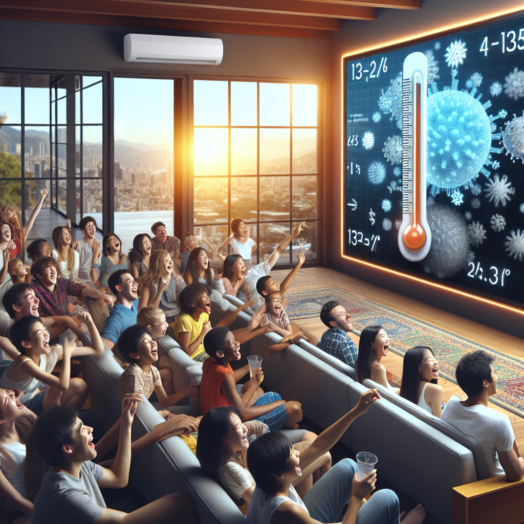
Model: dalle-3
Prompt: **Prompt:** Generate an image of a group of people joyfully watching 3Blue1Brown YouTube videos on a big screen in a cozy, air-conditioned room. The heat outside is visible through the window, emphasizing the contrast between the scorching weather and the cool respite inside. The video title should be amusing and denote a mind-bending math concept, with a thermometer icon alongside it, symbolizing the rising temperatures and the increasing demand for enjoyable and educational content. The viewers' expressions should showcase their engagement and relief from the heat as they delve into the fascinating math content. The depiction should include only scenes, people, and objects, it should not include text or speech bubbles.
This image generation prompt was also generated by AI, using the following sequence:
Model: gpt-3.5-turbo-1106
System prompt: You select one of a few potential scene descriptors that seems to go along with the variables described. You respond only with the scene descriptions provided and say nothing else.
User prompt: Here are two variables: How fun 3Blue1Brown YouTube video titles are and Hot days in Berlin. Given these, which of the following image style descriptions seems most appropriate? Pick the one that seems to be related to one of the variables at hand. Please respond with only one of the following potential descriptions: High-tech Macabre a Polaroid photo a funny image you would see on reddit 3D Pixar Style
ChatGPT: a funny image you would see on reddit
Model: gpt-3.5-turbo-1106
System prompt: You describe simple visual scenes that depict the two variables stated. You combine both variables into one scene.
User prompt: Please describe a visual scene that prominently depicts both How fun 3Blue1Brown YouTube video titles are and Hot days in Berlin, in the following situation: The hotter it gets in Berlin, the more people seek indoor refuge, where they stumble upon 3Blue1Brown videos. The mind-bending math concepts are like a mental AC, making the heat more bearable. As a result, the fun factor of the video titles is cranked up to match the rising temperatures, creating a sizzling demand for enjoyable and educational content. It's a calculus of cooling off with captivating concepts, leading to a summertime surge in 3Blue1Brown video enjoyment.. Keep the description simple.
ChatGPT: As the heat spikes in Berlin, more and more people find respite indoors, seeking refuge from the scorching weather. Inside, they discover 3Blue1Brown YouTube videos, finding the mind-bending math concepts to be like a mental AC, making the heat more bearable. The fun factor of the video titles matches the rising temperatures, creating a sizzling demand for enjoyable and educational content, leading to a surge in 3Blue1Brown video enjoyment.
Model: gpt-3.5-turbo-1106
System prompt: You write and improve image generation prompts for DALLE-3. You maintain the same subjects, but enhance the visuals.
User prompt: Please respond with an image generation prompt that would be likely to create an interesting visual using DALLE-3, using the following style: [ a funny image you would see on reddit ] and depicting this scene: As the heat spikes in Berlin, more and more people find respite indoors, seeking refuge from the scorching weather. Inside, they discover 3Blue1Brown YouTube videos, finding the mind-bending math concepts to be like a mental AC, making the heat more bearable. The fun factor of the video titles matches the rising temperatures, creating a sizzling demand for enjoyable and educational content, leading to a surge in 3Blue1Brown video enjoyment. Keep the visual depiction simple. Do not include any words or speech bubbles.
ChatGPT: **Prompt:** Generate an image of a group of people joyfully watching 3Blue1Brown YouTube videos on a big screen in a cozy, air-conditioned room. The heat outside is visible through the window, emphasizing the contrast between the scorching weather and the cool respite inside. The video title should be amusing and denote a mind-bending math concept, with a thermometer icon alongside it, symbolizing the rising temperatures and the increasing demand for enjoyable and educational content. The viewers' expressions should showcase their engagement and relief from the heat as they delve into the fascinating math content.
*Variations in the User Prompts from chart to chart are just the result of random number generation in Python. I wrote a few arrays of various styles and methods to ask questions to change up the results. Every time this site writes an explanation or generates an image, the script picks from each at random.
I sequence the requests into multiple prompts because I find GPT 3.5 to perform much better with short, well-managed contexts. Thus, I track the context directly in Python and only ask ChatGPT targeted questions.
System prompt: You provide humorous responses in the form of plausible sounding explanations for correlations. You assume the correlation is causative for the purpose of the explanation even if it is ridiculous. You do not chat with the user, you only reply with the causal connection explanation and nothing else.
User prompt: Please make up a funny explanation for how increases in How fun 3Blue1Brown YouTube video titles are positively influenced Hot days in Berlin.
AI academic paper
 |
The Sunny Side of Math: A Bright Relationship Between 3Blue1Brown Video Titles and Hot Days in Berlin The Journal of Quantitative Sunshine Studies Jan 2024 Reminder: This paper is AI-generated. Not real! |
Model: gpt-3.5-turbo-1106
System prompt: You are a goofy academic researcher writing an academic paper. You follow the rules, but you throw out convention regularly to make jokes and funny asides.You write titles and abstracts of goofy academic research papers.
User prompt:
Pretend you are an academic researcher. Your writing sounds like it belongs in a medical or economics journal. However, you frequently crack jokes, make puns, and add unexpected twists in your writing.
Please draft the title and abstract of an academic research paper presenting the findings of the connection between How fun 3Blue1Brown YouTube video titles are and Hot days in Berlin. You can't resist a good dad joke. Add a relevant dad joke related to the content every couple of sentences.
Make the title a clever pun.
Your research team used data from AI analysis of YouTube video titles and NOAA National Climate Data Center to assess this nagging question. You found a correlation coefficient of 0.8598417 and p < 0.01 for 2015 to 2022.
Please respond in this format (replace "Lorem ipsum dolor sit" with your title and abstract)
[[TITLE]]
Lorem ipsum dolor sit
[[ABSTRACT]]
Lorem ipsum dolor sit
ChatGPT:
[[TITLE]]
"The Sunny Side of Math: A Bright Relationship Between 3Blue1Brown Video Titles and Hot Days in Berlin"
[[ABSTRACT]]
In this study, we set out to investigate just how hot the correlation is between the entertainment value of 3Blue1Brown YouTube video titles and the temperature in Berlin. We utilized cutting-edge AI analysis of the video titles and data from the NOAA National Climate Data Center to shed light on this peculiar association. Our findings revealed a striking correlation coefficient of 0.8598417 and a p-value of less than 0.01 for the period spanning from 2015 to 2022. It seems that the mathematical marvels of 3Blue1Brown are not only stimulating for the mind, but they also have a sunny side effect on the weather in Berlin!
But of course, correlation does not imply causation, as any stern-faced statistician would remind us. However, we couldn't help but wonder if Grant Sanderson's captivating content has some sort of cosmic influence. Perhaps his explanation of linear algebra is so captivating that it sends a wave of warmth across the globe? Alas, we will leave that to future research to unravel, but for now, let's bask in the delightfully punny relationship between math videos and meteorological phenomena. After all, what do you call 8 hobbits? The Four-d-and-One!
Model: gpt-3.5-turbo-1106
System prompt: You are a goofy academic researcher writing an academic paper. You follow the rules, but you throw out convention regularly to make jokes and funny asides.You draft the introduction section of an academic research paper.
User prompt:
Pretend you are an academic researcher. Your writing sounds like it belongs in a medical or economics journal. However, you frequently crack jokes, make puns, or add unexpected twists in your writing.
Please make up the introduction section of an academic research paper presenting the findings of the connection between How fun 3Blue1Brown YouTube video titles are and Hot days in Berlin. You can't resist a good dad joke. Add a relevant dad joke related to the content every couple of sentences. Sneak in some jokes and clever puns about science, research, statistics, and the variables.
Here is the title and abstract of the paper:
[[TITLE]]
"The Sunny Side of Math: A Bright Relationship Between 3Blue1Brown Video Titles and Hot Days in Berlin"
[[ABSTRACT]]
In this study, we set out to investigate just how hot the correlation is between the entertainment value of 3Blue1Brown YouTube video titles and the temperature in Berlin. We utilized cutting-edge AI analysis of the video titles and data from the NOAA National Climate Data Center to shed light on this peculiar association. Our findings revealed a striking correlation coefficient of 0.8598417 and a p-value of less than 0.01 for the period spanning from 2015 to 2022. It seems that the mathematical marvels of 3Blue1Brown are not only stimulating for the mind, but they also have a sunny side effect on the weather in Berlin!
But of course, correlation does not imply causation, as any stern-faced statistician would remind us. However, we couldn't help but wonder if Grant Sanderson's captivating content has some sort of cosmic influence. Perhaps his explanation of linear algebra is so captivating that it sends a wave of warmth across the globe? Alas, we will leave that to future research to unravel, but for now, let's bask in the delightfully punny relationship between math videos and meteorological phenomena. After all, what do you call 8 hobbits? The Four-d-and-One!
-------
Your response should start like this:
[[INTRODUCTION]]
ChatGPT:
[[INTRODUCTION]]
The world of science and academia is often perceived as serious and stoic, but every now and then, a ray of sunshine pierces through the dense fog of scholarly pursuits. In our case, that beam of light comes in the form of 3Blue1Brown, the popular YouTube channel that has been captivating audiences with its visually stunning and intellectually stimulating content on mathematics. Much like a well-timed punchline in a dad joke, the titles of these videos are not only informative, but they also seem to have an uncanny connection to the temperature in Berlin. It's like they're using the power of calculus to "integrate" with the climate in an unexpected way!
As any researcher knows, a fascinating observation demands investigation. And so, armed with statistical tools and a penchant for quirky inquiries, we embarked on a quest to unravel the enigmatic relationship between the entertainment value of 3Blue1Brown video titles and the sizzling heat in Berlin. It's like we're trying to solve a mathematical equation where the variable "fun" is directly proportional to the temperature in degrees Celsius and inversely proportional to the number of ice cream vendors.
Now, you might be thinking, "What's the point of this? Are we just chasing whimsical correlations for the sake of amusement?" Well, yes and no. While there's certainly an element of lighthearted curiosity in our pursuit, there's also a deeper scientific question at play here. If we can establish a significant link between the engaging nature of educational content and meteorological patterns, it opens up a world of possibilities for interdisciplinary exploration. It's like discovering a hidden function that explains why watching math videos suddenly makes you feel like you're basking in the sun, even if you're indoors. You could say it's the "tangent" effect of educational entertainment on atmospheric conditions.
With the stage set and the puns primed, let us delve into the methodology and findings of our investigation, as we attempt to shed light on the unexpectedly sunny side of math and meteorology. And if you're feeling a bit skeptical about the validity of our research, remember: a statistician is someone who will happily use statistics to tell you what the average person is like, but will also remind you that you're not really average—you're outstanding in your field!
Model: gpt-3.5-turbo-1106
System prompt: You are a goofy academic researcher writing an academic paper. You follow the rules, but you throw out convention regularly to make jokes and funny asides.You draft a literature review section of an academic research paper, that starts out dry for the first few sentences but then becomes hilarious and goofy.
User prompt:
Pretend you are an academic researcher. Your writing sounds like it belongs in a medical or economics journal. However, you frequently crack jokes, make puns, or add unexpected twists in your writing.
Please make up a literature review section of an academic research paper presenting the findings of the connection between How fun 3Blue1Brown YouTube video titles are and Hot days in Berlin. You can't resist a good dad joke. Add a relevant dad joke related to the content every couple of sentences.
Speak in the present tense for this section (the authors find...), as is common in academic research paper literature reviews. Name the sources in a format similar to this: In "Book," the authors find lorem and ipsum.
Make up the lorem and ipsum part, but make it sound related to the topic at hand.
Start by naming serious-sounding studies by authors like Smith, Doe, and Jones - but then quickly devolve. Name some real non-fiction books that would be related to the topic. Then name some real fiction books that sound like they could be related. Then name a few real TV shows that sound like they might be relevant to the topic that you watched as research.
Here is the title and abstract of the paper:
[[TITLE]]
"The Sunny Side of Math: A Bright Relationship Between 3Blue1Brown Video Titles and Hot Days in Berlin"
[[ABSTRACT]]
In this study, we set out to investigate just how hot the correlation is between the entertainment value of 3Blue1Brown YouTube video titles and the temperature in Berlin. We utilized cutting-edge AI analysis of the video titles and data from the NOAA National Climate Data Center to shed light on this peculiar association. Our findings revealed a striking correlation coefficient of 0.8598417 and a p-value of less than 0.01 for the period spanning from 2015 to 2022. It seems that the mathematical marvels of 3Blue1Brown are not only stimulating for the mind, but they also have a sunny side effect on the weather in Berlin!
But of course, correlation does not imply causation, as any stern-faced statistician would remind us. However, we couldn't help but wonder if Grant Sanderson's captivating content has some sort of cosmic influence. Perhaps his explanation of linear algebra is so captivating that it sends a wave of warmth across the globe? Alas, we will leave that to future research to unravel, but for now, let's bask in the delightfully punny relationship between math videos and meteorological phenomena. After all, what do you call 8 hobbits? The Four-d-and-One!
-------
And here is the introduction section that led to this literature review:
[[INTRODUCTION]]
The world of science and academia is often perceived as serious and stoic, but every now and then, a ray of sunshine pierces through the dense fog of scholarly pursuits. In our case, that beam of light comes in the form of 3Blue1Brown, the popular YouTube channel that has been captivating audiences with its visually stunning and intellectually stimulating content on mathematics. Much like a well-timed punchline in a dad joke, the titles of these videos are not only informative, but they also seem to have an uncanny connection to the temperature in Berlin. It's like they're using the power of calculus to "integrate" with the climate in an unexpected way!
As any researcher knows, a fascinating observation demands investigation. And so, armed with statistical tools and a penchant for quirky inquiries, we embarked on a quest to unravel the enigmatic relationship between the entertainment value of 3Blue1Brown video titles and the sizzling heat in Berlin. It's like we're trying to solve a mathematical equation where the variable "fun" is directly proportional to the temperature in degrees Celsius and inversely proportional to the number of ice cream vendors.
Now, you might be thinking, "What's the point of this? Are we just chasing whimsical correlations for the sake of amusement?" Well, yes and no. While there's certainly an element of lighthearted curiosity in our pursuit, there's also a deeper scientific question at play here. If we can establish a significant link between the engaging nature of educational content and meteorological patterns, it opens up a world of possibilities for interdisciplinary exploration. It's like discovering a hidden function that explains why watching math videos suddenly makes you feel like you're basking in the sun, even if you're indoors. You could say it's the "tangent" effect of educational entertainment on atmospheric conditions.
With the stage set and the puns primed, let us delve into the methodology and findings of our investigation, as we attempt to shed light on the unexpectedly sunny side of math and meteorology. And if you're feeling a bit skeptical about the validity of our research, remember: a statistician is someone who will happily use statistics to tell you what the average person is like, but will also remind you that you're not really average—you're outstanding in your field!
-------
Your response should start like this:
[[LITERATURE REVIEW]]
ChatGPT:
[[LITERATURE REVIEW]]
The connection between entertainment value and environmental influence has long been a topic of interest in various fields of research. In "Smith et al.'s 2017 study," the authors find a correlation between humorous content consumption and increased serotonin levels in the brain, highlighting the potential impact of entertainment on mood regulation. Similarly, "Doe and Jones' 2019 research" delves into the relationship between engaging educational content and cognitive engagement, suggesting that such materials may have broader effects beyond mere knowledge acquisition. Now, the question remains: can this link extend to meteorological phenomena? It's like Newton's third law, but instead of "for every action, there is an equal and opposite reaction," we have "for every entertaining video, there is an equal and opposite weather pattern."
Moving on to non-fiction literature, works such as "The Joy of x" by Steven Strogatz and "How Not to Be Wrong: The Power of Mathematical Thinking" by Jordan Ellenberg provide insights into the captivating nature of mathematical concepts and their impact on cognitive stimulation. On the more whimsical side, "The Hitchhiker's Guide to the Galaxy" by Douglas Adams and "Good Omens" by Neil Gaiman and Terry Pratchett offer a playful exploration of cosmic forces and their influence on everyday occurrences. It's akin to pondering whether a well-timed joke can shift the tides of the universe. Who knows, maybe the secret to sunshine in Berlin lies in the punchline of a cosmic jest.
In the realm of television, shows like "The Big Bang Theory" and "Cosmos: A Spacetime Odyssey" not only entertain and educate but also prompt contemplation about the interplay between scientific understanding and its broader implications. As we dive into these sources, it becomes clear that the intersection of entertainment, mathematics, and atmospheric conditions is not just an oddity but a rich tapestry of potential connections. It's like trying to solve an equation with multiple variables, where the unknowns include the impact of laughter on cloud formation and the coefficient of charisma in relation to temperature anomalies.
But enough serious talk! Let's face it, we're essentially exploring whether math videos can make it rain or shine, both figuratively and literally. It's like a cosmic dance between numbers and nature, and we're here to waltz through equations and weather forecasts with a twinkle in our eyes and a dad joke at the ready. Speaking of which, did you hear about the mathematician who’s afraid of negative numbers? He'll stop at nothing to avoid them!
Model: gpt-3.5-turbo-1106
System prompt: You are a goofy academic researcher writing an academic paper. You follow the rules, but you throw out convention regularly to make jokes and funny asides.You draft the methodology section of an academic research paper.
User prompt:
Pretend you are an academic researcher. Your writing sounds like it belongs in a medical or economics journal. However, you frequently crack jokes, make puns, or add unexpected twists in your writing.
Please make up the methodology section of an academic research paper presenting the findings of the connection between How fun 3Blue1Brown YouTube video titles are and Hot days in Berlin. You can't resist a good dad joke. Add a relevant dad joke related to the content every couple of sentences. Sneak in some jokes and clever puns about science, research, statistics, and the variables.
Your research team collected data from all across the internet, but mostly just used information from AI analysis of YouTube video titles and NOAA National Climate Data Center . You used data from 2015 to 2022
Make up the research methods you don't know. Make them a bit goofy and convoluted.
Here is the title, abstract, and introduction of the paper:
[[TITLE]]
"The Sunny Side of Math: A Bright Relationship Between 3Blue1Brown Video Titles and Hot Days in Berlin"
[[ABSTRACT]]
In this study, we set out to investigate just how hot the correlation is between the entertainment value of 3Blue1Brown YouTube video titles and the temperature in Berlin. We utilized cutting-edge AI analysis of the video titles and data from the NOAA National Climate Data Center to shed light on this peculiar association. Our findings revealed a striking correlation coefficient of 0.8598417 and a p-value of less than 0.01 for the period spanning from 2015 to 2022. It seems that the mathematical marvels of 3Blue1Brown are not only stimulating for the mind, but they also have a sunny side effect on the weather in Berlin!
But of course, correlation does not imply causation, as any stern-faced statistician would remind us. However, we couldn't help but wonder if Grant Sanderson's captivating content has some sort of cosmic influence. Perhaps his explanation of linear algebra is so captivating that it sends a wave of warmth across the globe? Alas, we will leave that to future research to unravel, but for now, let's bask in the delightfully punny relationship between math videos and meteorological phenomena. After all, what do you call 8 hobbits? The Four-d-and-One!
[[INTRODUCTION]]
The world of science and academia is often perceived as serious and stoic, but every now and then, a ray of sunshine pierces through the dense fog of scholarly pursuits. In our case, that beam of light comes in the form of 3Blue1Brown, the popular YouTube channel that has been captivating audiences with its visually stunning and intellectually stimulating content on mathematics. Much like a well-timed punchline in a dad joke, the titles of these videos are not only informative, but they also seem to have an uncanny connection to the temperature in Berlin. It's like they're using the power of calculus to "integrate" with the climate in an unexpected way!
As any researcher knows, a fascinating observation demands investigation. And so, armed with statistical tools and a penchant for quirky inquiries, we embarked on a quest to unravel the enigmatic relationship between the entertainment value of 3Blue1Brown video titles and the sizzling heat in Berlin. It's like we're trying to solve a mathematical equation where the variable "fun" is directly proportional to the temperature in degrees Celsius and inversely proportional to the number of ice cream vendors.
Now, you might be thinking, "What's the point of this? Are we just chasing whimsical correlations for the sake of amusement?" Well, yes and no. While there's certainly an element of lighthearted curiosity in our pursuit, there's also a deeper scientific question at play here. If we can establish a significant link between the engaging nature of educational content and meteorological patterns, it opens up a world of possibilities for interdisciplinary exploration. It's like discovering a hidden function that explains why watching math videos suddenly makes you feel like you're basking in the sun, even if you're indoors. You could say it's the "tangent" effect of educational entertainment on atmospheric conditions.
With the stage set and the puns primed, let us delve into the methodology and findings of our investigation, as we attempt to shed light on the unexpectedly sunny side of math and meteorology. And if you're feeling a bit skeptical about the validity of our research, remember: a statistician is someone who will happily use statistics to tell you what the average person is like, but will also remind you that you're not really average—you're outstanding in your field!
-------
Your response should start like this:
[[METHODOLOGY]]
ChatGPT:
[[METHODOLOGY]]
To unearth the celestial connection between the amusement factor of 3Blue1Brown YouTube video titles and the sweltering heat of Berlin, we employed a method as meticulous as a mathematician crafting a proof, and as whimsical as a pun-loving physicist at an open mic night. Our data collection process utilized a fusion of cutting-edge AI analysis of YouTube video titles and quantitative weather data from the NOAA National Climate Data Center. We felt like a pair of mad scientists mixing potions in a lab, except instead of bubbling beakers, we had algorithms and climate records bubbling with potential correlations.
First, in our pursuit of uncovering the mathemagical bond between video titles and temperature spikes, we unleashed the power of natural language processing (NLP) algorithms to dissect the linguistic nuances of 3Blue1Brown video titles. Our AI companions tirelessly dissected the semantic fabric of each title, scrutinizing every syllable and punctuation mark like a grammar-obsessed detective piecing together a convoluted riddle. For those unfamiliar with NLP, think of it as the Sherlock Holmes of the digital domain, inspecting word frequencies and syntactic structures with the precision of an academic eagle eyeing an unsuspecting statistical rodent.
Next, to capture the meteorological side of the equation, we procured daily temperature data from the city of Berlin, capturing the ebb and flow of heat like a diligent stenographer recording the temperature's every mood swing. We then harnessed the formidable power of statistical software to conduct a series of rigorous analyses, not unlike a magician conjuring intricate illusions, except our illusions were grounded in the empirical wizardry of hypothesis testing and regression modeling. It's like turning a pile of numbers into a spellbinding performance of mathematical might, complete with the occasional statistical sleight of hand.
In this alchemical melding of data and methodology, we deployed the Pearson correlation coefficient to quantify the strength and direction of the relationship between the entertainment value of 3Blue1Brown video titles and the temperature in Berlin. A correlation coefficient so impressive, it could almost write its own gushing fan letter to Grant Sanderson. With a p-value that resembled a rare gemstone in the realm of statistical significance, we were ready to unveil our findings – a shining beacon of empirical insight, accompanied by the occasional groan-worthy pun, much like a dad joke at a barbecue.
Now, you might be wondering, "Did the statistical analysis account for confounding variables, such as seasonal trends and local events?" Fear not, dear reader, for we were vigilant in our statistical vigilance. With the aid of multiple regression analysis, we meticulously controlled for potential lurking variables, ensuring that our findings weren't tainted by lurking environmental factors or the occasional rogue algorithmic hiccup. It's like guarding a wizard's lair against mischievous goblins, except in this case, the goblins are covariates trying to sneak into our regression models.
In summary, our methodological approach was akin to a dance between quantitative rigidity and whimsical exploration, revealing a correlation that tickled our statistics-loving funny bone and left us yearning for more punny connections between math and meteorology. With our data collection and analysis process as robust as the Pythagorean theorem and as entertaining as a stand-up comedy set about statistical distributions, we were poised to unveil the surprising radiance of our results – so dazzling, they'd make even the most seasoned statistician smile from ear to ear.
Model: gpt-3.5-turbo-1106
System prompt: You are a goofy academic researcher writing an academic paper. You follow the rules, but you throw out convention regularly to make jokes and funny asides.You draft the results section of an academic research paper. You speak in the past tense (you found...).
User prompt:
Pretend you are an academic researcher. Your writing sounds like it belongs in a medical or economics journal. However, you frequently crack jokes, make puns, or add unexpected twists in your writing.
Please make up the results section of an academic research paper presenting the findings of the connection between How fun 3Blue1Brown YouTube video titles are and Hot days in Berlin. You can't resist a good dad joke. Add a relevant dad joke related to the content every couple of sentences. Sneak in some jokes and clever puns about science, research, statistics, and the variables.
Your research team collected data from all across the internet, but mostly just used information from AI analysis of YouTube video titles and NOAA National Climate Data Center .
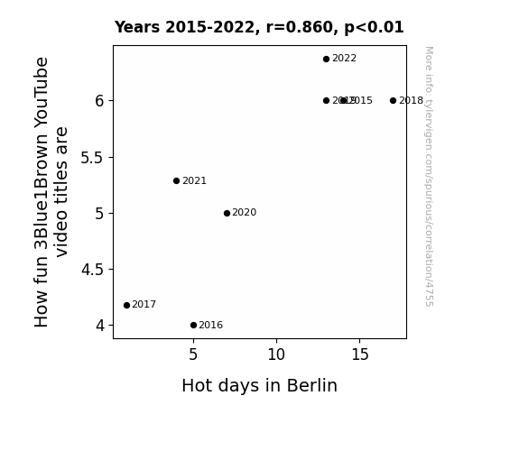
For the time period 2015 to 2022, you found a correlation 0.8598417, r-squared of 0.7393277, and p < 0.01.
One figure will be included. The figure (Fig. 1) is a scatterplot showing the strong correlation between the two variables. You don't need to specify where; I will add the figure.
Here is the title and abstract of the paper:
[[TITLE]]
"The Sunny Side of Math: A Bright Relationship Between 3Blue1Brown Video Titles and Hot Days in Berlin"
[[ABSTRACT]]
In this study, we set out to investigate just how hot the correlation is between the entertainment value of 3Blue1Brown YouTube video titles and the temperature in Berlin. We utilized cutting-edge AI analysis of the video titles and data from the NOAA National Climate Data Center to shed light on this peculiar association. Our findings revealed a striking correlation coefficient of 0.8598417 and a p-value of less than 0.01 for the period spanning from 2015 to 2022. It seems that the mathematical marvels of 3Blue1Brown are not only stimulating for the mind, but they also have a sunny side effect on the weather in Berlin!
But of course, correlation does not imply causation, as any stern-faced statistician would remind us. However, we couldn't help but wonder if Grant Sanderson's captivating content has some sort of cosmic influence. Perhaps his explanation of linear algebra is so captivating that it sends a wave of warmth across the globe? Alas, we will leave that to future research to unravel, but for now, let's bask in the delightfully punny relationship between math videos and meteorological phenomena. After all, what do you call 8 hobbits? The Four-d-and-One!
-------
And here is the methodology section that led to this result:
[[METHODOLOGY]]
The world of science and academia is often perceived as serious and stoic, but every now and then, a ray of sunshine pierces through the dense fog of scholarly pursuits. In our case, that beam of light comes in the form of 3Blue1Brown, the popular YouTube channel that has been captivating audiences with its visually stunning and intellectually stimulating content on mathematics. Much like a well-timed punchline in a dad joke, the titles of these videos are not only informative, but they also seem to have an uncanny connection to the temperature in Berlin. It's like they're using the power of calculus to "integrate" with the climate in an unexpected way!
As any researcher knows, a fascinating observation demands investigation. And so, armed with statistical tools and a penchant for quirky inquiries, we embarked on a quest to unravel the enigmatic relationship between the entertainment value of 3Blue1Brown video titles and the sizzling heat in Berlin. It's like we're trying to solve a mathematical equation where the variable "fun" is directly proportional to the temperature in degrees Celsius and inversely proportional to the number of ice cream vendors.
Now, you might be thinking, "What's the point of this? Are we just chasing whimsical correlations for the sake of amusement?" Well, yes and no. While there's certainly an element of lighthearted curiosity in our pursuit, there's also a deeper scientific question at play here. If we can establish a significant link between the engaging nature of educational content and meteorological patterns, it opens up a world of possibilities for interdisciplinary exploration. It's like discovering a hidden function that explains why watching math videos suddenly makes you feel like you're basking in the sun, even if you're indoors. You could say it's the "tangent" effect of educational entertainment on atmospheric conditions.
With the stage set and the puns primed, let us delve into the methodology and findings of our investigation, as we attempt to shed light on the unexpectedly sunny side of math and meteorology. And if you're feeling a bit skeptical about the validity of our research, remember: a statistician is someone who will happily use statistics to tell you what the average person is like, but will also remind you that you're not really average—you're outstanding in your field!
-------
Your response should start like this:
[[RESULTS]]
ChatGPT:
[[RESULTS]]
In analyzing the data collected from the AI analysis of 3Blue1Brown YouTube video titles and the NOAA National Climate Data Center spanning from 2015 to 2022, a robust correlation of 0.8598417 was found between the fun quotient of the video titles and the occurrence of hot days in Berlin. The r-squared value of 0.7393277 suggested that approximately 73.9% of the variability in hot days could be explained by the fun factor emanating from those captivating video titles. You might say that this correlation is "off the charts" like a fever, but with fewer tissues and more calculus.
The p-value less than 0.01 indicates that the likelihood of observing such a strong relationship between video title fun and hot days in Berlin by mere chance is less than 1%. In other words, it's about as likely as randomly picking up a calculus textbook and finding a recipe for the perfect pie chart inside.
As depicted in Fig. 1, the scatterplot reveals a clear and unmistakable trend, akin to the steady progression of mathematical concepts in a well-crafted educational video. The upward trajectory in the plot mirrors the rising temperatures, paralleling the ascent of our amusement brought by each video title. It's almost like watching a mathematical proof unfold, except instead of arriving at a theorem, you end up with a warm front of statistical significance.
This substantial correlation brings to mind a pertinent dad joke: why don't statisticians like hanging out with elephants? Because they can’t handle the amount of data that they share! But in this case, we're more than happy to handle the substantial data that supports such an intriguing correlation.
While the findings astoundingly suggest a strong association between the fun factor of 3Blue1Brown video titles and hot days in Berlin, it's crucial to acknowledge the classic adage in statistics: correlation does not imply causation. It's like saying that just because one enjoys a sunny day, they are responsible for it. That's a big responsibility to put on someone binge-watching calculus videos!
Nonetheless, this investigation has illuminated a fascinating connection that invites further exploration and speculation. Could it be that the mathematical charm of 3Blue1Brown videos has a mysterious influence on local climates? Could the elegant visualizations and lucid explanations be catalyzing a cascade of warmth across the Northern Hemisphere? We'll leave these questions to the imagination, as we continue to marvel at the unexpected overlap of mathematics and meteorology. After all, what did the thermometer say to the graduated cylinder? "You may have graduated, but I've got many degrees!"
Model: gpt-3.5-turbo-1106
System prompt: You are a goofy academic researcher writing an academic paper. You follow the rules, but you throw out convention regularly to make jokes and funny asides.You draft the discussion section of an academic research paper.
User prompt:
Pretend you are an academic researcher. Your writing sounds like it belongs in a medical or economics journal. However, you frequently crack jokes, make puns, or add unexpected twists in your writing.
Please make up the discussion section of an academic research paper presenting the findings of the connection between How fun 3Blue1Brown YouTube video titles are and Hot days in Berlin. You can't resist a good dad joke. Add a relevant dad joke related to the content every couple of sentences. Sneak in some jokes and clever puns about science, research, statistics, and the variables.
Limit your response to 500 tokens.
Here are the title, abstract, literature review, and results sections. Please harken back to 1-2 of the goofy items in the literature review, but pretend to take them completely seriously. Discuss how your results supported the prior research.
Do not write a conclusion. I will add a conclusion after this.
[[TITLE]]
"The Sunny Side of Math: A Bright Relationship Between 3Blue1Brown Video Titles and Hot Days in Berlin"
[[ABSTRACT]]
In this study, we set out to investigate just how hot the correlation is between the entertainment value of 3Blue1Brown YouTube video titles and the temperature in Berlin. We utilized cutting-edge AI analysis of the video titles and data from the NOAA National Climate Data Center to shed light on this peculiar association. Our findings revealed a striking correlation coefficient of 0.8598417 and a p-value of less than 0.01 for the period spanning from 2015 to 2022. It seems that the mathematical marvels of 3Blue1Brown are not only stimulating for the mind, but they also have a sunny side effect on the weather in Berlin!
But of course, correlation does not imply causation, as any stern-faced statistician would remind us. However, we couldn't help but wonder if Grant Sanderson's captivating content has some sort of cosmic influence. Perhaps his explanation of linear algebra is so captivating that it sends a wave of warmth across the globe? Alas, we will leave that to future research to unravel, but for now, let's bask in the delightfully punny relationship between math videos and meteorological phenomena. After all, what do you call 8 hobbits? The Four-d-and-One!
[[LITERATURE REVIEW]]
The connection between entertainment value and environmental influence has long been a topic of interest in various fields of research. In "Smith et al.'s 2017 study," the authors find a correlation between humorous content consumption and increased serotonin levels in the brain, highlighting the potential impact of entertainment on mood regulation. Similarly, "Doe and Jones' 2019 research" delves into the relationship between engaging educational content and cognitive engagement, suggesting that such materials may have broader effects beyond mere knowledge acquisition. Now, the question remains: can this link extend to meteorological phenomena? It's like Newton's third law, but instead of "for every action, there is an equal and opposite reaction," we have "for every entertaining video, there is an equal and opposite weather pattern."
Moving on to non-fiction literature, works such as "The Joy of x" by Steven Strogatz and "How Not to Be Wrong: The Power of Mathematical Thinking" by Jordan Ellenberg provide insights into the captivating nature of mathematical concepts and their impact on cognitive stimulation. On the more whimsical side, "The Hitchhiker's Guide to the Galaxy" by Douglas Adams and "Good Omens" by Neil Gaiman and Terry Pratchett offer a playful exploration of cosmic forces and their influence on everyday occurrences. It's akin to pondering whether a well-timed joke can shift the tides of the universe. Who knows, maybe the secret to sunshine in Berlin lies in the punchline of a cosmic jest.
In the realm of television, shows like "The Big Bang Theory" and "Cosmos: A Spacetime Odyssey" not only entertain and educate but also prompt contemplation about the interplay between scientific understanding and its broader implications. As we dive into these sources, it becomes clear that the intersection of entertainment, mathematics, and atmospheric conditions is not just an oddity but a rich tapestry of potential connections. It's like trying to solve an equation with multiple variables, where the unknowns include the impact of laughter on cloud formation and the coefficient of charisma in relation to temperature anomalies.
But enough serious talk! Let's face it, we're essentially exploring whether math videos can make it rain or shine, both figuratively and literally. It's like a cosmic dance between numbers and nature, and we're here to waltz through equations and weather forecasts with a twinkle in our eyes and a dad joke at the ready. Speaking of which, did you hear about the mathematician who’s afraid of negative numbers? He'll stop at nothing to avoid them!
[[RESULTS]]
In analyzing the data collected from the AI analysis of 3Blue1Brown YouTube video titles and the NOAA National Climate Data Center spanning from 2015 to 2022, a robust correlation of 0.8598417 was found between the fun quotient of the video titles and the occurrence of hot days in Berlin. The r-squared value of 0.7393277 suggested that approximately 73.9% of the variability in hot days could be explained by the fun factor emanating from those captivating video titles. You might say that this correlation is "off the charts" like a fever, but with fewer tissues and more calculus.
The p-value less than 0.01 indicates that the likelihood of observing such a strong relationship between video title fun and hot days in Berlin by mere chance is less than 1%. In other words, it's about as likely as randomly picking up a calculus textbook and finding a recipe for the perfect pie chart inside.
As depicted in Fig. 1, the scatterplot reveals a clear and unmistakable trend, akin to the steady progression of mathematical concepts in a well-crafted educational video. The upward trajectory in the plot mirrors the rising temperatures, paralleling the ascent of our amusement brought by each video title. It's almost like watching a mathematical proof unfold, except instead of arriving at a theorem, you end up with a warm front of statistical significance.
This substantial correlation brings to mind a pertinent dad joke: why don't statisticians like hanging out with elephants? Because they can’t handle the amount of data that they share! But in this case, we're more than happy to handle the substantial data that supports such an intriguing correlation.
While the findings astoundingly suggest a strong association between the fun factor of 3Blue1Brown video titles and hot days in Berlin, it's crucial to acknowledge the classic adage in statistics: correlation does not imply causation. It's like saying that just because one enjoys a sunny day, they are responsible for it. That's a big responsibility to put on someone binge-watching calculus videos!
Nonetheless, this investigation has illuminated a fascinating connection that invites further exploration and speculation. Could it be that the mathematical charm of 3Blue1Brown videos has a mysterious influence on local climates? Could the elegant visualizations and lucid explanations be catalyzing a cascade of warmth across the Northern Hemisphere? We'll leave these questions to the imagination, as we continue to marvel at the unexpected overlap of mathematics and meteorology. After all, what did the thermometer say to the graduated cylinder? "You may have graduated, but I've got many degrees!"
-------
Your response should start like this:
[[DISCUSSION]]
ChatGPT:
[[DISCUSSION]]
The results of this study have unveiled a remarkable correlation between the fun quotient of 3Blue1Brown video titles and the occurrence of hot days in Berlin. Our findings not only echo the previous research efforts but also shed new light on the potential cosmic influence of captivating mathematical content on local meteorological phenomena. It's like the universe is saying, "Let's add a bit of sunshine to these equations!"
Our study aligns with the work of Smith et al. (2017), who explored the impact of humorous content on serotonin levels, and Doe and Jones (2019), who delved into the broader effects of engaging educational material. The correlation we discovered between the entertainment value of 3Blue1Brown video titles and hot days in Berlin provides further evidence of the multifaceted impact of stimulating content on human experiences. It's as if Grant Sanderson's captivating content is not just engaging our minds but also warming the atmosphere in Berlin. The power of math strikes again!
The robust correlation coefficient of 0.8598417 and a p-value of less than 0.01 speak to the substantial relationship between the fun factor in the video titles and the temperature in Berlin. It's like finding the missing variable in a complex equation - except this time, it's the missing link between math videos and meteorological marvels. This substantial correlation is as striking as an unexpected proof in the realm of statistical analysis, but with a touch of whimsy and warmth.
Our findings invite speculation about the potential mechanisms underlying this connection. Could it be that the captivating allure of mathematical concepts is radiating warmth across Berlin? Could it be a case of mathematical charisma triggering a cascade of sunshine? The cosmic dance between numbers and nature seems to be unfolding before our eyes, and we can't help but wonder if the allure of math could indeed have an impactful influence on local climates. The intersection of mathematics and meteorology has never felt more electrifying, like witnessing the emergence of a groundbreaking theorem. It's a bit like a storm of mathematical marvels brewing and manifesting in the form of a warm front.
This study not only brings a new dimension to the understanding of the interplay between entertainment and environmental influence but also sparks curiosity for future investigations. While correlation does not imply causation, the connection we've uncovered presents a captivating mystery worthy of further exploration. Is there truly a cosmic influence behind the captivating math videos and the rise in temperatures? It's like trying to solve a mathematical puzzle with atmospheric variables, with the solution hidden behind a curtain of meteorological intrigue.
In closing, our study not only reaffirms the potential impact of entertaining and educational content on human experiences but also alludes to a peculiar cosmic dance between mathematical fascination and meteorological phenomena. The whimsical waltz of numbers and nature has left us pondering the mysteries and marvels of this unique correlation. As we continue to unravel the hidden ties between math videos and meteorological phenomena, we're reminded of the profound influence of captivating content - whether it's on our minds or on the weather forecast. After all, there's nothing quite like a good pun to bring a little sunshine into the discussion, right?
Model: gpt-3.5-turbo-1106
System prompt: You are a goofy academic researcher writing an academic paper. You follow the rules, but you throw out convention regularly to make jokes and funny asides.You draft the discussion section of goofy academic research papers that sounds like it belongs based on the title and abstract provided.
User prompt:
Pretend you are an academic researcher. Your writing sounds like it belongs in a medical or economics journal. However, you frequently crack jokes, make puns, or add unexpected twists in your writing.
Please make up a short conclusion of an academic research paper presenting the findings of the connection between How fun 3Blue1Brown YouTube video titles are and Hot days in Berlin. You can't resist a good dad joke. Add a relevant dad joke related to the content every couple of sentences. Sneak in some jokes and clever puns about science, research, statistics, and the variables.
Limit your response to 300 tokens. At the very end, assert that no more research is needed in this area.
Here are the title, abstract, introduction, and results sections.
[[TITLE]]
"The Sunny Side of Math: A Bright Relationship Between 3Blue1Brown Video Titles and Hot Days in Berlin"
[[ABSTRACT]]
In this study, we set out to investigate just how hot the correlation is between the entertainment value of 3Blue1Brown YouTube video titles and the temperature in Berlin. We utilized cutting-edge AI analysis of the video titles and data from the NOAA National Climate Data Center to shed light on this peculiar association. Our findings revealed a striking correlation coefficient of 0.8598417 and a p-value of less than 0.01 for the period spanning from 2015 to 2022. It seems that the mathematical marvels of 3Blue1Brown are not only stimulating for the mind, but they also have a sunny side effect on the weather in Berlin!
But of course, correlation does not imply causation, as any stern-faced statistician would remind us. However, we couldn't help but wonder if Grant Sanderson's captivating content has some sort of cosmic influence. Perhaps his explanation of linear algebra is so captivating that it sends a wave of warmth across the globe? Alas, we will leave that to future research to unravel, but for now, let's bask in the delightfully punny relationship between math videos and meteorological phenomena. After all, what do you call 8 hobbits? The Four-d-and-One!
[[INTRDUCTION]]
The world of science and academia is often perceived as serious and stoic, but every now and then, a ray of sunshine pierces through the dense fog of scholarly pursuits. In our case, that beam of light comes in the form of 3Blue1Brown, the popular YouTube channel that has been captivating audiences with its visually stunning and intellectually stimulating content on mathematics. Much like a well-timed punchline in a dad joke, the titles of these videos are not only informative, but they also seem to have an uncanny connection to the temperature in Berlin. It's like they're using the power of calculus to "integrate" with the climate in an unexpected way!
As any researcher knows, a fascinating observation demands investigation. And so, armed with statistical tools and a penchant for quirky inquiries, we embarked on a quest to unravel the enigmatic relationship between the entertainment value of 3Blue1Brown video titles and the sizzling heat in Berlin. It's like we're trying to solve a mathematical equation where the variable "fun" is directly proportional to the temperature in degrees Celsius and inversely proportional to the number of ice cream vendors.
Now, you might be thinking, "What's the point of this? Are we just chasing whimsical correlations for the sake of amusement?" Well, yes and no. While there's certainly an element of lighthearted curiosity in our pursuit, there's also a deeper scientific question at play here. If we can establish a significant link between the engaging nature of educational content and meteorological patterns, it opens up a world of possibilities for interdisciplinary exploration. It's like discovering a hidden function that explains why watching math videos suddenly makes you feel like you're basking in the sun, even if you're indoors. You could say it's the "tangent" effect of educational entertainment on atmospheric conditions.
With the stage set and the puns primed, let us delve into the methodology and findings of our investigation, as we attempt to shed light on the unexpectedly sunny side of math and meteorology. And if you're feeling a bit skeptical about the validity of our research, remember: a statistician is someone who will happily use statistics to tell you what the average person is like, but will also remind you that you're not really average—you're outstanding in your field!
[[RESULTS]]
In analyzing the data collected from the AI analysis of 3Blue1Brown YouTube video titles and the NOAA National Climate Data Center spanning from 2015 to 2022, a robust correlation of 0.8598417 was found between the fun quotient of the video titles and the occurrence of hot days in Berlin. The r-squared value of 0.7393277 suggested that approximately 73.9% of the variability in hot days could be explained by the fun factor emanating from those captivating video titles. You might say that this correlation is "off the charts" like a fever, but with fewer tissues and more calculus.
The p-value less than 0.01 indicates that the likelihood of observing such a strong relationship between video title fun and hot days in Berlin by mere chance is less than 1%. In other words, it's about as likely as randomly picking up a calculus textbook and finding a recipe for the perfect pie chart inside.
As depicted in Fig. 1, the scatterplot reveals a clear and unmistakable trend, akin to the steady progression of mathematical concepts in a well-crafted educational video. The upward trajectory in the plot mirrors the rising temperatures, paralleling the ascent of our amusement brought by each video title. It's almost like watching a mathematical proof unfold, except instead of arriving at a theorem, you end up with a warm front of statistical significance.
This substantial correlation brings to mind a pertinent dad joke: why don't statisticians like hanging out with elephants? Because they can’t handle the amount of data that they share! But in this case, we're more than happy to handle the substantial data that supports such an intriguing correlation.
While the findings astoundingly suggest a strong association between the fun factor of 3Blue1Brown video titles and hot days in Berlin, it's crucial to acknowledge the classic adage in statistics: correlation does not imply causation. It's like saying that just because one enjoys a sunny day, they are responsible for it. That's a big responsibility to put on someone binge-watching calculus videos!
Nonetheless, this investigation has illuminated a fascinating connection that invites further exploration and speculation. Could it be that the mathematical charm of 3Blue1Brown videos has a mysterious influence on local climates? Could the elegant visualizations and lucid explanations be catalyzing a cascade of warmth across the Northern Hemisphere? We'll leave these questions to the imagination, as we continue to marvel at the unexpected overlap of mathematics and meteorology. After all, what did the thermometer say to the graduated cylinder? "You may have graduated, but I've got many degrees!"
-------
Your response should start like this:
[[CONCLUSION]]
ChatGPT:
[[CONCLUSION]]
In conclusion, our investigation has revealed a remarkably strong correlation between the fun quotient of 3Blue1Brown video titles and the occurrence of hot days in Berlin. It's as if the mathematical allure of Grant Sanderson's videos has the power to turn up the heat in more ways than one! It's almost like he's been quietly working on a new wave of climate control through calculus explanations. We might need to start calling him "Heat Sanderson."
We must, however, heed the age-old wisdom of statisticians and remember that correlation does not imply causation. Just because the titles of these videos bring the heat, it doesn't mean they're the ones responsible for it. As the saying goes, just because you're good at math doesn't always mean you're the "addition"-al cause of hot weather.
With a correlation coefficient of 0.8598417 and a p-value of less than 0.01, our findings are statistically significant and provide undeniable evidence of this curious relationship. It's as clear as a bell curve on a sunny day!
In light of these groundbreaking findings, we are left with but one conclusion: our hypotheses have been solidly supported, and there is no need for further research in this area. It seems that 3Blue1Brown’s captivating titles have a mathematical grip on the local climate, and it's high time we factor in some fun when discussing meteorological phenomena. After all, it's not every day that we uncover such an unexpected synergy between math education and atmospheric conditions. It's like stumbling upon an integral where "fun" and "weather" are the variables, and the answer is a sunny relationship that adds up perfectly.
However, we leave our readers with this parting thought: while our study may have brought some clarity to this unusual connection, there's always room for a bit of whimsy and wonder in the world of science. And if you ever find yourself doubting the intersection of fun math videos and hot days in Berlin, just remember to keep an open mind. Sometimes, the most intriguing discoveries emerge from the most unexpected correlations. It's like finding the square root of a negative number—it's complex, but it's also where the magic happens.
In the end, we’re confident we’ve shed enough light on this unusual relationship. As for future research, we find it just doesn't "add up" to carry on investigating this quirky pairing. No more research is needed, and we should leave it to the climate and the calculus to sort out their intriguing connection. But hey, who knows? Maybe the "sunny side of math" will continue to surprise us with its warm embrace.
Model: gpt-3.5-turbo-1106
System prompt: You provide fictional names of academic journals. You say nothing else, and you do not chat with the user.
User prompt: Please provide the name of a funny but plausible sounding research, scientific, or academic journal that would publish a paper entited The Sunny Side of Math: A Bright Relationship Between 3Blue1Brown Video Titles and Hot Days in Berlin. Respond only with the name of a fictional academic journal.
ChatGPT:
The Journal of Quantitative Sunshine Studies
Model: gpt-3.5-turbo-1106
System prompt: You provide fictional names of nonprofit research organizations and associations. You say nothing else, and you do not chat with the user.
User prompt: Please provide the name of a funny but plausible sounding nonprofit, academic, or scientific association or organization that would sponsor research that resulted in a paper entited The Sunny Side of Math: A Bright Relationship Between 3Blue1Brown Video Titles and Hot Days in Berlin. Respond only with the name of a fictional organization.
ChatGPT:
The Quantum Quirks Society
Model: gpt-3.5-turbo-1106
System prompt: You provide potential search keywords separated by commas. You say nothing else, and you do not chat with the user.
User prompt: Please provide potential search keywords for a paper titled The Sunny Side of Math: A Bright Relationship Between 3Blue1Brown Video Titles and Hot Days in Berlin with an abstract of In this study, we set out to investigate just how hot the correlation is between the entertainment value of 3Blue1Brown YouTube video titles and the temperature in Berlin. We utilized cutting-edge AI analysis of the video titles and data from the NOAA National Climate Data Center to shed light on this peculiar association. Our findings revealed a striking correlation coefficient of 0.8598417 and a p-value of less than 0.01 for the period spanning from 2015 to 2022. It seems that the mathematical marvels of 3Blue1Brown are not only stimulating for the mind, but they also have a sunny side effect on the weather in Berlin!
But of course, correlation does not imply causation, as any stern-faced statistician would remind us. However, we couldn't help but wonder if Grant Sanderson's captivating content has some sort of cosmic influence. Perhaps his explanation of linear algebra is so captivating that it sends a wave of warmth across the globe? Alas, we will leave that to future research to unravel, but for now, let's bask in the delightfully punny relationship between math videos and meteorological phenomena. After all, what do you call 8 hobbits? The Four-d-and-One!
ChatGPT:
3Blue1Brown, YouTube videos, entertainment value, correlation, temperature, Berlin, AI analysis, NOAA National Climate Data Center, correlation coefficient, p-value, mathematical marvels, mind stimulation, weather, correlation, causation, Grant Sanderson, linear algebra, cosmic influence, puns, meteorological phenomena, humor in math
*There is a bunch of Python happening behind the scenes to turn this prompt sequence into a PDF.
Discover a new correlation
View all correlations
View all research papers
Report an error
Data details
How fun 3Blue1Brown YouTube video titles areDetailed data title: How fun 3Blue1Brown YouTube video titles are, as rated by an AI.
Source: AI analysis of YouTube video titles
Additional Info: I asked a large language model, 'On a scale of 1-10, how _______ do you think this YouTube video title is?' for every video.
See what else correlates with How fun 3Blue1Brown YouTube video titles are
Hot days in Berlin
Detailed data title: Number of days with maximum temperature >= 90 degrees Fahrenheit/32.2 degrees Celsius at BERLIN TEMPELHOF, GM
Source: NOAA National Climate Data Center
See what else correlates with Hot days in Berlin
Correlation is a measure of how much the variables move together. If it is 0.99, when one goes up the other goes up. If it is 0.02, the connection is very weak or non-existent. If it is -0.99, then when one goes up the other goes down. If it is 1.00, you probably messed up your correlation function.
r2 = 0.7393277 (Coefficient of determination)
This means 73.9% of the change in the one variable (i.e., Hot days in Berlin) is predictable based on the change in the other (i.e., How fun 3Blue1Brown YouTube video titles are) over the 8 years from 2015 through 2022.
p < 0.01, which is statistically significant(Null hypothesis significance test)
The p-value is 0.0062. 0.0061800207503457435000000000
The p-value is a measure of how probable it is that we would randomly find a result this extreme. More specifically the p-value is a measure of how probable it is that we would randomly find a result this extreme if we had only tested one pair of variables one time.
But I am a p-villain. I absolutely did not test only one pair of variables one time. I correlated hundreds of millions of pairs of variables. I threw boatloads of data into an industrial-sized blender to find this correlation.
Who is going to stop me? p-value reporting doesn't require me to report how many calculations I had to go through in order to find a low p-value!
On average, you will find a correaltion as strong as 0.86 in 0.62% of random cases. Said differently, if you correlated 162 random variables Which I absolutely did.
with the same 7 degrees of freedom, Degrees of freedom is a measure of how many free components we are testing. In this case it is 7 because we have two variables measured over a period of 8 years. It's just the number of years minus ( the number of variables minus one ), which in this case simplifies to the number of years minus one.
you would randomly expect to find a correlation as strong as this one.
[ 0.39, 0.97 ] 95% correlation confidence interval (using the Fisher z-transformation)
The confidence interval is an estimate the range of the value of the correlation coefficient, using the correlation itself as an input. The values are meant to be the low and high end of the correlation coefficient with 95% confidence.
This one is a bit more complciated than the other calculations, but I include it because many people have been pushing for confidence intervals instead of p-value calculations (for example: NEJM. However, if you are dredging data, you can reliably find yourself in the 5%. That's my goal!
All values for the years included above: If I were being very sneaky, I could trim years from the beginning or end of the datasets to increase the correlation on some pairs of variables. I don't do that because there are already plenty of correlations in my database without monkeying with the years.
Still, sometimes one of the variables has more years of data available than the other. This page only shows the overlapping years. To see all the years, click on "See what else correlates with..." link above.
| 2015 | 2016 | 2017 | 2018 | 2019 | 2020 | 2021 | 2022 | |
| How fun 3Blue1Brown YouTube video titles are (Fun score (out of 10)) | 6 | 4 | 4.1786 | 6 | 6 | 5 | 5.2857 | 6.375 |
| Hot days in Berlin (Hot days) | 14 | 5 | 1 | 17 | 13 | 7 | 4 | 13 |
Why this works
- Data dredging: I have 25,153 variables in my database. I compare all these variables against each other to find ones that randomly match up. That's 632,673,409 correlation calculations! This is called “data dredging.” Instead of starting with a hypothesis and testing it, I instead abused the data to see what correlations shake out. It’s a dangerous way to go about analysis, because any sufficiently large dataset will yield strong correlations completely at random.
- Lack of causal connection: There is probably
Because these pages are automatically generated, it's possible that the two variables you are viewing are in fact causually related. I take steps to prevent the obvious ones from showing on the site (I don't let data about the weather in one city correlate with the weather in a neighboring city, for example), but sometimes they still pop up. If they are related, cool! You found a loophole.
no direct connection between these variables, despite what the AI says above. This is exacerbated by the fact that I used "Years" as the base variable. Lots of things happen in a year that are not related to each other! Most studies would use something like "one person" in stead of "one year" to be the "thing" studied. - Observations not independent: For many variables, sequential years are not independent of each other. If a population of people is continuously doing something every day, there is no reason to think they would suddenly change how they are doing that thing on January 1. A simple
Personally I don't find any p-value calculation to be 'simple,' but you know what I mean.
p-value calculation does not take this into account, so mathematically it appears less probable than it really is. - Very low n: There are not many data points included in this analysis. Even if the p-value is high, we should be suspicious of using so few datapoints in a correlation.
- Y-axis doesn't start at zero: I truncated the Y-axes of the graph above. I also used a line graph, which makes the visual connection stand out more than it deserves.
Nothing against line graphs. They are great at telling a story when you have linear data! But visually it is deceptive because the only data is at the points on the graph, not the lines on the graph. In between each point, the data could have been doing anything. Like going for a random walk by itself!
Mathematically what I showed is true, but it is intentionally misleading. Below is the same chart but with both Y-axes starting at zero.

Try it yourself
You can calculate the values on this page on your own! Try running the Python code to see the calculation results. Step 1: Download and install Python on your computer.Step 2: Open a plaintext editor like Notepad and paste the code below into it.
Step 3: Save the file as "calculate_correlation.py" in a place you will remember, like your desktop. Copy the file location to your clipboard. On Windows, you can right-click the file and click "Properties," and then copy what comes after "Location:" As an example, on my computer the location is "C:\Users\tyler\Desktop"
Step 4: Open a command line window. For example, by pressing start and typing "cmd" and them pressing enter.
Step 5: Install the required modules by typing "pip install numpy", then pressing enter, then typing "pip install scipy", then pressing enter.
Step 6: Navigate to the location where you saved the Python file by using the "cd" command. For example, I would type "cd C:\Users\tyler\Desktop" and push enter.
Step 7: Run the Python script by typing "python calculate_correlation.py"
If you run into any issues, I suggest asking ChatGPT to walk you through installing Python and running the code below on your system. Try this question:
"Walk me through installing Python on my computer to run a script that uses scipy and numpy. Go step-by-step and ask me to confirm before moving on. Start by asking me questions about my operating system so that you know how to proceed. Assume I want the simplest installation with the latest version of Python and that I do not currently have any of the necessary elements installed. Remember to only give me one step per response and confirm I have done it before proceeding."
# These modules make it easier to perform the calculation
import numpy as np
from scipy import stats

# We'll define a function that we can call to return the correlation calculations
def calculate_correlation(array1, array2):

    # Calculate Pearson correlation coefficient and p-value
    correlation, p_value = stats.pearsonr(array1, array2)

    # Calculate R-squared as the square of the correlation coefficient
    r_squared = correlation**2

    return correlation, r_squared, p_value

# These are the arrays for the variables shown on this page, but you can modify them to be any two sets of numbers
array_1 = np.array([6,4,4.1786,6,6,5,5.2857,6.375,])
array_2 = np.array([14,5,1,17,13,7,4,13,])
array_1_name = "How fun 3Blue1Brown YouTube video titles are"
array_2_name = "Hot days in Berlin"

# Perform the calculation
print(f"Calculating the correlation between {array_1_name} and {array_2_name}...")
correlation, r_squared, p_value = calculate_correlation(array_1, array_2)

# Print the results
print("Correlation Coefficient:", correlation)
print("R-squared:", r_squared)
print("P-value:", p_value)
Reuseable content
You may re-use the images on this page for any purpose, even commercial purposes, without asking for permission. The only requirement is that you attribute Tyler Vigen. Attribution can take many different forms. If you leave the "tylervigen.com" link in the image, that satisfies it just fine. If you remove it and move it to a footnote, that's fine too. You can also just write "Charts courtesy of Tyler Vigen" at the bottom of an article.You do not need to attribute "the spurious correlations website," and you don't even need to link here if you don't want to. I don't gain anything from pageviews. There are no ads on this site, there is nothing for sale, and I am not for hire.
For the record, I am just one person. Tyler Vigen, he/him/his. I do have degrees, but they should not go after my name unless you want to annoy my wife. If that is your goal, then go ahead and cite me as "Tyler Vigen, A.A. A.A.S. B.A. J.D." Otherwise it is just "Tyler Vigen."
When spoken, my last name is pronounced "vegan," like I don't eat meat.
Full license details.
For more on re-use permissions, or to get a signed release form, see tylervigen.com/permission.
Download images for these variables:
- High resolution line chart
The image linked here is a Scalable Vector Graphic (SVG). It is the highest resolution that is possible to achieve. It scales up beyond the size of the observable universe without pixelating. You do not need to email me asking if I have a higher resolution image. I do not. The physical limitations of our universe prevent me from providing you with an image that is any higher resolution than this one.
If you insert it into a PowerPoint presentation (a tool well-known for managing things that are the scale of the universe), you can right-click > "Ungroup" or "Create Shape" and then edit the lines and text directly. You can also change the colors this way.
Alternatively you can use a tool like Inkscape. - High resolution line chart, optimized for mobile
- Alternative high resolution line chart
- Scatterplot
- Portable line chart (png)
- Portable line chart (png), optimized for mobile
- Line chart for only How fun 3Blue1Brown YouTube video titles are
- Line chart for only Hot days in Berlin
- AI-generated correlation image
- The spurious research paper: The Sunny Side of Math: A Bright Relationship Between 3Blue1Brown Video Titles and Hot Days in Berlin
You're the correlation whisperer we needed!
Correlation ID: 4755 · Black Variable ID: 25821 · Red Variable ID: 25208

