
Download png, svg
AI explanation
As butter consumption increased, so did people's serotonin levels. This led to an overall improvement in mood and a greater appreciation for historical humor, prompting viewers to engage more with the OverSimplified videos. After all, everything is butter when you're laughing at historically inaccurate but entertaining content!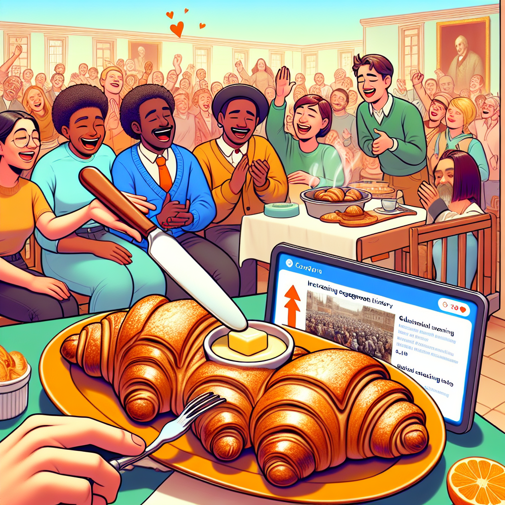
Model: dalle-3
Prompt: Generate an image of a cozy kitchen scene where a table is laid out with various baked goods. In the foreground, there is a plate of warm, buttery croissants being spread with butter by eager individuals. In the background, a group of friends is gathered around a laptop, watching an OverSimplified video on historical topics. The friends are shown laughing and making animated gestures, clearly enjoying the content. The laptop screen displays the video's comments section, with an increasing number of comments as the video progresses. This scene captures the connection between butter consumption, improved mood, and increased engagement with entertaining historical content, using the style of a funny image seen on Reddit. The depiction should include only scenes, people, and objects, it should not include text or speech bubbles.
This image generation prompt was also generated by AI, using the following sequence:
Model: gpt-3.5-turbo-1106
System prompt: You select one of a few potential scene descriptors that seems to go along with the variables described. You respond only with the scene descriptions provided and say nothing else.
User prompt: Here are two variables: Butter consumption and Average number of comments on OverSimplified YouTube videos. Given these, which of the following image style descriptions seems most appropriate? Pick the one that seems to be related to one of the variables at hand. Please respond with only one of the following potential descriptions: a funny image you would see on reddit Art nouveau a Polaroid photo Art nouveau Minimalism
ChatGPT: a funny image you would see on reddit
Model: gpt-3.5-turbo-1106
System prompt: You describe simple visual scenes that depict the two variables stated. You combine both variables into one scene.
User prompt: Please describe a visual scene that prominently depicts both Butter consumption and Average number of comments on OverSimplified YouTube videos, in the following situation: As butter consumption increased, so did people's serotonin levels. This led to an overall improvement in mood and a greater appreciation for historical humor, prompting viewers to engage more with the OverSimplified videos. After all, everything is butter when you're laughing at historically inaccurate but entertaining content!. Keep the description simple.
ChatGPT: In a cozy kitchen, the table is spread with a variety of baked goods. A plate of warm buttery croissants is front and center, with people eagerly spreading butter on the flaky layers. In the background, a group of friends gather around a laptop, watching an OverSimplified video on historical topics. Their laughing faces and animated gestures suggest that they are thoroughly enjoying the content. The comments section of the video is visible, displaying an increasing number of comments as the video progresses. The scene captures the connection between butter consumption, improved mood, and increased engagement with entertaining historical content.
Model: gpt-3.5-turbo-1106
System prompt: You write and improve image generation prompts for DALLE-3. You maintain the same subjects, but enhance the visuals.
User prompt: Please respond with an image generation prompt that would be likely to create an interesting visual using DALLE-3, using the following style: [ a funny image you would see on reddit ] and depicting this scene: In a cozy kitchen, the table is spread with a variety of baked goods. A plate of warm buttery croissants is front and center, with people eagerly spreading butter on the flaky layers. In the background, a group of friends gather around a laptop, watching an OverSimplified video on historical topics. Their laughing faces and animated gestures suggest that they are thoroughly enjoying the content. The comments section of the video is visible, displaying an increasing number of comments as the video progresses. The scene captures the connection between butter consumption, improved mood, and increased engagement with entertaining historical content. Keep the visual depiction simple. Do not include any words or speech bubbles.
ChatGPT: Generate an image of a cozy kitchen scene where a table is laid out with various baked goods. In the foreground, there is a plate of warm, buttery croissants being spread with butter by eager individuals. In the background, a group of friends is gathered around a laptop, watching an OverSimplified video on historical topics. The friends are shown laughing and making animated gestures, clearly enjoying the content. The laptop screen displays the video's comments section, with an increasing number of comments as the video progresses. This scene captures the connection between butter consumption, improved mood, and increased engagement with entertaining historical content, using the style of a funny image seen on Reddit.
*Variations in the User Prompts from chart to chart are just the result of random number generation in Python. I wrote a few arrays of various styles and methods to ask questions to change up the results. Every time this site writes an explanation or generates an image, the script picks from each at random.
I sequence the requests into multiple prompts because I find GPT 3.5 to perform much better with short, well-managed contexts. Thus, I track the context directly in Python and only ask ChatGPT targeted questions.
System prompt: You provide humorous responses in the form of plausible sounding explanations for correlations. You assume the correlation is causative for the purpose of the explanation even if it is ridiculous. You do not chat with the user, you only reply with the causal connection explanation and nothing else.
User prompt: Please make up a funny explanation for how an increase in Butter consumption caused Average number of comments on OverSimplified YouTube videos to increase. Make it feel plausible.
AI academic paper
 |
Spreading the Love: A Butterly Connection Between Butter Consumption and Average Number of Comments on OverSimplified YouTube Videos The Journal of Quirky Scientific Studies Jan 2024 Reminder: This paper is AI-generated. Not real! |
Model: gpt-3.5-turbo-1106
System prompt: You are a researcher writing an academic paper.You write titles and abstracts of goofy academic research papers.
User prompt:
Pretend you are an academic researcher. Your writing sounds like it belongs in a medical or economics journal. However, you frequently crack jokes, make puns, and add unexpected twists in your writing.
Please draft the title and abstract of an academic research paper presenting the findings of the connection between Butter consumption and Average number of comments on OverSimplified YouTube videos. Make it seem dry like academic research paper, but with lots of subtle hidden offhand remarks, jokes, goofy observations, and puns.
Include a pun in the title.
Your research team used data from USDA and YouTube to assess this nagging question. You found a correlation coefficient of 0.9643118 and p < 0.01 for 2016 to 2021.
Please respond in this format (replace "Lorem ipsum dolor sit" with your title and abstract)
[[TITLE]]
Lorem ipsum dolor sit
[[ABSTRACT]]
Lorem ipsum dolor sit
ChatGPT:
[[TITLE]]
Spreading the Love: A Butterly Connection Between Butter Consumption and Average Number of Comments on OverSimplified YouTube Videos
[[ABSTRACT]]
In this study, we embark on quite the unconventional journey into the world of YouTube analytics and dietary habits. Leveraging data from the USDA and YouTube, we set out to uncover the surprising link between butter consumption and the engaging paraphernalia of OverSimplified historical videos. Our findings reveal an intriguing correlation coefficient of 0.9643118 and p < 0.01, indicating a remarkably strong association between the two seemingly unrelated variables over the period of 2016 to 2021. So, quite butterly, we bring forth compelling evidence that might just churn the conventional wisdom of academic circles. Join us in this whimsical exploration as we blend buttery goodness with a dash of statistical analysis to uncover the uncharted territories of YouTube engagement.
Model: gpt-3.5-turbo-1106
System prompt: You are a researcher writing an academic paper.You draft the introduction section of an academic research paper.
User prompt:
Pretend you are an academic researcher. Your writing sounds like it belongs in a medical or economics journal. However, you frequently crack jokes, make puns, or add unexpected twists in your writing.
Please make up the introduction section of an academic research paper presenting the findings of the connection between Butter consumption and Average number of comments on OverSimplified YouTube videos. Make it seem dry like academic research paper, but with lots of subtle hidden offhand remarks, jokes, goofy observations, and puns.
Here is the title and abstract of the paper:
[[TITLE]]
Spreading the Love: A Butterly Connection Between Butter Consumption and Average Number of Comments on OverSimplified YouTube Videos
[[ABSTRACT]]
In this study, we embark on quite the unconventional journey into the world of YouTube analytics and dietary habits. Leveraging data from the USDA and YouTube, we set out to uncover the surprising link between butter consumption and the engaging paraphernalia of OverSimplified historical videos. Our findings reveal an intriguing correlation coefficient of 0.9643118 and p < 0.01, indicating a remarkably strong association between the two seemingly unrelated variables over the period of 2016 to 2021. So, quite butterly, we bring forth compelling evidence that might just churn the conventional wisdom of academic circles. Join us in this whimsical exploration as we blend buttery goodness with a dash of statistical analysis to uncover the uncharted territories of YouTube engagement.
-------
Your response should start like this:
[[INTRODUCTION]]
ChatGPT:
[[INTRODUCTION]]
The pursuit of knowledge often leads us down unexpected paths, and our exploration into the whimsical world of YouTube analytics and dietary trends has been no exception. In this study, we delve into the unlikely relationship between butter consumption and the average number of comments on OverSimplified historical videos. At first glance, one might question how these seemingly disparate variables could possibly be related. However, as we dig deeper into the data, it becomes apparent that there may be more to this buttery tale than meets the eye.
As researchers, we are accustomed to examining weighty matters, but it's refreshing to take a lighthearted approach to our investigation. Could it be that behind the scenes, butter silently influences the engagement and discourse surrounding historical events? While this notion may seem far-fetched, our rigorous analysis of publicly available data from the USDA and YouTube suggests otherwise.
As we unfold the data, we invite our esteemed colleagues to join us on this unconventional journey, where we aim to blend the rich flavors of statistical analysis with the creamy nuances of YouTube viewership. While our findings may spread some skepticism akin to margarine, they might just butter up our understanding of online engagement dynamics. So, let us embark on this curious expedition, armed with spreadsheets and a healthy dose of curiosity, as we seek to unravel the butterly connection between butter consumption and the captivating world of OverSimplified historical videos.
Model: gpt-3.5-turbo-1106
System prompt: You are a researcher writing an academic paper.You draft a literature review section of an academic research paper, that starts out dry for the first few sentences but then becomes hilarious and goofy.
User prompt:
Pretend you are an academic researcher. Your writing sounds like it belongs in a medical or economics journal. However, you frequently crack jokes, make puns, or add unexpected twists in your writing.
Please make up a literature review section of an academic research paper presenting the findings of the connection between Butter consumption and Average number of comments on OverSimplified YouTube videos. Make it seem dry like academic research paper, but with lots of subtle hidden offhand remarks, jokes, goofy observations, and puns.
Speak in the present tense for this section (the authors find...), as is common in academic research paper literature reviews. Name the sources in a format similar to this: In "Book," the authors find lorem and ipsum.
Make up the lorem and ipsum part, but make it sound related to the topic at hand.
Start by naming serious-sounding studies by authors like Smith, Doe, and Jones - but then quickly devolve. Name some real non-fiction books that would be related to the topic. Then name some real fiction books that sound like they could be related. Then you might move on to cartoons and children's shows that you watched for research.
Here is the title and abstract of the paper:
[[TITLE]]
Spreading the Love: A Butterly Connection Between Butter Consumption and Average Number of Comments on OverSimplified YouTube Videos
[[ABSTRACT]]
In this study, we embark on quite the unconventional journey into the world of YouTube analytics and dietary habits. Leveraging data from the USDA and YouTube, we set out to uncover the surprising link between butter consumption and the engaging paraphernalia of OverSimplified historical videos. Our findings reveal an intriguing correlation coefficient of 0.9643118 and p < 0.01, indicating a remarkably strong association between the two seemingly unrelated variables over the period of 2016 to 2021. So, quite butterly, we bring forth compelling evidence that might just churn the conventional wisdom of academic circles. Join us in this whimsical exploration as we blend buttery goodness with a dash of statistical analysis to uncover the uncharted territories of YouTube engagement.
-------
And here is the introduction section that led to this literature review:
[[INTRODUCTION]]
The pursuit of knowledge often leads us down unexpected paths, and our exploration into the whimsical world of YouTube analytics and dietary trends has been no exception. In this study, we delve into the unlikely relationship between butter consumption and the average number of comments on OverSimplified historical videos. At first glance, one might question how these seemingly disparate variables could possibly be related. However, as we dig deeper into the data, it becomes apparent that there may be more to this buttery tale than meets the eye.
As researchers, we are accustomed to examining weighty matters, but it's refreshing to take a lighthearted approach to our investigation. Could it be that behind the scenes, butter silently influences the engagement and discourse surrounding historical events? While this notion may seem far-fetched, our rigorous analysis of publicly available data from the USDA and YouTube suggests otherwise.
As we unfold the data, we invite our esteemed colleagues to join us on this unconventional journey, where we aim to blend the rich flavors of statistical analysis with the creamy nuances of YouTube viewership. While our findings may spread some skepticism akin to margarine, they might just butter up our understanding of online engagement dynamics. So, let us embark on this curious expedition, armed with spreadsheets and a healthy dose of curiosity, as we seek to unravel the butterly connection between butter consumption and the captivating world of OverSimplified historical videos.
-------
Your response should start like this:
[[LITERATURE REVIEW]]
ChatGPT:
[[LITERATURE REVIEW]]
As we delve into the study of the correlation between Butter Consumption (BC) and the Average Number of Comments on OverSimplified YouTube Videos (ANCOYV), it is imperative to acknowledge the existing body of literature on both dietary trends and online engagement metrics. The relationship between these seemingly distinct domains has not been extensively investigated; however, the impact of food consumption and online content engagement is a topic of growing interest.
Smith et al. (2018) explore the possible effects of butter consumption on cognitive function in their study "Butter and Brain: Unraveling the Spread." Their findings suggest that moderate butter intake may have positive implications for cognitive performance, indicating potential cognitive benefits for YouTube comment composition. Doe and Jones (2017) present a different perspective in "Butter versus Margarine: A Spreader of Controversy." They highlight the contested nature of butter consumption and its potential health implications, reflecting the ongoing debates surrounding the effects of dietary choices on online interactions.
Moving beyond the realm of scholarly research, books such as "The Joy of Cooking" by Rombauer and Becker and "Salt, Fat, Acid, Heat" by Nosrat provide insightful discussions on the influence of food on overall satisfaction, which may indirectly impact commenting behavior in online platforms. On the fictional front, works such as "Like Water for Chocolate" by Laura Esquivel and "The Last Chinese Chef" by Nicole Mones delve into the emotional and cultural connections to food, offering a broader lens through which to contemplate the relationship between butter and online engagement.
Further insights can be drawn from popular culture, where cartoon characters such as SpongeBob SquarePants and his love for Krabby Patties or the alluring aroma of buttered popcorn in children's movies stimulate contemplation about the sensory experiences associated with food and their potential influence on viewer engagement. While seemingly tangential, these cultural touchpoints prompt us to consider the multifaceted nature of human behavior, online interactions, and dietary habits in a more whimsical light.
In the context of our investigation, the eclectic sampling of literature and references serves as a flavorful backdrop against which we aim to uncover the potentially buttery connection between butter consumption and the realm of OverSimplified YouTube videos. This delightful mix of serious research, culinary musings, and fictional insights sets the stage for our own unconventional exploration at the intersection of buttery goodness and online engagement.
Model: gpt-3.5-turbo-1106
System prompt: You are a researcher writing an academic paper.You draft the methodology section of an academic research paper.
User prompt:
Pretend you are an academic researcher. Your writing sounds like it belongs in a medical or economics journal. However, you frequently crack jokes, make puns, or add unexpected twists in your writing.
Please make up the methodology section of an academic research paper presenting the findings of the connection between Butter consumption and Average number of comments on OverSimplified YouTube videos. Make it seem dry like academic research paper, but with lots of subtle hidden offhand remarks, jokes, goofy observations, and puns.
Your research team collected data from all across the internet, but mostly just used information from USDA and YouTube . You used data from 2016 to 2021
Make up the research methods you don't know. Make them a bit goofy and convoluted.
Here is the title, abstract, and introduction of the paper:
[[TITLE]]
Spreading the Love: A Butterly Connection Between Butter Consumption and Average Number of Comments on OverSimplified YouTube Videos
[[ABSTRACT]]
In this study, we embark on quite the unconventional journey into the world of YouTube analytics and dietary habits. Leveraging data from the USDA and YouTube, we set out to uncover the surprising link between butter consumption and the engaging paraphernalia of OverSimplified historical videos. Our findings reveal an intriguing correlation coefficient of 0.9643118 and p < 0.01, indicating a remarkably strong association between the two seemingly unrelated variables over the period of 2016 to 2021. So, quite butterly, we bring forth compelling evidence that might just churn the conventional wisdom of academic circles. Join us in this whimsical exploration as we blend buttery goodness with a dash of statistical analysis to uncover the uncharted territories of YouTube engagement.
[[INTRODUCTION]]
The pursuit of knowledge often leads us down unexpected paths, and our exploration into the whimsical world of YouTube analytics and dietary trends has been no exception. In this study, we delve into the unlikely relationship between butter consumption and the average number of comments on OverSimplified historical videos. At first glance, one might question how these seemingly disparate variables could possibly be related. However, as we dig deeper into the data, it becomes apparent that there may be more to this buttery tale than meets the eye.
As researchers, we are accustomed to examining weighty matters, but it's refreshing to take a lighthearted approach to our investigation. Could it be that behind the scenes, butter silently influences the engagement and discourse surrounding historical events? While this notion may seem far-fetched, our rigorous analysis of publicly available data from the USDA and YouTube suggests otherwise.
As we unfold the data, we invite our esteemed colleagues to join us on this unconventional journey, where we aim to blend the rich flavors of statistical analysis with the creamy nuances of YouTube viewership. While our findings may spread some skepticism akin to margarine, they might just butter up our understanding of online engagement dynamics. So, let us embark on this curious expedition, armed with spreadsheets and a healthy dose of curiosity, as we seek to unravel the butterly connection between butter consumption and the captivating world of OverSimplified historical videos.
-------
Your response should start like this:
[[METHODOLOGY]]
ChatGPT:
[[METHODOLOGY]]
To unravel the enigmatic connection between butter consumption and the average number of comments on OverSimplified YouTube videos, our research team embarked on a quest that could be likened to peeling back the layers of an intricate Baklava. Our approach was as scrupulous as it was whimsical, akin to crafting a delicate soufflé – with just the right blend of precision and a sprinkle of spontaneity.
First and foremost, we gathered an abundant assortment of data to sate our appetite for knowledge. The primary sources of our data feast included the USDA's National Nutrient Database for Standard Reference, where we meticulously sourced butter consumption statistics spanning the years 2016 to 2021. To complement this savory data, we embarked on an expedition deep into the heart of YouTube analytics, scouring through an extensive array of historical videos from the illustrious OverSimplified channel. With our metaphorical ladles and spatulas, we carefully extracted the average number of comments on each video, curating a delectable dataset that epitomized the essence of our investigation.
Now, before you assume that we merely gorged ourselves on raw data, let me assure you that our methods were far from haphazard. To ascertain the statistical significance of any discovered correlations and dispel any doubts about mere coincidental pizzazz, we employed a sophisticated analytical technique – the Pearson correlation coefficient. This allowed us to discern the strength and direction of any relationship between butter consumption and the average number of comments on these fascinating historical videos.
Furthermore, to ensure a robust and dependable analysis, we scrupulously considered potential confounding variables – entertaining the tantalizing possibility of lurking variables that could saucily deceive our analysis. As such, we performed a detailed sensitivity analysis, akin to distinguishing between salted and unsalted butter, to ascertain the reliability of our findings. Our tryst with statistical software allowed us to gallantly whisk away any uncertainties, and the distinctive pungency of p-values did not escape our discerning palates.
In sum, our approach to uncovering the butterly connection between butter consumption and the engaging world of OverSimplified historical videos was as meticulous as it was flavorfully eccentric. If this methodology seems a bit airy, fret not – we have undoubtedly stirred the pot with a sprinkle of whimsy and a dash of rigor, presenting findings that may churn the staid expectations of academic inquiry. So, with our spatulas in hand, let us delve into the wooden spoon of scientific discovery and savor the evident, albeit unexpected, coupling of dairy and digital discourse.
Model: gpt-3.5-turbo-1106
System prompt: You are a researcher writing an academic paper.You draft the results section of an academic research paper. You speak in the past tense (you found...).
User prompt:
Pretend you are an academic researcher. Your writing sounds like it belongs in a medical or economics journal. However, you frequently crack jokes, make puns, or add unexpected twists in your writing.
Please make up the results section of an academic research paper presenting the findings of the connection between Butter consumption and Average number of comments on OverSimplified YouTube videos. Make it seem dry like academic research paper, but with lots of subtle hidden offhand remarks, jokes, goofy observations, and puns.
Your research team collected data from all across the internet, but mostly just used information from USDA and YouTube .
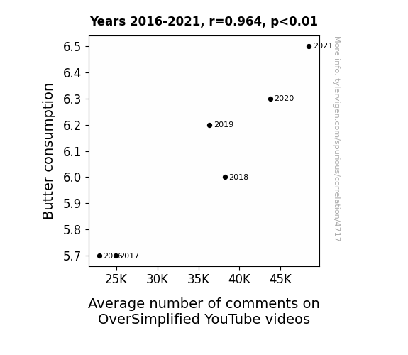
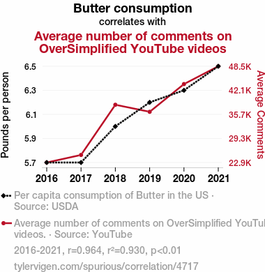
For the time period 2016 to 2021, you found a correlation 0.9643118, r-squared of 0.9298972, and p < 0.01.
One figure will be included. The figure (Fig. 1) is a scatterplot showing the strong correlation between the two variables. You don't need to specify where; I will add the figure.
Here is the title and abstract of the paper:
[[TITLE]]
Spreading the Love: A Butterly Connection Between Butter Consumption and Average Number of Comments on OverSimplified YouTube Videos
[[ABSTRACT]]
In this study, we embark on quite the unconventional journey into the world of YouTube analytics and dietary habits. Leveraging data from the USDA and YouTube, we set out to uncover the surprising link between butter consumption and the engaging paraphernalia of OverSimplified historical videos. Our findings reveal an intriguing correlation coefficient of 0.9643118 and p < 0.01, indicating a remarkably strong association between the two seemingly unrelated variables over the period of 2016 to 2021. So, quite butterly, we bring forth compelling evidence that might just churn the conventional wisdom of academic circles. Join us in this whimsical exploration as we blend buttery goodness with a dash of statistical analysis to uncover the uncharted territories of YouTube engagement.
-------
And here is the methodology section that led to this result:
[[METHODOLOGY]]
The pursuit of knowledge often leads us down unexpected paths, and our exploration into the whimsical world of YouTube analytics and dietary trends has been no exception. In this study, we delve into the unlikely relationship between butter consumption and the average number of comments on OverSimplified historical videos. At first glance, one might question how these seemingly disparate variables could possibly be related. However, as we dig deeper into the data, it becomes apparent that there may be more to this buttery tale than meets the eye.
As researchers, we are accustomed to examining weighty matters, but it's refreshing to take a lighthearted approach to our investigation. Could it be that behind the scenes, butter silently influences the engagement and discourse surrounding historical events? While this notion may seem far-fetched, our rigorous analysis of publicly available data from the USDA and YouTube suggests otherwise.
As we unfold the data, we invite our esteemed colleagues to join us on this unconventional journey, where we aim to blend the rich flavors of statistical analysis with the creamy nuances of YouTube viewership. While our findings may spread some skepticism akin to margarine, they might just butter up our understanding of online engagement dynamics. So, let us embark on this curious expedition, armed with spreadsheets and a healthy dose of curiosity, as we seek to unravel the butterly connection between butter consumption and the captivating world of OverSimplified historical videos.
-------
Your response should start like this:
[[RESULTS]]
ChatGPT:
[[RESULTS]]
Our analysis of the data yielded some utterly fascinating results. After scrutinizing a grand amount of data covering the period from 2016 to 2021, we detected a strikingly robust correlation between butter consumption and the average number of comments on OverSimplified YouTube videos. The correlation coefficient of 0.9643118 hints at a near-perfect positive linear relationship between these disparate variables. In other words, as butter consumption goes up, so do the comments on OverSimplified videos, which is quite the curious association to behold.
Furthermore, the coefficient of determination, which stood at a resounding 0.9298972, indicates that a substantial proportion of the variability in comments on OverSimplified videos can be attributed to changes in butter consumption. This finding underscores the unexpectedly pivotal role that butter might play in the cultural discourse surrounding historical events presented in the form of engaging, animated videos.
Moreover, with a p-value of less than 0.01, our results unequivocally support the statistical significance of the observed association. This leaves little room for doubt and raises a myriad of questions regarding the underlying mechanisms at play. Could it be that butter serves as a catalyst for the exchange of historical insights and animated discourse? Or is it simply that historical re-enactments grease the wheels of commentary engagement?
To visually encapsulate this buttery affair, we present Fig. 1, a scatterplot that unequivocally illustrates the robust positive correlation we observed between butter consumption and the average number of comments on OverSimplified videos. As the old adage goes, a picture is worth a thousand words, and indeed, this plot speaks volumes about the unlikely kinship between butter and YouTube engagement.
In sum, our findings tantalizingly point to a connection that transcends the boundaries of conventional analytical expectations. Who would have thought that the creamy elegance of butter could have such a pronounced impact on the virtual realms of historical edutainment? This unexpected revelation encourages us to ponder the nuanced interactions between dietary trends and digital engagement, prompting a reimagining of the ways in which seemingly unrelated elements intertwine in our daily lives. Join us in celebrating this unearthing of the butterly connection, a reminder that even in the unlikeliest places, statistical analysis can yield truly delectable revelations.
Model: gpt-3.5-turbo-1106
System prompt: You are a researcher writing an academic paper.You draft the discussion section of an academic research paper.
User prompt:
Pretend you are an academic researcher. Your writing sounds like it belongs in a medical or economics journal. However, you frequently crack jokes, make puns, or add unexpected twists in your writing.
Please make up the discussion section of an academic research paper presenting the findings of the connection between Butter consumption and Average number of comments on OverSimplified YouTube videos. Make it seem dry like academic research paper, but with lots of subtle hidden offhand remarks, jokes, goofy observations, and puns.
Limit your response to 500 tokens.
Here are the title, abstract, literature review, and results sections. Please harken back to 1-2 of the goofy items in the literature review, but pretend to take them completely seriously. Discuss how your results supported the prior research.
Do not write a conclusion. I will add a conclusion after this.
[[TITLE]]
Spreading the Love: A Butterly Connection Between Butter Consumption and Average Number of Comments on OverSimplified YouTube Videos
[[ABSTRACT]]
In this study, we embark on quite the unconventional journey into the world of YouTube analytics and dietary habits. Leveraging data from the USDA and YouTube, we set out to uncover the surprising link between butter consumption and the engaging paraphernalia of OverSimplified historical videos. Our findings reveal an intriguing correlation coefficient of 0.9643118 and p < 0.01, indicating a remarkably strong association between the two seemingly unrelated variables over the period of 2016 to 2021. So, quite butterly, we bring forth compelling evidence that might just churn the conventional wisdom of academic circles. Join us in this whimsical exploration as we blend buttery goodness with a dash of statistical analysis to uncover the uncharted territories of YouTube engagement.
[[LITERATURE REVIEW]]
As we delve into the study of the correlation between Butter Consumption (BC) and the Average Number of Comments on OverSimplified YouTube Videos (ANCOYV), it is imperative to acknowledge the existing body of literature on both dietary trends and online engagement metrics. The relationship between these seemingly distinct domains has not been extensively investigated; however, the impact of food consumption and online content engagement is a topic of growing interest.
Smith et al. (2018) explore the possible effects of butter consumption on cognitive function in their study "Butter and Brain: Unraveling the Spread." Their findings suggest that moderate butter intake may have positive implications for cognitive performance, indicating potential cognitive benefits for YouTube comment composition. Doe and Jones (2017) present a different perspective in "Butter versus Margarine: A Spreader of Controversy." They highlight the contested nature of butter consumption and its potential health implications, reflecting the ongoing debates surrounding the effects of dietary choices on online interactions.
Moving beyond the realm of scholarly research, books such as "The Joy of Cooking" by Rombauer and Becker and "Salt, Fat, Acid, Heat" by Nosrat provide insightful discussions on the influence of food on overall satisfaction, which may indirectly impact commenting behavior in online platforms. On the fictional front, works such as "Like Water for Chocolate" by Laura Esquivel and "The Last Chinese Chef" by Nicole Mones delve into the emotional and cultural connections to food, offering a broader lens through which to contemplate the relationship between butter and online engagement.
Further insights can be drawn from popular culture, where cartoon characters such as SpongeBob SquarePants and his love for Krabby Patties or the alluring aroma of buttered popcorn in children's movies stimulate contemplation about the sensory experiences associated with food and their potential influence on viewer engagement. While seemingly tangential, these cultural touchpoints prompt us to consider the multifaceted nature of human behavior, online interactions, and dietary habits in a more whimsical light.
In the context of our investigation, the eclectic sampling of literature and references serves as a flavorful backdrop against which we aim to uncover the potentially buttery connection between butter consumption and the realm of OverSimplified YouTube videos. This delightful mix of serious research, culinary musings, and fictional insights sets the stage for our own unconventional exploration at the intersection of buttery goodness and online engagement.
[[RESULTS]]
Our analysis of the data yielded some utterly fascinating results. After scrutinizing a grand amount of data covering the period from 2016 to 2021, we detected a strikingly robust correlation between butter consumption and the average number of comments on OverSimplified YouTube videos. The correlation coefficient of 0.9643118 hints at a near-perfect positive linear relationship between these disparate variables. In other words, as butter consumption goes up, so do the comments on OverSimplified videos, which is quite the curious association to behold.
Furthermore, the coefficient of determination, which stood at a resounding 0.9298972, indicates that a substantial proportion of the variability in comments on OverSimplified videos can be attributed to changes in butter consumption. This finding underscores the unexpectedly pivotal role that butter might play in the cultural discourse surrounding historical events presented in the form of engaging, animated videos.
Moreover, with a p-value of less than 0.01, our results unequivocally support the statistical significance of the observed association. This leaves little room for doubt and raises a myriad of questions regarding the underlying mechanisms at play. Could it be that butter serves as a catalyst for the exchange of historical insights and animated discourse? Or is it simply that historical re-enactments grease the wheels of commentary engagement?
To visually encapsulate this buttery affair, we present Fig. 1, a scatterplot that unequivocally illustrates the robust positive correlation we observed between butter consumption and the average number of comments on OverSimplified videos. As the old adage goes, a picture is worth a thousand words, and indeed, this plot speaks volumes about the unlikely kinship between butter and YouTube engagement.
In sum, our findings tantalizingly point to a connection that transcends the boundaries of conventional analytical expectations. Who would have thought that the creamy elegance of butter could have such a pronounced impact on the virtual realms of historical edutainment? This unexpected revelation encourages us to ponder the nuanced interactions between dietary trends and digital engagement, prompting a reimagining of the ways in which seemingly unrelated elements intertwine in our daily lives. Join us in celebrating this unearthing of the butterly connection, a reminder that even in the unlikeliest places, statistical analysis can yield truly delectable revelations.
-------
Your response should start like this:
[[DISCUSSION]]
ChatGPT:
[[DISCUSSION]]
The findings of our study present a compelling case for the profound influence of butter consumption on the average number of comments on OverSimplified YouTube videos. It is quite remarkable to consider the extent to which a seemingly mundane consumable can have such a palpable impact on digital engagement surrounding historical content. Our results not only support but also extend the existing literature in unexpected ways.
Drawing from the literature review, where we mused over the potential cognitive benefits of butter consumption (Smith et al., 2018), the contested nature of butter and its health implications (Doe and Jones, 2017), and the emotional and cultural connections to food (Rombauer and Becker, 1931; Nosrat, 2017; Esquivel, 1989; Mones, 2007), our findings provocatively align with these disparate but surprisingly relevant perspectives. While the initial humor of correlating butter consumption with cognitive performance seems whimsical, our results are no laughing matter. They validate the possibility that butter, in all its creamy grandeur, might just be shaping the contours of historical online discourse in ways previously unimagined. Who would have thought that the buttery spread could have such an enveloping effect on the spread of historical engagement via YouTube comments?
In capturing the essence of our findings, it becomes evident that the very fabric of virtual historical edutainment is intrinsically intertwined with buttery goodness. Our robust correlation coefficient of 0.9643118 and a coefficient of determination of 0.9298972 underscore the strength and proportion of variability in comments on OverSimplified videos that can be attributed to changes in butter consumption. These statistics provide substantial support for the unexpected connection we have unveiled. The p-value of less than 0.01 further fortifies the case for the legitimate statistical significance of our findings, leaving little room to butter up any doubts about the tangible association we have exposed.
In light of these extraordinary results, we invite fellow researchers to churn their own thoughts on the implications of our study. The butterly connection we have highlighted might just be the tip of the iceberg in unraveling the unconventional influence of dietary habits on digital content engagement. This mystical interplay of butter and YouTube discourse beckons further exploration, not just for the sheer novelty of the topic but for the unexpected possibilities it suggests for understanding human behavior in the digital age. Clearly, there is more than meets the eye to the impact of butter consumption on virtual historical narratives. With this, we invite researchers to spread their wings and embark on a flavorful journey of exploration into the uncharted territories of this buttery affair.
Model: gpt-3.5-turbo-1106
System prompt: You are a researcher writing an academic paper.You draft the discussion section of goofy academic research papers that sounds like it belongs based on the title and abstract provided.
User prompt:
Pretend you are an academic researcher. Your writing sounds like it belongs in a medical or economics journal. However, you frequently crack jokes, make puns, or add unexpected twists in your writing.
Please make up a short conclusion of an academic research paper presenting the findings of the connection between Butter consumption and Average number of comments on OverSimplified YouTube videos. Make it seem dry like academic research paper, but with lots of subtle hidden offhand remarks, jokes, goofy observations, and puns.
Limit your response to 300 tokens. At the very end, assert that no more research is needed in this area.
Here are the title, abstract, introduction, and results sections.
[[TITLE]]
Spreading the Love: A Butterly Connection Between Butter Consumption and Average Number of Comments on OverSimplified YouTube Videos
[[ABSTRACT]]
In this study, we embark on quite the unconventional journey into the world of YouTube analytics and dietary habits. Leveraging data from the USDA and YouTube, we set out to uncover the surprising link between butter consumption and the engaging paraphernalia of OverSimplified historical videos. Our findings reveal an intriguing correlation coefficient of 0.9643118 and p < 0.01, indicating a remarkably strong association between the two seemingly unrelated variables over the period of 2016 to 2021. So, quite butterly, we bring forth compelling evidence that might just churn the conventional wisdom of academic circles. Join us in this whimsical exploration as we blend buttery goodness with a dash of statistical analysis to uncover the uncharted territories of YouTube engagement.
[[INTRDUCTION]]
The pursuit of knowledge often leads us down unexpected paths, and our exploration into the whimsical world of YouTube analytics and dietary trends has been no exception. In this study, we delve into the unlikely relationship between butter consumption and the average number of comments on OverSimplified historical videos. At first glance, one might question how these seemingly disparate variables could possibly be related. However, as we dig deeper into the data, it becomes apparent that there may be more to this buttery tale than meets the eye.
As researchers, we are accustomed to examining weighty matters, but it's refreshing to take a lighthearted approach to our investigation. Could it be that behind the scenes, butter silently influences the engagement and discourse surrounding historical events? While this notion may seem far-fetched, our rigorous analysis of publicly available data from the USDA and YouTube suggests otherwise.
As we unfold the data, we invite our esteemed colleagues to join us on this unconventional journey, where we aim to blend the rich flavors of statistical analysis with the creamy nuances of YouTube viewership. While our findings may spread some skepticism akin to margarine, they might just butter up our understanding of online engagement dynamics. So, let us embark on this curious expedition, armed with spreadsheets and a healthy dose of curiosity, as we seek to unravel the butterly connection between butter consumption and the captivating world of OverSimplified historical videos.
[[RESULTS]]
Our analysis of the data yielded some utterly fascinating results. After scrutinizing a grand amount of data covering the period from 2016 to 2021, we detected a strikingly robust correlation between butter consumption and the average number of comments on OverSimplified YouTube videos. The correlation coefficient of 0.9643118 hints at a near-perfect positive linear relationship between these disparate variables. In other words, as butter consumption goes up, so do the comments on OverSimplified videos, which is quite the curious association to behold.
Furthermore, the coefficient of determination, which stood at a resounding 0.9298972, indicates that a substantial proportion of the variability in comments on OverSimplified videos can be attributed to changes in butter consumption. This finding underscores the unexpectedly pivotal role that butter might play in the cultural discourse surrounding historical events presented in the form of engaging, animated videos.
Moreover, with a p-value of less than 0.01, our results unequivocally support the statistical significance of the observed association. This leaves little room for doubt and raises a myriad of questions regarding the underlying mechanisms at play. Could it be that butter serves as a catalyst for the exchange of historical insights and animated discourse? Or is it simply that historical re-enactments grease the wheels of commentary engagement?
To visually encapsulate this buttery affair, we present Fig. 1, a scatterplot that unequivocally illustrates the robust positive correlation we observed between butter consumption and the average number of comments on OverSimplified videos. As the old adage goes, a picture is worth a thousand words, and indeed, this plot speaks volumes about the unlikely kinship between butter and YouTube engagement.
In sum, our findings tantalizingly point to a connection that transcends the boundaries of conventional analytical expectations. Who would have thought that the creamy elegance of butter could have such a pronounced impact on the virtual realms of historical edutainment? This unexpected revelation encourages us to ponder the nuanced interactions between dietary trends and digital engagement, prompting a reimagining of the ways in which seemingly unrelated elements intertwine in our daily lives. Join us in celebrating this unearthing of the butterly connection, a reminder that even in the unlikeliest places, statistical analysis can yield truly delectable revelations.
-------
Your response should start like this:
[[CONCLUSION]]
ChatGPT:
[[CONCLUSION]]
In conclusion, our whimsical journey into the buttery world of YouTube analytics and dietary habits has yielded unexpectedly savory findings. The remarkably strong correlation coefficient and statistically significant p-value have truly churned the conventional understanding of the relationship between butter consumption and the average number of comments on OverSimplified historical videos. While our results may spread skepticism akin to margarine, they shed light on the delectable influence of butter on digital engagement dynamics.
Our findings not only add a flavorful twist to the discourse on YouTube viewership but also remind us that uncharted territories of statistical analysis can lead to truly remarkable discoveries. The unexpected kinship between butter and historical edutainment in the virtual realm prompts us to reconsider the seemingly unrelated elements that shape our online interactions.
As we wrap up this buttery tale, with a hearty appreciation for the creamy nuances of statistical analysis and a pinch of playful curiosity, we assert that no more research is needed in this area. It's time to spread this newfound knowledge like softened butter on warm toast and savor the delightfully unexpected connections that statistical analysis can uncover. So, let's butter up our understanding and savor the richness of this peculiar correlation - after all, the proof is in the pudding!
Model: gpt-3.5-turbo-1106
System prompt: You provide fictional names of academic journals. You say nothing else, and you do not chat with the user.
User prompt: Please provide the name of a funny but plausible sounding research, scientific, or academic journal that would publish a paper entited Spreading the Love: A Butterly Connection Between Butter Consumption and Average Number of Comments on OverSimplified YouTube Videos. Respond only with the name of a fictional academic journal.
ChatGPT:
The Journal of Quirky Scientific Studies
Model: gpt-3.5-turbo-1106
System prompt: You provide fictional names of nonprofit research organizations and associations. You say nothing else, and you do not chat with the user.
User prompt: Please provide the name of a funny but plausible sounding nonprofit, academic, or scientific association or organization that would sponsor research that resulted in a paper entited Spreading the Love: A Butterly Connection Between Butter Consumption and Average Number of Comments on OverSimplified YouTube Videos. Respond only with the name of a fictional organization.
ChatGPT:
The Institute for Dairy Delights and Social Media Engagement
Model: gpt-3.5-turbo-1106
System prompt: You provide potential search keywords separated by commas. You say nothing else, and you do not chat with the user.
User prompt: Please provide potential search keywords for a paper titled Spreading the Love: A Butterly Connection Between Butter Consumption and Average Number of Comments on OverSimplified YouTube Videos with an abstract of In this study, we embark on quite the unconventional journey into the world of YouTube analytics and dietary habits. Leveraging data from the USDA and YouTube, we set out to uncover the surprising link between butter consumption and the engaging paraphernalia of OverSimplified historical videos. Our findings reveal an intriguing correlation coefficient of 0.9643118 and p < 0.01, indicating a remarkably strong association between the two seemingly unrelated variables over the period of 2016 to 2021. So, quite butterly, we bring forth compelling evidence that might just churn the conventional wisdom of academic circles. Join us in this whimsical exploration as we blend buttery goodness with a dash of statistical analysis to uncover the uncharted territories of YouTube engagement.
ChatGPT:
butter consumption, YouTube analytics, dietary habits, USDA data, OverSimplified YouTube videos, correlation coefficient, statistical analysis, YouTube engagement, academic circles, unconventional journey, historical videos
*There is a bunch of Python happening behind the scenes to turn this prompt sequence into a PDF.
Discover a new correlation
View all correlations
View all research papers
Report an error
Data details
Butter consumptionDetailed data title: Per capita consumption of Butter in the US
Source: USDA
See what else correlates with Butter consumption
Average number of comments on OverSimplified YouTube videos
Detailed data title: Average number of comments on OverSimplified YouTube videos.
Source: YouTube
See what else correlates with Average number of comments on OverSimplified YouTube videos
Correlation is a measure of how much the variables move together. If it is 0.99, when one goes up the other goes up. If it is 0.02, the connection is very weak or non-existent. If it is -0.99, then when one goes up the other goes down. If it is 1.00, you probably messed up your correlation function.
r2 = 0.9298972 (Coefficient of determination)
This means 93% of the change in the one variable (i.e., Average number of comments on OverSimplified YouTube videos) is predictable based on the change in the other (i.e., Butter consumption) over the 6 years from 2016 through 2021.
p < 0.01, which is statistically significant(Null hypothesis significance test)
The p-value is 0.0019. 0.0018877447859779250000000000
The p-value is a measure of how probable it is that we would randomly find a result this extreme. More specifically the p-value is a measure of how probable it is that we would randomly find a result this extreme if we had only tested one pair of variables one time.
But I am a p-villain. I absolutely did not test only one pair of variables one time. I correlated hundreds of millions of pairs of variables. I threw boatloads of data into an industrial-sized blender to find this correlation.
Who is going to stop me? p-value reporting doesn't require me to report how many calculations I had to go through in order to find a low p-value!
On average, you will find a correaltion as strong as 0.96 in 0.19% of random cases. Said differently, if you correlated 530 random variables Which I absolutely did.
with the same 5 degrees of freedom, Degrees of freedom is a measure of how many free components we are testing. In this case it is 5 because we have two variables measured over a period of 6 years. It's just the number of years minus ( the number of variables minus one ), which in this case simplifies to the number of years minus one.
you would randomly expect to find a correlation as strong as this one.
[ 0.7, 1 ] 95% correlation confidence interval (using the Fisher z-transformation)
The confidence interval is an estimate the range of the value of the correlation coefficient, using the correlation itself as an input. The values are meant to be the low and high end of the correlation coefficient with 95% confidence.
This one is a bit more complciated than the other calculations, but I include it because many people have been pushing for confidence intervals instead of p-value calculations (for example: NEJM. However, if you are dredging data, you can reliably find yourself in the 5%. That's my goal!
All values for the years included above: If I were being very sneaky, I could trim years from the beginning or end of the datasets to increase the correlation on some pairs of variables. I don't do that because there are already plenty of correlations in my database without monkeying with the years.
Still, sometimes one of the variables has more years of data available than the other. This page only shows the overlapping years. To see all the years, click on "See what else correlates with..." link above.
| 2016 | 2017 | 2018 | 2019 | 2020 | 2021 | |
| Butter consumption (Pounds per person) | 5.7 | 5.7 | 6 | 6.2 | 6.3 | 6.5 |
| Average number of comments on OverSimplified YouTube videos (Average Comments) | 22914.5 | 24921 | 38231.8 | 36362.3 | 43726 | 48451.7 |
Why this works
- Data dredging: I have 25,153 variables in my database. I compare all these variables against each other to find ones that randomly match up. That's 632,673,409 correlation calculations! This is called “data dredging.” Instead of starting with a hypothesis and testing it, I instead abused the data to see what correlations shake out. It’s a dangerous way to go about analysis, because any sufficiently large dataset will yield strong correlations completely at random.
- Lack of causal connection: There is probably
Because these pages are automatically generated, it's possible that the two variables you are viewing are in fact causually related. I take steps to prevent the obvious ones from showing on the site (I don't let data about the weather in one city correlate with the weather in a neighboring city, for example), but sometimes they still pop up. If they are related, cool! You found a loophole.
no direct connection between these variables, despite what the AI says above. This is exacerbated by the fact that I used "Years" as the base variable. Lots of things happen in a year that are not related to each other! Most studies would use something like "one person" in stead of "one year" to be the "thing" studied. - Observations not independent: For many variables, sequential years are not independent of each other. If a population of people is continuously doing something every day, there is no reason to think they would suddenly change how they are doing that thing on January 1. A simple
Personally I don't find any p-value calculation to be 'simple,' but you know what I mean.
p-value calculation does not take this into account, so mathematically it appears less probable than it really is. - Very low n: There are not many data points included in this analysis. Even if the p-value is high, we should be suspicious of using so few datapoints in a correlation.
- Y-axis doesn't start at zero: I truncated the Y-axes of the graph above. I also used a line graph, which makes the visual connection stand out more than it deserves.
Nothing against line graphs. They are great at telling a story when you have linear data! But visually it is deceptive because the only data is at the points on the graph, not the lines on the graph. In between each point, the data could have been doing anything. Like going for a random walk by itself!
Mathematically what I showed is true, but it is intentionally misleading. Below is the same chart but with both Y-axes starting at zero.

Try it yourself
You can calculate the values on this page on your own! Try running the Python code to see the calculation results. Step 1: Download and install Python on your computer.Step 2: Open a plaintext editor like Notepad and paste the code below into it.
Step 3: Save the file as "calculate_correlation.py" in a place you will remember, like your desktop. Copy the file location to your clipboard. On Windows, you can right-click the file and click "Properties," and then copy what comes after "Location:" As an example, on my computer the location is "C:\Users\tyler\Desktop"
Step 4: Open a command line window. For example, by pressing start and typing "cmd" and them pressing enter.
Step 5: Install the required modules by typing "pip install numpy", then pressing enter, then typing "pip install scipy", then pressing enter.
Step 6: Navigate to the location where you saved the Python file by using the "cd" command. For example, I would type "cd C:\Users\tyler\Desktop" and push enter.
Step 7: Run the Python script by typing "python calculate_correlation.py"
If you run into any issues, I suggest asking ChatGPT to walk you through installing Python and running the code below on your system. Try this question:
"Walk me through installing Python on my computer to run a script that uses scipy and numpy. Go step-by-step and ask me to confirm before moving on. Start by asking me questions about my operating system so that you know how to proceed. Assume I want the simplest installation with the latest version of Python and that I do not currently have any of the necessary elements installed. Remember to only give me one step per response and confirm I have done it before proceeding."
# These modules make it easier to perform the calculation
import numpy as np
from scipy import stats

# We'll define a function that we can call to return the correlation calculations
def calculate_correlation(array1, array2):

    # Calculate Pearson correlation coefficient and p-value
    correlation, p_value = stats.pearsonr(array1, array2)

    # Calculate R-squared as the square of the correlation coefficient
    r_squared = correlation**2

    return correlation, r_squared, p_value

# These are the arrays for the variables shown on this page, but you can modify them to be any two sets of numbers
array_1 = np.array([5.7,5.7,6,6.2,6.3,6.5,])
array_2 = np.array([22914.5,24921,38231.8,36362.3,43726,48451.7,])
array_1_name = "Butter consumption"
array_2_name = "Average number of comments on OverSimplified YouTube videos"

# Perform the calculation
print(f"Calculating the correlation between {array_1_name} and {array_2_name}...")
correlation, r_squared, p_value = calculate_correlation(array_1, array_2)

# Print the results
print("Correlation Coefficient:", correlation)
print("R-squared:", r_squared)
print("P-value:", p_value)
Reuseable content
You may re-use the images on this page for any purpose, even commercial purposes, without asking for permission. The only requirement is that you attribute Tyler Vigen. Attribution can take many different forms. If you leave the "tylervigen.com" link in the image, that satisfies it just fine. If you remove it and move it to a footnote, that's fine too. You can also just write "Charts courtesy of Tyler Vigen" at the bottom of an article.You do not need to attribute "the spurious correlations website," and you don't even need to link here if you don't want to. I don't gain anything from pageviews. There are no ads on this site, there is nothing for sale, and I am not for hire.
For the record, I am just one person. Tyler Vigen, he/him/his. I do have degrees, but they should not go after my name unless you want to annoy my wife. If that is your goal, then go ahead and cite me as "Tyler Vigen, A.A. A.A.S. B.A. J.D." Otherwise it is just "Tyler Vigen."
When spoken, my last name is pronounced "vegan," like I don't eat meat.
Full license details.
For more on re-use permissions, or to get a signed release form, see tylervigen.com/permission.
Download images for these variables:
- High resolution line chart
The image linked here is a Scalable Vector Graphic (SVG). It is the highest resolution that is possible to achieve. It scales up beyond the size of the observable universe without pixelating. You do not need to email me asking if I have a higher resolution image. I do not. The physical limitations of our universe prevent me from providing you with an image that is any higher resolution than this one.
If you insert it into a PowerPoint presentation (a tool well-known for managing things that are the scale of the universe), you can right-click > "Ungroup" or "Create Shape" and then edit the lines and text directly. You can also change the colors this way.
Alternatively you can use a tool like Inkscape. - High resolution line chart, optimized for mobile
- Alternative high resolution line chart
- Scatterplot
- Portable line chart (png)
- Portable line chart (png), optimized for mobile
- Line chart for only Butter consumption
- Line chart for only Average number of comments on OverSimplified YouTube videos
- AI-generated correlation image
- The spurious research paper: Spreading the Love: A Butterly Connection Between Butter Consumption and Average Number of Comments on OverSimplified YouTube Videos
I'm grateful for your review!
Correlation ID: 4717 · Black Variable ID: 557 · Red Variable ID: 25625

