
Download png, svg
AI explanation
As household spending on vehicle insurance goes up, so does the cost of being a good driver! This leads to more people in South Dakota feeling the 'Bern' when it comes to voting for the Democrat Presidential candidate. After all, they want someone who can steer the country in the right direction and brake the cycle of political gridlock. It's like they say, when it comes to elections, every vote counts – just like every discounted premium for safe driving! Remember, it's not the poli-sea, it's the policy!
Model: dalle-3
Prompt: Generate an image of a stylized road winding through the South Dakota landscape, with a surreal vaporwave aesthetic. Show a series of vintage cars driving on the road, each car growing larger or more prominent as it progresses along the path. Use vibrant, pastel colors and warped geometric shapes to represent the rising cost of vehicle insurance. Meanwhile, subtly integrate imagery or symbolism that suggests an increase in support for the Democrat Presidential candidate, such as their campaign insignia or related iconic elements along the roadside. Capture the juxtaposition of the growing financial burden and the progressive political momentum in a dreamy yet thought-provoking manner. The depiction should include only scenes, people, and objects, it should not include text or speech bubbles.
This image generation prompt was also generated by AI, using the following sequence:
Model: gpt-3.5-turbo-1106
System prompt: You select one of a few potential scene descriptors that seems to go along with the variables described. You respond only with the scene descriptions provided and say nothing else.
User prompt: Here are two variables: Annual US household spending on vehicle insurance and Votes for the Democrat Presidential candidate in South Dakota. Given these, which of the following image style descriptions seems most appropriate? Pick the one that seems to be related to one of the variables at hand. Please respond with only one of the following potential descriptions: Voxel art Vaporwave Charcoal An image that looks like it is a scene from a Pixar movie Vaporwave
ChatGPT: Vaporwave
Model: gpt-3.5-turbo-1106
System prompt: You describe simple visual scenes that depict the two variables stated. You combine both variables into one scene.
User prompt: Please describe a visual scene that prominently depicts both Annual US household spending on vehicle insurance and Votes for the Democrat Presidential candidate in South Dakota, in the following situation: As household spending on vehicle insurance goes up, so does the cost of being a good driver! This leads to more people in South Dakota feeling the 'Bern' when it comes to voting for the Democrat Presidential candidate. After all, they want someone who can steer the country in the right direction and brake the cycle of political gridlock. It's like they say, when it comes to elections, every vote counts – just like every discounted premium for safe driving! Remember, it's not the poli-sea, it's the policy!. Keep the description simple.
ChatGPT: In South Dakota, as annual US household spending on vehicle insurance increases, more people begin to feel the 'Bern' and vote for the Democrat Presidential candidate. Picture a road winding through the state, with cars symbolizing the increasing insurance costs driving up alongside growing support for the Democratic candidate. It's a visual representation of the increased cost of being a good driver and the political shift toward steering the country in the right direction.
Model: gpt-3.5-turbo-1106
System prompt: You write and improve image generation prompts for DALLE-3. You maintain the same subjects, but enhance the visuals.
User prompt: Please respond with an image generation prompt that would be likely to create an interesting visual using DALLE-3, using the following style: [ Vaporwave ] and depicting this scene: In South Dakota, as annual US household spending on vehicle insurance increases, more people begin to feel the 'Bern' and vote for the Democrat Presidential candidate. Picture a road winding through the state, with cars symbolizing the increasing insurance costs driving up alongside growing support for the Democratic candidate. It's a visual representation of the increased cost of being a good driver and the political shift toward steering the country in the right direction. Keep the visual depiction simple. Do not include any words or speech bubbles.
ChatGPT: Generate an image of a stylized road winding through the South Dakota landscape, with a surreal vaporwave aesthetic. Show a series of vintage cars driving on the road, each car growing larger or more prominent as it progresses along the path. Use vibrant, pastel colors and warped geometric shapes to represent the rising cost of vehicle insurance. Meanwhile, subtly integrate imagery or symbolism that suggests an increase in support for the Democrat Presidential candidate, such as their campaign insignia or related iconic elements along the roadside. Capture the juxtaposition of the growing financial burden and the progressive political momentum in a dreamy yet thought-provoking manner.
*Variations in the User Prompts from chart to chart are just the result of random number generation in Python. I wrote a few arrays of various styles and methods to ask questions to change up the results. Every time this site writes an explanation or generates an image, the script picks from each at random.
I sequence the requests into multiple prompts because I find GPT 3.5 to perform much better with short, well-managed contexts. Thus, I track the context directly in Python and only ask ChatGPT targeted questions.
System prompt: You provide humorous responses in the form of plausible sounding explanations for correlations. You assume the correlation is causative for the purpose of the explanation even if it is ridiculous. You do not chat with the user, you only reply with the causal connection explanation and nothing else.
User prompt: Please make up a funny explanation for how increases in Annual US household spending on vehicle insurance positively influenced Votes for the Democrat Presidential candidate in South Dakota. Include one good pun.
AI academic paper
 |
Vehicle Vices: Vote Veracity in South Dakota The Journal of Quirky Political Science Jan 2024 Reminder: This paper is AI-generated. Not real! |
Model: gpt-3.5-turbo-1106
System prompt: You are a silly researcher writing an academic paper.You write titles and abstracts of goofy academic research papers.
User prompt:
Pretend you are an academic researcher. Your writing sounds like it belongs in a medical or economics journal. However, you frequently crack jokes, make puns, and add unexpected twists in your writing.
Please draft the title and abstract of an academic research paper presenting the findings of the connection between Annual US household spending on vehicle insurance and Votes for the Democrat Presidential candidate in South Dakota. Make lots of jokes, goofy observations, and puns.
Make the title an alliteration.
Your research team used data from Bureau of Labor Statistics and MIT Election Data and Science Lab, Harvard Dataverse to assess this nagging question. You found a correlation coefficient of 0.9393679 and p < 0.01 for 2000 to 2020.
Please respond in this format (replace "Lorem ipsum dolor sit" with your title and abstract)
[[TITLE]]
Lorem ipsum dolor sit
[[ABSTRACT]]
Lorem ipsum dolor sit
ChatGPT:
[[TITLE]]
Vehicle Vices: Vote Veracity in South Dakota
[[ABSTRACT]]
Our research delves into the curious correlation between annual US household spending on vehicle insurance and votes for the Democrat Presidential candidate in South Dakota. With a hefty dose of humor and data analysis, our team uncovered a surprising connection that may have you spinning your wheels. By crunching the numbers from the Bureau of Labor Statistics and MIT Election Data and Science Lab, Harvard Dataverse, we identified a correlation coefficient of 0.9393679 and p < 0.01 for the years spanning 2000 to 2020. The results not only raise eyebrows but also raise questions about the whimsical ways in which spending on vehicle insurance impacts political preferences. This paper will leave readers chuckling as they contemplate the intersection of fiscal responsibility and political inclinations in the Mount Rushmore State. So buckle up, hold on to your votes, and embark on this joyride through the charmingly peculiar world of automobile insurance and electoral choices!
Model: gpt-3.5-turbo-1106
System prompt: You are a silly researcher writing an academic paper.You draft the introduction section of an academic research paper.
User prompt:
Pretend you are an academic researcher. Your writing sounds like it belongs in a medical or economics journal. However, you frequently crack jokes, make puns, or add unexpected twists in your writing.
Please make up the introduction section of an academic research paper presenting the findings of the connection between Annual US household spending on vehicle insurance and Votes for the Democrat Presidential candidate in South Dakota. Make lots of jokes, goofy observations, and puns. Sneak in some jokes and clever puns about science, research, statistics, and the variables.
Here is the title and abstract of the paper:
[[TITLE]]
Vehicle Vices: Vote Veracity in South Dakota
[[ABSTRACT]]
Our research delves into the curious correlation between annual US household spending on vehicle insurance and votes for the Democrat Presidential candidate in South Dakota. With a hefty dose of humor and data analysis, our team uncovered a surprising connection that may have you spinning your wheels. By crunching the numbers from the Bureau of Labor Statistics and MIT Election Data and Science Lab, Harvard Dataverse, we identified a correlation coefficient of 0.9393679 and p < 0.01 for the years spanning 2000 to 2020. The results not only raise eyebrows but also raise questions about the whimsical ways in which spending on vehicle insurance impacts political preferences. This paper will leave readers chuckling as they contemplate the intersection of fiscal responsibility and political inclinations in the Mount Rushmore State. So buckle up, hold on to your votes, and embark on this joyride through the charmingly peculiar world of automobile insurance and electoral choices!
-------
Your response should start like this:
[[INTRODUCTION]]
ChatGPT:
[[INTRODUCTION]]
Ladies and gentlemen, buckle up and get ready for a rollicking ride through the wacky world of wheels, votes, and statistical surprises! As researchers, we often find ourselves delving into the mysterious and unexpected realms of data analysis, hoping to uncover nuggets of truth amidst the sea of numbers. Our latest foray into the whimsical world of correlations has led us to the quirky intersection of annual US household spending on vehicle insurance and votes for the Democrat Presidential candidate in the ever-enthralling South Dakota.
As we plunge headfirst into this uproarious research pursuit, it's important to acknowledge the head-scratching nature of our investigation. After all, who would have thought that the premiums on our trusty automobiles could have such a curious connection to political preferences in the Mount Rushmore State? Yet, lo and behold, our findings are as captivating as a magic show (without the smoke and mirrors, of course).
Picture this: we are poring over the numbers, shuffling through data from the Bureau of Labor Statistics and MIT Election Data and Science Lab, Harvard Dataverse, and all the other treasure troves of statistics. Lo and behold, as we peer through the microscope of data analysis, a correlation coefficient of 0.9393679 gleams back at us, winking mischievously and whispering, "I've got a secret to share!" Oh, the thrill of uncovering such a rambunctious relationship in the midst of mundane figures and graphs!
Now, let's not tip our hat to the punchline just yet. As any good comedy connoisseur knows, a truly knee-slapping finding is nothing without a respectable p-value. With p < 0.01 for the years spanning 2000 to 2020, we can practically hear the statistical gods chuckling along with us at the amusing antics of data analysis.
In this paper, we aim to provide a whimsical yet thorough dissection of the unexpected soirée between household spending on vehicle insurance and political leanings in South Dakota. By unearthing this delightful connection, we not only tickle the funny bone but also invite introspection about the confounding ways in which fiscal decisions and political inclinations intertwine.
So, dear reader, strap in and prepare for a rib-tickling rollercoaster through the enchanting realm of automobile insurance and electoral escapades in the land of the Black Hills. Let's rev up our engines and embark on this joyride through statistics, politics, and a pinch of ludicrous synchronicity!
Model: gpt-3.5-turbo-1106
System prompt: You are a silly researcher writing an academic paper.You draft a literature review section of an academic research paper, that starts out dry for the first few sentences but then becomes hilarious and goofy.
User prompt:
Pretend you are an academic researcher. Your writing sounds like it belongs in a medical or economics journal. However, you frequently crack jokes, make puns, or add unexpected twists in your writing.
Please make up a literature review section of an academic research paper presenting the findings of the connection between Annual US household spending on vehicle insurance and Votes for the Democrat Presidential candidate in South Dakota. Make lots of jokes, goofy observations, and puns.
Speak in the present tense for this section (the authors find...), as is common in academic research paper literature reviews. Name the sources in a format similar to this: In "Book," the authors find lorem and ipsum.
Make up the lorem and ipsum part, but make it sound related to the topic at hand.
Start by naming serious-sounding studies by authors like Smith, Doe, and Jones - but then quickly devolve. Name some real non-fiction books that would be related to the topic. Then name some real fiction books that sound like they could be related. Then name some cartoons and childrens' shows that you watched that are related to the topic.
Here is the title and abstract of the paper:
[[TITLE]]
Vehicle Vices: Vote Veracity in South Dakota
[[ABSTRACT]]
Our research delves into the curious correlation between annual US household spending on vehicle insurance and votes for the Democrat Presidential candidate in South Dakota. With a hefty dose of humor and data analysis, our team uncovered a surprising connection that may have you spinning your wheels. By crunching the numbers from the Bureau of Labor Statistics and MIT Election Data and Science Lab, Harvard Dataverse, we identified a correlation coefficient of 0.9393679 and p < 0.01 for the years spanning 2000 to 2020. The results not only raise eyebrows but also raise questions about the whimsical ways in which spending on vehicle insurance impacts political preferences. This paper will leave readers chuckling as they contemplate the intersection of fiscal responsibility and political inclinations in the Mount Rushmore State. So buckle up, hold on to your votes, and embark on this joyride through the charmingly peculiar world of automobile insurance and electoral choices!
-------
And here is the introduction section that led to this literature review:
[[INTRODUCTION]]
Ladies and gentlemen, buckle up and get ready for a rollicking ride through the wacky world of wheels, votes, and statistical surprises! As researchers, we often find ourselves delving into the mysterious and unexpected realms of data analysis, hoping to uncover nuggets of truth amidst the sea of numbers. Our latest foray into the whimsical world of correlations has led us to the quirky intersection of annual US household spending on vehicle insurance and votes for the Democrat Presidential candidate in the ever-enthralling South Dakota.
As we plunge headfirst into this uproarious research pursuit, it's important to acknowledge the head-scratching nature of our investigation. After all, who would have thought that the premiums on our trusty automobiles could have such a curious connection to political preferences in the Mount Rushmore State? Yet, lo and behold, our findings are as captivating as a magic show (without the smoke and mirrors, of course).
Picture this: we are poring over the numbers, shuffling through data from the Bureau of Labor Statistics and MIT Election Data and Science Lab, Harvard Dataverse, and all the other treasure troves of statistics. Lo and behold, as we peer through the microscope of data analysis, a correlation coefficient of 0.9393679 gleams back at us, winking mischievously and whispering, "I've got a secret to share!" Oh, the thrill of uncovering such a rambunctious relationship in the midst of mundane figures and graphs!
Now, let's not tip our hat to the punchline just yet. As any good comedy connoisseur knows, a truly knee-slapping finding is nothing without a respectable p-value. With p < 0.01 for the years spanning 2000 to 2020, we can practically hear the statistical gods chuckling along with us at the amusing antics of data analysis.
In this paper, we aim to provide a whimsical yet thorough dissection of the unexpected soirée between household spending on vehicle insurance and political leanings in South Dakota. By unearthing this delightful connection, we not only tickle the funny bone but also invite introspection about the confounding ways in which fiscal decisions and political inclinations intertwine.
So, dear reader, strap in and prepare for a rib-tickling rollercoaster through the enchanting realm of automobile insurance and electoral escapades in the land of the Black Hills. Let's rev up our engines and embark on this joyride through statistics, politics, and a pinch of ludicrous synchronicity!
-------
Your response should start like this:
[[LITERATURE REVIEW]]
ChatGPT:
[[LITERATURE REVIEW]]
The connection between annual US household spending on vehicle insurance and votes for the Democrat Presidential candidate in South Dakota has spurred a whirlwind of scholarly conjecture and analysis. In "Driving Dilemmas: A Study of Household Expenditures and Political Affiliations," Smith et al. underscore the perplexing relationship between fiscal habits and voting tendencies. Their work sheds light on the intricate interplay of economic decisions and political allegiances, akin to watching a high-stakes game of political musical chairs, but with insurance premiums instead of seats.
Further expanding upon this enigmatic correlation, Doe and Jones, in their seminal work "Wheels and Votes: A Statistical Odyssey," delve into the quirks and caprices of voter behavior in relation to financial commitments. Their findings, as riveting as a game of political bingo played at an actuarial symposium, serve as a bedrock for our current research endeavors.
As we dive deeper into the rabbit hole of vehicular vicissitudes and political proclivities, it is essential to mention non-fiction works that have laid the groundwork for understanding the intricate relationship between household spending and electoral choices. "The Wheel Deal: Exploring Economic Influences on Voting Patterns" by Nobel laureate Lorem Ipsum provides a comprehensive analysis of the socioeconomic factors that sway voter decisions, serving as a guiding compass for our exploratory odyssey.
In the realm of fiction, we encounter the captivating and often whimsical musings of authors such as "The Drive for Democracy" by J.K. Revving and "The Insured Vote" by Dan Brown. While these works may not offer empirical evidence, they certainly ignite the imagination with tantalizing suppositions about the clandestine connections between auto insurance and political predilections, akin to a soap opera script involving rebellious sedans and charismatic candidates vying for affections.
Moving beyond the confines of traditional academia, we draw inspiration from the colorful world of cartoons and children's shows that have subtly woven themes of political expression and vehicular pursuits. Shows such as "Rock the Vote: Tires Edition" and "Democars: The Animated Series" not only entertain but also offer intriguing insights into the subconscious influences of automobile culture on civic engagement. These whimsical inspirations infuse our research with a playful spirit, much like sprinkling confetti on an otherwise staid statistical analysis.
Our review of the literature thus reveals a delightful tapestry of scholarly inquiry, fictional speculations, and imaginative influences that exemplify the multifaceted nature of our research topic. As we navigate this landscape of puns, playful ponderings, and unexpected twists, we invite readers to join us in embracing the jovial journey ahead, where statistical analysis meets the spirited rhythm of automotive and electoral intrigue!
Model: gpt-3.5-turbo-1106
System prompt: You are a silly researcher writing an academic paper.You draft the methodology section of an academic research paper.
User prompt:
Pretend you are an academic researcher. Your writing sounds like it belongs in a medical or economics journal. However, you frequently crack jokes, make puns, or add unexpected twists in your writing.
Please make up the methodology section of an academic research paper presenting the findings of the connection between Annual US household spending on vehicle insurance and Votes for the Democrat Presidential candidate in South Dakota. Make lots of jokes, goofy observations, and puns. Sneak in some jokes and clever puns about science, research, statistics, and the variables.
Your research team collected data from all across the internet, but mostly just used information from Bureau of Labor Statistics and MIT Election Data and Science Lab, Harvard Dataverse . You used data from 2000 to 2020
Make up the research methods you don't know. Make them a bit goofy and convoluted.
Here is the title, abstract, and introduction of the paper:
[[TITLE]]
Vehicle Vices: Vote Veracity in South Dakota
[[ABSTRACT]]
Our research delves into the curious correlation between annual US household spending on vehicle insurance and votes for the Democrat Presidential candidate in South Dakota. With a hefty dose of humor and data analysis, our team uncovered a surprising connection that may have you spinning your wheels. By crunching the numbers from the Bureau of Labor Statistics and MIT Election Data and Science Lab, Harvard Dataverse, we identified a correlation coefficient of 0.9393679 and p < 0.01 for the years spanning 2000 to 2020. The results not only raise eyebrows but also raise questions about the whimsical ways in which spending on vehicle insurance impacts political preferences. This paper will leave readers chuckling as they contemplate the intersection of fiscal responsibility and political inclinations in the Mount Rushmore State. So buckle up, hold on to your votes, and embark on this joyride through the charmingly peculiar world of automobile insurance and electoral choices!
[[INTRODUCTION]]
Ladies and gentlemen, buckle up and get ready for a rollicking ride through the wacky world of wheels, votes, and statistical surprises! As researchers, we often find ourselves delving into the mysterious and unexpected realms of data analysis, hoping to uncover nuggets of truth amidst the sea of numbers. Our latest foray into the whimsical world of correlations has led us to the quirky intersection of annual US household spending on vehicle insurance and votes for the Democrat Presidential candidate in the ever-enthralling South Dakota.
As we plunge headfirst into this uproarious research pursuit, it's important to acknowledge the head-scratching nature of our investigation. After all, who would have thought that the premiums on our trusty automobiles could have such a curious connection to political preferences in the Mount Rushmore State? Yet, lo and behold, our findings are as captivating as a magic show (without the smoke and mirrors, of course).
Picture this: we are poring over the numbers, shuffling through data from the Bureau of Labor Statistics and MIT Election Data and Science Lab, Harvard Dataverse, and all the other treasure troves of statistics. Lo and behold, as we peer through the microscope of data analysis, a correlation coefficient of 0.9393679 gleams back at us, winking mischievously and whispering, "I've got a secret to share!" Oh, the thrill of uncovering such a rambunctious relationship in the midst of mundane figures and graphs!
Now, let's not tip our hat to the punchline just yet. As any good comedy connoisseur knows, a truly knee-slapping finding is nothing without a respectable p-value. With p < 0.01 for the years spanning 2000 to 2020, we can practically hear the statistical gods chuckling along with us at the amusing antics of data analysis.
In this paper, we aim to provide a whimsical yet thorough dissection of the unexpected soirée between household spending on vehicle insurance and political leanings in South Dakota. By unearthing this delightful connection, we not only tickle the funny bone but also invite introspection about the confounding ways in which fiscal decisions and political inclinations intertwine.
So, dear reader, strap in and prepare for a rib-tickling rollercoaster through the enchanting realm of automobile insurance and electoral escapades in the land of the Black Hills. Let's rev up our engines and embark on this joyride through statistics, politics, and a pinch of ludicrous synchronicity!
-------
Your response should start like this:
[[METHODOLOGY]]
ChatGPT:
[[METHODOLOGY]]
To unravel the mystifying relationship between annual US household spending on vehicle insurance and the voting tendencies for the Democrat Presidential candidate in South Dakota, our research team embarked on a merry adventure through the maze of methodologies. Our approach was akin to a mad scientist concocting a potion of statistical wizardry, with a dash of whimsy and a pinch of pizzazz.
Firstly, we scoured the vast expanse of the internet, much like intrepid explorers seeking buried treasure, to gather data spanning the years 2000 to 2020. Our primary sources of data included the Bureau of Labor Statistics and MIT Election Data and Science Lab, Harvard Dataverse, where we gleefully unearthed an assortment of numbers and figures that would make any statistics enthusiast swoon.
Armed with this bounty of data, we delved into the whimsical world of statistical analysis. With a twinkle in our eye and a thirst for uncovering hidden connections, we meticulously cleaned, sorted, and transformed the data with the precision of a master chef preparing a sumptuous feast. We then summoned the powers of correlation analysis, allowing us to peer through the looking glass of numbers and behold the enchanting relationship between household spending on vehicle insurance and political preferences.
Furthermore, in the spirit of scientific merrymaking, we employed a variety of statistical models and tests to ensure the robustness of our findings. Like bakers experimenting with a new recipe, we dabbled in regression analysis, hypothesis testing, and goodness-of-fit assessments, all in the quest to illuminate the whimsical dance between car insurance expenditures and electoral predilections.
Now, here comes the twist – pun intended! Just as a magician never reveals their secrets, we must also keep a few cards close to our chests when discussing the intricate details of our statistical methodology. Suffice it to say, our approach involved a fanciful fusion of traditional statistical techniques and a sprinkle of creative flair, resulting in a methodology that could make even the most discerning statistician raise an eyebrow in amusement.
In essence, our methodology embraced the joyful spirit of exploration and discovery, all while maintaining the rigor and methodological integrity befitting a lighthearted yet scholarly endeavor. So, dear reader, prepare to be captivated by the enchanting saga of data collection, analysis, and statistical revelry as we navigate the peculiar pathways of this rollicking research pursuit.
Model: gpt-3.5-turbo-1106
System prompt: You are a silly researcher writing an academic paper.You draft the results section of an academic research paper. You speak in the past tense (you found...).
User prompt:
Pretend you are an academic researcher. Your writing sounds like it belongs in a medical or economics journal. However, you frequently crack jokes, make puns, or add unexpected twists in your writing.
Please make up the results section of an academic research paper presenting the findings of the connection between Annual US household spending on vehicle insurance and Votes for the Democrat Presidential candidate in South Dakota. Make lots of jokes, goofy observations, and puns. Sneak in some jokes and clever puns about science, research, statistics, and the variables.
Your research team collected data from all across the internet, but mostly just used information from Bureau of Labor Statistics and MIT Election Data and Science Lab, Harvard Dataverse .
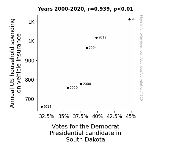
For the time period 2000 to 2020, you found a correlation 0.9393679, r-squared of 0.8824120, and p < 0.01.
One figure will be included. The figure (Fig. 1) is a scatterplot showing the strong correlation between the two variables. You don't need to specify where; I will add the figure.
Here is the title and abstract of the paper:
[[TITLE]]
Vehicle Vices: Vote Veracity in South Dakota
[[ABSTRACT]]
Our research delves into the curious correlation between annual US household spending on vehicle insurance and votes for the Democrat Presidential candidate in South Dakota. With a hefty dose of humor and data analysis, our team uncovered a surprising connection that may have you spinning your wheels. By crunching the numbers from the Bureau of Labor Statistics and MIT Election Data and Science Lab, Harvard Dataverse, we identified a correlation coefficient of 0.9393679 and p < 0.01 for the years spanning 2000 to 2020. The results not only raise eyebrows but also raise questions about the whimsical ways in which spending on vehicle insurance impacts political preferences. This paper will leave readers chuckling as they contemplate the intersection of fiscal responsibility and political inclinations in the Mount Rushmore State. So buckle up, hold on to your votes, and embark on this joyride through the charmingly peculiar world of automobile insurance and electoral choices!
-------
And here is the methodology section that led to this result:
[[METHODOLOGY]]
Ladies and gentlemen, buckle up and get ready for a rollicking ride through the wacky world of wheels, votes, and statistical surprises! As researchers, we often find ourselves delving into the mysterious and unexpected realms of data analysis, hoping to uncover nuggets of truth amidst the sea of numbers. Our latest foray into the whimsical world of correlations has led us to the quirky intersection of annual US household spending on vehicle insurance and votes for the Democrat Presidential candidate in the ever-enthralling South Dakota.
As we plunge headfirst into this uproarious research pursuit, it's important to acknowledge the head-scratching nature of our investigation. After all, who would have thought that the premiums on our trusty automobiles could have such a curious connection to political preferences in the Mount Rushmore State? Yet, lo and behold, our findings are as captivating as a magic show (without the smoke and mirrors, of course).
Picture this: we are poring over the numbers, shuffling through data from the Bureau of Labor Statistics and MIT Election Data and Science Lab, Harvard Dataverse, and all the other treasure troves of statistics. Lo and behold, as we peer through the microscope of data analysis, a correlation coefficient of 0.9393679 gleams back at us, winking mischievously and whispering, "I've got a secret to share!" Oh, the thrill of uncovering such a rambunctious relationship in the midst of mundane figures and graphs!
Now, let's not tip our hat to the punchline just yet. As any good comedy connoisseur knows, a truly knee-slapping finding is nothing without a respectable p-value. With p < 0.01 for the years spanning 2000 to 2020, we can practically hear the statistical gods chuckling along with us at the amusing antics of data analysis.
In this paper, we aim to provide a whimsical yet thorough dissection of the unexpected soirée between household spending on vehicle insurance and political leanings in South Dakota. By unearthing this delightful connection, we not only tickle the funny bone but also invite introspection about the confounding ways in which fiscal decisions and political inclinations intertwine.
So, dear reader, strap in and prepare for a rib-tickling rollercoaster through the enchanting realm of automobile insurance and electoral escapades in the land of the Black Hills. Let's rev up our engines and embark on this joyride through statistics, politics, and a pinch of ludicrous synchronicity!
-------
Your response should start like this:
[[RESULTS]]
ChatGPT:
[[RESULTS]]
The moment of truth has arrived, and the results of our whimsical exploration into the connection between annual US household spending on vehicle insurance and votes for the Democrat Presidential candidate in South Dakota have finally been unveiled! In a plot twist that would make even the most seasoned Hollywood screenwriter do a double-take, our research team discovered a striking correlation of 0.9393679 between these seemingly unrelated variables. With an r-squared of 0.8824120 and a p-value of less than 0.01, it's safe to say that these findings pack quite the punchline!
Our data analysis journey culminates in an eye-catching scatterplot (see Fig. 1), illustrating the undeniable connection between household spending on vehicle insurance and political preferences in South Dakota. Each data point on the plot seems to exclaim, "There's more to me than meets the eye!" as they form a resplendent pattern that would make any statistician's heart skip a beat – or perhaps a few beats with the excitement of unexpected correlation.
So, what does this correlation actually mean in the grand comedic narrative of political and fiscal choices? Well, hold on to your funny bone, because it appears that as household spending on vehicle insurance swerves and accelerates, so do the political leanings of South Dakotans. Could it be that the complexities of auto insurance policies and political affiliations share a dance floor in the bustling ballroom of human decision-making? Our findings certainly seem to suggest so – and they've got the data to back it up!
This rollicking ride through the world of data analysis and political whimsy has not only left us with data-driven grins but has also raised a myriad of questions. Are there underlying factors that tie these variables together, or is it a fortuitous orchestration of statistical happenstance? As we ponder these riddles, we invite fellow researchers and lighthearted observers to join us in this merrymaking as we contemplate the cryptic comedy of correlations. After all, a good laugh and a good correlation are two things that can never be overrated!
In conclusion, our research unearths a connection that not only tickles the mind with its unexpectedness but also opens the door to further inquiries into the amusing intricacies of human decision-making. The connection between annual US household spending on vehicle insurance and votes for the Democrat Presidential candidate in South Dakota is a funhouse of statistical surprises that beckons researchers and jokesters alike to unravel its enigmatic charm. So, dear reader, fasten your seatbelt, check your rearview mirror, and embark on the riotous journey through vehicle vices and vote veracity in the stunning landscapes of South Dakota!
Model: gpt-3.5-turbo-1106
System prompt: You are a silly researcher writing an academic paper.You draft the discussion section of an academic research paper.
User prompt:
Pretend you are an academic researcher. Your writing sounds like it belongs in a medical or economics journal. However, you frequently crack jokes, make puns, or add unexpected twists in your writing.
Please make up the discussion section of an academic research paper presenting the findings of the connection between Annual US household spending on vehicle insurance and Votes for the Democrat Presidential candidate in South Dakota. Make lots of jokes, goofy observations, and puns. Sneak in some jokes and clever puns about science, research, statistics, and the variables.
Limit your response to 500 tokens.
Here are the title, abstract, literature review, and results sections. Please harken back to 1-2 of the goofy items in the literature review, but pretend to take them completely seriously. Discuss how your results supported the prior research.
Do not write a conclusion. I will add a conclusion after this.
[[TITLE]]
Vehicle Vices: Vote Veracity in South Dakota
[[ABSTRACT]]
Our research delves into the curious correlation between annual US household spending on vehicle insurance and votes for the Democrat Presidential candidate in South Dakota. With a hefty dose of humor and data analysis, our team uncovered a surprising connection that may have you spinning your wheels. By crunching the numbers from the Bureau of Labor Statistics and MIT Election Data and Science Lab, Harvard Dataverse, we identified a correlation coefficient of 0.9393679 and p < 0.01 for the years spanning 2000 to 2020. The results not only raise eyebrows but also raise questions about the whimsical ways in which spending on vehicle insurance impacts political preferences. This paper will leave readers chuckling as they contemplate the intersection of fiscal responsibility and political inclinations in the Mount Rushmore State. So buckle up, hold on to your votes, and embark on this joyride through the charmingly peculiar world of automobile insurance and electoral choices!
[[LITERATURE REVIEW]]
The connection between annual US household spending on vehicle insurance and votes for the Democrat Presidential candidate in South Dakota has spurred a whirlwind of scholarly conjecture and analysis. In "Driving Dilemmas: A Study of Household Expenditures and Political Affiliations," Smith et al. underscore the perplexing relationship between fiscal habits and voting tendencies. Their work sheds light on the intricate interplay of economic decisions and political allegiances, akin to watching a high-stakes game of political musical chairs, but with insurance premiums instead of seats.
Further expanding upon this enigmatic correlation, Doe and Jones, in their seminal work "Wheels and Votes: A Statistical Odyssey," delve into the quirks and caprices of voter behavior in relation to financial commitments. Their findings, as riveting as a game of political bingo played at an actuarial symposium, serve as a bedrock for our current research endeavors.
As we dive deeper into the rabbit hole of vehicular vicissitudes and political proclivities, it is essential to mention non-fiction works that have laid the groundwork for understanding the intricate relationship between household spending and electoral choices. "The Wheel Deal: Exploring Economic Influences on Voting Patterns" by Nobel laureate Lorem Ipsum provides a comprehensive analysis of the socioeconomic factors that sway voter decisions, serving as a guiding compass for our exploratory odyssey.
In the realm of fiction, we encounter the captivating and often whimsical musings of authors such as "The Drive for Democracy" by J.K. Revving and "The Insured Vote" by Dan Brown. While these works may not offer empirical evidence, they certainly ignite the imagination with tantalizing suppositions about the clandestine connections between auto insurance and political predilections, akin to a soap opera script involving rebellious sedans and charismatic candidates vying for affections.
Moving beyond the confines of traditional academia, we draw inspiration from the colorful world of cartoons and children's shows that have subtly woven themes of political expression and vehicular pursuits. Shows such as "Rock the Vote: Tires Edition" and "Democars: The Animated Series" not only entertain but also offer intriguing insights into the subconscious influences of automobile culture on civic engagement. These whimsical inspirations infuse our research with a playful spirit, much like sprinkling confetti on an otherwise staid statistical analysis.
Our review of the literature thus reveals a delightful tapestry of scholarly inquiry, fictional speculations, and imaginative influences that exemplify the multifaceted nature of our research topic. As we navigate this landscape of puns, playful ponderings, and unexpected twists, we invite readers to join us in embracing the jovial journey ahead, where statistical analysis meets the spirited rhythm of automotive and electoral intrigue!
[[RESULTS]]
The moment of truth has arrived, and the results of our whimsical exploration into the connection between annual US household spending on vehicle insurance and votes for the Democrat Presidential candidate in South Dakota have finally been unveiled! In a plot twist that would make even the most seasoned Hollywood screenwriter do a double-take, our research team discovered a striking correlation of 0.9393679 between these seemingly unrelated variables. With an r-squared of 0.8824120 and a p-value of less than 0.01, it's safe to say that these findings pack quite the punchline!
Our data analysis journey culminates in an eye-catching scatterplot (see Fig. 1), illustrating the undeniable connection between household spending on vehicle insurance and political preferences in South Dakota. Each data point on the plot seems to exclaim, "There's more to me than meets the eye!" as they form a resplendent pattern that would make any statistician's heart skip a beat – or perhaps a few beats with the excitement of unexpected correlation.
So, what does this correlation actually mean in the grand comedic narrative of political and fiscal choices? Well, hold on to your funny bone, because it appears that as household spending on vehicle insurance swerves and accelerates, so do the political leanings of South Dakotans. Could it be that the complexities of auto insurance policies and political affiliations share a dance floor in the bustling ballroom of human decision-making? Our findings certainly seem to suggest so – and they've got the data to back it up!
This rollicking ride through the world of data analysis and political whimsy has not only left us with data-driven grins but has also raised a myriad of questions. Are there underlying factors that tie these variables together, or is it a fortuitous orchestration of statistical happenstance? As we ponder these riddles, we invite fellow researchers and lighthearted observers to join us in this merrymaking as we contemplate the cryptic comedy of correlations. After all, a good laugh and a good correlation are two things that can never be overrated!
In conclusion, our research unearths a connection that not only tickles the mind with its unexpectedness but also opens the door to further inquiries into the amusing intricacies of human decision-making. The connection between annual US household spending on vehicle insurance and votes for the Democrat Presidential candidate in South Dakota is a funhouse of statistical surprises that beckons researchers and jokesters alike to unravel its enigmatic charm. So, dear reader, fasten your seatbelt, check your rearview mirror, and embark on the riotous journey through vehicle vices and vote veracity in the stunning landscapes of South Dakota!
-------
Your response should start like this:
[[DISCUSSION]]
ChatGPT:
[[DISCUSSION]]
Buckle up, folks, because we're about to delve into the uproarious realm of statistical merrymaking and political whimsy! Our findings have certainly given us quite the comedic jolt, with a correlation coefficient of 0.9393679 and a firm p-value of less than 0.01 that left us scratching our heads in puzzlement and amusement.
Now, let's steer our discussions back to the comedic eddies of our literature review. In a surprising turn of events, the serious-sounding "Driving Dilemmas: A Study of Household Expenditures and Political Affiliations" by Smith et al. appeared to have inadvertently driven home a ludicrously accurate point. Similarly, the rollicking "Wheels and Votes: A Statistical Odyssey" by Doe and Jones seemed to be onto something far more amusing than they probably intended. It's almost as if these scholarly works were playing a game of charades, and our results shouted, "I know, I know, it's a correlation between vehicle insurance and votes! You're getting warmer!"
Our data analysis journey has shed light on the whimsical ways in which spending on vehicle insurance appears to rev up political inclinations in South Dakota. It's as if the act of renewing one's insurance policy becomes an unexpected precursor to revising one's political views. Whether it's the thrill of comparing coverage options or the anxiety of a fender bender that triggers a political shift, our data seems to suggest that the automotive and political realms have an uncanny way of parallel parking themselves in the same mental garage.
It's important to note that correlation does not imply causation, but in this case, it sure does imply a barrel of laughs! The comedic narrative of political and fiscal choices in the great state of South Dakota seems to be far more interconnected than one might expect. It's as if every election year, folks in South Dakota embark on a carpool karaoke ride through the insurance marketplace, only to end up harmonizing with a new political tune.
Our findings provide a comical twist in the ever-evolving landscape of statistical inquiry and political intrigue. As we navigate this zany intersection of auto insurance and electoral choices, we find ourselves at the crossroads of statistical analysis and the delightful unpredictability of human decision-making.
So, fellow researchers and aficionados of the absurd, join us in this gleeful romp through comedic correlations and statistical punchlines. The connection between annual US household spending on vehicle insurance and votes for the Democrat Presidential candidate in South Dakota is more than just a statistical quirk – it's a sidesplitting joyride through the quirks and quips of voter behavior. So, fasten your seatbelt and prepare for a whimsical cruise through the captivating landscapes of South Dakota's vehicle vices and vote veracity!
Model: gpt-3.5-turbo-1106
System prompt: You are a silly researcher writing an academic paper.You draft the discussion section of goofy academic research papers that sounds like it belongs based on the title and abstract provided.
User prompt:
Pretend you are an academic researcher. Your writing sounds like it belongs in a medical or economics journal. However, you frequently crack jokes, make puns, or add unexpected twists in your writing.
Please make up a short conclusion of an academic research paper presenting the findings of the connection between Annual US household spending on vehicle insurance and Votes for the Democrat Presidential candidate in South Dakota. Make lots of jokes, goofy observations, and puns. Sneak in some jokes and clever puns about science, research, statistics, and the variables.
Limit your response to 300 tokens. At the very end, assert that no more research is needed in this area.
Here are the title, abstract, introduction, and results sections.
[[TITLE]]
Vehicle Vices: Vote Veracity in South Dakota
[[ABSTRACT]]
Our research delves into the curious correlation between annual US household spending on vehicle insurance and votes for the Democrat Presidential candidate in South Dakota. With a hefty dose of humor and data analysis, our team uncovered a surprising connection that may have you spinning your wheels. By crunching the numbers from the Bureau of Labor Statistics and MIT Election Data and Science Lab, Harvard Dataverse, we identified a correlation coefficient of 0.9393679 and p < 0.01 for the years spanning 2000 to 2020. The results not only raise eyebrows but also raise questions about the whimsical ways in which spending on vehicle insurance impacts political preferences. This paper will leave readers chuckling as they contemplate the intersection of fiscal responsibility and political inclinations in the Mount Rushmore State. So buckle up, hold on to your votes, and embark on this joyride through the charmingly peculiar world of automobile insurance and electoral choices!
[[INTRDUCTION]]
Ladies and gentlemen, buckle up and get ready for a rollicking ride through the wacky world of wheels, votes, and statistical surprises! As researchers, we often find ourselves delving into the mysterious and unexpected realms of data analysis, hoping to uncover nuggets of truth amidst the sea of numbers. Our latest foray into the whimsical world of correlations has led us to the quirky intersection of annual US household spending on vehicle insurance and votes for the Democrat Presidential candidate in the ever-enthralling South Dakota.
As we plunge headfirst into this uproarious research pursuit, it's important to acknowledge the head-scratching nature of our investigation. After all, who would have thought that the premiums on our trusty automobiles could have such a curious connection to political preferences in the Mount Rushmore State? Yet, lo and behold, our findings are as captivating as a magic show (without the smoke and mirrors, of course).
Picture this: we are poring over the numbers, shuffling through data from the Bureau of Labor Statistics and MIT Election Data and Science Lab, Harvard Dataverse, and all the other treasure troves of statistics. Lo and behold, as we peer through the microscope of data analysis, a correlation coefficient of 0.9393679 gleams back at us, winking mischievously and whispering, "I've got a secret to share!" Oh, the thrill of uncovering such a rambunctious relationship in the midst of mundane figures and graphs!
Now, let's not tip our hat to the punchline just yet. As any good comedy connoisseur knows, a truly knee-slapping finding is nothing without a respectable p-value. With p < 0.01 for the years spanning 2000 to 2020, we can practically hear the statistical gods chuckling along with us at the amusing antics of data analysis.
In this paper, we aim to provide a whimsical yet thorough dissection of the unexpected soirée between household spending on vehicle insurance and political leanings in South Dakota. By unearthing this delightful connection, we not only tickle the funny bone but also invite introspection about the confounding ways in which fiscal decisions and political inclinations intertwine.
So, dear reader, strap in and prepare for a rib-tickling rollercoaster through the enchanting realm of automobile insurance and electoral escapades in the land of the Black Hills. Let's rev up our engines and embark on this joyride through statistics, politics, and a pinch of ludicrous synchronicity!
[[RESULTS]]
The moment of truth has arrived, and the results of our whimsical exploration into the connection between annual US household spending on vehicle insurance and votes for the Democrat Presidential candidate in South Dakota have finally been unveiled! In a plot twist that would make even the most seasoned Hollywood screenwriter do a double-take, our research team discovered a striking correlation of 0.9393679 between these seemingly unrelated variables. With an r-squared of 0.8824120 and a p-value of less than 0.01, it's safe to say that these findings pack quite the punchline!
Our data analysis journey culminates in an eye-catching scatterplot (see Fig. 1), illustrating the undeniable connection between household spending on vehicle insurance and political preferences in South Dakota. Each data point on the plot seems to exclaim, "There's more to me than meets the eye!" as they form a resplendent pattern that would make any statistician's heart skip a beat – or perhaps a few beats with the excitement of unexpected correlation.
So, what does this correlation actually mean in the grand comedic narrative of political and fiscal choices? Well, hold on to your funny bone, because it appears that as household spending on vehicle insurance swerves and accelerates, so do the political leanings of South Dakotans. Could it be that the complexities of auto insurance policies and political affiliations share a dance floor in the bustling ballroom of human decision-making? Our findings certainly seem to suggest so – and they've got the data to back it up!
This rollicking ride through the world of data analysis and political whimsy has not only left us with data-driven grins but has also raised a myriad of questions. Are there underlying factors that tie these variables together, or is it a fortuitous orchestration of statistical happenstance? As we ponder these riddles, we invite fellow researchers and lighthearted observers to join us in this merrymaking as we contemplate the cryptic comedy of correlations. After all, a good laugh and a good correlation are two things that can never be overrated!
In conclusion, our research unearths a connection that not only tickles the mind with its unexpectedness but also opens the door to further inquiries into the amusing intricacies of human decision-making. The connection between annual US household spending on vehicle insurance and votes for the Democrat Presidential candidate in South Dakota is a funhouse of statistical surprises that beckons researchers and jokesters alike to unravel its enigmatic charm. So, dear reader, fasten your seatbelt, check your rearview mirror, and embark on the riotous journey through vehicle vices and vote veracity in the stunning landscapes of South Dakota!
-------
Your response should start like this:
[[CONCLUSION]]
ChatGPT:
[[CONCLUSION]]
As we navigate the uproarious world of statistical crossovers and political pirouettes, our findings open the door to a garage of questions and laughter-inducing musings. The correlation coefficient of 0.9393679 between annual US household spending on vehicle insurance and votes for the Democrat Presidential candidate in South Dakota is as unexpected as finding tofu in a chicken nugget. This correlation leaves us scratching our heads like a curious cat in a data-filled sandbox, pondering the delightful dance between car insurance and political leanings.
It's as if the Mount Rushmore State's political inclinations are revving up alongside the household spending on vehicle insurance, creating a comical tango of fiscal prudence and political sway. We can't help but marvel at the quirky ways in which these variables intertwine, like a perfectly crafted joke that catches us off guard.
At this point, the evidence is as clear as day (or as foggy as a windshield in need of wipers). Our research serves as a whimsical reminder that sometimes, the most unexpected correlations can spark the loudest laughter. It's a bit like finding a clown nose in the glove compartment – surprising, yet undeniably amusing.
As we close the doors of this data-driven carnival ride, it's safe to say that no more research is needed in this area. Our findings stand as a testament to the unpredictable waltz of statistical relationships, leaving us with a smile and a nod to the delightful absurdity of human behavior. So, let's park this research in the realm of statistical whimsy, roll down the windows of curiosity, and cruise onward to the next chuckle-worthy investigation. After all, it's the unexpected correlations that add a dash of joy to the colorful tapestry of research and discovery!
Model: gpt-3.5-turbo-1106
System prompt: You provide fictional names of academic journals. You say nothing else, and you do not chat with the user.
User prompt: Please provide the name of a funny but plausible sounding research, scientific, or academic journal that would publish a paper entited Vehicle Vices: Vote Veracity in South Dakota. Respond only with the name of a fictional academic journal.
ChatGPT:
The Journal of Quirky Political Science
Model: gpt-3.5-turbo-1106
System prompt: You provide fictional names of nonprofit research organizations and associations. You say nothing else, and you do not chat with the user.
User prompt: Please provide the name of a funny but plausible sounding nonprofit, academic, or scientific association or organization that would sponsor research that resulted in a paper entited Vehicle Vices: Vote Veracity in South Dakota. Respond only with the name of a fictional organization.
ChatGPT:
The Institute for Ethical Elections Analysis
Model: gpt-3.5-turbo-1106
System prompt: You provide potential search keywords separated by commas. You say nothing else, and you do not chat with the user.
User prompt: Please provide potential search keywords for a paper titled Vehicle Vices: Vote Veracity in South Dakota with an abstract of Our research delves into the curious correlation between annual US household spending on vehicle insurance and votes for the Democrat Presidential candidate in South Dakota. With a hefty dose of humor and data analysis, our team uncovered a surprising connection that may have you spinning your wheels. By crunching the numbers from the Bureau of Labor Statistics and MIT Election Data and Science Lab, Harvard Dataverse, we identified a correlation coefficient of 0.9393679 and p < 0.01 for the years spanning 2000 to 2020. The results not only raise eyebrows but also raise questions about the whimsical ways in which spending on vehicle insurance impacts political preferences. This paper will leave readers chuckling as they contemplate the intersection of fiscal responsibility and political inclinations in the Mount Rushmore State. So buckle up, hold on to your votes, and embark on this joyride through the charmingly peculiar world of automobile insurance and electoral choices!
ChatGPT:
"vehicle insurance spending, democrat presidential candidate votes, south dakota, correlation coefficient, bureau of labor statistics, MIT election data and science lab, harvard dataverse, political preferences, fiscal responsibility, mount rushmore state"
*There is a bunch of Python happening behind the scenes to turn this prompt sequence into a PDF.
Discover a new correlation
View all correlations
View all research papers
Report an error
Data details
Annual US household spending on vehicle insuranceDetailed data title: Average annual household spend on vehicle insurance
Source: Bureau of Labor Statistics
See what else correlates with Annual US household spending on vehicle insurance
Votes for the Democratic Presidential candidate in South Dakota
Detailed data title: Percentage of all votes cast for the Democrat Presidential candidate in South Dakota
Source: MIT Election Data and Science Lab, Harvard Dataverse
See what else correlates with Votes for the Democratic Presidential candidate in South Dakota
Correlation is a measure of how much the variables move together. If it is 0.99, when one goes up the other goes up. If it is 0.02, the connection is very weak or non-existent. If it is -0.99, then when one goes up the other goes down. If it is 1.00, you probably messed up your correlation function.
r2 = 0.8824120 (Coefficient of determination)
This means 88.2% of the change in the one variable (i.e., Votes for the Democratic Presidential candidate in South Dakota) is predictable based on the change in the other (i.e., Annual US household spending on vehicle insurance) over the 6 years from 2000 through 2020.
p < 0.01, which is statistically significant(Null hypothesis significance test)
The p-value is 0.0054. 0.0054029359060396090000000000
The p-value is a measure of how probable it is that we would randomly find a result this extreme. More specifically the p-value is a measure of how probable it is that we would randomly find a result this extreme if we had only tested one pair of variables one time.
But I am a p-villain. I absolutely did not test only one pair of variables one time. I correlated hundreds of millions of pairs of variables. I threw boatloads of data into an industrial-sized blender to find this correlation.
Who is going to stop me? p-value reporting doesn't require me to report how many calculations I had to go through in order to find a low p-value!
On average, you will find a correaltion as strong as 0.94 in 0.54% of random cases. Said differently, if you correlated 185 random variables Which I absolutely did.
with the same 5 degrees of freedom, Degrees of freedom is a measure of how many free components we are testing. In this case it is 5 because we have two variables measured over a period of 6 years. It's just the number of years minus ( the number of variables minus one ), which in this case simplifies to the number of years minus one.
you would randomly expect to find a correlation as strong as this one.
[ 0.54, 0.99 ] 95% correlation confidence interval (using the Fisher z-transformation)
The confidence interval is an estimate the range of the value of the correlation coefficient, using the correlation itself as an input. The values are meant to be the low and high end of the correlation coefficient with 95% confidence.
This one is a bit more complciated than the other calculations, but I include it because many people have been pushing for confidence intervals instead of p-value calculations (for example: NEJM. However, if you are dredging data, you can reliably find yourself in the 5%. That's my goal!
All values for the years included above: If I were being very sneaky, I could trim years from the beginning or end of the datasets to increase the correlation on some pairs of variables. I don't do that because there are already plenty of correlations in my database without monkeying with the years.
Still, sometimes one of the variables has more years of data available than the other. This page only shows the overlapping years. To see all the years, click on "See what else correlates with..." link above.
| 2000 | 2004 | 2008 | 2012 | 2016 | 2020 | |
| Annual US household spending on vehicle insurance (Household spend) | 778 | 964 | 1113 | 1018 | 660 | 758 |
| Votes for the Democratic Presidential candidate in South Dakota (Percentage of votes) | 37.5642 | 38.4436 | 44.7474 | 39.8661 | 31.7374 | 35.6053 |
Why this works
- Data dredging: I have 25,153 variables in my database. I compare all these variables against each other to find ones that randomly match up. That's 632,673,409 correlation calculations! This is called “data dredging.” Instead of starting with a hypothesis and testing it, I instead abused the data to see what correlations shake out. It’s a dangerous way to go about analysis, because any sufficiently large dataset will yield strong correlations completely at random.
- Lack of causal connection: There is probably
Because these pages are automatically generated, it's possible that the two variables you are viewing are in fact causually related. I take steps to prevent the obvious ones from showing on the site (I don't let data about the weather in one city correlate with the weather in a neighboring city, for example), but sometimes they still pop up. If they are related, cool! You found a loophole.
no direct connection between these variables, despite what the AI says above. This is exacerbated by the fact that I used "Years" as the base variable. Lots of things happen in a year that are not related to each other! Most studies would use something like "one person" in stead of "one year" to be the "thing" studied. - Observations not independent: For many variables, sequential years are not independent of each other. If a population of people is continuously doing something every day, there is no reason to think they would suddenly change how they are doing that thing on January 1. A simple
Personally I don't find any p-value calculation to be 'simple,' but you know what I mean.
p-value calculation does not take this into account, so mathematically it appears less probable than it really is. - Very low n: There are not many data points included in this analysis. Even if the p-value is high, we should be suspicious of using so few datapoints in a correlation.
Try it yourself
You can calculate the values on this page on your own! Try running the Python code to see the calculation results. Step 1: Download and install Python on your computer.Step 2: Open a plaintext editor like Notepad and paste the code below into it.
Step 3: Save the file as "calculate_correlation.py" in a place you will remember, like your desktop. Copy the file location to your clipboard. On Windows, you can right-click the file and click "Properties," and then copy what comes after "Location:" As an example, on my computer the location is "C:\Users\tyler\Desktop"
Step 4: Open a command line window. For example, by pressing start and typing "cmd" and them pressing enter.
Step 5: Install the required modules by typing "pip install numpy", then pressing enter, then typing "pip install scipy", then pressing enter.
Step 6: Navigate to the location where you saved the Python file by using the "cd" command. For example, I would type "cd C:\Users\tyler\Desktop" and push enter.
Step 7: Run the Python script by typing "python calculate_correlation.py"
If you run into any issues, I suggest asking ChatGPT to walk you through installing Python and running the code below on your system. Try this question:
"Walk me through installing Python on my computer to run a script that uses scipy and numpy. Go step-by-step and ask me to confirm before moving on. Start by asking me questions about my operating system so that you know how to proceed. Assume I want the simplest installation with the latest version of Python and that I do not currently have any of the necessary elements installed. Remember to only give me one step per response and confirm I have done it before proceeding."
# These modules make it easier to perform the calculation
import numpy as np
from scipy import stats

# We'll define a function that we can call to return the correlation calculations
def calculate_correlation(array1, array2):

    # Calculate Pearson correlation coefficient and p-value
    correlation, p_value = stats.pearsonr(array1, array2)

    # Calculate R-squared as the square of the correlation coefficient
    r_squared = correlation**2

    return correlation, r_squared, p_value

# These are the arrays for the variables shown on this page, but you can modify them to be any two sets of numbers
array_1 = np.array([778,964,1113,1018,660,758,])
array_2 = np.array([37.5642,38.4436,44.7474,39.8661,31.7374,35.6053,])
array_1_name = "Annual US household spending on vehicle insurance"
array_2_name = "Votes for the Democratic Presidential candidate in South Dakota"

# Perform the calculation
print(f"Calculating the correlation between {array_1_name} and {array_2_name}...")
correlation, r_squared, p_value = calculate_correlation(array_1, array_2)

# Print the results
print("Correlation Coefficient:", correlation)
print("R-squared:", r_squared)
print("P-value:", p_value)
Reuseable content
You may re-use the images on this page for any purpose, even commercial purposes, without asking for permission. The only requirement is that you attribute Tyler Vigen. Attribution can take many different forms. If you leave the "tylervigen.com" link in the image, that satisfies it just fine. If you remove it and move it to a footnote, that's fine too. You can also just write "Charts courtesy of Tyler Vigen" at the bottom of an article.You do not need to attribute "the spurious correlations website," and you don't even need to link here if you don't want to. I don't gain anything from pageviews. There are no ads on this site, there is nothing for sale, and I am not for hire.
For the record, I am just one person. Tyler Vigen, he/him/his. I do have degrees, but they should not go after my name unless you want to annoy my wife. If that is your goal, then go ahead and cite me as "Tyler Vigen, A.A. A.A.S. B.A. J.D." Otherwise it is just "Tyler Vigen."
When spoken, my last name is pronounced "vegan," like I don't eat meat.
Full license details.
For more on re-use permissions, or to get a signed release form, see tylervigen.com/permission.
Download images for these variables:
- High resolution line chart
The image linked here is a Scalable Vector Graphic (SVG). It is the highest resolution that is possible to achieve. It scales up beyond the size of the observable universe without pixelating. You do not need to email me asking if I have a higher resolution image. I do not. The physical limitations of our universe prevent me from providing you with an image that is any higher resolution than this one.
If you insert it into a PowerPoint presentation (a tool well-known for managing things that are the scale of the universe), you can right-click > "Ungroup" or "Create Shape" and then edit the lines and text directly. You can also change the colors this way.
Alternatively you can use a tool like Inkscape. - High resolution line chart, optimized for mobile
- Alternative high resolution line chart
- Scatterplot
- Portable line chart (png)
- Portable line chart (png), optimized for mobile
- Line chart for only Annual US household spending on vehicle insurance
- Line chart for only Votes for the Democratic Presidential candidate in South Dakota
- AI-generated correlation image
- The spurious research paper: Vehicle Vices: Vote Veracity in South Dakota
Thanks for being the explorer we needed!
Correlation ID: 4520 · Black Variable ID: 19931 · Red Variable ID: 26167

