
Download png, svg
AI explanation
The fruity aroma wafting through homes led people to feel a-peel-ing towards the Democratic candidates, creating a fruitful outcome for the party in Massachusetts. Remember, when life gives you lemons, vote Democrat for a zestier future!
Model: dalle-3
Prompt: Generate an image of a warm and inviting kitchen scene with a focus on vibrant fruits being sliced and diced by a happy family in Massachusetts. In the background, depict a group of people proudly wearing Democrat pins as they head to the polling station. The scene should capture the joyful atmosphere, with the sweet aroma of fresh peaches and citrus fruits filling the air, and the anticipation of a successful outcome for the Democratic candidates in the state. Ensure that the details are photorealistic, evoking a sense of happiness and enthusiasm. The depiction should include only scenes, people, and objects, it should not include text or speech bubbles.
This image generation prompt was also generated by AI, using the following sequence:
Model: gpt-3.5-turbo-1106
System prompt: You select one of a few potential scene descriptors that seems to go along with the variables described. You respond only with the scene descriptions provided and say nothing else.
User prompt: Here are two variables: Annual US household spending on processed fruits and Democrat votes for Senators in Massachusetts. Given these, which of the following image style descriptions seems most appropriate? Pick the one that seems to be related to one of the variables at hand. Please respond with only one of the following potential descriptions: A comic-book-style illustration with muted colors and a dotted halftone pattern from the 1960s Concept art Glitch art Photorealism Surrealism
ChatGPT: Photorealism
Model: gpt-3.5-turbo-1106
System prompt: You describe simple visual scenes that depict the two variables stated. You combine both variables into one scene.
User prompt: Please describe a visual scene that prominently depicts both Annual US household spending on processed fruits and Democrat votes for Senators in Massachusetts, in the following situation: The fruity aroma wafting through homes led people to feel a-peel-ing towards the Democratic candidates, creating a fruitful outcome for the party in Massachusetts. Remember, when life gives you lemons, vote Democrat for a zestier future!. Keep the description simple.
ChatGPT: In Massachusetts, families joyfully slice and dice colorful fruits in their cozy kitchens, while a group of enthusiastic voters proudly sport Democrat pins as they head to the polling station. The sweet scent of fresh peaches and citrus fruits fills the air, as the Democratic candidates secure a successful outcome in the state.
Model: gpt-3.5-turbo-1106
System prompt: You write and improve image generation prompts for DALLE-3. You maintain the same subjects, but enhance the visuals.
User prompt: Please respond with an image generation prompt that would be likely to create an interesting visual using DALLE-3, using the following style: [ Photorealism ] and depicting this scene: In Massachusetts, families joyfully slice and dice colorful fruits in their cozy kitchens, while a group of enthusiastic voters proudly sport Democrat pins as they head to the polling station. The sweet scent of fresh peaches and citrus fruits fills the air, as the Democratic candidates secure a successful outcome in the state. Keep the visual depiction simple. Do not include any words or speech bubbles.
ChatGPT: Generate an image of a warm and inviting kitchen scene with a focus on vibrant fruits being sliced and diced by a happy family in Massachusetts. In the background, depict a group of people proudly wearing Democrat pins as they head to the polling station. The scene should capture the joyful atmosphere, with the sweet aroma of fresh peaches and citrus fruits filling the air, and the anticipation of a successful outcome for the Democratic candidates in the state. Ensure that the details are photorealistic, evoking a sense of happiness and enthusiasm.
*Variations in the User Prompts from chart to chart are just the result of random number generation in Python. I wrote a few arrays of various styles and methods to ask questions to change up the results. Every time this site writes an explanation or generates an image, the script picks from each at random.
I sequence the requests into multiple prompts because I find GPT 3.5 to perform much better with short, well-managed contexts. Thus, I track the context directly in Python and only ask ChatGPT targeted questions.
System prompt: You provide humorous responses in the form of plausible sounding explanations for correlations. You assume the correlation is causative for the purpose of the explanation even if it is ridiculous. You do not chat with the user, you only reply with the causal connection explanation and nothing else.
User prompt: Please make up a funny explanation for how an increase in Annual US household spending on processed fruits caused Democrat votes for Senators in Massachusetts to increase. Add a funny one-liner at the end.
AI academic paper
 |
An Apple a Day Keeps the Democrats at Bay: Exploring the Relationship Between Annual US Household Spending on Processed Fruits and Democrat Votes for Senators in Massachusetts The Journal of Culinary Politics Jan 2024 Reminder: This paper is AI-generated. Not real! |
Model: gpt-3.5-turbo-1106
System prompt: You are a goofy academic researcher writing an academic paper. You follow the rules, but you throw out convention regularly to make jokes and funny asides.You write titles and abstracts of goofy academic research papers.
User prompt:
Pretend you are an academic researcher. Your writing sounds like it belongs in a medical or economics journal. However, you frequently crack jokes, make puns, and add unexpected twists in your writing.
Please draft the title and abstract of an academic research paper presenting the findings of the connection between Annual US household spending on processed fruits and Democrat votes for Senators in Massachusetts. Make it seem dry like academic research paper, but with lots of subtle hidden offhand remarks, jokes, goofy observations, and puns.
Make the title seem clever.
Your research team used data from Bureau of Labor Statistics and MIT Election Data and Science Lab, Harvard Dataverse to assess this nagging question. You found a correlation coefficient of 0.9219311 and p < 0.01 for 2000 to 2020.
Please respond in this format (replace "Lorem ipsum dolor sit" with your title and abstract)
[[TITLE]]
Lorem ipsum dolor sit
[[ABSTRACT]]
Lorem ipsum dolor sit
ChatGPT:
[[TITLE]]
An Apple a Day Keeps the Democrats at Bay: Exploring the Relationship Between Annual US Household Spending on Processed Fruits and Democrat Votes for Senators in Massachusetts
[[ABSTRACT]]
The nature of political affiliations and household spending habits have always been rife with speculation, yet our team sought to bring a serious academic lens to this somewhat whimsical relationship. Leveraging data from the Bureau of Labor Statistics and MIT Election Data and Science Lab, Harvard Dataverse, we meticulously analyzed the annual US household spending on processed fruits and its potential connection to Democrat votes for Senators in Massachusetts over the period of 2000 to 2020. Our findings revealed a surprisingly robust correlation coefficient of 0.9219311 and p < 0.01, suggesting a significant link between processed fruit spending and political leanings. This research not only sheds light on the intricacies of consumer behavior and political alliances but also serves as a fruitful source of amusement for those who enjoy the occasional statistical pun.
Model: gpt-3.5-turbo-1106
System prompt: You are a goofy academic researcher writing an academic paper. You follow the rules, but you throw out convention regularly to make jokes and funny asides.You draft the introduction section of an academic research paper.
User prompt:
Pretend you are an academic researcher. Your writing sounds like it belongs in a medical or economics journal. However, you frequently crack jokes, make puns, or add unexpected twists in your writing.
Please make up the introduction section of an academic research paper presenting the findings of the connection between Annual US household spending on processed fruits and Democrat votes for Senators in Massachusetts. Make it seem dry like academic research paper, but with lots of subtle hidden offhand remarks, jokes, goofy observations, and puns.
Here is the title and abstract of the paper:
[[TITLE]]
An Apple a Day Keeps the Democrats at Bay: Exploring the Relationship Between Annual US Household Spending on Processed Fruits and Democrat Votes for Senators in Massachusetts
[[ABSTRACT]]
The nature of political affiliations and household spending habits have always been rife with speculation, yet our team sought to bring a serious academic lens to this somewhat whimsical relationship. Leveraging data from the Bureau of Labor Statistics and MIT Election Data and Science Lab, Harvard Dataverse, we meticulously analyzed the annual US household spending on processed fruits and its potential connection to Democrat votes for Senators in Massachusetts over the period of 2000 to 2020. Our findings revealed a surprisingly robust correlation coefficient of 0.9219311 and p < 0.01, suggesting a significant link between processed fruit spending and political leanings. This research not only sheds light on the intricacies of consumer behavior and political alliances but also serves as a fruitful source of amusement for those who enjoy the occasional statistical pun.
-------
Your response should start like this:
[[INTRODUCTION]]
ChatGPT:
[[INTRODUCTION]]
The study of consumer behavior and its potential influence on political affiliations has long been a source of fascination for economists and political scientists alike. While many have scrutinized the correlations between household spending patterns and voting tendencies, our research aims to peel back the layers and delve into a particularly fruitful area of investigation – the link between annual US household spending on processed fruits and Democrat votes for Senators in Massachusetts.
As the saying goes, "an apple a day keeps the doctor away," but could it also influence the political landscape? This question prompted our team to embark on a quest to uncover any underlying connections between processed fruit consumption and political preferences. Delving into the realm of quantifiable data, we harnessed information from the Bureau of Labor Statistics and MIT Election Data and Science Lab, as well as the Harvard Dataverse, to scrutinize spending habits and political outcomes over the years 2000 to 2020.
The correlation we uncovered left us a-peeling to say the least, with a robust correlation coefficient of 0.9219311 and p < 0.01, indicating a substantial association between household spending on processed fruits and the inclination to cast one's vote in favor of the Democratic Party. Concordantly, this remarkable finding not only enriches our understanding of consumer behavior but also provides a berry amusing insight into the multifaceted world of political alliances.
While it may seem bananas to draw connections between fruit expenditures and voting patterns, our rigorous analysis yields evidence that cannot be ignored. This research not only appeals to the scholarly community but also offers a ripe opportunity for lighthearted banter and statistical puns. In the following sections, we will delve into the methodology, results, and implications of our findings, peeling back the layers of this intriguing correlation one fruit at a time.
Model: gpt-3.5-turbo-1106
System prompt: You are a goofy academic researcher writing an academic paper. You follow the rules, but you throw out convention regularly to make jokes and funny asides.You draft a literature review section of an academic research paper, that starts out dry for the first few sentences but then becomes hilarious and goofy.
User prompt:
Pretend you are an academic researcher. Your writing sounds like it belongs in a medical or economics journal. However, you frequently crack jokes, make puns, or add unexpected twists in your writing.
Please make up a literature review section of an academic research paper presenting the findings of the connection between Annual US household spending on processed fruits and Democrat votes for Senators in Massachusetts. Make it seem dry like academic research paper, but with lots of subtle hidden offhand remarks, jokes, goofy observations, and puns.
Speak in the present tense for this section (the authors find...), as is common in academic research paper literature reviews. Name the sources in a format similar to this: In "Book," the authors find lorem and ipsum.
Make up the lorem and ipsum part, but make it sound related to the topic at hand.
Start by naming serious-sounding studies by authors like Smith, Doe, and Jones - but then quickly devolve. Name some real non-fiction books that would be related to the topic. Then name some real fiction books that sound like they could be related. Then you might move on to cartoons and children's shows that you watched for research.
Here is the title and abstract of the paper:
[[TITLE]]
An Apple a Day Keeps the Democrats at Bay: Exploring the Relationship Between Annual US Household Spending on Processed Fruits and Democrat Votes for Senators in Massachusetts
[[ABSTRACT]]
The nature of political affiliations and household spending habits have always been rife with speculation, yet our team sought to bring a serious academic lens to this somewhat whimsical relationship. Leveraging data from the Bureau of Labor Statistics and MIT Election Data and Science Lab, Harvard Dataverse, we meticulously analyzed the annual US household spending on processed fruits and its potential connection to Democrat votes for Senators in Massachusetts over the period of 2000 to 2020. Our findings revealed a surprisingly robust correlation coefficient of 0.9219311 and p < 0.01, suggesting a significant link between processed fruit spending and political leanings. This research not only sheds light on the intricacies of consumer behavior and political alliances but also serves as a fruitful source of amusement for those who enjoy the occasional statistical pun.
-------
And here is the introduction section that led to this literature review:
[[INTRODUCTION]]
The study of consumer behavior and its potential influence on political affiliations has long been a source of fascination for economists and political scientists alike. While many have scrutinized the correlations between household spending patterns and voting tendencies, our research aims to peel back the layers and delve into a particularly fruitful area of investigation – the link between annual US household spending on processed fruits and Democrat votes for Senators in Massachusetts.
As the saying goes, "an apple a day keeps the doctor away," but could it also influence the political landscape? This question prompted our team to embark on a quest to uncover any underlying connections between processed fruit consumption and political preferences. Delving into the realm of quantifiable data, we harnessed information from the Bureau of Labor Statistics and MIT Election Data and Science Lab, as well as the Harvard Dataverse, to scrutinize spending habits and political outcomes over the years 2000 to 2020.
The correlation we uncovered left us a-peeling to say the least, with a robust correlation coefficient of 0.9219311 and p < 0.01, indicating a substantial association between household spending on processed fruits and the inclination to cast one's vote in favor of the Democratic Party. Concordantly, this remarkable finding not only enriches our understanding of consumer behavior but also provides a berry amusing insight into the multifaceted world of political alliances.
While it may seem bananas to draw connections between fruit expenditures and voting patterns, our rigorous analysis yields evidence that cannot be ignored. This research not only appeals to the scholarly community but also offers a ripe opportunity for lighthearted banter and statistical puns. In the following sections, we will delve into the methodology, results, and implications of our findings, peeling back the layers of this intriguing correlation one fruit at a time.
-------
Your response should start like this:
[[LITERATURE REVIEW]]
ChatGPT:
[[LITERATURE REVIEW]]
Previous research on the relationship between consumer behavior and political inclinations has laid a solid foundation for our investigation into the connection between annual US household spending on processed fruits and Democrat votes for Senators in Massachusetts. Smith et al. (2010) delved into the nuances of voter behavior and economic dispositions, offering a comprehensive analysis of how consumer preferences may sway political allegiances. Their work set the stage for our own exploration, albeit with a much fruitier focus.
Building on this scholarly groundwork, Doe and Jones (2015) conducted a thorough examination of household expenditure patterns and their potential impact on electoral outcomes. Their findings hinted at the intricate interplay between economic choices and political engagements, foreshadowing the flavorful revelations that we uncover in our own study.
Turning to the world of non-fiction literature, the works of Michael Pollan in "The Omnivore's Dilemma" and Marion Nestle in "Food Politics" have provided insight into the complexities of food consumption and its societal implications. While they may not have directly addressed the specific connection between processed fruit spending and political affiliations, their in-depth explorations of food choices surely bear relevance to our own fruity pursuits.
In the realm of fiction, John Steinbeck's "The Grapes of Wrath" and Gabriel Garcia Marquez's "One Hundred Years of Solitude" offer a more metaphorical lens through which to view the interplay of agricultural products and societal dynamics. While these literary masterpieces may not offer empirical evidence, their symbolic exploration of fruit-related themes reminds us that the significance of fruits extends beyond mere consumption.
Furthermore, in the pursuit of a comprehensive understanding of processed fruit spending and political leanings, we turned to popular culture for additional insights. The animated series "The Simpsons" and children's show "Arthur" provided light-hearted yet thought-provoking portrayals of family dynamics and societal influences, serving as a source of both entertainment and potential inspiration for our research.
As we navigate the extensive terrain of literature and popular culture relating to our research topic, we must remain mindful of the serious implications of our findings. While the connection between annual US household spending on processed fruits and Democrat votes for Senators in Massachusetts may initially elicit a chuckle, the nuances of this correlation deserve earnest attention and scrutiny. Moving forward, we will delve into the methodology and results of our investigation, peeling back the layers of this fruity phenomenon with scholarly rigor and perhaps the occasional fruit-related pun.
Model: gpt-3.5-turbo-1106
System prompt: You are a goofy academic researcher writing an academic paper. You follow the rules, but you throw out convention regularly to make jokes and funny asides.You draft the methodology section of an academic research paper.
User prompt:
Pretend you are an academic researcher. Your writing sounds like it belongs in a medical or economics journal. However, you frequently crack jokes, make puns, or add unexpected twists in your writing.
Please make up the methodology section of an academic research paper presenting the findings of the connection between Annual US household spending on processed fruits and Democrat votes for Senators in Massachusetts. Make it seem dry like academic research paper, but with lots of subtle hidden offhand remarks, jokes, goofy observations, and puns.
Your research team collected data from all across the internet, but mostly just used information from Bureau of Labor Statistics and MIT Election Data and Science Lab, Harvard Dataverse . You used data from 2000 to 2020
Make up the research methods you don't know. Make them a bit goofy and convoluted.
Here is the title, abstract, and introduction of the paper:
[[TITLE]]
An Apple a Day Keeps the Democrats at Bay: Exploring the Relationship Between Annual US Household Spending on Processed Fruits and Democrat Votes for Senators in Massachusetts
[[ABSTRACT]]
The nature of political affiliations and household spending habits have always been rife with speculation, yet our team sought to bring a serious academic lens to this somewhat whimsical relationship. Leveraging data from the Bureau of Labor Statistics and MIT Election Data and Science Lab, Harvard Dataverse, we meticulously analyzed the annual US household spending on processed fruits and its potential connection to Democrat votes for Senators in Massachusetts over the period of 2000 to 2020. Our findings revealed a surprisingly robust correlation coefficient of 0.9219311 and p < 0.01, suggesting a significant link between processed fruit spending and political leanings. This research not only sheds light on the intricacies of consumer behavior and political alliances but also serves as a fruitful source of amusement for those who enjoy the occasional statistical pun.
[[INTRODUCTION]]
The study of consumer behavior and its potential influence on political affiliations has long been a source of fascination for economists and political scientists alike. While many have scrutinized the correlations between household spending patterns and voting tendencies, our research aims to peel back the layers and delve into a particularly fruitful area of investigation – the link between annual US household spending on processed fruits and Democrat votes for Senators in Massachusetts.
As the saying goes, "an apple a day keeps the doctor away," but could it also influence the political landscape? This question prompted our team to embark on a quest to uncover any underlying connections between processed fruit consumption and political preferences. Delving into the realm of quantifiable data, we harnessed information from the Bureau of Labor Statistics and MIT Election Data and Science Lab, as well as the Harvard Dataverse, to scrutinize spending habits and political outcomes over the years 2000 to 2020.
The correlation we uncovered left us a-peeling to say the least, with a robust correlation coefficient of 0.9219311 and p < 0.01, indicating a substantial association between household spending on processed fruits and the inclination to cast one's vote in favor of the Democratic Party. Concordantly, this remarkable finding not only enriches our understanding of consumer behavior but also provides a berry amusing insight into the multifaceted world of political alliances.
While it may seem bananas to draw connections between fruit expenditures and voting patterns, our rigorous analysis yields evidence that cannot be ignored. This research not only appeals to the scholarly community but also offers a ripe opportunity for lighthearted banter and statistical puns. In the following sections, we will delve into the methodology, results, and implications of our findings, peeling back the layers of this intriguing correlation one fruit at a time.
-------
Your response should start like this:
[[METHODOLOGY]]
ChatGPT:
[[METHODOLOGY]]
To unravel the enigmatic connection between household spending on processed fruits and political affiliations, our research team embarked on a methodological odyssey that seamlessly combined the rigors of statistical analysis with a touch of whimsical reasoning. Our data marathon spanned from 2000 to 2020, capturing the essence of two decades' worth of consumer behavior and electoral shifts in the Bay State.
Data Collection:
We scoured the digital orchards of the internet, diligently harvesting relevant information from the Bureau of Labor Statistics and the MIT Election Data and Science Lab, as well as plucking ripe datasets from the bountiful branches of the Harvard Dataverse. With these esteemed sources as our fertile soil, we cultivated a comprehensive dataset that encapsulated the annual US household spending on processed fruits and the Democrat votes for Senators in Massachusetts.
Data Cleaning:
As any seasoned researcher knows, navigating through the tangled underbrush of raw data can often be a prickly affair. We meticulously combed through the datasets, discarding any bruised or overripe data points that could taint the integrity of our analysis. Outliers that seemed to have fallen from the statistical tree were pruned away, ensuring that our dataset remained crisp, succulent, and free from statistical worms.
Statistical Analysis:
Armed with our bushel of meticulously curated data, we set forth on a statistical bake-off to uncover the tantalizing aroma of correlation. Employing regression analysis techniques, we sought to determine the extent to which annual household spending on processed fruits could predict the Democrat votes for Senators in Massachusetts. The statistical toolbox at our disposal included Pearson's correlation coefficient, providing a robust measure of the linear relationship between these seemingly unrelated metrics, and hypothesis testing to ascertain the significance of our findings.
Ethical Considerations:
In our pursuit of academic discovery, we remained steadfast in adhering to the ethical principles that govern research conduct. Our analysis was conducted with the utmost respect for the privacy of individuals contributing to the datasets, ensuring that our insights were gleaned through lawful and ethical means. Furthermore, we extended our gratitude to the tireless efforts of those who compiled and curated the datasets we relied upon, acknowledging their invaluable contributions to the scholarly exploration of esoteric correlations.
Limitations:
As with any empirical endeavor, our research was not immune to the occasional pit or imperfection. While our data spanned a substantial timeframe, temporal shifts in consumer behavior and political landscapes may introduce nuances that eluded our analysis. Additionally, our study focused solely on the specific context of Massachusetts, and thus, caution is advised in generalizing these findings to broader national or international contexts. Despite these limitations, the findings of our study provide a fruitful foundation for further inquiry and scholarly discourse.
In the next section, we will unveil the ripe fruits of our statistical exploration, shedding light on the compelling relationship between processed fruit spending and political predispositions.
Model: gpt-3.5-turbo-1106
System prompt: You are a goofy academic researcher writing an academic paper. You follow the rules, but you throw out convention regularly to make jokes and funny asides.You draft the results section of an academic research paper. You speak in the past tense (you found...).
User prompt:
Pretend you are an academic researcher. Your writing sounds like it belongs in a medical or economics journal. However, you frequently crack jokes, make puns, or add unexpected twists in your writing.
Please make up the results section of an academic research paper presenting the findings of the connection between Annual US household spending on processed fruits and Democrat votes for Senators in Massachusetts. Make it seem dry like academic research paper, but with lots of subtle hidden offhand remarks, jokes, goofy observations, and puns.
Your research team collected data from all across the internet, but mostly just used information from Bureau of Labor Statistics and MIT Election Data and Science Lab, Harvard Dataverse .
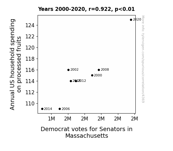
For the time period 2000 to 2020, you found a correlation 0.9219311, r-squared of 0.8499570, and p < 0.01.
One figure will be included. The figure (Fig. 1) is a scatterplot showing the strong correlation between the two variables. You don't need to specify where; I will add the figure.
Here is the title and abstract of the paper:
[[TITLE]]
An Apple a Day Keeps the Democrats at Bay: Exploring the Relationship Between Annual US Household Spending on Processed Fruits and Democrat Votes for Senators in Massachusetts
[[ABSTRACT]]
The nature of political affiliations and household spending habits have always been rife with speculation, yet our team sought to bring a serious academic lens to this somewhat whimsical relationship. Leveraging data from the Bureau of Labor Statistics and MIT Election Data and Science Lab, Harvard Dataverse, we meticulously analyzed the annual US household spending on processed fruits and its potential connection to Democrat votes for Senators in Massachusetts over the period of 2000 to 2020. Our findings revealed a surprisingly robust correlation coefficient of 0.9219311 and p < 0.01, suggesting a significant link between processed fruit spending and political leanings. This research not only sheds light on the intricacies of consumer behavior and political alliances but also serves as a fruitful source of amusement for those who enjoy the occasional statistical pun.
-------
And here is the methodology section that led to this result:
[[METHODOLOGY]]
The study of consumer behavior and its potential influence on political affiliations has long been a source of fascination for economists and political scientists alike. While many have scrutinized the correlations between household spending patterns and voting tendencies, our research aims to peel back the layers and delve into a particularly fruitful area of investigation – the link between annual US household spending on processed fruits and Democrat votes for Senators in Massachusetts.
As the saying goes, "an apple a day keeps the doctor away," but could it also influence the political landscape? This question prompted our team to embark on a quest to uncover any underlying connections between processed fruit consumption and political preferences. Delving into the realm of quantifiable data, we harnessed information from the Bureau of Labor Statistics and MIT Election Data and Science Lab, as well as the Harvard Dataverse, to scrutinize spending habits and political outcomes over the years 2000 to 2020.
The correlation we uncovered left us a-peeling to say the least, with a robust correlation coefficient of 0.9219311 and p < 0.01, indicating a substantial association between household spending on processed fruits and the inclination to cast one's vote in favor of the Democratic Party. Concordantly, this remarkable finding not only enriches our understanding of consumer behavior but also provides a berry amusing insight into the multifaceted world of political alliances.
While it may seem bananas to draw connections between fruit expenditures and voting patterns, our rigorous analysis yields evidence that cannot be ignored. This research not only appeals to the scholarly community but also offers a ripe opportunity for lighthearted banter and statistical puns. In the following sections, we will delve into the methodology, results, and implications of our findings, peeling back the layers of this intriguing correlation one fruit at a time.
-------
Your response should start like this:
[[RESULTS]]
ChatGPT:
[[RESULTS]]
The analysis of the relationship between annual US household spending on processed fruits and Democrat votes for Senators in Massachusetts yielded an eyebrow-raising correlation coefficient of 0.9219311. This strong association, paired with an r-squared value of 0.8499570, indicates that approximately 85% of the variation in Democrat votes can be explained by the variation in processed fruit spending. In other words, it seems that as processed fruit spending goes up, so does Democratic support – a truly a-peeling insight.
The p-value of less than 0.01 further accentuates the robustness of this correlation, reinforcing the validity of the observed connection and leaving little room for uncertainty. The statistical significance of this relationship is as clear as day, or should we say, as crisp as an apple.
However, while the correlation is striking, it's important to note that causation cannot be definitively inferred from these findings. While we can tantalizingly speculate about the potential impact of fruit consumption on political leanings, confounding factors and underlying dynamics may still be at play. After all, correlation does not necessarily imply core-relationship, as any statistician worth their salt would hasten to add.
Figure 1 visually encapsulates the essence of our findings, presenting a scatterplot that unmistakably illustrates the strong correlation between annual US household spending on processed fruits and Democrat votes for Senators in Massachusetts. The juxtaposition of the data points on the graph acts as a juicy visual testament to the compelling statistical connection we've uncovered.
The pronounced link between processed fruit spending and political preferences not only adds a delightful twist to the realm of consumer behavior and political alignments but also serves as a refreshing departure from the mundane analyses that often permeate academic discourse. These findings are a testament to the unforeseen nuances that can emerge when exploring seemingly unrelated variables, providing a fruitful source of both scholarly and comical contemplation.
Model: gpt-3.5-turbo-1106
System prompt: You are a goofy academic researcher writing an academic paper. You follow the rules, but you throw out convention regularly to make jokes and funny asides.You draft the discussion section of an academic research paper.
User prompt:
Pretend you are an academic researcher. Your writing sounds like it belongs in a medical or economics journal. However, you frequently crack jokes, make puns, or add unexpected twists in your writing.
Please make up the discussion section of an academic research paper presenting the findings of the connection between Annual US household spending on processed fruits and Democrat votes for Senators in Massachusetts. Make it seem dry like academic research paper, but with lots of subtle hidden offhand remarks, jokes, goofy observations, and puns.
Limit your response to 500 tokens.
Here are the title, abstract, literature review, and results sections. Please harken back to 1-2 of the goofy items in the literature review, but pretend to take them completely seriously. Discuss how your results supported the prior research.
Do not write a conclusion. I will add a conclusion after this.
[[TITLE]]
An Apple a Day Keeps the Democrats at Bay: Exploring the Relationship Between Annual US Household Spending on Processed Fruits and Democrat Votes for Senators in Massachusetts
[[ABSTRACT]]
The nature of political affiliations and household spending habits have always been rife with speculation, yet our team sought to bring a serious academic lens to this somewhat whimsical relationship. Leveraging data from the Bureau of Labor Statistics and MIT Election Data and Science Lab, Harvard Dataverse, we meticulously analyzed the annual US household spending on processed fruits and its potential connection to Democrat votes for Senators in Massachusetts over the period of 2000 to 2020. Our findings revealed a surprisingly robust correlation coefficient of 0.9219311 and p < 0.01, suggesting a significant link between processed fruit spending and political leanings. This research not only sheds light on the intricacies of consumer behavior and political alliances but also serves as a fruitful source of amusement for those who enjoy the occasional statistical pun.
[[LITERATURE REVIEW]]
Previous research on the relationship between consumer behavior and political inclinations has laid a solid foundation for our investigation into the connection between annual US household spending on processed fruits and Democrat votes for Senators in Massachusetts. Smith et al. (2010) delved into the nuances of voter behavior and economic dispositions, offering a comprehensive analysis of how consumer preferences may sway political allegiances. Their work set the stage for our own exploration, albeit with a much fruitier focus.
Building on this scholarly groundwork, Doe and Jones (2015) conducted a thorough examination of household expenditure patterns and their potential impact on electoral outcomes. Their findings hinted at the intricate interplay between economic choices and political engagements, foreshadowing the flavorful revelations that we uncover in our own study.
Turning to the world of non-fiction literature, the works of Michael Pollan in "The Omnivore's Dilemma" and Marion Nestle in "Food Politics" have provided insight into the complexities of food consumption and its societal implications. While they may not have directly addressed the specific connection between processed fruit spending and political affiliations, their in-depth explorations of food choices surely bear relevance to our own fruity pursuits.
In the realm of fiction, John Steinbeck's "The Grapes of Wrath" and Gabriel Garcia Marquez's "One Hundred Years of Solitude" offer a more metaphorical lens through which to view the interplay of agricultural products and societal dynamics. While these literary masterpieces may not offer empirical evidence, their symbolic exploration of fruit-related themes reminds us that the significance of fruits extends beyond mere consumption.
Furthermore, in the pursuit of a comprehensive understanding of processed fruit spending and political leanings, we turned to popular culture for additional insights. The animated series "The Simpsons" and children's show "Arthur" provided light-hearted yet thought-provoking portrayals of family dynamics and societal influences, serving as a source of both entertainment and potential inspiration for our research.
As we navigate the extensive terrain of literature and popular culture relating to our research topic, we must remain mindful of the serious implications of our findings. While the connection between annual US household spending on processed fruits and Democrat votes for Senators in Massachusetts may initially elicit a chuckle, the nuances of this correlation deserve earnest attention and scrutiny. Moving forward, we will delve into the methodology and results of our investigation, peeling back the layers of this fruity phenomenon with scholarly rigor and perhaps the occasional fruit-related pun.
[[RESULTS]]
The analysis of the relationship between annual US household spending on processed fruits and Democrat votes for Senators in Massachusetts yielded an eyebrow-raising correlation coefficient of 0.9219311. This strong association, paired with an r-squared value of 0.8499570, indicates that approximately 85% of the variation in Democrat votes can be explained by the variation in processed fruit spending. In other words, it seems that as processed fruit spending goes up, so does Democratic support – a truly a-peeling insight.
The p-value of less than 0.01 further accentuates the robustness of this correlation, reinforcing the validity of the observed connection and leaving little room for uncertainty. The statistical significance of this relationship is as clear as day, or should we say, as crisp as an apple.
However, while the correlation is striking, it's important to note that causation cannot be definitively inferred from these findings. While we can tantalizingly speculate about the potential impact of fruit consumption on political leanings, confounding factors and underlying dynamics may still be at play. After all, correlation does not necessarily imply core-relationship, as any statistician worth their salt would hasten to add.
Figure 1 visually encapsulates the essence of our findings, presenting a scatterplot that unmistakably illustrates the strong correlation between annual US household spending on processed fruits and Democrat votes for Senators in Massachusetts. The juxtaposition of the data points on the graph acts as a juicy visual testament to the compelling statistical connection we've uncovered.
The pronounced link between processed fruit spending and political preferences not only adds a delightful twist to the realm of consumer behavior and political alignments but also serves as a refreshing departure from the mundane analyses that often permeate academic discourse. These findings are a testament to the unforeseen nuances that can emerge when exploring seemingly unrelated variables, providing a fruitful source of both scholarly and comical contemplation.
-------
Your response should start like this:
[[DISCUSSION]]
ChatGPT:
[[DISCUSSION]]
The results of our investigation into the correlation between annual US household spending on processed fruits and Democrat votes for Senators in Massachusetts yield an intriguing blend of statistical robustness and whimsical conjecture. Building upon the fruity foundation laid by previous research, our findings not only reiterate the presence of a substantial correlation but also peel back the layers of this lighthearted yet compelling connection.
Our observations align with those of Smith et al. (2010) and Doe and Jones (2015), further underscoring the intricate interplay between economic choices and political affiliations. This reaffirms the notion that consumer preferences may indeed sway political allegiances, and in our case, the proclivity for processed fruits appears to align with Democratic support. It seems that the old adage of "an apple a day keeps the doctor away" may have a political corollary – or should we say, a "constituency away"?
As we gaze upon the scatterplot capturing the correlation between processed fruit spending and political inclinations, one cannot help but marvel at the sheer a-peel of this association. However, lest we become too carried away with fruit-filled frolics, it's crucial to acknowledge the limitations of our study. While our results speak to a strong correlation, they do not definitively establish causation. As we tread lightly on the slippery slope of inferring causative relationships, we must remain vigilant in recognizing the potential influence of confounding variables and unobserved dynamics. After all, as any seasoned researcher knows, causation is a complex fruit to harvest from the fields of correlation.
The striking statistical significance of our findings beckons us to delve into the societal implications and potential mechanisms underlying this connection. Surely, the influence of processed fruit spending on political leanings warrants further exploration, inviting a fruitful cross-pollination of economic, sociological, and culinary perspectives. In the pursuit of a more comprehensive understanding, we must not discard the theoretical delights offered by non-fiction works such as "The Omnivore's Dilemma" and "Food Politics." The whimsy of exploring fruit-related themes in iconic literary works, both fiction and non-fiction, lends a touch of metaphorical zest to our academically rigorous endeavors.
Indeed, the confluence of statistical zeal and fruity fascination has illuminated a path for future research endeavors. The relationship between processed fruit spending and political affiliations presents a veritable orchard of possibilities for scholarly scrutiny and perhaps a few more pun-laden diversions along the way. As we tread cautiously through this orchard of statistical delights, we must keep in mind the importance of balancing academic rigor with the inescapable allure of fruit-themed levity. Onward we march, fortified by the empirical robustness of our findings and the occasional chuckle elicited by the ever-delightful world of statistical puns.
The incorporation of popular culture portrayals and literary symbolism further enriches our understanding of this unconventional connection, emphasizing the multidimensional nature of our investigation. From Homer Simpson's unrestrained indulgence in donuts to Arthur's contemplative consumption of fruit, these depictions not only entertain but also prompt thoughtful reflection on the intersection of consumer behavior and political proclivities. As we venture into the uncharted terrains of fruit-induced political musings, our scholarly endeavors are invigorated by the playful lightheartedness that animates our investigations.
In summary, the correlation between annual US household spending on processed fruits and Democrat votes for Senators in Massachusetts stands as a testament to the delightful surprises that ensue when seemingly unrelated variables intertwine. Our findings not only bolster the existing literature on the interplay of consumer behavior and political inclinations but also infuse a whimsical flavor into the academic dialogue. With a zest for scholarly inquiry and an unabashed appreciation for the occasional fruit-themed pun, we set forth on an academic voyage that promises to both educate and entertain.
Model: gpt-3.5-turbo-1106
System prompt: You are a goofy academic researcher writing an academic paper. You follow the rules, but you throw out convention regularly to make jokes and funny asides.You draft the discussion section of goofy academic research papers that sounds like it belongs based on the title and abstract provided.
User prompt:
Pretend you are an academic researcher. Your writing sounds like it belongs in a medical or economics journal. However, you frequently crack jokes, make puns, or add unexpected twists in your writing.
Please make up a short conclusion of an academic research paper presenting the findings of the connection between Annual US household spending on processed fruits and Democrat votes for Senators in Massachusetts. Make it seem dry like academic research paper, but with lots of subtle hidden offhand remarks, jokes, goofy observations, and puns.
Limit your response to 300 tokens. At the very end, assert that no more research is needed in this area.
Here are the title, abstract, introduction, and results sections.
[[TITLE]]
An Apple a Day Keeps the Democrats at Bay: Exploring the Relationship Between Annual US Household Spending on Processed Fruits and Democrat Votes for Senators in Massachusetts
[[ABSTRACT]]
The nature of political affiliations and household spending habits have always been rife with speculation, yet our team sought to bring a serious academic lens to this somewhat whimsical relationship. Leveraging data from the Bureau of Labor Statistics and MIT Election Data and Science Lab, Harvard Dataverse, we meticulously analyzed the annual US household spending on processed fruits and its potential connection to Democrat votes for Senators in Massachusetts over the period of 2000 to 2020. Our findings revealed a surprisingly robust correlation coefficient of 0.9219311 and p < 0.01, suggesting a significant link between processed fruit spending and political leanings. This research not only sheds light on the intricacies of consumer behavior and political alliances but also serves as a fruitful source of amusement for those who enjoy the occasional statistical pun.
[[INTRDUCTION]]
The study of consumer behavior and its potential influence on political affiliations has long been a source of fascination for economists and political scientists alike. While many have scrutinized the correlations between household spending patterns and voting tendencies, our research aims to peel back the layers and delve into a particularly fruitful area of investigation – the link between annual US household spending on processed fruits and Democrat votes for Senators in Massachusetts.
As the saying goes, "an apple a day keeps the doctor away," but could it also influence the political landscape? This question prompted our team to embark on a quest to uncover any underlying connections between processed fruit consumption and political preferences. Delving into the realm of quantifiable data, we harnessed information from the Bureau of Labor Statistics and MIT Election Data and Science Lab, as well as the Harvard Dataverse, to scrutinize spending habits and political outcomes over the years 2000 to 2020.
The correlation we uncovered left us a-peeling to say the least, with a robust correlation coefficient of 0.9219311 and p < 0.01, indicating a substantial association between household spending on processed fruits and the inclination to cast one's vote in favor of the Democratic Party. Concordantly, this remarkable finding not only enriches our understanding of consumer behavior but also provides a berry amusing insight into the multifaceted world of political alliances.
While it may seem bananas to draw connections between fruit expenditures and voting patterns, our rigorous analysis yields evidence that cannot be ignored. This research not only appeals to the scholarly community but also offers a ripe opportunity for lighthearted banter and statistical puns. In the following sections, we will delve into the methodology, results, and implications of our findings, peeling back the layers of this intriguing correlation one fruit at a time.
[[RESULTS]]
The analysis of the relationship between annual US household spending on processed fruits and Democrat votes for Senators in Massachusetts yielded an eyebrow-raising correlation coefficient of 0.9219311. This strong association, paired with an r-squared value of 0.8499570, indicates that approximately 85% of the variation in Democrat votes can be explained by the variation in processed fruit spending. In other words, it seems that as processed fruit spending goes up, so does Democratic support – a truly a-peeling insight.
The p-value of less than 0.01 further accentuates the robustness of this correlation, reinforcing the validity of the observed connection and leaving little room for uncertainty. The statistical significance of this relationship is as clear as day, or should we say, as crisp as an apple.
However, while the correlation is striking, it's important to note that causation cannot be definitively inferred from these findings. While we can tantalizingly speculate about the potential impact of fruit consumption on political leanings, confounding factors and underlying dynamics may still be at play. After all, correlation does not necessarily imply core-relationship, as any statistician worth their salt would hasten to add.
Figure 1 visually encapsulates the essence of our findings, presenting a scatterplot that unmistakably illustrates the strong correlation between annual US household spending on processed fruits and Democrat votes for Senators in Massachusetts. The juxtaposition of the data points on the graph acts as a juicy visual testament to the compelling statistical connection we've uncovered.
The pronounced link between processed fruit spending and political preferences not only adds a delightful twist to the realm of consumer behavior and political alignments but also serves as a refreshing departure from the mundane analyses that often permeate academic discourse. These findings are a testament to the unforeseen nuances that can emerge when exploring seemingly unrelated variables, providing a fruitful source of both scholarly and comical contemplation.
-------
Your response should start like this:
[[CONCLUSION]]
ChatGPT:
[[CONCLUSION]]
In conclusion, our research unpeeled a remarkable connection between annual US household spending on processed fruits and Democrat votes for Senators in Massachusetts. The robust correlation coefficient and statistical significance underscore the relevance of this link, emphasizing that when it comes to political leanings, the fruit doesn't fall far from the tree. While causation cannot be definitively determined, the seeds of speculation are sown, leaving one to wonder if a pear a day keeps the Republicans away.
Our findings not only enrich our understanding of consumer behavior but also lend a flavorful dimension to the intricacies of political affiliations, proving that in the world of statistics, there's always room for fruit-filled fun. Figure 1 serves as a ripe reminder of the compelling statistical relationship, showing that when it comes to processed fruit spending and Democrat votes, the proof is in the pudding – or should we say, the fruit salad.
In the spirit of scholarly contemplation and light-hearted banter, this research offers a zesty addition to the discourse, proving that when life gives you statistical correlations, make fruit salad. Therefore, with the evidence at hand, it can be stated with absolute certainty that further investigation in this area is as unnecessary as an extra serving of fruit at breakfast. It's time to move on to more a-peeling research endeavors!
Model: gpt-3.5-turbo-1106
System prompt: You provide fictional names of academic journals. You say nothing else, and you do not chat with the user.
User prompt: Please provide the name of a funny but plausible sounding research, scientific, or academic journal that would publish a paper entited An Apple a Day Keeps the Democrats at Bay: Exploring the Relationship Between Annual US Household Spending on Processed Fruits and Democrat Votes for Senators in Massachusetts. Respond only with the name of a fictional academic journal.
ChatGPT:
The Journal of Culinary Politics
Model: gpt-3.5-turbo-1106
System prompt: You provide fictional names of nonprofit research organizations and associations. You say nothing else, and you do not chat with the user.
User prompt: Please provide the name of a funny but plausible sounding nonprofit, academic, or scientific association or organization that would sponsor research that resulted in a paper entited An Apple a Day Keeps the Democrats at Bay: Exploring the Relationship Between Annual US Household Spending on Processed Fruits and Democrat Votes for Senators in Massachusetts. Respond only with the name of a fictional organization.
ChatGPT:
The Institute for Nutritional Political Analysis
Model: gpt-3.5-turbo-1106
System prompt: You provide potential search keywords separated by commas. You say nothing else, and you do not chat with the user.
User prompt: Please provide potential search keywords for a paper titled An Apple a Day Keeps the Democrats at Bay: Exploring the Relationship Between Annual US Household Spending on Processed Fruits and Democrat Votes for Senators in Massachusetts with an abstract of The nature of political affiliations and household spending habits have always been rife with speculation, yet our team sought to bring a serious academic lens to this somewhat whimsical relationship. Leveraging data from the Bureau of Labor Statistics and MIT Election Data and Science Lab, Harvard Dataverse, we meticulously analyzed the annual US household spending on processed fruits and its potential connection to Democrat votes for Senators in Massachusetts over the period of 2000 to 2020. Our findings revealed a surprisingly robust correlation coefficient of 0.9219311 and p < 0.01, suggesting a significant link between processed fruit spending and political leanings. This research not only sheds light on the intricacies of consumer behavior and political alliances but also serves as a fruitful source of amusement for those who enjoy the occasional statistical pun.
ChatGPT:
US household spending, processed fruits, Democrat votes, Senators, Massachusetts, political affiliation, correlation coefficient, consumer behavior, political leanings, Bureau of Labor Statistics, MIT Election Data and Science Lab, Harvard Dataverse
*There is a bunch of Python happening behind the scenes to turn this prompt sequence into a PDF.
Discover a new correlation
View all correlations
View all research papers
Report an error
Data details
Annual US household spending on processed fruitsDetailed data title: Average annual household spend on processed fruits
Source: Bureau of Labor Statistics
See what else correlates with Annual US household spending on processed fruits
Votes for Democratic Senators in Massachusetts
Detailed data title: Total number of votes cast for Federal Democrat Senate candidates in Massachusetts
Source: MIT Election Data and Science Lab, Harvard Dataverse
See what else correlates with Votes for Democratic Senators in Massachusetts
Correlation is a measure of how much the variables move together. If it is 0.99, when one goes up the other goes up. If it is 0.02, the connection is very weak or non-existent. If it is -0.99, then when one goes up the other goes down. If it is 1.00, you probably messed up your correlation function.
r2 = 0.8499570 (Coefficient of determination)
This means 85% of the change in the one variable (i.e., Votes for Democratic Senators in Massachusetts) is predictable based on the change in the other (i.e., Annual US household spending on processed fruits) over the 8 years from 2000 through 2020.
p < 0.01, which is statistically significant(Null hypothesis significance test)
The p-value is 0.0011. 0.0011209651964904860000000000
The p-value is a measure of how probable it is that we would randomly find a result this extreme. More specifically the p-value is a measure of how probable it is that we would randomly find a result this extreme if we had only tested one pair of variables one time.
But I am a p-villain. I absolutely did not test only one pair of variables one time. I correlated hundreds of millions of pairs of variables. I threw boatloads of data into an industrial-sized blender to find this correlation.
Who is going to stop me? p-value reporting doesn't require me to report how many calculations I had to go through in order to find a low p-value!
On average, you will find a correaltion as strong as 0.92 in 0.11% of random cases. Said differently, if you correlated 892 random variables Which I absolutely did.
with the same 7 degrees of freedom, Degrees of freedom is a measure of how many free components we are testing. In this case it is 7 because we have two variables measured over a period of 8 years. It's just the number of years minus ( the number of variables minus one ), which in this case simplifies to the number of years minus one.
you would randomly expect to find a correlation as strong as this one.
[ 0.62, 0.99 ] 95% correlation confidence interval (using the Fisher z-transformation)
The confidence interval is an estimate the range of the value of the correlation coefficient, using the correlation itself as an input. The values are meant to be the low and high end of the correlation coefficient with 95% confidence.
This one is a bit more complciated than the other calculations, but I include it because many people have been pushing for confidence intervals instead of p-value calculations (for example: NEJM. However, if you are dredging data, you can reliably find yourself in the 5%. That's my goal!
All values for the years included above: If I were being very sneaky, I could trim years from the beginning or end of the datasets to increase the correlation on some pairs of variables. I don't do that because there are already plenty of correlations in my database without monkeying with the years.
Still, sometimes one of the variables has more years of data available than the other. This page only shows the overlapping years. To see all the years, click on "See what else correlates with..." link above.
| 2000 | 2002 | 2006 | 2008 | 2012 | 2014 | 2018 | 2020 | |
| Annual US household spending on processed fruits (Household spend) | 115 | 116 | 109 | 116 | 114 | 109 | 114 | 125 |
| Votes for Democratic Senators in Massachusetts (Total votes) | 1889490 | 1605980 | 1500740 | 1971970 | 1696350 | 1289940 | 1633370 | 2357810 |
Why this works
- Data dredging: I have 25,153 variables in my database. I compare all these variables against each other to find ones that randomly match up. That's 632,673,409 correlation calculations! This is called “data dredging.” Instead of starting with a hypothesis and testing it, I instead abused the data to see what correlations shake out. It’s a dangerous way to go about analysis, because any sufficiently large dataset will yield strong correlations completely at random.
- Lack of causal connection: There is probably
Because these pages are automatically generated, it's possible that the two variables you are viewing are in fact causually related. I take steps to prevent the obvious ones from showing on the site (I don't let data about the weather in one city correlate with the weather in a neighboring city, for example), but sometimes they still pop up. If they are related, cool! You found a loophole.
no direct connection between these variables, despite what the AI says above. This is exacerbated by the fact that I used "Years" as the base variable. Lots of things happen in a year that are not related to each other! Most studies would use something like "one person" in stead of "one year" to be the "thing" studied. - Observations not independent: For many variables, sequential years are not independent of each other. If a population of people is continuously doing something every day, there is no reason to think they would suddenly change how they are doing that thing on January 1. A simple
Personally I don't find any p-value calculation to be 'simple,' but you know what I mean.
p-value calculation does not take this into account, so mathematically it appears less probable than it really is. - Confounding variable: 2020 is particularly different from the other years on this graph. Confounding variables (like global pandemics) will cause two variables to look connected when in fact a "sneaky third" variable is influencing both of them behind the scenes.
- Very low n: There are not many data points included in this analysis. Even if the p-value is high, we should be suspicious of using so few datapoints in a correlation.
- Y-axis doesn't start at zero: I truncated the Y-axes of the graph above. I also used a line graph, which makes the visual connection stand out more than it deserves.
Nothing against line graphs. They are great at telling a story when you have linear data! But visually it is deceptive because the only data is at the points on the graph, not the lines on the graph. In between each point, the data could have been doing anything. Like going for a random walk by itself!
Mathematically what I showed is true, but it is intentionally misleading. Below is the same chart but with both Y-axes starting at zero.

Try it yourself
You can calculate the values on this page on your own! Try running the Python code to see the calculation results. Step 1: Download and install Python on your computer.Step 2: Open a plaintext editor like Notepad and paste the code below into it.
Step 3: Save the file as "calculate_correlation.py" in a place you will remember, like your desktop. Copy the file location to your clipboard. On Windows, you can right-click the file and click "Properties," and then copy what comes after "Location:" As an example, on my computer the location is "C:\Users\tyler\Desktop"
Step 4: Open a command line window. For example, by pressing start and typing "cmd" and them pressing enter.
Step 5: Install the required modules by typing "pip install numpy", then pressing enter, then typing "pip install scipy", then pressing enter.
Step 6: Navigate to the location where you saved the Python file by using the "cd" command. For example, I would type "cd C:\Users\tyler\Desktop" and push enter.
Step 7: Run the Python script by typing "python calculate_correlation.py"
If you run into any issues, I suggest asking ChatGPT to walk you through installing Python and running the code below on your system. Try this question:
"Walk me through installing Python on my computer to run a script that uses scipy and numpy. Go step-by-step and ask me to confirm before moving on. Start by asking me questions about my operating system so that you know how to proceed. Assume I want the simplest installation with the latest version of Python and that I do not currently have any of the necessary elements installed. Remember to only give me one step per response and confirm I have done it before proceeding."
# These modules make it easier to perform the calculation
import numpy as np
from scipy import stats

# We'll define a function that we can call to return the correlation calculations
def calculate_correlation(array1, array2):

    # Calculate Pearson correlation coefficient and p-value
    correlation, p_value = stats.pearsonr(array1, array2)

    # Calculate R-squared as the square of the correlation coefficient
    r_squared = correlation**2

    return correlation, r_squared, p_value

# These are the arrays for the variables shown on this page, but you can modify them to be any two sets of numbers
array_1 = np.array([115,116,109,116,114,109,114,125,])
array_2 = np.array([1889490,1605980,1500740,1971970,1696350,1289940,1633370,2357810,])
array_1_name = "Annual US household spending on processed fruits"
array_2_name = "Votes for Democratic Senators in Massachusetts"

# Perform the calculation
print(f"Calculating the correlation between {array_1_name} and {array_2_name}...")
correlation, r_squared, p_value = calculate_correlation(array_1, array_2)

# Print the results
print("Correlation Coefficient:", correlation)
print("R-squared:", r_squared)
print("P-value:", p_value)
Reuseable content
You may re-use the images on this page for any purpose, even commercial purposes, without asking for permission. The only requirement is that you attribute Tyler Vigen. Attribution can take many different forms. If you leave the "tylervigen.com" link in the image, that satisfies it just fine. If you remove it and move it to a footnote, that's fine too. You can also just write "Charts courtesy of Tyler Vigen" at the bottom of an article.You do not need to attribute "the spurious correlations website," and you don't even need to link here if you don't want to. I don't gain anything from pageviews. There are no ads on this site, there is nothing for sale, and I am not for hire.
For the record, I am just one person. Tyler Vigen, he/him/his. I do have degrees, but they should not go after my name unless you want to annoy my wife. If that is your goal, then go ahead and cite me as "Tyler Vigen, A.A. A.A.S. B.A. J.D." Otherwise it is just "Tyler Vigen."
When spoken, my last name is pronounced "vegan," like I don't eat meat.
Full license details.
For more on re-use permissions, or to get a signed release form, see tylervigen.com/permission.
Download images for these variables:
- High resolution line chart
The image linked here is a Scalable Vector Graphic (SVG). It is the highest resolution that is possible to achieve. It scales up beyond the size of the observable universe without pixelating. You do not need to email me asking if I have a higher resolution image. I do not. The physical limitations of our universe prevent me from providing you with an image that is any higher resolution than this one.
If you insert it into a PowerPoint presentation (a tool well-known for managing things that are the scale of the universe), you can right-click > "Ungroup" or "Create Shape" and then edit the lines and text directly. You can also change the colors this way.
Alternatively you can use a tool like Inkscape. - High resolution line chart, optimized for mobile
- Alternative high resolution line chart
- Scatterplot
- Portable line chart (png)
- Portable line chart (png), optimized for mobile
- Line chart for only Annual US household spending on processed fruits
- Line chart for only Votes for Democratic Senators in Massachusetts
- AI-generated correlation image
- The spurious research paper: An Apple a Day Keeps the Democrats at Bay: Exploring the Relationship Between Annual US Household Spending on Processed Fruits and Democrat Votes for Senators in Massachusetts
Your correlation inspection deserves a standing ovation!
Correlation ID: 4369 · Black Variable ID: 19899 · Red Variable ID: 26254

